30
Types of Color Schemes ● Monochromatic ● Related -Analogous ● Contrast -Complementary -Split Complementary -Triadic
| Date post: | 21-Jan-2016 |
| Category: |
Documents |
| Upload: | diane-king |
| View: | 235 times |
| Download: | 0 times |

Types of Color Schemes●Monochromatic●Related
-Analogous●Contrast
-Complementary-Split Complementary-Triadic

Monochromatic● One color and its values
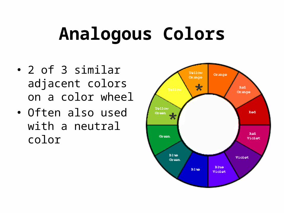
Analogous Colors
● 2 of 3 similar adjacent colors on a color wheel
● Often also used with a neutral color

Contrast Complementary ●Colors that are direct opposite each other on the color wheel●Complementary colors are “opposites” and generally result in good contrast●Naturally go well together

Split Complementary●A color and the two colors that are next to the complementary color

Triad Color Scheme
● Any three colors spaced equally from each other in the color wheel
● Creates an equilateral triangle on the color wheel

RED
● Anger● Excitement● Love● Dominant● Strong● Intense● Active

BLUE● Calm● Sad● Comfort● Security● Loyalty● Trust

YELLOW● Happy● Cheerful● Energetic

GREEN● Calm● Happy● Natural● Quietness● Refreshment● Endurance● Stability

ORANGE● Exciting● Upsetting● Distressing● Determination● Success

PURPLE● Defined● Royal● Distinguished● Power● Ambition● Luxury

WHITE *yes technically it’s a “value” not a true color
● Purity● Goodness● Light● Innocence● Positive● Simple● Clean

BLACK *yes technically it’s a “value” not a true color
● Elegant● Powerful● Formal● Death


Elements of Design

SPACE• Space is the 3 dimensional expanse that
a designer is working with.– Large, open spaces give people a feeling of
freedom and luxury.• Too much open space can make people feel lonely
and uncomfortable.• Rooms with high ceilings or too few furnishings
can have this effect as well.• Empty parts of room may look larger than smaller
areas containing furniture.– Crowded spaces with too much furniture may
make you feel confined.• On the other hand, you may feel snug and secure.

LINE• Line outlines form and conveys a sense of
movement or direction.• Lines can be used to convey a sense of
strength, serenity, gracefulness, or action.• All lines are either straight or curved and are
placed in a direction, vertical, horizontal, or diagonal.– Vertical lines can convey strength and stability
• (pinstriped suit)– A horizontal line may suggest rest.– Diagonal or zigzag lines evoke excitement and
movement.– Curved lines have a graceful and delicate effect.

FORM Form describes the shape and structure of solid
objects.• Large heavy objects such as pianos or sofas give
a feeling of stability.– Their massive appearance adds a solid feeling to the
room.– Placing several small objects together will create
stability as well (such as 2 chairs and a table grouped together)
• Designers are usually more concerned with apparent weight rather than actual weight.– Light colors pair with other light colors equal a
lightness– Light colors paired with dark colors may add weight.
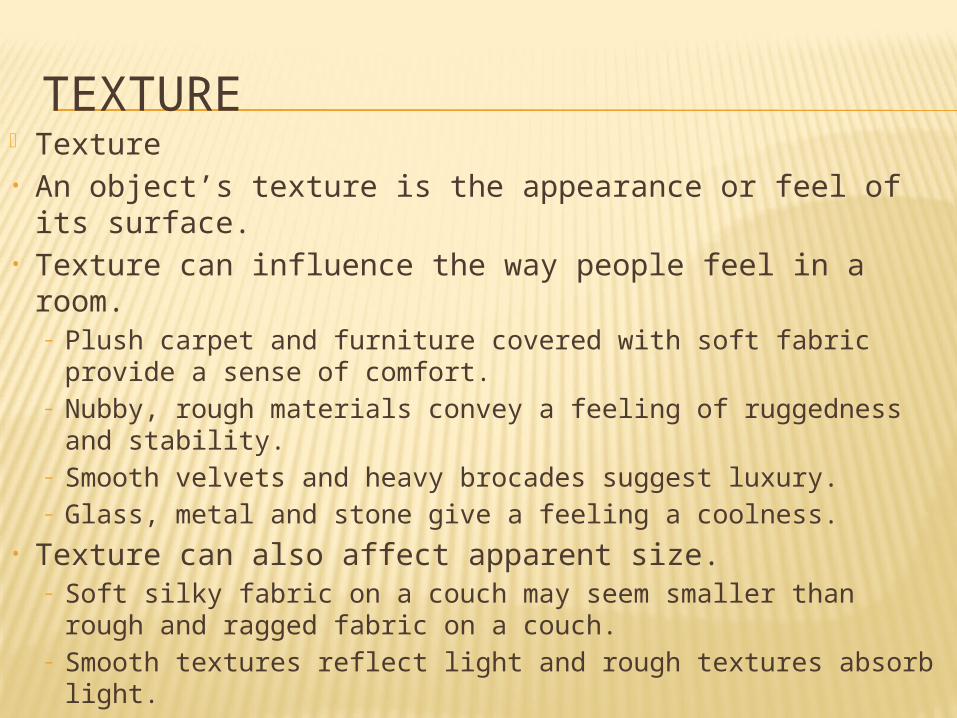
TEXTURE Texture• An object’s texture is the appearance or feel of its
surface.• Texture can influence the way people feel in a room.
– Plush carpet and furniture covered with soft fabric provide a sense of comfort.
– Nubby, rough materials convey a feeling of ruggedness and stability.
– Smooth velvets and heavy brocades suggest luxury.– Glass, metal and stone give a feeling a coolness.
• Texture can also affect apparent size.– Soft silky fabric on a couch may seem smaller than rough
and ragged fabric on a couch.– Smooth textures reflect light and rough textures absorb
light.

Principles of Design

BALANCESYMMETRICAL BALANCE
Creates a quiet, restful feeling. Suggests restraint, orderliness, formality. Also called, FORMAL balance.
ASYMMETRICAL BALANCE Creates more interesting arrangements. Suggests informality, relaxed. Also referred to as INFORMAL balance.

RHYTHM Rhythm by Repetition Rhythm by Gradation Rhythm by Radiation Rhythm by Opposition Rhythm by Transition

SCALE AND PROPORTIONSCALE
Relates to the actual and relative size and visual weight of the design and its components.
Furniture and accessories must be in scale to the room
PROPORTION The Golden Mean – the division of a line or form
so that the smaller portion has the same ratio to the larger as the larger has to the whole.
The creative use of color, texture, pattern, and furniture arrangement can create illusions of properly proportioned space.

EMPHASIS
The center or focus of attention and interest within a design

HARMONY
UNITY Unity occurs when all the parts of a home or room
are related by one idea. A unified design has consistency of style
VARIETY When two or more different elements of design are
used to add interest to a design. Variety can be achieved by combining different
styles and materials, as long as they are compatible.


