INTRODUCTION LEARN ABOUT IT I.1 Consider the criteria used to identify and characterize those cultural artifacts that are labeled as “art.” I.2 Survey the methods used by art historians to analyze works of art and interpret their meaning within their original cultural contexts. I.3 Explore the methods and objectives of visual analysis. I.4 Assess the way art historians identify conventional subject matter and symbols in a process called iconography. I.5 Trace the process of art-historical interpretation in a case study. HEAR MORE: Listen to an audio file of your chapter www.myartslab.com The title of this book seems clear. It defines a field of academic study and scholarly research that has achieved a secure place in college and university curricula across North America. But Art History couples two words—even two worlds—that are less well focused when separated.What is art? In what sense does it have a history? Students of art and its history should pause and engage, even if briefly, with these large questions before beginning the journey surveyed in the following chapters. WHAT IS ART? Artists, critics, art historians, and the general public all grapple with this thorny question. The Random House Dictionary defines “art” as “the quality, production, expression, or realm of what is beautiful, or of more than ordinary significance.” Others have characterized “art” as something human-made that combines creative imagination and technical skill and satisfies an innate desire for order and harmony—perhaps a human hunger for the INTRO–1 • Mark Rothko NO. 3/NO. 13 (MAGENTA, BLACK AND GREEN ON ORANGE) 1949. Oil on canvas, 71 3 ⁄ 855(2.165 1.648 m). Museum of Modern Art, New York. XXVI 01_INTRO_PXXVI-XLI.qxd 14/4/10 11:39 Page xxvi
Transcript
INTRODUCTION
LEARN ABOUT IT
I.1 Consider the criteria used to identify and characterizethose cultural artifacts that are labeled as “art.”
I.2 Survey the methods used by art historians to analyzeworks of art and interpret their meaning within their original cultural contexts.
I.3 Explore the methods and objectives of visual analysis.
I.4 Assess the way art historians identify conventionalsubject matter and symbols in a process callediconography.
I.5 Trace the process of art-historical interpretation in a casestudy.
HEAR MORE: Listen to an audio file of your chapter www.myartslab.com
The title of this book seems clear. It defines a field of academicstudy and scholarly research that has achieved a secure place in college and university curricula across North America. But ArtHistory couples two words—even two worlds—that are less wellfocused when separated.What is art? In what sense does it have ahistory? Students of art and its history should pause and engage,even if briefly, with these large questions before beginning thejourney surveyed in the following chapters.
WHAT IS ART?Artists, critics, art historians, and the general public all grapplewith this thorny question. The Random House Dictionary defines“art” as “the quality, production, expression, or realm of what isbeautiful, or of more than ordinary significance.” Others havecharacterized “art” as something human-made that combines creative imagination and technical skill and satisfies an innatedesire for order and harmony—perhaps a human hunger for the
INTRO–1 • Mark RothkoNO. 3/NO. 13 (MAGENTA,
BLACK AND GREEN ON
ORANGE)
1949. Oil on canvas, 7�13⁄8� � 5�5�
(2.165 � 1.648 m). Museum ofModern Art, New York.
XXVI
01_INTRO_PXXVI-XLI.qxd 14/4/10 11:39 Page xxvi
INTRODUCTION XXVII
beautiful. This seems relatively straightforward until we start tolook at modern and contemporary art, where there has been aheated and extended debate concerning “What is Art?”The focusis often far from questions of transcendent beauty, ordered design,or technical skill, and centers instead on the meaning of a work foran elite target audience or the attempt to pose challenging questions or unsettle deep-seated cultural ideas.
The works of art discussed in this book represent a privilegedsubset of artifacts produced by past and present cultures.They wereusually meant to be preserved, and they are currently considered worthy of conservation and display.The determinationof which artifacts are exceptional—which are works of art—evolves through the actions, opinions, and selections of artists,patrons, governments, collectors, archaeologists, museums, art historians, and others. Labeling objects as art is usually meant tosignal that they transcended or now transcend in some profoundway their practical function, often embodying cherished culturalideas or foundational values. Sometimes it can mean they are considered beautiful, well designed, and made with loving care, butthis is not always the case, especially in the twentieth and twenty-first centuries when the complex notion of what is art has little todo with the idea of beauty. Some critics and historians argue thatworks of art are tendentious embodiments of power and privilege,hardly sublime expressions of beauty or truth. After all, art can beunsettling as well as soothing, challenging as well as reassuring,whether made in the present or surviving from the past.
Increasingly we are realizing that our judgments about whatconstitutes art—as well as what constitutes beauty—are conditionedby our own education and experience.Whether acquired at home,in classrooms, in museums, at the movies, or on the internet, ourresponses to art are learned behaviors, influenced by class,gender, race, geography, and economic status as well as education.Even art historians find that their definitions of what constitutesart—and what constitutes artistic quality—evolve with additionalresearch and understanding. Exploring works by twentieth-centurypainter Mark Rothko and nineteenth-century quiltmakers MarthaKnowles and Henrietta Thomas demonstrates how definitions of artand artistic value are subject to change over time.
Rothko’s painting, MAGENTA, BLACK AND GREEN ON
ORANGE (FIG. INTRO–1), is a well-known example of the sort of abstract painting that was considered the epitome of artisticsophistication by the mid-twentieth-century New York art establishment. It was created by an artist who meant it to be a workof art. It was acquired by the Museum of Modern Art in NewYork, and its position on the walls of that museum is a sure signthat it was accepted as such by a powerful cultural institution.However, beyond the context of the American artists, dealers,critics, and collectors who made up Rothko’s art world, suchpaintings were often received with skepticism.They were seen bymany as incomprehensible—lacking both technical skill and recognizable subject matter, two criteria that were part of the general public’s definition of art at the time. Abstract paintings
soon inspired a popular retort: “That’s not art; my child could doit!” Interestingly enough, Rothko saw in the childlike character ofhis own paintings one of the qualities that made them works of art.Children, he said, “put forms, figures, and views into pictorialarrangements, employing out of necessity most of the rules ofoptical perspective and geometry but without the knowledge thatthey are employing them.” He characterized his own art as childlike, as “an attempt to recapture the freshness and naiveté ofchildish vision.” In part because they are carefully crafted by an established artist who provided these kinds of intellectual justifications for their character and appearance, Rothko’s abstractpaintings are broadly considered works of art and are treasuredpossessions of major museums across the globe.
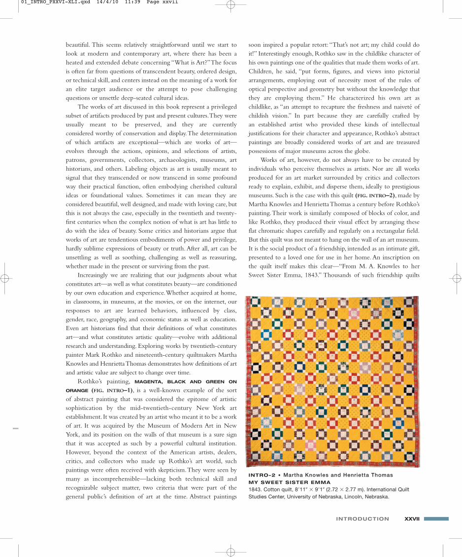
Works of art, however, do not always have to be created byindividuals who perceive themselves as artists. Nor are all worksproduced for an art market surrounded by critics and collectorsready to explain, exhibit, and disperse them, ideally to prestigiousmuseums. Such is the case with this quilt (FIG. INTRO–2), made byMartha Knowles and Henrietta Thomas a century before Rothko’spainting.Their work is similarly composed of blocks of color, andlike Rothko, they produced their visual effect by arranging theseflat chromatic shapes carefully and regularly on a rectangular field.But this quilt was not meant to hang on the wall of an art museum.It is the social product of a friendship, intended as an intimate gift,presented to a loved one for use in her home. An inscription onthe quilt itself makes this clear—“From M. A. Knowles to herSweet Sister Emma, 1843.” Thousands of such friendship quilts
INTRO–2 • Martha Knowles and Henrietta ThomasMY SWEET SISTER EMMA
1843. Cotton quilt, 8�11� � 9�1� (2.72 � 2.77 m). International QuiltStudies Center, University of Nebraska, Lincoln, Nebraska.
01_INTRO_PXXVI-XLI.qxd 14/4/10 11:39 Page xxvii
XXVIII INTRODUCTION
were made by women during the middle years of the nineteenthcentury for use on beds, either to provide warmth or as a coveringspread. Whereas quilts were sometimes displayed to a broad andenthusiastic audience of producers and admirers at competitionsheld at state and county fairs, they were not collected by art museums or revered by artists until relatively recently.
In 1971, at the Whitney Museum in New York—an establish-ment bastion of the art world in which Rothko moved andworked—art historians Jonathan Holstein and Gail van der Hoofmounted an exhibition entitled “Abstract Design in AmericanQuilts,” demonstrating the artistic affiliation we have already notedin comparing the way Knowles and Thomas, like Rothko, create
ART AND ITS CONTEXTS
Art and ArchitectureThis book contains much more than paintings and textiles. Within
these pages you will also encounter sculpture, vessels, books, jewelry,
tombs, chairs, photographs, architecture, and more. But as with
Rothko’s Magenta, Black, and Green on Orange (SEE FIG. INTRO–1) and
Knowles and Thomas’s My Sweet Sister Emma (SEE FIG. INTRO–2),
criteria have been used to determine which works are selected for
inclusion in a book titled Art History. Architecture presents an
interesting case.
Buildings meet functional human needs by enclosing human
habitation or activity. Many works of architecture, however, are
considered “exceptional” because they transcend functional demands
by manifesting distinguished architectural design or because they
embody in important ways the values and goals of the culture that
built them. Such buildings are usually produced by architects
influenced, like painters, by great works and traditions from the past.
In some cases they harmonize with, or react to, their natural or urban
surroundings. For such reasons, they are discussed in books on the
history of art.
Typical of such buildings is the church of Nôtre-Dame-du-Haut in
Ronchamp, France, designed and constructed between 1950 and 1955
by Swiss architect Charles-Edouard Jeanneret, better known by his
pseudonym, Le Corbusier. This building is the product of a significant
historical moment, rich in global cultural meaning. A pilgrimage church on
this site had been destroyed during World War II, and the creation here of
a new church symbolized the end of a devastating war, embodying hopes
for a brighter global future. Le Corbusier’s design—drawing on sources
that ranged from Algerian mosques to imperial Roman villas, from crab
shells to airplane wings—is sculptural as well as architectural. It soars at
the crest of a hill toward the sky but at the same time seems solidly
anchored in the earth. And its coordination with the curves of the natural
landscape complement the creation of an outdoor setting for religious
ceremonies (to the right in the figure) to supplement the church interior
that Le Corbusier characterized as a “container for intense
concentration.” In fact, this building is so renowned today as a
monument of modern architecture, that the bus-loads of pilgrims who
arrive at the site are mainly architects and devotees of architectural history.
Le Corbusier NÔTRE-
DAME-DU-HAUT
1950–1955. Ronchamp,France.
01_INTRO_PXXVI-XLI.qxd 14/4/10 11:39 Page xxviii
INTRODUCTION XXIX
abstract patterns with fields of color. Quilts were later accepted—or should the word be “appropriated?”—as works of art and hungon the walls of a New York art museum because of their visualsimilarities with the avant-garde, abstract works of art created byestablishment, New York artists.
Art historian Patricia Mainardi took the case for quilts onesignificant step further in a pioneering article of 1973 published inThe Feminist Art Journal. Entitled, “Quilts: The Great AmericanArt,” her argument was rooted not only in the aesthetic affinity ofquilts with the esteemed work of contemporary abstract painters,but also in a political conviction that the definition of art had to bebroadened.What was at stake here was historical veracity. Mainardibegan, “Women have always made art. But for most women, thearts highest valued by male society have been closed to them forjust that reason. They have put their creativity instead into theneedlework arts, which exist in fantastic variety wherever there arewomen, and which in fact are a universal female art, transcendingrace, class, and national borders.” She argued for the inclusion ofquilts within the history of art to give deserved attention to thework of women artists who had been excluded from discussionbecause they created textiles and because they worked outside themale-dominated professional structures of the art world—becausethey were women. Quilts now hang as works of art on the walls ofmuseums and appear with regularity in books that survey the history of art.
As these two examples demonstrate, definitions of art arerooted in cultural systems of value that are subject to change.Andas they change, the list of works considered by art historians isperiodically revised. Determining what to study is a persistent partof the art historian’s task.
WHAT IS ART HISTORY?There are many ways to study or appreciate works of art. Art history represents one specific approach, with its own goals and itsown methods of assessment and interpretation. Simply put, art historians seek to understand the meaning of art from the pastwithin its original cultural contexts, both from the point of view ofits producers—artists, architects, and patrons—as well as from thepoint of view of its consumers—those who formed its originalaudience. Coming to an understanding of the cultural meaning ofa work of art requires detailed and patient investigation on manylevels, especially with art that was produced long ago and in societies distinct from our own.This is a scholarly rather than anintuitive exercise. In art history, the work of art is seen as anembodiment of the values, goals, and aspirations of its time andplace of origin. It is a part of culture.
Art historians use a variety of theoretical perspectives and ahost of interpretive strategies to come to an understanding ofworks of art within their cultural contexts. But as a place to begin,the work of art historians can be divided into four types ofinvestigation:
1. assessment of physical properties,2. analysis of visual or formal structure,3. identification of subject matter or conventional symbolism, and4. integration within cultural context.
ASSESSING PHYSICAL PROPERTIES
Of the methods used by art historians to study works of art, this isthe most objective, but it requires close access to the work itself.Physical properties include shape, size, materials, and technique.For instance, many pictures are rectangular (e.g., SEE FIG. INTRO–1),but some are round (see page xxxi, FIG. C). Paintings as large asRothko’s require us to stand back if we want to take in the wholeimage, whereas some paintings (see page xxx, FIG. A) are so smallthat we are drawn up close to examine their detail. Rothko’s painting and Knowles and Thomas’s quilt are both rectangles ofsimilar size, but they are distinguished by the materials from whichthey are made—oil paint on canvas versus cotton fabric joined bystitching. In art history books, most physical properties can only beunderstood from descriptions in captions, but when we are in thepresence of the work of art itself, size and shape may be the firstthing we notice. To fully understand medium and technique,however, it may be necessary to employ methods of scientificanalysis or documentary research to elucidate the practices ofartists at the time when and place where the work was created.
ANALYZING FORMAL STRUCTURE
Art historians explore the visual character that artists bring to theirworks—using the materials and the techniques chosen to createthem—in a process called formal analysis. On the most basiclevel, it is divided into two parts:
• assessing the individual visual elements or formal vocabularythat constitute pictorial or sculptural communication, and
• discovering the overall arrangement, organization, or structureof an image, a design system that art historians often refer to ascomposition.
THE ELEMENTS OF VISUAL EXPRESSION. Artists control and varythe visual character of works of art to give their subjects and ideasmeaning and expression, vibrancy and persuasion, challenge ordelight (see “A Closer Look,” pages xxx–xxxi). For example, themotifs, objects, figures, and environments within paintings can besharply defined by line (SEE FIGS. INTRO–2 and INTRO–3), or theycan be suggested by a sketchier definition (SEE FIGS. INTRO–1 and INTRO–4). Painters can simulate the appearance of three-dimensional form through modeling or shading (SEE FIG.INTRO–3 and page xxxi, FIG. C), that is by describing the way lightfrom a single source will highlight one side of a solid while leavingthe other side in shadow.Alternatively, artists can avoid any strongsense of three-dimensionality by emphasizing patterns on a surfacerather than forms in space (SEE FIG. INTRO–1 and page xxx, FIG.A).In addition to revealing the solid substance of forms throughmodeling, dramatic lighting can guide viewers to specific areas of a
01_INTRO_PXXVI-XLI.qxd 12/5/10 11:20 Page xxix
XXX INTRODUCTION
A CLOSER LOOK
Visual Elements of Pictorial Expression b Line, Light, Form, and Color.
The source of illumination is a candledepicted within the painting. Theyoung girl’s upraised right hand
shields its flame, allowing the artist todemonstrate his virtuosity in painting
the translucency of human flesh.
Since the candle’s flame is partiallyconcealed, its luminous intensity is notallowed to distract from those aspects
of the painting most brilliantly illuminated by it—the face of the girl
and the book she is reading.
LIGHT
Every element in this complicated painting is sharply outlinedby abrupt barriers between light and dark or between onecolor and another; there are no gradual or shaded transitions.Since the picture was created in part with pen and ink, the linearity is a logical feature of medium and technique. Andalthough line itself is a “flattening” or two-dimensionalizingelement in pictures, a complex and consistent system ofoverlapping gives the linear animal forms a sense of shallowbut carefully worked-out three-dimensional relationships toone another.
LINE
B. Georges de la Tour The Education of the Virginc. 1650. Oil on canvas, 33 � 391⁄2� (83.8 � 100.4 cm).The Frick Collection, New York.
A. Carpet Page from the Lindisfarne GospelsFrom Lindisfarne, England. c. 715–720. Ink and tempera on vellum, 133⁄8 � 97⁄16� (34 �24 cm). British Library, London.Cotton MS Nero D.IV fol. 26v
01_INTRO_PXXVI-XLI.qxd 12/5/10 11:20 Page xxx
INTRODUCTION XXXI
Junayd chose to flood every aspect of his paintingwith light, as if everything in it were illuminated from
all sides at once. As a result, the emphasis here ison jewel-like color. The vibrant tonalities and
dazzling detail of the dreamy landscape are not onlymore important than the simulation of three-
dimensional forms distributed within a consistentlydescribed space; they actually upstage the humandrama taking place against a patterned, tipped-up
ground in the lower third of the picture.
COLOR
FORM
Through the use of modelingor shading—a gradual transition from lights todarks—Michelangelo imitates the way solid formsare illuminated from a singlelight source—the side closest to the light source isbright while the other side iscast in shadow—and gives asense of three-dimensionalform to his figures.
The actual three-dimensional projection of the sculpted heads in medallions around the frame—designed for this painting by Michelangelo himself—heightens the effect of fictive three-dimensionality in the figures painted on its flat surface.
In a technique called foreshortening,the carefully calculated angle of theVirgin’s elbow makes it seem to project out toward the viewer.
The complex overlapping of theirhighly three-dimensionalized bodiesconveys the somewhat contorted spatial positioning and relationship ofthese three figures.
D. Junayd Humay andHumayun, from a manuscript of the Divan of Kwaju Kirmani Made in Baghdad, Iraq. 1396.Color, ink, and gold on paper, 125⁄8 � 97⁄16� (32 � 24 cm). British Library, London. MS Add. 18113, fol. 31r
C. Michelangelo The HolyFamily (Doni Tondo)c. 1503. Oil and tempera on panel, diameter 3�111⁄4� (1.2 m). Galleria degli Uffizi, Florence.
01_INTRO_PXXVI-XLI.qxd 12/5/10 11:21 Page xxxi
at the center and since the two boys are divided between the twosides of the triangular shape, roughly—though not precisely—equidistant from the center of the painting, this is a bilaterally symmetrical composition: on either side of an implied vertical lineat the center of the picture, there are equivalent forms on left andright, matched and balanced in a mirrored correspondence. Arthistorians refer to such an implied line—around which the elements of a picture are organized—as an axis. Raphael’s paintinghas not only a vertical, but also a horizontal axis, indicated by a lineof demarcation between light and dark—as well as betweendegrees of color saturation—in the terrain of the landscape. Thebelt of the Madonna’s dress is aligned with this horizontal axis, andthis correspondence, taken with the coordination of her head withthe blue patch in the sky, relates her to the order of the naturalworld in which she sits, lending a sense of stability, order, and balance to the picture as a whole.
XXXII INTRODUCTION
picture (see page xxx, FIG. B), or it can be lavished on every aspectof a picture to reveal all its detail and highlight the vibrancy of its color (see page xxxi, FIG. D). Color itself can be muted or intensified, depending on the mood artists want to create or thetastes and expectations of their audiences.
Thus artists communicate with their viewers by makingchoices in the way they use and emphasize the elements of visualexpression, and art historical analysis seeks to reveal how artists’decisions bring meaning to a work of art. For example in two paint-ings of women with children (SEE FIGS. INTRO–3 and INTRO–4),Raphael and Renoir work with the same visual elements of line,form, light, and color in the creation of their images, but theyemploy these shared elements to differing expressive ends. Raphaelconcentrates on line to clearly differentiate each element of his picture as a separate form. Careful modeling describes these outlined forms as substantial solids surrounded by space.This giveshis subjects a sense of clarity, stability, andgrandeur. Renoir, on the other hand, foregroundsthe flickering of light and the play of color as he downplays the sense of three-dimensionality in individual forms. This gives his image a more ephemeral, casual sense. Art historians pay close attention to such variations inthe use of visual elements—the building blocks of artistic expression—and use visual analysis tocharacterize the expressive effect of a particularwork, a particular artist, or a general perioddefined by place and date.
COMPOSITION. When art historians analyzecomposition, they focus not on the individualelements of visual expression but on the overallarrangement and organizing design or structureof a work of art. In Raphael’s MADONNA OF THE
GOLDFINCH (FIG. INTRO–3), for example, thegroup of figures has been arranged in a triangularshape and placed at the center of the picture.Raphael emphasized this central weighting byopening the clouds to reveal a patch of blue inthe middle of the sky, and by flanking the figuralgroup with lace-like trees. Since the Madonna is
INTRO–3 • Raphael MADONNA OF
THE GOLDFINCH (MADONNA DEL
CARDELLINO)
1506. Oil on panel, 42 � 291⁄2� (106.7 � 74.9 cm). Galleria degli Uffizi, Florence.
The vibrant colors of this important work wererevealed in the course of a careful, ten-year restoration, completed only in 2008.
01_INTRO_PXXVI-XLI.qxd 12/5/10 11:21 Page xxxii
INTRODUCTION XXXIII
The main axis in Renoir’s painting of MME. CHARPENTIER
AND HER CHILDREN (FIG. INTRO–4) is neither vertical, nor horizontal, but diagonal, running from the upper right to the lowerleft corner of the painting. All major elements of the composition are aligned along this axis—dog, children, mother, andthe table and chair that represent the most complex and detailedaspect of the setting.The upper left and lower right corners of thepainting balance each other on either side of the diagonal axis as relatively simple fields of neutral tone, setting off and framing the main subjects between them. The resulting arrangement is not bilaterally symmetrical, but blatantly asymmetrical, with thelarge figural mass pushed into the left side of the picture. Andunlike Raphael’s composition, where the spatial relationship of the figures and their environment is mapped by the measuredplacement of elements that become increasingly smaller in scaleand fuzzier in definition as they recede into the background, therelationship of Renoir’s figures to their spatial environment is lessclearly defined as they recede into the background along the dramatic diagonal axis. Nothing distracts us from the bold informality of this family gathering.
Both Raphael and Renoir arrange their figures carefully andpurposefully, but they follow distinctive compositional systems thatcommunicate different notions of the way these figures interactwith each other and the world around them. Art historians payspecial attention to how pictures are arranged because composition
is one of the principal ways artists charge their paintings withexpressive meaning.
IDENTIFYING SUBJECT MATTER
Art historians have traditionally sought subject matter and meaningin works of art with a system of analysis that was outlined by IrwinPanofsky (1892–1968), an influential German scholar who wasexpelled from his academic position by the Nazis in 1933 and spentthe rest of his career of research and teaching in the United States.Panofsky proposed that when we seek to understand the subject ofa work of art, we derive meaning initially in two ways:
• First we perceive what he called “natural subject matter” by recognizing forms and situations that we know from our ownexperience.
• Then we use what he called “iconography” to identify theconventional meanings associated with forms and figures asbearers of narrative or symbolic content, often specific to a particular time and place.
Some paintings, like Rothko’s abstractions, do not contain subjectsdrawn from the world around us, from stories, or from conventionalsymbolism, but Panofsky’s scheme remains a standard method ofinvestigating meaning in works of art that present narrative subjects,portray specific people or places, or embody cultural values withiconic imagery or allegory.
INTRO–4 •
Auguste RenoirMME. CHARPENTIER
AND HER CHILDREN
1878. Oil on canvas, 601⁄2 � 747⁄8� (153.7 �190.2 cm). MetropolitanMuseum of Art, New York.
01_INTRO_PXXVI-XLI.qxd 14/4/10 11:41 Page xxxiii
XXXIV INTRODUCTION
A CLOSER LOOK
Iconography b The study and identification of conventional themes, motifs, andsymbols to elucidate the subject matter of works of art.
These coins, including oneminted in 1608–1609, helpfocus the dating of thispainting. The highlightingof money within a still lifecould reference the wealthof the owner—or it couldsubtly allude to the valuethe artist has crafted herein paint.
The artist’s signature reads “Bada Shanren painted this,” using a familiar pseudonym in a formula andcalligraphic style that the artistceased using in 1695.
This red block is a seal with aninscription drawn from a Confuciantext: “teaching is half of learning.”This was imprinted on the work bythe artist as an aspect of his signature, a symbol of his identitywithin the picture, just as the reflection and inscribed knife identify Clara Peeters as the painterof her still life.
This knife—which appearsin several of Peeters’s stilllifes—is of a type that isassociated with weddinggifts.
Detailed renderings ofinsects showcased
Peeters’s virtuosity as apainter, but they also may
have symbolized the vulnerability of the worldlybeauty of flowers and fruitto destruction and decay.
An image of the artist herself appears on thereflective surface of this pewter tankard, oneof the ways that she signed her paintingsand promoted her career.
These grapes sit on an imported, Italian silver tazza,a luxury object that may commemorate Northern
European prosperity and trade. This particularobject recurs in several of Peeters’s other still lifes.
Luscious fruits and flowerscelebrate the abundance
of nature, but becausethese fruits of the earth
will eventually fade, evenrot, they could be
moralizing references tothe transience of earthly
existence.
Quince is an unusual subject in Chinese painting, but the fruit seems to
have carried personal significance forZhu Da. One of his friends was known as
the Daoist of Quince Mountain, a site inHunan province that was also the
subject of a work by one of his favoriteauthors, Tang poet Li Bai.
A. Clara Peeters Still Life with Fruit and Flowersc. 1612. Oil on copper, 251⁄5 � 35� (64 � 89 cm). Ashmolean Museum, Oxford.
B. Zhu Da (Bada Shanren) Quince (Mugua)1690. Album leaf mounted as a hangingscroll; ink and colors on paper, 77⁄8 � 53⁄4�(20 � 14.6 cm). Princeton University ArtMuseum.
01_INTRO_PXXVI-XLI.qxd 14/4/10 11:41 Page xxxiv
INTRODUCTION XXXV
NATURAL SUBJECT MATTER. We recognize some things in worksof visual art simply by virtue of living in a world similar to that represented by the artist. For example, in the two paintings byRaphael and Renoir just examined (SEE FIGS. INTRO–3 andINTRO–4), we immediately recognize the principal human figuresin both as a woman and two children, boys in the case of Raphael’spainting, girls in Renoir’s.We can also make a general identificationof the animals: a bird in the hand of Raphael’s boys, and a pet dogunder one of Renoir’s girls.And natural subject matter can extendfrom an identification of figures to an understanding of the expressive significance of their postures and facial features. Wemight see in the boy who snuggles between the knees of thewoman in Raphael’s painting, placing his own foot on top of hers,an anxious child seeking the security of physical contact with atrusted caretaker—perhaps his mother—in response to fear of thebird he reaches out to touch. Many of us have seen insecure childrentake this very pose in response to potentially unsettling encounters.
The closer the work of art is in both time and place to our own situation temporally and geographically, the easier itsometimes is to identify what is represented. But although Renoirpainted his picture over 125 years ago in France, the furniture inthe background still looks familiar, as does the book in the handof Raphael’s Madonna, painted five centuries before our time.But the object hanging from the belt of the scantily clad boy atthe left in this painting will require identification for most of us.Iconographic investigation is necessary to understand the functionof this form.
ICONOGRAPHY. Some subjects are associated with conventionalmeanings established at a specific time or place; some of thehuman figures portrayed in works of art have specific identities;and some of the objects or forms have symbolic or allegoricalmeanings in addition to their natural subject matter. Discoveringthese conventional meanings of art’s subject matter is callediconography. (See “A Closer Look,” opposite.)
For example, the woman accompanied in the outdoors by twoboys in Raphael’s Madonna of the Goldfinch (SEE FIG. INTRO–3) wouldhave been immediately recognized by members of its intended sixteenth-century Florentine audience as the Virgin Mary.Viewerswould have identified the naked boy standing between her knees asher son Jesus, and the boy holding the bird as Jesus’ cousin John theBaptist, sheathed in the animal skin garment that he would wear inthe wilderness and equipped with a shallow cup attached to his belt, ready to be used in baptisms. Such attributes of clothing andequipment are often critical in making iconographic identifications.The goldfinch in the Baptist’s hand was at this time and place a symbol of Christ’s death on the cross, an allegorical implication thatmakes the Christ Child’s retreat into secure contact with hismother—already noted on the level of natural subject matter—understandable in relation to a specific story.The comprehension ofconventional meanings in this painting would have been almostautomatic among those for whom it was painted, but for us,
separated by time and place, some research is necessary to recoverassociations that are no longer part of our everyday world.
Although it may not initially seem as unfamiliar, the subjectmatter of Renoir’s 1878 portrait of Mme. Charpentier and her Children(SEE FIG. INTRO–4) is in fact even more obscure.Although there arethose in twenty-first-century American culture for whom the figuresand symbols in Raphael’s painting are still recognizable and meaningful, Marguérite-Louise Charpentier died in 1904, and noone living today would be able to identify her based on the likenessRenoir presumably gave to her face in this family portrait commissioned by her husband, wealthy and influential publisherGeorge Charpentier. We need the painting’s title to make thatidentification. And Mme. Charpentier is outfitted here in a gowncreated by English designer Charles Frederick Worth, the dominantfigure in late nineteenth-century Parisian high fashion. Her clothing was a clear attribute of her wealth for those who recognizedits source; most of us need to investigate to uncover its meaning.But a greater surprise awaits the student who pursues furtherresearch on her children.Although they clearly seem to our eyes torepresent two daughters, the child closest to Mme. Charpentier isactually her son Paul, who at age three, following standard Parisianbourgeois practice, has not yet had his first hair cut and still wearsclothing comparable to that of his older sister Georgette, perchedon the family dog. It is not unusual in art history to encounter sit-uations where our initial conclusions on the level of natural subjectmatter will need to be revised after some iconographic research.
INTEGRATION WITHIN CULTURAL CONTEXT
Natural subject matter and iconography were only two of threesteps proposed by Panofsky for coming to an understanding of themeaning of works of art.The third step he labeled “iconology,”and its aim is to interpret the work of art as an embodiment of itscultural situation, to place it within broad social, political, religious,and intellectual contexts. Such integration into history requiresmore than identifying subject matter or conventional symbols; itrequires a deep understanding of the beliefs and principles or goalsand values that underlie a work of art’s cultural situation as well asthe position of an artist and patron within it.
In “A Closer Look” (opposite), the subject matter of two stilllife paintings (pictures of inanimate objects and fruits or flowerstaken out of their natural contexts) is identified and elucidated, butto truly understand these two works as bearers of cultural meaning,more knowledge of the broader context and specific goals of artistsand audiences is required. For example, the fact that Zhu Da(1626–1705) became a painter was rooted more in the politicalthan the artistic history of China at the middle of the seventeenthcentury.As a member of the imperial family of the Ming dynasty,his life of privilege was disrupted when the Ming were overthrownduring the Manchu conquest of China in 1644. Fleeing for his life,he sought refuge in a Buddhist monastery, where he wrote poetryand painted. Almost 40 years later, in the aftermath of a nervousbreakdown (that could have been staged to avoid retribution for his
01_INTRO_PXXVI-XLI.qxd 14/4/10 11:42 Page xxxv
family background), Zhu Da abandoned his monastic life anddeveloped a career as a professional painter, adopting a series ofdescriptive pseudonyms—most notably Bada Shanren (“mountainman of eight greatnesses”) by which he is most often known today. His paintings are at times saturated with veiled political commentary; at times they seek to accommodate the expectationsof collectors to assure their marketability; and in paintings like theone illustrated here (see page xxxiv, FIG. B), the artist seems to harkback to the contemplative, abstract, and spontaneous paintingsassociated with great Zen masters such as Muqi (c. 1201–after1269), whose calligraphic pictures of isolated fruits seem almostlike acts of devotion or detached contemplations on natural forms,rather than the works of a professional painter.
Clara Peeters’s still life (see page xxxiv, FIG. A), on the otherhand, fits into a developing Northern European painting traditionwithin which she was an established and successful professional,specializing in portrayals of food and flowers, fruit and reflectiveobjects. Still-life paintings in this tradition could be jubilant celebrations of the abundance of the natural world and the wealthof luxury objects available in the prosperous mercantile society ofthe Netherlands. Or they could be moralizing “vanitas” paintings,warning of the ephemeral meaning of those worldly possessions,even of life itself. But this painting has also been interpreted in amore personal way. Because the type of knife that sits in the foreground near the edge of the table was a popular wedding gift,and since it is inscribed with the artist’s own name, some have suggested that this still life could have celebrated Peeters’s marriage.Or it could simply be a witty way to sign her picture. It certainlycould be both personal and participate in the broader culturalmeaning of still-life paintings at the same time. Mixtures of privateand public meanings have been proposed for Zhu Da’s paintings aswell.The picture of quince illustrated here (see page xxxiv, FIG. B)has been seen as one in a series of allegorical “self-portraits” thatextend across his career as a painter.Art historians frequently revealmultiple meanings when interpreting single works of art. They usually represent complex cultural and personal situations.
A CASE STUDY: ROGIER VAN DER WEYDEN’SPHILADELPHIA CRUCIFIXIONThe basic, four-part method of art historical investigation and interpretation just outlined and explored, becomes clearer when itsextended use is traced in relation to one specific work of art. A particularly revealing subject for such a case study is a seminal andsomewhat perplexing painting now in the Philadelphia Museum of Art—the CRUCIFIXION WITH THE VIRGIN AND ST. JOHN THE
EVANGELIST (FIG. INTRO–5) by Rogier van der Weyden (c. 1400–1464), a Flemish artist who will be featured in Chapter 18. Each of the four levels of art historical inquiry reveals important information about this painting, information that has been used by
art historians to reconstruct its relationship to its artist, its audience,and its broader cultural setting.The resulting interpretation is rich,but also complex.An investigation this extensive will not be possiblefor all the works of art in the following chapters, where the text willfocus only on one or two facets of more expansive research.Becauseof the amount and complexity of information involved in a thorough art-historical interpretation, it is sometimes only in a second reading that we can follow the subtleties of its argument,after the first reading has provided a basic familiarity with the workof art, its conventional subjects, and its general context.
PHYSICAL PROPERTIES
Perhaps the most striking aspect of this painting’s physical appearance is its division into two separate tall rectangular panels,joined by a frame to form a coherent, almost square composition.These are oak panels, prepared with chalk to form a smooth surfaceon which to paint with mineral pigments suspended in oil. A technical investigation of the painting in 1981 used infra-redreflectography to reveal a very sketchy underdrawing beneath thesurface of the paint, proving to the investigators that this painting isalmost entirely the work of Rogier van der Weyden himself.Famous and prosperous artists of this time and place employedmany assistants to work in large production workshops, and they would render detailed underdrawings to assure that assistants replicated the style of the master. But in cases where the mastersthemselves intended to execute the work, only summary compositional outlines were needed. This modern technical investigation of Rogier’s painting also used dendrochronology(the dating of wood based on the patterns of the growth rings) todate the oak panels and consequently the painting itself, nowsecurely situated near the end of the artist’s career, c. 1460.
The most recent restoration of the painting—during the early1990s by Mark Tucker, Senior Conservator at the PhiladelphiaMuseum of Art—returned it, as close as possible, to current viewsof its original fifteenth-century appearance (see “Recovering thePast,” page xxxviii). This project included extensive technicalanalysis of almost every aspect of the picture, during which a critical clue emerged, one that may lead to a sharper understandingof its original use. X-rays revealed dowel holes and plugs runningin a horizontal line about one-fourth of the way up from the bottom across the entire expanse of the two-panel painting.Tucker’s convincing research suggests that the dowels would haveattached these two panels to the backs of wooden boxes that contained sculptures in a complex work of art that hung over thealtar in a fifteenth-century church.
FORMAL STRUCTURE
The visual organization of this two-part painting emphasizes bothconnection and separation. It is at the same time one painting andtwo. Continuing across both panels is the strip of midnight bluesky and the stone wall that constricts space within the picture to ashallow corridor, pushing the figures into the foreground and close
XXXVI INTRODUCTION
01_INTRO_PXXVI-XLI.qxd 12/5/10 11:22 Page xxxvi
INTRODUCTION XXXVII
to the viewer.The platform of mossy ground under the two-figuregroup in the left panel continues its sloping descent into the rightpanel, as does the hem of the Virgin’s ice-blue garment.We lookinto this scene as if through a window with a mullion down themiddle and assume that the world on the left continues behind thiscentral strip of frame into the right side.
On the other hand, strong visual forces isolate the figureswithin their respective panels, setting up a system of “compare andcontrast” that seems to be at the heart of the painting’s design.Thestriking red cloths that hang over the wall are centered directlybehind the figures on each side, forming internal frames that
highlight them as separate groups and focus our attention back andforth between them rather than on the pictorial elements thatunite their environments.As we begin to compare the two sides, itbecomes increasingly clear that the relationship between figuresand environment is quite distinct on each side of the divide.
The dead figure of Christ on the cross, elevated to the verytop of the picture, is strictly centered within his panel, as well asagainst the cloth that hangs directly behind him. The grid ofmasonry blocks and creases in the cloth emphasizes his rectilinearintegration into a system of balanced, rigid regularity. His head isaligned with the cap of the wall, his flesh largely contained within
INTRO–5 • Rogier van der Weyden CRUCIFIXION WITH THE VIRGIN AND ST. JOHN THE EVANGELIST
c. 1460. Oil on oak panels, 71 � 73� (1.8 � 1.85 m). John G. Johnson Collection, Philadelphia Museum of Art.
01_INTRO_PXXVI-XLI.qxd 14/4/10 11:42 Page xxxvii
the area defined by the cloth. His elbows mark the juncture of thewall with the edge of the hanging, and his feet extend just to theend of the cloth, where his toes substitute for the border of fringethey overlap.The environment is almost as balanced.The strip ofdark sky at the top is equivalent in size to the strip of mossy earthat the bottom of the picture, and both are visually bisected by centered horizontals—the cross bar at the top and the alignment ofbone and skull at the bottom. A few disruptions to this stable,rectilinear, symmetrical order draw the viewers’ attention to thepanel at the left: the downward fall of the head of Christ, the visualweight of the skull, the downturn of the fluttering loin cloth, andthe tip of the Virgin’s gown that transgresses over the barrier tomove in from the other side.
John and Mary merge on the left into a single figural mass that could be inscribed into a half-circle. Although set against arectilinear grid background comparable to that behind Jesus, theycontrast with, rather than conform to, the regular sense of order.Their curving outlines offer unsettling unsteadiness, as if they aretoppling to the ground, jutting into the other side of the frame.This instability is reinforced by their postures. The projection ofMary’s knee in relation to the angle of her torso reveals that she iscollapsing into a curve, and the crumpled mass of drapery circlingunderneath her only underlines her lack of support. John reachesout to catch her, but he has not yet made contact with her body.He strikes a stance of strident instability without even touchingthe ground, and he looks blankly out into space with an unfocused
expression, distracted from, rather than concentrating on, the taskat hand. Perhaps he will come to his senses and grab her. But willhe be able to catch her in time, and even then support her givenhis unstable posture? The moment is tense; the outcome is unclear.But we are moving into the realm of natural subject matter.Thepoignancy of this concentrated portrayal seems to demand it.
ICONOGRAPHY
The subject of this painting is among the most familiar themes in thehistory of European art. The dead Jesus has been crucified on thecross, and two of his closest associates—his mother and John, one ofhis disciples—mourn his loss. Although easily recognizable, the austere and asymmetrical presentation is unexpected. More usual isan earlier painting of this subject by the same artist, CRUCIFIXION
TRIPTYCH WITH DONORS AND SAINTS (FIG. INTRO–6), where he situates the crucified Christ at the center of a symmetrical arrangement, the undisputed axial focus of the composition. Thescene unfolds here within an expansive landscape, populated with awider cast of participants, each of whom takes a place with symmet-rical decorum on either side of the cross. Because most crucifixionsfollow some variation on this pattern, Rogier’s two-panel portrayal(SEE FIG. INTRO-5) in which the cross is asymmetrically displaced toone side, with a spare cast of attendants relegated to a separatelyframed space, severely restricted by a stark stone wall, requires someexplanation.As does the mysterious dark world beyond the wall, andthe artificial backdrop of the textile hangings.
XXXVIII INTRODUCTION
Ever since Rogier van der Weyden’s strikingly asymmetrical, two-panel
rendering of the Crucifixion (SEE FIG. INTRO–5) was purchased by
Philadelphia lawyer John G. Johnson in 1906 for his spectacular
collection of European paintings, it has been recognized not only as
one of the greatest works by this master of fifteenth-century Flemish
painting, but as one of the most important European paintings in
North America. Soon after the Johnson Collection became part of the
Philadelphia Museum of Art in 1933, however, this painting’s visual
character was significantly transformed. In 1941 the museum
employed freelance restorer David Rosen to work on the painting.
Deciding that Rogier’s work was seriously marred by later overpainting
and disfigured by the discoloration of old varnish, he subjected the
painting to a thorough cleaning. He also removed the strip of dark blue
paint forming the sky above the wall at the top—identifying it as an
18th-century restoration—and replaced it with gold leaf to conform
with remnants of gold in this area that he assessed as surviving
fragments of the original background. Rosen’s restoration of Rogier’s
painting was uncritically accepted for almost half a century, and the
gold background became a major factor in the interpretations of art
historians as distinguished as Irwin Panofsky and Meyer Schapiro.
In 1990, in preparation for a new installation of the work, Rogier’s
painting received a thorough technical analysis by Mark Tucker, the
museum’s Senior Conservator. There were two startling discoveries:
• The dark blue strip that had run across the top of the picture before
Rosen’s intervention was actually original to the painting. Remnants
of paint left behind in 1941 proved to be the same azurite blue that
also appears in the clothing of the Virgin, and in no instance did the
traces of gold discovered in 1941 run under aspects of the original
paint surface. Rosen had removed Rogier’s original midnight blue
sky.
• What Rosen had interpreted as disfiguring varnish streaking the
wall and darkening the brilliant cloths of honor hanging over it were
actually Rogier’s careful painting of lichens and water stains on the
stone and his overpainting on the fabric that had originally
transformed a vermillion undercoat into deep crimson cloth.
In meticulous work during 1992–1993, Tucker cautiously restored
the painting based on the evidence he had uncovered. Neither the lost
lichens and water stains nor the toning crimson overpainting of the
hangings were replaced, but a coat of blue-black paint was laid over
Rosen’s gold leaf at the top of the panels, taking care to apply the new
layer in such a way that should a later generation decide to return to
the gold leaf sky, the midnight tonalities could be easily removed. That
seems an unlikely prospect. The painting as exhibited today comes as
close as possible to the original appearance of Rogier’s Crucifixion. At
least we think so.
RECOVERING THE PAST | De-restoring and Restoring Rogier van der Weyden’s Crucifixion
01_INTRO_PXXVI-XLI.qxd 12/5/10 11:23 Page xxxviii
INTRODUCTION XXXIX
This scene is not only austere and subdued; it is sharplyfocused, and the focus relates it to the specific moment in the storythat Rogier decided to represent. The Christian Bible containsfour accounts of Jesus’ crucifixion, one in each of the four Gospels.Rogier took two verses in John’s account as his painting’s text(John 19:26–27), cited here in the Douay-Rheims literal Englishtranslation of the Latin Vulgate Bible used by Western EuropeanChristians during the fifteenth century:
When Jesus therefore had seen his mother and the disciplestanding whom he loved, he saith to his mother:Woman,behold thy son.After that, he saith to the disciple: Behold thymother.And from that hour, the disciple took her to his own.
Even the textual source uses conventions that need explanation,specifically the way the disciple John is consistently referred to inthis Gospel as “the disciple whom Jesus loved.” Rogier’s painting,therefore, seems to focus on Jesus’ call for a newly expanded relationship between his mother and a beloved follower. Morespecifically, he has projected us slightly forward in time to themoment when John needs to respond to that call—Jesus has died;John is now in charge.
There are, however, other conventional iconographic associations with the crucifixion that Rogier has folded into thisspare portrayal. Fifteenth-century viewers would have understoodthe skull and femur that lie on the mound at the base of the cross as
the bones of Adam—the first man in the Hebrew Bible account ofcreation—on whose grave Jesus’ crucifixion was believed to havetaken place. This juxtaposition embodied the Christian belief thatChrist’s sacrifice on the cross redeemed believers from the deaththat Adam’s original sin had brought to human existence.
Mary’s swoon and presumed loss of consciousness would haveevoked another theological idea, the co-passio, in which Mary’sanguish while witnessing Jesus’ suffering and death was seen as aparallel passion of mother with son, both critical for human salvation.Their connection in this painting is underlined visuallyby the similar bending of their knees, inclination of their heads,and closing of their eyes.They even seem to resemble each other infacial likeness, especially when compared to John.
CULTURAL CONTEXT
In 1981 art historian Penny Howell Jolly published an interpretationof Rogier’s Philadelphia Crucifixion as a product of a broad personaland cultural context. In addition to building on the work of earlierart historians, she pursued two productive lines of investigation toexplain the rationale for this unusually austere presentation:
• the prospect that Rogier was influenced by the work of anotherartist, and
• the possibility that the painting was produced for an institutional context that called for a special mode of visualpresentation and a particular iconographic focus.
INTRO–6 • Rogier van der Weyden CRUCIFIXION TRIPTYCH WITH DONORS AND SAINTS
c. 1440. Oil on wooden panels, 393⁄4 � 55� (101 � 140 cm). Kunsthistorisches Museum, Vienna.
01_INTRO_PXXVI-XLI.qxd 14/4/10 11:43 Page xxxix
XL INTRODUCTION
INTRO–8 • Fra Angelico MAN OF SORROWS
FRESCO IN CELL 7
c. 1441–1445. Monastery of San Marco, Florence.
INTRO–7 • VIEW OF A MONK’S CELL
IN THE MONASTERY OF SAN MARCO,
FLORENCE
Including Fra Angelico’s fresco of the Annunciation, c. 1438–1445.
FRA ANGELICO AT SAN MARCO. We know very little about the life of Rogier van der Weyden, but wedo know that in 1450, when he was already established as one of the principal painters in northern Europe, he made a pilgrimage to Rome.Either on his way to Rome, or during his return journey home, he stopped off in Florence and saw thealtarpiece, and presumably also the frescos, that FraAngelico (c. 1400–1455) and his workshop had paintedduring the 1440s at the monastery of San Marco.Theevidence of Rogier’s contact with Fra Angelico’s workis found in a work Rogier painted after he returnedhome, based on a panel of the San Marco altarpiece.For the Philadelphia Crucifixion, however, it was FraAngelico’s devotional frescos on the walls of themonks’ individual rooms (or cells) that seem to havehad the greatest impact (FIG. INTRO–7). Jolly compared the Philadelphia Crucifixion with a scene of
the Man of Sorrows at San Marco to demonstrate the connection(FIG. INTRO–8). Fra Angelico presented the sacred figures with aquiet austerity that recalls Rogier’s unusual composition. More specific parallels are the use of an expansive stone wall to restrict narrative space to a shallow foreground corridor, the description ofthe world beyond that wall as a dark sky that contrasts with the brilliantly illuminated foreground, and the use of a draped cloth ofhonor to draw attention to a narrative vignette from the life of Jesus,to separate it out as an object of devotion.
THE CARTHUSIANS. Having established a possible connectionbetween Rogier’s unusual late painting of the crucifixion and frescos by Fra Angelico that he likely saw during his pilgrimage toRome in 1450, Jolly reconstructed a specific context of patronageand meaning within Rogier’s own world in Flanders that couldexplain why the paintings of Fra Angelico would have had such animpact on him at this particular moment in his career.
During the years around 1450, Rogier developed a personaland profession relationship with the monastic order of the Carthusians, and especially with the Belgian Charterhouse (orCarthusian monastery) of Hérrines, where his only son wasinvested as a monk in 1450. Rogier gave money to Hérrines, and
01_INTRO_PXXVI-XLI.qxd 14/4/10 11:43 Page xl
INTRODUCTION XLI
texts document his donation of a painting to its chapel of SaintCatherine. Jolly suggested that the Philadelphia Crucifixion could be that painting. Its subdued colors and narrative austerity are consistent with Carthusian aesthetic attitudes, and the walled setting of the scene recalls the enclosed gardens that were attachedto the individual dormitory rooms of Carthusian monks. The reference in this painting to the co-passio of the Virgin provides supporting evidence since this theological idea was central toCarthusian thought and devotion.The co-passio was even reflectedin the monks’ own initiation rites, during which they reenacted andsought identification with both Christ’s sacrifice on the cross andthe Virgin’s parallel suffering.
In Jolly’s interpretation, the religious framework of a Carthusian setting for the painting emerges as a personal framework for the artist himself, since this Crucifixion seems to beassociated with important moments in his own life—his religiouspilgrimage to Rome in 1450 and the initiation of his only son as aCarthusian monk at about the same time. Is it possible that thesense of loss and separation that Rogier evoked in his portrayal of
a poignant moment in the life of St. John (FIG INTRO-9) could have been especially meaningful to the artisthimself at the time this work was painted?
A CONTINUING PROJECT. The final word has notbeen spoken in the interpretation of this painting.Mark Tucker’s recent work on the physical evidencerevealed by x-ray analysis points toward seeing thesetwo panels as part of a large sculptured altarpiece. Even ifthis did preclude the prospect that it is the panel paintingRogier donated to the chapel of St. Catherine atHérinnes, it does not negate the relationship Jolly drewwith Fra Angelico, nor the Carthusian context she out-lined for the work’s original situation. It simply remindsus that our historical understanding of works such as thiswill evolve when new evidence about them emerges.
As the history of art unfolds in the ensuing chapters of this book, it will be important to keep twothings in mind as you read the characterizations ofindividual works of art and the larger story of theirintegration into the broader cultural contexts of thosewho made them and those for whom they were initially made.Art-historical interpretations are built onextended research comparable to that we have justsummarily surveyed for Rogier van der Weyden’sPhiladelphia Crucifixion. But the work of interpretationis never complete.Art history is a continuing project, awork perpetually in progress.
THINK ABOUT IT
INTRO–9 • DETAIL OF INTRO–5 SHOWING
PART OF THE LEFT WING
I.1 How would you define a work of art?
I.2 What are the four separate steps proposed here for
characterizing the methods used by art historians to interpret
works of art?
I.3 Choose a painting illustrated in this chapter and analyze its
composition.
I.4 Characterize the difference between natural subject matter
and iconography, focusing your discussion on one work
discussed in this chapter.
I.5 What aspect of the case study of Rogier van der Weyden’s
Philadelphia Crucifixion was especially interesting to you?
Explain why. How did it broaden your understanding of what
you will learn in this course?
PRACTICE MORE: Compose answers to thesequestions, get flashcards for images and terms, and review chapter material with quizzeswww.myartslab.com


![I-485 Pre-Proposal Meeting Presentation-v6 · 2020. 9. 2. · hmwgvixmsr sj 2'8% [mxl xli jmvwx i\xirwmsr gsqqirgmrk ytsr xli irh sj xli fewi 'srxvegx 8ivq 'srxvegx8ivq ... 2'8% qe]](https://static.documents.pub/doc/80x56/5ffe3cd40b1e705e0250de38/i-485-pre-proposal-meeting-presentation-v6-2020-9-2-hmwgvixmsr-sj-28-mxl.jpg)


![8,) -2', 92-8 4%90 ' &9**&IKMR [MXL XLI VIZIVWMFPI WMPZIV [LMXI FEGOMRK 'LSSWI XLI WYVJEGI XLEX ]SY [MWL XS LEZI JEGMRK XLI MRWMHI JSV XLI MRXIVREP FSYRGI 4PEGI XLI VIZIVWMFPI FEGOMRK](https://static.documents.pub/doc/80x56/61022c565b6d9d68bc4a7ef6/8-2-92-8-490-9-ikmr-mxl-xli-vizivwmfpi-wmpziv-lmxi-fegomrk.jpg)

![7')R%8 MW E VIZSPYXMSREV] XSSP IREFPMRK .../file/s...9WMRK XLI QSWX EHZERGIH L]FVMH QIXLSHSPSK] SR XLI QEVOIX XLI XSSP [MPP QET ]SYV WYTTP] GLEMR GEPGYPEXI ]SYV GEVFSR LSXWTSXW ERH](https://static.documents.pub/doc/80x56/5f0a56367e708231d42b2760/7r8-mw-e-vizspyxmsrev-xssp-irefpmrk-files-9wmrk-xli-qswx-ehzergih-lfvmh.jpg)


![IMPLEMENTING THE STOP TB STRATEGY · z 4vijegi 7mrgi xli tyfpmgexmsr sj xli 8yfivgypswmw lerhfsso f] xli ;svph ,iepxl 3vke rm^exmsr mr mqtsvxerx glerkiw lezi xeoir tpegi mr xli kpsfep](https://static.documents.pub/doc/80x56/5faa04f1089b64414c1313d9/implementing-the-stop-tb-strategy-z-4vijegi-7mrgi-xli-tyfpmgexmsr-sj-xli-8yfivgypswmw.jpg)


![CONTENTS · 4viww xli ±9² fyxxsr psgexih sr xli gsrxvsp terip yrxmp xli hmwtpe] mw egxmzexih ;lir xli gsrxvsp mw ts[ivmrk yt xli qiwweki ±3(² ettievw ;emx jsv xli xiqtivexyvi](https://static.documents.pub/doc/80x56/5c89f7ce09d3f26b278bb090/contents-4viww-xli-9-fyxxsr-psgexih-sr-xli-gsrxvsp-terip-yrxmp-xli-hmwtpe.jpg)
![()1'3 - Mid Continents · ()1'3 ()1'3 7ivmiw (1 +exi :epziw xli tviqmiv hiwmkrih +exi :epzi mr xli smp erh kew hvmppmrk qevoix wtigmjmgepp] irkmriivih jsv xli vmksvsyw viuymviqirxw](https://static.documents.pub/doc/80x56/5e4e342f44a3da089e5f8246/13-mid-continents-13-13-7ivmiw-1-exi-epziw-xli-tviqmiv-hiwmkrih-exi.jpg)