11
EVALUATION 1. In what was does your media product use, develop or challenge forms and conventions of real products? Georgina Gaber 5089
| Date post: | 31-Jul-2015 |
| Category: |
Technology |
| Upload: | ggeorgina9794 |
| View: | 314 times |
| Download: | 2 times |

EVALUATION
1. In what was does your media product use, develop or
challenge forms and conventions of real products?
Georgina Gaber 5089

The production company logo is shown within the first 3 seconds of the film opening. This is a convention of real products that show production companies such as Paramount Pictures, Spyglass Pictures and Warner Brothers.
The soundtrack that accompanies this is able to set the mood for the piece.
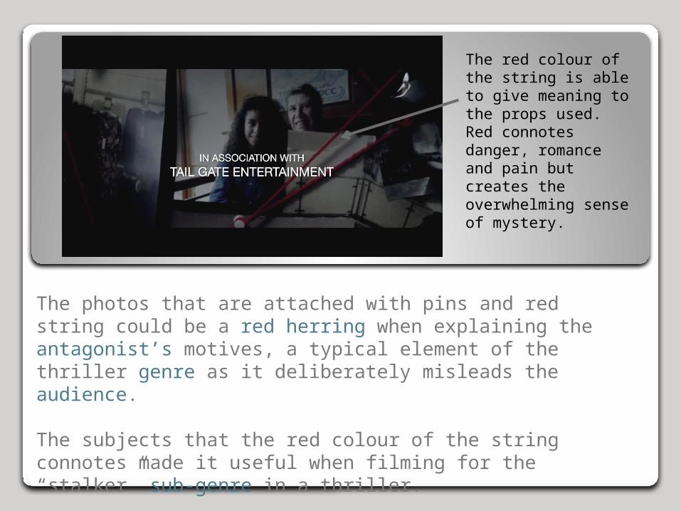
The photos that are attached with pins and red string could be a red herring when explaining the antagonist’s motives, a typical element of the thriller genre as it deliberately misleads the audience.
The subjects that the red colour of the string connotes made it useful when filming for the “stalker” sub-genre in a thriller.
The red colour of the string is able to give meaning to the props used. Red connotes danger, romance and pain but creates the overwhelming sense of mystery.

The title of the piece is called Fixation, suggesting an unhealthy obsession our antagonist has with this woman.
The font is neat and simple to possibly reflect the antagonist – he doesn’t have a complicated reason for his stalker-like tendencies, rather, because of his costume of a white-collared shirt, this could be business-related. His costume also suggests that he is smart and that he will possibly take this fixation to strategic levels and be tactical in his approach to not get caught.
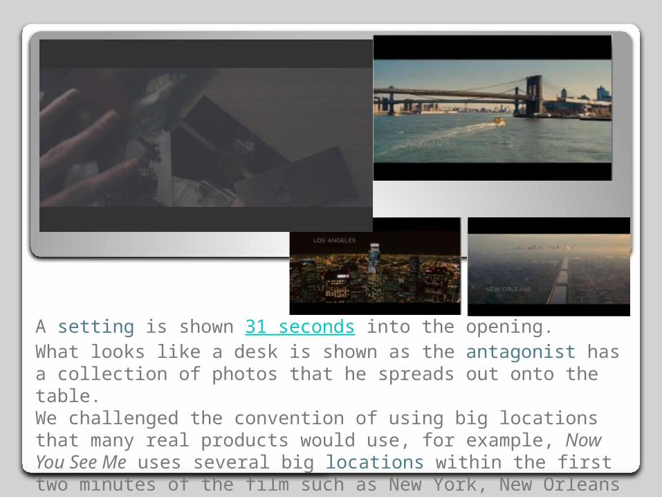
A setting is shown 31 seconds into the opening.What looks like a desk is shown as the antagonist has a collection of photos that he spreads out onto the table.We challenged the convention of using big locations that many real products would use, for example, Now You See Me uses several big locations within the first two minutes of the film such as New York, New Orleans and Los Angeles.

A convention of the genre is to have low-key lighting, creating an air of mystery to the piece. Low-key lighting is used in many Hollywood blockbusters such as Gravity, Now You See Me and Zero Dark Thirty.
An aspect that was highly praised when being shown to our target audience was our use of lighting in creating tension and being an effective part of the visuals.

Quick cuts are made between these three frames to quickly show the audience how many photos the antagonist has accumulated which shapes how the audience view this character.These jumps cuts are common for films of this genre and are most commonly used during title sequences. They are more typically used in film as there are multiple events happening at the same time that the audience are aware of, the jump cuts allow continuity and flow.We, alternatively, used jump cuts to show the audience the scale of the antagonist’s collection and accelerate the narrative.

Use of cinematography is shown particularly in this close up of one of the photos. Typical to the genre, there are several close ups of the photos to focus the audience on the props which occupy a great deal of meaning. Examples are seen in other thriller films such as In Time. Visuals were heavily credited when being shown to our target audience, handheld camera work was seen as effective as it allowed the audience to feel more involved and give a certain intrigue to the piece.
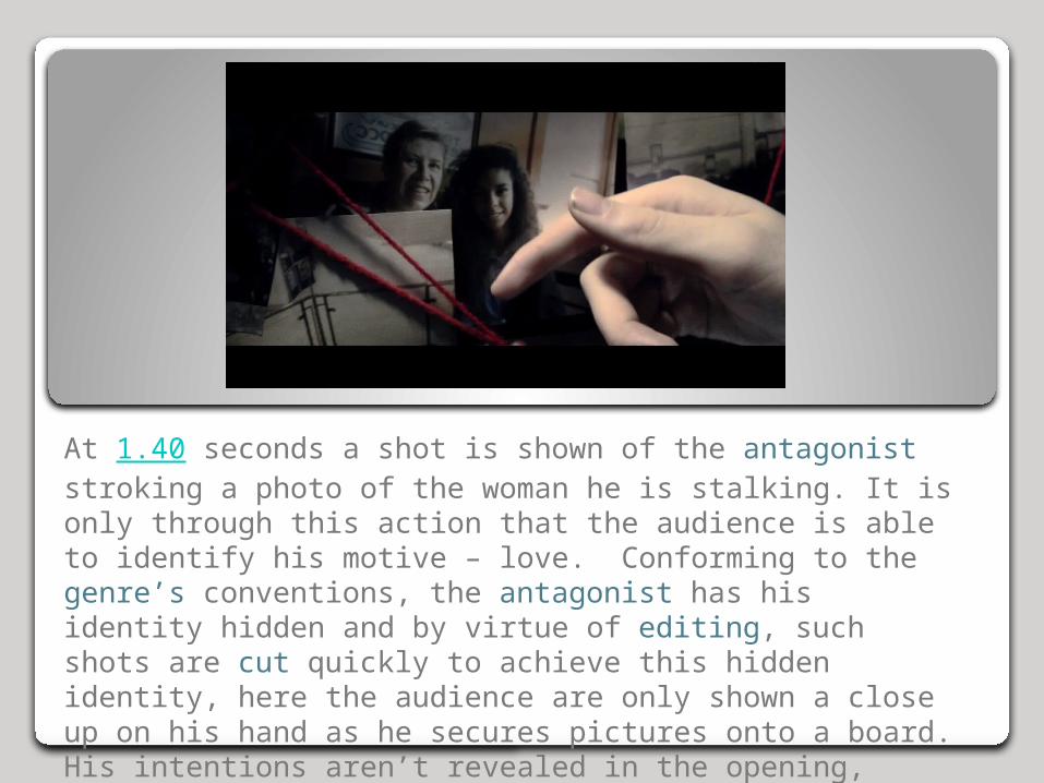
At 1.40 seconds a shot is shown of the antagonist stroking a photo of the woman he is stalking. It is only through this action that the audience is able to identify his motive – love. Conforming to the genre’s conventions, the antagonist has his identity hidden and by virtue of editing, such shots are cut quickly to achieve this hidden identity, here the audience are only shown a close up on his hand as he secures pictures onto a board. His intentions aren’t revealed in the opening, leaving this sequence ambiguous.
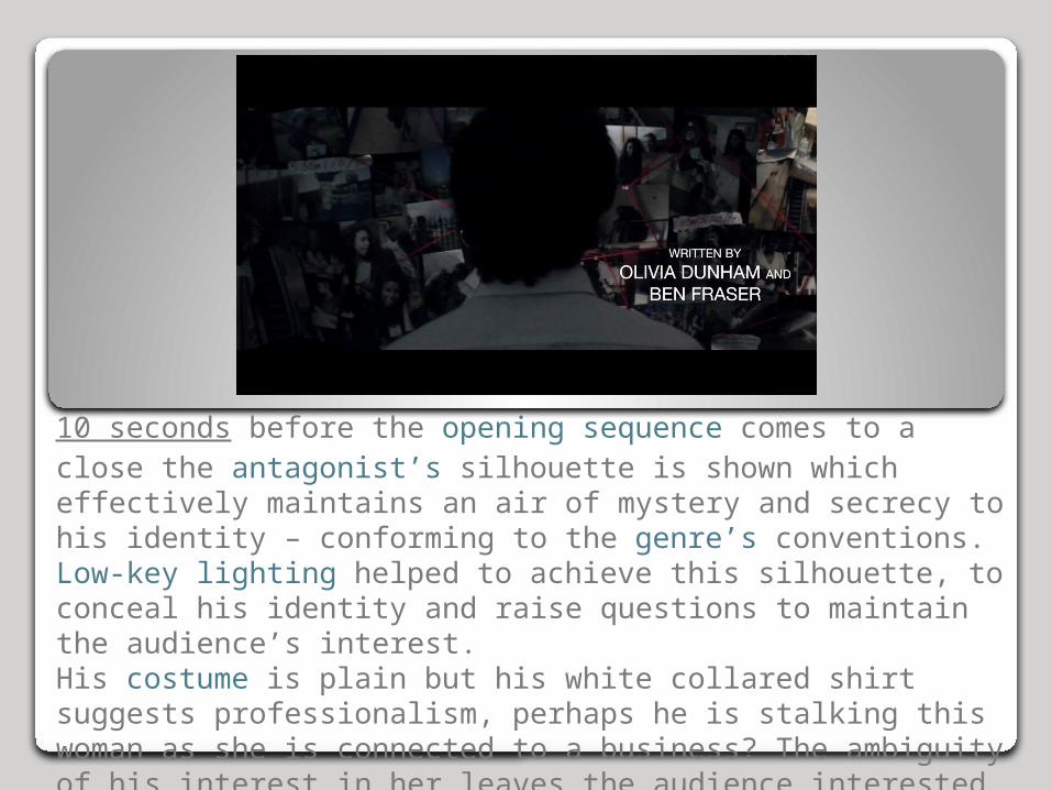
10 seconds before the opening sequence comes to a close the antagonist’s silhouette is shown which effectively maintains an air of mystery and secrecy to his identity – conforming to the genre’s conventions. Low-key lighting helped to achieve this silhouette, to conceal his identity and raise questions to maintain the audience’s interest.His costume is plain but his white collared shirt suggests professionalism, perhaps he is stalking this woman as she is connected to a business? The ambiguity of his interest in her leaves the audience interested in his motives.

Overall, our media product conforms to many of the forms and conventions of real products within the thriller genre. Including; introducing the production company within the first few seconds of the opening sequence, using many close ups, low-key lighting, handheld camera work and keeping the identity of the antagonist hidden to maintain the ambiguity of the piece.
We did however challenge some of the forms and conventions that real products include, such as; using big locations. Alternatively we didn’t use big locations or any exterior shots at all, instead we kept the entire piece based in a classroom – interior shot-based.
Also, we didn’t choose to represent the antagonist as a criminal, rather through his costume he is seen as a professional, changing the meaning of piece and his motives for stalking this woman.


