24
1 Usability Study
| Date post: | 26-Dec-2015 |
| Category: |
Documents |
| Upload: | edwin-richard |
| View: | 213 times |
| Download: | 0 times |

1
Usability Study

22
There were two parts to this usability study.
1. Participants filled out an online survey via Google Forms.
2. In person interviews were conducted where the participant was given three task to perform within a 60 minute period. Each task focused on different scenarios.
The Study

33
The environments varied. The task stayed the same.
1. In the wild studies; where participants were randomly selected.– Bookstores– Coffee shops– Eateries
2. Controlled Environment; participants answered a Craig's list ad. The study was conducted in a office
3. Compensation was a $25 Visa Gift Certificate for all participants.
Lab Environment

44
The Participants
Total number of Participants= 12

55
The Participants

66
To view more online survey results. Please visit:
Study Stats
Online survey

77
The Task / Takeaways

88
Task 1- Product search
Task:• Search and buy the
Audio Technica ATH-M50S
Headphones.
• Participants were told to use
any search engine and
purchase from any online
retailer.
Takeaways:• Users gravitated toward Amazon. Then priced
checked other online retailers.
• Main focus was on “Reviews” and “5-Star Reviews.”
• Users look for “gotcha” phrases as a reason not to
buy. In some cases a 3-star review pushed them to
buy.
• 2-users used C-Net for product reviews.
• 25% of the users clicked on “see price in cart” on
Amazon.com
• What users look for? Price and free shipping.
• Google was the preferred search engine.
99
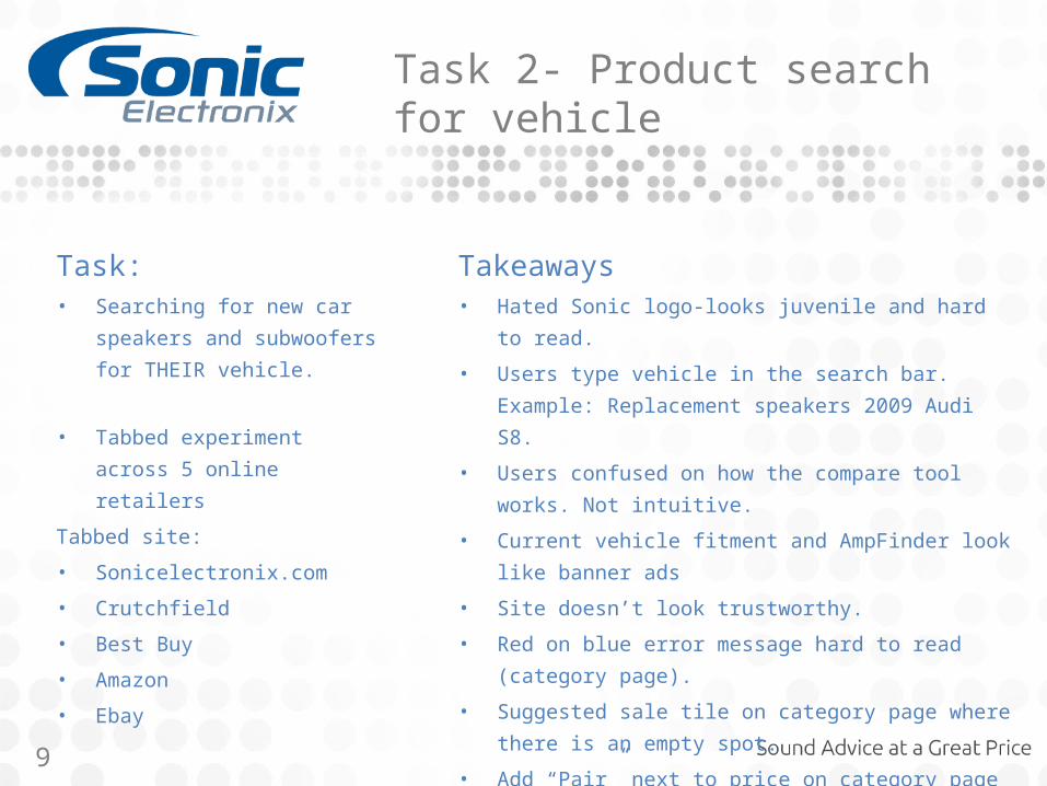
Task 2- Product search for vehicle
Task:• Searching for new car
speakers and subwoofers
for THEIR vehicle.
• Tabbed experiment across 5
online retailers
Tabbed site:
• Sonicelectronix.com
• Crutchfield
• Best Buy
• Amazon
• Ebay
Takeaways• Hated Sonic logo-looks juvenile and hard to read.
• Users type vehicle in the search bar. Example:
Replacement speakers 2009 Audi S8.
• Users confused on how the compare tool works.
Not intuitive.
• Current vehicle fitment and AmpFinder look like
banner ads
• Site doesn’t look trustworthy.
• Red on blue error message hard to read (category
page).
• Suggested sale tile on category page where there
is an empty spot.
• Add “Pair” next to price on category page

1010
Task 3- Vehicle specific search
Task:• Participants were told to
purchase a new stereo for a
2001 Honda Accord with a
$300 budget
• Participants were told to
search for this stereo on
Sonicelectronix.com and
Bestbuy.com
Takeaways:• Users typed 2001 Honda Accord into the
search field.
• Looking for vehicle compatibility in guided
browsing, mega menu and specs.
• Wants a cleaner category page. Tiles look to
similar.
• Reviews and 5-star reviews were a leading
buying trigger next to price.

1111
Participant quotes
• “My price pain point is $300.” (incomes over 100k)
• “I noticed Amazon is starting to raise prices”
• “I’m concerned about sellers and returning items on Ebay—That’s why I don’t shop there”
• “I don’t associate Ebay with experts”
• “Amazon doesn’t have install”
1212
Suggested improvements

1313
Suggested Improvements
Comments:• Study showed that users gravitate
toward the NUMBER of reviews and stars.
• Guided browsing is outdated. Users liked Crutchfield and Best Buy narrow search by checkboxes with real time screen re-fresh.
• Users get confused if these are single products or pairs. Especially at the lower price tier.
Suggestion• Suggest adding “Pair” to the price.
Especially at the lower price tier.• Partner with third party to generate
reviews. Increase Sonic bux for reviews• Change out guided browsing for
checkboxes with real time results. Like search as you type.

1414
Suggested Improvements
Comments:• “View All Car Stereos” should match the
vehicle listing. • Current functionality resets the vehicle
and the products listed don’t match the customers vehicle. The user enters a problem space. They get all the way to the accessories page only to be told the product doesn’t fit they’re vehicle.
• Users don’t notice the word (change). Its to small.
Suggestion• Increase the pixel size and color of
(change.)• Change verbiage on “View All Car
Stereos.”• Fix business logic on results page after
the customer feedback for the OnClick event for “View All Car Stereos”

1515
Suggested Improvements
Comments:• Red error message is hard to read
against the blue (We currently have no stereos that fit your vehicle).
Suggestion:• Needs color change and larger font.

1616
Suggested Improvements
Comments:• Users thought the Amplifinder banner
looked like a banner ad.
• Users were also confused on the language. Didn’t know if they had to find an AMP first.
Suggestion:• Change banner look to represent more
of a tool to help the consumer and look less like an advertisement.

1717
Suggested Improvements
Comments:• Users thought the vehicle look-up
banner looked like a banner ad.
• To many messages on this artifact. Free installation and find what fits your car.
Suggestion:• Change banner look to represent more
of a tool to help the consumer and look less like an advertisement.
• Change messaging (we currently have an issue in Jira to fix this problem)

1818
Suggested Improvements
Comments:• Tool tips hard to read.
• Compare feature is a disconnect with the user. Not intuitive enough
Suggestion:• On tool tip shorten the line length.
Change font color and graphic elements.
• Display the compare elements together on the same page. Stick it to the bottom of the browser window with an absolute position attribute.

1919
Suggested Improvements
Comments:• Users have a hard time finding the
vehicle look up.
Suggestion:• We need to capture the vehicle type
when they get to the category or product page. Forcing the vehicle look-up removes any errors and provides a solid user experience that’s consistent with web usability standards.

2020
Suggested Improvements
• Auto Anything has the vehicle look up in the navigation as well as the modal on the the category page.

2121
Suggested Improvements
Comments:• The SEO text has no value to the user and
projects a negative perception.
• Improve category tiles to differentiate the various segments.
Solution:• Improve tile layout using different shape
tiles with larger images and titles. Could add sale verbiage along with image.
• Replace SEO text with a more condensed version or a impactful headline.
• Empty tiles are an excellent place for cross promotion or sale announcements.

2222
Suggested Improvements
Comments:• Checkout page looks like a foreign site.
Doesn’t lend itself to being trustworthy.
• Update and remove functions are removed from the “Quantity” checkbox for easy cart updates.
• Shipping code and coupon code are to close and similar.
• Vehicle specific info looks like product text.
• Price is placed away from the product.
Solution:• Total redesign of this page.

2323
Suggested Improvements
Comments:• User commented that the current
homepage looks like Sonic Electronix didn’t spend much money on its site.
• Looks like a template
Solution using (Optimizely):• For a quick win I deleted a lot of external
lines.
• Removed the shop now button so the user selects the image or product name.
• Changed the font weight color and size of the product name, descriptor and free shipping.
• Added the years in business banner to help increase trust with the end user.

24
Thank you


