22
10 things you should graphic design know about
| Date post: | 24-Mar-2016 |
| Category: |
Documents |
| Upload: | jnae-saunders |
| View: | 214 times |
| Download: | 1 times |

10things you should
graphic design know about

10"'talk to me"'

One of the most important elements in design is that it must get a
message across to an audience. consider the tone of voice to direct
you into the style of your design and make sure it's clear.
informinstruct educate
humourousserious formal

primary colour: colours that can't be mixed by any other colour.
secondary colour:
colours that are mixed by primary colours.
terchiary colour: colours that are mixed by secondary + primary
complementary colour: colours that shoudn't be used together in design.
As a designer it's important to know some basic colour theory.
understanding these terms will help you determine what colours
to use and what not to use when designing.

9'colour me bad'

8'LINE ME UP'

COLU
MNS
GRIDS
MARGINS
A grid is a 2 dimensional structure made of
intersecting horizontal + vertical axes used
to structure content. grids serves as a guide-
line which helps designers organise their
content in a aesthetically pleasing way.
Margins can have a influence on the overall
feel of a page. TheY ARE THE edge or border of
A PAGE SET UP used to guide the content.
Columns run vertically down the page to
break up large bodies of text that can't fit in
a single box WHICH improvES readability.

SIGN: a add icon.+SIGNifier: possitive, mathmatical, good, mutliply.
Symbol: a multiplication sign.
semiotics is the understanding of what something symbolises. the
sign below is a simple plus sign but the sign, symbol and signifers
represent all different things depending on what context it is put
into.
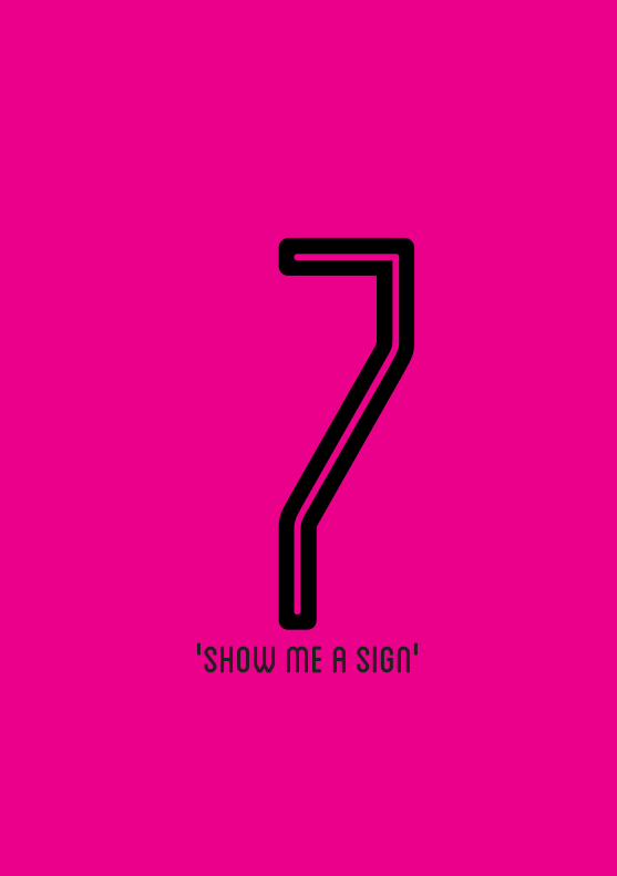
'SHOW ME A SIGN'7

'TYPE VS. FONT'6

typeface: A collection of characters, letters, numbers, sym-
bols, punctuation, which have the same distinct design. like the "design" of a
alphabet, the shape of the letters that make up the typestyle.
hello hello
font: A font is a complete character set of a single style of particular
typeface. -e.g italic, regular and bold.
hello hello
as a designer it's important to know the difference between a type-
face and a font. although they seem the same they are completely
different.

Legibility and readability are fundamental to successful typo-
graphic design. Often the terms are used interchangeably. Yet, there
is a difference between them.
L E G I B I L I T Yis concerned with how easy it is to distinguish individual
letters. line lengths, point size , leading, spacing and type
alignment all contribute to this.
READABILITYrefers to the ease with which a reader can
scan over paragraphs of type. it's about how
the type is placed in order for it to be read
clearly.

'READ ME'5

'IN THE MODE'4

rgb
cmyk
red, green and blue is a 3 colour process wich works
best with screen based and web designs. the colours
are also know as additive because when they are mixed
they make white. this is because they absorb light.
cyan, magenta, yellow and key (also known as black)
is a 4 colour process. these colours work best with
printed designs. the colours are known as subtractive
because when they are mixed they make black.

Metric Name
A5
A4
A3
A2
A1
A0
a4
a2a3
a0a1
a5
Metric Size
148 x 210 mm
210 x 297 mm
297 x 420 mm
420 x 594 mm
594 x 841 mm
841 x 1189 mm
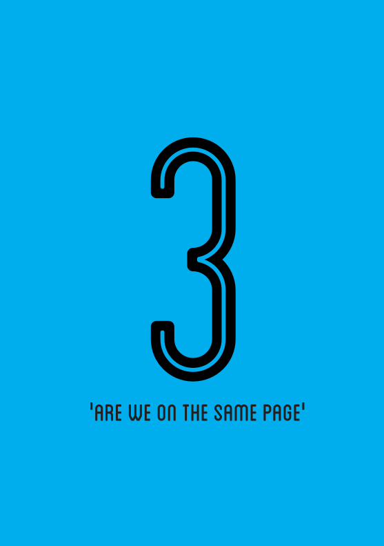
'ARE WE ON THE SAME PAGE'
3

'SIMPLY DIVINE'2
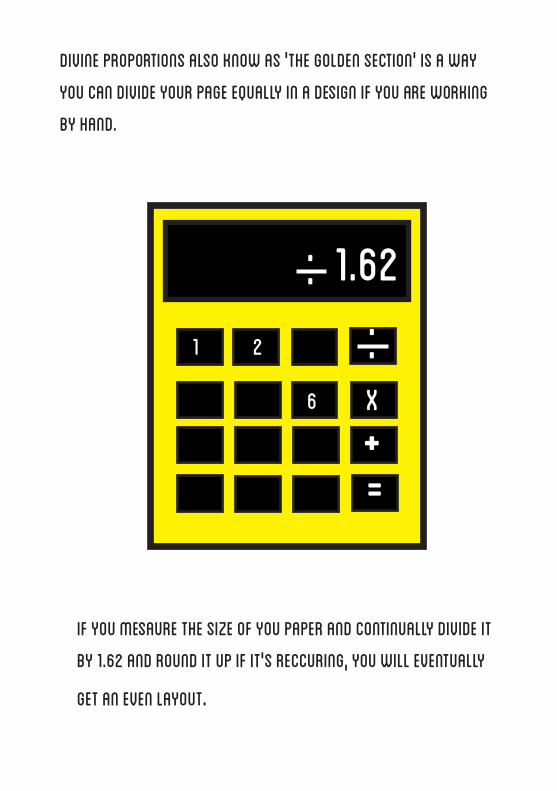
divine proportions also know as 'the golden section' is a way
you can divide your page equally in a design if you are working
by hand.
1.62..
..
x
+=
1 2
if you mesaure the size of you paper and continually divide it
by 1.62 and round it up if it's reccuring, you will eventually
get an even layout.
6

""Design is not your job. Design is about
people + your personality. the ability to
make relationships work is a massive
factor in your employability. ""
-Craig Oldham

'IT'S ALL ABOUT YOU'
1


![HITP Student Exchange Program - Life@SP...me one thing , learning how to do is one thing, mastering it is another thing . Day 6 [ Wednesday, 5/10 ] •After the Kendama lesson, we](https://static.documents.pub/doc/80x56/5e716fdf1eae07257f6b1ce6/hitp-student-exchange-program-lifesp-me-one-thing-learning-how-to-do-is.jpg)


