Art and Design Education that Matters Through art and design education, Otis pre-pares talented students to enrich our future. Communication Arts, highlighted in this issue, exemplifies this mission. Kali Nikitas, Depart-ment Chair, sums it up well in describing the new MFA Graphic Design Program: “Otis is an institution that prides itself on reaching out to the community and advancing culture through art and design. (The curricula) speak directly to educating conscientious individuals who believe that design has the power to contribute to and shape our world.” (see p. 4) An Otis education combines the vision, values, and skill sets that enable our graduates to excel and make a difference in the 21st century. First and foremost, Otis students become artists and designers with a personal voice. Essential to their artistic preparation are elements of a well-rounded and contributing life. These include • acommitmenttocommunitywell- being on a local and global scale • aconvictionthatartanddesignmatters socially, culturally, and economically • afundamentalappreciationofand ability to navigate fluidly and resource- fully in a complex and diverse world • thecapacitytocommunicate and collaborate • ahungerforexperimentationand innovation
Over its 90-year history, Otis has devel-oped this pedagogical approach as an organic response to its context – the unique phenom-enon that is Los Angeles, the most futuristic of all American cities. The characteristics described above, innate to Otis, are gaining widespread recognition in both higher education and employment sectors as essential factors for success in any field. Otis is proud to be a leader in defining an art and design curriculum for the 21st Century. The more we understand the past, the further we can advance. As Otis contemplates its future, the College and its faculty unabash-edly embrace new technologies and emerging disciplines. At the same time, historical know-ledge and time-honored practices continue to anchor teaching and learning. On campus, I am always heartened to see students being equally delighted by and adept at bookbinding and computer graphics. At Otis, art and design matters, and innova-tion springs from tradition.
–Samuel Hoi, President
President Samuel Hoi with designers Isabel and Ruben Toledo at Otis’ “Inside the Designer’s Studio,” March ‘08
Cover: Ave Pildas Deep Space 2002
Editor: Margi Reeve, Communications Director Co-editor: Sarah Russin, Alumni Director
Photography: Kelly Akashi (‘06), Brooklyn Brown (‘07), Meg Cranston, Mara Thompson, Ave Pildas
Staff Writer: George Wolfe
Creative: Intersection Studio Design Direction: Greg Lindy Design: Brooklyn Brown (‘07)
Otis prepares diverse students of art and design to enrich our world through their creativity, their skill, and their vision.
Founded in 1918, Otis is L.A.’s first independent professional school of visual arts. Otis’ 1170 students pursue BFA degrees in advertising design, architecture/landscape/interiors, digital media, fashion design, graphic design, illustration, interactive product design, painting, photography, sculpture/new genres, and toy design. MFA degrees are offered in fine arts, graphic design, public practice, and writing. Otis has trained generations of artists who have been in the vanguard of the cultural and entrepreneurial life of the city. Nurtured by Los Angeles’ forward-thinking spirit, these artists and designers explore the landscape of popular culture and the significant impact of identity, politics, and social policy at the intersection of art and society.
02
14 24
19
28
2008 Vol.4 In This Issue:
Communication Arts
Otis Monitor
College News
Alumni Around the World
Class Notes
Robert Irwin at San Diego’s MOCAAlison Saar’s Harriet Tubman SculptureMeg Cranston on the Venice Biennale Nothing Moments
Paul Vangelisti and Antonio RiccardiAlex Coles on DesignArt Nancy Chunn’s Media MadnessRich Shelton on Collecting Plastic “Transforma: New Orleans” Scholarship Funding Expands
Sabine Dehnel in Berlin Alex Donis in Sri Lanka Berton Hasebe in The Hague
Publication of material does not necessarily indicate endorsement of the author’s viewpoint by Otis College of Art and Design
Ave Pildas Kali Nikitas on Communication Arts John White on Advertising JT Steiny on Illustration Alumni in the Professional World Students Re-invent the Book
OMAG 02
FeAture
3 OMAG
FeAture
What got you started in the art and design field? After high school, I enrolled in architecture at The University of Cincinnati. The program was very conservative and not very creative, so I switched to design. Design seemed to me like a team sport. I felt comfortable with that; I had started playing baseball when I was six, and had always believed in the importance of team sports. Understanding the importance of the team developed my ability to direct people and projects.
Would you tell us about a current project? The solar house I built in Santa Monica will be ten years old next year; I’d like to build another house using current sustainable mat-erials and methods. This one will be a duplex with newer technology—solar energy and a grey water system.
I saw you with your camera last week in the midst of Chris Burden’s “Urban Light,” an installation of 202 street lamps at LACMA’s new BCAM. Tell us about some of the photography work you have been doing. Last summer, I shot a series of photographs at New York’s Museum of Modern Art (at left) of people on the escalators in the new addition. I am particularly interested in serial imagery that combines people with ladders and stairs, and I am continuing this investigation utilizing local sites. I loved the new Chris Burden piece as soon as I saw it, and have done a number of shoots there. My Hollywood Blvd. star series and Century City series are other examples of sequential imagery that I did some years ago. As a stringer for Downbeat magazine in the 1960s, I did a series of portraits of jazz musi-cians, including Dizzie Gillespie (at far left), Joe Williams and Gerry Mulligan. Michael Solway of Solway Jones Gallery is producing a portfolio of ten of these in an edition of 40. This portfolio will be exhibited at the Gallery later this year. I con-tinue my “California Christmas” series, which may become a book or another publication.
In your long career as a teacher, what was your favorite class? That would be PhotoGraphics, Photography and Typography, in which students combined their
photo and type skills to represent aphorisms like “the early bird catches the worm.”
What are some of your favorite places in the world? I like to go on “camera safaris” and have visited China, Argentina and Peru recently. I would like to return to China to explore the Silk Road, and to take my camera to India, Brazil (Brasilia, in particular), and the underground churches of central Turkey. Nearer home, I love Death Valley, Stinson Beach, Nipomo Dunes, the last-century tourist attractions near Barstow and other little towns on Route 66.
Everyone in L.A. is writing a screenplay. What’s on your plate? I own some property in Mt. Washington and have had very colorful tenants over the years. I’ve saved correspondence and notes about them, and would like to write a sitcom screenplay about these experiences. I like interwoven stories, like the current television series “The Wire.”
Do you keep in touch with former students? Constantly. They are colleagues and friends. Recently I went to the House of Blues with Ray Sanchez, Turner Johnson, and Henry Escoto (all ‘99) to see G.Love, a blues/rap/reggae group. I am a gym rat, so I see alumni at the gym. Or at galleries.
What advice do you give to young designers and artists? I believe that a design education doesn’t have to result in only making design. Design is a process of collecting, organizing, and dissemi-nating information, and this process can trans-late into other fields. The links between design and commerce are unlimited for someone with an entrepreneurial spirit. Sitting behind a computer all day may not pay enough to get your kids into college.
Editors’ Note: During the 90th homecoming weekend Oct. 10-12, join alumni in celebrating Ave’s many years of teaching. ●
Ave Ave Pildas has taught at Otis for 26 years, and served as Chair of the Communication Arts Department from 2001 to 2007. In July, he will become a Professor Emeritus. Alumni Relations Director Sarah Russin and Com- munications Director Margi Reeve asked him some questions about his time at Otis, and the ensuing discussion included comments on topics ranging from baseball to Dizzie Gillespie, and Mt. Washington stories to “The Wire.”
(That's “Dave” without the “D”)
Pildas
3OMAG 04 05 OMAG
FeAture
Launch of MFA in Graphic Design Beginning in summer 2008, a new MFA will be offered in Graphic Design. Running for three consecutive eight-week summer sessions in residence and two spring sessions of mentored off-campus independent study, this 2 1/2 year program provides a rigorous and challenging academic and studio environment for candidates interested in enhancing their current professional practice.
This program has three individual themes or tracks from which students elect to study: typography and type design, social responsibility of the art-ist in society, and advancing the discipline through theory and innovation. Summer sessions are taught by core faculty, visiting lecturers, and visiting artists who are recognized internationally and nationally in their design and art practices. The curriculum includes project-specific assignments; individual projects; liberal arts courses focusing on history, theory, and criticism; and a thesis project.
Otis is an institution that prides itself on reaching out to the community and advancing culture through art and design. The three tracks of this MFA program speak directly to educating conscientious individuals who believe that design has the power to contribute to and shape our world.
International collaboration and outreachHosted International Student Competition and Design Symposium, “What Matters?” In collaboration with Interactive Product Design and Archi-tecture/Landscape/Interiors, the event was sponsored by the Consulate General of the Netherlands. Speakers affiliated with American schools such as Cranbrook, Princeton, UCLA and European academies in Stock-holm, Germany, and The Netherlands. Also hosted “Fifteen,” an exhibition celebrating the last fifteen years of FontShop and a talk by internationally recognized type designer, Erik Spiekermann.
Advertising (added 4 years ago)
Graphic Design Illustration
Sophomores: Core skills/craftJuniors: Major specialization and professional preparationSeniors: Innovation and theory plus specialized interest
CurriculumCourses that are offered with multiple sections are taught simultaneously, offering collaboration, team-teaching, and community-building opportunities
19 new faculty members Several have collaborated with Fine Arts, Architecture/Landscape/Interiors, and Interactive Product Design to create event posters.
Two new faculty members, Jessica Fleischmann and Ana Llorente-Thurik, designed the ‘07-‘08 Otis undergrad viewbook (below)
Ogilvy & Mather
Garza Group
AdamsMorioka
72 and Sunny
Community CollaborationsWith AIGA/LA “180 degrees: U-turns from the Intersection of Design and Culture.” In summer ‘08, Dutch type foundry Underware will participate in this lecture series at MOCA. ●
1
2
4
5
Special InitiativesStudent Travel ExcursionsIn San Francisco and New York City, students visited top design studios, ad agencies, illustrators, and museums and galleries. Two upcoming trips include London and Minneapolis.
Forms of ProductionBookbinding, letterpress, sketchbooks, and silkscreen
Learning Lab for Technologies Workshops on software, understanding the role of technology. “Teaching students to teach themselves.” Programs come and go but students must be confident in their ability to navigate through technology, and be proficient in production skills.
Professional Experience Local professionals are invited regularly to lecture, teach, cri-tique and review students’ work. In turn, they frequently host students for internships. Some of them have hired our students. Several students are interning outside the U.S.
Faculty
Hello Design
TwinArt
Picture Mill
StillRoom
Jung + Pfeffer,
GermanySchematic
April Grieman/ Made in Space
Select Internships & Professional Affiliations
3 majors:
FeAture
became Chair of the Communication Arts Department in August 2006.
Kali Nikitas
Vis
itin
g d
esig
ner
s
Gra
ph
ic D
esig
n
Sea
n A
dam
s, L
AC
aryn
Ao
no,
LA
Ph
ilip
pe
Ap
elo
ig, P
aris
Bra
d B
erlin
g, L
AA
nn
e B
urd
ick,
LA
, Wh
at M
atte
rsD
avid
Cla
yto
n, L
AS
ean
Do
nah
ue,
LA
Vo
lker
Du
rre,
LA
Elli
ott
Ear
ls, B
loo
mfi
eld
Hill
s, M
IA
dam
Eu
wen
s, L
AA
gu
stin
Gar
za, L
AA
pri
l Gre
iman
, LA
Dav
id G
rey,
New
Mex
ico
Eri
n H
aub
er, L
AG
eoff
Kap
lan
, San
Fra
nci
sco
Har
men
Lie
mb
urg
, Am
ster
dam
Har
min
e Lo
uw
e, A
mst
erd
amH
enri
Lu
cas,
LA
Lau
rie
Hay
cock
Mak
ela,
Sto
ckh
olm
Flo
rian
Pfe
ffer
, Am
ster
dam
Eri
k S
pie
kerm
ann
, Ber
lin, F
on
tsh
op
Jo
hn
Su
eda,
LA
Ric
k V
erm
eule
n, R
ott
erd
amD
avey
Wh
itcr
aft,
LA
Illu
stra
tio
nYu
ko S
him
izu
, NY
CK
athy
Ble
ck, T
exas
Mar
k M
urp
hy, S
an D
ieg
oJo
e Le
adb
ette
r,
(SIL
A S
tud
ent
gro
up
), L
AJa
mes
Jea
n, L
A
Ad
vert
isin
gJo
hn
Bo
iler,
LAJo
hn
Ste
in, L
AS
avoy
Hal
linan
, LA
Tony
Lu
na,
LA
Editor's Note: In 2010, Kali and partner Otis faculty member Rich Shelton will curate an exhibition on the art and design of the album cover at the Ben Maltz Gallery.
Poster by faculty member Greg Lindy
FeAture FeAture
OMAG 06 07 OMAG
After running his own ad company for 17 years in the rough-and-tumble world of advertising (Paperplane, his studio, consisted of more than 30 employees, and did $20 million/year), he now spearheads a department that prepares students—over a more luxurious four- year time period—to enter the business world that’s so familiar to him. For White, Southern California is home. He attended the Art Center In Pasadena (though he claims to have been a poor student) prior to working in advertising for nearly a decade, after which he continued his “self-directed life path” and founded his business. He says that about ten years ago he sometimes taught but was “so whacked with the job during the day that I couldn’t focus. You tend to be a bit relentless when you have a business.” Now, able to really think about teaching as a main priority, he has taken his lead from Kali Nikitas, the Communication Arts Department Chair, who has overhauled the curriculum. In only his second year of running the program, White has already achieved many of the original goals and is in the process of creating bold new ones. Advertising Design is in a stage of rapid evolution as White uses his real-world clout and muscle to build alliances with pro-fessionals in the field, gently hooking them into various roles that include guest teaching, portfolio review and mentorships.
By George Wolfe
“I ask for their opinions on our classes, too,” he says. “I sort of have an outside board of directors [from these companies] who advise me and with whom I keep up close relations. It works out well for them, too—they become familiar with what our students can do, and they’re positioned to get talented interns or to hire a graduating student to fill their needs when the time comes.” Having a mandatory intern program provides invaluable ties to the outside, and having developed such close working relation-ships with his students, he’s in regular touch with them when they graduate. Some have already placed with top ad agencies. In general, he says that there’s been a large increase in number and quality of placements. “Internships are really trial periods at low pay, but my students take it seriously. It really is good just to get in where you want to go, and work hard. Now I’m beginning to bring back some of my students to tell their stories.” With its emphasis on real-world relationships, a proactive internship program and strong leadership, the department is on course to develop much like the Fashion Department grew by leaps and bounds over its 20-year history, with perennial, strategic guidance from the top. In terms of course structure, the program offers a unique ap-proach that weds advertising and design: Essentially, two years of design are followed by two years of advertising. “At first I thought
Plugging Away: Evolution of the Advertising Major
I had to quickly turn my students into ad people, but now I’ve changed my mind. With my business, it was always better if an employee had a graphic design background because they had a more complete skill set.” With the Foundation and design years as a base, in their junior year students hit the ground, learning about more tradi-tional advertising—but White says that the giant companies still work that way, so it’s vital. Come senior year, they work more in teams, pitching ideas to an agency and exploring other types of advertising. For instance, a company like Quiksilver doesn’t spend any money on advertising, so White sets up a scenario to grow the company’s customer base by other nontraditional means. Students deal with: What’s the message? The concept? How to pitch? Then they might work with interactive product designers and address various challenges: Who’s the audience? What will the package include? How else to sell the brand and its products? White covers online advertising, too, but notes that it’s a growing but still relatively small piece of the pie. White is impressed with the hard-working, down-to-earth quality he finds in many Otis students. And, working also as an advisor, and discussing students with other faculty, he sees a diverse group that doesn’t sit and rest upon privilege. “There’s not a lot of ‘Yeah, I’m on my second degree’ or ‘My dad pays for
my schooling’ etc. It’s more like ‘I work 15-30 hours per week, drive an hour to and from school, and then there’s my regular workload. I’d say 60-70% of the students are like that—I don’t remember it being that way when I was in school. They’re a little humbler, there’s less ego. I’d know ‘cause I remember when it came to hiring, I’d run into the attitude: ‘I’m so hot you can’t touch me!’ “At Otis, White sees a proper measure of humility combined with the drive to work very hard. In the end though, he says that in the advertising world, agencies hire based on the portfolio and what it demonstrates about the designer’s ability to deliver creative solutions in the business world. Regarding the future of the department, White is clear on wanting there to be “a waiting line for the students. I want them all to have jobs ready and waiting for them when they get out—and at the top agencies. I don’t want to have to cull through my books and figure out how a particular company can give one of my students a shot. I want the companies [willingly, hungrily] coming to us, seeing all the things that Otis has to offer, and snatching them up.”●
John White, head of the relatively new Advertising Design department— a virtual Kindergartner in years in existence—has transitioned from the hard-core business world to soft-sell academia.
Travis Swingler (‘07) advertising student project “Let’s Go Bowling” Instructor(s): Elena Salij & Jim Wojtowicz
OMAG 08
FeAture
09 OMAG
FeAture
Every morning, with newspaper and tea beside him at the kitchen table, he dutifully goes through a first tier of self-imposed studies in his craft (though sometimes it feels more self-inflicted). “I draw lines, literally, and cross-hatchings, patterns, whatever,” he says as he demonstrates, “mixing words with whatever images come to mind. I work on the steadiness of my hand. It’s one page of practice. I keep all these sheets bound together, and I often refer back to them for later cleaning-up and refinement. These are like conversations with myself. My students don’t always believe me—at least at first—but creating the things that I do, e.g., an illustration for the L.A. Weekly, is a practiced thing. I have to keep up this process up to stay sharp. It’s like priming a pump to keep the water coming.” Likewise, J.T. gives out blank “junk books” to all his students to carry around, 24/7, and doodle in. To him, it mitigates the pres-sure of producing perfectly finished work. “We all have our peo-ple who are staring at us or hanging over our shoulder, keeping us from doing more original work.” Freed of that nagging pres-ence, students become privy to and conscious of valuable core ideas and imagery that they’d otherwise forget (e.g., the thoughts that arise as you’re waking up from sleep). “I stress that there’s
"Shut up, lighten up, and work hard."
By George Wolfe
Tricking Them into Learning
no ‘bad.’ But it’s hard to communicate that you have to make a lot of crap and discard it. Students tend to think that it comes out nice and tidy and polished.” All this becomes the creative fodder for later brilliance, paying off with handsome rewards in the form of final projects. Throughout the semester, however, J.T. reviews each student’s book on a weekly basis. J.T. is a strong advocate for a customized approach to teach-ing, leaving the more traditional approach, in general, to other classes. “A lot of schools start by teaching from the outside in, i.e., these are the materials … blue is cool, red is warm, etc. I like to start on the inside, and work out from there. Even so, each group of students is unique, and you have to custom-tailor your methods to meet their particular needs. Essentially, I don’t believe there should be any one set standard to teach to all students and classes.” Apart from being taught about mining their own psychologi-cal caverns, the students are given collective illustration as-signments, in which they must solve real-world projects—say, a magazine headline with an article—and must conceptualize and execute a visual to go with it. Crits reveal the work and foster dis-cussions about each student’s choices. “Sometimes,” says Steiny,
Drawing Inspiration from Illustrator J.T. Steiny
“there’s shyness or an unwillingness to open up. But I really try to nudge them outside themselves, out of their shells or social cliques, and get them to realize: ‘Hey, it’s not so bad, even to see something fail and feel humiliated.’ In every part of my classes, I try to make it feel like it’s not a chore. My ultimate goal is to trick them into learning by virtue of it being a fun pastime.” Self-promotion is another area where artists often feel discom-fort. But marketing oneself becomes more of an issue as students approach graduation. “At some point they’ll have to talk about themselves,” he says, “which doesn’t always come naturally, but it’s important. With clients, it’ll become essential. In our final projects, they make all aspects of an actual book which becomes part of their portfolios. It’s not just about making the book—we venture into marketing and merchandizing those books, too, and I get them to prepare postcard mailers adorned with postage stamps with their own work on them, via services like Zazzle. At the same time, I have the students build their own website. These days, sure, you need to know how to draw to be an illustrator, but that’s only 50% of it. Like it or not, marketing is key.” The marketplace has certainly changed in the 20-odd years since Steiny was a student. He perceives the trend whereby a lot
of illustrators cross over into other areas and become savvy work-ing in various mediums. So there’s less separation now between illustrators and other practitioners of visual arts (apart from fine arts, which tends to be more exclusive). There used to be a lot of newspaper work, but now a lot of it is filled in-house or through clip art. In short, budding illustrators must be resourceful and flexible, becoming conscious of their own style and voice—their personal brand—in order to entice prospective employers to take advantage of their skills. Another change is that now, more than ever, things come and go much quicker. Ad campaigns, movies, and publications come into being, then vanish just as quickly, so students must learn to be responsive and act quickly. Cutting through all of Steiny’s teaching work is the above-and-beyond-the-call-of-duty notion that he’s trying to develop, in a gestalt-like way, in each student, “a sense of contentment within themselves.” If only we all had someone nurturing us in that way, we’d be truly richer indeed. ●
That’s the bare-bones message—paradoxical and tongue-in- cheek as it may be—of professional illustrator, Otis alum (’84) and teacher J.T. Steiny. Far from being harsh though, J.T. is an amiable, approachable artist who was once named “Alumnus of the Year” and now preaches his own brand of creative methodology to students who enter his classroom.
Robbie Buzus (‘02), Autry Museum Sergio Leone Identity
John McDonald (‘91), Decor Craft package design
In Sung Kim (‘97), Chinatown Wayfinding
Mark Caneso (‘05), Geffen Playhouse
Robert Fishe (‘89), Nirvana AlbumRobert Fisher (‘89), Beck Album
Mark Leroy (‘93), Eminem Album
the Professional World
Graduates design web sites, billboards, environmental graphics, catalogues, posters, album covers, wayfinding graphics, magazines, packaging, and products.
Silas Hickey (‘91), United Nations Lighting Project, Tokyo
Brian Jones (‘04) You Can’t Milk a Dancing Cow illustrations
13 OMAGOMAG 12
1
2
3
4
5
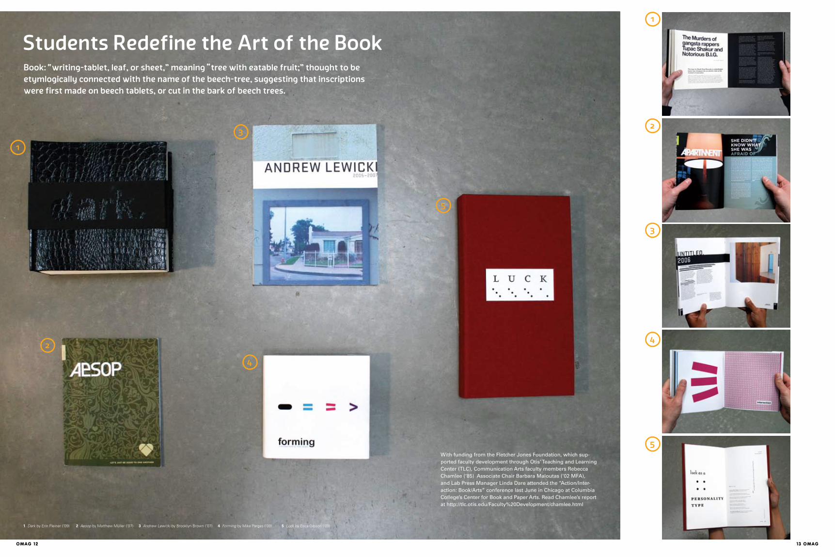
Students Redefine the Art of the Book
1
2
3
4
5
1 Dark by Erin Fleiner (‘09) 2 Aesop by Matthew Müller (‘07) 3 Andrew Lewicki by Brooklyn Brown (‘07) 4 Forming by Mike Pargas (‘09) 5 Luck by Erica Gibson (‘09)
Book: writing-tablet, leaf, or sheet," meaning tree with eatable fruit;" thought to be
etymlogically connected with the name of the beech-tree, suggesting that inscriptions
were first made on beech tablets, or cut in the bark of beech trees.
With funding from the Fletcher Jones Foundation, which sup-ported faculty development through Otis’ Teaching and Learning Center (TLC), Communication Arts faculty members Rebecca Chamlee (‘85) Associate Chair Barbara Maloutas (‘02 MFA), and Lab Press Manager Linda Dare attended the “Action/Inter-action: Book/Arts” conference last June in Chicago at Columbia College’s Center for Book and Paper Arts. Read Chamlee’s report at http://tlc.otis.edu/Faculty%20Development/chamlee.html
" "
OMAG 14
Otis MOnitOr
15 OMAG
Manhattan’s public art honors dogs more frequently than it does women (and even then mostly fictional women). How could artist Alison Saar (‘81, MFA) resist the call for a project about Harriet Tubman and the Underground Railroad? Having been through the public art wringer on previous jobs, Saar was hesitant to jump back into that realm. Nevertheless, last fall, some four years since the call went out for sculptors to tackle the subject matter and pitch proposals, Saar found herself putting the finish-ing touches on her Tubman sculpture in Harlem (or “SoHa”/South Harlem, as they say), in what is now referred to as Harriet Tubman Square (though, technically, it’s in a traffic triangle). Hard as it is to believe, Saar’s work represents the first public monument in New York City dedi-cated to an African-American woman. “What attracted me was her phenomenal spirit,” says Saar. “We all know her as a person who freed slaves, but she was also a nurse and a spy, and she took responsibility for the people she freed, creating a school for children and creating retirement homes for ex-slaves. At first, the budget sounded great—but you just don’t figure it’ll take so many years of your life!” Between 2003 and 2007, there were a diz-zying number of issues to contend with from various agencies, community members and regional officials. Would the bronze roots com-ing off the lower portion of Tubman pose an impalement or strangulation threat to neighbor-hood kids? How to design the sculpture so that thieves wouldn’t be able to cut off and steal thin portions of the bronze? What are the implica-tions of Tubman facing the South (which is what the triangular location suggested) or the North (where there happened to be a jail)? Saar claims that for certain intense periods during the process, she’d have anxiety dreams: a coral snake getting loose and chasing her; later, a python slowly wrapping itself around her; and still later, a tiger running amok—all manifesta-tions of the Tubman project-related entities she grappled with. But neither having artworld parents (former faculty member Betye Saar, and painter/art conservator Richard Saar) nor going to art school could fully prepare her for all the issues she would encounter along the public art path. “Only a handful of people do public art,” says Saar, “because it takes so much out of you. Once you do one project, though still daunting, you know the ropes and it’s easier—until then, it’s very difficult to get into that world.” Saar cast Tubman in bronze, as the Underground Railroad train itself, an unstop-pable locomotive chugging hard and steady all her 93 years. The cast sculpture, more than 13-feet tall and 12-feet long, shows Tubman emerging from woods (oak trees) beside a river
Aiming High, Swinging Low in HarlemAlison Saar's Tubman Sculpture
By George Wolfe
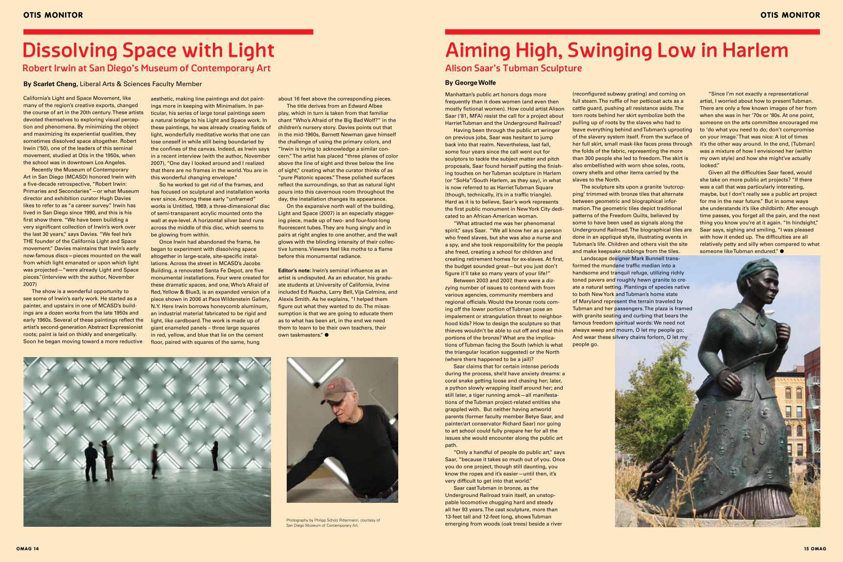
California’s Light and Space Movement, like many of the region’s creative exports, changed the course of art in the 20th century. These artists devoted themselves to exploring visual percep-tion and phenomena. By minimizing the object and maximizing its experiential qualities, they sometimes dissolved space altogether. Robert Irwin (‘50), one of the leaders of this seminal movement, studied at Otis in the 1950s, when the school was in downtown Los Angeles. Recently the Museum of Contemporary Art in San Diego (MCASD) honored Irwin with a five-decade retrospective, “Robert Irwin: Primaries and Secondaries”—or what Museum director and exhibition curator Hugh Davies likes to refer to as “a career survey.” Irwin has lived in San Diego since 1990, and this is his first show there. “We have been building a very significant collection of Irwin’s work over the last 30 years,” says Davies. “We feel he’s THE founder of the California Light and Space movement.” Davies maintains that Irwin’s early now-famous discs—pieces mounted on the wall from which light emanated or upon which light was projected—“were already Light and Space pieces.”(interview with the author, November 2007) The show is a wonderful opportunity to see some of Irwin’s early work. He started as a painter, and upstairs in one of MCASD’s build-ings are a dozen works from the late 1950s and early 1960s. Several of these paintings reflect the artist’s second-generation Abstract Expressionist roots; paint is laid on thickly and energetically. Soon he began moving toward a more reductive
aesthetic, making line paintings and dot paint-ings more in keeping with Minimalism. In par-ticular, his series of large tonal paintings seem a natural bridge to his Light and Space work. In these paintings, he was already creating fields of light, wonderfully meditative works that one can lose oneself in while still being boundaried by the confines of the canvas. Indeed, as Irwin says in a recent interview (with the author, November 2007), “One day I looked around and I realized that there are no frames in the world. You are in this wonderful changing envelope.” So he worked to get rid of the frames, and has focused on sculptural and installation works ever since. Among these early “unframed” works is Untitled, 1969, a three-dimensional disc of semi-transparent acrylic mounted onto the wall at eye-level. A horizontal silver band runs across the middle of this disc, which seems to be glowing from within. Once Irwin had abandoned the frame, he began to experiment with dissolving space altogether in large-scale, site-specific instal-lations. Across the street in MCASD’s Jacobs Building, a renovated Santa Fe Depot, are five monumental installations. Four were created for these dramatic spaces, and one, Who’s Afraid of Red, Yellow & Blue3, is an expanded version of a piece shown in 2006 at Pace Wildenstein Gallery, N.Y. Here Irwin borrows honeycomb aluminum, an industrial material fabricated to be rigid and light, like cardboard. The work is made up of giant enameled panels – three large squares in red, yellow, and blue that lie on the cement floor, paired with squares of the same, hung
By Scarlet Cheng, Liberal Arts & Sciences Faculty Member
Dissolving Space with LightRobert Irwin at San Diego's Museum of Contemporary Art
Otis MOnitOr
(reconfigured subway grating) and coming on full steam. The ruffle of her petticoat acts as a cattle guard, pushing all resistance aside. The torn roots behind her skirt symbolize both the pulling up of roots by the slaves who had to leave everything behind and Tubman’s uprooting of the slavery system itself. From the surface of her full skirt, small mask-like faces press through the folds of the fabric, representing the more than 300 people she led to freedom. The skirt is also embellished with worn shoe soles, roots, cowry shells and other items carried by the slaves to the North. The sculpture sits upon a granite ‘outcrop-ping’ trimmed with bronze tiles that alternate between geometric and biographical infor-mation. The geometric tiles depict traditional patterns of the Freedom Quilts, believed by some to have been used as signals along the Underground Railroad. The biographical tiles are done in an appliqué style, illustrating events in Tubman’s life. Children and others visit the site and make keepsake rubbings from the tiles. Landscape designer Mark Bunnell trans-formed the mundane traffic median into a handsome and tranquil refuge, utilizing richly toned pavers and roughly hewn granite to cre-ate a natural setting. Plantings of species native to both New York and Tubman’s home state of Maryland represent the terrain traveled by Tubman and her passengers. The plaza is framed with granite seating and curbing that bears the famous freedom spiritual words: We need not always weep and mourn, O let my people go; And wear these silvery chains forlorn, O let my people go.
about 16 feet above the corresponding pieces. The title derives from an Edward Albee play, which in turn is taken from that familiar chant “Who’s Afraid of the Big Bad Wolf?” in the children’s nursery story. Davies points out that in the mid-1960s, Barnett Newman gave himself the challenge of using the primary colors, and “Irwin is trying to acknowledge a similar con-cern.” The artist has placed “three planes of color above the line of sight and three below the line of sight,” creating what the curator thinks of as “pure Platonic spaces.” These polished surfaces reflect the surroundings, so that as natural light pours into this cavernous room throughout the day, the installation changes its appearance. On the expansive north wall of the building, Light and Space (2007) is an especially stagger-ing piece, made up of two- and four-foot-long fluorescent tubes. They are hung singly and in pairs at right angles to one another, and the wall glows with the blinding intensity of their collec-tive lumens. Viewers feel like moths to a flame before this monumental radiance.
Editor’s note: Irwin’s seminal influence as an artist is undisputed. As an educator, his gradu-ate students at University of California, Irvine included Ed Ruscha, Larry Bell, Vija Celmins, and Alexis Smith. As he explains, ”I helped them figure out what they wanted to do. The misas-sumption is that we are going to educate them as to what has been art, in the end we need them to learn to be their own teachers, their own taskmasters.” ●
“Since I’m not exactly a representational artist, I worried about how to present Tubman. There are only a few known images of her from when she was in her ‘70s or ‘80s. At one point, someone on the arts committee encouraged me to ‘do what you need to do; don’t compromise on your image.’ That was nice: A lot of times it’s the other way around. In the end, [Tubman] was a mixture of how I envisioned her (within my own style) and how she might’ve actually looked.” Given all the difficulties Saar faced, would she take on more public art projects? “If there was a call that was particularly interesting, maybe, but I don’t really see a public art project for me in the near future.” But in some ways she understands it’s like childbirth: After enough time passes, you forget all the pain, and the next thing you know you’re at it again. “In hindsight,” Saar says, sighing and smiling, “I was pleased with how it ended up. The difficulties are all relatively petty and silly when compared to what someone like Tubman endured.” ●
Photography by Philipp Scholz Rittermann, courtesy of San Diego Museum of Contemporary Art.
Otis MOnitOr
OMAG 16 17 OMAG
By Meg Cranston, Professor of Fine Arts
Art Together Now: Why the Venice Biennale Matters
Otis MOnitOr
Right: Felix Gonzales-Torres installation at the American Pavilion
Left: Meg Cranston at the American Pavilion
I was sitting at the rooftop restaurant of Venice’s Hotel Danieli —the nerve center for art world luminaries who had come to the Biennale as the first stop on the grand tour of last summer’s mega exhibitions, including Documenta, the Munster Sculpture project, and the Basel Art Fair. One after the other, art dealers (with an occasional millionaire artist) wandered onto the terrace to eat and complain. On the day after the opening, the verdicts were in: The show’s main exhibitions in the Giardini pavilions were ho-hum, the group show in the Italian pavilion was too conservative (read too much painting or too much like Chelsea), and the Arsenale exhibition was dull (read full of political art). All in all, these self-anointed judges declared the 2007 Biennale a disaster, and many were tickled to add that they’d heard Documenta was “even worse.” Dreary as that sounds, I took certain comfort in knowing that the connoisseurs were as vigi-lant, cranky and hard to please as ever. If they voted the show a unanimous winner, I’d be ner-vous. By being choosy, difficult and more than a little mean, they were doing their important time-honored job of being snobs. Their presence (however unseen) assured the ordinary art-lov-ing crowds—teeming into the vaporetti to pay 20 euros for Biennale entry—that they had come to the right place. I, too, was invigorated by their discontent. The gods were in their heaven and disappointment was in the air! Part of the success of the Venice Biennale comes from this displeasure. It succeeds in drawing large numbers of visitors despite the often rather lackluster showing by individual art-ists, and it is generally a reliable predictor of an artist’s standing and/or future success. Overall, what the show lacks in masterpieces it gains in indicating something of the general atmosphere of art and its current place in the larger social context. The works themselves should not be judged as they would be in museums or galleries. In those contexts, we typically view the work as relatively independent of its context (we don’t usually judge a museum show based on what is being served in the cafeteria), but in Venice the surrounding has a profound effect on how we understand the work. How we understand the art at Venice and, to an even greater degree at outdoor exhibitions like the Munster Sculpture Project, is profoundly affected by how we experience the city, the season and the crowd. The big international exhibitions (especially on the opening days) are total events where the experience in one area colors one’s critique of the next. They are not places for an isolated contemplative artistic experience, but the chance to have a collective experience in a highly
structured context—to view art with the often tired, hungry and impatient crowd. Each exhibition in the Biennale should, then, be considered in terms of how it addresses that audience—how it functions as part of the greater spectacle, the greater social (albeit temporary) system which in turn models its effectiveness in the “outside world.” The most effective artworks in shows like the Venice Biennale, Munster or Documenta are not necessarily those that pro-vide the most profound artistic experience but instead those that seem most sensitive to their surrounding, those works that self-consciously use the context to model the current potential for art. Using those criteria, I formed a very unpopu-lar opinion that the best pavilion in the Biennale was the American, exhibiting the work of Felix Gonzalez-Torres. Some critics condemned the selection of Gonzalez-Torres because they felt that the pavilion should display work by one of many deserving living artists. (Gonzalez-Torres died in 1996.) Others objected to the curators’ distortedly meek version of Gonzalez-Torres’ work, asserting that the exhibition did a disser-vice to an artist associated with activism and outrage. Both criticisms have merit and are connected to what made the American pavilion impressive. Its relative modesty—a small number of works in a fairly small building (a kitsch mini-version of Thomas Jefferson’s Monticello) made it sig-nificant in the context of a Biennale full of works satirizing the hubris of the United States. In cosmopolitan Europe, many view the USA as an outsized monster set on destroying the world.
disorientating. There was so much bad news that it had the disturbing effect of making some of the somber works seem like parodies. A case in point was a video of a young boy playing soccer with a human skull. The jaded opening crowd imagined a mash-up with Damien Hirst—a boy playing soccer with a diamond-crusted skull. Political work in the Biennale is there because curators see the event as an opportu-nity to expose the greatest number of people to urgent issues. The logic sounds good but it doesn’t work. Political work is extremely sensitive to location and to its surroundings. The more the cacophony grows, the easier it is to dismiss the message. Political art, like all art, depends to some degree on the element of surprise, but in the Arsenale, as work after work hit the same note of alarm, viewers (like me) became quickly immune to the message. One suspects that few left the exhibition with their minds changed on any topic. However, that may not have been the goal. The works in the Arsenale were, in a sense, endorsements for a way of working—a trend in contemporary art practice that Storr supports. What will likely happen now is that the artists he selected for the show will be given other opportunities by other curators. As a result of their participation in the Biennale, these artists will have the chance to make their point elsewhere in smaller, more focused exhibitions. That would be a successful outcome for what appeared to be an unsuccess-ful exhibition. Big international shows like the Venice Biennale usually fall short of expectations. The work of hundreds of artists strewn across several acres doesn’t have the same impact as a more narrowly conceived exhibition outside the biennale context. Art doesn’t do particularly well in a festival atmosphere. If asked, most artists would rather not compete for the audi-ence’s attention with the snack shop, especially if it serves beer. Art is never shown to its best advantage in that context, but the international festival style shows are important. Although they fail to do anything as specific as giving a satisfying aesthetic experience, they succeed in reminding viewers that having such an experi-ence is truly important. All the people, all the hassle, and all the complaints are necessary to make that point. We make the journey and put up with it all because it is a way to ritualistically confirm that art matters. When 300,000 people visit a show over three months, as happens in Venice, the audience consecrates the site of art.
Gonzalez-Torres’ deceptively simple work gave the United States Pavilion—and, meta-phorically, the nation it represents—a quality of frank plainness long associated with the American character but sorely missing from its current politics. With Gonzalez-Torres’ iconic string of lights slung unceremoniously across the entrance and, on the day I was there, a slight drizzle in the air, the pavilion seemed slumped in resignation. Adding to that general quality of exhaustion were stacks of Gonzalez-Torres’ give-away posters with the simple imprinted texts, “Memorial Day Sale” and “Veterans Day Sale.” Tourists in flip-flops grabbed the freebies from stacks that were continually replenished by dutiful gallery workers. Seeing the posters later stuffed in trashcans along the leafy lanes of the Giardini did little to allay the somber message of the exhibition. Framed by current politics and the fact that the artist was one of the hundreds of thousands of Americans to die of AIDS, visi-tors got the rather heartbreaking feeling that America is a nation worn out by illness, greed and constant war. (I, and other Americans I spoke to, got that feeling.) The American Pavilion was effective not because it hosted a great Felix Gonzalez-Torres show but because the show was particularly suited to its context. Its political message was staged effectively (if inadvertently). The two group exhibitions curated by Biennale direc-tor Robert Storr in the Italian Pavilion and the Arsenale, though full of interesting works, were less impressive because of their failure to achieve the proportions suited to the mass event. Storr’s hanging of the Italian pavilion was a mishmash. There was a lot of painting by very prominent painters and various other seem-ingly “important” things tossed in willy-nilly. I went through the show with artist friends. We all sensed a familiar problem—a curator afraid to be himself. Robert Storr is a painter, and clearly painting is his great love. I wished he had more courage to be what he seems to want to be—a painter/curator with a great love of painters of a certain time and place. Why bother hav-ing curators if they can’t be one-sided? Equal opportunity curation is always a bore. I vote for partisan curating 100%. If Storr wanted to stage a battle of the painting titans (Richter, Polke, etc.) he should have delivered on that and accepted the consequences. Perhaps paradoxically, Storr is also a passionately political man, which led to his selection for the Arsenale exhibition that some described simply as bad news. Nearly every work in the show referenced political and social injustice somewhere in the world. The effect was
●
“Nearly every work in the show referenced political and social injustice somewhere in the world.”
cOlleGe newsOtis MOnitOr
OMAG 18 19 OMAG
Sometimes, in the middle of a very long stretch of writing, the process feels like trying to hold onto a whale—elusive and too big to handle, but filled with a curiosity and wonder that keeps me going. Working with artists Steven Hull and Tami Demaree (MFA, ’03) and designer Jon Sueda on the art/literature/design hybrid, “Nothing Moments,” was a similar experience. What fascinates me most about this project is its potentially impossible insistence on plac-ing literature, art, and design on a level playing field. Rather than position design in the service of text, or art in the service of story, this series of books and art seeks to celebrate writing, art, and design equally within one whole; both process and result are dependent on the abil-ity to see beyond established boundaries and hierarchies. In the summer of 2006, I received an email from fellow Otis grad, Tami Demaree. It read something along the lines of “send me your stories, now!!!” with the kind of enthusiasm generally reserved for coveted concert tickets, not unpublished fiction. I attached my manu-script, pressed send, and hoped for the best. Later that summer, Tami replied that she and Steven wanted to publish my stories and explained the gist of the “Nothing Moments” project. First, writers write fiction, then artists make drawings inspired by the stories, and
By Annie Buckley (‘03 MFA)
Nothing Moments: Holding onto a Whale Celebrating writing, art, and design equally
Antonio Riccardi was born in Parma in 1962. He graduated in philosophy from the University of Pavia and went to work for Arnoldo Mondadori Publishing in Milan, where today he is editor in chief of Mondadori Libri, the company’s book division. He is the author of two collections of poetry, Il profitto domestico (1996) and Gli impi-anti del dovere e della guerra (2004), and is also the editor of classic editions of Giordano Bruno’s Candelaio and Cena delle Ceneri. Most recently, with Maurizio Cucchi, Riccardi edited the anthology of young Italian poets, Nuovissima poesia italiana (2004), for Mondadori.
PV: Directly after finishing a degree in phi-losophy, you went to work in the publishing
business for Arnoldo Mondadori, where you have been for more than sixteen years. How deliberate was this choice?AR: Like many other lovers of literature before me, I wanted to be intimately involved in the mak-ing and selling of books. So I had the opportunity to start with Mondadori, and I have been there ever since. I think my various duties with different aspects of book publishing—for instance, direct-ing the paperback great classics called the Oscar series—have kept me close to my original passion for writing. Sometimes publishers forget that the primary reason they were compelled to take up such a complex profession in the first place was their personal love for literature.
PV: You have gone from editorial assistant to editor in chief of one of the most prestigious, and certainly largest, Italian publishing houses while working at the poet’s craft the entire time. What’s the difference between then and now? AR: As a poet, there is not a lot of difference. Writing poetry was for me in the early 1990s about as impossibly difficult an undertaking as it is now. As an editor, I have come to realize that publishing, on the scale of a company like Mondadori, is also a very difficult job, principally because of the dynamic demands of literature and business—which aren’t always easily reconcilable. Publishing is, after all, a business, and one would be irresponsible to ignore that. One, however, remains optimistic of being able to influence and ultimately steer business decisions in the direction of what is significant and lasting in literature, not just what is immediately marketable or novel.
Renewing the CanonGraduate Writing Chair Paul Vangelisti interviews Antonio Riccardi in October 2007, as part of the Grad-uate Writing Program's Visiting Writers Series
PV: Defining or redefining a classic is a big cul-tural responsibility. Can you hazard a definition of a ”classic”?AR: It’s not simple, because a classic has basically to do with a canon that is not so much determined by a critic or publisher. The definition of a canon is tied intrinsically to the sensibility of an age, and it seems to me that the publisher’s job is to give editorial substance to this sensibility. Each generation reads literature in a different way, and it can’t be denied that an age’s sensibility modi-fies the definition of the canon, demanding that the publisher make available books of particular significance for his or her own time.
PV: How important, in this respect, is translation?AR: Very much, extremely so. Mondadori’s Oscar series, for instance, from its debut in 1965 with Hemingway’s Addio alle armi (A Farewell to Arms), has always paid close attention to translation. We rediscover or replace translations when they are obsolete: Editing translations is one of the most critical and time-consuming aspects of our publishing. I think that one of the main duties of a large and important publishing house like Mondadori is to take particular care of its catalog, to offer new and older generations of readers the most important books. Precisely because sensibili-ties change and translations are of vital impor-tance, it’s only fitting that a publishing house is constantly in the process of renewing itself. ●
1
DesignArtAlumna Annie Buckley interviews Fine Arts Chair Alex Coles
Annie Buckley: You arrived in Los Angeles fairly recently. What draws you to the city? Alex Coles: I’ve visited LA numerous times in the past. I think it was on my first visit in 1998 that I saw the work of Jorge Pardo. From there I became interested in LA artists and visited a number of times in the intervening years in order to interview artists. In 2005, I wrote a book called DesignArt (Tate Publishing, 2005) that focused on the work of many of these Los Angeles artists. So it was principally the artists, and the energy the artists created in the city, that brought me here. I had been looking to move here for a while and this [Fine Arts Chair] seemed like the appropriate job for me.
AB: So what attracts you to Otis in particular?AC: Though it started as a fine arts school and added design disciplines later, I was interested in today’s reality, in the fact that this is a college pri-marily led by the design majors. With my interest
2
finally, designers create an original book design from these elements. I was intrigued and offered to help read the mounting pile of manuscripts submitted to the project. Over the next few months, I collaborated with Tami, Steven, and Jon on reading manu-scripts, communicating with participants, checking proofs, and found myself composing my own emails to writers—filled with dates and deadlines, if decidedly less flair. Slowly but surely, the project came together. What was originally conceived of as a few books, inspired by the relay-like process of Steven’s previous projects, eventually grew into a series of 24 books that included the contribu-tions of 101 writers, artists, and designers. The size of the group added to the project’s steadfast resistance to categorization by style, discipline, or venue. You can find the project on the ever-accessible Amazon as well as in a gallery, and no one person or vision dictated the type of fiction, art, or design to include. Rather, the series is defined by the contributions of all the participants, producing an amalgam of options that would not likely be found within a traditional editorial format. The results challenge widely accepted notions predicating a singular style or position in favor of the more unwieldy and multifarious chorus of voices. If it sounds utopic, it is in a
way, with attendant frustrations and imperfec-tions; both participants and organizers gave up a certain amount of control over the outcome. But the push-and-pull of working with so many people on one project created a multi-handed organism—or perhaps a metaphorical whale—for readers and viewers to determine how and in what context to hold.
Editor’s Note: “Nothing Moments” consists of 24 limited-edition books and more than 400 original drawings by 101 artists, designers and writers. In October 2007, the project was shown at Steve Turner Contemporary in L.A. and launched at MOCA at the Pacific Design Center. It has been shown in San Francisco and Dallas, and will travel to Chicago. Other Otis participants in the “Nothing Moments” project are Graduate Fine Arts faculty members Renee Petropoulos and Benjamin Weissman; Communication Arts faculty members Yasmin Khan and Penny Pehl; LAS faculty member Marsha Hopkins (‘97, ‘04 MFA), and alumni Jesse Benson: (’03 MFA), Tami Demaree (’03 MFA), Jacob Melchi (’03 MFA),and Colin Roberts (’01) Rheana Rafferty now Wilson (’05 MFA Writing), and Mary Younakof (’06 MFA). ●
1
21 Antonio Riccardi and Paul Vangelisti
2 Alex Coles
cOlleGe news cOlleGe news
OMAG 20 21 OMAG
3
in artists who engage with design, I hoped that Fine Arts could strike up a relationship, which it had lacked in the past, with these other programs in the college such as architecture and graphic design. That was a big attraction.
AB: How do you see your interest in ‘designart’ influencing your decisions about curriculum and faculty as chair of Fine Art? AC: There are a number of things. The first was that we introduced a new elective for Spring ’08 that has to do with the relationship of fine art to design, principally 3D design. This will be the first time at Otis that Fine Arts students will get to use materials, processes, and technologies that have previously been the province of design majors. It will investigate the overlap between disciplines thematically and theoretically, but practically as well. We’ll do a series of workshops and lectures, and I hope to establish this course as part of the new curriculum. Photography, among other fine arts, will actively pursue this engagement with other disciplines, and I think those things will constitute a shift in the department.
AB: Tell me more about what you mean by ‘des-ignart’? Is it a fusion of art and design, a branch of art history, or how do you see it? AC: It’s been a number of things. What some people have attempted to do is to make it a fusion. For me, it’s something that practitioners from dif-ferent disciplines can do together, gathering in a think tank-type situation to pool their ideas, skills, and resources, and from that to generate a new form of practice. The result would emerge from the various disciplines, but would not belong to any one discipline in particular. About ten years ago, designers interfaced with art as a fashion for a while, and designers have just now created a new fashion for arty-looking design. My hope is that we won’t just repeat either of those things, but generate something new.
AB: As art overlaps with other disciplines—in particular those that rely on a marketable product—there is a danger of losing the essence of art, its independence and/or potential for rebellion. For example, designers work for clients whereas artists do not. How might you help students navigate this tricky terrain? AC: I think there’s a naïve supposition that artists work freely and independently, whereas design-ers work for clients. But I think if you go back to the Renaissance, that was not true, and it’s no longer true today. For instance, an artist’s dealer and collectors and curators are, in a way, the art-ist’s clients. It’s a more expansive definition of what a “client” can mean. This connects with the way that art is made too; the processes by which much art is made are similar to design processes, where things are designed on a computer and sent off to a factory to be fabricated in an edition — much the way design is produced. They are different ultimately, but there are lots of paral-lels between the two disciplines and the way they operate. What I’m interested in is exploring those relationships.
AB: I read that you want to increase the number of Fine Arts majors. Are you hoping to create more parity between the programs, or what motivates that goal? AC: It would be nice if the numbers increased in Fine Arts, to a certain degree, because this would enable us to offer a greater diversity of electives for the students, and also to bring in fresh faculty. The department would benefit in that Fine Arts would play an even more crucial role both within the college and in the outward perception of the college and its role in contemporary visual culture.
AB: A lot of what we’ve been talking about is how art students benefit from interfacing with design and other programs. Do you have any plans to see that collaboration go in the other direction as well, for other students to benefit from Fine Arts? AC: At present, it’s focused more on the Fine Arts department because that’s what I am able to do in my position. But sure, it would be great to think that the same spirit of collaboration would be reciprocated.
AB: In this day and age, what’s the ideal art student like?AC: Um… I can’t really answer that — I’m not sure. Let’s just say good skinny jeans and a moppy haircut. [laughter]
AB: What advice would you give to a young artist just graduating school now? How do you envision integrating professional practice and the curriculum?AC: I think this is crucial, especially within today’s marketplace. Fine art is big business. The role played by the auction houses and the fairs over the last few years has accelerated. What’s good for the art student in relation to that is that there are more possibilities than there were before to be a successful commercial practitioner, and for the art student to diversify and think of their practice in an expanded way. By that I mean they might make site-specific work, or work as a curator, or in an education department, in a museum, or in a gal-lery. In other words, the professional roles avail-able for someone who has graduated from Fine Arts are widely expanded now. We’re offering a new course in the spring for the seniors, which is called Professional Practices.
AB: I’ve lived and worked in Los Angeles most of my life, so I’m always curious to hear newcom-ers’ responses to the city. What is the thing you love most about it so far? Anything driving you nuts or making you homesick?AC: What fascinates me most is people’s plastic surgery. There is a fine art to people’s plastic sur-gery in this city that fascinates me. These doctors have made the designing of people’s faces and bodies into a fine art.
AB: [laughter] Well, let’s close with that. ●
Editors’s note: Nancy Chunn, fall 2007 Jennifer Howard Coleman Distinguished Artist in Residence, spent six weeks at Otis teaching a master painting class, conducting one-on-one student critiques with stu-dents, and installing and speaking about her exhi-bition, “Media Madness.” Chunn, a self-described “political junkie,” creates work about geopolitics and the power of the media. As she describes her recent series Chicken Little and the Culture of Fear, “I’m telling a story and I’m using silliness and I’m using absurdity because I think that the world is now so absurd that the only way I can deal with it is through humor. And I hope that a lot of people can get some enjoyment out of my work and giggle and laugh and look at some of the issues I am discussing.” These issues include global warm-ing, contaminated food streams, terrorist threats, species extinction, death and disease.
A catalogue of the exhibition with an essay by Meg Linton, curator and Ben Maltz Gallery Director, will be available in summer 2008.
Nancy Chunn's Media Madness
She helped me realize things that were right in front of my face but blocked by mounds of books and theory.
She offered fresh ideas on a wide range of media, not limited to painting.
While there were concerns about doing a group show without pre- cedence, Nancy fully endorsed our plan to do it in a totally uncon- ventional way.
Nancy brought a practical point of view as an artist working in N.Y. She was very accessible and sup-portive about my future plans. She exposed us to opportunities that are available after school. She has great energy and it was a pleasure to have her on campus. ●
Fine Arts student responses:
3
3 Nancy Chunn, Chicken Little and the Culture of Fear, 2004-07. Acrylic on canvas.
cOlleGe news cOlleGe news
OMAG 22 23 OMAG
Scholarship Funding Expands5Why do scholarships matter? Scholarships recognize academic excellence, give low-income students an opportunity, and help colleges to attract and retain talent. But scholarships offer something bigger, something deeper and more meaningful. As Otis expands its partnerships and projects to national and international levels, students are exposed to issues beyond their text-books and studios. They gain an understanding of how their creativity, skill and vision can impact issues such as poverty, healthcare, and the envi-ronment. Scholarships are an investment in the next generation of problem-solvers and visionar-ies, in role models and risk-takers who will use their talents and success to enrich the world. • Five new, incoming students in fall 2007 have been selected to receive full-tuition assis-tance from funds from the National Endowment for the Arts John Renna Art Scholarships, created at the behest of the late John Anthony Renna. Renna established this fund for talented visual arts students who do not have the financial resources to attend college, and Otis was one of seven schools selected. The students come from Charlotte, North Carolina; Miami; Lafayette, Indiana; Bakersfield, and Philadelphia. As NEA John Renna Scholarship winners, they will
mentor younger students through Otis’ outreach programs, and vow to become exemplary leaders in art, design and community activism. • The Annenberg Foundation awarded $125,000 in scholarship support for exceptionally artistic and academically outstanding students. • The The Price Galinson Collaborative Fund awarded scholarship funding of $100,000 to sup-port incoming freshmen. • The Surdna Foundation awarded $150 K to support Summer of Art scholarships to teenagers of limited financial means, to increase outreach to underserved communities, and to enhance the Program’s quality and benefits. • Nike and Hurley announced a joint five-year endowment gift of $1 million for fashion design scholarships. The gift provides scholarship sup-port to the outstanding student talent who, upon graduating, will have extraordinary opportuni-ties to work with industry leaders such as Nike, Hurley and other international companies. ●
Transforma: New OrleansJules Rochielle Graduate student in Public Practice
6I had never been to New Orleans until this visit. I was living in Canada when Hurricane Katrina hit the region, so most of my awareness came through the media and research. Now, through Otis’ Public Practice MFA Program, I participated in a case study and site visit for a potential public art project called the Transforma Project. The Transforma Project is a multi-year initia-tive that will bring artists together with com-munity members to address critical issues, from housing to education. This will provide an ongo-ing vehicle for critical discourse that will nurture cultural rebuilding efforts throughout the city. As an aspect of this case study, one of the projects we explored was the design of a public artwork that pays tribute to Homer Plessy, of the landmark U.S. Supreme Court decision Plessy v. Ferguson (1896), which upheld the constitution-ality of racial segregation even in public accom-modations (particularly railroads), under the doctrine of “separate but equal.” This public work will celebrate and honor his activism and courage through memory. During discussions about this public work, we met and worked with architects, artists, and public art experts Rick Lowe, Mel Chin, Jessica Cusack, and Sam Durant. To increase our awareness of how the design of this piece of public art could tie into the
6
4
5
political and cultural landscape, life-long New Orleans resident Laverne Dunn gave us a tour of the city. We spent time in the Wards, the French Quarter, the Warehouse District, and the Mid-City area. The territory we traveled through was economically and physically diverse, yet the dam-age left behind by Hurricane Katrina was visible everywhere. My experience became more profound as I traveled through the 9th Ward. One of the most haunting images was an abandoned home with the words “We’ll be back” spray-painted on it. In some areas rubble and debris replaced what used to be a neighborhood. Witnessing these emotion-ally charged images became a form of acknowl-edging the silent resistance, giving a presence to people displaced through geographical, economi-cal and racial marginalization. When you are invited to visit what was once someone’s home and listen to how they have survived and continue to struggle to find a way to return home, you begin to question if justice truly exists. During this trip, I thought about the impor-tance of the artist’s role as a witness. A witness is someone who gains firsthand knowledge of a dramatic event through his or her senses (hearing, touching, smelling, seeing). In my role as a wit-ness, I can offer the space for other individuals to express and communicate their social realities by providing an opportunity or venue for storytell-ing. The information collected through this field methodology can then be fed back into a public discourse and design process. Becoming familiar with the cultural and social terrain of a place and listening to community stories can connect the community to a public work of art because they have been engaged in its design process. ●
By Richard M. Shelton Otis faculty member
Collecting Pieces of Plastic 4
5
4 Album cover for Professor of Fine Arts Carole Carompaas’ “Target Practice.”
5 Graduate Pubic Practice Chair Suzanne Lacy (center) with students in downtown New Orleans.
Graduate Public Practice student Ofunne Obiamiwe’s photograph of New Orleans neighborhood.
6 Three of five NEA Renna Scholarship winners: Catarina Jacinta Gates, Vickie Thomas, and Forrest Michael Smith (all 2011).
Editor’s note: Many faculty members have created podcasts that are posted on the Otis web site, on Otis’ YouTube channel and at iTunesU. These have been funded by a grant from the Fletcher Jones Foundation, which supports faculty projects that incorporate new technology for teaching. Among the most viewed Otis podcasts and videos are those on information literacy and identify-ing sources, an interview with celebrity fashion designer and longtime mentor Bob Mackie, a cross-contour drawing video, and demos of sew-ing an invisible zipper and creating a life drawing from the model. Below is an excerpt from a blog called “Imagination Station” that responds to some of these educational podcasts. I’ve finally discovered podcasts, thanks to… well, no one actually introduced it to me, I was just trying to momentarily distract myself from the exhausting ordeals of mara- thon paper-checking when I figured out how it worked. Thanks to the wonderfully free wire- less internet access at the university, I’ve been able to download and listen to podcasts from BBC Radio and NPR, as well as lectures from MIT, UC Berkeley, and Stanford. I’m currently “enrolled” in a Social Psychology podclass from UC Berkeley, one on Information Literacy from Otis College of Art and Design, and a series on communications and media from Stanford. I listen to at least one of them every day, usually during my workout sessions or while I’m doing my household cleaning. It only makes sense, doesn’t it? Exercise the mind while you exercise the body, and all that. I love it. It’s glorious brain food. —“Podclasses or, How I Learned to Stop Playing with Brain Food and Actually Eat It” Jan 21, ’08 6:22 AM ●
For the past 34 years, I have been an avid collector of all genres of records. In addition to building my personal collection, I have studied and taught music history. When I arrived at Otis, I was amazed to find an amazing collection of art recordings in the Millard Sheets Library, includ-ing the likes of Henry Moore, John Giorno, Joseph Beuys, Laurie Anderson, John Cage, and Otis faculty members Carol Caroompas and Joyce Lightbody. Such recordings illustrate concepts; act as forms of self-expression or self-reflection; docu-ment ideas and evidence performance. These sound-bearing pieces of plastic have honestly and directly chronicled the history of art through freedom of authorship. It has been a privilege to select and digitize some of these significant and obscure recordings. At times I may question my life-long commitment to record collecting, but while cataloging Otis’ record library, I was reminded that music, music history, poetry, and performance art have had a significant and powerful influence throughout my personal and professional life.
Link to Shelton’s podcast and interview with Fine Arts Professor Carole Caroompas: http://tlc.otis.edu/Faculty%20Development/ shelton.html
Alumni Around the world
omAG 24 25 omAG
Role-Playing & Reconstruction
The journey started in January in my hometown of Ludwigshafen, where I was invited to exhibit my work in the “Kunstverein,” via Copenhagen, Berlin (my adopted home), then Leipzig, Cologne, London, Amsterdam and Paris. In my artistic work, I use next-to-new impressions—a kind of a data bank of experienced moments captured by photographs. The result is a conceptual way of working which includes painting, photography and installations. During my studies at Otis, my working process was scrutinized and turned upside down. Of profound importance to me were the different points of view and opinions that I experienced in one-on-one meetings, group presentations and artist lectures. I was engaged with the following questions: Why do I use photos as a tool to create my paintings? Does making figurative paintings today communicate a very nostalgic attitude? Can the medium of painting question actual phenomena and social structures? In a nine-part photo series, “Green Salon I-IX,” started in Los Angeles in 2000, the curtain and the clothes were taken from different photographs shot in California in the 1970s. The original pictures were reprocessed, cut out of a beige-colored living room
Sabine Dehnel (’01 MFA)
2007 was a very fast and full art year. When I think back, my inner eye zaps through many different cities and places in Europe. Memories and pictures oscillate and overlap to form a big, abstract urban landscape.
and placed in front of an undulating curtain in various shades of green. The collage was then transferred, and the sitting couple captured on canvas, as if time was inscribed layer for layer. The painted picture was then reconstructed in the studio, and photo-graphed and documented by the camera that was once captured by the painting. Like a scene in a play or a sequence in a movie, painting reconstructs a moment. To this end, I look for models whose postures and physiognomies are similar to those of the people in the original photographs. Then the props are prepared on a three-dimensional stage and make-up is applied, in line with the aesthetics and gestures of the painting. The models become representatives of the couple who lived in Los Angeles at that time. The whole piece is about role-playing and reconstruction. Whenever I recall an experience, talk about it or reconstruct it in pictures, I write or draw over a part of the original story. Memo-ries are not authentic. They are not inscribed forever but change with time. Psychologists speak of “reframing”—the re-interpre-tation of an experience. What a nice and comforting thought: A picture kept in your memory can process a new frame, thus being embedded differently in the story. ●
Lacquer Paint & Hill Country Tea
Although my sister and I hadn’t traveled together since 1996, when we trekked through Nepal and India, we had heard great things about Sri Lanka, and had always wanted to travel to this primarily Buddhist country. Ever since the 2004 tsunami devas-tated much of this country’s coastal region, we knew we wanted to help out through some kind of volunteer work. This led us to contact the long-standing organization Volunteers for Peace (www.vfp.org), that helped organize and place us with a local school near the town of Hatton. After soaking up the sun on the powdery beaches of Unawa-tuna, and leopard-spotting at Yala National Wildlife Reserve, we arrived in the heart of Sri Lanka’s hill country, known for its moun-tainous terrain and manicured tea estates. Getting past several unanswered cell-phone calls and missed pick-up points, we arrived haphazardly at the town of Bogawantalawa. The Tientsin Tamil School, a K-12 government school, perches high above the tea plantations amidst low-flying clouds. My sister’s plan was to teach English, and I intended to teach drawing and painting. The day we arrived, we met our team leader Victor, who enthusiastically greeted us with a warm embrace. He was origi-nally from the region but had moved to India as a boy. A group of South Korean high school and college students had arrived a week earlier to do various volunteer projects around the school. We met them in the principal’s office as they painted it a paler shade of lavender. We exchanged many a vanucam, which means hello and/or welcome in the Tamil language. Later that evening, we hiked down the hill and met the lo-cal family hosts: Kala, her husband, and their three beautiful daughters, along with grandma (whom I fell in love with) and the mischievous servant boy, Tambie. They were a gracious Tamil family who ran a local shop named ‘Sathiyas.’ Although the ac-
commodations weren’t exactly five-star, the early morning cold-bucket showers were warmed by Kala’s sweet smile, milk tea and delicious curries. My first day of teaching was a bit of a shocker. To my sur-prise, the students all stood when I entered the class and did not sit until I told them that they were allowed to do so. I’d like to try this on a particular group of Westside 9th-graders (ha!). At Crossroads School, where I teach in Santa Monica, I whine when I get 15 students in a class. Here, I faced 40 students, plus all the onlookers at the windows who wanted in on the class as soon as they saw me passing out watercolor sets. I began with my staple self-portrait lesson and had a sweet exchange with the students, translating facial parts and colors into the Tamil language. After the class was over, I was ushered to the science lab—past a group of Korean students who were doing a an outdoor mural featur-ing hand-holding students in front of a globe with a ‘We love Sri Lanka banner.’ “Poor kids,” I mused. “Murals are such a pain.” I was introduced to the science teacher, a sweet lady in a bright yellow sari, and she asked me if I was a “professional art-ist.” I assured her that I was, and thought to say, “Lady, please. —I went to Otis!” but I figured that wouldn’t get too far in these parts. She gestured toward the large wall at the back of the sci-ence lab, and said she needed a mural that the students could learn from—an educational mural. “How ‘bout a Tamil Tiger and a Sri Lankan soldier doing a Bollywood dance together?” I thought. Probably not, Sri Lanka doesn’t need another civil war. After look-ing at several science books, we agreed on the cycle of life of a tadpole turning into a frog, and the metamorphosis of a caterpil-lar becoming a butterfly. Never having done a mural, I pulled up my knickers, tied a pencil to a long stick and thought to myself, “What would Gronk
After the longest flight in the entire universe, my sister Lucy and I stepped off the plane at Colombo International Airport. We finally arrived in Sri Lanka (formerly Ceylon), the island at the southern tip of India-of tsunami, Ramayana, and The Bridge on the River Kwai fame.
Alex Donis ('94 MFA)
Alumni Around the world
q
BERLIN SRI LANKA
Alumni Around the world
omAG 26 27 omAG
Berton Hasebe (‘05)
However the city itself is great, the sky is becoming blue more often, and weather-related concerns are a small factor compared to how much I’ve enjoyed living, studying, and traveling in the Netherlands. I graduated from Otis in 2005 with a BFA in Graphic Design, and in my junior and senior years, my interest in letterforms and type design grew to a point where I knew I’d eventually like to continue my studies. After working for about two years at Inter-section Studio in Venice, I was accepted at the Type and Media program at The Royal Academy of Art in The Hague (KABK). There are several courses in the world that offer a type design curriculum, however I was particularly interested in KABK because of its great faculty and underlying curriculum. Although research of historical type models plays a part in the curriculum, teaching comes from a hands-on approach, where students quickly begin drawing letterforms through an understanding of basic structures. Through lessons in contrast, spacing and propor-tion, we analyze and draw letters based on an understanding of construction rather than direct historical references. The first part of the curriculum introduces type design through a broad range of topics such as calligraphy, stone carving, let-terform sketching, typeface software/production methods, Python programming, and type history and theory. The second part is devoted to an execution of a final project, where the student focuses on a specific area of interest and de-signs a type family in this context. Intermittently throughout the year are class trips outside of the Netherlands, which included the Plantin Moretus museum in Antwerp and the Typo Berlin Conference. The ten students in the class come from Brazil, Canada, Italy, Switzerland and Vienna. This diversity plays a strong role in the class atmosphere, as each person’s background and perspective contributes to a variety of coursework and design sensibilities. Since the start of the course we have become quite close, acting as a family with the same goals, rather than individuals compet-ing against one another. My girlfriend Yuko Sawamoto, who graduated from Otis in 2006 with a BFA in Graphic Design, will join me this spring in an attempt to intern or work at one of the many design studios in the Netherlands. With such a high density of studios and events, it has been exciting to take part in such a lively community. As much as I have enjoyed the course’s progression, I’m not looking forward to its end. Through my amazing peers, teachers, and environment, this year has had a major impact on me. I am glad to have been given this opportunity. ●
Hands-On Typography
Alumni Around the world
do? Does Kent Twitchell ask for a contract? Would Judy Chicago hold out for a press release?” Time to leave my ego at the bottom of the hill and just do the work. Besides, there was a butterfly in the making and possibly a lotus. I’d try to make Roy and Lari proud. Since the Korean students had used almost all the supplies for their mural, there was very little paint left. Also, the lacquer paint and the thinner had been left out in the rain, so I had to find kero-sene and diesel fuel in order to salvage the remaining supplies. They had forgotten to leave the brushes soaking overnight in paint thinner, so I had to use some of the preschool brushes that I had brought to donate. I blocked in the mural using ground-up watercolor sets mixed with the white latex paint that was used to whitewash the classrooms. This got me started but sent the science teacher into a flurry as she thought I was doing the mural with “water paint” as opposed to “shiny” lacquer paint. “Chill, lady,” I thought, “I know what I’m doing.” We soon got the supplies straightened out and I was off and running, with many of the students poking their heads in through the windows, sharing smiles and helping out with a few brushstrokes. Later in the week, on their last day, the Korean students gave a cultural performance, complete with music, dance and fashion show. The Tamil students also sang and performed traditional dances. My sister and I were honored with flowered wreathes and I was repeatedly called “the greatest artist ever.” Later that eve-ning, we all gathered in the science lab and the Korean students passed out many bottles of ginseng sake. Needless to say, I got honorably sloshed. During our last few days, exhausted by teaching, my sister decided to help me out with the mural. The school also brought in a local temple painter named Desh, who was very patient, and had the best attitude when it came to all my requests. On our last day at the school, I completed the giant butterfly that loomed over the pond. The school gave us a farewell assembly with all the students and faculty in attendance. We returned to the science lab to share our last goodbyes, hear my sister sing a few Spanish songs to the faculty (who knew she could sing?), and watch “the greatest artist ever” dedicate his first mural “To the Children of Tientsen Tamil School.” ●
I can’t say that winter in The Hague has been the easiest thing for me. As a Hawaii expat, biking in zero-degree weather or being surrounded by grey skies most of the time is difficult.
THE HAGUE
class notes class notes
oMaG 28 29 oMaG
EntrepreneursAnne-Christine Pajunen (’87, Fashion Design) Designer/Owner, Minis (children’s clothing and products store), San Francisco.
Andrew Glazier (’89, Communication Arts)Website Owner and Video Producer, Back Roads Wine.
Claire Pettibone (’89, Fashion Design)Owner, Claire Pettibone couture bridal salon, Beverly Hills. Featured on cover of Women’s Wear Daily, October 30.
Carla Denker (’93, Fine Arts)Owner: “Plastica,” 8405 East Third Street, L.A.
Soyun Shin (’93, Fashion Design)Owner and Designer, Marlova, L.A. Published in Daily Candy: “Pull the Wool over Your Eyes,” August 31, 2007.
Colleen Dowd Saglimbeni (’94, Fashion Design) Designer/Owner, Chaps and Chicks childrenswear and products.
Entrepreneurs, Cool Designers, Soloists, Entertainers, Alumni In Print, Award-Winners, In Memoriam
Edgar Ibarra-Lepe (’04, Fine Arts)Co-owner: The Sphinx Studios and Peach Gallery, Professional Tattoo & Body Piercing, 438 S. Main Street, Downtown L.A.
Cool DesignersTom Recchion (’79, Fine Arts)Art Director, Capitol/EMI. Working on CDs for Ringo Starr and pro-paganda for a Ringo For President campaign. Featured in Cover Art By... by Adrian Shaughnessy.
Michelle Frantz (’94, Fine Arts)Director of Design, Donna Karan Collection Accessories, NY.
Vicki Sum (’95, Communication Arts)Senior Art Director, Trinchero Family Estates, St. Helena, CA. Designer for thirteen wine labels, including Sutter Home.
Susannah (Nah-Hyun) Leam (’01, Communication Arts)Senior Graphic Designer, Autry National Center, L.A.
Tofer Chin(‘02 Fine Arts)Billboard design, International Outdoor Urban Art Exhibition spon-sored by J&B, Barcelona, Spain.
Margaret Berg (’04, Communication Arts)Art Director, Art Machine. Art Director/Designer/Illustrator, Pan’s Labyrinth poster for Faction Creative, owned by Otis alumnus Bryan Allen (‘87). Nominated for a Key Art Award.
Christopher Diaz(’04, Communication Arts)Graphic Designer, Billabong.
Terry Keating (’04, Digital Media)Graphic Designer, Roxy, Quiksilver.
Mark Monterroso(’05, Communication Arts)Graphic Designer, Old Navy (GAP Inc.), San Francisco.
Charles Belak-Berger (aka Chuck BB)(’06, Communication Arts)Black Metal graphic novel, Onipress.
Laurel Scribner (’06, Communication Arts)Graphic Design Associate, Walt Disney Imagineering, Glendale, CA.
Mehran Azma (’07, Communication Arts) Graphic Designer, Guess, Inc. — Men’s Fashion. Designer of t-shirt graphics, fashion packaging, knits and woven graphics, patterns for Guess and LADA (Los Angeles Denim Atelier).
Ismael Basso(’07, Interactive Product Design)3D CAD Modeler for Apple Industrial Design Team.
Brooklyn Brown (’07, Communication Arts)Graphic Designer, Intersection Studio, Venice, CA.
Ivan Canevero (’07, Communication Arts)Graphic Designer, New Media Department, Warner Brothers Records, L.A.
(Yee) Jeanie Chong (’07, Communication Arts)Graphic Designer, Intersection Studio, Venice, CA.
Matthew Müller (’07, Communication Arts)Art Director, Spyder Paintball.
Casey Ryder (’07, Communication Arts)Graphic Designer, Studio Number One, L.A., owned by Shepard Fairey (OBEY). Designs for Ozzfest 2007, OBEY clothing, Swindle Magazine, Dewar’s Scotch and Guitar Center.
Travis Swingler (’07, Communication Arts)Junior Art Director, Foot Cone & Belding, Irvine, CA.
SoloistsBilly Al Bengston (’57, Fine Arts)Patricia Faure Gallery, Bergamot Station, Santa Monica.
Malcolm Lubliner (’62, Fine Arts) “Lens on L.A. Artists,” The 8 Gallery, San Francisco.
Judith Miller (’69, MFA Fine Arts) “New Paintings,” Cheryl Pelavin Gallery, NY.
Joanne Julian (’73, MFA Fine Arts)“ Joanne Julian: Counterpoints,” a 25-year retrospective exhibition, Mike Curb College of Arts, Media, and Communication, California State University, Northridge.
Bruce Edelstein(‘77, MFA Fine Arts)Museo de los Pintores Oaxaquenos, Oaxaca, Mexico.
Sharon Kagan (’79, MFA Fine Arts)“Dancing Girls Don’t Need Safety Nets,” Los Angeles Art Association/ Gallery 825, West Hollywood.
Jeffrey Vallance (’81, MFA Fine Arts) “Reliquary Chapel,” De Vleeshal, Middelburg, the Netherlands. Publication: Third Edition (30th anniversary) of “Blinky, the Friendly Hen,” Smart Art Press. Review of exhibition at Margo Leavin Gallery by Annie Buckley (’03, MFA Fine Arts), Artforum.
Peter Zokosky (’81, MFA Fine Arts) “The Order of the Primates,” Koplin Del Rio Gallery, Culver City. Gallery owned by Eleana Del Rio (’89, Fine Arts ). “Artist Profile,” Art Ltd. magazine, September 2007.
Lucas Reiner (’85, Fine Arts) “Portraits,” Carl Berg Gallery, L.A.; “Trees,” Pocket Utopia, Brooklyn, NY.
Elisabeth Condon (’86, Fine Arts) “New Paintings & Collages,” Ada Gallery, Richmond, VA.
Steve Roden (’86, Fine Arts)New Works at Susanne Vielmetter Berlin Projects, Berlin.
Bari Kumar (’88, Communication Arts) “Acceptance of Denial,” Bose Pacia Gallery, NY.
Sandow Birk (’89, Fine Arts)“The Depravities of War,” Catharine Clark Gallery, San Francisco, and University Art Museum, California State University, Long Beach.
Bill Kleiman (’89, Fine Arts) “Stateline,” Jail Gallery, L.A.
Daniel Atyim (’91, Communication Arts) “Spoil Strain Release,” Cecelia Coker Bell Gallery, Coker College Department of Art, Hartville, SC.
James Thegerstrom (’91, Fine Arts)“Transits,” Los Angeles Art Association/Gallery 825, West Hollywood.
Camille Rose Garcia (’92, Fine Arts) “Escape to Darlingtonia,” Merry Karnowsky Gallery, L.A.
Trine Wejp-Olsen (’94, Fine Arts)“Wild Things,” work by Trine Wejp-Olsen and René Vasquez, Milo Gallery, L.A. Gallery owner: Jennifer Eckstein (’91, Fine Arts).
Ruben Ochoa (’97, Fine Arts) “A Recurring Amalgamation,” Susanne Vielmetter Los Angeles Projects, Culver City. Performance “DANCING PoPos,” installation for Storefront’s series, Ring Dome Pavilion, Petrosino Park, NY. Koh Byoung-ok(’98, Fine Arts) “D-Sculpture,” Andrew Shire Gallery, L.A.
Kim Fisher (’98, MFA Fine Arts)China Art Objects, L.A.
Joe Sola (’99, MFA Fine Arts) “The Buck Stops Here,” Bucket Rider Gallery, Chicago, IL.
Otino Corsano (’00, MFA Fine Arts)“Ones,” Katharine Mulherin Contemporary Art Projects, West Toronto, Ontario.
Patrick Hill (‘00, MFA Fine Arts) “Forming,” Bortolami, NY.
Robert Dobbie (aka Bob Dob) (’01, Communication Arts) “Where Crows Die,” Luz de Jesus Galley, L.A.
Mercedes Gertz (’03, MFA Fine Arts)“Contes de Fees et Object de Desir (Fairy Tales and Objects of Desire),” Catherine Niederhauser Gallery, Lausanne, Switzerland. Exhibition travels to Mexico and the U.S.
Timothy Tompkins (’03, Fine Arts) “New Paintings from the Leftover Series,” Susanne Vielmetter Los Angeles Projects, L.A.
Michael Brunswick (’05, MFA Fine Arts) “New Paintings,” Hunsaker/Schlesinger Gallery, Bergamot Station, Santa Monica.
Rashell George (’05, Fine Arts) “Blank Verse,” Project Room, Hunsaker/Schlesinger Fine Art, Bergamot Station, Santa Monica.
This is a small sampling of recent alumni accomplishments. To keep up with Otis’ever-active alumni, and to see the fully illustrated digital newsletter ONEWS, clickon “Class Notes” at www.otis.edu/alumni. To submit news and images, contact Sarah Russin, Director of Alumni Relations at [email protected]. Also, feel free to call Sarah at 310.665.6937.
Claire Pettibone (‘89, Fashion Design) Charles Belak-Berger aka Chuch BB (‘06, Communication Arts)
Trine Wejp-Olsen (‘94, Fine Arts)
Nate Frizell (‘06, Communication Arts)
class notes
oMaG 30 31 oMaG
In PrintDiane Gamboa (’84, Fine Arts)Chicana Art: the Politics of Spiritual and Aesthetic Altarities, by Laura E. Pérez (Duke University Press). Also includes Patssi Valdez (’85, Fine Arts).
Lawrence Gipe (’86, MFA Fine Arts)Feature: Harper’s Magazine, August 2007.
Jennifer McChristian (’92, Communication Arts)Featured in Southwest Art Magazine’s “Artists to Watch,” November 2007.
Sam Watters (‘02, MFA Fine Arts)Author, Houses of Los Angeles, 1885-1919 and Houses of Los Angeles, 1920-1935 (2 volumes,) Acanthus Press. Editor, American Gardens, 1890-1930: Northeast, Mid-Atlantic, and Midwest Regions, Acanthus Press, 2006.
Natasha Lee (’04, Digital Media)Photographer. Cover story photogra-phy and spread featuring TV actress Lindsay Price, Audrey Magazine, December 2007/January 2008.
Frances Adams (’07, Fashion Design)Journalist and Editorial Assistant, www.fashionwiredaily.com, Paris.
Award-WinnersKerry James Marshall (’78, MA Fine Arts)Distinguished Visiting Painting Fellow, San Francisco Art Institute
Elisabeth Condon (’86, Fine Arts)Pollock Krasner Foundation Award.
J.T. Steiny (’86, Communication Arts)Fine Artist and Award-winning Cartoonist, LA Weekly.
Susan Mondt (’87, Communication Arts)Emmy Award, Individual Achievement in Animation for art directing “Squirrel Secrets” segment for Cartoon Network’s “Camp Lazlo.”
Johnny Coleman (’89, Fine Arts)Fellowship and Exhibition: “Celebration of Creativity: OAC Fellowships 1980-2005,” Riffe Gallery, The Ohio Arts Council, Columbus, OH.
Sherman Sam (’90, Fine Arts)“Inspire Curatorial Fellowship” at the Hayward Gallery, London; funded by Arts Council, London. Contributing Writer, The Brooklyn Rail and www.kultureflash.com.
Marco Rios (’97, Fine Arts)2007 Fellowship for Emerging Visual Artists, California Community Foundation, L.A.
In MemoriamJune Muriel Watson Yuer (’52, Fine Arts), artist and celebrated Tai Chi teacher, age 90; died in October from complications of Alzheimer’s. “The Defiant Wait,” at Otis’ Helen and Abe Bolsky Gallery at Otis in March 2003, was curated by Molly Corey (’01, MFA Fine Arts).
Norman Zammitt (’61, MFA) passed away in November 2007. His work is collected around the world, including LACMA. One can learn a lot about light and color from watching the sun set over the Pacific Ocean and filter through the atmosphere. I was trying to under-stand what was going on up there in the sky, and down here on my palette. I wanted to unify them. To make light with paint. – Norman Zammitt
Dorrie Dunlap (’72, MFA), Professor of Art at Orange Coast College for nearly 30 years, passed away in October 2007 after a long battle with cancer.
Carolyn Wong-Pfanner (’87, Fashion Design) passed away in November 2007 in a boating accident. Christine Pajunen (‘87, Fashion Design) posted thoughts at www.otis.edu/alumni (Class Notes, Dec. 2007)
Hector Soriano (’96, Fine Arts) passed away in October 2007 after suffering from liver and kidney failure.
Miles Forst (1923-2006), legendary faculty member at Otis, passed away April 5, 2006. He was a student of Hans Hoffman at the Art Students League in the 1950s in New York and was amongst the group of young painters who achieved fame
as the New York School of Abstract Expressionism. He taught at U.C. Davis and at Otis, later returning to Manhattan to teach at the School of Visual Arts. Miles is remembered with fondness by the alumni who studied with him in the ’70s and ’80s at Otis.
Milford Zornes (’27, Fine Arts) died in February in his Claremont home at 100 years old. Born in rural western Oklahoma, he studied at Otis with renowned watercolorist Millard Sheets, and developed the plein air “California Style,” charac-terized by overlapping transparent washes of watercolor that allow the white of the paper to define shapes and light. His subject matter was the world around him – first, the rural landscape of California but later, the landscapes of China, Alaska, Mexico, Ireland, Italy, Spain, and Hawaii. Zornes taught watercolor paint-ing workshops all over the world. During the early 1930s, he worked for the federally funded Public Works of Art Project, producing wa-tercolors to be displayed in public buildings. He painted murals for several U.S. post offices, including the Claremont branch. His paintings are represented in the collections of the Metropolitan Museum of Art, Corcoran Gallery of Art, Los Angeles County Museum of Art, the White House, and the Library of Congress Collection. He also created New Deal murals for post offices in his hometown of Claremont, California, and in El Campo, Texas. Milford’s work was featured at the Riverside Art Museum and the Pasadena Museum of California Art in March 2008. He gave his last art demonstration for the public at the Pasadena exhibition in January to celebrate his 100th birthday.
Aida Klein (’05, Fine Arts)“Not Waving but Flailing,” Mary Goldman Gallery, L.A.
Nate Frizzell (’06, Communication Arts) “Head in the Trees,” Project: Gallery L.A., Culver City.
Kathrin Burmester (’07, MFA Fine Arts) “Peoplescapes,” Hunsaker/Schlesinger Gallery, Bergamot Station, Santa Monica.EntertainersTyrus Wong (’32, Fine Arts)Exhibition: “The Art of the Motion Picture Illustrator: Harold Michelson, Bill Major and Tyrus Wong,” Academy of Motion Picture Arts and Sciences, Beverly Hills.
Dean Tavoularis (’55, Fine Arts)Production Designer. Exhibition of collaborations with director Francis Ford Coppola, Pavillon Populaire de la Photographie, Montpellier, France.
Alex Gibson (’79, Fine Arts)Music Editor for Live Free or Die Hard starring Bruce Willis and The Shooter with Mark Wahlberg.
Hethur Suval (’90, Fine Arts)Senior Photo Editor, BLT & Associates, entertainment industry design firm specializing in theatrical movie posters, television advertising and home entertainment marketing.
Susan Matheson (’92, Fashion Design)Costume Designer, Semi-Pro with Will Ferrell and The Kingdom with Jamie Fox, Chris Cooper and Jennifer Garner.
Scott Holmes (’93, Communication Arts)Animator, Double Negative, London, England. Working on Hellboy 2. Formerly with Sony.
Chris Rowland (’00, MFA; ‘93 BFA Fine Arts)Documentary Editor, Over the River: Life of Lydia Maria Child, Abolitionist for Freedom, narrated by Diahann Carroll.
Laura Daroca (‘03, MFA Fine Arts)Cinematographer, short indie film Westsider. Review: www.badlit.com/?p=622.
Lindsay Thompson (’07, Digital Media)Animator, Rhythm and Hues, for Alvin and the Chipmunks.
“Humor Us,” Los Angeles Municipal Gallery, Barnsdall Park, LA, September 14-December 30. Featured Joey Santarromana (’90), Testuji Aono (’96), Susan Choi (’97), Sandeep Mukherjee (’96), and Byoung Ok Koh (’98). www.humorus.net
“SoCal: Southern California Art of the 1960s and 70s From LACMA’s Collection,” October 1–March 30, Los Angeles County Museum of Art, L.A. Featured work by Robert Irwin (’50), Billy Al Bengston (’57), Ken Price (’57) and Norman Zammitt (’61).
“Latitude,” a dual-venue exhibition that highlighted the work of six contemporary L.A. Chicano artists included Ruben Ochoa (’97), Ed Gomez (’03) and Mario Ybarra Jr. (‘99), LA Artcore Center at Union Center for the Arts and Artcore Brewery Annex, October 3-31.
Norman Zammit (‘61, Fine Arts)
Bruce Edelstein (‘77 MFA, Fine Arts) Tofer Chin (‘02, Fine Arts) Billy Al Bengston (‘57, Fine Arts)
Milford Zornes (‘27, Fine Arts)
class notes
Joey Santarromana (‘90, Fine Arts)
Ed Gomez (‘03, Fine Arts)
oMaG 32 07 oMaG
New York
Alumni connected with each other at the second annual San Francisco reunion in October. They met Sarah Russin and Mara Thompson, the Alumni Office team, as well as Laura Daroca from Career Services. Alumni viewed the historic company “vault” and were shown archival pieces by Levi’s archivist and historian. Thanks to Jean Swift, Otis’ Sr. Director of Corporate Relations and our friends at Levi Strauss & Co. for hosting this special gathering.
In November, East Coast alumni gathered at the Jonathan Levine Gallery in Chelsea to see the solo exhibition of Brooklyn artist Mark Dean Veca (’85, Fine Arts). Recent graduates, new to the City, enjoyed connecting with alumni from the ‘60s, ‘70s, ‘80s and ‘90s. The Alumni and Career Services Offices were on hand to meet the ever-expanding community of New York alumni.
San Francisco
class notes
JiberisThe headlines in this issue are set in Jiberis, a typeface designed by (Yee) Jeanie Chong (‘07, Communication Arts). Each issue of OMAG will feature a headline typeface designed by an Otis student or alumna/us.
Aa Bb Cc Dd Ee Ff Gg Hh Ii Jj Kk Ll Mm Nn Oo Pp Qq Rr Ss Tt Uu Vv Ww Xx Yy Zz 0123456789 !@#$%^&*()_+-={}[]:;"'<>?/~.,
Anne Christine Pajunen (‘87, Fashion Design), Colleen Dowd Saglimbeni (‘94, Fashion Design), and John McConnico (‘96, Environmental Design).
‘06 Fashion Alumni: Marcus LeBlanc, Karen Hieda, and Mary Timmons
On-Line Self-Service If you haven’t yet joined, contact [email protected] to register with the online community!
Update your Address and Email Ensure your contact information is correct (accessed by the Alumni Office only).
Find a Classmate Search for a friend by first name, last name, or class year.
Review your Directory Profile Select the contact information, if any, you would like to share with other alumni.
Register for the Job Board New features include résumé and image posting, and job search tracking