11
Portfolio Cassidy Strong
| Date post: | 15-Apr-2017 |
| Category: |
Education |
| Upload: | cassidy-strong |
| View: | 80 times |
| Download: | 0 times |
PortfolioCassidy Strong

Contact
Name: Cassidy Strong
Phone: (805)477-8156
Email: [email protected]
Instagram: cassidyy_strong
Website: www.cassidystrong95.wordpress.com
Table of Contents
Brochure 1
Montage 2
Magazine Cover 3
Photodesign 4
Infographic 5
Letterhead 6
Business Card 7
HTML // Coding 8
Web Design 9

Brochure
Description: Design a brochure for a travel company.
Date: November 30, 2016
Course: COMM130 Visual Media Section 6
Instructor: Vanessa Godfrey
Programs Used: Adobe InDesign // Adobe Photoshop
Objective: Create a full bleed folded brochure that contains text wrapping, a logo, and high quality images.
Process: I first created the logo in Illustrator. Then I went into InDesign and started to design my brochure. I created box-es and created my layout map. I then created my color scheme, added images, and added text. I then exported the brochure document as JPEGS.

Montage Description: Design a spiritual poster montage us-ing the blend of images and type.
Date: October 20, 2016
Course: COMM130 Visual Media Section 6
Instructor: Vanessa Godfrey
Programs Used: Adobe Photoshop
Objective: To learn the abilities of blending images, using mask and filter.
Process: In photoshop, I combined all three photos together. I then added a filter to make the background photo darker, and used the brush tool to blend the photos together so that it looked better.I then chose a quote that I liked, which is from Henry B. Eyring about the uphill climb of life, which I felt fit the image I had made.

Magazine Cover Description: Design a magazine cover in InDesign, using principles of alignment and flow.
Date: September 28, 2016
Course: COMM130 Visual Media Section 6
Instructor: Vanessa Godfrey
Programs Used: Adobe InDesign
Objective: To learn the abilities of placing text and
Process: I first created a sketch of what ideas of layouts that I could use. I knew that I wanted it to be sports themed, and chose to do Sports Illustrated. Originally, I had chosen anoth-er photo and color scheme, but when I decided to re-do my magazine color, I switched the photo to a an action shot, which created more flow. I then switched my color scheme to navy blue and white. It’s simple but but grabs your atten-tion. I was much happier with my second magazine cover than with my first.
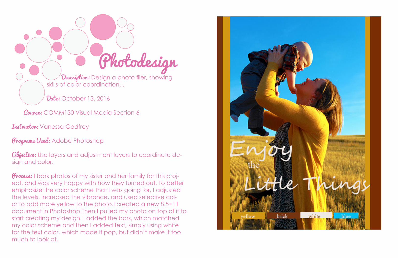
Photodesign Description: Design a photo flier, showing skills of color coordination. . Date: October 13, 2016
Course: COMM130 Visual Media Section 6
Instructor: Vanessa Godfrey
Programs Used: Adobe Photoshop
Objective: Use layers and adjustment layers to coordinate de-sign and color.
Process: I took photos of my sister and her family for this proj-ect, and was very happy with how they turned out. To better emphasize the color scheme that I was going for, I adjusted the levels, increased the vibrance, and used selective col-or to add more yellow to the photo.I created a new 8.5×11 document in Photoshop.Then I pulled my photo on top of it to start creating my design. I added the bars, which matched my color scheme and then I added text, simply using white for the text color, which made it pop, but didn’t make it too much to look at.

Infographic Description: Create an infographic that organizes data in a visually pleasing way. Date: November 2, 2016
Course: COMM130 Visual Media Section 6
Instructor: Vanessa Godfrey
Programs Used: Adobe Illustrator
Objective: To learn to apply flow and alignment in Adobe Illus-trator.
Process: I began sketching some ideas for my layout, and af-ter sharing my ideas with classmates, they helped me come up with the idea of using a chocolate river and more of a Willie Wonka theme After making some sketches, I opened up Illustrator and began putting my ideas to the computer. I found vectors on websites online, such as pixabay.com and freepik.com, which was very helpful. I also created a pink and brown color scheme.

Description: Design a letterhead, using consis tent logo and branding.
Date: October 26, 2016
Course: COMM130 Visual Media Section 6
Instructor: Vanessa Godfrey
Programs Used: Adobe InDesign // Adobe Illustrator
Objective: Create a letterhead and business cards that keep a consistent theme, color scheme and logo.
Process: I began the process by sketching out ideas on a piece of paper. I then put the ideas to the computer, and created three different logos. I chose one of the logos that I especially liked. This logo evolved in a lot of ways. It wasn’t until the end as I continued to make changes that I final-ly found a color scheme that I liked. I created wave type shapes at the bottom to keep with my “beach” theme, and added the shadowing of the palm tree logo in the back-ground of the letterhead.
Letterhead

Business Card Description: Design a business card, using consistent logo and branding.
Date: October 26, 2016
Course: COMM130 Visual Media Section 6
Instructor: Vanessa Godfrey
Programs Used: Adobe InDesign // Adobe Illustrator
Objective: Create a letterhead and business cards that keep a consistent theme, color scheme and logo.
Process: I began the process by sketching out ideas on a piece of paper. I then put the ideas to the computer, and created three different logos. I chose one of the logos that I especially liked. This logo evolved in a lot of ways. It wasn’t until the end as I continued to make changes that I finally found a color scheme that I liked. I decided on blue business cards, and decided to keep them simple so that they would continue to be pleasant to look at. I tried to keep consistent with my palm tree logo.

HTML // Coding Description: Create a basic, handmade web site using HTML and CSS. Date: November 9, 2016
Course: COMM130 Visual Media Section 6
Instructor: Vanessa Godfrey
Programs Used: HTML // CSS // Adobe Photoshop
Objective: Use HTML and CSS to create a handmade web de-sign.
Process: This project was one of the hardest ones for me, as it took awhile for me to get the hang of coding and CSS. However, I had a lot of fun as I chose a color scheme, fonts, and watched as it was created. I used a photo for the back-ground effect, which I felt added a lot more depth.

Web Design Description: Design a website homepage using a grid.
Date: November 16, 2016
Course: COMM130 Visual Media Section 6
Instructor: Vanessa Godfrey
Programs Used: Adobe InDesign // Adobe Photoshop
Objective: Create the homepage of a website, using principles in InDesign and Photoshop, and using layer maps.
Process: I began by choosing my theme. I then began doing sketches of layouts that I could use, and decided to keep it simple and clean so that it would be an easy navigation for my audience. I then chose the layout that I felt would be the best. Photoshop came next, and I began to put my sketch ideas on the computer. I created the layout, created a blue and pink color scheme, and then added text and photos.


