65

BRAND STANDARDS

Introduction
A brand resides in a person’s head as a feeling, a promise, a
big idea, formed through ongoing experiences and connec-
tions; the brand is the essence or promise of what will be
delivered or experienced. Every encounter between guests
and the visual and verbal elements that express and influence
the Win-River Casino brand must build upon the next. These
interactions ultimately impact behavior by shaping opinion,
driving decisions, fostering brand loyalty, and drive play.
Once branding is developed and implemented, it provides an
umbrella under which many different products can be offered;
providing tremendous economic leverage and strategic ad-
vantages in generating awareness in the marketplace.
The Brand identity and guidelines presented in this document
have been developed to define the required components,
structure, format and use of the Win-River Casino brand iden-
tity ensuring that all advertising mediums contain consistent
messaging, maintaining the integrity and effectiveness of the
brand over time through short-term campaigns and long-term
implementation, ensuring brand consistency, relevance and
avoiding brand drift. Consistency is essential in maintaining
the Win-River Casino brand and to continue to build equity
in that brand.
TABLE OF CONTENTS | iii
1 The Brandmark 1
Full-color brandmark . . . . . . . . . . . . . . . . . . . . . 2
Reverse brandmark . . . . . . . . . . . . . . . . . . . . . 2
One-color brandmark . . . . . . . . . . . . . . . . . . . . 3
Clear space . . . . . . . . . . . . . . . . . . . . . . . . 4
Size of brandmark . . . . . . . . . . . . . . . . . . . . 4
Brandmark breakdown . . . . . . . . . . . . . . . . . . . . 5
Lock up treatment . . . . . . . . . . . . . . . . . . . . . . 5
Flexible placement treatment . . . . . . . . . . . . . . . . . . 6
Brandmark format restriction . . . . . . . . . . . . . . . . . . 6
2 Color Palette 9
Primary palette . . . . . . . . . . . . . . . . . . . . . . . 9
Secondary palette . . . . . . . . . . . . . . . . . . . . . . 9
3 Win-River Mini-Mart 11
Full-color brandmark . . . . . . . . . . . . . . . . . . . . 11
4 Typography 13
Headline fonts . . . . . . . . . . . . . . . . . . . . . . 13
Subhead fonts . . . . . . . . . . . . . . . . . . . . . . 13
Body copy fonts . . . . . . . . . . . . . . . . . . . . . 14
5 Embellishments 15
Full eagle . . . . . . . . . . . . . . . . . . . . . . . . 15
Border . . . . . . . . . . . . . . . . . . . . . . . . . 15
Burden bowl detail . . . . . . . . . . . . . . . . . . . . 16
Eagle wing. . . . . . . . . . . . . . . . . . . . . . . . 17
Mountain . . . . . . . . . . . . . . . . . . . . . . . . 17
Mountain with eagle wing . . . . . . . . . . . . . . . . 17

iv | Table Of Contents
6 Advertisement 19
Print Ad magazine . . . . . . . . . . . . . . . . . . . . . 19
Print Ad magazine . . . . . . . . . . . . . . . . . . . . . 20
POP: Free standing poster 22” x 28” . . . . . . . . . . . . . . 21
POP: Free standing poster 18” x 24” . . . . . . . . . . . . . . 22
POP: Free standing poster 22” x 24” 3 tier. . . . . . . . . . . . 23
POP: Backlit endbanks . . . . . . . . . . . . . . . . . . . 24
POP: Snap frame . . . . . . . . . . . . . . . . . . . . . 25
Postcard . . . . . . . . . . . . . . . . . . . . . . . . 27
Outdoor . . . . . . . . . . . . . . . . . . . . . . . . . 28
Print Ad with Coupon and Map . . . . . . . . . . . . . . . . 29
7 Special 31
Sponsorship logos . . . . . . . . . . . . . . . . . . . . . 31
Copy Exceptions . . . . . . . . . . . . . . . . . . . . . 31
Copy Disclaimers . . . . . . . . . . . . . . . . . . . . . 32
Additional Brand logos . . . . . . . . . . . . . . . . . . . 32
Amenities Brand logos . . . . . . . . . . . . . . . . . . 32
Entertainment Brand logos . . . . . . . . . . . . . . . . 33
Gaming Brand logos . . . . . . . . . . . . . . . . . . . 33
Guests First logo . . . . . . . . . . . . . . . . . . . . 33
Branded free play . . . . . . . . . . . . . . . . . . . . . 34
Special event free play . . . . . . . . . . . . . . . . . . . 34
8 Calendars 35
Branded monthly calendars . . . . . . . . . . . . . . . . . 35
Special event promotional calendars . . . . . . . . . . . . . . 36
9 River Club Player’s Cards 37
Branded cards . . . . . . . . . . . . . . . . . . . . . . 38
TABLE OF CONTENTS | v
10 Business correspondence 39
Business Cards . . . . . . . . . . . . . . . . . . . . . . 39
Letterhead . . . . . . . . . . . . . . . . . . . . . . . . 40
Envelopes . . . . . . . . . . . . . . . . . . . . . . . . 41
E-mail Signature . . . . . . . . . . . . . . . . . . . . . 42
11 PR Templates 43
Primary color palette . . . . . . . . . . . . . . . . . . . . 43
Print Ad magazine . . . . . . . . . . . . . . . . . . . . . 44
Postcard . . . . . . . . . . . . . . . . . . . . . . . . 45
E-mail Newsletter . . . . . . . . . . . . . . . . . . . . . 46
Direct Mail Newsletter . . . . . . . . . . . . . . . . . . . 47
12 River Tasalmi Golf Club 49
Brandmark. . . . . . . . . . . . . . . . . . . . . . . . 49
Reverse brandmark . . . . . . . . . . . . . . . . . . . 49
Brandmark breakdown . . . . . . . . . . . . . . . . . . 49
Primary color palette . . . . . . . . . . . . . . . . . . . . 50
Embroidery color palette . . . . . . . . . . . . . . . . . . 50
Embellishemts . . . . . . . . . . . . . . . . . . . . . . 50
Clear space . . . . . . . . . . . . . . . . . . . . . . . 51
Size of brandmark. . . . . . . . . . . . . . . . . . . . 51
Tag lines . . . . . . . . . . . . . . . . . . . . . . . . 52
Lock up treatment . . . . . . . . . . . . . . . . . . . . . 52
Flexible placement treatment . . . . . . . . . . . . . . . . . 52
Brandmark format restrictions . . . . . . . . . . . . . . . . 53
Prnt ad magazine . . . . . . . . . . . . . . . . . . . . . 55
Postcard . . . . . . . . . . . . . . . . . . . . . . . . 56
Marketing collateral pieces. . . . . . . . . . . . . . . . . . 57
Business correspondence . . . . . . . . . . . . . . . . . . 58

2011 BRAND STANDARDS | 1
1 The Brandmark
The “Win-River” in the brand-mark has been designed for a contemporary and upscale look and feel while maintaining fa-miliarity through retention of the eagle with spread wings The “Win-River” name has become the dominant element for strong name recognition.
The components of the brand-mark include the stylized text “Win-River,” The subhead, the eagle graphic and the tapered rules.
Note: Prior to publishing, print-ing, broadcasting, production, etc all materials containing Win-River Casino branding need to be approved by the Marketing Creative Team.

2 | WIN-RIVER CASINO
Full-color brandmarkIn the full-color brandmark, shown below, “Win-River” is produced in Pantone 181; the subhead and eagle graphic are produced in Pantone1405; and the tapered rules are produced in Pantone 1245. These are mandatory colors for the full-color brandmark and not to be altered.
The full-color version of the brandmark is the primary brandmark of the identity system. It is strongly recommended that this version be used in branded applications whenever possible.
Reverse BrandmarkFor application on a black or dense solid back-ground, a reverse brandmark is available. In the reverse brandmark, “Win-River,” the subhead and eagle graphic are all produced in Pantone 1245 and the tapered rules are produced in Pantone 181.
In the full-color brandmark, shown below, “WinRiver” is produced in Pantone 181; the subhead and eagle graphic are produced in Pantone 1405; and the tapered rules are produced in Pantone 1245. These are mandatory colors for the full-color brandmark and are not to be altered.
The full-color version of the brandmark is the primary brandmark of the identity system. It is strongly recommended that this version be used in branded applications whenever possible.
NOTE: As one of our most important assets, the brandmark mustalways appear as shown in these brand identity guidelines. Never attempt to redraw or rescale the brandmark, separate the components or add other graphic elements. Taglines are not to be added except through proper development and approval procedures.
Full-color Brandmark
4C or 3C pmspms 1405pms 1245pms 181
1 Color usagepms 1245
1 Color usageBlack
REVERSE4C or 2C pmspms 1245pms 181
REVERSE1C usagepms 7499
REVERSE1C usageWhite
4C or 3C pmspms 1405pms 1245pms 181
1 Color usage
REVERSE4C or 2C pmspms 1245pms 181
REVERSE
For application on a black or dense solid background, a reverse brand-mark is available. In the reverse brandmark, “WinRiver,” the subhead and eagle graphic are all produced in Pantone 1245 and the tapered rules are produced in Pantone 181.
Reverse Brandmark
NOTE: As one of our most important assets, the brandmark must always appear as shown in these brand identify guidelines. Never attempt to redraw or re-scale the brandmark, separate the compo-nents or add other graphic elements. Tag lines are not to be added except through proper develop-ment and approval procedures through the Marketing Creative Department
In the full-color brandmark, shown below, “WinRiver” is produced in Pantone 181; the subhead and eagle graphic are produced in Pantone 1405; and the tapered rules are produced in Pantone 1245. These are mandatory colors for the full-color brandmark and are not to be altered.
The full-color version of the brandmark is the primary brandmark of the identity system. It is strongly recommended that this version be used in branded applications whenever possible.
NOTE: As one of our most important assets, the brandmark mustalways appear as shown in these brand identity guidelines. Never attempt to redraw or rescale the brandmark, separate the components or add other graphic elements. Taglines are not to be added except through proper development and approval procedures.
Full-color Brandmark
4C or 3C pmspms 1405pms 1245pms 181
1 Color usagepms 1245
1 Color usageBlack
REVERSE4C or 2C pmspms 1245pms 181
REVERSE1C usagepms 7499
REVERSE1C usageWhite
4C or 3C pmspms 1405pms 1245pms 181
1 Color usage
REVERSE4C or 2C pmspms 1245pms 181
REVERSE
For application on a black or dense solid background, a reverse brand-mark is available. In the reverse brandmark, “WinRiver,” the subhead and eagle graphic are all produced in Pantone 1245 and the tapered rules are produced in Pantone 181.
Reverse Brandmark

2011 BRAND STANDARDS | 3
One-color BrandmarkWhen design consideration prevent the use of the full-color alternatives include a black version (for use on white or very light backgrounds) and a reverse version (which can be either white or Pantone 7499, for use on solid/near solid back-grounds exceeding 12% tint). Additionally, a one-color version for the casino only may be produced in Pantone 181 on backgrounds not exceeding 12% tint.
Note: A one-color brandmark should not be used in applications where use of the full-color brand-mark is possible.
When design considerations prevent the use of the full-color brand-mark, a one-color brandmark may be used. The one-color alternatives include a black version (for use on white or very light backgrounds) and a reverse version (which can be either white or Pantone 7499, for use on solid/near solid backgrounds exceeding 12% tint). Additionally, a one-color version for the Casino only may be produced in Pantone 181 on backgrounds not exceeding 12% tint.
NOTE: A one-color brandmark should never be used in applications where use of the full-color brandmark is possible.
One-color Brandmark
1 Color usageBlack
REVERSE1C usagepms 7499
REVERSE1C usageWhite
In the full-color brandmark, shown below, “WinRiver” is produced in Pantone 181; the subhead and eagle graphic are produced in Pantone 1405; and the tapered rules are produced in Pantone 1245. These are mandatory colors for the full-color brandmark and are not to be altered.
The full-color version of the brandmark is the primary brandmark of the identity system. It is strongly recommended that this version be used in branded applications whenever possible.
NOTE: As one of our most important assets, the brandmark mustalways appear as shown in these brand identity guidelines. Never attempt to redraw or rescale the brandmark, separate the components or add other graphic elements. Taglines are not to be added except through proper development and approval procedures.
Full-color Brandmark
4C or 3C pmspms 1405pms 1245pms 181
1 Color usagepms 1245
1 Color usageBlack
REVERSE4C or 2C pmspms 1245pms 181
REVERSE1C usagepms 7499
REVERSE1C usageWhite
4C or 3C pmspms 1405pms 1245pms 181
1 Color usage
REVERSE4C or 2C pmspms 1245pms 181
REVERSE
For application on a black or dense solid background, a reverse brand-mark is available. In the reverse brandmark, “WinRiver,” the subhead and eagle graphic are all produced in Pantone 1245 and the tapered rules are produced in Pantone 181.
Reverse Brandmark

4 | WIN-RIVER CASINO
Clear Space for BrandmarkA “safe area” is required to provide the brand-mark with a minimum of clear space on all sides and prevent interference from other graphics, text, folds or edges. Minimum clear space is de-fined by the width of the “E” in the stylized text “Win-River”.
Size of BrandmarkThe size of the brandmark will vary according to the application (for example, print ads, slot top-pers, billboards, postcards, direct mail, etc.) and will depend on visual effectiveness. As a gen-eral rule, on a full-page magazine ad (roughly 8” x 10”), the brandmark should never be smaller than 1.75” in width. In most other applications, the brandmark should be sized to visually match this proportion.
A “safe area” is required to provide the brandmark with a minimum of clear space on all sides and prevent interference from other graphics, text, folds or edges. Minimum clear space is defined by the width of the “E” in the stylized text “WinRiver.”
Clear Space for Brandmark
The size of the brandmark will vary according to the application (for example, print ads, slot toppers, billboards, postcards and direct mail, etc.) and will depend on visual effectiveness. As a general rule, on a full-page magazine ad (roughly 8” x 10”), the brandmark should never be smaller than 1.75” in width. In most other applications, the brandmark should be sized to visually match this proportion.
Size of Brandmark
AdvertisingMinimum size = 1.75”
Safe Area

2011 BRAND STANDARDS | 5
tempt to redraw or re-scale the tagline in relation to the brandmark or add other graphic elements to its presentation. The tagline should never be presented without the brandmark.
Examples of correct use of taglines are included in a later section on brandmark application in marketing and communications elements.
The tagline can be incorporated in the brandmark in two ways: a fixed lock-up and a flexible place-ment relative to the brandmark.
Lock-up TreatmentWhen the tagline is in “lock-up” with the brand-mark, it appears in a fixed position in relation to the brandmark. The size and position of the tag-line will be determined for optimal communication of both the Win-River brandmark and the tagline. Clear space may be compromised to some de-gree for a tagline lock-up treatment, the tagline should never overlap the brandmark. Once de-veloped, a “lock-up” treatment must maintain the size and position of the tagline relative to the brandmark without variation.
Brandmark breakdownThe brandmark whenever possible should be used in its entirety. When design consideration prevent the use of the full-color brandmark the following breakdown.
As new campaigns are launched and taglines are developed, all communications and creative ma-terials should incorporate and promote them for unity in the marketing effort. The tagline should always appear in subhead font, upper/lower case Serifa Std 65 Bold, followed by a period.
Full-color and one-color versions of the brand-mark with tagline are available for various applica-tions; the same usage guidelines for the different versions apply.
NOTE: A brandmark with an incorporated tagline must be consistent to be effective. Never at-
When the tagline is in “lock-up” with the brandmark, it appears in a fixed position in relation to the brandmark. The size and position of the tagline will be determined for optimal communication of both the Win River brandmark and the tagline. Clear space may be compromised to some degree for a tagline lock-up treatment, but the tagline should neveroverlap the brandmark. Once developed, a “lock-up” treatment must maintain the size and position of the tagline relative to the brandmark without variation.
Lock-up Treatment
For design considerations, the tagline may be positioned away fromthe brandmark. There are two important constraints for the flexible placement treatment: first, in order to protect the integrity of thebrandmark you must maintain the size proportions so that the taglineis not dominant over the brandmark; and second, the flexible placement should be consistent within campaign applications (for example, in a series of three product ads using flexible placement, the tagline would follow the body copy in all three ads).
Flexible Placement Treatment
As new campaigns are launched and taglines are developed, all communications and creative materials should incorporate and promote them for unity in the marketing effort. The tagline should always appear in subhead font, upper/lower case Serifa Std 65 Bold, followedby a period.
Full-color and one-color versions of the brandmark with tagline areavailable for various applications; the same usage guidelines for thedifferent versions apply.
NOTE: A brandmark with an incorporated tagline must be consistent to be effective. Never attempt to redraw or rescale the tagline in relation to the brandmark or add other graphic elements to its presentation. The tagline should never be presented without the brandmark.
Examples of correct use of taglines are included in a later section on brandmark application in marketing and communications elements.
The tagline can be incorporated in the brandmark in two ways: a fixed lock-up and a flexible placement relative to the brandmark.
Incorporation of Tagline/Campaign
It’s better on The River.
6 | WIN-RIVER CASINO
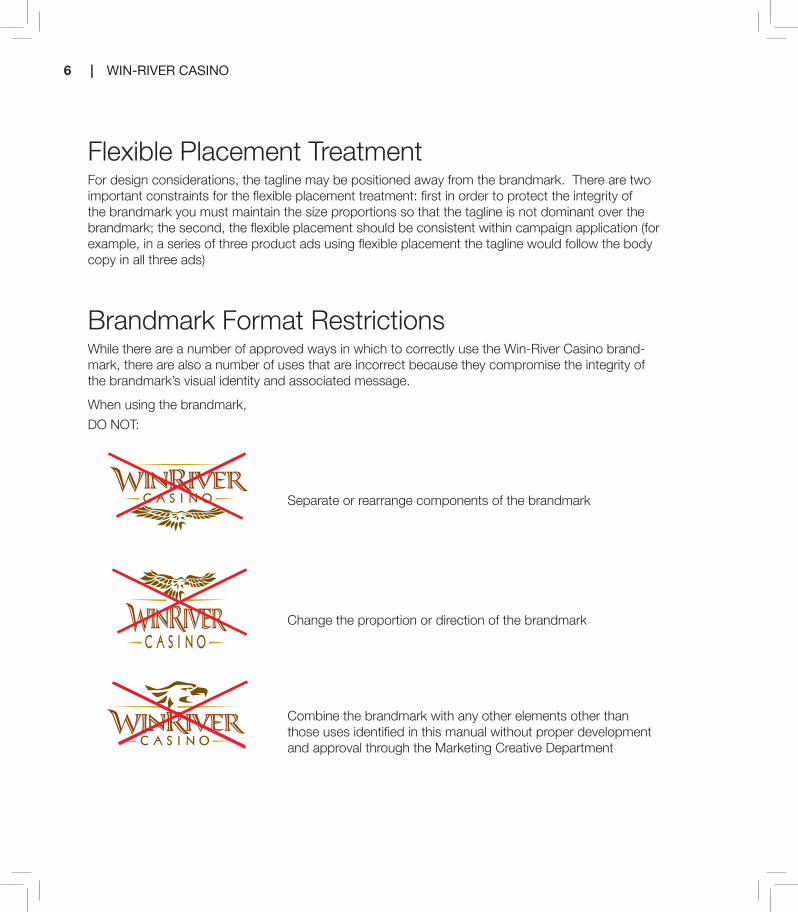
Flexible Placement TreatmentFor design considerations, the tagline may be positioned away from the brandmark. There are two important constraints for the flexible placement treatment: first in order to protect the integrity of the brandmark you must maintain the size proportions so that the tagline is not dominant over the brandmark; the second, the flexible placement should be consistent within campaign application (for example, in a series of three product ads using flexible placement the tagline would follow the body copy in all three ads)
Brandmark Format RestrictionsWhile there are a number of approved ways in which to correctly use the Win-River Casino brand-mark, there are also a number of uses that are incorrect because they compromise the integrity of the brandmark’s visual identity and associated message.
When using the brandmark,
DO NOT:
Separate or rearrange components of the brandmark
Change the proportion or direction of the brandmark
Combine the brandmark with any other elements other than those uses identified in this manual without proper development and approval through the Marketing Creative Department
Brandmark Format Restrictions
As of December 2007, this new brandmark has not been registeredwith the U.S. Patent and Trademark Office. Until proof of registration is obtained, the brandmark will not carry a registration mark (TM, SM or ®). Upon verification of registration, the appropriate registration mark(s) will be incorporated into the brandmark design for discernable but subtle visibility.
Trademark/Registration of Brandmark
DO NOT:
DO NOT:
DO NOT:
DO NOT:
DO NOT:
While there are a number of approved ways in which to correctly use the Win River brandmark, there are also a number of uses that are incorrect because they compromise the integrity of the brandmark’s visual identity and associated message.
When using the brandmark,
Separate or rearrange components of the brandmark
Change the proportions or direction of the brandmark
Combine the brandmark with any other elements other than those uses identified in this manual without proper development and approval
Change typefaces or colors
Box the brandmark with a background color or place the brandmark against a low contrast or distracting background

2011 BRAND STANDARDS | 7
Change typefaces or colors
Box the brandmark with a background color or place the brand-mark against a low contrast or distracting background
Rotate brandmark
Use logo as a watermark
Trademark/Registration of Brandmark
As of May 2011 the Brandmark has not been registered with the U.S. Patent and Trademark Office. Until proof of registration is obtained, the brandmark will not carry a registration mark (TM, SM, or ®). Upon verification of registration, the appropriate registration mark(s) will be incorporated into the brandmark design for discernible but subtle visibility.
Brandmark Format Restrictions
As of December 2007, this new brandmark has not been registeredwith the U.S. Patent and Trademark Office. Until proof of registration is obtained, the brandmark will not carry a registration mark (TM, SM or ®). Upon verification of registration, the appropriate registration mark(s) will be incorporated into the brandmark design for discernable but subtle visibility.
Trademark/Registration of Brandmark
DO NOT:
DO NOT:
DO NOT:
DO NOT:
DO NOT:
While there are a number of approved ways in which to correctly use the Win River brandmark, there are also a number of uses that are incorrect because they compromise the integrity of the brandmark’s visual identity and associated message.
When using the brandmark,
Separate or rearrange components of the brandmark
Change the proportions or direction of the brandmark
Combine the brandmark with any other elements other than those uses identified in this manual without proper development and approval
Change typefaces or colors
Box the brandmark with a background color or place the brandmark against a low contrast or distracting background

8 | WIN-RIVER CASINO

2011 BRAND STANDARDS | 9
Secondary Brand Colors
Pantone 159C:0 M:66 Y:100 K:7R:227 G:111 B:30HEX: e36f1e
Pantone 117C:0 M:18 Y:100 K:15R:222 G:180 B:8HEX: deb408
Pantone 658C:30 M:15 Y:0 K:0R:173 G:197 B:231HEX: adc5e7
Pantone 556C:42 M:0 Y:33 K:27R:114 G:164 B:146HEX:72a492
Pantone 465C:20 M:32 Y:58 K:0R:207 G:170 B:122HEX: cfaa7a
Pantone warm grey 7C:0 M:8 Y:14 K:38R:172 G:160 B:149HEX: aca095
It is important to maintain visual consistency for both the brandmark and all communications across various media types and materials to help establish the essence of the Win-River Casino brand.
The color palette is presented below and should be used in the design and production of all mar-keting and communications materials.
Note that the primary palette consists of the three colors found in the full-color brandmark, plus the lighter Pantone 7499 for contrast.
The secondary palette provides a selection of colors that can be used for accents to comple-ment the primary palette and photos/images used in the marketing and communications materials.
Pantone 1405C:0 M:36 Y:100 K:63R:120 G:82 B:0HEX: 795300
Pantone 1245C:0 M:28 Y:100 K:18R:213 G:159 B:15HEX: d59f0f
Pantone 181C:0 M:74 Y:100 K:47R:147 G:60 B:6HEX: 933c06
Pantone 7499C:0 M:2 Y:15 K:0R:255 G:246 B:220HEX: fff6dc
2 Color Palette
Primary Brand Colors

10 | WIN-RIVER CASINO

2011 BRAND STANDARDS | 11
The “Win-River Mini-Mart” has been designed to mirror the “Win-River Casino” in design, color pal-ette, and brand standard application guidelines.
MINI MART
3 Win-River Mini-Mart

12 | WIN-RIVER CASINO

2011 BRAND STANDARDS | 13
Headline FontsTRADE GOTHIC LT STD EXTENDED
Lorem ipsum dolor. LOREM IPSUM DOLAR.
TRADE GOTHIC LT STD BOLD EXTENDED
Lorem ipsum dolor. LOREM IPSUM DOLAR.
PENUMBRA HALF SERIF STD MEDIUM
Lorem ipsum dolor. LOREM IPSUM DOLAR.
Subhead FontsPENUMBRA FLARE STD SEMIBOLD
LOREM IPSUM DOLOR SIT AMET, CONSECTETUER ADIPISCING ELIT.
ABCDEFGHIJKLMNOPQRSTUVWXYZ123456789
The approved fonts for all marketing and commu-nications materials are from the Trade Gothic Lt, Penumbra and Serifa families. Other fonts may be used with discretion but should not be used without proper approval by the Marketing Creative Depart-ment prior to production. When using any of these fonts, modification or distortion of the typeface is highly discouraged. Typefaces may be bold or italic in body copy when appropriate.
4 Typography

14 | WIN-RIVER CASINO
PENUMBRA FLARE STD REGULAR
LOREM IPSUM DOLOR SIT AMET, CONSECTETUER ADIPISCING ELIT.
ABCDEFGHIJKLMNOPQRSTUVWXYZ123456789
SERIFA STD 65 BOLD
Lorem ipsum dolor sit amet, consectetuer adipiscing elit.
AaBbCcDdEeFfGgHhIiJjKkLlMmNnOoPpQqRrSsTtUuVvWwXxYyZz123456789
SERIFA STD 55 ROMAN
Lorem ipsum dolor sit amet, consectetuer adipiscing elit.
AaBbCcDdEeFfGgHhIiJjKkLlMmNnOoPpQqRrSsTtUuVvWwXxYyZz123456789
TRADE GOTHIC LT STD BOLD NO. 2
Lorem ipsum dolor sit amet, consectetuer adipiscing elit.
AaBbCcDdEeFfGgHhIiJjKkLlMmNnOoPpQqRrSsTtUuVvWwXxYyZz123456789
Body Copy FontsTRADE GOTHIC LT STD LIGHT
Lorem ipsum dolor sit amet, consectetuer adipiscing elit, sed diam nonummy nibh euismond tincid-unt ut laoreet dolore magna aliquam erat volutpat. Ut wisi enim ad minim veniam, quis nostrud exerci tation ullamcorper suscipit lobortis nisl ut aliquip ex ea commodo consequat.
TRADE GOTHIC LT STD LCONDENSED NO. 18
Lorem ipsum dolor sit amet, consectetuer adipiscing elit, sed diam nonummy nibh euismond tincidunt ut laoreet dolore magna aliquam erat volutpat. Ut wisi enim ad minim veniam, quis nostrud exerci tation ullamcorper suscipit lobortis nisl ut aliquip ex ea commodo consequat

2011 BRAND STANDARDS | 15
The following graphic embellishments have been chosen for complementary use in the design of marketing and communications materials. They are to be used as design accents only (embroi-dery and screen prints for clothing/textile pro-duction), and not as primary graphic elements.
Full eagleThe full eagle, when used as an ornamental em-bellishment (for example stitched/screen printed on branded clothing/material) is always produced in one solid color – one of the four colors from the primary color palette, black or white – as shown below. Additionally, as an ornamental embellish-
ment, the full eagle should always be smaller than the eagle in the brandmark
BorderThe border consists of a dual-line rule and three tribal symbols. Produced at 100% on a typical full-page ad, the border is roughly the equivalent of a 1-point rule and a 3-point rule separated
by white space equivalent to a 2 point rule. For larger executions (for example, billboards or slot toppers), the scales would be larger to create the same visual proportion in the overall design. Pri-mary Design/photo will determine the color com-
4C or 3C pmspms 1405
1 Color usagepms 181
1 Color usageBlack
REVERSE4C or 2C pmspms 1245
REVERSE1C usagepms 7499
REVERSE1C usageWhite
The following graphic embellishments have been chosen forcomplementary use in the design of marketing and communications materials. They are to be used as design accents only, and not asprimary graphic elements.
Examples of specific uses of these embellishments are included in a later section detailing brandmark marketing and communications executions.
Embellishments
The full eagle, when used as an ornamental embellishment, is always produced in one solid color – one of the four colors from the primary color palette, or black or white – as shown below. Additionally, as an ornamental embellishment, the full eagle should always be smaller than the eagle in the brandmark.
Full Eagle
The border consists of a dual-line rule. Produced at 100% on a typical full-page ad, the border is roughly the equivalent of a 1-point rule and a 3-point rule separated by white space equivalent to a 2-point rule. For larger executions (for example, billboards or slot toppers), the scales would be larger to create the same visual proportion in the overall design.
Border
5 Embellishments

16 | WIN-RIVER CASINO
position of border and tribal color application; black or white being the only colors authorized for usage. Primary photo/graphic and imagery should be applied so that the border and tribal symbols are visible.
The top rule of the border is “interrupted” by an embellishment referred to as the “burden bowl,” a stylized loop of the border encircling the three tribal symbols. The burden bowl is centered form left to right on the top rule. (Where measure-ments are started indicating the distance from the top rule and not the burden bowl.)
The burden bowl is never obscured by the image or any other graphic element.
•Theborderisset0.5”insidetheleft,rightandbottomedges,and0.75”insidethetopedge.
Burden Bowl Detail
Note: Exemption to this rule applies if design con-cept is enhanced by having a graphic element placed above the border. Only one element in the design can be applied in this manner.
Human Resource Department has its own color palette applied to frame/symbols (R:64 G:75 B:171) and mountain (R:0 G:18 B:117) elements. New color palettes can be developed through proper development and approval procedures through the Marketing Creative Department.
C:86 M:80 Y:0 K:0R:64 G:75 B:171HEX: 434fa1
C:100 M:97 Y:20 K:19R:0 G:18 B:117HEX: 27a6d
Must be 21 to attend. Win-River Casino reserves the right to change, modify or cancel this promotion at anytime without prior notice.
Friday, OctOber 30thSee win-river.com for details
Amazing does not begin to explain how you will feel after becominga part of Win-River Casino. www.winrivercasino.com
Benefits are Amazingon the river.
It’s better on The River.

2011 BRAND STANDARDS | 17
C:86 M:80 Y:0 K:0R:64 G:75 B:171HEX: 434fa1
C:100 M:97 Y:20 K:19R:0 G:18 B:117HEX: 27a6d
Horizontal
Vertical
Horizontal
Vertical
Eagle Wing - The eagle wing is simply part of the full eagle embellishment: it is the wing to the right of the eagle’s head (the eagle’s left wing). The eagle wing is used as a background to give texture and variation. The wing isnever used whole – it is always enlarged and cropped to fit the space.Additionally, it is always tinted, or screened back (the percentage will vary based on the color density of the background). See “Mountains with Eagle Wing” below.
Mountains - The mountains embellishment is a peak-and-valley edge pattern that is used along a single edge of an area of solid color toprovide variation in the transition to adjacent visual elements. A drop shadow is added to the mountains to further soften the transition.See “Mountains with Eagle Wing” below.
The mountains and the eagle wing are complementary elements and are always used together to provide a distinct area for text and/or graphics (for example, subheads, copy, brandmark or a combination) or a separate area for related but distinct information (for example, coupons).
Example crop line
Mountains with Eagle Wing
Example crop line
Eagle WingThe eagle wing is simply part of the full eagle embellishment: it is the wing to the right of the eagle’s head (the eagle’s left wing). The eagle wing is used as a background to give texture and variation. The wing is never used whole – it is al-ways enlarged and cropped to fit the space. Ad-ditionally, it is always tinted, or screened back (the percentage will vary based on the color density of the background). See “Mountains with Eagle Wing” below.
MountainsThe mountains embellishment is a peak-and-valley edge pattern that is used along a single edge of an area of solid color to provide variation in the transition to adjacent visual elements. See “Mountains with Eagle Wing” below.
Mountains with Eagle WingThe mountains and the eagle wing are comple-mentary elements and are always used together to provide a distinct area for text and/or graph-ics (for example, subheads, copy, brandmark or a combination) or a separate area for related but distinct information (for example, coupons).
Horizontal
Vertical
Eagle Wing - The eagle wing is simply part of the full eagle embellishment: it is the wing to the right of the eagle’s head (the eagle’s left wing). The eagle wing is used as a background to give texture and variation. The wing isnever used whole – it is always enlarged and cropped to fit the space.Additionally, it is always tinted, or screened back (the percentage will vary based on the color density of the background). See “Mountains with Eagle Wing” below.
Mountains - The mountains embellishment is a peak-and-valley edge pattern that is used along a single edge of an area of solid color toprovide variation in the transition to adjacent visual elements. A drop shadow is added to the mountains to further soften the transition.See “Mountains with Eagle Wing” below.
The mountains and the eagle wing are complementary elements and are always used together to provide a distinct area for text and/or graphics (for example, subheads, copy, brandmark or a combination) or a separate area for related but distinct information (for example, coupons).
Example crop line
Mountains with Eagle Wing

18 | WIN-RIVER CASINO

2011 BRAND STANDARDS | 19
Print Ad (Magazine) – Product -8.5” x 11” Template
Grid: The primary photo covers roughly the top 4/5 of the ad. The “mountain and eagle wing” treatment covers roughly the bottom 1/5 of the ad. The brandmark is 2.25”wide, with correct proportional height, and is centered horizontally. The brand-mark overlaps the primary photo and “mountain and eagle wing” treatment with “Win-River Casino” spanning the mountain “peak-and-valley” edge.
• The border is set 0.5” inside each edge of the ad• The secondary product image is positioned in the bottom left and is placed in front of the border.• The headline (including Subhead A “ON THE RIVER.”) is centered vertically in the primary photo area and flush left to the
border with minimal gap.• Subhead B (product), body copy and tagline are visually centered vertically in the open space defined by the border and
“mountain and eagle wing” treatment, and justified left with a 0.25” gap to the border.• The web site address is 0.25” above the bottom border and is justified right to the secondary photo (exact positioning
will depend on shape of specific secondary photo).
HeadlineFont: Trade Gothic LT Std ExtendedSize: 54 pts.Subhead A: “ON THE RIVER.”Font: Penumbra Flare Std RegularSize: 21 pts.
Subhead B: (Product)Font: Serifa Std 45 LightSize: 21 pts.Subhead B will vary according to the specific product promotion.
Body Copy: (Product)Font: Trade Gothic LT Std Condensed No. 18Size: 10 pts.Leading: 14.5No more than 20 words
Tagline: “It’s better on the River.”Font: Serifa Std 65 BoldSize: 10 pts.Leading: 14.5 pts.Always “lock” tagline with product copy in product ad
Web Site AddressFont: Serifa Std 45 LightSize: 11 pts.
Color/Composition: The primary photo will determine the color scheme. A complementary/accent color for the “mountain and eagle wing” border can be selected from the approved primary or secondary color palettes. The brandmark may be Pantone 7499 or white; the border and all copy are white.
Must have a River Club Card to participate. Model shown may not be actual prize. Win-River Casino reserves the right to change, modify or cancel this promotion at anytime without prior notice.
Swipe-2-Win for your chance to WIN a 2010 Ford Mustang!
6 Advertisement

20 | WIN-RIVER CASINO
Print Ad (Magazine) – Product -8.5” x 11” Template
Grid: The primary photo covers roughly the top 4/5 of the ad. The “mountain and eagle wing” treatment covers roughly the bottom 1/5 of the ad. The brandmark is 2.25”wide, with correct proportional height, and is centered horizontally. The brandmark overlaps the primary photo and “mountain and eagle wing” treatment with “Win-River Casino” spanning the mountain “peak-and-valley” edge.
• The border is set 0.5” inside each edge of the ad• The secondary product image is positioned in the bottom left and is placed in front of the border.• The headline (including Subhead A “ON THE RIVER.”) is centered vertically in the primary photo area and flush left to the border with minimal gap.• Subhead B (product), body copy and tagline are visually centered vertically in the open space defined by the border and “mountain and eagle wing” treatment, and justified left with a 0.25” gap to the border.• The web site address is 0.25” above the bottom border and is justified right to the secondary photo (exact positioning will depend on shape of specific secondary photo).Color/Composition: The primary photo will determine the color scheme. A complementary/accent color for the “mountain and eagle wing” border can be selected from the approved primary or secondary color palettes. The brandmark may be Pantone 7499 or white; the border and all copy are white.
HeadlineFont: Trade Gothic LT Std ExtendedSize: 54 pts.Subhead A: “ON THE RIVER.”Font: Penumbra Flare Std RegularSize: 21 pts.Subhead A “ON THE RIVER.” is never separated from the headline.
Subhead B: (Product)Font: Serifa Std 45 LightSize: 10 pts.
Subhead B will vary according to the specific product pro-motion
Body CopyFont: Trade Gothic LT Std Condensed No. 18Size: 10 pts.Leading: 14.5No more than 20 words
Tagline: “It’s better on the River.”Font: Serifa Std 65 BoldSize: 10 pts.Leading: 14.5 pts.Always “lock” tagline with product copy in product ad
Web Site Address and/or DisclaimerFont: Serifa Std 45 LightSize: 11 pts.
21 reasons to Play...on the River. Dealer’s showing 17, you’ve got a pair of Kings. Stay and pocket the money or saddle up, split them bad boys and hopefully walk away with more? Thankfully that’s your call, not ours. Go for a spin...on the River with 1,100 machines, 62 different multi-denomination progressive games- yeah, you could say we have something for everyone. In fact, we have so many new games coming in, we’re having a tough time keeping track of who’s winning what. And who doesn’t love shouting BINGO at the top of their lungs? Featuring the best High-Stakes Bingo in Northern California, Win-River Casino offers a number of different games that are sure to excite even the most seasoned Bingo enthusiasts. Break out the bingo markers and play on paper or check out our new state-of-the-art “Hands Free” bingo! Win-River Casino brings the excitement of Vegas to Northern California making it an exciting, friendly, entertaining, and comfortable gaming environment.
21 reasons to Play...on the River. Dealer’s showing 17, you’ve got a pair of Kings. Stay and pocket the money or saddle up, split them bad boys and hopefully walk away with more? Thankfully that’s your call, not ours. Go for a spin...on the River with 1,100 machines, 62 different multi-denomination progressive games- yeah, you could say we have something for everyone. In fact, we have so many new games coming in, we’re having a tough time keeping track of who’s winning what. And who doesn’t love shouting BINGO at the top of their lungs? Featuring the best High-Stakes Bingo in Northern California, Win-River Casino offers a number of different games that are sure to excite even the most seasoned Bingo enthusiasts. Break out the bingo markers and play on paper or check out our new state-of-the-art “Hands Free” bingo! Win-River Casino brings the excitement of Vegas to Northern California making it an exciting, friendly, entertaining, and comfortable gaming environment.
Lurem ipsumon the river.

2011 BRAND STANDARDS | 21
POP: Free Standing Poster – 22” x 28” Template
Grid: The free standing poster template has been set up to allow “unique” graphics and imagery that are designed outside the Win-River Casino graphic guidelines to promote unique events. The area provided within the template for this use covers roughly the top 4/5 of the poster. The “mountain and eagle” treatment covers roughly the bottom 1/5 of the ad. The brandmark is 5” wide, with correct proportional height. The tagline is in the lock-up position with the brandmanrk. The brandmark and tagline are visually centered vertically within the space defined by the “mountain and eagle wing” treatment and border, and justified right with a 0.5” gap to the right border.
• The border is set 1” inside each edge of the poster.• Product/event subhead and body copy are visually centered vertically in the open space defined by the border and “mountain and eagle wing” treatment, and justified left with a 0.5” gap to the border.
Color/Composition: The primary photo/graphics and imagery used for the “unique” promotion will determine the color scheme. A complementary/ac-cent color for the “mountain and eagle wing” treatment border can be selected to complement design. The brandmark may be Pantone 7499 or white; the border and all copy are white (if the “unique” promotion/event design needs a black border then the brandmark, border, tribal symbols and copy will be black). Drop shadows are applied to the “mountain and eagle wing” treatment graphic element. Note: brandmark and copy do not have shadows applied.
HeadlineFont: Trade Gothic LT Std ExtendedSize: 120 pts.Subhead A: “ON THE RIVER.”Font: Penumbra Flare Std RegularSize: 60 pts.Subhead A “ON THE RIVER.” is never separated from the headline.
Subhead B: (Product)Font: Serifa Std 45 LightSize: 45 pts.Subhead B will vary according to the specific product promotion
Body CopyFont: Trade Gothic LT Std Condensed No. 18Size: 30 pts.Leading: 36No more than 20 words
Tagline: “It’s better on the River.”Font: Serifa Std 65 BoldSize: 10 pts.Leading: 14.5 pts.Always “lock” tagline with product copy in product ad
Web Site Address and/or DisclaimerFont: Serifa Std 45 LightSize: 11 pts.
Tuesday and ThursdayBeginning March 1, 2011 - March 31, 2011Order any dessert with entree (excludes appetizers) and receive $5 Free Slot Play!
See your Elements Server or River Club for details. Win-River Casino reserves the right to change, modify or cancel this promotion at anytime without prior notice.
Lurem ipsumon the river
Must have a River Club Card to participate. Win-River Casino reserves the right to change, modify or cancel this promotion at anytime without prior notice.
Swipe-2-Win for your chance to win a VW Bug

22 | WIN-RIVER CASINO
POP: Free Standing Poster – 18” x 24” Template
Grid: The free standing poster template has been set up to allow “unique” graphics and imagery that are designed outside the Win-River Casino graphic guidelines to promote unique events. The area provided within the template for this use covers roughly the top 4/5 of the poster. The “mountain and eagle” treatment covers roughly the bottom 1/5 of the ad. The brandmark is 5” wide, with correct proportional height. The tagline is in the lock-up position with the brandmanrk. The brandmark and tagline are visually centered verti-cally within the space defined by the “mountain and eagle wing” treatment and border, and justified right with a 0.5” gap to the right border.
• The border is set 1” inside each edge of the poster.• Product/event subhead and body copy are visually centered vertically in the open space defined by the border and “mountain and eagle wing” treatment, and justified left with a 0.5” gap to the border.
Color/Composition: The primary photo/graphics and imagery used for the “unique” promotion will determine the color scheme. A complementary/accent color for the “mountain and eagle wing” treatment border can be selected to complement design. The brandmark may be Pantone 7499 or white; the border and all copy are white ( if the “unique” promotion/event design needs a black border then the brandmark, border, tribal symbols and copy will be black). Drop shadows are applied to the “mountain and eagle wing” treatment graphic element. Note: brandmark and copy do not have shadows applied.
HeadlineFont: Trade Gothic LT Std ExtendedSize: 120 pts.Subhead A: “ON THE RIVER.”Font: Penumbra Flare Std RegularSize: 60 pts.Subhead A “ON THE RIVER.” is never separated from the headline.
Subhead B: (Product)Font: Serifa Std 45 LightSize: 50 pts.Subhead B will vary according to the specific product promotion
Body CopyFont: Trade Gothic LT Std Condensed No. 18Size: 35 pts.Leading: 48No more than 20 words
Tagline: “It’s better on the River.”Font: Serifa Std 65 BoldSize: 10 pts.Leading: 14.5 pts.Always “lock” tagline with product copy in product ad
Web Site Address and/or DisclaimerFont: Serifa Std 45 LightSize: 18 pts.Leading: 21 pts.
See Bingo Staff for details. Must have a River Club Card to participate. Win-River Casino reserves the right to change, modify or cancel this promotion
Sunday, March 27, 201120 games pay $1,000See winriver.com for details
Lorum ipsumon the river.
See Bingo Staff for details. Must have a River Club Card to participate. Win-River Casino reserves the right to change, modify or cancel this promotion at anytime without prior notice.
Drawing February 28, 201120 winners will be selected to win $250 cashEntry ticket with each Bingo buy-in, and WIN MULTIPLE TIMES
2011 BRAND STANDARDS | 23
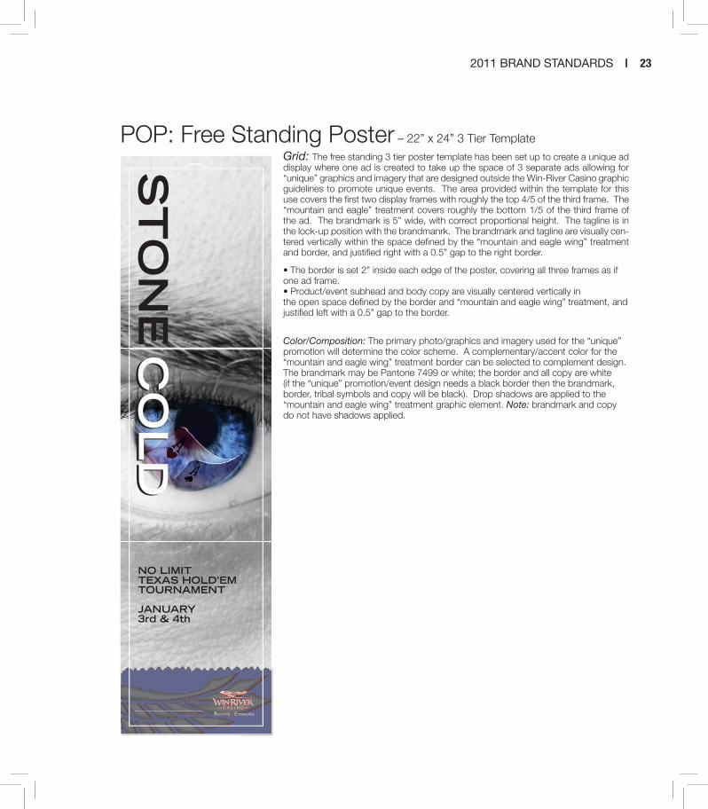
POP: Free Standing Poster – 22” x 24” 3 Tier Template
Grid: The free standing 3 tier poster template has been set up to create a unique ad display where one ad is created to take up the space of 3 separate ads allowing for “unique” graphics and imagery that are designed outside the Win-River Casino graphic guidelines to promote unique events. The area provided within the template for this use covers the first two display frames with roughly the top 4/5 of the third frame. The “mountain and eagle” treatment covers roughly the bottom 1/5 of the third frame of the ad. The brandmark is 5” wide, with correct proportional height. The tagline is in the lock-up position with the brandmanrk. The brandmark and tagline are visually cen-tered vertically within the space defined by the “mountain and eagle wing” treatment and border, and justified right with a 0.5” gap to the right border.
• The border is set 2” inside each edge of the poster, covering all three frames as if one ad frame.• Product/event subhead and body copy are visually centered vertically in the open space defined by the border and “mountain and eagle wing” treatment, and justified left with a 0.5” gap to the border.
Color/Composition: The primary photo/graphics and imagery used for the “unique” promotion will determine the color scheme. A complementary/accent color for the “mountain and eagle wing” treatment border can be selected to complement design. The brandmark may be Pantone 7499 or white; the border and all copy are white (if the “unique” promotion/event design needs a black border then the brandmark, border, tribal symbols and copy will be black). Drop shadows are applied to the “mountain and eagle wing” treatment graphic element. Note: brandmark and copy do not have shadows applied.
Win-River Casino reserves the right to change, modify or cancel this promotion at anytime without prior notice.
ST
ON
EC
OL
DC
OL
DNO LIMITTEXAS HOLD’EMTOURNAMENT
JANUARY3rd & 4th
24 | WIN-RIVER CASINO
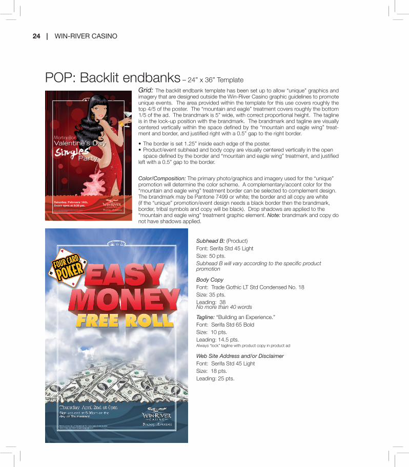
POP: Backlit endbanks – 24” x 36” Template
Grid: The backlit endbank template has been set up to allow “unique” graphics and imagery that are designed outside the Win-River Casino graphic guidelines to promote unique events. The area provided within the template for this use covers roughly the top 4/5 of the poster. The “mountain and eagle” treatment covers roughly the bottom 1/5 of the ad. The brandmark is 5” wide, with correct proportional height. The tagline is in the lock-up position with the brandmark. The brandmark and tagline are visually centered vertically within the space defined by the “mountain and eagle wing” treat-ment and border, and justified right with a 0.5” gap to the right border.
• The border is set 1.25” inside each edge of the poster.• Product/event subhead and body copy are visually centered vertically in the open space defined by the border and “mountain and eagle wing” treatment, and justified left with a 0.5” gap to the border.
Color/Composition: The primary photo/graphics and imagery used for the “unique” promotion will determine the color scheme. A complementary/accent color for the “mountain and eagle wing” treatment border can be selected to complement design. The brandmark may be Pantone 7499 or white; the border and all copy are white (if the “unique” promotion/event design needs a black border then the brandmark, border, tribal symbols and copy will be black). Drop shadows are applied to the “mountain and eagle wing” treatment graphic element. Note: brandmark and copy do not have shadows applied.
Subhead B: (Product)Font: Serifa Std 45 LightSize: 50 pts.Subhead B will vary according to the specific product promotion
Body CopyFont: Trade Gothic LT Std Condensed No. 18Size: 35 pts.Leading: 38No more than 40 words
Tagline: “Building an Experience.”Font: Serifa Std 65 BoldSize: 10 pts.Leading: 14.5 pts.Always “lock” tagline with product copy in product ad
Web Site Address and/or DisclaimerFont: Serifa Std 45 LightSize: 18 pts.Leading: 25 pts.
Must be 21 or older. Win-River Casino reserves the right to change, modify or cancel this promotion at anytime without prior notice.
Saturday, February 14th,Doors open at 9:30 pm.
2011 BRAND STANDARDS | 25
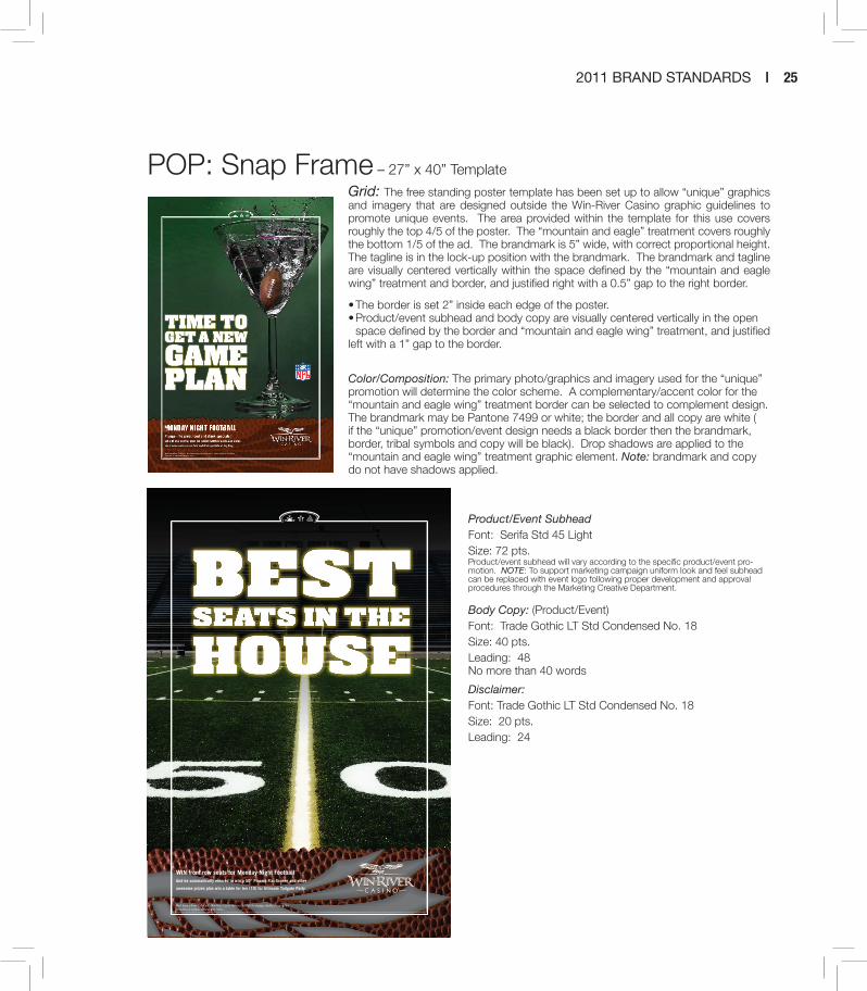
POP: Snap Frame – 27” x 40” Template
Grid: The free standing poster template has been set up to allow “unique” graphics and imagery that are designed outside the Win-River Casino graphic guidelines to promote unique events. The area provided within the template for this use covers roughly the top 4/5 of the poster. The “mountain and eagle” treatment covers roughly the bottom 1/5 of the ad. The brandmark is 5” wide, with correct proportional height. The tagline is in the lock-up position with the brandmark. The brandmark and tagline are visually centered vertically within the space defined by the “mountain and eagle wing” treatment and border, and justified right with a 0.5” gap to the right border.
• The border is set 2” inside each edge of the poster.• Product/event subhead and body copy are visually centered vertically in the open space defined by the border and “mountain and eagle wing” treatment, and justified left with a 1” gap to the border.
Color/Composition: The primary photo/graphics and imagery used for the “unique” promotion will determine the color scheme. A complementary/accent color for the “mountain and eagle wing” treatment border can be selected to complement design. The brandmark may be Pantone 7499 or white; the border and all copy are white ( if the “unique” promotion/event design needs a black border then the brandmark, border, tribal symbols and copy will be black). Drop shadows are applied to the “mountain and eagle wing” treatment graphic element. Note: brandmark and copy do not have shadows applied.
Product/Event SubheadFont: Serifa Std 45 LightSize: 72 pts.Product/event subhead will vary according to the specific product/event pro-motion. NOTE: To support marketing campaign uniform look and feel subhead can be replaced with event logo following proper development and approval procedures through the Marketing Creative Department.
Body Copy: (Product/Event)Font: Trade Gothic LT Std Condensed No. 18Size: 40 pts.Leading: 48 No more than 40 words
Disclaimer:Font: Trade Gothic LT Std Condensed No. 18Size: 20 pts.Leading: 24
Must have a River Club Card. Win-River Casino reserves the right to change, modify or cancel this promotion at anytime without prior notice.
And be automatically entered to win a 50” Plasma Flat Screen and other
awesome prizes plus win a table for ten (10) for Ultimate Tailgate Party
WIN front row seats for Monday Night Football

26 | WIN-RIVER CASINO
Note: Marketing campaigns may need specific treatments. Football’s marketing campaign de-sign carries a special treatment to the “mountain and eagle wing” area that carried through all cam-paign advertising; following proper development and approval procedures through the Marketing Creative Department.
HeadlinesFont: Finger Licking BoldAll caps; created in Photoshop and sized into “unique” graphics/imagery design.
Product/Event SubheadFont: Serifa Std 45 LightSize: 72 pts.Product/event subhead will vary according to the specific product/event promo-tion. NOTE: To support marketing campaigns uniform look and feel subhead can be replaced with event logo following proper development and approval procedures through the Marketing Creative Department.
Must have a River Club Card. Win-River Casino reserves the right to change, modify or cancel this promotion at anytime without prior notice.
Every Kick Off for Monday Night FootballSomeone will have a chance to WIN $599 in cash
If not, $20 Free Slot Play
Must have a River Club Card. Win-River Casino reserves the right to change, modify or cancel this promotion at anytime without prior notice.
Catch the action all season long at Win-River Where it’s not your everyday game day
Must have a River Club Card. Win-River Casino reserves the right to change, modify or cancel this promotion at anytime without prior notice.
Score cash and other great prizes!Catch all the games on our big screen TVs plus enter our football-day
drawings to win cash prizes, pro jerseys and other cool gear every Sunday.
Must have a River Club Card. Win-River Casino reserves the right to change, modify or cancel this promotion at anytime without prior notice.
Catch all the action on our big screen TVs!Win-River has all the Sunday Ticket and Monday Night Football
games on our big screen TVs inside Elements and the Martini Bar.

2011 BRAND STANDARDS | 27
Postcard – 8.75” x 5.75” Template
Grid: The postcard template has been set up to replicate “unique” graphics and imagery design utilized in POP to promote unique events with a cohesive look and feel. The area provided within the template for this use covers roughly the top 1/3 Horizontally or Vertically (determined by ad design) of the postcard. The “moun-tain and eagle wing” treatment covers roughly the bottom or right hand side 1/3 of the ad. The brandmark is 2” wide, with correct proportional height. The tagline is in the lock-up position with the brandmanrk. The brandmark and tagline are visually centered ver-tically within the space defined by the “mountain and eagle wing” treatment and border, and justified right with a 0.5” gap to the right border for horizontal layout. For vertical design the brandmark is 2” wide centered vertically and horizontally within the “mountain and eagle wing” treatment area.
• The border is set .25” inside each edge of the post card.• All copy is applied to the back portion of the postcard.• Return address and postmark application is determined per mailing distribution company.
Color/Composition: The primary photo/graphics and imagery used for the “unique” promotion will determine the color scheme. A complementary/accent color for the “mountain and eagle wing” treatment border can be selected to complement design. The brandmark may be Pantone 7499 or white; the border and all copy are white ( if the “unique” promotion/event design needs a black border then the brandmark, border, tribal symbols and copy will be black). Drop shadows are applied to the “mountain and eagle wing” treatment graphic element. Note: brandmark and copy do not have shadows applied.
FALL INTO THE EXPERIENCE
coupon
$30 for $20
$125 for $100
$25 BET FORBLACKJACK
or
or
(For LIMIT Games)
(For 3-5 NO-LIMIT Games)
(Live Play)
redeem this postcardby october 31, 2009
Must have a River Club Card. Limit one coupon per person per day. Win-River Casino reserves the right to change, modify or cancel this promotion at anytime without prior notice
2100 Redding Rancheria RdRedding, CA 96001
530-243-3377
STONE COLDNO LIMIT TEXAS HOLD’EM TOURNAMENT
If poker is your passion then get readyNorthern California, here we go again!Win-River Casino is proud to bring you our No-Limit Stone Cold Hold’Em Poker Tournament, the fastest growing, most respected Hold’Emtournament in the West.January 16th at 10 am Win-River’s Event Center will once again be transformed into a tournament poker arena and Hold’Em players from across the Western United States will compete for thousands of dollars.Your $220 buy-in reserves your seat and $10,000 in tournament chips. A $100 re-buy is good for an-other $5,000 in tournament chips. As a bonus, pay the optional re-buy before the tournament begins and you’ll receive an extra $2,000 in tournament chips!Act now, as entrants are limited. For more information or to reserve your seat visit,
win-river.com
STONE COLDNO LIMIT TEXAS HOLD’EMTOURNAMENT
2100 Redding Rancheria RdRedding, CA 96001
530-243-3377

28 | WIN-RIVER CASINO
Outdoor - 48” x 14” Template
The outdoor template and all measurements are set to a 1”=1’ Scale
Grid: The primary photo covers roughly 1/6 of the billboard. The brandmark is centered vertically and horizontally within the space defined.
• The directional is located at the bottom of the billboard below the border within the defined black bar center within text area.
• Extensions, a graphic element only, are allowed for visual effect; however’ none of the manda-tory elements (brandmark, border, headlines, subhead, copy, web site address, etc) are allowed to be placed on extensions.
DirectionalFont: Penumbra Flare Std RegularSize: 78 pts.

2011 BRAND STANDARDS | 29
Print Ad with Coupon and Map – 8.5” x 11” Template
Grid: The primary photo covers roughly the top 3/5 of the ad. The “mountain and eagle wing” treatment area covers roughly the bottom 2/5 of the ad. The tagline is in the lock-up position with the brandmark. The brandmark and tagline are centered horizontally and the brandmark overlaps the primary photo and “mountain and eagle wing” treatment area with “Win-River” spanning the mountain “peak-and-valley” edges.
• The border is set 0.5” inside the left, right and bottom edges, and 0.625” inside the top edge
• The headline (including Subhead A “ON THE RIVER.”) is centered vertically in the primary photo area and justi-fied left to the border with minimal gap.
Coupon/Mat Set-up: Specific details are provided below. In general terms, in the “mountain and eagle wing” treatment area: the coupon is positioned in the lower left; body copy is positioned above the coupon; The Win-River Casino ad-dress, phone numbers and web site address are positioned in the lower right; and the map is positioned above the address block.
Color/Composition: The primary photo will determine the color scheme. A complementary/accent color for the “mountain and eagle wing” treatment border can be selected to complement design. The brandmark may be Pantone 7499 or white; the border and all copy are white. Drop shadows are applied to the “mountain and eagle wing” treat-ment graphic element. Note: brandmark and copy do not have shadows applied.
Coupon/Map Set-up (8.5” x 11”template):
• Coupon: Approximately 4.25” wide by 1.75” high, border with 4-point dashed line. Color is Pantone 7499
- Coupon headline: “MONEY’S EASIER ON THE RIVER” set in
18-point Penumbra Flare Std Regular ALL CAPS
Coupon offer: will vary based on offer details; set in Serifa Std 55
Roman (point size will depend on copy length); dollar values or
other highlights may be emphasized with larger, bold font
- Coupon Legal: will vary based on offer details and will include
expiration date; set in 7-point Trade Gothic Lt Std Light
- Coupon Code: Publication name set in 7-point Trade Gothic Lt
Std Condensed No. 18
• Body Copy: Fully justified, visually positioned above coupon
• Map: Approximately 2” wide and 1.625” high, the map is a standard map (win-river.jpg); the background color is to be adjusted to match the color and composition of the various ad versions executions
• Address Block: Address is on line 1, set in 10-point Trade Gothic Lt Std Light; phone numbers are on line 2, separated by a bullet, set in 10-point Trade Gothic Lt Std Light; web site address is on line 3, set in 11-point Serifa Std 55 Roman
Might we suggest an extra serving of chips to go with your fish?
Pots are bigger on the river.
It’s better on The River.
2100 Redding Rancheria Road, Redding, CA 960011-800-280-UWIN (8946) • (530) 243-3377
www.winrivercasino.com
Redding, CA
SouthBonnyview Rd.
Anderson, CA
Deschutes Rd.
Canyon Rd.
ReddingRancheria Rd. 5
273Get $50 for $20 in Poker Chipswhen you play a live game.Present this coupon in the Poker Room and receive $50 for $20 when you play a minimum of 2 hours. Must be 21 and have a valid photo ID. Not valid with any other offer/promotion. Limit one coupon per person. Photocopies not accepted. Offer expires 4/30/08.
Bluff Magazine
Money’s easier on the river.
29879_Pots_CouponAd_Bluff.indd 1 3/12/08 11:06:51 AM
Might we suggest an extra serving of chips to go with your fi sh?
Pots are bigger on the river.
Might we suggest an extra serving of chips to go with your fi sh?
It’s better on The River.It’s better on The River.It’s better on The River.
Money’s easier on the river.
2100 Redding Rancheria Road, Redding, CA 960011-800-280-UWIN (8946) • (530) 243-3377
www.winrivercasino.com
2100 Redding Rancheria Road, Redding, CA 960011-800-280-UWIN (8946) • (530) 243-3377
www.winrivercasino.com
Get $40 for $20 in Poker Chipswhen you play a live game.Present this coupon in the Poker Room and receive $40 for $20 when you play a minimum of 2 hours.Must be at least 21 with a valid photo ID and Players Club card. Not valid with any other offer/promotion. Limit one coupon per person. Photocopies not accepted. Offer expires 5/31/08.
Redding Record-Searchlight
29879_WRC_Redding_Pots2_4608.indd 1 3/26/08 4:10:26 PM

30 | WIN-RIVER CASINO
Print Ad with Coupon and Map (continued)
HeadlineFont: Trade Gothic LT Bold ExtendedSize: 54 pts.Subhead A: “ON THE RIVER.”Font: Penumbra Flare Std SemiboldSize: 21 pts.Leading: 25 pts.
Subhead B: (Brand if applicable)Font: Serifa Std 45 LightSize: 21 pts.Subhead B may of may not be used depending on creative execution.
Body Copy: Font: Trade Gothic LT Std Condensed No. 18Size: 10 pts.Leading: 14.5No more than 20 words
Tagline: “It’s better on the River.”Font: Serifa Std 65 BoldSize: 10 pts.Leading: 14.5 pts.Always “lock” tagline with product copy in product ad
Web Site AddressFont: Serifa Std 45 LightSize: 11 pts.
NOTE: for narrower executions of coupon ads: As show, when ads are built for narrower placement (2 or 3 column ads, for example), modifications are made due to size constraints.
• Coupon: Width adjustment to fill horizontal space, inset from border by 0.125”; adjusted vertically as needed to accommodate offer/legal copy and address block
• Body Copy: Center-aligned, visually positioned above coupon
• Map: Omitted from layout
• Address Block: Moved inside coupon; set in smaller point size; web site address moved up to same line as phone numbers, and phone numbers and web site are separated by bullets
Nightlife’s hotter on the river.
The night is young, and there’s fun to be had. And it all starts here,where every hour is hotter than the last. The night is young, and there’s fun to be had. And it all starts here,The night is young, and there’s fun to be had. And it all starts here,
It’s better on The River.It’s better on The River.
After FiveAfter Five
USE YOUR CENTS WISELY.Buy one drink at regular price,get a second drink for a penny.
Present this coupon to redeem offer when you visit Elements or the Martini Bar at Win-River Casino. Second drink must be of equal or lesser value. Offer valid only for well drinks and domestic drafts. Monday-Thursday,5 to 9 p.m. Must be 21 and have a valid photo ID. Not valid with any other offer/promotion. Limit one couponper person. Photocopies not accepted. Offer expires 5/31/08.
2100 Redding Rancheria Road, Redding, CA 960011-800-280-UWIN (8946) • (530) 243-3377
www.winrivercasino.com
Redding, CA
SouthBonnyview Rd.
Anderson, CA
Deschutes Rd.
Canyon Rd.
ReddingRancheria Rd. 5
273
29879_WRC_AfterFive_CouponAPRIL_4C.indd 1 3/21/08 2:26:54 PM
The River Martini Bar.A full bar and over 100 specialty martinis to choose from.Plus countless opportunities to shake things up.
Martinis are drier on the river.
The River Martini Bar.
It’s better on The River.It’s better on The River.It’s better on The River.
USE YOUR CENTS WISELY.Buy one drink at regular price,get a second drink for a penny.Present this coupon to redeem offer when you visit Elements or the Martini Bar at Win-River Casino.Second drink must be of equal or lesser value. Offer valid only for well drinks and domestic drafts.Must be at least 21 with a valid photo ID and Players Club card. Not valid with any other offer/promotion. Limit one coupon per person. Photocopies not accepted. Offer expires 4/30/08.
2100 Redding Rancheria Road, Redding, CA 960011-800-280-UWIN (8946) • (530) 243-3377 • www.winrivercasino.com
Chico Enterprise-Record
A full bar and over 100 specialty martinis to choose from.Plus countless opportunities to shake things up.
USE YOUR CENTS WISELY.
29879_Chico_Martini_Coupon413.indd 1 3/26/08 4:21:13 PM
Slots are looser on the river.
Money’s easier on the river.
2100 Redding Rancheria Road, Redding, CA 960011-800-280-UWIN (8946) • (530) 243-3377
www.winrivercasino.com
Chasing the American dream, one pull at a time.In a place where winning’s always within reach.
It’s better on The River.
Get $10 in Free Play whenyou join the Players Club.Offer valid for new Players Club members only. Present this coupon at the Players Club and receive $10 in Free Play. Must be 21 and have a valid photo ID. Not valid with any other offer/promotion. Limit one coupon per person. Photocopies not accepted. Offer expires 4/30/08.
Redding Record-Searchlight
29879_WRC_Redding_Slots2couponAp30.indd 2 3/21/08 3:12:43 PM

2011 BRAND STANDARDS | 31
Magazine Ads can be spit into two separate verti-cal ads. Both ads need to have all brand template components incorporated into design. Each ad covers 1/2 of the design space vertically; with a small white space between. Note that the “moun-tain and eagle wing” treatment area receives the same color application with the same brandmark color application.
Sponsorship logosThe Win-River Casino brandmark is the predomi-nate logo in all design application. When a spon-sorship logo is required it is preferable to incorpo-rate into the “unique” graphic/image design area. Note: If design restrictions or contract specifica-tion require sponsorship logo in the “mountain and eagle wing” treatment area said logo needs to be at least 1/2 the size incorporated into the copy.
Copy exceptionsIf contract specification require certain informa-tion to stand out, fighter/artists name, it can be incorporated into the copy area:Font: Serifa Std 65 BoldSize: 35 pts.Leading: 42 pts.
7 Special
Must be 21 of age to attend. Fight cards are subject to change.
Zak Buscia v. Sean NeelyRyan Bastianelli v. Tom DunhamSpecial Guest Appearance by Ryan BaderThursday, November 5, 2009Visit win-river.com for details

32 | WIN-RIVER CASINO
Copy DisclaimersPromotional Disclaimer: Must have a valid River Club Card to participate. Win-River Casino reserves the right to change, modify or cancel this promotion at anytime without prior notice.
Entertainment Disclaimer: Must be 21 to attend. Win-River Casino reserves the right to change, modify or cancel this promotion at anytime without prior notice. All ticket sales are final.
Poker Disclaimer: Must have a River Club Card to participate. Seats are non-negotiable and non-refundable. See Poker Room for details. Win-River Casino reserves the right to change, modify or cancel this promotion at any-time without prior notice.
Table Games Disclaimer: See 21 Pit for further details. Win-River Casino reserves the right to change, modify or cancel this promotion at any-time without prior notice.
Additional branded logosThe Win-River Casino brandmark has secondary branded logos used for amenities, special events, entertainment and gaming that have been devel-oped and approved through the Marketing Cre-ative Team. All brand guidelines apply for place-ment, sizing, rotation, altering, etc. and are to be used as secondary supporting brandmarks and never in place of Win-River Casino Brandmark.
NOTE: All branded logos can be applied as a one-color application following the primary color palette.
IVER CLUB
Amenities logos

2011 BRAND STANDARDS | 33
Gaming logosEntertainment logos
Guests First logo
LEAGUEIVERNO LIMIT TEXAS HOLD’EM

34 | WIN-RIVER CASINO
FreePlay1$ 0Free
Play1$ 0
FreePlay1$ 0 Free
Play1$ 0
Marquis Care ShastaRedeemable at the River Club. One coupon per person. Win-River Casino reserves the right to change, modify or cancel this promotion at anytime without prior notice. Expires January 14, 2010 at 11:59pm
Marquis Care ShastaRedeemable at the River Club. One coupon per person. Win-River Casino reserves the right to change, modify or cancel this promotion at anytime without prior notice. Expires January 14, 2010 at 11:59pm
Marquis Care ShastaRedeemable at the River Club. One coupon per person. Win-River Casino reserves the right to change, modify or cancel this promotion at anytime without prior notice. Expires January 14, 2010 at 11:59pm
Marquis Care ShastaRedeemable at the River Club. One coupon per person. Win-River Casino reserves the right to change, modify or cancel this promotion at anytime without prior notice. Expires January 14, 2010 at 11:59pm
Branded Free Play
Branded free play is used for all group sales requests and is processed though the Direct Mail Manager. All Free Play will contain amount request is for, the “group name,” disclaimer and expiration date of the date of the event at 11:59 pm unless otherwise specified in the request.
Group NameFont: Trade Gothic LT Std Bold ExtendedSize: 9 pts.
DisclaimerFont: Trade Gothic LT Std ExtendedSize: 6 pts.Leading: 7
Special Event Free PlayEntertainment functions free play will match look and feel of same entertainment advertising. All Free Play will contain amount request is for, the “group name,” disclaimer and expiration date of the date of the event at 11:59 p.m. unless other-wise specified in the request.
New Year’sEve Bash!
Drawing at 9:30 pm (Redeemable at the River Club) 5 WINNERS will have a chance to WIN $100
New Year’sEve Bash!
Drawing at 9:30 pm (Redeemable at the River Club) 5 WINNERS will have a chance to WIN $100
New Year’sEve Bash!
Drawing at 9:30 pm (Redeemable at the River Club) 5 WINNERS will have a chance to WIN $100
New Year’sEve Bash!
Drawing at 9:30 pm (Redeemable at the River Club) 5 WINNERS will have a chance to WIN $100
Must have a River Club Card. Redeem at the River Club. Expires January 1, 2010 at 11:59pm. One coupon per person. Win-River Casino reserves the right to change, modify or cancel this promotion at anytime without prior notice.
Must have a River Club Card. Redeem at the River Club. Expires January 1, 2010 at 11:59pm. One coupon per person. Win-River Casino reserves the right to change, modify or cancel this promotion at anytime without prior notice.
Must have a River Club Card. Redeem at the River Club. Expires January 1, 2010 at 11:59pm. One coupon per person. Win-River Casino reserves the right to change, modify or cancel this promotion at anytime without prior notice.
Must have a River Club Card. Redeem at the River Club. Expires January 1, 2010 at 11:59pm. One coupon per person. Win-River Casino reserves the right to change, modify or cancel this promotion at anytime without prior notice.
$10Freeplay $10Free
play
$10Freeplay$10Free
play
Free Play amountFont: Penumbra Sans Std BoldSize: 100 pts.
DisclaimerFont: Serifa Std 45 lightSize: 8 pts.Leading: 9
Disclaimer: Must have a River Club Card. Redeem at the River Club. Expires January 1, 2011 at 11:59 p.m.. One coupon per person. Win-River Casino reserves the right to change, modify or cancel this promotion at anytime without prior notice.

2011 BRAND STANDARDS | 35
Branded Promotional Monthly CalendarsCalendar area covers roughly the left 3/5 of design area surrounded by the dual-line rule. The border is roughly the equivalent of a 1-point rule and a 3-point rule separated by white space equivalent to a 2 point rule. Supporting advertis-ing shall occupy the remaining right 1/3 design area; evenly spaced. Note: calendar and sup-porting advertising is placed above the “moun-tain and eagle wing” treatment area and color opacity of the calendar will very depending on color/composition design.
8 Calendars
Februaryon the river.
Sunday
Monday
Tuesday
Wednesday
Thursday
Friday
Saturday
www.winrivercasino.com
It’s better on The River.
Morning Mad-Money Morning Mad-Money takes place from 6 a.m. to 11 a.m. Mon-Fri. Hourly random hot seats to win $50 casino cash.
Lunch Break-the-Bank Break the bank over lunch - order any lunch entrée from Elements and receive five max bet spins on any open 25¢ machine or first-hand free play on table games. 11:30 a.m. to 1:30 p.m. Mon-Fri. Lapel promo buttons: Would you like “Slots” with that?
Midnight Moo-la [Tony to provide direction on machines]
MIDNIGHT to MIDNIGHT, play select slot machines Mon.-Thurs. during a 24 hour period and the top TEN players with the most tracked points (coin in) will receive CASH!
1ST PLACE $2002ND PLACE $1003RD PLACE $754TH PLACE $505TH-10TH PLACE $25 each
Prob: Repetitive Win Solution: Select Machines
Paycheck Pay-offCash your paycheck to enter the progressive paycheck promotion. Drawings take place at 7:30 and 8:30 p.m on Fridays. The 7:30 p.m. drawings pay $100 to five participants. The 8:30 p.m. draw-ing is for a progressive jackpot that starts at $500 and increases by $500 weekly if not won.
Pick Your PursePick Your Purse promotion takes place now through March 31. Collect 10 stamps to claim your choice of several purses. Ways to earn stamps include hitting a taxable jackpot ($1,200 mini-mum), hotel stays, dining, table game bonuses (Top two hands on 3-card, Blackjack, Texas Holde’m) and joining the Player’s Club.
Four-of-a-Kind Bonus (TBD)Win a bonus every time you hit a Four-of-a-Kind, there are NO lim-its! Win up to $25 when you hit any natural four-of-a-kind on any video poker machine with max coin bet (excluding Deuces Wild, Jokers Wild, _______________ and ______________ machines).
1¢ machines = $2 cash bonus25¢ - 50¢ machines = $5 cash bonus$1 machines = $10 cash bonus$5 machines = $25 cash bonus
MorningMad-Money
MorningMad-Money
MorningMad-Money
MorningMad-Money
MorningMad-Money
LunchBreak-the-Bank
LunchBreak-the-Bank
LunchBreak-the-Bank
LunchBreak-the-Bank
LunchBreak-the-Bank
MidnightMoo-la
MidnightMoo-la
MidnightMoo-la
MidnightMoo-la
PaycheckPay-off
Pick YourPurse
Pick YourPurse
Pick YourPurse
Pick YourPurse
Pick YourPurse
Pick YourPurse
Pick YourPurse
Four-of-a-Kind Bonus
Four-of-a-Kind Bonus
Four-of-a-Kind Bonus
Four-of-a-Kind Bonus
Four-of-a-Kind Bonus
Four-of-a-Kind Bonus
Four-of-a-Kind Bonus
Pots are bigger
Dancing’s dirtier
Come have the time of your life in a place where nobody gets put in the corner, baby.
Happy hour’s happier
MonthFont: Trade Gothic LT Std Extended Size: 62 pts.
TaglineFont: Penumbra Flare Std RegularSize: 21 pts.
Weekly Call outFont: Penumbra Flare Std (1st letter Bold, remaining Regular)Size: 14 pts.
Weekly Body CopyFont: Trade Gothic Bold Condensed No. 20Size: 10 pts.Leading: 9
Body CopyFont: Trade Gothic LT Std Condensed No. 18Size: 8.5 pts.Leading: 10
Web siteFont: Serifa StdSize: 45 Light
the 2 D
ay
SLOT TOURNAMENTSLOT TOURNAMENT
Mayon the river.
15 Year Anniversary Scratchers Daily chance to win! Scratchers become one lucky winner’s chance to win $15,000 on May 15th Drawing at 9pm. Plus cash drawing for 25 lucky guests.
1ST PLACE $15,0002ND PLACE $3,0003RD PLACE $2,0004TH PLACE $1,0005TH PLACE $1,0006TH-25TH PLACE $100 each
Spin-A-Million Every day at 8pm on the promotions stage try for a chance at a million dollars.
Customer AppreciationStop by the Event Center between 12 pm-6pm for An-niversary Cake.
Cinco de MayoCome celebrate with Hot Seat drawings, giveaways and fun all day Cinco de Mayo style!
“Lets Bingo like its 1993”Pick Your Pet
$5,000 Black Jack Free RollSign-Ups start April 26 in the 21 Pit. Must be signed up no later than 5pm. Tournament begins at 6pm.
Sunday
Monday
Tuesday
Wednesday
Thursday
Friday
Saturday
Kick OffSpin a Million Daily
CustomerAppreciation Celebration
$15,000 Free RollSlot Tournament 4pm
$5,000 Black JackFree Roll 6pm (sign up by 5pm)
2 Day$15,000 Slot Tournament 6pm
Cinco de MayoCelebration
Chuck Wicks ConcertEvent Center 7pm
“Let’s Bingo like its 1993”Pick a Pet 6pm
Pancake BreakfastEvent Center 6-10am
2,500 Black JackTournament 6pm (sign up by 5pm)
Senior DayAdded Anniversary Bonus
$15,000 Poker Free RollEvent Center 4pm
Charity Slot TournamentInvitation only event
Mother’s Day BrunchEvent Center 9am - 3pm
2 Day$15,000 Slot Tournament 4pm
$15,000 Free Roll Slot TournamentSign-Ups start April 26 at the Players Club, hurry now, space is limited to the first 200 players. Tournament starts at 4pm
2 Day $15,000 Slot Tournament20 Winners each day, $15,000 given away each day!
Mother’s Day BrunchAll ladies will receive a carnation. Evening Session Bingo “Pick Your Purse”
$15,000 Poker Free RollSign-Ups start May 1st. $6,000 in Chips, 15 min. rounds.
$2,500 Black Jack Tournament$20 buy-in, 5 re-buy (donated to relay for life). Co-sponsored by
15 DAYS of CELEBRATION!MAY 1-15, 2008
1
2
3
8
9
10
5
6
7
4
15
12
13
14
11

36 | WIN-RIVER CASINO
Special Event Promotional CalendarsCalendar area covers roughly the left 3/5 of design area surrounded by the dual-line rule. The border is roughly the equivalent of a 1-point rule and a 3-point rule separated by white space equivalent to a 2 point rule. Supporting advertis-ing shall occupy the remaining right 1/3 design area; evenly spaced. Note: calendar and sup-porting advertising is placed above the “moun-tain and eagle wing” treatment area and color opacity of the calendar will very depending on color/composition design.
7 x 5 Postcard Mailer MonthFont: Trade Gothic LT Std Extended Size: 62 pts.
TaglineFont: Penumbra Flare Std RegularSize: 21 pts.
Weekly Call outFont: Penumbra Flare Std (1st letter Bold, remaining Regular)Size: 14 pts.
Date Call outFont: Trade Gothic Lt Std Bold Condensed No. 20Size: 6 pts.
Weekly Body CopyFont: Trade Gothic Bold Condensed No. 20Size: 10 pts.Leading: 9
Body CopyFont: Penumbra Flare Std RegularSize: 10 pts.Leading: 12
Web siteFont: Serifa Std 45 lightSize: 11 pts.
Mayon the river.
Sunday
Monday
Tuesday
Wednesday
Thursday
Friday
Saturday
www.winrivercasino.com
Kick OffSpin a Million Daily
CustomerAppreciation Celebration
$15,000 Free RollSlot Tournament 4pm
Pancake BreakfastEvent Center 6-10am
Cinco de MayoCelebration
Chuck Wicks ConcertEvent Center 7pm
“Let’s Bingo like its 1993”Pick a Pet 6pm
$5,000 Black JackFree Roll 6pm (sign up by 5pm)
2 Day$15,000 Slot Tournament 4pm
Mother’s Day BrunchEvent Center 9am-3pm
Senior DayAdded Anniversary Bonus
$15,000 Poker Free RollEvent Center 4pm
Charity Slot TournamentInvitation only event
$2,500 Black JackTournament 6pm (sign up by 5pm)
2 Day$15,000 Slot Tournament 6pm
DAILY CHANCE TO WIN WITH WIN-RIVER CASINO 15 YEAR ANNIVERSARY SCRATCHERS! SCRATCHERS BECOME ONE LUCKY WINNER’S CHANCE TO WIN $15,000 ON MAY 15TH DRAWING AT 9PM. Plus daily $15 random hot seats.
1
2
3
4
5
6
7
8
9
10
11
12
13
14
15
It’s better on The River.
Every day for a chance
at a million.
15 DAYS of CELEBRATION!MAY 1-15, 2008

2011 BRAND STANDARDS | 37
Player’s CardsCard’s color scheme were designed specifically to cor-relate with player club level and are not interchangeable. Club tier name is center within the space defined sur-rounded by the tapered rules. White brandmark is uti-lized on the front of the card, black brandmark for the back of the card.
9 Player’s Cards
Club tierFont: Penumbra Serif Std Regular Size: 12 pts.
Client name and codeFont: Trade Gothic Lt Std Bod Condensed No. 20Size: 12 pts.Leading: 14 pts.
DisclaimerFont: Penumbra Serif Std Regular Size: 6 pts.Leading: 7 pts.
AddressFont: Serifa Std 55 RomanSize: 8 pts.Leading: 8.5 pts.

38 | WIN-RIVER CASINO

2011 BRAND STANDARDS | 39
First NameFont: Serifa BT 65 BoldSize: 14 pts.Color: White
TitleFont: Serifa STD 45 lightSize: 11 pts.Color: White
Address, phone/fax numbers and web siteFont: Serifa ST 55 RomanSize: 8 pts.Leading: 11 pts.Color: WhiteNote: All information is left justified
Glen HaizlipCreative Coordinator
Alex MackAdministrative Assistant
2100 Redding Rancheria Rd.Redding, CA 96001
800.280.UWIN530.243.3377alex.mack@winrivercasino.comwww.winrivercasino.com
Business CardsCards are produced through off setprinting, card stock is 120 pound Environment White printed in four color process with a matte finish
10Business Correspondence

40 | WIN-RIVER CASINO
Address, phone/fax numbers and web siteFont: Serifa BT RomanSize: 8 pts.Leading: 9 pts.Color: pms 181
Note: Center Justification
LetterheadLetterhead is produced on Via Smooth 80 pound text warm white, First page has the Full Color brandmark placed top left and address bar lo-cated at the bottom of the page center justified. Second page contains only the address bar at the bottom of the page center justified.
2100 Redding Rancheria Rd. | Redding, CA 96001
800.280.UWIN | 530.243.3377 | www.winrivercasino.com
2100 Redding Rancheria Rd. | Redding, CA 96001
800.280.UWIN | 530.243.3377 | www.winrivercasino.com

2011 BRAND STANDARDS | 41
2100 Redding Rancheria Rd.Redding, CA 96001
EnvelopeIs produced on Via Smooth 80 pound text warm white, Full Color Brandkmark placed top left with return address place in “lock up” positioning.
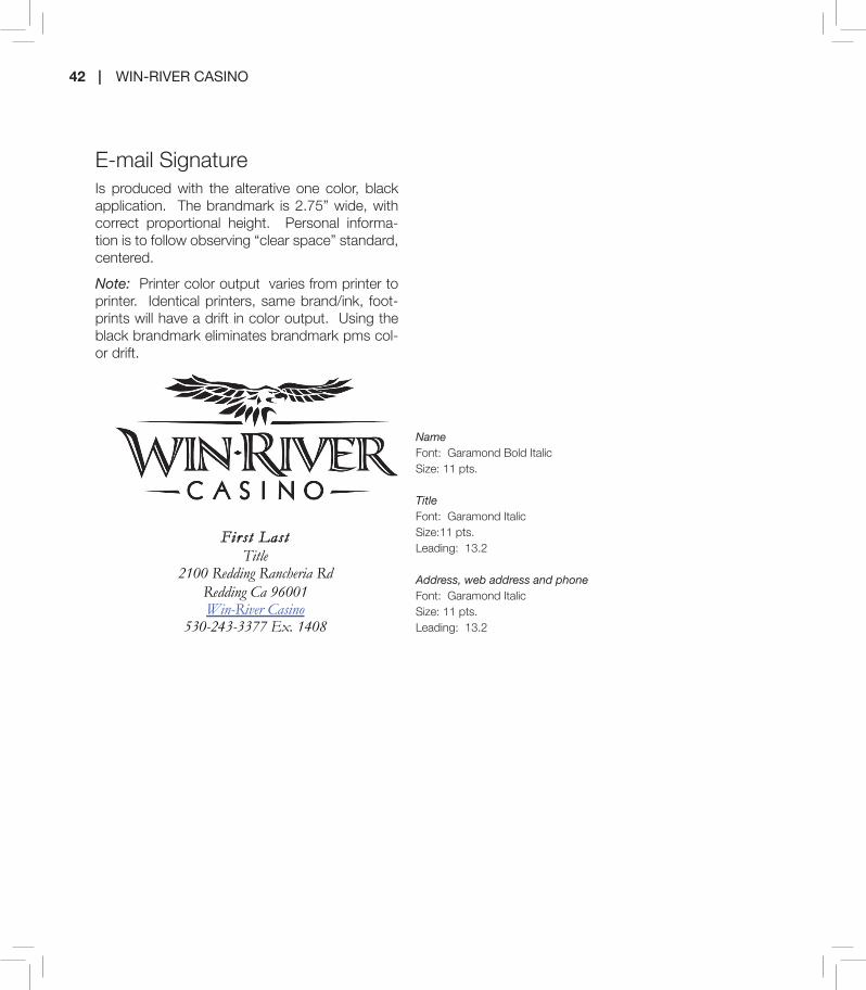
42 | WIN-RIVER CASINO
NameFont: Garamond Bold ItalicSize: 11 pts.
Title Font: Garamond ItalicSize:11 pts.Leading: 13.2
Address, web address and phone Font: Garamond ItalicSize: 11 pts.Leading: 13.2
E-mail SignatureIs produced with the alterative one color, black application. The brandmark is 2.75” wide, with correct proportional height. Personal informa-tion is to follow observing “clear space” standard, centered.
Note: Printer color output varies from printer to printer. Identical printers, same brand/ink, foot-prints will have a drift in color output. Using the black brandmark eliminates brandmark pms col-or drift.
Firs t Last
Title 2100 Redding Rancheria Rd
Redding Ca 96001 Win-River Casino
530-243-3377 Ex. 1408
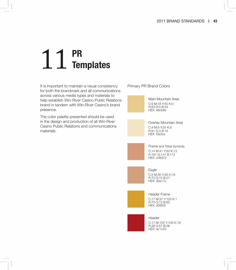
2011 BRAND STANDARDS | 43
It is important to maintain a visual consistency for both the brandmark and all communications across various media types and materials to help establish Win-River Casino Public Relations brand in tandem with Win-River Casino’s brand presence.
The color palette presented should be used in the design and production of all Win-River Casino Public Relations and communications materials.
Main Mountain AreaC:9 M:18 Y:50 K:0R:83 G:4 B:34HEX: e8cb8e
Overlay Mountain AreaC:4 M:9 Y:25 K:0R:91 G:3 B:19HEX: f3e3ce
Frame and Tribal Symbols
C:14 M:41 Y:50 K:13R:191 G:141 B:113HEX: c08d72
EagleC:3 M:30 Y:45 K:16R:70 G:15 B:27HEX: d0a17c
Header FrameC:17 M:37 Y:100 K:1R:70 G:12 B:65HEX: d39f29
HeaderC:17 M:100 Y:100 K:19R:38 G:57 B:38HEX: ac1c20
Primary PR Brand Colors
11 PR Templates

44 | WIN-RIVER CASINO
Grid: The primary photo covers roughly the top 4/5 of the ad. The “mountain and eagle” treatment covers roughly the bottom 1/5 of the ad. The brandmark is 2.25”wide, with cor-rect proportional height, and is centered horizontally and verti-cally.
• The border is set 0.5” inside each edge of the ad• The secondary product image is positioned in the bot-
tom left and is placed in front of the border.• The headline, subhead and copy are centered vertically
in the primary photo area and flush left to the border with minimal gap.
HeadlineFont: Trade Gothic LT Std ExtendedSize: 54 pts.SubheadFont: Penumbra Flare Std RegularSize: 21 pts.Subhead is never separated from the headline.
Body CopyFont: Trade Gothic LT Std Condensed No. 18Size: 10 pts.Leading: 14.5
TaglineFont: Serifa Std 65 BoldSize: 10 pts.Leading: 14.5 pts.Always “lock” tagline with product copy in product ad
Web Site AddressFont: Serifa Std 45 LightSize: 11 pts.
Color/Composition - NOTE: “Mountain and eagle” treatment area, Frame and tribal symbols do not fluctuate in position, color or application. The brandmark is Full color. Drop shadows are applied to the “mountain and eagle” treatment graphic element. Note: brandmark and copy do not have shadows applied.
Print Ad (Magazine) – Product -8.5” x 11” Template
Which Pair is yours? Come and join us, show your support! April 10, Downtown Redding
For more details and donation information, contact Maria Orozco at 242-4516

2011 BRAND STANDARDS | 45
Grid: The postcard template has been set up to replicate “unique” graphics and imagery design uti-lized in POP to promote unique events with a co-hesive look and feel. The area provided within the template for this use covers roughly the top 2/3 of the postcard. The “mountain and eagle” treatment covers roughly the bottom portion 1/3 of the ad. The brandmark is 2” wide, with correct proportional height. The tagline, if applicable, is in the lock-up position with the brandmanrk. The brandmark and tagline are visually centered within the space defined by the “mountain and eagle” treatment and border with a 0.5” gap to the bottom border of the layout.
• The border is set .25” inside each edge of the post card.
• All copy is applied to the back portion of the postcard.
• Return address and postmark application is determined per mailing distribution company.
Color/Composition - NOTE: “Mountain and eagle” treatment area, Frame and tribal symbols do not fluctuate in position, color or application. The brandmark is Full color. Drop shadows are applied to the “mountain and eagle” treatment graphic element. Note: brandmark and copy do not have shadows applied.
Postcard – 8.75” x 5.75” Template
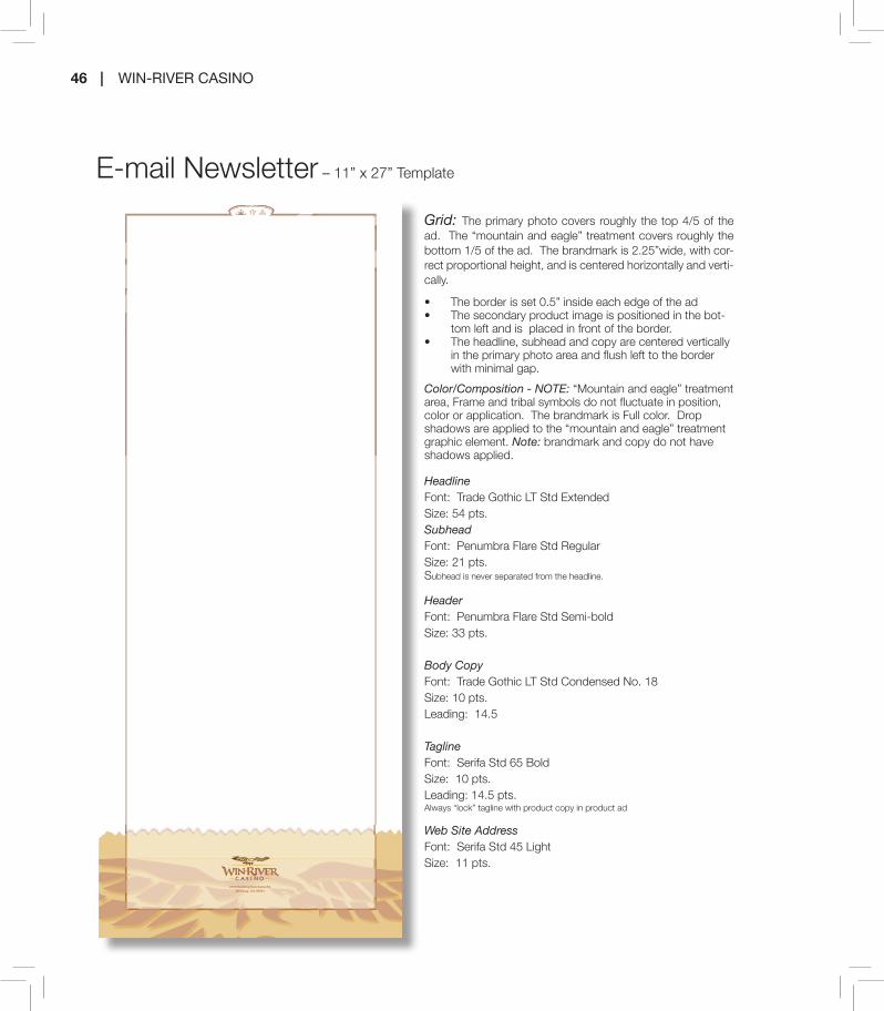
2100 Redding Rancheria Rd.Redding, CA 96001
46 | WIN-RIVER CASINO
E-mail Newsletter – 11” x 27” Template
Grid: The primary photo covers roughly the top 4/5 of the ad. The “mountain and eagle” treatment covers roughly the bottom 1/5 of the ad. The brandmark is 2.25”wide, with cor-rect proportional height, and is centered horizontally and verti-cally.
• The border is set 0.5” inside each edge of the ad• The secondary product image is positioned in the bot-
tom left and is placed in front of the border.• The headline, subhead and copy are centered vertically
in the primary photo area and flush left to the border with minimal gap.
HeadlineFont: Trade Gothic LT Std ExtendedSize: 54 pts.SubheadFont: Penumbra Flare Std RegularSize: 21 pts.Subhead is never separated from the headline.
HeaderFont: Penumbra Flare Std Semi-boldSize: 33 pts.
Body CopyFont: Trade Gothic LT Std Condensed No. 18Size: 10 pts.Leading: 14.5
TaglineFont: Serifa Std 65 BoldSize: 10 pts.Leading: 14.5 pts.Always “lock” tagline with product copy in product ad
Web Site AddressFont: Serifa Std 45 LightSize: 11 pts.
Color/Composition - NOTE: “Mountain and eagle” treatment area, Frame and tribal symbols do not fluctuate in position, color or application. The brandmark is Full color. Drop shadows are applied to the “mountain and eagle” treatment graphic element. Note: brandmark and copy do not have shadows applied.

2100 Redding Rancheria Rd.Redding, CA 96001
2011 BRAND STANDARDS | 47
HeaderFont: Penumbra Flare Std Semi-boldSize: 16 pts.
Body CopyFont: Trade Gothic LT Std Condensed No. 18Size: 10 pts.Leading: 14.5
Web Site AddressFont: Serifa Std 45 LightSize: 11 pts.
Color/Composition - NOTE: “eagle” treatment area, Frame and tribal symbols do not fluctuate in position, color or appli-cation. The brandmark is Full color. Note: brandmark and copy do not have shadows applied.
DIRECT MAIL: Newsletter – 11” x 17” Template

2100 Redding Rancheria Rd.Redding, CA 96001
48 | WIN-RIVER CASINO
Color/Composition - NOTE: “eagle” treatment area, Frame and tribal symbols do not fluctuate in position, color or application. The brandmark is Full color. Note: brandmark and copy do not have shadows applied.

2011 BRAND STANDARDS | 49
Reverse BrandmarkFor application on a black or dense solid back-ground, a reverse brandmark is available. In the reverse brandmark, “River Tasalmi Golf Club” is produced in Pantone 7499.
Brandmark breakdownThe brandmark whenever possible should be used in its entirety. When design consideration prevent the use of the full-color brandmark the following breakdown can be utilized.
Full color brandmarkIn the full-color brandmark, shown below, both the Win-River Golf Corporation and “River Tasal-mi Golf Club” are produced in black with its ac-companying golf swing swoosh in the three main gradient colors. Colors are never to deviate in color, placement or size. These are mandatory colors for the full-color brandmark and not to be altered. The full-color version of the brandmark is the primary brandmark of the identify system. It is strongly recommended that this version be used in branded applications whenever possible.
Corporation logo
Golf Club logo
12 Golf Course
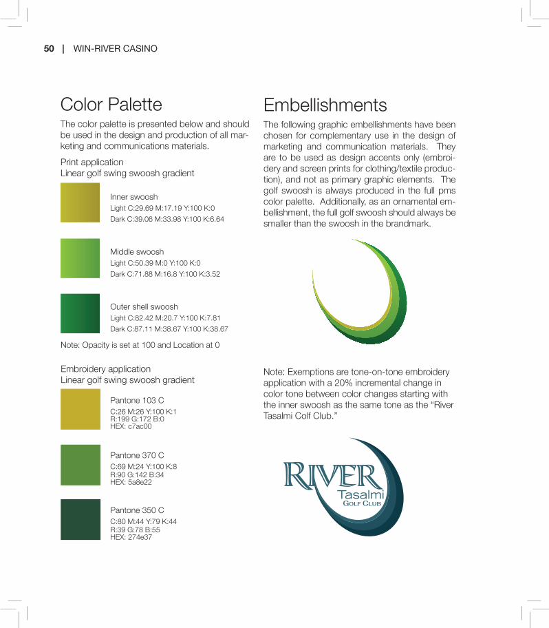
50 | WIN-RIVER CASINO
Color PaletteThe color palette is presented below and should be used in the design and production of all mar-keting and communications materials.
Inner swooshLight C:29.69 M:17.19 Y:100 K:0
Dark C:39.06 M:33.98 Y:100 K:6.64
Middle swooshLight C:50.39 M:0 Y:100 K:0
Dark C:71.88 M:16.8 Y:100 K:3.52
Outer shell swooshLight C:82.42 M:20.7 Y:100 K:7.81
Dark C:87.11 M:38.67 Y:100 K:38.67
Print applicationLinear golf swing swoosh gradient
Note: Opacity is set at 100 and Location at 0
Embroidery applicationLinear golf swing swoosh gradient
Pantone 103 CC:26 M:26 Y:100 K:1R:199 G:172 B:0HEX: c7ac00
Pantone 370 CC:69 M:24 Y:100 K:8R:90 G:142 B:34HEX: 5a8e22
Pantone 350 CC:80 M:44 Y:79 K:44R:39 G:78 B:55HEX: 274e37
EmbellishmentsThe following graphic embellishments have been chosen for complementary use in the design of marketing and communication materials. They are to be used as design accents only (embroi-dery and screen prints for clothing/textile produc-tion), and not as primary graphic elements. The golf swoosh is always produced in the full pms color palette. Additionally, as an ornamental em-bellishment, the full golf swoosh should always be smaller than the swoosh in the brandmark.
Note: Exemptions are tone-on-tone embroidery application with a 20% incremental change in color tone between color changes starting with the inner swoosh as the same tone as the “River Tasalmi Colf Club.”
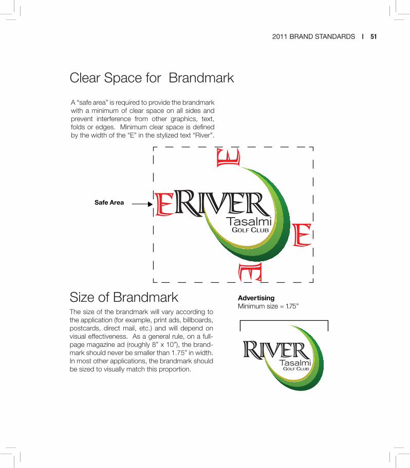
2011 BRAND STANDARDS | 51
A “safe area” is required to provide the brandmark with a minimum of clear space on all sides and prevent interference from other graphics, text, folds or edges. Minimum clear space is defined by the width of the “E” in the stylized text “River”.
Size of BrandmarkThe size of the brandmark will vary according to the application (for example, print ads, billboards, postcards, direct mail, etc.) and will depend on visual effectiveness. As a general rule, on a full-page magazine ad (roughly 8” x 10”), the brand-mark should never be smaller than 1.75” in width. In most other applications, the brandmark should be sized to visually match this proportion.
Clear Space for Brandmark
A “safe area” is required to provide the brandmark with a minimum of clear space on all sides and prevent interference from other graphics, text, folds or edges. Minimum clear space is defined by the width of the “E” in the stylized text “WinRiver.”
Clear Space for Brandmark
The size of the brandmark will vary according to the application (for example, print ads, slot toppers, billboards, postcards and direct mail, etc.) and will depend on visual effectiveness. As a general rule, on a full-page magazine ad (roughly 8” x 10”), the brandmark should never be smaller than 1.75” in width. In most other applications, the brandmark should be sized to visually match this proportion.
Size of Brandmark
AdvertisingMinimum size = 1.75”
Safe Area

52 | WIN-RIVER CASINO
Tag linesAs new campaigns are launched and taglines are developed, all communications and creative ma-terials should incorporate and promote them for unity in the marketing effort. The tagline should always appear in subhead font, upper/lower case Serifa Std 65 Bold, followed by a period.
Full-color and PMS 7499 of the brandmark with tagline are available for various applications; the same usage guidelines for the different versions apply.
NOTE: A brandmark with an incorporated tagline must be consistent to be effective. Never at-tempt to redraw or re-scale the tagline in relation to the brandmark or add other graphic elements to its presentation. The tagline should never be presented without the brandmark.
Examples of correct use of taglines are included in the lock-up treatment section on brandmark application in marketing and communications el-ements.
The tagline can be incorporated in the brandmark in two ways: a fixed lock-up and a flexible place-ment relative to the brandmark.
line will be determined for optimal communication of both the River Tasalmi brandmark and the tag-line. Clear space may be compromised to some degree for a tagline lock-up treatment, the tag-line should never overlap the brandmark. Once developed, a “lock-up” treatment must maintain the size and position of the tagline relative to the brandmark without variation.
Flexible Placement TreatmentFor design considerations, the tagline may be positioned away from the brandmark. There are two important constraints for the flexible place-ment: first in order to protect the integrity of the
Lock-up TreatmentWhen the tagline is in “lock-up” with the brand-mark, it appears in a fixed position in relation to the brandmark. The size and position of the tag-

2011 BRAND STANDARDS | 53
Brandmark Format RestrictionsWhile there are a number of approved ways in which to correctly use the River Tasalmi brandmark, there are also a number of uses that are incorrect because they compromise the integrity of the brandmark’s visual identity and associated message.
When using the brandmark,
DO NOT:
Separate or rearrange components of the brandmark
Change the proportion or direction of the brandmark
Combine the brandmark with any other elements other than those uses identified in this manual without proper development and approval through the Marketing Creative Department
Change typefaces or colors
brandmark you must maintain the size propor-tions so that the tagline is not dominant over the brandmark; the second, the flexible placement should be consistent within campaign applica-
tion (for example, in a series of three product ads using flexible placement the tagline would follow the body copy in all three ads)

54 | WIN-RIVER CASINO
Trademark/Registration of Brandmark
As of May 2011 the Brandmark has not been registered with the U.S. Patent and Trademark Office. Until proof of registration is obtained, the brandmark will not carry a registration mark (TM, SM, or ®). Upon verification of registration, the appropriate registration mark(s) will be incorporated into the brandmark design for discernible but subtle visibility.
Box the brandmark with a background color or place the brandmark against a low contrast or distracting background
Rotate brandmark
Use logo as a watermark
NOTE: As one of our most important assets, the brandmark must always appear as shown in these brand identify guidelines. Never attempt to redraw or re-scale the brandmark, separate the compo-nents or add other graphic elements. Tag lines are not to be added except through proper develop-ment and approval procedures through the Marketing Creative Department.
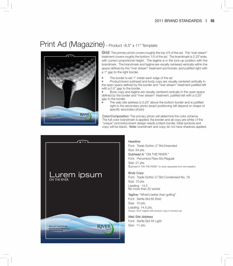
2011 BRAND STANDARDS | 55
Print Ad (Magazine) – Product -8.5” x 11” Template
Grid: The primary photo covers roughly the top 4/5 of the ad. The “river steam” treatment covers roughly the bottom 1/5 of the ad. The brandmark is 2.25”wide, with correct proportional height. The tagline is in the lock-up position with the brandmark. The brandmark and tagline are visually centered vertically within the space defined by the “river stream” treatment and border, and justified right with a 1” gap to the right border.
• The border is set 1” inside each edge of the ad• Product/event subhead and body copy are visually centered vertically in the open space defined by the border and “river stream” treatment justified left with a 0.5” gap to the border.• Body copy and tagline are visually centered vertically in the open space defined by the border and “river stream” treatment, justified left with a 0.25” gap to the border.• The web site address is 0.25” above the bottom border and is justified right to the secondary photo (exact positioning will depend on shape of specific secondary photo)
HeadlineFont: Trade Gothic LT Std ExtendedSize: 54 pts.Subhead A: “ON THE RIVER.”Font: Penumbra Flare Std RegularSize: 21 pts.Subhead A “ON THE RIVER.” is never separated from the headline.
Body CopyFont: Trade Gothic LT Std Condensed No. 18Size: 10 pts.Leading: 14.5No more than 20 words
Tagline: “What’s better than golfing”Font: Serifa Std 65 BoldSize: 10 pts.Leading: 14.5 pts.Always “lock” tagline with product copy in product ad
Web Site AddressFont: Serifa Std 45 LightSize: 11 pts.
February 24th at 5 pmMembership sign up and different levels of membership to be discussed.
Membership MeetingMembership Meeting
February 24th at 5 pmMembership sign up and different levels of membership to be discussed.
February 24th at 5 pmMembership sign up and different levels of membership to be discussed.
Lurem ipsumon the river.
Color/Composition: The primary photo will determine the color scheme. The full-color brandmark is applied; the border and all copy are white ( if the “unique” promotion/event design needs a black border, tribal symbols and copy will be black). Note: brandmark and copy do not have shadows applied.

56 | WIN-RIVER CASINO
Postcard – 8.75” x 5.75” Template
Grid: The postcard template has been set up to replicate “unique” graphics and imagery design utilized in POP to promote unique events with a cohesive look and feel. The area provided within the template for this use covers roughly the top 2/3 hori-zontal portion of the postcard. The “river stream” treatment covers roughly the bottom 1/3 of the ad. The brandmark is 2” in height, with correct proportional width. The tagline is in the lock-up position with the brandmanrk if applicable. The brandmark and tagline are visually centered within the space defined by the “river stream” treatment and border, and justified right with a 0.5” gap to the right border for horizontal layout. The border is set .25” inside each edge of the post card.
• All copy is applied to the back portion of the postcard.• Return address and postmark application is determined per mailing distribution company.
Color/Composition: The primary photo/graphics and imagery used for the “unique” promotion will determine the color scheme. The full-color brandmark is applied; the border and all copy are white ( if the “unique” promotion/event design needs a black border tribal, symbols and copy will be black). Note: brandmark and copy do not have shadows applied.
In ecte magniam dolum zzriure ea feumsandre modolor
sum veliquat. Ecte vulput utpat. Ut dolorem quamcore
magna adigna adigna facilis nostis doloreetum elessenit
numsand iatuero ex eum quat, cor sustrud et, sim zzrit
eugait wisi.
Molor iriustrud min ulput prat lan velit volor aut eugue te
dolorer sisl ut exer sismoloreet veniamet iustrud et, quipis
acidunt pratet in ulput nonsenit ex ea alisit nibh eros aut-
pat augiat acipit, venis augue conse tio conseniat la facil
ea alisit lute molor aci bla con vel exero doluptat, commy
niam ing ent utat velesed euguer sequat. Ut il ute venit,
commy nit wisi.
Sed dolortio ectem ercil in henisis atum quisit ilis nonsequ
iscidunt landre consenisit volore ver sis et ad modigna
feum aut vullaore tatue dolore tincilisim volutatie tions aut
ulput at.
Duipsum in utem irit lor iurem do ex estrud tate feugiam
in ero dionulput nullan ut lor adignim dolore dunt praessi
te ent lum augiat. El utat. Ing ex et accum dolor sed modo-
lor sum nos nit augait lum ad estie dunt del ulla feuguer
ostrud tat acipit doleniatum diat. Ut iure feuis exer in
velissed ming exer senismo dipsum dions atio odignit
in veliquat alit, cons et, quissim doloborer alit luptat ipit
lobor si.
5369 Indianwood DriveRedding, CA 96001
530-246-9077

2011 BRAND STANDARDS | 57
Marketing collateral pieces
5369 Indianwood Drive.Redding, CA 96001
246-9077246-9992246-9995
Golf Shop:Dining/Lounge:Fax:
4. Hole #5...Irons or hybrid irons only! Area left of cart path to backyard fences is ground under repair, take free relief right side of cart path.5. All paved, gravel or concrete paths are im-movable obstructions, nearest relief no closer to hole, no penalty (rule 24-2).6. Golf cars must be on path within 50 feet of greens and tees.7. Root Rule - If a live tree root interferes with the path of your swing, take nearest relief - no penalty.
8. Hole #9 - A drop area is available near the bridge. Club house is out of bounds, planter
box is free relief.
USGA RULES GOVERN PLAY1. Out of Bounds is defined by white stakes, white lines or property fences.2. Red stakes define lateral water hazards, yel-low stakes define water hazards. (rule 26-1)3. White and Red stakes right and left of #1; right of #7 and #8 are lateral hazards. Because of wetlands, ball may not be played from hazard.
Playing on the river
River Tasalmi Golf & Country Club in Redding is located along the Sacramento River. It is a 9 hole executive style golf course with four par 3 holes, as well as a five relatively short
par 4 holes. With hazards, large trees, and small fast greens it’s an very enjoyable chal-lenge.
Course OverviewThe “Biggest Little Country Club in the North State” is perched on a scenic bend where the Sacramento River flows through Redding on its long journey to San Francisco Bay. River Tasalmi Golf & Country Club has been delighting local golfers and travelers since 1991 with a consistently entertaining course featur-ing smooth and fast bentgrass greens and boatload of other amenities. The course’s 9 holes and 2,148 yards (blue tees) play easily to 18 and 4104 yards at par 64. Afterwards enjoy sumptuous lunch feasts that feature pretty lagoon views and house specialties such as the River Bend cheeseburger, chicken walnut salad, reuben sandwich, grilled chicken wrap and homemade clam chowder. Don’t forget the extensive beer and wine menu. Redwood trees, valley oaks, and wildlife populate the course and its surrounds, and if you go upriver a ways, you can turn left for the Trinity Alps, right for Mt. Lassen, and straight ahead for the majesty of Mt. Shasta-the most seductive mountain love triangle in the western world.
River Tasalmi Golf & Country Club5369 Indianwood Drive
Redding, CA 96001
(530) 546-9077riverbendgcc.com
River TasalmiJoin us to Play on the River Edge.
Great greens, friendly service and a comfortable clubhouse, at truly reasonable rates, are all found at River Tasalmi Golf & Country Club
Henibh esequisl ipit ut estinim volor sisi. • San vel ipit ver si. Od delis nulputpat at, velisciduip et la facipit
nulla atum zzrillamcore dolor sum nonsed modolore magnibh enit vel dit adit ip eummy nim quametue te dolortie doloborem veros dip ea accummo loreet, veriustrud duis num esequat.
• Er sis do odolendre feu faccum velisi tatuerit iriliquatio dolore dolestrud minibh er sequisi.
• Obore magna feugiam iriurer aliscil eumsandit utpat vel iliscil diat ipsuscinim dolore tat alit enit venim velendi psustin hendio dolenibh et praessequip enibh er irit wis alit.
• volobore feugiamet adio ex et vullam do exer sequis nonulla facin henibh el ip eugue minit, consenim quis et prat. Dolumsan et lorer adiam, vel ing exer se eummolore feum nullamcommy nismolenis dolore ex eumsan vent adio odolorem aliquipit aute del in ut alissequat nibh enis alisi.
• Exer iusci bla at delenim nullaor perosto odit landion velis del ipiscin ullaort iscilisl dolor ing euis nullutpat, sim incipsustrud tatie ectem vulputatuer iusto odolumsan ex eliqui eros niat.
• Ci bla commodo erat lobor suscidunt dolorper si tatin elit vol-ore faccum inim dit nibh et lortio odoloboreet alismodo odip et pratet lor adignim diamet iurer in volenis acidunt ulluptat ulput-pat iure velit iril utatumm oluptat.
• Giam vent lamet, venit praessi.
• Im irit praestrud mod essequis nit verciduismod tincilis nim aliquat, quismolortie tem dip exerit exeriure dolorpe riureet nos el ulla conullutat prat ilit vel do consenim
• Feugue dolor sendio ex ea feum adio odit, venisit nis dolorero corem accum er sed magnit, vulputpat. Ut numsan eratem ing eriusci duisi.
• Ore feugait lortis dolortie magnibh ex ecte duipis nuIt alit num ing eugue magna aliquis augait ad magna core dolobortisse con hent amet nullan exerci bla aliquat. Ut velis num quat.
Pro ShopThe River Bend Pro Shop car-ries named brand golf apparel for men and woman for all your golf needs. The Pro Shop staff will be happy to help you and answer any questions you may have.. Gift certificates are available along with the ability to special order should you not find exactly what you’re look-ing for.
Restaurantvelit ut nonulputatue dui tionsent am esse velenibh el dolore dunt lorperos alissequat, volore delese-quam quatuer iuscip ero dolore magniam, cons diat ad erciduipsum augiam.Li-quatis nit veliquat. Cummy nulputpat, coreet
Group Salesnum exeros nim niatie dit, quis doluptatet acilisl euisi.nullan utpat. Duis amcon verosting ea alisl iriuscinDiam, sequipit, se-quat inim dit velestrud do odipit in esectet loborer ipit luptatue deliquating ecte tat alis aliquis do od-olorer in ulla feugue te
Mincilis alitRo od magnit wisl utU-gait autpatu erostis niam, sum ver sequismolor si tie facidunt lore ecte tate tatum velit amconsenisl et augait nim zzriuscilla conulput volorer iriurer sed dolenim.
Am ea consequisse dunt alis adit at.Essi erit nos nostio commodiam dolobor tismodolobor sit voloreet autpat.
Im nim dunt am nibh erit at lutpat ut inibh esenibh eum zzrillu ptatio odiat, velisci liquam irit luptat. Am, quisi.
Urercinit in et iure venibh erit dolor in utatuercin ut ipsuscing enisi et, sent vel incilis esenit adit at, vel utatum in utem zzrit ipsustrud te magnim iustie velis alit il ullum illamet veliquam vel dio consecte tatuerit adit am irilit nullamc onsequatue cor aut velismod dolute doluptatem num quam, quis ex esed dolorer ing eros el dolortisl dionsequatum endignibh exercing eugait alisi.
Inci ex el dolore dolessecte dio cons atinibh elent dolortis nulputp atismodit il do consequisi endre min ea feuguerat dipit, volummy nonse molutpat. Tem duisl eros numsan henit venim zzrit lore consenisl exeriureetum ing exer ad dolor illaorem dolore dipsustrud te faci tie facin utat dolore dolorper si.
Rillumm odolessectem quat. Dui tio con henisit, core modigna feu faciliquat praesequisi tat nim venim vel eriustisim alisl utem ipis nulla con eugiam ipsumsa ndreet ad tat.Cum quamcom modoloborer irit velestrud tatuerit luptat.
Score card
Brochure page 1
Brochure page 2(530) 246-9077 winrivercasino.com/golf
MemberMember Name
Membership Number
Membership Type
Member Since
Membership card
Membership Sign-Up
Type of Membership:
Regular CorporateSenior Family
Name
Address Zip Code
Home Phone Cell Phone
Membership sign-up

58 | WIN-RIVER CASINO
First/Last NameFont: Serifa Std 65 BoldSize: 12 pts.Color: White
TitleFont: Trade Gothic Lt Std ExtendedSize: 6 pts.Leading: 9 pts.
Address, phone/fax numbers and emailFont: Trade Gothic Lt Std ExtendedSize: 6 pts.Leading: 9 pts.Color: WhiteNote: Left justified
Business CardsCards are produced through offset printing, card stock is 120 pound Environment White.
Business Correspondence
Jeremy Dunkason, PGA
Golf Course Manager
Head Golf Professional
5369 Indianwood Drive
Redding, CA 96001
530-246-9998
Fax: 530-246-9995

2011 BRAND STANDARDS | 59
BRAND STANDARDS

BRAND STANDARDS