The Connected Scatterplot for Presenting Paired Time Series Steve Haroz, Robert Kosara, and Steven L. Franconeri Abstract—The connected scatterplot visualizes two related time series in a scatterplot and connects the points with a line in temporal sequence. News media are increasingly using this technique to present data under the intuition that it is understandable and engaging. To explore these intuitions, we (1) describe how paired time series relationships appear in a connected scatterplot, (2) qualitatively evaluate how well people understand trends depicted in this format, (3) quantitatively measure the types and frequency of misinter pretations, and (4) empirically evaluate whether viewers will preferentially view graphs in this format over the more traditional format. The results suggest that low-complexity connected scatterplots can be understood with little explanation, and that viewers are biased towards inspecting connected scatterplots over the more traditional format. We also describe misinterpretations of connected scatterplots and propose further research into mitigating these mistakes for viewers unfamiliar with the technique. Ç 1 INTRODUCTION D ATA visualizations can be used for both exploration and presentation, but journalists are primarily inter- ested in the latter. For presenting paired time series, news media have recently begun using a technique called the Connected Scatterplot (CS) shown in Fig. 1. One of the first uses of this technique in news graphics was Oil’s Roller Coaster Ride by Amanda Cox for The New York Times in Feb- ruary 2008 [1] (Fig. 2). Since that article was published, over a dozen other instances of connected scatterplots have appeared, with the number of uses increasing dramatically in 2013 and 2014. Table 1 lists the majority of these charts that have appeared in the news media. Although the CS may be new to journalists and their audience, similar charts have been used for hundreds of years to explore time series data—the development of this style of plot even coincided with some of the earliest data graphing by William Playfair. One of the first examples, a physical device called a steam indicator, was developed by John Southern in the 1790s (though often credited to James Watt [2]). It drew the cycle of a steam piston over time, graphing piston position against steam pressure to show the timing of the movement, valves opening and closing, and total power output (the area within the curve). In 1958, another connected scatterplot depicted a part of a economic labor model [3], graphing the unemployment rate against the rate of job openings. Known as the Beveridge Curve, Philips curve, or Unemployment-Vacancy rate (UV) curve [4], the shape of this plot can act as an indicator for the state of an economy. Because the technique has been used for centuries as an analysis tool and has experienced a surge in recent years as a means for communicating data, we were surprised to find minimal testing of the technique’s clarity. Although Robertson et al. [5] explored ways of reducing clutter for multiple simultaneous connected scatterplots, we found no experimental evidence that compared comprehension of a connected scatterplot with other static representa- tions. We therefore began with an informal survey of four journalists working for major U.S. news organizations (both daily newspapers and magazines) to learn why they believed the technique to be useful, and these conversa- tions inspired a set of four experiments designed to evalu- ate their intuitions. Here we explain the construction and idiosyncrasies of the connected scatterplot, discuss four experiments, and present a set of conclusions, guidelines, and open questions. 2 THE CONNECTED SCATTERPLOT TECHNIQUE We conducted informal interviews with journalists who produce data visualizations. All of the journalists said that the Connected Scatterplot was novel to them, and most likely to their readers, before they used it. In his book, Alberto Cairo even called it a most uncommon kind of scatter- plot [23]. Furthermore, none had heard of the Beveridge Curve, as the the first journalistic use of the technique was inspired by a paper about oil markets [24]. The CS technique depicts two simultaneous time series. A traditional way to plot these datasets would be a dual- axis line graph (DALC), which typically maps the time dimension to the horizontal axis and the series’ values onto the vertical axis (Fig. 1). The CS, however, maps two values onto a 2D Cartesian plane, with one time series being repre- sented on the horizontal axis, the other on the vertical (visi- ble as different colors in Fig. 1). A line is drawn to connect the points in temporal order. Note that the common time sampling, and the line that represents its progression, could in theory be replaced with any other strictly monotonically increasing dimension. S. Haroz and S.L. Franconeri are with the Psychology Department, North- western University, Evanston, IL. E-mail: [email protected], [email protected]. R. Kosara is with the Tableau Research, Seattle, WA. E-mail: [email protected]. Manuscript received 18 June 2015; revised 18 Oct. 2015; accepted 22 Oct. 2015. Date of publication 20 Nov. 2015; date of current version 3 Aug. 2016. Recommended for acceptance by J. Heer. For information on obtaining reprints of this article, please send e-mail to: [email protected], and reference the Digital Object Identifier below. Digital Object Identifier no. 10.1109/TVCG.2015.2502587 2174 IEEE TRANSACTIONS ON VISUALIZATION AND COMPUTER GRAPHICS, VOL. 22, NO. 9, SEPTEMBER 2016 1077-2626 ß 2015 IEEE. Personal use is permitted, but republication/redistribution requires IEEE permission. See http://www.ieee.org/publications_standards/publications/rights/index.html for more information.
Transcript
The Connected Scatterplot for PresentingPaired Time Series
Steve Haroz, Robert Kosara, and Steven L. Franconeri
Abstract—The connected scatterplot visualizes two related time series in a scatterplot and connects the points with a line in temporal
sequence. News media are increasingly using this technique to present data under the intuition that it is understandable and engaging.
To explore these intuitions, we (1) describe how paired time series relationships appear in a connected scatterplot, (2) qualitatively
evaluate how well people understand trends depicted in this format, (3) quantitatively measure the types and frequency of misinter
pretations, and (4) empirically evaluate whether viewers will preferentially view graphs in this format over the more traditional format.
The results suggest that low-complexity connected scatterplots can be understood with little explanation, and that viewers are biased
towards inspecting connected scatterplots over the more traditional format. We also describe misinterpretations of connected
scatterplots and propose further research into mitigating these mistakes for viewers unfamiliar with the technique.
Ç
1 INTRODUCTION
DATA visualizations can be used for both explorationand presentation, but journalists are primarily inter-
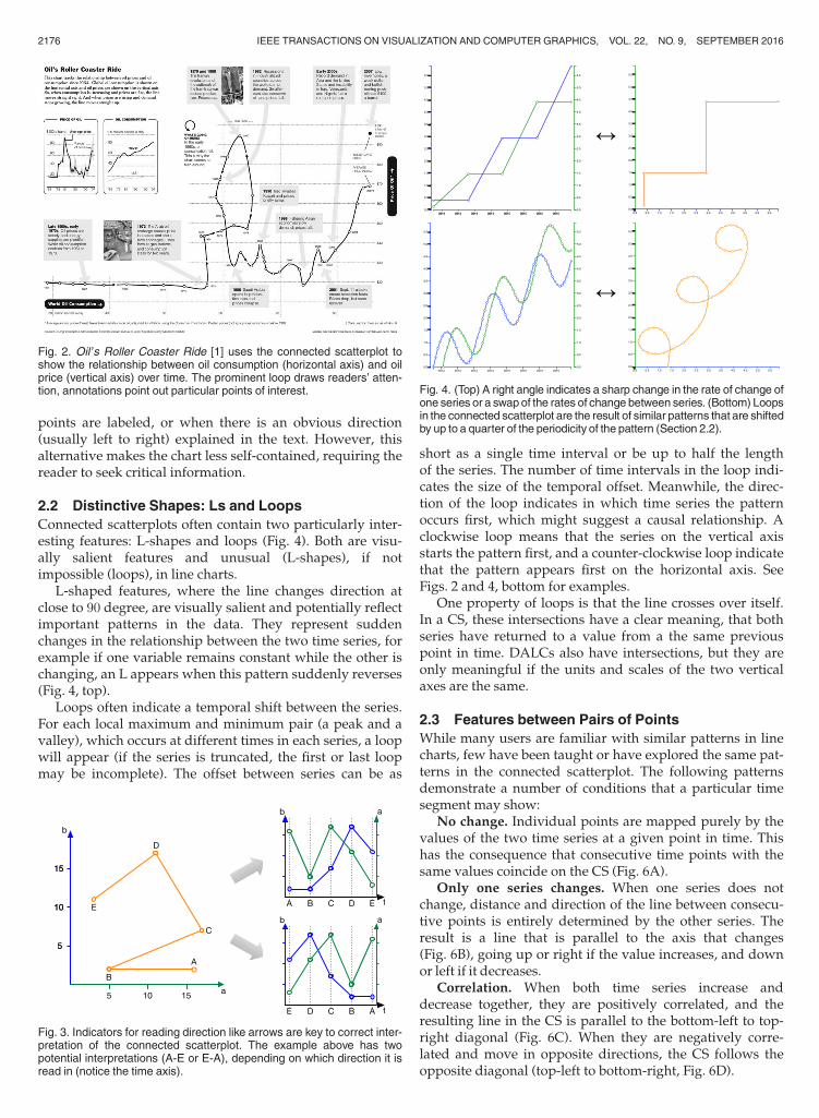
ested in the latter. For presenting paired time series, newsmedia have recently begun using a technique called theConnected Scatterplot (CS) shown in Fig. 1. One of the firstuses of this technique in news graphics was Oil’s RollerCoaster Ride by Amanda Cox for The New York Times in Feb-ruary 2008 [1] (Fig. 2). Since that article was published, overa dozen other instances of connected scatterplots haveappeared, with the number of uses increasing dramaticallyin 2013 and 2014. Table 1 lists the majority of these chartsthat have appeared in the news media.
Although the CS may be new to journalists and theiraudience, similar charts have been used for hundreds ofyears to explore time series data—the development of thisstyle of plot even coincided with some of the earliest datagraphing by William Playfair. One of the first examples, aphysical device called a steam indicator, was developed byJohn Southern in the 1790s (though often credited to JamesWatt [2]). It drew the cycle of a steam piston over time,graphing piston position against steam pressure to showthe timing of the movement, valves opening and closing,and total power output (the area within the curve). In 1958,another connected scatterplot depicted a part of a economiclabor model [3], graphing the unemployment rate againstthe rate of job openings. Known as the Beveridge Curve,Philips curve, or Unemployment-Vacancy rate (UV) curve[4], the shape of this plot can act as an indicator for the stateof an economy.
Because the technique has been used for centuries as ananalysis tool and has experienced a surge in recent yearsas a means for communicating data, we were surprised tofind minimal testing of the technique’s clarity. AlthoughRobertson et al. [5] explored ways of reducing clutter formultiple simultaneous connected scatterplots, we foundno experimental evidence that compared comprehensionof a connected scatterplot with other static representa-tions. We therefore began with an informal survey of fourjournalists working for major U.S. news organizations(both daily newspapers and magazines) to learn why theybelieved the technique to be useful, and these conversa-tions inspired a set of four experiments designed to evalu-ate their intuitions. Here we explain the construction andidiosyncrasies of the connected scatterplot, discuss fourexperiments, and present a set of conclusions, guidelines,and open questions.
2 THE CONNECTED SCATTERPLOT TECHNIQUE
We conducted informal interviews with journalists whoproduce data visualizations. All of the journalists said thatthe Connected Scatterplot was novel to them, and mostlikely to their readers, before they used it. In his book,Alberto Cairo even called it a most uncommon kind of scatter-plot [23]. Furthermore, none had heard of the BeveridgeCurve, as the the first journalistic use of the technique wasinspired by a paper about oil markets [24].
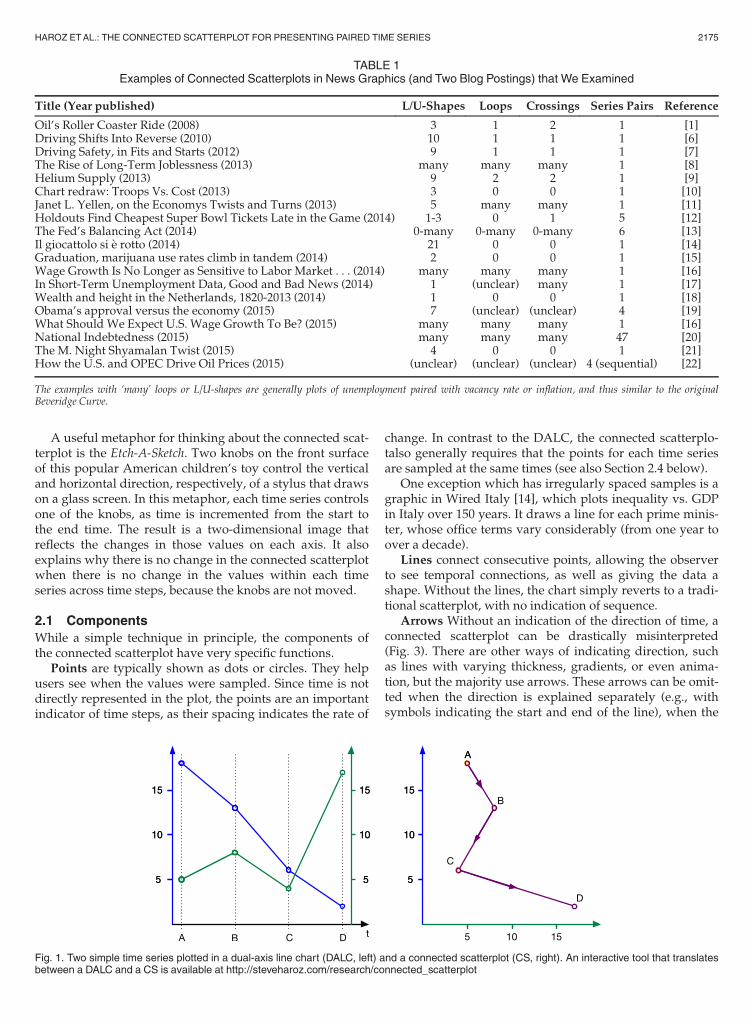
The CS technique depicts two simultaneous time series.A traditional way to plot these datasets would be a dual-axis line graph (DALC), which typically maps the timedimension to the horizontal axis and the series’ values ontothe vertical axis (Fig. 1). The CS, however, maps two valuesonto a 2D Cartesian plane, with one time series being repre-sented on the horizontal axis, the other on the vertical (visi-ble as different colors in Fig. 1). A line is drawn to connectthe points in temporal order. Note that the common timesampling, and the line that represents its progression, couldin theory be replaced with any other strictly monotonicallyincreasing dimension.
� S. Haroz and S.L. Franconeri are with the Psychology Department, North-western University, Evanston, IL.E-mail: [email protected], [email protected].
� R. Kosara is with the Tableau Research, Seattle, WA.E-mail: [email protected].
Manuscript received 18 June 2015; revised 18 Oct. 2015; accepted 22 Oct.2015. Date of publication 20 Nov. 2015; date of current version 3 Aug. 2016.Recommended for acceptance by J. Heer.For information on obtaining reprints of this article, please send e-mail to:[email protected], and reference the Digital Object Identifier below.Digital Object Identifier no. 10.1109/TVCG.2015.2502587
2174 IEEE TRANSACTIONS ON VISUALIZATION AND COMPUTER GRAPHICS, VOL. 22, NO. 9, SEPTEMBER 2016
1077-2626� 2015 IEEE. Personal use is permitted, but republication/redistribution requires IEEE permission.See http://www.ieee.org/publications_standards/publications/rights/index.html for more information.
A useful metaphor for thinking about the connected scat-terplot is the Etch-A-Sketch. Two knobs on the front surfaceof this popular American children’s toy control the verticaland horizontal direction, respectively, of a stylus that drawson a glass screen. In this metaphor, each time series controlsone of the knobs, as time is incremented from the start tothe end time. The result is a two-dimensional image thatreflects the changes in those values on each axis. It alsoexplains why there is no change in the connected scatterplotwhen there is no change in the values within each timeseries across time steps, because the knobs are not moved.
2.1 Components
While a simple technique in principle, the components ofthe connected scatterplot have very specific functions.
Points are typically shown as dots or circles. They helpusers see when the values were sampled. Since time is notdirectly represented in the plot, the points are an importantindicator of time steps, as their spacing indicates the rate of
change. In contrast to the DALC, the connected scatterplo-talso generally requires that the points for each time seriesare sampled at the same times (see also Section 2.4 below).
One exception which has irregularly spaced samples is agraphic in Wired Italy [14], which plots inequality vs. GDPin Italy over 150 years. It draws a line for each prime minis-ter, whose office terms vary considerably (from one year toover a decade).
Lines connect consecutive points, allowing the observerto see temporal connections, as well as giving the data ashape. Without the lines, the chart simply reverts to a tradi-tional scatterplot, with no indication of sequence.
Arrows Without an indication of the direction of time, aconnected scatterplot can be drastically misinterpreted(Fig. 3). There are other ways of indicating direction, suchas lines with varying thickness, gradients, or even anima-tion, but the majority use arrows. These arrows can be omit-ted when the direction is explained separately (e.g., withsymbols indicating the start and end of the line), when the
TABLE 1Examples of Connected Scatterplots in News Graphics (and Two Blog Postings) that We Examined
Title (Year published) L/U-Shapes Loops Crossings Series Pairs Reference
Oil’s Roller Coaster Ride (2008) 3 1 2 1 [1]Driving Shifts Into Reverse (2010) 10 1 1 1 [6]Driving Safety, in Fits and Starts (2012) 9 1 1 1 [7]The Rise of Long-Term Joblessness (2013) many many many 1 [8]Helium Supply (2013) 9 2 2 1 [9]Chart redraw: Troops Vs. Cost (2013) 3 0 0 1 [10]Janet L. Yellen, on the Economys Twists and Turns (2013) 5 many many 1 [11]Holdouts Find Cheapest Super Bowl Tickets Late in the Game (2014) 1-3 0 1 5 [12]The Fed’s Balancing Act (2014) 0-many 0-many 0-many 6 [13]Il giocattolo si �e rotto (2014) 21 0 0 1 [14]Graduation, marijuana use rates climb in tandem (2014) 2 0 0 1 [15]Wage Growth Is No Longer as Sensitive to Labor Market . . . (2014) many many many 1 [16]In Short-Term Unemployment Data, Good and Bad News (2014) 1 (unclear) many 1 [17]Wealth and height in the Netherlands, 1820-2013 (2014) 1 0 0 1 [18]Obama’s approval versus the economy (2015) 7 (unclear) (unclear) 4 [19]What Should We Expect U.S. Wage Growth To Be? (2015) many many many 1 [16]National Indebtedness (2015) many many many 47 [20]The M. Night Shyamalan Twist (2015) 4 0 0 1 [21]How the U.S. and OPEC Drive Oil Prices (2015) (unclear) (unclear) (unclear) 4 (sequential) [22]
The examples with ‘many’ loops or L/U-shapes are generally plots of unemployment paired with vacancy rate or inflation, and thus similar to the originalBeveridge Curve.
Fig. 1. Two simple time series plotted in a dual-axis line chart (DALC, left) and a connected scatterplot (CS, right). An interactive tool that translatesbetween a DALC and a CS is available at http://steveharoz.com/research/connected_scatterplot
HAROZ ETAL.: THE CONNECTED SCATTERPLOT FOR PRESENTING PAIRED TIME SERIES 2175
points are labeled, or when there is an obvious direction(usually left to right) explained in the text. However, thisalternative makes the chart less self-contained, requiring thereader to seek critical information.
2.2 Distinctive Shapes: Ls and Loops
Connected scatterplots often contain two particularly inter-esting features: L-shapes and loops (Fig. 4). Both are visu-ally salient features and unusual (L-shapes), if notimpossible (loops), in line charts.
L-shaped features, where the line changes direction atclose to 90 degree, are visually salient and potentially reflectimportant patterns in the data. They represent suddenchanges in the relationship between the two time series, forexample if one variable remains constant while the other ischanging, an L appears when this pattern suddenly reverses(Fig. 4, top).
Loops often indicate a temporal shift between the series.For each local maximum and minimum pair (a peak and avalley), which occurs at different times in each series, a loopwill appear (if the series is truncated, the first or last loopmay be incomplete). The offset between series can be as
short as a single time interval or be up to half the lengthof the series. The number of time intervals in the loop indi-cates the size of the temporal offset. Meanwhile, the direc-tion of the loop indicates in which time series the patternoccurs first, which might suggest a causal relationship. Aclockwise loop means that the series on the vertical axisstarts the pattern first, and a counter-clockwise loop indicatethat the pattern appears first on the horizontal axis. SeeFigs. 2 and 4, bottom for examples.
One property of loops is that the line crosses over itself.In a CS, these intersections have a clear meaning, that bothseries have returned to a value from a the same previouspoint in time. DALCs also have intersections, but they areonly meaningful if the units and scales of the two verticalaxes are the same.
2.3 Features between Pairs of Points
While many users are familiar with similar patterns in linecharts, few have been taught or have explored the same pat-terns in the connected scatterplot. The following patternsdemonstrate a number of conditions that a particular timesegment may show:
No change. Individual points are mapped purely by thevalues of the two time series at a given point in time. Thishas the consequence that consecutive time points with thesame values coincide on the CS (Fig. 6A).
Only one series changes. When one series does notchange, distance and direction of the line between consecu-tive points is entirely determined by the other series. Theresult is a line that is parallel to the axis that changes(Fig. 6B), going up or right if the value increases, and downor left if it decreases.
Correlation. When both time series increase anddecrease together, they are positively correlated, and theresulting line in the CS is parallel to the bottom-left to top-right diagonal (Fig. 6C). When they are negatively corre-lated and move in opposite directions, the CS follows theopposite diagonal (top-left to bottom-right, Fig. 6D).
Fig. 3. Indicators for reading direction like arrows are key to correct inter-pretation of the connected scatterplot. The example above has twopotential interpretations (A-E or E-A), depending on which direction it isread in (notice the time axis).
Fig. 2. Oil’s Roller Coaster Ride [1] uses the connected scatterplot toshow the relationship between oil consumption (horizontal axis) and oilprice (vertical axis) over time. The prominent loop draws readers’ atten-tion, annotations point out particular points of interest. Fig. 4. (Top) A right angle indicates a sharp change in the rate of change of
one series or a swapof the rates of change between series. (Bottom) Loopsin the connected scatterplot are the result of similar patterns that are shiftedby up to a quarter of the periodicity of the pattern (Section 2.2).
2176 IEEE TRANSACTIONS ON VISUALIZATION AND COMPUTER GRAPHICS, VOL. 22, NO. 9, SEPTEMBER 2016
Directions. Which time series is changing more quickly,and the sign of those changes, determines the angle of theline segment. Eight regions around the origin (illustrated in
Fig. 5) correspond to the various relationships between thetime series.
2.4 Limitations
A connected scatterplot of two time series can only bedrawn when the points in time at which they are sampledare the same, or largely the same. This is similar to the scat-terplot, which can only be drawn for data sets that share acriterion that identifies values on different dimensions asbelonging to the same point. This does not present a prob-lem in most journalism scenarios, because their data is typi-cally reported at certain fixed intervals (monthly, quarterly,etc.), such that points always coincide in time (though theremay be gaps). If the series don’t have the same sampling,the data can be interpolated and resampled before beingvisualized.
Another limitation is that the CS can create extremelycomplex shapes that can be impossible to read. This hasbeen an issue in some studies that have looked at similartechniques (such as Robertson et al.’s work on gapminder [5]and Rind et al.’s TimeRider [25]). Since we are interested inpresentation, we find this to be less problematic. A journal-ist will try the technique on data and then decide if the
Fig. 6. A sampling of cases showing the same values in dual-axis line charts and connected scatterplots.
Fig. 5. Line direction as a function of the difference in value between thetwo time steps in each series. Da indicates the difference on the horizon-tal axis, Db the difference on the vertical axis.
HAROZ ETAL.: THE CONNECTED SCATTERPLOT FOR PRESENTING PAIRED TIME SERIES 2177
resulting graph is sufficiently interesting, readable, etc. forpublication. If not, other options are available, such as thedual-axis line chart or small multiples.
3 STUDY 1A: QUALITATIVELY UNDERSTANDING
THE CS
Due to the lack of familiarity with the technique among thegeneral population, the journalists that we interviewed pre-sumed that readers would look closer at the charts, howevernone expected people to be able to immediately understandthem. Connected Scatterplots violate many of the usualcharting conventions people are accustomed to, such as shift-ing the representation of time onto the line connecting thedots and using the x-axis to represent one of the variables.Nevertheless, the journalists believed that despite initial dif-ficulties, connected scatterplots should be understandablewith only a small amount of instruction, which could beaided by annotations.
Study 1 tested how this less familiar formatmight affect theability of a set of participants (college students) to understandand interpret the underlying data. It consisted of two relatedparts, one that asked participants to explain what they wereseeing, and one that had them predict what either a CS orDALC would show given certain patterns. We describe thetwo parts of this study separately in this section and the next.
3.1 Materials and Procedure
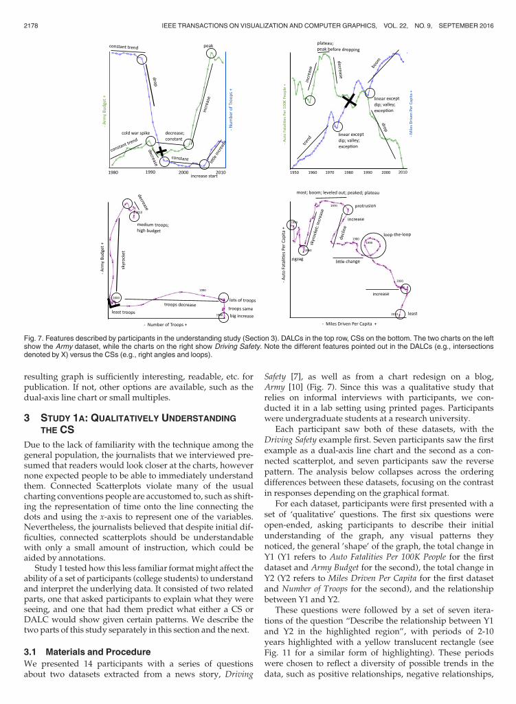
We presented 14 participants with a series of questionsabout two datasets extracted from a news story, Driving
Safety [7], as well as from a chart redesign on a blog,Army [10] (Fig. 7). Since this was a qualitative study thatrelies on informal interviews with participants, we con-ducted it in a lab setting using printed pages. Participantswere undergraduate students at a research university.
Each participant saw both of these datasets, with theDriving Safety example first. Seven participants saw the firstexample as a dual-axis line chart and the second as a con-nected scatterplot, and seven participants saw the reversepattern. The analysis below collapses across the orderingdifferences between these datasets, focusing on the contrastin responses depending on the graphical format.
For each dataset, participants were first presented with aset of ‘qualitative’ questions. The first six questions wereopen-ended, asking participants to describe their initialunderstanding of the graph, any visual patterns theynoticed, the general ’shape’ of the graph, the total change inY1 (Y1 refers to Auto Fatalities Per 100K People for the firstdataset and Army Budget for the second), the total change inY2 (Y2 refers to Miles Driven Per Capita for the first datasetand Number of Troops for the second), and the relationshipbetween Y1 and Y2.
These questions were followed by a set of seven itera-tions of the question “Describe the relationship between Y1and Y2 in the highlighted region”, with periods of 2-10years highlighted with a yellow translucent rectangle (seeFig. 11 for a similar form of highlighting). These periodswere chosen to reflect a diversity of possible trends in thedata, such as positive relationships, negative relationships,
Fig. 7. Features described by participants in the understanding study (Section 3). DALCs in the top row, CSs on the bottom. The two charts on the leftshow the Army dataset, while the charts on the right show Driving Safety. Note the different features pointed out in the DALCs (e.g., intersectionsdenoted by X) versus the CSs (e.g., right angles and loops).
2178 IEEE TRANSACTIONS ON VISUALIZATION AND COMPUTER GRAPHICS, VOL. 22, NO. 9, SEPTEMBER 2016
and change in one variable but not the other. For the last ofthese questions in the Driving Safety example, and the lasttwo from the Army example, the question was replacedwith a more contextualized version, e.g., “American carsget bigger, faster, and more deadly, all the while becomingmore popular. Does the highlighted region reflect this state-ment?” The participant should respond “Yes” to this if thechosen region contained both an increase in fatalities and anincrease in miles driven per capita. One contextual questionin the Driving Safety dataset was later determined to havemultiple possible answers, and was removed from theanalysis.
The complete experiment (including both this part andthe one described in the next section) lasted approximately35 minutes, and the responses of each participant were tran-scribed by the experimenter or the participant. Subjectswere paid $10 for their participation.
3.2 Results
Questions. Despite the novelty of the connected scatterplotformat, our set of college students performed at near-ceilingaccuracy in their open-ended descriptions for both charttypes. When asked to describe their understanding of thegraph, note visual patterns, total changes in one measure, orthe relation between the two measures, participantresponses reflected a high ability to determine relativeincreases and decreases separately for each measure. Whilethe level of detail and added context (e.g., relevant historicalevents) varied greatly, a typical response to the question of“what is your initial understanding?” was “The amount ofmiles driven by people has dramatically increased, autofatalities has decreased.”
For the questions of type “Describe the relationshipbetween Y1 and Y2 in the highlighted region”, participantsdid make a handful of errors (3 total), and all were for con-nected scatterplots. Two of these errors seem to reflect inap-propriate reliance on data interpretation habits learned frommore traditional graph formats. One participant noted thatthe segment of the Driving Safety data from the 1990’s (a linesloping downward and to the right) was “the reverse” of the1960’s (a line sloping upward and to the right) across bothmeasures, even though the reversal was only for the fatalitiesmeasure, not the miles driven measure. In a traditional graphwith time on the x-axis, this inference would have been validfor such a mirror flip across the horizontal meridian. But in aconnected scatterplot, reverses on both measures requires a180-degree rotation of line orientation. Another error wasfound in a highlighted section around 1990 in the Army data-set. The participant noted that “The number of troops and thedefense budget were both very minimal,” even though thenumber of troops was relatively high. This error may alsoreflect a habit of drawing inferences primarily from y-values(which were minimal in this case), but not x-values (whichwere not in this case). A third error was found in a participantobservation that “auto fatalities significantly decreased” inthe 1960’s, when they actually increased. This error mayreflect an accidental flip of the polarity of the y-axis.
Descriptions. The way that data is depicted in a graphcan drastically impact which patterns participants noticeand the types of conclusions that they draw [26]. To evalu-ate such differences across the two graphical formats, we
examined the types of descriptions produced by partici-pants. Fig. 7 depicts typical parts of each graph formatpicked out by participants, along with key phrases used todescribe those parts.
Participants noted several salient visual features of eachgraph format, particularly for the questions that explicitlyasked about visual patterns and the shape of the graph.Many participants commented that the graphs for theDALC examples both had a global X-shape (an intersec-tion), and that the lines for each measure would at times“converge” and “diverge.” For the CS format, participantsfrequently noted the L-shape in the Army example, with oneparticipant noting, “Right angle? Weird graph”. Partici-pants noted two other features of the connected scatterplotformat that they found to be particularly unusual. In theDriving Safety example, which contained a loop in thegraph, participant responses (separated by semicolons)included “I don’t know what’s going on with the loop-the-loop there; I notice a loop . . . I’ve never seen that before . . . Idon’t know how that reads . . . it is confusing; quite erratic,it crosses itself at one point which is uncommon; erratic.” Inthe Army example, where time runs from right to left acrossthe first half of the graph, participant responses included,“The graph goes from right to left when plotting time; It isnot really a line graph because the times are not chronologi-cal; It is going reverse chronologically.”
A post-hoc review of the verbal descriptions suggeststhat these differences in visual format have the potential tolead participants to different conclusions. For example,there were trends toward differences among the types ofmetaphors used by participants for subsets of data [27].DALC formats produced many descriptions related tomountainous terrain, with data patterns going downhill; fall-ing off; mountain ranges with a high peak; peak (3), plateau (2),steep rate or drops (5), uphill, valley with two cliffs, while CSformats only had five examples of such terms. CS formats,in contrast, have relatively more examples of superlativedescriptions of trends, due primarily to the strong horizon-tal and vertical lines in the Army example: huge/sharpincrease/leap (4), roller-coaster, skyrockets (3), stagnant (2),steadiness, takes a turn (at the L-junction).
Another post-hoc examination revealed a consistent dif-ference in the use of terminology related to correlation.DALC formats produced terms such as converging, diverg-ing (2), correlated (2), direct relationship (2), directly propor-tional (2), exact opposite, inverse proportional, inverserelationship (5), inversely proportionate, inversely related, nega-tive exponential, negatively correlated (4), opposing/oppositetrends (5) far more often than the mere handful of suchterms mentioned for CS formats: direct relationship, inverserelationship, close to a linear relationship.
3.3 Discussion
In summary, both DALC and CS formats allowed high per-formance on objective measures of understanding in ourcollege student population. The CS format produced twomistakes among the qualitative questions, where partici-pants appeared to have relied inappropriately on conven-tions from the better-known DALC format: (1) that oppositetrends tend to reflect across a horizontal meridian, unlikethe 180 degree rotations in a CS, and (2) a low value on the
HAROZ ETAL.: THE CONNECTED SCATTERPLOT FOR PRESENTING PAIRED TIME SERIES 2179
y-axis does not mean that all values are low—a CS readermust also inspect the x-axis value.
Qualitative responses showed that participants foundloops and possible right-to-left ordering to be a surprisingand salient feature in the CS format, with the loop provokingsubstantial uncertainty across participants. There was agreater prevalence of mountainous metaphors for DALC for-mats, and a greater prevalence of strong descriptions(‘skyrockets’) of long linear sequences in the CS format (pri-marily from the Army example). The strongest trend was theextreme difference in the use of correlational language.Although this analysis was post-hoc, the strong trend—28examples for the DALC format, and only three for the CS for-mat—warrants further evaluation. The long-term experiencethat participants have with DALC formats may cue them torecognize familiar patterns—parallel lines suggest a positivecorrelation, while an X-shape suggests a negative correla-tion [26]. CS formats are not likely to have these associationsbetween correlation types, and particular diagonal orienta-tions of a single line—and such associations are a core require-ment for complex thinking [28], [29]. Without learning theseassociations, CS readers may have more difficulty in drawingmore sophisticated inferences from the presented data.
4 STUDY 1B: FROM WORDS TO LINES
In the second part of Study 1, participants had to translatequalitative statements about the data into a prediction ofthe next step in either a DALC or a CS.
4.1 Materials and Procedure
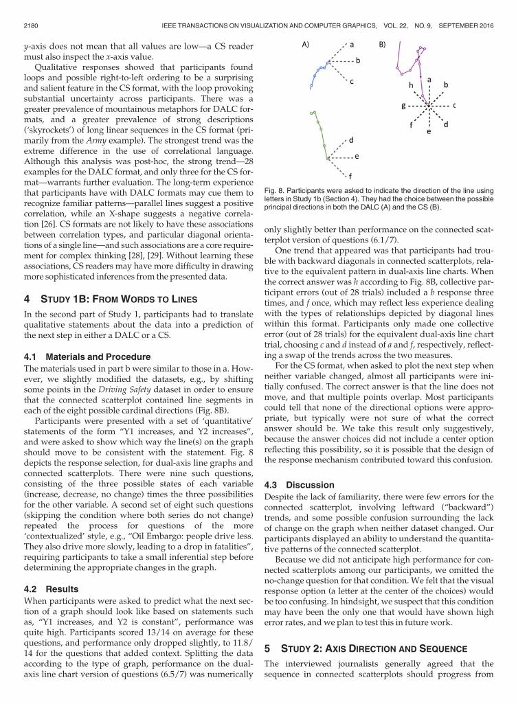
The materials used in part b were similar to those in a. How-ever, we slightly modified the datasets, e.g., by shiftingsome points in the Driving Safety dataset in order to ensurethat the connected scatterplot contained line segments ineach of the eight possible cardinal directions (Fig. 8B).
Participants were presented with a set of ‘quantitative’statements of the form “Y1 increases, and Y2 increases”,and were asked to show which way the line(s) on the graphshould move to be consistent with the statement. Fig. 8depicts the response selection, for dual-axis line graphs andconnected scatterplots. There were nine such questions,consisting of the three possible states of each variable(increase, decrease, no change) times the three possibilitiesfor the other variable. A second set of eight such questions(skipping the condition where both series do not change)repeated the process for questions of the more‘contextualized’ style, e.g., “Oil Embargo: people drive less.They also drive more slowly, leading to a drop in fatalities”,requiring participants to take a small inferential step beforedetermining the appropriate changes in the graph.
4.2 Results
When participants were asked to predict what the next sec-tion of a graph should look like based on statements suchas, “Y1 increases, and Y2 is constant”, performance wasquite high. Participants scored 13/14 on average for thesequestions, and performance only dropped slightly, to 11.8/14 for the questions that added context. Splitting the dataaccording to the type of graph, performance on the dual-axis line chart version of questions (6.5/7) was numerically
only slightly better than performance on the connected scat-terplot version of questions (6.1/7).
One trend that appeared was that participants had trou-ble with backward diagonals in connected scatterplots, rela-tive to the equivalent pattern in dual-axis line charts. Whenthe correct answer was h according to Fig. 8B, collective par-ticipant errors (out of 28 trials) included a b response threetimes, and f once, which may reflect less experience dealingwith the types of relationships depicted by diagonal lineswithin this format. Participants only made one collectiveerror (out of 28 trials) for the equivalent dual-axis line charttrial, choosing c and d instead of a and f, respectively, reflect-ing a swap of the trends across the two measures.
For the CS format, when asked to plot the next step whenneither variable changed, almost all participants were ini-tially confused. The correct answer is that the line does notmove, and that multiple points overlap. Most participantscould tell that none of the directional options were appro-priate, but typically were not sure of what the correctanswer should be. We take this result only suggestively,because the answer choices did not include a center optionreflecting this possibility, so it is possible that the design ofthe response mechanism contributed toward this confusion.
4.3 Discussion
Despite the lack of familiarity, there were few errors for theconnected scatterplot, involving leftward (“backward”)trends, and some possible confusion surrounding the lackof change on the graph when neither dataset changed. Ourparticipants displayed an ability to understand the quantita-tive patterns of the connected scatterplot.
Because we did not anticipate high performance for con-nected scatterplots among our participants, we omitted theno-change question for that condition. We felt that the visualresponse option (a letter at the center of the choices) wouldbe too confusing. In hindsight, we suspect that this conditionmay have been the only one that would have shown higherror rates, andwe plan to test this in future work.
5 STUDY 2: AXIS DIRECTION AND SEQUENCE
The interviewed journalists generally agreed that thesequence in connected scatterplots should progress from
Fig. 8. Participants were asked to indicate the direction of the line usingletters in Study 1b (Section 4). They had the choice between the possibleprincipal directions in both the DALC (A) and the CS (B).
2180 IEEE TRANSACTIONS ON VISUALIZATION AND COMPUTER GRAPHICS, VOL. 22, NO. 9, SEPTEMBER 2016
left to right, though that was considered much more impor-tant in print and other static graphics, compared to the web,where interaction and animation might help guide viewerstoward a non-conventional reading direction.
Most of our studied examples from the news mediaarrange variables across the axes such that the time linesflow generally in a left-to-right progression, but this is by nomeans necessary. The left-to-right progression is consistentwith literature that suggests that visual exploration tend tostart at the left before moving right [30], and is a dominantdirection for imagining a sequence unfolding over time [31],including in graphical representations. One root of suchbiases may be an individual’s learned reading direction [32],at least in the West.
This experiment aims to measure the potential direc-tional confusion by asking subjects to re-imagine how agraph in one format would look when translated to another.We asked a group of participants to take data depicted in aDALC and replot it as a CS, and vice versa. As a control con-dition, we also asked the participants to copy DALCs toDALCs and CSs to CSs to obtain a baseline level of error forreplotting a graph with known coordinates.
5.1 Materials and Procedure
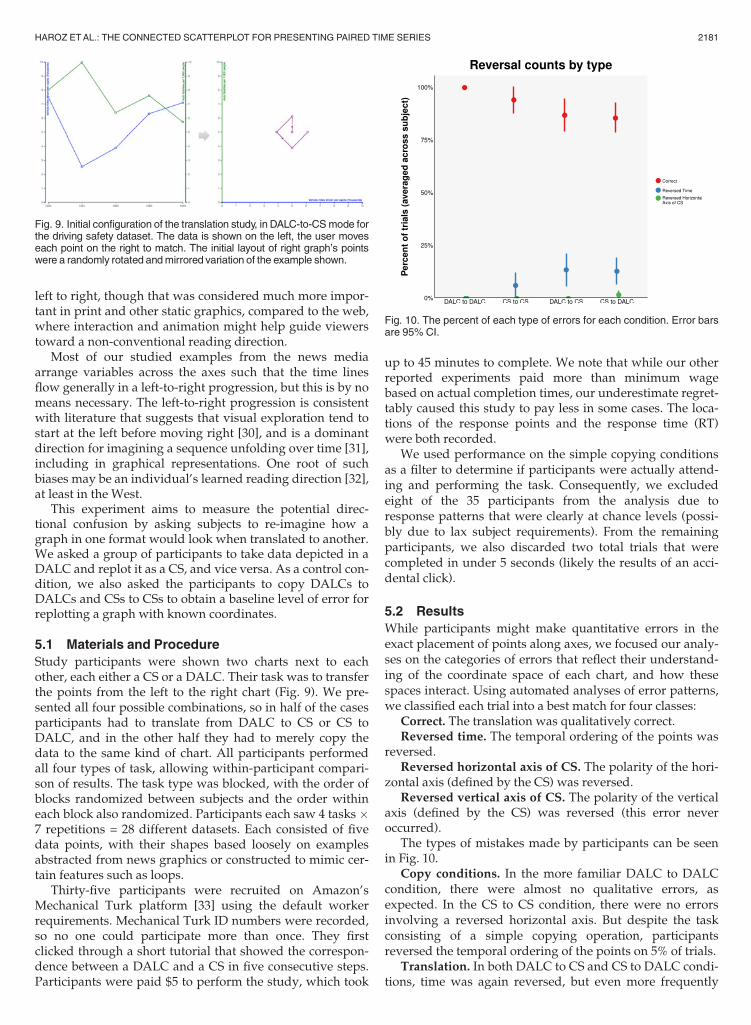
Study participants were shown two charts next to eachother, each either a CS or a DALC. Their task was to transferthe points from the left to the right chart (Fig. 9). We pre-sented all four possible combinations, so in half of the casesparticipants had to translate from DALC to CS or CS toDALC, and in the other half they had to merely copy thedata to the same kind of chart. All participants performedall four types of task, allowing within-participant compari-son of results. The task type was blocked, with the order ofblocks randomized between subjects and the order withineach block also randomized. Participants each saw 4 tasks �7 repetitions = 28 different datasets. Each consisted of fivedata points, with their shapes based loosely on examplesabstracted from news graphics or constructed to mimic cer-tain features such as loops.
Thirty-five participants were recruited on Amazon’sMechanical Turk platform [33] using the default workerrequirements. Mechanical Turk ID numbers were recorded,so no one could participate more than once. They firstclicked through a short tutorial that showed the correspon-dence between a DALC and a CS in five consecutive steps.Participants were paid $5 to perform the study, which took
up to 45 minutes to complete. We note that while our otherreported experiments paid more than minimum wagebased on actual completion times, our underestimate regret-tably caused this study to pay less in some cases. The loca-tions of the response points and the response time (RT)were both recorded.
We used performance on the simple copying conditionsas a filter to determine if participants were actually attend-ing and performing the task. Consequently, we excludedeight of the 35 participants from the analysis due toresponse patterns that were clearly at chance levels (possi-bly due to lax subject requirements). From the remainingparticipants, we also discarded two total trials that werecompleted in under 5 seconds (likely the results of an acci-dental click).
5.2 Results
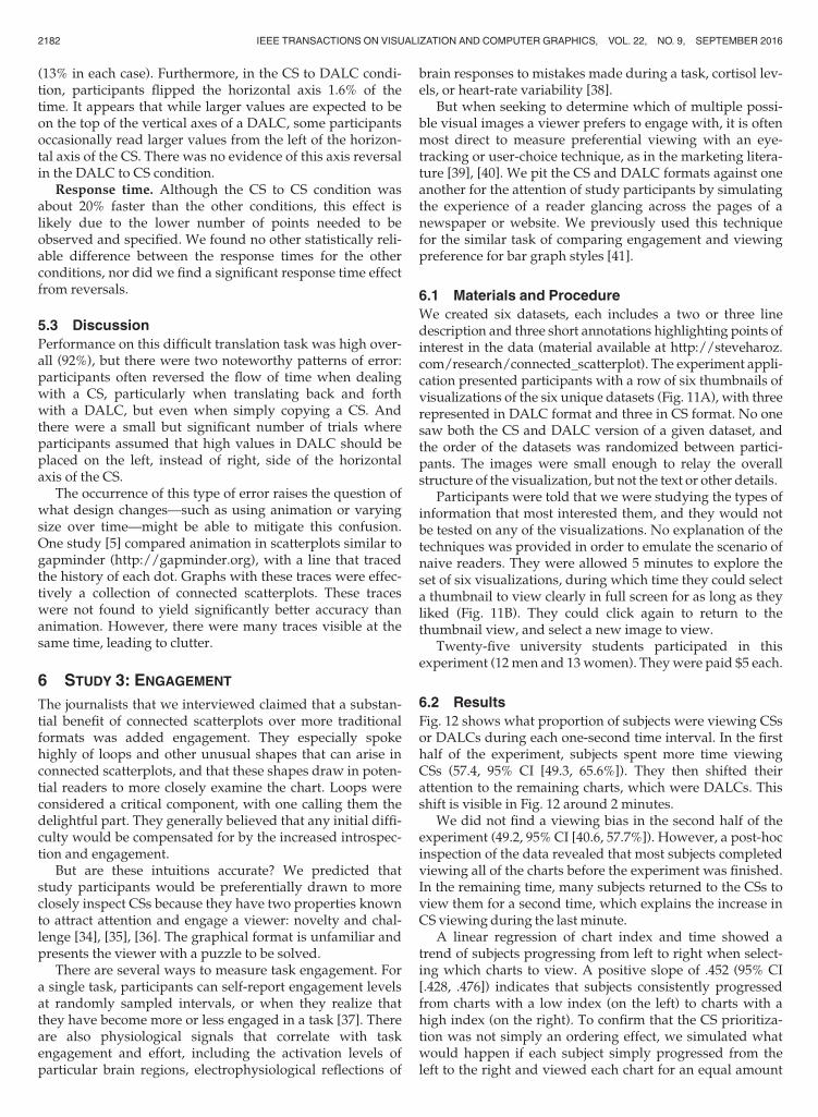
While participants might make quantitative errors in theexact placement of points along axes, we focused our analy-ses on the categories of errors that reflect their understand-ing of the coordinate space of each chart, and how thesespaces interact. Using automated analyses of error patterns,we classified each trial into a best match for four classes:
Correct. The translation was qualitatively correct.Reversed time. The temporal ordering of the points was
reversed.Reversed horizontal axis of CS. The polarity of the hori-
zontal axis (defined by the CS) was reversed.Reversed vertical axis of CS. The polarity of the vertical
axis (defined by the CS) was reversed (this error neveroccurred).
The types of mistakes made by participants can be seenin Fig. 10.
Copy conditions. In the more familiar DALC to DALCcondition, there were almost no qualitative errors, asexpected. In the CS to CS condition, there were no errorsinvolving a reversed horizontal axis. But despite the taskconsisting of a simple copying operation, participantsreversed the temporal ordering of the points on 5% of trials.
Translation. In both DALC to CS and CS to DALC condi-tions, time was again reversed, but even more frequently
Fig. 9. Initial configuration of the translation study, in DALC-to-CSmode forthe driving safety dataset. The data is shown on the left, the user moveseach point on the right to match. The initial layout of right graph’s pointswere a randomly rotated andmirrored variation of the example shown.
Fig. 10. The percent of each type of errors for each condition. Error barsare 95% CI.
HAROZ ETAL.: THE CONNECTED SCATTERPLOT FOR PRESENTING PAIRED TIME SERIES 2181
(13% in each case). Furthermore, in the CS to DALC condi-tion, participants flipped the horizontal axis 1.6% of thetime. It appears that while larger values are expected to beon the top of the vertical axes of a DALC, some participantsoccasionally read larger values from the left of the horizon-tal axis of the CS. There was no evidence of this axis reversalin the DALC to CS condition.
Response time. Although the CS to CS condition wasabout 20% faster than the other conditions, this effect islikely due to the lower number of points needed to beobserved and specified. We found no other statistically reli-able difference between the response times for the otherconditions, nor did we find a significant response time effectfrom reversals.
5.3 Discussion
Performance on this difficult translation task was high over-all (92%), but there were two noteworthy patterns of error:participants often reversed the flow of time when dealingwith a CS, particularly when translating back and forthwith a DALC, but even when simply copying a CS. Andthere were a small but significant number of trials whereparticipants assumed that high values in DALC should beplaced on the left, instead of right, side of the horizontalaxis of the CS.
The occurrence of this type of error raises the question ofwhat design changes—such as using animation or varyingsize over time—might be able to mitigate this confusion.One study [5] compared animation in scatterplots similar togapminder (http://gapminder.org), with a line that tracedthe history of each dot. Graphs with these traces were effec-tively a collection of connected scatterplots. These traceswere not found to yield significantly better accuracy thananimation. However, there were many traces visible at thesame time, leading to clutter.
6 STUDY 3: ENGAGEMENT
The journalists that we interviewed claimed that a substan-tial benefit of connected scatterplots over more traditionalformats was added engagement. They especially spokehighly of loops and other unusual shapes that can arise inconnected scatterplots, and that these shapes draw in poten-tial readers to more closely examine the chart. Loops wereconsidered a critical component, with one calling them thedelightful part. They generally believed that any initial diffi-culty would be compensated for by the increased introspec-tion and engagement.
But are these intuitions accurate? We predicted thatstudy participants would be preferentially drawn to moreclosely inspect CSs because they have two properties knownto attract attention and engage a viewer: novelty and chal-lenge [34], [35], [36]. The graphical format is unfamiliar andpresents the viewer with a puzzle to be solved.
There are several ways to measure task engagement. Fora single task, participants can self-report engagement levelsat randomly sampled intervals, or when they realize thatthey have become more or less engaged in a task [37]. Thereare also physiological signals that correlate with taskengagement and effort, including the activation levels ofparticular brain regions, electrophysiological reflections of
brain responses to mistakes made during a task, cortisol lev-els, or heart-rate variability [38].
But when seeking to determine which of multiple possi-ble visual images a viewer prefers to engage with, it is oftenmost direct to measure preferential viewing with an eye-tracking or user-choice technique, as in the marketing litera-ture [39], [40]. We pit the CS and DALC formats against oneanother for the attention of study participants by simulatingthe experience of a reader glancing across the pages of anewspaper or website. We previously used this techniquefor the similar task of comparing engagement and viewingpreference for bar graph styles [41].
6.1 Materials and Procedure
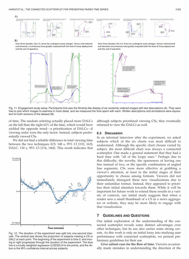
We created six datasets, each includes a two or three linedescription and three short annotations highlighting points ofinterest in the data (material available at http://steveharoz.com/research/connected_scatterplot). The experiment appli-cation presented participants with a row of six thumbnails ofvisualizations of the six unique datasets (Fig. 11A), with threerepresented in DALC format and three in CS format. No onesaw both the CS and DALC version of a given dataset, andthe order of the datasets was randomized between partici-pants. The images were small enough to relay the overallstructure of the visualization, but not the text or other details.
Participants were told that we were studying the types ofinformation that most interested them, and they would notbe tested on any of the visualizations. No explanation of thetechniques was provided in order to emulate the scenario ofnaive readers. They were allowed 5 minutes to explore theset of six visualizations, during which time they could selecta thumbnail to view clearly in full screen for as long as theyliked (Fig. 11B). They could click again to return to thethumbnail view, and select a new image to view.
Twenty-five university students participated in thisexperiment (12men and 13women). Theywere paid $5 each.
6.2 Results
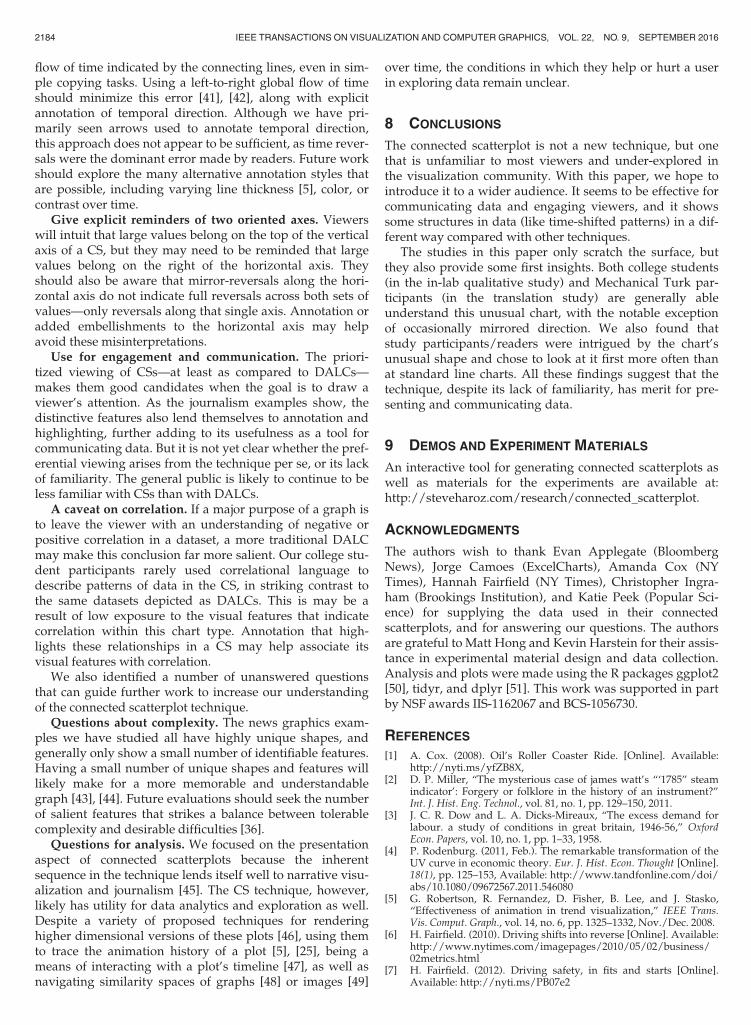
Fig. 12 shows what proportion of subjects were viewing CSsor DALCs during each one-second time interval. In the firsthalf of the experiment, subjects spent more time viewingCSs (57.4, 95% CI [49.3, 65.6%]). They then shifted theirattention to the remaining charts, which were DALCs. Thisshift is visible in Fig. 12 around 2 minutes.
We did not find a viewing bias in the second half of theexperiment (49.2, 95% CI [40.6, 57.7%]). However, a post-hocinspection of the data revealed that most subjects completedviewing all of the charts before the experiment was finished.In the remaining time, many subjects returned to the CSs toview them for a second time, which explains the increase inCS viewing during the last minute.
A linear regression of chart index and time showed atrend of subjects progressing from left to right when select-ing which charts to view. A positive slope of .452 (95% CI[.428, .476]) indicates that subjects consistently progressedfrom charts with a low index (on the left) to charts with ahigh index (on the right). To confirm that the CS prioritiza-tion was not simply an ordering effect, we simulated whatwould happen if each subject simply progressed from theleft to the right and viewed each chart for an equal amount
2182 IEEE TRANSACTIONS ON VISUALIZATION AND COMPUTER GRAPHICS, VOL. 22, NO. 9, SEPTEMBER 2016
of time. The random ordering actually placed more DALCson the left than the right 62% of the time, which would haveyielded the opposite trend—a prioritization of DALCs—ifviewing order were the only factor. Instead, subjects prefer-entially viewed CSs.
We did not find a reliable difference in total viewing timebetween the two techniques (CS: 148 s, 95% CI [132, 163];DALC: 130 s, 95% CI [114, 146]). This result indicates that
although subjects prioritized viewing CSs, they eventuallyreturned to view the DALCs as well.
6.3 Discussion
In an informal interview after the experiment, we askedsubjects which of the six charts was most difficult tounderstand. Although the specific chart chosen varied bysubject, the most difficult chart was always a connectedscatterplot. One made a general statement that they had ahard time with “all of the loopy ones.” Perhaps due tothis difficulty, the novelty, the sparseness of having oneline instead of two, or the specific combination of angledline segments, CSs were more effective at grabbing aviewer’s attention, at least in the initial stages of theiropportunity to choose among formats. Viewers did notimmediately disregard these new visualizations due totheir unfamiliar format. Instead, they appeared to priori-tize their initial attention towards them. While it will beimportant for future work to extend these results in a vari-ety of contexts, our initial study suggests that when areader sees a small thumbnail of a CS in a news aggrega-tor or website, they may be more likely to engage withthat visualization.
7 GUIDELINES AND QUESTIONS
Our initial exploration of the understanding of the con-nected scatterplot reveals some distinct advantages overother techniques, but its use also carries some strong cav-eats. As this work is only an initial foray into studying userperformance with connected scatterplots, we present pre-liminary guidelines for their use.
Give salient cues for the flow of time. Viewers occasion-ally made mistakes in understanding the direction of the
Fig. 11. Engagement study setup. Participants first saw the filmstrip-like display of six randomly ordered images with text descriptions (A). They werefree to pick which images to examine in more detail, and we measured the time spent with each. Written descriptions and annotations were equiva-lent for both versions of the dataset (B).
Fig. 12. The duration of the experiment was split into one-second inter-vals. The vertical axis shows the proportion of subjects viewing a CS orDALC at each point. The beginning of the experiment is time 0, and mov-ing to right progresses through the duration of the experiment. The blueline is a locally weighted regression (LOESS) fit to the points, and the rib-bon is the 95% confidence interval across subjects.
HAROZ ETAL.: THE CONNECTED SCATTERPLOT FOR PRESENTING PAIRED TIME SERIES 2183
flow of time indicated by the connecting lines, even in sim-ple copying tasks. Using a left-to-right global flow of timeshould minimize this error [41], [42], along with explicitannotation of temporal direction. Although we have pri-marily seen arrows used to annotate temporal direction,this approach does not appear to be sufficient, as time rever-sals were the dominant error made by readers. Future workshould explore the many alternative annotation styles thatare possible, including varying line thickness [5], color, orcontrast over time.
Give explicit reminders of two oriented axes. Viewerswill intuit that large values belong on the top of the verticalaxis of a CS, but they may need to be reminded that largevalues belong on the right of the horizontal axis. Theyshould also be aware that mirror-reversals along the hori-zontal axis do not indicate full reversals across both sets ofvalues—only reversals along that single axis. Annotation oradded embellishments to the horizontal axis may helpavoid these misinterpretations.
Use for engagement and communication. The priori-tized viewing of CSs—at least as compared to DALCs—makes them good candidates when the goal is to draw aviewer’s attention. As the journalism examples show, thedistinctive features also lend themselves to annotation andhighlighting, further adding to its usefulness as a tool forcommunicating data. But it is not yet clear whether the pref-erential viewing arises from the technique per se, or its lackof familiarity. The general public is likely to continue to beless familiar with CSs than with DALCs.
A caveat on correlation. If a major purpose of a graph isto leave the viewer with an understanding of negative orpositive correlation in a dataset, a more traditional DALCmay make this conclusion far more salient. Our college stu-dent participants rarely used correlational language todescribe patterns of data in the CS, in striking contrast tothe same datasets depicted as DALCs. This is may be aresult of low exposure to the visual features that indicatecorrelation within this chart type. Annotation that high-lights these relationships in a CS may help associate itsvisual features with correlation.
We also identified a number of unanswered questionsthat can guide further work to increase our understandingof the connected scatterplot technique.
Questions about complexity. The news graphics exam-ples we have studied all have highly unique shapes, andgenerally only show a small number of identifiable features.Having a small number of unique shapes and features willlikely make for a more memorable and understandablegraph [43], [44]. Future evaluations should seek the numberof salient features that strikes a balance between tolerablecomplexity and desirable difficulties [36].
Questions for analysis. We focused on the presentationaspect of connected scatterplots because the inherentsequence in the technique lends itself well to narrative visu-alization and journalism [45]. The CS technique, however,likely has utility for data analytics and exploration as well.Despite a variety of proposed techniques for renderinghigher dimensional versions of these plots [46], using themto trace the animation history of a plot [5], [25], being ameans of interacting with a plot’s timeline [47], as well asnavigating similarity spaces of graphs [48] or images [49]
over time, the conditions in which they help or hurt a userin exploring data remain unclear.
8 CONCLUSIONS
The connected scatterplot is not a new technique, but onethat is unfamiliar to most viewers and under-explored inthe visualization community. With this paper, we hope tointroduce it to a wider audience. It seems to be effective forcommunicating data and engaging viewers, and it showssome structures in data (like time-shifted patterns) in a dif-ferent way compared with other techniques.
The studies in this paper only scratch the surface, butthey also provide some first insights. Both college students(in the in-lab qualitative study) and Mechanical Turk par-ticipants (in the translation study) are generally ableunderstand this unusual chart, with the notable exceptionof occasionally mirrored direction. We also found thatstudy participants/readers were intrigued by the chart’sunusual shape and chose to look at it first more often thanat standard line charts. All these findings suggest that thetechnique, despite its lack of familiarity, has merit for pre-senting and communicating data.
9 DEMOS AND EXPERIMENT MATERIALS
An interactive tool for generating connected scatterplots aswell as materials for the experiments are available at:http://steveharoz.com/research/connected_scatterplot.
ACKNOWLEDGMENTS
The authors wish to thank Evan Applegate (BloombergNews), Jorge Camoes (ExcelCharts), Amanda Cox (NYTimes), Hannah Fairfield (NY Times), Christopher Ingra-ham (Brookings Institution), and Katie Peek (Popular Sci-ence) for supplying the data used in their connectedscatterplots, and for answering our questions. The authorsare grateful to Matt Hong and Kevin Harstein for their assis-tance in experimental material design and data collection.Analysis and plots were made using the R packages ggplot2[50], tidyr, and dplyr [51]. This work was supported in partby NSF awards IIS-1162067 and BCS-1056730.
REFERENCES
[1] A. Cox. (2008). Oil’s Roller Coaster Ride. [Online]. Available:http://nyti.ms/yfZB8X,
[2] D. P. Miller, “The mysterious case of james watt’s “‘1785” steamindicator’: Forgery or folklore in the history of an instrument?”Int. J. Hist. Eng. Technol., vol. 81, no. 1, pp. 129–150, 2011.
[3] J. C. R. Dow and L. A. Dicks-Mireaux, “The excess demand forlabour. a study of conditions in great britain, 1946-56,” OxfordEcon. Papers, vol. 10, no. 1, pp. 1–33, 1958.
[4] P. Rodenburg. (2011, Feb.). The remarkable transformation of theUV curve in economic theory. Eur. J. Hist. Econ. Thought [Online].18(1), pp. 125–153, Available: http://www.tandfonline.com/doi/abs/10.1080/09672567.2011.546080
[5] G. Robertson, R. Fernandez, D. Fisher, B. Lee, and J. Stasko,“Effectiveness of animation in trend visualization,” IEEE Trans.Vis. Comput. Graph., vol. 14, no. 6, pp. 1325–1332, Nov./Dec. 2008.
[6] H. Fairfield. (2010). Driving shifts into reverse [Online]. Available:http://www.nytimes.com/imagepages/2010/05/02/business/02metrics.html
[7] H. Fairfield. (2012). Driving safety, in fits and starts [Online].Available: http://nyti.ms/PB07e2
2184 IEEE TRANSACTIONS ON VISUALIZATION AND COMPUTER GRAPHICS, VOL. 22, NO. 9, SEPTEMBER 2016
[8] P. Coy, E. Applegate, and J. Daniel. (2013). The rise of Long-termjoblessness [Online]. Available: http://www.businessweek.com/articles/2013-02-07/the-rise-of-long-term-j oblessness
[9] K. Peek, “Helium supply,” Popular Sci., vol. 283, no. 2, p. 36, Aug.2013.
[10] J. Camoes. (2013). Chart redraw: Troops Vs. Cost (Time Magazine)[Online]. Available: http://www.excelcharts.com/blog/redraw-troops-vs-cost-time-magazine/
[11] T. Giratikanon and A. Parlapiano. (2013). Janet L. Yellen, on theeconomy’s twists and turns [Online]. Available: http://nyti.ms/19jPM2o
[12] A. Tribou, D. Ingold, and J. Diamond. (2014). Holdouts findcheapest super bowl tickets late in the game [Online]. Available:http://www.bloomberg.com/infographics/2014-01-16/tracking-super-bowl-ti cket-prices.html
[13] M. Murray and C. Szymanski. (2014). The Fed’s balancing act[Online]. Available: http://www.reuters.com/investigates/graphics/fed/
[14] D. Mancino. (2014). Il giocattolo si �e rotto [Online]. Available:http://www.wired.it/attualita/2014/06/18/nord-sud-150-anni-differenze-italiane/
[15] C. Ingraham. (2014). Graduation, marijuana use rates climb in tan-dem [Online]. Available: http://wapo.st/XNfDOe
[16] J. Wolfers. (2014). Wage growth is no longer as sensitive to labormarket conditions [Online]. Available: http://nyti.ms/1rThNrM
[17] S. Furth. (2014). In Short-term unemployment data, good and badnews [Online]. Available: http://on.wsj.com/1pPPwDl
[18] R. Olson. (2015). Wealth and height in the netherlands, 1820-2013[Online]. Available: http://www.randalolson.com/2014/06/23/why-the-dutch-are-so-tall/, 2015
[19] P. Bump. (2015). Obama’s approval versus the economy [Online].Available: http://wpo.st/d1_b0
[20] (2015). The Data Team at The Economist Daily chart: The tracks ofarrears [Online]. Available: http://econ.st/1Fguao4
[21] W. Hickey. (2015). The m. night shyamalan twist [Online]. Avail-able: http://53eig.ht/1i1jDon
[22] J. Ashkenas, A. Parlapiano, and H. Fairfield. (2015). How the u.s.and opec drive oil prices [Online]. Available: http://nyti.ms/1KNjS0t
[23] A. Cairo, The Functional Art. San Francisco, CA, USA: New RidersPress, 2012.
[24] D. Gately (1989). Do oil markets work? is OPEC dead? Annu. Rev.Energy [Online]. 14, pp. 95–116, Available: http://econ.as.nyu.edu/docs/IO/9395/RR88-37.pdfhttp://www.annualreviews.org/doi/pdf/10.1146/annurev.eg.14.110189.000523
[25] A. Rind, W. Aigner, S. Miksch, S. Wiltner, M. Pohl, F. Drexler, B.Neubauer, and N. Suchy. (2011). Visually exploring multivariatetrends in patient cohorts using animated scatter plots in Proc.Ergonom. Health Aspects Work Comput. [Online]. 6779, pp. 139–148.Available: http://ieg.ifs.tuwien.ac.at/research/timerider/
[26] P. Shah and J. Hoeffner, “Review of graph comprehensionresearch: Implications for instruction,” Educational Psychol. Rev.,vol. 14, no. 1, pp. 47–69, 2002.
[27] C. Ziemkiewicz and R. Kosara. (2008). The shaping of informationby visual metaphors. IEEE Trans. Vis. Comput. Graph. [Online]14,(6), pp. 1269–1276, Available: http://kosara.net/papers/Ziemkie-wicz_InfoVis_2008.pdf
[28] G. S. Halford, N. Cowan, and G. Andrews, “Separating cognitivecapacity from knowledge: A new hypothesis,” Trends CognitiveSci., vol. 11, no. 6, pp. 236–242, 2007.
[29] G. A. Miller, “The magical number seven, plus or minus two:Some limits on our capacity for processing information,” Psychol.Rev., vol. 101, no. 2, pp. 343–352, 1994.
[30] C. A. Dickinson and H. Intraub, “Spatial asymmetries in viewingand remembering scenes: Consequences of an attentional bias?”Atten. Percept. Psychophys., vol. 71, no. 6, pp. 1251–1262, 2009.
[31] D. Casasanto and L. Boroditsky. (2008, Feb.). Time in the mind:Using space to think about time. Cognition [Online] 106 (2),pp. 579–93 Available: http://www-psych.stanford.edu/lera/papers/duration-cognition-2008.pdf
[32] A. Rom�an, A. El Fathi, and J. Santiago. (2013, May). Spatial biasesin understanding descriptions of static scenes: The role of readingand writing directionMemory Cognition [Online] 41(4), pp. 588–99,Available: http://www.ncbi.nlm.nih.gov/pubmed/23307481
[33] J. Heer and M. Bostock, “Crowdsourcing graphical perception:Using mechanical turk to assess visualization design,” in Proc.Conf. Human Factors. Comput. Syst., 2010, pp. 203–212.
[34] W. A. Johnston, K. J. Hawley, and J. M. Farnham, “Novel popout:Empirical boundaries and tentative theory,” J. Exp. Psychol.:Human Percept. Perform., vol. 19, no. 1, pp. 140–153, 1993.
[35] Q. Wang, P. Cavanagh, and M. Green, “Familiarity and Pop-out invisual search,” Percept. Psychophys., vol. 56, no. 5, pp. 495–500,1994.
[36] J. Hullman, E. Adar, and P. Shah, “Benefitting infovis with visualdifficulties,” Trans. Vis. Comput. Graph., vol. 17, no. 12, pp. 2213–2222, 2011.
[37] J. Smallwood, J. B. Davies, D. Heim, F. Finnigan, M. Sudberry, R.O’Connor, and M. Obonsawin, “Subjective experience and theattentional lapse: Task engagement and disengagement duringsustained attention,” Consciousness Cognition, vol. 13, no. 4,pp. 657–690, 2004.
[38] M. Tops, M. A. S. Boksem, A. E. Wester, M. M. Lorist, and T. F.Meijman, “Task engagement and the relationships between theError-related negativity, agreeableness, behavioral shame prone-ness and cortisol,” Psychoneuroendocrinology, vol. 31, no. 7,pp. 847–858, 2006.
[39] S. Djamasbi, M. Siegel, and T. Tullis, “Generation Y, web design,and eye tracking,” Int. J. Human Comput. Stud., vol. 68, no. 5,pp. 307–323, 2010.
[40] R. Pieters, M. Wedel, and R. Batra, “The stopping power of adver-tising: Measures and effects of visual complexity,” J. Marketing,vol. 74, pp. 48–60, 2010.
[41] S. Haroz, R. Kosara, and S. L. Franconeri, “Isotype visualization:Working memory, performance, and engagement withpictographs,” in Proc. 33rd Annu. ACM Conf. Human FactorsComput. Syst., 2015, pp. 1191–1200.
[42] A. L. Michal and S. L. Franconeri, “The order of attentional shiftsdetermines what visual relations we extract,” J. Vis., vol. 14,no. 10, pp. 1033–1033, 2014.
[43] S. L. Franconeri, “The nature and status of visual resources,” inOxford Handbook of Cognitive Psychology, vol. 8481. London, U.K.:Oxford Univ. Press, 2013, pp. 147–162.
[44] S. Haroz and D. Whitney. (2012, Dec.). How capacity limits ofattention influence information visualization effectiveness. IEEETrans. Vis. Comput. Graph. [Online]. 18(12), pp. 2402–2410, Avail-able: http://steveharoz.com/research/attention/
[45] E. Segel and J. Heer. (2010). Narrative visualization: Telling storieswith data. IEEE Trans. Vis. Comput. Graph. [Online]. 16(6),pp. 1139–1148, Available: http://vis.stanford.edu/files/2010-Narrative-InfoVis.pdf
[46] S. Grottel, J. Heinrich, D. Weiskopf, and S. Gumhold, “Visual anal-ysis of trajectories in multi-dimensional state spaces,” Comput.Graph. Forum, vol. 33, no. 6, pp. 310–321, 2014.
[47] B. Kondo and C. M. Collins, “DimpVis: Exploring Time-varyinginformation visualizations by direct manipulation,” IEEE Trans.Vis. Comput. Graph., vol. 20, no. 12, pp. 2003–2012, Dec. 31, 2014.
[48] S. van den Elzen, D. Holten, J. Blaas, and J. van Wijk, “Reducingsnapshots to points: A visual analytics approach to dynamic net-work exploration,” IEEE Trans. Vis. Comput. Graph., vol. 22, no. 1,pp. 1–10, Jan. 2016.
[49] B. Bach, C. Shi, N. Heulot, T. Madhyastha, T. Grabowski, and P.Dragicevic, “Time curves: Folding time to visualize patterns oftemporal evolution in data,” IEEE Trans. Vis. Comput. Graph.,vol. 22, no. 1, pp. 559–568, Jan. 2016.
[50] H. Wickham, Ggplot2: Elegant Graphics for Data Analysis. NewYork, NY, USA: Springer Science & Business Media, 2009.
[51] H. Wickham, “Tidy data,” J. Statistical Softw., vol. 59, no. 10, 2014,Doi: 10.18637/jss.v059.i10.
Steve Haroz researches how our brain perceivesand comprehends visual information. Steve is apostdocoral fellow in the Psychology Departmentat Northwestern University. He received his PhDfrom University of California, Davis on perceptionand attention for visualization.
HAROZ ETAL.: THE CONNECTED SCATTERPLOT FOR PRESENTING PAIRED TIME SERIES 2185
Robert Kosara is research scientist at TableauSoftware, where he focuses on visualization fordata presentation and storytelling. He was for-merly an associate professor at UNC Charlotte.He also runs the visualization blog https://eager-eyes.org/.
Steven L. Franconeri is a professor of psychol-ogy at Northwestern University, and director inthe Northwestern Cognitive Science Program.He studies visuospatial thinking and visual com-munication, across psychology, education, andinformation visualization.
" For more information on this or any other computing topic,please visit our Digital Library at www.computer.org/publications/dlib.
2186 IEEE TRANSACTIONS ON VISUALIZATION AND COMPUTER GRAPHICS, VOL. 22, NO. 9, SEPTEMBER 2016