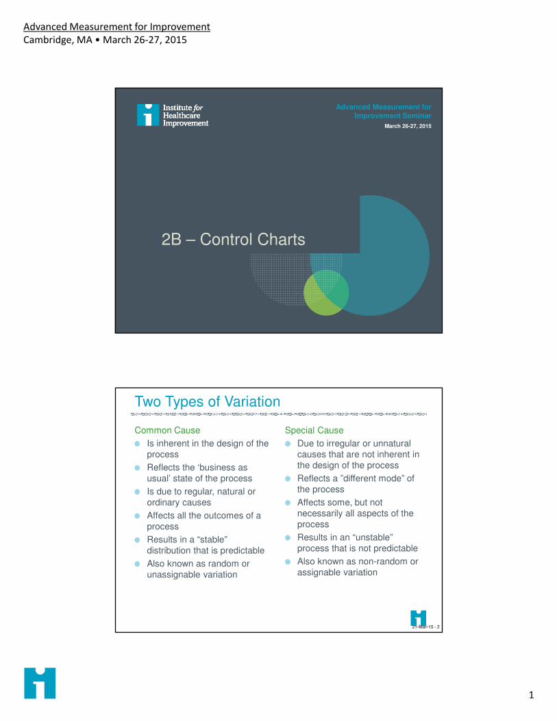
Advanced Measurement for Improvement Cambridge, MA • March 26-27, 2015 1 2B – Control Charts Advanced Measurement for Improvement Seminar March 26-27, 2015 Two Types of Variation Common Cause Is inherent in the design of the process Reflects the ‘business as usual’ state of the process Is due to regular, natural or ordinary causes Affects all the outcomes of a process Results in a “stable” distribution that is predictable Also known as random or unassignable variation Special Cause Due to irregular or unnatural causes that are not inherent in the design of the process Reflects a ”different mode” of the process Affects some, but not necessarily all aspects of the process Results in an “unstable” process that is not predictable Also known as non-random or assignable variation 21-Mar-15 • 2
Transcript
Advanced Measurement for Improvement
Cambridge, MA • March 26-27, 2015
1
2B – Control Charts
Advanced Measurement for Improvement Seminar
March 26-27, 2015
Two Types of Variation
Common Cause
Is inherent in the design of the
process
Reflects the ‘business as
usual’ state of the process
Is due to regular, natural or
ordinary causes
Affects all the outcomes of a
process
Results in a “stable”
distribution that is predictable
Also known as random or
unassignable variation
Special Cause
Due to irregular or unnatural
causes that are not inherent in
the design of the process
Reflects a ”different mode” of
the process
Affects some, but not
necessarily all aspects of the
process
Results in an “unstable”
process that is not predictable
Also known as non-random or
assignable variation
21-Mar-15 • 2
Advanced Measurement for Improvement
Cambridge, MA • March 26-27, 2015
2
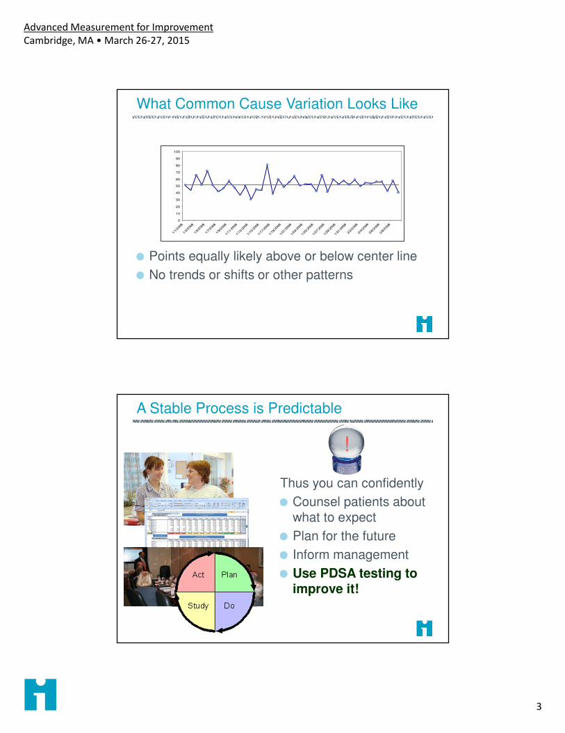
A Stable Process
A predictable (stable) process has only common causes in play.
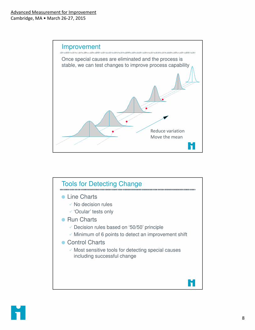
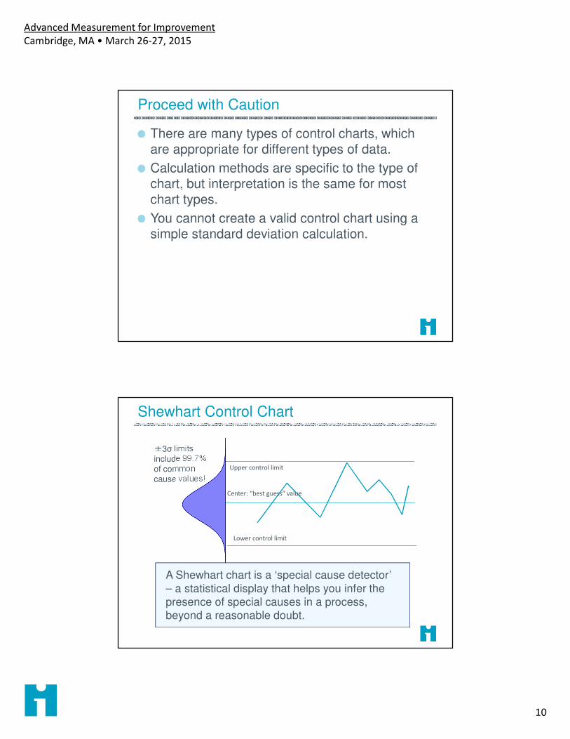
There are many types of control charts, which are appropriate for different types of data.
Calculation methods are specific to the type of chart, but interpretation is the same for most chart types.
You cannot create a valid control chart using a simple standard deviation calculation.
Shewhart Control Chart
Upper control limit
Lower control limit
Center: “best guess” value
±3σ limits include 99.7% of common
cause values!
A Shewhart chart is a ‘special cause detector’ – a statistical display that helps you infer the
presence of special causes in a process, beyond a reasonable doubt.
Advanced Measurement for Improvement
Cambridge, MA • March 26-27, 2015
11
Special Cause
Upper control limit
Lower control limit
Center: “best guess” value
±3σ limits include 99.7% of common cause values!
A single point outside the control limits is likely
NOT generated by a stable process, but by some
others set of causes.
Tests for Special Cause
UCL
LCL
Center
2σ
A cluster of points far from the center line is
relatively unlikely from a stable, normally-
distributed process: Special Cause!
Advanced Measurement for Improvement
Cambridge, MA • March 26-27, 2015
12
Tests for Special Cause
UCL
LCL
Center
2σ
So are other non-random patterns. These too
are evidence of special causes.
A single point outside the control limits
Six consecutive points increasing (trend up) or
decreasing (trend down)
Two our of three consecutive points near a control
limit (outer one-third)
Eight or more consecutive points above or below
the centerline
Fifteen consecutive points close to the centerline
(inner one-third)
API Rules for
Detecting Special
Cause
Advanced Measurement for Improvement
Cambridge, MA • March 26-27, 2015
13
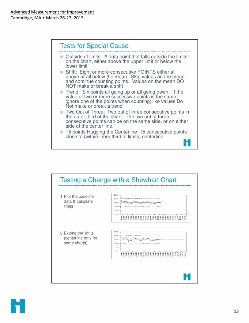
Tests for Special Cause
Outside of limits: A data point that falls outside the limits on the chart, either above the upper limit or below the lower limitShift: Eight or more consecutive POINTS either all above or all below the mean. Skip values on the mean and continue counting points. Values on the mean DO NOT make or break a shiftTrend: Six points all going up or all going down. If the value of two or more successive points is the same, ignore one of the points when counting; like values Do Not make or break a trendTwo Out of Three: Two out of three consecutive points in the outer third of the chart. The two out of three consecutive points can be on the same side, or on either side of the center line. 15 points Hugging the Centerline: 15 consecutive points close to (within inner third of limits) centerline
Testing a Change with a Shewhart Chart
1.Plot the baseline
data & calculate
limits
2.Extend the limits
(centerline only for
some charts)
Advanced Measurement for Improvement
Cambridge, MA • March 26-27, 2015
14
Testing a Change with a Shewhart Chart
3. Plot new data using
baseline limits
(centerline)
Apply decision rules
for special cause
4. If change is
confirmed, plot
limits for new phase
of process
If You Don’t Have Baseline Data
1. Plot all of your data
2. Apply the decision rules
3. Do all of these points appear to be part of the same stable process?
4. Is the pattern consistent with changes?
0%
10%
20%
30%
40%
50%
60%
70%
80%
90%
100%
1/1
/08
2/1
/08
3/1
/08
4/1
/08
5/1
/08
6/1
/08
7/1
/08
8/1
/08
9/1
/08
10
/1/0
8
11
/1/0
8
12
/1/0
8
1/1
/09
2/1
/09
3/1
/09
4/1
/09
5/1
/09
6/1
/09
7/1
/09
8/1
/09
9/1
/09
10
/1/0
9
11
/1/0
9
12
/1/0
9
1/1
/10
2/1
/10
3/1
/10
4/1
/10
5/1
/10
6/1
/10
Advanced Measurement for Improvement
Cambridge, MA • March 26-27, 2015
15
P Charts (for Proportions)
Underlying observation measures a binary attribute, e.g..� Dead or alive � Completed within 1 hour
� Infected or not � Risk assessed at current visit
Observations are randomly sampled from the process in each subgroup
Each plotted data point is the percent (between 0 and 100%) of all observations in the subgroup with the attribute
Common cause variation in the underlying process is modeled by the binomial distribution
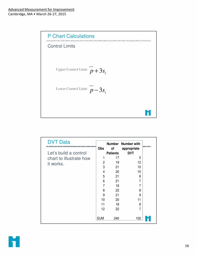
P Chart Calculations
ni
xi
si
p
Number of items in measurement window 1
Number of items that “have it” in measurement window 1
∑∑
nx
i
iCenter lineobserveditemsTotal
ithavethatitemsTotal
__
"__"__
Standard deviation
ni
pp )1( −
Advanced Measurement for Improvement
Cambridge, MA • March 26-27, 2015
16
P Chart Calculations
Control Limits
isp 3+Upper Control Limit
isp 3−Lower Control Limit
DVT Data
Let’s build a control chart to illustrate how it works.
Obs
Number
of
Patients
Number with
appropriate
DVT
1 17 5
2 19 12
3 21 10
4 20 10
5 21 8
6 21 7
7 18 7
8 22 8
9 21 9
10 20 11
11 18 8
12 22 7
SUM 240 102
Advanced Measurement for Improvement
Cambridge, MA • March 26-27, 2015
17
P Chart Calculations
For the first DVT Observation
171
=n
51 =x
102=∑ ix
240=∑ in785.)12(.3425. =+=UCL
065.)12(.3425. =−=LCL425.240
102==pMean
12.17
)425.1(425.=
−=isStandard deviation
Is the Process Stable Before the Change?
Pts With DVT Prophylaxis
0%
10%
20%
30%
40%
50%
60%
70%
80%
90%
100%
1 2 3 4 5 6 7 8 9 10 11 12
Advanced Measurement for Improvement
Cambridge, MA • March 26-27, 2015
18
Obs
Number
of
Patients
Number with
appropriate
DVT
% Approp Mean SD UCL LCL
1 17 5 29.4% 0.425 0.120 0.785 0.065
2 19 12 63.2% 0.425 0.113 0.765 0.085
3 21 10 47.6% 0.425 0.108 0.749 0.101
4 20 10 50.0% 0.425 0.111 0.757 0.093
5 21 8 38.1% 0.425 0.108 0.749 0.101
6 21 7 33.3% 0.425 0.108 0.749 0.101
7 18 7 38.9% 0.425 0.117 0.775 0.075
8 22 8 36.4% 0.425 0.105 0.741 0.109
9 21 9 42.9% 0.425 0.108 0.749 0.101
10 20 11 55.0% 0.425 0.111 0.757 0.093
11 18 8 44.4% 0.425 0.117 0.775 0.075
12 22 7 31.8% 0.425 0.105 0.741 0.109
13 20 16 80.0% 0.425 0.111 0.757 0.093
14 17 16 94.1% 0.425 0.120 0.785 0.065
15 24 22 91.7% 0.425 0.101 0.728 0.122
SUM 301 156
A P-Chart Confirms A Change
Pts With DVT Prophylaxis
0%
10%
20%
30%
40%
50%
60%
70%
80%
90%
100%
1 2 3 4 5 6 7 8 9 10 11 12 13 14 15
Advanced Measurement for Improvement
Cambridge, MA • March 26-27, 2015
19
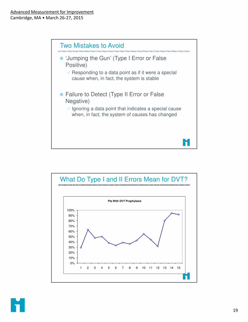
Two Mistakes to Avoid
‘Jumping the Gun’ (Type I Error or False Positive)
� Responding to a data point as if it were a special
cause when, in fact, the system is stable
Failure to Detect (Type II Error or False Negative)
� Ignoring a data point that indicates a special cause when, in fact, the system of causes has changed
What Do Type I and II Errors Mean for DVT?
0%
10%
20%
30%
40%
50%
60%
70%
80%
90%
100%
1 2 3 4 5 6 7 8 9 10 11 12 13 14 15
Pts With DVT Prophylaxis
Advanced Measurement for Improvement
Cambridge, MA • March 26-27, 2015
20
Mammography Screening
Measure: Percent of women over 50 in a sample of 50 who obtain documented mammograms within 3 months of receiving reminder
Data for subgroups collected by month reminder is sent out
References
Benneyan, J. C. (2001). "Number-between g-type statistical quality control charts for monitoring adverse events." Health Care Manag Sci 4(4): 305-18.
Benneyan, J. (2008). "Design, use and performance of statistical control charts for clinical process improvement." International Journal of Six Sigma 4(3): 219-239.
Langley, G. J., K. M. Nolan, et al. (2009). The improvement guide : a practical approach to enhancing organizational performance. San Francisco, Jossey-Bass.
Moen, R. D., T. W. Nolan, et al. (1999). Quality improvement through planned experimentation. New York, McGraw Hill.
Mohammed, M. A., P. Worthington, et al. (2008). "Plotting basic control charts: tutorial notes for healthcare practitioners." Qual Saf Health Care 17(2): 137-145
Perla, R. J., L. P. Provost, et al. (2011). "The run chart: a simple analytical tool for learning from variation in healthcare processes." BMJ Qual Saf 20(1): 46-51.
Provost, L. P. and S. K. Murray (2010). The Data Guide - Learning from data to improve health care. Austin TX, Associates in Process Improvement - www.pipproducts.com.
Advanced Measurement for Improvement
Cambridge, MA • March 26-27, 2015
21
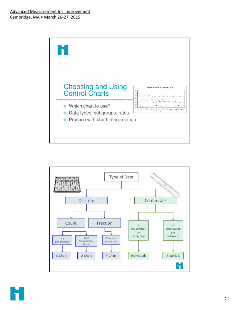
Choosing and Using Control Charts
Which chart to use?
Data types; subgroups; rates
Practice with chart interpretation
Type of Data
Discrete
Count Fraction
No
Denominator
With
Denominator
(Rate)
Percent or
proportion
Continuous
1
observation
per
subgroup
C-Chart U-Chart P-Chart Individuals X-bar & S
>1
observation
per
subgroup
Advanced Measurement for Improvement
Cambridge, MA • March 26-27, 2015
22
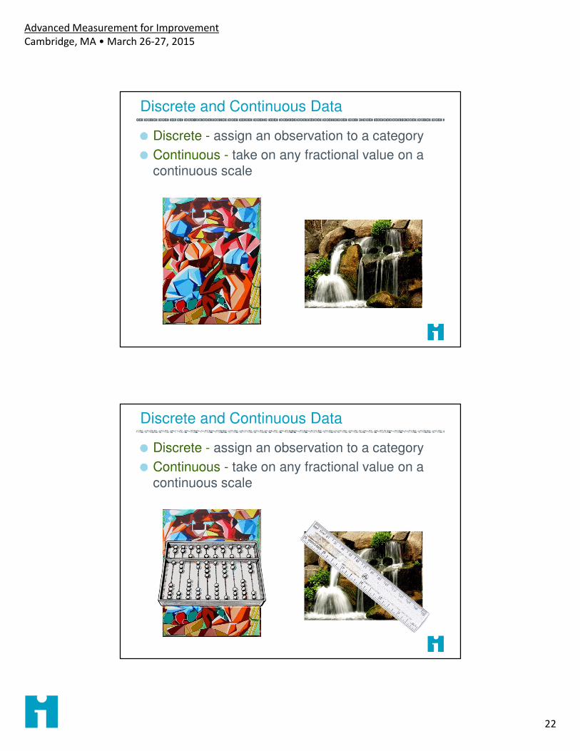
Discrete and Continuous Data
Discrete - assign an observation to a category
Continuous - take on any fractional value on a continuous scale
Discrete and Continuous Data
Discrete - assign an observation to a category
Continuous - take on any fractional value on a continuous scale
Advanced Measurement for Improvement
Cambridge, MA • March 26-27, 2015
23
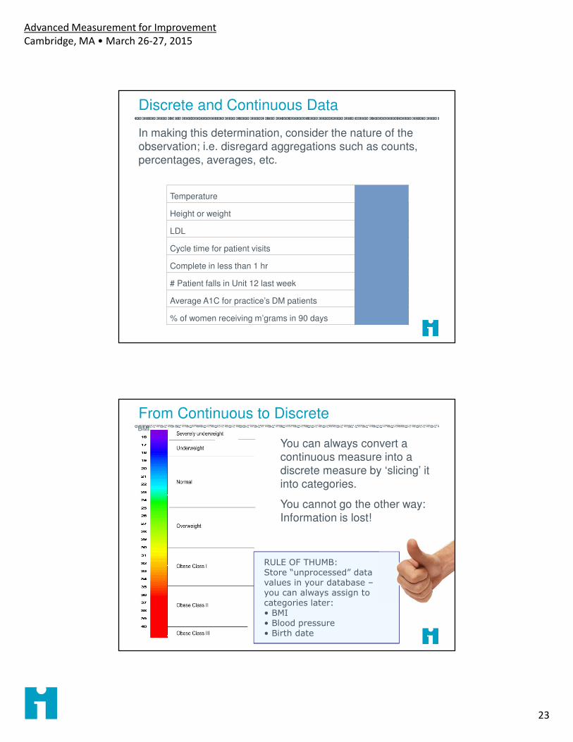
Discrete and Continuous Data
In making this determination, consider the nature of the
observation; i.e. disregard aggregations such as counts,
percentages, averages, etc.
Temperature Continuous
Height or weight Continuous
LDL Continuous
Cycle time for patient visits Continuous
Complete in less than 1 hr Discrete
# Patient falls in Unit 12 last week Discrete
Average A1C for practice’s DM patients Continuous
% of women receiving m’grams in 90 days Discrete
From Continuous to Discrete
You can always convert a continuous measure into a discrete measure by ‘slicing’ it into categories.
You cannot go the other way: Information is lost!
BMI
RULE OF THUMB: Store “unprocessed” data values in your database –you can always assign to categories later:• BMI• Blood pressure• Birth date
Advanced Measurement for Improvement
Cambridge, MA • March 26-27, 2015
24
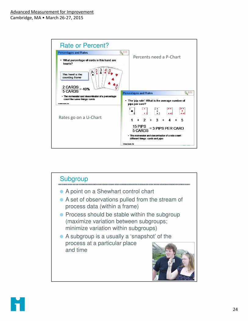
Rate or Percent?
Percents need a P-Chart
Rates go on a U-Chart
Subgroup
A point on a Shewhart control chart
A set of observations pulled from the stream of process data (within a frame)
Process should be stable within the subgroup (maximize variation between subgroups; minimize variation within subgroups)
A subgroup is a usually a ‘snapshot’ of the process at a particular place and time
Advanced Measurement for Improvement
Cambridge, MA • March 26-27, 2015
25
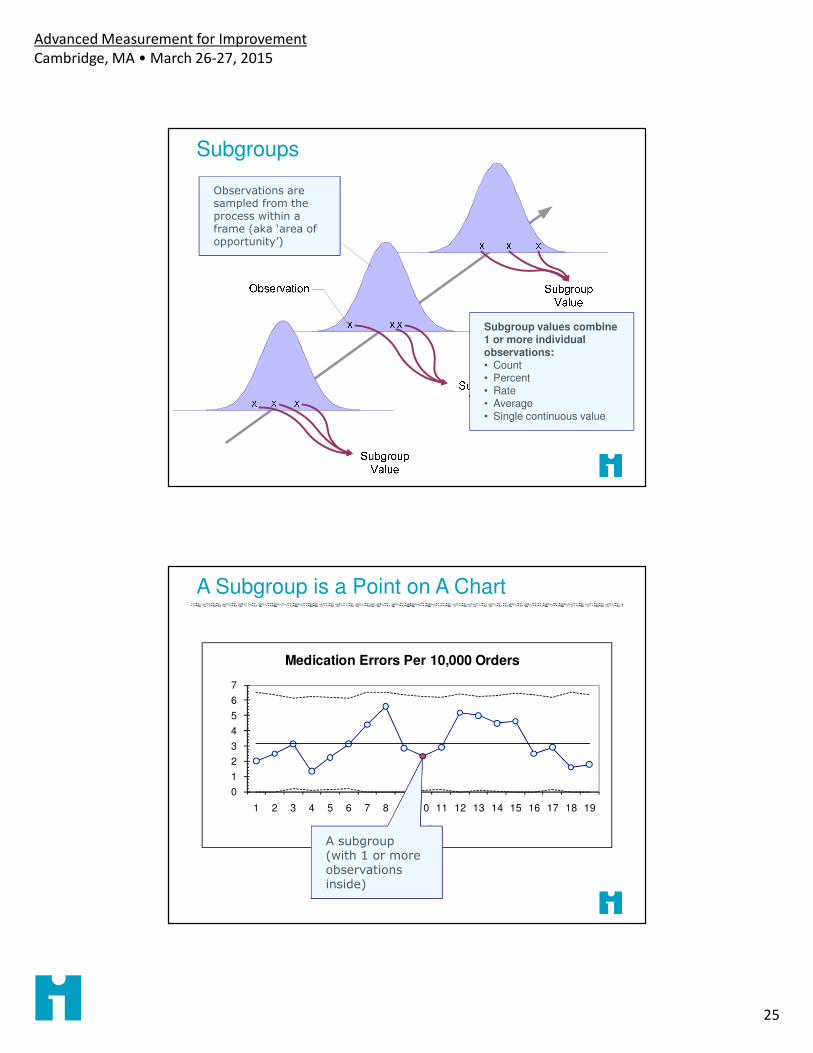
Subgroups
Observations are sampled from the process within a frame (aka ‘area of opportunity’)
Subgroup values combine 1 or more individual observations:• Count• Percent• Rate• Average• Single continuous value
A Subgroup is a Point on A Chart
0
1
2
3
4
5
6
7
1 2 3 4 5 6 7 8 9 10 11 12 13 14 15 16 17 18 19
Week
Medication Errors Per 10,000 Orders
A subgroup(with 1 or more observations inside)
Advanced Measurement for Improvement
Cambridge, MA • March 26-27, 2015
26
Subgroup Example
Measure: time to process a new hospital admission
We suspect that admission staff on different shifts use different procedures for processing patients.
We should choose a subgroup to minimize variation within the subgroups
Subgroup = average time for 5 admissions randomly selected within a shift on Unit XWhat are possible subgroups for admission process time?
Type of Data
Discrete
Count Fraction
No
Denominator
With
Denominator
(Rate)
Percent or
proportion
Continuous
1
observation
per
subgroup
C-Chart U-Chart P-Chart Individuals X-bar & S
>1
observation
per
subgroup
Advanced Measurement for Improvement
Cambridge, MA • March 26-27, 2015
27
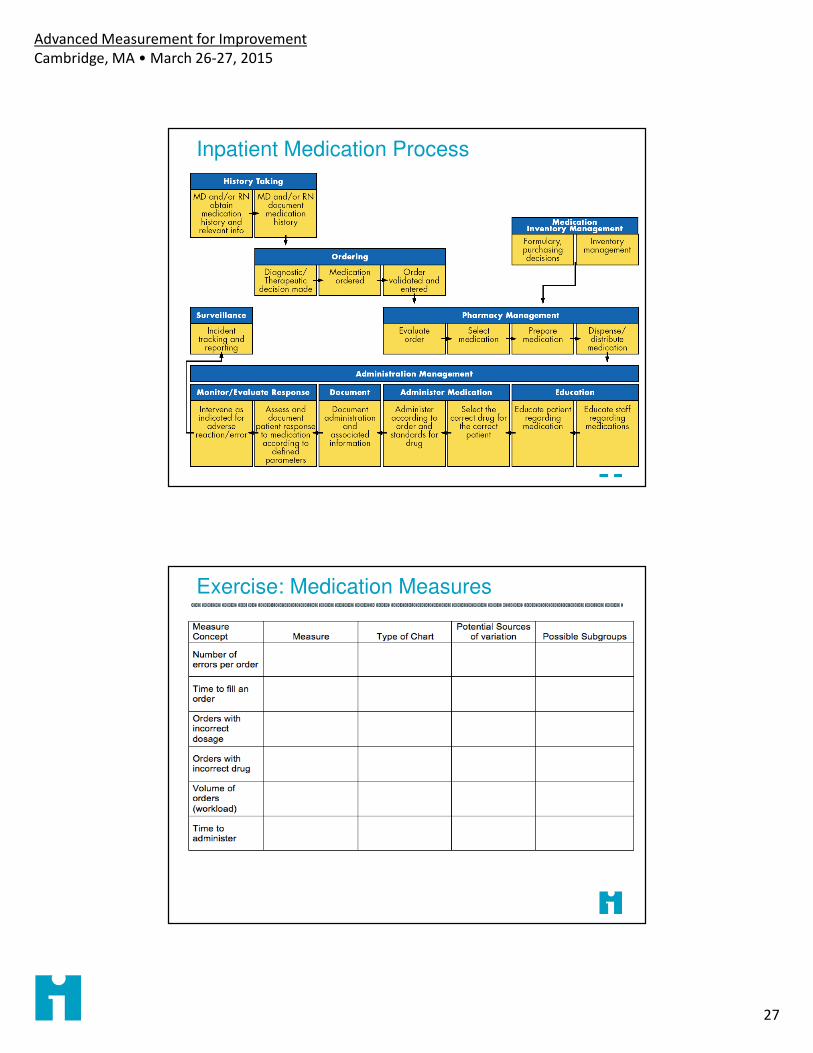
Inpatient Medication Process
Exercise: Medication Measures
Advanced Measurement for Improvement
Cambridge, MA • March 26-27, 2015
28
Chart Calculations
Each chart type has its own construction formulas & procedures.
See Mohammed & Worthington (2008)* for overview of calculation of basic chart types. See The Data Guide for details.
Once constructed, all charts are interpreted in the same way.
*Mohammed, M. A., P. Worthington, et al. (2008). "Plotting basic control charts: tutorial notes for
healthcare practitioners." Qual Saf Health Care 17(2): 137-145.
When Do We Recalculate Limits?
You’re still gathering data to find a stable baseline: you have “trial” limits with <20 subgroups
You have identified special causes and want to assess stability with those subgroups removed
When improvements have be made to the process and the improvements result in special causes on the Shewhart chart
When you have reason to believe that the process is now operating in a new mode, and you want to assess its stability
Advanced Measurement for Improvement
Cambridge, MA • March 26-27, 2015
29
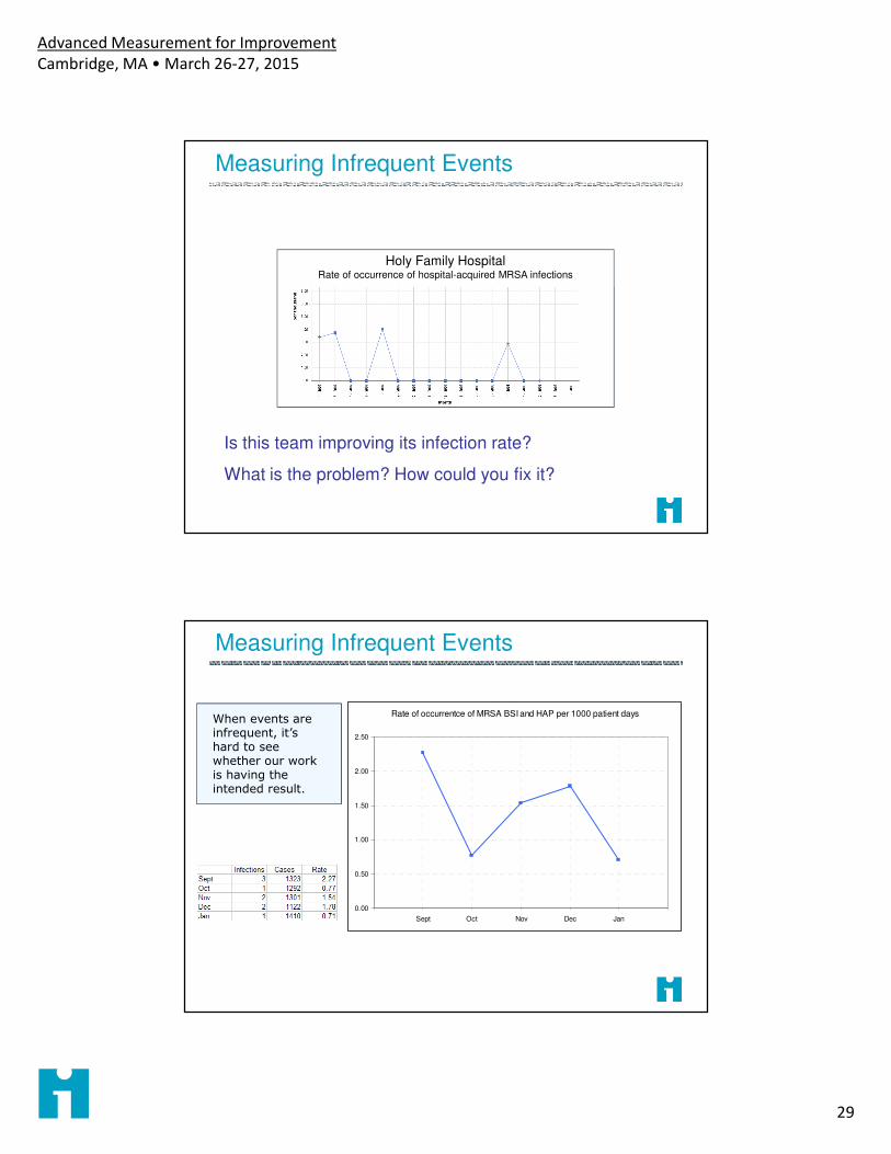
Measuring Infrequent Events
Holy Family HospitalRate of occurrence of hospital-acquired MRSA infections
Is this team improving its infection rate?
What is the problem? How could you fix it?
Measuring Infrequent Events
Rate of occurrentce of MRSA BSI and HAP per 1000 patient days
0.00
0.50
1.00
1.50
2.00
2.50
Sept Oct Nov Dec Jan
When events are infrequent, it’s hard to see whether our work is having the intended result.
Advanced Measurement for Improvement
Cambridge, MA • March 26-27, 2015
30
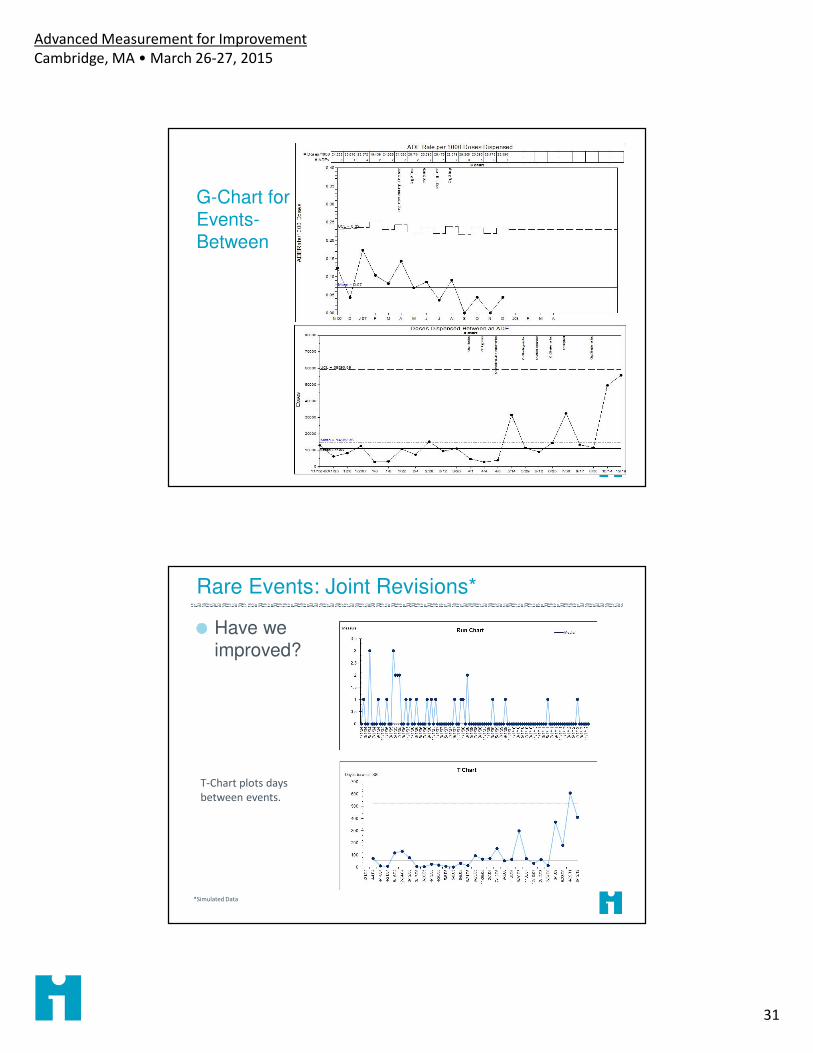
Measuring Infrequent Events
Plotting the number of days since the prior event shows that infections are becoming steadily less frequent.
15 days since last event (today 1/31/2008)
Note – frequency of cases should be relatively constant!
Measuring Infrequent Events
Time between: Number of days between events
� Use T-Chart to model
� Assumes volume is relatively constant
� Data are just dates of occurrence
Cases between: Number of processed items (e.g. cases, patients) between events
� Use G-Chart
� Standardizes volume
� Requires more complex data extraction
Advanced Measurement for Improvement
Cambridge, MA • March 26-27, 2015
31
G-Chart for Events-Between
Rare Events: Joint Revisions*
Have we improved?
*Simulated Data
T-Chart plots days
between events.
Advanced Measurement for Improvement
Cambridge, MA • March 26-27, 2015
32
Discussion: Interpreting Control Charts
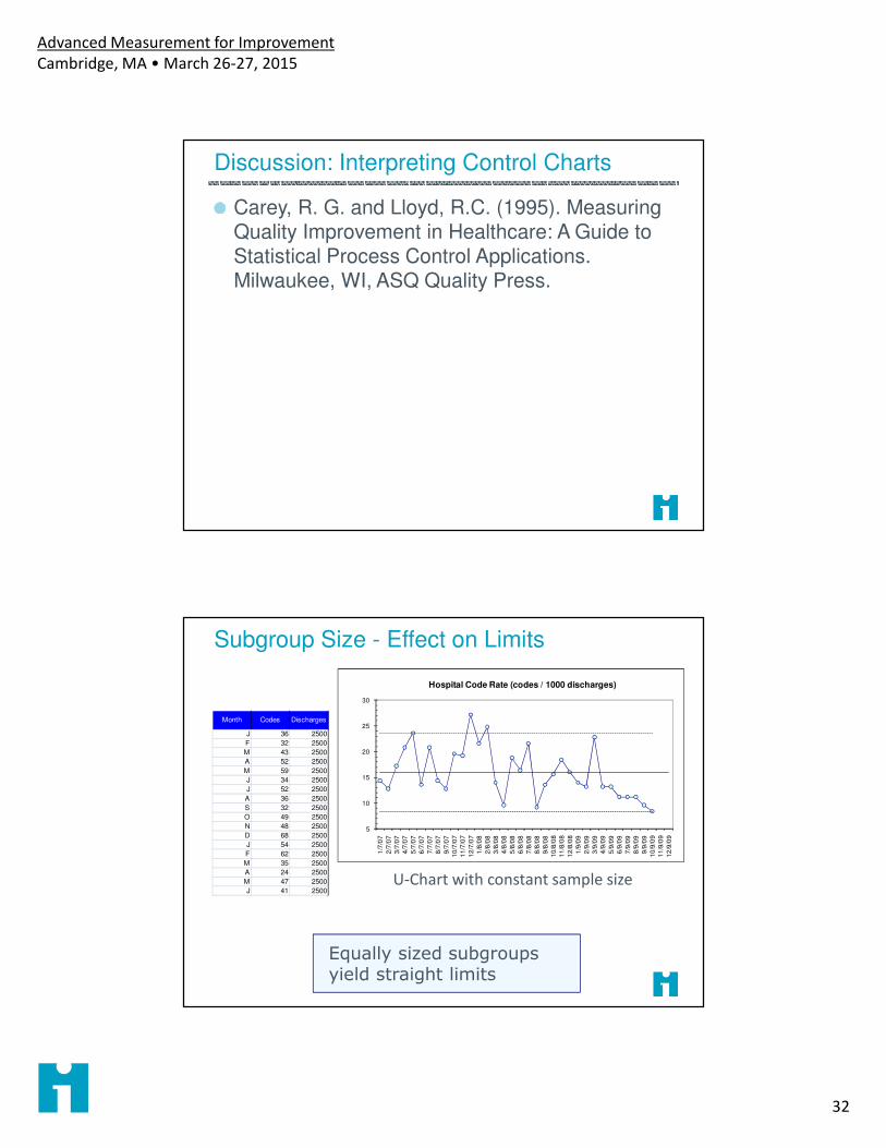
Carey, R. G. and Lloyd, R.C. (1995). Measuring Quality Improvement in Healthcare: A Guide to Statistical Process Control Applications. Milwaukee, WI, ASQ Quality Press.
Subgroup Size - Effect on Limits
Equally sized subgroups yield straight limits
5
10
15
20
25
30
1/7
/07
2/7
/07
3/7
/07
4/7
/07
5/7
/07
6/7
/07
7/7
/07
8/7
/07
9/7
/07
10
/7/0
7
11
/7/0
7
12
/7/0
7
1/8
/08
2/8
/08
3/8
/08
4/8
/08
5/8
/08
6/8
/08
7/8
/08
8/8
/08
9/8
/08
10
/8/0
8
11
/8/0
8
12
/8/0
8
1/9
/09
2/9
/09
3/9
/09
4/9
/09
5/9
/09
6/9
/09
7/9
/09
8/9
/09
9/9
/09
10
/9/0
9
11
/9/0
9
12
/9/0
9
Hospital Code Rate (codes / 1000 discharges)
Month Codes Discharges
J 36 2500
F 32 2500
M 43 2500
A 52 2500
M 59 2500
J 34 2500
J 52 2500
A 36 2500
S 32 2500
O 49 2500
N 48 2500
D 68 2500
J 54 2500
F 62 2500
M 35 2500
A 24 2500
M 47 2500
J 41 2500U-Chart with constant sample size
Advanced Measurement for Improvement
Cambridge, MA • March 26-27, 2015
33
Subgroup Size - Effect on Limits
Unequal number of observations per subgroup results in ‘squiggly’ limits (smaller n means wider limits, means less sensitivity)