Chapter 02 - Describing Data: Frequency Tables, Frequency Distributions, and Graphic Presentation 2-1 Chapter 2 Describing Data: Frequency Tables, Frequency Distributions, and Graphic Presentation 1. Pepsi-Cola has a 25% market share, found by 90/360. (LO 3) 2. Three classes are needed, one for each player. (LO 1) 3. There are four classes: winter, spring, summer, and fall. The relative frequencies are 0.1, 0.3, 0.4, and 0.2, respectively. (LO 1) 4. (LO 1) City Frequency Relative Frequency Indianapolis 100 0.05 St. Louis 450 0.225 Chicago 1300 0.65 Milwaukee 150 0.075 5. a. A frequency table. Color Frequency Relative Frequency Bright White 130 0.10 Metallic Black 104 0.08 Magnetic lime 325 0.25 Tangerine Orange 455 0.35 Fusion Red 286 0.22 Total 1300 1.00 b. Color Frequency Red Orange Lime Black White 500 400 300 200 100 0 Chart of Frequency vs Color
Transcript
Chapter 02 - Describing Data: Frequency Tables, Frequency Distributions, and Graphic Presentation
2-1
Chapter 2
Describing Data: Frequency Tables, Frequency Distributions, and
Graphic Presentation
1. Pepsi-Cola has a 25% market share, found by 90/360. (LO 3)
2. Three classes are needed, one for each player. (LO 1)
3. There are four classes: winter, spring, summer, and fall.
The relative frequencies are 0.1, 0.3, 0.4, and 0.2, respectively. (LO 1)
4. (LO 1)
City Frequency Relative Frequency
Indianapolis 100 0.05
St. Louis 450 0.225
Chicago 1300 0.65
Milwaukee 150 0.075
5. a. A frequency table.
Color Frequency Relative Frequency
Bright White 130 0.10
Metallic Black 104 0.08
Magnetic lime 325 0.25
Tangerine Orange 455 0.35
Fusion Red 286 0.22
Total 1300 1.00
b.
Color
Fre
qu
en
cy
RedOrangeLimeBlackWhite
500
400
300
200
100
0
Chart of Frequency vs Color
Chapter 02 - Describing Data: Frequency Tables, Frequency Distributions, and Graphic Presentation
2-2
c.
d. 350,000 orange; 250,000 lime; 220,000 red; 100,000 white, and 80,000 black, found by
multiplying relative frequency by 1,000,000 production. (LO 3)
6. Maxwell Heating & Air Conditioning far exceeds the other corporations in sales. Mancell
electric & Plumbing and Mizelle Roofing & Sheet Metal are the two corporations with the
least amount of fourth quarter sales. (LO 2)
7.
5 62 32, 2 64 therefore 6 classes (LO 4)
8. 25 = 32, 26 = 64 suggests 6 classes. $29 $0
4.476
i
Use interval of 5. (LO 4)
9. 27 = 128, 28 = 256 suggests 8 classes 567 235
41.58
i
Use interval of 45. (LO 4)
10. a. 25 = 32, 26 = 64 suggests 6 classes.
b. 129 42
14.56
i
Use interval of 15 and start first class at 40. (LO 4)
0 5000 10000 15000 20000 25000 30000
Hoden
J & R
Long Bay
Mancell
Maxwell
Mizelle
Chapter 02 - Describing Data: Frequency Tables, Frequency Distributions, and Graphic Presentation
2-3
11. a. 24 =16 suggests 5 classes
b. 31 25
1.25
i
Use interval of 1.5
c. 24
d. f Relative frequency
24 up to 25.5 2 0.125
25.5 up to 27 4 0.250
27 up to 28.5 8 0.500
28.5 up to 30 0 0.000
30 up to 31.5 2 0.125
Total 16 1.000
e. The largest concentration is in the 27 up to 28.5 class (8). (LO 5)
12. a. 24 = 16, 25 = 32, suggest 5 classes
b. 98 51
9.45
i
Use interval of 10.
c. 50
d. f Relative frequency
50 up to 60 4 0.20
60 up to 70 5 0.25
70 up to 80 6 0.30
80 up to 90 2 0.10
90 up to 100 3 0.15
Total 20 1.00
e. The fewest number is about 50, the highest about 100. The greatest concentration is in
classes 60 up to 70 and 70 up to 80. (LO 5)
Visits f
13. a. 0 up to 3 9
3 up to 6 21
6 up to 9 13
9 up to 12 4
12 up to 15 3
15 up to 18 1
Total 51
b. The largest group of shoppers (21) shop at BiLo 3, 4 or 5 times during a month period.
Some customers visit the store only 1 time during the month, but others shop as many
as 15 times.
c. Number of Percent of
Visits Total
0 up to 3 17.65
3 up to 6 41.18
6 up to 9 25.49
9 up to 12 7.84
12 up to 15 5.88
15 up to 18 1.96
Total 100.00 (LO 5)
Chapter 02 - Describing Data: Frequency Tables, Frequency Distributions, and Graphic Presentation
2-4
14. a. An interval of 10 is more convenient to work with. The distribution using 10 is:
f
15 up to 25 1
25 up to 35 2
35 up to 45 5
45 up to 55 10
55 up to 65 15
65 up to 75 4
75 up to 85 3
Total 40
b. Data tends to cluster in classes 45 up to 55 and 55 up to 65.
c. Based on the distribution, the youngest person taking the Caribbean cruise is 15 years
(actually 18 from the raw data). The oldest person was less than 85 years. The largest
concentration of ages is between 45 up to 65 years.
d. Ages Percent of
Total
15 up to 25 2.5
25 up to 35 5.0
35 up to 45 12.5
45 up to 55 25.0
55 up to 65 37.5
65 up to 75 10.0
75 up to 85 7.5
Total 100.0 (LO 5)
15. a. Histogram
b. 100
c. 5
d. 28
e. 0.28
f. 12.5
g. 13 (LO 6)
16. a. 3
b. about 26
c. 2
d. frequency polygon (LO 6)
Chapter 02 - Describing Data: Frequency Tables, Frequency Distributions, and Graphic Presentation
2-5
17. a. 50
b. 1.5 thousands of miles
c.
1614121086420
25
20
15
10
5
0
Employees
Mil
es
0
0
Histogram of Frequent Flier Miles
d. X = 1.5, Y = 5
e.
1612840
25
20
15
10
5
0
Miles(000)
Nu
mb
er
of
Em
plo
ye
es
0
0
Frequency Polygon of Frequent Flier Miles
f. For the 50 employees about half earn between 6 and 8 thousand frequent flier miles.
Five earn less than 3 thousand frequent flier miles, and two earn more than 12
thousand frequent flier miles. (LO 6)
Chapter 02 - Describing Data: Frequency Tables, Frequency Distributions, and Graphic Presentation
2-6
18. a. 40
b. 2.5
c. 2.5
d.
e. Based on the charts, the shortest lead time is 0 days, the longest 25 days. The
concentration of lead times is 10-15 days. (LO 6)
19. a. 40
b. 5
c. 11 or 12
d. about $18 per hour
e. about $9 per hour
f. about 75% (LO 7)
67
12
87
0
2
4
6
8
10
12
14
0 2.5 7.5 12.5 17.5 22.5 27.5
Lead Time(Days)
Fre
qu
ency
0
2
4
6
8
10
12
14
-2.5 2.5 7.5 12.5 17.5 22.5 27.5
Frequency
Lead Time (Days)
Chapter 02 - Describing Data: Frequency Tables, Frequency Distributions, and Graphic Presentation
2-7
20. a. 200
b. about 50 or $50,000
c. about $180,000
d. about $240,000
e. about 60 homes
f. about 130 homes (LO 7)
21. a. 5
b. Miles f CF
0 up to 3 5 5
3 up to 6 12 17
6 up to 9 23 40
9 up to 12 8 48
12 up to 15 2 50
c.
d. about 8.7 thousands of miles (LO 7)
0 3 6 9 12 15
Day s Absent
0
10
20
30
40
50
60
0
0.2
0.4
0.6
0.8
1
1.2
Frequent Flier Files
Chapter 02 - Describing Data: Frequency Tables, Frequency Distributions, and Graphic Presentation
2-8
22. a. 13, 25
b. Lead Time f CF
0 up to 5 6 6
5 up to 10 7 13
10 up to 15 12 25
15 up to 20 8 33
20 up to 25 7 40
c.
d. 14 (LO 7)
23. a. Qualitative variables are ordinarily nominal level of measurement, but some are ordinal.
Quantitative variables are commonly of interval or ratio level of measurement.
b. Yes, both types depict samples and populations. (LO 1)
24. A frequency table calls for qualitative data. On the other hand, a frequency distribution
involves quantitative data. (LO 1)
25. a. A frequency table.
b.
Activity
Pre
fere
nce
No AnswerUnsureNon-plannedPlanned
140
120
100
80
60
40
20
0
Chart of Preference vs Activity
0 5 10 15 20 25
Lead Time (day s)
0
10
20
30
40
50
0
0.2
0.4
0.6
0.8
1
1.2
Chapter 02 - Describing Data: Frequency Tables, Frequency Distributions, and Graphic Presentation
2-9
c.
8.0%No Answer
26.0%Unsure
45.0%Non-planned
21.0%Planned
Pie Chart of Preference vs Activity
d. The pie chart may be easier to comprehend. (LO 3)
26. a. The scale is ordinal and the variable is qualitative.
b.
Performance Frequency
Early 22
On-time 67
Late 9
Lost 2
c.
Performance Relative Frequency
Early .22
On-time .67
Late .09
Lost .02
d.
LostLateEarlyOn-time
70
60
50
40
30
20
10
0
Performance
Co
un
t
Bar Chart of Delivery Performance
Chapter 02 - Describing Data: Frequency Tables, Frequency Distributions, and Graphic Presentation
2-10
e.
67.0%On-time 2.0%
Lost
9.0%Late
22.0%Early
Delivery Performance
f. 89% of the packages are either early or on-time and 2% of the packages are lost. So they
are missing both of their objectives. They must eliminate all lost packages and reduce
the late percentage to below 1%. (LO 3)
27. 62 64 and 72 128 suggest 7 classes (LO 4)
28. 27 = 128, 28 = 256 suggests 8 classes. 490 56
54.258
i
Use interval of 60. (LO 4)
29. a. 5 because 4 52 16 25and 2 32 25
b. 48 16
6.45
i
use interval of 7.
c. 15
d. Class Frequency
15 up to 22 3
22 up to 29 8
29 up to 36 7
36 up to 43 5
43 up to 50 2
25
e. It is fairly symmetric with most of the values between 22 and 36. (LO 4)
30. a. 6 because 5 62 32 45and 2 64 45
b. 100, found by 570 41
88.176
c. 0
d. Class Frequency
0 up to 100 3
100 up to 200 12
200 up to 300 16
300 up to 400 10
400 up to 500 3
500 up to 600 1
45 (LO 4)
Chapter 02 - Describing Data: Frequency Tables, Frequency Distributions, and Graphic Presentation
2-11
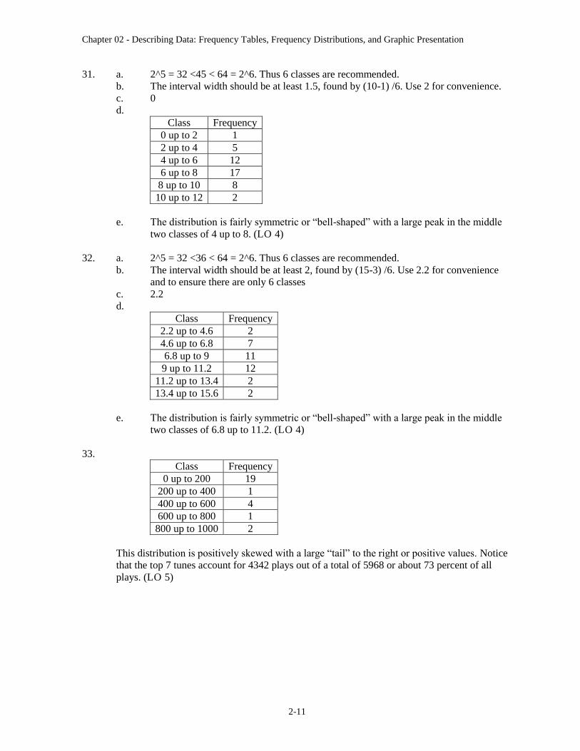
31. a. 2^5 = 32 <45 < 64 = 2^6. Thus 6 classes are recommended.
b. The interval width should be at least 1.5, found by (10-1) /6. Use 2 for convenience.
c. 0
d.
Class Frequency
0 up to 2 1
2 up to 4 5
4 up to 6 12
6 up to 8 17
8 up to 10 8
10 up to 12 2
e. The distribution is fairly symmetric or “bell-shaped” with a large peak in the middle
two classes of 4 up to 8. (LO 4)
32. a. 2^5 = 32 <36 < 64 = 2^6. Thus 6 classes are recommended.
b. The interval width should be at least 2, found by (15-3) /6. Use 2.2 for convenience
and to ensure there are only 6 classes
c. 2.2
d.
Class Frequency
2.2 up to 4.6 2
4.6 up to 6.8 7
6.8 up to 9 11
9 up to 11.2 12
11.2 up to 13.4 2
13.4 up to 15.6 2
e. The distribution is fairly symmetric or “bell-shaped” with a large peak in the middle
two classes of 6.8 up to 11.2. (LO 4)
33.
Class Frequency
0 up to 200 19
200 up to 400 1
400 up to 600 4
600 up to 800 1
800 up to 1000 2
This distribution is positively skewed with a large “tail” to the right or positive values. Notice
that the top 7 tunes account for 4342 plays out of a total of 5968 or about 73 percent of all
plays. (LO 5)
Chapter 02 - Describing Data: Frequency Tables, Frequency Distributions, and Graphic Presentation
2-12
34. a. 25 = 32 < 33 < 64 = 26. Thus 6 classes are recommended.
b. The interval width should be at least 1253, found by (7829-312) /6. Use 1500 for
convenience.
c. 0
d.
Class Frequency
0 up to 1500 1
1500 up to 3000 2
3000 up to 4500 0
4500 up to 6000 7
6000 up to 7500 20
7500 up to 9000 3
e. This distribution is negatively skewed with a few very small values which likely
correspond to the “start up” phase of this publication. The crest of the distribution is in
the 6000 up to 7500 class which contains the greater part or 20 of the 33 months. (LO
4)
35. a. 56
b. 10 (found by 60 – 50)
c. 55
d. 17 (LO 7)
36. a. Cumulative frequency polygon
b. 250
c. 50 (found by 100 – 50)
d. $240,000
e. $230,000 (LO 4)
37. a. $30.50, (found by 265 – 82)/6
b. $35
c. $70 up to $105 4
105 up to 140 17
140 up to 175 14
175 up to 210 2
210 up to 245 6
245 up to 280 1
Total 44
d. The purchases ranged from a low of about $70 to a high of about $280. The
concentration is in the $105 up to $175 class. (LO 4)
Chapter 02 - Describing Data: Frequency Tables, Frequency Distributions, and Graphic Presentation
2-13
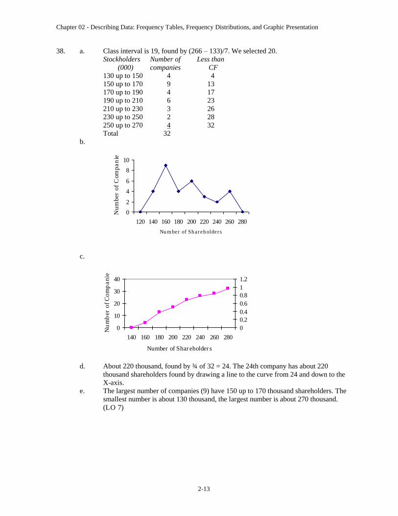
38. a. Class interval is 19, found by (266 – 133)/7. We selected 20.
Stockholders Number of Less than
(000) companies CF
130 up to 150 4 4
150 up to 170 9 13
170 up to 190 4 17
190 up to 210 6 23
210 up to 230 3 26
230 up to 250 2 28
250 up to 270 4 32
Total 32
b.
c.
d. About 220 thousand, found by ¾ of 32 = 24. The 24th company has about 220
thousand shareholders found by drawing a line to the curve from 24 and down to the
X-axis.
e. The largest number of companies (9) have 150 up to 170 thousand shareholders. The
smallest number is about 130 thousand, the largest number is about 270 thousand.
(LO 7)
0
2
4
6
8
10
120 140 160 180 200 220 240 260 280
Number of Shareholders
Nu
mb
er o
f C
om
pa
nie
s
0
10
20
30
40
140 160 180 200 220 240 260 280
Number of Shareholders
Nu
mb
er o
f C
om
pa
nie
s
0
0.2
0.4
0.6
0.8
1
1.2
Chapter 02 - Describing Data: Frequency Tables, Frequency Distributions, and Graphic Presentation
2-14
39. (LO 3)
40. a. Balance f CF
0 up to 100 9 9
100 up to 200 6 15
200 up to 300 6 21
300 up to 400 6 27
400 up to 500 5 32
500 up to 600 2 34
600 up to 700 1 35
700 up to 800 3 38
800 up to 900 1 39
900 up to 1000 1 40
Total 40
Probably a class interval of $200 would be better.
b.
c. About 67% have less than a $400 balance. Therefore, about 33% would be considered
“preferred.”
d. Less than $50 would be a convenient cutoff point. (LO 7)
0
10
20
30
40
50
0
10
0
20
0
30
0
40
0
50
0
60
0
70
0
80
0
90
0
10
00
Balances
Nu
mb
er o
f A
cco
un
ts
0 200 400 600 800 1000
Fuel
Interest
Repairs
Insurance
Depreciation
Ex
pen
dit
ures
Amount
Chapter 02 - Describing Data: Frequency Tables, Frequency Distributions, and Graphic Presentation
2-15
South Carolina AGI
73%
11%
8%
3%
2%
3%
Wages and Salaries
Dividends, Interest, andCapital Gains
IRAs and Taxablepensions
Business incomepensions
Social Security
Other sources
41.
By far the largest part of income in South Carolina is earned income. Almost three-fourths of
adjusted gross income comes from wages and salaries. Dividends and IRAs each contribute
roughly another ten percent. (LO 3)
42. a. Since 5 62 32 60 64 2 , 6 classes are recommended. The interval should be at
least (10.1 0.4)/6 = 1.6. So we will use two as a convenient value.
Hours f
0 up to 2 7
2 up to 4 11
4 up to 6 19
6 up to 8 12
8 up to 10 10
10 up to 12 1
Total 60
b.
0
10
20
1 3 5 7 9 11
Hours
Fre
qu
en
cy
The “typical” person used the computer about 5 hours per week and everyone is
within about five hours of that amount. (LO 6)
Chapter 02 - Describing Data: Frequency Tables, Frequency Distributions, and Graphic Presentation
2-16
43. a. Since 6 72 64 70 128 2 , 7 classes are recommended. The interval should be at
least (1002.2 3.3)/7 = 142.7 use 150 as a convenient value. (LO 4)
Values f
0 up to 150 28
150 up to 300 19
300 up to 450 15
450 up to 600 2
600 up to 750 4
750 up to 1050 1
Total 70
b.
44. (LO 3)
70.8%Others
2.2%UPN2.0%WB
6.0%NBC
5.5%Fox
7.6%CBS
5.9%ABC
Audience percentages
0
10
20
30
75 225 375 525 675 825 975
Value
Fre
qu
en
cy
Chapter 02 - Describing Data: Frequency Tables, Frequency Distributions, and Graphic Presentation
2-17
45. a. pie chart
b. 215, found by 0.43(500)
c. Seventy-eight percent are in either a house of worship (43%) or outdoors (35%). (LO 3)
46. a. 87.88%, found by 44.54% + 43.34%
b. Corporate taxes (8.31%) are more than license fees (2.9%)
c. 2.81 billion, found by (0.4454)(6.3), in sales taxes and
2.73 billion, found by (0.4334)(6.3), in individual taxes (LO 3)
47. a.
Pape
r and
pap
erbo
ard
Plas
tic electric
mac
hine
ry
Mac
hine
ry
Vehi
cles
Min
eral fu
el and
oil
70
60
50
40
30
20
10
0
Product
Am
ou
nt
Chart of Amount
b. Mineral fuel and oil are 28.4%, found by 63.9/224.9, of total exports to the U.S.
Vehicles are 14.1%, found by 31.6/224.9. The two categories together represent
42.5% of Canada’s total exports to the United States.
c. Mineral fuel and oil are 50.3%, found by 63.9/127, of the top five exported products
to the U.S. Vehicles are 24.9%, found by 31.6/127. The two categories together
represent 75.2% of Canada’s top five exports to the United States.
Chapter 02 - Describing Data: Frequency Tables, Frequency Distributions, and Graphic Presentation
2-18
48. There are 50 observations so the recommended number of classes is 6. However, there are
several states that have many more farms than the others, so it may be useful to have an open
ended class.
One possible frequency distribution is.
Farms in USA Frequency
0 up to 20 16
20 up to 40 13
40 up to 60 8
60 up to 80 6
80 up to 100 4
100 or more 3
Total 50
Twenty-nine of the 50 states, or 58 percent, have fewer than 40,000 farms. There are three
states that have more than 100,000 farms. (LO 4)
49.
M & M s
Brown
29%
Yellow
22%
Red
22%
Orange
8%
Blue
12%
Green
7%
Brown, yellow, and red make up almost 75 percent of the candies. The other 25 percent is
composed of blue, orange, and green. (LO 2)
50. a.
Class Cumulative Frequency
0 up to 15 1
15 up to 30 6
30 up to 45 16
45 up to 60 26
60 up to 75 30
Chapter 02 - Describing Data: Frequency Tables, Frequency Distributions, and Graphic Presentation
2-19
b.
80706050403020100
30
25
20
15
10
5
0
Upper class limit
Cu
mu
lati
ve
Fre
qu
en
cy
Cumulative Frequency Polygon for Minneapolis Y
c. 6 days saw fewer than 30.
d. The highest 80 percent of the days had at least 30 families. (LO 7)
51. 345.3 125.0
31.477
i
Use interval of 35.
Selling Price F CF
110 up to 145 3 3
145 up to 180 19 22
180 up to 215 31 53
215 up to 250 25 78
250 up to 285 14 92
285 up to 320 10 102
320 up to 355 3 105
a. Most homes (53%) are in the 180 up to 250 range.
b. The largest value is near 355; the smallest, near 110.
c.
About 42 homes sold for less than 200.
About 55% of the homes sold for less than 220. So 45% sold for more.
Less than 1% of the homes sold for less than 125.
0
20
40
60
80
100
120
110 145 180 215 250 285 320 355
Selling Price
0
0.2
0.4
0.6
0.8
1
1.2
Selling Price
Chapter 02 - Describing Data: Frequency Tables, Frequency Distributions, and Graphic Presentation
2-20
d.
54321
30
25
20
15
10
5
0
Twnship
Co
un
t
Chart of Twnship
Townships 3 and 4 have more sales than average and Townships 1 and 5 have somewhat less
than the average. (LO 7)
52. a. Since 4 52 16 30 32 2 , use 5 classes. The interval should be at least (206.33
34.94)/5 = 34.3 (in millions of dollars). Use 40. The resulting frequency distribution
is:
Class f
20 up to 60 5
60 up to 100 17
100 up to 140 4
140 up to 180 3
180 up to 220 1
1. The typical team payroll is 90. It ranges from 20 to 220 (in millions).
2. The distribution is positively skewed. The higher payroll teams are further
from the center than the lower payroll teams. The Yankees appear to be quite
unusual!
b.
250200150100500
30
25
20
15
10
5
0
Class
Cu
m.
Fre
q.
Cumulative Frequency Polygon of 2010 Team Salaries
Chapter 02 - Describing Data: Frequency Tables, Frequency Distributions, and Graphic Presentation
2-21
1. Forty-percent of the teams have payrolls less than $75,000,000.
2. Twenty-two teams pay less than $100,000,000.
3. The lowest five teams pay less than $60,000,000.
c. Use 5 classes here also. The interval should be at least (56,000 – 34,077)/5 = 4384.6.
Use 5000 for convenience. The resulting frequency distribution is:
Class f
33,000 up to 38,000 3
38,000 up to 43,000 13
43,000 up to 48,000 5
48,000 up to 53,000 8
53,000 up to 58,000 1
1. A typical stadium seats 42,000. The sizes cluster between 38,000 and 48,000.
2. The distribution is fairly balanced with a slight positive skew. No stadium is
out of line with the others.
d. Use 5 classes here also. The interval should be at least (2010 – 1912)/5 = 19.6. Use 20
for convenience and to include extreme values. The resulting frequency distribution is
below.
Class f
1910 up to 1930 2
1930 up to 1950 0
1950 up to 1970 3
1970 up to 1990 3
1990 up to 2010 22
1. The typical stadium was built around 1997. The majority cluster in the years
between 1990 and 2010.
2. The distribution is negatively skewed because 2 “old” stadiums are at least 80
years older than the rest.
53. Since 26 = 64 < 80 < 128 = 27, use 7 classes. The interval should be at least (1008 741)/7 =
38.14 miles. Use 40. The resulting frequency distribution is:
Class f
730 up to 770 5
770 up to 810 17
810 up to 850 37
850 up to 890 18
890 up to 930 1
930 up to 970 0
970 up to 1010 2
a. The typical amount driven is 830 miles. The range is from 740 up to 1010 miles.
b. The distribution is “bell shaped” around 830. However, there are two outliers up
around 1000 miles.
Chapter 02 - Describing Data: Frequency Tables, Frequency Distributions, and Graphic Presentation
2-22
c.
1000950900850800750700
90
80
70
60
50
40
30
20
10
0
Mile
Cu
m.F
req
.
Cumulative Frequency of Miles Driven per Month
Forty percent of the buses were driven fewer than 820 miles.
Fifty-nine busses were driven less than 850 miles.
d.
Bluebird
Keiser
Thompson
Category
Pie Chart of Bus Type
6
14
42
55
Category
Pie Chart of Seats
The first chart shows that Bluebird makes most of the buses. The second diagram shows that nearly