23
7-5 Choosing an Appropriate Display Warm Up Warm Up Lesson Presentation Problem of the Day Lesson Quizzes
| Date post: | 30-Dec-2015 |
| Category: |
Documents |
| Upload: | edgar-oconnor |
| View: | 213 times |
| Download: | 0 times |

7-5 Choosing an Appropriate Display
Warm UpWarm Up
Lesson Presentation
Problem of the Day
Lesson Quizzes
7-5 Choosing an Appropriate Display
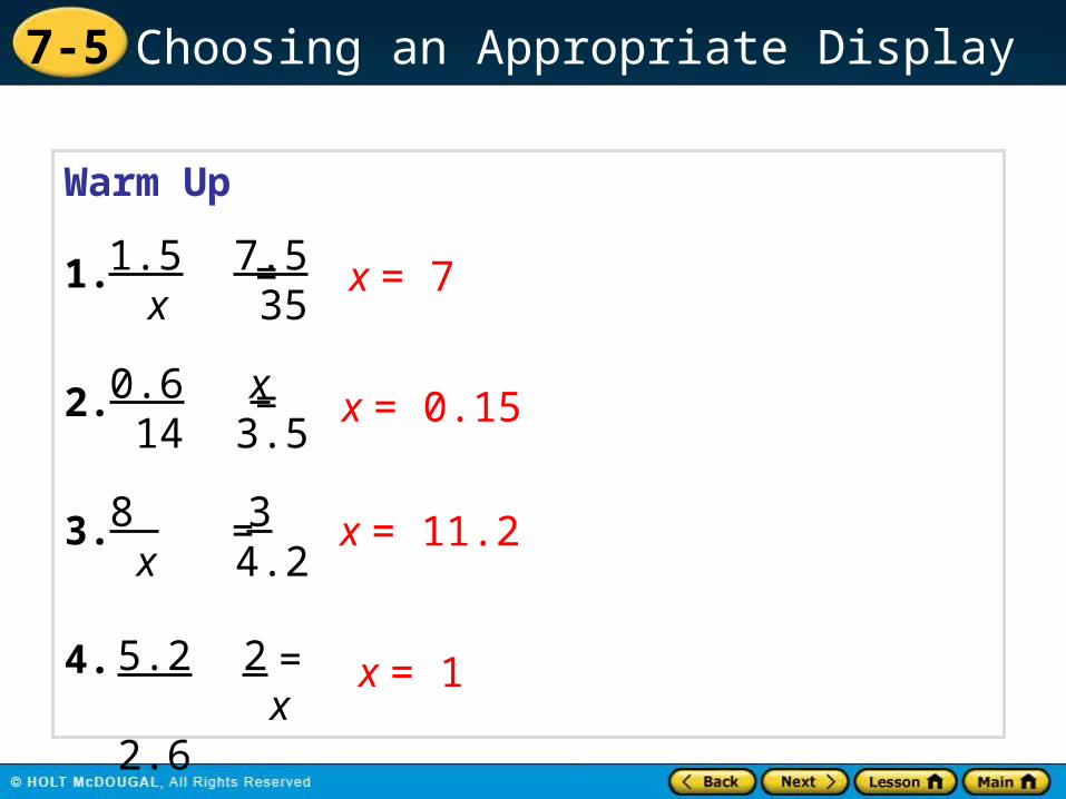
Warm Up
1. =
2. =
3. =
4. =
x = 71.5 x
7.5 35
0.6 14
x 3.5
8 x 3 4.2
5.2 2.6
2 x
x = 0.15
x = 11.2
x = 1
7-5 Choosing an Appropriate Display
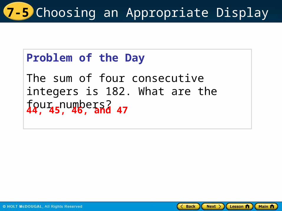
Problem of the Day
The sum of four consecutive integers is 182. What are the four numbers?
44, 45, 46, and 47

7-5 Choosing an Appropriate Display
MA.7.S.6.2 Construct and analyze histograms, stem-and-leaf plots, and circle graphs.
Sunshine State Standards
7-5 Choosing an Appropriate Display
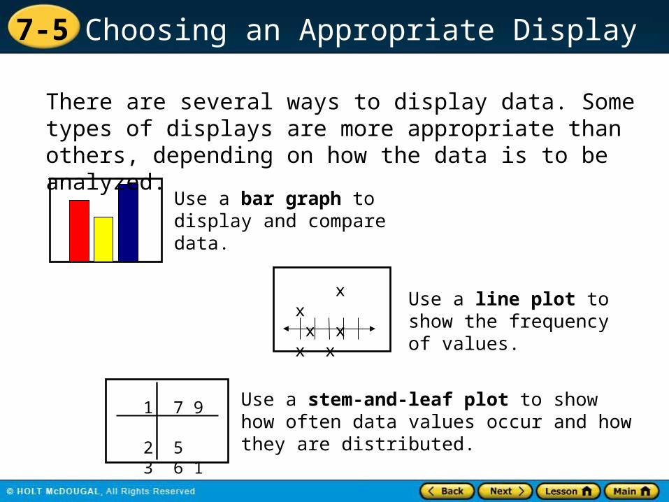
Use a bar graph to display and compare data.
There are several ways to display data. Some types of displays are more appropriate than others, depending on how the data is to be analyzed.
x x x x x x
Use a line plot to show the frequency of values.
1 7 9 2 5 3 6 1
Use a stem-and-leaf plot to show how often data values occur and how they are distributed.

7-5 Choosing an Appropriate Display
Use a line graph to show how data change over a time period.
Use a Venn Diagram to show relationships between two or more data sets.
Use a circle graph to show how a set of data is divided into parts.

7-5 Choosing an Appropriate Display
Additional Example 1A: Choosing an Appropriate Display
The students want to create a display to show each species of butterfly as a percentage of all species in the butterfly family. Which type of graph would they use? Explain.
7Gossamer-wing
10Skippers
5Swallowtails
4Whites and sulphurs
Number of SpeciesButterfly Family
Circle graph; each listed species is a part of the whole population.

7-5 Choosing an Appropriate Display
Additional Example 1B: Choosing an Appropriate Display
Visitors to the park record how many times they see a member of one of the four butterfly families during their visit. You want to make a display of how many times a member of each butterfly family was spotted. Which type of graph would you use? Explain.
I would use a bar graph because this display makes it easy to compare families.

7-5 Choosing an Appropriate Display
Check It Out: Example 1
Which type of display should you use to show how many different species from four rose families there are in a garden? Explain.
23English
13Hybrid Teas
14Standard Tree
2Miniature
Number of Species in the GardenRose Family
Bar graph; it would display the total number of roses and allow the students to see the frequency.
7-5 Choosing an Appropriate Display
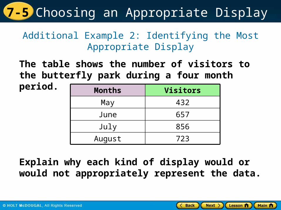
Additional Example 2: Identifying the Most Appropriate Display
The table shows the number of visitors to the butterfly park during a four month period.
432May
657June
856July
723August
VisitorsMonths
Explain why each kind of display would or would not appropriately represent the data.

7-5 Choosing an Appropriate Display
Additional Example 2A: Identifying the Most Appropriate Display
Circle Graph432May
657June
856July
723August
VisitorsMonths
The circle graph does not accurately display the number of visitors per month, so it is not appropriate in representing the data.
May
June
July
August
A circle graph shows how a set of data is divided into parts.

7-5 Choosing an Appropriate Display
Additional Example 2B: Identifying the Most Appropriate Display
Bar Graph432May
657June
856July
723August
VisitorsMonths
The bar graph appropriately displays and compares the data and the number of visitors during each month.
May
June
July
August
0
100
200
300
400
500
600
700
800
900
May June July August
A bar graph displays and compares data.

7-5 Choosing an Appropriate Display
Additional Example 2C: Identifying the Most Appropriate Display
Histogram432May
657June
856July
723August
VisitorsMonths
There are only four pieces of data, which gives four bars of height 1, so the histogram is not appropriate.
A histogram shows the frequency of data within equal intervals.

7-5 Choosing an Appropriate Display
Additional Example 2D: Identifying the Most Appropriate Display
Line Graph432May
657June
856July
723August
VisitorsMonths
The line graph appropriately displays and compares the data and the number of visitors during each month.
A line graph shows how data changes over time.

7-5 Choosing an Appropriate Display
Check It Out: Example 2
The table shows the population of each type of animal at an animal sanctuary. Does the circle graph below appropriately represent the same data? Explain.
16Koala
20Chimpanzee
4Sumatran Tiger
10Male Gorilla
PopulationAnimal

7-5 Choosing an Appropriate Display
Check It Out: Example 2 Continued
The circle graph appropriately displays the percent of each type of animal to the whole animal sanctuary population.

7-5 Choosing an Appropriate Display
Standard Lesson Quiz
Lesson Quizzes
Lesson Quiz for Student Response Systems

7-5 Choosing an Appropriate Display
Lesson Quiz: Part I
1. The number of points scored per game by the basketball team during the season.
2. The number of books read by each student in third period English class.
line plot
line graph
For each description of the data set, tell what type of display would be most appropriate.

7-5 Choosing an Appropriate Display
Lesson Quiz: Part II
3. The percentage of the variety of cakes made by a bakery.
4. The number of magazine subscriptions sold by each member of the sales staff.
circle graph
bar graph

7-5 Choosing an Appropriate Display
1. Identify the type of display that would be most appropriate for the description of the given data set.
The number of points scored per match by a rugby team during the season.
A. line graph
B. line plot
C. bar graph
D. circle graph
Lesson Quiz for Student Response Systems

7-5 Choosing an Appropriate Display
2. Identify the type of display that would be most appropriate for the description of the given data set.
The shoe size of a group of students.
A. line graph
B. line plot
C. bar graph
D. circle graph
Lesson Quiz for Student Response Systems

7-5 Choosing an Appropriate Display
3. Identify the type of display that would be most appropriate for the description of the given data set.
The percent of salary spent by a person on different items.
A. line graph
B. line plot
C. bar graph
D. circle graph
Lesson Quiz for Student Response Systems

7-5 Choosing an Appropriate Display
4. Identify the type of display that would be most appropriate for the description of the given data set.
The grades earned by a student in different subjects.
A. line graph
B. line plot
C. bar graph
D. circle graph
Lesson Quiz for Student Response Systems


