41
that convert customers 7 rules of content marketing design
that convert customers
7 rules of content marketing design

How many times have you left a blog because
it was hard to figure out?

?

Or maybe because it wasn’t optimized for mobile devices?


Surprise!
Crappy content marketing design takes users to a dead end.


And it doesn’t convert customers.


Good design is about taking users through an engaging
and persuasive journey.
These are the 7 rules that your content marketing
design can’t ignore:

Provide a clear user path 1

Can visitors easily find what they're looking for? Or is your content buried
deep in Navigation Jungle?
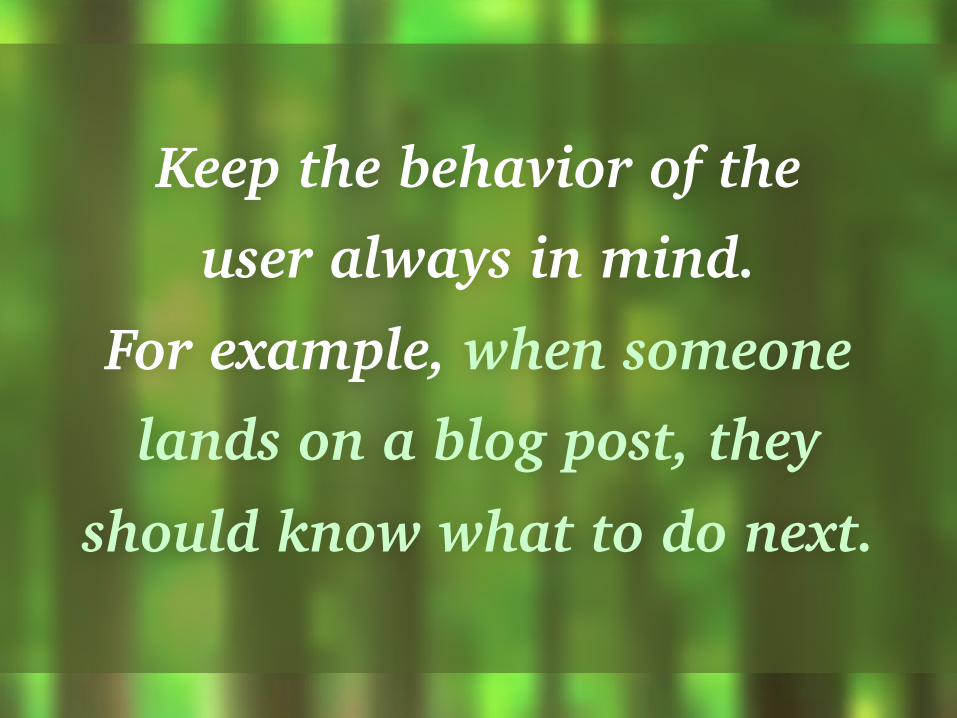
Keep the behavior of the user always in mind.
For example, when someone lands on a blog post, they
should know what to do next.
Keep design consistency 2

Just like your messaging, content marketing design
has to have a consistent flow.
Example: The look & feel of a CTA should complement
the landing page that it leads to.
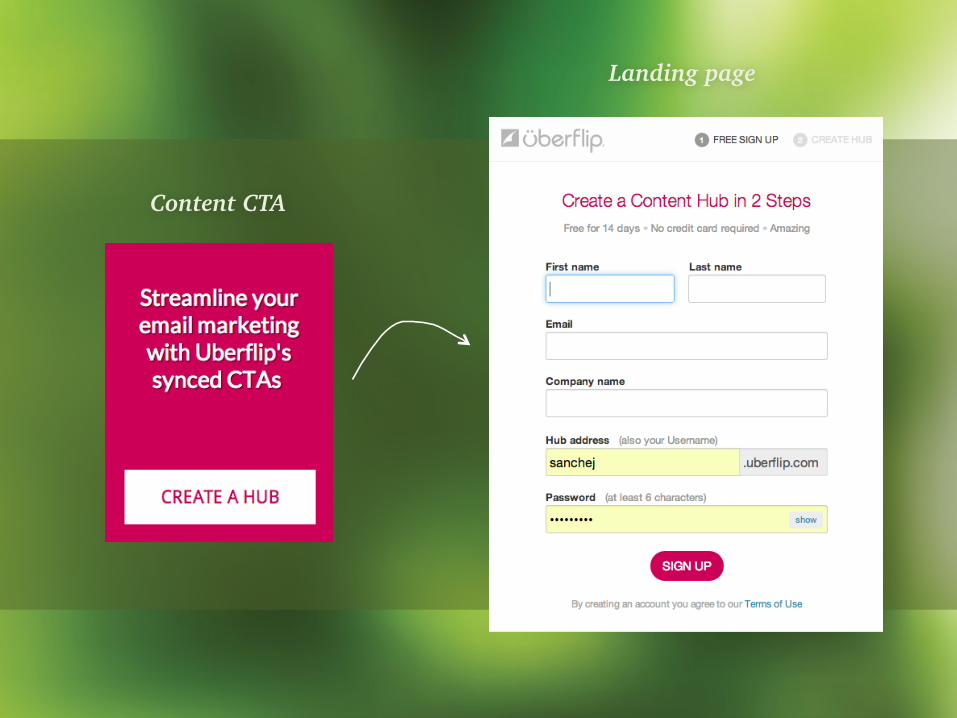
Content CTA
Landing page

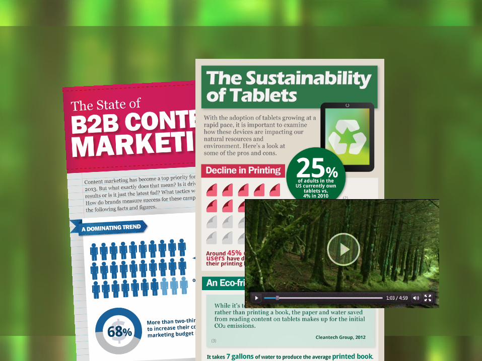
Show more, tell less 3

Images and videos can help you tell your story
with less clicks and less reading.

Instead of writing long descriptions or explanations,
incorporate visuals and interactive content.

Optimize for different devices 4
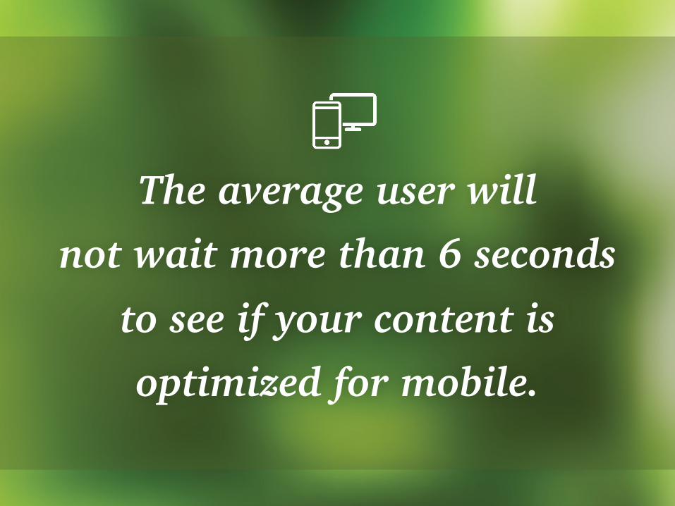
The average user will not wait more than 6 seconds
to see if your content is optimized for mobile.

Technologies like responsive design can help you ensure
that your content works on any screen size.

Enable virality 5

Social networking sites account for the most referral traffic to almost all websites, just behind organic search.

Add sharing buttons for the social networks
that your target audience uses the most.

You can also simplify sharing steps by including embed codes right below videos,
infographics, and other visuals
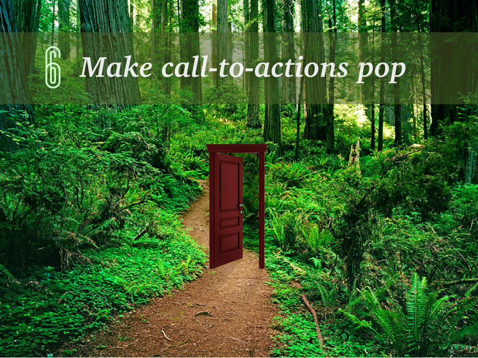
Make call-to-actions pop 6
CTAs have to stand out from the rest of the page
so that it’s easy for prospects to know where to click once they
decide to take the next step.
From choosing the right size (bigger isn’t always better), to using colors that pop, and
leaving enough spacing around buttons, different versions of CTAs
should be continually tested.

Offer the right prize 7
One of the biggest factors in capturing your lead
is balancing the value of what you’re giving away vs. the
perceived barrier to getting it.
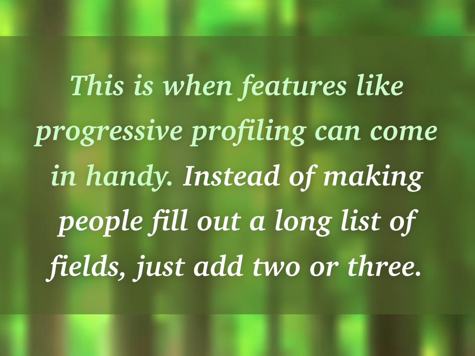
This is when features like progressive profiling can come in handy. Instead of making people fill out a long list of
fields, just add two or three.
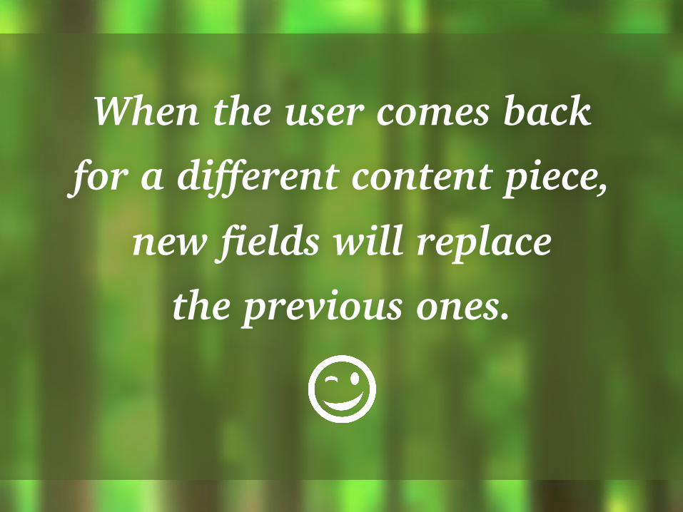
When the user comes back for a different content piece,
new fields will replace the previous ones.

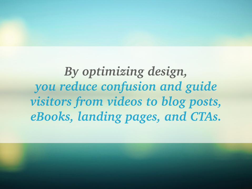
By optimizing design, you reduce confusion and guide
visitors from videos to blog posts, eBooks, landing pages, and CTAs.

By optimizing design, you increase leads and sales.
You immerse people in your journey and take them exactly where they want.


WANT TO GET MORE OUT OF YOUR CONTENT MARKETING?
Increase readers, subscribers, and leads with Uberflip
START A FREE TRIAL


