Page 1
8 Rules for Creating Effective Typography
#1 Learn the Basics
Your first step towards more effective typography is to learn a bit about the art. If you’re unfamiliar
with its concepts, you might think that typography must be a fairly simple discipline. In reality,
typography is quite complicated and is as much science as it is art.
The anatomy of a typeface involves very specific jargon, precise measurements and general
standards that must be known and respected. As with many forms of design, you can only get away
with breaking a rule if you know it well and are doing it intentionally to make a statement.
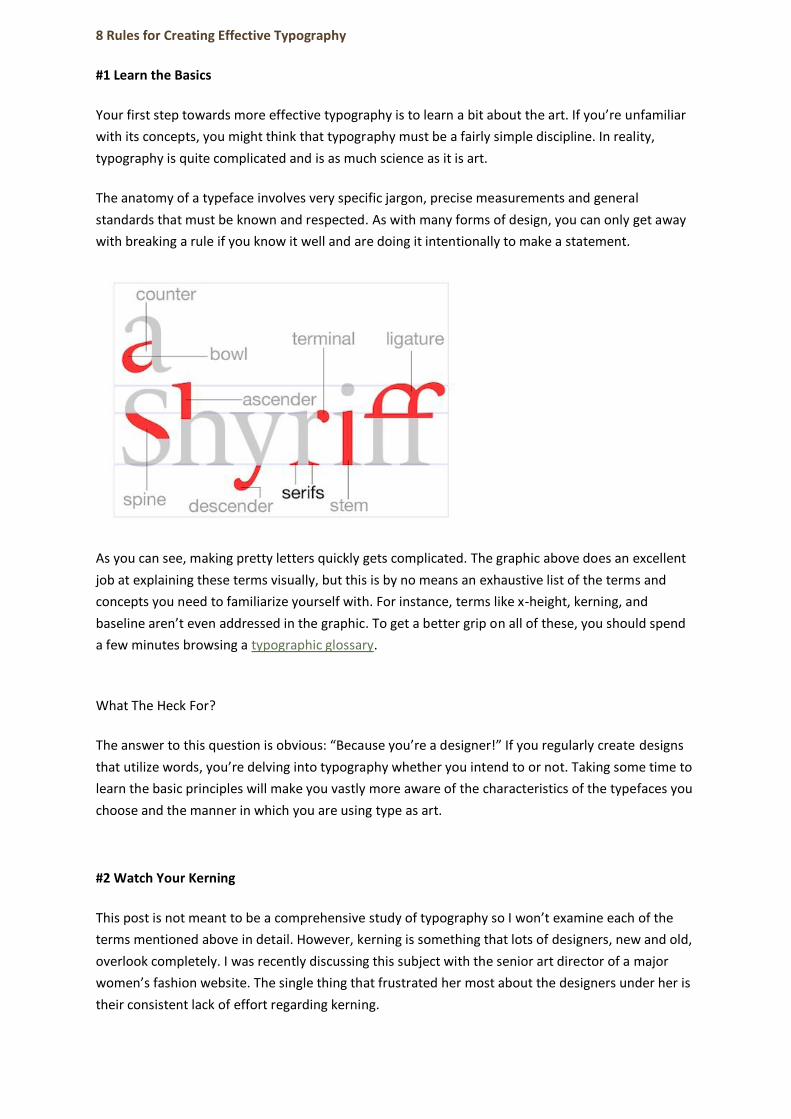
As you can see, making pretty letters quickly gets complicated. The graphic above does an excellent
job at explaining these terms visually, but this is by no means an exhaustive list of the terms and
concepts you need to familiarize yourself with. For instance, terms like x-height, kerning, and
baseline aren’t even addressed in the graphic. To get a better grip on all of these, you should spend
a few minutes browsing a typographic glossary.
What The Heck For?
The answer to this question is obvious: “Because you’re a designer!” If you regularly create designs
that utilize words, you’re delving into typography whether you intend to or not. Taking some time to
learn the basic principles will make you vastly more aware of the characteristics of the typefaces you
choose and the manner in which you are using type as art.
#2 Watch Your Kerning
This post is not meant to be a comprehensive study of typography so I won’t examine each of the
terms mentioned above in detail. However, kerning is something that lots of designers, new and old,
overlook completely. I was recently discussing this subject with the senior art director of a major
women’s fashion website. The single thing that frustrated her most about the designers under her is
their consistent lack of effort regarding kerning.
Page 2
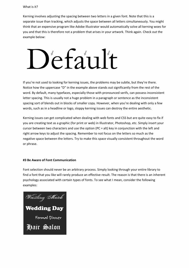
What is it?
Kerning involves adjusting the spacing between two letters in a given font. Note that this is a
separate issue than tracking, which adjusts the space between all letters simultaneously. You might
think that an expensive program like Adobe Illustrator would automatically solve all kerning woes for
you and that this is therefore not a problem that arises in your artwork. Think again. Check out the
example below:
If you’re not used to looking for kerning issues, the problems may be subtle, but they’re there.
Notice how the uppercase “D” in the example above stands out significantly from the rest of the
word. By default, many typefaces, especially those with pronounced serifs, can possess inconsistent
letter spacing. This is usually not a huge problem in a paragraph or sentence as the inconsistent
spacing sort of blends out in blocks of smaller copy. However, when you’re dealing with only a few
words, such as in a headline or logo, sloppy kerning issues can destroy the entire aesthetic.
Kerning issues can get complicated when dealing with web fonts and CSS but are quite easy to fix if
you are creating text as a graphic (for print or web) in Illustrator, Photoshop, etc. Simply insert your
cursor between two characters and use the option (PC = alt) key in conjunction with the left and
right arrow keys to adjust the spacing. Remember to not focus on the letters so much as the
negative space between the letters. Try to make this space visually consistent throughout the word
or phrase.
#3 Be Aware of Font Communication
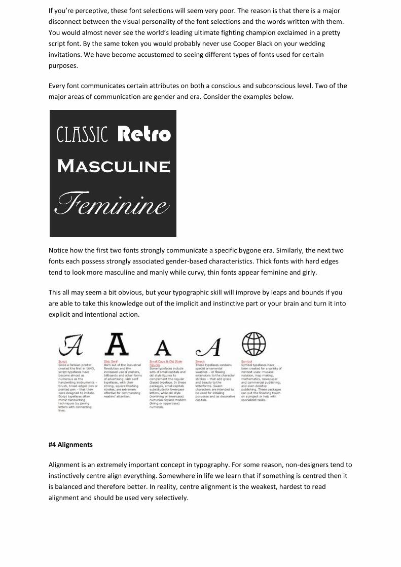
Font selection should never be an arbitrary process. Simply looking through your entire library to
find a font that you like will rarely produce an effective result. The reason is that there is an inherent
psychology associated with certain types of fonts. To see what I mean, consider the following
examples:
Page 3
If you’re perceptive, these font selections will seem very poor. The reason is that there is a major
disconnect between the visual personality of the font selections and the words written with them.
You would almost never see the world’s leading ultimate fighting champion exclaimed in a pretty
script font. By the same token you would probably never use Cooper Black on your wedding
invitations. We have become accustomed to seeing different types of fonts used for certain
purposes.
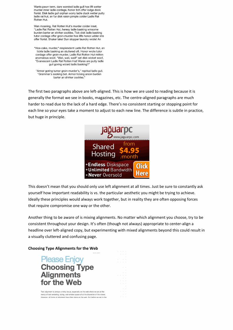
Every font communicates certain attributes on both a conscious and subconscious level. Two of the
major areas of communication are gender and era. Consider the examples below.
Notice how the first two fonts strongly communicate a specific bygone era. Similarly, the next two
fonts each possess strongly associated gender-based characteristics. Thick fonts with hard edges
tend to look more masculine and manly while curvy, thin fonts appear feminine and girly.
This all may seem a bit obvious, but your typographic skill will improve by leaps and bounds if you
are able to take this knowledge out of the implicit and instinctive part or your brain and turn it into
explicit and intentional action.
#4 Alignments
Alignment is an extremely important concept in typography. For some reason, non-designers tend to
instinctively centre align everything. Somewhere in life we learn that if something is centred then it
is balanced and therefore better. In reality, centre alignment is the weakest, hardest to read
alignment and should be used very selectively.
Page 4
The first two paragraphs above are left-aligned. This is how we are used to reading because it is
generally the format we see in books, magazines, etc. The centre-aligned paragraphs are much
harder to read due to the lack of a hard edge. There’s no consistent starting or stopping point for
each line so your eyes take a moment to adjust to each new line. The difference is subtle in practice,
but huge in principle.
This doesn’t mean that you should only use left alignment at all times. Just be sure to constantly ask
yourself how important readability is vs. the particular aesthetic you might be trying to achieve.
Ideally these principles would always work together, but in reality they are often opposing forces
that require compromise one way or the other.
Another thing to be aware of is mixing alignments. No matter which alignment you choose, try to be
consistent throughout your design. It’s often (though not always) appropriate to center-align a
headline over left-aligned copy, but experimenting with mixed alignments beyond this could result in
a visually cluttered and confusing page.
Choosing Type Alignments for the Web
Page 5
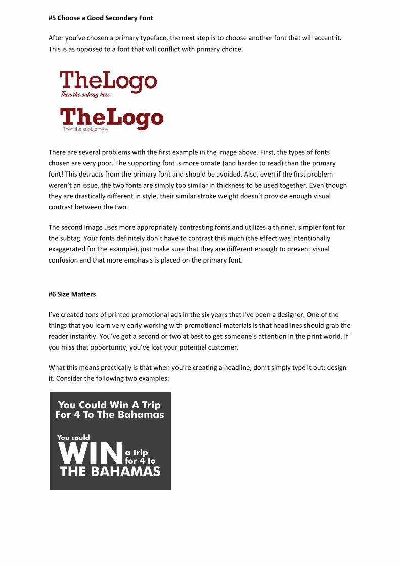
#5 Choose a Good Secondary Font
After you’ve chosen a primary typeface, the next step is to choose another font that will accent it.
This is as opposed to a font that will conflict with primary choice.
There are several problems with the first example in the image above. First, the types of fonts
chosen are very poor. The supporting font is more ornate (and harder to read) than the primary
font! This detracts from the primary font and should be avoided. Also, even if the first problem
weren’t an issue, the two fonts are simply too similar in thickness to be used together. Even though
they are drastically different in style, their similar stroke weight doesn’t provide enough visual
contrast between the two.
The second image uses more appropriately contrasting fonts and utilizes a thinner, simpler font for
the subtag. Your fonts definitely don’t have to contrast this much (the effect was intentionally
exaggerated for the example), just make sure that they are different enough to prevent visual
confusion and that more emphasis is placed on the primary font.
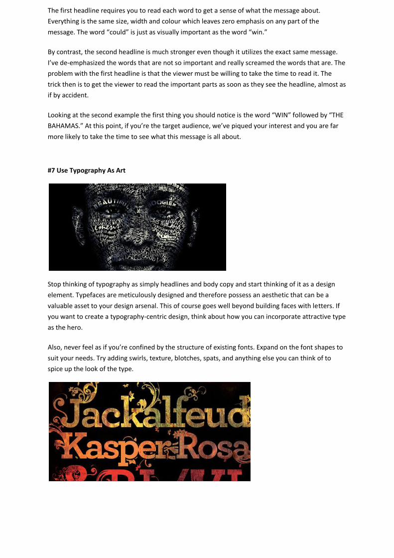
#6 Size Matters
I’ve created tons of printed promotional ads in the six years that I’ve been a designer. One of the
things that you learn very early working with promotional materials is that headlines should grab the
reader instantly. You’ve got a second or two at best to get someone’s attention in the print world. If
you miss that opportunity, you’ve lost your potential customer.
What this means practically is that when you’re creating a headline, don’t simply type it out: design
it. Consider the following two examples:
Page 6
The first headline requires you to read each word to get a sense of what the message about.
Everything is the same size, width and colour which leaves zero emphasis on any part of the
message. The word “could” is just as visually important as the word “win.”
By contrast, the second headline is much stronger even though it utilizes the exact same message.
I’ve de-emphasized the words that are not so important and really screamed the words that are. The
problem with the first headline is that the viewer must be willing to take the time to read it. The
trick then is to get the viewer to read the important parts as soon as they see the headline, almost as
if by accident.
Looking at the second example the first thing you should notice is the word “WIN” followed by “THE
BAHAMAS.” At this point, if you’re the target audience, we’ve piqued your interest and you are far
more likely to take the time to see what this message is all about.
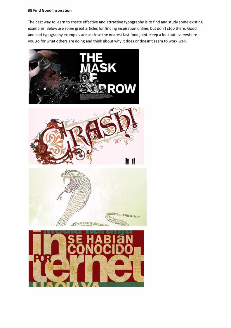
#7 Use Typography As Art
Stop thinking of typography as simply headlines and body copy and start thinking of it as a design
element. Typefaces are meticulously designed and therefore possess an aesthetic that can be a
valuable asset to your design arsenal. This of course goes well beyond building faces with letters. If
you want to create a typography-centric design, think about how you can incorporate attractive type
as the hero.
Also, never feel as if you’re confined by the structure of existing fonts. Expand on the font shapes to
suit your needs. Try adding swirls, texture, blotches, spats, and anything else you can think of to
spice up the look of the type.
Page 7
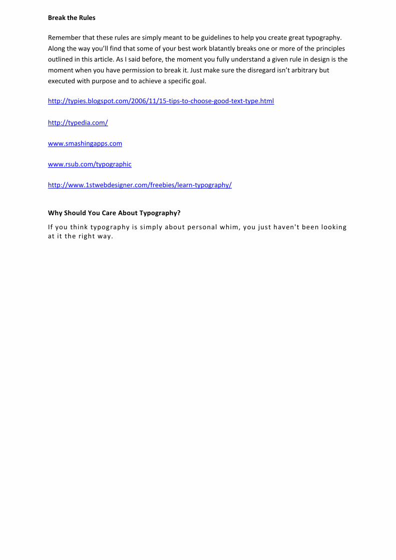
#8 Find Good Inspiration
The best way to learn to create effective and attractive typography is to find and study some existing
examples. Below are some great articles for finding inspiration online, but don’t stop there. Good
and bad typography examples are as close the nearest fast food joint. Keep a lookout everywhere
you go for what others are doing and think about why it does or doesn’t seem to work well.
Page 8
Break the Rules
Remember that these rules are simply meant to be guidelines to help you create great typography.
Along the way you’ll find that some of your best work blatantly breaks one or more of the principles
outlined in this article. As I said before, the moment you fully understand a given rule in design is the
moment when you have permission to break it. Just make sure the disregard isn’t arbitrary but
executed with purpose and to achieve a specific goal.
http://typies.blogspot.com/2006/11/15-tips-to-choose-good-text-type.html
http://typedia.com/
www.smashingapps.com
www.rsub.com/typographic
http://www.1stwebdesigner.com/freebies/learn-typography/
Why Should You Care About Typography?
If you think typography is simply about personal whim, you just haven't been looking at it the right way.
Page 10
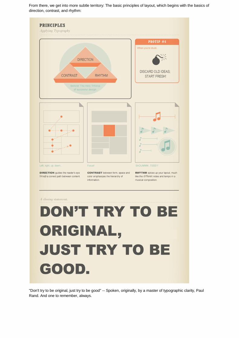
From there, we get into more subtle territory: The basic principles of layout, which begins with the basics of
direction, contrast, and rhythm:
"Don't try to be original, just try to be good" -- Spoken, originally, by a master of typographic clarity, Paul
Rand. And one to remember, always.
Page 11
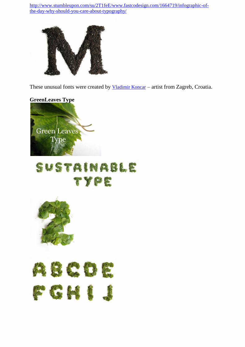
http://www.stumbleupon.com/su/2T1feE/www.fastcodesign.com/1664719/infographic-of-the-day-why-should-you-care-about-typography/
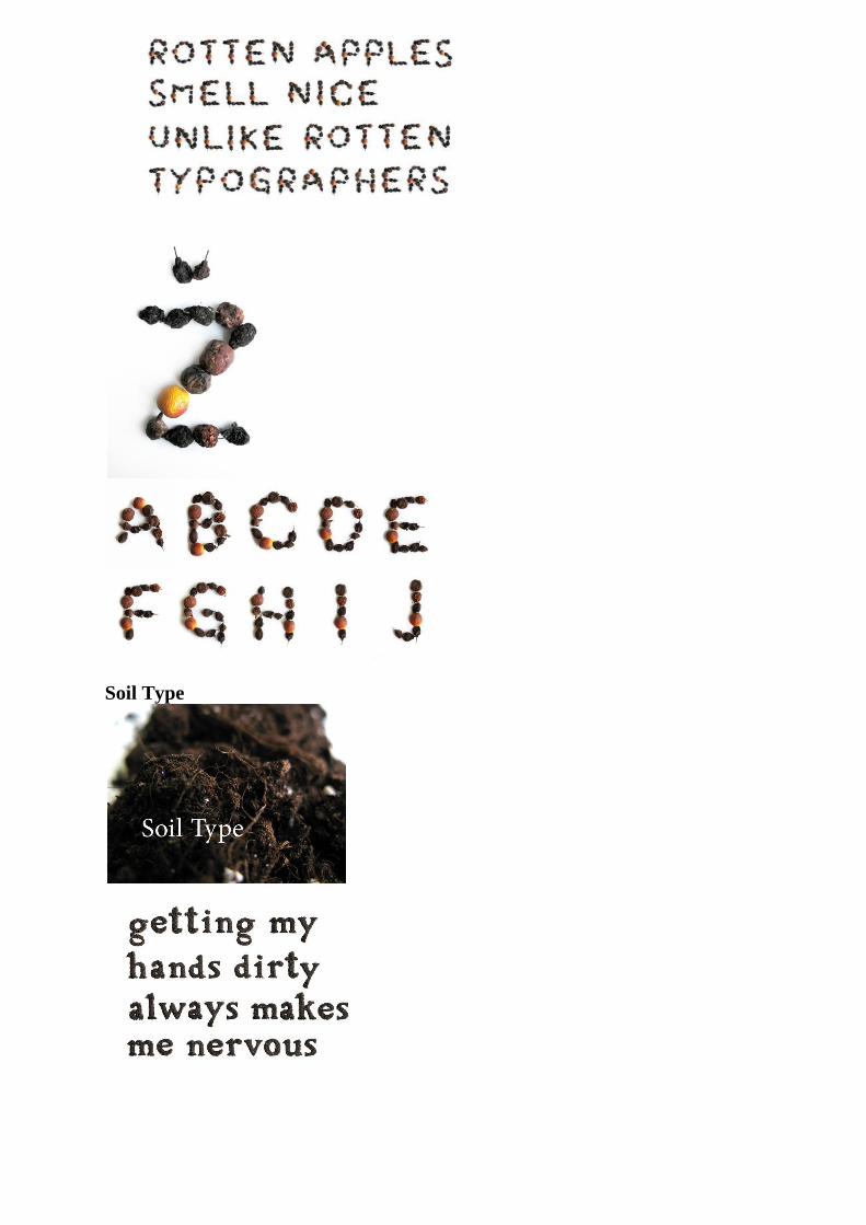
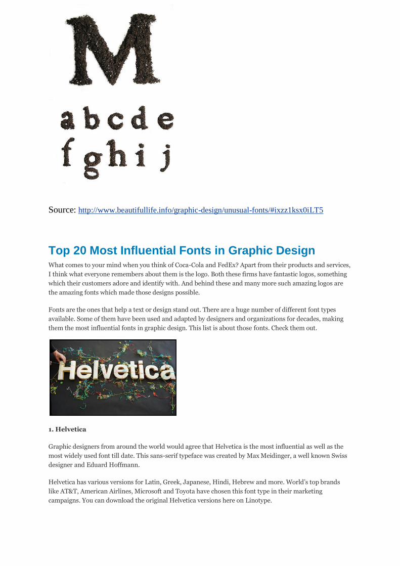
These unusual fonts were created by Vladimir Koncar – artist from Zagreb, Croatia.
GreenLeaves Type
Page 12
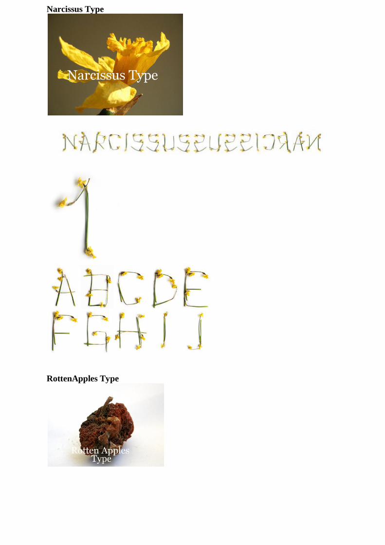
Narcissus Type
RottenApples Type
Page 14
Source: http://www.beautifullife.info/graphic-design/unusual-fonts/#ixzz1ksx0iLT5
Top 20 Most Influential Fonts in Graphic Design What comes to your mind when you think of Coca-Cola and FedEx? Apart from their products and services,
I think what everyone remembers about them is the logo. Both these firms have fantastic logos, something
which their customers adore and identify with. And behind these and many more such amazing logos are
the amazing fonts which made those designs possible.
Fonts are the ones that help a text or design stand out. There are a huge number of different font types
available. Some of them have been used and adapted by designers and organizations for decades, making
them the most influential fonts in graphic design. This list is about those fonts. Check them out.
1. Helvetica
Graphic designers from around the world would agree that Helvetica is the most influential as well as the
most widely used font till date. This sans-serif typeface was created by Max Meidinger, a well known Swiss
designer and Eduard Hoffmann.
Helvetica has various versions for Latin, Greek, Japanese, Hindi, Hebrew and more. World’s top brands
like AT&T, American Airlines, Microsoft and Toyota have chosen this font type in their marketing
campaigns. You can download the original Helvetica versions here on Linotype.
Page 15
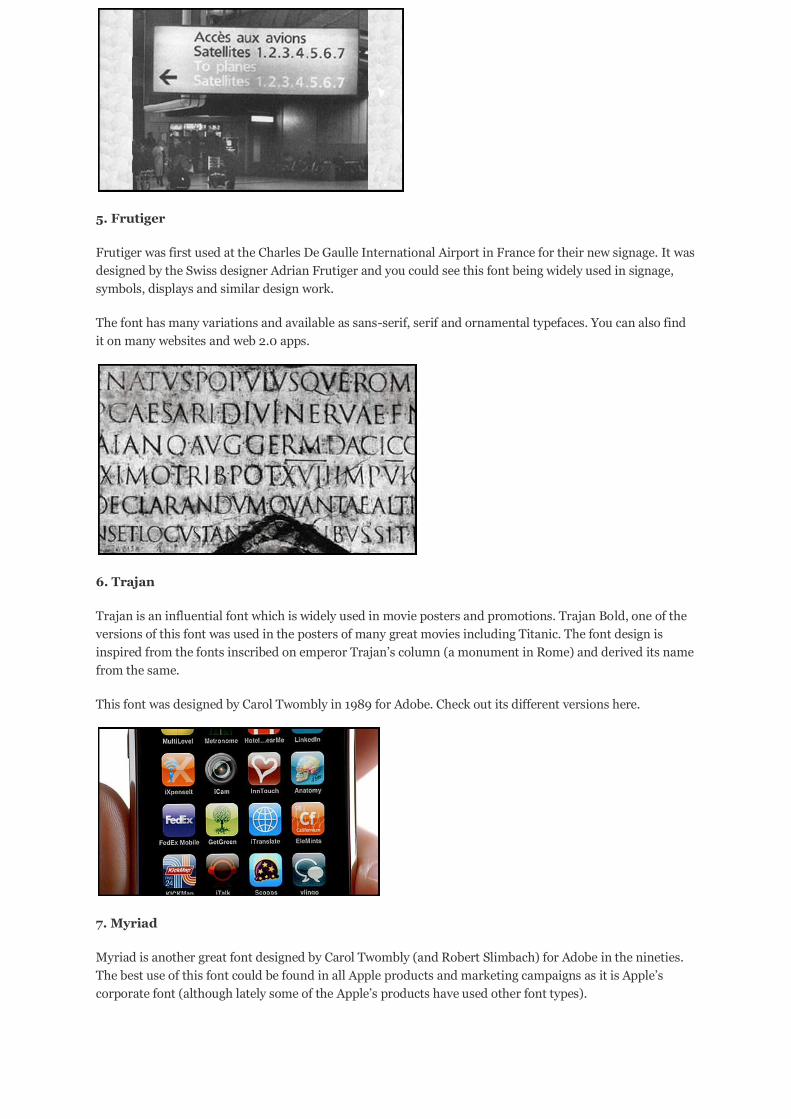
2. Futura
Futura is another sans-serif typeface widely used in graphic design. This font is based on geometric shapes
and used in logos, displays and books where the text size needed is not significantly large. It was first used
commercially in 1927 when it was released by the Bauer type foundry.
There are different versions of this font like the Futura Black, Futura Display, Futura Condensed etc. Check
all the versions of Futura here.
3. Garamond
Garamond is a very old typeface said to have first created for the French King Francis I in the 1540s. Since
then this style serif typeface has been used in various forms across the world. The modern version which is
the most popular is called Adobe Garamond which finds its place in textbooks and magazines. You can also
find it in the different editions of Harry Potter.
4. Bodoni
Bodoni, which is named after its creator Giambattista Bodoni is primarily used for headlines and logos. It
has been used in books for the last three hundred years. One of its versions, which was designed by
Chauncey H. Griffith, is called Poster Bodoni. This version finds use in posters and big displays.
Since Bodoni has an aesthetic look, it is also used in decorative text. Hilton Hotels uses this typeface in their
restaurant menu content.
Page 16
5. Frutiger
Frutiger was first used at the Charles De Gaulle International Airport in France for their new signage. It was
designed by the Swiss designer Adrian Frutiger and you could see this font being widely used in signage,
symbols, displays and similar design work.
The font has many variations and available as sans-serif, serif and ornamental typefaces. You can also find
it on many websites and web 2.0 apps.
6. Trajan
Trajan is an influential font which is widely used in movie posters and promotions. Trajan Bold, one of the
versions of this font was used in the posters of many great movies including Titanic. The font design is
inspired from the fonts inscribed on emperor Trajan’s column (a monument in Rome) and derived its name
from the same.
This font was designed by Carol Twombly in 1989 for Adobe. Check out its different versions here.
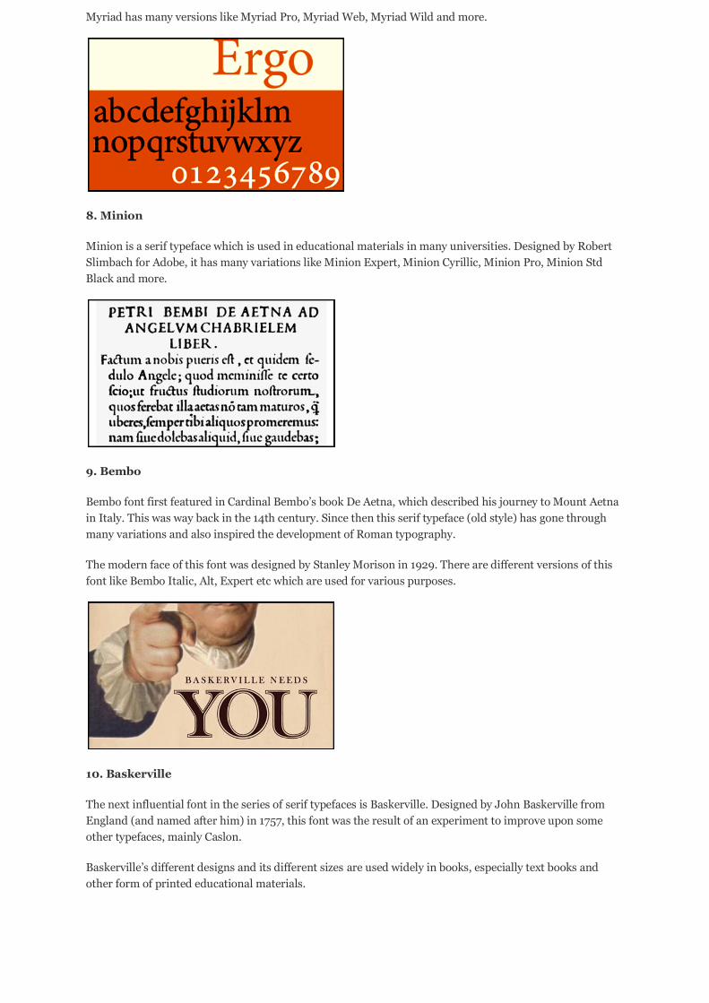
7. Myriad
Myriad is another great font designed by Carol Twombly (and Robert Slimbach) for Adobe in the nineties.
The best use of this font could be found in all Apple products and marketing campaigns as it is Apple’s
corporate font (although lately some of the Apple’s products have used other font types).
Page 17
Myriad has many versions like Myriad Pro, Myriad Web, Myriad Wild and more.
8. Minion
Minion is a serif typeface which is used in educational materials in many universities. Designed by Robert
Slimbach for Adobe, it has many variations like Minion Expert, Minion Cyrillic, Minion Pro, Minion Std
Black and more.
9. Bembo
Bembo font first featured in Cardinal Bembo’s book De Aetna, which described his journey to Mount Aetna
in Italy. This was way back in the 14th century. Since then this serif typeface (old style) has gone through
many variations and also inspired the development of Roman typography.
The modern face of this font was designed by Stanley Morison in 1929. There are different versions of this
font like Bembo Italic, Alt, Expert etc which are used for various purposes.
10. Baskerville
The next influential font in the series of serif typefaces is Baskerville. Designed by John Baskerville from
England (and named after him) in 1757, this font was the result of an experiment to improve upon some
other typefaces, mainly Caslon.
Baskerville’s different designs and its different sizes are used widely in books, especially text books and
other form of printed educational materials.
Page 18
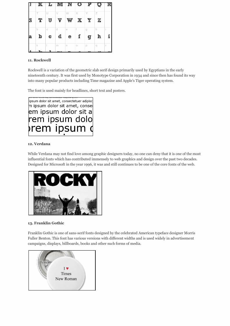
11. Rockwell
Rockwell is a variation of the geometric slab serif design primarily used by Egyptians in the early
nineteenth century. It was first used by Monotype Corporation in 1934 and since then has found its way
into many popular products including Time magazine and Apple’s Tiger operating system.
The font is used mainly for headlines, short text and posters.
12. Verdana
While Verdana may not find love among graphic designers today, no one can deny that it is one of the most
influential fonts which has contributed immensely to web graphics and design over the past two decades.
Designed for Microsoft in the year 1996, it was and still continues to be one of the core fonts of the web.
13. Franklin Gothic
Franklin Gothic is one of sans-serif fonts designed by the celebrated American typeface designer Morris
Fuller Benton. This font has various versions with different widths and is used widely in advertisement
campaigns, displays, billboards, books and other such forms of media.
Page 19
14. Times New Roman
Who can forget Times New Roman when creating a list like this one. Probably the most ubiquitous typeface
ever, Times New Roman is used extensively in books, magazines and various other forms of printed
material. The font was designed by Stanley Morison and Victor Lardent, and it first appeared on 3 October
1932 in the issue of the famous British newspaper, The Times.
15. Gill Sans
Gill Sans first appeared in England in 1928 when it was introduced by Monotype. This sans-serif typeface
was originally designed by Douglas Cleverdon and later adapted developed by Eric Gill. Inspired by Edward
Johnston’s font design for London Underground, this font finds use in a variety of products and designs like
Mac OS X and some Microsoft products.
16. Univers
Univers, a font designed by Adrian Frutiger has lots of similarities with Helvetica. Univers’ design is such
that it can be easily read from long distances when compared to other fonts. Hence you could find it being
used for signage and by various airline companies. Some of the prominent firms which used this font are
Swiss International Air Lines, Deutsche Bank and Frankfurt airport.
17. Clarendon
Clarendon is an old slab serif typeface developed in the early nineteenth century in Great Britain. During
that period of industrialization, this font was used by a huge number of establishments in England and
other European countries. Recently, it came into prominence when the well known restaurant chain Ruby
Tuesday used it in their re-branding initiative.
Page 20
18. FF DIN
DIN means Deutsches Institut für Normung (German Institute for Standardisation). FF DIN is a modern
font designed by a Dutch designer and is being used lately by many prominent firms as part of their
corporate identity. Some of those firms include Adidas, JetBlue Airways and American Eagle Outfitters.
19. Avenir
Avenir is another font in the series of popular fonts designed by Adrian Frutiger. The font is classified as a
geometric sans-serif typeface and used widely in printed matter where it adds style and clarity to the text.
Like the other fonts, this one also has many versions to choose from.
20. Warnock Pro
Warnock Pro was designed by Robert Slimbach and named after John Warnock, the co-founder of Adobe
Systems. Considered as one of the most influential typefaces designed in the 21st century, Warnock Pro is a
part of an opentype font family which has various versions and used in many products (ex - Adobe CS).
http://www.stumbleupon.com/su/2meXCM/www.artdesignschools.com/careers/top-20-most-
influential-fonts-in-graphic-design/
http://www.stumbleupon.com/su/AZWdMo/psd.tutsplus.com/articles/web/50-totally-free-lessons-
in-graphic-design-theory/ this looks amazing, do all the tutorials
Page 21
http://www.stumbleupon.com/su/1suNtL/www.designflavr.com/resources/21-Inspirational-
Typography-Artworks--from-DeviantArt-i116/ see first 5 pics
http://o-nay.deviantart.com/art/your-type-111679247 6 to 8 pics
Tips for Better Typography Whenever applicable, respect the history of your typeface.
Understand it might not have been designed to stretch, bend, or be distorted.
Design for readability and legibility. Type is supposed to be read.
Consider what your font was designed for when choosing it. Don’t write your memos in Impact. Sending emails sent in Funstuff makes you look goofy.
Many fonts are designed to be set in Upper and Lower case. Script fonts are an example of
this and are nigh-illegible in all caps.
Blackletter fonts are another example. There is an aesthetic associated with all-caps
Blackletter fonts, but they aren’t necessarily designed for reading that way.
When your primary purpose is communicating the content, simpler is often better.
Use as few fonts and point sizes in those fonts as possible on a single design.
If you use a different font or point size in that font in a design, make sure you have a reason.
Make sure they are different enough that the difference is noticed.
If you ignore any of the so called “rules of design,” have a good reason, and do itextremely well.
http://www.stumbleupon.com/su/1PLons/www.howtogeek.com/howto/30065/how-to-understand-
typography-like-a-professional-designer/