88
#2 / Winter 2010

#2 / Winter 2010
WelcomeA note from the editor
A World of WordsIntro by Aegir Hallmundur
Martin Majoor
Ale Paul
Stephen Coles
Tim Brown
Nick Sherman
Rich Rutter
Veronika Burian & José Scaglione
Work as if You Live in The Early Days of a Better NationArtwork by Jez Burrows
P is for PaperCompetition winner Ayaka Ito
FakirFeature by Samantha Cliffe
Windows Phone 7Feature by Elliot Jay Stocks
A Brief History of Uncial TypeFeature by Dan Reynolds
The Ad Section
3
4
6
14
22
30
38
46
54
62
64
66
70
72
76
8 Faces #This magazine was made possible thanks to the kind and generous support of our partners. Thank you!
2Platinum
Partner
Diamond Partner
Diamond Partner
Diamond Partner
PAGE 02 CONTENTS

Welcome A note from the editor
honesty that I had no idea whatsoever! Its near-immediate sell-out was as much of a surprise to me as it was to the thousands clamouring to get a copy.
This time around, we’ve tripled the print run in an effort to satisfy the demand. We’ve also upped the page count, added new features, partnered with a number of great companies to turn this from a side project into a proper business, and enlisted the help of many talented individuals to contribute to an issue which may prove to be even better than the first!
Thanks once again for your support. We wouldn’tbe here without you!
I’ve recently returned from speaking at Brooklyn Beta, at which I did a presentation on 8 Faces — an overview of how it went from a half-baked, slightly silly idea to a real, finished, printed magazine that sold out of all 1000 of its copies within just two hours. At the end of the talk, I thanked everyone who had bought a copy and unexpectedly found myself with a tear in my eye. It was as if I’d suddenly realised what had happened, and I felt genuinely overcome with gratitude for everyone who bought a copy of our debut issue.
Many people asked me if I’d known how successful #1 was going to be, and I can say with complete
WELCOME PAGE 03

As typographers and type designers, we’re very much part of this process. With contextual ligatures and glyph substitution, we can beautify and clarify words as they’re typed; with hinting and kerning we can ensure readability across a range of devices and resolutions; with unicode we can cover all the world’s languages; with universal icons and symbols we hoped (and, perhaps, still hope) to bring type to the illiterate.
We live in a world of words. Technological development in recent years has seen an explosion in the ways we appreciate and consume the written word. From artisanal letterpress to digital billboards and nanotechnological e-ink book readers; the sheer range of technology we use to display type is enormous, and — temporary phenomenon or long-term trend —it will all have an impact on how we design and think about type.
Type has gone beyond being merely moveable: it is now active.
Our words are no longer passive things, waiting for the turn of a page and the glance of an eye. They are active, they are input: software constructs possessed of logical structure and semantics, and connected to a whole world of data. When we type our keystrokes are interpreted: if there’s a ‘va’, the kerning may be adjusted, if there’s a double-f, the screen may show a ligature, if the word is part of a search, the screen may start to fill with results before we even finish typing, and if — quelle horreur! — our word isn’t in a system dictionary, it will get highlighted or even replaced with a ‘correct’ one.
A World
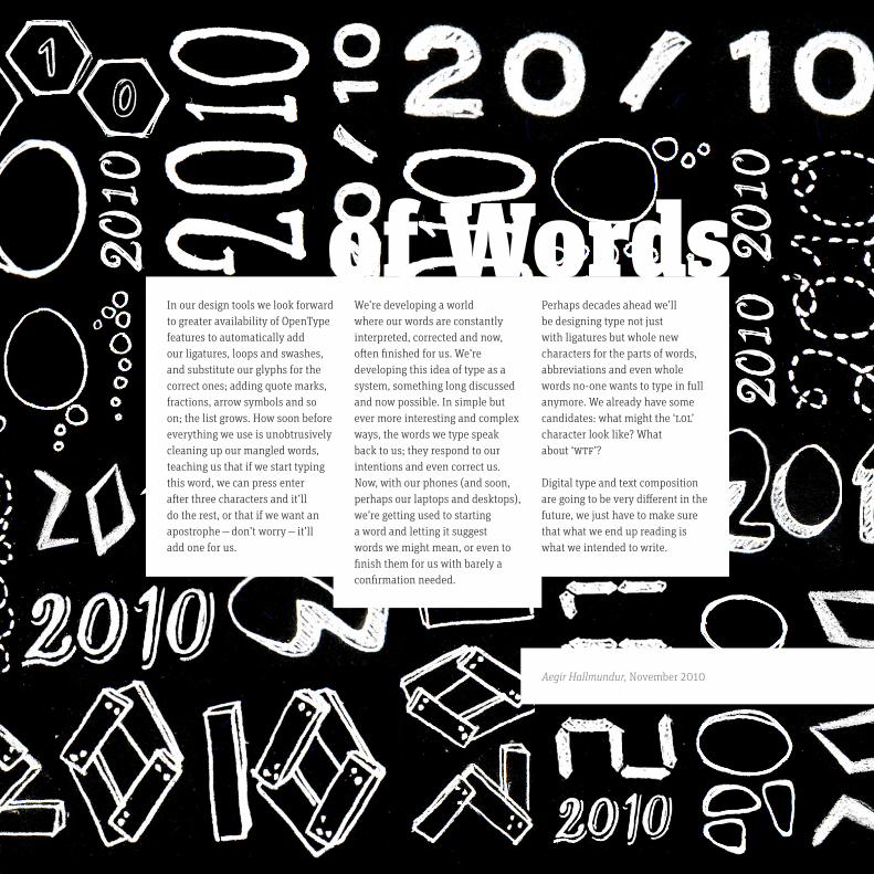
Perhaps decades ahead we’ll be designing type not just with ligatures but whole new characters for the parts of words, abbreviations and even whole words no-one wants to type in full anymore. We already have some candidates: what might the ‘lol’ character look like? What about ‘wtf’?
Digital type and text composition are going to be very different in the future, we just have to make sure that what we end up reading is what we intended to write.
In our design tools we look forward to greater availability of OpenType features to automatically add our ligatures, loops and swashes, and substitute our glyphs for the correct ones; adding quote marks, fractions, arrow symbols and so on; the list grows. How soon before everything we use is unobtrusively cleaning up our mangled words, teaching us that if we start typing this word, we can press enter after three characters and it’ll do the rest, or that if we want an apostrophe — don’t worry — it’ll add one for us.
We’re developing a world where our words are constantly interpreted, corrected and now, often finished for us. We’re developing this idea of type as a system, something long discussed and now possible. In simple but ever more interesting and complex ways, the words we type speak back to us; they respond to our intentions and even correct us. Now, with our phones (and soon, perhaps our laptops and desktops), we’re getting used to starting a word and letting it suggest words we might mean, or even to finish them for us with barely a confirmation needed.
of Words
Aegir Hallmundur, November 2010

MartinMajoor
You developed your type system of creating a sans and a serif — and later a slab — from the same form, which you later coined ‘The Nexus Principle’, after your work on Nexus. Has that evolved even further since 2005 (when you wrote the article on your type design philosophy), or do the same principles apply to your more recent type design projects?
The principle hasn’t changed, although I might have extended it a little bit. After I made ‘The Nexus Principle’ (nexus meaning ‘connection’), that for me was the basic thing about this whole project: to make connections; to base it on one thing, make a sans and a slab, and have all of them connected.
In the same way, you can connect a fourth font if you want, and that is something I’ve been experimenting with, although I’ve never shown or published it. If you have a serif typeface, cut off the serifs, but not lower the contrast, does it become a sans-serif or is it simply a serif without serifs?
And with Nexus, you also have a typewriter font within the family as well. How does a typewriter font fit in with the overall principle?
Not many type designers would boast about only producing one typeface every six years, but then not every type designer is Martin Majoor. This is the man who virtually wrote the rule book on super-families and influenced many with his famous type design philosophy: a principle that says the serif, sans, and slab serif should all share the same basic structure. We talked theory with the father of Scala...
martinmajoor.com
1 2 3 4 5 6 7 8
PAGE 06 INTERVIEW MARTIN MAJOOR

It is possible to do this from a sans-serif, but to me it’s totally illegible and doesn’t make sense, so I wouldn’t recommend it. But there are always typefaces — sans typefaces — which later have a serif equivalent. I remember Syntax — the metal version — which is a very beautiful, humanist sans-serif. Much later, there was a serif version added to this. It’s such a horrible thing to say, but it’s so empty. It doesn’t have anything of the strength of the original Syntax. So it’s very difficult to do it in reverse order. I don’t think it’s a good idea. It is possible, but what comes out mostly is not as strong.
What is it about a serif being first in the process that makes it the best starting point?
It’s the way history has developed. Serifs were there first. You have to ask yourself: where did they come from? Who made these? How were they constructed? And that is what my principle is about as well: the historical explanation. As a type designer, I strongly believe that these punchcutters from Germany and England must have had some sort of example before they could start a sans. In England they must have used Bell or something; in Germany, they must have used Walbaum or Didot or Bodoni.
It doesn’t fit in. It’s just for fun! In Nexus Typewriter, I tried to make it as readable as possible, but you always have this problem with a very narrow ‘m’ and a very wide ‘i’, and so on. It’s something that’s not connected to the principle.
What about swashes? You’ve got swash italics for Nexus. Did you find that there’s a standard you have for producing swashes, or is that again just a little fun?
It’s a lot of fun. Not so long ago, I told somebody that making swashes was one of the happiest times of my type designing life. I really love calligraphy and certainly the very old, Italian masters of calligraphy. What they did often amazes me, as it’s always very difficult to make a swash. If you make one range of swash capitals, you can’t stop and you have to make another range, and maybe a third one. I stopped with two, but I could have gone on and done more! But this also has nothing to do with the principle, it’s just an extra thing.
Is there ever a scenario — perhaps in other designers’ projects — where the principle wouldn’t work?
I don’t think so. It’s a very simple principle. Of course you have to have the serif typeface. If you have that, you just cut off the serifs, change the contrast, and that’s basically it. You can do this with Bembo, Bodoni, with everything.
Is there ever a way you can do it in reverse, if you have a sans first?
[Left] Nexus characteristics designed by Wim Westerveld and first published in the FF Nexus FontFont Focus type specimen
INTERVIEW MARTIN MAJOOR

Making swashes was one of the happiest times of my type designing life.
In your philosophy, 1 you highlight an example of Akzidenz-Grotesk potentially being based on Walbaum because it’s so similar.
Yes, and that’s what I’m doing together with Jos Buivenga 2 — proving it by just doing it. We're making a Didot / Bodoni sort of text typeface — a serif typeface of course — which is based on a display face Jos worked on previously, and from this text face, we create a sans. If you make the lowercase ‘a’ exactly on the base of what you did with the serif, you’ll see that it’s really like a sort of Akzidenz-Grotesk or an early sans-serif. This is quite interesting. You can really show that this is actually the process of the punchcutters when they started making the first sans-serif.
Last issue, Jos told us a little about this collaborative project Questa, which I believe you spoke about at ATypI and in Arnhem. What else can you tell us about it?
We’re making progress slowly and are now at a stage where we've made a text typeface and a sans-serif derived from the serif. We're making the display typeface again, this time based on the serif.
Just to clarify, the original idea came from the first version of the display face that Jos created, and then you took that and started to make the text face from that?
In fact it was two different ideas. One was from Jos and one was mine. It was Jos’ idea to create a Bodoni / Didot style display face, and when I saw that, I said, ‘I’m trying to prove this sans-serif story,
Is there going to be a slab variant as well?
Well, now that you mention it, there could be! It’s not what we
so maybe we can use the Didot sort of typeface to make the sans.’
When do you think we’ll see this, live and in the public?
We don’t have a deadline, but if all goes well, then hopefully we’ll release it sometime in the spring of 2011.
planned, but who knows, maybe if it’s a success, in the end we'll make a slab serif.
You're known for your theoretical approach and wide appreciation of type history. What do you feel is the single most important lesson you've learned from the type masters of yesteryear?
1. My Type Design Philosophy: martinmajoor.com/6_my_philosophy.html2. See our last issue
INTERVIEW MARTIN MAJOOR PAGE 09

Helvetica is a clear rip-off of Akzidenz-Grotesk. For me, Max Miedinger is not an original type designer.
it’s a real, physical thing that you can hold in your hands.
Do you do a lot of book design yourself these days?
I have done, but not anymore. I stopped because it was a lot of work and I wanted to concentrate on type design. To me, it was important to have made a lot of books, because I know how I should use typefaces. I always say you must be a good book typographer, book designer, or graphic designer to also be a type designer. There are of course type designers who never make anything with their types, but I feel that one should always make things with his own type.
Do you feel there’s a problem at the moment with the prevalence of
I’m very much inspired by a lot of designers from the past; the people who are original; people who don’t imitate the things that are already there, and who dare to be original — people like Eric Gill. He’s a very original type designer. He did his own thing and didn’t care about what others thought of it or how others did it. There are lots of examples of designers who imitate, and for me they’re not real designers. I always give the example of Max Miedinger, who created Helvetica, which is a clear ripoff of Akzidenz-Grotesk. For me, he’s not an original type designer, and I can’t learn anything from him. However, I can learn from Gill and people who really created new things; people who helped the type world to improve.
There’s a lot going on in the world of typography right now. What in particular excites you?
I am still always excited by books — real books, not iPads. The iPad is nice, but I like the three-dimensional thing that a book is. To me, a book is like a sculpture:
PAGE 10

iPads, and what that means for the future of books, such as the bad typography we currently have in applications like iBooks?
This is all passing and there are always solutions. The first desktop publishing programs — like PageMaker — were very poor, but we still did things with it. Now they’re very rich, and yet I do the same things with it. Sometimes developments go too far. For example, I hate OpenType.
Why is that?
Well, I don’t like having the small caps option as a button in InDesign. For me, it’s not nice to use this. We’re developing, but in a way we’re not developing. We just invent new things that are more complicated than they used to be, and that’s not always good.
Do you feel that features such as swashes, which you might get as an alternative glyph in a OpenType font, should be kept to a completely different font file?
I think so, yes. I really would like to have the small caps in a separate font, so you can use it as an OpenType feature with all the buttons, but you can also choose from the list of typefaces, which is very simple for swashes as well. I once wrote an article about digital typefaces, in which I said that digital typefaces don’t exist because a typeface exists as a shape. But the way it’s technically presented is always changing: from handwriting, to metal type, to photosetting, to digital type. Now we have this new, hi-res display on the iPhone 4, so things get better and better, but who knows how it will look in 25 years? Maybe Scala will only be used as a screen type because there will be no books!
We’re at an interesting point in time, especially with web fonts finally taking off.
Everyone is now very excited about web fonts. And yes, I’m very happy that Scala is being used on the I Love Typography website. 3 But in five years’ time, we’ll probably all look back and laugh about how excited we were about it!
I think we’re going see some very ugly websites coming out of the poor use of all these typefaces we now have available to us.
Yes, but that doesn’t bother me. Let them be. If they don’t exist, you won’t be able to appreciate the good designs! 8
Sometimes developments go too far. For example, I hate OpenType.
3. ilovetypography.com
[Above] ‘Phases of the moon’ designed by Mark Thomson for the ‘Made
with FontFont’ book
INTERVIEW MARTIN MAJOOR PAGE 11

Bembo (hot metal, 11 point)The best book face ever, both beautiful and functional. Like in many faces the digital Bembo is too thin, too weak and too perfect. This metal face is strong and nicely irregular.
Fournier (hot metal, 11 point)Based on a typeface from 1742 by Pierre-Simon Fournier, this is quite a ‘modern’ typeface. Its vertical stress and its straight serifs were a big inspiration to me.
DeepdeneWith Deepdene (1927) Frederic Goudy made one of the most beautiful italics. I wish I had made a lowercase ‘g’ like this.
Romanée (hot metal, 16 point)Jan van Krimpen is one of my typographic heroes. His Romanée from 1928 is his best typeface, with distinguishing capitals and an extraordinary italic.

Gill Sans (hot metal, 9 point)Eric Gill is still by far the best
British type designer. Again this metal version of Gill Sans from 1928 is superior to its digital counterpart.
I am very much influenced by its humanistic touch.
Joanna (hot metal, 11 point)Another Eric Gill typeface (1930)
Joanna is simple and straight, but surprisingly elegant. The thickness
of the bracketed serifs are in perfect balance with the stems.
FF QuadraatFred Smeijers was my room-mate and friend at art school. In 1992 I
witnessed the genesis of this great typeface from close by, and ever since
it has a special place in my heart.
PrensaThis typeface from 1999 is clearly
influenced by the work of W.A. Dwiggins, another of my typographic
heroes. Cyrus Highsmith designed this highly original interpretation;
one I look at with great respect.

Argentina has become a hot bed for new typeface design. Do you feel that Sudtipos has had a major role to play in that?
Possibly. Maybe it’s because there was nobody doing stuff with type before, or maybe it’s simply that no-one knew about it because there was no Internet or social media. It’s never been promoted in this way before. There were some exhibitions in Argentina and all around South America in the last eight years that were free for everyone from Latin American countries. With this, social media, and with new schools opening in Mexico, Chile, and Argentina with Masters programs in Typography, they’ve all helped to create an image of something happening in South America. But there really are things happening here. The Internet is great for us because we don’t have magazines where we can show our work; we don’t have enough resources to pay for an advertisement, and we are very far from everything. I’m twelve hours from New York!
So it’s a combination of new work and better exposure.
Definitely. But although we have typography in the universities now, some schools here still don’t have
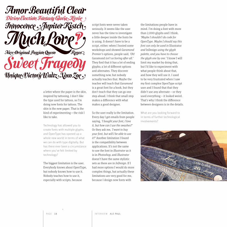
Ale Paul is one of the most exuberant characters in the world of type design: not content with creating beautiful script faces, he fills his font files with more alternate glyphs, off-the-wall ligatures, and lavish ornaments than you can shake a stick at. We got in touch to talk about the hot Argentinian type design scene, in which he’s playing a huge role...
sudtipos.com
AlePaul 1 2 3 4 5 6 7 8
PAGE 14 INTERVIEW ALE PAUL

I began doing it because I lost my job in the 2001 economical crisis. I was doing packaging design for eight years before that, after graduating from university. I got a cheque from T26, the foundry that was selling my first typeface. When I got that, I thought that if I don’t work in graphic design, maybe I can do type design and sell that. You do it, you polish it, and you see what happens. So we had some fonts, and we thought, why not make a collective and call it Sudtipos? It was like a breath of fresh air for typography. Not necessarily because it was good but because it was new; people from Argentina were trying to do a type project. I never studied typography: all I knew was packaging design. I discovered that I was always using the same fonts because I didn’t have many for packaging ready to use on my computer. I met with Angel Consuper, a 73-year old lettering guy who was more of a type-retouch guy who cleans up logotypes for agencies. He was without work too, so I asked him to begin thinking about some fonts with a focus on packaging. That was my first approach to hand-lettering design. (Hand-lettering is very important in packaging design because it communicates a lot to the customer.)
typography in their graphic design courses. The schools here are not focused on the important role that typography plays in design, and the problem with that is that many designers usually don’t respect the intellectual property. But hopefully that will change in the near future. Some people went to study in
The Hague, and some people are now studying the Masters here in Buenos Aires. Everyone working in the Argentinian type industry is involved in the Masters course in some way, so I see that as a very positive thing. The only potential problem I see is that a lot of people think of typography from
I think the focus should be on how good we are in using typography and not designing fonts to make money.
a business perspective. I’m not sure where the business is going. I think our focus should be on how good we are in using typography and not designing fonts just to make money.
You’ve had great success with Sudtipos. What has been your personal experience in setting up and maintaining a successful type foundry?
INTERVIEW ALE PAUL

After a few fonts, I approached a guy that used to work in the beer industry. He said, ‘Yes we love your work,’ and, ‘Why don’t you publish with us’. They gave me a kind of brand with my name.
Your designs typically get as close to hand-lettering as possible. Are actual hand-written signs your main source of inspiration?
When I built a strong packaging fonts collection — I call it that even though it’s not exactly only for packaging — I found myself saying that I don’t like just doing what is straightforward, I like to experiment with things that are very difficult for me to do. I don’t have good handwriting, so I like to do nice digital handwriting
fonts. I began to study and buy more books about how to write well, or about different systems for penmanship. I really liked technology and discovered OpenType a long time ago. I thought I should try to move hand lettering to digital technology. That was my first experiment. I did
Ministry Script, my first complex OpenType font. I learned by error because I did a lot of ligatures that weren’t useful. I keep some fonts for packaging, but what I really try to do is experiment in type. Maybe it’s a little difficult because there are a lot of people doing scripts with flourishes and everything looks the same. But I’m not interested in that: I’m interested in doing things that haven’t been done yet.
Everybody always asked me why I always do script fonts and not text fonts, so I did Brownstone. That is a sans serif font, but it is a sans serif with my touch: with ornaments and ligatures. When I did a fern font, I imagined a fern growing up a wall. I imagined the wall like white paper, and the plant as a letter, and designed a letter that looks like a plant. Now I want to do
I’m interested in doing things that haven’t been done yet.
PAGE 17
the limitations people have in mind. I’m doing a font with more than 2,000 glyphs and I think, ‘Maybe I shouldn’t do code for OpenType. Maybe I should say this font can only be used in Illustrator and InDesign using the glyph palette, and you have to choose the glyph one by one.’ I know I will limit my market by doing that, but I’d like to experiment with what people think about that, and how they will use it. I used to be very frustrated when I saw my first complex OpenType script user and I found that that they didn’t use any alternate — or they used everything — it looked weird. That’s why I think the difference between designers is in the details.
What are you looking forward to in terms of further technological involvements?
a letter where the paper is the skin, inspired by tattooing. I don’t like the type used for tattoos, so I’m doing new fonts for tattoos. The skin is the new paper. That is the kind of experimenting — the risk I like to take.
Technology has allowed you to create fonts with multiple glyphs, and OpenType has opened up a whole new world in terms of what we can do with type digitally. But has there ever been a circumstance where you’ve felt limited by technology?
The biggest limitation is the user. Everybody knows about OpenType, but nobody knows how to use it. Nobody teaches how to use it, especially with scripts, because
script fonts were never taken seriously. It seems like the user never has the time to investigate a little deeper inside the fonts he is using. It doesn’t have to be a script, either: when I hosted some workshops and showed Garamond Premier’s options, people said, ‘Oh! Garamond isn’t so boring after all.’ They find that it has a lot of ending glyphs; a lot of different options and alternates. They discover something new, but nobody actually teaches that. Maybe the teacher will teach that Garamond is a great font for a book, but they don’t teach that they can go one step ahead. I think that small step makes a difference with what makes a good designer.
So the user really is the limitation. Every day I get emails from people saying, ‘I bought your font, I love it, but how can I use the swashes?’ Or they ask me, ‘I want to buy your font, but will I be able to use it?’ Another limitation I found is the compatibility between applications. It’s not the same to use the font in Illustrator as it is in Photoshop, and Illustrator doesn’t have the same stylistic sets as there are in InDesign. If I had more options I would do more complex things, but actually these limitations are very good for me, because I design new fonts with
PAGE 18 INTERVIEW ALE PAUL
I would be happy with a glyphs palette in Photoshop! Maybe from my narrow point of view, I would like to see some improvements in FontLab, but this is very focused on the tools. Another thing I want to see at some point is the ability to use my fonts in web type.
Are you excited by woff?
I’m waiting. First I want to see how all the browsers will support it, then I want to see how the browsers will support OpenType features. After that, I want to see if the fonts look good on the web. I still haven’t seen any fonts that made me say, ‘This is better than Verdana.’ I really don’t like how most web fonts look: there are a lot of discrepancies with the rendering and the hinting, and nothing is really uniform. OpenType features are virtually nonexistent right now. I think everything will grow and at some point type will look on screen like it does on paper. Personally, I prefer plain black and white; I want to read what I need to read and that’s all. I like blogs because they are image and text, everything is plain: just the image and the information. I hate to read on the screen.
It’s interesting — considering your style is so elaborate and
exuberant — that you like the plain and simple.
As I said, I’m a sans serif guy. I don’t want to see paper on the screen; I see a screen as a screen and paper as paper. When I want to see something beautiful, I like to touch it. I like to buy books to read them, to open them. I like to have some kind of personalised contact with the thing, which doesn’t happen for me on screen. That could be why I like packaging design and creating typefaces that are more focused on a different experience with the customer, because I like that real, tangible interaction. I know the web is real. I am on the computer all day. But still, it’s not as personal. I don’t like to buy food on the Internet; I want to go to the supermarket and take the packaging, look at it and say, ‘That’s good for me.’ I still like to be stimulated by design.
I don’t know about web fonts. I like it when when graphic designers go beyond my fonts, and do a little more by adding and amending things. That’s where the graphic design work actually come in. I don’t think graphic design is taking the font and just typing it, and the trouble is that all too often, type on the web is about just taking the font and typing it. 8
The biggest limitation is the user. Everybody knows about OpenType, but nobody knows how to use it.
INTERVIEW ALE PAUL PAGE 19

Affair with Laπy LiΩatures PielScript ink & needlen
FanScript aguante!
Mati ¡El príncipe del tipografía!
Adoi Script, el amor de mi vidaBurguesScriptt de Louis
“…because it let me experiment with ligatures.” “…because I want to have a tattoo.”
“…because it’s funny.” “…because I love sports.”
BROWNONE ur
“…because I love people getting married with it.”“…because it made me very happy.”
“…because people can see I’m not just a ‘script whore’.”“…because I love my son.”
y
C∑ndy Script dulce de lee!
zh g
hg h g
hg h g
hg h g
hg h ghg h ghg h g
hg h g
hg h g
hg h g
hg h g
hg h g
hg h g
hg
h g
hg
h g
hg
h g
hg Find and buy these typefaces at 8faces.com/2/fonts

You’ve recently left your role as Type Director at FontShop. What’s next for you personally?
It’s mostly been freelance work, consulting with foundries and websites where typography is a focus. It was difficult to leave FontShop, but it was good to make a public announcement and say I’ve moved on. Nobody would have thought to ask me for my help with anything because I’ve been known as ‘The FontShop Guy’ for at least the last six years. So it’s been fun work on a few side projects.
My main focus now is a database of typefaces in use. I’ve always been interested in how designers choose and use type. Foundries have become more sophisticated in how they promote their stuff. Complete and useful typeface specimens are much more common now, so that helps in type selection. But seeing how a font performs in the real world is an important part of making that choice, and there has never been an independent resource dedicated to that.
Is this new site going to be maintained by a centralised source, or are you going to allow foundries to contribute to that database?
For the past six years, Stephen Coles has been ‘The FontShop Guy’, serving as Director of Type in their San Francisco office. Now he’s left to pursue other projects and revive the excellent Typographica. We spoke to him about what’s next...
stephencoles.org
StephenColes 1 2 3 4 5 6 7 8
PAGE 22 INTERVIEW STEPHEN COLES

are just twelve people. I was the only guy that was dedicated just to typography. There were web developers, tech support, accounting, administration and all of that; but I was the only actual type guy there.
The office in Berlin is in charge of the FontFont foundry production and is the headquarters for all of the other FontShops. There are more type people there, of course, but as far as FontShop.com and all of the content that was created for that site and all the auxiliary sites around it such as The FontFeed 2 and FontStruct, 3 all of the type content was basically just me. We did get help from people like Yves Peters who runs The FontFeed, and designers and developers who work on other sites. My role was creating content and creating the experience for people and designers so they could learn how to find what they need as far as shopping for fonts is concerned.
Is there anything in particular you miss about that?
Obviously when you have something where thousands of people come to look for fonts everyday — where you have the ability to shape how that looks and how it’s organised for them — that
That is definitely something we want to do: we want to make it very open and independent. At the moment there are a couple of partners on it and it’s pretty closed because we want to build something that’s presentable first, but the idea is that everybody can participate in it; becoming something like Typedia. 1
Is it going to have any links to Typedia? I’d love to work together with Typedia and it would make a lot of sense. Typedia has that little ‘in the wild’ section for each font page, which is currently pulling from Flickr. Even though we have machine tags working for Flickr, it’s still not a very standardised way of sharing typefaces in use; so this new site can hopefully plug into that and share the images with those kinds of sites, and also bring in font data from them, sharing information back and forth and making it easier for users. In order
to do that we want to make it as independent as possible; so there may be some foundry sponsors, but the goal won’t be to sell typefaces from any one foundry: our real goal for the project is for it to be more of an educational and inspirational resource.
Who are you developing this with?
Right now I’m working with Nick Sherman, Petr van Blokland, Indra Kupferschmidt, and Marc Oxborrow. The idea is to start talking bout type in use and build an archive. We hope to involve font resellers and foundries soon. Pulling from their archives of their own fonts in use and inviting them to participate in other ways.
Can you give us an insight into what you did day-to-day at FontShop?
FontShop is a much smaller organisation than most people realise. I think one thing we all fought against was the idea that because of all the history behind it, all the FontShops around the world, and all of the great type designers the FontFont library represented, it is a massive organisation. But really, in the San Francisco office — which runs the website FontShop.com — there
2. fontfeed.com3. fontstruct.com
1. typedia.com
PAGE 24 INTERVIEW STEPHEN COLES

One of the great things about FontShop is that they’re willing to put resources into things that don’t necessarily drive a lot of sales.
was the thing I enjoyed the most about the role.
The FontFeed has become a great resource for all things type. Is it a challenge to remain ‘independent’ while being linked to FontShop?
Well I don’t think it was, particularly for Yves, whose main role has been running that site. Being on his own and able to say what he wanted on that website made it easy for him to feel independent. We set down some guidelines when we created the blog; as you know, FontShop is a sponsor and links to fonts will go to FontShop.com, but beyond that, everything that each author says is their own opinion and their own voice. They can write about whatever they want and with complete freedom.
It really is a nice independent venue, and I think one of the great things about FontShop is that they’re willing to put resources into things that don’t drive a lot of sales. It’s really educational and it’s the kind of thing that they’ve always been willing to put money into, which is a rarity in a business of that size. Fontstruct is another example of that, too: it’s completely free. It’s not a revenue driver, but it’s just something that
speaks well of the FontShop name, and it was something fun to build, so they built it. It all comes from Erik’s guidance. He isn’t involved on a day-to-day basis, but he founded the company because he loves type, and that’s pervaded through to each new project that they fund or work on. As long as they maintain that kind of passion for typography, they’ll always be set apart from other sellers.
Even though you’ve left FontShop, are you going to continue writing for The FontFeed?
I hope so. We’re still discussing how things will work, but as far as I know my name is up there, so
hopefully they’ll still let me put my word in from time to time.
Typographica... The FontFeed... The Mid-Century Modernist... How do you balance your time between all of these projects?
INTERVIEW STEPHEN COLES PAGE 25

I think that the most exciting thing [right now] is the general interest in typography.
the wayside — like Typographica has been lately — because all of my font love has gone into FontShop for the last few years. When I say that will change, it’s because now I can dedicate my typography interests to Typographica and these other things. It really is just a matter of personal interest in projects that gets me motivated for that day.
Part of your ‘next step’ is to revive the relatively quiet Typographica. Do you have any major new plans for the website now that you have more time to work on it?
No, I don’t have anything that I can reveal yet. We have lots of plans, but nothing that has enough shape to describe it. I will definitely be doing the ‘Fonts of the Year’ review that we missed last year. We’re going to make sure we do one for 2010, and maybe even a review of the decade of fonts. Now I have a place for my own views about the industry — some of which I probably couldn’t have voiced before being at FontShop — I’m going to be a little bit more opinionated, which is something I look forward to doing because I have a lot of opinions!
So we can expect to see quite a few more posts on Typograhica now that it’s your main type outlet?
I wish I could say that I’m very organised about it and I’ve determined where it makes more sense to put my time during the day, but really these all just represent different interests and
passions, and whenever I get excited about a particular piece of furniture for example, then The Midcentury Modernist is where my time is going to go for that day. Eventually some things get put by

1 ABetterSon/DAughterriloKiley
interluDeColDColDWAter(StringS)MirAh 3 inKonthePAPertheProM
4 PePitACAlexiCo
5 thiSPlACeiSAPriSonthePoStAlServiCe
6 nuDeAStheneWSCAtPoWer
7 SergeFolKiMPloSion 8 thelAnDlorDiSDeADDoMAKeSAythinK
9 Don'tholDyourBreAthCAllA
10 tAKeAWAlKSPoon
11 DeStroyertheKinKS
12 SWeeterthAnAnythingBonnie"PrinCe"Billy
13 velvetWAltzBuilttoSPill
interluDeColDColDWAter(DruMS/ClAPPing/ChoruS)MirAh15 WAKeuPtheWAlKMen
16 nottheSAMeBenFolDS17 DArKneSSthePoliCe
18 CAn'tgetuSeDtothiSJohnCunninghAM
19 DuKeSuPMoDeStMouSe
20 DeAthoFADiSCoDAnCertheSMithS
interluDeColDColDWAter(StringS)MirAhPoStluDeenCoreChAntFroMMyBlooDyvAlentineConCert,
hultSFelDFeStivAl,SWeDen,4Aug1987
FighterThat’s right. I’ll be writing a lot about the way that fonts are used on this new site — the ‘fonts in use’ site — but anything else typographic is going to go there.
What excites you in the world of typography right now?
I think that the most exciting thing is the general interest in typography. It was such a niche profession and field for so many years, and so esoteric, and now anybody knows what a font is and that actually is a very new thing. That’s probably been the case for maybe ten or fifteen years, but in the scheme of publishing that is a very short time and it’s exciting to see people actually paying attention to what they see — not just in terms of what it is semantically, but the design of the typography and the design of the typeface — so I think that will make everything that we do and write
about more relevant to a broader audience, and that’s exciting.
Especially on the web, everyone is probably going to say that web type is what is the most exciting to them right now, which makes sense because that’s the biggest technological breakthrough of the last couple of years. But I think it’s really the extension of that: it’s that people will now suddenly notice that, ‘Hey, I’m not looking at the same three typefaces online anymore.’ And so the people who aren’t just font geeks are going to continue to be more aware of typography, which is a great thing for everyone.
I’m really glad you mentioned the general interest in typography, because it’s a question I asked people in the first issue. And I agree with you: I feel there’s a resurgence in interest and the layman is more aware of type then he was a few years ago.
I think that many of the people you asked — and I am guilty of this as well — tend to be sequestered in our little world of font geeks and often we don’t notice or we don’t talk about typography outside that world; so it’s hard to tell sometimes that it really is growing in general interest, but I really do
believe it is. You wouldn’t have been able to produce and have so much success with a documentary like Helvetica ten years ago, but you can now because it’s something many more people are aware of. That documentary was interesting to people who weren’t designers, and I think that that’s an important thing to note. 8
INTERVIEW STEPHEN COLES PAGE 27
zh g
hg h g
hg h g
hg h g
hg h ghg h ghg h g
hg h g
hg h g
hg h g
hg h g
hg h g
hg h g
hg
h g
hg
h g
hg
h g
hg
Affair with Laπy LiΩatures PielScript ink & needlen
FanScript aguante!
Mati, el príncipe del tipografía!
Adoi Script, el amor de mi vidaBurguesScriptt de Louis
‘…because it let me experiment with ligatures.’ ‘…because I want to have a tattoo.’
‘…because it‘s funny.’ ‘…because I love sports.’
BROWNONE ur
‘…because I love people getting married with it.’‘…because it made me very happy.’
‘…because people can see I’m not just a “script whore”.’‘…because I love my son.’
y
C∑ndy Script dulce de lee! with all the
AmplitudeScala via of the mid-century modernist era! A journey recorded with
Salt Lake City,Stockholm,Berlin,San Francisco,and Oakland.
Pitu . 470 characterſ
Robust, geometric lines from the
With the enthusiastic help of those variant, stylish heroes, italic, bold, bold italic, and by the grace of one cat, the adventure continued. One last peak to climb. A visit to an original. A face that has been evolving steadily since 2002. Behold, the deadly sword-points and flying fox tails of Mount
& 3 superb weights.
klavika plainR
glowed in the slow sunset. A low ring shone like an expectant nim-bus. Serifs flew. Inexorable. It was
Freighttrain,
stretching time. Seconds expanded in a flurry. Strokes modulated. Axes swung. Only a scant few adepts could identify the disctinct forms in the mælström. Awe redrew all our faces. J
vs.GeorgiaCliffordKobayashi Carter
An in
coming
A magnificent 30 second KNOCKOUT
Find and buy these typefaces at 8faces.com/2/fonts
You’re in the process of redesigning Nice Web Type. How is that going? You’re documenting it on Tumblr?
Yes, that’s what I wanted to do. More important than redesigning the site is talking to people about how I approached designing it. I haven’t met anybody who designs the way I do, and I want to see what people think about that. I wanted to open up and share what I’m doing.
What is your method of design? How do you think that it differs from other designers?
It’s reflected in the outcome of my final designs. Most often I start with markup and content. I used to work at Vassar College, and we wouldn’t always have content for our site before we designed for it. By reading the content and talking to the client, you get a feel for what it’s about, what people need to use the site for, and what their experience will be as they absorb the content. From the content, you can then take cues about the typeface selection.
My considerations are: reasons, solutions, emotions. Why am I making this site? What are the reasons
What started as a school project propelled Tim Brown into the spotlight and his current role as Type Manager for Typekit. We talked to Tim about Nice Web Type and his process of designing from the type outwards...
nicewebtype.com
TimBrown 1 2 3 4 5 6 7 8
PAGE 30 INTERVIEW T IM BROWN


so I started doing what I’m doing with Nice Web Type now, just not in public. I was building a site, little by little, and keeping notes about it. The site was my way of bringing typography and web design together when my college curriculum couldn’t.
From your point of view, has it changed much in terms of what you’re seeking to accomplish with the project and the kind of content you cover?
It has, but I’m trying to return what I was trying to do in college. I still love Robert Bringhurst’s book, 1 but at the time it was my only and favourite resource. What I wanted to do was like Richard Rutter did with webtypography.net: to apply all the rules to web design and give people a guide. 2 After school, I read a lot and followed what others were doing. I read everything that Richard posted; he was a huge influence on me. Jon Tan and
people are going to be here? Why does it need to exist? That’s the absorbing content part. Solutions are the functional parts of the site that need to exist. I’ve taken a hard line with the Nice Web Type redesign: I’m not putting in anything that doesn’t absolutely need to be there. That’s partly because I have questions about the conventions we stick to as web designers; those that exist because we’ve been relying on them for years. Why does the site need to show you navigation all the time? Why does the site need to show you the search as part of the ui? Google have been doing some interesting things with their homepage with elements that don’t show up until you start moving the mouse around.
Once I know exactly what needs to be present, I can start doing rough sketches and deciding where things should be placed. That’s when I get to the typeface selection: when I have an idea of where things should be placed and an intimate knowledge of the content. I start to think about how I want people to feel about this, which always leads me to typefaces first rather than colour, photography, or layout. Although I certainly appreciate the power of those elements and of
composition, type is the genesis of what I do. From the typeface, you can get proportions for the layout, historical references that you can use for decisions in pairing fonts, or size-relationships. You have so much flexibility when you use type as that atomic element; that starting point. I think that is what’s different about how I design compared to other people: I don’t start with a layout and then choose type; I start with type and then grow out from that.
How long has the Nice Web Type website been going?
Since 2006 or 2007. The website is quite young compared to the idea of the project, which started while I was in college. That was my bfa thesis, which came about because I just fell in love with a number of things all at once. In typography class, there was the balance of classically good typeset pages and type as a formal thing. There’s a right and wrong in type. If you learn certain rules, you’re doing it right. There are no such rules in fine art: there’s just something magic to it. At the same time, I was learning about web standards because I was working in the publications office in my college, and Jeffrey Zeldman’s Taking Your Talent to the Web was on the shelf,
1. The Elements of Typographic Style (Hartley and Marks, 1992)2. Rich talks more about his project from page 46 onwards
PAGE 32 INTERVIEW T IM BROWN
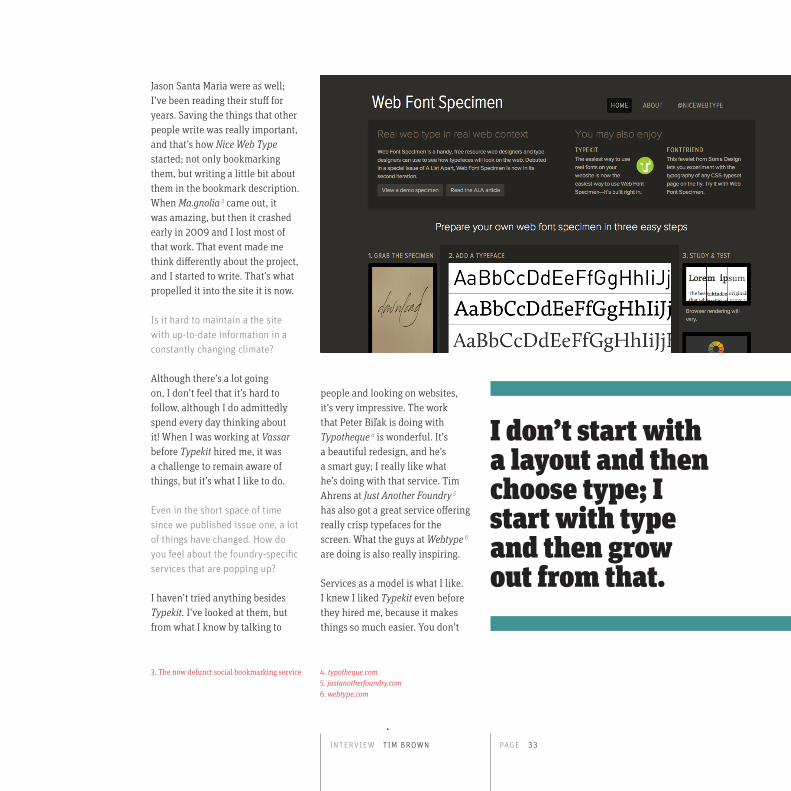
Jason Santa Maria were as well; I’ve been reading their stuff for years. Saving the things that other people write was really important, and that’s how Nice Web Type started; not only bookmarking them, but writing a little bit about them in the bookmark description. When Ma.gnolia 3 came out, it was amazing, but then it crashed early in 2009 and I lost most of that work. That event made me think differently about the project, and I started to write. That’s what propelled it into the site it is now.
Is it hard to maintain a the site with up-to-date information in a constantly changing climate?
Although there’s a lot going on, I don’t feel that it’s hard to follow, although I do admittedly spend every day thinking about it! When I was working at Vassar before Typekit hired me, it was a challenge to remain aware of things, but it’s what I like to do.
Even in the short space of time since we published issue one, a lot of things have changed. How do you feel about the foundry-specific services that are popping up?
I haven’t tried anything besides Typekit. I’ve looked at them, but from what I know by talking to
people and looking on websites, it’s very impressive. The work that Peter Biľak is doing with Typotheque 4 is wonderful. It’s a beautiful redesign, and he’s a smart guy; I really like what he’s doing with that service. Tim Ahrens at Just Another Foundry 5 has also got a great service offering really crisp typefaces for the screen. What the guys at Webtype 6 are doing is also really inspiring.
Services as a model is what I like. I knew I liked Typekit even before they hired me, because it makes things so much easier. You don’t
I don’t start with a layout and then choose type; I start with type and then grow out from that.
4. typotheque.com5. justanotherfoundry.com6. webtype.com
3. The now defunct social bookmarking service
INTERVIEW T IM BROWN PAGE 33

Until we don’t have to support ie8, it’s going to be hard to go woff all-in.
the file size, you have to think about the subsets, how much you want to include on your page, the definitions and connecting them to css selectors; there are conventions. So the model of a ‘kit’ that goes with your site or project is comforting.
What can you tell us about your day-to-day role on Typekit?
I’m type manager, so I talk with all our foundry partners, update all the fonts in the library and examine them with the partners to see how they’ll perform on the web. I’m in the process — along with Jason and Mandy Brown — of evaluating our library and improving not only the quality, but helping people find and use the type. So part of my job is caring for the library, technically, and liaising with our foundry partners, who are amazing people. It’s a dream for me to be working with the type designers that Typekit is working with; they’re just incredibly smart people. Experts. I can always consult one of them and learn more. It’s incredible. They have a reverence for tradition that you don’t often find on the web, and that is in line with my own style of designing: thinking about the meaning of things, the math involved in typography,
have to worry about updating font files when something changes, or configuring font matching between @font-face definitions and css declarations. The syntax is changing all the time. The woff format is coming along, but until we don’t have to support ie8, it’s going to be hard to go woff all-in. Complexity is needed in @font-face definitions; it’s just easier to let somebody else handle
that. It’s also nice to have all of my type selection in one place: a project-based spot to think about type and to group and study things. I think services like that are the way forward.
Do you think there are any standards emerging? Or is all the different competition pulling everything in different directions?
Well, there are conceptual things that were very undefined before, with Typekit in particular. The guys I work with — Jeff Veen, Ryan Mason, Ryan Carver, Greg Veen, Jason Santa Maria, and Matt Collier — made part of the effort before I came over there: they’re helping people think about fonts as this new asset. It’s not like you just rig fonts to your css and use them normally. There’s a lot more to it: you have to manage
INTERVIEW T IM BROWN

and the cultural implications of doing things a certain way. They are a great group of people to spend my time with. The other part of my job is equally fun and probably what I want to be doing if I could be doing anything. It was what I was doing with my spare time — with Nice Web Type and when working at Vassar — learning about web typography and sharing it with other people. Jeff Veen has provided some awesome direction to our team, and one of the things I look forward to doing more of is
writing posts on the Typekit site. To be writing for the Typekit blog is an immense joy for me. It’s everything that I want to be doing in my job. What I learn goes into the Typekit service immediately. The developers I work with are the smartest people I’ve ever met, and they iterate on Typekit every day. They’re always working on it, and deploying new stuff to the live code. What we learn is reflected in the product right away, and we can see if people like it, and then learn even more. We have a ‘tools’ section for our foundry partners, which tells us what the included glyphs are, how that matches up to our default subset, and how it will match up to our other subsets, vertical metrics information, and the relationship to css. If it isn’t set the right way, type can be positioned differently in different browsers and can get clipped. So the tools at Typekit started as an exploration into how type behaves on the web, and later those tools get built into Typekit so that all our foundry partners can use this service to check out their fonts, change them, and upload new versions to us. It’s amazing to do what I want to do and use that knowledge to make people happy, and make their designs better.
Are there any juicy ‘coming soon’
features we can expect to see soon in Typekit?
We’re working on language support. The thing I’m most excited about is the way writing will influence the service. There are twelve of us now. We have daily stand-up meetings and everybody counts. We’re always fielding ideas and organising plans. The educational blog posts that we’re planning will not only be useful to people, but also to Typekit the organisation. We’re going to have a section called ‘Learn’, and the blog — and the font pages themselves — are all going to be integrated to help people decide on particular typefaces for different reasons and how to use them. For me, that’s what is most exciting about my job. 8
What we learn is reflected in the product right away.
INTERVIEW T IM BROWN PAGE 35
Qunibody
Goudy Swash,ScalaSans surfer.Now featuring Brown & Co.
wave blend!
A Róisín ná bíodh brón ort fé’r éirigh dhuit:Tá na bráithre ’teacht thar sáile ’s iad ag triall ar muir,Tiocfaidh do phárdún ón bPápa is ón Róimh anoir
’S ní spárálfar fíon Spáinneach ar mo Róisín Dubh.
Is fada an réim a léig mé léi ó inné ’dtí inniu,Trasna sléibhte go ndeachas léi, fé sheolta ar muir;An éirne is chaith mé ’léim í, cé gur mór é an sruth;’S bhí ceol téad ar gach taobh díom is mo Róisín Dubh.
Mhairbh tú mé, a bhrídeach, is nárbh fhearrde dhuit,Is go bhfuil m’anam istigh i ngean ort ’s ní inné ná inniu;D’fhág tú lag anbhfann mé i ngné is i gcruth-Ná feall orm is mé i ngean ort, a Róisín Dubh.
Shiubhalfainn féin an drúcht leat is fásaigh ghuirt,Mar shúil go bhfaighinn rún uait nó páirt dem thoil.A chraoibhín chumhra, gheallais domhsa go raibh grá agat dom-’S gurab í fíor-scoth na Mumhan í, mo Róisín Dubh.
Dá mbeadh seisreach agam threabhfainn in aghaidh na gcnoc,is dhéanfainn soiscéal i lár an aifrinn do mo Róisín Dubh,bhéarfainn póg don chailín óg a bhéarfadh a hóighe dhom,is dhéanfainn cleas ar chúl an leasa le mo Róisín Dubh.
Beidh an Éirne ’na tuiltibh tréana is réabfar cnoic,Beidh an fharraige ’na tonntaibh dearga is doirtfear fuil,Beidh gach gleann sléibhe ar fud éireann is móinte ar crith,Lá éigin sul a n-éagfaidh mo Róisín Dubh.
Caslon
Verdana
Aldus
Shelly sang Róisín Dubh
Then, with a
3CRONOS•
Find and buy these typefaces at 8faces.com/2/fonts
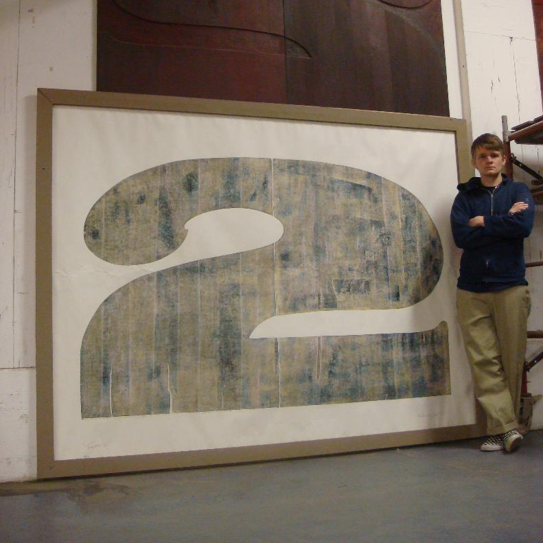
Tell us about your love for wood type and what you get up to at The Hamilton Wood Type & Printing Museum. How did you get involved with the project?
It’s a pretty unique wood type museum, not only because it’s one of the few type museums in the world, but because it’s definitely the only one that is dedicated exclusively to wood type. It’s located in the original factory building for Hamilton, which used to be the largest manufacturer of wood type in the world. At one point it had more or less a monopoly on wood type, at least in America.
I got involved with them through a project I did at school. It was an intercut wood type project where I designed my own experimental, modular wood typeface, and produced it as a printable, movable type. It was through that project that I met someone from the museum, and they encouraged me to go out and spend time there. So I took a whole month and did a sort of residency there, and I’ve been involved with them ever since. I’m now on their ‘Board of Advisors’. Last year they had their first annual Wayzgoose as a means of encouraging more people to come to the museum and get more wood type activity going on.
Nick Sherman has his fingers in many type-related pies: he was almost single-handedly responsible for the redesign of MyFonts, he serves on the advisory board for the Hamilton Wood Type & Printing Museum, he consults for the highly-praised Cooper Union Typeface Design program, and has now joined the ranks of The Font Bureau. We sat down to talk about the family that is the type design community...
nicksherman.com
NickSherman 1 2 3 4 5 6 7 8
PAGE 38 INTERVIEW NICK SHERMAN
The first time I was there, I was doing a lot. They had a lot of wood type that had to be identified, and I helped them do that. I did some printing just for fun and to get acquainted with the wood type, and I spent a lot of time just looking around. There’s so much there; it’s kind of like a playground for me. They have a pretty impressive collection of old wood type specimens that I spent a lot of time looking at; not necessarily for anything specific, but just to take
It’s funny: I gave a talk recently at the Type Directors Club here in New York, and it was about wood type. I started the talk by clarifying that a lot of people think of me as ‘the wood type guy’, but there’s a lot of other stuff that I’m interested in. Metal type is just as interesting to me as wood type.
I’ve been working with The Dale Guild Type Foundry and we’ve recently launched their website. They’re one of the very few type foundries that can create a foundry-type font from drawings of letters all the way through the process of making patterns and cutting matrices, finally casting it as a metal font. The history of the company is really interesting. The American Type Founders Company — which was at one point the largest producer of metal type in the world — slowly got smaller and smaller as the demand for metal type decreased. The last
a look at things, to take notes and photos, and to put everything into my mental database.
Do you think there’s more interest in wood type these days?
Yes, for sure. I think not only in wood type, but letterpress printing in general. I think wood type plays a big part in that because it’s much more forgiving than metal type. It’s almost like training wheels for letterpress. If you’re learning to use wood type, the concepts are easier to understand because it’s on a larger scale. I also think that part of the reason why wood type is a big part of this letterpress resurgence is that it tends to show the texture a lot more, due to the wear and tear being more evident on such a large scale. The imperfections draw people in.
Do you enjoy doing work with metal type as well?
INTERVIEW NICK SHERMAN

person who was trained at atf was a guy named Theo Rehak, and when they went out of business in 1993, he bought a lot of all of the most important stuff that was at atf. He got a job there because he wanted to figure out how to do type casting for himself. By working with them, he got a good feeling of what the most important
stuff was, and he bought all of it and continued casting type. But I think that Theo has done enough type casting for his lifetime, so he’s just recently sold The Dale Guild Type Foundry to my friends Dan Morris and Michael Courier, both of whom are New York-based letterpress people.
You do a lot of teaching as well, including overseeing a lot of stuff at The Cooper Union — is that right?
Yes, I’m involved. My technical title at The Cooper Union is ‘advisor’. I’d been helping them figure out who to come in to talk and what kind of material to be teaching. I did the website for them as well, but I’m also going to be taking part in the programme by attending the classes.
What has becoming an educator done for your own understanding of type?
You learn that when you have to teach somebody something that you’re familiar with, you have to really know whatever it is you’re talking about, especially the history. I would have a general idea of what was going on — and I could explain it generally — but in order to give a good lecture about it, I basically had to learn it all
over again: get the dates down, get the names down, the places, and things like that. It was almost as much of a learning experience for me as the students, because I had to re-learn everything in order to teach it. It had been so long since I’d thought about type on that basic a level.
You were virtually single-handedly responsible for the MyFonts.com redesign and their lovely newsletters. Was it hard to leave a project you had such a big hand in?
Definitely. In some ways I feel like I still haven’t totally left. As far as working situations go, I’m not technically working with MyFonts anymore, but all the people I worked with there are the greatest people ever, and I still talk to them on a daily basis. I send them emails on a weekly basis saying, ‘This is broken. Fix it,’ or just giving them quick ideas about what they should do to make things better. So I’m definitely still watching over it like it was my child. It’s not something I feel I could just walk away from, especially because it was a continuation of work that I had been doing in school. A lot of my motivation — even working for MyFonts — was selfishly motivated. It was stuff that I wanted to see. I wanted a website that did this, so
INTERVIEW NICK SHERMAN PAGE 41
That’s been the main thing that I’ve worked on with Font Bureau so far. It’s interesting going from working at MyFonts, which is the largest collection of fonts in the world. There is obviously a huge variation in how fonts are made, how they’re packaged, and how they’re sold; different foundries do different things in different ways. Working with Font Bureau, it’s so much more focused and I can have more control over how the fonts are shown. All the people involved at Font Bureau have this long history of working with type and understanding how it’s used. A lot of the people at Ascender worked on Verdana and Georgia, and all the screen fonts that people have been relying on for so long. I had to know about web fonts when I was at MyFonts because it was the upcoming thing, but now — even though it’s less than a year later — so much has changed with how people are using fonts online, and the general reality of web fonts. It’s crazy how quickly it’s moving.
It must be difficult at times!
I feel like part of my job is to try to stay on top of things. I dedicate time every day to making sure I know what’s going on: how technology has evolved, and how the standards and processes
I was building it around that idea. Obviously I thought about helping other people, and we had to do testing and things like that, but it was something that I felt really strongly about, and that I still feel really strongly about. That’s why it was such a good job for me. I
still have a lot of ideas for things I wanted to do, and I left a to-do list a mile long, but I’m definitely happy with the way it turned out.
Have you been heavily involved with the Webtype project that Font Bureau are a part of?
PAGE 42 INTERVIEW NICK SHERMAN
are going. It’s much more time sensitive now than a lot of the other stuff that I had worked on, but I like it. The more I work on it, the more I’m interested in it; especially working with people like David Berlow. It’s amazing working with him because he understands things in a way that is unlike anybody that I know. He’s kind of like this mad scientist in a way. I’ll think I have a good understanding of how it works and what the ideal situation should be, and then I’ll talk to him about it for twenty minutes and my mind will be totally changed.
You’re involved with type in many different ways. How have those extremes from the type world fed into each other and your work?
One of the things I’m most interested in is not just type, but the way in which it’s presented. When you have a typeface that has been worked on for years and years, and you’re ready to release it to the world, it’s important to do it right. There are only a small number of people who really think about it in depth. When I’m presenting digital fonts — and even fonts that are purely digital in the sense of web fonts — there are still a lot of the same principles that apply in terms of how you should
present things. In terms of how the extremes of the type world come into play, it’s great that the type world is so small; there are always so many crossovers as far as projects that I’m working on. Someone that I would have worked with at MyFonts might come into The Cooper Union to teach a class. It’s such a small community, and everyone is so interconnected that it’s hard not to have crossovers. It’s nice. A lot of times the ‘competition’ is just a good friend of yours who happens to be doing something similar. Stephen Coles is a perfect example of that with me when I was working at MyFonts and he was working at FontShop. We had very similar jobs at companies that were — for lack
of a better word — competition; but he would put me up when I was visiting San Francisco. The type community feels a lot more like a family. 8
When you have a typeface that has been worked on for years and years, and you’re ready to release it to the world, it’s important to do it right.
INTERVIEW NICK SHERMAN
Feijoa & AivyEs la verdad.
“
Find and buy these typefaces at 8faces.com/2/fonts
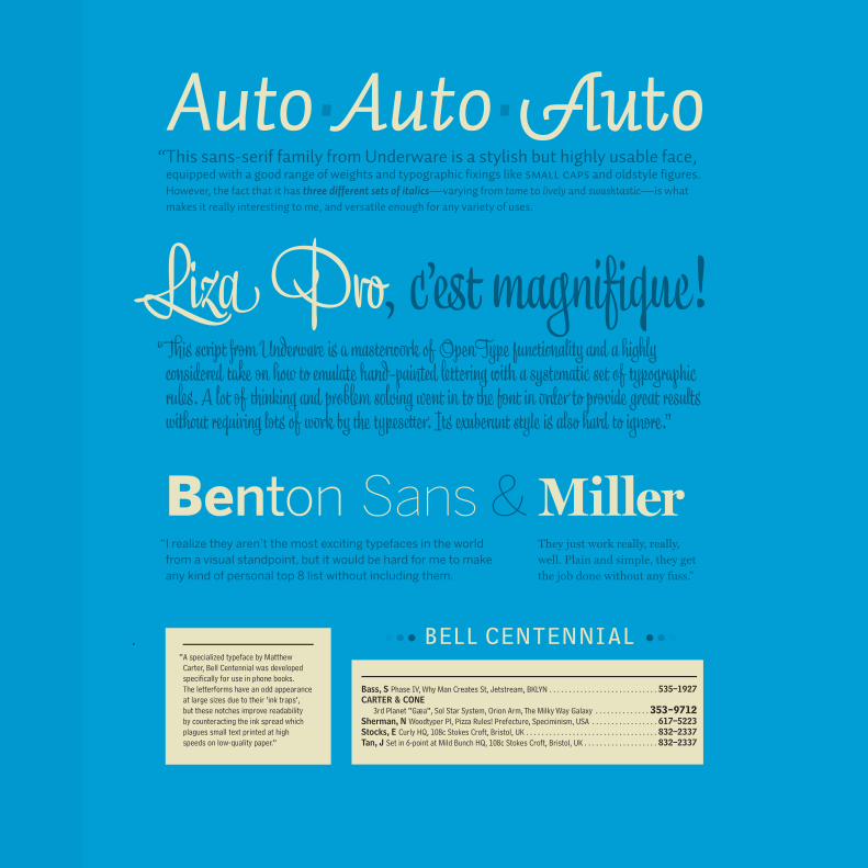
Auto•Auto•AutoThis sans-serif family from Underware is a stylish but highly usable face, equipped with a good range of weights and typographic fixings like small caps and oldstyle figures. However, the fact that it has three different sets of italics — varying from tame to lively and swashtastic — is what makes it really interesting to me, and versatile enough for any variety of uses.
“
Bass, S Phase IV, Why Man Creates St, Jetstream, BKLYNCARTER & CONE 3rd Planet “Gæa”, Sol Star System, Orion Arm, The Milky Way GalaxySherman, N Woodtyper Pl, Pizza Rules! Prefecture, Speciminism, USAStocks, E Curly HQ, 108c Stokes Croft, Bristol, UKTan, J Set in 6-point at Mild Bunch HQ, 108c Stokes Croft, Bristol, UK
••• Bell Centennial •••
Liza Pro, c’est magnifique!This script from Underware is a masterwork of OpenType functionality and a highly considered take on how to emulate hand-painted lettering with a systematic set of typographic rules. A lot of thinking and problem solving went in to the font in order to provide great results without requiring lots of work by the typesetter. Its exuberant style is also hard to ignore.”
“
Benton Sans & MillerI realize they aren’t the most exciting typefaces in the world from a visual standpoint, but it would be hard for me to make any kind of personal top 8 list without including them.
They just work really, really, well. Plain and simple, they get the job done without any fuss.”
“
A specialized typeface by Matthew Carter, Bell Centennial was developed specifically for use in phone books. The letterforms have an odd appearance at large sizes due to their ‘ink traps’, but these notches improve readability by counteracting the ink spread which plagues small text printed at high speeds on low-quality paper.”
. . . . . . . . . . . . . . . . . . . . . . . . . . . . 535–1927
. . . . . . . . . . . . . . 353-9712. . . . . . . . . . . . . . . . . 617–5223
. . . . . . . . . . . . . . . . . . . . . . . . . . . . . . . . . . 832–2337. . . . . . . . . . . . . . . . . . . 832–2337
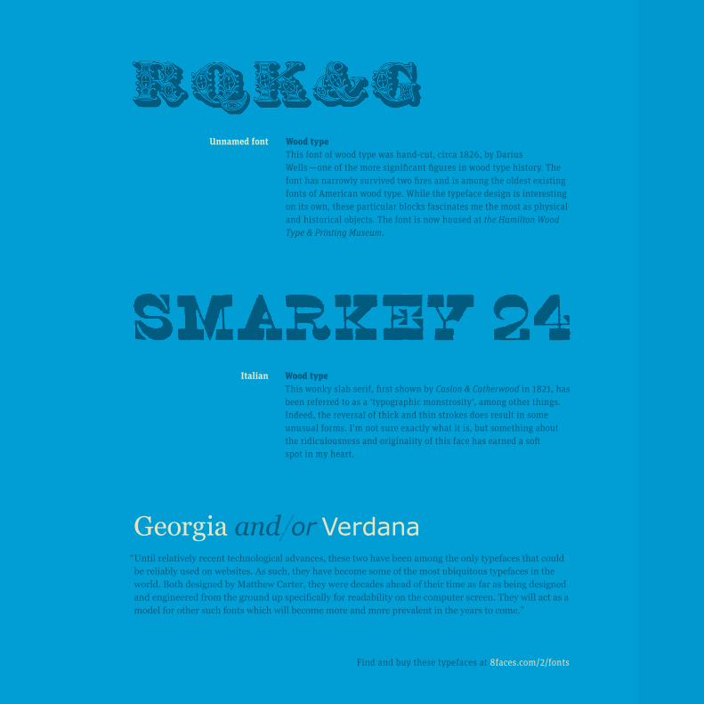
“ Georgia and/or VerdanaUntil relatively recent technological advances, these two have been among the only typefaces that could be reliably used on websites. As such, they have become some of the most ubiquitous typefaces in the world. Both designed by Matthew Carter, they were decades ahead of their time as far as being designed and engineered from the ground up specifically for readability on the computer screen. They will act as a model for other such fonts which will become more and more prevalent in the years to come.”
“
Feijoa & AivyEs la verdad.
“
Find and buy these typefaces at 8faces.com/2/fonts
Auto•Auto•AutoThis sans-serif family from Underware is a stylish but highly usable face, equipped with a good range of weights and typographic fixings like small caps and oldstyle figures. However, the fact that it has three different sets of italics — varying from tame to lively and swashtastic — is what makes it really interesting to me, and versatile enough for any variety of uses.
“
Bass, S Phase IV, Why Man Creates St, Jetstream, BKLYNCARTER & CONE 3rd Planet “Gæa”, Sol Star System, Orion Arm, The Milky Way GalaxySherman, N Woodtyper Pl, Pizza Rules! Prefecture, Speciminism, USAStocks, E Curly HQ, 108c Stokes Croft, Bristol, UKTan, J Set in 6-point at Mild Bunch HQ, 108c Stokes Croft, Bristol, UK
••• Bell Centennial •••
Liza Pro, c’est magnifique!This script from Underware is a masterwork of OpenType functionality and a highly considered take on how to emulate hand-painted lettering with a systematic set of typographic rules. A lot of thinking and problem solving went in to the font in order to provide great results without requiring lots of work by the typesetter. Its exuberant style is also hard to ignore.”
“
Benton Sans & MillerI realize they aren’t the most exciting typefaces in the world from a visual standpoint, but it would be hard for me to make any kind of personal top 8 list without including them.
They just work really, really, well. Plain and simple, they get the job done without any fuss.”
“
A specialized typeface by Matthew Carter, Bell Centennial was developed specifically for use in phone books. The letterforms have an odd appearance at large sizes due to their ‘ink traps’, but these notches improve readability by counteracting the ink spread which plagues small text printed at high speeds on low-quality paper.”
. . . . . . . . . . . . . . . . . . . . . . . . . . . . 535–1927
. . . . . . . . . . . . . . 353-9712. . . . . . . . . . . . . . . . . 617–5223
. . . . . . . . . . . . . . . . . . . . . . . . . . . . . . . . . . 832–2337. . . . . . . . . . . . . . . . . . . 832–2337
“ Georgia and/or VerdanaUntil relatively recent technological advances, these two have been among the only typefaces that could be reliably used on websites. As such, they have become some of the most ubiquitous typefaces in the world. Both designed by Matthew Carter, they were decades ahead of their time as far as being designed and engineered from the ground up specifically for readability on the computer screen. They will act as a model for other such fonts which will become more and more prevalent in the years to come.”
“
Wood type This font of wood type was hand-cut, circa 1826, by Darius Wells — one of the more significant figures in wood type history. The font has narrowly survived two fires and is among the oldest existing fonts of American wood type. While the typeface design is interesting on its own, these particular blocks fascinates me the most as physical and historical objects. The font is now housed at the Hamilton Wood Type & Printing Museum.
Wood type This wonky slab serif, first shown by Caslon & Catherwood in 1821, has been referred to as a ‘typographic monstrosity’, among other things. Indeed, the reversal of thick and thin strokes does result in some unusual forms. I’m not sure exactly what it is, but something about the ridiculousness and originality of this face has earned a soft spot in my heart.
Unnamed font
Italian

You’ve been working on applying Robert Bringhurst’s work to web typography for some time now with your website ‘The Elements of Typographic Style Applied to the Web’. How is the project going?
It’s been dormant for a couple of years and not much has happened to it, due to time constraints and having so many other things to do. I’m trying to get more people to try and help out with some of it, and I’ve got a new sense of vigour about it because there are so many good things happening with css: things are moving on so quickly and right now we’re on the crest of a wave. I really want to start going back through the whole guide and updating it, because in some places it refers to some modules which have since been merged or re-named in the spec. In the fonts module in particular, there’s a lot of new stuff appearing which needs to be talked about. So it will soon be redesigned slightly and tweaked.
What developments would you like to see happen in the near future?
The main thing for me is simply for proper OpenType features, which is massively important for non-Latin
When most of us were being weened off table-based website layouts, he was busy applying Bringhurst’s seminal work ‘The Elements of Typographic Style’ to the world of web design, and he’s still at it. As one of the founders of accessibility-focused agency Clearleft, and more recently the co-founder of font delivery service Fontdeck, Rich Rutter is one of the most respected authorities on web type...
clagnut.com
RichRutter 1 2 3 4 5 6 7 8
PAGE 46 INTERVIEW RICH RUTTER


Have you contacted foundries and people like yourselves to try and form a library of typefaces, so that you can support some of the lesser-known languages?
Yes, but we haven’t been hugely proactive recently because we’re building up our library of Latin fonts, but we have managed to host pt Sans. I met a designer in Armenia who has a foundry called Pomegranate, which just does Armenian stuff, and we should have some of those soon. However, some stuff that we want to do in the future with connected scripts is very difficult to do; until browsers
fonts. But even just thinking about Latin ones — just having an ‘ff’ or an ‘ffi’ ligature when it’s required in the headline hasn’t been so much of a problem in the past because Georgia and its ilk have been designed in such a way that they don’t need ligatures. But when you start using font linking, a lot of the fonts need ligatures to stop the clashes happening, and so ligatures need to be enabled.
The latest version of Firefox has kerning, which is quite important for type set at bigger sizes. Kerning and common ligatures are turned on by default on Macs, and they are turned on by default on Windows when the type is over 20 pixels. In Safari they’re turned off by default, but you can turn both those on with the optimize:legibility property.
What can you tell us about Fontdeck’s noble support for rare languages? Jon Tan mentioned this last issue and it sounds great.
That’s still the goal: to be able to provide support for languages that don’t have many typefaces. It also depends on the foundry: if they give it away for free, we host it for free. With some scripts, ligatures are essential: if the ligatures aren’t working then you
can’t read it; it doesn’t make any sense. We’ve got some support for Greek and Cyrillic. Greek, in some ways, is a rare language: it’s only written in one country, and among academics, but of course there are quite a number of designs out there. We are hosting one of the Cyrillic ones for pt Sans, which is one of my chosen ‘eight faces’ because I think it’s such an astonishing achievement. When you consider Japanese and Chinese languages, OpenType features are needed in order to swap things in and out. As a long-term goal, we’re committed to looking to do other scripts, too.
PAGE 48 INTERVIEW RICH RUTTER
You’d never think of hosting your own maps, for example, and I think the same analogy applies to fonts, and may apply to more things in the future.
offer more support for this, it’s almost not worth touching. In particular, Japanese and Chinese languages have huge character sets — 6000 glyphs as opposed to 300 for a fairly basic Latin script — so these are also problematic.
What have you learned since launching Fontdeck?
There have been hard lessons for sure. This applies to anyone staring up a dot com, but it’s especially true if it has been set up as a side project, as was the case with Fontdeck. You have to get the legal and financial side sorted out as soon as you can, while you are building the app. The whole thing has been a really interesting experience, as has getting involved in the type industry. It’s a close-knit community, similar to the web design industry. The majority of the foundries are either actively or already selling web fonts in one way or another, either by themselves, through a third party, or both; or they’re seriously considering it. Unfortunately, there are still a group who are holding out and believe that the likes of Fontdeck are the type agents of piracy. They are in the minority but sadly they are very vocal. That attitude has got to change. In some ways, I can understand how you
need to protect your ip; but how much of your text consumption is done on screen, and how much is done in print? It’s got to be a significant proportion and it’s the same for most people. If you’re designing text, surely you want people to read it! If you’re eliminating, say, 40% of their
control over that. Web services are becoming more and more prevalent for lots of different things. You’d never think of hosting your own maps, for example, and I think the same analogy applies to fonts, and may apply to more things in the future. It applies to jQuery as a lot
reading time, then that doesn’t quite make sense to me.
Do you see a growing interest in font delivery services or do designers still want to host the fonts themselves?
Some people like to host their own stuff and they like having
INTERVIEW RICH RUTTER

There’s a line of communica-tion that needs to be open, and it extends to wider projects. But it doesn’t necessarily mean that at the end of the day you’re going to get nice curly quotes out of a cms.
no coincidence that our front-end developers at Clearleft are typographic enthusiasts as well. There’s a line of communication that needs to be open, and it extends to wider projects. But it doesn’t necessarily mean that at the end of the day you’re going to get nice curly quotes out of a cms, unless you happen to have the luxury of typesetting an individual page, which — let’s face it —very rarely happens. What about orphans and widows? Somehow you need a non-breaking space inserted. Someone somewhere has got to specify that, and someone somewhere else has got to make sure that it always happens and that it can happen programmatically. There are a lot of different ways of approaching it, but it’s a challenge. It’s one of those things that’s just down to attention to detail, which is what typography is all about: all of these tiny details that build up to form a bigger picture.
Clearleft’s focus is on usability. What role does typography play in making a website usable? Have there been core principles that have come up time and time again?
It’s an intrinsic part of good design. Information Architects recently said that 95% of design is typography.
on a page. Many organisations have visual designers in house and front-end developers, so there’s a communication point there where the designers specify type sizes, measure, line heights, and margins; that all needs to be communicated to the person who is actually writing the css. It’s
of people link off to Google’s code distribution for this, and for jQuery there are a lot of advantages to that. There’s a model there that isn’t just about fonts, and spans across a number of things.
For the kind of work that Clearleft does, that’s probably true. Information design or application design primarily revolves around words, so the layout and the size is really important to hierarchy
PAGE 50 INTERVIEW RICH RUTTER
I believe that browser defaults are the enemy of considered typography.
Besides these things, what would you say are the main obstacles the web design community has to overcome to understand and implement the key typographic principles espoused by Bringhurst?
I think it’s probably not unfair to say that there are a relatively small fraction of professional web designers out there who have actually been taught design. I wasn’t taught design by anyone other than those people who had written the books and the blogs that I read. I taught myself about typography just out of a rampant interest in it. The Bringhurst project was more a case of showing
people that what he’s saying can be achieved on the web, especially when you consider it was started in 2004 when css support was a lot worse than it is now. It’s still the case of these guidelines that he’s setting down; if you were to follow them, you can achieve it. There are a lot of steps in this. Let’s say you have been taught these guidelines and maybe spent a few years in print design and are branching out into doing web design; you may be a good print designer but not necessarily willing to carry some of those things you learnt over to web design because you think it’s too hard, or you think it’s not worth it because it’s only a screen. I get the impression that some of that attitude actually does exist and is probably quite prevalent.
It seems that one of the challenges is really just getting to grips with
the very basics of typography; something we’ve felt challenged by, because of the fairly limited technology we’ve been using up until recently.
I believe that browser defaults are the enemy of considered typography, by which I mean browsers set margins and they set line heights themselves, which isn’t wrong, but they’re not considered; they don’t necessarily work as well as they could do. This is why I think css resets are a very good idea: if you get rid of all those margins and line heights and all line heights are set solid, then you’ve got to go back and change those; if you go back and change them, that means you have to think about what you’re changing them to as opposed to using what comes out of the box. That’s extremely important. 8
INTERVIEW RICH RUTTER PAGE 51
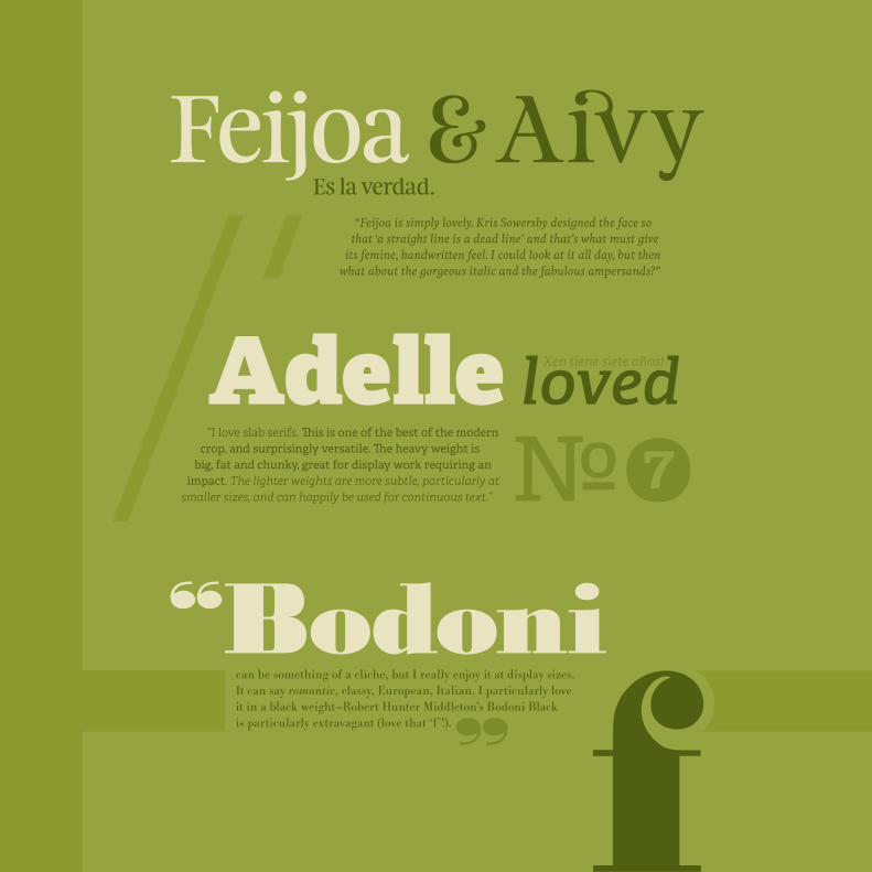
”
7 “I love slab serifs. This is one of the best of the modern crop, and surprisingly versatile. The heavy weight is
big, fat and chunky, great for display work requiring an impact. The lighter weights are more subtle, particularly at
smaller sizes, and can happily be used for continuous text.”
Adelle
“Bodoni
Feijoa & Aivy
loved
can be something of a cliche, but I really enjoy it at display sizes. It can say romantic, classy, European, Italian. I particularly love it in a black weight – Robert Hunter Middleton’s Bodoni Black is particularly extravagant (love that ‘f’!). f
Es la verdad.“Feijoa is simply lovely. Kris Sowersby designed the face so
that ‘a straight line is a dead line’ and that’s what must give its femine, handwritten feel. I could look at it all day, but then
what about the gorgeous italic and the fabulous ampersands?”
Xen tiene siete años!
PT Sans ПараТайпI was introduced to this at Typecon 2010. Commissioned by the Russian Federation to cater for its 78 written languages, it’s a magnificent achievement and comes in eight styles. Essentially it’s a fully hinted, humanist sans screen font which I hope will replace the usual candidates – it is free after all.”
“
&Plantin*1913
I’ve liked Plantin for a long time. It’s classy, but actually quite utilitarian with its large x-height and relatively low contrast; consequently it works rather well on screen. Famously used in Monocle, I’ve also seen it used creatively on Underworld’s 12” vinyl artwork.”
momentus
“When choosing 8 typefaces, a sans-serif family is surely required. Bliss
is a very British sans with humanist forms of Gill Sans, but without the
awkward idiosyncrasies. It’s neutral enough to fit most purposes, but with a
lively character twinkling through.”
Baskerville 1757
BLISS
“Baskerville is such a classic face, it would be hard to leave out. My brother, a super-talented graphic designer, chose this version
when designing the stationery for our wedding. There’s an authenticity to it which is both charming and solid.”
Oh, and Georgia(We love you!)
Find and buy these typefaces at 8faces.com/2/fonts
“
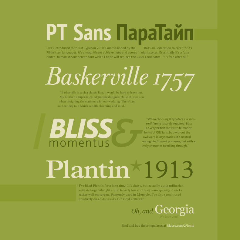
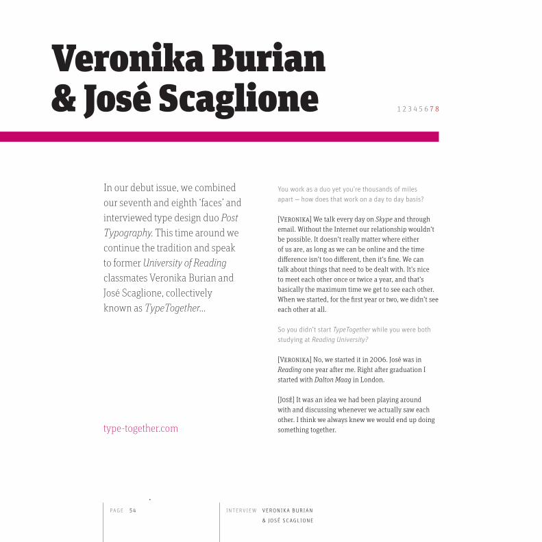
You work as a duo yet you’re thousands of miles apart — how does that work on a day to day basis?
[Veronika] We talk every day on Skype and through email. Without the Internet our relationship wouldn’t be possible. It doesn’t really matter where either of us are, as long as we can be online and the time difference isn’t too different, then it’s fine. We can talk about things that need to be dealt with. It’s nice to meet each other once or twice a year, and that’s basically the maximum time we get to see each other. When we started, for the first year or two, we didn’t see each other at all.
So you didn’t start TypeTogether while you were both studying at Reading University?
[Veronika] No, we started it in 2006. José was in Reading one year after me. Right after graduation I started with Dalton Maag in London.
[José] It was an idea we had been playing around with and discussing whenever we actually saw each other. I think we always knew we would end up doing something together.
In our debut issue, we combined our seventh and eighth ‘faces’ and interviewed type design duo Post Typography. This time around we continue the tradition and speak to former University of Reading classmates Veronika Burian and José Scaglione, collectively known as TypeTogether...
type-together.com
1 2 3 4 5 6 7 8
Veronika Burian& José Scaglione
PAGE 54 INTERVIEW VERONIKA BURIAN
& JOSÉ SCAGLIONE


discuss them again in case we’re ready to start production on them.
[Veronika] That tends to happen quite often because we get sidetracked on other custom projects, or admin. But designing typefaces is a lot of hard work. On top of that you also have to promote yourself.
[José] Veronica and I also like to do academic speeches at colleges or visit classrooms and discuss design. We give workshops and lectures, sometimes on our own and sometimes together. These things are time-consuming.
Do you feel that your collective style is a coming together of
How does it work? How do you decide who does what?
[Veronika] It changes all the time. If we decide to do a new typeface, we discuss it in great detail and decide on the general direction; on what kind of typeface it’s going to be; what type of application we aim for. In our case it’s mostly editorial design.
[José] We like starting with just a few characters, sending them back and forth to discuss details. The one rule that we have is that if I design a basic shape, it’s then up to Veronica to fix it or edit it, and vice versa.
[Veronika] It’s really handy doing
things that way. Neither one of us gets too stuck or focused on something, because often when you look at things for a long time you don’t notice mistakes, so it is helpful to get feedback right away.
[José] In the first stages, we have ‘letter a’, ‘letter a.alt’, ‘letter a.alt2’, and then we look at it, test it, and discuss it over and over. Another interesting thing about the way we work together is that most of our designs spend at least six to eight months in a drawer. At many points in time we have designs that we have started. Right now we have four or five typefaces that are in the early stages of development. We like to let them rest and then revisit them a few months later to
[Right] Adelle in South African newspaper ‘City
Press’, redesignedby Peter Ong
PAGE 56 INTERVIEW VERONIKA BURIAN
& JOSÉ SCAGLIONE

The one rule that we have is that if I design a basic shape, it’s then up to Veronica to fix it or edit it, and vice versa.
Eastern European and South American styles?
[José] That’s a tough one. Let me be honest: I don’t really like talking in terms of styles. I like to think that we’re focused on a particular kind of typography, specifically for editorial use. I’m not sure that we have a fixed style in the sense of the way our stuff looks. I don’t think someone will see one of our typefaces and say, ‘Oh, that’s a Scaglione and Burian.’
[Veronika] I think that’s something for other people to decide. Of course we have our preferences; we have shapes we like that are really attractive to us that we use elsewhere. But I agree: I don’t think that we have templates of shapes of letters that we always use. We try to find new solutions and try not to repeat ourselves.
These days you publish typefaces from other designers as well as your own. How do you decide if a typeface is suitable for the TypeTogether brand?
[Veronika] At the beginning it was very much our friends from Reading. We only had a couple of fonts in our repertoire, and you can’t necessarily run a type
foundry with two fonts. Since it takes a long time to develop a new typeface, we began asking a few people if they would like to publish with us. In some cases it was very fast, and in others, we still haven’t released them! It’s not that they send us their files and that’s it, we actually work very closely with them. We give the designers a lot of feedback and suggestions and do post-production. In some cases it took quite a few years to develop and fine-tune the typeface because most of the designers don’t dedicate every minute of the day to it. They have other projects and clients to attend to. But in terms of how we choose, we have a library that has a certain focus, and we try to stay within that and always consider high quality as a factor, be that aesthetically or technically.
What are lessons have you learned from running TypeTogether?
[Above] Athelas in ‘Tradiciones Argentinas’,a letterpress book by The Society of Argentinian Bibliophiles
PAGE 57INTERVIEW VERONIKA BURIAN
& JOSÉ SCAGLIONE
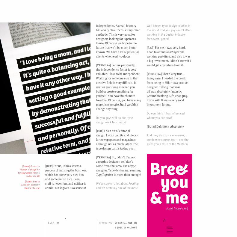
well-known type design courses in the world. Did you guys enrol after working in the design industry for several years?
[José] For me it was very hard. I had to attend Reading while working part-time, and also it was a big investment. I didn’t know if I would get any return from it.
[Veronika] That’s very true. In my case, I needed the break from being in Milan as a product designer. Taking that year off was absolutely fantastic. Groundbreaking. Life-changing, if you will. It was a very good investment for me.
Do you think it has influenced where you are now?
[Both] Definitely. Absolutely.
And they also run a one-week, condensed course, too — one that gives you a taste of the Masters?
[José] For us, I think it was a process of learning the business, which has some very nice bits and some not so nice. Legal stuff is never fun, and neither is admin, but it gives us a sense of
independence. A small foundry has a very clear focus; a very clear aesthetic. This is very good for designers looking for typefaces to use. Of course we hope in the future that we’ll be much better known. We have a lot of potential clients who need typefaces.
[Veronika] For me personally, the independence factor is very valuable. I love to be independent. Working for someone else in the creative field is very difficult. It isn’t as gratifying as when you build or create something for yourself. You have much more freedom. Of course, you have many more risks to take, but I wouldn’t change anything.
Do you guys still do non-type design work for clients?
[José] I do a bit of editorial design. I work on bits and pieces for newspapers and magazines, although not as much lately. The type design part is taking over.
[Veronika] No, I don’t. I’m not a graphic designer, so I don’t come from that area. I’m a type designer. Type design and running TypeTogether is more than enough!
We’ve spoken a lot about Reading and it’s certainly one of the most
[Above] Ronnia in ‘Women of Design’ by
Bryony Gomez-Palacio and Armin Vit
[Right] Bree in ‘I love her’ poster by
Marina Chaccur
PAGE 58 INTERVIEW VERONIKA BURIAN
& JOSÉ SCAGLIONE
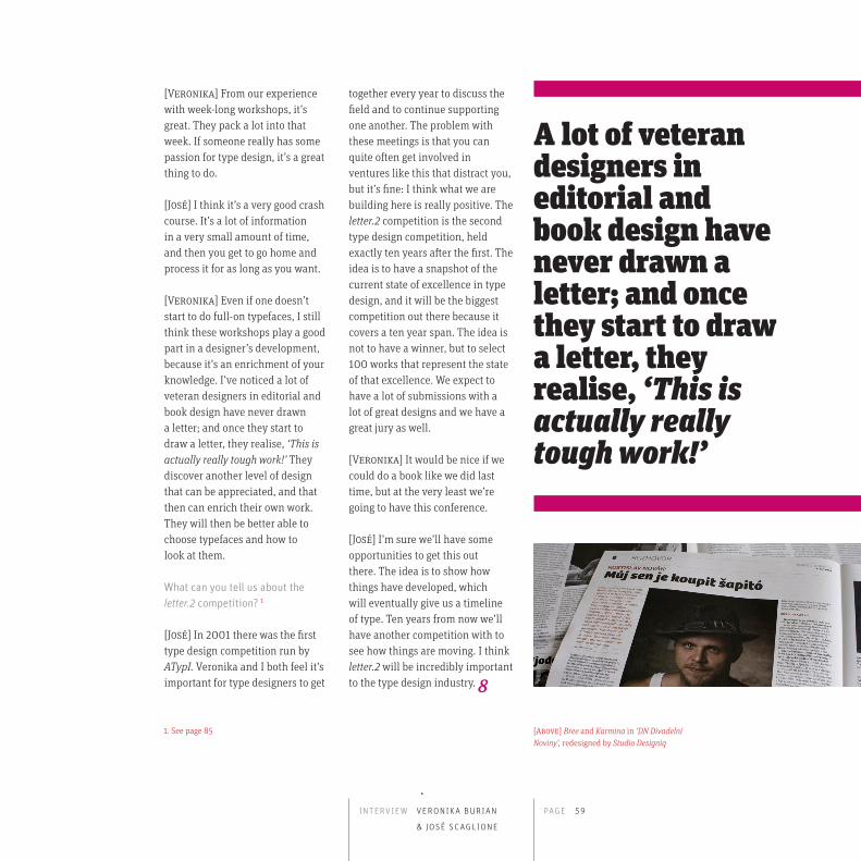
[Veronika] From our experience with week-long workshops, it’s great. They pack a lot into that week. If someone really has some passion for type design, it’s a great thing to do.
[José] I think it’s a very good crash course. It’s a lot of information in a very small amount of time, and then you get to go home and process it for as long as you want.
[Veronika] Even if one doesn’t start to do full-on typefaces, I still think these workshops play a good part in a designer’s development, because it’s an enrichment of your knowledge. I’ve noticed a lot of veteran designers in editorial and book design have never drawn a letter; and once they start to draw a letter, they realise, ‘This is actually really tough work!’ They discover another level of design that can be appreciated, and that then can enrich their own work. They will then be better able to choose typefaces and how to look at them.
What can you tell us about the letter.2 competition? 1
[José] In 2001 there was the first type design competition run by ATypI. Veronika and I both feel it’s important for type designers to get
A lot of veteran designers in editorial and book design have never drawn a letter; and once they start to draw a letter, they realise, ‘This is actually really tough work!’
together every year to discuss the field and to continue supporting one another. The problem with these meetings is that you can quite often get involved in ventures like this that distract you, but it’s fine: I think what we are building here is really positive. The letter.2 competition is the second type design competition, held exactly ten years after the first. The idea is to have a snapshot of the current state of excellence in type design, and it will be the biggest competition out there because it covers a ten year span. The idea is not to have a winner, but to select 100 works that represent the state of that excellence. We expect to have a lot of submissions with a lot of great designs and we have a great jury as well.
[Veronika] It would be nice if we could do a book like we did last time, but at the very least we’re going to have this conference.
[José] I’m sure we’ll have some opportunities to get this out there. The idea is to show how things have developed, which will eventually give us a timeline of type. Ten years from now we’ll have another competition with to see how things are moving. I think letter.2 will be incredibly important to the type design industry. 8
1. See page 85 [Above] Bree and Karmina in ‘DN Divadelní Noviny’, redesigned by Studio Designiq
INTERVIEW PAGE 59VERONIKA BURIAN
& JOSÉ SCAGLIONE
“
Find and buy these typefaces at 8faces.com/2/fonts
¶ kBreetogether
Find and buy these typefaces at 8faces.com/2/fonts
Bree has its origins in our logotype. It is a sleek sans serif that delivers a polished and modern look and feel for branding or headline usage. Bree is quite unusual in being a spirited and rhythmic upright italic. It successfully merges elements from handwriting with contemporary typography.”
Abrildisplay&textAbril is our latest project and is still a work-in-progress. It is a font family engineered mainly for newspapers and magazines that features friendly and elegant styles for headlines and robust and economic styles for text. Abril Text is inspired by Scotch Romans, sturdy work-horses from the 19th century, while Abril Display has more influences from French Didot-styled typefaces.”
ADELLEAdelle is a slab serif, inspired by classic slab serifs of the 19th century. However, early in the design process, we decided to move away from the mechanical feel and adapt Adelle to a more humanist model. It was conceived specifically for intensive editorial use, mainly in newspapers and magazines, but its person-ality and flexibility make it a real multiple-purpose typeface. As it becomes larger in print, Adelle shows its personality through a series of measured particularities that make it easy to remember and identify.”
KARMINAKarmina is our first collaborative project, which resulted in a fresh and contemporary work-horse typeface. It was built to withstand the worst printing conditions: low quality papers, high printing speed with web presses and variations in the ink level of the printing press. Karmina’s features, such as the rather large serifs, intended to work perfectly in small reproduction sizes, the sharpness of the shapes, including some calligraphic reminiscences, the large and yet graceful and narrow proportions, grant Karmina outstanding legibility and economy.”
FenwayDelight“Matthew Carter’s Fenway is simply beautiful.”
National“We paid close attention to National when looking for an accompanying sans serif for our Adelle. Definitely an impressive piece of design by Kris Sowersby.”$₨€₪₢₤
TRADE GOTHICTrade Gothic was one of first typefaces I worked with and I still like it. It is clean, simple and somewhat independent, but at the same time it feels a bit quirky and very warm, friendly.”
Fedra Serif B & A“Peter Biľak’s Fedra Serif is a beautifully crafted typeface. A very nice contemporary example of technical quality and careful design.”
by Jackson Burke from 1948–1960
•• ••
“
““
“
“
“
Find and buy these typefaces at 8faces.com/2/fonts
¶ kBreetogether
Find and buy these typefaces at 8faces.com/2/fonts
Bree has its origins in our logotype. It is a sleek sans serif that delivers a polished and modern look and feel for branding or headline usage. Bree is quite unusual in being a spirited and rhythmic upright italic. It successfully merges elements from handwriting with contemporary typography.”
Abrildisplay&textAbril is our latest project and is still a work-in-progress. It is a font family engineered mainly for newspapers and magazines that features friendly and elegant styles for headlines and robust and economic styles for text. Abril Text is inspired by Scotch Romans, sturdy work-horses from the 19th century, while Abril Display has more influences from French Didot-styled typefaces.”
ADELLEAdelle is a slab serif, inspired by classic slab serifs of the 19th century. However, early in the design process, we decided to move away from the mechanical feel and adapt Adelle to a more humanist model. It was conceived specifically for intensive editorial use, mainly in newspapers and magazines, but its person-ality and flexibility make it a real multiple-purpose typeface. As it becomes larger in print, Adelle shows its personality through a series of measured particularities that make it easy to remember and identify.”
KARMINAKarmina is our first collaborative project, which resulted in a fresh and contemporary work-horse typeface. It was built to withstand the worst printing conditions: low quality papers, high printing speed with web presses and variations in the ink level of the printing press. Karmina’s features, such as the rather large serifs, intended to work perfectly in small reproduction sizes, the sharpness of the shapes, including some calligraphic reminiscences, the large and yet graceful and narrow proportions, grant Karmina outstanding legibility and economy.”
FenwayDelight“Matthew Carter’s Fenway is simply beautiful.”
National“We paid close attention to National when looking for an accompanying sans serif for our Adelle. Definitely an impressive piece of design by Kris Sowersby.”$₨€₪₢₤
TRADE GOTHICTrade Gothic was one of first typefaces I worked with and I still like it. It is clean, simple and somewhat independent, but at the same time it feels a bit quirky and very warm, friendly.”
Fedra Serif B & A“Peter Biľak’s Fedra Serif is a beautifully crafted typeface. A very nice contemporary example of technical quality and careful design.”
by Jackson Burke from 1948–1960
•• ••
“
““
“
“

Artworkby Jez Burrows
Every issue we’re asking one of our favourite artists and fellow type fans to create a piece of type-inspired art. This issue we called on Jez Burrows and he produced the wonderful illustration you see on your right, as well as our cover art.
Jez says of the quote: ‘I can’t help but feel enormously buoyed by that quote every time I read it. It suggests this unstoppable, almost romantic air of productivity, and my artwork is just an attempt to show it visually.’
Jez has kindly made the artwork available as desktop backgrounds for your computer, iPhone, and iPad. Visit 8faces.com / 2 / wallpapers for the downloads.
If you’d like to contribute artwork to a future issue of 8 Faces, please email [email protected].
PAGE 62 ARTWORK
JEZ BURROWS

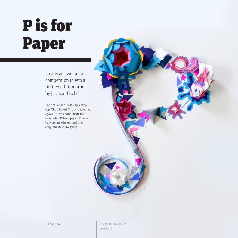
P is for Paper
The challenge? To design a drop cap. The winner? The very talented Ayaka Ito, who hand-made this wonderful ‘P’ from paper. Thanks to everyone who entered and congratulations to Ayaka!
Last issue, we ran a competition to win a limited edition print by Jessica Hische.
PAGE 64 COMPETITION WINNER
AYAKA OTO

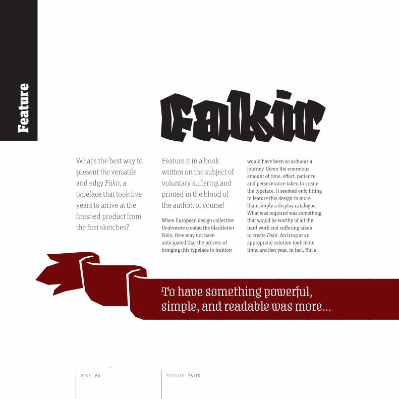
would have been so arduous a journey. Given the enormous amount of time, effort, patience and perseverance taken to create the typeface, it seemed only fitting to feature this design in more than simply a display catalogue. What was required was something that would be worthy of all the hard work and suffering taken to create Fakir. Arriving at an appropriate solution took more time: another year, in fact. But a
When European design collective Underware created the blackletter Fakir, they may not have anticipated that the process of bringing this typeface to fruition
=
AFGGGGGGGGGGGGGGGGHDTo have something powerful, simple, and readable was more...
What’s the best way to present the versatile and edgy Fakir, a typeface that took five years to arrive at the finished product from the first sketches?
Feature it in a book written on the subject of voluntary suffering and printed in the blood of the author, of course!
Feat
ure
PAGE 66 FEATURE FAKIR

solution was finally concluded and the decision was made to create a publication focusing on the subject of voluntary suffering, which seemed entirely appropriate for all the time and effort that went into its creation. For a Gothic typeface such as Fakir, the theme was certainly fitting: harking back to medieval times when the Gothic style of type first originated in the days suffering was a daily theme. In order to find suitable material
for this subject, Underware’s attention soon came to Ruud Linssen; the Catholic Dutch author, poet and journalist. ‘If there’s anyone who really knows what suffering truly means, it’s him.’ says Sami Kortemäki of Underware.
Ruud immediately took to the idea, and the decision was soon agreed for him to write a short story on voluntary suffering, and a deadline of completion in
approximately two to three months was agreed. However, six months later, no story had materialised. Ruud had in fact become heavily involved in writing an extensive book on the subject, and instead of two months, The Book of war, mortification, and love took two years to complete. The author ascertained that he had rewritten every sentence of the book at least
AFGGGGGGGGGGGGGGGGHD...important than following the style of historical blackletters.
FEATURE FAKIR PAGE 67
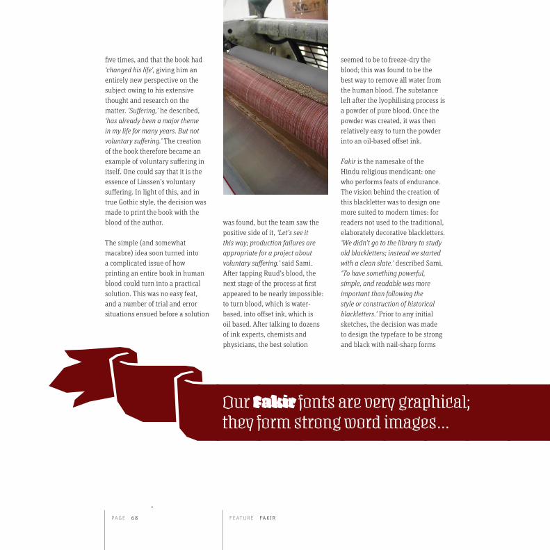
seemed to be to freeze-dry the blood; this was found to be the best way to remove all water from the human blood. The substance left after the lyophilising process is a powder of pure blood. Once the powder was created, it was then relatively easy to turn the powder into an oil-based offset ink.
Fakir is the namesake of the Hindu religious mendicant: one who performs feats of endurance. The vision behind the creation of this blackletter was to design one more suited to modern times: for readers not used to the traditional, elaborately decorative blackletters. ‘We didn’t go to the library to study old blackletters; instead we started with a clean slate.’ described Sami, ‘To have something powerful, simple, and readable was more important than following the style or construction of historical blackletters.’ Prior to any initial sketches, the decision was made to design the typeface to be strong and black with nail-sharp forms
five times, and that the book had ‘changed his life’, giving him an entirely new perspective on the subject owing to his extensive thought and research on the matter. ‘Suffering,’ he described, ‘has already been a major theme in my life for many years. But not voluntary suffering.’ The creation of the book therefore became an example of voluntary suffering in itself. One could say that it is the essence of Linssen’s voluntary suffering. In light of this, and in true Gothic style, the decision was made to print the book with the blood of the author.
The simple (and somewhat macabre) idea soon turned into a complicated issue of how printing an entire book in human blood could turn into a practical solution. This was no easy feat, and a number of trial and error situations ensued before a solution
was found, but the team saw the positive side of it, ‘Let’s see it this way; production failures are appropriate for a project about voluntary suffering.’ said Sami. After tapping Ruud’s blood, the next stage of the process at first appeared to be nearly impossible: to turn blood, which is water-based, into offset ink, which is oil based. After talking to dozens of ink experts, chemists and physicians, the best solution
AFGGGGGGGGGGGGGGGGHDOur Fakir fonts are very graphical; they form strong word images...
PAGE 68 FEATURE FAKIR
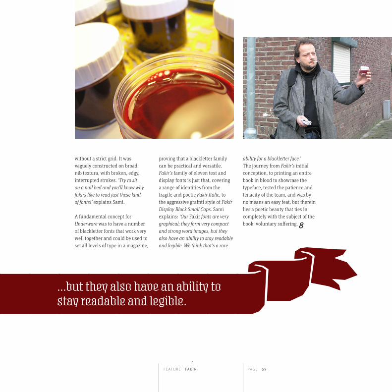
without a strict grid. It was vaguely constructed on broad nib textura, with broken, edgy, interrupted strokes. ‘Try to sit on a nail bed and you’ll know why fakirs like to read just these kind of fonts!’ explains Sami.
A fundamental concept for Underware was to have a number of blackletter fonts that work very well together and could be used to set all levels of type in a magazine,
proving that a blackletter family can be practical and versatile. Fakir’s family of eleven text and display fonts is just that, covering a range of identities from the fragile and poetic Fakir Italic, to the aggressive graffiti style of Fakir Display Black Small Caps. Sami explains: ‘Our Fakir fonts are very graphical; they form very compact and strong word images, but they also have an ability to stay readable and legible. We think that’s a rare
ability for a blackletter face.’The journey from Fakir’s initial conception, to printing an entire book in blood to showcase the typeface, tested the patience and tenacity of the team, and was by no means an easy feat; but therein lies a poetic beauty that ties in completely with the subject of the book: voluntary suffering. 8
AFGGGGGGGGGGGGGGGGHD...but they also have an ability to stay readable and legible.
FEATURE FAKIR PAGE 69

‘A lot of ui you see these days is about making things pretty by adding decoration. I wanted it to look beautiful once you stripped out the decoration; something pure.’
The ui’s design and interaction guide — which Microsoft kindly let us have a peak at — references way-finding as a key inspiration and it’s clear that this simple, no-nonsense approach permeates the entire experience. ‘It’s about having something glanceable,’ says Jeff. ‘Iconography is of course
The new mobile os has a ui that is distinctively type-heavy. In a dramatic departure from the icon-heavy visual style of iOS and Android, wp7 is very clearly an attempt to get back to basics; to employ solid design principles instead of elaborate graphics to deliver a fulfilling but ultimately very simple user experience.
We spoke to Jeff Fong (Design Lead for wp7) and Simon Daniels (Lead Program Manager for Fonts, Windows Core Experience) about the phone and how importantly type played a role in its realisation. Jeff had previously worked on the Zune ui and done a lot of work on bringing content to the forefront. He says that the phone was about formalising these principles:
Feat
ure
Microsoft is not a name that many associate with groundbreaking design, but the stigma is undeserved: they’ve done much for the world of type, from commissioning modern classics such as Matthew Carter’s Georgia, to paving a new path for type rendering with the DirectWrite engine. Their latest achievement is Windows Phone 7.
PAGE 70 FEATURE WINDOWS PHONE 7
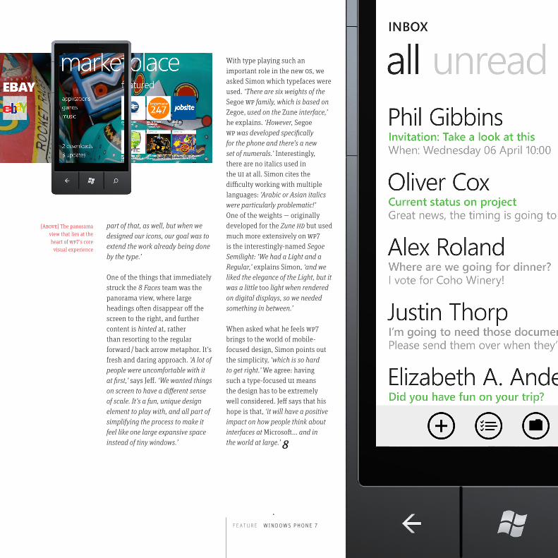
part of that, as well, but when we designed our icons, our goal was to extend the work already being done by the type.’
One of the things that immediately struck the 8 Faces team was the panorama view, where large headings often disappear off the screen to the right, and further content is hinted at, rather than resorting to the regular forward / back arrow metaphor. It’s fresh and daring approach. ‘A lot of people were uncomfortable with it at first,’ says Jeff. ‘We wanted things on screen to have a different sense of scale. It’s a fun, unique design element to play with, and all part of simplifying the process to make it feel like one large expansive space instead of tiny windows.’
With type playing such an important role in the new os, we asked Simon which typefaces were used. ‘There are six weights of the Segoe wp family, which is based on Zegoe, used on the Zune interface,’ he explains. ‘However, Segoe wp was developed specifically for the phone and there’s a new set of numerals.’ Interestingly, there are no italics used in the ui at all. Simon cites the difficulty working with multiple languages: ‘Arabic or Asian italics were particularly problematic!’ One of the weights — originally developed for the Zune hd but used much more extensively on wp7 is the interestingly-named Segoe Semilight: ‘We had a Light and a Regular,’ explains Simon, ‘and we liked the elegance of the Light, but it was a little too light when rendered on digital displays, so we needed something in between.’
When asked what he feels wp7 brings to the world of mobile-focused design, Simon points out the simplicity, ‘which is so hard to get right.’ We agree: having such a type-focused ui means the design has to be extremely well considered. Jeff says that his hope is that, ‘it will have a positive impact on how people think about interfaces at Microsoft... and in the world at large.’ 8
[Above] The panorama view that lies at the heart of wp7’s core
visual experience
FEATURE WINDOWS PHONE 7

continue to be used for a variety of cultural applications, display purposes, logos, and signage; especially in Ireland.
If uncial typefaces from the primary vendors of digital fonts are searched for, it’s difficult to classify the results as being clearly uncial, half-uncial, insular, or any other specific style.
Libra and Simplex are a pair of related display typefaces from the Lettergieterij “Amsterdam”, also known as The Amsterdam Typefoundry, or simply Tetterode. Sjoerd H. De Roos designed Libra, a unicase alphabet made up of broad nib pen-based forms, in 1937. Simplex is its sans serif counterpart, developed by De Roos
Today, graphic designers often use the term ‘uncial’ to describe Irish letter styles, although this is not particularly accurate. In early medieval Europe, many books produced in Ireland, Britain, or Irish monasteries on the continent, used insular scripts influenced by earlier forms of Roman writing. After the reign of Charlemagne in Europe, the Carolingian minuscule became the predominate style of letter in most countries where the Roman alphabet was used. Insular scripts made the transition to typography when books printed in the Irish language began appearing in the sixteenth century. Although the printing of books in Gaelic typefaces fell out of common practice in Ireland during the twentieth century, these forms
Feat
ure
Uncials and half-uncials were developed in the Roman Empire. Originally used for Latin or Greek texts, these scripts were also used by scribes writing in Germanic and Gaelic languages. Since uncials have never really disappeared from the western vocabulary of letters, they’ve been used for multiple modern languages, too.
A Brief History of Type
PAGE 72 FEATURE A BRIEF HISTORY
OF UNCIAL T YPE
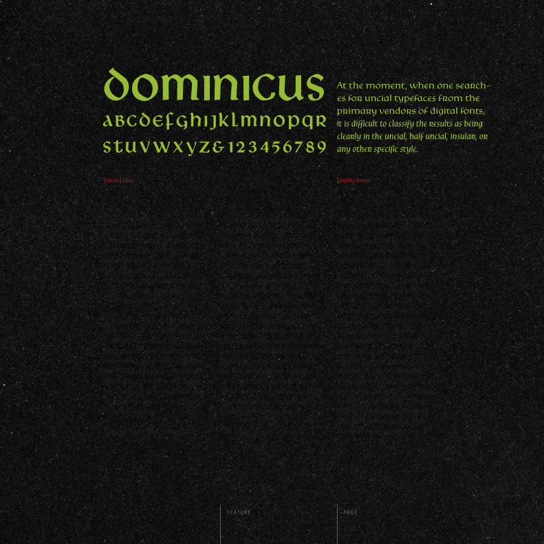
together with Dick Dooijes in 1940. Both men were giants of 20th century Dutch type design, and these uncial typefaces function as footnotes in their bodies of work. Still, Libra and Simplex offer an interesting vantage point into how uncial typefaces were viewed in the mid-twentieth century.
Although De Roos hoped that Libra would be used as a book face, Tetterode marketed it and Simplex as display faces. Both designs are unicameral, rather than including the standard upper and lowercase. This feature ties Libra and Simplex into the many lowercase writing experiments going on in European design at the time.
The typefaces’ use of the uncial
character is stylistic, rather than historic or linguistic. Libra and Simplex are not literal revivals of any specific book hands. Dutch printers were the primary market for the types, although the typefaces were also distributed abroad. New display typefaces should appear unique — presumably, this helps their sales — as printers would be more likely to consider them if they appear different from other designs of the same foundry, or Tetterode’s competitors. Very few uncial typefaces were available in 1937. Printers who purchased these types could rest assured that the design would create a unique text image on the page.
The Austrian-born artist and
designer Victor Hammer seems to have had different motivations from De Roos and Dooijes. Hammer worked with uncial letterforms throughout his long career. Before emigrating from Vienna to the United States in 1939, he had travelled widely, spending almost a decade in Florence. His work — which included many books — was in several languages. Hammer felt that texts written in Latin had a different appearance than in modern English, French, German, or Italian. Latin words have a lower frequency of ascenders or descenders, for instance. Inspired by Irish scribal writing, like the style of letters seen in the Book of Kells (which is written in Latin), Hammer developed his own
[Above] Libra [Above] Rieven
PAGE 73FEATURE A BRIEF HISTORY
OF UNCIAL T YPE

Despite the ubiquity of poor American Uncial digitisation, a version of Neue Hammer Unziale is available from Adobe and Linotype. Using this lends a more graceful appearance to text, and is even more faithful to Hammer’s design intentions.
Monotype’s Colmcille type family may be a better choice for Irish text rather than Libra, Simplex, or American Uncial. Designed explicitly for book printing in Ireland, its fonts include authentic Gaelic letterforms, as well as the diacritics required by the Irish language. Colm O’Lochlainn, a printer and typographer from Dublin, designed Colmcille’s regular and italic during the 1930s; Stanley Morison, Monotype
had no uppercase / lowercase differentiation, Hammer’s concept for uppercase letters featured serifless roman capitals, rather than the enlarged ‘lowercase’ seen in some other uncial or Gaelic typefaces. The design of the uppercase letters from American Uncial / Neue Hammer Unziale is similar in appearance to those of Hermann Zapf’s Optima (1958).
Klingspor distributed Neue Hammer Unziale with a set of large initials. These stylised versions of the lowercase were really ornaments, rather than proper letters. Unfortunately, most digital versions of American Uncial today are made up of just these initials, rather than the true upper and lowercase letters from design.
uncial style handwriting, which he translated into several typefaces from the 1920s to the 1950s.
In 1943, the Dearborn Type Foundry cast the first version of his American Uncial typeface. The design did not enter distribution until 1954, when the Gebr. Klingspor foundry in Germany published it. Klingspor changed the name to Neue Hammer Unziale. Today, the design is available in several digital versions, under both names.
Unlike Libra and Simplex — as well as some of Victor Hammer’s earlier typefaces — American Uncial / Neue Hammer Uncial is a bicameral design. Since handwriting styles in the early Middle Ages
[Left] Simplex
PAGE 74 FEATURE A BRIEF HISTORY
OF UNCIAL T YPE

Corporation’s typographical consultant, played a key role in ushering the face’s development along. In 1988, O’Lochlainn’s son Dara added a design for a bold weight. Today, Comcille is available as an OpenType family, with regular, italic, bold, and bold italic variants.
Each of the OpenType fonts include a number of extras. Beside the standard character set, users may switch on Irish versions of A, G, d, f, g, r, s, and t. Alternate designs for A, E, G, T, g, and t are also included. 40 ornaments are also inside the fonts. These glyphs are mostly of the traditional Irish knot pattern variety, and may be used together to construct borders.
The development of uncial typefaces continues into the 21st century: digital font-making tools make designs easier than ever to bring to fruition. The most recent uncial to receive critical acclaim is Rieven Uncial, designed by Steven Skaggs for Delve Fonts, which received a Certificate of Excellence in Type Design from the Type Directors Club in their tdc² 2010 competition. Skaggs, influenced by Hammer’s example, set out to create an uncial face appropriate for book text. Unlike American Uncial, however, which pairs an
uncial lowercase with capitals that are rather roman, Rieven Uncial’s upper and lowercase letters are more harmonised.
Designed in 2008 by German designer Ludwig Übele, Walhalla is a revival of Oldřich Menhart’s Česka Unciala, released by Státní Tiskárna in 1948. Walhalla Sans is a sans serif version, conceived of by Übele himself. This ‘serif’ and sans serif pairing is more continental than Irish, but Übele includes the acute and dot accents necessary to set Irish-language text (although, the typefaces may need Gaelic alternates of some letters before traditional typesetters could deem it appropriate). As was the case with Hammer and Skaggs, Menhart spent many years developing his Česka Unciala. All three designers hoped to create new uncial faces that would be worthy interpretations of old book hands, in contemporary typographic form. Walhalla Sans reminds us of Simplex, but also somewhat of Colmcille’s italic. Where Colm O’Lochlainn expanded on his upright face to create the first-ever finished Irish italic, Übele’s Walhalla Sans shows a thorough investigation and understanding of the uncial letterform. 8
You can find Dan’s complete bibliography for this article at 8faces.com / 2 / uncial
[Left] Walhalla
PAGE 75FEATURE A BRIEF HISTORY
OF UNCIAL T YPE

ff Suhmo
ff Amman
ff DIN Round
FontFont – Innovative digital typefaces bydesigners for designers. For 20 years.
heightsgreatSuch
trackONE
MIND Tonight, I have to leave it.
© 2010 fsi FontShop International
Our newFontFonts
fontshop.com
fontfont.com
TheAd SectionWe believe in tasteful, honest advertising. Companies on these pages paid a fee that helped toward our printing costs. If you’d like to advertise in our next issue, please email [email protected]
Free to USe & eASY to Set UPonly pay for the fonts you need, when you need them
Classical & refined
Humanistic proportions
Rounded versatility
Lively & contemporary
A typeface with flow
The award-winning superfamilyCentro Pro
Baskerville
Proxima Nova
Chennai
Bree
Calluna
from PARACHUTE
from UrW++
from MARK SIMONSON STUDIO
from INSIGNE
from TYPE TOGETHER
from EXLJBRIS
Get these and many more at fontdeck.com
the finest webfonts

If you remember the shapeof your spoon at lunchthen it has to be the wrong shape
because the letter is both banal and beautiful
The spoon and the letter are tools
When it is a good design
one to take food from the bowlthe other to take information off the page
the reader has to feel comfortable
—Adrian Frutiger
Francker™
Neue Swift®
ITC Stone® Sans II
Madison Antiqua™
Klint®
ITC Handel Gothic™
ITC Chino™
DIN Next
Frutiger® Serif
The source of the originals www.linotype.com
Frutiger, Klint, and Swift are trademarks of Linotype Corp. registered in the U.S. Patent and Trademark Office and may be registered in certain other jurisdictions in the name of Linotype Corp. or its licensee Linotype GmbH. Francker is a trademark of Linotype Corp. and may be registered in certain jurisdictions in the name of Linotype Corp. or its licensee Linotype GmbH. Linotype and Madison Antiqua are trademarks of Linotype GmbH and may be registered in certain jurisdictions. ITC Stone is a trademark of International Typeface Corporation registered in the U.S. Patent and Trademark Office and which may be registered in certain other jurisdictions. ITC Chino and ITC Handel Gothic are trademarks of International Typeface Corporation and may be registered in certain jurisdictions.

ANCHORANCHOR
ANCHOR
AVAILABLE EXCLUSIVELY
AT PROCESSTYPEFOUNDRY.COM

Jeremy Tankard [email protected]
T +44(0)1223 47 46 14
Contact Jeremy Tankard Typography for a free limited edition booklet
in 1993 disturbance was released, now the design has been redisturbed
with swash characterswide language support
optical size versionsa more complete typeface designed for all kinds of typographic work
visit typography.net for more information
New weights Light | Regular | Medium | Bold | Heavy
Available at Fontsmith.com
FS Joey -> An inventive digital type with a unique energy.
al*Affair
the commercial version of PF Regal Pro is cominglate this fall visit http://www.parachute.gr or the upscaletypography blog for release dates
*

angularQUITE
Rearranged.
yeahModern
CULTURAL
internationalsimpleFRANKsonorous
Calypso E ↑ and Vinkel for Print & Web from www.typolar.com
Better fonts for better websites.
.com


ATypI is proud to announce its second type design com-petition, Letter.2. A jury of renowned professionals will select typefaces from the last ten years that represent excellence in design.
Mark your calendar! Submission opens on April 4, 2011. Find out how to submit your work at www.letter2.org
Platinum Sponsors:
Gold Sponsors:
Media Partners:
Artwork & Design
Designed by Elliot Jay Stockselliotjaystocks.com
Typeface choices spreadsdesigned by Jon Tanjontangerine.com
Cover artwork & illustration on page 63 by Jez Burrowsjezburrows.com
Illustration on pages 4 & 5by Annica Lydenbergdirtybandits.com
Uncial type examples typeset by Dan Reynoldstypeoff.de
Website designed & built by Kyle Meyerkylemeyer.com& Dan Millar at Decode.ukdecode.uk.com
Printed in England by Prime Groupprimegroup.co.uk
Set in FF Unit Slab(and FF Unit for page footers)
CreditsPhotography
Elliot portrait by Chris Casciano. Ale portrait by Daniel Bericua. Stephen portrait by Michael Kressner. Tim portrait by Ryan Carver. Rich portrait by Jack Barnes. Jez portrait by Lizzy Stewart. Fakir photographs by Underware. ‘P is for Paper’ photos by Ayaka Ito. Windows Phone imagery used courtesy of Microsoft Corporation.
Editorial
Written & edited by Elliot Jay Stockselliotjaystocks.com
Copy edited by Samantha Cliffesamanthacliffe.com
Pages 4 & 5 written by Aegir Hallmundurministryoftype.co.uk
Pages 72 – 75 written by Dan Reynoldstypeoff.de
Pages 64 – 67 written by Samantha Cliffesamanthacliffe.com
Audio interviews transcribed by Brian Beavers, John Griffiths, Karen Kuhn, Michael Oullette, Allen Tan, Heather Van De Mark, and Mai-Chi Vu
PAGE 86 CREDITS

The small print
8 Faces, volume 1, number 2. issn 2043-7692. Published in November 2010 by Elliot Jay Stocks Design Ltd. © 2010 Elliot Jay Stocks Design Ltd. & the contributors. All rights reserved. Contact: [email protected]
For errata, please see8faces.com / 2 / errata
Thank you
Our contributors:Samantha, Aegir, Dan Reynolds, Jon, Jez, Annica, Kyle, Dan Millar, and the photographers
Our interviewees: Martin, Ale, Stephen, Tim, Nick, Rich, Veronika, and José
Our partners: Ascender, Chank, Fontdeck, FontFont, FontSmith, Jeremy Tankard Typography, La Fabrica, letter.2, Mark Simonson, Parachute, Process, Typolar, Typotheque, Underware,and Webtype
Special thanks to our extremely generous ‘Platinum’ and ‘Diamond’ partners: Linotype, MailChimp, (mt) Media Temple, and Microsoft
Extra special thanks to Erik Spiekermann, for guidance
This issue is dedicated to those who believed in us and rushed to get a copy of issue one in the first two hours of its release. Thank you for your support!
~ Elliot Jay Stocks, Editor
CREDITS PAGE 87

If you could use just eight typefaces for the rest of your life, which would you choose?
8 Faces is a new magazine for devotees of typography that asks this question — and many more — to eight leading designers from the fields of web design, print design, illustration, and of course type design itself. Plus:
An introduction by Ministry of Type’s Aegir Hallmundur
The story of Underware’s contemporary blackletter Fakir
A look at the type-focused interface of Windows Phone 7
Dan Reynolds on uncial type
Exclusive artwork by Jez Burrows
In partnership with:
issn 2043-7692 02
9 772043769008
This issue:
Martin Majoor, Ale Paul, Stephen Coles, Tim Brown, Nick Sherman,Rich Rutter, Veronika Burian, and José Scaglione
→
→
→
→
→


