A-1 IntroductIonBy now, you have learned a wide variety of statistical tools, ranging from simple charts and descriptive measures to more complex tools, such as regression and time series analysis. We suspect that all of you will be required to use some of these tools in your later course-work and in your eventual jobs. This means that you will not only need to understand the statistical tools and apply them correctly, but you will also have to write reports of your analyses for someone else—an instructor, a boss, or a client—to read. Unfortunately, the best statistical analysis is worth little if the report is written poorly. A good report must be accurate from a statistical point of view, but maybe even more important, it must be written in clear, concise English.1
As instructors, we know from experience that statistical report writing is the downfall of many students taking statistics courses. Many students appear to believe that they will be evaluated entirely on whether the numbers are right and that the quality of the write-up is at best secondary. This is simply not true. It is not true in an academic environment, and it is certainly not true in a business environment. Managers and executives in business are very busy people who have little time or patience to wade through poorly written reports. In fact, if a report starts out badly, the remainder will probably not be read at all. Only when it is written clearly, concisely, and accurately will a report have a chance of making any impact. Stated simply, a statistical analysis is often worthless if not reported well.
The goals of this brief appendix are to list several suggestions for writing good reports and to provide examples of good reports based on the analyses presented in this textbook. You have undoubtedly taken several classes in writing throughout your school years, and we cannot hope to make you a good writer if you have not already developed good basic writing skills. However, we can do three things to make you a competent statistical report writer. First, we can motivate you to spend time on your report writing by stressing how important it is in the business world. Indeed, we believe that poor writing often occurs because writers do not believe the quality of their writing makes any difference to anyone. However, we promise you that it does make a difference in the business world—your job might depend on it. Second, we can list several suggestions for improving your statistical report writing. Once you believe that good writing is really important, these tips might be all you need to help you improve your report writing significantly. Finally, we can provide examples of good reports. Some people learn best by example, so these “templates” should come in very handy.
There is no single best way to write a statistical report. Just as there are many different methods for writing a successful novel or a successful biography, there are many different methods for writing a successful statistical report. The examples we provide look good to us, but you might want to change them according to your own tastes—or maybe even
1This appendix discusses report writing. However, we acknowledge that oral presentation of statistical analysis is also very important. Fortunately, virtually all of our suggestions for good report writing carry over to making effective presentations. Also, we focus here on statistical reporting. The same comments apply to other quantitative reports, such as those dealing with optimization or simulation models.
88269_appA_online_hr_A-1-A-18.indd 1 01/10/13 1:27 AM
A-2 Appendix A Statistical Reporting
improve on them. Nevertheless, there are some bad habits that practically all readers will object to, and there are some good habits that will make your writing more effective. We list several suggestions here and expand on them in the next section.
Planning
■■ Clarify the objective.
■■ Develop a clear plan.
■■ Give yourself enough time.
Developing a Report
■■ Write a quick first draft.
■■ Edit and proofread.
■■ Give your report a professional look.
Be Clear
■■ Provide sufficient background information.
■■ Tailor statistical explanations to your audience.
■■ Place charts and tables in the body of the report.
Be Concise
■■ Let the charts do the talking.
■■ Be selective in the computer outputs you include.
Be Precise
■■ List assumptions and potential limitations.
■■ Limit the decimal places.
■■ Report the results fairly.
■■ Get advice from an expert.
A-2 SuggeStIonS for good StAtIStIcAl reportIngTo some extent, the habits that make someone a good statistical report writer are the same habits that make someone a good writer in general. Good writing is good writing. However, there are some specific aspects of good statistical reporting that do not apply to other forms of writing. In this section, we list several suggestions for becoming a good writer in general and for becoming a good statistical report writer in particular.
A-2a planning
Clarify the objective. When you write a statistical report, you are probably writing it for someone—an instructor, a boss, or maybe even a client. Make sure you know exactly what this other person wants, so that you do not write the wrong report (or perform the wrong statistical analysis). If there is any doubt in your mind about the objective of the report, clarify it with the other person before proceeding. Do not just assume that coming close to the target objective is good enough.
88269_appA_online_hr_A-1-A-18.indd 2 01/10/13 1:27 AM
A-2 Suggestions for Good Statistical Reporting A-3
Develop a clear plan. Before you start writing the report, make a plan for how you are going to organize it. This can be a mental plan, especially if the report is short and straightforward, or it can be a more formal written outline. Think about the best length for the report. It should be long enough to cover the important points, but it should not be verbose. Think about the overall organization of the report and how you can best divide it into sections (if separate sections are appropriate). Think about the computer outputs you need to include (and those you can exclude) to make your case as strong as possible. Think about the audience for whom you are writing and what level of detail they will demand or will be able to comprehend. If you have a clear plan before you begin writing, the writing itself will flow much more smoothly and easily than if you make up a plan as you go. Most effective statistical reports essentially follow the outline below. We recom-mend that you try it.
■■ Executive summary
■■ Problem description
■■ Data description
■■ Statistical methodology
■■ Results and conclusions
Give yourself enough time. If you plan to follow the suggestions listed here, you need to give yourself time to do the job properly. If the report is due first thing Monday morning and you begin writing it on Sunday evening, your chances of producing anything of high quality are slim. Get started early, and don’t worry if your first effort is not perfect. If you produce something a week ahead of time, you will have plenty of time to polish it in time for the deadline.
A-2b developing a report
Write a quick first draft. We have all seen writers in movies who agonize over the first sentence of a novel, and we suspect that many of you suffer the same problem when writing a report. You want to get it exactly right the first time through, so you agonize over every word, especially at the beginning. We suggest writing the first draft as quickly as possible—just get something down in writing—and then worry about improving it with careful editing later on. The worst thing many of us face as writers is a blank piece of paper (or a blank computer document). Once there is something written, even if it is only in pre-liminary form, the hard part is over and the perfecting can begin.
Edit and proofread. The secret of good writing is rewriting. We believe this sugges-tion (when coupled with the previous suggestion) can have the most immediate impact on the quality of your writing. Fortunately, it is relatively easy to do. With today’s software, there is no excuse for not editing and checking thoroughly, yet we are con-stantly amazed at how many people fail to do so. Spell checkers and grammar checkers are available in all of the popular word processors, and although they do not catch all errors, they should definitely be used. Then the real editing task can begin. A report that contains no spelling or grammatical errors is not necessarily well written. We believe a good practice, given enough time and planning, is to write a report and then reread it with a critical eye a day or two later. Better yet, get a knowledgeable friend to read it. Often the wording you thought was fine the first time around will sound awkward or confusing on a second reading. If this is the case, rewrite it! And don’t just change a word or two. If a sentence sounds really awkward or a paragraph does not get your
88269_appA_online_hr_A-1-A-18.indd 3 01/10/13 1:27 AM
A-4 Appendix A Statistical Reporting
point across, don’t be afraid to delete the whole thing and explore better ways of struc-turing it. Finally, proofread the final copy at least once, preferably more than once. Just remember that this report has your name on it, and any careless spelling or grammar mistakes will reflect badly on you. Admittedly, this editing and proofreading process can be time-consuming, but it can also be very rewarding when you realize how much better the final report reads.
Give your report a professional look. We are not necessarily fans of the glitz that today’s software enables (fancy colored fonts, 3-D charts, and so on), and we suspect that many writers spend too much time on glitz as opposed to substance. Nevertheless, it is important to give your reports a professional look. If nothing else, an attractive report makes a good first impression, and a first impression matters. It indicates to the reader that you have spent some time on the report and that there might be something inside worth reading. Of course, the fanciest report in the world cannot overcome a lack of substance, but at least it will gain you some initial respect. A sloppy report, even if it presents a great statistical analysis, might never be read at all. In any case, leave the glitz until last. Spend sufficient time to ensure that your report reads well and makes the points you want to make. Then you can have some fun dressing it up.
A-2c Be clear
How many times have you read a passage from a book, only to find that you need to read it again—maybe several times—because you keep losing your train of thought? It could be that you were daydreaming about something else, but it could also be that the writing itself is not clear. If a report is written clearly, chances are you will pick up its meaning on the first reading. Therefore, strive for clarity in your own writing. Avoid long, convoluted sentence structure. Don’t beat around the bush, but come right out and say what you mean to say. Make sure each paragraph has a single theme that hangs together. Don’t use jargon (unless you define it explicitly) that your intended readers are unlikely to understand. And, of course, read and reread what you have written—that is, edit it—to ensure that your writing is as clear as you initially thought.
Provide sufficient background information. After working on a statistical analysis for weeks or even months, you might lose sight of the fact that others are not as familiar with the project as you are. Make sure you include enough background information to bring the reader up to speed on the context of your report. As instructors, we have read through the fine details of many student reports without knowing exactly what the overall report is all about. Don’t put your readers in this position.
Tailor statistical explanations to your audience. Once you begin writing the Statistical Methodology and Results sections of a statistical report, you will probably start wondering how much explanation you need to include. For example, if you are describing the results of a regression analysis, you certainly want to mention the R2 value, the standard error of estimate, and the regression coefficients, but do you need to explain the meanings of these statistical concepts? This depends entirely on your intended audience. If this report is for a statistics class, your instructor is certainly famil-iar with the statistical concepts, and you do not need to define them in your report. But if your report is for a nontechnical boss who knows very little about statistics beyond means and medians, some explanation is certainly warranted. Even in this case, how-ever, keep in mind that your task is not to write a statistics textbook; it is to analyze a particular problem for your boss. So keep the statistical explanations brief, and get on with the analysis.
88269_appA_online_hr_A-1-A-18.indd 4 01/10/13 1:27 AM
A-2 Suggestions for Good Statistical Reporting A-5
Place charts and tables in the body of the report. This is a personal preference and can be disputed, but we favor placing charts and tables in the body of the report, right next to where they are referenced, rather than at the back of the report in an appendix. This way, when readers see a reference to Figure 3 or Table 2 in the body of the report, they do not have to flip through pages to find Figure 3 or Table 2. Given the options in today’s word processors, this can be done in a visually attractive manner with very little extra work. Alternatively, you can use hyperlinks to the charts and tables.
A-2d Be concise
Statistical report writing is not the place for the flowery language often used in novels. Your readers want to get straight to the point, and they typically have no patience for verbose reports. Make sure each paragraph, each sentence, and even each word has a purpose, and eliminate everything that is extraneous. This is the time where you should put critical editing to good use. Just remember that many professionals have a one-page rule—they refuse to read anything that does not fit on a single page. You might be sur-prised at how much you can say on a single page once you realize that this is the limit of your allotted space.
Let the charts do the talking. After writing this book, we are the first to admit that it can sometimes be very difficult to explain a statistical result in a clear, concise, and precise manner. It is sometimes easy to get mired in a tangle of words, even when the statistical concepts are fairly simple. This is where charts can help immensely. A well-constructed chart can be a great substitute for a long, drawn-out sentence or paragraph. For example, we have seen many confusing discussions of interaction effects in regression or two-way ANOVA studies, although an accompanying chart of interactions makes the results clear and simple to understand. Do not omit the accompanying verbal explanations completely, but keep them short and refer instead to the charts.
Be selective in the computer outputs you include. With today’s statistical software, it is easy to produce masses of numerical outputs and accompanying charts. Unfortunately, there is a tendency to include everything the computer spews out—often in an appendix to the report. Worse yet, there are often no references to some of these outputs in the body of the report; the outputs are just there, supposedly self-explanatory to the intended reader. This is a bad practice. Be selective in the outputs you include in your report, and don’t be afraid to alter them (with a text processor or a graphics package, say) to help clarify your points. Also, if you believe a table or chart is really important enough to include in the report, be sure to refer to it in some way in your write-up. For example, you might say, “You can see from the chart in Figure 3 that men over 50 years old are much more likely to try our product than are women under 50 years old.” This observation is probably clear from the chart in Figure 3—this is probably why you included Figure 3—but it is a good idea to bring attention to it in your write-up.
A-2e Be precise
Statistics is a science as well as an art. The way a statistical concept or result is explained can affect its meaning in a critical way. Therefore, use very precise language in your stat-istical reports. If you are unsure of the most precise wording, look at the wording used in this book (or another statistics book) for guidance. For example, if you are reporting a confidence interval, don’t report, “The probability is 95% that the sample mean is between 97.3 and 105.4.” This might sound good enough, but it is not really correct. A more precise
88269_appA_online_hr_A-1-A-18.indd 5 01/10/13 1:27 AM
A-6 Appendix A Statistical Reporting
statement is, “We are 95% confident that the true but unobserved population mean is between 97.3 and 105.4.” Of course, you must understand a statistical result (and some-times the theory behind it) before you can report it precisely, but we suspect that imprecise statements are often due to laziness, not lack of understanding. Make the effort to phrase your statistical statements as precisely as possible.
List assumptions and potential limitations. Many of the statistical procedures we have discussed rely on certain assumptions for validity. For example, in standard regression analysis there are assumptions about equal error variance, lack of residual autocorrelation, and normality of the residuals. If your analysis relies on certain assump-tions for validity, mention these in your report, especially when there is some evidence that they are violated. In fact, if they appear to be violated, warn the reader about the possible limitations of your results. For example, a confidence interval reported at the 95% level might, due to the violation of an equal variance assumption, really be valid at only the 80% or 85% level. Don’t just ignore assumptions—with the implication that they do not matter.
Limit the decimal places. We are continually surprised at the number of students who quote statistical results (directly from computer outputs, of course) to 5–10 decimal places, even when the original data contain much less precision. For example, when fore-casting sales a year from now, given historical sales data such as $3440, $4120, and so on, some people report a forecast such as $5213.2345. Who are they kidding? Statistical methods are exact only up to a certain limit. If you quote a forecast such as $5213.2345, just because this is what appears in your computer output, you are not gaining precision; you are showing your lack of understanding of the limits of the statistical methodology. If you instead report a forecast of “about $5200,” you will probably gain more respect from critical readers.
Report the results fairly. We have all heard statements such as, “It is easy to lie with statistics.” It is true that the same data can often be analyzed and reported by two different analysts to support diametrically opposite points of view. Certain results can be omitted, the axes of certain charts can be distorted, important assumptions can be ignored, and so on. This is partly a statistical issue and partly an ethical issue. There is not necessarily any-thing wrong with two competent analysts using different statistical methods to arrive at dif-ferent conclusions. For example, in a case where gender discrimination in salary has been charged, honest statisticians might very well disagree as to the legitimacy of the charges, depending on how they analyze the data. The world is not always black and white, and statistical analysts often find themselves in the gray areas. However, you are ethically obli-gated to report your results as fairly as possible. You should not deliberately try to lie with statistics.
Get advice from an expert. Even if you have read and understood every word in this book, you are still not an expert in statistics. You know a lot of useful techniques, but there are many specific details and nuances of statistical analysis that we have not had time to cover. A good example is violation of assumptions. We have discussed how to detect violations of assumptions several times, but we have not always discussed possible reme-dies because they require advanced methods. If you become stuck on how to write a specific part of your report because you lack the statistical knowledge, don’t be afraid to consult someone with more statistical expertise. For example, try e-mailing former instructors. They might be flattered that you remember them and value their knowledge—and they can probably provide the information you need.
88269_appA_online_hr_A-1-A-18.indd 6 01/10/13 1:27 AM
A-3 Examples of Statistical Reports A-7
A-3 exAmpleS of StAtIStIcAl reportSBecause many of you probably learn better from examples of report writing than from lists of suggestions, we now present several example reports. As stated earlier, our reports represent just one possible style of writing, and other styles might be equally good or even better. But we have attempted to follow the suggestions listed in the previous section. In particular, we have strived for clarity, conciseness, and precision—and the final reports you see here are the result of much editing.
I am working for Spring Mills Company, and my boss, Sharon Sanders, has asked me to report on the accounts receivable problem our company is currently experiencing. My
task is to describe data on our customers, analyze the magnitude of interest lost because of late payments from our customers, and suggest a solution for remedying the problem. Ms. Sanders knows basic statistics, but she probably needs a refresher on the meaning of box plots.
SPRING MILLS COMPANYZANESVILLE, OHIO
To: Sharon SandersFrom: Wayne WinstonSubject: Report on accounts receivableDate: July 6, 2013
ExEcutivE summary
Our company produces and distributes a wide variety of manufactured goods. Due to this variety, we have a large number of customers. We have classified our customers as small, medium, or large depending on the amount of business they do with us. Recently, we have had problems with accounts receivable. We are not getting paid as promptly as we would like, and we sense that it costs our company a good deal of money in potential interest. You assigned me to investigate the magnitude of the problem and to suggest a strategy for fixing it. This report discusses my findings.
Data sEt
I collected data on 280 customer accounts. The breakdown by size is: 150 small customers, 100 medium customers, and 30 large customers. For each account, my data set includes the number of days since the customer was originally billed (Days) and the amount the customer currently owes (Amount). If necessary, we can identify any of these accounts by name, although specific names do not appear in this report. The data and my analysis are in the file Accounts Receivable.xlsx. I have attached this file to my report in case you want to see further details.
softwarE
My analysis was performed entirely in Excel® 2010, using Palisade’s StatTools add-in where necessary.
88269_appA_online_hr_A-1-A-18.indd 7 01/10/13 1:27 AM
A-8 Appendix A Statistical Reporting
analysis
Given the objectives of the analysis, my analysis is broken down by customer size. Exhibit A.1 shows summary statistics for the Days and Amount for each customer size. [Small, medium, and large are coded throughout as 1, 2, and 3. For example, Days(1) refers to the Days variable for small customers]. You can see, not surprisingly, that larger cus-tomers tend to owe larger amounts. The median amounts for small, medium, and large customers are $250, $470, and $1395, and the mean amounts follow a similar pattern. In contrast, medium and large companies tend to delay payments equally long (median days delayed is about 19–20), whereas small companies tend to delay only about half as long. The standard deviations in this exhibit indicate some variation across companies of any size, but this variation is considerably smaller for the amounts owed by small companies.
Graphical comparisons of these different size customers appear in Exhibits A.2 and A.3. Each of these shows side-by-side box plots (the first of Days, the second of Amount) for easy visual comparison. (For any box plot, the box contains the middle 50% of the
7891011121314151617181920212223
Days(1)
Amount(1) Amount(2) Amount(3)
Days(2) Days(3)One Variable Summary Data Set #2
A B C D
Data Set #2 Data Set #2
Mean 9.800Std. Dev. 3.128Median 10.000Minimum 2.000Maximum 17.000Count 150
88269_appA_online_hr_A-1-A-18.indd 8 01/10/13 1:27 AM
A-3 Examples of Statistical Reports A-9
observations, the line and the dot inside the box represent the median and mean, respec-tively, and individual points outside the box represent extreme observations.) These box plots graphically confirm the patterns seen in Exhibit A.1.
Exhibits A.1–A.3 describe the variables Days and Amount individually, but they do not indicate whether there is a relationship between them. Do our customers who owe large amounts tend to delay longer? To investigate this, I created scatterplots of Amount versus Days for each customer size. The scatterplot for small customers (not shown) indicates no relationship whatsoever; the correlation between Days and Amount is a negligible −0.044. However, the scatterplots for medium and large customers both indicate a fairly strong positive relationship. The scatterplot for medium-size customers is shown in Exhibit A.4.
Box Plot of Comparison of Amount
0 500 1000 1500 2000 2500
Exhibit A.3 Box Plots of Amount by Different-Size Customers
Sca�erplot of Amount(2) vs Days(2)
00
100
200
300
400
Amou
nt(2)
500
600
700
800
5 10 15 20Days(2)
25 30 35 40 45
Exhibit A.4 Scatterplot of Amount versus Days for Medium Customers
88269_appA_online_hr_A-1-A-18.indd 9 01/10/13 1:27 AM
A-10 Appendix A Statistical Reporting
(The one for large customers is similar, only with many fewer points.) The correlation is fairly large, 0.612, and the upward sloping (and reasonably linear) pattern is clear: the larger the delay, the larger the amount owed—or vice versa.
The analysis up to this point describes our customer population, but it does not directly answer our main concerns: How much potential interest are we losing, and what can we do about it? The analysis in Exhibit A.5 and accompanying pie chart in Exhibit A.6 address the first of these questions. To create Exhibit A.5, I assumed that we can earn an annual rate of 12% on excess cash. Then for each customer, I calculated the interest lost by not having a payment made for a certain number of days. (These calculations are shown for only a few of the customers.) Then I summed these lost interest amounts to obtain the totals in row 5 and created a pie chart from the sums in row 5 (expressed as percent-ages of the total). By the way, if you think the 12% value is too large, you can change it in cell C7 and everything will update automatically.
The message from the pie chart is fairly clear. We do not need to worry about our many small customers; the interest we are losing from them is relatively small. However, we might want to put some pressure on the medium and large customers. I would suggest targeting the large customers first, especially those with large amounts due. There are fewer of them, so we can concentrate our efforts more easily. Also, remember that amounts due and days delayed are positively correlated for the large customers. Therefore, the accounts with large amounts due are where we are losing the most potential interest.
88269_appA_online_hr_A-1-A-18.indd 10 01/10/13 1:27 AM
A-3 Examples of Statistical Reports A-11
I’m a student in a MBA statistics course. For the statistical inference part of the course, each student has been assigned to gather data in a real setting that can be used to find
a suitably narrow confidence interval for a population parameter. Although the instructor, Rob Jacobs, certainly knows statistics well, he has asked us to include explanations of rel-evant statistical concepts in our reports, just to confirm that we know what we are talking about. Professor Jacobs has made it clear that he does not want a lot of padding. He wants our reports to be brief and concise.
Report on Confidence Intervals for Professor Rob JacobsManagerial Statistics, S540, Spring semester, 2013Submitted by Teddy Albright
ExEcutivE summary
This report summarizes my findings on potential differences between husbands and wives in their ratings of automobile presentations. I chose this topic because my uncle manages a Honda dealership in town, and he enabled me to gain access to the data for this report. The report contains the following: (1) an explanation of the overall study, (2) a rationale for the sample size I chose, (3) the data, (4) the statistical methodology, and (5) a summary of my results.
thE stuDy
We tend to associate automobiles with males—horsepower, dual cams, and V-6 engines are arguably macho terms. I decided to investigate whether husbands, when shopping for new cars with their wives, tend to react more favorably to salespeople’s presentations than their wives. (My bias that this is true is bolstered by the fact that all salespeople I have seen, including all of those in this study, are men.) To test this, I asked a sample of couples at the Honda dealership to rate the sales presentation they had just heard on a 1 to10 scale, 10 being the most favorable. The husbands and wives were asked to give independent ratings. I then used these data to calculate a confidence interval for the mean difference between the husbands’ and wives’ ratings. If my initial bias was correct, this confidence interval should be predominantly positive.
thE samplE sizE
Before I could conduct the study, I had to choose a sample size: the number of couples to sample. The eventual sample was based on two considerations: the time I could devote to the study and the length of the confidence interval I desired. For the latter consideration, I used StatTools’s sample size determination procedure to get an esti-mate of the required sample size. This procedure requests a confidence level (I chose the usual 95% level), a desired confidence interval half-length, and a standard deviation of the differences. I suspected that most of the differences (husband rating minus wife rating) would be from −1 to +3, so I (somewhat arbitrarily) chose a desired half-length of 0.25 and guessed a standard deviation of 0.75. StatTools reported that this would require a sample size of 35 couples. I decided that this was reasonable, given the amount of time I could afford, so I used this sample size and proceeded to gather data from 35 husbands and wives. Of course, I realize that if the actual standard deviation of differences turned out to be larger than my guess, my confidence interval would not be as narrow as I specified.
E X A M P l E A . 2 reporting ConfidenCe intervalS
88269_appA_online_hr_A-1-A-18.indd 11 01/10/13 1:27 AM
A-12 Appendix A Statistical Reporting
thE Data
The data I collected includes a husband and a wife rating for each of the 35 couples in the sample. Exhibit A.7 presents data for the first few couples, together with several summary statistics for the entire data set. As the sample means and medians indicate, husbands do tend to rate presentations somewhat higher than their wives, but this comparison of means and medians is only preliminary. The statistical inference is discussed next.
statistical mEthoDology
My goal is to compare two means: the mean rating of husbands and the mean rating of wives. There are two basic statistical methods for comparing two means: the two-sample method and the paired-sample method. I chose the latter. The two-sample method assumes that the observations from the two samples are independent. Although I asked each husband–wife pair to evaluate the presentation independently, I suspected that hus-bands and wives, by the very fact that they live together and tend to think alike, would tend to give positively correlated ratings. The data confirmed this. The correlation between the husband and wife ratings was a fairly large and positive 0.44. When data come in natural pairs and are positively correlated, the paired-sample method for comparing means is preferred. The reason is that it takes advantage of the positive correlation to provide a narrower confidence interval than the two-sample method.
rEsults
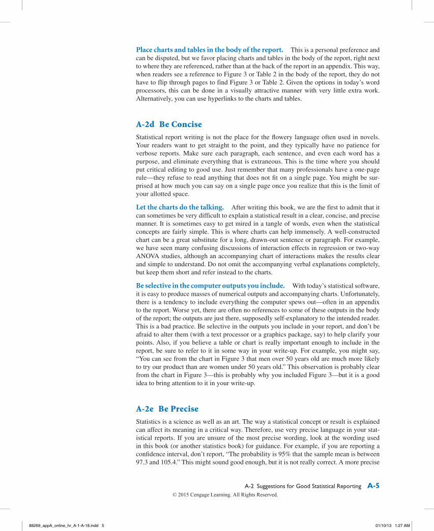
To obtain the desired confidence interval, I used StatTools’s paired-sample procedure. This calculates the “husband minus wife” differences and then analyzes these differences. Exhibit A.8 contains the StatTools output. The summary measures at the top of this output pro-vide one more indication that husbands react, on average, more favorably to presentations than their wives. The mean difference is about 1.6 rating points. A graphical illustration of this difference appears in Exhibit A.9, which includes a box plot of the “husband minus wife” negative differences. It shows that the vast majority of the differences are positive.
The right section of Exhibit A.8 contains the statistical inference, including the 95% confidence interval for the mean difference. This interval extends from approximately 1.0 to 2.2. To understand how it is formed, the method first calculates the standard error (not shown) of the sample mean difference. This is the standard deviation of the differ-ences divided by the square root of the sample size. Then it goes out approximately two standard errors on either side of the sample mean difference to form the limits of the confidence interval.
88269_appA_online_hr_A-1-A-18.indd 12 01/10/13 1:27 AM
A-3 Examples of Statistical Reports A-13
Because the confidence interval includes only positive values (and the lower limit is not even close to 0), there is little doubt that husbands, on average, react more positively to sales presentations than their wives. Note, however, that the confidence interval is not nearly as narrow as I specified in the sample size section. This is because the stand-ard deviation of negative differences turned out to be considerably larger than I guessed (1.66 versus 0.75). If I wanted a narrower confidence interval, I would need a considerably larger sample. Given that I have essentially proved my conjecture that the mean difference is positive, however, a larger sample does not appear to be necessary. ■
88269_appA_online_hr_A-1-A-18.indd 13 01/10/13 1:28 AM
A-14 Appendix A Statistical Reporting
I am a statistical consultant, and I have been hired by Bendrix Company, a manufacturing company, to analyze its overhead data. The company has supplied me with historical
monthly data from the past three years on overhead expenses, machine hours, and the num-ber of production runs. My task is to develop a method for forecasting overhead expenses in future months, given estimates of the machine hours and number of production runs that are expected in these months. My contact, Dave Clements, is in the company’s finance department. He obtained an MBA degree about 10 years ago, and he vaguely remembers some of the statistics he learned at that time. However, he does not profess to be an expert. The more I can write my report in nontechnical terms, the more he will appreciate it.
To: Dave Clements, financial managerSubject: Forecasting overheadDate: July 20, 2013
Dave, here is the report you requested. (See also the attached Excel file, Overhead Costs.xlsx, which contains the details of my analysis. By the way, it was done with the help of Palisade’s StatTools add-in for Excel. If you plan to do any further statistical anal-ysis, I would strongly recommend purchasing this add-in.) As I explain in this report, regression analysis is the best-suited statistical methodology for your situation. It fits an equation to historical data, uses this equation to forecast future values of overhead, and provides a measure of the accuracy of these forecasts. I believe you will be able to sell this analysis to your colleagues. The theory behind regression analysis is admittedly complex, but the outputs I provide are quite intuitive, even to people without a statistical background.
objEctivEs anD Data
To ensure that we are on the same page, I will briefly summarize my task. You supplied me with Bendrix monthly data for the past 36 months on three variables: Overhead (total overhead expenses during the month), MachHrs (number of machine hours used during the month), and ProdRuns (number of separate production runs during the month). You suspect that Overhead is directly related to MachHrs and ProdRuns, and you want me to quantify this relationship so that you can forecast future overhead expenses on the basis of (estimated) future values of MachHrs and ProdRuns. Although you did not state this explicitly in your requirements, I assume that you would also like a measure of the accu-racy of the forecasts.
statistical mEthoDology
Fortunately, there is a natural methodology for solving your problem: regression analysis. Regression analysis was developed specifically to quantify the relationship between a single dependent variable and one or more explanatory variables (assuming that there is a rela-tionship to quantify). In your case, the dependent variable is Overhead, the explanatory variables are MachHrs and ProdRuns, and from a manufacturing perspective, there is every reason to believe that Overhead is related to MachHrs and ProdRuns. The outcome of the regression analysis is a regression equation that can be used to forecast future values of Overhead and provide a measure of the accuracy of these forecasts. There are a lot of
88269_appA_online_hr_A-1-A-18.indd 14 01/10/13 1:28 AM
A-3 Examples of Statistical Reports A-15
calculations involved in regression analysis, but statistical software, such as StatTools, per-forms these calculations easily, allowing you to focus on the interpretation of the results.
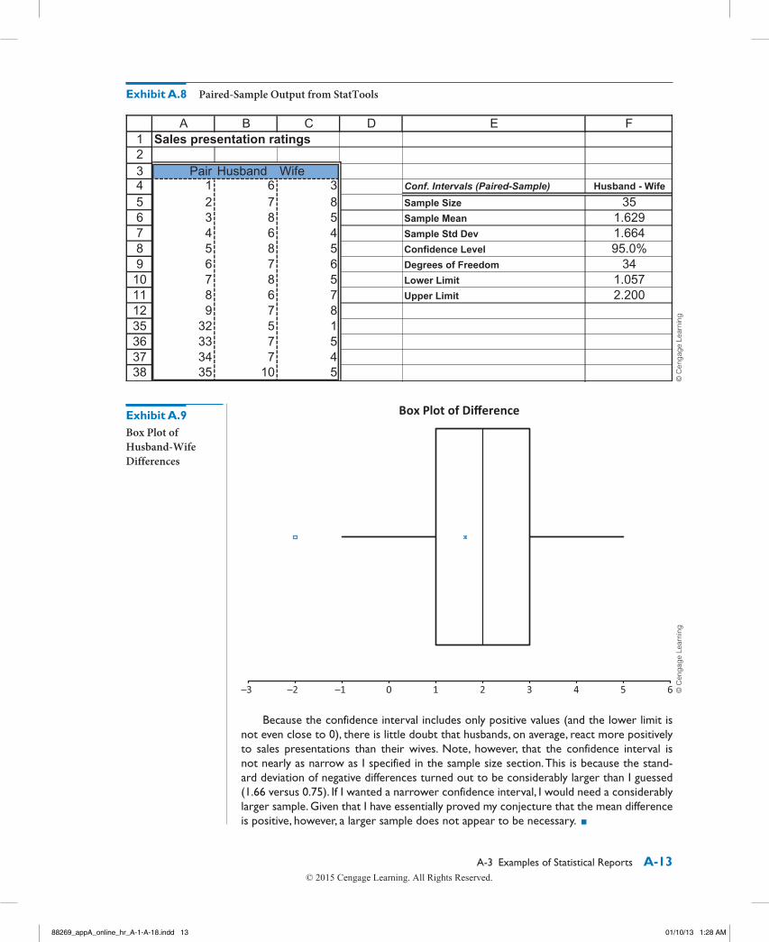
prEliminary analysis of thE Data
Before diving into the regression analysis itself, it is always a good idea to check graphically for relationships between the variables. The best type of chart for your problem is a scat-terplot, which shows the relationship between any pair of variables. The scatterplots in Exhibits A.10 and A.11 illustrate how Overhead varies with MachHrs and with ProdRuns. In both charts, the points follow a reasonably linear pattern from bottom left to upper right. That is, Overhead tends to increase linearly with MachHrs and with ProdRuns, which is probably what you suspected. The correlations below these plots indicate the strength of the linear relationships. These correlations, 0.632 and 0.521, are fairly large. (The maxi-mum possible correlation is 1.0.) They suggest that regression analysis will yield reason-ably accurate forecasts of overhead expenses.
Exhibit A.10 Scatterplot of Overhead Versus MachHrs
Exhibit A.11 Scatterplot of Overhead Versus ProdRuns
88269_appA_online_hr_A-1-A-18.indd 15 01/10/13 1:28 AM
A-16 Appendix A Statistical Reporting
You should also check the time series nature of your overhead data. For example, if your overhead expenses are trending upward over time, or if there is a seasonal pattern to your expenses, then MachHrs and ProdRuns, by themselves, would probably not be adequate to forecast future values of Overhead. However, as illustrated in Exhibit A.13 a time series graph of Overhead indicates no obvious trends or seasonal patterns.
rEgrEssion analysis
The plots in Exhibits A.10–A.13 provide some evidence that regression analysis for Overhead, using MachHrs and ProdRuns as the explanatory variables, will yield useful results. Therefore, I used StatTools’s multiple regression procedure to estimate the regres-sion equation. As you may know, the regression output from practically any software pack-age, including StatTools, can be somewhat overwhelming. For this reason, I report only the most relevant outputs. (You can see the rest in the Excel file if you like.) The estimated regression equation is
Two important summary measures in any regression analysis are R-square and the stand-ard error of estimate. Their values for this analysis are 93.1% and $4109.
Now let’s turn to interpretation. The two most important values in the regression equation are the coefficients of MachHrs and ProdRuns. For each extra machine hour your company uses, the regression equation predicts that an extra $43.54 in overhead will be incurred. Similarly, each extra production run is predicted to add $883.62 to over-head. Of course, these values should be considered as approximate only, but they provide a sense of how much extra machine hours and extra production runs add to overhead.
Before moving to the regression analysis, there are two other charts you should consider. First, you ought to check whether there is a relationship between the two explanatory variables, MachHrs and ProdRuns. If the correlation between these variables is high (negative or positive), then you have a phenomenon called multicollinearity. This is not necessarily bad, but it complicates the interpretation of the regression equation. Fortunately, as Exhibit A.12 indicates, there is virtually no relationship between MachHrs and ProdRuns, so multicollinearity is not a problem for you.
Exhibit A.12 Scatterplot of MachHrs versus ProdRuns
88269_appA_online_hr_A-1-A-18.indd 16 01/10/13 1:28 AM
A-3 Examples of Statistical Reports A-17
(Don’t spend too much time trying to interpret the constant term 3997. Its primary use is to get the forecasts to the correct “level.”)
The R-square value indicates that 93.1% of the variation in overhead expenses you observed during the past 36 months can be explained by the values of MachHrs and ProdRuns your company used. Alternatively, only 6.9% of the variation in overhead has not been explained. To explain this remaining variation, you would probably need data on one or more other relevant variables. However, 93.1% is quite good. In statistical terms, you have a good fit.
For forecasting purposes, the standard error of estimate is even more important than R-square. It indicates the approximate magnitude of forecast errors you can expect when you base your forecasts on the regression equation. This standard error can be interpreted much like a standard deviation. Specifically, there is about a 68% chance that a forecast will be off by no more than one standard error, and there is about a 95% chance that a forecast will be off by no more than two standard errors.
forEcasting
Your forecasting job is now quite straightforward. Suppose, for example, that you expect 1525 machine hours and 45 production runs next month. (These values are in line with your historical data.) Then you simply plug these values into the regression equation to forecast overhead:
Given that the standard error of estimate is $4109, you can be about 68% confident that this forecast will be off by no more than $4109 on either side, and you can be about 95% confident that it will be off by no more than $8218 on either side. Of course, I’m sure you know better than to take any of these values too literally, but I believe this level of forecasting accuracy should be useful to your company.
88269_appA_online_hr_A-1-A-18.indd 17 01/10/13 1:28 AM
A-18 Appendix A Statistical Reporting
One last recommendation I have is to update the analysis as time moves on. As you observe future values of the variables, incorporate them into the data set (and remove old values if you believe they are obsolete), and rerun the regression analysis. You can do this easily with the same Excel file I have attached.
If you have any questions, feel free to call me at any time. You have my number. ■
A-4 concluSIonMany people believe that statistical analysis is heavy-duty number crunching and little else. As many of our former students have told us, however, this is definitely not true. They con-tinually testify to the importance of written reports (and oral presentations) in their jobs. In fact, we believe that many of you will be judged more by the quality of your writing (and speaking) than by the quality of your quantitative analysis. Therefore, keep the suggestions and examples in this appendix handy—you might need them more than you realize. Just remember that well-designed studies and careful statistical analysis are often worthless unless they are communicated clearly and effectively to the audience who needs them.