1 A Climate-Change Primer The Basic Science 350Corvallis.org Colorado pine forest killed by an infestation of Mountain Pine Beetles (Dendroctonus ponderosae) no longer controlled by prolonged winter cold Revised Spring, 2018, updating graphs to include 2017
Transcript
1
A Climate-Change Primer The Basic Science
350Corvallis.org Colorado pine forest killed by an infestation of Mountain Pine Beetles (Dendroctonus ponderosae) no longer controlled by prolonged winter cold Revised Spring, 2018, updating graphs to include 2017
2
It is important for every educated person to know that global climate warming is real and is
well and reliably understood. Warming is having serious effects on human and all life on Earth. We provide here an introduction to the scientific data and thinking regarding climate change, primarily the extent and causes of the general warming that is underway across the entire Earth. We address atmospheric and oceanic warming in that order: first the reality, next the causes, finally some impacts. There is no avoiding a somewhat technical flavor in this, but work past that.
The atmosphere is getting warmer
An essential graph (Figure 1) was originally developed by James Hansen’s laboratory at
NASA, and laboratories at NASA and NOAA update it annually. It shows the changes in global average air temperatures at ground level. Temperature is measured with 10’s of thousands of excellent recording thermometers at weather stations scattered on land all over the Earth. Each station generates a time-series of air temperature readings, and those are averaged for each calendar year. To generate the graph, every local series is converted to variations (“anomalies”) from its own mean for the interval of relative global stability from 1951 to 1980. That is done because the local average in, say, Nome, Alaska, is much lower than that in Houston, Texas, or Timbuktu, Mali. The anomaly series are thus the variations around the local means, and they are appropriate for global averaging. The result of that is the graph in the figure. The anomalies averaged on a yearly basis (the black squares) are plotted as differences (again, anomalies) from the global average for 1951 to 1980. That average, about 14 °C (57 °F) is plotted at zero. Figure 1:
This overall index of air temperature is going up; it is up over the last 137 years by about 1.5 °C or 2.7 °F, up by 0.2 °C in 2016. The last four years have been progressively warmer, each the warmest year ever. There are other jumps of 0.2 °C followed by smaller drops. So, it was likely
3
2017 could be slightly cooler. And it was. The data have been looked at for every possible explanation other than general warming, and none comes close. Richard Muller, a particle physicist and climate-change skeptic, asked for and got the data. He and a team of smart folks checked, averaged, checked again, and in the end generated exactly the same graph. Muller gracefully admitted that warming is general and real.
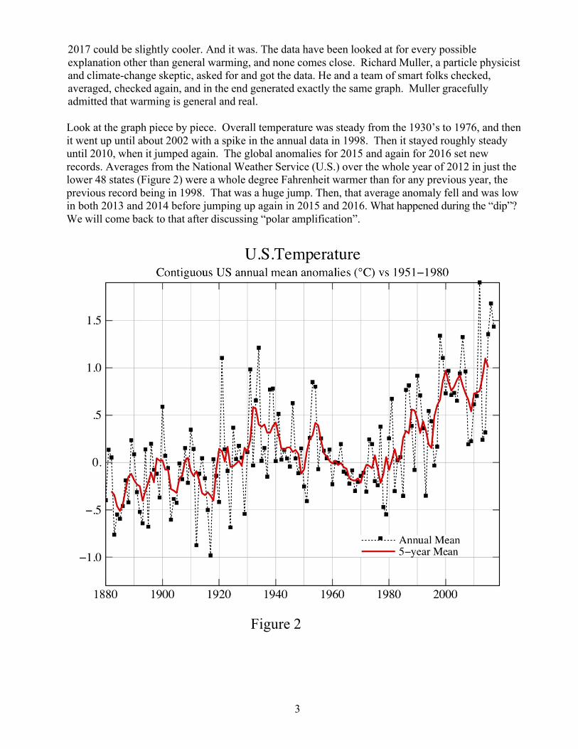
Look at the graph piece by piece. Overall temperature was steady from the 1930’s to 1976, and then it went up until about 2002 with a spike in the annual data in 1998. Then it stayed roughly steady until 2010, when it jumped again. The global anomalies for 2015 and again for 2016 set new records. Averages from the National Weather Service (U.S.) over the whole year of 2012 in just the lower 48 states (Figure 2) were a whole degree Fahrenheit warmer than for any previous year, the previous record being in 1998. That was a huge jump. Then, that average anomaly fell and was low in both 2013 and 2014 before jumping up again in 2015 and 2016. What happened during the “dip”? We will come back to that after discussing “polar amplification”.
Figure 2
4
The Oceans are Getting Warmer
What about that decade of little warming before 2012? Because the oceans cover more of the Earth than does land, and because water holds heat better, much of the incoming solar energy not reradiated to space (to which we will return) has been warming the upper layers of the oceans. Because vertical churning of ocean temperature gradients (warmer above, colder below) makes for weird arithmetic, average ocean temperatures are not a good index of ocean warming or cooling. It is better to average ocean heat content:
Figure 3, from http://www.nodc.noaa.gov/OC5/3M_HEAT_CONTENT/
The result, from Sydney Levitus’s Ocean Climate Laboratory (NOAA), shows a time series of
the heat content (again as an “anomaly, here relative to 1985) of the whole global ocean down to 2000 meters depth in Joules (tiny amounts, about a quarter of a calorie, so the scale is a number of Joules including 22 zeros). That heat, determined from hundreds of thousands of ocean temperature profiles, has gone up steadily. These are staggering amounts of heat, because it takes more heat to raise water temperature than those of any other kind of surface on Earth. W ater has “high specific heat,” that is, it takes more heat to raise its temperature than that of, say, volcanic rock.
So what? For one thing, marine life is mostly cold-blooded organisms, like algae fish and squids, with their physiologic rates set mostly by the temperature of the water. With changes of the observed magnitude, not quite a degree now at the surface, those rates are dangerously accelerated. Another effect from the warming can be more or stronger hurricanes and typhoons. It is the heat in tropical oceans that generates hurricanes and typhoons. Warmer water evaporates more readily, generating more rain, much of which falls on the land masses. Warming is greater at the surface, which expands the upper layers making them less dense and more stably stratified. That reduces the vertical mixing of the oceans, reducing in turn the supplies of plant nutrients (nitrate, phosphate, trace metals) available to oceanic algae, the phytoplankton generating about half the annual oxygen input to the air.
5
Why Are Ocean and Atmosphere Getting Warmer?
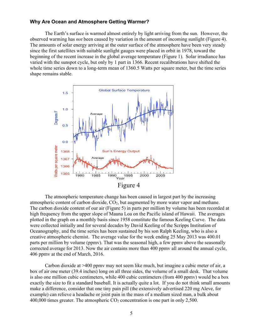
The Earth’s surface is warmed almost entirely by light arriving from the sun. However, the observed warming has not been caused by variation in the amount of incoming sunlight (Figure 4). The amounts of solar energy arriving at the outer surface of the atmosphere have been very steady since the first satellites with suitable sunlight gauges were placed in orbit in 1978, toward the beginning of the recent increase in the global average temperature (Figure 1). Solar irradiance has varied with the sunspot cycle, but only by 1 part in 1366. Recent recalibrations have shifted the whole time series down to a long-term mean of 1360.5 Watts per square meter, but the time series shape remains stable.
Figure 4
The atmospheric temperature change has been caused in largest part by the increasing atmospheric content of carbon dioxide, CO2, but augmented by more water vapor and methane. The carbon dioxide content of our air (Figure 5) in parts per million by volume has been recorded at high frequency from the upper slope of Mauna Loa on the Pacific island of Hawaii. The averages plotted in the graph on a monthly basis since 1958 constitute the famous Keeling Curve. The data were collected initially and for several decades by David Keeling of the Scripps Institution of Oceanography, and the time series has been sustained by his son Ralph Keeling, who is also a creative atmospheric chemist. The average value for the week ending 25 May 2013 was 400.01 parts per million by volume (ppmv). That was the seasonal high, a few ppmv above the seasonally corrected average for 2013. Now the air contains more than 400 ppmv all around the annual cycle, 406 ppmv at the end of March, 2016.
Carbon dioxide at >400 ppmv may not seem like much, but imagine a cubic meter of air, a box of air one meter (39.4 inches) long on all three sides, the volume of a small desk. That volume is also one million cubic centimeters, while 400 cubic centimeters (from 400 ppmv) would be a box exactly the size to fit a standard baseball. It is actually quite a lot. If you do not think small amounts make a difference, consider that one tiny pain pill (the extensively advertised 220 mg Aleve, for example) can relieve a headache or joint pain in the mass of a medium sized man, a bulk about 400,000 times greater. The atmospheric CO2 concentration is one part in only 2,500.
6
Figure 5 The seasonal peak of 2018 was ~412 ppmv.
The Keeling curve wiggles rhythmically atop the general increase, because carbon dioxide is taken up and converted to organic matter by photosynthesis and then oxidized back to CO2 by plant, bacterial and animal metabolism. Photosynthesis exceeds metabolism in summer; metabolism reverses the net change in the winter. The southern hemisphere’s cycle is, as expected, opposite to that in the Mauna Loa record. Ralph Keeling has added data demonstrating the obvious effect of burning carbon on the Earth’s atmospheric oxygen content. That has gone down, and (accounting for smaller CO2 sources like land clearing and for the modest measurement errors) gone down in recent years in the proportion one O2 molecule for each fossil-fuel carbon atom burned. Accounts are kept by government agencies around the world of fossil fuel production and use, so we know how much carbon has been burned. For three years that has been stable at ~ 10 billion metric tons.
There are other greenhouse gases, most prominently methane (CH4). Methane is an
increasingly urgent concern, which calls for a whole new section. Stay tuned. The Sources of Increasing CO2
Carbon dioxide is the product of burning (oxidizing) carbon. Where does the increase of
burned carbon, which implied by the “Keeling curve,” come from? There are several smaller sources, but (to reiterate the point) the big one is burning of fossil fuel. We know that with certainty, because the relative amounts of different carbon isotopes in the atmospheric carbon dioxide increase are the same as those of a sort of global average oil, coal and gas mixture. Isotopes are atomic forms of an element with that element’s number of nuclear protons, and thus its positive nuclear charge, but with slightly different numbers of nuclear neutrons. For CO2, chemists mostly look at the ratio of the rarer carbon-13 (atomic mass of 13 with 6 protons and 7 neutrons) to carbon-12 (with only 6 neutrons).
Atmospheric CO2 from 1958 through February, 2016, at an observatory high on Mauna Loa, Hawaii. The measures are made by IR spectroscopy, using the same 15 µm IR absorbance by CO2 that causes global warming. Data source: R.F. Keeling, S.J. Walker, S.C. Piper and A.F.Bollenbacher, Scripps CO2 Program: www:scrippsco2.ucsd.edu Plotted from monthly averages of hourly data.
7
Why Do CO2 and Other Greenhouse Gases Cause Warming?
What is it about carbon dioxide that causes warming? Here we come to the key facts. The
Earth and air are warmed by sunlight. Some of that light arriving in the atmosphere is reflected back into space by white, upper cloud surfaces and by snow or ice. Most sunlight shoots straight through the atmosphere without being absorbed, heating the land and the water below. Then the atmosphere is primarily heated by upward convection and radiation from the warmed land and ocean. If the heat did not escape again, the earth and air would get hotter and hotter until, …, well, never mind, that does not happen. Rather, heat exits as infrared light, familiarly IR.
Any even slightly warm object produces some infrared light. That is why we can take pictures
at night with IR sensors. More IR is emitted at higher temperatures, and at higher temperatures the wavelength of that light is shorter. Light has in some respects wave-like character, waves of different lengths from crest to crest. Natural selection has provided us with capability to see the wavelengths most abundant in sunlight, and our eyes interpret the variations as a progression from blue (shorter waves) to red (longer waves). There are also waves outside this spectrum that we cannot see. Turn an electric stove burner to high, and shortly it will glow a dull red, even bright red, at wavelengths slightly less than 1 millionth of a meter (one micron, or µm in scientists’ not so secret code), short enough for the pigments in your retina to absorb the light and make it visible. Now drop the burner to medium. The burner cools, and it blackens because you cannot see the IR of the longer wavelengths now being emitted. But, you can feel the IR radiance with your hand.
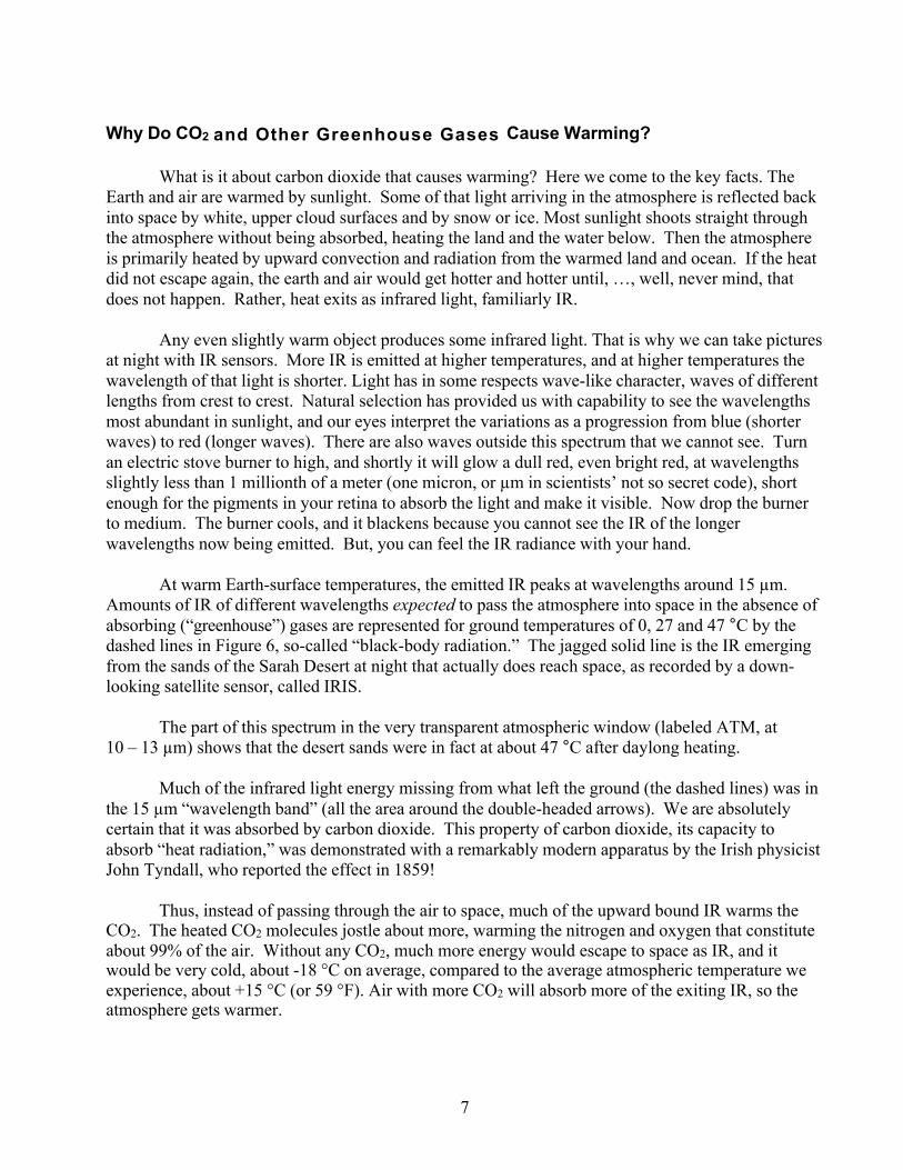
At warm Earth-surface temperatures, the emitted IR peaks at wavelengths around 15 µm.
Amounts of IR of different wavelengths expected to pass the atmosphere into space in the absence of absorbing (“greenhouse”) gases are represented for ground temperatures of 0, 27 and 47 °C by the dashed lines in Figure 6, so-called “black-body radiation.” The jagged solid line is the IR emerging from the sands of the Sarah Desert at night that actually does reach space, as recorded by a down-looking satellite sensor, called IRIS.
The part of this spectrum in the very transparent atmospheric window (labeled ATM, at
10 – 13 µm) shows that the desert sands were in fact at about 47 °C after daylong heating.
Much of the infrared light energy missing from what left the ground (the dashed lines) was in the 15 µm “wavelength band” (all the area around the double-headed arrows). We are absolutely certain that it was absorbed by carbon dioxide. This property of carbon dioxide, its capacity to absorb “heat radiation,” was demonstrated with a remarkably modern apparatus by the Irish physicist John Tyndall, who reported the effect in 1859!
Thus, instead of passing through the air to space, much of the upward bound IR warms the
CO2. The heated CO2 molecules jostle about more, warming the nitrogen and oxygen that constitute about 99% of the air. Without any CO2, much more energy would escape to space as IR, and it would be very cold, about -18 °C on average, compared to the average atmospheric temperature we experience, about +15 °C (or 59 °F). Air with more CO2 will absorb more of the exiting IR, so the atmosphere gets warmer.
8
Figure 6 There is an additional effect. Warmer air will hold more water vapor without losing it as rain, and water vapor is also an important greenhouse gas, a much more locally variable one than CO2. It strongly absorbs IR of ~7 and ~20 microns (labeled as H2O in Figure 6). This creates a knock-on effect to CO2 warming: more CO2 → more warming → more water vapor → even more warming. In most estimates that is about double the CO2 effect alone. Remarkably, John Tyndall also characterized the IR absorbance of water vapor, actually writing in the mid-19th century that water vapor is at least partly responsible for the habitable temperature of the Earth, that without it everything would be frozen.
Additional IR absorbance, at about 7.8 µm, comes from methane, CH4. This gas is produced by bacteria in marshes, tundra, animal intestines and ocean sediments. It is a component of natural gas, and it escapes from wells drilled to obtain that and also from oil wells. Industrial activities of many kinds, including animal husbandry and fuel harvesting, even coal mining, release significant methane. Substantial potential for release of more resides in the melting of permafrost under Arctic tundra, and in attempts to harvest it from water-bound deposits in continental-shelf sediments. Molecule-for-molecule methane absorbs 9-fold more IR energy than CO2. Fortunately, it has a shorter atmospheric residence time, a half-life of only ~8.4 years. Even so, potential for substantial and sudden methane out-gassing from several sources makes it a concern.
9
The overall process of sunlight IN to long-wave radiation (IR) OUT is termed “the radiation balance.” That is, over the long term there will be equality between incoming solar energy and energy reradiated to space as IR. However, as CO2 increases there can be an interval in which the usual temperature of the Earth’s surface rises, particularly of ocean waters. At present we have an imbalance of about 2.5 joules (~0.6 small calories) per square meter per day across the oceans, less over the land. That is not much, but it is operating over decades and the effect eventually becomes dramatic. It has done so already.
Those are the basics. All reasonably well-founded models of global climate processes
(there are more than 20) show no semblance of the present warming without the added carbon dioxide generated by burning fossil fuels. Burning this “ancient sunlight” is not only warming our houses in winter, air-conditioning us in summer, powering our cars along the road and airplanes over the seas, smelting our steel and distilling our whiskey, it is warming the climate globally.
A recent comparison of increasing global temperatures with the history of atmospheric
CO2 amounts is presented in Technical Appendix 1. While the comparison applies logarithms to base 2, which may be unfamiliar, that is explained, and quantification of the impact of rising CO2 is graphically illustrated.
One Step Beyond the Basics –
the Greenhouse Gas “Fingerprint”
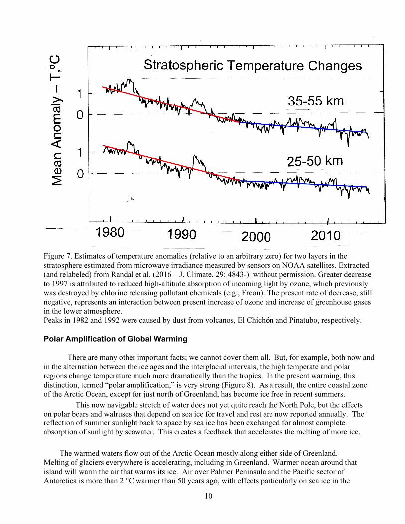
It is interesting and important that lower atmosphere (troposphere) warming (Figure 1) due to increases in greenhouse gases parallels upper atmosphere (stratosphere) cooling. This is evident from both satellite observations (Figure 7) and radiosonde (rising balloons reporting sensor results by radio) temperature profiles. This cooling is important because no other likely cause of troposphere warming that more greenhouse gases would cause it. Although the story has complex details that were left out here, the basic physics are reasonably simple. More absorption of upward radiation close to the ground, to about 20 km up, leaves less to be absorbed far from the ground. If varying sunlight were causing global warming, the most frequent claim of those who deny the role of carbon dioxide from fossil fuel burning, the atmosphere would have warmed all the way to the near-total vacuum of space. The extremely fine dust and aerosol sulfate injected into the stratosphere by volcanoes El Chichόn in 1982 and Pinatubo in 1991 generated warming of the upper air because those particles absorbed sunlight. Since less sunlight reached the ground, the warming of the troposphere slowed for a while. Notice in Figure 7 how long it took for the stratospheric effects of those volcanic injections to taper back to the general trend line, over a half decade.
Climate scientists consider the stratospheric cooling of recent decades to be a “fingerprint” of
the greenhouse gas effect, a signal definitely distinct from the possible effects of varying sunlight. It is likely that some of the climate variations before the twentieth century were due to sunlight variation. Solar input during the past four decades (Figure 4) has not varied enough to account for the observed general warming of the troposphere in that recent interval.
10
Figure 7. Estimates of temperature anomalies (relative to an arbitrary zero) for two layers in the stratosphere estimated from microwave irradiance measured by sensors on NOAA satellites. Extracted (and relabeled) from Randal et al. (2016 – J. Climate, 29: 4843-) without permission. Greater decrease to 1997 is attributed to reduced high-altitude absorption of incoming light by ozone, which previously was destroyed by chlorine releasing pollutant chemicals (e.g., Freon). The present rate of decrease, still negative, represents an interaction between present increase of ozone and increase of greenhouse gases in the lower atmosphere. Peaks in 1982 and 1992 were caused by dust from volcanos, El Chichón and Pinatubo, respectively. Polar Amplification of Global Warming
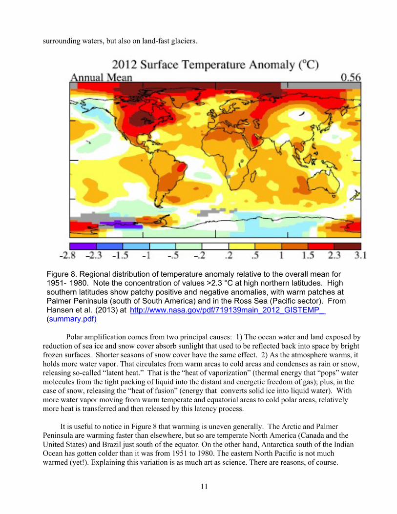
There are many other important facts; we cannot cover them all. But, for example, both now and in the alternation between the ice ages and the interglacial intervals, the high temperate and polar regions change temperature much more dramatically than the tropics. In the present warming, this distinction, termed “polar amplification,” is very strong (Figure 8). As a result, the entire coastal zone of the Arctic Ocean, except for just north of Greenland, has become ice free in recent summers. This now navigable stretch of water does not yet quite reach the North Pole, but the effects on polar bears and walruses that depend on sea ice for travel and rest are now reported annually. The reflection of summer sunlight back to space by sea ice has been exchanged for almost complete absorption of sunlight by seawater. This creates a feedback that accelerates the melting of more ice. The warmed waters flow out of the Arctic Ocean mostly along either side of Greenland. Melting of glaciers everywhere is accelerating, including in Greenland. Warmer ocean around that island will warm the air that warms its ice. Air over Palmer Peninsula and the Pacific sector of Antarctica is more than 2 °C warmer than 50 years ago, with effects particularly on sea ice in the
11
surrounding waters, but also on land-fast glaciers.
Figure 8. Regional distribution of temperature anomaly relative to the overall mean for 1951- 1980. Note the concentration of values >2.3 °C at high northern latitudes. High southern latitudes show patchy positive and negative anomalies, with warm patches at Palmer Peninsula (south of South America) and in the Ross Sea (Pacific sector). From Hansen et al. (2013) at http://www.nasa.gov/pdf/719139main_2012_GISTEMP_ (summary.pdf)
Polar amplification comes from two principal causes: 1) The ocean water and land exposed by reduction of sea ice and snow cover absorb sunlight that used to be reflected back into space by bright frozen surfaces. Shorter seasons of snow cover have the same effect. 2) As the atmosphere warms, it holds more water vapor. That circulates from warm areas to cold areas and condenses as rain or snow, releasing so-called “latent heat.” That is the “heat of vaporization” (thermal energy that “pops” water molecules from the tight packing of liquid into the distant and energetic freedom of gas); plus, in the case of snow, releasing the “heat of fusion” (energy that converts solid ice into liquid water). With more water vapor moving from warm temperate and equatorial areas to cold polar areas, relatively more heat is transferred and then released by this latency process.
It is useful to notice in Figure 8 that warming is uneven generally. The Arctic and Palmer Peninsula are warming faster than elsewhere, but so are temperate North America (Canada and the United States) and Brazil just south of the equator. On the other hand, Antarctica south of the Indian Ocean has gotten colder than it was from 1951 to 1980. The eastern North Pacific is not much warmed (yet!). Explaining this variation is as much art as science. There are reasons, of course.
12
So, what happened in the U.S. in 2012 (look back at Figure 2)? The warming in the boreal and Arctic regions to our north has been the greatest over the Earth as a whole. That has reduced the temperature gradient from equator to pole. The atmospheric pressure gradient that drives the jet stream (the ‘polar vortex’) is established by that temperature gradient. With less temperature difference, the pressure difference is also less, and the jet stream slows. That allows (because of some well understood physics) the huge, north-south bending waves in the jet stream to sag farther to the south, and that lets polar weather extend to Texas, not just to Minnesota. So, the 2013-2014 and 2014-2015 winters were extreme in our mid-western and eastern states, both very cold and delivering unusual snowfall. It seems like cooling, but it derives from global warming. Even Senator Inhof should be able to understand this (and, of course, deny that he does). Rising Sea Level
One obvious effect of melting glaciers is rising sea level (Figure 9), which amounts over the last 120 years to 20 cm. The gray shadow on the plots shows confidence limits for the avarages. The rise accelerated in about 1976 (red arrow in Figure 9), coincident with the recent upswing in the average global air temperature (Figure 1). About half the rise is attributable to thermal expansion of ocean waters, half to ice previously on land that has melted and run into the sea (see Appendix 2). Sea ice that floats on polar oceans, can melt without raising sea level. Because it is buoyed up by the water below, sea level has already adjusted to its presence. We do not know the exact rate at which the land-fast ice in Greenland and Antarctica may melt, raising sea level more. Most experts assure us it will be a progression of one thousand years or longer. Since Greenland holds enough ice to raise sea level globally by 7 meters and Antarctica holds enough to raise it farther to 70 or 80 meters above the present stand, we all need to hope they are right and that we find some ways to reduce the rate at which we pour CO2 and methane the atmosphere. Of course, in some respects we hold responsibility for the world as it will be in a thousand years. There is reason to consider effects our activities may have that far ahead and beyond. Some detailed, recent sea-level data from satellites are presented in Technical Appendix 2 at the end of the primer.
13
Figure 9
Other impacts
Absence of sea ice in the Arctic Ocean, melting of the near-polar glaciers, effects on walruses, polar bears and Inuit peoples are reasons that scientific concern for high latitude effects is so intense. However, there are now and will be more effects at all latitudes. We can list a few of them:
(1) Many readers in the western U.S. will be personally familiar with the massive loss of pine trees to bark beetles across the Rocky Mountains (on the cover) and in wide areas of Oregon, Washington and British Columbia. We no longer have the prolonged winter periods of intense cold that killed most of their larvae.
(2)Many bird species no longer migrate so far equatorward in winter. Anna’s Hummingbird now stays in Oregon through the whole winter, saving the work of a trip to central California. And, of course, subtropical and tropical species are moving poleward. Concern focuses on mosquitos of the genera Anopheles, the malaria vectors, and Aedes, vectors of yellow fever and zika viruses.
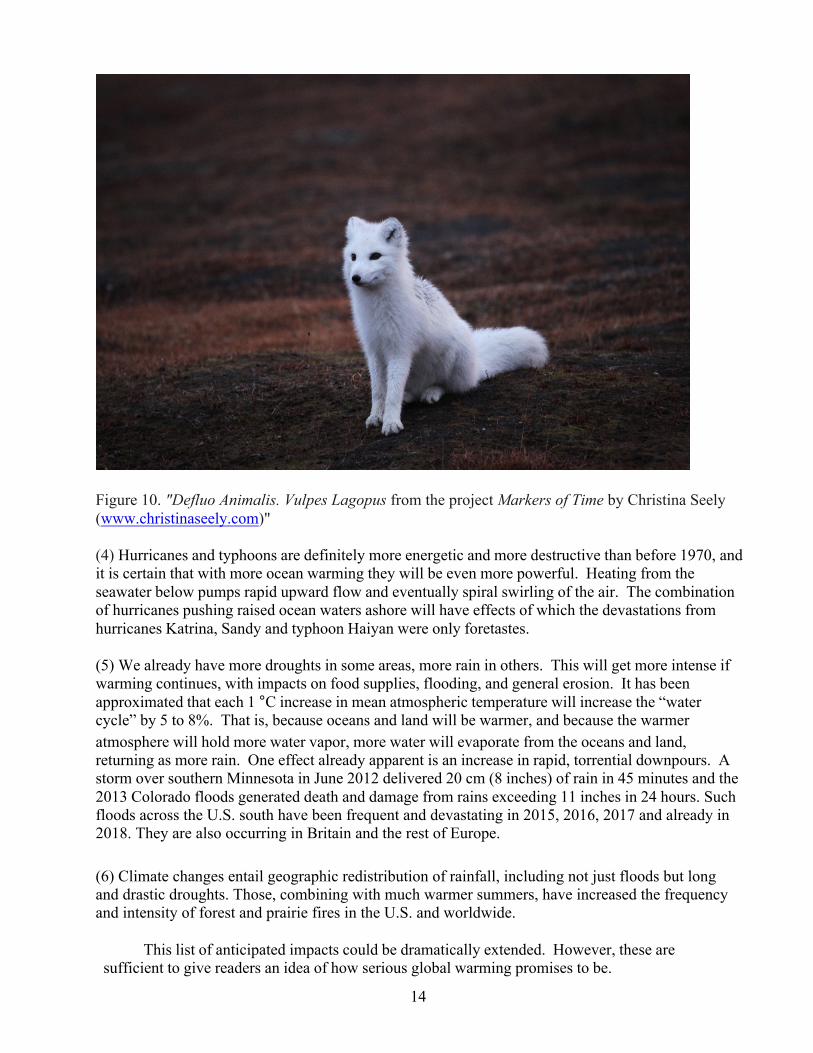
(3) The lengths of seasons in temperate and polar zones are changing. Winters start later and end earlier. Spring through autumn is longer than only a few decades ago. The impacts on plants and animals, particularly those regulating their seasonal adaptations by day-length (photoperiod) are often behind or ahead of schedule. See, for example, the recent photo (Fig. 10) by Christina Seely, who encountered an arctic fox. She says the photo caught “the exact window when the fox, in its winter coat, was dramatically out of alignment with new climate patterns, leaving it bright white and vulnerable on the brown arctic tundra.” Also, prey would more readily see it coming.
14
Figure 10. "Defluo Animalis. Vulpes Lagopus from the project Markers of Time by Christina Seely (www.christinaseely.com)" (4) Hurricanes and typhoons are definitely more energetic and more destructive than before 1970, and it is certain that with more ocean warming they will be even more powerful. Heating from the seawater below pumps rapid upward flow and eventually spiral swirling of the air. The combination of hurricanes pushing raised ocean waters ashore will have effects of which the devastations from hurricanes Katrina, Sandy and typhoon Haiyan were only foretastes. (5) We already have more droughts in some areas, more rain in others. This will get more intense if warming continues, with impacts on food supplies, flooding, and general erosion. It has been approximated that each 1 °C increase in mean atmospheric temperature will increase the “water cycle” by 5 to 8%. That is, because oceans and land will be warmer, and because the warmer atmosphere will hold more water vapor, more water will evaporate from the oceans and land, returning as more rain. One effect already apparent is an increase in rapid, torrential downpours. A storm over southern Minnesota in June 2012 delivered 20 cm (8 inches) of rain in 45 minutes and the 2013 Colorado floods generated death and damage from rains exceeding 11 inches in 24 hours. Such floods across the U.S. south have been frequent and devastating in 2015, 2016, 2017 and already in 2018. They are also occurring in Britain and the rest of Europe. (6) Climate changes entail geographic redistribution of rainfall, including not just floods but long and drastic droughts. Those, combining with much warmer summers, have increased the frequency and intensity of forest and prairie fires in the U.S. and worldwide. This list of anticipated impacts could be dramatically extended. However, these are sufficient to give readers an idea of how serious global warming promises to be.
15
Ocean Acidification
We have covered warming and its relation to CO2 without mentioning the acidification of the oceans being caused by dissolution of a substantial fraction of our fossil fuel CO2 in the sea, actually about one third so far of the long-term input from fossil fuels. This can be usefully oversimplified without invoking errors. Basically, CO2 is soluble in water, including the oceans. As more is added to the atmosphere, an imbalance arises in the equilibrium of the gas molecules entering and leaving the ocean surface. With more in the atmosphere (higher “partial pressure”), more dissolves. When CO2 dissolves, most of the molecules combine with water molecules to form carbonic acid: CO2 + H2O ↔ H2CO3.
Those new molecules interact with more water molecules, dissociating into H3O+
(hydronium or strongly reactive acid ions, usually called just “hydrogen ions,” H+) and HCO3‾ (bicarbonate ions). The concentration of H+ is important to many biochemical reactions in marine organisms. In slightly more complex chemistry, the presence of more H+ and more HCO3‾ reduces the concentration of carbonate (CO3
2-), which is particularly important for the formation of shells by clams and snails (among other animals) and skeleton formation by corals. More HCO3‾ and less CO3
2- means more energy is required to form and protect structures of calcium carbonate, the main component of most really hard shells. The impacts upon marine ecosystems promise to be extensive, but are yet to be well characterized.
An impressive study by the Japan Meteorological Agency* has examined the change in
ocean acidity along a north-south transect east of Japan for 31 years. Chemists most commonly express acidity as “pH”, a unit based on logarithms. Greater hydrogen ion concentration is represented by lower pH values. Rain with substantial dissolved CO2 has a pH of about 5.6; stomach acid that is very corrosive has a pH of about 1.5. Ocean water is weakly basic, with pH a little greater than 8.0. The JMA results (Figure 10) show that at three latitudes the decline in pH since 1984 has been about 0.05 pH units. Changing to concentration units (molarity), the change in hydrogen ion concentration there has been about 12%. That is substantial, and in other places the change has been greater. The global importance of this remains unquantified, but it is likely to be significant for molluscs (clams, snails), particularly during larval stages, and for coral skeleton formation and stability.
*Takeda, Yoshida (2015) The state of the North Pacific in the first half and warm season of 2014.
Pices Press 23 (1):31-32.
16
Figure 11. Long-term trends (below left) of pH at 10°, 20° and 30°N along 137°E (the red transect at left) during winter, a 31-year record. The rate of decline is ~0.017 per decade.
As these data suggest, pH is
not the same at all places in the ocean. That results from complex interactions of temperature, biology, circulation (particularly upwelling of deep water with more dissolved inorganic carbon) and exchange with the atmosphere. Recent trends, as the three lines suggest, are more consistent: acidity is increasing everywhere.
17
Will Anthropogenic Global Warming Sterilize the Earth?
It is necessary to say that Earth history includes long very warm intervals, periods with much more atmospheric CO2 than the 450 or 500 ppmv that the atmosphere is almost certain to reach in less than a century without massive reductions in fossil fuel use. Levels have been as great as 4000 ppmv for very long stretches and were >1000 ppmv for most of geologic time. Much of that ancient CO2 is presently bound up in fossil fuel and (with oceanic calcium) in much more massive amounts of marine limestone. A wide range of land and ocean organisms came through those warmer periods: plants and animals whose relatives have been present from about 600 million years ago to the present. We also know there were losses both of species and of larger groupings, and there were biological re- radiations as a result. Some of those extinctions may have been caused by warming itself, some by ocean acidity. Others are believed to have been caused by catastrophic events including “snowball Earth” periods, prolonged flood-basalt eruptions, copious volcanic gas releases and meteorite impacts.
Thus, the present global warming will not be the end of the world. But, it could be the end
of a world that will support multiple billions of people. Global warming is extraordinarily serious, reasonably characterized now as accelerating to crisis proportions.
What Must We Do In Response to Global Warming?
We, including absolutely everybody, every human being, must achieve the socially,
economically and technically difficult, almost inconceivably vast, task of nearly stopping the burning of fossil fuel. That will take ethical strength, technological substitutions and radical levels of energy conservation. At least some attention should be paid to the possibilities for removing CO2 from the atmosphere, but that would likely be more difficult than anything ever accomplished by globally coordinated human activity. The required scale of the projects would make them the largest industrial activity on the planet. Some of the proposed schemes (collectively termed geoengineering) will not work, including fertilization of vast ocean areas with iron, areas where that is the nutrient limiting algal growth. The hope would be that the stimulated algae would remove CO2 from the sea via photosynthesis. Other schemes apply means for capturing only the CO2 generated by burning more fossil fuel, then sequestering it somewhere, usually deep in the ground. That overlooks the shredding of the Earth and oceans done to acquire more fossil fuel from dwindling and less and less ideal deposits.
Schemes to reduce heating by forcing reflection of more incoming sunlight back to space
are under consideration. The one taken most seriously would be distribution of sulfur dioxide into the stratosphere, where it would combine with water to form reflective sulfate aerosols. This would whiten the sky some; not quite so much blue would reach the ground. In order to work, the sulfate gassing of the stratosphere would have to be continuous, because the aerosols will not stay aloft indefinitely. If we kept burning carbon fuels until a social breakdown forced an end to the gassing, the sudden heat impact of stopping would be catastrophic. All these geoengineering schemes have very serious drawbacks.
The first priority is global reduction of fossil fuel burning to very low rates. Agreement
about that among serious climate scientists is universal. At the moment, we (everybody, everywhere) are moving in the opposite direction.
18
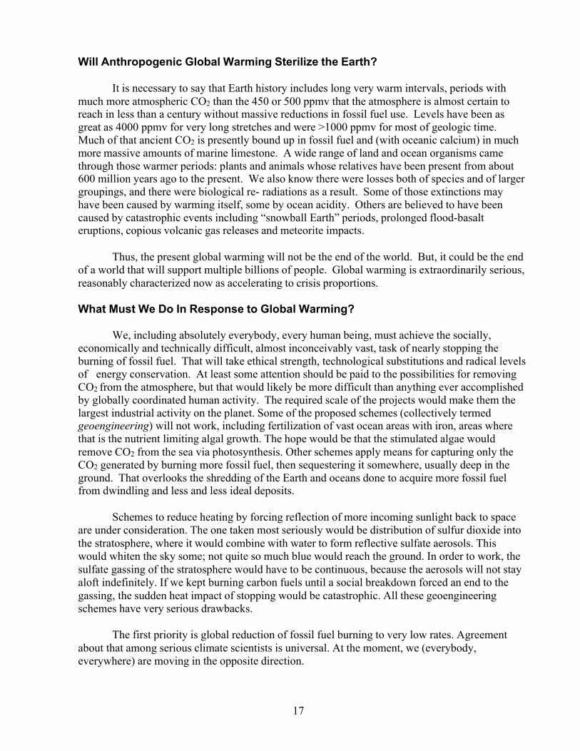
Technical Appendix 1. Shaun Lovejoy has published (“Climate Closure”, EOS, 96, 20 October 2015) a graphical comparison of the Keeling-Curve atmospheric CO2 data to the NASA-GISS global temperature time series. The graph is reproduced here as Figure A1:
Figure A1 Figure A1. The temperatures on the Y-Axis are the NASA global temperature anomalies shown in Figure 1 (text above), after moving the zero point down to about the average for 1900. The X-Axis is a proxy for the change in atmospheric CO2 concentration. From 1958 on, these are the Keeling-curve data. Data before that are from air captured in glacial ice. The logarithms (base 2) are for atmospheric {CO2, ppm, for a given year} divided by {277, ppm for the preindustrial atmosphere in 1759}, written Log2(pCO2(t)/pCO2, pre) as the axis label. The log2 values represent fractions of doublings above 277 ppm. Log2 of full doubling would be 1.0. An X-axis value of 0.5 represents half a doubling from 277 ppm, or 399ppm, close to the present concentration. The slope of the regression line is 2.33 °C per CO2 doubling. A value close to 2.4 °C per doubling was predicted by climate scientists decades ago. The graph shows they were right, given changes to date. The absorption of reradiated IR responsible for the temperature increase includes the “knock-on” effects of increased atmospheric water-vapor content, which approximately doubles the direct absorption by CO2 itself. Effects of added methane and other greenhouse gases remain smaller, but they threaten even faster atmospheric warming, possibly in the not very distant future.
19
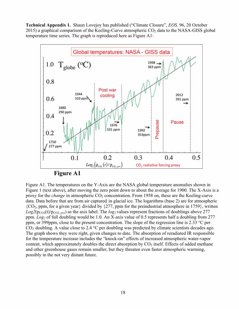
Technical Appendix A2. A great deal of sophisticated engineering since the early 1990s has been applied to mapping of sea level relative to a gravitationally defined “geoid” (shape of the Earth) using satellites in Earth orbit. Globally averaged results have been plotted by NOAA and reproduced here in Figure A2. The slope of the line, the overall rate at which the waters have risen since 1993 was 2.4 mm/year. After a drop in 2011 (ocean mass can decrease temporarily when more water is in rivers, reservoirs and soil), sea level has risen by greater than 5 mm/year (black line). Whether this greater rise of recent years will hold is going to be clear soon. It may and the rate could become even faster as warming and, thus, global ice melting continues.
Figure A2. Changes in mean sea level estimated by satellite radar relative to an arbitrary base value labeled zero, the black line. “Change” is a variable equivalent to an average anomaly calculated across numerous ocean areas. Changes in sea level result from thermal expansion (termed “steric,” measured by ocean profiles – the red line) and from water added by melting of ice sitting on land (more ocean mass – the blue line). The purple line is the sum of the steric and mass increases in volume (measured as sea level), which agrees with the satellite data to remarkable precision. (Updated by NOAA from the sources listed in the original caption, which is included above.) For an explanation of “Grace“ see ; https://en.wikipedia.org/wiki/Gravity_Recovery_and_Climate_Experiment ; for “Argo,” see https://en.wikipedia.org/wiki/Argo_(oceanography) [Those probably are not links; copy and paste in a browser.]
20
Acknowledgements
With the exceptions of the Keeling Curve and Figures 10, 11 and A1, the figures reproduced in this pamphlet were produced by U.S. Government agencies and, with the further exceptions of Figure 7, could be reproduced without permission. Permission to show the Keeling Curve was kindly granted by Professor Ralph Keeling of the Scripps Institution of Oceanography. Thanks to Professor Christina Sealy of Dartmouth College for use of Figure 10; it should not be reproduced from this file. Professor Shaun Lovejoy was pleased to have his figure used here as A1; permission from the AGU was not sought. The text was written by oceanographer Charles Miller of Corvallis, Oregon, to whom comments can be sent at [email protected].