Page 1
Virginia Commonwealth UniversityVCU Scholars Compass
Theses and Dissertations Graduate School
2008
A Key to All MythologiesTheresa Frances MarchettaVirginia Commonwealth University
Follow this and additional works at: http://scholarscompass.vcu.edu/etd
Part of the Art and Design Commons
© The Author
This Thesis is brought to you for free and open access by the Graduate School at VCU Scholars Compass. It has been accepted for inclusion in Thesesand Dissertations by an authorized administrator of VCU Scholars Compass. For more information, please contact [email protected] .
Downloaded fromhttp://scholarscompass.vcu.edu/etd/765
Page 2
Theresa Marchetta 2008
All Rights Reserved
Page 3
A KEY TO ALL MYTHOLOGIES
A thesis submitted in partial fulfillment of the requirements for the degree of MFA in
Painting and Printmaking at Virginia Commonwealth University.
by
THERESA FRANCES MARCHETTA
BFA, Carnegie Mellon University, 2002
Virginia Commonwealth University
Richmond, Virginia
May 2008
Page 4
Acknowledgement
I would like to thank my spouse, Anthony Matteo, for his constant support. There is no
doubt that I couldn’t have done it without him.
Page 5
Table of Contents
Page
Acknowledgement...............................................................................................................
Table of Contents ................................................................................................................
Radical Landscape......................................................................................................... 1
Key to all Mythologies .................................................................................................. 2
A visit from E.F............................................................................................................. 6
The Retreat Paintings..................................................................................................... 7
Going Literal ............................................................................................................... 10
Meeting with James Hyde............................................................................................ 12
Question Power ........................................................................................................... 13
Power points................................................................................................................ 14
The Romantic Impulse................................................................................................. 18
Niagara as a historical marker...................................................................................... 19
Quintessentially American........................................................................................... 21
VITA............................................................................................................................... 23
Page 6
Radical Landscape
Radical Landscape was a phrase I first read describing Peter Doig's work. His use of
landscape in the context of the Sensational YBA London scene was considered radical if
only because it was a scandalous use of kitsch cliché; it was so pop sentimental. Maybe
he began using it for an ironic edge but his continued use points to a real emotional
engagement.
The landscape is easy to project upon. It can be a sounding board for emotions,
symbolism, or philosophy. In fact, while one might suspect the contrary, a landscape is
difficult to portray neutrally, it continuously slips into utopic or distopic readings. Perhaps
it is the point of view that contributes to these loaded readings by implying a survey,
measure or even an appraisal of nature. The objects in a landscape are seen from a
distance, which implies reflection and summation instead of momentary action or
narrative.
Over the last two years I have primarily been engaged in landscape painting that
takes an experimental approach to material. My use of acrylic, the plastic paint, combines
landscape with distortion and artificiality. In the paintings the artificial is evoked not
solely by the use of acrylic but also by privileging the aesthetic effects of poured acrylic
over an illusionistic naturalism.
In the Retreat paintings, for example, the artificial asserts its presence through the
inclusion of railings and tourist footpaths. It is also asserted through other decisions such
as color choices. Drab cave interiors are mutated into Technicolor fantasies and the
artificial is embedded in the mottled acrylic surface. Sometimes the transparency of the
paint undermines the integrity of the subject so completely that the wood grain of the panel
is a key element of composition.
During an early critique of the American Falls painting Amy Chan said the surface
looked rubbery, and while this probably was not meant as a compliment, it is proof that the
materiality strongly influences a viewers experience of the work. And while I am gratified
Page 7
when the media is stealing the show, my goal is to have those meanings, that are linked
with materiality, reflect back on the subjects, the landscapes.
Key to all Mythologies
The “Key to all Mythologies” is a fascinating sub-plot within George Eliot’s novel
Middlemarch, a Study of Provincial Life. Middlemarch is a tremendously complex novel
that integrates the most advanced science, philosophy and social thought of the 19th
century into the plot of a novel that portrays the lives and social relationships between
characters of every class in the fictional town of Middlemarch.
The Key is an incomplete book that the character Rev. Edward Casaubon is writing
as his major scholarly contribution to theology. The Key is meant to expose the
correlations and confluences that link “all mythologies” (all cultural belief systems and
superstitions) to Christianity. Casaubon’s project has become for me an interesting parallel
to my painting practice. In the novel the Key is an ambitious project that is meant to
combine many disparate strains of research. In a similar way, the subjects in my paintings
are intended to represent actual landscapes as well as evoke metaphors and suggest
associations. For both Casaubon, the fictional character in Eliot's novel, and for me the
challenge is to create a document, or artwork, that can contain and combine a tremendously
expanded and associative collection of ideas. Alluding to broad notions of technology,
politics, American sentimentality and even environmental crisis (see the associative map
for the Power Series paintings) is not just the goal of my work it is also its genesis.
In the novel the Key would unlock the mysteries of the ancient Greeks and
Egyptians and simultaneously bind them to Christian theology. This ambitious scholarly
work is at once compelling, onerous and ultimately doomed. The academic scholar who
attempts to write the Key is a gloomy, tragic figure who, in the hubris of a dedicated and
intense work ethic, has set himself an impossible task. By the end of the novel the project
has been abandoned, portrayed as a seductive yet impossible task, a problematic
universalism that could never be proved even with an endless provision of research and
work.
Page 8
This story can be taken as a cautionary postmodern fable (although written
significantly prior to literary modernism) warning against the futility and folly of
universalizing projects and ideas. And the point is well taken; the attempt to prove the
existence of underling universals has been discredited as the attempt to force a pleasing
solution on uncooperative realities. But can there still be a Key? Can there still be an
object that incorporates many diverse systems and meanings? So in the case of the
American Falls painting, can it contain a list of meanings that simultaneously includes: a
heroic sense of the American landscape, a kitschy awareness of tourism, an underlying
unease about pollution, a relationship to the energy crisis and political quagmires, a sense
of art historical lineage and a sensitivity to the method of artistic production, namely,
controlling the flow of liquid.
I want to believe that it is possible for one painting to contain all of this and more, I
want to believe that a painting can be a Key and contain and bind together a multitude of
seemingly unrelated ideas. But at the same time, I acknowledge that I may be setting
myself up as a tragic character. I recognize, as I mentioned earlier, that Eliot portrays
Casaubon as a fool so in an effort to save myself from his fate I propose a switch from a
teleological point of view to an archeological point of view. (Perhaps the trouble for
Casaubon was a directional difficulty.) The Key to all Mythologies was based on the idea
that all myths are local expressions of particular instances of a general, universal Truth.
The American Falls painting instead is the result of all myths and stories. Instead of
representing “everything” in one object, the painting and its associative potential are the
result of everything. This idea is related to the common post-modern practice of
“unpacking”. It proposes that the ideas and beliefs of the parent culture, the culture in
which the painting was made, are embedded within it.
And to go further, I propose that an artist should actively engage with this process
and consciously add and organize meanings that can be as associative, rich and discursive
as possible. An artist should not rely on obvious systems of linear logic but should stretch
meanings and connections. There should be double meanings and double reasoning’s for
each choice an artist makes. For example I chose to represent water streaming downwards
Page 9
with heart-shaped patterning in the American Falls painting. This choice has several
meanings and purposes. The heart pattern creates verticality and is a simple method for
mixing paint. The heart shape alludes to the kitschy slogan of Niagara as the honeymoon
destination while the heart pattern gives order to a very large yet simple painting. The
pattern creates expectations and tracks distortions. A viewer becomes highly aware of
where in the painting the pattern is warped or allowed to deform. There are even meanings
to the pattern that I did not consider in the hours I spent slowly painting and pouring.
Dominique Nahas commented that the patterning of the hearts suggested text; that they
have a horizontal and vertical visual rhythm that caused his eye to move across the
painting as it does across a page.
Embracing associative chaos and attempting to channel the contemporary moment
(as impossible to define as that may be) are the guiding principles behind my work. And
while I attempt to load my paintings with meaning they always contain much more than I
can control or appreciate. Changes in my work result from both carefully managed
research and the unpredictable such as my interactions with professors and peers. The
pages that follow contain a small but representative sample of those influences and ideas.
Page 11
A visit from E.F.
When Eric Fischl, came for my studio visit I was very alert and nervous. He speaks slowly
and that control is intimidating. Luckily I had seen his lecture and was used to his
languorous style.
At first he seemed very confused . . . why didn't my paintings look like paintings
and why were they so shiny? How is one supposed to approach/think about these?
(My studio was full of Retreat cave paintings, intensely colored, employing some
decorative vocabulary, and generally abstract, but more about these later.) He looked at
me as if he expected me to shrug, but I didn't. Instead I spoke slowly, like he did.
I said that first I expect people (the audience) to see them as shiny objects, not illusionist
windows. They then might consider the colors and hopefully appreciate some of the
thought I put into choosing and balancing them. Perhaps then they would realize that there
were figures and that the seemingly abstract forms were marginally representative of a
landscape (maybe they even figure out that these are cave interiors.) I guessed that they
might then contemplate how odd the experience of a figure would be in that perplexing a
landscape. And finally, after considerable time, they might begin to imagine more
complicated connections between media and subject, the escapist subtext, or the
artificiality of tourist perception.
He kept resting his hands on his belly. And I got the impression that I had to some
extent convinced him. He then asked me why I had come to grad school and if these visits
helped me at all? I gave my somewhat standard answers and his response was, "I think you
should drop out." He went on to say how he thought that I would do well, probably not in
the art world, but in something related. I know that he meant this as a compliment but I
took it as an oddity.
Page 12
The Retreat Paintings
In the Retreat Series, I chose caves as my subject. Specifically Show Caverns, the
privately run tourist traps that first became popular in the 20's. I chose caves and the
formations inside them primarily as a dodge around abstraction. I wanted to make
paintings that were "about" color and material without having to deal with the history of
abstraction. Cave formations seemed the perfect compromise, already very abstract; they
could mediate the relationship between abstract painting values and abstract painting
history.
I began making these paintings and became totally convinced that there were other
maybe more important ideas embedded in them. While there was no obvious or logical
connection between a cave and my acrylic medium, over time it became obvious to me
why stalactites and stalagmites had become such compelling subjects. They are created
through the action of water and minerals and are, in a sense, a water-based medium, just
like acrylic paint.
The idea of a retreat from the surface of the earth and the sense of escapism and
fantasy that pervades these subterranean landscapes is also intriguing. Show Caverns have
been manipulated to suit the needs of tourists. The addition of asphalt paths and handrails
guide them while the formations are lit for dramatic effect, often with colored lights. My
paintings include these man-made paths and my color choices were also dramatic, even
escapist. These escapist color choices highlighted the fact that the natural color of a cave
is no color. Any light that illuminates is an artificial addition; as a natural landscape caves
are invisible, completely dark with no natural light and no horizon. In the paintings and
the caves all sense of space, perspective, depth, and color is an invention and, in a sense, an
artificial and invented experience.
The title of these paintings, “Retreat” has several relevant meanings: its recreational
meaning references the American tourism industry; while the word retreat also suggests
possible responses to the current American political situation, both a tactical strategy for
our military and a conceptual escapism indulged in by citizens.
Page 13
Retreat #2, acrylic and wax on panel, 48"x72", 2006
Retreat #5, acrylic and wax on panel, 48"x70", 2006
Page 14
Synonyms, acrylic and wax on panel,
72"x48", 2007
grotto, acrylic, yupo, and marker on panel,
72"x48", 2007
Retreat J, acrylic and wax on panel, 48"x78", 2007
Page 15
Going Literal
By the middle of my graduate experience I had become convinced that not only was I
going to keep using acrylic but also that acrylic was in fact an incredibly rich subject.
Most of my peers had heard me enthusiastically make the connection between acrylic and
petroleum but they were less convinced that any of my paintings could substantiate this
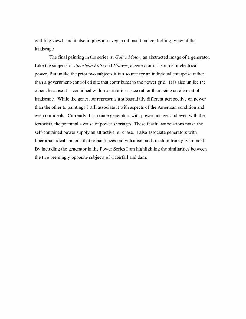
relationship. It is with this in mind that I read a profile of Exxon Mobile in Fortune
magazine. Included in the article were images of sonar, labeled as photographed in the
Houston lab Upstream Research Center. Geoscientists analyze the 3-D seismic images
produced by sonar to find the most promising sites for petroleum prospecting. Petroleum
is the product that makes Exxon Mobile the most valuable business in the world.
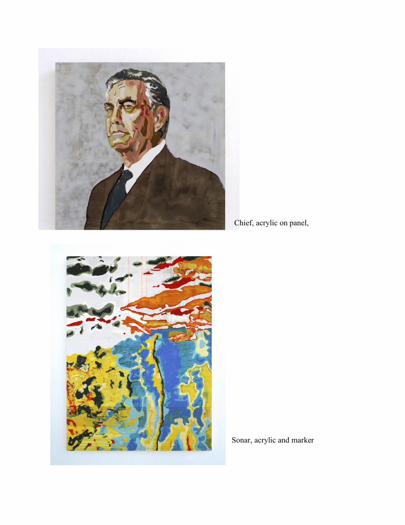
I painted an image of sonar as well as a portrait of Rex Tillerson, the CEO of
Exxon. His semi-transparent visage is created through a puddle of acrylic, the petroleum
product. But having made this connection literal I was finished with this group of
paintings and started working with combining subjects and techniques.
Page 16
Chief, acrylic on panel,
24"x24", 2007
Sonar, acrylic and marker
on panel, 68"x48", 2007
Page 17
Meeting with James Hyde
I met with James Hyde many times over the course of the fall semester. He was generally
disturbed by my interest in Pop and had problems with my mechanical approach to
painting. He thought that I needed to go all the way, to make big moves and changes.
He became very intrigued by the small sketch panels that I kept around to practice on. On
these panels I tried out techniques, like sprinkling raw titanium pigment into a puddle of
acrylic, or testing the relative values and transparencies of paints I was mixing to do a
portrait painting. James thought that these sketches and tests were far superior to the
paintings I was making. And one day he sorted them all out and selected six of them with
which he then curated a show on top of my flat files. The implication was that I should
now make large-scale versions of these smaller compositions.
I was intrigued by his ideas but resisted his call for complete overhaul. I didn’t
made the radical changes he wanted but he was, in a large part, responsible for the new
mantra with which I approached my thesis work: Simplify & Drama-tize.
Page 18
Question Power
How do you become Powerful? Asked the little painting of the big.
Is it size?
Is it weight?
Is it your constant reemphasis of technique?
Is it your ability to reproduce well?
Is it a technical mastery?
Is it your ability to surprise, confuse or synthesize?
Is it your prime real estate?
Is it just what you are literally made of?
Is it your ability to reference?
Is it your ability to improvise?
Is it your name or title?
Is it your position in history and the world you were born into?
Is it who you know?
Page 19
Power points
The body of work I created for my thesis exhibition is titled the Power Series. In these
paintings I am reexamining Romantic traditions as well as meditating on how the ideas of
power and control are contained in my paintings. The subjects I have chosen, while they
continue to be American landscapes frequented by tourists, are no longer subterranean.
The largest painting in this series, American Falls, is a simplified image of a part of the
Niagara cataract. The painting is in a historic scale (137"x90") and physically dwarfs the
viewer. There is a long tradition of artists who have chosen to paint this site such as
Frederic Edwin Church and Thomas Moran as well as more contemporary painters such as
Frank Moore and Jeff Koons. The falls are painted in poured acrylic with an unusual
plastic sheen, while the sky is a pale yellow-green.
The persistent pattern that compromises the falls, is made of tiny hearts streaming
downwards. They simultaneously suggest the kitschy appeal of Niagara (the self-declared
honeymoon capital), create a verticality and directional movement, and function as the
simplest method for mixing two colors: lay out one color; then drip a second color into it;
then combine them with a lateral stroke.
Page 20
The American Falls Painting expresses many varied approaches to power and control. The
subject, Niagara, is a literal source of electrical power and it is also a destination for
tourists to gawk at the power and raw force of the natural world. On the other hand the
painting is made from a petroleum product and its sheer size implies grand intentions. The
patterning is generally controlled yet sometimes distorted through unrestrained pooling of
media. The title both refers to the actual location, an international border, as well as a more
abstract sense of nationhood caught up in a landscape.
Hoover, another painting in the Power Series, is of the Hoover Dam. This painting
is also monumental in scale (108"x96"), yet the dam portion of the painting is
approximately human scale and human colored. The dam structure parallels my painting
process, controlling the force and flow of water. Yet it is also a symbol and a source of
power (energy) unassociated with Petroleum. The large blue area is suggestive of water but
colored an intense blue that is more reminiscent of plastic than water. Unlike the point of
view in American Falls, Hoover is not seen from below. Instead I chose the Ariel view of
the man-made intervention in landscape. The Ariel view connotes a position of power (a
Detail of American Falls, acrylic on panel, 2008
Page 21
god-like view), and it also implies a survey, a rational (and controlling) view of the
landscape.
The final painting in the series is, Galt’s Motor, an abstracted image of a generator.
Like the subjects of American Falls and Hoover, a generator is a source of electrical
power. But unlike the prior two subjects it is a source for an individual enterprise rather
than a government-controlled site that contributes to the power grid. It is also unlike the
others because it is contained within an interior space rather than being an element of
landscape. While the generator represents a substantially different perspective on power
than the other to paintings I still associate it with aspects of the American condition and
even our ideals. Currently, I associate generators with power outages and even with the
terrorists, the potential a cause of power shortages. These fearful associations make the
self-contained power supply an attractive purchase. I also associate generators with
libertarian idealism, one that romanticizes individualism and freedom from government.
By including the generator in the Power Series I am highlighting the similarities between
the two seemingly opposite subjects of waterfall and dam.
Page 22
American Falls, acrylic on panel, 89"x138", 2008
Hoover, acrylic on panel, 96"x108", 2008
Page 23
The Romantic Impulse
Don't we all harbor romantic ideals underneath our practiced
practicality?
For example I can discern that...
Amy is romantic about rocks
Alexis is romantic about the self
Brooke is romantic about relationships
Carmen is romantic about culture
Jessica is romantic about innocence
Monica is romantic about the mark
Val is romantic about humor
and I am romantic about the future
The Future is my ideal audience, my match made in heaven.
The audiences of the future will look back and understand not just the
impulse behind my work but the culture it came out of. They will be
amused at the use of a paint made from petroleum. They will be
surprised by the strange combination of plastic and wood. They will
comment on how odd it was that while we had relatively advanced
technology we often relied on wood to construct our homes, furniture
and cultural objects. They might even be surprised at such an
individualistic approach to artistic production.
The future is also, in my opinion, the purpose of art. Art is not
an illusionist window but more like a window on your computer
screen. It's a construction from the contemporary moment, a timely
object. It is also, like the window on your computer screen, part of a
huge filing system, one element stored in the vast art archive.
The Romantic Impulse
Page 24
Niagara as a historical marker
Moore’s Didactic American Landscapes and Koons, the Romantic populist Ironist
Niagara has a long and esteemed list of painters including historical figures such as
Fredrick E. Church and Tomas Moran. When they painted Niagara it was described as a
wonder of the world and their paintings solidified its iconic image of natural mystique. But
Niagara has also been the subject for contemporary painters such as Frank Moore and Jeff
Koons.
Moore, “the preeminent painter of
the AIDS pandemic”1, painted Niagara as a
majestic power whose beauty was
compromised by the knowledge of its high
pollution levels and its status as a
Superfund pollution site. Moore wanted to
include in his portrayal his childhood
wonder with the Falls yet he was also "ever
conscious of his own medical condition.”
Moore wondered, as an adult taking the
famous river tour on the Maid of the Mist
beneath the falls, what exactly he was
inhaling in the mists."2 The water in the
falls- of which there is much less than in
Moore’s youth, since much of it is diverted
for Hydroelectric- is highly contaminated.
1 p127 Faye Hirsch May 2003 Art in America
2 ibid
Frank Moore, Niagara, 1994, oil on canvas
over wood, 99 x 67 inches, Collection of
Paine Webber, Inc
Page 25
The EPA monitors 365 chemicals at this site.
Moore's paintings of Niagara all include swirling chemical structures hanging in the
mist. His painting Maid of the Mist, is even more explicit and depicts figures with their
skeletons showing. These paintings mix sublime landscape with the death fears of our
chemical reality.
When Jeff Koons painted the falls he chose to highlight the destination as a kitschy
tourist paradise. While tourism has been a part of the Niagara experience since the time of
the Hudson River School painters, its presence had been edited out of the paintings and
memorabilia. Koons instead focuses on the vacation accessories. His kitsch vision
includes a mash up of sandwiches, donuts and ladies feet, nails painted for vacation. The
Falls are a backdrop that is merely glimpsed through all the accoutrements of the tourist
destination. Places were citizens go expressly for the purpose of pleasure and the formation
of happy memories (Niagara Falls has been called the Honeymoon capital of the world).
The bright colors and funny combinations of objects in Koons painting create a surrealist,
escapist and ultimately ironic vision of the once majestically idealized falls.
Jeff Koons Niagara, 2000. Oil on canvas, 120 x 172 inches. Deutsche Guggenheim.
Page 26
The Waterfall painting in my thesis, American Falls, while not an exact likeness of that
part of the Niagara cataract, contains some of the same features, such as the top contour of
the falls. At the base of that fall is a collection of rocks that I represented with very flat yet
rock-shaped forms. And the top ridge of the falls, represented against a yellow-green sky,
is a faithful translation of that particular natural feature. The falls are distorted primarily
through material and technique. The chalky flat colors were chosen to emphasize the
plastic sheen of the paint.
Like Moore and Koons I suggest a compromise of the romantic vision but instead
of collaging signs of corruption into the image, my portrayal of the Falls is mediated by the
artificiality of material. I rely primarily on materials to communicate the conflicting
echoes of this place. There are also other elements, besides material that complicate
meaning. There are hearts for a Koons/ironic type reading, a yellow green sky for a Moore
type reading and a mural scale to communicate a relationship with the sublime and the
Romantic Landscape artists.
Quintessentially American
In a recent interview I did with Jessica Langley she asked me if my paintings were
particularly American? (“American” here referring to the United States of America and its
ideologies, as opposed to those of the entire Northern and Southern continents.)
It is difficult to categorically agree because, as an American, my perspective is
biased. I know that there are many parts of the world where the landscape is idealized, and
that there are caves, dams and waterfalls all over the world as well. Be that as it may, I do
think there are some particularly American aspects to my subjects. Maybe it is because I
have been indoctrinated but I often see my subjects as a part of iconic American imagery;
part of the Pioneering sprit, manifest destiny and even the National Highway system.
I also think that we as Americans identify with acrylic as well. Unlike oil paint, it
is not an old world technology. Acrylic, and plastics in general, are relatively new on the
scene and correspond to the American rise in international power. They have lost their
Page 27
futuristic and hopeful associations and are, instead, a ubiquitous part of our reality.
Plastics are not the future any longer, and that implication makes the famous line in film
The Graduate seem dated. While it isn’t environmentally friendly and has a tendency to
become unsightly litter, plastic might yet still be an apt material to employ for a truly
American artwork. It might be the medium of the moment.
Page 28
VITA
Theresa Marchetta was born on April 29th 1980 in New Brunswick, NJ. She
completed her undergraduate studies at Carnegie Mellon University in Pittsburgh,
Pennsylvania. She received a BFA in 2002 and subsequently moved to Philadelphia,
Pennsylvania where she remained until 2005. She then moved to Austin, Texas to join her
fiancée where he was in a doctoral program for a year she began her graduate studies.