Q A B C D E F G H I J K L M N O P Q R S T U V W X Y Z a b c d e f g h i j k l m n o p q r s t u v w x y z 0 1 2 3 4 5 6 7 8 9 Continuous construction Traditional transitional shape Regular proportions Gradual medium contrast with vertical axis. High contrast in long tail. Meduim in colour and weight. Refined, tapered Roman serifs and terminals. E- Vertical, slightly splayed terminals. G- Slightly vertical, almost curved spur. K- Use of thick and thins. Both head and foot serifs are tapered and Roman. N- Uses thick and thins. Two head serifs, one foot at left. f- Softened teardrop terminal on ascender. g- Double storey with open tail, small apeture and teardrop ear. t- Thick stroke with thin horizonatal cross bar. No serif on bar. Concave apex on ascender. y- Thick and thin strokes with refined Roman serifs and teardrop tail on descender. Baskerville- transitional typeface, by John Baskerville 1757
Transcript
QA B C D E F G H I J K L M N O P Q R S T U V W X Y Z
a b c d e f g h i j k l m n o p q r s t u v w x y z
0 1 2 3 4 5 6 7 8 9
Continuous construction
Traditional transitional shape
Regular proportions
Gradual medium contrast with vertical axis. High contrast in long tail.
Meduim in colour and weight.
Refined, tapered Roman serifs and terminals.
E- Vertical, slightly splayed terminals.
G- Slightly vertical, almost curved spur.
K- Use of thick and thins. Both head and foot serifs are tapered and Roman.
N- Uses thick and thins. Two head serifs, one foot at left.
f- Softened teardrop terminal on ascender.
g- Double storey with open tail, small apeture and teardrop ear.
t- Thick stroke with thin horizonatal cross bar. No serif on bar. Concave apex on ascender.
y- Thick and thin strokes with refined Roman serifs and teardrop tail on descender.
Baskerville- transitional typeface, by John Baskerville 1757
With no emphatic points oftransition this letter Q hascontinuous construction.Smooth transitions betweenthe strokes and no breaks inthe elements. Variants to thetraditional Q form exist,curv- -ing the normally straight tail.
Other properties include an oval aspect of curves in a concave fashion. Also a large x height, which sits below the baseline. The colour is black with the weight set at medium.
The relative difference between thickest & thinnest lines ishigh, as in this Q. The x-height terminals for the c, r & are completely rounded. Whereasthe uppercase terminals such asF & E are vertical and symmetrical.
The lower cases in the font such as g and a are double
storied. Horizontal crossbars & flat apex’s also exist in Bell. No spurs are present. The shape of the font embodies
edges parallel and the
aeBemboThe Bembo regular lowercase 'a' is double
storey and has complete construction
with parallel edges on the upright stem.
The modelling contrast is high and the
axis of contrast is verticle thick. The
transition of modelling is fairly abrupt
similar to that of 'Times'. Weight of the
letterform is medium in colour with
other weights available up to extra bold.
Baseline terminal hooked stroke has a flat
tip whilst the upper terminal is sheared.
A B C D E F G H I J K L M N O P Q R S T U V W X Y Za b c d e f g h i j k l m n o p q r s t u v w x y z
gBembo lowercase'g' is a double storey
letterform with complete construction.
The main characteristic which
differenciates it from Times is the upper
ear has a more abrupt transition and the
horitzontal stroke is not parralell on both
sides.
Bembo Poster2.indd 1 20/01/2011 09:25
0123456789
Letter Form:Capital letter R
Construction:Continuous construc-tion.
Shape:Traditional form. Up-right stem with paral-lel edges. Exaggerated bowl treatment with a continuous curve.
Proportions:Regular capital width.
Modelling:Medium contrast with a vertical axis. The transition is gradual.
Weight:Medium weight and colour.
Terminations:Blunt tapeBlunt tapered slab serifs which are bracketed.
Key Characters:Horizontal crossbar.Straight leg with Straight leg with bracketed slab serif. Sits on the baseline.
aThe letter ‘J’ has a key characteristic within the Clarendon typeface as the serif is somewhat like a large circle on the serif tail.The transition of the letter is also quite abrupt. The uppercase ‘J’ shown sits directly on the baseline.
‘Q’ in Clarendon Black has the dis-tinct, long tail that dissects the bowl.Yet again the transition of the letter is quite abrupt.
The ‘U’ may not be the most distinct letter in the typeface but a key characterisitic within all the letters in Clarendon Black is the slab serifs each uppercase letter seems to have. The other running theme being the abrupt transition.
Clarendon Black has a double storey ‘a’ the transition of the lowercase let-ters in this typeface are quite gradual unlike the uppercase.
Like the letter ‘J,’ letter ‘y’ has a circle on the serif tail. These are quite key characteristics as they differ from the slab serifs on the uppercase letters.
This ‘g’ is quite extraordinary as it is a double story with a closed tail. also the letter has a serif tail like the letters ‘J’ and ‘y.’The transition of this letter is also more abrupt than most as the shapes make two continuous circles.
A serif font with continuous construction, lining figures, curved thicks and thins and a round shape. The proportions are medium with regular capital widths, ascenders slightly above the cap height and a small x-height. The modelling is medium with the transition gradual and a medium weight. The terminations are tapered serifs that are very sharp and refined, with the exception of the A which has an oblique rectangular serif at it’s cap. The upper terminals are symmetrical, as seen in the T. The Key characters are J due to it being the only capital letter with a fully-rounded serif that sits on the baseline, B with it’s overlapping counters, and Q with its detached long tail.B
Proportions:Medium width, following Roman square capital proportions. Ascenders equal to cap-height. X-height is proportionate to large cap-height.
Modelling:High contrast with vertical stress. Gradual transition between thicks and thins.
Weight:Medium in colour.
Terminations:Flat serifs. (As opposed to tapered/bracketed serifs in Bodoni with which Didot is often confused. Another distinguishing feature is their rounder bowls).
Key characters:
alt WJQRDecoration:None
A Comparison To Times New Roman:Didot and Times New Roman share the same continuous construction, of a traditional form with parallel upright stems and continuous curves. Times New Roman has a slightly narrower width, although still following Roman square capital proportions. Times New Roman’s ascenders are slightly above the cap-height, and the contrast is a lot lower between Times’ thicks and thins. Times also has a bracketed serif, whereas Didot’s are flat. Both typefaces have double storey ‘a’s and ‘g’s and are medium in colour.
The Quick Brown FoxDiDot
The Quick Brown Foxtimes New RomaN
Didot is a name given to a group of typefaces named after the famous French printing and type producing family. The classification is known as modern, or Didone. The typeface takes
inspiration from John Baskerville’s experimentation with increasing stroke contrast and a more condensed armature. The Didot family’s development of a high contrast typeface with
an increased stress is contemporary to similar faces developed by Giambattista Bodoni in Italy. Didot is described as neoclassical, and is evocative of the Age of Enlightenment.
the key defining characteristic of the letter ‘g’ that allow you to identify this typeface is the shape of the vertical spur.
the other formal attributes of the typeface include:• continuous construction• traditional forms with straight
lines• continuous, round curves
• closed bowl treatment• upright slightly flared stems• medium width proportions• ascenders higher than cap-
height• large x-height• exaggerated contrast• angled axis of contrast• abrupt transition• medium in colour
ABCDEFGHIJKLMNOPQRSTUVWXYZ
ABCDEFGHIJKLMNOPQRSTUVWXYZ
abcdefghijklmnopqrstuvwxyz
abcdefghijklmnopqrstuvwxyz
Typeface Analysis
Garamond
ConstructionContinuous construction for both typefaces.
ShapeThe curves are continuous for both typefaces.
Garamond’s aspect of curves circular apposed to Times New Roman’s round, but slightly square aspect. (This is especially apparent on the letter ‘O’) The stems are both upright ans flared for both typefaces. However Timesbrackets are more rounded.
The positioning of the crossbars is central for both typefaces.
ProportionsThe width of both typefaces are mediumm however Garamond is slightly wider.
Both capital widths are Roman square.The ascenders are both equal to the cap-height
Garamond’s x-height is slightly shorter than Times New Roman because of its circular curves.
ModellingThe contrast is medium on both typeface.
There is no axis of contrast for either typeface.There is no transition for either typeface.
WeightBoth typefaces are medium in colour.
They both have a regualr weight however Times New Roman’s ‘regular’ weight is heavier than Garamond’s.
TerminationsThey both have beak stroke on their baselines.
Tapered serifs appear on the baselines as sharp and refined.All ascender terminals are tapered serifs.
Specific characters such as a, c and j vary with Times New Roman’s having softened teardrop lobes and Garamond’s having a less definied softened teardrop lobe.The upper and lower terminals on ‘E’ and ‘F’ are symmetrical and splayed.
Key Characters‘a’ Double story.
‘e’ horizontal cross-bar‘f ’ sitting on the baseline
‘g’ double story closed tail‘A’ for Garamond is flat and for Times New Roman is pointed
‘G’ no spur‘J’ for Garamond descends below the baseline and sits on the baseline for Times New Roman.
‘Q’ has a long tail‘R’ has a straight led with serif.
Times New Roman
G GGaramond Times New Roman
ABCDEFGHIJKLMNOPQRSTUVWXYZ
ABCDEFGHIJKLMNOPQRSTUVWXYZ
abcdefghijklmnopqrstuvwxyz
abcdefghijklmnopqrstuvwxyz
Typeface Analysis
Garamond
ConstructionContinuous construction for both typefaces.
ShapeThe curves are continuous for both typefaces.
Garamond’s aspect of curves circular apposed to Times New Roman’s round, but slightly square aspect. (This is especially apparent on the letter ‘O’) The stems are both upright ans flared for both typefaces. However Timesbrackets are more rounded.
The positioning of the crossbars is central for both typefaces.
ProportionsThe width of both typefaces are mediumm however Garamond is slightly wider.
Both capital widths are Roman square.The ascenders are both equal to the cap-height
Garamond’s x-height is slightly shorter than Times New Roman because of its circular curves.
ModellingThe contrast is medium on both typeface.
There is no axis of contrast for either typeface.There is no transition for either typeface.
WeightBoth typefaces are medium in colour.
They both have a regualr weight however Times New Roman’s ‘regular’ weight is heavier than Garamond’s.
TerminationsThey both have beak stroke on their baselines.
Tapered serifs appear on the baselines as sharp and refined.All ascender terminals are tapered serifs.
Specific characters such as a, c and j vary with Times New Roman’s having softened teardrop lobes and Garamond’s having a less definied softened teardrop lobe.The upper and lower terminals on ‘E’ and ‘F’ are symmetrical and splayed.
Key Characters‘a’ Double story.
‘e’ horizontal cross-bar‘f ’ sitting on the baseline
‘g’ double story closed tail‘A’ for Garamond is flat and for Times New Roman is pointed
‘G’ no spur‘J’ for Garamond descends below the baseline and sits on the baseline for Times New Roman.
‘Q’ has a long tail‘R’ has a straight led with serif.
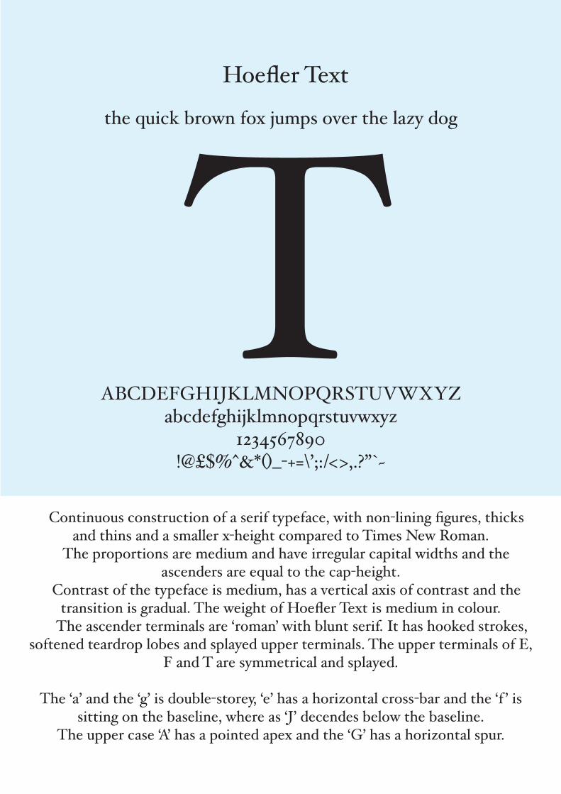
Continuous construction of a serif typeface, with non-lining figures, thicks and thins and a smaller x-height compared to Times New Roman.
The proportions are medium and have irregular capital widths and the ascenders are equal to the cap-height.
Contrast of the typeface is medium, has a vertical axis of contrast and the transition is gradual. The weight of Hoefler Text is medium in colour.
The ascender terminals are ‘roman’ with blunt serif. It has hooked strokes, softened teardrop lobes and splayed upper terminals. The upper terminals of E,
F and T are symmetrical and splayed.
The ‘a’ and the ‘g’ is double-storey, ‘e’ has a horizontal cross-bar and the ‘f ’ is sitting on the baseline, where as ‘J’ decendes below the baseline.
The upper case ‘A’ has a pointed apex and the ‘G’ has a horizontal spur.
T
gAR
fj
Upper case Q features a majorly continuous construction, with the addition of a long tail, which has blunt terminals. Ovular shape, with regular proportions and high contrast. Vertical axis of contrast and abrupt transitions.
Weights available:
Book, Book Italic, Medium, Medium Italic,Bold, Bold Italic,Black, Black Italic
abcdefghijklmnopqrstuvwxyz
ABCDEFGHIJKLMNOPQRSTUVWXYZ
Upper case A features a thick and thin stroke, joined by a thin crossbar. All structural lines are straight except from when they create the blunt bracketed serifs and the concaved apex. Regular proportions and with high contrasting.
Upper case R features thick straight and curved strokes, which all become thin at points of contact and increase to create blunt bracketed serifs. Regular proportions, bowl is of ovular construction and has high contrast. The leg is straight on one side but curved on the other. It finished with a single sided serif.
Q
ITC Caslon 224 STD
Lower case F & J featur continuous construction. Both are mainly thick stroked, except from where they reduce to allow adequate visual space for the ball terminals. Both descend below the baseline. The J has a circle tittle and the F carries a delicate cross bar.
Lower case G features continuous curves in an ovalur fashion, with stroke width being thin at points of contact. Regular proportions and high contrasting. Double storey and closed tail. Centrally positioned ear with a ball terminal.
straight leg
short tail
sitting on bass line
without spur
double story with closed tail
horizontal cross-bar
double story
pointed apex Aa e f Gg J Q R
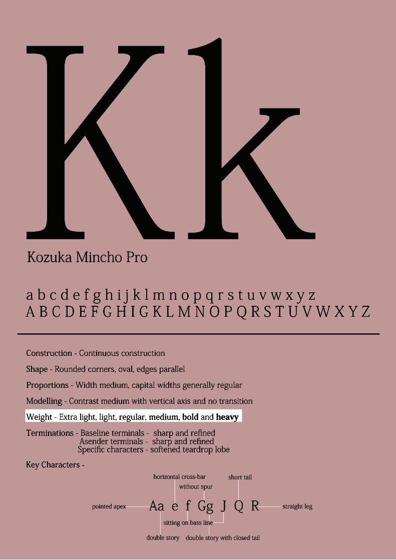
Construction - Continuous construction
Shape - Rounded corners, oval, edges parallel
Proportions - Width medium, capital widths generally regular
Modelling - Contrast medium with vertical axis and no transition
Weight - Extra light, light, regular, medium, bold and heavy
Terminations - Baseline terminals - sharp and refined
Key Characters -
Specific characters - softened teardrop lobe Asender terminals - sharp and refined
a b c d e f g h i j k l m n o p q r s t u v w x y zA B C D E F G H I G K L M N O P Q R S T U V W X Y Z
KkKozuka Mincho Pro
1. Lucida Fax was created to be legible when used on fax machines. References typewriter lettering.
2. Thick parallel stems and medium colour to increase legibility when used in fax.
3. Exaggerated bowls with gradual medium constrast from stem to curve.
4. Prominent slab serifs to ensure legibility and a direct influence of typewriter lettering.
5. Medium x-height.
6. Botton curves of letters all descend slightly below the baseline.
7. Medium letter width.
8. Distinctive terminals on letters a, c, g, t and y. Derivatives characters of handwriting.
Vertical slab terminal.
Flicking slab serif termination.
Vertical slab terminal.
Expanding slab serif terminal.
Closed tail.
Diagonal terminal slightly taller
than x-height but not as tall as
cap-height.
Expanding slab serif termination.
AA
Aoh, haik
A
A
Aa,Bb,Cc,Dd,Ee
A B C D E F G H I J K L M N O P Q R S T U V W X Y Z
abcdefghijklmnopqrstuvwxyz
Calligraphic style created through;
Tapered head serifHigh contrast between thick and thinsSharp roman serifs
Legibility through;
Larger proportions combined with standard ascender height
Features of the k;
Extended leg sits below base-lineSlanted serif to legSmall contact point between legs and stem
Key letters;
b - axis and contrast of thick and thins in the bowlj - heavily tapered, sharp tail
Palatino
R - bowl doesn’t meet stem, consistent thickness of leg
x - angled head serif, as with k’s leg serif
PerpetuaABCDEFGHIJKLMNOPGRSTUVWXYZa b c d e f g h i j k l m n o p q r s t u v w x y z
0123456789
cap heightacender height
-x-height-
baseline
depth of descender
-ascender
decender-
-tail
bowl
counter
-serif
-bracketing
GgThis is the letter G both in its upper and lower case. This par-ticular type-face is called Perpetua. It was designed by an Eng-lish sculptor named Eric Gill. Perpetua can be classified withtransitional typefaces because of characteristics such as highstroke contrast and bracketed serifs.
This type is medium in colour. The lowercase letter is a double-story ‘g’ with a tradi-tional closed tail. The baseline terminationoff the ‘a’ and ‘i’ is a hooked stroke sereif.The capital ‘G’ has no spur. This typefaceholds a continuous contruction without anybreaks. The ascender is about half the heightof the cap-height. The modelling is a gradualtransition.
PerpetuaA B C D E F G H I J K LM N O P Q R S T U V W X Y Zabcdefghi jklmnopqr stuvwxyz
Times New RomanA B C D E F G H I J K LM N O P Q R S T U V W X Y Zabcdefghijklmnopqrstuvwxyz
yThe Quick Brown Fox Jumps Over The Lazy Dog
Analysis of PerpetuaI would describe Perpetua’s overall look as a more modern and stylish version of Times New Roman. It is
thinner and more understated for example it has almost horizontal and blunt/sheared terminals compared with
the angles and tear drop lobe terminals of with the than Times New Roman.
Construction - Continuous
Shape - most of the curves in Perpetua are curved except for the letter ‘o’ which is round and differs from
Times New Roman which has a curved ‘o’. Perpetua has upright stems with parallel edges and the cross bars
are positioned normally.
Proportions - Times New Roman’s capital and lowercase letters are all taller than Perpetua’s but both fonts
have just about the same captial and lowercase letter width. Perpetua has ascenders higher than it’s cap-height
and a smaller x-height than Times New Roman due to all it’s letters being shorter than Times New Roman.
Modelling - Perpetua has a high contrast and an angled axis of contrast except for the ‘o’ which doesn’t have
one. The transition in all it’s letters is gradual.
Weight - Perpetua has two weights (colour), regular and bold.
Terminations - Perpetua has hooked stroke baseline terminals (more hooked than Times New Roman) and
sharp and refined serifs very similar to Times New Roman. The ascender terminals are tapered serifs but not as
angled as Times New Roman. Perpetua has blunt/sheared terminals on letters like ‘y’ and ‘f’ unlike Times New
Roman which has softened tear drop lobes.
Key characters - The ‘a’ in Perpetua is double-storied and the capital ‘A’ has a flat apex unlike Times New
Roman which has a pointed apex. Perpetua’s capital and lower case ‘J’ and lower case ‘y’are the most
characteristic letters compared to Times New Roman.
ghijklmn
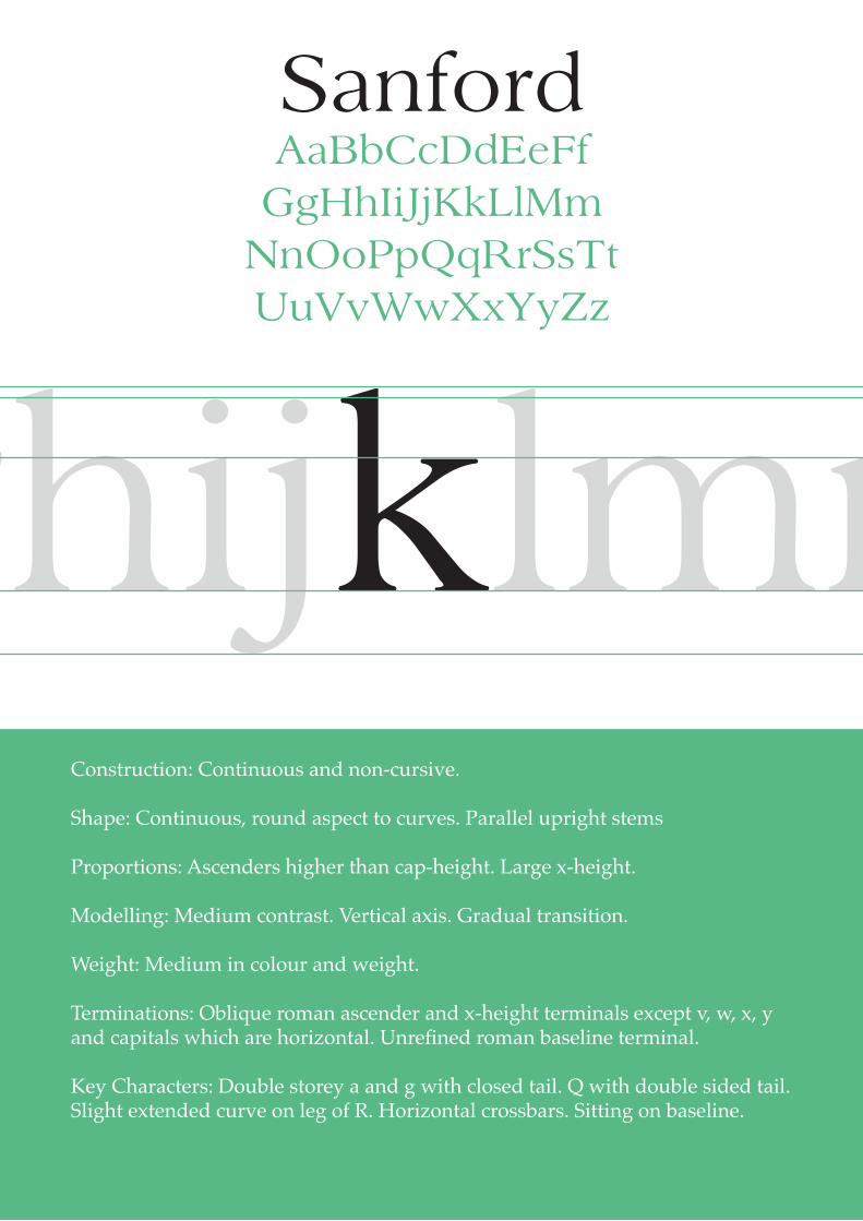
Sanford
Construction: Continuous and non-cursive.
Shape: Continuous, round aspect to curves. Parallel upright stems
Proportions: Ascenders higher than cap-height. Large x-height.
Modelling: Medium contrast. Vertical axis. Gradual transition.
Weight: Medium in colour and weight.
Terminations: Oblique roman ascender and x-height terminals except v, w, x, y and capitals which are horizontal. Unrefined roman baseline terminal.
Key Characters: Double storey a and g with closed tail. Q with double sided tail. Slight extended curve on leg of R. Horizontal crossbars. Sitting on baseline.