In presenting this thesis in partial fulfilment of the requirements for an advanced degree at the University of British Columbia, I agree that the Library shall make it freely available for reference and study. I further agree that permission for extensive copying of this thesis for scholarly purpose may be granted by the head of my department or by his or her representatives. It is understood that copying or publication of this thesis in whole or in part for financial gain shall not be allowed without my written permission. Thesis Title: A Study of Haptic Icons Author: Mario Enriquez . . . . . . . . . . . . . . . . . . . . . . . . . . . . . . . . . . (signature) . . . . . . . . . . . . . . . . . . . . . . . . . . . . . . . . . . (date) Department of Computer Science The University of British Columbia 2366 Main Mall Vancouver, BC, Canada V6T 1Z4
ii
ABSTRACT
The goal for this research is to study a new class of force feedback applications based on
abstract messages we call haptic icons. With the introduction of active haptic displays, a
single knob or joystick can be used to control several different, sometimes non-related,
functions. The functions associated with these multi-function handles can no longer be
identified from one another by position, shape or texture differences. Haptic icons are
brief programmed forces applied to a user through a haptic interface conveying an
object’s or event’s state, function or content in a manner similar to visual or auditory
icons.
This thesis begins with a presentation of several tools that were developed to aid this
research. It then describes a series of psychophysical tests designed to obtain the basic
perceptual limits for our haptic interface. Knowing these perceptual limits is a
prerequisite for proper haptic icon design. We analyzed a set of synthetically constructed
haptic icons using Multidimensional Scaling, in order to discover the underlying
perceptual processes in identifying different haptic stimuli.
Results show that a set of icons constructed by varying the frequency, magnitude and
shape of 2-sec, time-invariant waveforms map to two perceptual axes, which differ
depending on the signals’ frequency range, and suggest that expressive capability is
maximized in one frequency subspace.
I finish by proposing future work to be done on this area.
Figure 46. Average results for the Discriminability Analysis . . . . . . . . . . . . . . . . . 88
xi
Acknowledgments
Many people have made my studies at UBC an unforgettable experience. I owe all of
them my gratitude. I extend sincere appreciation to Dr. Karon MacLean, my faculty
supervisor, for her valuable guidance and encouragement, reviewing my work and
suggesting needed improvements. Much appreciation goes to Dr. Vince DiLollo for his
insight and invaluable knowledge. I am also very grateful to Dr. Jim Little for his help
and everlasting enthusiasm, which sheds off to everyone in the lab. Special thanks go to
Dr. Jason Harrison for his help and comments on my writing and experiment design.
Many thanks for the LCI lab community and particularly for the SPIN group,
particularly, Tim Beamish, Michael Shaver and Giusi Di Pietro.
I shall make a special thank you note for Valerie McRae for her help, support, humor and
general TLC that go way beyond her duty.
Finally, I would like to thank my family and friends who have had to listen to the words
“haptic icons” a googolplex more times than they wanted.
Mario Enríquez
The University of British Columbia September 2002
1
Chapter 1
Introduction and General Methodology
1.1 Introduction
Human-machine interaction has long used icons of different sorts to aid in identifying the
different functions of a machine. These icons can be used instead of words to help keep the
interface compact, concise and language-free. Traditionally, icons are small graphic
representations of real things. These icons should be easily identified by the user and are
used to relate specific functions to abstract physical controls. For example, can be
placed next to a switch to let the user know its function is to turn on a light. A visual icon
is defined as an image that represents an application, a capability, or some other concept or
specific entity with meaning for the user [1].
In the world of natural touch we use characteristics such as shape, texture and relative
position (from some fixed location to the user or other reference point) to identify different
functions and states of knobs, switches and other controls. However, with the introduction
of active haptic displays, a single knob or joystick can be used to control several different
and sometimes unrelated functions which might now become indistinguishable from one
another by position, shape or texture differences. “Haptic icons” offer a new challenge and
opportunity. With the addition of haptic output, a controller (knob, button or joystick) also
becomes a display, since it can be made to provide a different haptic behavior when
manipulating different functions. For example, the hapticized knob might allow us to
convey information to the user as to what function is currently being adjusted by the handle
2
without the need for a separate display. Thus, a car-stereo knob might inform the user if it
is currently adjusting volume, bass or balance levels by displaying a different haptic
behavior for each function. Another example is a cell phone buzzer that feels different
depending on who is calling. These are only two of many ways that haptic icons might
come in handy.
The main topic for this thesis is the study of haptic icons. We will define haptic icons as
brief computer-generated signals displayed to a user through force feedback with the role of
communicating a simple idea in a similar manner as visual or auditory icons.
Using haptic icons, we may be able to reduce the visual attention and cognitive load
otherwise required to identify what the device is controlling at that time. We believe that
these haptic icons will help the user control functions by touch and manipulation, leaving
his/her visual system free to interact with their environment or visual displays.
In this work, we present an innovative approach to study the perception of haptic icons,
relying on an exploratory mathematical procedure called Multidimensional Scaling
Analysis (MDS). The goal of this research is to understand and characterize haptic
perception of complex stimuli in terms of key input dimensions for artificially generated
haptic icons.
1.2 Methodology and General Approach
There are several possible approaches to studying haptic icons. We present the following
two and explain our choice:
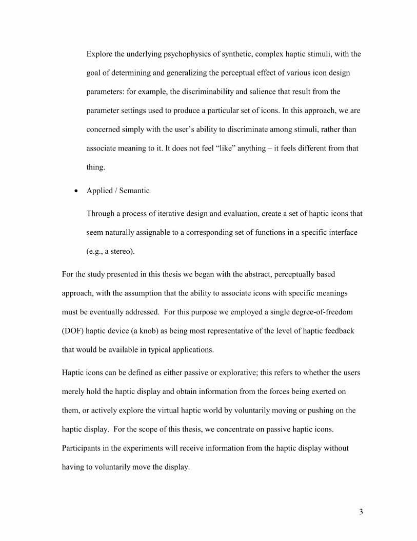
• Abstract / Perceptual.
3
Explore the underlying psychophysics of synthetic, complex haptic stimuli, with the
goal of determining and generalizing the perceptual effect of various icon design
parameters: for example, the discriminability and salience that result from the
parameter settings used to produce a particular set of icons. In this approach, we are
concerned simply with the user’s ability to discriminate among stimuli, rather than
associate meaning to it. It does not feel “like” anything – it feels different from that
thing.
• Applied / Semantic
Through a process of iterative design and evaluation, create a set of haptic icons that
seem naturally assignable to a corresponding set of functions in a specific interface
(e.g., a stereo).
For the study presented in this thesis we began with the abstract, perceptually based
approach, with the assumption that the ability to associate icons with specific meanings
must be eventually addressed. For this purpose we employed a single degree-of-freedom
(DOF) haptic device (a knob) as being most representative of the level of haptic feedback
that would be available in typical applications.
Haptic icons can be defined as either passive or explorative; this refers to whether the users
merely hold the haptic display and obtain information from the forces being exerted on
them, or actively explore the virtual haptic world by voluntarily moving or pushing on the
haptic display. For the scope of this thesis, we concentrate on passive haptic icons.
Participants in the experiments will receive information from the haptic display without
having to voluntarily move the display.
4
1.3 Document Structure
We begin by presenting previous work in several related areas (Chapter 2) and explain
several methodologies we adopted.
Our study was carried out in 2 basic steps:
Step 1: Determine the Basic Perceptual Limits (Chapter 4)
Design, develop and perform basic psychophysical experiments to obtain the
perceptual limits for our setup utilizing an adaptive procedure, Parameter Estimation
by Sequential Testing (PEST) [2]. These limits are needed to create a balanced
stimulus set for our formal MDS analysis.
Step 2: Mapping the Perceptual Space (Chapter 5)
The Multidimensional Scaling techniques and methodology used for our tests are
explained in detail (Chapter 5.1).
Experiment 1 (Chapter 5.3)
Using the results from Step 1, we defined the haptic icons to be analyzed using MDS.
We present the design and implementation of the MDS experiment for the chosen
haptic icons and present the results obtained.
Experiment 2 (Chapter 5.4)
The MDS analysis for Experiment 1 (Chapter 5.3) raised several questions that we
addressed with a second experiment using a re-designed haptic icon set. We present
this re-designed haptic icon set, the MDS analysis performed on it and the results. We
finish by presenting our conclusions and suggested future work (Chapter 6).
5
Chapter 2
Previous Work
2.1 On Iconography
Visual and auditory icons have long been integral to computer interfaces, as a means of
indicating functionality, location and other low-dimensional information more efficiently
than does displayed text [3,4]. Graphic icons, for example, are small and concise graphic
representations of real or abstract objects.
The auditory and haptic icon design spaces share key attributes: they are both temporally
sequential and have limits to amplitude and period discrimination abilities. Thus in our
haptic icon research program, we have found it most productive to consider auditory icon
design as an example.
In the case of using audio to iconify information, there have been two general approaches:
• Gaver et al. [5,6] studied “Auditory Icons”. These are essentially representations of
objects or notions that embody a literal, direct meaning: for example, using the
sound of a paper being crushed to indicate deleting a computer file. Most of us are
familiar with both the sound of a wadded paper and the action of deleting a file, and
easily make the association. Auditory Icons are auditory representations of real
objects and actions imitated by computer interfaces.
• Stephen Brewster et al. [7,8] took a different approach. “Earcons” are sounds and
rhythms with no intrinsic or cultural meaning: their target or meaning has to be
learned to be effective. Their study focused on understanding and quantifying the
6
different “Earcons” that could be differentiated by people at a perceptual level.
Amongst other things, they found that Earcons were better-differentiated than
unstructured bursts of sound and that musical timbres were more effective than
simple tones. Another important aspect was determining which sounds are more
perceptually salient or even whether certain sounds are appropriate for a given
application. For example, a quiet sound might literally represent a very urgent or
dangerous event because that event does not generate much sound in the real world.
However, in a different application, this might be inappropriate. This work differs
from Gaver’s work, which does not address whether users can differentiate the
icons or how many icons they can tell apart.
Our own study shares more philosophically with Brewster’s; it relies on perceptual
science and studies to determine where haptic icons should lie perceptually.
However, we have a long-term aim of adding the intuitive benefits of Gaver’s approach
when we better understand the perception of complex haptic stimuli.
2.2 On Applied Multidimensional Scaling (MDS) Techniques
In this work, we will be using Multidimensional Scaling to analyze the perception of haptic
icons. MDS is a powerful tool for analyzing complex scenarios. It simplifies the
understanding of complex preference data by uncovering potential hidden structure. A
fairly detailed explanation of this technique is given in Chapter 5.1.
Many studies have been carried out in different disciplines utilizing this technique. We
looked at several of them to observe their different approaches, ideas and pitfalls.
7
Mark Hollins et al. analyzed the tactile perception of real surface textures using MDS [9].
These textures were presented by moving them across the index finger of the subjects who
sorted them into categories on the basis of perceived similarity. Their test set consisted of
17 textures such as wood, sandpaper, and velvet. They obtained results mapped into a 3-
dimensional space. Two axes were roughly associated with hard/soft and rough/smooth;
the third was difficult to interpret. Their work shows an interpretation of the results based
on the groupings in the MDS solution space that we adopted for our interpretations.
Aleksandra Mojsilovic et al. utilized MDS in a set of experiments on the visual perception
of color patterns [10]. In this work twenty patterns from an interior design catalog were
presented to the participants. The stimuli were rated on a scale from 0 for “very different”
to 100 for “very similar”. No instruction was given to the participants concerning the
characteristics on which these similarity judgments were to be made. This allowed the
experimenters to discover what characteristics were important for the participants in
differentiating between the textures. The results obtained mapped onto a 2-dimensional
space. The two axes were associated with “color” and “color purity” respectively. From
this work, we adopted the general approach of giving the participants freedom as to the
characteristics to consider for judging the stimuli.
Lawrence Ward used MDS to study the perception of a set of pictures containing images of
different natural and artificial (human generated) environments [11,12]. For his work,
Ward utilizes an innovative approach to obtain the dissimilarity data for the MDS analysis.
Participants in these experiments were asked to rank the images five times using a different
number of categories for each sort. The perceived dissimilarity for the picture set is
calculated based on these sortings. The results obtained mapped to a space where one axis
8
represented “naturalness” and another “scale”. The sorting methodology used in this work
increases the efficiency of evaluating large sample sets, and improves repeatability and
accuracy by avoiding the need to judge each item pair individually. We utilized this sorting
methodology for our own experiments.
Terri L. Bonebright utilized MDS for a different task: a study of everyday sounds [13]. In
this work, the dissimilarity data required for the MDS tests was obtained using a similar
approach to the category sorting method used by Lawrence Ward. The participants were
asked to sort the sound stimuli presented into categories. There were 74 different stimuli.
Each stimulus had a visual representation on the screen that was used to perform the sorting
into categories. The visual representation was a small graphical icon in the shape of a
randomly numbered box, which the participant could repeatedly test and move about. The
use of graphic icons allows the analysis of large data sets without requiring exceedingly
long tasks. The results for these tests were mapped in a 3-D solution space where
dimension 1 is defined by 5 perceptual attributes and 3 acoustic measures; dimension 2 is
explained by 1 perceptual attribute and 1 acoustic measure; and finally dimension 3 is
characterized by 3 perceptual attributes and 1 acoustic measurement. We adopted the idea
of representing the stimuli as icons on the screen to allow graphic sorting for our own
experiments (Chapter 5).
2.3 On Haptics in General
With few exceptions, haptic force feedback research has been devoted to rendering virtual
environments. To our knowledge, synthetic haptic stimuli have not been studied in the
context of supplying iconic information prior to the research presented here. There are,
however, a great number of papers and research articles that focus on haptic feedback
9
applications, their design and use. We were particularly interested in those that addressed
some simple questions that we felt were relevant to our work.
The work done by Martha A. Rinker et al. [14] was particularly interesting to us. Their
study focused on determining the sensory capacity of a human hand to perceive haptic
stimuli through the fingers, in particular the ability to discriminate finger movements along
the dimensions of amplitude and frequency for the purpose of processing speech stimuli.
Their study involved determining the difference thresholds for a series of stimuli using an
adaptive, two-interval temporal forced choice procedure. The results obtained from this
experiments show thresholds in a range from 10% to 18% for amplitude discrimination and
6% to 16% for frequency discrimination. We adopted the general methodology followed in
these tests to determine the basic perceptual limits for our specific setup (Chapter 4).
Hong Z. Tan et al. performed a series of experiments to determine human perceptual
capabilities for parameters such as pressure, stiffness, position sensing resolution, force
sensing, human force control and force output range and resolution [15]. Their idea was to
provide simple rules to be used as a guideline for the mechanical requirements in the design
of haptic interfaces. Of particular interest to us, the Just Noticeable Differences (JND) for
force sensing of slowly varying forces is presented as being 7%. The JND for vibro-tactile
stimulation is roughly 28 dB below 30 Hz and decreases at a rate of roughly –12 dB/octave
from 30 to 300 Hz. After that, the threshold rises again. We used the results presented here
as a rough guideline to authenticate the experiments done for our own system.
10
Chapter 3
Experiment Setup and Standard Procedures
All of the experiments carried out throughout this work and described in Chapters 4 and 5
utilize the same haptic display, setup and general procedures. We proceed to explain them
in detail here.
3.1 Equipment
All participant sessions took place in a quiet corner of the UBC Computer Science
Department’s “Laboratory for Computational Intelligence”.
3.2 Hardware
A generic 1.2 GHz Pentium 3 computer running Windows 2000 in real-time mode was
used for all experiments. An Immersion Impulse Drive I/O Board v. 1.0 provided I/O and
amplification for the haptic interface.
The haptic interface was a direct drive actuated knob, shown in Figure 1. The knob was
rubber-covered brass with an outer diameter of 10.5 mm and a length of 16.5 mm. The 1
mm thick rubber coating prevented slipping and allowed a better grip of the knob while
minimizing compliance. The knob was mounted directly on the shaft of a 20-W Maxon DC
motor model 118752. This 24-volt motor has a stall torque of 240 mNm and a mechanical
time constant of 5 ms allowing a maximum frequency output of 200 Hz.
A Hewlett Packard model HEDS-5500 optical encoder with 4000 post-quadrature counts
per revolution provides positional feedback.
11
All force magnitudes presented through our haptic knob are expressed as peak-to-peak
torque values in mNm (Newton/millimeters). These torque values are approximate, derived
from the electrical current multiplied by the motor torque constant, since we could not
easily measure displayed absolute force.
Figure 1. The haptic display motor. Shown here is the DC motor used as a haptic display. The knob on the motor shaft was covered with 1-mm thick rubber to prevent slipping and facilitate grasp during the experiments. The adjustable vise allowed us to re-position the motor for each participant.
The motor/knob assembly was held horizontally with an adjustable vise on a table. A
padded arm support was built to hold the participants’ forearm comfortably while
performing the experiments. The purpose of this armrest was twofold; the participants
remained comfortable even for the one-hour long tests and they were forced to grasp the
100 mm
16.5 mm
10.5 mm
12
knob in a specific manner. This setup was designed to provide the participants with a
single comfortable grasping position of the knob (Figure 2).
Figure 2. Participant arm position while grasping the haptic knob. The participants were asked to hold the knob lightly between their thumb and index finger as shown here. The haptic knob was placed horizontally in a position easily reachable by the participant while resting the forearm on a cushioned armrest.
3.3 Software
The experiment control GUI and the I/O routines were written by the author in Visual Basic
and C++ respectively. The I/O board control routines were developed based on sample
code provided by Dr. Karon MacLean and Immersion Co. The experiment results were
stored in *.CSV (Comma separated value) files that can be read using any spreadsheet
software or text editor.
13
3.4 Pre-experiment procedures
Prior to beginning each experiment, participants signed a consent form as required by the
university ethics review board. The form gave the participants some basic information
about the type of experiment they were to perform, as well as an outline of the payment and
withdrawal conditions. A copy of this form can be found in Appendix E.
After receiving instructions about the task to be performed, participants were required to
wear noise-canceling headphones to block any audible artifacts from the haptic display.
3.5 Post experiment procedures
At the end of every session, the participants’ questions regarding the purpose and
application of the experiment were answered. Participants were paid $10 per hour spent in
the experiments.
14
Chapter 4
Determining the Basic Perceptual Limits
In order to effectively compare the perception of haptic icons composed by varying
multiple haptic signal parameters, we must first determine the perceptual limits for those
signal parameters in isolation when displayed using our haptic hardware. We performed a
series of experiments to determine what we considered to be the two most important
perceptual parameters for our setup:
• the minimum amplitude required to detect the presence of a haptic stimulus for a
set of different frequencies and waveforms (Chapter 4.2)
• the minimum detectable change in frequency for haptic stimuli generated using
different frequencies and waveforms (Chapter 4.3)
4.1 Tools for Basic Perceptual Limits Testing
The experiments used to determine the perceptual parameters for our setup required the use
of several different methodologies and techniques. These are presented in Chapters 4.1.1
and 4.1.2.
4.1.1 Two Alternative Forced Choice (2 AFC)
When presenting a stimulus to participants with the purpose of inquiring whether it holds a
specific characteristic, the responses obtained might be affected by differences in the
participants’ personalities. Because the task is hard, there is always uncertainty as to what
was there or not. Either there was a signal (signal plus noise) or there was none (noise
15
alone). There are four possible outcomes for this type of test: hit (signal present and
participant says “yes”), miss (signal present and participant says “no”), false alarm (signal
absent and participant says “yes”), and correct rejection (signal absent and participant says
“no”) [16].
One problem with this approach is that the participants are asked to use their own criteria in
making the decision. Different participants might have a different idea of what the
researcher is asking for. Daring participants might claim to feel the particular characteristic
when they are not sure, conversely, timid participants might be more inclined to
conservative judgments and require a positive identification before declaring they perceive
the characteristic.
Another approach to measure performance independently from any participant criterion is
to use a two-alternative forced choice method (2AFC). This technique avoids these
response biases and prevents obtaining different results for conservative and liberal
observers. 2AFC eliminates such problems by avoiding the need to answer a “yes-no”
question, presenting instead 2 non-intimidating options: the characteristic was present in
the first stimulus or in the second stimulus.
For our experiments, this method is implemented by presenting two intervals, only one of
which contains a signal. The participant is then asked which interval holds the signal. The
order of the intervals is randomized so the participant has to identify the location of the
stimulus in order to answer correctly.
We utilized this methodology for all of our psychophysical experiments (Chapter 4.2 and
4.3).
16
4.1.2 Parameter Estimation by Sequential Testing (PEST)
The Two Alternative Forced Choice (2AFC) methodology explained in Chapter 4.1.1 is
essential for the implementation of Parameter Estimation by Sequential Testing or PEST
[16]. PEST is an adaptive procedure for rapid and efficient psychophysical testing used
extensively in our experiments. It allows the researcher to determine the level of an
independent variable that leads to some predetermined probability that a related event will
occur on a single discrete trial. An example is the signal loudness required for a participant
to hear a beep in a quiet room 75% of the times the signal is presented. Here, for example,
we used it to determine the lowest possible amplitude at which a specific waveform with
certain frequency will be detected 80% of the time when displayed using our haptic knob.
PEST was designed to obtain information using trial-by-trial sequential 2AFC decisions at
each stimuli level in a sequence converging on a selected target level.
Let us suppose we are trying to determine the amplitude at which a sine waveform with a
specific frequency is detected 80% of the time when displayed through the haptic knob.
We want the signal level to be as low as possible but still large enough to be noticed by the
human observer 80% of the time it is displayed. PEST allows you to determine the signal
intensity at which the participant will be able to determine the “location” of the stimulus
with a predetermined probability level, typically 80% or greater.
PEST is an adaptive procedure, which means its behaviour is continuously affected and
determined by the ongoing test. The system follows a set of steps that eventually lead to
the determination of a stimulus intensity that meets a specified criterion for detecting its
presence.
17
PEST OPERATION
PEST begins by presenting the participant with two intervals in random order:
• One of them is a signal large enough so it is easily noticeable.
• The other is a “blank” signal.
Following this, the participant is asked for the “location” of said signal amongst 2 interval
choices. This constitutes a single trial.
After every trial, PEST takes the collected responses for the previous trials and decides
whether they are statistically better or worse than a pre-specified percentage of correct
responses (80% for our example). If the results are statistically inconclusive, PEST runs
another trial at the same level. If the results merit a change, PEST specifies the amount of
change to be made according to the following rules:
For our scenario:
1. If the results are above the desired correct response percentage (test too easy), the
amplitude of the waveform to be presented is decremented by a specified step size.
This should make the test harder. If the results are above the desired correct
response percentage for two trials in a row, the step size is doubled for the next
change to be made. If the previous results had determined that the test was too hard,
the step size is halved before changing the amplitude of the waveform.
2. If the results are below the desired correct response percentage (test too hard), the
amplitude of the waveform is incremented by a specified step size. This should
make the test easier. If the results are below the desired correct response percentage
for two trials in a row, the step size is doubled for the next change. If the previous
18
results determined the test was too easy, the step size is halved before changing the
amplitude of the waveform.
The initial value for the step size is pre-defined by the researcher and is dynamically altered
by PEST thereafter. Figure 3 shows a sample graph of the amplitude changes ordered by
PEST to eventually converge at a level (0.34 for this example) that meets the percentage of
Figure 3. Amplitude Changes and Steps of PEST Procedure. The vertical axis represents the amplitude of the stimulus presented. The horizontal axis represents the sequential trials. This graph presents the amplitudes presented by PEST in 48 trials converging to a final value of 0.34 mNm.
PEST repeats the previous steps: presenting the stimulus, collecting data and possibly
changing the stimulus amplitude, until a certain criterion is met.
There are two methods for deciding when to stop PEST:
1. Minimum Overshoot and Undershoot Sequential Estimates (MOUSE)
19
This method works by monitoring the step size magnitude ordered by PEST. When
the step size is smaller than a pre-specified minimum, the process stops. The result
for the test is calculated by averaging the values at the last 5 reversals in amplitude
change direction. A reversal occurs when PEST commands a change in stimulus
level using a step size in a direction opposite to the previous one (Figure 4).
2. Rapid Adaptive Tracking (RAT)
RAT monitors the number of reversals in amplitude change direction. This method
stops PEST after a specified number of step size reversals plus a specified number
of additional trials. After the 5th reversal, the participant is presented with the
stimuli 16 times and the values obtained from these 16 trials are averaged to get a
final result (Figure 4).
For our experiments we used the RAT criterion to decide when to stop the test. PEST was
used in both of our perceptual limits experiments (Chapters 4.2 and 4.3).
Figure 4. PEST operation using Rapid Adaptive Tracking. For this example, Rapid Adaptive Tracking (RAT) was used to determine the target level. The final value is the average (0.34 for this example) of the 16 trials following the fifth reversal in magnitude change direction.
4.2 Detection Threshold Experiment
In order to properly quantify what humans can perceive through our haptically enabled
knob, we must first understand humans’ perceptual limits. As with all physical systems,
humans have different gains and sensitivity levels for varying frequencies, amplitudes and
waveforms [17]. The purpose of the Detection Threshold (DT) experiment is to determine
these sensitivity levels for our specific setup, i.e., for a set of simple waveforms displayed
through the knob. Obtaining these thresholds is a prerequisite to determining appropriate
amplitude levels for the stimuli to be used as haptic icons.
Given these requirements, we designed and completed a set of experiments to collect data
from participants regarding their perceptual limits to a set of haptic sensations.
Reversal
Reversal
Reversal
Reversal
Reversal
16 Trials
21
4.2.1 Methodology
Participants were presented with the haptic stimuli using a 2 Alternative Forced Choice
(2AFC) paradigm. The stimuli were presented in two intervals: one that held a haptic
sensation with a given frequency and amplitude and a second “blank” interval. The order
of the intervals was randomized. The participant was asked to identify which of the
intervals contained the haptic sensation.
4.2.2 Stimuli Selection
In our experiments we used a combination of frequencies and simple waveforms to
generate the haptic sensations to be tested. The stimuli presented consisted of 4
waveforms: sine, square, triangle and sawtooth. These waveforms were presented at
different frequencies and amplitudes throughout the experiment. The hardware used
(Chapter 3) limits the test frequencies to those 200Hz and under.
We selected frequencies for this experiment to be spread over the frequency range allowed
by our existing setup. The four waveforms were presented at 10 different frequencies: 0.1,
0.25, 0.5, 1,7,10, 20, 40, 100 and 200 Hz. This gives us a total of 40 stimulus detection
levels to be determined. The duration of the stimuli to be used was set at 10 seconds per
interval for each trial.
All force magnitudes presented through our haptic knob are expressed as peak-to-peak
torque values in mNm (Newton/millimeters). These torque values are approximate, derived
from the electrical current multiplied by the motor torque constant, since we could not
easily measure displayed absolute force.
22
4.2.3 Considerations
To be able to effectively measure the participants’ sensitivity at a given frequency, we had
to confirm that the intended signal was the only factor determining the participants’
responses. Due to physical (electrical) limitations of our setup, a small magnitude “bump”
movement is generated on our haptic knob anytime the output device is enabled. To
prevent this noise from having a negative effect on our results, we present the participant
with two stimuli: a blank presentation and the stimulus that holds the specified waveform.
For both cases, the output device is enabled. This causes the participant to feel the “bump”
at both intervals and thus makes the judgment whether there is a specific sensation present
in the stimulus more precise. The duration for each stimulus was chosen to be 10 seconds
as to allow a single complete cycle for the lowest frequency to be tested (0.1 Hz); the
“blank” stimuli had a 10 second duration as well. The presentation order for the stimuli
was randomized.
4.2.4 Experimental Procedure
A complete session yields the Detection Threshold for a specific waveform at all 10
selected frequencies. Each session was divided into 10 blocks, each with a duration of
approximately 8 minutes. The Detection Threshold for a single frequency is determined in
each block. This frequency is presented in a number of sequential trials with different force
amplitudes as determined by the experiment system. We used Parameter Estimation by
Sequential Testing (PEST) to determine the Detection Threshold. PEST adaptively
determines the number of trials required for each block. All trials were self-paced with
breaks allowed between blocks and when the participant felt the need for relaxing the grip
23
on the knob. Participants were told that the experiment was not timed. A complete session
had a duration of approximately 1.5 hours.
4.2.4.1 Participants
Due to the nature of this experiment, which focuses on determining basic perceptual limits,
we recruited participants without regard to background or abilities on the assumption that
basic tactile perceptual abilities would be consistent across the general population.
For this experiment, six participants were recruited through a posting in a bulletin board in
the computer science building. The participants included one female and five males. One
was left-handed and five right-handed, all of them between 20 and 29 years of age. None
of the participants had any disabilities or limitations in the sight or touch senses. The
participants were naïve to haptic perceptual experiments and were paid cash for their
involvement. Figure 5 shows a table explaining the details of the participants’ involvement
in the DT experiments. Three participants completed a session for each waveform tested;
and some participants completed more than one session.
24
Participation in Detection Threshold Experiments
Participant Sine
Waveform Triangle
Waveform Square
Waveform Sawtooth Waveform
1 X X X X
2 X
3 X X
4 X X
5 X X
6 X
Figure 5. Participant involvement in Detection Threshold experiment. The X denotes participation for the experiment in the respective column. Each experiment was completed by 3 participants.
4.2.4.2 Stimuli Presentation
In each trial, two randomly-ordered 10-second intervals were presented: a haptic sensation
and a “blank” presentation. During the stimuli presentation, the screen was cleared and the
participants were required to wear noise canceling headphones to ensure the haptic stimuli
was the only factor determining their responses.
4.2.4.3 Instruction of Participants
Each session began by presenting a set of simple instructions on the screen. The
instructions were then read to the participant by the experimenter. Copies of these
instructions are included in appendix D.
After making sure that the participant was seated comfortably and the haptic display was
adjusted to be within easy reach, we observed the participant interact with the system and
answered any questions. Since PEST is an adaptive procedure, the first couple of trials can
be used for training without affecting the end results of the experiment.
25
Participants were instructed to perform the first two trials under our supervision. After
these trials, the participants were again asked if they had any questions. Having answered
any further questions, the participants were required to wear the noise canceling
headphones and continue with the experiment. After each block the participants were
reminded by the experiment software to take a break.
4.2.4.4 Experiment Session
For the duration of the session, the participants were asked to determine the location of a
stimulus amongst two intervals. During the presentation of the stimuli, the screen was
blank. After each stimulus pair, the participants were presented with a dialog box with two
options: the stimulus was located in interval one or in interval two (Figure 6). The
participants answered by typing 1 or 2 in the keyboard and pressing the <ENTER> key or
clicking on the <OK> button to continue to the next trial. The <Cancel> button had no
functionality.
Figure 6. Dialog box presented to participants for identification of interval holding the specified stimulus. This dialog box was presented to the participants after each trial. The participants had to type their response using the keyboard.
4.2.5 Data Collection and Experiment Output
The data gathered from each session was stored into individual files. The name of these
files was formed by combining the date and time of the session with the participant’s name.
26
The file contained the waveform being tested, the participant’s name, age and gender and
the Detection Threshold results. These results were stored as 10 values that represent the
amplitude required for detection of a signal at each frequency tested. The results were
graphed using Microsoft Excel.
4.2.6 Results for the Detection Threshold Test
The Detection Threshold Experiment results are displayed in five graphs (Figures 7 to 11).
The results for each waveform tested (sine, square, triangle and sawtooth) are shown in four
separate graphs, a fifth graph presents a comparative of the results.
Figure 7 shows the average results of the Detection Threshold for the sine waveform. The
error bars represent the standard deviation of the 3 samples taken. There is a noticeable
increase in sensitivity for the higher frequencies. We can also notice that standard
deviation decreases with the increment in frequency.
DT for Sine Waveform
0
1
2
3
4
5
6
7
8
9
0.1 1 10 100 1000
Frequency (Log10 Hz)
Am
plit
ud
e re
qu
ired
fo
r d
etec
tio
n (
mN
m)
Figure 7. The Detection Threshold experiment results for the sine waveform. Each point in the graph represents the average for 3 participants. The graph represents the average sensitivity to the haptic sensations presented at the different frequencies. The horizontal axis is the frequency (scaled in log10) being tested and the vertical axis is the force output required for detection. The error bars are the standard deviation of the samples taken.
27
Figure 8 shows the average results of the Detection Threshold for the square waveform.
The error bars represent the standard deviation of the 3 samples taken. There is a subtle
increase in sensitivity for the higher frequencies. However, the change is smaller than for
the sine waveform (Figure 7). We can observe the standard deviation decreases with the
increment in frequency. Note that the scale of the vertical axis in this graph is different
from that used in Figure 7.
DT for Square Waveform
0
0.2
0.4
0.6
0.8
1
1.2
1.4
1.6
1.8
2
0.1 1 10 100 1000
Frequency (log10 Hz)
Am
plit
ud
e re
qu
ired
fo
r d
etec
tio
n (
mN
m)
Figure 8. Detection Threshold results for the square waveform. Each point in the graph represents the average for 3 participants. The graph represents the average sensitivity to the haptic sensations presented at the different frequencies. The horizontal axis is the frequency (scaled in log10) being tested and the vertical axis is the force output required for detection. The error bars are the standard deviation for the samples taken. Note that the vertical scale of the graph is different from that of Figure 7.
28
Figure 9 shows the average results of the Detection Threshold for the triangle waveform.
The error bars represent the standard deviation of the 3 samples taken. This graph is
similar in shape and magnitude to that of the sine waveform. There is a noticeable increase
in sensitivity for the higher frequencies. Note that the scale of the vertical axis in this graph
is different from the one used in Figure 8.
DT for Triangle Waveform
0
1
2
3
4
5
6
7
8
9
0.1 1 10 100 1000
Frequency (log10 Hz)
Am
plit
ud
e re
qu
ired
fo
r d
etec
tio
n
(mN
m)
Figure 9. Detection Threshold results for the triangle waveform. Each point in the graph represents the average for 3 participants. The graph represents the average sensitivity to the haptic sensations presented at the different frequencies. The horizontal axis is the frequency (scaled in log10) being tested and the vertical axis is the force output required for detection. The error bars are the standard deviation for the samples taken. Note that the vertical scale for the graph is different from that of Figure 8.
29
Figure 10 shows the average results of the Detection Threshold for the sawtooth waveform.
The error bars represent the standard deviation of the 3 samples taken. This graph is
similar in magnitude to that of the square waveform. There is a subtle increase in
sensitivity for the higher frequencies. However, the change is smaller than for the sine and
triangle waveforms (Figure 7 and 9). Note that the scale of the vertical axis in this graph is
different from those used in Figures 7 and 9.
DT for Sawtooth Waveform
0.00
0.20
0.40
0.60
0.80
1.00
1.20
1.40
1.60
1.80
2.00
0.1 1 10 100 1000
Frequency (log10 Hz)
Am
plit
ud
e re
qu
ired
fo
r d
etec
tio
n (
mN
m)
Figure 10. Detection Threshold results for the sawtooth waveform. Each point in the graph represents the average for 3 participants. The graph represents the average sensitivity to the haptic sensations presented at the different frequencies. The horizontal axis is the frequency (scaled in log10) being tested and the vertical axis is the force output required for detection. The error bars are the standard deviation for the samples taken. Note that the vertical scale of the graph is different from that of Figures 7 and 9.
Figure 11 shows a comparison of the results obtained for the Detection Threshold
experiment with all four waveforms. In this graph, we can see two trends for the results:
• The results for the sine and triangle waveforms both show a noticeable increase in
sensitivity with the increasing frequency.
30
• The graph for the square and sawtooth waveforms show an increase in sensitivity at the
higher frequencies as well; however, this increment is subtle.
Overall, the participants have a higher sensitivity at the lower end of the frequency range
for the square and sawtooth waveforms. At the higher end of the frequency range, the
sensitivity levels are similar for all four waveforms. There is an apparent increase in the
force required for detection for all waveforms at 1 Hz. We have no clear explanation for
this phenomenon.
DT Results
0
1
2
3
4
5
6
7
0.1 1 10 100 1000
Frequency (Hz)
Am
pli
tud
e r
eq
uir
ed
fo
r d
ete
cti
on
(m
Nm
)
Square
Triangle
Sine
Sawtooth
Figure 11. Comparative Detection Threshold for all tested waveforms. The participants have a higher sensitivity at the lower end of the frequency range for the square and sawtooth waveforms than for the sine and triangle waveforms. At the higher frequencies tested, the sensitivity levels are similar for all four waveforms.
4.2.7 Conclusions
Overall, the detection threshold for the square and sawtooth waveforms is lower than that
of the sine and triangle waveforms particularly at the low end of the frequency range. We
believe this is due to the abrupt changes in force magnitude when displaying the square and
sawtooth waveforms. The sine waveform force graph has a smooth 1st derivative and the
31
triangle a continuous albeit sharp-edged derivative. On the other hand, the square and
sawtooth have impulse functions as 1st derivatives. This high frequency component is more
easily perceived when the stimulus presented has a low fundamental frequency. There still
is a lower detection threshold with the increasing frequencies for these discontinuous
waveforms. The sine and triangle waveforms were perceptually very similar to each other.
This prompted us to avoid using the triangle waveform in our icon set for the formal MDS
analysis.
As expected, participants were more sensitive to the icons with higher frequencies for our
chosen stimulus set. Due to hardware constraints we were unable to generate frequencies
beyond 200Hz. Previous work on vibro-tactile perception [18] suggests that the frequency
response graph for vibro-tactile stimuli should begin to drop-off beyond 800 Hz. We were
unable to corroborate these results due to the limitations in our hardware. At the
frequencies allowed by our existing setup (0-200Hz), the results obtained match previous
work in the area of vibro-tactile perception quite accurately. The participants were most
sensitive to the highest frequency used for our experiments, 200 Hz.
4.3 Frequency Differentiation Experiment
Frequency is a key ingredient of simple haptic sensations. In order to determine the correct
frequency spacing for the different haptic icons, we must first determine which frequencies
humans are able to differentiate from one another. Therefore, after determining the
Detection Threshold (Chapter 4.2) for the waveforms to be used in the haptic sensations,
we selected an easily detectable amplitude to obtain the Difference Threshold for
frequency.
32
The Difference Threshold (or "Just Noticeable Difference") is the minimum amount by
which a stimulus characteristic must be changed in order to produce a noticeable variation
in sensation. The purpose of the Frequency Differentiation experiment is to determine the
just noticeable difference (JND) in frequency between haptic sensations with a fixed
amplitude and waveform. We have completed experiments to collect data from participants
to determine their perceptual limits with a set of haptic sensations with differences in
frequency.
4.3.1 Methodology
Participants are presented with haptic stimuli using a 2 Alternative Forced Choice (2AFC)
paradigm similar to the one used for the Detection Threshold (DT) experiment (Chapter
4.2). The stimuli are presented as four intervals divided into two interval pairs. Three of
the intervals hold identical stimuli (Control Stimuli). One of the intervals holds a stimulus
with a higher frequency than the other 3. All stimuli have the same amplitude and
waveform. The order of the intervals is randomized. The participant is asked to identify
which of the interval pairs contains the different haptic sensation.
4.3.2 Stimuli Selection
The haptic sensations used for this experiment consist of four waveforms: sine, square,
triangle and sawtooth presented at 6 base frequencies: 0.5, 1, 5, 10, 50 and 100 Hz at a
fixed amplitude of 24.53 mNm. These frequencies were selected to spread over the
frequency range allowed by our existing setup. The amplitude selected is twice the
Detection Threshold for the least sensitive waveform-frequency combination as determined
by the DT experiment (Chapter 4.2).
33
Each base frequency was presented in the control stimuli (the 3 identical stimuli). The
initial frequency for the stimulus containing a difference (Test Stimulus) was set to be
150% of the base frequency being tested. For example, when testing a sine waveform at
50Hz., the control stimuli all present the same sine waveform at 50Hz. The test stimulus
initially presents a sine waveform with a frequency of 75Hz. The experiment software
dynamically adjusts the frequency for the test stimulus thereafter.
All force magnitudes presented through our haptic knob are expressed as peak-to-peak
torque values in mNm (Newton/millimeters).
The duration for all the stimuli to be used was set at 2 seconds per interval as to allow a
single complete cycle for the lowest frequency to be tested (0.5 Hz).
4.3.3 Considerations
In order to properly test the participant’s ability to distinguish differences in frequency we
had to address several issues:
4.3.3.1 Completeness of Cycles
When presenting a stimulus of fixed duration but changing frequency, the resulting output
of the haptic device could be introducing un-wanted noise when the waveform is cut to fit
the desired timeframe (Figures 12 and 13). If for example we wish to present a sine
waveform with a frequency of 0.6 Hz. and duration of 2 seconds, we end up presenting 1.2
cycles of said waveform. In this case, the force being displayed at the end of the stimulus
ends abruptly (Figure 13). This presents the participant with an unintentional difference in
feel between the stimuli. Our goal is to test the differentiability of the haptic sensations
based on frequency differences alone, so this must be avoided.
34
Force Amplitude
-1.5
0
1.5
Time
Fo
rce
Am
plit
ud
e (m
Nm
)
Figure 12. Haptic sensation with complete cycles. Both the starting and ending forces displayed for this haptic sensation are neutral.
Force Amplitude
-1.5
0
1.5
Time
Fo
rce
Am
plit
ud
e (m
Nm
)
Figure 13. Haptic sensation with incomplete cycles. This graph presents an incomplete cycle; the problem with this is that the force ends in an abrupt manner. This could allow the participants to differentiate the haptic sensations based on other aspects than frequency differences.
We solved this problem by presenting the participant with complete cycles for the haptic
sensations while keeping the intervals at 2 seconds. For a stimulus with a frequency of 2.1
Hz, 2 cycles were presented. This gave the stimulus a duration of 1.90 seconds. A “blank”
sensation of 0.1 seconds was added to the stimulus to keep the interval at 2 seconds.
Abrupt Change in Force
35
4.3.3.2 Counting of Cycles
When a participant is presented with a stimulus lasting 2 seconds, a 2 Hz stimulus consists
of 2 complete cycles while a 4Hz stimulus would be 4 complete cycles. At low
frequencies, this could allow the participant to distinguish between the stimuli by
“counting” the complete cycles. This can be avoided using one of the following methods:
• Present only frequencies higher than 5 Hz.
This prevents the participant from counting by keeping the speed of the cycles
above what can be easily counted.
• Present the participant with long stimuli.
This method prevents the counting by making it hard to keep track of the cycles
presented. When a long stimulus is presented, the participant can no longer count
the cycles effectively.
• Present the participant with stimuli that contain the same number of cycles
independent of the frequency being tested. This is the chosen method for our
experiments. We present stimuli with different frequencies but we keep the same
number of cycles presented so counting cannot be used to distinguish between
stimuli. This could have allowed the participants to discriminate between the stimuli
based on differences in length, however we believe this not to be the case given that
we used this method only for frequencies 5 Hz and below. This way we kept the
changes in stimulus length to a minimum.
36
Presenting the participant with the same number of cycles in each stimulus allowed us to
test very low frequencies (0.5 Hz) and still be able to keep the stimulus short (2 seconds) by
not having to present numerous cycles of the stimulus.
4.3.4 Experimental Procedure
A complete session yielded the Frequency Differentiation Threshold (FD) for a specific
waveform at the 6 selected frequencies. Each session was divided into 6 blocks of trials.
The FD Threshold for a specific frequency was determined in each block. We used
Parameter Estimation by Sequential Testing (PEST) to determine the FD Threshold. PEST
decided the number of trials required for each frequency being tested. All trials were self-
paced with breaks allowed between blocks or when the participant felt the need for relaxing
the grip on the knob. The participants were told that the experiment was not timed.
4.3.4.1 Participants
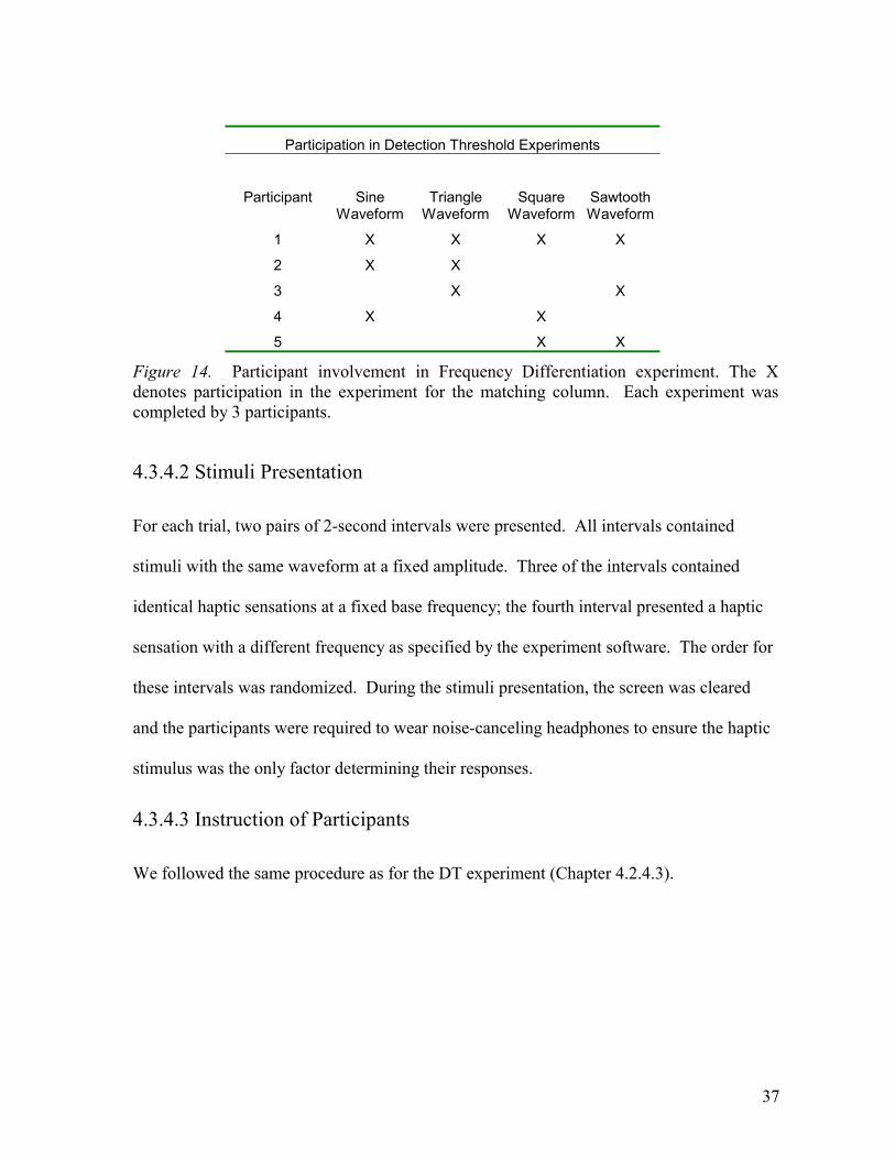
For this experiment, five participants were recruited through a posting in a bulletin board in
the computer science building. The participants included 2 females and 3 males, all right-
handed and between 20 and 29 years old. None of the participants had any disabilities or
limitations in the sight or touch senses. All participants were recruited from the Computer
Science Building and were paid cash for their involvement. Figure 14 shows details of the
participants’ involvement in the experiments. Each waveform was completed by 3
participants; some participants completed more than one session.
37
Participation in Detection Threshold Experiments
Participant Sine Waveform
Triangle Waveform
Square Waveform
Sawtooth Waveform
1 X X X X
2 X X
3 X X
4 X X
5 X X
Figure 14. Participant involvement in Frequency Differentiation experiment. The X denotes participation in the experiment for the matching column. Each experiment was completed by 3 participants.
4.3.4.2 Stimuli Presentation
For each trial, two pairs of 2-second intervals were presented. All intervals contained
stimuli with the same waveform at a fixed amplitude. Three of the intervals contained
identical haptic sensations at a fixed base frequency; the fourth interval presented a haptic
sensation with a different frequency as specified by the experiment software. The order for
these intervals was randomized. During the stimuli presentation, the screen was cleared
and the participants were required to wear noise-canceling headphones to ensure the haptic
stimulus was the only factor determining their responses.
4.3.4.3 Instruction of Participants
We followed the same procedure as for the DT experiment (Chapter 4.2.4.3).
38
4.3.4.4 Experiment Session
We used the same procedure and methodology followed for the DT experiment (Chapter
4.2.4.4); however, the participants were asked to determine the location of one different
stimulus amongst two interval pairs for this experiment.
4.3.5 Data Collection and Experiment Output
We used the same procedure and methodology followed for the DT experiment (Chapter
4.2.5); however, the results were stored as 6 values that represent the Just Noticeable
Difference (JND) in frequency for each base frequency with the waveform being tested.
4.3.6 Results for the Frequency Differentiation Experiment
The results for the Frequency Differentiation experiment are displayed in Figures 15 to 19.
Each waveform tested (sine, square, triangle and sawtooth) is shown in a separate graph; a
fifth graph presents a comparative of the results.
The plots for these results present the Just Noticeable Difference in frequency in a log10
scale.
39
Frequency Differentiation Results for Sine Waveform
0.1
1.0
10.0
100.0
0.5 1 5 10 50 100
Base Frequency (log10 Hz)
Fre
qu
ency
Ch
ang
e fo
r d
etec
tio
n
(lo
g10
Hz)
Figure 15. Frequency Differentiation experiment results for the sine waveform. The graph represents sensitivity to changes in frequency of the haptic sensations. The horizontal axis is the base frequency being tested and the vertical axis is the frequency change required for detection. The error bars are the standard deviation of the 3 samples taken. Both the axes in this graph are in log10 scale.
Frequency Differentiation Results for Square Waveform
0.0
0.1
1.0
10.0
100.0
0.5 1 5 10 50 100
Base Frequency (log10 Hz)
Fre
qu
ency
Ch
ang
e fo
r d
etec
tio
n
(lo
g10
Hz)
Figure 16. Frequency Differentiation experiment results for the square waveform. The graph represents the average sensitivity to changes in frequency of the haptic sensations. The horizontal axis is the base frequency being tested and the vertical axis is the frequency change required for detection. The error bars are the standard deviation of the 3 samples taken. Both the axes in this graph are in log10 scale.
40
Frequency Differentiation Results for Triangle Waveform
0.01
0.10
1.00
10.00
100.00
0.5 1 5 10 50 100
Base Frequency (log10 Hz)
Fre
qu
ency
Ch
ang
e fo
r d
etec
tio
n
(lo
g10
Hz)
Figure 17. Frequency Differentiation experiment results for the triangle waveform. The graph represents the average sensitivity to changes in frequency of the haptic sensations. The horizontal axis is the base frequency being tested and the vertical axis is the frequency change required for detection. The error bars are the standard deviation of the 3 samples taken. Both the axes in this graph are in log10 scale.
Frequency Differentiation Results for Sawtooth waveform
0.1
1.0
10.0
100.0
0.5 1 5 10 50 100
Base Frequency (log10 Hz)
Fre
qu
ency
Ch
ang
e fo
r d
etec
tio
n
(lo
g10
Hz)
Figure 18. Frequency Differentiation experiment results for the sawtooth waveform. The graph represents the average sensitivity to changes in frequency of the haptic sensations. The horizontal axis is the base frequency being tested and the vertical axis is the frequency change required for detection. The error bars are the standard deviation of the 3 samples taken. Both the axes in this graph are in log10 scale.
41
Figure 19 presents the Frequency Differentiation experiment results for all four waveforms
in a graph. Both axes on the graph are in log10 scale. The graph shows the average results
for the participants tested.
Frequency Differentiation Results
0.0
0.1
1.0
10.0
100.0
0.5 1 5 10 50 100
Base Frequency (log Hz)
Fre
qu
ency
Ch
ang
e fo
r d
etec
tio
n
(lo
g H
z) Sine
Square
Triangle
Sawtooth
Figure 19. Frequency Differentiation experiment result summary. The horizontal axis in this graph represents the base frequency being tested. The vertical axis represents the frequency change required for detection. Both axes in this graph are in log10 scale.
4.3.7 Conclusions for FD Experiment
From the graph in Figure 19, it becomes apparent that the JND for frequency is
approximately 1/5 of the base frequency for those frequencies 1 Hz and above. These
results seem to follow Weber’s law quite well. Weber’s law [19] states that the size of the
just noticeable difference (JND) of a stimulus is a constant proportion of the original
stimulus value.
kf
f =∆
42
For our case, the minimum detectable frequency change f∆ is a fixed proportion k of the
base frequency being tested f . All waveforms tested exhibit this phenomenon clearly at
frequencies beyond 1Hz (Figure 19).
4.4 Conclusions
The results obtained for the Detection Threshold and Frequency Differentiation
experiments were used to select appropriate amplitudes and frequencies to be used as
stimuli for our formal MDS analysis.
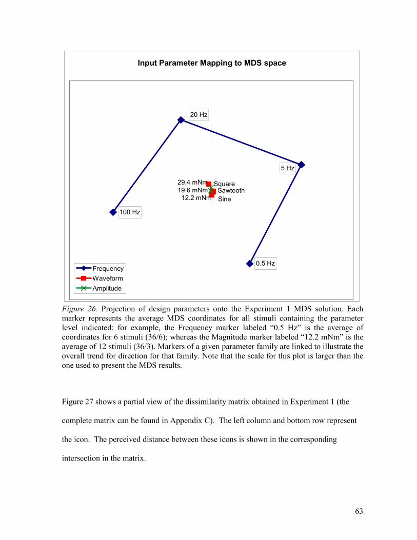
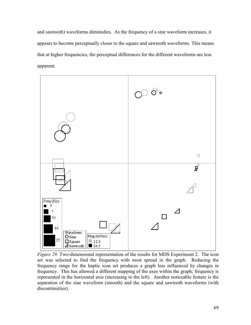
The stimuli selected for MDS Experiment 1 consists of 36 different haptic sensations.
These were created from the combination of 3 waveforms (sine, square and sawtooth), 4
frequencies (0.5, 5, 20 and 100 Hz) and 3 amplitudes (12.3, 19.6 and 29.4 mNm).
The minimum amplitude (12.3 mNm) is twice the value of the detection threshold level for
the waveform-frequency combination for which participants were the least sensitive in the
DT experiment (sine waveform at 0.1 Hz). The frequencies were chosen to be easily
differentiable from one another. The triangle waveform was not used due to its perceptual
similarity to the sine waveform.
43
Chapter 5
Mapping the Perceptual Space
In this chapter we present a novel approach to studying the perception of haptic icons using
an exploratory statistical method called Multidimensional Scaling (MDS) [20,21]. We
begin by presenting some of the methods and tools utilized in our work (Chapter 5.1)
followed by a description of the experiments carried out and the results obtained. The
study is divided in 2 experiments:
• Experiment 1 (Chapter 5.3)
We use MDS to analyze a set of haptic sensations created based on the results for the
Detection Threshold (Chapter 4.2) and Frequency Differentiation (Chapter 4.3)
experiments.
• Experiment 2 (Chapter 5.4)
The results obtained in Experiment 1 (Chapter 5.3) prompted the design of a second
haptic icon set to do further testing in order to determine a specific frequency which
might posses the most information carrying capabilities. Chapters 5.4 and 5.6 present
Experiment 2 and the results obtained from testing this second icon set.
Chapter 5.5 presents individual results for both experiments.
Chapter 5.7 presents a discussion of the results obtained for both experiments.
44
5.1 Multidimensional Scaling Analysis Techniques
5.1.1 Introduction to Multidimensional Scaling Analysis (MDS)
Before a researcher can understand why an organism reacts to a stimulus in a specific
manner, the researcher must first understand what aspects of the stimulus are attended by
such organism. Identifying such aspects directly for complex stimuli can be hard to do. In
order to simplify this identification, we use an exploratory statistical method known as
Multidimensional Scaling (MDS).
MDS is a set of mathematical techniques that enable a researcher to uncover the “hidden
structure” behind data. MDS is similar to principal component analysis (PCA), a
mathematical procedure that transforms a number of (possibly) correlated variables into a
(smaller) number of uncorrelated variables called principal components. However, PCA
cannot take into account nonlinear structures, structures consisting of arbitrarily shaped
clusters or curved manifolds, since it describes the data in terms of a linear subspace. PCA
is a linear projection data reduction method while MDS is a non-linear projection method.
An example illustrating a Multidimensional Scaling application can be seen in a 1968
election study conducted by the Survey Research Center of the University of Michigan
[22]. For this experiment, the participants were asked to evaluate 12 actual or possible
candidates for President of the United States. The idea was to determine how similarly the
candidates were viewed by the public and what identifiable features the public discerned in
the candidates that could help us understand what led individual citizens to their decisions.
MDS is useful in answering such questions by locating the political candidates in a spatial
configuration or “map”. Once we have located the candidates (or points) on a
45
multidimensional space, we seek to determine the hidden structure, or meaningful
representation of this map of candidates.
Applying an MDS procedure to this data set provided a way to reduce the information from
a collection of perceived distances between the 12 candidates to a two-dimensional map
representing the hidden structure of the data (in this case, partisanship and ideology). By
finding key differences between political candidates at opposite ends of each dimension, we
can attempt to develop indicators of variables that can be measured in future elections.
MDS allows you to analyze N objects (in our case, haptic icons) according to their
measured dissimilarity. A dissimilarity matrix is a set of values representing the perceived
distances between each object in a set. MDS takes as input a dissimilarity matrix and
generates a multidimensional configuration of the objects in an N dimensional space such
that the distances in the Euclidean space approximate the dissimilarities specified by the
matrix. MDS produces results in several representations ranging from one to N
dimensions. According to the literature reviewed [22,23] most object sets can be
satisfactorily represented with 2 to 3 dimensions.
Each dimensional representation obtained from an MDS experiment has a “fit to data”
measure. There are several different methods for measuring this fitness value: Stress, S-
Stress, F-stress and 1-R2. All these methods obtain a measure for goodness of fit to the data
tested. For our tests we chose to use Stress as a fit to data measure.
46
The formula for stress is:
( )( )scale
dxf ijij∑∑ − 2
In the equation, ijd refers to the Euclidean distance, across all dimensions, between points i
and j on the map, ( )ijxf is some function of the input data, and scale refers to a constant
scaling factor, used to keep stress values between 0 and 1. When the MDS map perfectly
reproduces the input data, ( )( )ijij dxf − is zero for all i and j, so stress is zero. Thus, the
smaller the stress, the better the representation.
This measure of fitness can be used as a rough guideline to determine the number of
dimensions appropriate for representing the data. A greater number of dimensions in the
representation generally produce a lower stress value. In order to determine how many
dimensions are appropriate for representing the dissimilarities/configuration, we must look
at a plot of the stress values for the different representations (dimensionalities); this is
called a Scree Plot [24]. According to the Scree criteria, the particular dimensionality at
which a sharp “elbow” is seen in the stress curve indicates an appropriate choice of solution
dimensionality. For the sample graph shown in Figure 20, the correct number of
dimensions to use for the configuration is 2.
In our experiments, we used this measure as a preliminary indication of the algorithm’s
performance; we followed it by visually inspecting the MDS solutions for neighboring
dimensions and confirming that the variability was being absorbed in meaningful way.
47
Figure 20. Scree plot of stress values for MDS solutions in several dimensions. The horizontal axis represents the number of dimensions for the MDS representation. The vertical axis is the stress (fit to data) measure. We can observe a sharp “bend” in the graph at 2 dimensions; this suggests that a two-dimensional representation of the solution for this particular example is appropriate.
The dissimilarity (distance) of the object pairs is estimated by averaging the judgments of
several participants. The number of participants needed is dependent on the estimated
number of dimensions for the representation and the number of stimuli to be used in the
experiment. [25,26]
The higher dimensionality expected, the greater the number of stimuli needed – usually the
number of stimuli should be at least 4 to 5 times the expected number of dimensions,
preferably more. Also, the dissimilarity data should be as stable as possible – the more
observations per stimulus pair, the more stable, but usually 5-10 observations per pair is
enough to get reasonable stability. This means that 5-10 participants are required to
complete the experiment.
48
For most MDS tests, the number of dimensions is not known a priori. The researcher must
choose the dimensionality based on the interpretability of the results and the fit to the data
values. The interpretation of the solutions must rely on meaningful stimulus features,
orderings or groupings of stimuli that correspond to meaningful stimulus attributes. A pilot
study can be carried out to get a better idea of the representation dimensionality to be used
for an experiment.
Like most user studies, MDS requires that a standard set of instructions be given to the
participants prior to participating in the experiment. The directions should standardize the
participants’ expectations about the stimuli to be judged. For example, these instructions
can be used to inform the participants if they are expected to differentiate frequency,
amplitude or any other specific characteristic of the stimulus; or conversely, they might
(consistently) give the participant no such guidance and leave the criteria for discrimination
up to the participant. As part of the pre-test preparations, the participants typically are
required to review all of the stimuli to be judged after getting the directions but before
making any judgments to allow them to calibrate their judgments.
5.1.2 Types of MDS
There are three types of MDS analyses; each addresses a specific type of problem to be
solved.
• Dimensional MDS.
The dimensions recovered by MDS are taken to be the salient aspects for the organism
and the stimulus coordinates recovered in the scaling are interpreted as the location of
the objects along these salient aspects.
49
• Data Reduction Applications [27,28]
No interpretation is given to the dimensions recovered in MDS; the analysis focuses on
clusters of stimuli found within the plot of the MDS dimensions. The scaling only
serves as a device for reducing the data to a form in which the stimulus clusters can be
readily displayed graphically.
• Configural Verification Type
This method is used to confirm a theory. The experimenter begins from a hypothesis
that specifies the number of dimensions that should be obtained if the proximity
measure is submitted to a non-metric MDS. The results are used to confirm or reject an
existing theory of behavior.
The final goal for this study is the discovery of the underlying psychophysics for the
perception of haptic icons. We decided to use Dimensional MDS because it allows the
extraction of the perceptual axes we are trying to discover. For these experiments, the pre-
test instructions will not advise the participants what aspects of the stimuli to differentiate.
This gives them creative freedom when rating the stimuli, however, it could allow for more
strategic influences on the results. Different participants might use different strategies in
their analysis of the haptic sensations.
5.1.3 Data Gathering Techniques for MDS Tests
5.1.3.1 Traditional Direct Comparison Method
In the Direct Comparison method, the participant is presented with a pair of stimuli and
asked to give a measure of similarity for it. All possible pair combinations have to be
50
presented at least one time. For our scenario, this means presenting a pair of haptic icons
and asking the participant to rate them on a scale from Same to Different.
This method presents all possible combinations of icon pairs in random order and asks the
participant to give a measure of similarity between them. A screenshot of the interface
used to perform this test is shown in Figure 21. This method is straightforward and simple
to implement, however, the tests are long and their duration increases geometrically with an
increase in the number of icons to be tested.
Figure 21. Interface used to gather similarity data for a test set using direct comparison.
51
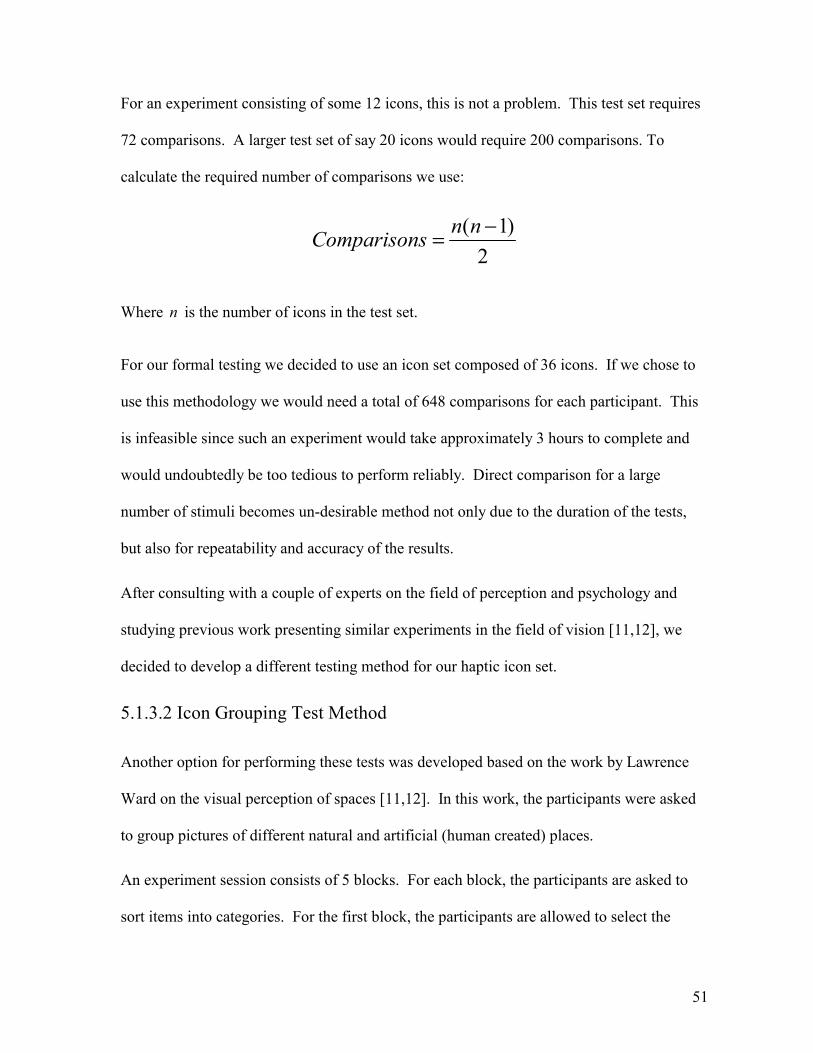
For an experiment consisting of some 12 icons, this is not a problem. This test set requires
72 comparisons. A larger test set of say 20 icons would require 200 comparisons. To
calculate the required number of comparisons we use:
2
)1( −= nnsComparison
Where n is the number of icons in the test set.
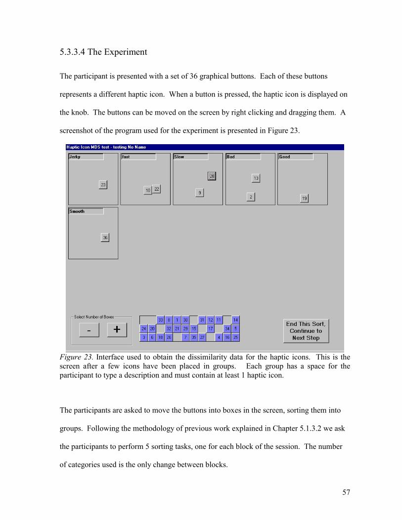
For our formal testing we decided to use an icon set composed of 36 icons. If we chose to
use this methodology we would need a total of 648 comparisons for each participant. This
is infeasible since such an experiment would take approximately 3 hours to complete and
would undoubtedly be too tedious to perform reliably. Direct comparison for a large
number of stimuli becomes un-desirable method not only due to the duration of the tests,
but also for repeatability and accuracy of the results.
After consulting with a couple of experts on the field of perception and psychology and
studying previous work presenting similar experiments in the field of vision [11,12], we
decided to develop a different testing method for our haptic icon set.
5.1.3.2 Icon Grouping Test Method
Another option for performing these tests was developed based on the work by Lawrence
Ward on the visual perception of spaces [11,12]. In this work, the participants were asked
to group pictures of different natural and artificial (human created) places.
An experiment session consists of 5 blocks. For each block, the participants are asked to
sort items into categories. For the first block, the participants are allowed to select the
52
number of categories that they wish to use. For the remaining blocks in the experiment, the
participants place the items into a predetermined number-of-categories as to obtain a
complete categorization into 3, 6, 9, 12, and 15 groups. From this set of number-of-
categories (3, 6, 9, 12 and 15), the one closest to that selected freely by the participant in
the first block is eliminated. Thus, if a participant selects 5 categories for the first block,
the following blocks ask the participant to sort the items into 3, 9, 12 and 15 categories,
substituting the sorting into 6 categories with the participant’s chosen 5. The order of
number-of-categories was randomized among the last 4 blocks. The similarity data for the
set of items is calculated as follows:
For each block in an experiment session, if two particular items coincide in the same
category, a similarity value equal to the number of categories for that block is given to the
particular item pair. These values are added for all blocks in the session.
For example, if items 1 and 3 are grouped together for the blocks with 3, 9 and 15
categories but not for the blocks with 6 and 12 categories, the similarity measure for this
pair is calculated as 3 + 9 + 15 = 27. The maximum similarity value obtainable with this
methodology is 45, when a pair of items is grouped together for all blocks in a session (3 +
6 + 9 + 12 + 15 = 45).
This grouping methodology was adopted for all our MDS experiments (Chapters 5.3 and
5.4).
5.2 MDS Pilot Test
Before appropriately defining the haptic icons to use for our formal MDS analysis, we
performed a pilot study using a set of 9 different very crudely prepared haptic icons. The
53
pilot was completed by 10 participants recruited informally in the lab. The icons for the
test were formed by combining 3 frequencies (100, 300 and 500 Hz) and 3 amplitudes (6.1,
18.3 and 30.5 mNm) of a sine waveform. Figure 22 shows the output obtained for this pilot
test. In this case, a two-dimensional representation was chosen based on the scree criteria.
The plot for the results shows a strong grouping for the smallest magnitude. The
participants seem able to differentiate icon amplitude easily but do not differentiate
frequency. We can see that for the specific frequencies and amplitudes selected, there is no
orientation for the graph that can be mapped directly to scales of frequency and amplitude.
The 3 haptic icons on the upper right corner of the graph represent the 3 frequencies at the
lowest amplitude. The fact that they are placed so close together in the graph indicates that
they are perceptually similar.
Figure 22. Two-dimensional MDS representation for the simple haptic icons used in the pilot study. A small graphical icon identifies the locations of the test stimuli in the MDS solution space. This icon’s size represents stimulus amplitude and its period, the frequency used.
54
Although this was designed to be a simple pilot test, we obtained useful information for our
later experiments. As we later discovered in the Detection Threshold experiment, our
selection for the lowest amplitude to use in the pilot test was too low (6.1 mNm). Another
problem with the selected test set were the frequencies used; the frequencies selected for
this test (100, 300 and 500 Hz) were above what the display could accurately reproduce
(200Hz). We also learned that the use of the direct comparison data gathering method
(Chapter 5.1.3.1), proved to be too tedious to perform accurately. For this reason, we
selected to use the icon grouping methodology (Chapter 5.1.3.2) for our formal MDS
analyses.
5.3 Multidimensional Scaling Experiment 1
Having performed the Detection Threshold and Frequency Differentiation tests, we
designed a haptic icon set to be tested using MDS techniques.
5.3.1 Methodology
Participants are presented with the haptic stimuli using the icon grouping MDS test method.
A complete session with the test set consisting of 36 haptic icons required between 45
minutes and 1 hour to complete.
5.3.2 Stimuli Selection
The stimuli selected for this experiment consists of 36 different haptic sensations. These
are created from the combination of 3 waveforms (sine, square and sawtooth), 4
frequencies (0.5, 5, 20 and 100 Hz) and 3 amplitudes (12.3, 19.6 and 29.4 mNm).
We selected the amplitudes and frequencies based on the results for the Detection
Threshold and Frequency Differentiation tests. The minimum amplitude (12.3 mNm) is
55
twice the value of the detection threshold level for the waveform-frequency combination
for which participants were the least sensitive in the DT experiment (sine waveform at 0.1
Hz). The frequencies were chosen to be easily differentiable from one another.
Every stimulus used in this experiment has 2-second duration. All force magnitudes
presented through our haptic knob are scaled as peak-to-peak torque values in mNm
(Newton/millimeters).
5.3.3 Experimental Procedure
Participants are presented with the haptic stimuli using the icon grouping MDS test method
(Chapter 5.1.3.2). This method is interactive and self paced. A complete session yields a
dissimilarity matrix containing the calculated perceived distances between the icons in the
set. Each session is divided into 5 blocks of stimuli sorting.
5.3.3.1 Participants
Due to the nature of this experiment, which focuses on determining basic parameters for
perception of haptic icons, we recruited participants without regard to background or
abilities on the assumption that basic tactile perceptual abilities would be consistent across
the general population.
For this experiment, eight participants were recruited through a posting in a bulletin board
in the computer science building. The participants included 4 females and 4 males, all
right-handed and between 20 and 29 years old. None of the participants had any disabilities
or limitations in the sight or touch senses. All participants were recruited from the
Computer Science Building and were paid cash for their involvement.
56
5.3.3.2 Stimuli Presentation
The graphic icon sorting method is thoroughly interactive. The participants decide which
haptic icons are to be displayed by clicking on a graphic representation of the haptic icons
presented on the screen. Each icon can be displayed as many times as the participant
requires.
5.3.3.3 Instruction of Participants
The session began by presenting a set of simple instructions on the screen. The instructions
were then read to the participant by the experimenter. These instructions informed the
participant of the tasks to be completed. The participants were told to sort the sensations
based on perceived similarity using whatever criteria they choose. Copies of these
instructions are included in Appendix D.
After making sure that the participant was seated comfortably and the haptic display was
adjusted to be within easy reach, we observed the participant interact with the system and
answered any questions. Since the icon sorting method is an interactive procedure, the
participants can learn the basics of operation by exploring the interface without affecting
the end results of the experiment.
Participants were instructed to perform the first block under our supervision. After this, the
participants were again asked if they had any questions. Having answered any further
questions the participants were required to wear the noise canceling headphones and
continue with the experiment. After each block the participants were reminded by the
experiment software to take a break.
57
5.3.3.4 The Experiment
The participant is presented with a set of 36 graphical buttons. Each of these buttons
represents a different haptic icon. When a button is pressed, the haptic icon is displayed on
the knob. The buttons can be moved on the screen by right clicking and dragging them. A
screenshot of the program used for the experiment is presented in Figure 23.
Figure 23. Interface used to obtain the dissimilarity data for the haptic icons. This is the screen after a few icons have been placed in groups. Each group has a space for the participant to type a description and must contain at least 1 haptic icon.
The participants are asked to move the buttons into boxes in the screen, sorting them into
groups. Following the methodology of previous work explained in Chapter 5.1.3.2 we ask
the participants to perform 5 sorting tasks, one for each block of the session. The number
of categories used is the only change between blocks.
58
For each block in the session, the participants can feel the haptic icons as many times as
they require. They can also move the icons between the groups as they see fit. When the
participants are comfortable with the sorting, they can proceed to the next block by clicking
on the appropriate button on the screen. At this time, the experiment software reminds the
participants to take a break.
Figure 23 shows a screenshot of a typical session in progress. Some of the haptic icons
have been put into groups (the blue buttons have been placed in the boxes on the top of the
screen). The groups (represented by boxes on the screen) have a space provided for the
participant to type a description. This description not only allows the participant to identify
the group, but also provides us with additional information as to what characteristics were
considered when sorting the haptic icons. For this example, the participant chose 6
categories for the first block in the session.
5.3.4 Data Collection and Experiment Output
After a participant completes the 5 blocks in a session, having sorted the haptic icons into 3,
6, 9, 12 and 15 categories, the program calculates the similarity between the haptic icons
based on the groupings as explained in Chapter 5.1.3.2.
The data gathered from each session was stored into individual files. The name of these
files was formed by combining the date and time of the session with the participant’s name.
The file contained the participant’s name, age and gender and the dissimilarity matrix
obtained. The dissimilarity matrix was processed using ALSCAL PC [29,30] to obtain the
MDS results. The results are presented using graphing software developed by the author.
59
5.3.5 Results for MDS Experiment 1
The stress measure (fit to data) we obtained for the average results for MDS Experiment 1
(Figure 24), suggests that a two-dimensional representation of the output data is
appropriate. Some individuals make more complex distinctions than others, but on
average, 2 dimensions seem to produce a good overall representation.
Stress (Fit to Data) Measure
0
0.1
0.2
0.3
0.4
0.5
0.6
1 2 3 4 5Dimensions
Str
ess
Figure 24. Stress values for the average results of MDS Experiment 1. The marked “elbow” at 2 dimensions suggests that a two-dimensional representation of the results is appropriate for analysis of the data.
Figure 25 presents the two-dimensional representation for the average results of MDS
Experiment 1. We observed higher dimensional representations for these results, but they
provided no additional information. Graphs of the individual results for this experiment
can be found in appendix A. In addition to this graph, we present a partial view of the
dissimilarity matrix obtained for this experiment (Figure 27) and a graph showing the
mapping of the haptic icon input parameters onto the MDS solution space (Figure 26), to
aid in the interpretation of the results.
In order to aid in the interpretation of the MDS solutions presented beforehand, we devised
a procedure to visualize the relation of the stimulus input parameters to the MDS
60
representation. Figure 26 shows essentially a projection of the original input parameter
space (i.e., frequency, amplitude and waveform) onto the Experiment 1 MDS solution. For
example, each point in the set of points corresponding to frequency is the average of all
MDS solution coordinates for a single frequency (including every shape, magnitude and
participant); and likewise for the shape and magnitude sets. This view suggests a possible
interpretation of the accommodation of stimulus variability among the two solution axes,
wherein it can be seen that frequency dominates both dimensions. Note that the plot is
presented at a larger scale than the MDS solution to aid in interpretability.
From Figure 25, we can observe that frequency differences dominate both axes in the plot.
The tight frequency grouping indicates a strong tendency to discriminate haptic icons based
on frequency. Changes in frequency amongst the haptic icons overwhelm the other
changes in the parameters that make the icons feel different.
A closer look at the graph reveals that waveform shape is of secondary importance
followed by amplitude. When looking only at a specific frequency, we can still see a clear
grouping based on waveform and also some discrimination for amplitude changes. This
means that the participants are still able to differentiate changes in waveform and
amplitudes, but these differences are not as perceptually salient as are the changes in
frequency.
Another interesting feature illustrated in the plot is the tight grouping for the lowest (0.5
Hz) and highest (100 Hz) frequencies. The groupings for 5 Hz and 20Hz are not as tight as
the 0.5 and 100 Hz frequency groups. Within a single frequency, the most spread in the
plot is noticeable at 20 Hz. This leads us to believe that there could be a specific frequency
61
at which the other characteristics for the haptic icons are most noticeable, making this
frequency the one with the most information carrying capability.
This phenomenon prompted a new set of experiments. These experiments, designed to find
that specific frequency with the highest expressive capability (the most spread in the
graph), are presented in Chapter 5.4 and 5.6.
62
Figure 25. MDS Experiment 1 results. The haptic icons are represented by figures in the plot with sizes representing frequencies, tones representing magnitudes and shapes representing the different waveforms used to create the haptic icons. The smallest black circle represents the haptic icon with a sine waveform, a magnitude of 29.4 mNm and a frequency of 0.5 Hz. Conversely, the largest light gray triangle represents a haptic icon generated with a sawtooth waveform with magnitude of 12.3 mNm and a frequency of 100 Hz. This Graph shows a tight grouping based on frequency. The tightest groupings are for the 0.5 and 100 Hz frequencies. Waveform is of second importance in the grouping, followed by amplitude. The frequency with the most spread in the graph is 20 Hz.
63
Input Parameter Mapping to MDS space
0.5 Hz
5 Hz
20 Hz
100 Hz
Square
SineSawtooth19.6 mNm
12.2 mNm
29.4 mNm
Frequency
Waveform
Amplitude
Figure 26. Projection of design parameters onto the Experiment 1 MDS solution. Each marker represents the average MDS coordinates for all stimuli containing the parameter level indicated: for example, the Frequency marker labeled “0.5 Hz” is the average of coordinates for 6 stimuli (36/6); whereas the Magnitude marker labeled “12.2 mNm” is the average of 12 stimuli (36/3). Markers of a given parameter family are linked to illustrate the overall trend for direction for that family. Note that the scale for this plot is larger than the one used to present the MDS results.
Figure 27 shows a partial view of the dissimilarity matrix obtained in Experiment 1 (the
complete matrix can be found in Appendix C). The left column and bottom row represent
the icon. The perceived distance between these icons is shown in the corresponding
Figure 27. Portion of Dissimilarity Matrix for sine waveform obtained in MDS Experiment 1. Shown here is part of the dissimilarity matrix obtained for Experiment 1. This section of the dissimilarity matrix represents the distances between the icons within the sine waveform. The complete matrix is shown in Appendix C.
65
5.4 Multidimensional Scaling Experiment 2
The results obtained in MDS Experiment 1 (Chapter 5.2) suggested the existence of a
specific frequency that would allow the maximum spread in the MDS graph.
For the results presented in Figure 25, we can observe that within a specific frequency, 20
Hz has the most spread in the graph. We speculate that there is a specific frequency that
allows the most spread in the MDS graph and that it should lie somewhere between 5 and
20 Hz. This frequency would have the largest bandwidth and thus the greatest Expressive
Capability (EC). We designed a second haptic icon set with a smaller frequency spread to
test our theory and performed an MDS analysis on the data obtained for it.
5.4.1 Methodology
The same procedures were used as in Experiment 1 (Chapter 5.2.1).
5.4.2 Stimuli Selection
In order to better determine the frequency with the greatest Expressive Capability, we
devised a new haptic icon set consisting of 30 icons created from the combination of 2
amplitudes, 5 frequencies and 3 waveforms. We selected to use 2 amplitudes (unlike the
icon set for Experiment 1 which uses 3) based on the results obtained for MDS Experiment
1 that suggest that differences in amplitude of the haptic icons are not as perceptually
salient as are the differences in frequency or waveform. We speculate that by using only
two amplitudes for the second icon set we can make the now more obvious differences in
amplitude become more perceptually salient. The new torque amplitudes chosen for this set
were 12.265 and 24.53 mNm. The largest amplitude is smaller in magnitude than the
66
largest amplitude for Experiment 1 (29.4 mNm). We chose these values based on the
words used by the participants to describe the categories for MDS Experiment 1. Amongst
these comments were: “bad”, “violent-unpleasant”, “big vibration” and “forceful”. It’s a
possible issue that the stimuli selected for MDS Experiment 1 were subjectively unpleasant
at the larger amplitudes.
Our objective is to determine the frequency with the most Expressive Capabilities so we
decided to try 5 different frequencies for this second haptic icon set. We use the same 3
waveforms as with Experiment 1: sine, square and sawtooth. Having 2 amplitudes (12.265
and 24.53 mNm), 3 waveforms (sine, square and sawtooth) and 5 frequencies (3, 7, 10, 16
and 25 Hz), our new test set consists of 30 different icons (2 x 3 x 5 = 30). Every stimulus
used in this experiment has a 2-second duration. All force magnitudes presented through
our haptic knob are scaled as peak-to-peak torque values in mNm (Newton/millimeters).
5.4.3 Experimental Procedure
The same procedures were used as in MDS Experiment 1 (Chapter 5.2.3).
5.4.3.1 Participants
For this experiment, nine participants were recruited through a posting in a bulletin board in
the computer science building. The participants included 5 females and 4 males, all right-
handed and between 20 and 29 years old. None of the participants had any disabilities or
limitations in the sight or touch senses. Three of the participants had completed
Experiment 1. All participants were recruited from the Computer Science Building and
were paid cash for their involvement.
67
5.4.3.2 Stimuli Presentation
The same procedures were used as for MDS Experiment 1 (Chapter 5.2.3.2).
5.4.3.3 Instruction of Participants
The same procedures were used as in MDS Experiment 1 (Chapter 5.2.3.3).
5.4.3.4 The Experiment
The same procedures were used as in MDS Experiment 1 (Chapter 5.2.3.4); however, the
participant is presented with a set of 30 graphical buttons representing each different haptic
icon in Experiment 2.
5.4.4 Data Collection and Experiment Output
The same procedures were used as in MDS Experiment 1 (Chapter 5.2.4).
5.4.5 MDS Results for Experiment 2
The stress measure (fit to data) we obtained for MDS Experiment 2 (Figure 28), suggests
that a two-dimensional representation of the output data is appropriate. However, the bend
in the graph at 2 dimensions is not as clear as for Experiment 1 so we present the results for
a three-dimensional representation as well. The two-dimensional representation for the
solution is shown in Figure 29. The three-dimensional representation is presented in 3
graphs showing the different views of the solution (Figures 31, 33 and 35). Figures 30, 32,
34 and 36 present a projection of the stimulus input parameters to the MDS representation
plots.
In addition to these graphs, we present a partial view of the dissimilarity matrix (Figure 37)
obtained for this experiment to aid in the interpretation of the results.
68
Stress (Fit to Data) Measure
0
0.1
0.2
0.3
0.4
0.5
0.6
1 2 3 4 5Dimensions
Str
ess
Figure 28. Stress values for the average results for MDS Experiment 2. The “elbow” at 2 dimensions suggests that a two-dimensional representation of the results is appropriate for analysis of the data.
Figure 29 shows the two-dimensional average results for MDS Experiment 2. Individual
results for this experiment are included in Appendix B. The experiment was designed to
find the frequency with the most discriminability (spread in the graph). Having a reduced
frequency range for the second icon set produced a graph where the influence of frequency
is not as overwhelming as with the icon set used in Experiment 1. Several interesting
features can be distinguished in this graph.
Frequency is mapped on the horizontal axis, increasing from right to left (Figure 29).
Frequency increases from right to left for all waveforms, however specific frequencies for
the different waveforms do not align.
Another noticeable aspect of this graph is the clear separation between the sine waveform
and the square and sawtooth waveforms. Both the square and sawtooth waveforms contain
sharp changes in force (jerk), while the sine waveform is smooth. We can also notice that,
as frequencies increase, the separation between smooth (sine) and sharp changing (square
69
and sawtooth) waveforms diminishes. As the frequency of a sine waveform increases, it
appears to become perceptually closer to the square and sawtooth waveforms. This means
that at higher frequencies, the perceptual differences for the different waveforms are less
apparent.
Figure 29. Two-dimensional representation of the results for MDS Experiment 2. The icon set was selected to find the frequency with most spread in the graph. Reducing the frequency range for the haptic icon set produces a graph less influenced by changes in frequency. This has allowed a different mapping of the axes within the graph; frequency is represented in the horizontal axis (increasing to the left). Another noticeable feature is the separation of the sine waveform (smooth) and the square and sawtooth waveforms (with discontinuities).
70
Figure 30 illustrates the mapping of the input parameters to the MDS space. Frequency
maps closely to the horizontal axis while waveform dominates the vertical axis. Amplitude
shares both axes and is not as perceptually salient as the other factors, but is more salient
relative to other factors than it was for Experiment 1.
Input Parameter Mapping to MDS Space
25 Hz
16 Hz 10 Hz
7 Hz
3 Hz
SawtoothSquare
Sine
24.5 mNm
12.2 mNm
Frequency
Waveform
amplitude
Figure 30. Projection of design parameters onto the two-dimensional Experiment 2 MDS solution. Each marker represents the average MDS coordinates for all stimuli containing the parameter level indicated: for example, the Frequency marker labeled “3 Hz” is the average of coordinates for 6 stimuli (30/5); whereas the Magnitude marker labeled “12.2 mNm” is the average of 15 stimuli (30/2). Markers of a given parameter family are linked to illustrate the overall trend for direction for that family. Note that the scale for this plot is larger than the one used to present the MDS results.
71
Figure 31 shows the first of 3 views of the three-dimensional interpretation of the MDS
solution for Experiment 2. Dimensions 1 and 2 from the solution map to the horizontal and
vertical axes respectively. In this graph, we can see a mapping of the frequency to the
horizontal axis (Dimension 1), increasing from right to left. The vertical axis represents the
different waveforms (Dimension 2). This is presented more clearly in Figure 32.
Figure 31. View 1 of the three-dimensional representation of the results for MDS Experiment 2. Dimensions 1 and 2 from the solution map to the horizontal and vertical axes respectively. Frequency is represented in the horizontal axis (increasing to the left). The vertical axis represents the different waveforms (Dimension 2).
72
In Figure 32, dimensions 1 and 2 from the solution map to the horizontal and vertical axes
respectively. A mapping of the frequency to the horizontal axis (Dimension 1), increasing
from right to left is clear. The vertical axis represents the different waveforms (Dimension
2).
Input Parameter Mapping to MDS Space
3 Hz7 Hz
10 Hz
16 Hz
25 Hz
Sine
Square
Sawtooth
24.5 mNm
12.2 mNm
Frequency
Waveform
Amplitude
Figure 32. Projection of design parameters for view 1 of the three-dimensional representation of Experiment 2 MDS solution. Each marker represents the average MDS coordinates for all stimuli containing the parameter level indicated: for example, the Frequency marker labeled “3 Hz” is the average of coordinates for 6 stimuli (30/5); whereas the Magnitude marker labeled “12.2 mNm” is the average of 15 stimuli (30/2). Markers of a given parameter family are linked to illustrate the overall trend for direction for that family. Note that the scale for this plot is larger than the one used to present the MDS results.
73
For Figure 33, dimensions 1 and 3 from the three-dimensional representation of the MDS
Experiment 2 solution map to the horizontal and vertical axes respectively. The horizontal
axis (Dimension 1) maps loosely to frequency, increasing from right to left. The vertical
axis (Dimension 3) maps loosely to amplitude, from small (at the top) to large (at the
bottom).
Figure 33. View 2 of the three-dimensional representation of the results for MDS Experiment 2. Dimensions 1 and 3 from the solution map to the horizontal and vertical axes respectively. Frequency is represented in the horizontal axis (increasing to the left). The vertical axis maps to differences in amplitude, from small to large (top to bottom).
74
Figure 34 shows dimensions 1 and 3 from the three-dimensional representation of the MDS
Experiment 2 solution mapped to the horizontal and vertical axes respectively. The
horizontal axis (Dimension 1) maps loosely to frequency, increasing from right to left. The
vertical axis (Dimension 3) maps loosely to amplitude, from small (at the top) to large (at
the bottom).
Input Parameter Mapping to MDS Space
25 Hz
16 Hz
10 Hz
7 Hz
3 Hz
Square
Sine Sawtooth
24.5 mNm
12.2 mNm
Frequency
Waveform
Amplitude
Figure 34. Projection of design parameters for view 2 of the three-dimensional representation of Experiment 2 MDS solution. Each marker represents the average MDS coordinates for all stimuli containing the parameter level indicated: for example, the Frequency marker labeled “3 Hz” is the average of coordinates for 6 stimuli (30/5); whereas the Magnitude marker labeled “12.2 mNm” is the average of 15 stimuli (30/2). Markers of a given parameter family are linked to illustrate the overall trend for direction for that family. Note that the scale is larger than the one used to present the MDS results.
75
For Figure 35, dimensions 2 and 3 from the three-dimensional representation of the MDS
Experiment 2 solution map to the horizontal and vertical axes respectively. The horizontal
axis (Dimension 2) maps loosely to waveform. The vertical axis (Dimension 3) maps
loosely to amplitude, from small (at the top) to large (at the bottom).
Figure 35. View 3 of the three-dimensional representation of the results for MDS Experiment 2. Dimensions 2 and 3 from the solution map to the horizontal and vertical axes respectively. The horizontal axis (Dimension 1) maps loosely to waveform. The vertical axis (Dimension 3) maps loosely to amplitude, from small (at the top) to large (at the bottom).
76
Figure 36 maps dimensions 2 and 3 from the three-dimensional representation of the MDS
Experiment 2 solution to the horizontal and vertical axes respectively. The horizontal axis
(Dimension 2) maps loosely to waveform. The vertical axis (Dimension 3) maps loosely to
amplitude, from small (at the top) to large (at the bottom).
Input Parameter Mapping to MDS Space
25 Hz
16 Hz
10 Hz
7 Hz
3 Hz
Sawtooth
Square
Sine
12.2 mNm
24.5 mNm
Frequency
Waveform
Amplitude
Figure 36. Projection of design parameters for view 3 of the three-dimensional representation of Experiment 2 MDS solution. Each marker represents the average MDS coordinates for all stimuli containing the parameter level indicated: for example, the Frequency marker labeled “3 Hz” is the average of coordinates for 6 stimuli (30/5); whereas the Magnitude marker labeled “12.2 mNm” is the average of 15 stimuli (30/2). Markers of a given parameter family are linked to illustrate the overall trend for direction for that family. Note that the scale for this plot is larger than the one used to present the MDS results.
77
Figure 37 shows a partial view of the dissimilarity matrix obtained in Experiment 2. The
matrix shows the measures for the sine waveform only. The left column and bottom row
represent the icon. The perceived distance between these icons is shown in the
Figure 37. Portion of Dissimilarity Matrix for sine waveform obtained in MDS Experiment 2. This section of the dissimilarity matrix represents the distances between the icons within the sine waveform. The complete matrix is shown in Appendix C.
78
5.5 Individual Results for Experiments 1 and 2
The results presented for both MDS experiments (Figures 25, 29,31, 33, and 35) are the
average results for all participants. It is useful to observe the results for individual
participants in order to better understand differences in perceptual abilities and uncover the
diverse strategies for differentiating the haptic icons, as well as to appreciate the “error
bars” in the group MDS solution. We will present 2 cases whose solution plots represent
the extremes in the results for the participants tested.
Figure 38 shows the two-dimensional MDS solution obtained for Participant 1 in
Experiment 1. Participant 1 is a left-handed female between the ages of 20-29. The plot
reveals an acute ability to identify the different frequencies used in the experiment. The
sharp frequency-based groupings indicate that this person utilized frequency as the primary
characteristic when evaluating the haptic icons. A closer look at the plot reveals that the
participant is able to distinguish the icons based on waveform differences and amplitude
changes as well. Within each frequency cluster, we observe tight groupings based on
waveform and an ordering based on increasing amplitude as well. Each frequency cluster
contains 3 groups, one for each waveform. Within this waveform sub-cluster, we see an
ordering based on increasing amplitude towards the center of the plot. Figure 39 shows the
mapping of the input parameters onto the two-dimensional MDS solution. The data
presented in Figure 39 differs from the average results (Figure 26) in the perceptual
distance between 0.5 and 20 Hz as well as the perceptual salience of changes in waveform
and amplitude. For Participant 1, the icons with 0.5 Hz are perceptually equidistant from
the icons with 5 and 20 Hz. The differences in amplitude and waveform are perceptually
79
small in comparison with the changes in frequency. The stress plot for Participant 1 is
shown in Figure 40.
Figure 38. MDS Experiment 1 results for Participant 1. The plot shows an acute ability to identify the different frequencies used in the experiment. The sharp frequency-based groupings indicate that this person utilized frequency as primary characteristic when evaluating the haptic icons. A closer look at the plot reveals that the participant is able to distinguish the icons based on waveform differences and amplitude changes as well. Within each frequency cluster, we observe tight groupings based on waveform differences and an ordering based on increasing amplitude as well. Each frequency cluster contains 3 groups, one for each waveform. Within this waveform sub-cluster, we see an ordering based on increasing amplitude towards the center of the plot.
80
Input Parameter Mapping to MDS Space
100 Hz
20 Hz
5 Hz
0.5 Hz
Sawtooth
Sine
Square
29.4 mNm
12.2 mNm
19.6 mNm
Frequency
Waveform
Amplitude
Figure 39. Projection of design parameters onto the Experiment 1 MDS solution for Participant 1. Each marker represents the average MDS coordinates for all stimuli containing the parameter level indicated: for example, the Frequency marker labeled “0.5 Hz” is the average of coordinates for 6 stimuli (36/6); whereas the Magnitude marker labeled “12.2 mNm” is the average of 12 stimuli (36/3). Markers of a given parameter family are linked to illustrate the overall trend for direction for that family. Note that the scale for this plot is larger than the one used to present the MDS results.
81
Experiment 1Stress Measure for Participant 1
0
0.1
0.2
0.3
0.4
0.5
0.6
1 2 3 4 5
Dimensionality
Str
ess
Figure 40. Experiment 1 stress values for participant 1. The marked “elbow” at 2 dimensions suggests that a two-dimensional representation of the results is appropriate for analysis of the data.
Figure 41 shows the results obtained for Participant 2 in Experiment 1. Participant 2 is a
right-handed male between the ages of 20-29. The graph shows a good spread in the
solution for all but the lowest (0.5 Hz) frequency. For the higher frequencies (20 and 100
Hz) the representation places the haptic icons separate from one another in waveform and
increasing in size from the top to the bottom of the plot. Figure 42 shows the mapping of
the input parameters onto the MDS solution. The stress values for Participant 2 are shown
in Figure 43. The plot suggests that 2 dimensions are appropriate to represent the solution.
Figure 42 illustrates an increased sensitivity for changes in amplitude and waveform when
compared to the average results (Figure 26). This plot shows frequency as the most salient
aspect for the stimuli, followed by amplitude and waveform.
82
Figure 41. MDS Experiment 1 results for Participant 2. This participant was able to distinguish nearly every haptic icon from each other. The graph shows a good spread in the solution for all but the lowest (0.5 Hz) frequency.
83
Input Parameter Mapping to MDS Space
0.5 Hz
5 Hz
20 Hz
100 Hz
Square
Sine
Sawtooth
19.6 mNm
12.2 mNm
29.4 mNm
Frequency
Waveform
Amplitude
Figure 42. Projection of design parameters onto the Experiment 1 MDS solution for Participant 2. Each marker represents the average MDS coordinates for all stimuli containing the parameter level indicated: for example, the Frequency marker labeled “0.5 Hz” is the average of coordinates for 6 stimuli (36/6); whereas the Magnitude marker labeled “12.2 mNm” is the average of 12 stimuli (36/3). Markers of a given parameter family are linked to illustrate the overall trend for direction for that family. Note that the scale for this plot is larger than the one used to present the MDS results.
84
Experiment 1 Stress Measure for Participant 2
0
0.1
0.2
0.3
0.4
0.5
0.6
0.7
1 2 3 4 5
Dimensionality
Str
ess
Figure 43. Experiment 1 stress values for participant 2. The marked “elbow” at 2 dimensions suggests that a two-dimensional representation of the results is appropriate for analysis of the data.
Participant 1 completed both Experiment 1 and 2. We present the results for Experiment 2
(Figure 44) as a two-dimensional representation for comparability purposes. The plot for
these results does not show a grouping for frequency like for Experiment 1 (Figure 38).
For Experiment 2, Participant 1 took more account of parameters other than frequency for
her judgments. Figure 45 shows the mapping of the input parameters onto the MDS
solution. The results for Experiment 2 for Participant 1 are very similar to the average
results obtained (Figure 30).
85
Figure 44. MDS Experiment 2 results for Participant 1. The plot for these results does not show a grouping for frequency like the results for Experiment 1 (Figure 38). For the icon set in Experiment 2, participant 1 was not as keen in identifying the differences in frequency.
86
Input Parameter Mapping to MDS Space
25 Hz
16 Hz
10 Hz
7 Hz
3 Hz
SawtoothSquare
Sine
12.2 mNm
24.5 mNm
Frequency
Waveform
Amplitude
Figure 45. Projection of design parameters onto the Experiment 2 MDS solution for Participant 1. Each marker represents the average MDS coordinates for all stimuli containing the parameter level indicated: for example, the Frequency marker labeled “3 Hz” is the average of coordinates for 6 stimuli (30/5); whereas the Magnitude marker labeled “12.2 mNm” is the average of 15 stimuli (30/2). Markers of a given parameter family are linked to illustrate the overall trend for direction for that family. Note that the scale for this plot is larger than the one used to present the MDS results.
87
5.6 Finding the Frequency with most Expressive Capabilities
To more precisely ascertain the frequency allowing the greatest spread in other parameters
in the MDS solution for a particular dimensionality, we defined a measure of the
“Discriminability” amongst icons that share a specific frequency while varying in the other
parameters. Df is the sum of the squared distances between solution coordinates for all
stimuli sharing that frequency.
12
1 1
= (discriminability of freq ) ( )N N
nmn m n
fD f d−
= = +
= ∑ ∑
A larger value for Df means more variability due to non-frequency parameters at that
frequency. d represents the perceived dissimilarity measure between the haptic icon n and
m within a specific frequency. N is the number of stimuli at a given frequency. The
measure for each frequency is obtained by adding the square of the distances between
solution coordinates for all icons within the frequency. A larger value for Df means more
variability due to non-frequency parameters at that frequency.
Figure 46 shows the average results obtained from our Discriminability Analysis. The data
for this graph was taken from the data gathered for MDS Experiment 1 and 2. According to
this measure, 10 Hz permits the greatest spread, followed closely by 7 Hz.
88
Discriminability
15
20
25
0 20 40 60 80 100
Frequency [Hz]
Ave
rage D
issi
mila
rity
[perc
eiv
ed d
ista
nce
] Experiment 1
Experiment 2
Figure 46. Average results for the Discriminability Analysis. Shown here are the results for the Discriminability Analysis for the data from Experiment 1 and 2. The frequency with the most spread in the MDS graph is 10 Hz, followed closely by 7Hz. This means that amongst the frequencies tested, 10 Hz has the most information carrying capabilities for the waveforms selected.
5.7 Discussion of MDS Experiments
5.7.1 Experiment 2 Dimensionality
The results for Experiment 2 were presented as two and three-dimensional maps. We did
this due to the lack of a clear “elbow” in the Scree plot for the solution (Figure 28). The
two-dimensional representation for Experiment 2 (Figure 29) shows the horizontal axis
mainly representing frequency and the vertical axis expressing changes in waveform. The
differences in amplitude are absorbed by the two axes. When the results are represented in
three dimensions, changes in amplitude are closely represented by the third dimension.
However, this dimension also represents the differences between the square waveform and
the other waveforms used (sine and sawtooth). This suggests that changes in waveform
89
(between square and the rest) are perceived in the same manner as changes in amplitude.
The icons generated with the square waveform seem perceptually louder than those
generated with the sine and sawtooth waveforms. This holds true for the icon set selected.
5.7.2 Participant Extremes
The individual results presented in Chapter 5.5 provide an insight into the different
strategies and individual differences amongst the participants.
Participant 1 had particularly interesting results in Experiment 1. She was able to perfectly
identify the different frequencies in the stimulus set giving little to no attention to the other
parameters. After analyzing the results obtained, we inquired on her particular abilities and
background to try and explain the results. Participant 1 is musically trained, which leads
us to believe some sort of cross-modality training is responsible for the results presented
here. A second musically trained (as we later found out) participant obtained strikingly
similar results for this experiment as well, however, further testing is required to be able to
determine if this phenomenon is indeed caused by cross-modality training.
Participant 1 completed both Experiment 1 and 2. Figure 44 presented the results for
Experiment 2 as a two-dimensional representation for comparability purposes. The plot for
these results does not show a grouping for frequency as do the results for Experiment 1
(Figure 38). For Experiment 2, Participant 1 appears to take more account of parameters
other than frequency for her judgments; however, this icon set has a much smaller
frequency range and perhaps the differences in frequency for this icon set are perceived in a
different manner than for Experiment 1. Another possible explanation for these results is
the fact that the participant had a better knowledge of the experiment design and operation
when she performed Experiment 2. All participants’ questions regarding the experiments
90
were answered after every session. In fact, all participants took more account of the
amplitude and waveform parameters with this new icon set; the results for Participant 1
may simply reflect the general trend of the results.
Figure 41 shows the results obtained for Participant 2 in Experiment 1. Participant 2 is a
26-year-old right-handed male. This participant was able to distinguish nearly every haptic
icon from each other. The plot shows an acute ability to separate the different sensations
from one another. This was the other extreme in the results obtained. Figure 42 shows an
increased sensitivity for changes in amplitude and waveform when compared to the average
results (Figure 26). Still, this plot shows frequency as the most salient aspect for the
stimuli, followed by amplitude and waveform.
For Experiment 1, participants in general focused on the changes in frequency for
differentiating the haptic icons. Participant 1 shows the extreme of relying on frequency to
differentiate them. Participant 2 shows the other extreme, considering amplitude and
waveform, while still mainly relying on frequency for the differentiation. Even the
extremes presented here, still show the same general trend as the group; they differentiate
the haptic icons mainly based on frequency.
For Experiment 2, the individual results showed even less variability. Participants in this
experiment still relied on frequency as the main parameter to differentiate haptic icons,
however, amplitude and waveform now played an important role in this differentiation.
5.7.3 Interpretation of Dimensions
A principal goal of our experiments was to relate our three stimulus design parameters to
human perceptual axes. Perhaps the most important finding of this study is that while both
91
sets of stimuli (those used for Experiment 1 and Experiment 2) are perceived in two
dimensions, the interpretation of those dimensions is markedly different for the two sets.
For Experiment 1 (Figure 25), whose stimulus set exhibited wide variation in the most
salient design parameter, that parameter dominated both perceived dimensions. That is,
participants sorted stimuli based on frequency and little else – yet found two dimensions
out of one control parameter.
In Experiment 2, all three parameters were evident in the MDS solution – frequency and
shape the most strongly and most nearly orthogonal to one another, while magnitude shared
shape’s dimension as illustrated by Figure 30.
The fact that frequency axes for different wave shapes do not precisely align (Figure 29)
could mean that participants perceive frequency differently for each wave shape. This and
similar observations for the other parameters imply the effect of moderate to strong
individual differences, which will need to be accommodated in future icon design. The
thee-dimensional representations for the MDS solution provide little extra information
about the icon set tested. The third dimension maps to changes in amplitude only weakly.
5.7.4 Maximizing Expressive Capacity through Frequency
The inconsistent domination by frequency in the results for MDS Experiment 1 (least
evident for 5 and 20 Hz), suggested that there might be a “sweet spot” for frequency where
the information carrying capability (expressive capacity) of the signal was maximized.
Thus, choosing a frequency range for the 2nd stimulus set which optimized discriminability
permitted more stimuli to be perceived as markedly different from one another. Among the
5 frequencies considered in Experiment 2, 7 and 10 Hz had the maximum expressive
capability according to our simple measure; and the entire range (3-25 Hz) permitted a
92
much greater expressive capacity of the stimulus set as a whole than did that of Experiment
1 (Figure 46).
Thus, to maximize information delivery in haptic icons which employ frequency as a
design parameter, frequency range should be carefully considered; and at least for the set of
design parameters and stimulus duration used here, a range between about 5 and 20 Hz is
optimal. Frequencies outside this range may also be used, but the contribution from other
design parameters will not be perceived.
5.7.5 Effect of Shape: Smooth vs. Jerky
As observed in Figure 29, there is a clear separation between the sine and the square /
sawtooth wave shapes. Both the square and sawtooth waves are discontinuous while the
sine wave has smooth derivatives. Further, the MDS solution’s separations between
smooth (sine) and sharply changing (square and sawtooth) shapes diminish; suggesting that
at higher frequencies, shape differences become less perceptible.
5.7.6 The Range Effect – A Possible Explanation for Our Results
When a set of stimuli has variations on a specific characteristic, the results of a perceptual
test for said stimuli might be affected by a phenomenon known as the Range Effect. The
results affected might show strong grouping at the extremes of the range for the specific
characteristic being changed in the stimuli. The effect is present when participants are able
to clearly identify one or both of the extremes in a range (for our case 0.5 and 100 Hz) and
not so capable at identifying steps within this range. The participants then use these
extremes as anchors from which to base their perceptual judgments. Participants have a
tendency to group their responses close to the perceived anchors; anything not lying near
93
the anchors is not as precisely identified in the scale. This could explain the grouping
found in the results for MDS Experiment 1 (Figure 25).
94
Chapter 6
Conclusions and Future Work
6.1 Conclusions
The stimulus design, data collection and analysis techniques presented here together
comprise an innovative approach to the design of haptic icons, which in turn have the
potential of becoming a new communication medium for many kinds of interactive devices.
The current results support the promise of the overall method.
Specific contributions of the present study include observations that for synthetic haptic
icons, (a) frequency plays a dominant perceptual role; (b) the meaning (in terms of design
parameters) of users’ perceptual dimensions across an entire set of icons is strongly
affected by the range of frequencies employed in that icon set; (c) the perceptual variability
between users across an entire set of icons is dependant on the icon set selected; (d) to
maximize expressive capability of other design parameters, frequency should be varied
around a relatively narrow range – probably 5-20 Hz; and (e) beyond frequency, wave
shape and finally force magnitude appear to be most important perceptually.
There are important limitations both to the scope of the present study (which covered only a
few design parameters, and confined itself to passively felt stimuli) and to the MDS
technique in general – which tells us about differentiability, but not about salience. It will
provide more useful results, for example, if supplied with data from novel wave shapes that
are judged as "somewhat similar" and "fairly similar" rather than at the two extremes of the
similarity-dissimilarity scale, regardless of frequency. We consider this work an important
95
first step, and are already widening its impact through modifications of the current
technique, and combining it with other forms of analysis that will broaden its applicability.
6.2 Future Work
The work done in this thesis is only the first step in defining haptic icons. The second
important step towards usable haptic icons is to create icons that convey complex meanings
using simple haptic feedback devices (i.e., how to make a knob feel like it is controlling
water flow or fan speed). Another possibility is the designing of “themes” for the haptic
icons (i.e., make a set of haptic icons that seem happy, serious or festive). The work done in
this thesis answered a few questions but it also raised many new ones about the perception
of haptic icons.
Amongst the questions raised by this work is the possible existence of some sort of cross-
modality training. Some of the participants tested obtained significantly different results
from the rest of the tested population. These participants were musically trained,
suggesting that their improved performance for determining differences in frequency for
the haptic icons might be due to this strong musical background. Further testing is required
to be able to examine what caused this phenomenon.
Our work concentrated on the use of passive haptic icons, where the participant does not
need to explore the environment to obtain information about it. Another follow up
experiment could be to carry on similar testing methods for exploratory haptic icons, those
where the participant needs to move the haptic display to obtain information about it. This
could allow us to better understand the perception of simple textures when displayed
through a low degree of freedom (DOF) haptic display.
96
REFERENCES:
[1] Westendorp, P. & Waarde, K. (2001). “Icons: Support or Substitute?” Information Design Journal 10(2): 91-94.
[2] Taylor, M. M. & Creelman, C. D. (1967). “PEST: Efficient estimates on probability functions.” Journal of the Acoustical Society of America 41: 782-787.
[3] Huggins, W. H. & Entwisle, D. R. (1974). Iconic Communication: an annotated biography. Baltimore, John Hopkins University Press.
[4] Yazdani, M. & Goring, D. (1990). “Iconic Communication.” Technical Report, Dept. of Computer Science, Exeter University.
[5] Gaver, W. W. (1988). "Everyday Listening and Auditory Icons." Ph.D. Dissertation, Dept. of Computer Science, University of California, San Diego.
[6] Gaver, W. W. (1989). "The SonicFinder: An Interface that Uses Auditory Icons." In Human Computer Interaction 4(1): 67-94.
[7] Brewster, S., Wright, P. & Edwards, A. (1992). “A detailed investigation into the effectiveness of earcons” In G. Kramer (Ed.), Auditory Display: Sonification, Audification and Auditory Interfaces. Addison-Wesley : 471-498.
[8] Brewster, S., Wright, P. & Edwards, A. (1993). “An evaluation of earcons for use in auditory human-computer interfaces.” Proc. InterCHI93, Amsterdam, Netherlands 5: 222-227.
[9] Hollins, M., Faldowski, R., Rao, S. & Young, F. (1993). “Perceptual Dimensions of Tactile Surface Texture: A Multidimensional Scaling Analysis” Perception and Psychophysics 54: 697-705
[10] Mojsilovic, A., Kovacevic, J., Kall, D., Safranek, R. J. & Ganapathy, K. (1999). “The Vocabulary and Grammar of Color Patterns” The IEEE Image Processing special issue on image and video processing for digital libraries, December 1999.
[11] Ward L., (1977). “Multidimensional Scaling of the Molar Physical Environment”, Multivariate Behavioral Research 12: 23-42.
97
[12] Ward L., Russell J. (1981). “Cognitive Set and the Perception of Place”, Environment and Behavior 13: 610-632.
[13] Bonebright, T. L. (2001). “Perceptual Structure of Everyday Sounds: A Multidimensional Scaling Approach” Proceedings of the 2001 International Conference on Auditory Display, Espoo, Finland, 2001.
[14] Rinker, M. A., Craig, J. C. & Bernstein, L. E. (1998). “Amplitude and Period discrimination of haptic stimuli” Journal of the Acoustic Society of America 104(1): 453-464.
[15] Tan, H. Z., Srinivasan, M. A., Eberman, B., & Cheng, B. (1994). “Human Factors for the Design of Force-Reflecting Haptic Interfaces” Proceedings of the 3rd Annual Symposium on Haptic Interfaces for Virtual Environment and Teleoperator Systems 55(1)
[16] Heeger, D (1997). “Signal Detection Theory” Department of Psychology, Stanford University.
[17] De Valois, R.L., De Valois, K.K. (1988). “Spatial Vision” Oxford: Oxford University Press 147-168.
[24] Cattel, R. B. (1978). “The scientific use of factor analysis in behavioral and life sciences.” New York: Plenum Press.
[25] MacCallum, R. C. (1979). “3-mode-MDS: A computer program to execute Tucker's three-mode multidimensional scaling” Applied Psychological Measurement 3(24).
[26] Spence, I. and Domoney, D.W. (1974). “Single subject incomplete designs for nonmetric multidimensional scaling” Psychometrika 39: 460-490.
[27] Shepherd R., (1963). “Analysis of Proximities as a Technique for the Study of Information Processing in Man" Human Factors 5: 33-48.
[28] Shepherd R., (1964). “Attention and the Metric Structure of the Stimulus Space" Journal of Mathematical Psychology 1: 54-87.
[29] Young, F. & Lewyckyj, R. (1990). “ALSCAL, ALTERNATING LEAST SQUARES SCALING”
[30] Young, F. & Lewyckyj, R. (1996). “Alscal User's Guide” L. L. Thurstone Psychometric Laboratory, University of North Carolina, Chapel Hill, North Carolina.
99
Appendix A
Individual Results for MDS Experiment 1
MDS Experiment 1 results for 26 year old, right-handed female.
100
MDS Experiment 1 results for 29 year old, left-handed female.
101
MDS Experiment 1results for 20 year old, right-handed male.
102
MDS Experiment 1results for 23 year old, left-handed female.
103
MDS Experiment 1 results for 26 year old, right-handed male.
104
MDS Experiment 1results for 25 year old, right-handed female.
105
MDS Experiment 1 results for 22 year old, right-handed male.
106
MDS Experiment 1 results for 24 year old, right-handed male.
107
Appendix B
Individual Results for MDS Experiment 2
MDS Experiment 2 results for 22 year old, right-handed male.
108
MDS Experiment 2 results for 29 year old, left-handed female.
109
MDS Experiment 2 results for 23 year old, left-handed female.
110
MDS Experiment 2 results for 24 year old, right-handed male.
111
MDS Experiment 2 results for 24 year old, right-handed female.
112
MDS Experiment 2 results for 22 year old, right-handed male.
113
MDS Experiment 2 results for 24 year old, right-handed female.
114
MDS Experiment 2 results for 20 year old, right-handed male.
115
Appendix C
Dissimilarity Matrices for MDS Experiment 1 and 2 Experiment 1
116
Experiment 2
117
Appendix D
Instructions for Multidimensional Scaling Experiments
Haptic Icon MDS Test v 2.0 The following test is intended to gather information as to how humans perceive simple forces applied through a knob. There is a set of __ different force feelings that will be tested. You can perceive each different force by left clicking on one of the __ buttons labeled with numbers on the bottom right of the screen. They are graphic representations of the force sensations. You can click on these buttons as many times as you need. These buttons can be moved to another location of the screen individually by right-clicking on the button (picking it up) and right clicking again on the on the screen in the place you want to drop the button. The buttons can only be dropped in the marked rectangular boxes in the screen. The test consists of 5 similar tasks. For the first step you will be asked to sort the buttons representing the forces into as many groups as you want (from 2 to 15 groups can be selected). By default you will get 2 groups for sorting. You can add more by clicking on the + button on the bottom of the screen. You can remove boxes by clicking on the - button on the bottom of the screen. For the first part of the test, you are required to sort the buttons into the number of boxes you selected based on perceived similarity. You can use any criteria you want. To aid in the sorting, you can label the boxes by clicking on the label located at the top left part of each box and typing a description. This description is for your use only, but try to write words that are understandable and may aid you in identifying the box later on. The other 4 steps will be quite similar with the exception that you will not get to choose the number of boxes on the screen but rather you will be asked to sort the buttons on the given number of boxes. Remember: -You can take as much time as you need for each sort. -You can feel the buttons as many times as you need. -You can re-position the buttons as you wish. -There are no wrong answers! If you feel tired, Take a break! If you require any assistance, don't hesitate to ask! Now...to carry on to the test, Click on the button below.
118
119
Appendix E
Consent Forms
T H E U N I V E R S I T Y O F B R I T I S H C O L U M B I A
PARTICIPANT’S COPY CONSENT FORM
Department of Computer Science 2366 Main Mall Vancouver, B.C. Canada V6T 1Z4 tel: (604) 822-9289 tax: (604) 822-5485
Project Title: Physical and Multimodal Perception Studies Principal Investigator: K. MacLean, tel. 822-8169
The purpose of this study is to examine changes in human performance when using different types of haptic (touch sense) feedback in conjunction with feedback to other senses while performing various types of tasks.
The task you will perform has been programmed on a computer. You will be asked to respond to each successive task by pressing a button on a keyboard. You may be asked to wear headphones for the delivery of auditory input. Please tell the experimenter if you find the auditory stimulus level uncomfortable, and it will be adjusted. You may be asked to wear an eye-monitoring device. Please ask the experimenter if you would like to see the eye-monitoring device before giving consent. You will receive practice with specific instructions for the task before you being (i.e., which buttons to press for a given response). If you are not sure about any instructions, or wish to have more practice, do not hesitate to ask.
REIMBURSEMENT: $10 / hour
TIME COMMITMENT: ½ hour session
CONFIDENTIALITY: Your results will be confidential: you will not be identified by name in any study reports. Test results will be stored in a secure Computer Science account accessible only to the experimenters.
You understand that the experimenter will ANSWER ANY QUESTIONS you have about the instructions or the procedures of this study. After participating, the experimenter will answer any questions you have about this study.
You understand that you have the RIGHT TO REFUSE to participate or to withdraw from the study at any time without penalty of any form.
You hereby CONSENT to participate in this study and acknowledge RECEIPT of a copy of the consent form.
If you have any concerns regarding your treatment, please contact the Director of Research Services at UBC, Dr. Richard Spratley at 822-8598.
Item #37: Sample Consent Forms
120
RESEARCHER’S COPY CONSENT FORM
Department of Computer Science 2366 Main Mall Vancouver, B.C. Canada V6T 1Z4 tel: (604) 822-9289 tax: (604) 822-5485
Project Title: Physical and Multimodal Perception Studies
Principal Investigator: K. MacLean, tel. 822-8169
The purpose of this study is to examine changes in human performance when using different types of haptic (touch sense) feedback in conjunction with feedback to other senses while performing various types of tasks.
The task you will perform has been programmed on a computer. You will be asked to respond to each successive task by pressing a button on a keyboard. You may be asked to wear headphones for the delivery of auditory input. Please tell the experimenter if you find the auditory stimulus level uncomfortable, and it will be adjusted. You may be asked to wear an eye-monitoring device. Please ask the experimenter if you would like to see the eye-monitoring device before giving consent. You will receive practice with specific instructions for the task before you being (i.e., which buttons to press for a given response). If you are not sure about any instructions, or wish to have more practice, do not hesitate to ask.
REIMBURSEMENT: $10 / hour
TIME COMMITMENT: ½ hour session
CONFIDENTIALITY: Your results will be confidential: you will not be identified by name in any study reports. Test results will be stored in a secure Computer Science account accessible only to the experimenters.
You understand that the experimenter will ANSWER ANY QUESTIONS you have about the instructions or the procedures of this study. After participating, the experimenter will answer any questions you have about this study.
You understand that you have the RIGHT TO REFUSE to participate or to withdraw from the study at any time without penalty of any form.
You hereby CONSENT to participate in this study and acknowledge RECEIPT of a copy of the consent form:
NAME DATE
(please print)
SIGNATURE
If you have any concerns regarding your treatment, please contact the Director of Research Services at UBC, Dr. Richard Spratley at 822-8598.