26
A2 Media Studies Evaluation Joe Grogan
| Date post: | 02-Aug-2015 |
| Category: |
Education |
| Upload: | joegrogan96 |
| View: | 22 times |
| Download: | 0 times |

A2 Media Studies Evaluation
Joe Grogan
In what ways does your media product use, develop or challenge forms and conventions of real media products?

In what ways does your media product use, develop or challenge forms and conventions of real media products?
I began my project by researching a plethora of music videos from a number of genres in order to familiarise myself with some of the codes, conventions and commonalities amongst the different genres of existing music videos. For example, I learnt that many rock bands chose performance videos over pure narrative videos to show off their passion for performance, manifesting their devotion to making music in a minimalist approach to production. The majority of the videos I analysed followed either performance video or a hybrid of narrative and performance together, however, there were some videos that used pure narratives (e.g. Ed Sheeran – “The A Team”) as documented in a series of posts from 7th July 2014 and 6th July 2014 – this is when I conducted textual analysis on a series of music videos.
Upon deciding who should feature in the video, my initial thoughts were to include the band themselves as this was clearly a convention I had found in rock/indie bands e.g. Guns N’ Roses use many performance videos to promote their songs. However despite this I took a chance and subverted this convention by choosing to feature a young girl in the video after being intrigued by Ed Sheeran’s “The A Team” video. The result of this is that rather than the sense of realism and verisimilitude that is associated with performance videos my video was ever so slightly more artificial and hyperreal than more conventional rock videos that usually intercut footage the director feels would be aesthetically pleasing with live gig footage. This is one way in which my video subverts (challenges) the conventions of traditional rock videos, whilst my video also uses a pure narrative style of narrative, which is something I did not come across often when analysing indie rock/rock bands. Whereas most rock bands use performance videos knowing that this is what their target demographic will want to see (bright and striking visuals and frenetic gig footage) I used a style of production that commented more on the lyrics in the song and based the diegesis more directly on the song lyrics themselves.
Unlike gig footage used in conventional rock performance videos, the vast majority of my video was scripted during the inaugural stages of my planning (15th November 2014 and 18th November 2014) which meant that in order to achieve the more indie/’rough around the edges look’ rather than a pristine video I incorporated some handheld shots into the video to give the audience a sense of involvement, which is something that I noticed was a commonality in Ed Sheeran’s “The A Team” (textual analysis 6th July 2014) which was a big inspiration in my product despite the fact he isn’t considered to produce music in the rock genre.
In what ways does your media product use, develop or challenge forms and conventions of real media products?
I thought it would be better to research a plethora of genres and hybrids to gain a more eclectic knowledge of the codes and conventions of certain music videos as it would then allow me to familiarise myself with conventions and inform me as to how I could subvert them or harness them. For example, when analysing Guns N’ Roses’ “Paradise City” and “Sweet Child O’ Mine” (Guns N’ Roses are notably a hard rock band like the band I was producing for) they used a monochrome effect on top of their gig/performance footage, which is something I was very taken by, however I developed this convention by instead of layering a black and white/monochrome effect over performance footage, placing this effect over a pure narrative that could expect to be seen in a pop or indie video – the result of which was making the visuals analogous with “The A Team” but juxtaposing/subverting this with a more hard core and frenetic audio, thus challenging the conventions of hard rock music videos that usually show the band performing to allow them to show their energy and passion eliciting excitement and thrills from the audience.
Whereas the mise en scene in rock videos is usually low key lighting with costumes that reflect the bands image e.g. Arctic Monkeys wear very slim fitting 60’s style clothes, Guns N’ Roses feature lots of leather jackets, leather trousers, belt buckles etc. However, this was always going to be subverted in my video as my video features a young girl as the main protagonist in the narrative because it is a pure narrative – this documents how by challenging and subverting certain conventions it has affected my video as a whole: costume, props have both been subject to change due to this subversion – in terms of the mise en scene, my video ended up being more comparable to more indie videos than a hard rock video. This comparison was made in my “Costume/Props” post published on 8th December 2014 – I wanted the impact of the mise en scene in “The A Team” to be just as prominent in my own work and so applied the concept of bricolage to my work in order to help my video achieve the same effect. I used similar costume such as a fur hooded parka as well as school uniform to denote youth and innocence, but in terms of camera I ensured there were a number of close ups to capture facial expressions just as I had witnessed in Sheeran’s promo video.
The reason I used a monochrome/black and white effect in my video is so that when audiences view the video they will immediately decode the text subconsciously and recognise the video as a rock video and get the target demographic engaged as an active participant and invest interest in the text. I also felt that the monochrome effect enhanced the mood of the song, much like “The A Team” (the diegesis in both texts include negative connotations about love and being abused, which allowed me to establish a good relationship between the audio and visuals, almost using the bleak environment I filmed in and digital after effects as a sort of pathetic fallacy) – the diegetic sound worked wonderfully well in conjunction with the visuals.

In what ways does your media product use, develop or challenge forms and conventions of real media products?
By subverting the convention of featuring the band performing in my video, it also changed a plethora of other things in my video. As well as the mise en scene it also affected the way in which I used the camera and the style in which I filmed: I noticed in my research in famous music videos such as “Sweet Child O’ Mine” (blog post 11th July 2014) that many wide shots are used throughout the chorus to represent the band as a cohesive whole, however, I used wide shots for a very different reason – I did not feature the band in my video so instead I employed the used of wide shots to build connotations of isolation of the girl in my video. Likewise, I noticed that during solos and verses close-ups/ECUs are used to enhance the relationship between the audio and visuals (e.g. if there is a guitar solo or lead break, Slash recieves more time on screen and takes up the majority of the frame with regards to the rule of thirds) and film iconic members of the band such as Slash so that the audience can feel more involved with the individual members of the band. In contrast to this, my use of close-ups/ECUs were used to capture the facial expression of the protagonist in my narrative, therefore there were stark contrasts in shots used in the Guns N’ Roses performance style videos and my pure narrative.
In addition to this, I very much wanted to maintain the use of semiotics in my video, as I had noticed that if you look in depth, even bands of such a magnitude as Guns N’ Roses use semiotics in their videos. For example, Slash is iconic, he is recognised throughout the music industry for his appearance such as his top hat, frizzy hair, leather trousers and of course his trademark Gibson Les Paul guitar – all these elements that make up his appearance are indexical, if an ECU is used on his Les Paul guitar, the audience immediately decodes this and recognises it as an index for Slash. Fundamentally, much like the famous example used in the study of signs that smoke is an index for fire, these elements of Slash’s appearance are indices of his presence. Therein, I wanted to incorporate this to some extent into my own work and used my costume as a means of doing this: I wanted the coat to become an index for the young girl who as a protagonist herself is iconic, but I wanted the coat to become an index as it is not a part of her as a person but it certainly hints strongly at her presence; this is useful when I filmed the girl walking with her back towards the camera: as far as the audience are concerned, they have no idea whether it is the protagonist or any other young girl as they can only make mere assumptions because they cannot see her face, however, the coat I chose the girl to feature in throughout the entire video acts as an index for her identity. This relates back to what American philosopher Charles Sanders Peirce once said, stating that indexical signs can “direct the attention of their objects by blind compulsion”. This exactly what I wanted to achieve, building meaning implicitly throughout my video through the use of signs just as I had discovered in my textual analysis.
Therein I wanted to include indices that are representative of the girl as an icon in the video, similar to slash in the Guns N’ Roses videos – the many constituents such as his hat, guitar, leather motorcycle jacket with buckles, top hat, poodle-like hair etc. make up his image as a whole which subsequently makes him an icon by default.
In what ways does your media product use, develop or challenge forms and conventions of real media products?
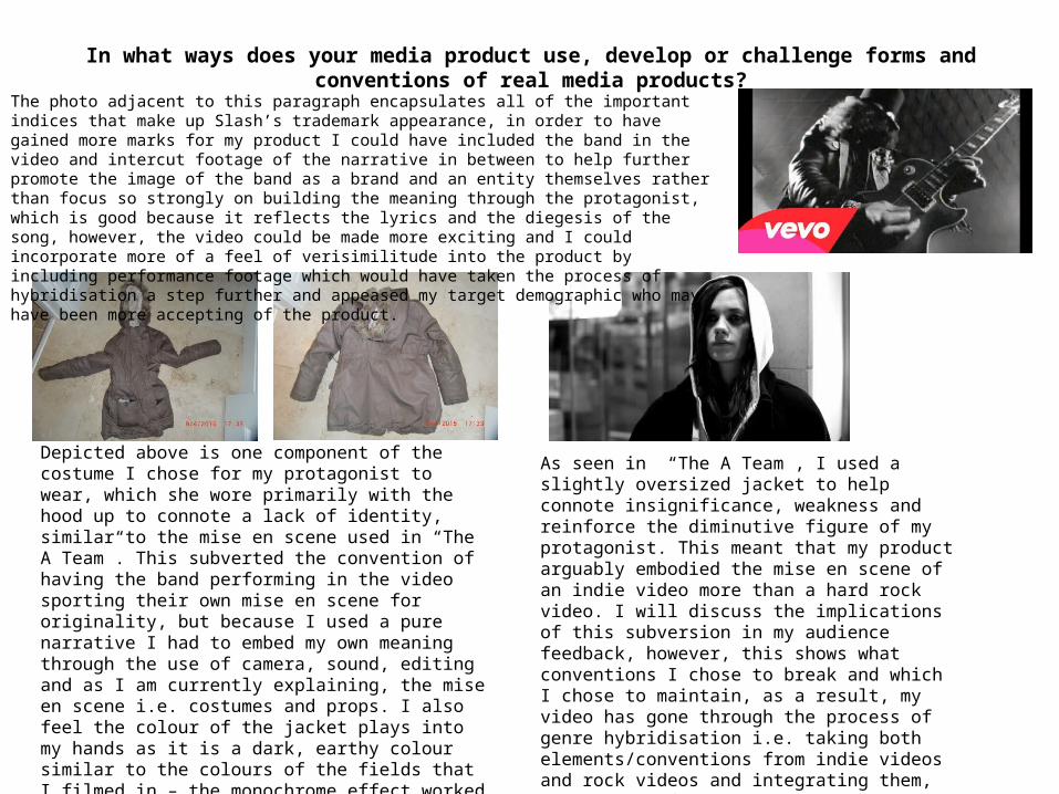
Depicted above is one component of the costume I chose for my protagonist to wear, which she wore primarily with the hood up to connote a lack of identity, similar to the mise en scene used in “The A Team”. This subverted the convention of having the band performing in the video sporting their own mise en scene for originality, but because I used a pure narrative I had to embed my own meaning through the use of camera, sound, editing and as I am currently explaining, the mise en scene i.e. costumes and props. I also feel the colour of the jacket plays into my hands as it is a dark, earthy colour similar to the colours of the fields that I filmed in – the monochrome effect worked well in conjunction with the dark colours I chose for the costumes, one way in which I enhanced the mood of the song through mise en scene and editing, which is one way in which I maintained the ability to enhance/maintain the mood of the song whilst subverting conventions
As seen in “The A Team”, I used a slightly oversized jacket to help connote insignificance, weakness and reinforce the diminutive figure of my protagonist. This meant that my product arguably embodied the mise en scene of an indie video more than a hard rock video. I will discuss the implications of this subversion in my audience feedback, however, this shows what conventions I chose to break and which I chose to maintain, as a result, my video has gone through the process of genre hybridisation i.e. taking both elements/conventions from indie videos and rock videos and integrating them, the result of which is my video which serves as a barometer of how genre hybridisation may be either be accepted or rejected by certain demographics i.e. indie fans may like this subversion, whereas metal/hard rock fans may detest this video.
The photo adjacent to this paragraph encapsulates all of the important indices that make up Slash’s trademark appearance, in order to have gained more marks for my product I could have included the band in the video and intercut footage of the narrative in between to help further promote the image of the band as a brand and an entity themselves rather than focus so strongly on building the meaning through the protagonist, which is good because it reflects the lyrics and the diegesis of the song, however, the video could be made more exciting and I could incorporate more of a feel of verisimilitude into the product by including performance footage which would have taken the process of hybridisation a step further and appeased my target demographic who may have been more accepting of the product.
In what ways does your media product use, develop or challenge forms and conventions of real media products?
Another convention which was subverted as a result of my narrative was the use of lip syncing – this is something that is of paramount importance in standard performance videos, however, I was able to omit this from my video as I based my video solely on a narrative. In terms of actually developing the conventions of rock videos, I feel I have changed the environment in which the archetypical rock video is filmed: usually they are filmed in locations such as rehearsal rooms and stadiums/stages in clubs for live gigs as seen in “Sweet Child O’ Mine” and “Paradise City”, whereas my video focuses more on showing the girl encompassed by large fields comprising of poor vegetation and very dull landscape to enhance the mood of the song – again using the environment as a form of pathetic fallacy. This development meant that my video bore more resemblance to indie videos than out-and-out rock videos, which may not find favour with my target demographic. The reason performance videos use halls or stadium/gig footage is to denote the success and the dedication of the band, representative of how dedicated they are to their craft. However, my video had to follow a diegesis, a narrative essentially. Therefore, I had to use an environment that would encapsulate the themes of the song, which is about disparity and psychologically abusive relationships, therefore I chose to use more bleak and almost sinister environments such as fields to act as a binary opposition to my protagonist. This was a common theme throughout my video: my video works on the basis of binary oppositions, for example, the girl represents youth, innocence and purity, however, this is opposed by the negative connotations in her facial expressions and the environments she finds herself encompassed in very grim locations. In other examples, she manifests a very pensive, depressed expression whilst playing in a playground – a place associated with joy and a feeling of carefree happiness, acting as another binary opposition, this is a convention I have only really found in “Cats in the Cradle” by Ugly Kid Joe (blog post 25 th July 2014) that uses more ominous lighting (low-key lighting) is used in conjunction with using young actors as the main protagonists.
In addition to this, I had to adapt my product in terms of camera work as usually during close ups (notably in “Sweet Child O’ Mine) it is conventional to use low angle shots to make the artist appear taller and more important, however, throughout my video I ensured that I represented the protagonist in the narrative through a number of high angle shots to connote inferiority, insignificance and weakness in order to build meaning into the protagonist as an icon and a character. In terms of how my product has been informed by other texts, I took huge inspiration from existing videos such as Ed Sheeran’s “The A Team” – this is how I was informed of using a number of high angle shots and how they can connote such insignificance and weakness, which is exactly what I wanted as I knew that I was going to be using a protagonist who was very young and female, very similar to Sheeran’s video. Also, I noticed that it is somewhat a convention for rock videos (such as the performance in “Sweet Child O’ Mine”) to create a good relationship between the audio and the visuals as previously discussed (e.g. Slash receiving more screen time when his solo becomes the focal point of the song) and this is what I have tried to implement into my product. This is most notable when towards the end of the song when the guitars become far more amplified and more distorted and whilst the vocals become far more aggressive after the line during the line “I’ve got to run away” I have included a shot of the girl running away from the camera in slow motion for breathtaking impact whilst establishing and maintaining this all important relationship with the diegesis/events in the video and also the diegetic sound.

In what ways does your media product use, develop or challenge forms and conventions of real media products?
Depicted above is an example of how I have borrowed elements of another video such as the monochrome effect as a post production technique and also using high angled shots as a way of representing inferiority, despite the fact this is very basic, AS level technique, it proved to be incredibly effective in my production as it allowed me to manipulate the elements/codes and conventions (camera, mise en scene, editing, sound) in order to make the girl appear more diminutive in stature just as Ruskin Kyle has done in Ed Sheeran’s “The A Team” (right). This is why it was so important in my research and planning to ensure that I analysed other texts to gain a more diverse range of knowledge on the subject matter and also ensure I had pre existing materials that have already proven effective to take inspiration from, essentially using bricolage as a catalyst in the production process of my own video/work. In addition to this I noticed that in the Guns N’ Roses videos, fast paced editing is certainly a prominent factor in the production process and this is something I sought to include in my product when the pace of the song picks up (at exactly 02:19 in the song) which is why I employed a more aggressive, frenetic approach to editing past the 02:19 point of the song – ensuring that despite the subversion in my video I was still sure to use conventions from existing media to bring balance to my product so that I would not completely lose my demographic.
As a result of this fast paced editing, the end of my video appears more of a montage and arguably doesn’t culminate as well as it should, and the narrative becomes quite elusive. This is something I should have rectified earlier in my planning, as I had never given much thought to the definitive ending in the video – hence why it became more of a montage than anything else.
In what ways does your media product use, develop or challenge forms and conventions of real media products?
In terms of how rock videos have developed since the inauguration of promo videos, I would say my product incorporates elements such as the mise en scene, camera, editing and sound, my video bears far more similarity and is analogous with videos that are more contemporary rather than those that are older (such as the ones I have analysed). Despite their differences, there are certainly elements of older rock videos that I have borrowed (monochrome effect which is still used in contemporary rock videos) however, the subversion in my video is due to the fact that I use a pure narrative and not a performance video, in fact, I do not even use a combination of a performance video with a narrative – this is something that is seen as far more conventional in rock videos than a narrative alone.
This could be seen as detrimental to the bands image in some ways as it is well documented that genre develops from within itself through familiarity, originality and repetition. This is a theory proposed by Steve Neale who claims that “genres are instances of repetition and difference”, stating that it is fundamental for genres to fluctuate in sporadic intervals to engage audiences. My product is certainly original despite the fact it borrows elements from other videos (pastiche) however, it is debatable as to what extent it repeats or echoes conventions from the genre as I have made quite a bold decision in choosing to use a pure narrative, which is somewhat unprecedented for rock videos as the bands generally like to express/convey their energy and passion to the camera which allows them to set their agendas and ideology through performance. One convention I could have implemented to give the piece slightly more credibility is the use of using the same shots for the chorus – this would have given the video a positive form of ‘repeatability’. My video not only subverts the conventions of usual rock videos by including a pure narrative, but it also uses a closed narrative with a distinct beginning, middle and end. I feel that despite the fact it was bold to subvert this convention, I should maybe have adhered to some of the pre-existing codes and conventions to maintain a sense of familiarity between the text and my audience so that they could empathize more with the text, which will strike them as slightly odd to what they are used to seeing due to the current conventions of rock videos.
In essence, the audience feel far more gratified from seeing the conventions maintained as it makes them feel more comfortable as they are able to spot these conventions, and they can remain in their comfort zone as they find the text easier to decode. This is quite possibly where my product went wrong: I should have used more conventions as there is a risk that people may express disapproval of this ‘breaking the rules’ which could affect how marketable the product is amongst the demographic – I should have taken my target demographic into account far more. With regards to Thomas Schatz’s theory, it is possible that the genre of my video is a ‘genre of order’ as it is about a young girl who is externalised due to psychological violence, however, it could be argued that this theory is not applicable as there is not a resolute ending to my narrative, it leaves the audience on somewhat of a ‘cliff hanger’ as there is no equilibrium restored.

How effective is the combination of your main and ancillary texts?

How effective is the combination of your main and ancillary texts?

How effective is the combination of your main and ancillary texts?
I remain very happy with my ancillary texts and the way in which they help market/promote my main text. In terms of how effective the combination of my main and ancillary texts is, I would say they are a very viable way to market/promote album sales as there is certainly synergy between the three texts: they all manifest a matching colour scheme that makes them identifiable (almost making them a ‘matching set’ that creates an effective brand identity by which to market the band) to potential consumers. In terms of how effective my actual ancillary texts are in conjunction with my main text, I would have to say that my advert is probably my more successful ancillary text as (like my digipak, but more effectively) it retains the continuity found in the video and sets the tone for the video perfectly, whilst in addition to this, I feel it pretty much encapsulates the essential features of the video in one frame with one picture, and if you can design an advert that expresses all the fundamental features of a product in a glance, then why not create such a thing? However, I still feel my digipak remains a very credible piece of work that also sets the tone for the video, I feel I have made great use of chiaroscuro elements in the post production process in order to achieve an effective and impressionable digipak as is evident in the photos on all panels of the digipak – most notable the top left hand panel which depicts the girl with a pensive expression. The reason there is synergy between my main and ancillary texts is because I edited all three of them in a short space of time and was therefore able to adjust the levels of the layers on Adobe Photoshop correctly to achieve an even finish (same levels of opacity and black and white) on both texts. In addition to this, I ensured that costumes remained the same to give the texts some credibility and further reinforce the synergy between my main and ancillary texts. The reason I have chosen to maintain this synergy throughout my main and ancillary texts is because it will build familiarity for the band’s demographic/audiences.
I also believe the colours used in my digipak are all incredibly effective: the red typography used against the black and white background appears incredibly striking which stands out to potential consumers. In addition to this I think that the picture of the girl on both ancillary texts conveys the messages in the diegesis of the song perfectly: it is about someone who has had their youth “strangled” (to quote the song) from them and suffers from a loss of identity – the front cover of my digipak and image used for my magazine advert/poster perfectly encapsulates perfectly what the song is about – loneliness, isolation and neglect and I feel I have summed these factors up with this iconic image. Therein, the main and ancillary texts go hand in hand with each other as they reflect the themes in the song perfectly.In terms of inspiration for the digipak , I was rather surprisingly inspired by Eminem’s “Recovery” album (as mentioned in my blog post on 14 th April 2015) due to the vaguely similar themes he discusses in the album – suffering alone in pure isolation and how he dealt with it. Although, despite this I have to cite U2’s 1983 album “War” as a huge inspiration for my own digipak due to it’s use of colour, approach to minimalism and feature of a child on the front of the poster/digipak (analysis blog post 15th February 2015). I found it truly fascinating and immediately wanted to use elements of the poster in my own work to promote intertextuality in my work and also pay tribute to the poster. As I will discuss, there is a very distinct similarity between the two album covers and I feel this is something that should be celebrated as it has brought a new dimension to my work and allowed me to re-use old pre-existing materials in order to promote/market my work. By incorporating features from another rock band it documents how I have take elements of work from the same genre (despite the fact the band are a slightly older variant of this genre) and implemented similar conventions into both my ancillary text, which happens to create synergy with my main text (the video features black and white as well as both of my ancillary texts.
How effective is the combination of your main and ancillary texts?
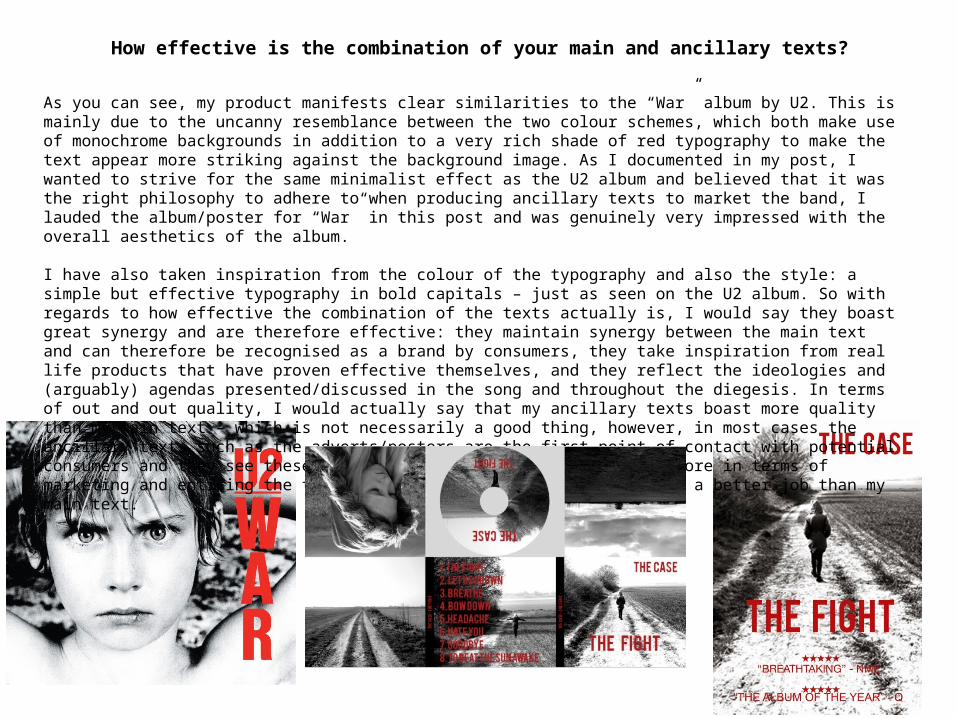
As you can see, my product manifests clear similarities to the “War” album by U2. This is mainly due to the uncanny resemblance between the two colour schemes, which both make use of monochrome backgrounds in addition to a very rich shade of red typography to make the text appear more striking against the background image. As I documented in my post, I wanted to strive for the same minimalist effect as the U2 album and believed that it was the right philosophy to adhere to when producing ancillary texts to market the band, I lauded the album/poster for “War” in this post and was genuinely very impressed with the overall aesthetics of the album.
I have also taken inspiration from the colour of the typography and also the style: a simple but effective typography in bold capitals – just as seen on the U2 album. So with regards to how effective the combination of the texts actually is, I would say they boast great synergy and are therefore effective: they maintain synergy between the main text and can therefore be recognised as a brand by consumers, they take inspiration from real life products that have proven effective themselves, and they reflect the ideologies and (arguably) agendas presented/discussed in the song and throughout the diegesis. In terms of out and out quality, I would actually say that my ancillary texts boast more quality than my main text – which is not necessarily a good thing, however, in most cases the ancillary texts such as the adverts/posters are the first point of contact with potential consumers and they see these before the actual video itself, therefore in terms of marketing and enticing the target demographic, my ancillary text do a better job than my main text.
How effective is the combination of your main and ancillary texts?
To continue this analysis, my ancillary texts (although very similar in design to the U2 album) may not actually be as effective as the U2 album, which has clearly been designed for a specific purpose:
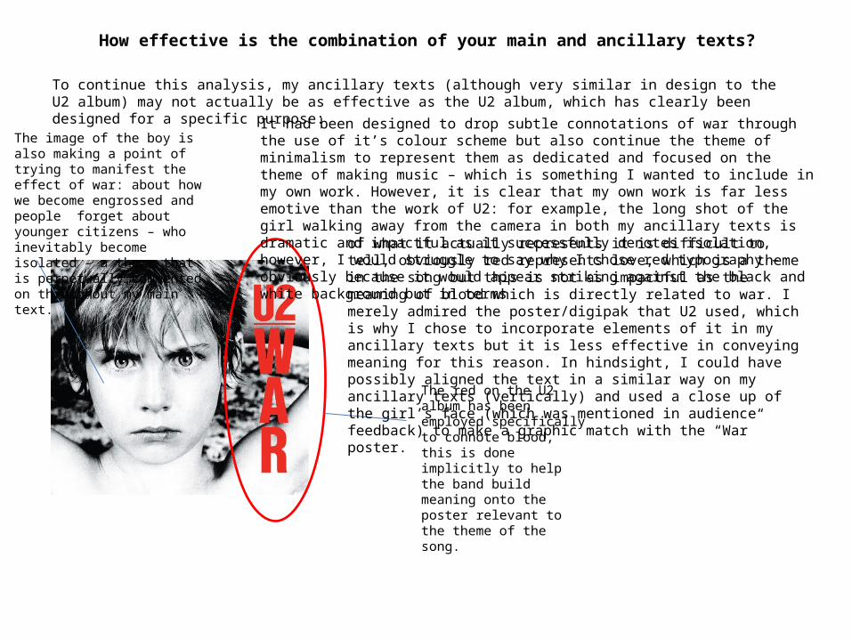
The red on the U2 album has been employed specifically to connote blood, this is done implicitly to help the band build meaning onto the poster relevant to the theme of the song.
The image of the boy is also making a point of trying to manifest the effect of war: about how we become engrossed and people forget about younger citizens – who inevitably become isolated – a theme that is perpetually commented on throughout my main text.
It had been designed to drop subtle connotations of war through the use of it’s colour scheme but also continue the theme of minimalism to represent them as dedicated and focused on the theme of making music – which is something I wanted to include in my own work. However, it is clear that my own work is far less emotive than the work of U2: for example, the long shot of the girl walking away from the camera in both my ancillary texts is dramatic and impactful as it successfully denotes isolation, however, I would struggle to say why I chose red typography – obviously because it would appear striking against the black and white background but in terms
of what it actually represents it is difficult to tell, obviously red represents love, which is a theme in the song but this is not as impactful as the meaning of blood which is directly related to war. I merely admired the poster/digipak that U2 used, which is why I chose to incorporate elements of it in my ancillary texts but it is less effective in conveying meaning for this reason. In hindsight, I could have possibly aligned the text in a similar way on my ancillary texts (vertically) and used a close up of the girl’s face (which was mentioned in audience feedback) to make a graphic match with the “War” poster.
What have you learned from your audience feedback?
What have you learned from your audience feedback?
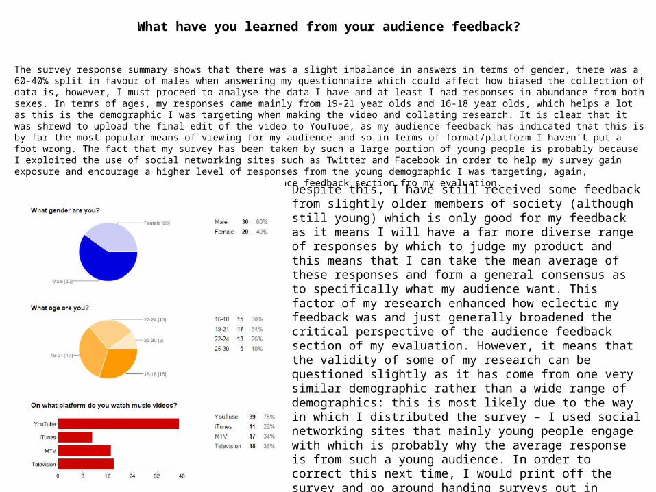
The survey response summary shows that there was a slight imbalance in answers in terms of gender, there was a 60-40% split in favour of males when answering my questionnaire which could affect how biased the collection of data is, however, I must proceed to analyse the data I have and at least I had responses in abundance from both sexes. In terms of ages, my responses came mainly from 19-21 year olds and 16-18 year olds, which helps a lot as this is the demographic I was targeting when making the video and collating research. It is clear that it was shrewd to upload the final edit of the video to YouTube, as my audience feedback has indicated that this is by far the most popular means of viewing for my audience and so in terms of format/platform I haven’t put a foot wrong. The fact that my survey has been taken by such a large portion of young people is probably because I exploited the use of social networking sites such as Twitter and Facebook in order to help my survey gain exposure and encourage a higher level of responses from the young demographic I was targeting, again, exploiting the use of Web 2.0 even in the audience feedback section fro my evaluation.
Despite this, I have still received some feedback from slightly older members of society (although still young) which is only good for my feedback as it means I will have a far more diverse range of responses by which to judge my product and this means that I can take the mean average of these responses and form a general consensus as to specifically what my audience want. This factor of my research enhanced how eclectic my feedback was and just generally broadened the critical perspective of the audience feedback section of my evaluation. However, it means that the validity of some of my research can be questioned slightly as it has come from one very similar demographic rather than a wide range of demographics: this is most likely due to the way in which I distributed the survey – I used social networking sites that mainly young people engage with which is probably why the average response is from such a young audience. In order to correct this next time, I would print off the survey and go around handing surveys out in tactile form (as this is what an older demographic would prefer/be familiar with) as this would increase the range of sources my research is obtained from.
What have you learned from your audience feedback?
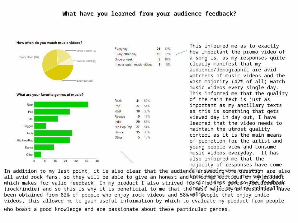
This informed me as to exactly how important the promo video of a song is, as my responses quite clearly manifest that my audience/demographic are avid watchers of music videos and the vast majority (42% of all) watch music videos every single day. This informed me that the quality of the main text is just as important as my ancillary texts as this is something that gets viewed day in day out, I have learned that the video needs to maintain the utmost quality control as it is the main means of promotion for the artist and young people view and consume music videos everyday. It has also informed me that the majority of responses have come from people who are very knowledgeable on the subject of music videos and so the feedback itself will be quite critically valid.
In addition to my last point, it is also clear that the audience answering the question are also all avid rock fans, so they will be able to give an honest and informed critique on my product which makes for valid feedback. In my product I also strived for a form of genre hybridisation (rock/indie) and so this is why it is beneficial to me that the vast majority of responses have been obtained from 82% of people who enjoy rock videos and 58% of people that enjoy indie videos, this allowed me to gain useful information by which to evaluate my product from
people who boast a good knowledge and are passionate about these particular genres.
What have you learned from your audience feedback?
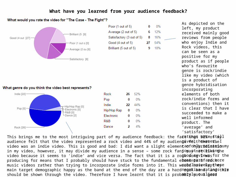
As depicted on the left, my product received mainly good reviews from people who enjoy Indie and Rock videos, this can be seen as a positive for my product as if people who’s favourite genre is rock/indie like my video (which is a product of genre hybridisation incorporating elements of both rock/indie forms and conventions) then it is clear that I have succeeded to make a well informed product. The ‘average’ and ‘satisfactory’ ratings were still given, however, I can only maintain my joy at receiving good reviews for the most part and more conclusively these negative ratings are merely outliers comparatively.
This brings me to the most intriguing part of my audience feedback: the fact that 52% of my audience felt that the video represented a rock video and 44% of my audience felt that the video was an indie video. This is good and bad: I did want a slight element of hybridisation in my video, however, it may divide my audience in a sense – some rock fans may not like the video because it seems to ‘indie’ and vice versa. The fact that it is a rock song I was producing for means that I probably should have stuck to the fundamental elements of rock music videos rather than trying to incorporate indie forms into it. This would have kept my main target demographic happy as the band at the end of the day are a hard rock band, and this should be shown through the video. Therefore I have learnt that it is probably not a good thing that I got such a high set of responses stating that they thought my product was indie rather than rock, I did not want my product to come across as this indie and this is an important piece of information I have learned from my audience feedback that I would carefully consider were I to do the project again.
What have you learned from your audience feedback?
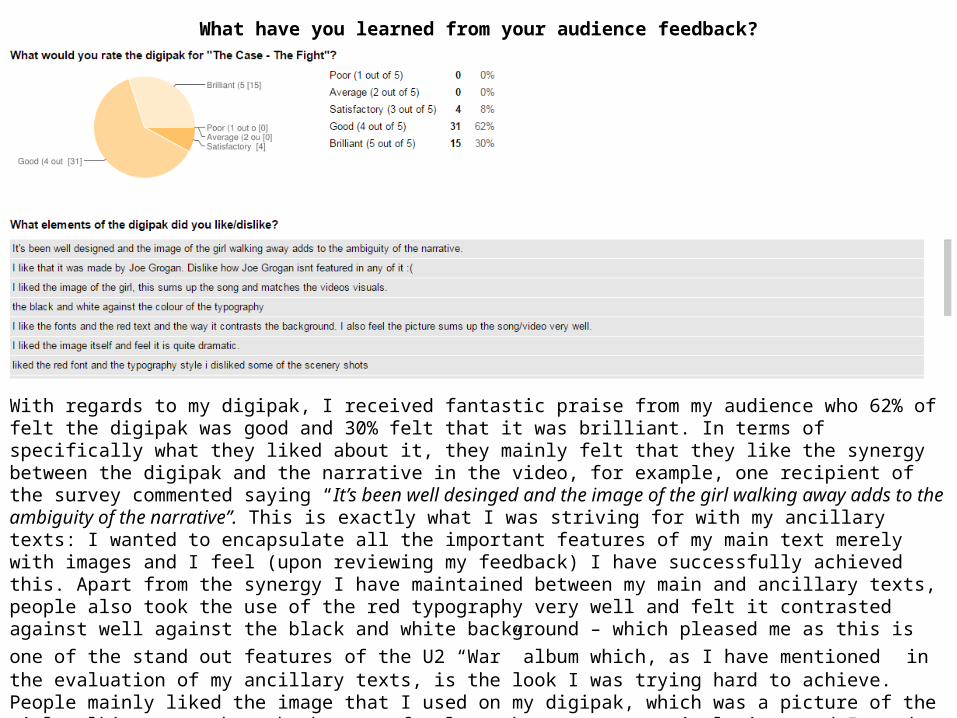
With regards to my digipak, I received fantastic praise from my audience who 62% of felt the digipak was good and 30% felt that it was brilliant. In terms of specifically what they liked about it, they mainly felt that they like the synergy between the digipak and the narrative in the video, for example, one recipient of the survey commented saying “It’s been well desinged and the image of the girl walking away adds to the ambiguity of the narrative”. This is exactly what I was striving for with my ancillary texts: I wanted to encapsulate all the important features of my main text merely with images and I feel (upon reviewing my feedback) I have successfully achieved this. Apart from the synergy I have maintained between my main and ancillary texts, people also took the use of the red typography very well and felt it contrasted against well against the black and white background – which pleased me as this is one of the stand out features of the U2 “War” album which, as I have mentioned in the evaluation of my ancillary texts, is the look I was trying hard to achieve. People mainly liked the image that I used on my digipak, which was a picture of the girl walking away through the use of a long shot to connote isolation, and I used this image precisely to echo what happens in the narrative and maintain synergy and I am delighted that my audience have recognised this and are impressed by it.
What have you learned from your audience feedback?
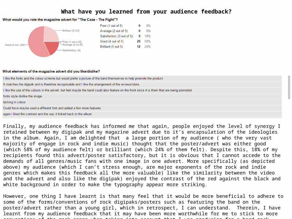
Finally, my audience feedback has informed me that again, people enjoyed the level of synergy I retained between my digipak and my magazine advert due to it’s encapsulation of the ideologies in the album. Again, I am delighted that a large portion of my audience ( who the very vast majority of engage in rock and indie music) thought that the poster/advert was either good (which 58% of my audience felt) or brilliant (which 24% of them felt). Despite this, 18% of my recipients found this advert/poster satisfactory, but it is obvious that I cannot accede to the demands of all genres/music fans with one image in one advert. More specifically (as depicted above) my audience (which I can’t stress enough, are major exponents of the rock and indie genres which makes this feedback all the more valuable) like the similarity between the video and the advert and also like the digipak) enjoyed the contrast of the red against the black and white background in order to make the typography appear more striking.
However, one thing I have learnt is that many feel that it would be more beneficial to adhere to some of the forms/conventions of rock digipaks/posters such as featuring the band on the poster/advert rather than a young girl, which in retrospect, I can understand. Therein, I have learnt from my audience feedback that it may have been more worthwhile for me to stick to more conventions of the rock genre when taking into account that I was producing for a hard rock band. Therefore if I were to do such a project again, I would contemplate using an image of the band on the advert in order to help reach their demographic through their look (fashion etc.) rather than by marketing them by using elements of the narrative. This way would be more effective in marketing the band as a brand and successfully building them a brand identity by which they can be recognised by their target market/demographic.
How did you use new media technologies in the construction and research, planning and evaluation stages?
How did you use new media technologies in the construction and research, planning and evaluation stages?
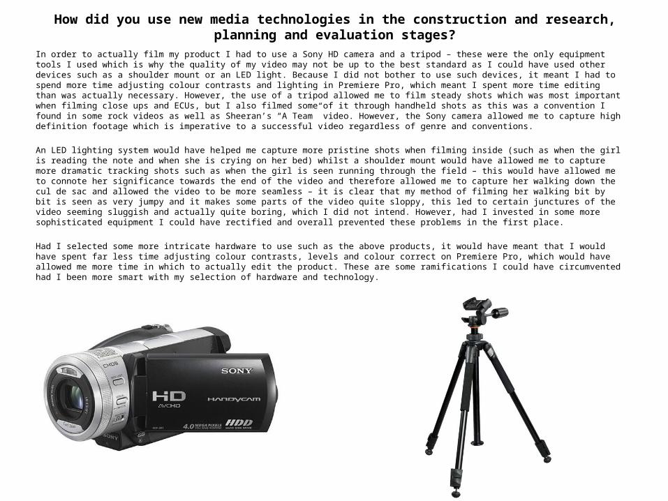
In order to actually film my product I had to use a Sony HD camera and a tripod – these were the only equipment tools I used which is why the quality of my video may not be up to the best standard as I could have used other devices such as a shoulder mount or an LED light. Because I did not bother to use such devices, it meant I had to spend more time adjusting colour contrasts and lighting in Premiere Pro, which meant I spent more time editing than was actually necessary. However, the use of a tripod allowed me to film steady shots which was most important when filming close ups and ECUs, but I also filmed some of it through handheld shots as this was a convention I found in some rock videos as well as Sheeran’s “A Team” video. However, the Sony camera allowed me to capture high definition footage which is imperative to a successful video regardless of genre and conventions.
An LED lighting system would have helped me capture more pristine shots when filming inside (such as when the girl is reading the note and when she is crying on her bed) whilst a shoulder mount would have allowed me to capture more dramatic tracking shots such as when the girl is seen running through the field – this would have allowed me to connote her significance towards the end of the video and therefore allowed me to capture her walking down the cul de sac and allowed the video to be more seamless – it is clear that my method of filming her walking bit by bit is seen as very jumpy and it makes some parts of the video quite sloppy, this led to certain junctures of the video seeming sluggish and actually quite boring, which I did not intend. However, had I invested in some more sophisticated equipment I could have rectified and overall prevented these problems in the first place.
Had I selected some more intricate hardware to use such as the above products, it would have meant that I would have spent far less time adjusting colour contrasts, levels and colour correct on Premiere Pro, which would have allowed me more time in which to actually edit the product. These are some ramifications I could have circumvented had I been more smart with my selection of hardware and technology.

How did you use new media technologies in the construction and research, planning and evaluation stages?
Adobe Photoshop CS3: Photoshop was sole piece of editing software I used for both of my ancillary texts – I had some very basic background knowledge but I was forced to adapt and look at some tutorials for the majority of the project, however, once I became familiar with the software my ability began to burgeon – this then allowed me to become more creative and be more incisive and translate more directly what I was thinking onto the page. In essence, becoming more accomplished on such software actually allowed me to adorn my ancillary texts more successfully and actually exploit more of the features available to me on the software. In order to achieve the black and white effect I had to adapt the contrast and also the ‘levels’ of the image. This was done by selecting Menu > Layer > New Adjustment Layer > Black and White (this was mentioned in my blog post on 27th April 2015). Following this I selected Layers > Chiaroscuro and then tweak the sliders accordingly in order to achieve the current level of black and white on the digipak and the magazine advert/poster. Following this I carefully selected a specific typography that was bold and easy to read, so that it was clear to people who would buy the digipak or read the advert exactly what the band is called so that it sticks in their heads. After this, I used the colours available on photoshop to choose a very rich shade of red to contrast the what would otherwise be mundane black and white background. At first I added a slightly tarnished look to the typography by increasing the opacity of the layer, however, upon feedback from my teacher, he told me it would be far more effective to increase the hardness of the text and reduce the opacity – this way people would be able to decipher the name of the band, the album name, track listings etc. far more easily. The one thing I would add if I could re-do the project is add a production logo – this is something I feel would have added to the authenticity of the product and given my main and ancillary texts more credibility. It was also important to memorise where I had placed the sliders for the chiaroscuro elements of the ancillary texts as in order to create synergy between the ancillary texts I had to ensure that the levels of contrast and levels themselves were matching when editing the ancillary texts.
Premiere Pro: Premiere was the only piece of film editing software I used for my product, my video contained hardly any effects as I adopted a far more minimalist approach to my production process and so this allowed me to produce the video in it’s entirety in premiere pro alone. I ensured that I applied a monochrome effect to the entire video as this is a post production technique that I had wanted to implement from the start. I found this difficult to use at first, however, after viewing a number of tutorials I found it much easier to utilise the drag and drop system. All I needed to make use of was adapting the duration of some clips by using the razor tool and also the speed at which the clip plays by right clicking the clip and selecting “speed/duration”. This is what I used to create the time lapse in the middle of my video. I also had to get used to rendering my work area due to the size of the video in order to maintain smooth transitions and an overall more seamless and smooth product. I learnt later on in the production process that without rendering my time lapse was very jumpy and quite staggered making it almost stutter. However, upon rendering I noticed that the video played as more of a cohesive whole and maintained fluidity. I was then able to keep track of what had been rendered and what had not been rendered through the coloured bars – a red bar in the time ruler of a sequence indicated that the footage had been under-rendered and should be rendered for more smooth playback, a yellow bar in the ruler section of a sequence informed me that the segment of the video did not have to be rendered in order to playback smoothly in real time and at full frame rate. Finally, a section with a green bar stationed in the ruler section of a sequence signified that the footage had already been rendered. However after research, I found out that it is best to render the footage in it’s entirety before exporting it for viewing.

How did you use new media technologies in the construction and research, planning and evaluation stages?
In order to help inform me for my research and planning, I utilised a number of new technologies: these included Google, YouTube, Twitter and Blogger, however there were others that I used far more sporadically. Google and YouTube were my primary sources of research, these were what I turned to gain information on common codes and conventions – Google allowed me to view commonalities for my ancillary texts through the use of images and also allowed me to unearth articles on an array of subject matters such as semiotics as well as pre-existing ancillary texts. On the other hand, YouTube was used solely to access famous music videos to inform my main text for which I conducted textual analysis. These technologies allowed me to gain a far more eclectic, diverse range of knowledge on the subject matter (researching and planning to make a video for a rock band) and these technologies were very successful in doing so. By using technologies such as Facebook and Twitter, I was able to slightly broaden the my audience feedback by gaining answers from a slightly wider demographic and allow my survey more exposure. This is a good example of how I made use of new media technologies (specifically social networking sites) to allow me to gain more of an insight into my target demographic – this informed a large portion of my research and planning which is why the use of new media technologies was pivotal to giving me an insight to my target demographic/audience. In addition to this, I was able to exploit the use of the hashtag feature on twitter to search for bands similar to the band I was producing for and this allowed me to gain an insight into who listened to these bands and what it was specifically that they liked about the bands. This allowed me to make use of Web 2.0, proving how effective the second stage of development of the internet and social networking sites created by user generated content as it allowed me to collect supplementary data along with my audience surveys.
The use of YouTube allowed me to view pre-existing texts within the music industry regardless of whether they were older or more contemporary texts, this was vital in allowing me to conduct a series of comprehensive textual comparisons/analysis in order to collate my research which would eventually go on to inform my planning. I was also allowed to view a diverse range of pre-existing videos from other past media studies students, which inspired me greatly as it allowed me to see what was already possible with the relatively low budget resources I had at my disposal. Likewise, YouTube was also the main source of tutorials I used when unearthing certain techniques using Premiere Pro and Adobe Photoshop CS3. This allowed me to develop an extensive knowledge of the technologies which in turn allowed me to create better products: in essence, when my ability to make use of both the editing software/technologies burgeoned, it allowed me to further design my main and ancillary texts exactly the way I wanted them and work more incisively rather than having to settle for an average product with the limited skills I already had, this is how YouTube helped the development of the actual construction of my texts. To put it simply, the more knowledgeable and proficient I became using the software (Premiere/Photoshop), the more creative freedom I had. This was all down to YouTube becoming an integral part of the research process, which then informed me and allowed me to be more effective in the construction process of my main and ancillary texts. Also, YouTube was the main media platform I used in uploading drafts of my video and also my animatic, which was vital in allowing me to collate all the rough sketches of shots in my storyboard and give me a guideline to work with when actually going out and shooting the video. This animatic was created on Premiere Pro, using simple images working within a chronological sequence, I then uploaded this via YouTube, which also allowed me to create somewhat of a portfolio as well as inform my research and planning as mentioned before.
How did you use new media technologies in the construction and research, planning and evaluation stages?
Another important technology I used that helped me in my planning stage was Blogger – this allowed me to not only collate all my information in an organised archive of information, but I was also able to gain invaluable information from pre-existing blogs from past media studies students that I could take inspiration from and use in my own work – another example of how Web 2.0 was a useful tool in the research and planning stages of my product. Not only this, but Blogger also allowed me to view past evaluations and gave me guidance as to exactly what to comment on when evaluating my work, regardless of whether students were making an advert or a music video, it broadened my mind and went beyond textual analysis and gave me a fantastic insight into how to analyse my main and ancillary texts more in depth and go deeper into the actual production processes of the entire project.
As I have mentioned, Blogger was mainly just used to collate all of my research and planning into one platform that was able to accommodate a number of different formats such as images, videos, Google forms and text. This made organising my research and planning incredibly easy and very convenient. I was also able to use Blogger for the research and planning stages of my AS thriller opening sequence, which also made use of an array of software such as Premiere Pro, Adobe Photoshop and Adobe After Effects. This is were I gained some background/foundation knowledge of the software from, however, at AS we worked in groups and it was made clear from the start that using the technology/software was not one of my main strengths, and so I was asked to do other jobs such as construct storyboards, suggest script/narrative ideas and even act in the production. However, I feel since AS my skills in using the technology has come on leaps and bounds, and my progress using this software has been most effective in helping me gather my ideas in the research and planning stage.
One other technology (which also outlines the benefits of Web 2.0 during the research and construction stage of my texts) I used was SlideShare, this is a site that allowed me to upload presentations to help chart my progress but also view presentations made by past media students that allowed me to refresh my AS knowledge of subjects such as narrative theory and semiotics. Google docs allowed me to create forms (surveys) in order to conduct audience research which helped me greatly in my evaluation stages as I received comprehensive feedback as to exactly what my audience liked/disliked about my final main and ancillary texts.
How did you use new media technologies in the construction and research, planning and evaluation stages?
In terms of actually creating my survey, it was made in Google Docs using Google Forms – it enabled me to make a very sophisticated survey that could be easily distributed through social networking sites and also published on my blog for others to fill out. I (as mentioned previously) could’ve and should’ve also printed the survey out in order to hand it out to older members of society who would probably still prefer to complete the survey in tactile form rather than being confused by the intangible nature of the internet and Web 2.0. This helped me in both my construction, research and evaluation stages, making it an essential piece of media technology in order to inform my research as it impacted all other stages of my project (research, construction and evaluation).
Therein, I used another new form of media technology in the early stages of planning and during my evaluation (my audience feedback was collected by a Google Form/survey) and so it was important that I familiarised myself with the nature of the programme. In addition to this, Google Docs/Forms allowed me to easily collate all of my responses/feedback and made it accessible at the click of a button so that I could then enclose my findings within my evaluation.


