23
| 247 | aAQUA: A Visualization | | Sp ‘08 | -1- aAqua: A Visualization Ruchi Kumar Deepti Chittamuru Anirban Sen
| Date post: | 19-Apr-2018 |
| Category: |
Documents |
| Upload: | truongphuc |
| View: | 218 times |
| Download: | 0 times |

| 247 | aAQUA: A Visualization | | Sp ‘08 |
-1-
aAqua: A Visualization
Ruchi Kumar
Deepti Chittamuru
Anirban Sen

| 247 | aAQUA: A Visualization | | Sp ‘08 |
-2-
Table of Contents aAqua: A Visualization .................................................................................................................. 1
Table of Contents....................................................................................................................... 2
1. Introduction ....................................................................................................................... 3
2. Project Goals ...................................................................................................................... 3
3. Related Work ..................................................................................................................... 3
4. A Visualization Of aAqua - Description............................................................................ 5
5. Target Audience ................................................................................................................ 5
6. Implementation ................................................................................................................. 5
6.1. Methodology.................................................................................................................... 5
6.2. Data Used......................................................................................................................... 6
7. Results ................................................................................................................................ 6
7.1. Users ................................................................................................................................ 6
7.2. Forums ............................................................................................................................. 9
7.2.1. Over Time.................................................................................................................. 9
7.2.2. Over Geography...................................................................................................... 14
7.2.3. Age vs. Activity ........................................................................................................ 17
8. Visual Properties ............................................................................................................. 19
8.1. Color............................................................................................................................... 19
8.2. Length, Width and Size .................................................................................................. 19
8.3. Animation....................................................................................................................... 19
9. Gestalt Properties............................................................................................................ 20
9.1. Similarity ........................................................................................................................ 20
9.2. Enclosure........................................................................................................................ 20
9.3. Connection..................................................................................................................... 20
10. Usability Study............................................................................................................. 20
10.1. Participants .................................................................................................................. 20
10.2. Method ........................................................................................................................ 20
10.3. Findings ........................................................................................................................ 21
10.4. Participant Comments ................................................................................................. 21
11. Post-Usability Study Changes..................................................................................... 22
12. Future Work................................................................................................................. 23
13. References.................................................................................................................... 23

| 247 | aAQUA: A Visualization | | Sp ‘08 |
-3-
1. Introduction In ICTD research projects, one of the challenges is that of creating scalable applications. aAQUA
(almost All Questions Answered) is an online expert Question and Answer community forum,
developed at KReSIT, IIT Bombay, India for delivering agricultural information to the grassroots
of the Indian Community. It is an online, multilingual, multimedia, archived discussion forum,
allowing members to create, view and manage content in their mother tongue (Hindi, Marathi
etc). It enables farmers from remote areas having little access to expert advice to seek
customized guidance about their issues in the agricultural domain. The primary mode of
interaction on this forum is for the farmers (who register as members) to ask questions and the
agricultural experts to then answer questions.[1]
2. Project Goals This information visualization project is primarily targeted towards exploring the scale of
growth of the aAQUA community; as requested by our client, Professor Krithi Ramamritham.
The aim of this project is to help our client visualize the growth and usage patterns in aAQUA. It
can further be used to showcase the same to other researchers in order to create interest in
the research community and motivate them to contribute in the areas of knowledge
management, cross-lingual information retrieval and providing accessible content for rural
populations. To this end we used data from the online community to analyze the behavior of
users over various parameters like time, seasons, geography.
3. Related Work There has been an abundance of work done in the field
of visualizing online communities. So instead of holding
a comprehensive discussion of all the work done in the
past, we shall only discuss what we chose to examine
and how they informed our project.
We looked at Vizster: Visualizing Online Social
Networks by Heer and boyd.[2] But realised that it
would not be very useful since the forum we were
visualizing was not really a social network, or even a
network in the traditional sense of that word. It
functioned mostly as a Question and Answer Forum,
where the farmers asked the questions and looked to the expert for answers. Thus there was
hardly any interaction between the farmers themselves. Hence, we felt Vizster would not be
able to reveal too many interesting things given the fact that it was specifically designed to
reveal relationships between people in a network.
Then we looked at the method used by Turner, Smith and Wesler[3] to visualize Usenet forums.
We believed that could be more relevant since they were also visualizing question-answer
forums, but then realised that they were looking at relationships between people too. Further,
Figure 1. Vister: Visualizing Online Social
networks

| 247 | aAQUA: A Visualization | | Sp ‘08 |
-4-
our project required that we be able to present an overview of the growth and usage patterns
of aAQUA. They had used Treemaps for this and we believed Treemaps felt too cluttered, not
very informative (in this context) and aesthetically unappealing.
Another tool related to our work was ‘Visual Who’ by
Judith Donath[4]. It was a very good tool for visualizing
associations in the community and presence (online).
This would have been interesting if our user audience
had been the users of the forum (farmers), instead of the
researchers. We believed that the researchers would
find an analysis of how it grew and the usage patterns on
it more informative.
Then we looked at Oculus [5] to display geo-location data
along with time and a third dimension. But then we
realised that if there were more than a few threads
rising up, it would
become hard to
differentiate one from the other, thus making the
visualization barely intelligible. Hence we decided
against using oculus.
Another visualization we considered was the
Visualization of Walmart’s growth over time as lighting
up of the area where they set up a store. Upon
consideration we felt this would not be able to convey
very much information except for locations and hence
we did not use it.
The various other network visualization tools discussed
in class were not considered since the goal of this project was not as much to visualize
relationships between members as it was to analyze and
visualize the growth and the usage patterns.
We found Tableau much more useful for such analysis and
hence decided to use Tableau. We used the Google Maps
API to geo-code the locations and a javascript to do a geo-
time animation.
Figure 4. Visualizing Presence
Figure 2. Picturing Usenet
Figure 3. Visualizing Association

| 247 | aAQUA: A Visualization | | Sp ‘08 |
-5-
4. A Visualization Of aAqua - Description This project attempts to present the growth and usage patterns within aAQUA from a variety of
perspectives. We look for things like correlations between the age of the membership of a user
and the magnitude of his activity on the forum. We also looked for trends and seasonal cycles.
We wanted to see which forums are growing more than others and if there was a correlation
between location and activity on a certain forum.
5. Target Audience Our target audience was researchers in the field of Information and Communication
Technologies for Development (ICTD). One of the major challenges in ICTD is to scale projects
into a much larger scope. We are attempting to contribute to this effort at scaling aAQUA by
helping the founder of the project present how useful it has been to the local farming
community in India. This is expected to lead to greater interest in and contribution to the
project (aAQUA).
6. Implementation This section shall discuss the implementation of the visualization project for aAQUA. It shall
attempt to describe the tools we used and justify our choices. It will also discuss the dataset we
worked with.
6.1. Methodology
We started with a php/MySQL script to get the latitude/longitude geo-locations for the dataset
using the Google Maps API. We were able to achieve about 80% accuracy in geocoding this data
as:
• Some of the users had spurious data in City name (free form field)
• Some of the locations were not accessible via the Google Maps API (being very remote)
We then plotted various views of the data on an outline map of India showing the international
boundary in a dark line and the state boundaries in dotted lines [6].
While maps were great to get an overview, we wanted to dig deeper to explore possible
interconnections of increasing complexity. We found Tableau's bar graphs and line graphs to be
better for drilling down into details and looking for trends. We looked for phenomena like
cycles in activity and correlations in trends. We started out by geocoding the address data into
the appropriate latitude/longitude. For the animation, we used Javascript to iterate over
multiple images. The images themselves were exported from Tableau, which was also our
primary visual analytical tool.
Accessibility over large distances was an issue of concern for us and hence we decided to put up
our visualizations in a simple website that we created for this purpose. This ensured that the
final users of the visualizations could access them from anywhere.

| 247 | aAQUA: A Visualization | | Sp ‘08 |
-6-
6.2. Data Used
The following was meta-data was used for this project:
• Registered Users - metadata related to unique users like their location, number of posts,
date of joining. (Member Name, Location (City/State/ Country) , Role, Date of joining, No.
of posts)
• Forums in which the questions are asked - metadata related to the first post in a thread.
(Member who posted it, Date of initial post, Forum name that the post falls under,
Category that it falls under)
7. Results This section shall discuss the results of the visualizations that we did. We categorized the
visualizations into two sections viz. those regarding users or members and those regarding
forums. Reduced images of all the visualizations are shown below, while higher resolution
images are posted to the website we created.
7.1. Users
1) Growth of Community Over Geography and Time
This visualization shows how the aAQUA user community has grown from 2003 to 2007. These
years are color coded, with each colored dot representing a new user who joined the
community in that year. In 2003 and 2004, the users were from the state of Maharashtra, the
Figure 5. Community Growth Over Geography and Time

| 247 | aAQUA: A Visualization | | Sp ‘08 |
-7-
birth-place of aAQUA; 2005 onwards the community quickly grew to other parts of India. We
see that the greatest growth took place in the year 2006.
2) Activity vs. Roles
Figure 6. Activity vs. Roles
This visualization tries to see if there is a relationship between the role of the user and the level
of his activity (defined as number of posts) on the forum. As can be seen, the expert posts the
maximum number of posts, while the farmers are posting very little compared to him. What is
interesting here is that in spite of being able to converse amongst themselves as they can see
and reply to each other’s posts an overwhelming number of users seem to prefer just asking
questions and look to the expert for answers. Hence we suggest that the nature of the aAQUA
community is Expert centric; him being the most active user with more than 5500 posts.
3) World Map
Figure 7. Members Outside India

| 247 | aAQUA: A Visualization | | Sp ‘08 |
-8-
This shows the world-view of the aAQUA user community plotted on the latitude-longitude
grid. Even though for the purposes of this project, we considered the data points outside India
as outliers, it is worth noting that while most of the users are clearly in India; there are still
some users spread all over the globe.
4) Activity Over Geography
Figure 8. Forum Activity Mapped Over Geography
This visualization shows an overview of the levels of activity (measured by the number of posts)
in the various regions of India. Members having a certain range of activity are put into one of
the four bins (signified by the size of the dots) as shown in the legend; in addition to this the
bins are also color-coded to make the image more intelligible.

| 247 | aAQUA: A Visualization | | Sp ‘08 |
-9-
7.2. Forums
7.2.1. Over Time
1) Growth Over Time - Trend
Figure 9. Growth Over Time- Trend
This visualization shows the growth of each forum over time aggregated by year, in a line graph.
Number of questions posted on each forum have been plotted on the Y-axis with time on the X-
axis; forums are color-coded. This picture helps us compare the rate of growth of each forum
over time. One can see that while the crops forum has grown steadily, the rest of the forums
after a sudden burst of growth in 2006, fall quite steeply in 2007.

| 247 | aAQUA: A Visualization | | Sp ‘08 |
-10-
2) Growth by Date - Continuous Trend
Figure 10. Growth of The Forum by Date- Plotted as a Continuous Trend
This visualization shows the growth of the top three forums that have the greatest number of
first questions asked over the last four years in a continuous graph plotted by date. Number of
questions posted on each forum is plotted on the Y- axis with time on the X-axis; forums are
color-coded in addition to being stacked in the graph. This shows that the spike in the growth
rate of the forums in 2006 was caused by increased questions posted in just a short span of
time like a month or 6 weeks.

| 247 | aAQUA: A Visualization | | Sp ‘08 |
-11-
3) Growth of the Forum Aggregated By Year
Figure 11. Growth of The Forum Aggregated By Year
This visualization give us insight into the total number of questions each year differentiated by
forum type. This image plots the number of questions asked each year on the Y-Axis against
time (aggregated in years) on the X-axis. It also shows the number of questions asked every
year on each of the six forums; forums are color-coded.

| 247 | aAQUA: A Visualization | | Sp ‘08 |
-12-
4) Growth of the Forum Aggregated By Year - Log Scale
Figure 12. Growth of The Forum Aggregated By Year -Log Scale
This visualization give us insight into the total number of questions each year differentiated by
forum type. This image plots the number of questions asked each year on the Y-Axis against
time (aggregated in years) on the X-axis. It also shows the number of questions asked every
year on each of the six forums; forums are color-coded. Since the range of values for each
forum varied greatly in the previous graph, the logarithmic scale was employed to better
display the forums that grew slower than others.

| 247 | aAQUA: A Visualization | | Sp ‘08 |
-13-
5) Seasonal Cycles in the Community
Figure 13. Seasonal Cycles in The Activity of The Forum
This shows the change in the number of questions asked (in each forum) over the months for
every year. It enables one to see if there are repeating patterns like greater activity during the
sowing or harvesting seasons. As can be seen above, there indeed is a peak in activity during
the monsoons. This graph plots the number of questions asked on the Y-axis against the various
months in a year on the X-axis and stacks the same for every year on top of the previous one.
The forums are color-coded

| 247 | aAQUA: A Visualization | | Sp ‘08 |
-14-
7.2.2. Over Geography
6) Activity over Location
Figure 14: Activity Over Location
This shows the location of users who start a thread in each of the six forums which are color
coded in the map. The forums having lesser questions have darker colors to allow for better
visibility of sparser data. As can be seen all the forums are used pretty uniformly across the
various regions with the crops forum getting the most number of questions and the remaining
ones getting lesser questions. We can also see that every forum is used most in Maharashtra.

| 247 | aAQUA: A Visualization | | Sp ‘08 |
-15-
7) Activity over State
Figure 15: Forum Activity Over State
This looks at the number of questions being asked on each forum by members from the various
states in India. This visualization is useful to know if there are geography specific needs for
farmers by seeing if people from a certain region are more active on a certain forum. This graph
plots the States over the X-axis and the number of questions asked on the Y-Axis.
| 247 | aAQUA: A Visualization | | Sp ‘08 |
-16-
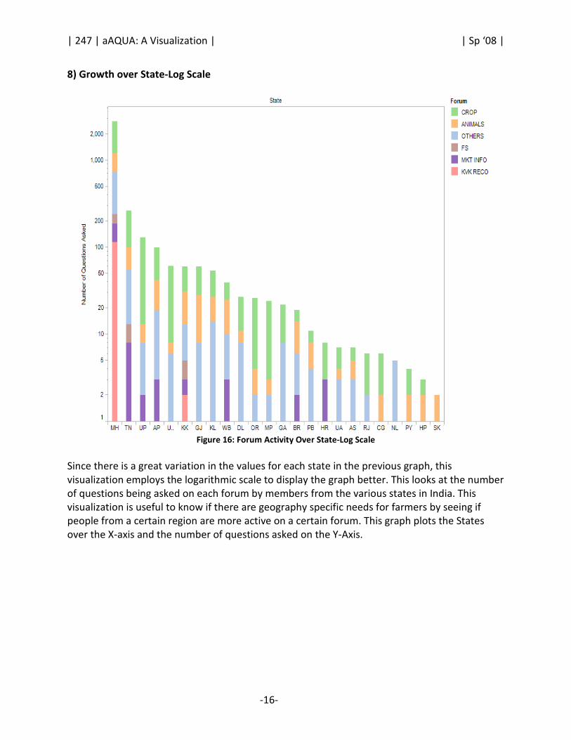
8) Growth over State-Log Scale
Figure 16: Forum Activity Over State-Log Scale
Since there is a great variation in the values for each state in the previous graph, this
visualization employs the logarithmic scale to display the graph better. This looks at the number
of questions being asked on each forum by members from the various states in India. This
visualization is useful to know if there are geography specific needs for farmers by seeing if
people from a certain region are more active on a certain forum. This graph plots the States
over the X-axis and the number of questions asked on the Y-Axis.

| 247 | aAQUA: A Visualization | | Sp ‘08 |
-17-
7.2.3. Age vs. Activity
9) Age Vs. Activity - Trend
Figure 17: Age Vs Activity - Trend
This visualization tries to see if there is a relationship between how long the member has been
participating in the community and the amount of his activity on the forum. It plots date of
joining against date of posting to see if older members are more active or vice versa. As can be
seen from the visualization, for some reason people seem to be most active for the first year
after joining and then the rate of activity falls off.

| 247 | aAQUA: A Visualization | | Sp ‘08 |
-18-
10) Age Vs. Activity-Aggregate View
Figure 18: Age Vs Activity - Aggregate View
This visualization shows the same thing as the previous graph (Figure 18) but from a slightly
different perspective. While the previous one tries to show trends this one shows absolute
numbers for each forum and totals for every year a lot more clearly than the last one. It plots
date of joining against date of posting to see if older members are more active or vice versa. As
can be seen from the visualization, for some reason people seem to be most active for the first
year after joining and then the rate of activity falls off.

| 247 | aAQUA: A Visualization | | Sp ‘08 |
-19-
8. Visual Properties
8.1. Color
We used color to differentiate dimensions with relatively few values in it such as forums, in
order to keep the visualization from becoming a riot of colors, which while pleasing can be
confusing. We tried to keep the choice of colors consistent throughout the whole set of
visualizations like green for “crops”, orange for “animals” and blue for “others”. This we hoped
would save the user the trouble of having to look at the legend each time.
In the animation over time we used color to differentiate time (which is a little unusual, we
confess). But we found this to be better than using shape for the different years since where
there were large clusters of data-points, the shapes tended to turn into an undifferentiated
blob, while color would still show through. The year with the least number of data points got
assigned the darkest color while the one with the most data-points was assigned the lightest.
This ensured that even the years with very few data-points were visible as the contrasts create
a pop-out effect.
In another case where we used color to represent numerical ranges (Figure 4: Activity over
Geography) In this case, users having a certain range of activity (described by number of posts)
were put into one of the four numerical bins. These bins were distinguished by size as also by
color. We used both the parameters here as being a static image, one would not have the
capability to zoom into a region of high density. If color alone or size alone was used here, it
would again have lead to an undifferentiated blob. Colors were chosen to create a contrast
between the more frequent data points and the less frequent ones.
8.2. Length, Width and Size
Varying size was used to differentiate between increasing number of posts. We used this in
addition to color to emphasize the variation in the data and to counteract the similarity of the
shape(circle) for the data points, especially in areas of high density.
8.3. Animation
We used animation to show progression over time as shown in Figure 19: Community Growth
Over Geography and Time. This visualization was one of the primary objectives for this project.
For each year, we used Tableau to create the individual static images showing the new users
who joined in that year in one color and the users who joined in prior years in different colors.
We used Javascript to iterate over these images in order to create a simple animation. This
visualization was made interactive in a simple way by :
• Allowing the year legends to be clickable buttons, on click of which the map image
would change to show the new users who joined aAQUA by that year.
• Start and Stop buttons were also provided to play with the animation.

| 247 | aAQUA: A Visualization | | Sp ‘08 |
-20-
9. Gestalt Properties We applied the Gestalt principles as descriptions of visual perception to our visualization
designs to intentionally tie data together, separate data, or make some data stand out as
distinct from the rest.
9.1. Similarity
We used color, size and shape to encode categorical variables in order to effectively group
visual objects that vary as different expressions of preattentive attributes. This was useful in
identifying different data sets in a graph (for example, color in Figure 16 is used to groups the
different forums together). Further, this principle of similarity in using the same color scheme
to denote forums across various graphs was also useful in establishing the link between these
various graphs across the website.
9.2. Enclosure
The principle of enclosure says that our perception notes visual objects as belonging together if
enclosed by some sort of visual border. We applied this principle by overlaying an image of an
outline map of India on our latitude/longitude grid in Tableau. This boundary map enclosed
these data-points and set them apart in a distinct region, the country of India.
9.3. Connection
This principle says that it is easier to perceive objects connected in some way, for example by a
line, as part of the same group. We used stacked bar charts for some of our visualizations. For
example, consider the visualization shown in Figure 11 - Growth of The Forum Aggregated By
Year. Every stacked bar consists of several mini-bars which individually show data for each
forum. Having these mini-bars stacked on top of each other creates a connection between
them, giving the perception of them being as one entity.
10. Usability Study We conducted four usability studies of our visualizations, the details of which are givenbelow.
The discussion is broken into three sections - the participants, the method and the participant
responses.
10.1. Participants
Our participants were research scientists involved in ICTD and familiar with aAQUA. We
contacted four such persons all of whom agreed to participate in the tests. We sought
permission from them to quote them in our reports or any work related to the project, after
anonymizing the data.
10.2. Method
We sent them a link to the website in an email with some background about the project we
were doing. We requested that they take a look at the visualizations and annotate the various

| 247 | aAQUA: A Visualization | | Sp ‘08 |
-21-
images inline to give us feedback. We were interested in finding out how informative and clear
they found each visualization to be. Then we discussed these personally with the users in a
one-on-one session and took notes of their feedback. Each session took between 30 and 45
minutes.
10.3. Findings
The users liked the visualizations very much. They found some of the insights (highlighted by
the visualizations) very interesting. By and large they found the visualizations aesthetically
pleasing. Some of the more complicated visualizations felt confusing for some (but that could
be because of their unfamiliarity with multidimensional graphs).
They wanted us to drill down into Maharashtra and analyze the data on a district wise basis for
that state. Some of them felt a couple of visualizations were redundant. One of the participants
also wanted a timeline of the major events conducted by aAQUA to be displayed underneath
the Time Axis for the trend graphs. They believed this would enable them to make inferences
about what might have caused changes in trends at certain times of the year. Similarly they
wanted a time line of seasons underneath the seasonal cycles graph in order to make
inferences about the factors that caused spikes in posting during certain months of the year.
Two of the four users we tested the visualizations with wanted pie charts to show activity
versus roles as well as activity over forums.
10.4. Participant Comments
Some of the comments from the user studies are quoted below-
Praise
“Ah! This is animated! Cool!- gives a nice overview of it has grown over the years” (About the
growth of the community over geography Figure 5.)
Pretty Cool! (About Seasonal Cycles in Forum Activity visualization Figure. 13)
“Interesting insights- the seasonal cycles, relationship between age of membership and
activity”
“Pretty Cool- it answered most of the high level questions I had about what happened after I
left”
“Nice to see that KVK Baramati is taking an active role of the expert and answering so many
questions! ” (About the Activity vs. Roles visualization, Figure 6.)
Criticism
“I would have loved a more detailed analysis of Maharashtra”
“This is redundant” (About Forum over years –Log scale visualization Figure. 13)
“This is confusing! Why did you try to pack so much info into one viz?” (About Age vs Activity
Trends visualization Figure. 17)
“Age vs. Activity - Why are the data separated out by forum type? That's not necessary for what
you're trying to show.”
“Growth over map, Growth Over State, Growth Over State-Log Scale : none of these three
actually show 'growth'.” (About Figure 14, 15 and 16)

| 247 | aAQUA: A Visualization | | Sp ‘08 |
-22-
11. Post-Usability Study Changes Some of the changes we made after the usability study was to improve the descriptions for
each of the visualizations on the website. Remove the redundant visualizations or those which
the users felt did not seem to add too much more value, like the log scale versions of forums
over the years (bar graph) and the Age Vs Activity (bar graph). We changed the titles for the
three visualizations on Figure 14, 15 and 16 to use the word ‘Activity’ instead of ‘Growth’. We
also added an overview of the Age vs. Activity cumulative (all forums put together) trend as
suggested by the users in the usability study.
1) Age vs. Activity Trends (Overview)
Figure 20. Age vs. Activity Trends (Overview)
This visualization tries to see if there is a relationship between how long the member has been
participating in the community and the amount of his activity on the forum. It plots the number
of posts against the date of posting with the date of joining being color coded. Thus the blue
line represents the activity of the members who joined in 2003; the path of the blue line shows
how the level of activity (the number of new threads opened) cumulatively over all forums has
changed over the years. As can be seen from the visualization, for some reason people seem to
be most active for the first year after joining and then the rate of activity falls off.

| 247 | aAQUA: A Visualization | | Sp ‘08 |
-23-
12. Future Work Some of the things that can be done in the future for this project are:
• Incorporate the changes suggested by the users in the usability tests.
• Do a more comprehensive analysis with more data from the forums.
• Do a more detailed analysis of the community growth and usage patterns in
Maharashtra.
• Finally make the visualizations more interactive, by allowing users to drill down over
each bar in a bar graph and such.
13. References
[1] Ramamritham K., Bahuman A., Duttagupta S., Bahuman C., Balasundaram S.; "Innovative ICT Tools for
Information Provision in Agricultural Extension (December 2005)," Information and Communication Technologies
and Development, 2006. ICTD '06. International Conference on , vol., no., pp.34-38, May 2006
URL: http://ieeexplore.ieee.org/iel5/4085497/4042660/04085510.pdf?isnumber=4042660∏=STD&arnumber=408
5510&arnumber=4085510&arSt=34&ared=38&arAuthor=Krithi+Ramamritham%3B+Anil+Bahuman%3B+Subhasri+
Duttagupta%3B+Chaitra+Bahuman%3B+Srividya+Balasundaram
[2] Heer J., boyd d.; Oct 2005; “Vizster: Visualizing Online Social Networks”, IEEE Symposium on Information
Visualization, http://jheer.org/publications/2005-Vizster-InfoVis.pdf
[3] Turner, T. C., Smith, M. A., Fisher, D., and Welser, H. T. (2005). “Picturing Usenet: Mapping computer-mediated
collective action”, Journal of Computer-Mediated Communication, 10(4), article 7.
http://jcmc.indiana.edu/vol10/issue4/turner.html
[4] Donath. J. S.; Nov 1995; “Visual Who: Animating the affinities and activities of an electronic community”; ACM
Multimedia 95 - Electronic Proceedings; doi; http://doi.acm.org/10.1145/217279.215255
[5] Oculus GeoTime® (available at http://www.oculusinfo.com/softwareproducts.html, last accessed May 12, 2008)
[6] Map adapted from www.mapsofindia.com


