WWW.GNOCDC.ORG | December 2012 1 ACS Mapping Methodology How to spatially display ACS 5-year data Ben Horwitz, Greater New Orleans Community Data Center Released: December 20, 2012 Much socio-economic data is available only from the American Community Survey (ACS), which is subject to large margins of error. In order to avoid drawing erroneous conclusions from ACS data, it is important to consider these margins of error. However, it is quite difficult to convey margins of error spatially. Therefore, with significant guidance from experts at Nielsen, GNOCDC created and evaluated new methods to improve the ACS block group estimates for use in mapping. Background: The Decennial Census and the American Community Survey After 2000, the Census Bureau began collecting a lot of their data through an ongoing sample survey called the American Community Survey (ACS) —instead of through their once every–ten–year census count. As a result, the 2010 Census did not collect information on income, poverty, or educational attainment because this data is now collected by the ACS. Because the ACS is a survey mailed to a sample of households, the ACS has only enough responses in a single-year to provide estimates for areas with over 65,000 people (e.g. Orleans Parish, Jefferson Parish, St. Tammany Parish, the New Orleans metro, the State of Louisiana). For smaller areas, the Census Bureau aggregates multiple years of data in order to have enough surveys for a reasonable sized sample. For areas with more than 20,000 people but less than 65,000 people (e.g. Plaquemines Parish, St. Bernard Parish, St. Charles Parish), data is available only from a three-year average while data at the census tract, block group, or neighborhood level is available only from a five-year average. Data from the most recent five-year ACS covers the years 2007 through 2011 and describes the average conditions during this five-year period. Considering the margin of error Because the ACS is a survey from a sample of the population, it comes with margins of error that must be considered when interpreting and analyzing the data. 1 For example, the poverty rate in Orleans Parish from the 2011 one-year ACS is 28.9 percent with a margin of error of 1.6 percent. In comparison, the poverty rate for Orleans Parish in 1999 was 27.9 percent. However, when the margin of error is considered and the appropriate statistical testing is conducted, the 2011 poverty rate in Orleans Parish is not statistically different from 1999. 2
Transcript
WWW.GNOCDC.ORG | December 2012 1
ACS Mapping Methodology How to spatially display ACS 5-year data Ben Horwitz, Greater New Orleans Community Data Center Released: December 20, 2012
Much socio-economic data is available only from the American Community Survey (ACS), which is subject to large margins of error. In order to avoid drawing erroneous conclusions from ACS data, it is important to consider these margins of error. However, it is quite difficult to convey margins of error spatially. Therefore, with significant guidance from experts at Nielsen, GNOCDC created and evaluated new methods to improve the ACS block group estimates for use in mapping.
Background: The Decennial Census and the American Community Survey After 2000, the Census Bureau began collecting a lot of their data through an ongoing sample survey called the American Community Survey (ACS) —instead of through their once every–ten–year census count. As a result, the 2010 Census did not collect information on income, poverty, or educational attainment because this data is now collected by the ACS. Because the ACS is a survey mailed to a sample of households, the ACS has only enough responses in a single-year to provide estimates for areas with over 65,000 people (e.g. Orleans Parish, Jefferson Parish, St. Tammany Parish, the New Orleans metro, the State of Louisiana). For smaller areas, the Census Bureau aggregates multiple years of data in order to have enough surveys for a reasonable sized sample. For areas with more than 20,000 people but less than 65,000 people (e.g. Plaquemines Parish, St. Bernard Parish, St. Charles Parish), data is available only from a three-year average while data at the census tract, block group, or neighborhood level is available only from a five-year average. Data from the most recent five-year ACS covers the years 2007 through 2011 and describes the average conditions during this five-year period.
Considering the margin of error Because the ACS is a survey from a sample of the population, it comes with margins of error that must be considered when interpreting and analyzing the data.1 For example, the poverty rate in Orleans Parish from the 2011 one-year ACS is 28.9 percent with a margin of error of 1.6 percent. In comparison, the poverty rate for Orleans Parish in 1999 was 27.9 percent. However, when the margin of error is considered and the appropriate statistical testing is conducted, the 2011 poverty rate in Orleans Parish is not statistically different from 1999.2
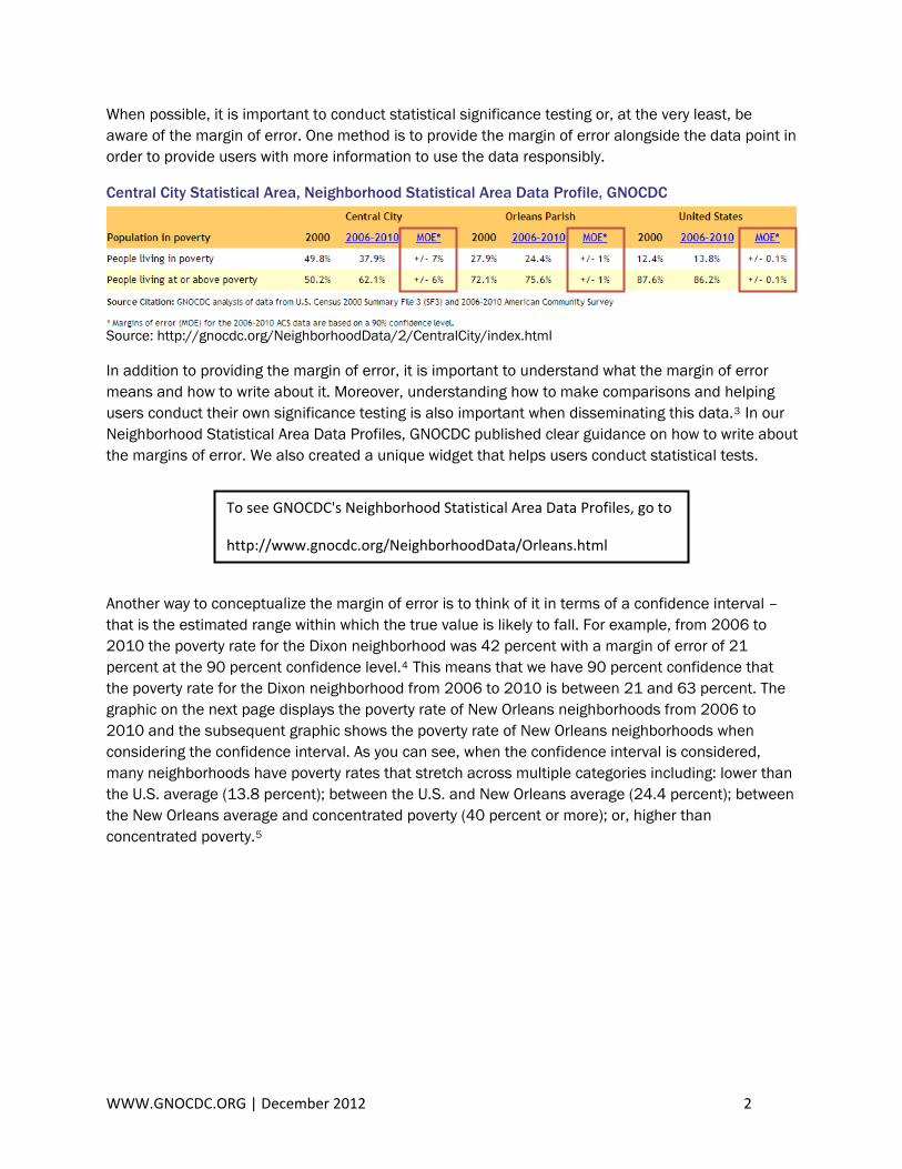
When possible, it is important to conduct statistical significance testing or, at the very least, be aware of the margin of error. One method is to provide the margin of error alongside the data point in order to provide users with more information to use the data responsibly.
Central City Statistical Area, Neighborhood Statistical Area Data Profile, GNOCDC
In addition to providing the margin of error, it is important to understand what the margin of error means and how to write about it. Moreover, understanding how to make comparisons and helping users conduct their own significance testing is also important when disseminating this data.3 In our Neighborhood Statistical Area Data Profiles, GNOCDC published clear guidance on how to write about the margins of error. We also created a unique widget that helps users conduct statistical tests.
To see GNOCDC's Neighborhood Statistical Area Data Profiles, go to
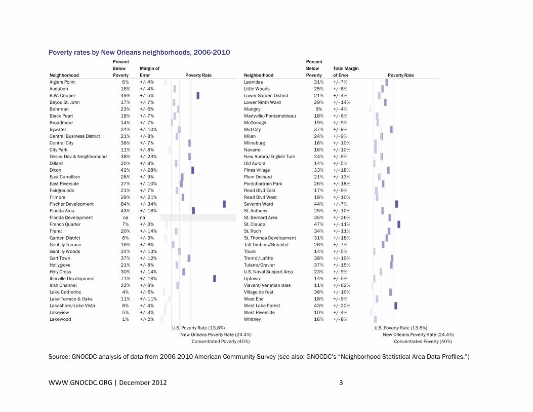
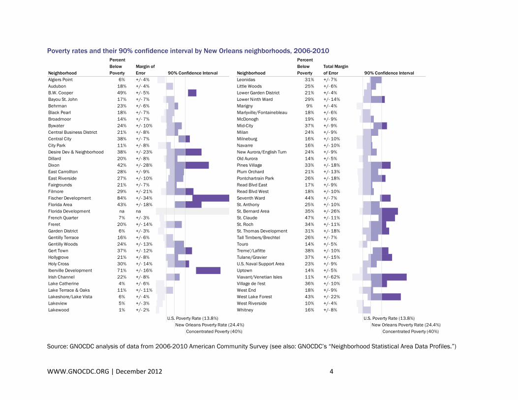
Another way to conceptualize the margin of error is to think of it in terms of a confidence interval – that is the estimated range within which the true value is likely to fall. For example, from 2006 to 2010 the poverty rate for the Dixon neighborhood was 42 percent with a margin of error of 21 percent at the 90 percent confidence level.4 This means that we have 90 percent confidence that the poverty rate for the Dixon neighborhood from 2006 to 2010 is between 21 and 63 percent. The graphic on the next page displays the poverty rate of New Orleans neighborhoods from 2006 to 2010 and the subsequent graphic shows the poverty rate of New Orleans neighborhoods when considering the confidence interval. As you can see, when the confidence interval is considered, many neighborhoods have poverty rates that stretch across multiple categories including: lower than the U.S. average (13.8 percent); between the U.S. and New Orleans average (24.4 percent); between the New Orleans average and concentrated poverty (40 percent or more); or, higher than concentrated poverty.5
Source: GNOCDC analysis of data from 2006-2010 American Community Survey (see also: GNOCDC’s “Neighborhood Statistical Area Data Profiles.”)
WWW.GNOCDC.ORG | December 2012 4
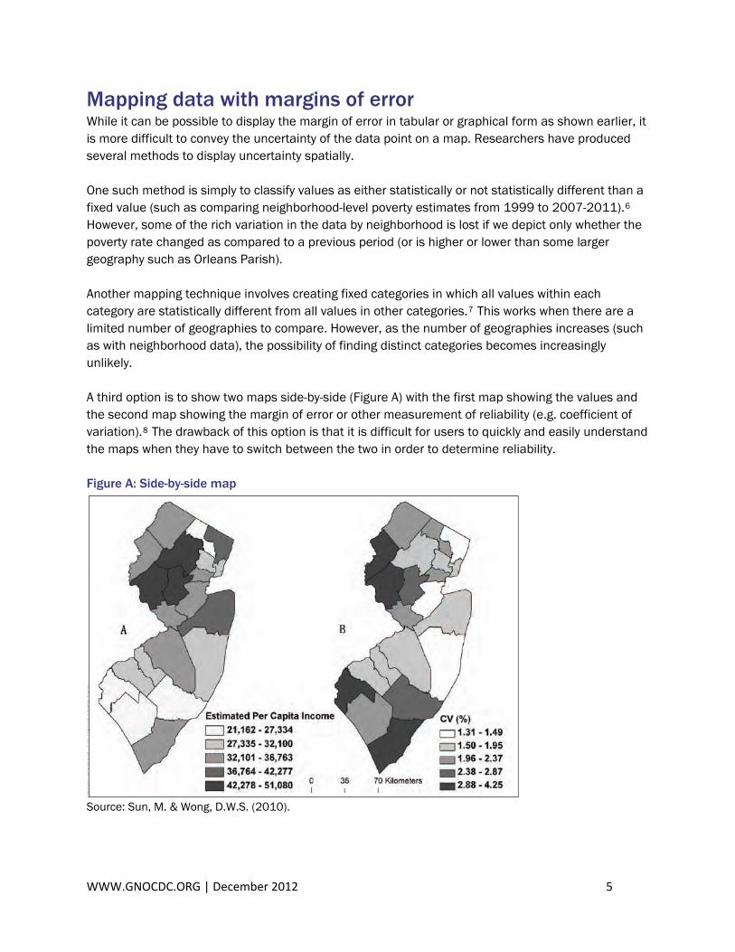
Mapping data with margins of error While it can be possible to display the margin of error in tabular or graphical form as shown earlier, it is more difficult to convey the uncertainty of the data point on a map. Researchers have produced several methods to display uncertainty spatially. One such method is simply to classify values as either statistically or not statistically different than a fixed value (such as comparing neighborhood-level poverty estimates from 1999 to 2007-2011).6 However, some of the rich variation in the data by neighborhood is lost if we depict only whether the poverty rate changed as compared to a previous period (or is higher or lower than some larger geography such as Orleans Parish). Another mapping technique involves creating fixed categories in which all values within each category are statistically different from all values in other categories.7 This works when there are a limited number of geographies to compare. However, as the number of geographies increases (such as with neighborhood data), the possibility of finding distinct categories becomes increasingly unlikely. A third option is to show two maps side-by-side (Figure A) with the first map showing the values and the second map showing the margin of error or other measurement of reliability (e.g. coefficient of variation).8 The drawback of this option is that it is difficult for users to quickly and easily understand the maps when they have to switch between the two in order to determine reliability. Figure A: Side-by-side map
Source: Sun, M. & Wong, D.W.S. (2010).
WWW.GNOCDC.ORG | December 2012 5
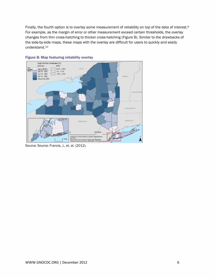
Finally, the fourth option is to overlay some measurement of reliability on top of the data of interestFor example, as the margin of error or other measurement exceed certain thresholds, the overchanges from t
.9 lay
hin cross-hatching to thicker cross-hatching (Figure B). Similar to the drawbacks of e side-by-side maps, these maps with the overlay are difficult for users to quickly and easily
Figure B: Map featuring reliability overlay
thunderstand.10
Source: Source: Francis, J., et. al. (2012).
WWW.GNOCDC.ORG | December 2012 6
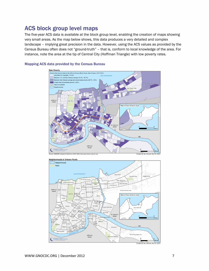
ACS block group level maps The five-year ACS data is available at the block group level, enabling the creation of maps showing very small areas. As the map below shows, this data produces a very detailed and complex landscape – implying great precision in the data. However, using the ACS values as provided by the Census Bureau often does not “ground-truth” – that is, conform to local knowledge of the area. For instance, note the area at the tip of Central City (Hoffman Triangle) with low poverty rates. Mapping ACS data provided by the Census Bureau
WWW.GNOCDC.ORG | December 2012 7
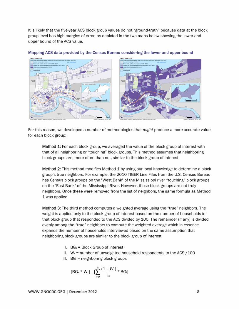
It is likely that the five-year ACS block group values do not “ground-truth” because data at the block group level has high margins of error, as depicted in the two maps below showing the lower and upper bound of the ACS value. Mapping ACS data provided by the Census Bureau considering the lower and upper bound
For this reason, we developed a number of methodologies that might produce a more accurate value for each block group:
Method 1: For each block group, we averaged the value of the block group of interest with that of all neighboring or “touching” block groups. This method assumes that neighboring block groups are, more often than not, similar to the block group of interest. Method 2: This method modifies Method 1 by using our local knowledge to determine a block group’s true neighbors. For example, the 2010 TIGER Line Files from the U.S. Census Bureau has Census block groups on the "West Bank" of the Mississippi river “touching” block groups on the "East Bank" of the Mississippi River. However, these block groups are not truly neighbors. Once these were removed from the list of neighbors, the same formula as Method 1 was applied. Method 3: The third method computes a weighted average using the “true” neighbors. The weight is applied only to the block group of interest based on the number of households in that block group that responded to the ACS divided by 100. The remainder (if any) is divided evenly among the “true” neighbors to compute the weighted average which in essence expands the number of households interviewed based on the same assumption that neighboring block groups are similar to the block group of interest.
I. BGx = Block Group of interest II. Wx = number of unweighted household respondents to the ACS /100
III. BGi = neighboring block groups
]BG*i
)(1[]W*[BG i
i
0i nxx
n
∑=
−+
xW
WWW.GNOCDC.ORG | December 2012 8
Method 4: The fourth method is similar to the third method, but weights neighboring block groups as well as the block group of interest based on the number of households that responded to the ACS in each block group. Like the third method, a weight is applied to the block group of interest based on the number of households. And the remainder weight from the block group of interest is spread across the neighboring block groups, but in a manner that incorporates the individual block groups weighting compared to the other neighbors.
I. BGx = Block Group of interest II. Wx = weight of block group of interest
III. BGi = neighboring block groups IV. Yi = weight of neighboring block group
)] )W - (1 * )Y
Y ( (*BG[]W*[BG x
i
0ii
0i
i
ixxx
n
n∑∑=
=
+
Evaluating the different methodologies While “ground-truthing” the maps created with the different methodologies is useful, a more rigorous evaluation of the estimated demographic values can be conducted by measuring how closely they align with the 2010 Census results. The 2007-2011 ACS time frame overlaps with the time frame when the 2010 Census head count took place. And the ACS measures a few household level variables that are captured by the 2010 Census count as well. Therefore, it is likely that for these household level variables, the 2007-2011 ACS and 2010 Census should produce relatively similar results. We conducted the evaluation using household size by type because it is the most robust Census 2010 household variable.11 The index of dissimilarity (IOD) was used to evaluate each method. The index of dissimilarity can be used to measure the evenness of the distribution of household type and size in the 2007-2011 ACS (or estimation method) versus the 2010 Census. In other words, the IOD measures the percent of values in the ACS that would have to change in order to have perfect symmetry with the 2010 Census.12 The smaller the resulting IOD percentage, the more closely the ACS or estimation method yields results that hue to Census 2010 results. Thus, the method with the smallest IOD percentage is preferable.
Index of dissimilarity = ∑=
K
1i
ii | Y- X|2/1
I. Xi = the percentage distribution from Census 2010 within a given block group II. Yi = the percentage distribution from 2007-2011 ACS within a given block
group for each method described above.
WWW.GNOCDC.ORG | December 2012 9
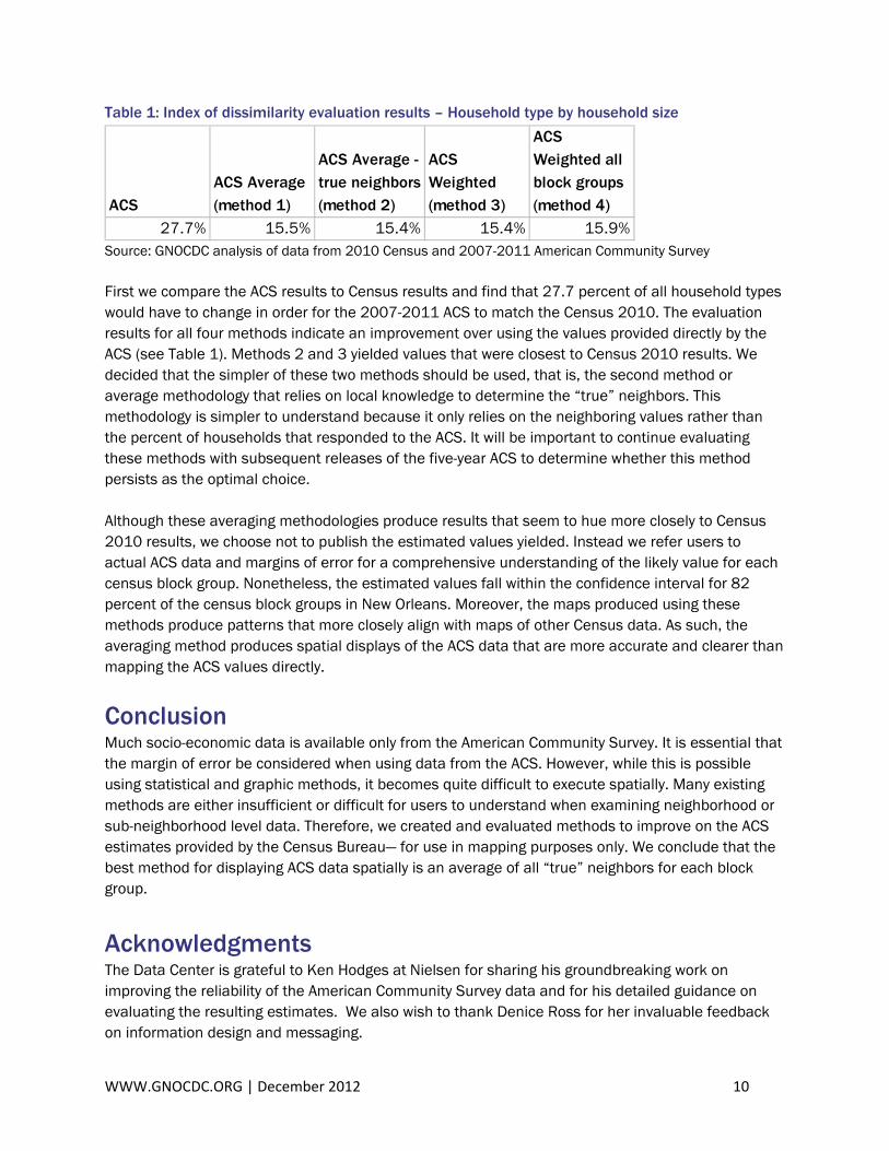
Table 1: Index of dissimilarity evaluation results – Household type by household size
ACSACS Average (method 1)
ACS Average - true neighbors (method 2)
ACS Weighted (method 3)
ACS Weighted all block groups (method 4)
27.7% 15.5% 15.4% 15.4% 15.9% Source: GNOCDC analysis of data from 2010 Census and 2007-2011 American Community Survey First we compare the ACS results to Census results and find that 27.7 percent of all household types would have to change in order for the 2007-2011 ACS to match the Census 2010. The evaluation results for all four methods indicate an improvement over using the values provided directly by the ACS (see Table 1). Methods 2 and 3 yielded values that were closest to Census 2010 results. We decided that the simpler of these two methods should be used, that is, the second method or average methodology that relies on local knowledge to determine the “true” neighbors. This methodology is simpler to understand because it only relies on the neighboring values rather than the percent of households that responded to the ACS. It will be important to continue evaluating these methods with subsequent releases of the five-year ACS to determine whether this method persists as the optimal choice. Although these averaging methodologies produce results that seem to hue more closely to Census 2010 results, we choose not to publish the estimated values yielded. Instead we refer users to actual ACS data and margins of error for a comprehensive understanding of the likely value for each census block group. Nonetheless, the estimated values fall within the confidence interval for 82 percent of the census block groups in New Orleans. Moreover, the maps produced using these methods produce patterns that more closely align with maps of other Census data. As such, the averaging method produces spatial displays of the ACS data that are more accurate and clearer than mapping the ACS values directly.
Conclusion Much socio-economic data is available only from the American Community Survey. It is essential that the margin of error be considered when using data from the ACS. However, while this is possible using statistical and graphic methods, it becomes quite difficult to execute spatially. Many existing methods are either insufficient or difficult for users to understand when examining neighborhood or sub-neighborhood level data. Therefore, we created and evaluated methods to improve on the ACS estimates provided by the Census Bureau— for use in mapping purposes only. We conclude that the best method for displaying ACS data spatially is an average of all “true” neighbors for each block group.
Acknowledgments The Data Center is grateful to Ken Hodges at Nielsen for sharing his groundbreaking work on improving the reliability of the American Community Survey data and for his detailed guidance on evaluating the resulting estimates. We also wish to thank Denice Ross for her invaluable feedback on information design and messaging.
WWW.GNOCDC.ORG | December 2012 10
WWW.GNOCDC.ORG | December 2012 11
The author thanks colleagues at GNOCDC who contributed to this research and the resulting map collection. Charlotte Cunliffe provided key information design insights. Elaine Ortiz provided web and information design support. Susan Sellers provided editorial support, and Allison Plyer provided guidance on evaluation methods and mathematical formulations. Finally, the Data Center wishes to thank the United Way of Southeast Louisiana, Baptist Community Ministries, Metropolitan Opportunities Fund at the Greater New Orleans Foundation, RosaMary Foundation, JPMorgan Chase Foundation, blue moon fund, and John S. and James L. Knight Foundation for their support.
1 U.S. Census Bureau. (2008). A compass for understanding and using American Community Survey data: What general data users need to know. Washington, D.C.: U.S. Government Printing Office. Retrieved December 5, 2012 from http://www.census.gov/acs/www/Downloads/handbooks/ACSGeneralHandbook.pdf
2 Ortiz, E. & Plyer, A. (2012). Who lives in New Orleans and the metro area now? Greater New Orleans Community Data Center. Retrieved December 4, 2012 from https://gnocdc.s3.amazonaws.com/reports/GNOCDC_WhoLivesInNewOrleansAndTheMetroAreaNow.pdf.
Please note that the statistical testing was conducted at the 95% confidence interval using standard errors for the ACS and Census estimates, which are derived from the margin of error. The standard error for the ACS was calculated using formulas in Appendix 3 of “What General Data Users Need to Know” available at http://www.census.gov/acs/www/Downloads/handbooks/ACSGeneralHandbook.pdf. The standard errors for Census 2000 SF3 data were calculated using formulas from Chapter 8 of the Technical Documentation available at http://www.census.gov/prod/cen2000/doc/sf3.pdf.
3 For more information, see http://www.gnocdc.org/NeighborhoodData/MarginofError.html.
4 The confidence interval provided is at the 90th percentile, consistent with the margin of error provided on the GNOCDC “Neighborhood Statistical Area Data Profiles.”
5 The concentration of poverty is the share of the poor population living in high-poverty areas, defined as census tracts with a poverty rate of 40 percent or above. Plyer, A. & Ortiz, E. (2012). Poverty in Southeast Louisiana Post-Katrina. Greater New Orleans Community Data Center. Retrieved December 3, 2012 from https://gnocdc.s3.amazonaws.com/reports/GNOCDC_PovertyInSoutheastLouisianaPostKatrina.pdf.
6 For an example, see Plyer, A. & Ortiz, E. (2012). Poverty in Southeast Louisiana Post-Katrina. Greater New Orleans Community Data Center. Page 5 Retrieved December 3, 2012 from https://gnocdc.s3.amazonaws.com/reports/GNOCDC_PovertyInSoutheastLouisianaPostKatrina.pdf.
7 For an example, see Plyer, A. & Ortiz, E. (2012). Poverty in Southeast Louisiana Post-Katrina. Greater New Orleans Community Data Center. Page 5 Retrieved December 3, 2012 from https://gnocdc.s3.amazonaws.com/reports/GNOCDC_PovertyInSoutheastLouisianaPostKatrina.pdf.
8 Sun, M. and D. W. S. Wong. (2010). Incorporating data quality information in mapping the American Community Survey data. Cartography and Geographic Information Science 37 (4): 285-300. Retrieved September 6, 2012 from http://gesg.gmu.edu/census/Final_ACS_CaGIS_small.pdf.
9 Francis, J., Vink, J., Tontisirn, N., Anantsuksomsri, S., & Zhong, V. (2012). Alternative strategies for mapping ACS estimates and error of estimation. Cornell University, Program on Applied Demographics. Retrieved September 6, 2012 from http://pad.human.cornell.edu/papers/downloads/CPC_Strategies%20for%20Mapping%20ACS%20Estimate%20and%20MOE.pdf.
10 Torrieri, N., Wong, D., & Ratcliffe, M. (2011). Mapping American Community Survey data. Paper presented at the Joint Statistical Meetings - Section on Survey Research Methods. Retrieved December 3, 2012 from https://www.amstat.org/sections/SRMS/Proceedings/y2011/Files/300792_65633.pdf.
11 From the 2010 Census, we used tables “P28 – Household Type by Household Size.” From the ACS, we used tables “B11016 – Household Type by Household Size.”
12 Murdock, S.H. & Ellis, D.R. (1991). Applied demography: An introduction to basic concepts, methods, and data. Boulder, CO: Westview Press, Inc.