17
ADAPTABLE DASHBOARD FOR VISUALIZATION OF ORIGIN-DESTINATION DATA PATTERNS NCG Symposium 2017 Ieva Dobrāja, PhD Candidate Prof. Dr. Menno-Jan Kraak Dr. Yuri Engelhardt
ADAPTABLE DASHBOARD FOR
VISUALIZATION OF ORIGIN-DESTINATION
DATA PATTERNS
NCG Symposium 2017
Ieva Dobrāja, PhD Candidate
Prof. Dr. Menno-Jan Kraak
Dr. Yuri Engelhardt

INTRODUCTION
Airplane Movements(www.openflights.org)
Human Movements(Galka 2016)
Ship Movements(www.marinetraffic.com)
Animal Movements(www.washington.edu)
ADAPTABLE DASHBOARD FOR VISUALIZATION OF ORIGIN-DESTINATION DATA PATTERNS
02-Nov-17 2

The main purpose – to communicate complex information and encourage user for further exploration
• Displays the most important information on one screen
• Contains multiple linked graphic representations
• Shows overview, patterns, trends, outliers
• Storytelling
BACKGROUNDTHE ROLE OF A DASHBOARD
302-Nov-17Dashboard example(Rahman 2017)
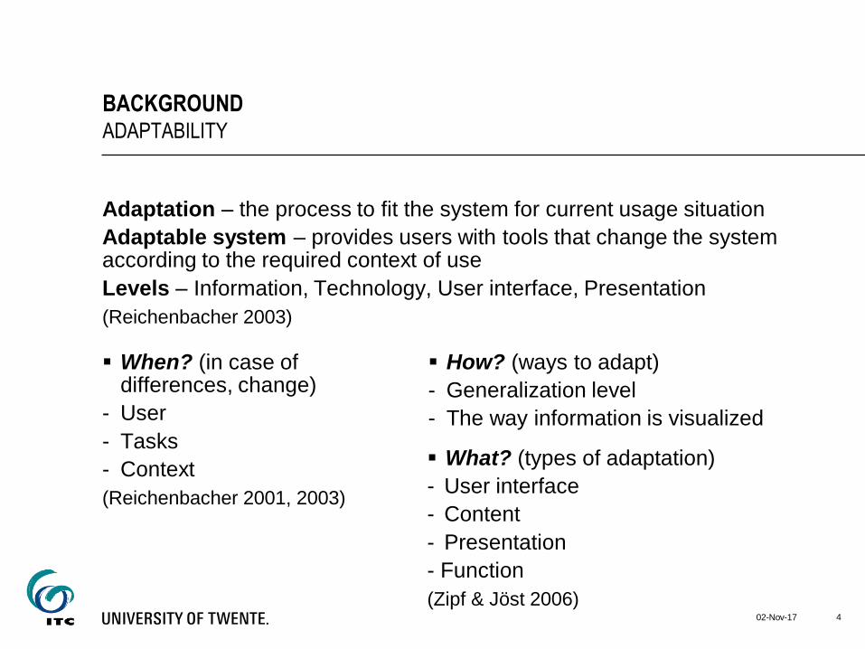
Adaptation – the process to fit the system for current usage situation
Adaptable system – provides users with tools that change the system according to the required context of use
Levels – Information, Technology, User interface, Presentation
(Reichenbacher 2003)
BACKGROUNDADAPTABILITY
02-Nov-17 4
How? (ways to adapt)
- Generalization level
- The way information is visualized
When? (in case of differences, change)
- User
- Tasks
- Context
(Reichenbacher 2001, 2003)
What? (types of adaptation)
- User interface
- Content
- Presentation
- Function
(Zipf & Jöst 2006)

The need
for
visualization
MOTIVATION AND PROBLEM STATEMENT
502-Nov-17
To get insights into O-D data
Number of
variables
Spatial and
temporal
components
Limitations of
traditional
dashboards
Location
• Origin
• Destination
• Fixed layout
• Not meant for
exploration
purposes
Attributes
• Airline
• Type
• Airplane capacity
• Ship age
• Crew members
(age, nationality)
• Travelled distance
• Ownership
Time
• Arrival
• Departure
• Travel time
• Transfer time
Spatial component(www.martingrandjean.ch)
Temporal component(www.metrocosm.com)
Source: ACI EUROPE & SEO AVIATION ECONOMICS (2017)

USER-CENTERED DESIGN (UCD)
02-Nov-17 6
Activities and iterative process of UCD(ISO 9241-210 2010)
• User questions of
interest (sub-case
studies)
• Requirements for the
dashboard
• Users
• The purpose for a dashboard
• Environment
• Technology
• Prototype of the dashboard
• Feedback from users

THE MAIN CHALLENGES IN VISUALIZATION OF O-D DATA
02-Nov-17 7
Dashboard designCarto(graphical) representation
Visual Clutter
Determinants of Visual Complexity(Miniukovich & De Angeli 2014)

Case Study 1 Airport Connectivity
• Global connectivity of world airports
• Connectivity of an airport of interest
• Development over time
• Trends:
Connectivity between Europe and Asia Pacific
Development of low cost carriers (LCC)
Case Study 2 Maritime Migration
• Connectivity
Labor migration patterns
Shipping patterns
Temporal patterns
• Links between ship efficiency and literacy level of crew members
CASE STUDIESSUB CASE STUDIES
802-Nov-17
Storytelling
(to represent known
information)
• Growth patterns
• Developments
Exploration
(to discover new information)
• What are the main flow
patterns?
• Are there changes over
time periods?
• Are there relations
between parameters?

• Airport Connectivity
Data set of flights from European airports
- Scheduled flights for 1 week (3rd week of June) for several years
- Direct and indirect flights
• Maritime Migration
2 data sets:
- Ships
- Crew members of the ships
CASE STUDIESDATA SETS
02-Nov-17 9
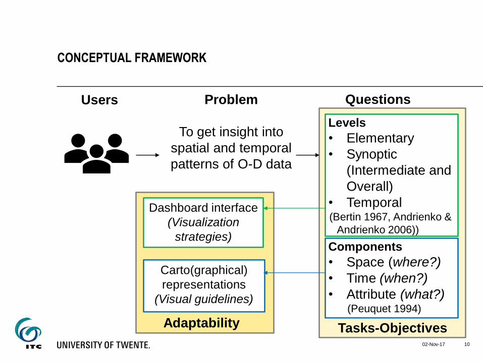
CONCEPTUAL FRAMEWORK
02-Nov-17 10
Problem
To get insight into
spatial and temporal
patterns of O-D data
Users
Dashboard interface
(Visualization
strategies)
Carto(graphical)
representations
(Visual guidelines)
Adaptability Tasks-Objectives
Questions
Levels
• Elementary
• Synoptic
(Intermediate and
Overall)
• Temporal(Bertin 1967, Andrienko &
Andrienko 2006))
Components
• Space (where?)
• Time (when?)
• Attribute (what?)(Peuquet 1994)

DASHBOARDS FOR BOTH CASE STUDIES
02-Nov-17 11
Storytelling
Airport Connectivity
Sub case
studies
as storylines
Exploration
Maritime MigrationSub case studies
and hypothesis
based questions
as potential
storylines
• Dashboard helps to tell
the story behind the data
• Storylines lead the user
through dashboard
based on the user
questions
• Dashboard helps to see
patterns and links of
involved components
• Sub case studies and
hypothesis based
questions help to ensure
exploration approach
How to represent patterns in a graphical
way so that it tells the story behind data?
Which graphical representations to
use to show the patterns and links?

CASE STUDY 1 (EXAMPLES)ELEMENTARY QUESTIONS
02-Nov-17 12
• Where is airport X located? (space) (Lookup/Locate/Search)
• Where are located airports with which airport X has connections?
(space) (Lookup)

CASE STUDY 1 (EXAMPLES)SYNOPTIC QUESTIONS
02-Nov-17 13
• Which hub airport provides the most onward connections to Asia
Pacific from airport X? (space and attribute) (Compare)
• Which airlines provide connections between airport X and Asia
Pacific? (attribute) (Identify)

Prototype of the dashboards for both case studies
Feedback from users
Usability test
FUTURE WORK
1402-Nov-17
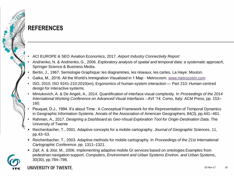
• ACI EUROPE & SEO Aviation Economics, 2017. Airport Industry Connectivity Report
• Andrienko, N. & Andrienko, G., 2006. Exploratory analysis of spatial and temporal data: a systematic approach,
Springer Science & Business Media.
• Bertin, J., 1967. Semiologie Graphique: les diagrammes, les réseaux, les cartes, La Haye: Mouton.
• Galka, M., 2016. All the World’s Immigration Visualized in 1 Map - Metrocosm. www.metrocosm.com
• ISO, 2010. ISO 9241-210:2010(en), Ergonomics of human-system interaction — Part 210: Human-centred
design for interactive systems.
• Miniukovich, A. & De Angeli, A., 2014. Quantification of interface visual complexity. In Proceedings of the 2014
International Working Conference on Advanced Visual Interfaces - AVI ’14. Como, Italy: ACM Press, pp. 153–
160.
• Peuquet, D.J., 1994. It’s about Time : A Conceptual Framework for the Representation of Temporal Dynamics
in Geographic Information Systems. Annals of the Association of American Geographers, 84(3), pp.441–461.
• Rahman, A., 2017. Designing a Dashboard as Geo-Visual Exploration Tool for Origin-Destination Data. The
University of Twente
Reichenbacher, T., 2001. Adaptive concepts for a mobile cartography. Journal of Geographic Sciences, 11,
pp.43–53.
Reichenbacher, T., 2003. Adaptive methods for mobile cartography. In Proceedings of the 21st International
Cartographic Conference. pp. 1311–1321.
Zipf, A. & Jöst, M., 2006. Implementing adaptive mobile GI services based on ontologies Examples from
pedestrian navigation support. Computers, Environment and Urban Systems Environ. and Urban Systems,
30(30), pp.784–798.
REFERENCES
1602-Nov-17

• www.marinetraffic.com
• www.martingrandjean.ch
• www.metrocosm.com
• www.openflights.org
• www.washington.edu
REFERENCES
02-Nov-17 17


