35
Alchemi | 1 ALCHEMI EMMA HOLLAND BFA Graphic Design | Senior Thesis 2018

Alchemi | 1
A L C H E M IE M M A H O L L A N D
BFA Graphic Design | Senior Thesis 2018


Alchemi | 3
I N T R O D U C T I O N . . . . . . . . . . . . . . . . . . . . . . . . . . . . . 1
T H E S I S . . . . . . . . . . . . . . . . . . . . . . . . . . . . . . . . . . . . . . . . . 1
M E T H O D O L O G Y . . . . . . . . . . . . . . . . . . . . . . . . . . . . . 1B O O K S . . . . . . . . 5
B O O K S . . . . . . . . 6
R E S E A R C H . . . . . . . . . . . . . . . . . . . . . . . . . . . . . . . . . . . . . 3B A C K G R O U N D I N F O R M AT I O N . . . . . . . . 7H I S T O R Y O F O R G A N I C A R T W O R K . . . . . . . . 5B A C K G R O U N D I N F O R M AT I O N . . . . . . . . 3H I S T O R Y O F D E S I G N A U T H O R S H I P. . . . . . . . 8
B O O K S . . . . . . . . 8
M a r k e t i n g & P r o m o t i o n . . . . . . . . . . . 8B R A N D I D E N T I T Y. . . . . . . . 8P R I N T A D V E R T I S I N G . . . . . . . . 9S E R V I C E A D V E R T I S I N G . . . . . . . . 9S O C I A L M E D I A . . . . . . . . 1 0T E C H N O L O G Y. . . . . . . . 1 0
P a c k a g i n g . . . . . . . . . . . . . . . . . . . . . . . . . . . . . . . . 1 0
D i g i t a l . . . . . . . . . . . . . . . . . . . . . . . . . . . . . . . . . . . . . . 1 1
Ou t - o f - h o m e . . . . . . . . . . . . . . . . . . . . . . . . . . . . 1 1
D e s i g n c o n s i d e r a t i o n . . . . . . . . . . . . . 1 2I M A G E R Y . . . . . . . . 1 2C O L O R . . . . . . . . 1 2T Y P O G R A P H Y . . . . . . . . 1 2C O N C E P T . . . . . . . . 1 2TA R G E T A U D I E N C E . . . . . . . . 1 2
A c t i o n s t a k e n . . . . . . . . . . . . . . . . . . . . . . . . . 1 4B U S I N E S S D E C I S I O N S . . . . . . . . 1 4B R A N D I D E N T I T Y . . . . . . . . 1 6PA C K A G I N G . . . . . . . . 1 8C O L L AT E R A L . . . . . . . . 1 9A D V E R T I S I N G . . . . . . . . 2 1A R C H I T E C T U R E . . . . . . . . 2 8W E B S I T E . . . . . . . . 2 9A P P L I C AT I O N . . . . . . . . 3 0
C o n c l u s i o n . . . . . . . . . . . . . . . . . . . . . . . . . . . . . . 3 2

I N T R O D U C T I O N
T H E S I S
M E T H O D O L O G Y
The population of the earth is growing at rapid speeds. By 2050 The United Nations predicts the population of the earth will be 9.6 billion. In order to keep up with this population growth, the rate of food production will have to grow by roughly 85% rather than the predicted 52%. Additionally, farming currently consumes about 80% of the U.S.’s fresh water. Wouldn’t it be great if there was a company able to combat overpopulation, fresh water waste, the carbon footprint associated with food transportation, food deserts, and minimize the use of harmful fertilizers and pesticides? Aeroponics allow for the growth of produce through a fine nutrient mist without the use of water and harmful pesticides.
This project involved the marketing and branding of Alchemi, a personalized aeroponic agriculture business that brings the open source spirit of commodity farming into the booming field of urban farming. This was accomplished through extensive research into produce farming, entrepreneurship, branding, advertising, and art history. Additional research was conducted on competing brands, technology based businesses, and recent consumer trends in order to accurately portray the business. This research led to the branding, advertising, package design, interactive design, motion design, photography, and art direction of Alchemi.
Descriptive research was used to gather information about urban gardening, traditional farming methods, and creative direction. This research helped to educate, clarify, and detail the specifications of Alchemi as both a successful product and branded urban farming business.
Alchemi | 5
B O O K S
100 Ideas That Changed Graphic Design by Steven Heller provided details about the history of graphic design and then a summary of pivotal changes along the way.
The Design Entrepreneur: Turning Graphic Design Into Goods That Sell by Steven Heller is the first book to survey the creative innovator through a number of case studies with designers who have leaped from mere design into production. Heller is an American art director, journalist, critic, author, and educator. Heller has received numerous awards for his accounts on the design industry and is credited with the footprint associated with the history of design.
The Alchemist by Paulo Coehlo provided details about the soul of the world and the underlying truth of creating magic from nothing. Paulo Coehlo is the recipient of numerous international awards and holds the highest amount of
novelist.
A Corporate Fool’s Guide to Surviving With Grace by Gordon Mackenzie details corporate normalcy, creative thought and his own professional evolution. Mackenzie worked at Hallmark Greeting Cards for over thirty years.
Ogilvy on Advertising by David Ogilvy provided a detailed account on persuasive communication through research figures, examples, and case studies on successful advertising. Ogilvy is known as the father of advertising due to his meticulous research with consumer habits and has been called “the most sought after wizard in the business.”
Ogilvy on Advertising in the Digital Age by Miles Young provides detail about the digital ecosystem and how to use available research for
optimal marketing against industry giants and a growingly complicated market; millennials. The book additionally offers trend predictions for the future of advertising and creative professions in general as a sequel to the original piece by Ogilvy himself. Young became the CEO of Ogilvy & Mather in 2009.
Hey Whipple Squeeze This: The Classic Guide to Creating Great Ads by Luke Sullivan provides advice for the modern fast-paced advertising industry through storytelling and conflict. The book has become a modern day rendition of Ogilvy for its all-encompassing account of advertising success, failure, and future. Sullivan has worked at some of the most well regarded advertising firms in the country and currently works with the
SCAD advertising DepartmentOne Plus One Equals Three: A
Masterclass in Creative Thinking by Dave Trott details creative impulse and provides creative exercises to strengthen those impulses. Trott studied at the Pratt Institute, majored in advertising, and went
on to be a highly successful creative director, copywriter, and author receiving numerous national awards.
Inside Art Direction by Steven Brower provides a number of interviews and case studies with a variety of art directors from industries such as advertising, illustration, and writing. Brower has served as the Creative Director of Print Magazine, and has received recognition from AIGA and a number of other international and national design critics.
How to Use Graphic Design to Sell Things, Explain Things, Make Things Look Better, Make People Laugh, Make People Cry, and (Every Once in a While) Change the World by Michael Bierut provides a retrospective on the career of a world renowned designer through
“ t h e s o u l o f t h ew o r l d a n d t h e
social media followers for a u n d e r l y i n g t r u t h
Orbiting the Giant Hairball: o f c r e a t i n g m a g i cf r o m n o t h i n g ”

his approach, inspiration, and selection process. Bierut is a protégé of design legend Massimo Vignelli and a partner at the world’s largest independent design consultancy, Pentagram, in New York and has been noted as “one of this century’s most renowned creative minds.”
Branding in Five and a Half Steps by Michael Johnson strips everyday brands down to the basic components through case studies of the world’s most successful brands. Johnson is a British graphic designer known for his ability to “distill the complex” with his rebranding as “one of Europe’s finest graphic designers.”
Kluge: The Haphazard Construction of the Human Mind by Gary Marcus argues that the human brain is fundamentally flawed and predictable for a unique perspective on human nature and processing. Marcus is a research psychologist whose work focuses on language biology and the mind and is currently a professor of psychology at NYU.
A R T I C L E S
“Inside an MIT Researcher’s Grand Plan to Create the Personal Food Computer” by Matt McFarland details the aeroponic technology being found at MIT’s CityFarm to make aeroponics more accessible for urban farming. McFarland is a CNN tech reporter that covers innovation in the technology through a variety of industries.

Alchemi | 7
R E S E A R C H
Results of the research led to valuable information related to the history of branding, promotion, entrepreneurship, advertising, collateral, design considerations, and the history of identity commonly used within similar industries.
B A C K G R O U N D I N F O R M AT I O NH I S T O R Y O F O R G A N I C A R T W O R K
O rganic forms can be traced back to the Lascaux Cave paintings in France for
their record of large animals some 20,000 years ago (Meggs 3). These organic art forms continued through generations to become widely popular with the “pervasive sentimentality and fastidious elegance of art nouveau” from 1890-1910. Organic forms then began to shift at the turn of the century with the industrial revolution and modernist ideals into highly stylized patterns with curvilinear floral motifs and rectangular elements that pushed the typical organic
qualities of art nouveau into the past for its unnecessary ornamentation (Heller, 100 Ideas, 60). The switch to conceptual, modernist, geometric design can also be credited to leading designers Charles Rennie Mackintosh, Koloman Moser, and Peter Behrens.
Charles Rennie Mackintosh, a Scottish architect and designer, similarly took the works of art nouveau and displayed them with geometric patterning and curvilinear qualities. Mackintosh was highly inspired by English Art Nouveau illustrator Aubrey Beardsley, who’s designs strongly influenced Chinese woodcuts and the aesthetic switch from art nouveau into geometric forms. Mackintosh paired with four other students, Margaret McDonald, Herbert McNair, and Frances McDonald to create a geometric style which blended the signature curvilinear elements and symbolic imagery of modernist design. These four created a magazine to display their artwork called Ver Sacrum (Meggs 251). Koloman Moser, an Austrian artist involved in the Vienna Secession movement, pioneered the stretch toward botanical geometry specifically. Scylla Wallpaper Design, by Moser in 1902, is a geometrical floral pattern whose graceful forms prefigure the more rigorous ornamentation that has since become synonymous with modernist design.
His work from the early twentieth century flattened out the typically three dimensional forms from organic specimens to create colorful patterning focused on shape and visual direction. Moser later became a principle designer for the Ver Saccrum along with Gustav Klimt and Josef Brockman where he created Ver Saccrum in 1902, a poster designed for the XIII Vienna Secession exhibition and magazine, showing the decorative tendencies to reject the realism from academic art of the time (Heller, 100 Ideas, 60). Klimt, largely known for his piece, The Kiss
1908, combined cubism with patterning to flatten the human figure with golden tones and organic ornamentation. Brockman, trained as an architect, created textiles after joining Klimt and Koloman in the Vienna secession which focused on plants, leaves, and the linear qualities of stems to “publicly
“ D i s t i l l th ec o m p l e x ”
reject the existing establishment’s emphasis on historicism and tradition” (Gibbons). The Swiss international of grid locked design and typography subsequently grew out of the geometric style established from the curvilinear geometry of Koloman, Behrens, and Mackintosh. Brockman, warned that the grid system is “an aid, not a guarantee, aimed to create sensible abstraction from geometric grid systems” (Heller, 100 Ideas, 140).
THE H IS TORY OF DES IGN AUTHORSH IP
The creation of a brand is “more even than the sum total of all its visuals, slogans, and ancillary products. A brand is an invisible entity, a story in the mind of consumers, a sense of excitement at the prospect of seeing, touching or acquiring a particular thing” (Heller, 100 Ideas, 148). A brand is an all- encompassing entity which includes the reaction of the consumer, its position in the public debate, and the origins of its discovery.

L O C AT I O N
Location of start-up businesses was researched and it was found that the most successful technologically advanced businesses, such as Apple and Amazon are based in major cities like San Francisco, California and Seattle, Washington. According to The Wall Street Journal, major businesses are returning to big cities for a number of reasons including trends in open space office environments, which occupy less real estate and can thus occupy spaces of urban nature, an ecosystem of advisors and services for legal, distribution, and talent reasons, and of course to maintain a competitive edge and an ability to respond to consumer needs in a timely manner (Nolop).
M A R K E T I N G & P R O M O T I O NB R A N D I D E N T I T Y
A griculture and technology call for a number of branding specifications. Outside of standard
FDA regulations required of food packaging, agriculture has a number of societal andcultural norms associated with its branding, as does technology. It is historically noted that agriculture companies often use earth tones in their branding such as greens, blues, and browns to reference the organic, natural aspects of their brand. It is similarly seen that technology companies use metallic and primary colors to reference the modern and industrial aspects of their brands. Agriculture companies found to be potential competitiors with Alchemi such as Tower Garden also use organic linework and airy design to portray their product which technologically advanced companies use hard edges and subtle textures to sell their products. Peter Behrens, a leader of the German Jugendstil, was a German artist, architect, and designer, known for his creation of what is now widely known as corporate identity. His modernist thought process was at the forefront of this aesthetic rebellion. The idea of developing a personalized, unified design scheme for business-consumer interaction with standards and templates was unheard of until 1907 when Behrens created the first corporate identity system. Before he became the design consultant for AEG, Germany's largest electrical company, there was no
“ t h e a e s t h e t i cr e b e l l i o n ”
formal corporate identity system or formal logo in place. His work for AEG became an
“aid-memoire that was recognizable as much outside as within the company” (Heller, 100 Ideas, 79). Behrens additionally went on to direct the Dusseldork
School of Arts and Crafts (DSAC) which provided introductory courses to The Bauhaus School, the ultimate hub for modernist, geometric design. Designers such as Paul Rand have since tackled the corporate identity system to overhaul the identities of business worldwide such as IBM. Today, the lack of a corporate identity system seems unimaginable, thanks to Peter Behrens (Meggs 445). The personality of a brand is truly an amalgamation of the name, price, product, and style that often are indistinguishable by product alone to the consumer. Creating an identity for a new brand requires choice architecture as “most customers shopping habits are well formedand hard to change…Don’t try to force or nag people into doing what you want. Accept that they are free to choose but you help them choose based on what you want... [you have to] go upstream and change the problem” rather than blindly accepting conventional wisdom (Trot 92). Brand loyalty has driven consumerism since the formulation of a brand began to take place with Behrens invention of the corporate identity system in 1907. “Take whiskey.

Alchemi | 9
P R I N T A D V E R T I S I N G
Print advertising will be used for its ability to simply market products to a broader audience. The ‘think small’ Volkswagen campaign lead by Bernbach in 1962 was simple in contrast to the conventionally exaggerated auto ads of the time. As the perfect example of branding posi-tioned to entertain away from their competitors, the entire campaign reflected the undersized beetle with clever copy that pointed out the virtues of owning such a small car. The “Lemon” piece within this campaign took a similarly humble position as a protest against Detroit to make the beetle and all of its drivers a cult among nonconformists looking for a realistic auto experience. The sales of the vehicle went up to 50,000 cars a year following the success of this brutally honest campaign (Heller 100 Ideas, 12). It is found through this campaign that when selling products, it is beneficial to be brutally honest about the realities and failures of the company. This is important especially for a company that is attempting to break into an industry.
S E R V I C E A D V E R T I S I N G
The first non-governmental ads to be considered Public Service Announcements (PSA’s) appeared after the turn of the century, along with curvilinear designs, and design authorship. The first of these PSA’s came with this aesthetic revolution through free ads ran in daily newspapers to draw attention to child labor. Felix Adler who supported the National Child Labor Committee ran these advertisements and designs necessary to educate the public and enact change within society. When the U.S. entered WWI in 1917, The Federal Committee of Public Information was then created to encourage support for the American Troops. A Division of Pictorial Publicity was formed within this committee by artist Charles Dana Gibson who recruited
“ g o u p s t r e a ma n d c h a n g e
t h e p r o b l e m . . . r a t h e r t h a n
b l i n d l y a c c e p t i n gc o n v e n t i o n a l
w i s d o m ”
Why do some people choose Jack Daniels while others choose Grand Dad or Taylor? Have they tried all three and compared the taste?... The reality is that these brands have different images which appeal to different kinds of people. It isn’t the whiskey they choose, it’s the image [because] the brand image is 90% of what the distiller has to sell…. They’re tasting images” (Ogilvy 15). Branding has the power to override the product, especially when dealing with uncharted, entrepren-eurial works that need to claim the trust of the consumer to elevate the public debate, through these campaigns has create awareness and unity nationwide.
numerous illustrators such as James Montgomery Flag for Uncle Sam Needs You. At this same time President Woodrow Wilson established a committee on Public Information which played a major role in war propaganda and public service efforts in general. With these advancements advertising, propaganda, and the public debate were in unison for national causes and stronger than numerous illustrators such as James Montgomery Flag for Uncle
Sam Needs You. At this same time President Woodrow Wilson established a committee on Public Information which played a major role in war propaganda and public service efforts in general. With these advancements advertising, propaganda and the public debate were in unison for national causes and stronger than ever before (Dalrymple). The United States Advertising Council (The Ad Council), founded in 1941 to support war propaganda, has become a powerful organization to coordinate and distribute public service campaigns of national relevance to this day.

The Ad Council has sponsored Rosie the Riveter, Keep America Beautiful, Smoky The Bear, and The Vince and Larry Crash Dummy Test, just to name a few. Cause marketing is a similar strategy promoting labels and trademarks such as Breast Cancer Awareness (Heller, 100 ideas, 139). The power of the controlled message has been lost with modern technology to interrupt consumer programing, but it is revitalized by campaigns such as the Coke Give Back initiative through pop culture engineering. The initiative is led by the Coca-Cola Foundation, founded in 1984, to raise money to support sustainable communities world-wide and has since grown to impact women through economic power and entrepreneurship, water through conservation and recycling, and wellbeing through education (Sullivan 20). America’s efforts to elevate the public debate, through these campaigns has create awareness and unity nationwide.
S O C I A L M E D I A
In a survey conducted for this thesis, it was found that respondents in the target market are more likely to be interested in a new product that has a heavy presence on social media. This response was mirrored by the majority of the target market preferring a product that is referred to them by a friend or someone that they follow on social media.
In Hey Whipple Squeeze This it is noted that “social media is where ideas, which become experiences, go to become immortal…it’s not about the stories we tell through social media, but the stories we get others to tell for us” (Sullivan 65). In this way social media will be used as a gathering place for social change through our product. It is further noted that “a brand becomes relevant by infusing itself directly into the culture. Advertising used to interrupt life’s programming. Now advertising is the programming. And if you’re being marketed to successfully, you’ll have no idea” due to pop-culture engineering (Sullivan 65).
T E C H N O L O G Y
The digital age has become increasingly reliant on technologically advanced advertising. It is prevalent and necessary to utilize the capabilities of modern day technology to engineer pop culture as hidden advertising. Technology companies have pioneered this movement as they have the brain power within their companies to alter that actual presentation of their work.
PA C K A G I N G
Secondary bene its will be highlights in collateral such as packaging (Sullivan 28). In a book on brain activity, a study was conducted on children ages three to five. The children gave "higher ratings to foods like carrots, milk, and apple juice if they came in McDonald's packaging. … We are born to be suckered” (Marcus 41). Packaging is entirely essential to the first impression of a brand, it can strengthen or deter a user based on its intuitive nature to simplify or complicate the product. Packaging design can save lives. In a case study found in Design Entrepreneurship, Deborah Adler realized that a new prescription labeling system could be used to save lives. Her prototype for the packaging began as a senior thesis and turned into a real product when taken up by Target as part of a radical revision to their drug packaging to make dosages and drug names easier to read and simpler in general (100 Ideas, 36).
Technology companies, such as Apple, were studied for their successful packaging which is noted to give users a sensory experience used to reinforce the brand before even interacting with the product they purchase itself. Apple is praised for its ability to maintain and herald in simplicity in the age of over stimulation and sensory overload. This is applied through a gestalt principal, meaning, the whole is perceived as greater than the sum of its parts. In this way Apple has successfully reinforced its brand through meticulously designed packaging that

Alchemi | 11
screams simplicity and modernity without any further necessary explanation. A 2014 study “Impact of Product Packaging in Consumers’ Buying Behavior” conducted through the European Journal of Scientific Research claims that “the packaging is perceived to be part of the product” so much so that “it can be difficult for consumers to separate the two,” which refers back to the principle of gestalt (Raheem).
Product based companies have a difficult time breaking into the market due to the overflow of products available today. In order for a product to stand out visually from its competitors, it is necessary to break the ‘norms’ of the business. This was seen through Wrigley’s 5 Gum which broke away from the typically colorful, outgoing packaging found in chewing gum companies and instead created a photography based package with black backgrounds. It was also discovered in consumer eye tracking that shoppers typically spend about 5 seconds looking at a product, so lack of distraction is key especially for a new product that will not have a brand bias initially (Personalics).
D I G I TA L
In Hey Whipple Squeeze This it is noted that “mobile is far more powerful as a response or activation mechanism to commercial messages we experience in other media… Creating serious utilitarian ideas that tie directly to the brand main offering” or otherwise the Alchemi product. It is further noted that mobile is likely to become the primary interface used by consumers for its ability to reach the consumer 24/7 and continue brand standards in a moving society (Sullivan 65). Viral advertising will be used through elements such as video clips, interactive flash games, sms text messages, etc to get ideas spread in a timely response recorded manner.
O U T - O F - H O M E
In Hey Whipple Squeeze This Sullivan suggests that companies no longer make ads but create events that become advertising through media coverage, word of mouth, and consumer response. “The days of solving business problems by doing an ad or shooting a spot are over. In an interview with Rob Schwarts of TBWA/Chiat… 'I can do a holistic, fully integrated, major, big chunky thought that is media infinite'” (Sullivan 196).

D E S I G N C O N S I D E R AT I O N SI M A G E R Y
Technology based companies often use striking imagery in their branding to draw attention and hyper realism to the brand. This process began with Contempora Studios, a United States design collective founded in 1928 including the works of Lucian Bernhard and Rockwell Kent dreamed up concepts that largely fulfilled their own creative and profit driven needs. The three created striking imagery with Plakatstil inspiration of flat designs and combined their respective creative fields with business ventures for one of the first collaborative design authorship studios in history (Meggs 295). Design authorship can also be discovered through advertising campaigns when a company chooses to change the public perspective on their product for an entirely new brand experience.
In order to motivate the buying habits of a consumer, it is necessary to visually link the brand to a broader human truth. This is seen thorugh campaigns such as Phillip Morris of Marlboro tobacco company who decided to change the brand voice of his cigarette company in the mid 1950’s. To create this new branding, Leo Burnett, advertising giant, selected the cowboy as the quintessential Marlboro smoker, thus subliminally linking the once feminine cigarette to the powerful myth of the great American frontier (Heller, 100 Ideas, 148). Not only does a brand need to motivate the buying habits of the consumer, they also have to entertain their product away from any and all competitors. Geometry is found to be successful in a number of technology and agriculture brands as it often creates unique perspective with fragmentation and angular takes on imagery. The representation of otherwise organic forms in a geometric state was first notably seen in Marcel Duchamp’s Nude Ascending the Staircase No.2 from 1912, and Pablo Picasso’s Vollard from 1930, and cubism in general. The layering geometric forms later inspired the modern work of Bill Schwab’s Ge Capitol ad’s for a modernist take on typical work from art nouveau (Inside Art Direction 25). Bill Schwabb’s GE Capitol ads drew inspiration from work by Duschamp for its fragmented imagery.
C O L O R S
In a survey conducted for this thesis, 75% of respondents in the primary market said that they would be most likely to purchase a new product that is bright in color and innovative in nature vs. muted and subtle in nature. The boldness of chartreuse is researched as appealing to young people and is nature oriented in palette. Green typically represents enthusiasm, happiness, growth, and youth. This color is also known to aid in focus and creativity. Warm colors such as red are known for their energizing effects, ability to receive attention, and refreshing qualities. Cool tones represent clarity, idealism, balance, and creativity. In further color theory, mixing colors in a gradient is found to represent progress, movement, and general growth.
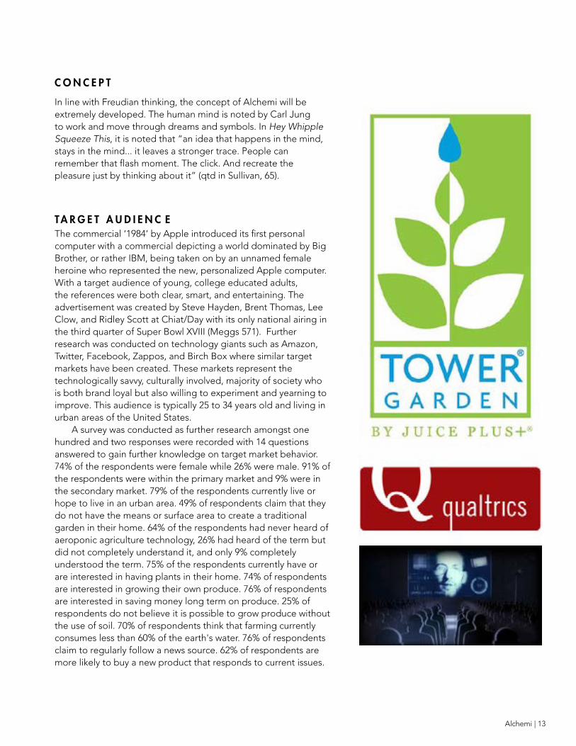
Competing companies were also observed and recorded with their use of color in branding and marketing means. Many agriculture and food businesses such as Tower Garden and Whole Foods use earth tones such as green, blue, and brown to emphasize their organic, natural qualities. Technology companies,
such as Apple, often use white and black and standard minimal colors with pops of primary colors to draw on stability. These companies also often feature gradients in their designs to create seamless growth and enhance the effortless nature of their products ability to change its environment.
T Y P O G R A P H Y
Hey Whipple Squeeze This, a highly acclaimed book on advertising notes to avoid fads with typography and rather chase after substance. The grid will be used in reference to the Swiss International Style of grid locked design and typography from post war 1940’s-1950’s. However; the grid system is an aid not a guarantee (100 Ideas, 146).
“ v i s u a l l y l i n k t h e b r a n d t o a b r o a d e r h u m a n
t r u t h ”
Alchemi | 13
C O N C E P T
In line with Freudian thinking, the concept of Alchemi will be extremely developed. The human mind is noted by Carl Jung to work and move through dreams and symbols. In Hey Whipple Squeeze This, it is noted that “an idea that happens in the mind, stays in the mind... it leaves a stronger trace. People can remember that flash moment. The click. And recreate the pleasure just by thinking about it” (qtd in Sullivan, 65).
TA R G E T A U D I E N C EThe commercial ‘1984’ by Apple introduced its first personal computer with a commercial depicting a world dominated by Big Brother, or rather IBM, being taken on by an unnamed female heroine who represented the new, personalized Apple computer. With a target audience of young, college educated adults, the references were both clear, smart, and entertaining. The advertisement was created by Steve Hayden, Brent Thomas, Lee Clow, and Ridley Scott at Chiat/Day with its only national airing in the third quarter of Super Bowl XVIII (Meggs 571). Further research was conducted on technology giants such as Amazon, Twitter, Facebook, Zappos, and Birch Box where similar target markets have been created. These markets represent the technologically savvy, culturally involved, majority of society who is both brand loyal but also willing to experiment and yearning to improve. This audience is typically 25 to 34 years old and living in urban areas of the United States.
A survey was conducted as further research amongst one hundred and two responses were recorded with 14 questions answered to gain further knowledge on target market behavior. 74% of the respondents were female while 26% were male. 91% of the respondents were within the primary market and 9% were in the secondary market. 79% of the respondents currently live or hope to live in an urban area. 49% of respondents claim that they do not have the means or surface area to create a traditional garden in their home. 64% of the respondents had never heard of aeroponic agriculture technology, 26% had heard of the term but did not completely understand it, and only 9% completely understood the term. 75% of the respondents currently have or are interested in having plants in their home. 74% of respondents are interested in growing their own produce. 76% of respondents are interested in saving money long term on produce. 25% of respondents do not believe it is possible to grow produce without the use of soil. 70% of respondents think that farming currently consumes less than 60% of the earth's water. 76% of respondents claim to regularly follow a news source. 62% of respondents are more likely to buy a new product that responds to current issues.
A C T I O N S TA K E N
Based on the results of the research, a number of design projects were executed including branding, packaging, advertising, digital, and collateral.
B U S I N E S S D E C I S I O N S
The target market was decided to be young, urban, socially involved, hobby driven people for their innovating thinking and technological minds. These individuals are interested in improvement, open to experimentation, and want to make a difference while staying connected. They are typically health conscious and brand loyal.
A secondary target market was created to be existing farmers and gardeners for their knowledge of traditional agriculture and hope to improve their current means of farming.
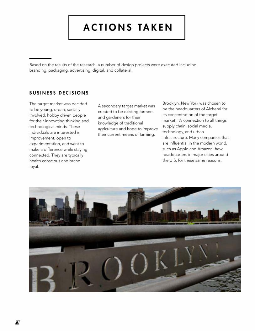
Brooklyn, New York was chosen to be the headquarters of Alchemi for its concentration of the target market, it’s connection to all things supply chain, social media, technology, and urban infrastructure. Many companies that are influential in the modern world, such as Apple and Amazon, have headquarters in major cities around the U.S. for these same reasons.

Alchemi | 15

B R A N D I D E N T I T Y
Alchemi was decided to be the namesake of the project through the research conducted in the intersection between science and art history. The word Alchemi is a combination of the traditional word Alchemy meaning the medieval forerunner to chemistry namely concerned with the magical transformation of matter from nothing into something. That word, Alchemy, was then changed in spelling to “Alchemi” to touch on the chemical solvent solution used with aeroponics to regulate plant growth.
The logo for Alchemi is predominantly a logo symbol that combines the traditional alchemist symbols for air, referencing the aeroponics behind Alchemi, and earth, referencing the nature of Alchemi as an agricultural advancement. The triangular forms of these symbols also
reference the geometry of the “A” in Alchemi. The positive and negative spaces in the logo symbol create a sense of development and growth within the Alchemi product as well as a hidden check mark to subliminally insert the idea of achievement within the user. The logotype creates open points between the counters of letters to emphasize the ability for Alchemi to grow and create an open space for the viewer to become involved.
The combination mark combines the logo symbol with the logotype in an airy layout to reference aeroponics and the growth of the brand.
Typography for Alchemi was purchased online through Creative Market. The fonts chosen were Kiona and Venti CF for their geometrical, complementary forms. Kiona was chosen to be the header font for
Alchemi. Kiona features extreme, modern points and verticality with subtle nuances in weight distribution to add drama and technology references to the brand. Venti CF utilizes similar geometry with softer edges.
The colors associated with Alchemi are chosen from the pantone book of colors and based on target audience, color theory, competing brands, vegetables, and technology. The colors chosen are Pantone Chartreuse, Biskay bay, and Melt. These colors are known for their urban, energetic, refreshing, idealistic, healthy, and sturdy properties. These colors were then broken down into secondary colors by mixing the colors to find their middle tones. This secondary palette shows the ability for alchemy to bring versatility, growth, and development to your life. These colors were then presented in a gradient to further emphasize the growth of Alchemi and reinforce the magical, transformative properties of the brand.
Imagery was chosen for the brand to reference the young, urban lifestyle associated with technologically forward, eco-friendly companies. The imagery reinforces the ease for Alchemi to be implemented into the consumers’ everyday life. The imagery is further
vibrant with high contrast and often within the color scheme chosen for the brand for subtle
unity. The imagery often features the target market interacting with the product or in the urban environment surrounding Alchemi. Imagery was expanded to include intricate illustrations based on traditional alchemist drawings. These drawings were discovered when researching the intersection between science history and art history. The drawings often featured symbolism and immense detail.
Layout for Alchemi is simple and asymmetrical. This reinforces the modern technology based side of the product. The layouts are often reliant on ‘negative’ space as it gives the viewer a focal point and simplifies an otherwise complex business model.
“ A l c h e m y m e a n i n g t h em e d i e v a l f o r e r u n n e r
t o c h e m i s t r y n a m e l y c o n c e r n e d w i t h t h e m a g i c a l
t r a n s f o r m a t i o n o f m a t t e r f r o m n o t h i n g
i n t o s o m e t h i n g ”

Alchemi | 17

C O L L AT E R A L
The collateral chosen for Alchemi includes a line of juice cleanse packages and alchemist gear. The alchemist gear includes a line of wearables with tshirts and accessories to further social conversation. The collateral chosen was based on target market research and surveys as well as the lifestyle associated with the product.
PA C K A G I N G
Packaging for Alchemi was created to resemble high tech company packaging. The packaging is flush with the products inside to create a seamless transition from package to product thus simplifying the user experience. The packaging is further reliant on textures to increase the sensory experience of the product and connect with the viewer on a deeper level. Through packaging research, it was discovered that packaging has a dramatic impact on the buying experience. For this reason, Alchemi’s product packaging stands out from the typical growing and agriculture product packaging found in retail and online stores to create a unique user experience. The packaging is founded around simple, innovative, minimal design with a focus on user interface.
The packaging of the actual product is transparent in nature to reflect the transparency of the brand and showcase the beauty of the roots of the plant being sprayed with solution. This further simplifies the user experience with Alchemi as the user is able to interact with the product in real time without being confused and obstructed by the barrier of opaque packaging.

Alchemi | 19

Alchemi | 21
A D V E R T I S I N G
Advertising was a focus of the thesis project for its ability to develop a new brand in a set market. The market for urban farming is relatively untapped and thus most consumers are not aware of the possibilities for urban farming to solve societal and environmental issues. However; advertising has the ability, when used correctly, to capture the attention of the target market in a non-invasive and inviting way. Immersive environmental advertising was created to meet the consumer in their daily space and create social conversation and customer follow through. Culture and lifestyle was utilized as an asset that can be owned to transcend the bittiness of the digital world.
An advertising campaign was created titled #homegrown that extended the product into the viewer’s everyday world to show the accessibility of Alchemi as
the future of urban farming.A launch TV spot to connect with
the viewer’s lifestyle and emotional needs. This launch spot further showed the ability for alchemy to integrate within this already established lifestyle, and to actually improve that lifestyle. The campaign
began by hiring a street artist to use eco-friendly Sugar Spray Paints to create “brandilism.” Brandilism is a term Ihave coined to define the intersection between branding and vandalism. Since Alchemi is a highly urban product, it was imperative that the product embraced the urban eccentricities of its target market. This includes street art. The artist created a massive #Homegrown art piece surrounded with modern takes on traditional alchemy symbols. This drawing was then executed in areas of high foot traffic to create social conversation and awareness. This type of a campaign would be highly broadcasted by both Alchemi and the target market on social media such as Snapchat, Instagram, and Facebook as an environmental art piece and a petition for a “homegrown” lifestyle.
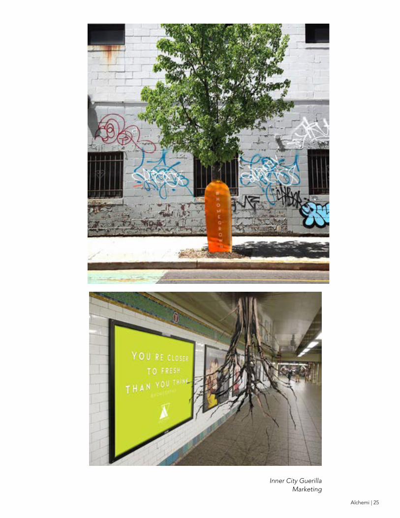
For campaign extension, large sculptural vegetables were placed at the base of trees in areas of high foot traffic to show the accessibility of Alchemi as the future of urban farming.
The piece extended to show large sculptural roots bursting from the ceiling of subway tunnels in areas of high foot traffic to again show the accessibility of Alchemi as the future of urban farming. The campaign was further extended with a takeover of the monumental Brooklyn Bridge through displaying a massive Alchemi logo symbol in vines around the signature cables on the Brooklyn Bridge. The execution has two viewpoints with the “Homegrown” and product name inside of the bridge on top of brick as a reference to Brandilism. The extension would create social conversation and mobility for the company as a Brooklyn based company. The campaign was extended again through print advertising to show the product in a modern, minimalist execution with creative surrealist photography to draw on the specific issues that Alchemi addresses, and how they can be
lessened through the use of Alchemi. The first print ad shows the ability for Alchemi to effect water scarcity in the United States by showing the snap peas, an Alchemi based product, replacing water that otherwise would have come from the faucet and have been wasted. Instead a beautiful and bountiful plant has taken its place. Alchemi uses 98% less water than traditional farming methods.
The second print ad shows the ability for Alchemi to impact food deserts. The visuals show a cucumber, an Alchemi grown plant, as a cactus to show the ability for Alchemi to take over dry and barren places with fresh produce. For each Alchemi kit ordered, you lessen food deserts by growing food in a reachable area, and a kit will be donated to a food shelter in a food desert near you.
“ C u l t u r e a n d l i f e s t y l e i s u t i l i z e d
a s a n a s s e t t h a t c a n b e o w n e d
t o t r a n s c e n d t h e b i t t i n e s s o f t h e d i g i t a l w o r l d ”


Alchemi | 23
Launch TV Spot

Inner City Guerilla Marketing
Alchemi | 25
Inner City Guerilla Marketing

Brandilism

Alchemi | 27
Brandilism

I N T E R A C T I V E
A s a technologically based company, Alchemi needed
an application that kept the user educated and involved throughout the growing process. The application gamifies the user experience with alchemist levels, tips, and a social platform to grow against your friends. The app tracks the spending and growing of each user to predict future spending and growing trends and connects with any of your designated devices to update the user on plant growth and notifications.

Alchemi | 29


Alchemi | 31
A R C H I T E C T U R E
A rchitecture was created for the headquarters and pop up store
of Alchemi to show the potential aesthetic associated with the urban physical scene of this product. A pop-up store was created to reflect the product design with a clear building encasing the base of the tree with the leaves of the tree expanding beyond the building to show the pop-up store as a massive execution of the product. The pop-up store would host demos, education on the environmental issues at hand and the product, as well as a site for sales in areas of high foot traffic. The headquarters were created in mostly silver metal to show the metallic associated with the brand in an urban setting with neon light up acrylic under the larger than life logotype. The building is covered in plants to give an immediate sense of the realms of Alchemi as urban farming. This building has the potential to also host a number of social gatherings that would host speakers on environmental issues, demos, sales, and would ultimately grow to be a catalyst of cultural change within the urban setting.
C O N C L U S I O N
Alchemi is the future of urban farming. When you combine overpopulation, water scarcity, and greenhouse gas emissions, the earth is left with massive food desserts that leave citizens eating processed, often fast foods. This thesis responds to the numerous environmental issues at hand through a creative, personalized, and versatile business model. The Alchemi kit utilizes culture as an asset that can be owned by displaying a brand that is not just socially beneficial and noticeable but is a pathway to change. By placing an emphasis on environmental advertising, the brand meets the consumer in their daily space to create advertising that is pervasive not invasive. This method also shows the accessibility of agriculture to integrate itself in the consumers typical, urban environment. Additionally, this type of advertising coerces peoples existing intensions in a hyper immersive way to transcend the bittiness so common in modern day advertising. The campaign, and brand in general, is designed for how people really behave, rather than how we traditionally think they behave.

WORKS CITED
Bierut, Michael. How to Use Graphic Design to Sell Things, Explain Things, Make Things Look Better, Make Pea pie Laugh, Make People Cry, and (Every Once in a While) Change the World. Harper Design, 2016.
Brower, Steven. Inside Art Direction: lnverviews and Case Studies. Fairchild Books, an Imprint of Bloomsbury Publishing Pie, 2016.
Dalrymple, H., and C. Goodrum. Advertising in America: the First 200 Years. Harry N. Abrams, Inc, 1990.
Gibbons , Julie. ''The Other Life of Josef Hoffmann -.• Pattern Observer,
10 Mar. 2014.
Heller, Steven, and Lita Talarico. The Design Entrepreneur: Turning Graphic Design into Goods That Sell. Rockport, 2008.
Heller, Steven, and Veronique Vienne. 100 Ideas That Changed Graplhic Design. Laurence King, 2014
"How Packaging Gives Apple's Buyers a Sensory Experience That Reinforces Brand." Personalics, 15 Mar. 2016
Meggs, Philip B. Meggs' History of Graphic Design. Wiley. 2016.
Nolop, Bruce. "Why Companies Are Returning to Big Cities." The Wall Street Journal, Dow Jones & Company, 27 Apr. 2016
Ogilvy, David. Ogilvy on Advertising. Crown Publishers, Inc , 1983
Raheem, Ahmed Rizwan, Parmar Vishnu, and Amin Muhammad Ahmed. "Impact of Product Packaging on Consumer’s Buying Behavior." European Journal of Scientific Research 122.2 (2014): 125-134.
Sullivan, Luke, and Edward Boches. Hey Whipple, Squeeze This: the Classic Guide to Creating Great Ads. John Wiley & Sons, Inc , 2016.
Trott, Dave. One plus One Equals Three. Macmillan, 2016.

Alchemi | 33


