21
ALVIN VALLEY

ALVIN VALLEY

www.pantone.com/fall06
STEADFASTAND STUNNING NEW YORK FASHION WEEK FALL 2006, FEBRUARY 3-10, 2006
JUST AS DAY TURNS TO TWILIGHT, FALL 2006 COLORS ARE A SUBTLE DEEPENING OF THE WORLD AROUND, LIT WITH THE FINAL GLOW OF THE TURNING HORIZON. NEW YORK DESIGNERS HAVE FOUND THEMSELVES IN A SANCTUARY OF COLOR, FILLED WITH THE CONSTANCY OF NIGHTFALL.
NEUTRALS TAKE CENTER STAGE AS A SOOTHING REMINDER OF LIFE’S MANY REASSURANCES: FROM FROST GRAY, EVOCATIVEOF A QUIET WINTER MORNING, TO APPLE CINNAMON, THEESSENCE OF FRESHLY BREWED TEA. THE NEUTRALS, WHILE SIMPLE, PROVIDE A LANDSCAPE FOR COMPLEXITY. THE TOUCHES OF RICH TONES IN THE PALETTE ADD AN EXOTIC DIMENSION TO THE NEUTRALS — ESPECIALLY RELEVANT AS ACCESSORIES CONTINUE TO PREVAIL. THE COMBINATION OF PALE KHAKI AND RED MAHOGANY TELLS THE STORY OF A CLASSIC BOOK, BOUND WITH A VELVET RIBBON. VETIVER PAIRED WITH PURPLE MAGIC IS A PLUSH COUCH DECORATED WITH A SILK PILLOW.
WARMTH AND VIBRANCY HAVE FOUND A WAY TO HARMONIZE. THIS SEASON’S ORANGE, GOLDEN OCHRE, GOES TO THE WARM SIDE WITH AN UMBER UNDERTONE AND A TOUCH OF ELEGANCE. MINERAL RED ADDS AN INVITING SENSE OF INTRIGUE WHEN USED AGAINST A BACKGROUND OF SIMPLY TAUPE, A BASIC YETCOMFORTING NEUTRAL.
STRONG THROUGH SEVERAL CONSECUTIVE SEASONS,NOTEWORTHY BIJOU BLUE GIVES A SENSE OF CONSTANCY, A COLOR WE CAN RELY ON. LEANING ON TEAL, IT IS A RARE SHADE THAT UNIVERSALLY COMPLEMENTS ALL SKIN TONES —A BEAUTIFUL COLOR FOR FLATTERING DESIGNS.
“FALL 2006 IS A TIME TO TRANSITION BACK TO MOREDEPENDABLE COLORS,” SAYS LEATRICE EISEMAN, EXECUTIVE DIRECTOR, PANTONE COLOR INSTITUTE®. WE’RE LOOKING FOR COLORS WE CAN WRAP OURSELVES IN — A FEELING ACHIEVED THROUGH CLASSIC NEUTRALS AS A BASE, ACCENTED WITH RICH HUES. HALF OF THE PALETTE, REMARKABLY, IS EXPRESSED IN BASIC CHESTNUTS — ALL VERY FAMILIAR, VERY APPROACHABLE TONES. IT’S AN INVITING WARMTH NOT SEEN IN THE PAST FEW SEASONS THAT DESIGNERS ARE NOW EMBRACING.”
FOR 12 YEARS, PANTONE, INC. HAS SURVEYED THE DESIGNERS OF NEW YORK FASHION WEEK TO BRING YOU THE SEASON’S MOST IMPORTANT COLOR TRENDS. THIS SKETCHBOOK PREVIEWS COLOR FOR FALL 2006. IT IS ALSO AVAILABLE ONLINE ATWWW.PANTONE.COM/FALL2006.
SIMPLY TAUPE
PANTONE 16-0906C.0 M.9 Y.25 K.27
PALE KHAKI
PANTONE 15-1216C.15 M.15 Y.46 K.3
APPLE CINNAMON
PANTONE 17-1045C.0 M.29 Y.79 K.18
GOLDEN OCHRE
PANTONE 16-1346C.0 M.52 Y.100 K.7
MINERAL RED
PANTONE 17-1537C.0 M.90 Y.83 K.12
FROST GRAY
PANTONE 17-0000C.2 M.2 Y.5 K.50
VETIVER
PANTONE 17-0613C.0 M.1 Y.30 K.50
BIJOU BLUE
PANTONE 18-3921C.88 M.71 Y.25 K.3
PURPLE MAGIC
PANTONE 19-3540C.57 M.100 Y.0 K.10
RED MAHOGANY
PANTONE 19-1521C.0 M.100 Y.90 K.55
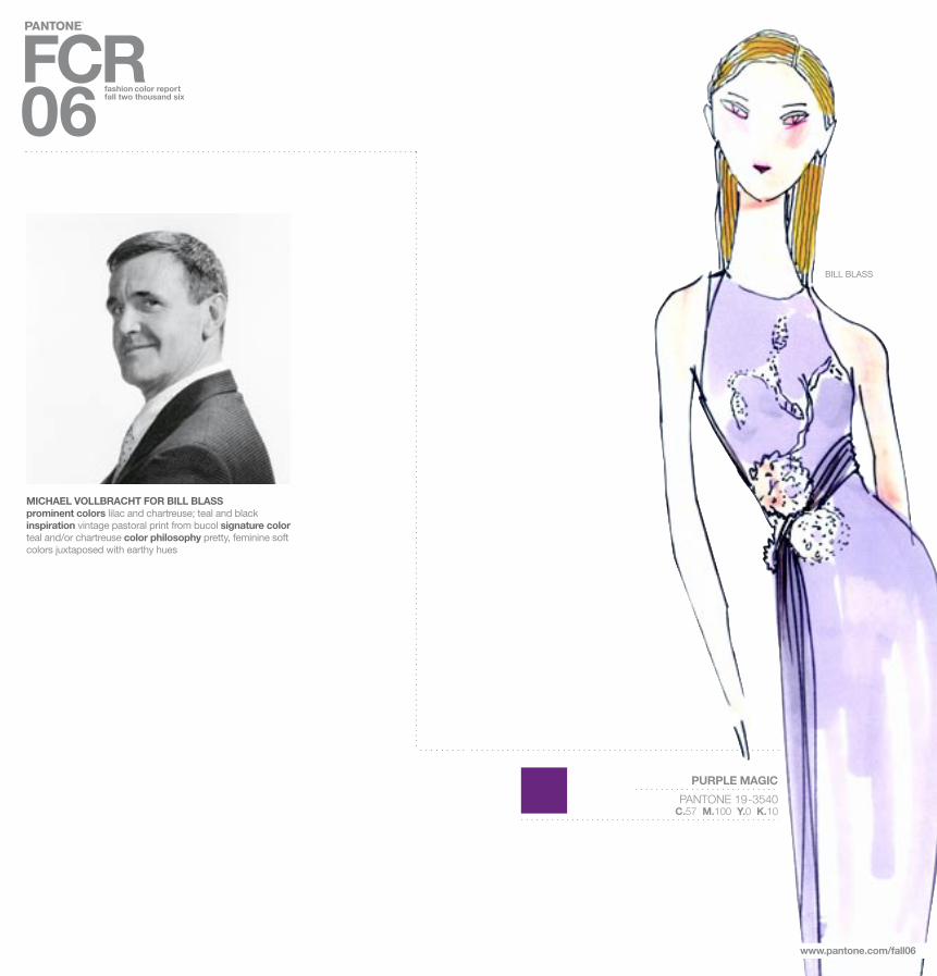
MICHAEL VOLLBRACHT FOR BILL BLASSprominent colors lilac and chartreuse; teal and black inspiration vintage pastoral print from bucol signature color teal and/or chartreuse color philosophy pretty, feminine soft colors juxtaposed with earthy hues
www.pantone.com/fall06
BILL BLASS
PURPLE MAGIC
PANTONE 19-3540C.57 M.100 Y.0 K.10

www.pantone.com/fall06
PURPLE MAGIC
PANTONE 19-3540C.57 M.100 Y.0 K.10
www.pantone.com/fall06
GILLES MENDEL FOR J. MENDELprominent colors powdery pales like chalk, pumice and dusty rose contrasted with black currant, the final accent is pewter metallic threads in the tweeds and gold lamé. inspiration a sophisticated palette is part of the signature of the house. signature color either chalk which we used for several gowns or wild berry, a new sensuous color for a knockout dress color philosophy powdery pales contrasted with deep stains J. MENDEL
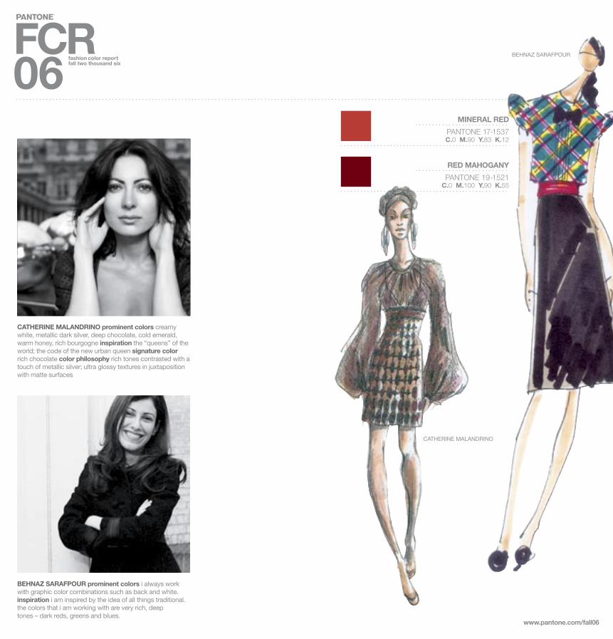
BEHNAZ SARAFPOUR prominent colors i always work with graphic color combinations such as back and white. inspiration i am inspired by the idea of all things traditional. the colors that i am working with are very rich, deeptones – dark reds, greens and blues.
www.pantone.com/fall06
MINERAL RED
PANTONE 17-1537C.0 M.90 Y.83 K.12
RED MAHOGANY
PANTONE 19-1521C.0 M.100 Y.90 K.55
CATHERINE MALANDRINO
BEHNAZ SARAFPOUR
CATHERINE MALANDRINO prominent colors creamy white, metallic dark silver, deep chocolate, cold emerald, warm honey, rich bourgogne inspiration the “queens” of the world; the code of the new urban queen signature color rich chocolate color philosophy rich tones contrasted with a touch of metallic silver; ultra glossy textures in juxtaposition with matte surfaces

BIJOU BLUE
PANTONE 18-3921C.88 M.71 Y.25 K.3
www.pantone.com/fall06
ZAC POSEN prominent colors there is nothing sexier and more real than navy and jet. inspiration this season’s girl is a “perfectionist rebel,” so i chose colors that evoke her fierce and moody side as well as her classic luxury. signaturecolor midnight navy color philosophy moody and rich withseductive classics: chocolate, jet and navy with sparks of sporty colors such as ochre, raspberry and billiard green
ZAC POSEN
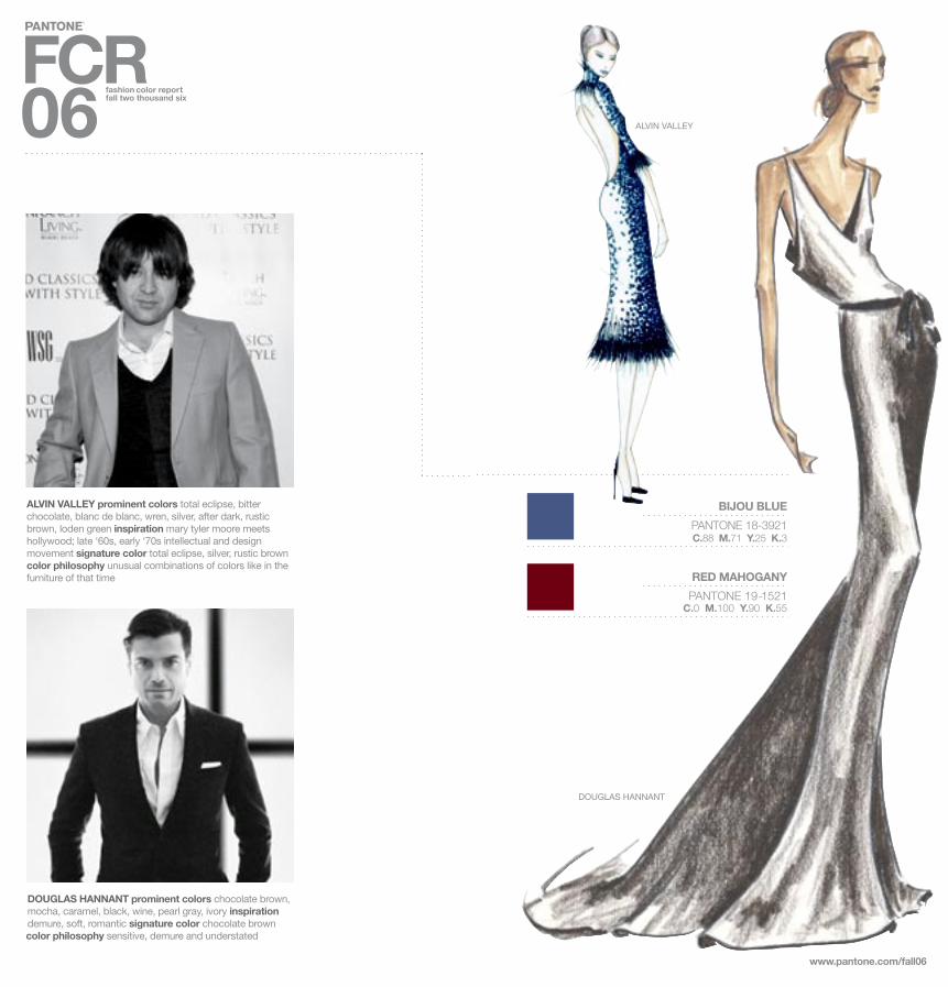
DOUGLAS HANNANT prominent colors chocolate brown, mocha, caramel, black, wine, pearl gray, ivory inspirationdemure, soft, romantic signature color chocolate brown color philosophy sensitive, demure and understated
BIJOU BLUE
PANTONE 18-3921C.88 M.71 Y.25 K.3
RED MAHOGANY
PANTONE 19-1521C.0 M.100 Y.90 K.55
www.pantone.com/fall06
ALVIN VALLEY
DOUGLAS HANNANT
ALVIN VALLEY prominent colors total eclipse, bitter chocolate, blanc de blanc, wren, silver, after dark, rustic brown, loden green inspiration mary tyler moore meets hollywood; late ‘60s, early ‘70s intellectual and design movement signature color total eclipse, silver, rustic brown color philosophy unusual combinations of colors like in the furniture of that time

PETER SOM prominent colors fall 2006 is about a graphic mix of jet black and cool dove gray with antique white. warm shades of reds – from pale rose to lipstick – add femininity. inspiration cecil beaton’s ascot from my fair lady signature color dove gray color philosophy this season a graphic but feminine combination of colors keeps it clean and sleek without being overpowering.
www.pantone.com/fall06
FROST GRAY
PANTONE 17-0000C.2 M.2 Y.5 K.50
PETER SOM
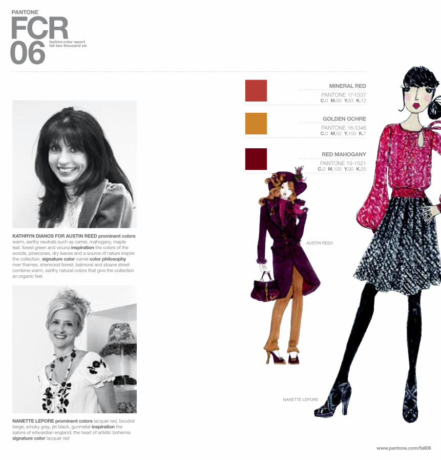
NANETTE LEPORE prominent colors lacquer red, boudoir beige, smoky gray, jet black, gunmetal inspiration thesalons of edwardian england; the heart of artistic bohemiasignature color lacquer red
MINERAL RED
PANTONE 17-1537C.0 M.90 Y.83 K.12
GOLDEN OCHRE
PANTONE 16-1346C.0 M.52 Y.100 K.7
RED MAHOGANY
PANTONE 19-1521C.0 M.100 Y.90 K.55
www.pantone.com/fall06
KATHRYN DIANOS FOR AUSTIN REED prominent colors warm, earthy neutrals such as camel, mahogany, maple leaf, forest green and vicuna inspiration the colors of the woods, pinecones, dry leaves and a source of nature inspire the collection. signature color camel color philosophy river thames, sherwood forest, balmoral and sloane street combine warm, earthy natural colors that give the collection an organic feel.
NANETTE LEPORE
AUSTIN REED
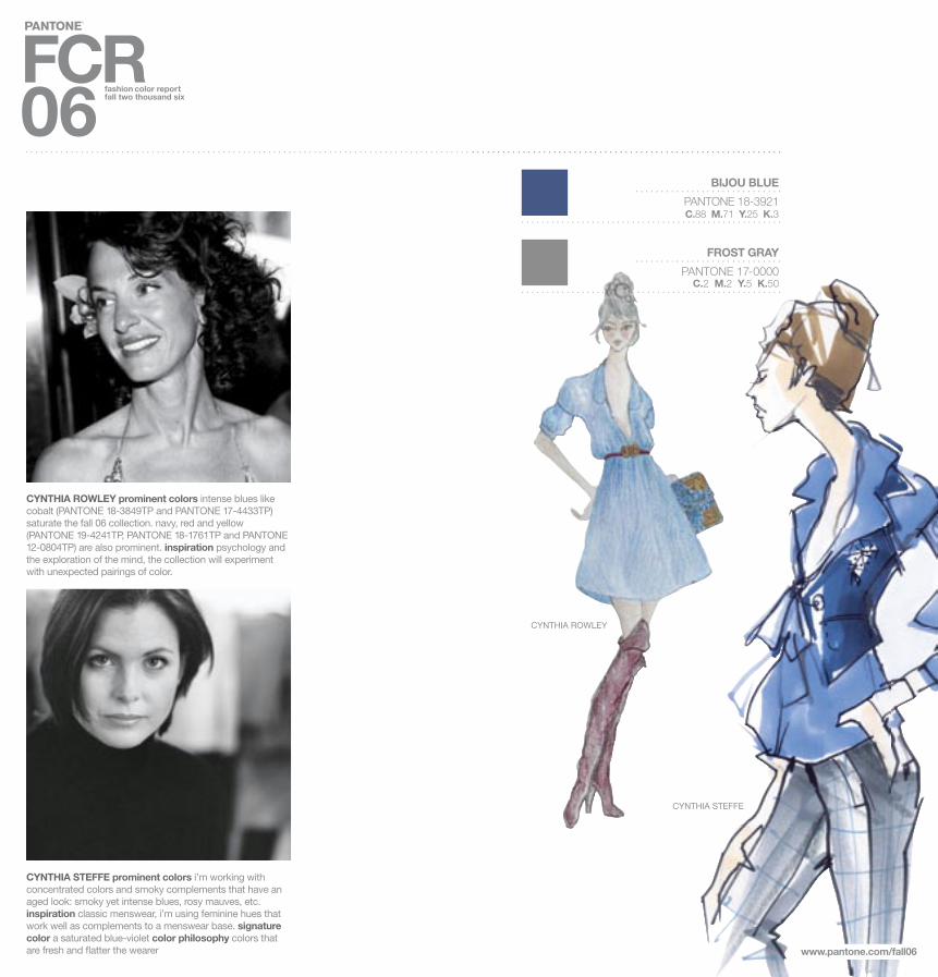
CYNTHIA ROWLEY prominent colors intense blues likecobalt (PANTONE 18-3849TP and PANTONE 17-4433TP) saturate the fall 06 collection. navy, red and yellow(PANTONE 19-4241TP, PANTONE 18-1761TP and PANTONE 12-0804TP) are also prominent. inspiration psychology and the exploration of the mind, the collection will experimentwith unexpected pairings of color.
CYNTHIA STEFFE prominent colors i’m working withconcentrated colors and smoky complements that have an aged look: smoky yet intense blues, rosy mauves, etc. inspiration classic menswear, i’m using feminine hues that work well as complements to a menswear base. signature color a saturated blue-violet color philosophy colors that are fresh and fl atter the wearer
BIJOU BLUE
PANTONE 18-3921C.88 M.71 Y.25 K.3
FROST GRAY
PANTONE 17-0000C.2 M.2 Y.5 K.50
CYNTHIA STEFFE
CYNTHIA ROWLEY
www.pantone.com/fall06
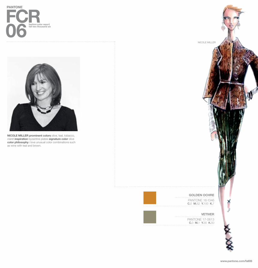
NICOLE MILLER prominent colors olive, teal, tobacco, claret inspiration byzantine plates signature color olive color philosophy i love unusual color combinations suchas wine with teal and brown.
www.pantone.com/fall06
GOLDEN OCHRE
PANTONE 16-1346C.0 M.52 Y.100 K.7
VETIVER
PANTONE 17-0613C.0 M.1 Y.30 K.50
NICOLE MILLER
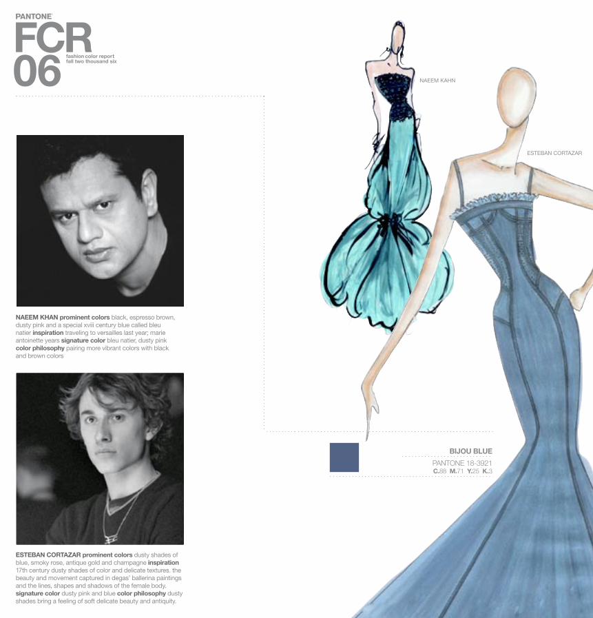
NAEEM KHAN prominent colors black, espresso brown, dusty pink and a special xviii century blue called bleu natier inspiration traveling to versailles last year; marieantoinette years signature color bleu natier, dusty pinkcolor philosophy pairing more vibrant colors with blackand brown colors
ESTEBAN CORTAZAR prominent colors dusty shades of blue, smoky rose, antique gold and champagne inspiration 17th century dusty shades of color and delicate textures. the beauty and movement captured in degas’ ballerina paintings and the lines, shapes and shadows of the female body. signature color dusty pink and blue color philosophy dusty shades bring a feeling of soft delicate beauty and antiquity. www.pantone.com/fall06
BIJOU BLUE
PANTONE 18-3921C.88 M.71 Y.25 K.3
NAEEM KAHN
ESTEBAN CORTAZAR
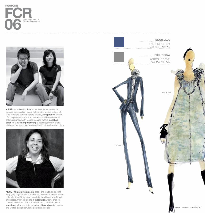
Y & KEI prominent colors primary colors: ermine white, almond, gold, carbon black. outstanding accent colors: ink blue, lavender, sensual purple, amethyst inspiration images of a crisp winter scene. the pureness of white and naturalcolors enhanced with rococo inspired details signature color ink blue color philosophy a cool elegance of sharp white and natural colors accented with rich and ornate colors
ALICE ROI prominent colors black and white, and a light ashy gray, high impact burnt sienna, washed out teal – all the colors look as if they were once bright and have now faded or oxidized. think old polaroid. inspiration washy shades of burnt sienna and raw umber with bold black and white signature color burnt sienna color philosophy crisp blacks and whites alongside washed out acidic colors www.pantone.com/fall06
BIJOU BLUE
PANTONE 18-3921C.88 M.71 Y.25 K.3
FROST GRAY
PANTONE 17-0000C.2 M.2 Y.5 K.50
ALICE ROI
Y & KEI

WUNDERKIND BY WOLFGANG JOOPprominent colors colors for the fall 06 collection aremuted earth tones: brick red, saffron, camel, midnightblue, gray and black.
PAM DEVOS FOR PAMELLA ROLAND prominent colors seasonal fall colors including charcoal, moss green, copper, dark ruby red and deep jewel-tone blue. a subtle black undertone adds a sophisticated feel. inspiration artist john singer sargent and his painting “madame x” infl uenced the subtle sophisticated color references in the collection. the colors include a wide range of oranges, yellows and grays. signature color navy and deep blue tones color philosophy infusing the rich and sophisticated colors of sargent’s portraits and landscapes
MINERAL RED
PANTONE 17-1537C.0 M.90 Y.83 K.12
GOLDEN OCHRE
PANTONE 16-1346C.0 M.52 Y.100 K.7
VETIVER
PANTONE 17-0613C.0 M.1 Y.30 K.50
www.pantone.com/fall06
PAMELLA ROLAND
WUNDERKIND

BABY PHAT BY KIMORA LEE SIMMONSprominent colors baby phat’s fall 2006 collection is about luxurious colors mixed with contrasting accents that punctuate our color story, starting with cool gray tones that transition into warm tones of rich burgundies and browns that are weaved with rich metallic hints. inspiration the upcoming baby phat fall 2006 collection is inspired by the elegance and panache of 20th century red carpet glamour. expect to see vamped-up suits, dresses, prints and fabrics where retro glam meets hip-hop royalty. signature color this season brown tones with pastel accents will be all the rage.color philosophy luxury and royalty define the babyphat color philosophy for fall 2006.
RED MAHOGANY
PANTONE 19-1521C.0 M.100 Y.90 K.55
APPLE CINNAMON
PANTONE 17-1045C.0 M.29 Y.79 K.18
GOLDEN OCHRE
PANTONE 16-1346C.0 M.52 Y.100 K.7
www.pantone.com/fall06
BABY PHAT

AKIKO OGAWA prominent colors graduations of gray, gold: PANTONE 13-0000TP moonbeam, PANTONE 15-1305TP feather gray, PANTONE 17-6205TP elephant skin,PANTONE 18-0403TP dull gull gray inspiration this seasoni was inspired by images of paris in the 1920s by jacques henri lartigue, most particularly a photograph of wiltingflowers. signature color PANTONE 15-1305TP feather gray color philosophy for this fall, i wanted my colors to be highlynuanced and evoke a classical, refined ambience. for me,this is manifested as a cloudy, hazy palette of graduationsof gray from smoky slate to charcoal.
PALE KHAKI
PANTONE 15-1216C.15 M.15 Y.46 K.3
VETIVER
PANTONE 17-0613C.0 M.1 Y.30 K.50
FROST GRAY
PANTONE 17-0000C.2 M.2 Y.5 K.50
www.panto ne.com/fall06
AKIKO OGAWA

SIMPLY TAUPE
PANTONE 16-0906C.0 M.9 Y.25 K.27
www.pantone.com/fall06
YIGAL AZROUEL prominent colors eggplant, mulberry, lilac, cobalt blue, midnight blue, ochre, army green, black, pearl and white inspiration gauguin signature color eggplant, shades of purple color philosophy expect the unexpected: mustard and midnight, olive and navy, cobalt and pearl.
PURPLE MAGIC
PANTONE 19-3540C.57 M.100 Y.0 K.10
RED MAHOGANY
PANTONE 19-1521C.0 M.100 Y.90 K.55
LAURA PORETZKY FOR ABAETÉ prominent colors titanium, sapphire navy and onyx. the combinations ofsapphire navy and wisteria and onyx and ginger.inspiration i was inspired by the warm tones combined with black in furniture made by bugatti, and my accents were inspired by the jewel tones that marioni fortuny used in his silk pleated fabrics. signature color warm gray and navy color philosophy mix dark with dark
ABAETÉ
YIGAL AZROUEL

JAMES COVIELLO prominent colors midnight teal,chartreuse, golden olive and smokey brown; plum wine, lavender, dusty tangerine and matte fuchsia; tarnished gold, faded salmon and khaki olive inspiration this season, the english interwar years (wwi and wwii) and the artists,tastemakers and aristocrats who peopled them are myinspiration. signature color midnight teal color philosophyjeweled tones faded by the sun
CHARLOTTE RONSON prominent colors cornflower blue, boysenberry reds, sandalwood brown. i chose a very warm color palette for a cold fall. inspiration the storybook, hansel and gretel signature color prussian blue color philosophy always embrace color for fall.
www.pantone.com/fall06
RED MAHOGANY
PANTONE 19-1521C.0 M.100 Y.90 K.55
BIJOU BLUE
PANTONE 18-3921C.88 M.71 Y.25 K.3
PALE KHAKI
PANTONE 15-1216C.15 M.15 Y.46 K.3
CHAROLETTE RONSON
JAMES COVIELLO

www.pantone.com/fall06
MUST-HAVE ITEMFOR FALL 06
AKIKO OGAWA Wrap coats in PANTONE 16-1305TP String
ABAETÉ The skinny pant and long jackets will be the must have items for fall.
ALICE ROI A Burnt Sienna wool jersey dress
ALVIN VALLEY Crystal beaded minidress with matching headband.Of course the impeccable fit of double cashmere AV classic pants.
AUSTIN REED Suede jacket in Camel or Brown
BABY PHAT BY KIMORA LEE SIMMONS Baby Phat dress embellished with fur and intricate beading in an either Midnight or Chocolate tone
BETSEY JOHNSON A bow tie and Black satin
MICHAEL VOLLBRACHT FOR BILL BLASS A Chartreuse double-faced cashmere swing coat
CATHERINE MALANDRINO Deep Chocolate and Bourgogne transparent tulle dress with handcrafted lace
CHARLOTTE RONSON My double-breasted tailor stripe cropped trench jacket – in Cornflower Blue of course.
DANA BUCHMAN A beautifully tailored knit jacket in Smoke Gray
DIANE VON FURSTENBERG A printed wrap dress in Red, Cameland Black
DOUGLAS HANNANT Olive Green Swakara fitted jacket
ESTEBAN CORTAZAR A Dusty Blue satin structured gown that embodies the lines, shapes and shadows of the female figure
J. MENDEL Custom-colored sables in either Chalk or Chestnut
JAMES COVIELLO Front-pleated chiffon blouse with neck bow inDusty Mauve
KENNETH COLE Paper-thin waxed leather wrap coat in Black
NAEEM KHAN An Espresso Brown capulet
NANETTE LEPORE A decadent Red velvet dance dress
NICOLE MILLER Hooded blouson sweater in Tobacco or Olive
PAMELLA ROLAND Our multi-colored paisley brocade coat with shawlcollar trimmed in leather – it boasts a beautiful mix of fall-toned Greens,Off-White, Copper and Brown
PETER SOM Dove Gray Metallic lace and tulle cocktail dress
TRACY REESE A structured frock in vampy Aubergine
WILLOW So far there is a sensational shirt/jacket which I love in Petrol Blue
Y & KEI Chic, sharply tailored suit in Ink Blue
YIGAL AZROUEL Cotton and silk voile blouse in washed Lilac with hand embroidery detail and ruched neckline
ZAC POSEN Our great tailored cocktail dress in Midnight Navy and Jet
PANTONE — the global expert in all things color — created PANTONE UNIVERSE on the simple principle that color is for everyone. The latestPANTONE UNIVERSE Collection, with a new home in Tokyo, makesit easy for design aficionados of all kinds to surround themselveswith bold hues and to style their homes with professional ease.
With striking, modern designs, PANTONE UNIVERSE brings color intothe home through a bold collection of bed, bath, kitchen and lifestyle products. Like only Pantone can do, every chair, sheet, pillowcase and slipper features designs that either incorporate or are reminiscent ofour signature PANTONE Color Chip.
The PANTONE UNIVERSE Home Collection, in partnership with threemanufacturers and under the IFS Japan umbrella, will be availablethroughout Japan in 2006 with plans to expand into a globallifestyle brand in the future. For licensing opportunities, pleaseemail [email protected].
NEVER LOST INTRANSLATION.
COLOR.

www.pantone.com/fall06
EXPERTS TALKABOUT FALL 06
HOW HAS THE HIGHLY POPULAR “NATURAL AND ORGANIC”TREND – FROM FOOD TO SKINCARE TO TEXTILES – INFLUENCED CONSUMERS’ FASHION CHOICES? WHAT ROLE DOES COLORPLAY IN THIS MARKET?
MICHAEL FINK, SENIOR FASHION DIRECTOR, SAKS FIFTH AVENUE It takes hours to look natural! Naturals and organics can ooze comfort and cool sophistication when applied with care. One misstep and suddenly you’re an earth mother poster child. Color is a wonderful solution to pop all of those Wheat, Oat and Bran colors.
CANDY PRATTS PRICE, EXECUTIVE FASHION DIRECTOR, STYLE.COM Consumers are familiar with the word “organic” in their food so they trust skincare products and textiles in the same way – healthier for you and your body. Pigments like Terracotta, Gold and Henna add the romance.
SIMON DOONAN, CREATIVE DIRECTOR, BARNEYS NEW YORK People have become more nuanced in their understanding of subtle organic tones –there are millions of subtle organic tones and a million ways to be sludgy.
ROOPAL PATEL, SENIOR WOMEN’S FASHION DIRECTOR, BERGDORFGOODMAN The natural and organic trend has been very influential among consumers. The direction for spring has been toned down and understated. Attention to texture and diversity within this color palette is key. Crochet, lace, appliqué and handcrafted techniques are important. Hair and makeup are much cleaner and natural. Home elements demand a much more organic approach to different fabrications. Natural and organic may be toned down, but the need for quality and luxury remains important to the consumer in regard to some of the “key” spring trends.
NINA GARCIA, FASHION DIRECTOR, ELLE Dior’s 2006 show was the best example of the natural trend. Ever theatrical in makeup and styling, John Galliano opted for an entirely nude palette. The message was loud and clear and the natural look of minimal makeup made an impact. Colors have been influenced by the increased use of natural fabrics: raffia, wood, crochet, wicker, linens and burlap, and all man-made fabrics have accented both clothing and accessories. The colors tend to be more sober and less saturated.
SASHA CHARNIN MORRISON, FASHION DIRECTOR, ALLURE Natural Oat Couture – every designer on this side of the pond and across it romanced neutral shades for spring. It’s the new Black. They layered it; they remixed it. As for consumers becoming attracted to it, it’s the news, its what celebrities will be photographed in. It will be featured in editorials in magazines andimpossible to ignore at retail. The way it’s merchandised on the floor in stores, consumers will be interested in the fresh, neutral palette which can be mixed with just about anything – lace, color, jeans, accessories, dogs, children. The challenge/fun part (for some) will be choosing the rightnude/neutral for your particular skin tone, much like matching afoundation to your skin.
THOM FILICIA, INTERIOR DESIGN EXPERT, NBC/BRAVO’S QUEER EYE Consumers’ fashion choices are being influenced by the popular “natural and organic” trend through the use of soft tailoring constructed in cashmere, flax, Sea Island cotton and other natural fabrics. Color plays an important role in this market because consumers don’t see “natural and organic” as a color, they see it as Beige. But, in fact, there are many colors. Utilizing an earthly palette with beautiful textures and inviting colors such as Coffee, Indigo, Moss, Stone, Wheat and Maize is the new face of natural.
HOW HAS THE HIGHLY POPULAR “ORGANIC ANDNATURAL” TREND INFLUENCED YOUR CHOICES IN COLORAND TEXTURE AS A DESIGNER?
ABAETÉ I always like organic tones to complement my brighter shades.
AKIKO OGAWA To be honest it wasn’t central to my work for thisseason...but in terms of fabric I have gone for a lot of natural fabrics, most notably silk, and the colors in my collection are soft, serene andessentially natural.
ALICE ROI There are a lot more Creams, Tans and mélanges present inthe collection because of the organic trend.
CHARLOTTE RONSON I have always loved earthy tones and natural earthy fabrics that feel like you are wearing a second skin.
DANA BUCHMAN The colors are more muted and natural in feeling.
DEREK LAM This season the collection is really moving toward sharp, graphic, intense almost neon color while keeping a dark and moodyunderlying palette.
DIANE VON FURSTENBERG It hasn’t this season.
ESTEBAN CORTAZAR Organic tones and textures make me feel more in touch with nature as a designer and they give a certain warmsoftness to the designs.
J. MENDEL Our colors are organically based and our textures use many raw edges to create a fragile feeling in the clothes and furs.
KENNETH COLE Natural jewel tones and shades of neutral Browns
NICOLE MILLER I’m using a lot of metal fabrics which guard againstharmful rays in the environment.
PAMELLA ROLAND The Deep Blue and Black “Leaf” patternedbrocade is influenced heavily by nature. The collection contains a plethora of natural fibers from cashmere and silk to a truly unique Gray,Black and White mohair.
PETER SOM Not too much
TRACY REESE Incorporating wood in wonderful earthlyneutral tones – all organic in coloration
WILLOW I do not use generic trends when selecting colors. I go by feelings I have for that collection and the colors appear to me.
Y & KEI The sharpness and cleanliness of pure White snow on a winter’s day... the natural shades and textures of Almond and muslin... the richearthliness of Charcoal... evoking the bedazzlement of jewelsand lustrous Golds
YIGAL AZROUEL The biggest influence has been in fiber and yarnselection. I don’t really alter my collections for trend so you wouldn’t see a heavy influence, only subtle.
ZAC POSEN The “organic and natural” trend has more influenced my choices in form this season.

SIMPLY TAUPE
PANTONE 16-0906C.0 M.9 Y.25 K.27
PALE KHAKI
PANTONE 15-1216C.15 M.15 Y.46 K.3
APPLE CINNAMON
PANTONE 17-1045C.0 M.29 Y.79 K.18
GOLDEN OCHRE
PANTONE 16-1346C.0 M.52 Y.100 K.7
MINERAL RED
PANTONE 17-1537C.0 M.90 Y.83 K.12
FROST GRAY
PANTONE 17-0000C.2 M.2 Y.5 K.50
VETIVER
PANTONE 17-0613C.0 M.1 Y.30 K.50
BIJOU BLUE
PANTONE 18-3921C.88 M.71 Y.25 K.3
PURPLE MAGIC
PANTONE 19-3540C.57 M.100 Y.0 K.10
RED MAHOGANY
PANTONE 19-1521C.0 M.100 Y.90 K.55
PANTONE Fashion Color Report Vol. 25, February 2006. Pantone, Inc. 590 Commerce Blvd., Carlstadt, NJ 07072-3098. Tel: 201.935.5500 Fax: 201.896.0242. PANTONE Colors displayed here may not match PANTONE-identified standards. Consult current PANTONE for fashion and home color system publications for accurate color. PANTONE® and other Pantone, Inc. trademarks arethe property of Pantone, Inc. EPSON, EPSON Stylus and Ultrachrome are trademarks or registered trademarks of Seiko Epson Corporation. ©Pantone, Inc., 2006. All rights reserved. P
rod
uctio
n b
y D
usk.
Prin
ting
by
LP T
heb
ault
Co.
Prin
ted
on
SM
AR
T P
aper
, Peg
asus
, Bril
liant
Whi
te, 8
0 lb
cov
er, s
moo
th. C
olor
pro
ofs
usin
g PA
NTO
NE
Col
orVA
NTA
GE
TM in
ks o
n an
EP
SO
N® S
tylu
s® P
ro 7
600.


