Amador Jaojoco. I have always been someone who spends more time drawing in the margins of books than reading their words. This life-long tendency highlights my natural proficiency in transcribing the language of words into the language of the visual. Design provides me with the perfect outlet to explore and develop this talent. Nothing excites me more than when I am approached with ideas and words, and an opportunity to craft them into a visual expression. 1 design + illustration Los Angeles/Napa Valley, CA graphic design, emp. Illustration B.S. + fine art, B.S.
Transcript
Amador Jaojoco. I have always been
someone who spends more time drawing
in the margins of books than reading their
words. This life-long tendency highlights
my natural proficiency in transcribing the
language of words into the language of the
visual. Design provides me with the perfect
outlet to explore and develop this talent.
Nothing excites me more than when I am
approached with ideas and words, and an
opportunity to craft them into a visual
expression.
1
d e s i g n + i l l u s t r a t i o n Los Angeles/ Napa Valley, CA
g r a p h i c d e s i g n , e m p . I l l u s t r a t i o n B . S . + f i n e a r t , B . S .
design is where science and art break even.
Design. I began developing and using my
artistic skills in high school, but it was at
Pacif ic Union College [PUC] that I found
my true calling in graphic design. My de-
sign classes gave me my first structured cre-
ative outlet and opened my eyes to what I
could accomplish.
In my sophomore year, I took the next step
in my development and put my skills to work
as a freelance designer. As I’ve transitioned
from hobby artist to professional designer,
my passion for design has grown. But what
has surprised me is the way that my passion
for people has grown as well.
As a freelancer, the only way I can do my
best work is to really connect with my client
and understand his or her story. It’s that
connection that enables me to create a true
graphic expression of who they are. The
most satisfying moment of each project is
when the client looks at my finished work
and sees a piece of himself.
05
p u b l i c a t i o n s , p o s t e r s , e t c . Napa Valley. Pacific Union College
g r a p h i c d e s i g n
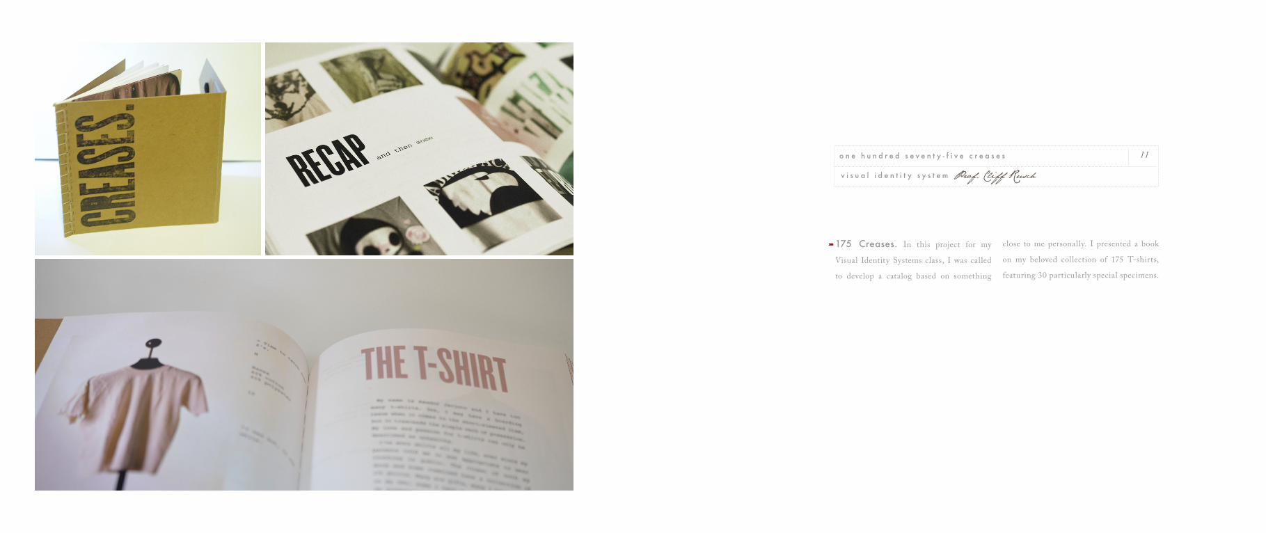
175 Creases. In this project for my
Visual Identity Systems class, I was called
to develop a catalog based on something
close to me personally. I presented a book
on my beloved collection of 175 T-shirts,
featuring 30 particularly special specimens.
11
v i s u a l i d e n t i t y s y s t e m Prof. Cliff Rusch
o n e h u n d r e d s e v e n t y - f i v e c r e a s e s
THROUGHOUT THE WORLD, HARLEY-DAVIDSON UNITES PEOPLE DEEPLY, PASSIONATELY AND AUTHENTICALLY.
AND IN THIS UNITY THERE IS A RICH AND UNENDING VARIETY OF PERSONAL EXPERIENCES. FROM TOWN TO TOWN
AND COUNTRY TO COUNTRY, HARLEY-DAVIDSON TRANSCENDS CULTURES IN WAYS THAT RESONATE LOCALLY.
WITH BOTH GLOBAL SIGNIFICANCE AND LOCAL RELEVANCE, IT’S NO SURPRISE THAT HARLEY-DAVIDSON RANKS
AS ONE OF THE STRONGEST BRANDS IN THE WORLD. SUCH ACCOLADES ARE GRATIFYING OF COURSE. BUT
IGNITING THE FIRE WITHIN PEOPLE ALL OVER THE WORLD IS MUCH MORE IMPORTANT.
The classic Harley-Davidson engines are two-cylinder, V-twin engines with the pistons mounted in a 45° “V”.
In 1983, the Motor Company formed a club for owners of its product by turning “hog” into the acronym HOG., for Harley Owners Group.
THE HARLEY OWNERS GROUP (HOG) is a sponsored community marketing club, operated by Harley-Davidson
for enthusiasts of that brand’s motorcycles. The HOG is “the grandaddy of all community-building efforts,” serving to promote not just a consumer product, but a lifestyle. The HOG has also served to open new revenue streams for the company, with the production of tie-in merchandise offered to club members, numbering over one million strong,[1] making it the largest factory-sponsored riding club in the world.[2] The Harley-Davidson community was the prototype for the ethnographic term subculture of consumption, defined as “a distinctive subgroup of society that self-selects on the basis of a shared commitment to a particular product class.
Brand, or consumption activity.”[3] The Harley Owners Group was created in 1983 as
way to build longer-lasting and stronger relationships with Harley-Davidson’s customers, by making ties between the company, its employees, and consumers.[4] HOG members typically spend 30% more than other Harley owners, on such items as clothing and Harley-Davidson-sponsored events.[5] Much of the intent of this branding effort is presenting Harley-Davidson as an American icon, with the focus on authenticity and pride in being American-made. All of this is credited with turning flagging sales around, and allowing the Harley-Davidson company to grow again.
Harley Davidson Annual Report.
In this class project, I wanted to try a
modern take on the classic, masculine ethos
of this iconic company. The result presents
a feeling of power and freedom that is just
what I think a Harley owner is looking for.
13
p u b l i c a t i o n d e s i g n prof. Milbert Mariano
h a r l e y d a v i d s o n a n n u a l r e p o r t
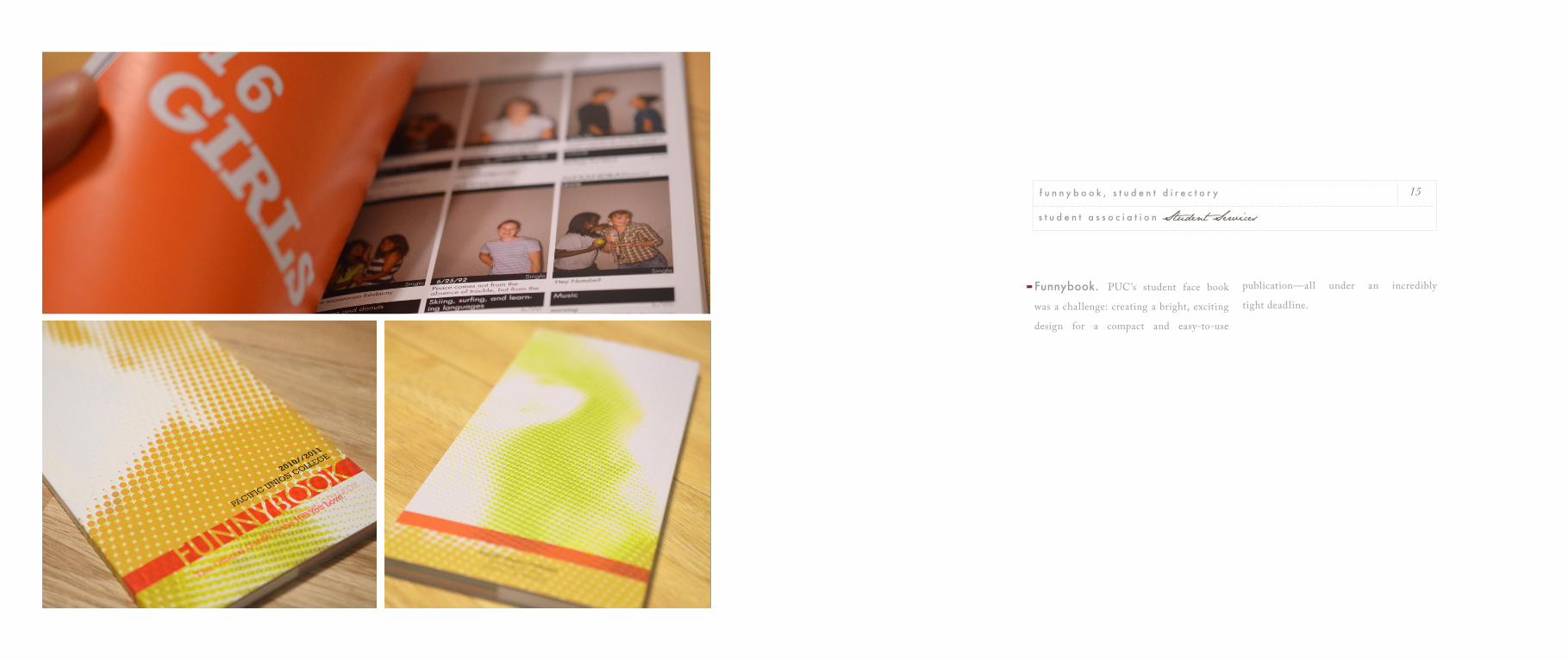
Funnybook. PUC’s student face book
was a challenge: creating a bright, exciting
design for a compact and easy-to-use
publication—all under an incredibly
tight deadline.
15
s t u d e n t a s s o c i a t i o n Student Services
f u n n y b o o k , s t u d e n t d i r e c t o r y
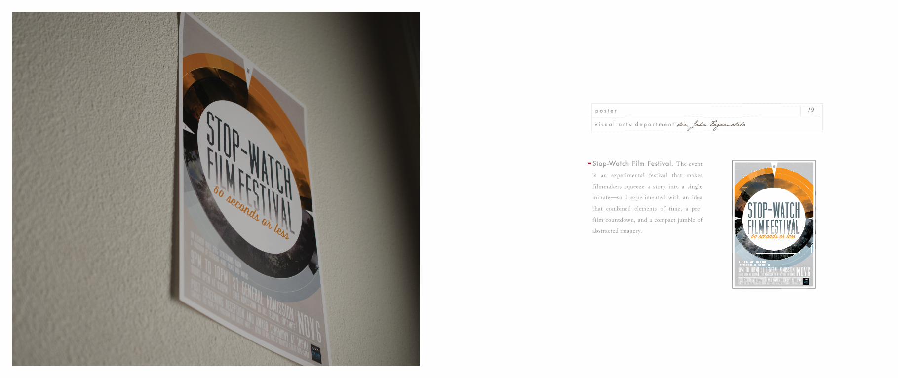
Stop-Watch Film Festival. The event
is an experimental festival that makes
f ilmmakers squeeze a story into a single
minute—so I experimented with an idea
that combined elements of time, a pre-
film countdown, and a compact jumble of
abstracted imagery.
19
v i s u a l a r t s d e p a r t m e n t dir. John Tagamolila
p o s t e r
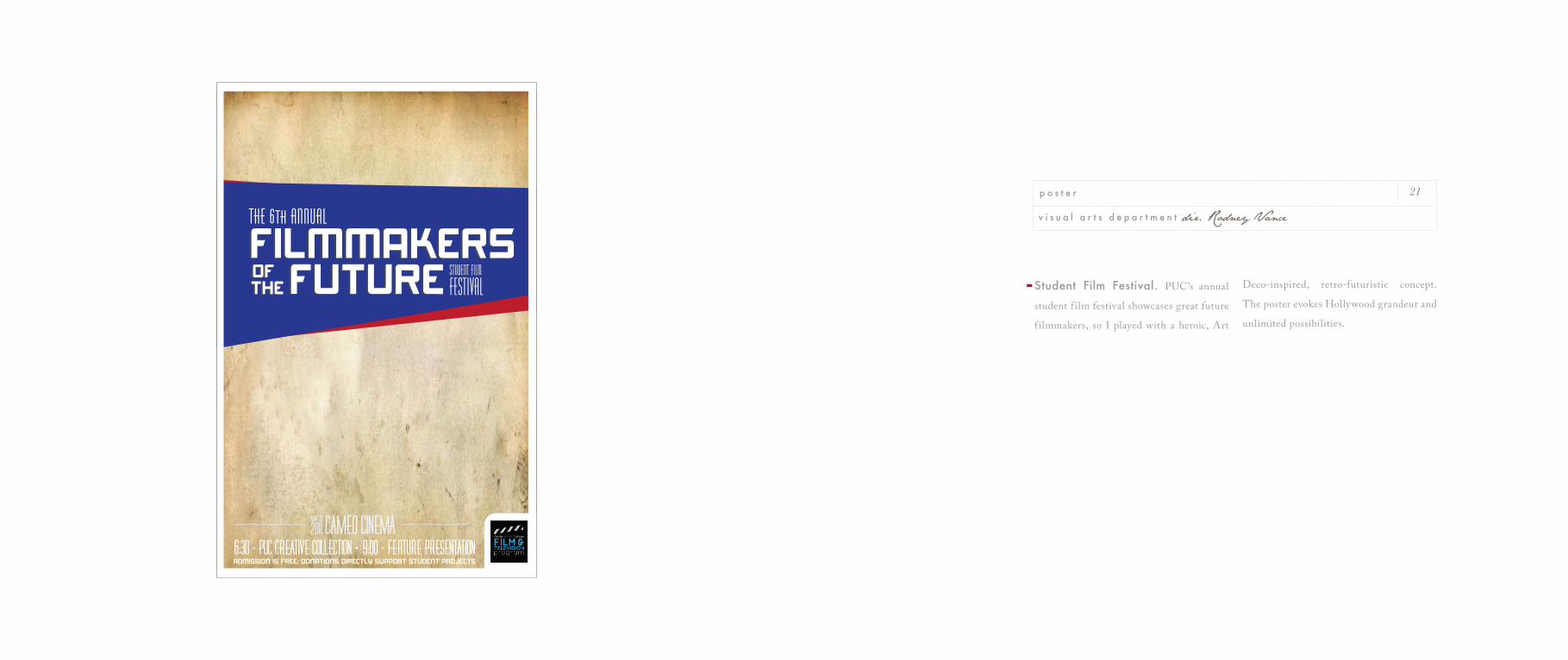
Student Film Festival. PUC’s annual
student f ilm festival showcases great future
f ilmmakers, so I played with a heroic, Art
Deco-inspired, retro-futuristic concept.
The poster evokes Hollywood grandeur and
unlimited possibilities.
21
v i s u a l a r t s d e p a r t m e n t dir. Rodney Vance
p o s t e r
8 PM
M A Y 18, 19, 25, 26, 29, 30
9:30 PM
M A Y 21, 28
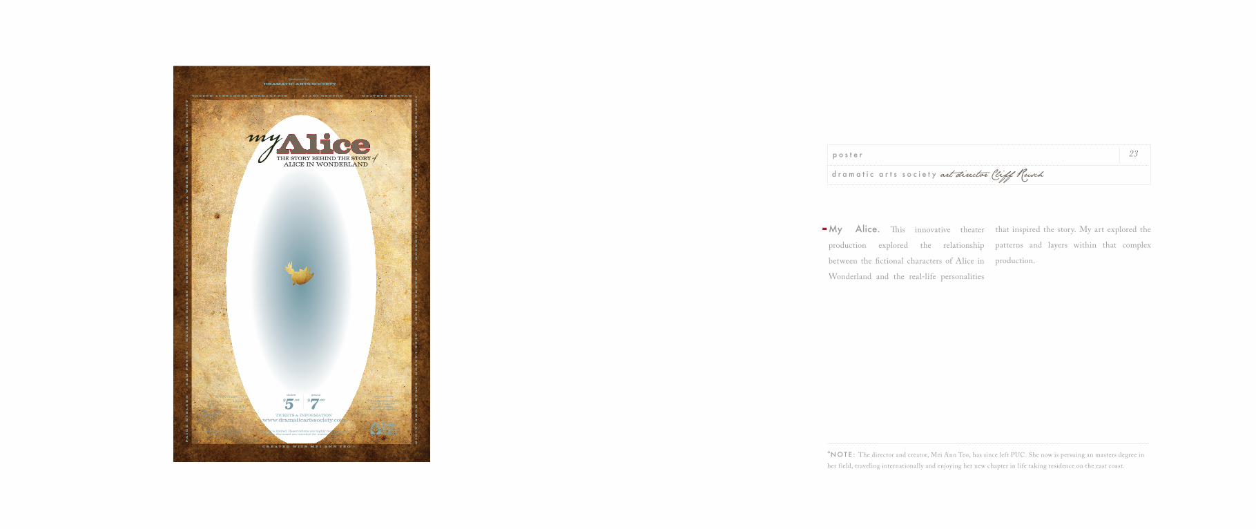
My Alice. This innovative theater
production explored the relationship
between the fictional characters of Alice in
Wonderland and the real-life personalities
that inspired the story. My art explored the
patterns and layers within that complex
production.
23
d r a m a t i c a r t s s o c i e t y art director Cliff Rusch
p o s t e r
*N O T E : The director and creator, Mei Ann Teo, has since left PUC. She now is persuing an masters degree in her f ield, traveling internationally and enjoying her new chapter in life taking residence on the east coast.
april 14 - may 5pacific union college • rasmussen art gallery
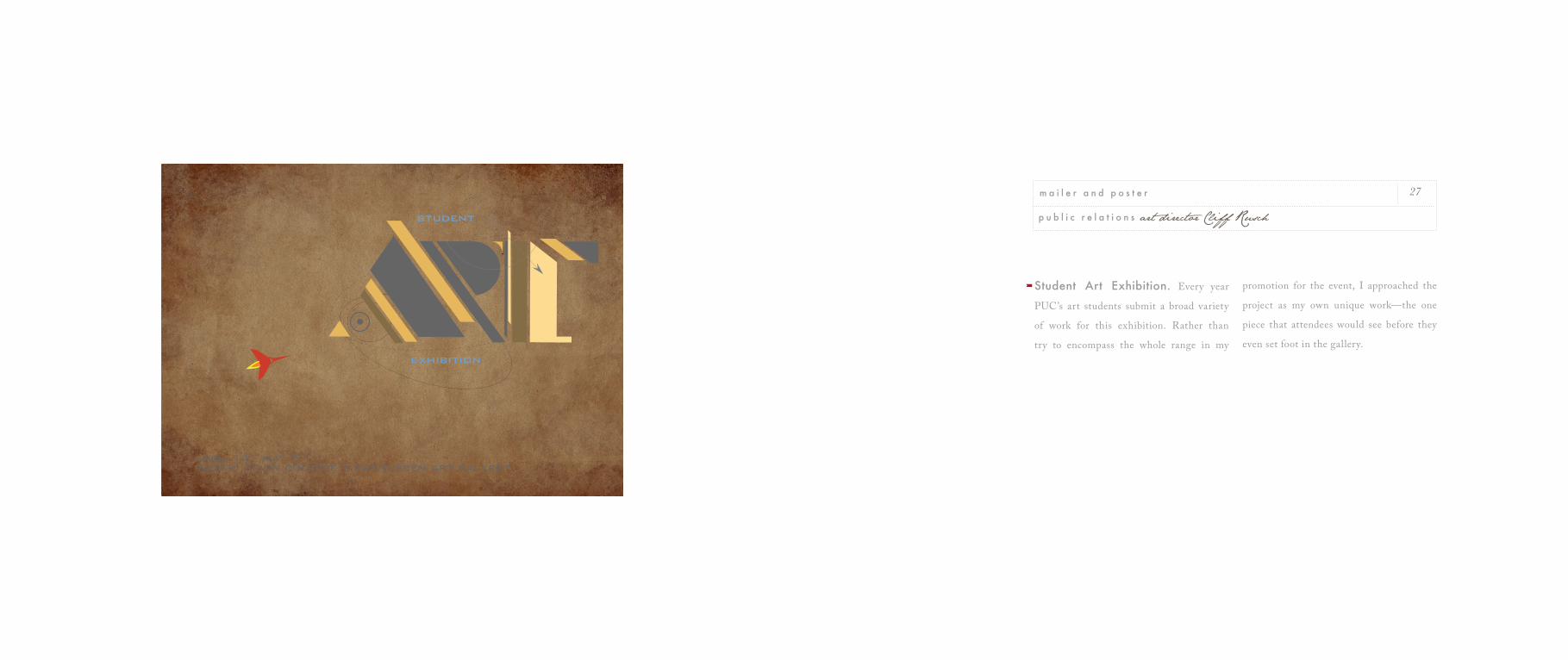
Student Art Exhibition. Every year
PUC’s art students submit a broad variety
of work for this exhibition. Rather than
try to encompass the whole range in my
promotion for the event, I approached the
project as my own unique work—the one
piece that attendees would see before they
even set foot in the gallery.
27
p u b l i c r e l a t i o n s art director Cliff Rusch
m a i l e r a n d p o s t e r
Pacific Union College
Knowledge for a
World Lived in Common
Colloquy Speaker Series
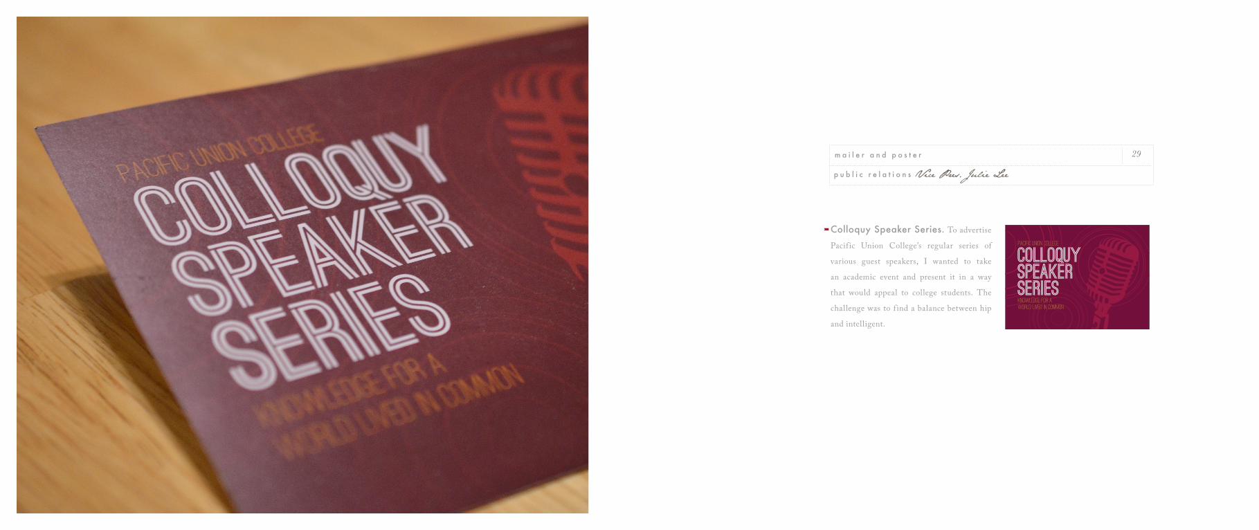
Colloquy Speaker Series. To advertise
Pacif ic Union College’s regular series of
various guest speakers, I wanted to take
an academic event and present it in a way
that would appeal to college students. The
challenge was to f ind a balance between hip
and intelligent.
29
p u b l i c r e l a t i o n s Vice Pres. Julie Lee
m a i l e r a n d p o s t e r
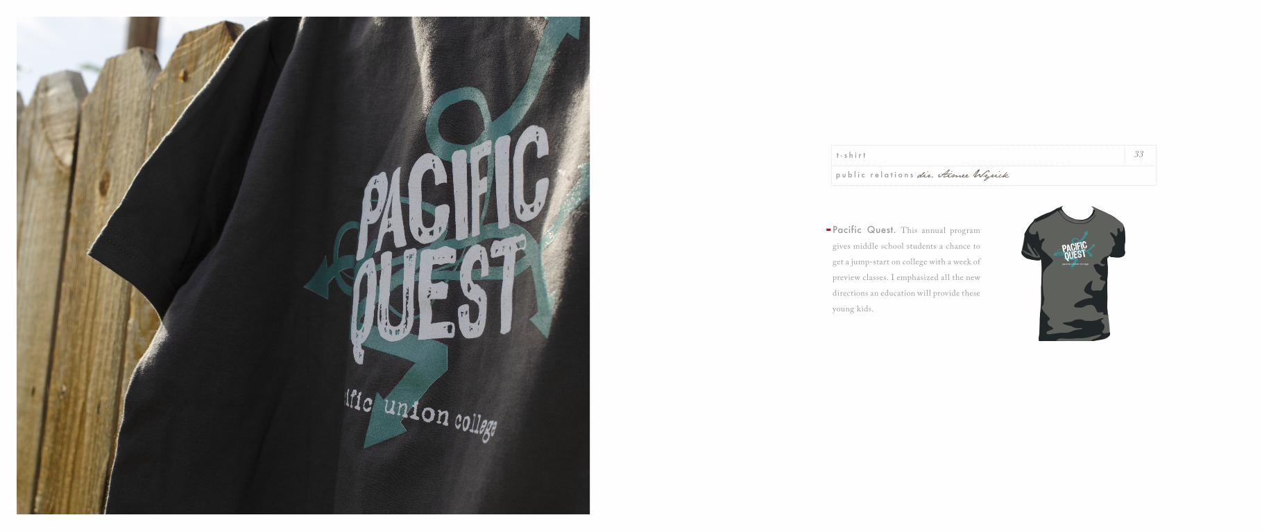
Pacific Quest. This annual program
gives middle school students a chance to
get a jump-start on college with a week of
preview classes. I emphasized all the new
directions an education will provide these
young kids.
p u b l i c r e l a t i o n s dir. Aimee Wyrick
t - s h i r t 33
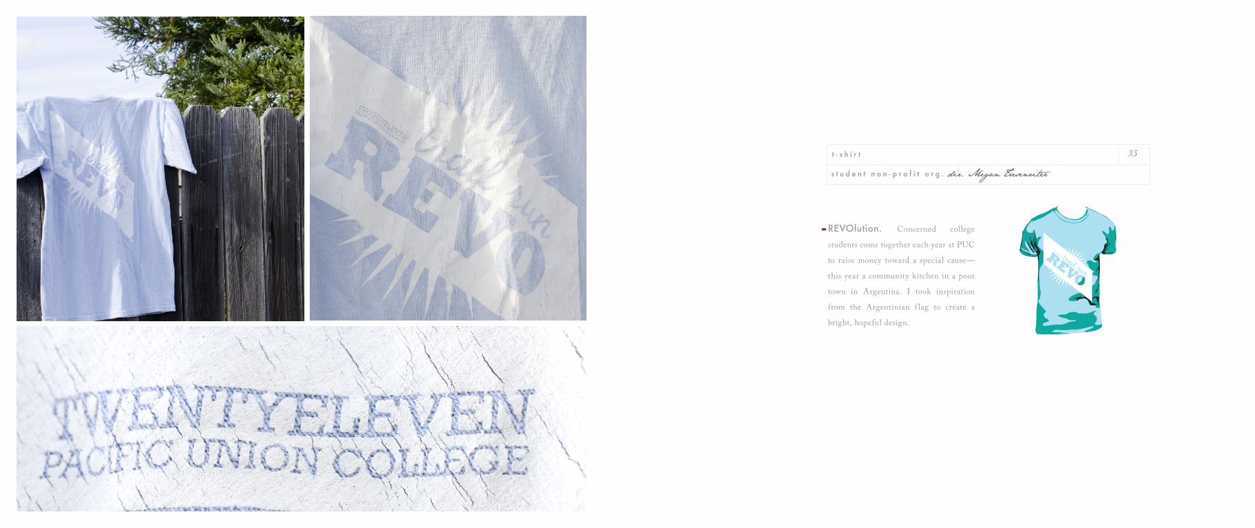
REVOlution. Concerned college
students come together each year at PUC
to raise money toward a special cause—
this year a community kitchen in a poor
town in Argentina. I took inspiration
from the Argentinian f lag to create a
bright, hopeful design.
s t u d e n t n o n - p r o f i t o r g . dir. Megan Tresenriter
t - s h i r t 35
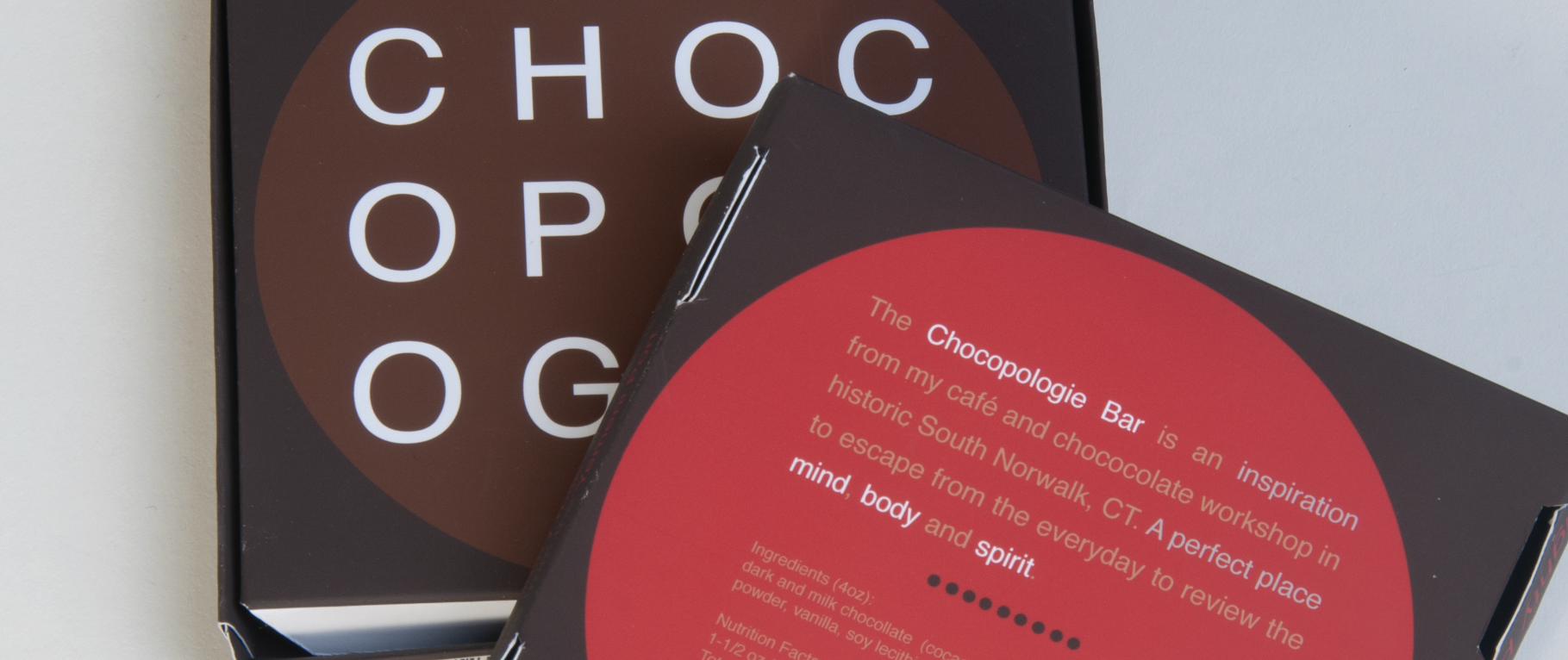
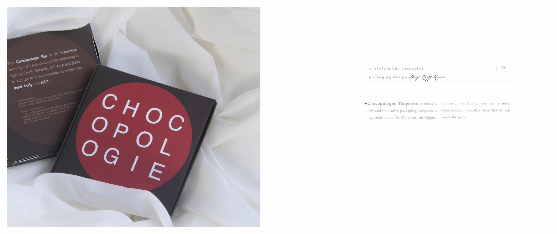
Chocopologie. The project: to create a
new and innovative packaging design for a
high-end brand. At $10 a bar, my biggest
motivation on this project was to make
Chocopologie chocolate look like it was
worth the price.
39
p a c k a g i n g d e s i g n Prof. Cliff Rusch
c h o c o l a t e b a r p a c k a g i n g
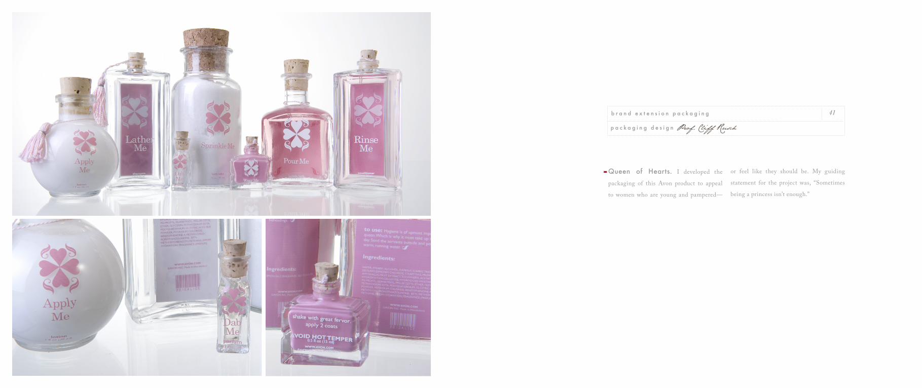
Queen of Hearts. I developed the
packaging of this Avon product to appeal
to women who are young and pampered—
or feel like they should be. My guiding
statement for the project was, “Sometimes
being a princess isn’t enough.”
41
p a c k a g i n g d e s i g n Prof. Cliff Rusch
b r a n d e x t e n s i o n p a c k a g i n g
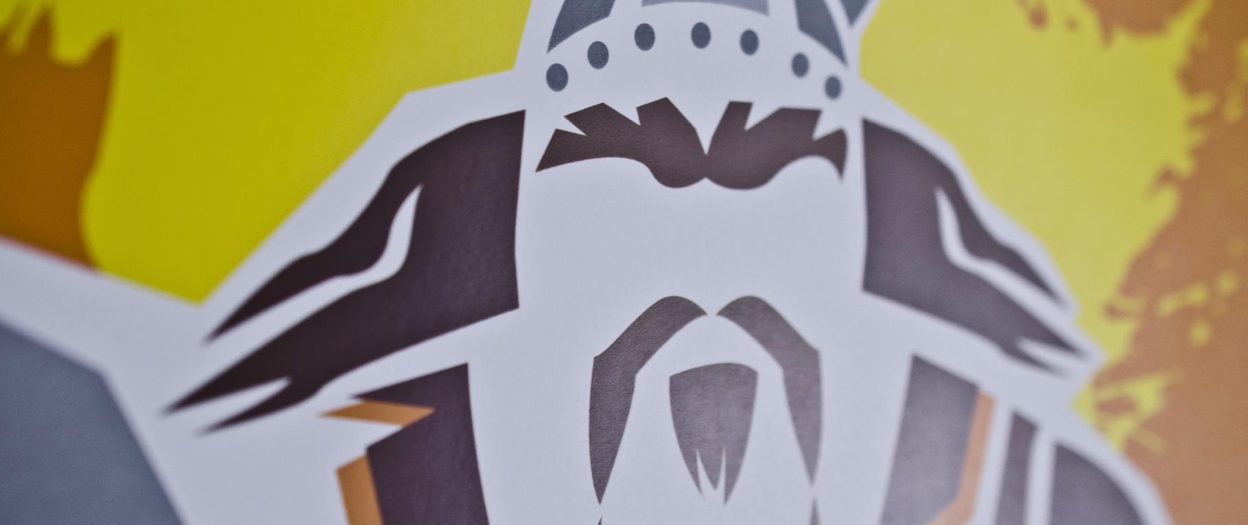
Man Talk. The men’s residence halls at
PUC asked me to design these promotional
posters for a discussion series on what it
means to be a man. Potentially a heavy topic,
so I tried to make if fun and appealing with
a playful take on classic icons of manhood:
the warrior, the outdoorsman, the
smooth operator.
45
m e n ’ s r e s i d e n c e h a l l s Dean Halversen
p o s t e r i l l u s t r a t i o n
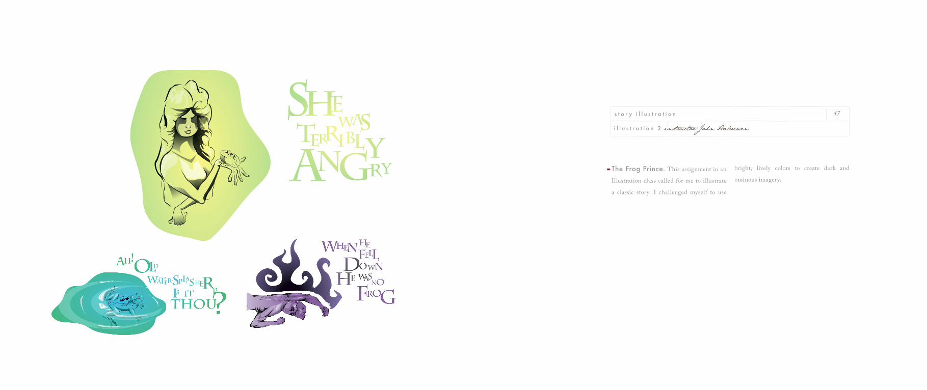
The Frog Prince. This assignment in an
Illustration class called for me to illustrate
a classic story. I challenged myself to use
bright, lively colors to create dark and
ominous imagery.
47
i l l u s t r a t i o n 2 instructor John Halversen
s t o r y i l l u s t r a t i o n
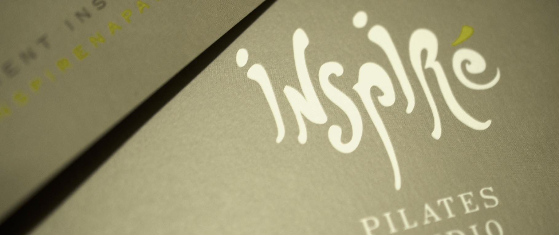
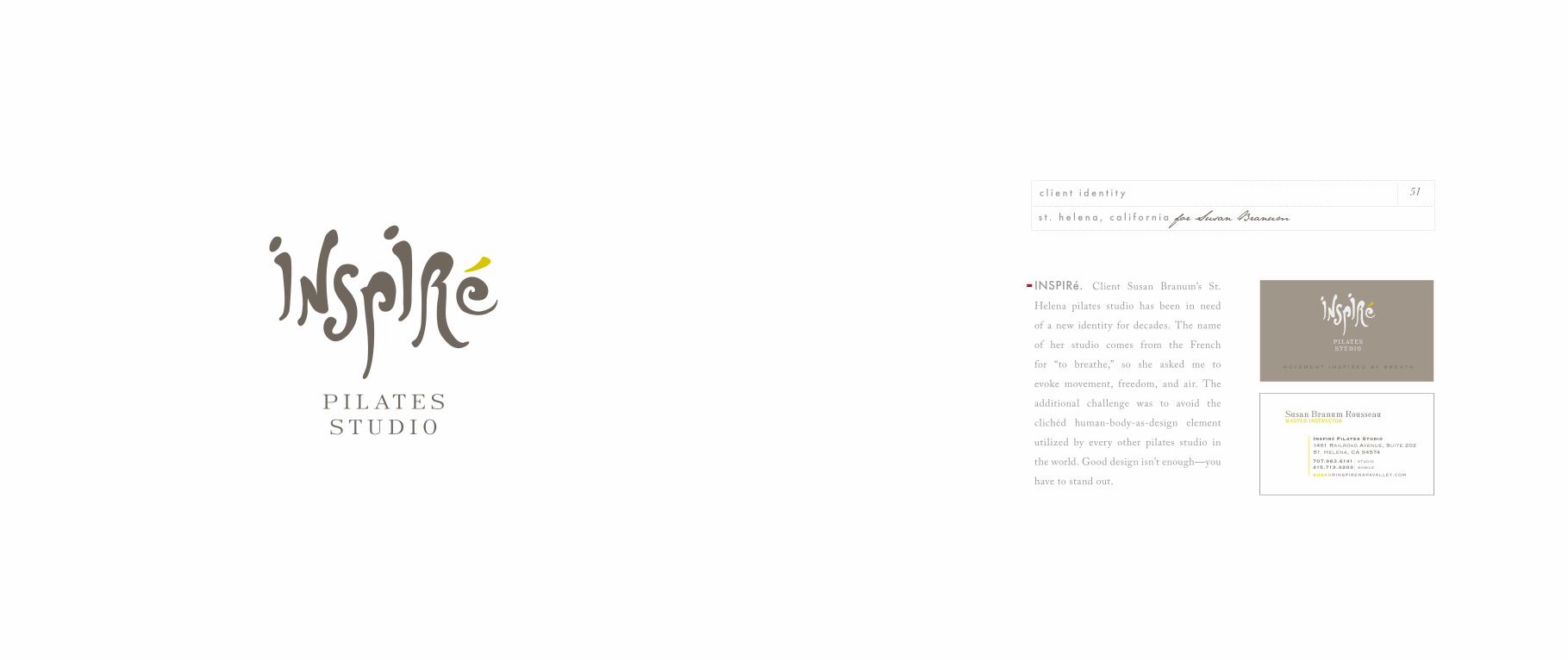
INSPIRé. Client Susan Branum’s St.
Helena pilates studio has been in need
of a new identity for decades. The name
of her studio comes from the French
for “to breathe,” so she asked me to
evoke movement, freedom, and air. The
additional challenge was to avoid the
clichéd human-body-as-design element
utilized by every other pilates studio in
the world. Good design isn’t enough—you
have to stand out.
51
s t . h e l e n a , c a l i f o r n i a for Susan Branum
c l i e n t i d e n t i t y
Kratos Display Systems. As a class
project, I developed this logo for a company
that manufactures scientif ic measurement
equipment. Although I didn’t actually work
with the company, I imagined their client
as the hip, young, up-and-coming scientist
on the town.
53
I D b r a n d i n g o n e Pro. Cliff Rusch
i d e n t i t y e x e r c i z e
naturally beautiful yarns & fibers
Sincere Sheep. Client Brooke Sinnes,
owner of this unique Napa Valley wool
company, was inspired by the ultra-clean
Scandinavian aesthetic. I warmed it up
a bit with a touch of American nostalgia.
This project resulted in a logo, as well as
packaging labels and a website.
55
n a p a , c a l i f o r n i a for Brooke Sinnes
c l i e n t i d e n t i t y
*N O T E : Brooke has since found great success in featuring her yarns at trade shows across the nation. Her mark has gained visibility and recognition on many social networks in the natural f iber online community.
Fine Art. As an artist, I love being inspired
by the world I see around me—the beauty
of nature, or the uniqueness of a face. My
favorite media are charcoal and watercolor.
Both are quick and easy to implement, fa-
cilitating the leap from inspiration to art.
Watercolor also offers an additional chal-
lenge: while the process is easy, there’s no
going back once paint touches the paper, so
it requires a lot of forethought and medita-
tion. I’ve also enjoyed working in encaustic,
acrylic, oil, stone, and ceramics.
On occasion, I’ve been fortunate enough
to sell my work after art exhibitions and
through word of mouth. It’s always a bit-
tersweet moment when a piece sells, be-
cause each unique piece is born out of my
own passion. But when I see that someone is
thrilled with something I’ve created, I can’t
not let it go.
I believe that there’s no real distinction
between fine art and graphic design—it’s
something that shapes my work in both ar-
eas. Both an art piece and a design project
should capture the mind and the heart; both
should be crafted carefully and with atten-
tion to detail; both should be works of pas-
sion.
59
p a i n t i n g , d r a w i n g , e t c . Napa Valley. Pacific Union College
f i n e a r t
art is not a thing; it is a way
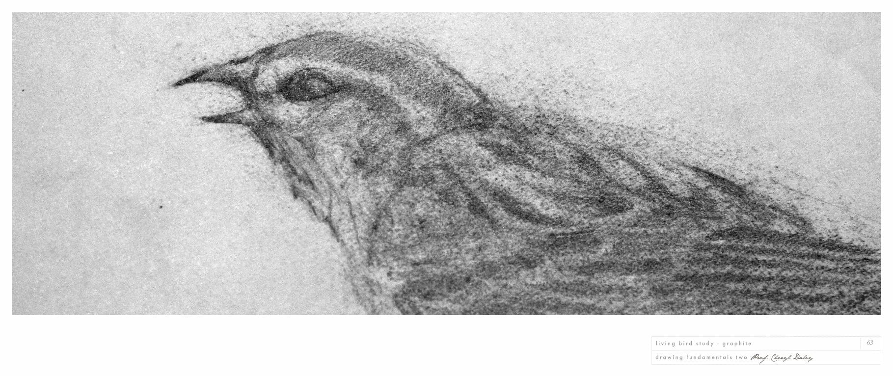
63
d r a w i n g f u n d a m e n t a l s t w o Prof. Cheryl Daley
l i v i n g b i r d s t u d y - g r a p h i t e
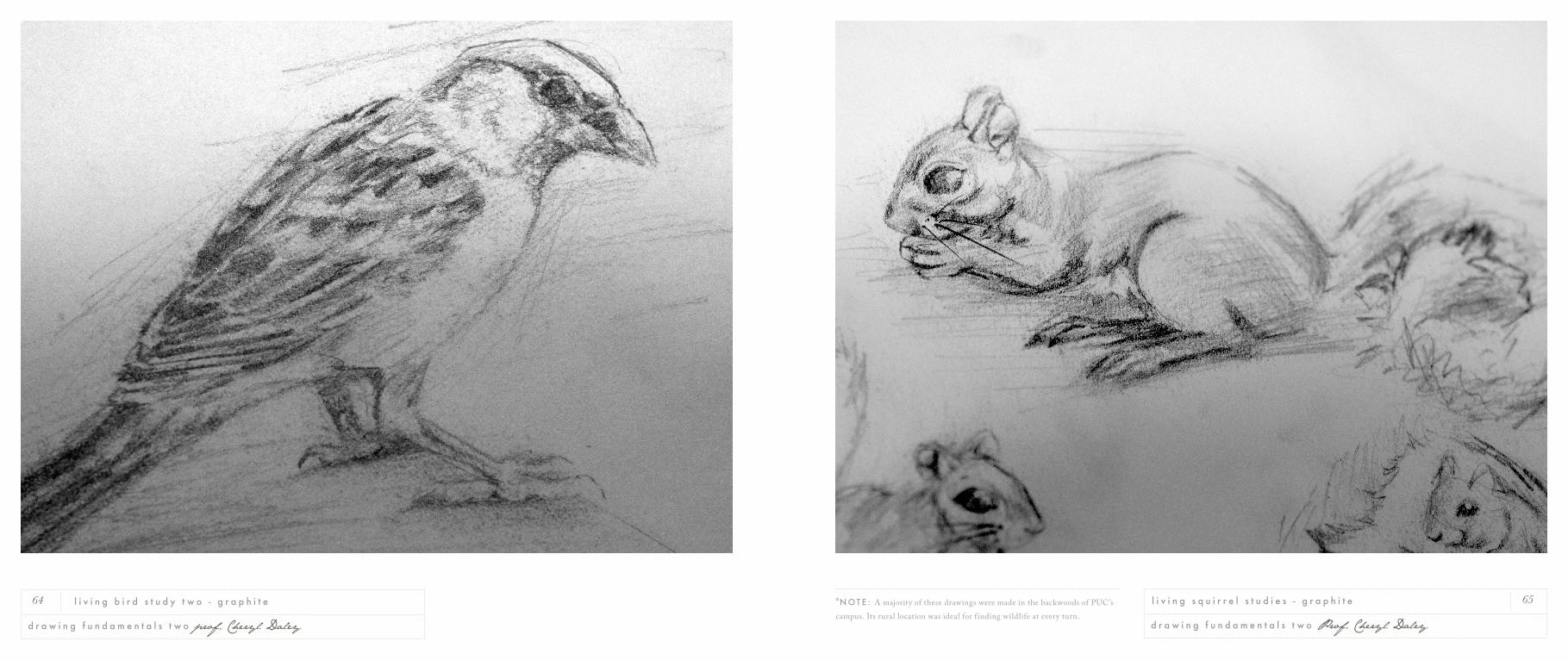
65
d r a w i n g f u n d a m e n t a l s t w o Prof. Cheryl Daley
l i v i n g s q u i r r e l s t u d i e s - g r a p h i t e64
d r a w i n g f u n d a m e n t a l s t w o prof. Cheryl Daley
l i v i n g b i r d s t u d y t w o - g r a p h i t e *N O T E : A majority of these drawings were made in the backwoods of PUC’s campus. Its rural location was ideal for f inding wildlife at every turn.
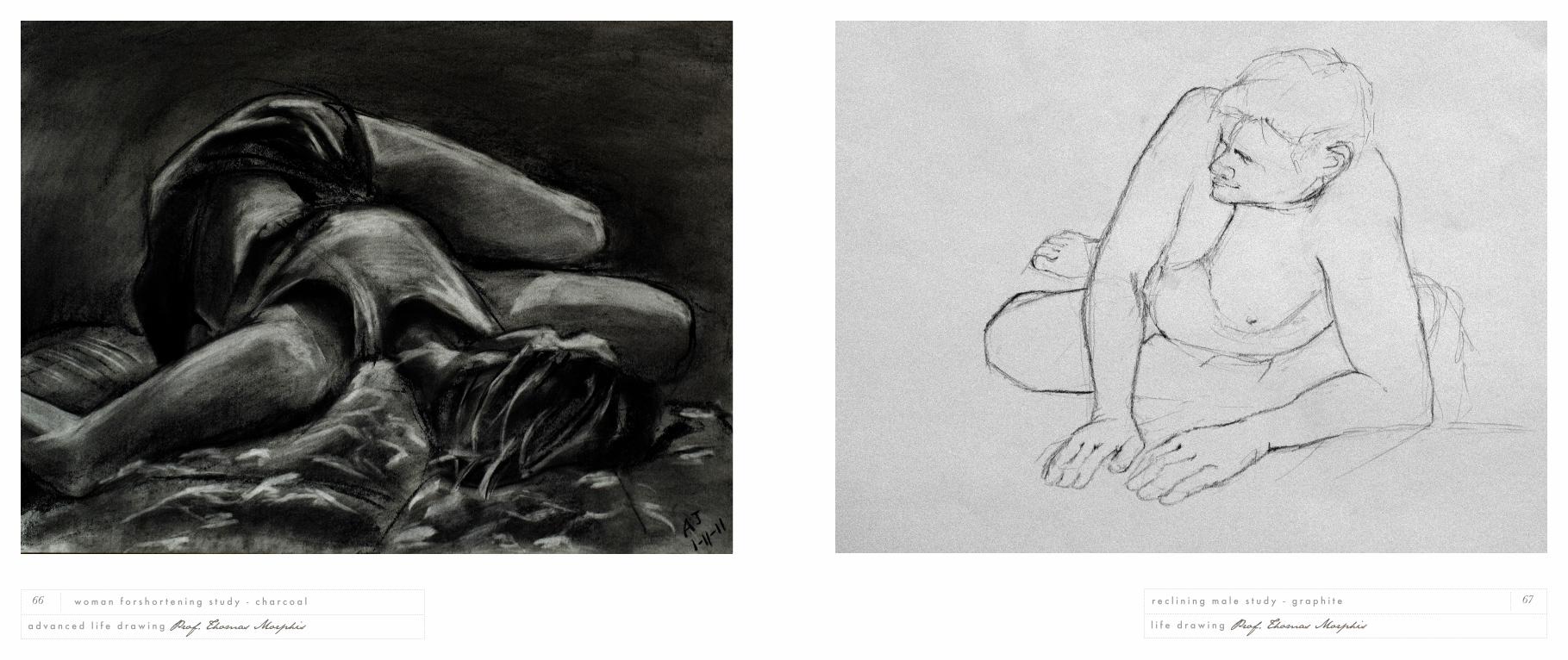
67
l i f e d r a w i n g Prof. Thomas Morphis
r e c l i n i n g m a l e s t u d y - g r a p h i t e66
a d v a n c e d l i f e d r a w i n g Prof. Thomas Morphis
w o m a n f o r s h o r t e n i n g s t u d y - c h a r c o a l
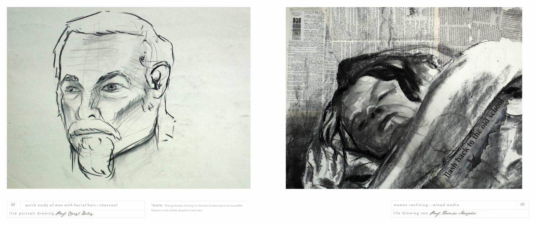
69
l i f e d r a w i n g t w o Prof. Thomas Morphis
w o m a n r e c l i n i n g - m i x e d m e d i a68
l i v e p o r t r a i t d r a w i n g Prof. Cheryl Daley
q u i c k s t u d y o f m a n w i t h f a c i a l h a i r - c h a r c o a l *N O T E : This particular drawing is a favorite of mine due to its incredible likeness to the model, despite its raw state.
71
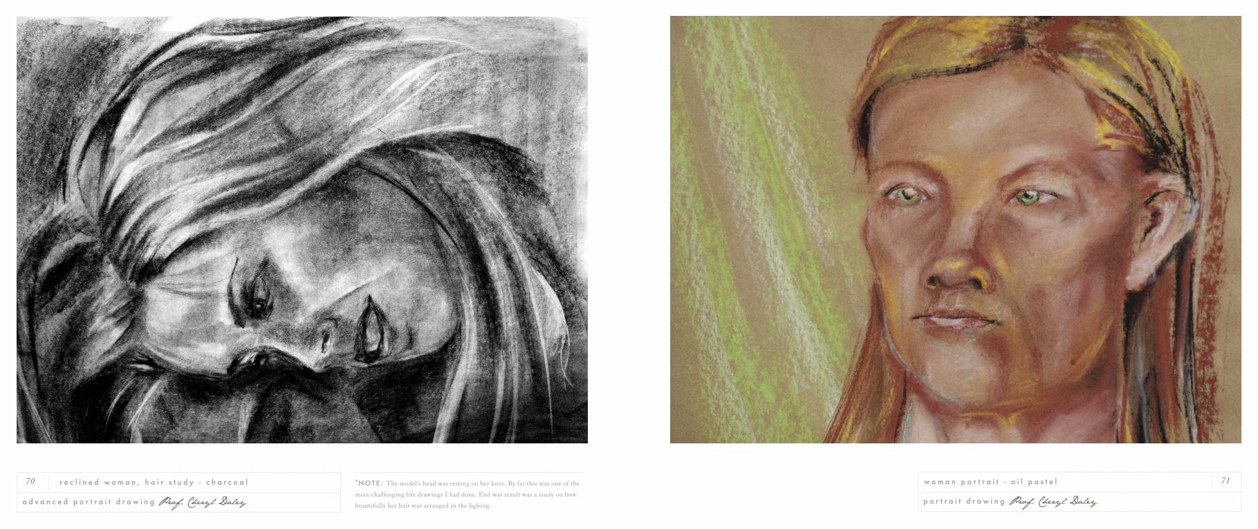
p o r t r a i t d r a w i n g Prof. Cheryl Daley
w o m a n p o r t r a i t - o i l p a s t e l70
a d v a n c e d p o r t r a i t d r a w i n g Prof. Cheryl Daley
r e c l i n e d w o m a n , h a i r s t u d y - c h a r c o a l *N O T E : The model ’s head was resting on her knee. By far this was one of the more challenging life drawings I had done. End was result was a study on how beautifully her hair was arranged in the lighing.
75
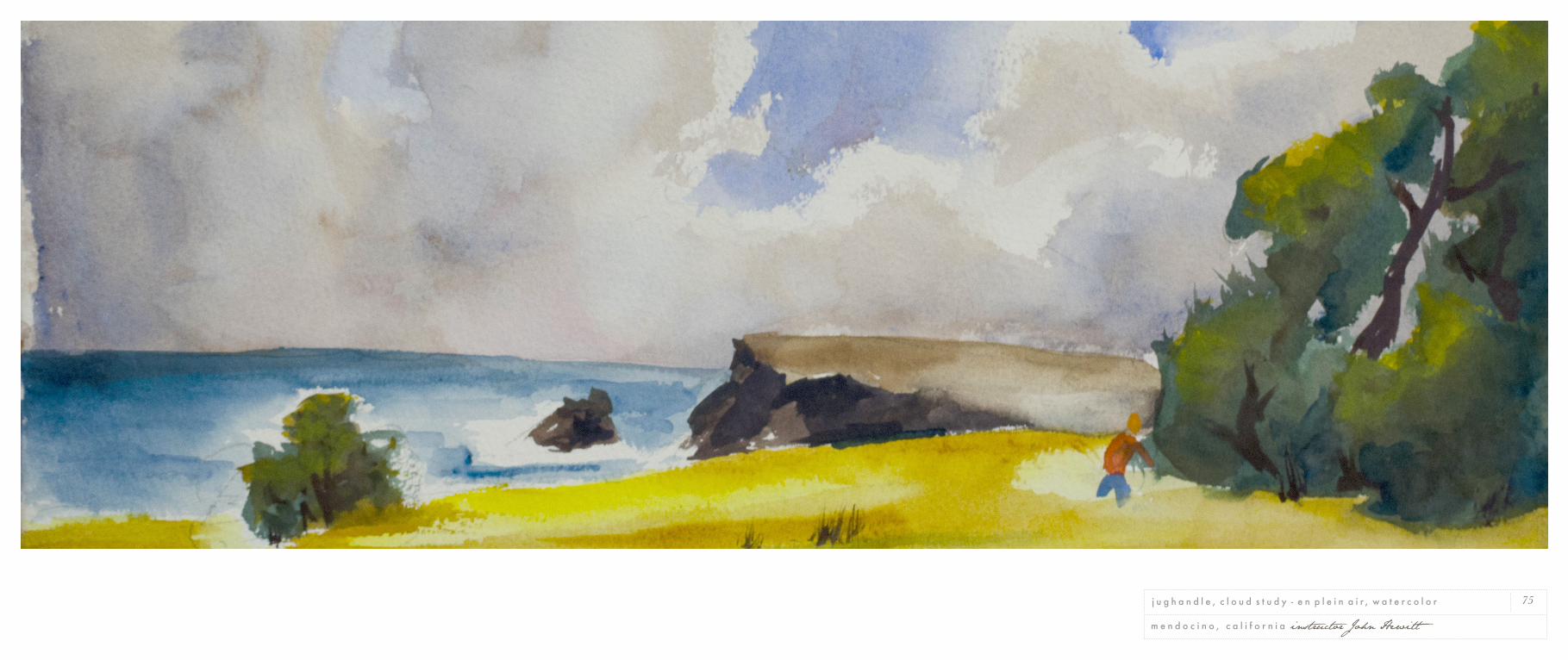
m e n d o c i n o , c a l i f o r n i a instructor John Hewitt
j u g h a n d l e , c l o u d s t u d y - e n p l e i n a i r , w a t e r c o l o r
77
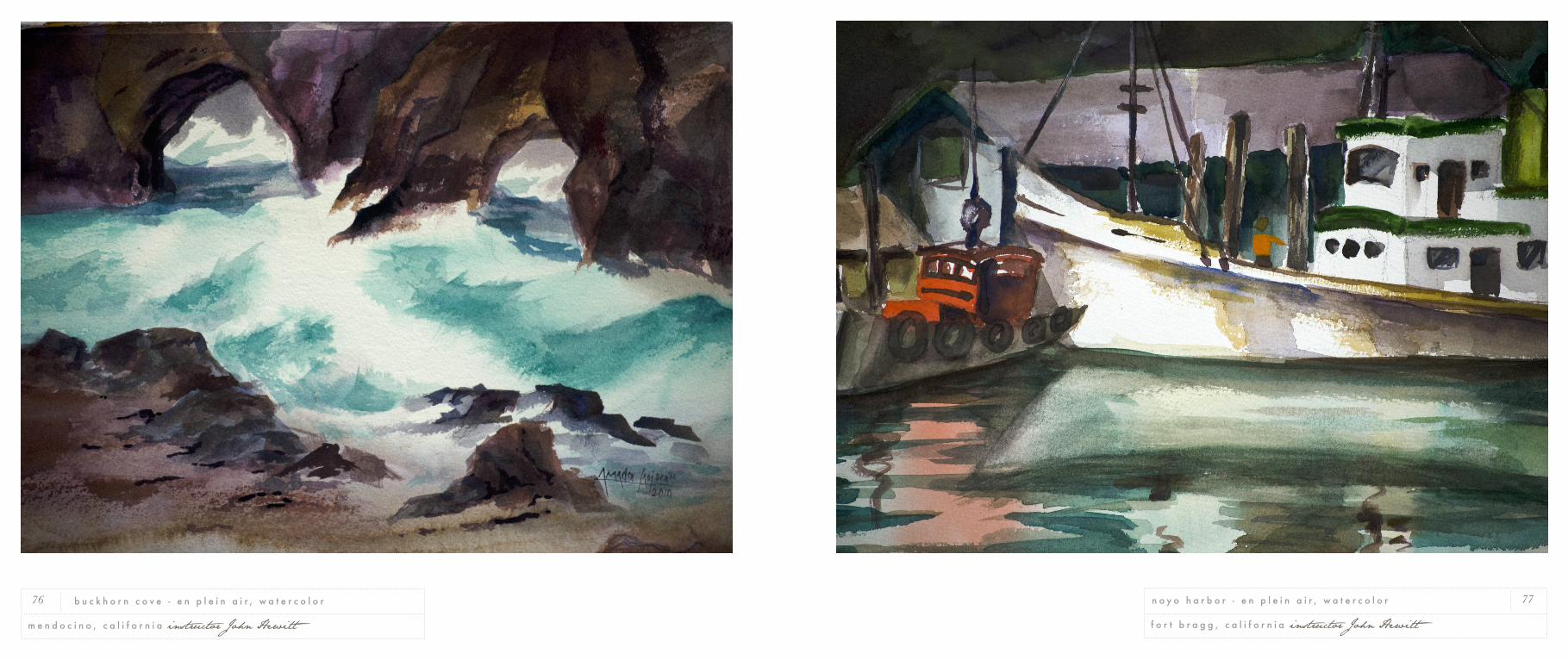
f o r t b r a g g , c a l i f o r n i a instructor John Hewitt
n o y o h a r b o r - e n p l e i n a i r , w a t e r c o l o r76
m e n d o c i n o , c a l i f o r n i a instructor John Hewitt
b u c k h o r n c o v e - e n p l e i n a i r , w a t e r c o l o r
nil metventis is fearing nothing
Thesis 2011. Fear is the motivator. It
produces inactivity as often as it produces
a relentless pursuit for advancement, or at
least prompts us to remove ourselves from a
fearful situation. Yet fear is more than the
elicitor of f ight or f light: it is an instrument
and can be manipulated to help us achieve
new levels of self-awareness and repose.
Fear guides, but only as we allow it.
Anxiety once f looded my mind and per-
meated my actions; it was fear looking to
be led. I soon learned that fear was not the
enemy, it was a tool.
Fear is often lent too much attention. Fear
grows with whatever control we grant it. My
works are substantial because they represent
the enormous power I once granted fear,
and they loom with the ominous immensity
of imagination running wild.
These works were not designed to im-
pose unnecessary fear upon you, they are
an homage to my own unbroken fear. They
embody my struggle, confrontation, and
conversation with fear.
As I rose above my fear and asserted my
authority over its whims, I gained confi-
dence in the identity which had been hid-
ing in fear’s shadow. I now choose when and
where to apply fear. I can freely immerse
myself in this emotion because I have bro-
ken it. As I was able to come out of that fear,
it allowed me to discover signif icant parts
of my identity. I give myself permission to
revisit and enter my fears at will, and then
leave them behind.
Fear is the protector, and it begs to be mas-
tered.
t h e s i s p r o j e c t 2 0 11 Napa Valley. Pacific Union College
f i n e a r t 79
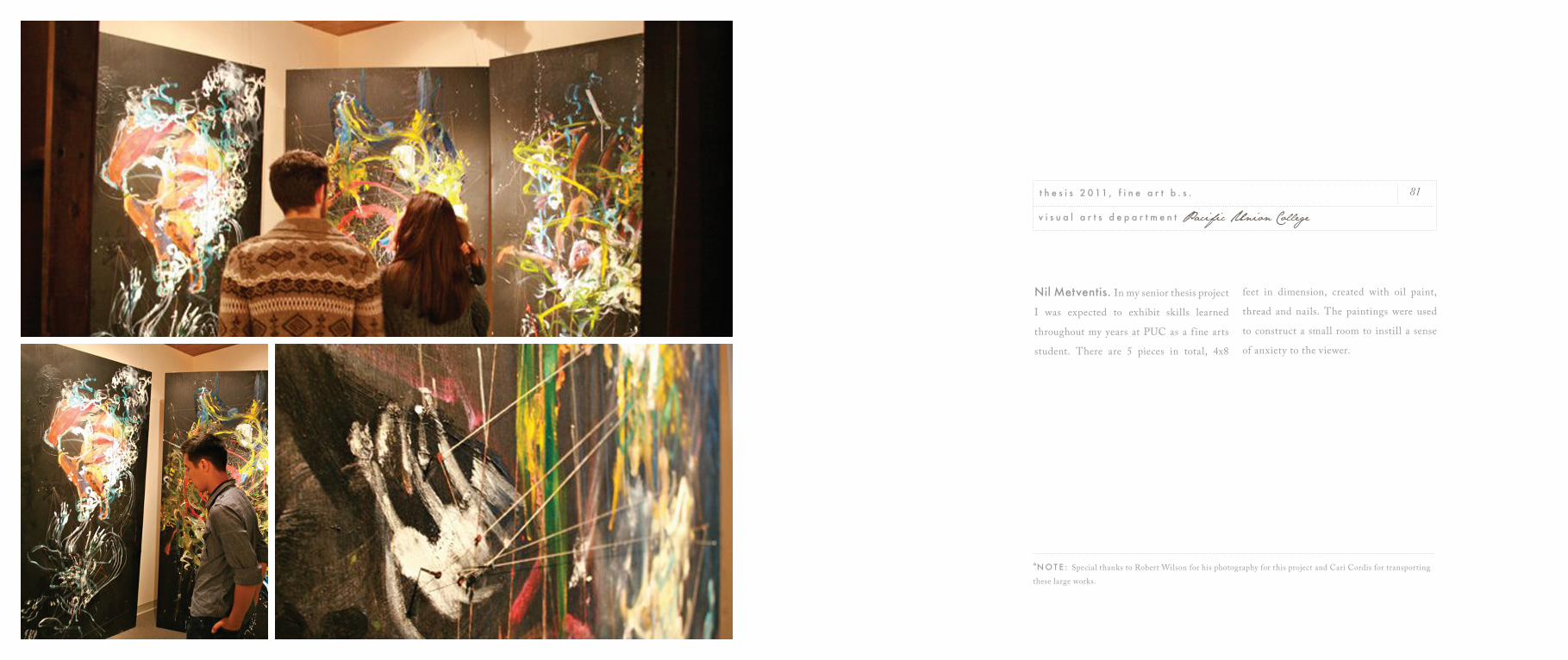
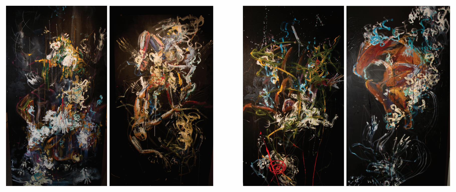
Nil Metventis. In my senior thesis project
I was expected to exhibit skills learned
throughout my years at PUC as a f ine arts
student. There are 5 pieces in total, 4x8
feet in dimension, created with oil paint,
thread and nails. The paintings were used
to construct a small room to instill a sense
of anxiety to the viewer.
81
v i s u a l a r t s d e p a r t m e n t Pacific Union College
t h e s i s 2 0 11 , f i n e a r t b . s .
*N O T E : Special thanks to Robert Wilson for his photography for this project and Cari Cordis for transporting these large works.
Later!
Special Thanks. Thanks to everyone
who took the time out of their schedule to
help me put this portfolio together.
Larry Peña is a writing god. Thank you for
f inding words in my works.
Divya Joseph has been one hundred percent
supportive of my endeavors since our Public
Relations 1 course our freshman year.
I can’t ignore Geoffrey Brummett, a peer
I look up to (literally) during all of our
classes, both design and not-so design.
Thanks to all of my professors and
mentors at PUC. Milbert Mariano, Cliff
Rusch, Cheryl Daley, Alexander Carpenter,
Haley Wesley and everyone. Also thanks to
Thomas Morphis for being a great advisor
for my Fine Arts thesis project.
This portfolio was created on one i5 2011
iMac and 2008 Macbook Pro with Adobe
CS5 software.
Photos were taken with a Nikon D5100
with a 40mm Nikkor Micro Lens. All other
photographs were contributed by Geoffrey
Brummet, Robet Wilson and the PUC
Visual Arts Department.
∞
d e d i c a t e d t o m y p e t b e t t a f i s h , a l p h o n s e . r . i . p .