7
Analysing the front cover, contents page and double page spread of Q Magazine July 2011
| Date post: | 24-Jan-2018 |
| Category: |
Entertainment & Humor |
| Upload: | mullhi |
| View: | 237 times |
| Download: | 0 times |

Analysing the front cover,
contents page and double page spread of Q Magazine July 2011

Masthead
The masthead consists of white Q which contrasts against the bright red background
Cover line
The cover line anchors the main image. It is bold and in sans serif.
Flash
Being the 300th issue, they have used iconic figures such as Adele and Paul McCartney. It is a different colour which makes it stand out to the rest.
Quote
Choosing a quote for the front cover, helps attract potential readers attention. This quote is influential and would appeal to those people who feel they don’t fit into the stereotype.
The main image
This image of Adele is placed across the whole background, highlighting how this issue is to do with her.
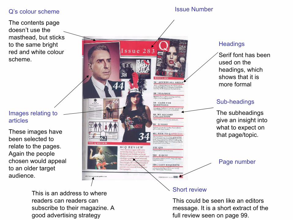
Issue Number
Headings
Serif font has been used on the headings, which shows that it is more formal
Sub-headings
The subheadings give an insight into what to expect on that page/topic.
Images relating to articles
These images have been selected to relate to the pages. Again the people chosen would appeal to an older target audience.
Short review
This could be seen like an editors message. It is a short extract of the full review seen on page 99.
Q’s colour scheme
The contents page doesn’t use the masthead, but sticks to the same bright red and white colour scheme.
Page number
This is an address to where readers can readers can subscribe to their magazine. A good advertising strategy

Double page image
This is the image seen before the article. It takes up to pages. They have also used a grey effect.
Quote from the article
This quote has been chosen on purpose as it reflects that Adele, an international singer, is just like the reader and acts like a normal person.
Article
The layout for this article is different to other magazines. It is done in a more quirky, informal style.
By line
The by line gives credit to those who helped with the article.
Sub heading: The subheading gives an insight into the article
Main image with the article
The picture has been placed in the middle, highlighting again that the article along side it is about Adele. It is a long shot.

Target Audience
The target audience of Q would be both male and female. They feature many different artists who appeal to both genders. The readers of Q would be aged between 30 to 40, those who have an understanding of music, “mature music lovers”. With 68% ABC1, this means that they can afford to be paying the £3.99 per issue.
The front cover reflects how it is targeted at an older audience as it isn’t cluttered, sticks to a colour scheme and tends to use the same font. Another way is the artists selected for each issue. Artists featured on the front aren’t dressed provocatively, which would suggest it is targeted at a much younger audience.

About Q
Q magazine published its first magazine in October 1986 and was founded by Mark Ellen and David Hepworth.
It is known for it’s extensive review section on; new releases, music compilations, film reviews, live concert reviews and also radio and TV reviews. Over its time it has done many interviews with famous artists.

Q Magazine


