The Silence of The Lambs • The simplicity of this horror poster is what pulled me to it. • The poster is an extreme close up shot of Jodie Foster, the lead actress in the film. • She is looking straight on which has a creepy feel to it, her eyes are a vibrant red which could symbolise death, evil and blood. • It could be a way of conveying what the film is about. • There is a butterfly covering the actresses mouth which could symbolise secrecy with in the film but at the same time innocence. • The poster graduates from whit to dark blue, this could show juxtaposition of good and evil. • The colour scheme has been thought of carefully. The title, butterfly and eyes all have a link which sums up the film. • The subheading ‘from the terrifying best seller’ tells us that the film has been long anticipated after the book. • The credits are quite small and tense in this horror poster, this could be to them getting in the way of the whole page. • Viewers will not be distracted by the credits. • Below the credits they have including productions that were involved in the making of the film. • Above the heading they have mentioned the actors names, its in a small font but still recognisable. • Other posters normally have the actors who stared in the films at the top of the poster to show more recognition. • The composition of the poster is simple.
Transcript
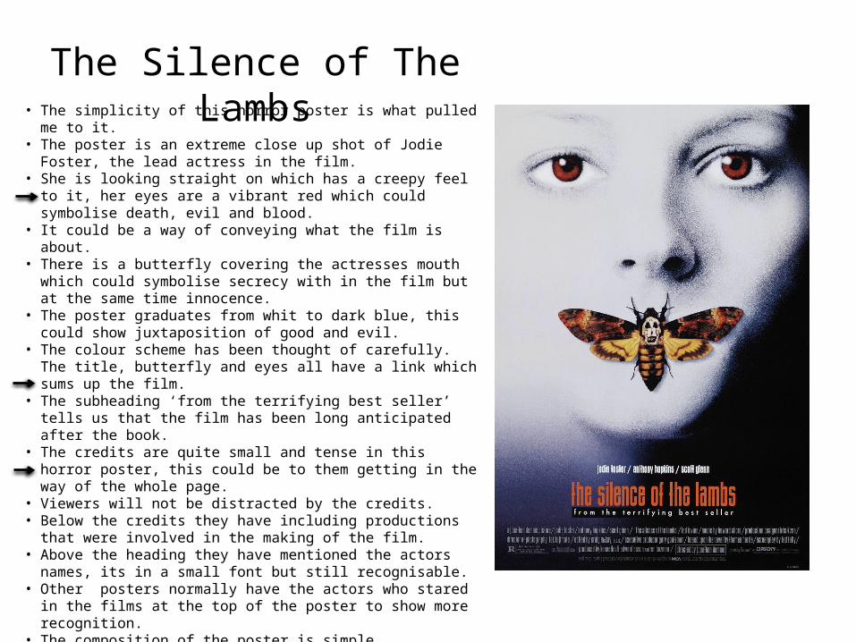
The Silence of The Lambs• The simplicity of this horror poster is what pulled me to it.• The poster is an extreme close up shot of Jodie Foster, the lead actress in
the film.• She is looking straight on which has a creepy feel to it, her eyes are a
vibrant red which could symbolise death, evil and blood. • It could be a way of conveying what the film is about.• There is a butterfly covering the actresses mouth which could symbolise
secrecy with in the film but at the same time innocence.• The poster graduates from whit to dark blue, this could show juxtaposition
of good and evil. • The colour scheme has been thought of carefully. The title, butterfly and
eyes all have a link which sums up the film.• The subheading ‘from the terrifying best seller’ tells us that the film has
been long anticipated after the book.• The credits are quite small and tense in this horror poster, this could be to
them getting in the way of the whole page. • Viewers will not be distracted by the credits.• Below the credits they have including productions that were involved in
the making of the film.• Above the heading they have mentioned the actors names, its in a small
font but still recognisable.• Other posters normally have the actors who stared in the films at the top
of the poster to show more recognition. • The composition of the poster is simple.• The headings, credits and subheading are all centred in the middle. • This leaves the face (Jodie Foster) to promote the film. • I’d say the poster is really good overall, I would think It would leave a
lasting impression from it not being a stereotypical horror poster. • I would also say that ever since the film, this poster has been iconic within
horror films.
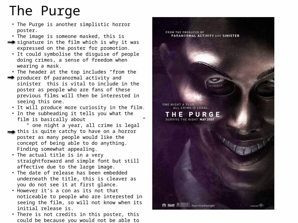
The Purge • The Purge is another simplistic horror poster.• The image is someone masked, this is signature in the film
which is why it was expressed on the poster for promotion.• It could symbolise the disguise of people doing crimes, a sense
of freedom when wearing a mask.• The header at the top includes “from the producer of
paranormal activity and sinister” this is vital to include in the poster as people who are fans of these previous films will then be interested in seeing this one.
• It will produce more curiosity in the film.• In the subheading it tells you what the film is basically about “ one night a year, all crime is legal” this is quite catchy to have
on a horror poster as many people would like the concept of being able to do anything. Finding somewhat appealing.
• The actual title is in a very straightforward and simple font but still affective due to the large image.
• The date of release has been embedded underneath the title, this is cleaver as you do not see it at first glance.
• However it’s a con as its not that noticeable to people who are interested in seeing the film, so will not know when its initial release is.
• There is not credits in this poster, this could be because you would not be able to see the full image on the poster.
• They have included productions that were in the making of the film and who actually funded it.
• A hashtag has also been include at the bottom “#survivethenight’ this is a good way to get people talking about the film especially the media.
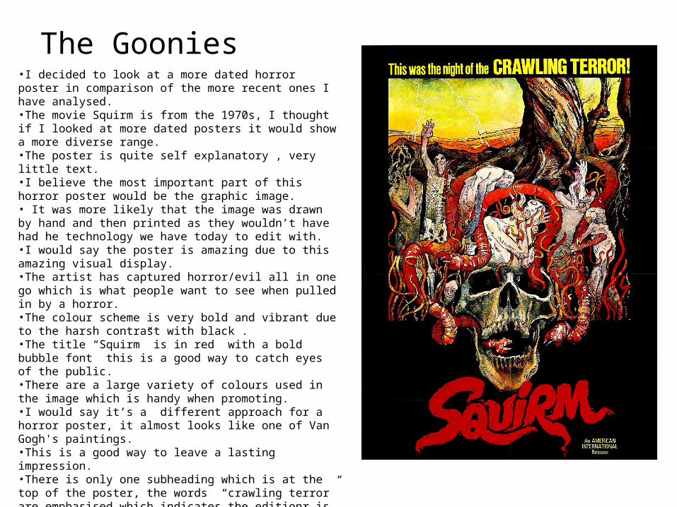
The Goonies •I decided to look at a more dated horror poster in comparison of the more recent ones I have analysed.•The movie Squirm is from the 1970s, I thought if I looked at more dated posters it would show a more diverse range.•The poster is quite self explanatory , very little text.•I believe the most important part of this horror poster would be the graphic image.• It was more likely that the image was drawn by hand and then printed as they wouldn’t have had he technology we have today to edit with. •I would say the poster is amazing due to this amazing visual display. •The artist has captured horror/evil all in one go which is what people want to see when pulled in by a horror. •The colour scheme is very bold and vibrant due to the harsh contrast with black .•The title “Squirm” is in red with a bold bubble font this is a good way to catch eyes of the public. •There are a large variety of colours used in the image which is handy when promoting.•I would say it’s a different approach for a horror poster, it almost looks like one of Van Gogh's paintings. •This is a good way to leave a lasting impression. •There is only one subheading which is at the top of the poster, the words “crawling terror” are emphasised which indicates the editionr is trying to persuade the public in to seeing the movie as terror is what they will be in for.