5
Analysis of magazine front covers

Analysis of
magazine
front
covers
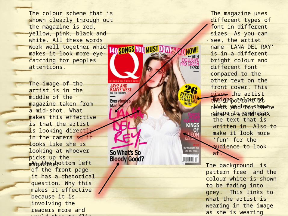
The colour scheme that is shown clearly through out the magazine is red, yellow, pink, black and white. All these words work well together which makes it look more eye-catching for peoples attentions.
The image of the artist is in the middle of the magazine taken from a mid-shot. What makes this effective is that the artist is looking directly in the camera so it looks like she is looking at whoever picks up the magazine.
The magazine uses different types of font in different sizes. As you can see, the artist name ‘LANA DEL RAY’ is in a different bright colour and different font compared to the other text on the front cover. This gives the artist the important it needs and for there name to stand out.
At the bottom left of the front page, it has a rhetorical question. Why this makes it effective because it is involving the readers more and would them to flip the next page to read on more.
Bright coloured, like yellow shown, shape to emphasis the text that is written in. Also to make it look more ‘fun’ for the audience to look at.
The background is pattern free and the colour white is shown to be fading into grey. This links to what the artist is wearing in the image as she is wearing full white implying a sense of purity.

The colour scheme that is going through out this magazine cover is pink, yellow, white and black. With the genre that this magazine is about ‘Pop’, the colours work well to emphasis this.
The front cover includes a couple of currently popular artists/bands of today. The effect of this it that it gives an idea to the audience already of what to expect.
The main image on the front cover is the famous Rihanna. The shot of the image is a mid long shot because we can see everything apart from her legs.
There are different coloured, sized and styled texts going on the front cover. The effect of this is it shows the how much emphasis there is for each content. For example, in bold and pink, ‘RIHANNA’ is written and place diagonally across her image.
There are pull out quotes on the front cover. This effect of this is that it would interest readers to flip the page and read more about it.
There are few types of shapes going around the front cover with text written inside and all shapes are in yellow. The effect of this that it would catch the audiences attention.
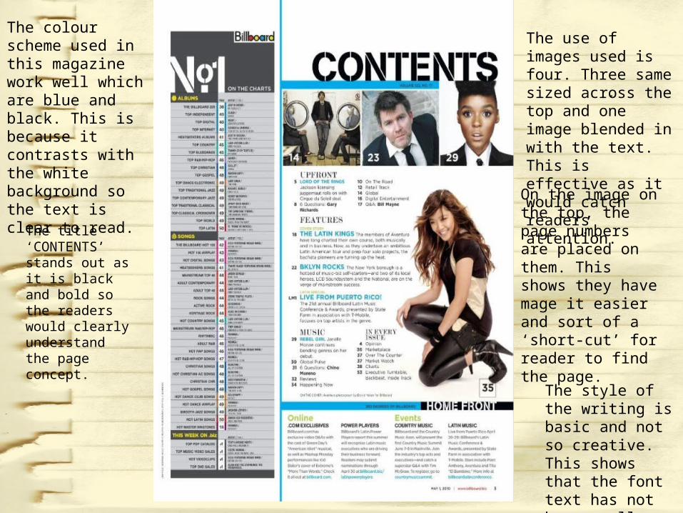
The colour scheme used in this magazine work well which are blue and black. This is because it contrasts with the white background so the text is clear to read.
The use of images used is four. Three same sized across the top and one image blended in with the text. This is effective as it would catch readers attention.
The style of the writing is basic and not so creative. This shows that the font text has not been really considered about.
On the image on the top, the page numbers are placed on them. This shows they have mage it easier and sort of a ‘short-cut’ for reader to find the page.
The title ‘CONTENTS’ stands out as it is black and bold so the readers would clearly understand the page concept.

The colour works well with the use of yellow, white along with the black background. This is effective as it would attract readers from the boldness.
The use on this dps is two. One large one on the left and a little one on the right side. This if effected because it feels like the reader is more interacted with the artist them self.
The title is effective with the use of the artist name them with a time next to it which is one of the conventions of hip hop/r’n’b. It involves reader more with this use of language.
The pull quote is effective on the right page as it tells us the artist point of view.
The front is small and the questions are in yellow so it makes it easier for readers to understand.


