36
Analytics –Data Discovery QlikView 3 rd -5 th September 2014 KS Gopinath Narayan, IAAS CIA, CFE, PMP Pr. Director (IT Audit) Office of the CAG of India [email protected]

Analytics –Data DiscoveryQlikView
3rd-5th September 2014
KS Gopinath Narayan, IAASCIA, CFE, PMP
Pr. Director (IT Audit)Office of the CAG of India

Presentation Outline
• About Data Analytics
• Data Discovery through Data Visualisation
• Various types of Graphs and Charts
• Tools for Data Discovery
– Microsoft Excel – Pivot and PowerPivot
– QlikView / QlikSense
– Tableau Desktop/Public
• QlikView
Data Discovery 2
About Data Analytics
• Analytics – Reduction of data to understandable findings.
• Data analytics is an analytical process by which insights are extracted from operational, financial, and other forms of electronic data.
• ….provide the “how?” and “why?” answers to initial “what?” questions frequently found in the information initially extracted from the data.
(KPMG-2013)
Data Discovery 3

About Data Analytics
• Data Analytics driven by the Hype around Big Data Analytics
• Big data: “collection of data sets so large and complex that it becomes difficult to process using traditional data processing applications”
• Massive growth in data volumes
• Google CEO Eric Schmidt in 2010: “There were 5 Exabytes of information created between the dawn of civilization through 2003, but that much information is now created every 2 days.”
• Growth Largely in unstructured data.
Data Discovery 4
Data Size Primer
• KB = kilobyte, a paragraph of text
• MB= Megabyte, 106 Bytes, Complete works of Shakespeare = 5MB
• GB= Gigabyte, 109 Bytes, Accounts Transaction Data of one year 1-3 GB (States in India)
• TB=Terabyte, 1012 Bytes, Tweets created daily = 12+ TB, US Library of Congress=235 TB
• PB=Petabyte, 1015 Bytes, Data processed in a day by Google=24 PB
• EB=Exabyte, 1018 Bytes, Total data created in 2006 = 161 EB
Data Discovery 5
Technological Changes Impacting Analytics
• Traditionally, Analytics capability through Business Intelligence (BI) Tools / Data Warehouse
– Top down, IT modeled with reports, KPIs, slice and dice capability
• BI moving towards self-service delivery model. New tools/segments being created
• New opportunity in the form of In-Memory Analytics
• Advanced analytics capability now affordable. Powered by:
– Increased computational power
– Lower cost of RAM
– 64 Bit computing
Big Data - Exploiting Big Opportunity, Avoiding Big Mistake 6
Data Discovery 7
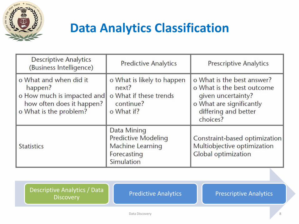
Data Analytics Classification
Data Discovery
Descriptive Analytics / Data Discovery
Predictive Analytics Prescriptive Analytics
8
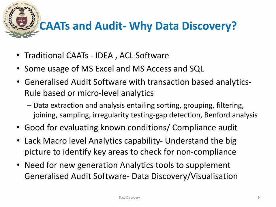
CAATs and Audit- Why Data Discovery?
• Traditional CAATs - IDEA , ACL Software
• Some usage of MS Excel and MS Access and SQL
• Generalised Audit Software with transaction based analytics-Rule based or micro-level analytics
– Data extraction and analysis entailing sorting, grouping, filtering, joining, sampling, irregularity testing-gap detection, Benford analysis
• Good for evaluating known conditions/ Compliance audit
• Lack Macro level Analytics capability- Understand the big picture to identify key areas to check for non-compliance
• Need for new generation Analytics tools to supplement Generalised Audit Software- Data Discovery/Visualisation
Data Discovery 9
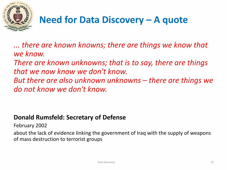
Need for Data Discovery – A quote
... there are known knowns; there are things we know that we know.There are known unknowns; that is to say, there are things that we now know we don't know.But there are also unknown unknowns – there are things we do not know we don't know.
Donald Rumsfeld: Secretary of DefenseFebruary 2002
about the lack of evidence linking the government of Iraq with the supply of weapons of mass destruction to terrorist groups
Data Discovery 10

Why Visualisation?
• Visual analysis aids analytical reasoning
• leverages the incredible capabilities and bandwidth of the visual system
• takes advantage of our brains’ built-in “software” to identify patterns and communicate relationships and meaning– Identify trends and outliers, discover or search for interesting or
specific data points in a larger field
• inspire new questions and further exploration
John Tukey - ”…the picture-examining eye is the best finder we have of the wholly unanticipated”
Data Discovery 11

12Data Discovery
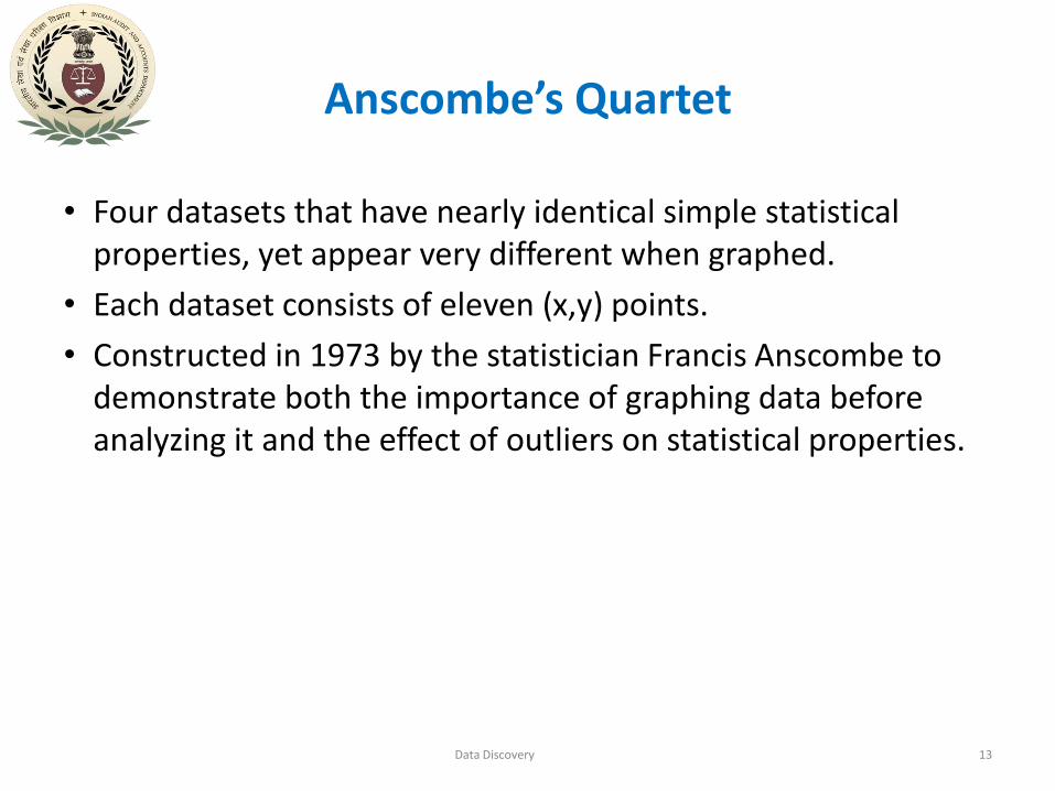
Anscombe’s Quartet
• Four datasets that have nearly identical simple statistical properties, yet appear very different when graphed.
• Each dataset consists of eleven (x,y) points.
• Constructed in 1973 by the statistician Francis Anscombe to demonstrate both the importance of graphing data before analyzing it and the effect of outliers on statistical properties.
Data Discovery 13
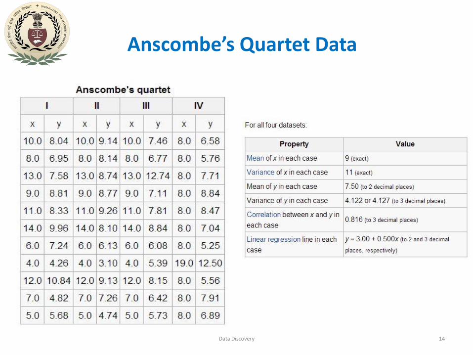
Anscombe’s Quartet Data
Data Discovery 14
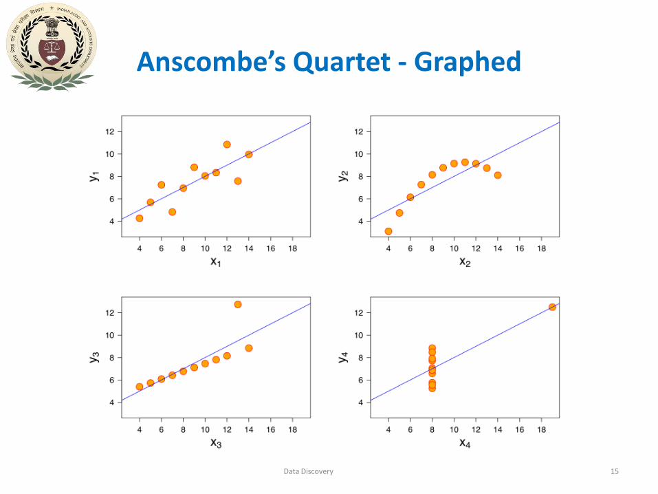
Anscombe’s Quartet - Graphed
Data Discovery 15

Data Discovery 16

Data Visualisation-1- John Snow’s map of London Cholera Epidemic of 1854
Data Discovery 17
Data Discovery 18
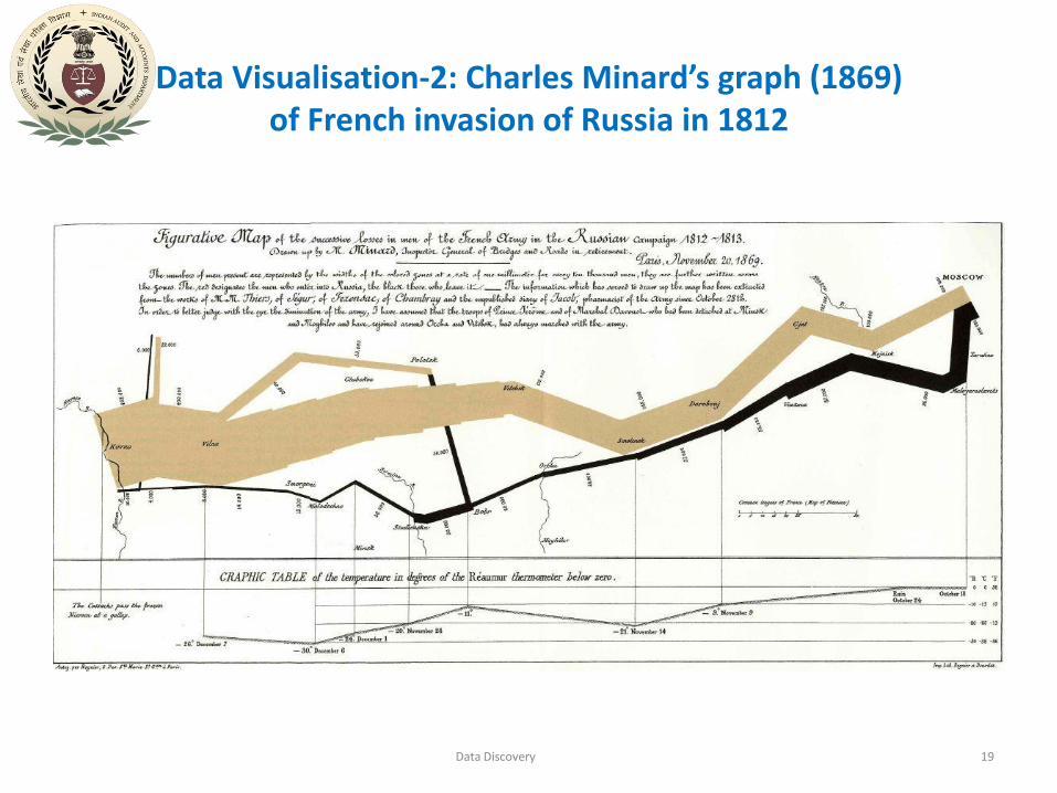
Data Visualisation-2: Charles Minard’s graph (1869) of French invasion of Russia in 1812
Data Discovery 19
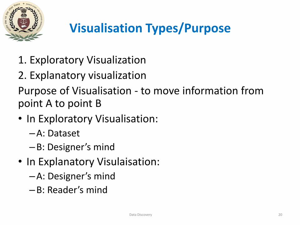
Visualisation Types/Purpose
1. Exploratory Visualization
2. Explanatory visualization
Purpose of Visualisation - to move information from point A to point B
• In Exploratory Visualisation:–A: Dataset
–B: Designer’s mind
• In Explanatory Visulaisation:–A: Designer’s mind
–B: Reader’s mind
Data Discovery 20
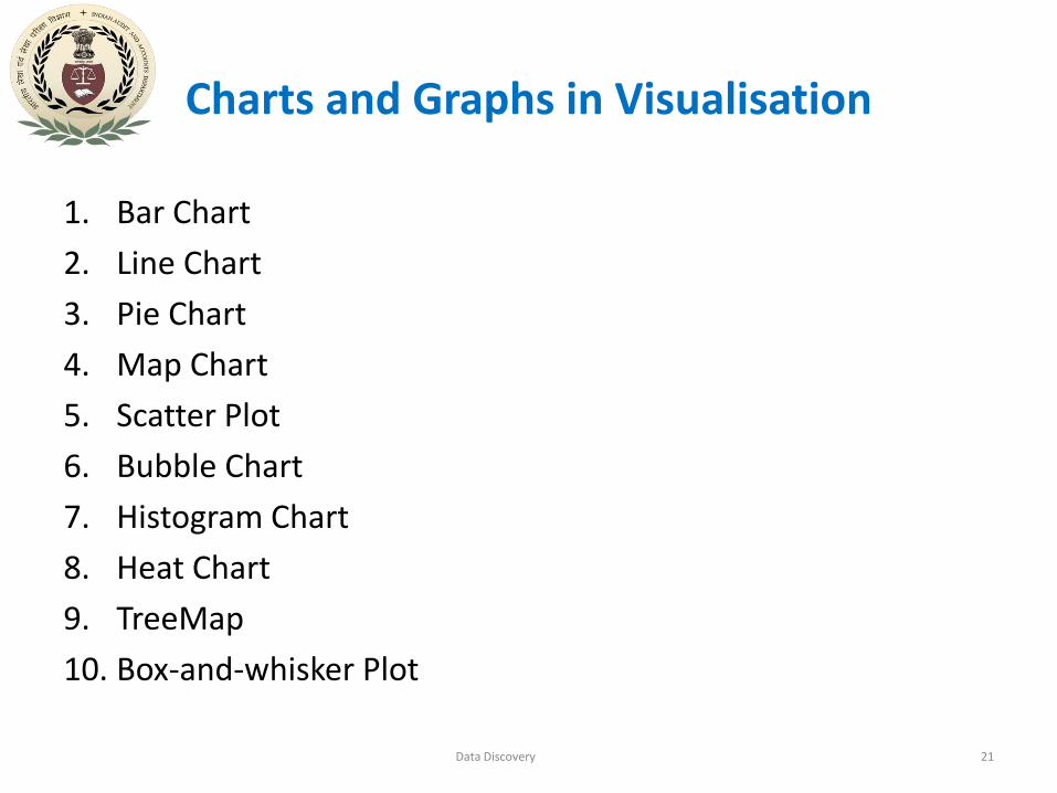
Charts and Graphs in Visualisation
1. Bar Chart
2. Line Chart
3. Pie Chart
4. Map Chart
5. Scatter Plot
6. Bubble Chart
7. Histogram Chart
8. Heat Chart
9. TreeMap
10. Box-and-whisker Plot
Data Discovery 21
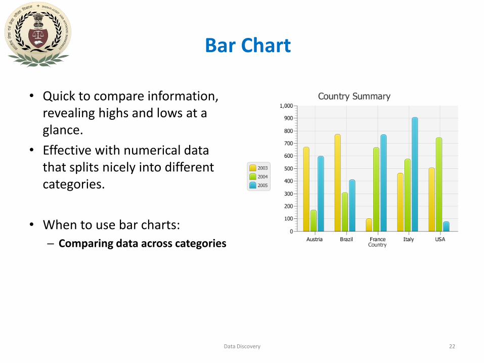
Bar Chart
• Quick to compare information, revealing highs and lows at a glance.
• Effective with numerical data that splits nicely into different categories.
• When to use bar charts:
– Comparing data across categories
Data Discovery 22

Line Chart
• Connect individual numeric data points.
• Simple way to visualize a sequence of values.
• When to use line charts:
– Viewing trends in data over time
Data Discovery 23
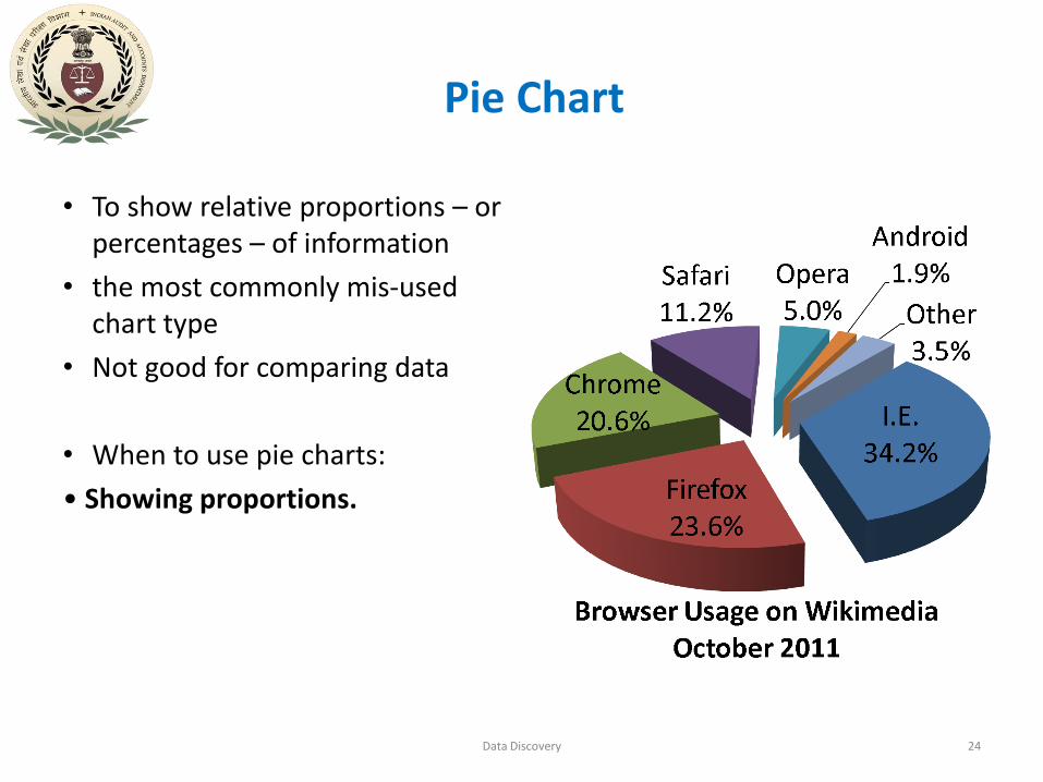
Pie Chart
• To show relative proportions – or percentages – of information
• the most commonly mis-used chart type
• Not good for comparing data
• When to use pie charts:
• Showing proportions.
Data Discovery 24
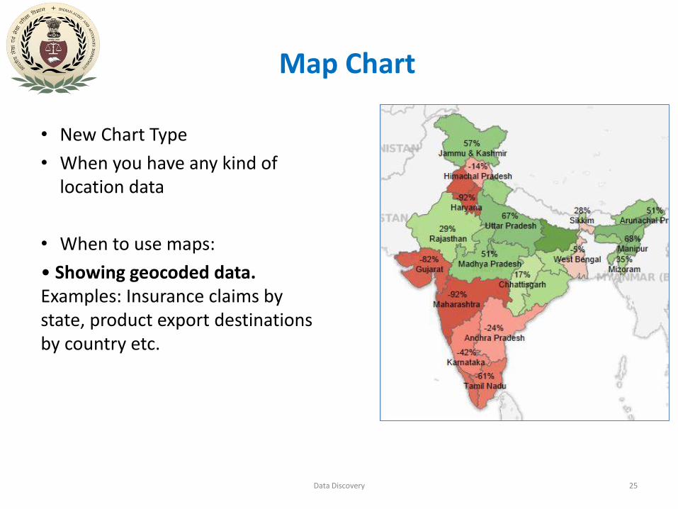
Map Chart
• New Chart Type
• When you have any kind of location data
• When to use maps:
• Showing geocoded data. Examples: Insurance claims by state, product export destinations by country etc.
Data Discovery 25

Scatter Plot
• To see how different pieces of information relate
• effective way to get a sense of trends, concentrations and outliers – identify areas to focus further investigation
• When to use scatter plots: Investigating the relationship between different variables
Data Discovery 26

Bubble Chart
• A technique to accentuate data on scatter plots or maps
• Not a separate type of visualization
• varied size of circles provides meaning about the data
• When to use bubbles:
• Showing the concentration of data along two axes.
Examples: sales concentration by product and geography
Data Discovery 27
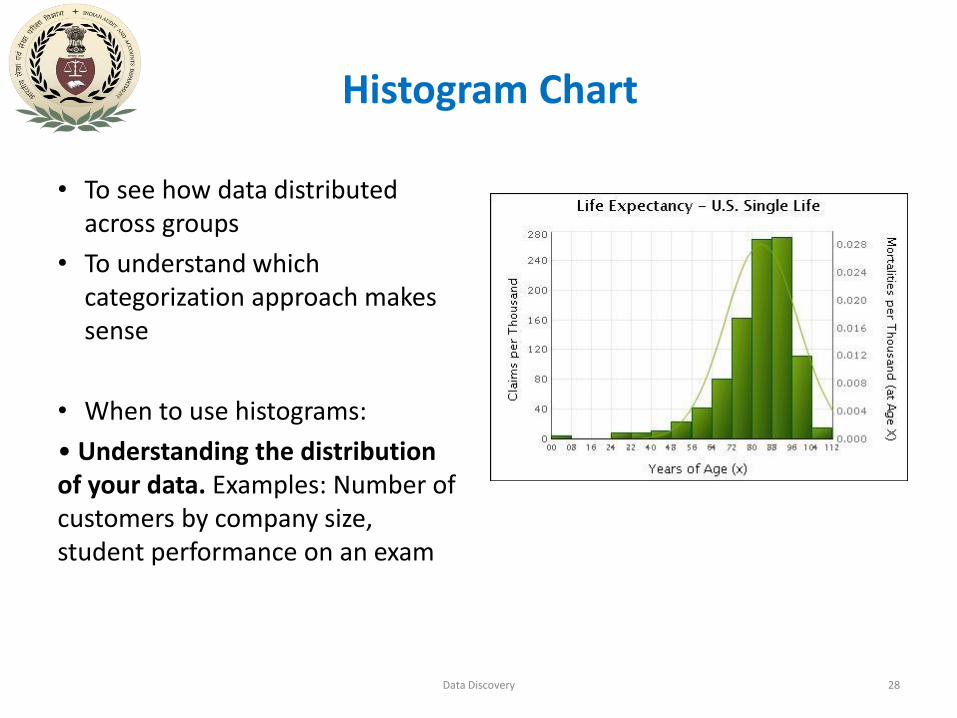
Histogram Chart
• To see how data distributed across groups
• To understand which categorization approach makes sense
• When to use histograms:
• Understanding the distribution of your data. Examples: Number of customers by company size, student performance on an exam
Data Discovery 28
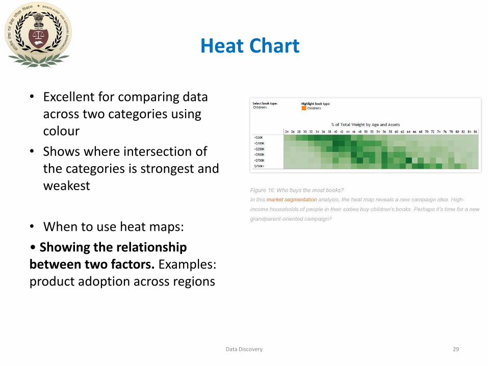
Heat Chart
• Excellent for comparing data across two categories using colour
• Shows where intersection of the categories is strongest and weakest
• When to use heat maps:
• Showing the relationship between two factors. Examples: product adoption across regions
Data Discovery 29

TreeMap
• To see data at a glance and discover how the different pieces relate to the whole
• Uses a series of rectangles, nested within other rectangles, to show hierarchical data as a proportion to the whole
• When to use treemaps:
• Showing hierarchical data as a proportion of a whole:
Data Discovery 30

Box-and-whisker Plot
• Shows distributions of data
• Box contains the median of the data along with the 1st and 3rd quartiles
• Whiskers typically represents data within 1.5 times the Inter-quartile Range (or Maximum/Minimum)
• When to use box-and-whisker plots:
• Showing the distribution of a set of a data: Examples: understanding
data at a glance, seeing how data is skewed towards one end, identifying outliers
Data Discovery 31
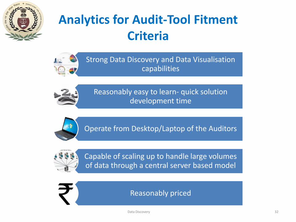
Analytics for Audit-Tool Fitment Criteria
Strong Data Discovery and Data Visualisation capabilities
Reasonably easy to learn- quick solution development time
Operate from Desktop/Laptop of the Auditors
Capable of scaling up to handle large volumes of data through a central server based model
Reasonably priced
Data Discovery 32
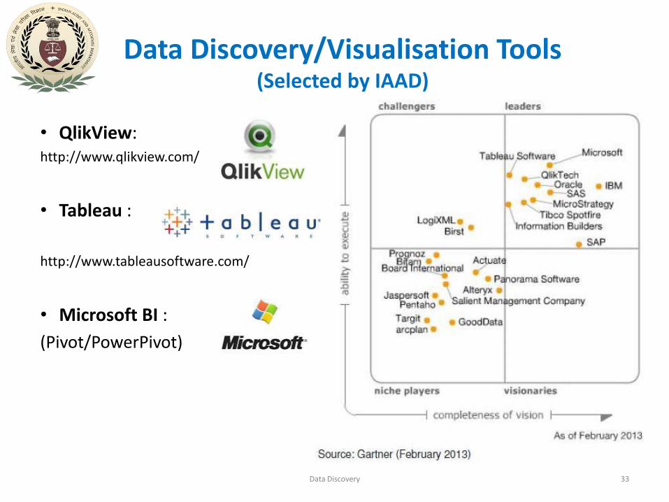
Data Discovery/Visualisation Tools(Selected by IAAD)
• QlikView: http://www.qlikview.com/
• Tableau :
http://www.tableausoftware.com/
• Microsoft BI :
(Pivot/PowerPivot)
Data Discovery 33
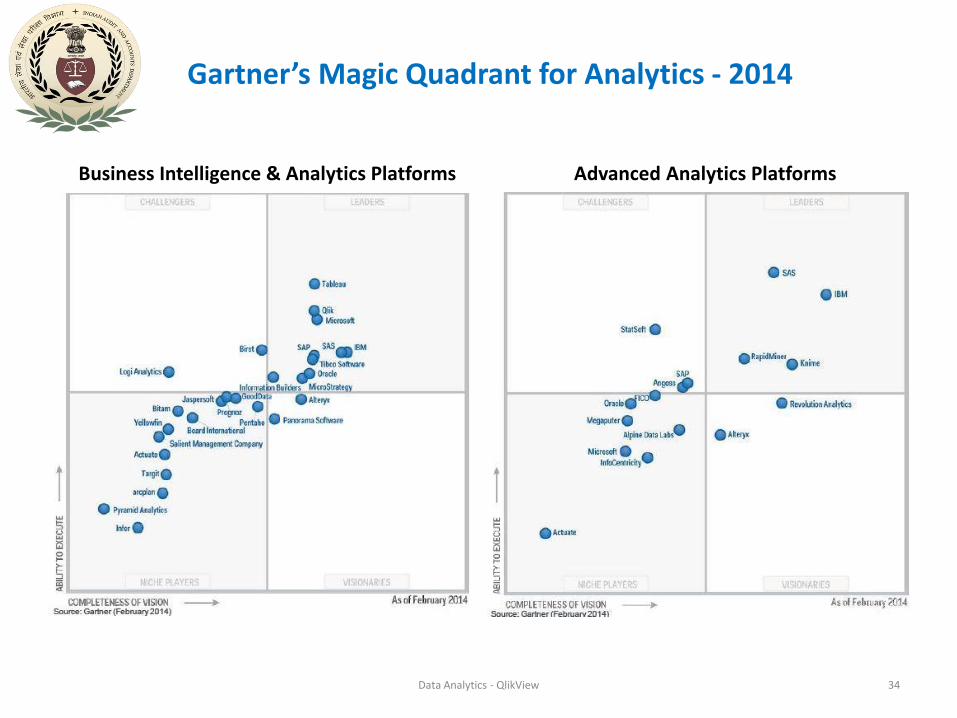
Gartner’s Magic Quadrant for Analytics - 2014
Data Analytics - QlikView 34
Business Intelligence & Analytics Platforms Advanced Analytics Platforms
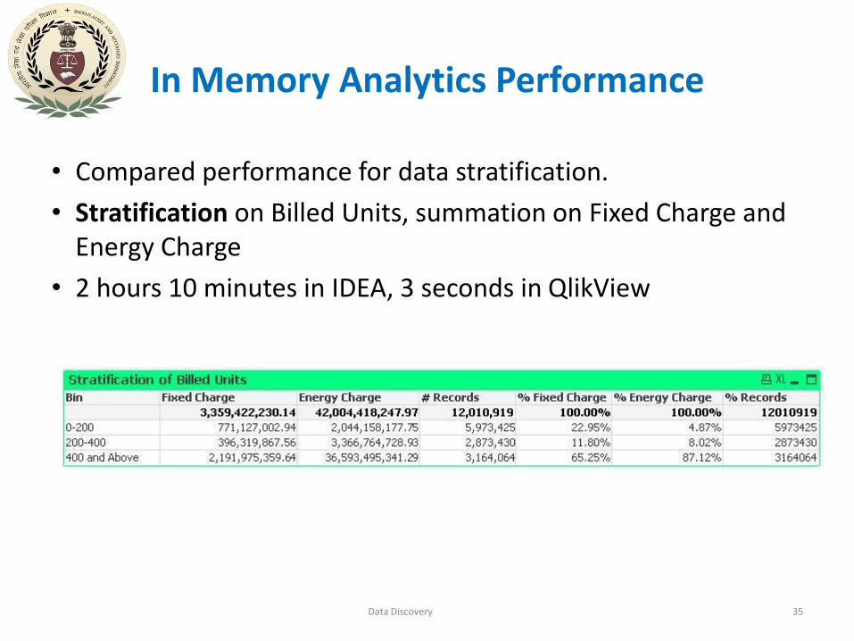
In Memory Analytics Performance
Data Discovery 35
• Compared performance for data stratification.
• Stratification on Billed Units, summation on Fixed Charge and Energy Charge
• 2 hours 10 minutes in IDEA, 3 seconds in QlikView

THANK YOU
Data Discovery 36


