+ All Categories
Home > Documents > Analyzing (Social Media) Networks with NodeXL · Analyzing (Social Media) Networks with NodeXL Marc...

Analyzing (Social Media) Networks with NodeXL · Analyzing (Social Media) Networks with NodeXL Marc...

Date post: 17-Jun-2018
Category:
Upload: hoangtram
View: 216 times
Download: 0 times
Share this document with a friend
9
Analyzing (Social Media) Networks with NodeXL Marc A. Smith 1 , Ben Shneiderman 2 , Natasa Milic-Frayling 3 , Eduarda Mendes Rodrigues 3 , Vladimir Barash 4 , Cody Dunne 2 , Tony Capone 5 , Adam Perer 2 , Eric Gleave 6 1 Telligent Systems, 2 University of Maryland, 3 Microsoft Research-Cambridge, 4 Cornell University, 5 Microsoft Research-Redmond, 6 University of Washington ABSTRACT We present NodeXL, an extendible toolkit for network overview, discovery and exploration implemented as an add-in to the Microsoft Excel 2007 spreadsheet software. We demonstrate NodeXL data analysis and visualization features with a social media data sample drawn from an enterprise intranet social network. A sequence of NodeXL operations from data import to computation of network statistics and refinement of network visualization through sorting, filtering, and clustering functions is described. These operations reveal sociologically relevant differences in the patterns of interconnection among employee participants in the social media space. The tool and method can be broadly applied. Categories and Subject Descriptors H.4.1 [Information Systems Applications]: Office Automation – spreadsheets; H.5.2 [Information Interfaces and Presentation]: User Interfaces – Graphical user interfaces (GUI); E.1 [Data Structures]: Data Structures – Graphs and networks. General Terms Design, Measurement Keywords NodeXL, Network Analysis, Visualization 1. INTRODUCTION We describe a tool and a set of operations for analysis of networks in general and in particular of the social networks created when employees use an enterprise social network service. The NodeXL tool adds “network graph” as a chart type to the nearly ubiquitous Excel spreadsheet. We intend the tool to make network analysis tasks easier to perform for novices and experts. In the following we describe a set of procedures for processing social networks commonly found in social media systems. We generate illustrations of the density of the company’s internal connections, the presence of key people in the network and relationships between network and job role attributes. We suggest these steps can be applied to similar data sets and describe future directions for developing tools for the analysis of social media and networks. Social media applications enable the collective creation and sharing of digital artifacts. The use of these tools inherently creates network data. These networks represent the connections between content creators as they view, reply, annotate or explicitly link to one another’s content. The many forms of computer-mediated social interaction, including many common communication tools like SMS messages on mobile phones, email and email lists, discussion groups, blogs, wikis, photo and video sharing systems, chat rooms, and “social network services”, all create digital records of social relationships. Almost all actions in a social media system leave a trace of a tie between users and other users and objects. These networks have academic and practical value: they offer detailed data about previously elusive social processes and can be leveraged to highlight important content and contributors. Social media systems are at an inflection point. Authoring tools for creating shared media are maturing but analysis tools for understanding the resulting collections have lagged. As large scale adoption of authoring tools for social media is now no longer in doubt, focus is shifting to the analysis of social media repositories, from public discussions and media sharing systems to personal email stores. Hosts, managers, and various users of these systems have a range of interests in improving the visibility of the structure and dynamics of these collections. We imagine one network analysis scenario for NodeXL will be to analyze social media network data sets. Many users now encounter Internet social network services as well as stores of personal communications like email, instant message and chat logs, and shared files. Analysis of social media populations and artifacts can create a picture of the aggregate structure of a user’s social world. Network analysis tools can answer questions like: What patterns are created by the aggregate of interactions in a social media space? How are participants connected to one another? What social roles exist and who plays critical roles like connector, answer person, discussion starter, or content caretaker? What discussions, pages, or files have attracted the most interest from different kinds of participants? How do network structures correlate with the contributions people make within the social media space? There are many network analysis and visualization software tools. Researchers have created toolkits from sets of network analysis components not limited to R and the SNA library, JUNG, Guess, and Prefuse [[2], [12], [15]]. So why create another network Copyright is held by the author/owner(s). C&T’09, June 25–27, 2009, University Park, Pennsylvania, USA. ACM 978-1-60558-601-4/09/06.
Transcript

Analyzing (Social Media) Networks with NodeXL Marc A. Smith1

, Ben Shneiderman2, Natasa Milic-Frayling3

, Eduarda Mendes Rodrigues3,

Vladimir Barash4, Cody Dunne2

, Tony Capone5, Adam Perer2, Eric Gleave6

1Telligent Systems,

2University of Maryland,

3Microsoft Research-Cambridge,

4Cornell University,

5Microsoft Research-Redmond,

6University of Washington

ABSTRACT We present NodeXL, an extendible toolkit for network overview,

discovery and exploration implemented as an add-in to the

Microsoft Excel 2007 spreadsheet software. We demonstrate

NodeXL data analysis and visualization features with a social

media data sample drawn from an enterprise intranet social

network. A sequence of NodeXL operations from data import to

computation of network statistics and refinement of network

visualization through sorting, filtering, and clustering functions is

described. These operations reveal sociologically relevant

differences in the patterns of interconnection among employee

participants in the social media space. The tool and method can

be broadly applied.

Categories and Subject Descriptors

H.4.1 [Information Systems Applications]: Office Automation –

spreadsheets; H.5.2 [Information Interfaces and Presentation]:

User Interfaces – Graphical user interfaces (GUI); E.1 [Data

Structures]: Data Structures – Graphs and networks.

General Terms

Design, Measurement

Keywords

NodeXL, Network Analysis, Visualization

1. INTRODUCTION We describe a tool and a set of operations for analysis of networks

in general and in particular of the social networks created when

employees use an enterprise social network service. The NodeXL

tool adds “network graph” as a chart type to the nearly ubiquitous

Excel spreadsheet. We intend the tool to make network analysis

tasks easier to perform for novices and experts. In the following

we describe a set of procedures for processing social networks

commonly found in social media systems. We generate

illustrations of the density of the company’s internal connections,

the presence of key people in the network and relationships

between network and job role attributes. We suggest these steps

can be applied to similar data sets and describe future directions

for developing tools for the analysis of social media and networks.

Social media applications enable the collective creation and

sharing of digital artifacts. The use of these tools inherently

creates network data. These networks represent the connections

between content creators as they view, reply, annotate or

explicitly link to one another’s content. The many forms of

computer-mediated social interaction, including many common

communication tools like SMS messages on mobile phones, email

and email lists, discussion groups, blogs, wikis, photo and video

sharing systems, chat rooms, and “social network services”, all

create digital records of social relationships. Almost all actions in

a social media system leave a trace of a tie between users and

other users and objects.

These networks have academic and practical value: they offer

detailed data about previously elusive social processes and can be

leveraged to highlight important content and contributors. Social

media systems are at an inflection point. Authoring tools for

creating shared media are maturing but analysis tools for

understanding the resulting collections have lagged. As large

scale adoption of authoring tools for social media is now no

longer in doubt, focus is shifting to the analysis of social media

repositories, from public discussions and media sharing systems

to personal email stores. Hosts, managers, and various users of

these systems have a range of interests in improving the visibility

of the structure and dynamics of these collections.

We imagine one network analysis scenario for NodeXL will be to

analyze social media network data sets. Many users now

encounter Internet social network services as well as stores of

personal communications like email, instant message and chat

logs, and shared files. Analysis of social media populations and

artifacts can create a picture of the aggregate structure of a user’s

social world. Network analysis tools can answer questions like:

What patterns are created by the aggregate of interactions in a

social media space? How are participants connected to one

another? What social roles exist and who plays critical roles like

connector, answer person, discussion starter, or content caretaker?

What discussions, pages, or files have attracted the most interest

from different kinds of participants? How do network structures

correlate with the contributions people make within the social

media space?

There are many network analysis and visualization software tools.

Researchers have created toolkits from sets of network analysis

components not limited to R and the SNA library, JUNG, Guess,

and Prefuse [[2], [12], [15]]. So why create another network

Copyright is held by the author/owner(s).

C&T’09, June 25–27, 2009, University Park, Pennsylvania, USA.

ACM 978-1-60558-601-4/09/06.

analysis toolkit? Our goal is to create a tool that avoids the use of

a programming language for the simplest forms of data

manipulation and visualization, to open network analysis to a

wider population of users, and to simplify the analysis of social

media networks. While many network analysis programming

languages are “simple” they still represent a significant overhead

for domain experts who need to acquire technical skills and

experience in order to explore data in their specific field. As

network science spreads to less computational and algorithmically

focused areas, the need for non-programmatic interfaces grows.

There are other network analysis tools like Pajek, UCINet, and

NetDraw that provide graphical interfaces, rich libraries of

metrics, and do not require coding or command line execution of

features. However, we find that these tools are designed for

expert practitioners, have complex data handling, and inflexible

graphing and visualization features that inhibit wider adoption

[[4], [5]].

Our objective is to create an extendible network analysis toolkit

that encourages interactive overview, discovery and exploration

through “direct” data manipulation, graphing and visualization.

While relevant for all networks, the project has a special focus on

social media networks and provides support for using email,

Twitter and other sources of social media network data sets.

NodeXL is designed to enable Excel users to easily import, clean-

up, analyze and visualize network data. NodeXL extends the

existing graphing features of the spreadsheet with the added chart

type of “network”, thus lowering the barrier for adoption of

network analysis. We integrated into the Excel 2007 spreadsheet

to gain access to its rich set of data analysis and charting features.

Users can always create a formula, sort, filter, or simply enter data

into cells in the spreadsheet containing network data. NodeXL

calculates a set of basic network metrics, allowing users familiar

with spreadsheet operations to apply these skills to network data

analysis and visualization. Those with programming skills can

access the NodeXL features as individual features in a library of

network manipulation and visualization components.

In future work we report on the deployment of NodeXL and the

observation of work practices with the tool across a range of

users. In the following we give a brief overview of the tool,

examine related work and describe key NodeXL features through

an analysis of a sample network data set collected from an

enterprise intranet social media application.

2. NodeXL OVERVIEW The NodeXL—Network Overview, Discovery and Exploration

add-in for Excel 2007 adds network analysis and visualization

features to the spreadsheet. The NodeXL source code and

executables are available at http://www.codeplex.com/NodeXL.

NodeXL is easy to adopt for many existing users of Excel and has

an extendable open source code base. Data entered into the

NodeXL template workbook can be converted into a directed

graph chart in a matter of a few clicks. The software architecture

comprises three extendable layers:

Data Import Features. NodeXL stores data in a pre-defined Excel

template that contains the information needed for generating

network charts. Data can be imported from existing Pajek files,

other spreadsheets, comma separated value (CSV) files, or

incidence matrices. NodeXL also extracts networks from a small

but extensible set of data sources that includes email stored in the

Windows Search Index and the Twitter micro-blogging network.

Email reply-to information from personal e-mail messages is

extracted from the Microsoft Windows Desktop Search index.

Data can also be imported about which user subscribes to one

another’s updates in Twitter, a micro-blogging social network

system. NodeXL has a modular architecture that allows for the

integration of new components to extract and import network data

from additional resources, services, and applications. The open

source access to the NodeXL code allows for a community of

programmers to extend the code and provide interfaces to data

repositories, analysis libraries, and layout methods. Spreadsheets

can then be used in a uniform way to exchange network data sets

by a wide community of users.

Network Analysis Module. NodeXL represents a network in the

form of edge lists, i.e., pairs of vertices which are also referred to

as nodes. Each vertex is a representation of an entity in the

network. Each edge, or link, connecting two vertices is a

representation of a relationship that exists between them. This

relationship may be directed or not. Some relationships are bi-

directional (like marriage); others can be uni-directional (like

lending money).

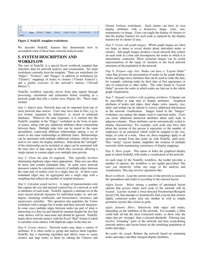
Figure 1. NodeXL Menu, Edge List Worksheet, and Graph Display Pane

An edge list is, minimally, a pair of entity names which indicate

the presence of a relationship. These lists can be extended with

additional columns that can contain data about the relationship.

NodeXL includes a number of software routines for calculating

statistics about individual vertices including in-degree, out-degree,

clustering coefficient, and closeness, betweenness, and

eigenvector centrality. Additional analyses features can be

integrated by advanced users. The results of the network metric

calculations are added to the spreadsheet as additional columns

that can be further combined and reused in Excel formula during

analysis and visualization. Spreadsheet features like data sorting,

calculated formulae, and filters can be applied to network data

sets directly.

Graph Layout Engine. NodeXL provides a canvas for displaying

and manipulating network charts and data. Users can apply a

range of controls to convert an edge list into a useful node-link

chart. These include display options that specify the appearance of

individual edges and nodes as well as the overall layout of the

network. The lines between nodes that represent edges can have

different thickness, color, and level of transparency depending on

the attributes of the data or parameters specified by the user.

Similarly, each node representing a vertex can be set to have a

different location, size, color, transparency, or shape. Optionally,

the user can specify images to replace the node shapes.

Reliance on a spreadsheet does limit the scale of NodeXL data

sets to small and medium size networks with thousands to tens of

thousands of nodes. However, we see a great value of working in

that spectrum of network analysis problems. First, networks with

a few thousands of nodes and edges are already sufficiently

challenging for visualization and interpretation and exhibit a

variety of complex issues that we attempt to address in our

research. Second, networks of such size are available in diverse

usage scenarios, allowing us to explore a range of design choices

and principles. Third, the practical scale supported by standard

spreadsheets will itself also expand over time, for example, the

latest version of Excel limits spreadsheet size to the limits of the

computer’s memory and storage resources rather than an arbitrary

value. Most networks even when composed of billions of

elements will ultimately need to be reduced to a limited set either

by aggregation or by selectively focusing on a sub region of the

larger network.

Following a brief review of related efforts in graph visualization

and exploration, we offer a step-by-step guide to the creation of

NodeXL visualizations and highlight analysis features of the

toolkit. We conclude with the discussion of challenges and future

directions for network exploration tools.

3. RELATED WORK Over the years there have been various efforts to provide flexible,

interactive, and effective exploratory interfaces for network

analysis [[11], [13]]. For example, the SocialAction tool provides

real-time exploration, filtering and clustering functions for small

to medium sized networks by integrating statistics and

visualizations [[16], [17], [18]]. An alternate approach applies

semantic substrates, i.e., attribute-based layouts in which node

attributes govern assignment to regions, e.g., managers in one

region, employees in another, and customers in a third. Then

node placement within regions is determined by other attributes

and the user can control edge visibility to reduce clutter [[3],

[20]]. The pursuit of less cluttered and more revealing

visualizations has prompted further research on measures of graph

layout quality [7].

The value of network visualizations for investigating social

structures of computer-mediated interactions is shown in a

growing number of recent papers [9]. Welser et al. [22] show that

distinct connecting patterns among users are related to a variety of

social roles that, in turn, form complex ecosystems in social media

spaces. Social network diagrams were used to illustrate key social

roles found in discussion spaces and wiki documents, including

‘answer people’, ‘discussion people’, ‘discussion starters’, and

people who specialized in improving the formatting of wiki pages.

Adamic et al. [1] illustrate the value of social network analysis for

understanding the social connections within question and answer

discussions in the Yahoo! Answers system. Their visualizations

of different collections of messages, grouped by a common tag or

category, illustrate a range of social practices and patterns, from

question and answer exchanges to long debates and arguments.

4. NETWORK ANALYSIS GOALS Network graphs can be explored along multiple dimensions, most

prominently scale and time. Some research questions focus on the

structure of the whole graph or large sub-graphs, other questions

focus on identifying individual nodes that are of particular

interest. Some analysts will want to analyze the whole graph

aggregated over its entire lifetime; others will want to slice the

network into units of time to explore the progression of the

network’s development. Attempts to enumerate the network

analysis tasks that most analysts will want to perform on their data

set are promoting discussion [13]. A starting point is the list from

Perer and Shneiderman [17]:

1. Overall network metrics, e.g., number of nodes, number of

edges, density, diameter

2. Node rankings, e.g., degree, betweenness, closeness centrality

3. Edge rankings, e.g., weight, betweenness centrality

4. Node rankings in pairs, e.g., degree vs. betweenness, plotted

on a scatter gram)

5. Edge rankings in pairs

6. Cohesive subgroups, e.g., finding communities

7. Multiplexity, e.g., analyzing comparisons between different

edge types, such as friends vs. enemies.

These tasks serve higher level goals for most network analysis.

At its most basic level, the initial goal is to grasp basic insights

into its macro structure. From an overview, the analyst can begin

to seek sub-elements of the network that are of particular interest.

This may involve finding sub-groups or cliques and measuring

their cohesion in terms of the density of their internal connections.

At the micro-level, network analysts focus on individual nodes.

Some nodes are notable, for example, because they have an

extreme degree of connection to other nodes. For network

analysts, the connection of such nodes to one another and their

‘betweenness’ or various forms of centrality (like degree,

closeness and eigenvector centrality, among others) are common

topics of interest. Some nodes play critical roles as bridges, sinks,

or sources within the network. With an overview of a network in

place, analysts may seek to find the gaps or holes in the network

that could indicate missing data, a hidden actor, or a strategic gap

that should be filled. These measures change over time and many

analysts also seek to map diffusion and change over time.

We describe NodeXL features that demonstrate how to

accomplish some of these basic network analysis tasks.

5. SYSTEM DESCRIPTION AND

WORKFLOW The core of NodeXL is a special Excel workbook template that

structures data for network analysis and visualization. Six main

worksheets currently form the template. There are worksheets for

“Edges”, “Vertices”, and “Images” in addition to worksheets for

“Clusters,” mappings of nodes to clusters (“Cluster Vertices”),

and a global overview of the network’s metrics (“Overall

Metrics”).

NodeXL workflow typically moves from data import through

processing, calculation and refinement before resulting in a

network graph that tells a useful story (Figure 2b). These steps

include:

Step 1: Import data. Network data can be imported from one or

more network data sources. Users may have data in files, e.g. in

text format, separated by delimiters, or stored in relational

databases. Wherever the data originates, it is entered into the

NodeXL template in the “Edges” worksheet in the form of pairs

of names, along with any additional attributes about relationship

between them. Multiple edge lists can be stored in the same

spreadsheet, expressing different relationships among a set of

nodes or the same relationships at different times. Relationships

can be annotated with multiple additional columns, which can be

used to set values for display attributes. Data about the “strength”

of the relationship can be included, or edges can be annotated with

the time slice or date range in which they occurred, allowing a

single dataset to contain edges over multiple time periods.

Step 2: Clean the data (if required). This typically involves

eliminating duplicate edges when appropriate. Data sets can often

be noisy and contain redundant data. In some cases network

measures cannot be calculated correctly if multiple edges between

the same pair of entities exist in a single data set. In these cases

redundant edges may be aggregated into a single edge with a

weighting that reflects the number of original instances.

Step 3: Calculate graph metrics. A range of measurements exist

that capture the size and internal connectivity of a network as well

as attributes of each node. NodeXL supports a minimal set of the

most crucial network measures for individual nodes: in- and out-

degree, clustering coefficient, and betweenness, closeness, and

eigenvector centrality. This operation also populates the Vertex

worksheet with a unique list of nodes and their network measures.

In some cases multiple edges between nodes are part of what is

interesting in a data set and should be retained despite the fact that

some metrics will be inaccurate and should be ignored. NodeXL

marks these network metrics with the Excel “Bad” format if asked

to calculate some metrics with duplicate edges in the data set.

Step 4: Create clusters. Network nodes may share a variety of

attributes. It is often useful to group and analyze them together.

NodeXL has a clustering algorithm and allows users to create

clusters and map nodes to them by editing the Clusters and

Cluster Vertices worksheets. Each cluster can have its own

display attributes with a distinctive shape, color, size,

transparency or image. Users can toggle the display of clusters so

that the display features for each node is replaced by the display

features for its cluster (if any).

Step 5: Create sub-graph images. Whole graph images are often

too large or dense to reveal details about individual nodes or

clusters. Sub-graph images produce a local network that centers

on each node at a time and encompasses the nodes to which it is

immediately connected. These extracted images can be useful

representations of the range of variation in the local network

structures of the population in the network.

Step 6: Prepare edge lists. Nodes can have a “Layout Order”

value that governs the presentation of nodes in the graph display.

Nodes and edges have attributes that can be used to order the data,

for example, ordering nodes by their date of first appearance or

rate of connection to other nodes. The value found in “Layout

Order” governs the order in which nodes are laid out in the whole

graph visualization.

Step 7: Expand worksheet with graphing attributes. Columns can

be auto-filled to map data to display attributes. Graphical

attributes of nodes and edges, their shape, color, opacity, size,

label, and tooltip can be altered to convey additional information

in the network visualization. Images listed in the “Images”

worksheet can replace the shapes used to represent nodes. Users

can insert additional numerical attributes about each node in

adjacent columns. These attributes can be automatically scaled to

display characteristics. For example, each node may have data

about the income of the person it represents or the number of

employees in an enterprise which could be mapped to the size,

shape, or color of a node. Once set, these mappings apply to all

networks created from that point on with NodeXL until reset.

This “sticky” layout feature simplifies the creation of multiple

networks while maintaining consistency of display mappings.

Step 8: Show graph. This opens or hides the graphical display

pane in which NodeXL will render a visualization of the network.

At each stage of the NodeXL workflow, the toolkit provides a

number of options; the workflow is not rigidly prescribed. The

user can iteratively refine any stage of the analysis and

visualization. This may involve operations like:

Read workbook. Load the current state of the network as stored in

the spreadsheet and render it according to the selected layout.

Adjust layout. Select among a number of automated layout

options that govern where each node in the network will be

located. Layouts include a force-directed Fruchterman-Reingold

layout [10], that attempts to dynamically find a layout that clusters

tightly connected nodes near one another as well as simple

geometric layouts like circles or grids.

Apply dynamic filters. Selectively hide edges and nodes,

depending on the attributes of the network. For example, a filter

could hide all but the most connected nodes, or show only the

edges that are ‘stronger’ than a selected threshold. Filtering may

involve “trimming” parts of the network and then recalculating

network metrics and layout based on the remaining population of

nodes and edges.

Re-render the graph. Redraw the network based on remaining

nodes and edges and their changed display attributes.

Figure 2. NodeXL template worksheets

Re-calculate network statistics. Return to the spreadsheet to sort

or calculate new data. Once initial visualizations are created, the

user may reorder nodes or import or calculate new data associated

with each node or edge.

Finalize the network analysis. Create final images or a data set

with an optimal network layout for sharing that highlights

meaningful features of the network.

NodeXL users can perform all of the operations suggested in the

network analysis tasks listed in Section 4.

6. NODEXL USAGE CASE We demonstrate the use of the NodeXL tool for finding

interesting patterns in a social media data set.

6.1 Data We extracted eight months of data from a social media application

used by a medium sized corporation. The company made

extensive use of an internal social networking service that allowed

employees to explicitly identify other employees with whom they

had a professional connection or friendship. Employees also

contributed heavily to an internal discussion web board and a

collection of wiki documents. There were 174 employees and

other user accounts present in the data collected from April -

December 2008 (Table 1).

Table 1. Network data statistics

Metric Value

Vertices 174

Unique Edges 7,852

Graph Density 0.26

6.2 Data Visualization using NodeXL

Figure 3 displays the “raw” network of the “friend” ties that users

created when they request and grant one another explicit

connections in the internal social network service application.

When a reciprocated tie is created, each person’s profile will list

the other person’s name as a “friend” or colleague.

Figure 3. The unrefined whole graph visualization of the data

sample comprising 174 nodes and 7,852 edges

Whole graph visualizations are often chaotic and illegible. Figure

3 is no exception, as expected given its size and the density of

ties. The network density is 26% of all possible ties (Table 1). We

now demonstrate several steps with NodeXL to explore and refine

the graph visualization.

Node and Edge Filtering. The chart in Figure 3 does convey the

high level of interconnection among members of this network but

it obscures many important features like the key nodes and

patterns in the network. Using NodeXL dynamic filters (Figure 4)

users can hide or grey out nodes that do not meet a set of criteria

and thus reveal structures among selected nodes that are otherwise

obscured. In Figure 5, the nodes with the highest in-degree are

highlighted while all other nodes and associated edges are grayed

out. The resulting network is composed of the most connected

nodes in the network.

Visual Enhancements. The network can be decorated to highlight

key features with color, size, shape, transparency and images. For

example, the node sizes in Figure 6 are made proportional to their

in-degree, while the color is used to indicate the value of their

clustering coefficient. From this display we can observe that the

larger core nodes, with high degree, have relatively lower

clustering coefficients because they connect to many people who

are not themselves connected to one another. Nodes with high

clustering coefficients typically connect to fewer people since

small groups are more able to connect every member to one

another.

Figure 4. Dynamic filters allow edge and vertex attributes to

determine what appears in the network visualization.

Analysis of Ego-centric Networks. Using the “Sub-graph Images”

feature users can generate a set of thumbnail images that represent

the connections around each node in the network. Users can select

the number of steps away from each core node to include in the

sub-graph. These ego-centric network images are inserted in-line

with the other vertex data in the Vertices worksheet. This allows

the images to be sorted along with the other data. Nodes can be

sorted by any column using the spreadsheet sort features. In

Figure 7 the nodes are sorted by decreasing clustering coefficient.

Figure 5. Filtered network, highlighting the most connected

employees and their connections to one another.

Figure 6. NodeXL graph with node size proportional to node

in-degree statistics and node color mapped to the value of the

clustering coefficient: low values are indicated in red, high

values indicated by shades of green.

This combination of visual data representation and statistical

analysis support additional non-trivial observations about the data.

For example, sub-graph images illustrate how the same clustering

coefficient can refer to very different local network sizes: a triad

(row 4) has the same clustering coefficient of “1” as a complete

graph (or strong “clique”) among a larger group (row 1). Sorting

nodes by various attributes can help correlate network structures

and other attributes of the nodes.

Visualization through Alternative Layouts. Additional alternative

layouts may be useful for some data analysis and visualization.

For example, in Figure 8 the network is laid out in a grid. Nodes

are ordered by the date on which they first connected with another

employee, laid out from left to right and top to bottom, where the

top-left node was the first joiner and the right bottom one was the

last joiner. This is roughly an indication of their hire date since

most employees quickly used the company intranet social network

tool and began to link to other employees in the company shortly

after being hired (many existing employees started using the

Figure 7. NodeXL Vertex worksheet showing the list of nodes,

(employees), with sub-graph images indicating the node-

networks (personal networks of colleagues) and selected

related metrics.

system in a large wave of “friending” when the system was first

installed and made operational).

Figure 8. A grid layout ordered by first connection date (from

left to right and top to bottom), sized by in-degree, and

colored by clustering coefficient. A recently hired employee’s

network is selected. High clustering coefficients are shown as

green.

A grid layout shows some aspects of the network more clearly

than one that clusters nodes tightly. As before, the size of each

node is proportional to the in-degree of that employee while its

color reflects the clustering coefficient of that person’s network.

Greener nodes are employees whose connections are all connected

to one another. Red nodes are those with lower clustering

coefficients, which indicate people who connect to people who are

not themselves densely connected to one another.

While edges can be displayed in this layout, it is possible to

remove the clutter of the underlying edges. In this time-sorted

grid, it is possible to see that the more recently hired employees

have been connected to by fewer other employees. One employee

is selected and that node’s edges or relationship connections is

displayed.

Nodes can also be located on the grid based on other attributes or

projected into any two dimensional space with the use of the “X”

and “Y” data columns in the Vertex worksheet. For example they

can be plotted in a coordinate space defined by their clustering

coefficient and ‘betweenness’ centrality. Figure 9 shows a scatter-

plot of these two statistics for the nodes in the graph.

Interactive Exploration of Graphs. NodeXL enables users to

display and hide connectivity data interactively, as shown in

Figure 8. This particular graph highlights a recently hired

employee who is more connected to other employees than others

among the latest hires in the data set.

Figure 9. Scatter plot of employees based on their betweenness

centrality (y) and clustering coefficient (x) highlighting the

same employee as Figure 8.Figure Size represents in-degree,

Red maps to high clustering coefficient.

We note that highly connected employees, represented with large

circles, tend to be red, indicating low clustering coefficient, i.e.,

the people they connect to are less well connected to one another.

This is in contrast with employees with smaller in-degrees who

are designated with smaller size but often greener color, i.e., with

higher clustering coefficients.

7. DISCUSSION NodeXL is intended to simplify the process of network data

analysis, making it easier to convert edge lists and incidence

matrices into useful visualizations that accelerate discovery.

Adding networks as a chart supported by a spreadsheet reduces

the barriers to network data analysis and manipulation. Since

network visualizations are not always immediately

comprehensible, simpler charts featuring a subset of network

attributes can be appealing during analysis. For instance, scatter

plots of nodes led to insights into outliers and gaps when larger

network visualizations were visually muddled in SocialAction

[18].

The use of a spreadsheet to host network data does not resolve

many of other long standing challenges facing network analysis in

general and network visualization in particular. Network

visualizations can easily become unintelligible or convey limited

information. Edge and node occlusion limit the number of nodes

and edges that can be distinctly displayed. Layout algorithms

often fail to find optimal arrangements of lines and nodes in order

to maximize the comprehension of the structure of the network.

Clusters of nodes are difficult to identify and represent,

particularly when a node participates in more than one cluster.

Large scale data sets remain hard to display.

NodeXL has not directly addressed these and many other of the

hard problems in graph layout and network visualization.

Nonetheless, the integration of network visualizations in a

spreadsheet continues to yield surprising payoffs that point to

improvements in some areas of the network analysis workflow.

In many cases, a spreadsheet is the existing home of much

network data, reducing data migration and pipeline issues. For

those who can code, the spreadsheet offers a rich and deep

programming language. For those who do not code, creating a

spreadsheet formula may be a more accessible while still powerful

way to manipulate data. NodeXL shows that a significant level of

flexibility can be achieved with nothing more than a few

spreadsheet formulae.

Flexible slicing of data. One of the strategies for increasing the

comprehensibility of network presentation is filtering and slicing

the network. Spreadsheet features provide useful support for data

manipulations related to collections of edges from multiple time

periods.

Time slices provide a natural and useful sampling approach as

network analysts push past static graphs. The spreadsheet can

easily allow for the addition of columns that represent the time

periods in which edges were active. These attributes can be used

to drive the “Visibility” control of each edge, allowing users to

step through time slices using the dynamic filters or directly

manipulating the spreadsheet data. Short time slices in which

fewer modes and edges are present are often more intelligible than

longer time spans in which all nodes and edges are present and

displayed.

Extracting ‘strong’ relationships is an alternative to slicing a

network by time. Users can limit complexity by constraining

relationships to the strongest present in the network. “Tie

strength” is a common attribute associated with an edge, a

measure of how much the tie is active. The number of replies one

person sends to another is an example of tie strength. A dynamic

filter can hide all nodes in a graph that do not connect to another

node with a frequency or strength above a threshold.

Alternatively, attributes of individual nodes may be added to the

spreadsheet, for example the income of people in a social network

or the publication citation count of a document in a research

literature can be selected to limit the number of remaining nodes

and edges. All attributes of nodes and edges in columns inserted

into the spreadsheet can be leveraged to control the display of the

network. These features are a benefit for those exploring data sets

with rich attributes.

Avoiding whole graph visualizations entirely is another approach.

Instead of generating overly complex and muddy graphs with too

much data, an alternative is to focus on ego-centric networks [1].

NodeXL already supports the creation of sub-graphs from a larger

graph. This is a useful but often labor intensive process in which

each node is visualized within its own “1.5 degree” network of

links to and among node connections. The automation of this

process allows for the rapid creation of small multiples of ego-

centric networks: grids of networks for each participant that

support individual and group level comparisons as illustrated in

Section 6.

Expanding the NodeXL layout engines. The application of

multiple layouts to different parts of the data set can help call out

important aspects of the network’s structure. Combinations of

different layouts can pull different classes of nodes into

complementary shapes or patterns that highlight their

interconnection. This points towards the potential benefit of

implementing features to support semantic substrates and further

organize nodes into more comprehensible patterns by constraining

nodes to regions in the network diagram.

Presentation of analysis. NodeXL images prepared for use in print

are more constrained than exploring a network structure

interactively in the NodeXL application graph visualization pane.

Dynamic network exploration enables users to make otherwise

visually opaque graphs more comprehensible as they highlight

different aspects of the network.

8. FUTURE WORK Network visualization is so complex a field that there is no limit

to the number of improvements and directions that the NodeXL

effort can take. A high priority item, however, is the

implementation of better support for clustering of network nodes.

This feature is needed to represent how groups of entities are

bound, for example, by a common membership or shared status.

Furthermore, clustering is required for normalizing multiple entity

identifiers that point to the same entity. For example, multiple

forms of a name or email address that appear in the data would

fragment a single person’s representation and affect the network

analysis by making what should be a single node into many.

The data structures required to support clusters are enabled in the

current version of NodeXL but we still need to design and

develop graphical user interfaces for creating clusters and adding

and removing nodes from clusters. These operations require that

the layout algorithm be altered to operate continuously as opposed

to the current ‘on-demand’ execution of the requested layouts.

The NodeXL toolkit currently provides only a minimal set of

network measures. A vast number of network measures have yet

to be implemented. While key metrics are calculated in NodeXL,

a more comprehensive library of network measures and

transformations may be best achieved by enabling interoperability

with existing libraries of network analysis algorithms. The project

seeks to prioritize the highest value missing measures that would

address the needs of the widest user population.

The basic layouts in the current implementation are often

inadequate for rendering complex or dense graphs. Better layouts

are the focus of several ongoing research efforts [8]. The modular

architecture of the NodeXL system already allows other layouts to

be added and, similar to the issues related to providing a

comprehensive library of network analysis metrics, it points to the

value of interoperability with existing libraries of layout

algorithms.

Finally, providing access to additional data sources is an

important direction for the project. Excel natively provides

connections to database servers. Other sources of social network

data include the many “Social Networking” services in popular

use, such as Facebook, mySpace, and LinkedIn as well as

enterprise implementations of similar services. In some cases

these services are opening programmable interfaces to their data

sets making connections between NodeXL and their data fairly

simple to implement.

NodeXL currently supports the import of social media network

data sets from the user’s own personal email repository, via the

Windows Search Index found on most Windows operating

systems. This allows users to study the patterns of reply in their

own email for any date range, set of folders, users, or keywords.

The resulting maps illustrate groups and connections maintained

via the exchange of email messages. NodeXL also supports

extracting social network data from the Twitter micro-blogging

and messaging service. Additional import connectors for social

media sites are a direction for future work for the project. The

goal would be to provide an extensive set of connections to

widely used social media sites. The result could be a more

comprehensive view of an individual’s social media context.

9. CONCLUSION Network structures are important in many disciplines and

professions. Interest in these structures is growing more common

as the world of social networks and computer-mediated social

content becomes more main stream. NodeXL aims to make

analysis and visualization of network data easier by combining the

common analysis and visualization functions with the familiar

spreadsheet paradigm for data handling. The tool enables

essential network analysis tasks and thus supports a wide audience

of users in a broad range of network analysis scenarios.

Using the tool on a sample social media network dataset we found

and illustrated structural patterns like the density of connections

within the enterprise, different kinds of contributors, and key

network metrics. These analysis tasks can be usefully applied to a

wide range of social media data sets.

Acknowledgements: We thank the Microsoft Research

External Research Program and the contributions of Tony Hey,

Dan Fay, Tim Dwyer, Tom Laird McConnell, Scott Sargent, Jana

Carter, Blake Smith, Zac Elsik, Telligent Systems, Derek Hansen,

the University of Maryland and the many helpful users of

NodeXL!

10. REFERENCES [1] Adamic, L.A., Zhang, J., Bakshy, E., and Ackerman, M.

(2008). Knowledge sharing and Yahoo Answers: Everyone

knows something, Proc. World Wide Web Conference,

WWW2008.org.

[2] Adar, E. (2006). GUESS: A Language and Interface for

Graph Exploration, Proc. ACM Conference on Human

Factors in Computing Systems.

[3] Aris, A. and Shneiderman, B., Designing semantic substrates

for visual network exploration, Information Visualization

Journal 6, 4 (2007), 1-20.

[4] Batagelj, A. M. V (1998). Pajek — program for large

network analysis. Connections, 21(2):47–57.

[5] Borgatti, S., Everett, M. G., and Freeman, L. C. (2006).

UCINET 6, Analytic Technologies.

[6] de Nooy, W., Mrvar, A. and Batageli, V. (2005). Exploratory

Social Network Analysis with Pajek. Cambridge University

Press, Cambridge, UK.

[7] Dunne, C. and Shneiderman, B. (2009). Improving graph

drawing readability by incorporating readability metrics: A

software tool for network analysts, Univ. of Maryland

Technical Report (submitted for review).

[8] Dwyer, T., Koren, Y., and Marriott, K. (2006): IPSep-CoLa:

An incremental procedure for separation constraint layout of

graphs, IEEE Trans. Visualization and Computer Graphics

12(5): 821-828.

[9] Freeman, L. C. (2004). Graphic Techniques for Exploring

Social Network Data, in Models and Methods in Social

Network Analysis, P. J. Carrington, J. Scott and S.

Wasserman, eds., Cambridge Univ Press, Cambridge, UK.

[10] Fruchterman, T. M. J., & Reingold, E. M. (1991). Graph

Drawing by Force-Directed Placement, Software: Practice

and Experience, 21(11).

[11] Heer, J. and boyd, d. (2005). Vizster: Visualizing online

social networks, IEEE Symposium on Information

Visualization.

[12] Heer, J., Card, S. K., and Landay, J. (2005). A. prefuse: A

toolkit for interactive information visualization, Proc. ACM

Conference on Human Factors in Computing Systems.

[13] Lee, B., Plaisant, C., Parr, C., Fekete, J.-D., and Henry, N.

(2006) Task Taxonomy for Graph Visualization

Proc. ACM BELIV '06, .81-85.

[14] Lee, B., C. S. Parr, C. Plaisant, B. B. Bederson, V. D.

Veksler, W., D. Gray and C. Kotfila (2006), TreePlus:

Interactive exploration of networks with enhanced tree

layouts, IEEE Trans. Visualization and Computer Graphics

12 (6): 1414-1426.

[15] O'Madadhain, J., Fisher, D., Smyth, P., White, S., and Boey,

Y.-B. (2005). Analysis and Visualization of Network Data

using JUNG, Journal of Statistical Software, VV, 2005.

[16] Perer, A. and Shneiderman, B. (2006). Balancing systematic

and flexible exploration of social networks, IEEE Symp. on

Information Visualization and IEEE Trans. Visualization and

Computer Graphics 12, 5 (October), 693-700.

[17] Perer, A. and Shneiderman, B. (2008). Systematic yet

flexible discovery: guiding domain experts through

exploratory data analysis, Proc. 13th Int’l Conf. on Intelligent

User Interfaces, 109-118, New York, NY, USA,. ACM.

[18] Perer, A. and Shneiderman, B. (2008). Integrating statistics

and visualization: case studies of gaining clarity during

exploratory data analysis. In CHI '08: Proc. SIGCHI

Conference on Human Factors in Computing Systems, pages

265-274, New York, NY, USA, 2008. ACM.

[19] Shneiderman, B. (2008). Treemaps for Space-Constrained

Visualization of Hierarchies. Retrieved December 29, 2008

from: http://www.cs.umd.edu/hcil/treemap-history.

[20] Shneiderman, B. and Aris, A. (2006). Network visualization

with semantic substrates, IEEE Symposium on Information

Visualization and IEEE Trans .Visualization and Computer

Graphics 12 (5): 733-740.

[21] Viegas, F. B. and Wattenberg, M. (2006). Communication-

minded visualization: A call to action. IBM Systems Journal,

45 (4):801-812.

[22] Welser, Howard T., Eric Gleave, Danyel Fisher, and Marc

Smith (2007). Visualizing the signatures of social roles in

online discussion groups, The Journal of Social Structure.

8(2).

http://www.cmu.edu/joss/content/articles/volume8/Welser/


Recommended