23
Midterm Portfolio Transformation by Christine Bazouzi
| Date post: | 23-Mar-2016 |
| Category: |
Documents |
| Upload: | christine-bazouzi |
| View: | 226 times |
| Download: | 5 times |
Midterm Portfolio Transformation by Christine Bazouzi
Jumping In Getting Wet: Taking stock of what I know, questioning it, and then exploring beyond the familiar.
First class I was introduced into Architecture Design and the linguistics behind it. This semester my goals are to understand and apply these concepts. Design:
is concept-based and evolves critically over time through iteration
is thoughtfully crafted rather than hastily thrown together
is readable to others and is not purely a personal expression
has the capacity to be fabricated in multiples rather than to be a one-of-a-kind product
innovative and avoids the obvious
tends towards the abstract over the literal
embraces both the symmetrical and asymmetrical
tends towards open and expandable over closed ones
embraces both the simple and the complex
is hierarchical and layered in composition and comprised minimally of primary, secondary, and tertiary aspects.
Tectonic Language pertains to construction. It is the science of Architecture. Design is tectonic.
Syntactic Language is the grammatical arrangement of words in sentences. A systematic orderly arrangement. Grammar, organization and sequence.
Semantic Language relates to meaning or the study of meaning. It denotes the meaning, intension, symbols, metaphor and quality.
Architecture Design incorporates aspects of organization and sequence. Each piece is syntactically (structurally) placed into an area to convey a meaning, intension, symbol (semantics). The ability to create physical form into the metaphysical with an implied purpose is a way of making a statement.
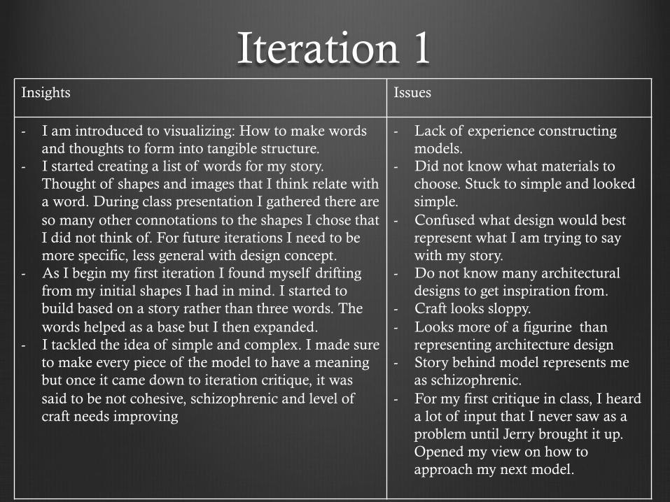
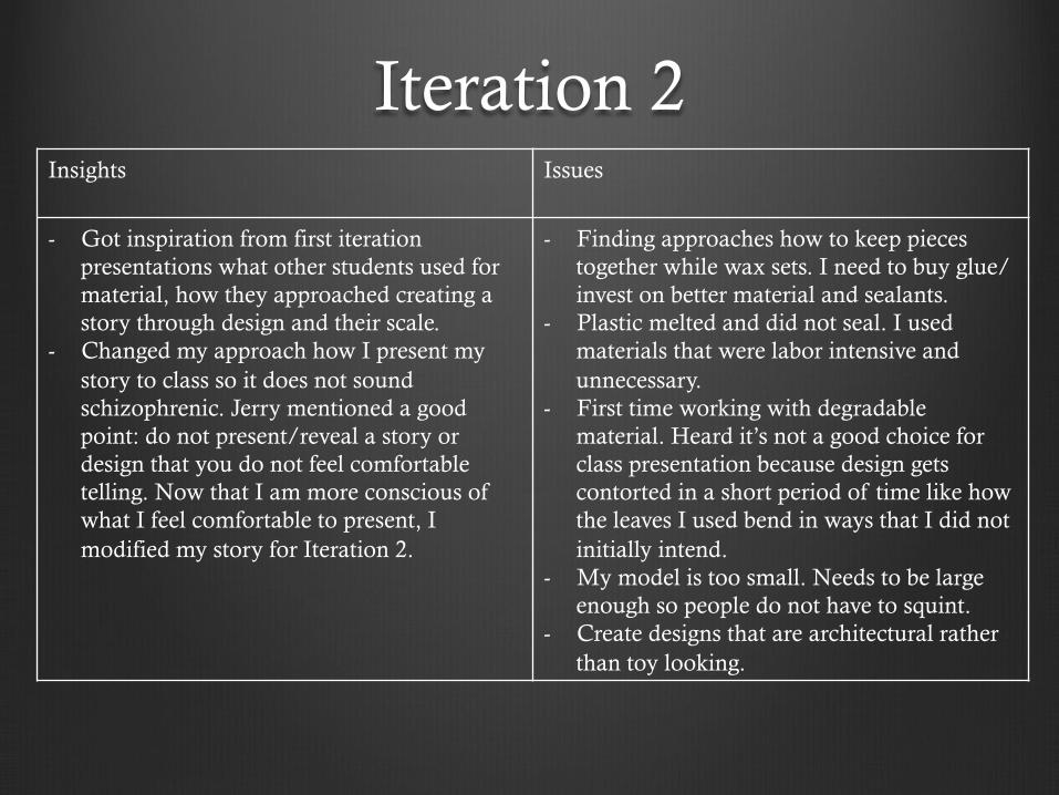
Iteration 1 Insights Issues
- I am introduced to visualizing: How to make words and thoughts to form into tangible structure.
- I started creating a list of words for my story. Thought of shapes and images that I think relate with a word. During class presentation I gathered there are so many other connotations to the shapes I chose that I did not think of. For future iterations I need to be more specific, less general with design concept.
- As I begin my first iteration I found myself drifting from my initial shapes I had in mind. I started to build based on a story rather than three words. The words helped as a base but I then expanded.
- I tackled the idea of simple and complex. I made sure to make every piece of the model to have a meaning but once it came down to iteration critique, it was said to be not cohesive, schizophrenic and level of craft needs improving
- Lack of experience constructing models.
- Did not know what materials to choose. Stuck to simple and looked simple.
- Confused what design would best represent what I am trying to say with my story.
- Do not know many architectural designs to get inspiration from.
- Craft looks sloppy. - Looks more of a figurine than
representing architecture design - Story behind model represents me
as schizophrenic. - For my first critique in class, I heard
a lot of input that I never saw as a problem until Jerry brought it up. Opened my view on how to approach my next model.
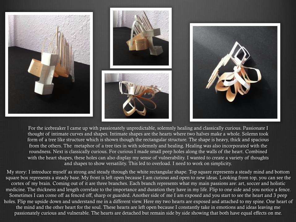
For the icebreaker I came up with passionately unpredictable, solemnly healing and classically curious. Passionate I thought of intimate curves and shapes. Intimate shapes are the hearts where two halves make a whole. Solemn took form of a tree like structure which is shown though the rectangular structure. The shape is heavy, thick and spacious from the others. The metaphor of a tree ties in with solemnly and healing. Healing was also incorporated with the roundness. Next is classically curious. For curious I made small peep holes along the walls of the heart. Combined
with the heart shapes, these holes can also display my sense of vulnerability. I wanted to create a variety of thoughts and shapes to show versatility. This led to overload. I need to work on simplicity.
My story: I introduce myself as strong and steady through the white rectangular shape. Top square represents a steady mind and bottom square box represents a steady base. My front is left open because I am curious and open to new ideas. Looking from top, you can see the
cortex of my brain. Coming out of it are three branches. Each branch represents what my main passions are: art, soccer and holistic medicine. The thickness and length correlate to the importance and duration they have in my life. Flip to one side and you notice a fence.
Sometimes I can come off as fenced off, sharp or guarded. Another side of me I am exposed and you start to see the heart and 3 peep holes. Flip me upside down and understand me in a different view. Here my two hearts are exposed and attached to my spine. One heart of
the mind and the other heart for the soul. These hearts are left open because I constantly take in emotions and ideas leaving me passionately curious and vulnerable. The hearts are detached but remain side by side showing that both have equal effects on me.
Iteration 2 Insights Issues
- Got inspiration from first iteration presentations what other students used for material, how they approached creating a story through design and their scale.
- Changed my approach how I present my story to class so it does not sound schizophrenic. Jerry mentioned a good point: do not present/reveal a story or design that you do not feel comfortable telling. Now that I am more conscious of what I feel comfortable to present, I modified my story for Iteration 2.
- Finding approaches how to keep pieces together while wax sets. I need to buy glue/invest on better material and sealants.
- Plastic melted and did not seal. I used materials that were labor intensive and unnecessary.
- First time working with degradable material. Heard it’s not a good choice for class presentation because design gets contorted in a short period of time like how the leaves I used bend in ways that I did not initially intend.
- My model is too small. Needs to be large enough so people do not have to squint.
- Create designs that are architectural rather than toy looking.
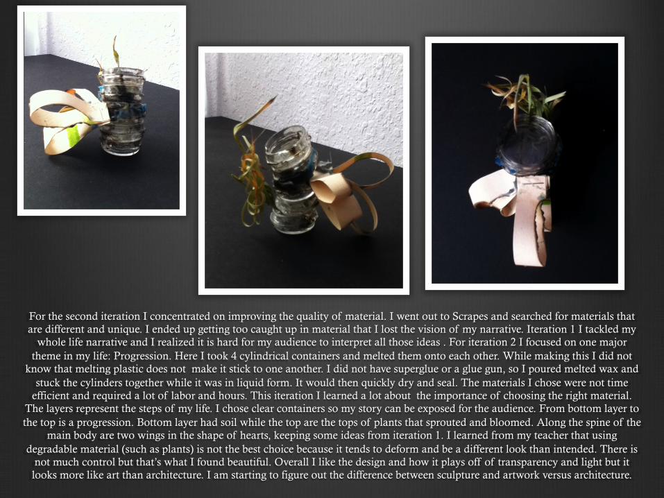
For the second iteration I concentrated on improving the quality of material. I went out to Scrapes and searched for materials that are different and unique. I ended up getting too caught up in material that I lost the vision of my narrative. Iteration 1 I tackled my
whole life narrative and I realized it is hard for my audience to interpret all those ideas . For iteration 2 I focused on one major theme in my life: Progression. Here I took 4 cylindrical containers and melted them onto each other. While making this I did not
know that melting plastic does not make it stick to one another. I did not have superglue or a glue gun, so I poured melted wax and stuck the cylinders together while it was in liquid form. It would then quickly dry and seal. The materials I chose were not time
efficient and required a lot of labor and hours. This iteration I learned a lot about the importance of choosing the right material. The layers represent the steps of my life. I chose clear containers so my story can be exposed for the audience. From bottom layer to the top is a progression. Bottom layer had soil while the top are the tops of plants that sprouted and bloomed. Along the spine of the
main body are two wings in the shape of hearts, keeping some ideas from iteration 1. I learned from my teacher that using degradable material (such as plants) is not the best choice because it tends to deform and be a different look than intended. There is
not much control but that’s what I found beautiful. Overall I like the design and how it plays off of transparency and light but it looks more like art than architecture. I am starting to figure out the difference between sculpture and artwork versus architecture.
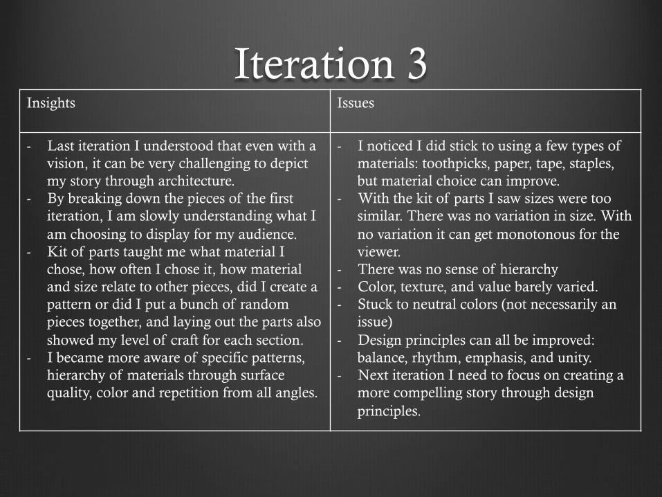
Iteration 3 Insights Issues
- Last iteration I understood that even with a vision, it can be very challenging to depict my story through architecture.
- By breaking down the pieces of the first iteration, I am slowly understanding what I am choosing to display for my audience.
- Kit of parts taught me what material I chose, how often I chose it, how material and size relate to other pieces, did I create a pattern or did I put a bunch of random pieces together, and laying out the parts also showed my level of craft for each section.
- I became more aware of specific patterns, hierarchy of materials through surface quality, color and repetition from all angles.
- I noticed I did stick to using a few types of materials: toothpicks, paper, tape, staples, but material choice can improve.
- With the kit of parts I saw sizes were too similar. There was no variation in size. With no variation it can get monotonous for the viewer.
- There was no sense of hierarchy - Color, texture, and value barely varied. - Stuck to neutral colors (not necessarily an
issue) - Design principles can all be improved:
balance, rhythm, emphasis, and unity. - Next iteration I need to focus on creating a
more compelling story through design principles.
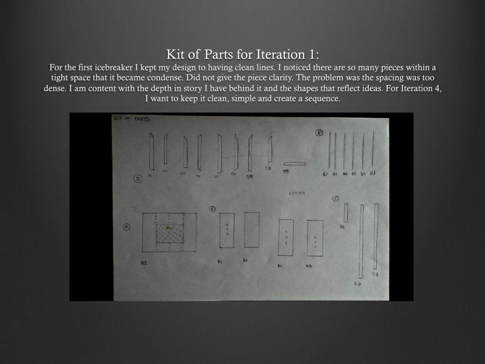
Kit of Parts for Iteration 1: For the first icebreaker I kept my design to having clean lines. I noticed there are so many pieces within a tight space that it became condense. Did not give the piece clarity. The problem was the spacing was too
dense. I am content with the depth in story I have behind it and the shapes that reflect ideas. For Iteration 4, I want to keep it clean, simple and create a sequence.
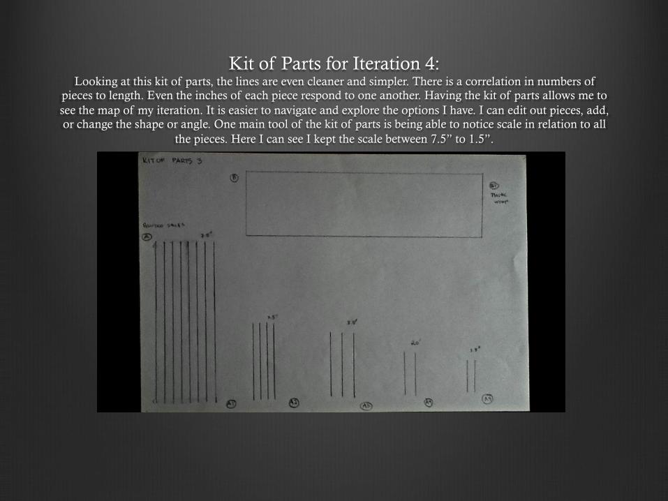
Kit of Parts for Iteration 4: Looking at this kit of parts, the lines are even cleaner and simpler. There is a correlation in numbers of
pieces to length. Even the inches of each piece respond to one another. Having the kit of parts allows me to see the map of my iteration. It is easier to navigate and explore the options I have. I can edit out pieces, add, or change the shape or angle. One main tool of the kit of parts is being able to notice scale in relation to all
the pieces. Here I can see I kept the scale between 7.5” to 1.5”.
Iteration 4 Insights Issues
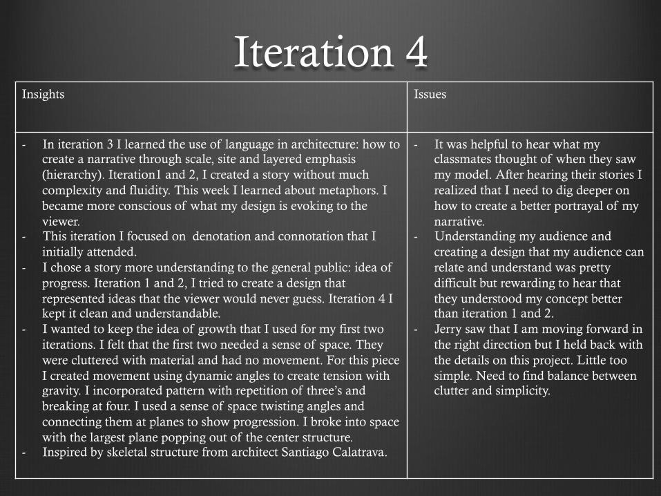
- In iteration 3 I learned the use of language in architecture: how to create a narrative through scale, site and layered emphasis (hierarchy). Iteration1 and 2, I created a story without much complexity and fluidity. This week I learned about metaphors. I became more conscious of what my design is evoking to the viewer.
- This iteration I focused on denotation and connotation that I initially attended.
- I chose a story more understanding to the general public: idea of progress. Iteration 1 and 2, I tried to create a design that represented ideas that the viewer would never guess. Iteration 4 I kept it clean and understandable.
- I wanted to keep the idea of growth that I used for my first two iterations. I felt that the first two needed a sense of space. They were cluttered with material and had no movement. For this piece I created movement using dynamic angles to create tension with gravity. I incorporated pattern with repetition of three’s and breaking at four. I used a sense of space twisting angles and connecting them at planes to show progression. I broke into space with the largest plane popping out of the center structure.
- Inspired by skeletal structure from architect Santiago Calatrava.
- It was helpful to hear what my classmates thought of when they saw my model. After hearing their stories I realized that I need to dig deeper on how to create a better portrayal of my narrative.
- Understanding my audience and creating a design that my audience can relate and understand was pretty difficult but rewarding to hear that they understood my concept better than iteration 1 and 2.
- Jerry saw that I am moving forward in the right direction but I held back with the details on this project. Little too simple. Need to find balance between clutter and simplicity.
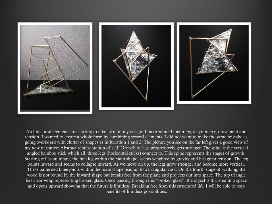
Architectural elements are starting to take form in my design. I incorporated hierarchy, a-symmetry, movement and tension. I wanted to create a whole form by combining several elements. I did not want to make the same mistake as going overboard with clutter of shapes as in Iteration 1 and 2. The picture you see on the far left gives a good view of my new narrative: Abstract representation of self. Growth of legs progressively gets stronger. The spine is the vertical
angled bamboo stick which all three legs (horizontal sticks) connect to. This spine represents the stages of growth. Starting off as an infant, the first leg within the main shape seems weighted by gravity and has great tension. The leg
points inward and seems to collapse inward. As we move on up, the legs grow stronger and become more vertical. These patterned knee joints within the main shape lead up to a triangular roof. On the fourth stage of walking, the wood is not bound by the inward shape but breaks free from the plane and projects out into space. The top triangle
has clear wrap representing broken glass. Once passing through this “broken glass”, the object is thrusted into space and opens upward showing that the future is limitless. Breaking free from this structured life, I will be able to reap
benefits of limitless possibilities.
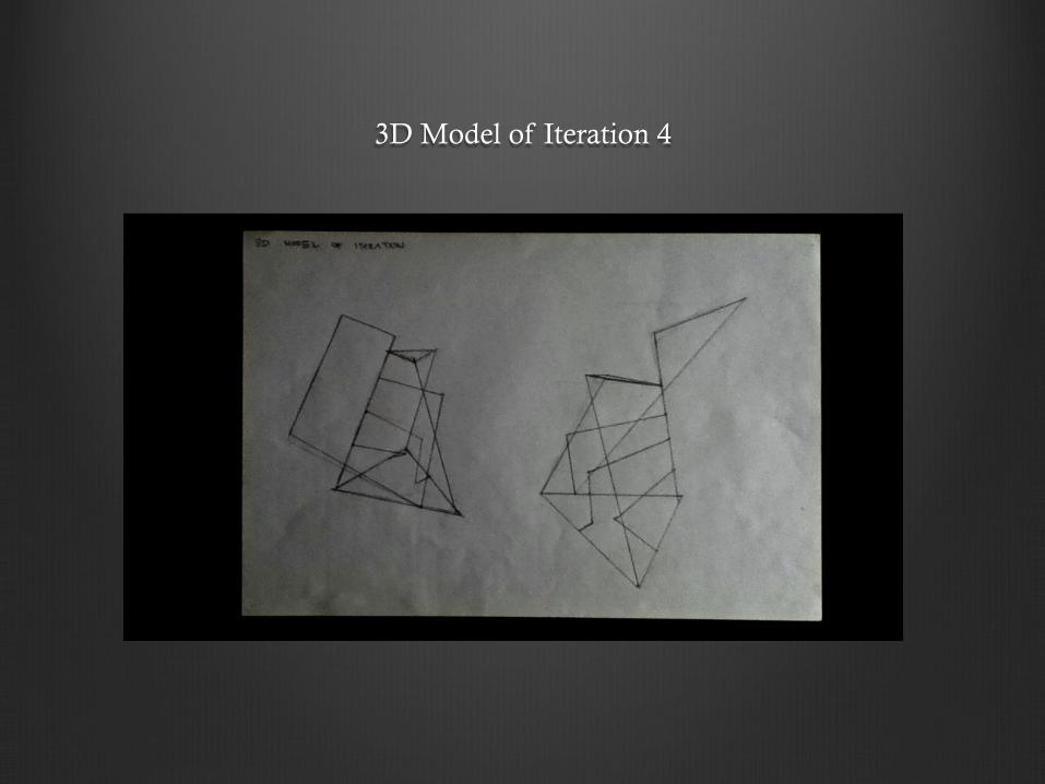
3D Model of Iteration 4
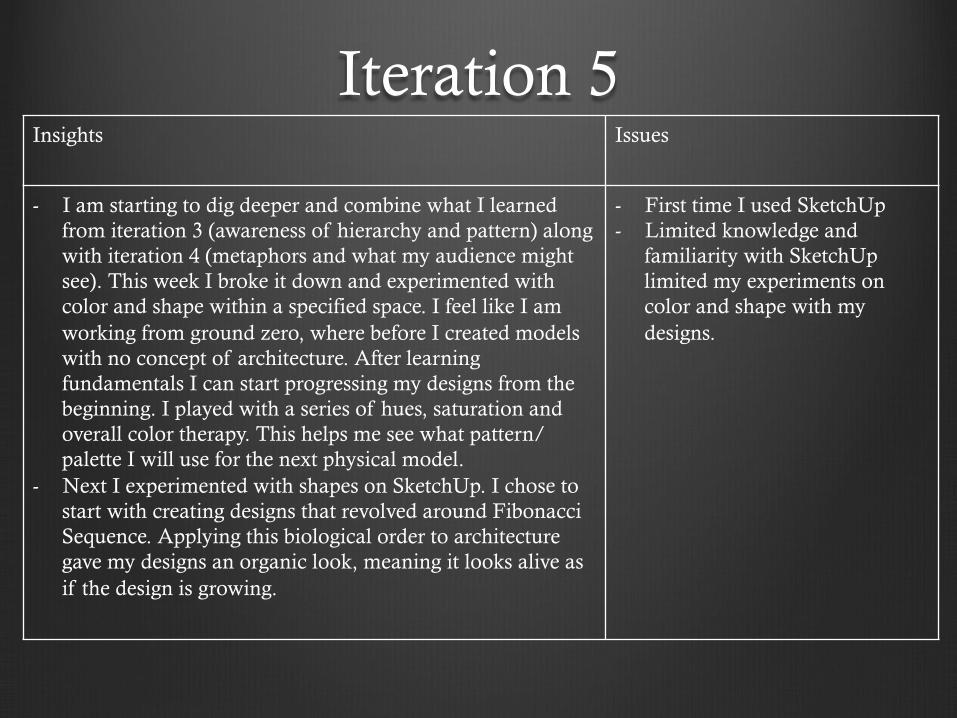
Iteration 5 Insights Issues
- I am starting to dig deeper and combine what I learned from iteration 3 (awareness of hierarchy and pattern) along with iteration 4 (metaphors and what my audience might see). This week I broke it down and experimented with color and shape within a specified space. I feel like I am working from ground zero, where before I created models with no concept of architecture. After learning fundamentals I can start progressing my designs from the beginning. I played with a series of hues, saturation and overall color therapy. This helps me see what pattern/palette I will use for the next physical model.
- Next I experimented with shapes on SketchUp. I chose to start with creating designs that revolved around Fibonacci Sequence. Applying this biological order to architecture gave my designs an organic look, meaning it looks alive as if the design is growing.
- First time I used SketchUp - Limited knowledge and
familiarity with SketchUp limited my experiments on color and shape with my designs.
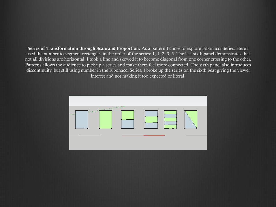
Series of Transformation through Scale and Proportion. As a pattern I chose to explore Fibonacci Series. Here I used the number to segment rectangles in the order of the series: 1, 1, 2, 3, 5. The last sixth panel demonstrates that
not all divisions are horizontal. I took a line and skewed it to become diagonal from one corner crossing to the other. Patterns allows the audience to pick up a series and make them feel more connected. The sixth panel also introduces discontinuity, but still using number in the Fibonacci Series. I broke up the series on the sixth beat giving the viewer
interest and not making it too expected or literal.
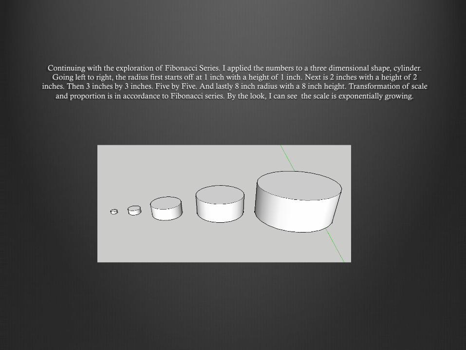
Continuing with the exploration of Fibonacci Series. I applied the numbers to a three dimensional shape, cylinder. Going left to right, the radius first starts off at 1 inch with a height of 1 inch. Next is 2 inches with a height of 2
inches. Then 3 inches by 3 inches. Five by Five. And lastly 8 inch radius with a 8 inch height. Transformation of scale and proportion is in accordance to Fibonacci series. By the look, I can see the scale is exponentially growing.
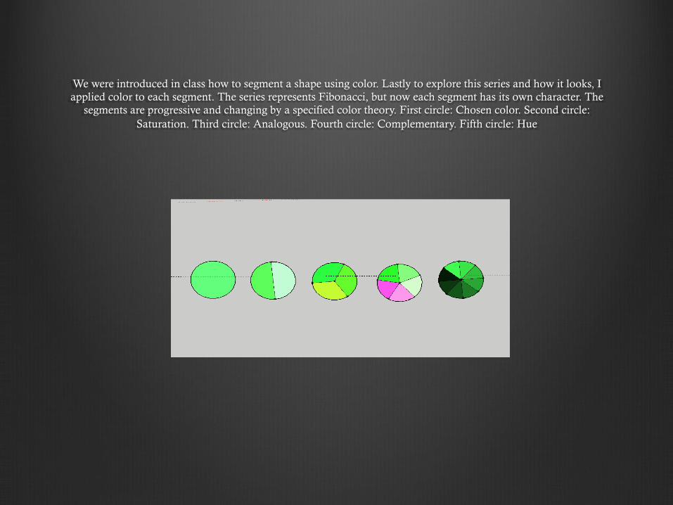
We were introduced in class how to segment a shape using color. Lastly to explore this series and how it looks, I applied color to each segment. The series represents Fibonacci, but now each segment has its own character. The
segments are progressive and changing by a specified color theory. First circle: Chosen color. Second circle: Saturation. Third circle: Analogous. Fourth circle: Complementary. Fifth circle: Hue
Iteration 6 Insights Issues
- Using combinations and creating spatial designs helped me understand the fundamentals of shape and purpose.
- Matrices taught me how to identify variable pairings to investigate lateral development.
- I saw how concepts, principle and approaches are used to develop spatial experiences.
- I broke down structural elements and saw how each correlate to another. After creating each pairing, I saw how these questions were answered: What does it evoke? What function can it serve? Where can this be used?
- I started off as generic and simple as possible. These simple combinations allowed me to understand basics. Understanding the basics gave me a sturdy foundation where I can expand with my design.
- I was limited to hand drawings. Has negatives and positives. With SketchUp image looks clearer and more realistic.
- It was difficult to make shapes appear parallel.
- SketchUp would have allowed me to turn and view 3D space. I could of explored more options faster rather than making many drafts.
- If I made a mistake, I had to use white out and wait where SktechUp is easier and cleaner to fix a mistake (tap of a button undo or delete).
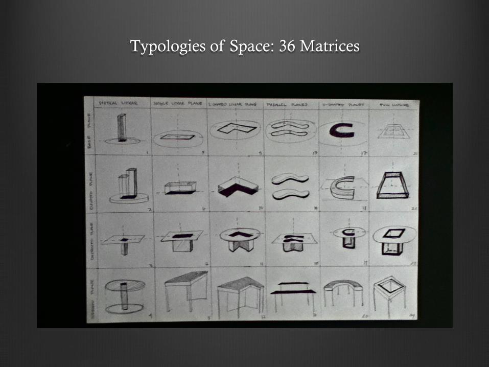
Typologies of Space: 36 Matrices
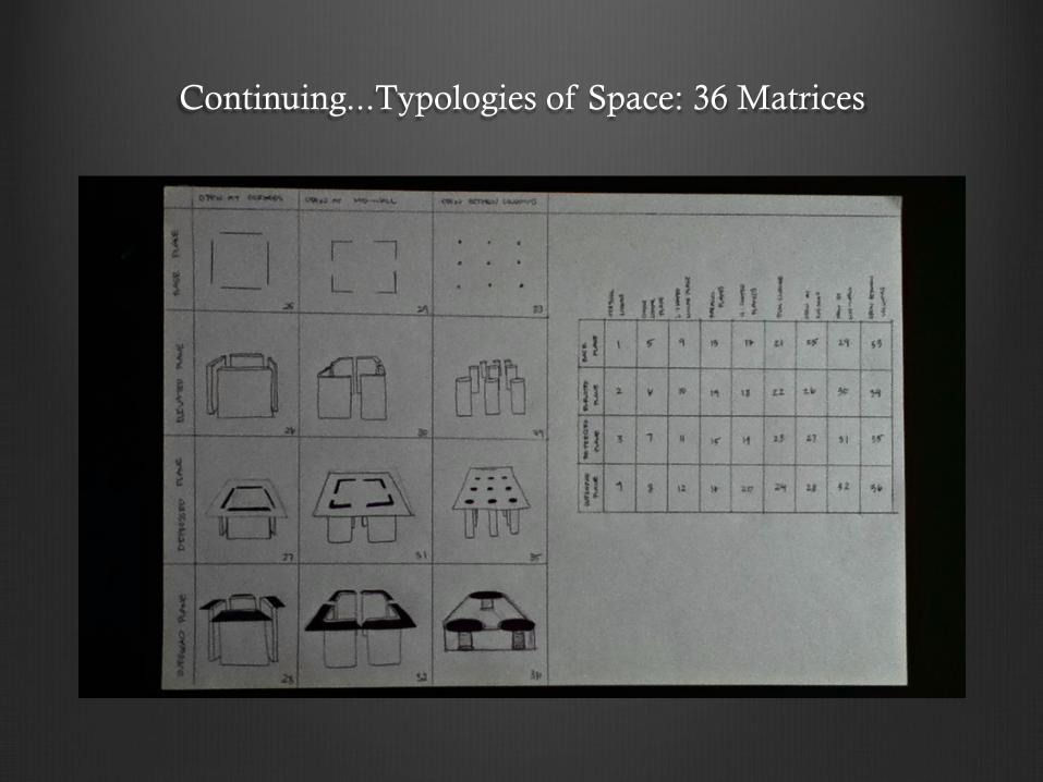
Continuing...Typologies of Space: 36 Matrices
Iteration 7 Insights Issues
- Took all the experience I learned from Iterations 1 to 6 and now I created a physical model for the human experience.
- I learned how to frame a site with intensions of each toothpick I glued and responding to its spatial experience: welcoming, monumental or tranquil.
- Highly influenced by Calatrava. I saw how he used skeletal work to create a strong frame while making his architecture look beautiful. His work has a sense of biology, rhythm and movement. My eye follows the patterns of density to open spaces. He taught me how to apply these concepts to my iteration.
- My frames were supportive as well as decorative. Each panel has an intended pattern of design throughout the three spatial elements while also serving its purpose to support structure.
- For the site frame I was highly influenced by a quote mentioned in class: “the house was always there and I designed the site”. I saw how Casa Malaparte becomes an extension of the mountain. From this I wanted to create a site which plays with the angles and spatial experience of the museum I designed.
- After critique I learned how load barring frames are represented as larger and thicker, while lighter weight barring pieces are thinner and in more abundance. My piece remained to have the same thickness throughout. I did not vary the thickness and number of sticks from the bottom of the structure to the top of the structure.
- I applied sheer wall (diagonal frames) but I did not calculate the long run of torque. My diagonal toothpicks added pressure to beams that were not balanced by an opposing force. This led some areas to snap while I transferred the model from my car to the classroom. Wind put durability to the test and some beams failed. I need to be careful on calculating how my angles put force on a specific regions.

Entering the site you walk up a hill on a stone path. To your right you will view a garden terrace. For my site, in front of the welcoming entrance I picture benches in each on the three garden terraces for people to sit down and enjoy the landscape. The
gardens on the site also introduce a welcoming factor, a place where there is life to be seen. Front entrance is a rounded arch passage leading you into a circular cozy room. Building this welcoming room I wanted to make the ceiling made of iced glass, allowing
sunlight to light up the ceiling but not being transparent to fill the room entirely. Ice glass gives a sense of play on light. As the day progresses, the ceiling changes color. My initial plan was to have a staircase lead from the welcoming space to monumental to create the play on terraces and layers, like that of the site. Due to lack of skill on building a staircase frame, I left the two rooms on the same
plane. Entering the monumental area, a person will see the dramatic height change. For this room I wanted the roof to also have importance. I did not want all the roofs to be flat so I undulated the surface to create skylights that pop out into the sky. This way when the sun hits the surface it will enter through different angles casting a play of different light shades within the monumental
space. Because this is the largest room I created a specific design for each panel on the wall. Some panels on the wall are less covered with toothpicks, giving more space to frame the outside landscape. Where I want to hide the landscape I made smaller frames. To keep the eye moving and flowing I created a mural with the toothpick frames. Panels go from diagonal to horizontal to vertical,
moving the eye around the room. The floors of each section is pointed to lead you out to the next room. The bridge is the transition to the tranquil. Here I made sure to slope upward so the building it not on one plane. The bridge gives a transition from large to
narrow and intimate. Last stop on the journey is the tranquil area. Here the roof is heavily reinforced to demonstrate there is a roof, which contrasts with the open side walls. Here I thought it would be beautiful to create a cylinder made of glass to view the rolling
hills outside. I made it small as to not allow many people in .This makes it more intimate and womb like. My initial design was hard to create but I wanted was to make a spiral ramp in this cylinder glass room and have seating areas be against the center point on which ramp spirals around. The seating area is to be made of stone with small openings in between giving a sense that you are
floating on clouds in this transparent area.
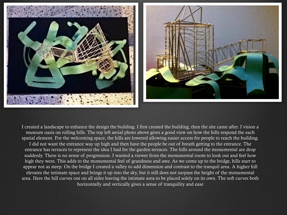
I created a landscape to enhance the design the building. I first created the building, then the site came after. I vision a museum oasis on rolling hills. The top left aerial photo above gives a good view on how the hills respond the each
spatial element. For the welcoming space, the hills are lowered allowing easier access for people to reach the building. I did not want the entrance way up high and then have the people be out of breath getting to the entrance. The
entrance has terraces to represent the idea I had for the garden terraces. The hills around the monumental are drop suddenly. There is no sense of progression. I wanted a viewer from the monumental room to look out and feel how high they were. This adds to the monumental feel of grandness and awe. As we come up to the bridge, hills start to
appear not as steep. On the bridge I created a valley to add dimension and contrast to the tranquil area. A higher hill elevates the intimate space and brings it up into the sky, but it still does not surpass the height of the monumental
area. Here the hill curves out on all sides leaving the intimate area to be placed solely on its own. The soft curves both horizontally and vertically gives a sense of tranquility and ease
Concluding Remarks about the First Half of this Semester:
I am surprised how much I have learned in this class already. This is my first year taking an architecture class and only several months I learned about the principles, elements, tectonic language of architecture and how to apply them to tangible physical models. Every three hour class is packed with a lesson that really improved my vision and clarity on Architecture Design. My transformation of language, presenting, familiarity and comfort with this subject improved positively. There is still so much more to learn and relearn. Two set backs I had this semester were fear and perfectionism. Fear of SketchUp led me to not explore a path that I need to know for my future career. And perfectionism led me to turn in this portfolio last minute. During my journey as a student in Jerry’s Architecture 101 class, I not only learned about Architecture but I learned about dedication. He gave us work loads to prepare us for real life scenarios when we become architects or move on to a 4 year university. I learned about discipline, perseverance and endurance. This semester I never saw myself so dedicated and driven at school. All I can say is that this class had a positive effect on me and improved my way of living and thinking. My driven attitude within the class has also helped in areas outside the class. I am looking forward to how my transformation will form by the end of this semester.


