39
make clear your surroundings 1
| Date post: | 29-Mar-2016 |
| Category: |
Documents |
| Upload: | christopher-pulcer |
| View: | 235 times |
| Download: | 3 times |

make clear your surroundings
1

2
Christopher PulcerTadd HeidgerkinARCH 1300-02Architectural Design IIIUniversity of Detroit MercySchool of Architecture

Contents
-Translucency
-Modifying Term Selection
-Formulating a Case Study
-Exploration into Mapping a Site
-Components of Financial Institutions
-Designing a Translucent Credit Union
5
6-9
10-19
20-27
28-30
31-39
3
Works cited are by published resources, internet sites, personal photos, and personal crafts and drawings.
Botta, Mario. Mario Botta: Architecture 1960-2010. N.p.: Silvana, 2010.N. pag. Print
Diller Scofidio + Renfro. N.p., n.d. Web. 20 Sept. 2011. http://www.dillerscodio.com/projects.html
Holl, Steven. Architecture Spoken. New York: Rizzoli, 2007 . N .pag. Print
Holl, Steven. House: Black Swan Theory. New York: Princeton Architectural Press, 2007 . N .pag. Print
Honeycutt, Kellie, and Elizabeth Reina. “Steven Holl Biografi.” Heart. Blue Medium, 2009 . Web. 18 Sept. 2011(714):
Peter Zumthor. Ed. Peter Zumthor. Power Web, 2010. Web, 2010. <http://peter-zumthor. mr926.me/>.
“Wohn-und Geschafshaus Schutzenmattstraise.” archinform. Power Web, n.d. Web Web. 18 Sept. 2011. http://eng.archinform.net/projekte/1627.htm?ID=j4eaa9tqa3n5g48a8872jk7b7.
Bibliography
4

Translucency
Dictionary Definitions:
-Admitting and diffusing light so that objects beyond cannot be clearly distinguished.-Letting Light pass through diffusely-Easily understandable; lucid
Personal Definitions:
-To distinguish what is uncertain
(As the semester went on my personal definition had evolved to a specific element of what translucency is as a whole)
-Uncertain or Unclear Boundaries
5

6
Modifying Term Selection

This semester the second studio focused on particular terms to be further studied and explored. We were given six adjectives and told to jot down as many objects that could be associated with those words. Those terms were warming, deafening, modern, translucency, contemplation, and thrilling. Individually we all had to define those words for ourselves and find examples of how the term could be expressed. That could be done in two different ways; measurable or immeasurable.
To be measurable means that it is physical entity and can be seen or touched whereas the immeasurable is a feeling or expression that cannot be literally seen or heard. An example being that a fireplace is measurable for the word warming for the reason that it is a physical object that can be touched and the heat that it gives off can be felt.
7

An immeasurable example for the term contemplation would be the image of the contents in a vending machine. This is a feeling of contemplation for all the many choices the vending machine has to offer and of what kind to pick.
I explored these concepts of the measurable and immeasurable and was greatly interest in images that were both relative to being both of those qualities almost as if you were uncertain as to which type it actually is.
Out of the six words that we were each defining, translucency sparked a great interest for the way that it bridges the gap between seeing clearly and not at all. For our assignments we had to devise an illustration of our word, so for translucency, I chose to create a layered expression of trace paper mounted on top of each other with pigments of color in certain areas of the paper. When placed all together the composition becomes an array of color that varies in degrees of clarity and faintness.
8

Measurable VS Immeasurable
Modern ExampleCell Tower = Measurable
Contemplation ExampleThe thought of chess = Immeasurable
Deafening IllustrationMeasurable and Immeasurable
9

10
Formulating a Case Study
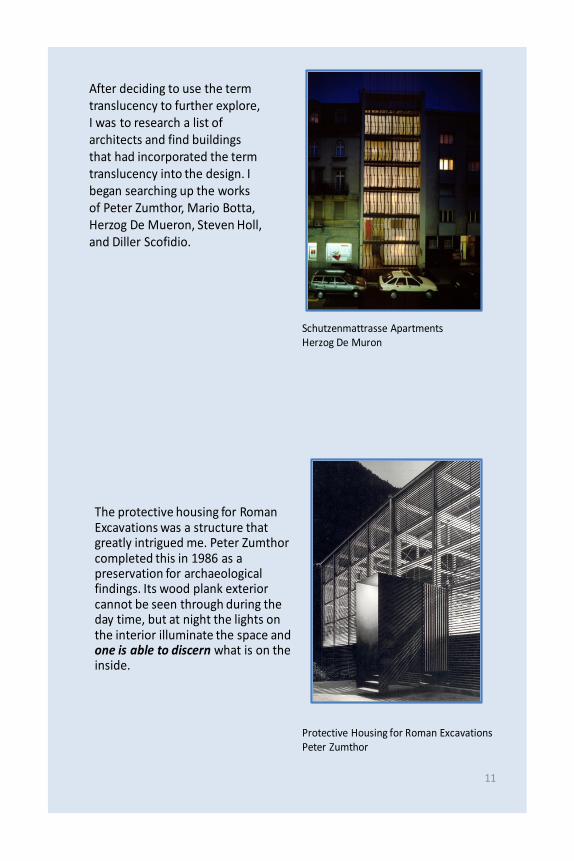
After deciding to use the term translucency to further explore, I was to research a list of architects and find buildings that had incorporated the term translucency into the design. I began searching up the works of Peter Zumthor, Mario Botta, Herzog De Mueron, Steven Holl, and Diller Scofidio.
Schutzenmattrasse ApartmentsHerzog De Muron
The protective housing for Roman Excavations was a structure that greatly intrigued me. Peter Zumthor completed this in 1986 as a preservation for archaeological findings. Its wood plank exterior cannot be seen through during the day time, but at night the lights on the interior illuminate the space and one is able to discern what is on the inside.
Protective Housing for Roman ExcavationsPeter Zumthor
11

Another architect I researched, Mario Botta, built his structures using a lot glass material and they contained varying degrees of clarity. The State Bank of Fribourg is built at an intersection and contains bands of frosted glass in between clear glass. The clear transparent glass is placed where someone would walk at eye level and the frosted glass at sitting level and floor slabs, which this case is an excellent example of making something translucent for personal/private means versus public.
State Bank of FribourgMario Botta
A perfect match for a building exhibiting translucency is designed by the Diller Scofidio firm. The Blur in Switzerland is a museum to educate those of water resources and technology at the Swiss Expo. The steel-made structure built on Lake Neuchatel pipes the water into mist and shrouds the entire complex in a hazy fog where you can only see the illuminated floor and railings. This concept alone is an out-of-the box idea of a building envelope being completely translucent and one simply walks into the fog of the building.
BlurDiller Scofidio
12

I was looking for other buildings that had been designed for one of the soul purposes of translucency and I quickly found several in the works of Steven Holl. While researching him I noticed that he experimented a lot with the aspects of light and shadow and how to mesh them together within a space. An exceptional example is the Sun Slice House on Lake Garda in Italy. The 3800 square foot residence is built with curvilinear windows that are in relation to the sun angles. This way the interior of the space fluctuates immensely into different rooms as the light from the sun bends and reflects into the house.
Sun Slice HouseSteven Holl
A true component of translucency is having one aspect to be not one hundred percent clear and Steven Holl’s Writing With Lighthouse accomplishes this and gratifies it with complete clarity. Steven Holl approached the design by utilizing the works from the painter Jackson Pollack and created the idea of the house based on the painting, There Were Seven In Eight, painted in 1849. The painting itself was an abstract blend browns crinkled into dark shades straying in every which way on the canvas. The finished product appeared to have a forested texture.
Writing With LighthouseSteven Holl
13

The actual site of the building was not too far from Jackson Pollack’s studio in Long Island overlooking the water.
Steven Holl chose to design the house using wooden balloon frame construction. Horizontal timber planks completely cover the exterior save for the windows. In some instances the beams run right across the window panes hiding the glass from view, and they can only be seen in the night when the interior lights flow through the slats. The deck is camouflaged in a flurry of wood posts that form the stairway leading to the ground level. Inside the house the floor plans are aligned with a central living space that becomes the focal point and can take passage to any other portion of the house
14

After a week or two of research, Steven Holl’s Writing With Lighthouse was the building I chose to base my project on for adhering to the qualities of translucency. Now the real challenge was to draw my knowledge from the research into a formidable expression that can be presented to any person not related in the architectural field.
Writing With LighthouseSteven Holl
15

For our presentation of our case study, each of us were to formulate hand drawings of the building’s site, sections, and plans that incorporated and expressed themselves to be our term. I myself would have to show in the drawings what makes Steven Holl’s residence translucent and accent those qualities so ,for example, that someone looking at them could see that light is illuminating from the windows hidden behind the house’s timber beams. This aspect and other components of the structure show affects of translucency.
I immediately sought after the effect how the hidden windows portray behind the timber slats and drew a night scene where the windows were showing through. For the sections, I shaded in areas where the light was prevalent and flowing from one space to the next. The plans of both floors were then lightened at the central living space and darkened from that midpoint.16

The drawings I had formed did display the qualities of translucency within them, but I just scratched the surface of how I could illustrate translucency into drawings. This seemed to be a common action by my peers as well and so the class was instructed to revise our drawings and present them a second time.
Writing With Lighthouse model made of bass wood
17

For the revision of my drawings I made the conscious decision to place my floor plans at an axonometric perspective to where I could shade and lighten where the light bounces off the walls and floor. I also placed my section drawing in perspective as well while adding people into the rooms. In this way I diagramed how people would use the house at an everyday basis and which rooms contained bright open spaces and which did not.
To inspire our second shot at the drawings, the class was given a slide show of varying types of technical drawings by the notable works of Tadao Ando and the Bjarke Ingels Firm. The axonometric prints that I saw on the screen lead me to realize I could further show translucency in my perspectives.
18

Both the final model and the newly revised drawings progressed in portraying translucent qualities of Steven Holl’s Writing With Lighthouse and the usage of perspectives added depth to the two-dimensional image allowing one to perceive how the building is displayed realistically.
19

20
An Exploration Into Mapping a Site

Moving forward to our next goal, the class took a trip to the Corktown area of Detroit where the notable, but abandoned, train station is located. Across the street was the Roosevelt Hotel amidst a residential neighborhood and small businesses on Michigan Avenue. Our next assignment was to design a pedestrian master plan on the alley behind the Roosevelt Hotel and the shops of the Mercury Bar, Duncan’s Speedometer Shop, and other businesses.
Our term had to be incorporated into the design following the form and function of the pedestrian plan. To get an idea of the area we were dealing in, I walked around the site and snapped photos of the location and nearby.
21

We had to map out the Corktown area in an assortment of ways that we saw fit to use later that would further develop our own concepts. The group I was associated with researched creating maps in terms of Corktown’s topography, vegetation, microclimates, sound, sights, materiality, and circulation.
I quickly explored the vegetation of the area and microclimates which lead me to see how little greenery there was besides Roosevelt Park and how I could implement that into my design. Trees could be a viable way to be translucent since they block and frame certain views. Depending on the seasons, you can see directly though them or not at all. This technique could be successfully placed into a park setting.
22

Vegetation and circulation were a few maps that were further explored and constructed for individual concepts. For designing the pedestrian plan we were to use the maps we constructed to create three different schemes that fabricated out own terms.
23

The three schemes in relation with translucency dealt with the ways to perceive a view whether it be blocked by trees, illuminated with light, framed by buildings, or able to see from a far open distance. I had an entirely open scheme which involved seeing the train station from any place in the plan
I also mapped out translucency as a metaphorical concept in relation to designing a congregation of people such as a farmers market and central vending station since the area is progressing with urban farms.
On the third scheme, I used vegetation, buildings, and topography to form translucent views and framed landscapes. My final model consisted of forested areas that blocked and framed views to the outside while also creating smaller interior spaces such as courtyards in the plan. I utilized vendor sheds to be a part of a paneled wall with open spaces which then illuminate the park space at night,
24
1st Scheme
2nd Scheme
3rd Scheme

25
The pedestrian master plan is set off of Michigan Avenue and 14th Street near the Roosevelt Park
Open Public Space
14th
Stre
et
Trees and existing buildings form courtyards within courtyards for contrasting views
Paneled walls to illuminate the space and see faintly through the park areas
Parking moved to contain a public front indicating its own views
Integrated residential houses with vendor sheds

The final scheme of the pedestrian alley space utilized the works of natural elements, such as trees and a grass field, to construct both individual and public spaces where distinct views of the grand train station can be achieved.
The residential neighborhood nearby the alley is fully integrated with the pedestrian space as the vendor sheds and market centers are aligned to gather nearby. A few houses on the Wabash Street side have a wing attatched to the end where dedicated for the production of trade and for people to sell their craft while having living quarters as well
26

27
Components of Financial Institutions

Receiving our final project to wrap up the semester the class was to design a credit union at the lot by the Mercury Bar. To understand how the formations of financial institutions were programmed in the past and are now today, I began visiting banks in the Detroit area and others elsewhere.
I noticed that the banks before 1950 were built with thick solid walls and very few windows looking very imposing from the street. They were usually raised on a platform and you had to walk up stairs to enter where the tellers were.
On the other side , the banks in post 1950 had a lot of glass and they were built with an open plan and friendly façade much less gaudy. This lead to the idea that banks are trying to navigate away from flaunting their wealth and be more at a personal level to the customer. This adds the change from electronic banking and that banks do not need to put on a show to be intimidating and show their financial security.
28

To develop my own ideas of a credit union, I diagramed the floor plans of what would be most functional for the employees and customers and then thought critically on how my term translucency could flow into the design. By bridging the present where the tellers are to be on hand and ready to serve, I came up with concepts of what in the building is and isn’t distinguishable.
29

30
Designing a Translucent Credit Union

By now my idea of translucency had evolved from being able to distinguish what is uncertain to how one perceives a view and I felt that I needed a new direction. After completing my three schemes based on the differences of indoor and outdoor views I went back and researched images of art of translucence to get a final grasp on how to base my design. I quickly found that the essence of being translucent is not seen with complete clarity which brought me to hazy and unclear boundaries.
To make a building with unclear boundaries, the structure’s composition has to fall out of its usual rectangular form and move in an unpredicted direction. I sketched out the building from the edge of the Mercury Bar and curved it around to the park side. The front façade becomes made up of frosted glass panels with a clear glass ribbon that starts at the second level and curves to the next.
31

32

33

I also wanted a transition between the brick from the Mercury Bar to the CCCU building and I added an outward wing on top of the Mercury Bar constructed of brick and glass with the brick receding into the glass ribbon. It would then seem as though the brick over cropping was part of the Mercury Bar and not the CCCU building.
To make unclear boundaries, I peeled the exterior wall to curve around and form their own spaces. The plan became very organic similar to the roots of tree, but the rooms still corresponded to each other as well in relation with the living quarters and credit union area.
34

The teller area was built as part of the exterior wall and winds its way around the lobby dropping at desk level. The receptionist desk also uses that same circular formation as it rises up to form the wall of the manager’s office. As the plan leads more to the right, the walls and interior become less organic and more box-like. In this way the financial section is still following a business like code which follows the form of the CCCU building itself. At the opposite end, the floor slopes to construct a curving gallery space that rises like a dome to the second level. The circular elevator is nearby and the living quarters of the bank manager is just on the other side of the lobby away from the bank areas. This way at night when the bank can be closed down, the living areas will not be affected and it still provides enough distance to be private.
35

The second level of the CCCU is integrated with a few more spaces used by the credit union, but will not disrupt the daily lives of the tenants. A spiral staircase curves into the floor and on to the third and final floor of the building.
36
To achieve the curvature of the interior walls, I continually soaked the bass wood. I also set up the model so that it could be taken apart level by level to see the programming for each floor.

The shading technique contrasts between materiality with a transparent glass ribbon forming the brick of the Mercury Bar. On either end of the ribbon, the glass becomes hazier and hazier until complete frosted glass occurs.
The model depicts how the organic wall structure finds itself into the buildings exterior like peeled ends similar to ripping the ends of string cheese that make multiple wall portions going in any direction.
37

The third floor is where the expansive apartment spaces are located with a grand loft outdoors. The outside balcony is designed not for one specific person, but it is a gathering space for all the tenants that live in the building. This is then integrated with the pedestrian master plan behind it.
The front façade of the CCCU final model indicates the transitionary areas between the glass and brick types.
38

Looking back from the beginning of my translucent study to the credit union project in Corktown, I noticed how my analysis of the broad term evolved into both a general expression and a detailed study. A single word can manifest into endless meanings and it is the individual who judges what that is themselves. My study with unclear boundaries found itself into the public space within structures and how an indefinite program can be set to represent a conceptual theme. I enjoyed working with the changes to my term and had a lot of fun depicting and illustrating my own thoughts into a complete demographic of how to process and represent a word into a design.
39
translucency
Christopher Pulcer


