69
AS 2 Human Geography Skills and Techniques Name: ______________
| Date post: | 27-Apr-2018 |
| Category: |
Documents |
| Upload: | hoangthuan |
| View: | 216 times |
| Download: | 1 times |

AS 2 Human Geography
Skills and Techniques
Name: ______________

Mapping Techniques
Dot Distribution Maps
When to useA dot distribution map is an effective and relatively simple mapping technique used to display a geographical distribution.Each dot represents a specific value and their distribution and density on a map allow a geographer to interpret patterns.Dots can be distributed randomly within defined ‘regions’ or alternatively they can be plotted in actual locations if the information is available.
How to construct a dot distribution map
Advantages Disadvantages
Easy to understand Time consuming, when done by hand
Effective in showing spatial density
GIS and mapping software typically randomise dots within designated ‘regions’, resulting in dots that may not be close to the phenomena they represent
Can show variation in pattern e.g. clustering
Large ranges in data values make it very difficult to select a single dot value that is visible across areas of highest and lowest density
2

Choropleth Maps
When to useA Choropleth map is one which is shaded to show the relative density of an area.A graduation of colour is used to reflect a range of values. The deepest, most intense colour illustrates the highest values.
How to Construct a Choropleth Map
To produce a choropleth map you need to (a)
devise suitable classes (groups of data) data must be grouped into classes or categories four to six groups should be identified which cover the entire range of
values present group sizes do not need to be equal however it is important that boundary
values do not overlap or that gaps do not occur between classes
3

(b) Consider Appropriate Shading Shading should be graded from dark to light Darkest tones indicate highest values Most effective when varying tones of one colour are used
Advantages DisadvantagesGives a good visual impression of change over space
Can give a false impression of abrupt changes at the boundary
Makes it easy to identify trends geographically
Variations within each area are hidden particularly if a wide data range is used
Allows patterns to be easily identified and anomalies to stand out
Reading exact data figures from the map is not possible
Easy to complete once the key is decided
4

Flow Line Maps
When to useFlow line maps are drawn to display visually the volume and direction of movement between 2 defined locations.
The width of the line is proportional to the quantity of movement, and the arrow indicates the direction of flow.Flow line maps can be used to represent a wide range of geographical information including traffic, migration and tourist flows.
How to construct a flow line map
5

Advantages DisadvantagesAn easy to read visual representation of data
They will sometimes be difficult to plot accurately/interpret correctly
A well drawn flow line map allows a user to see the differences in magnitude among the flows with a minimum of clutter
6

Isoline Maps
When to useIsoline maps which join together points of the same value.Examples are:
Isotherms – joining places of the same temperature Isobars - joining places of the same air pressure Isohyets - joining places of the same rainfall Contours - joining places of the same height above sea level
How to construct an isoline map
Mapping isolines involves interpolation (meaning between 2 points) e.g. a meteorologist may know the annual rainfall at Point A is 1150 mm and at Point B it is 850 mm. He can then interpolate the value of 1000 mm exactly halfway between them. When a number of such values are known the points can be joined to gives Isohyets.
7

In interpolation the assumption is made that the change between 2 points is steady and it may not be. Never the less we can be sure that there must be a 1000 millibar value between a point with 980 mb and another with 1010 mb but it may not always lie exactly two thirds of the way between these points. However any inaccuracies produced will generally be small and the more points used to create an isoline map the more accurate the result will be.
Advantages DisadvantagesMost data can be measured and collected at specific points in the landscape. The isoline map allows you to generalise from this point.
Unsuitable for patchy distributions
Ideal for showing gradual change over space. They avoid the unreal effect which boundary lines produce on choropleth maps
A large amount of data is difficult to present accurately on an isopleth map – the lines cannot overlap.
8

Annotated Sketch Maps
How to construct an annotated sketch map

10

Photographs
When describing photographs in Geography, it is important that you are as descriptive as possible. Look at what is in the fore, middle and background and always use evidence to support what you write.
Possible questions examples of physical features e.g. relief, river etc the human influence in a photograph e.g. channel management strategies identification of human features e.g. types of housing
11

Remote Sensing
What is Remote Sensing?Remote sensing is a technique used to collect data about the earth without taking a physical sample of the earth’s surface. A sensor is used to measure the energy reflected from the earth. This information can be displayed as a digital image or as a photograph. Sensors can be mounted on a satellite orbiting the earth, or on a plane or other airborne structure.
Advantages Provides pictorial representation of geographical processes It is the only practical way to obtain data from an inaccessible area Cheap and rapid method of constructing base maps in the absence of
detailed land surveys Easy to manipulate with the computer, and combine with other
geographic coverages in the GIS.
Disadvantages Resolution of satellite imagery is too coarse for detailed mapping and for
distinguishing small contrasting areas Phenomena which were not meant to be measured can interfere with the
image and must be accounted for Distinct phenomena can be confused if they look the same to the sensor,
leading to classification error. E.g. artificial & natural grass in green light (but infrared light can easily distinguish them)
Examples Mapping coastal features and shoreline changes Monitoring human influence in a range of situations e.g. deforestation,
desertification, studying sediment transport along a coastline Retreat/movement of sea ice Hazard impact – storms, earthquakes, erosion, and flooding Urban sprawl
12
Examples of Remote Sensing
South Carolina Shorelinewas Delineated from Aerial Photography
LIDAR Data Used to Map Beach Front Property
North Inlet National EstuarineResearch Reserve BoundaryOverlaid on Satellite
Sea Surface Temperatures for the Carolina Coast
13

Graphical Presentation
There are various types of graphs that can be used in Geography to analyse results. In the AS exam you may be asked to construct, analyse or interpret any of these graphs. You may have to use your own data (AS1 Fieldwork) or use data provided.
Analysing a graphAnalysis (description) of a graph should include:
The main trend/pattern The relationship between the variables (positive/negative/random) Any change in the trend Anomalies or unusual results Reference to specific sites, dates, months, values etc Reference to the hypothesis
Interpreting a graphIn order to investigate a hypothesis we construct graphs to help explain the relationship between variables. Geographical reasons to explain the pattern and the anomalies must be given.
14

Types of Graphs
1. Bar charts
When to useThis is the simplest and most commonly used methods of graphical presentation.Bar charts have one quantitative scale – usually the vertical axis – which shows the measured data (often known as the frequency). The height of each bar reflects the quantity of a discrete component. Labels on the horizontal axis show the categories such as place names or the names of flora or fauna. This method of presentation is useful when comparing quantities e.g. rainfall throughout a year.
Advantages Simple to construct Useful when comparing quantities Easily understood Good visual impression
Disadvantages Multiple bar charts and compound bar charts can become complicated if
too many component categories are used.
How to construct a bar chart
15

Examples of different uses of bar charts
16

Compound or Composite Bar Charts
When to useThese ‘divided’ bar charts display the proportional contribution of various elements within the total quantity. Components can be displayed as numerical values or as percentages and their relative differences can be visually compared. The bars can be drawn vertically or horizontally.
How to construct a compound bar chart
17

2. Line Graphs
When to useLine graphs are appropriate when data is continuous i.e. progression over time. They show how the dependent variable (plotted on the y-axis) changes in relation to the independent variable (plotted on the x-axis). They display trends, or changes, which can be relative or absolute. A simple line graph shows how one variable changes, while multiple line graphs show the changes of many variables plotted using the same axes.
Advantages Displays trends that are relative or absolute Quick to construct Represents data that changes over time and space Good visual impression of the rate of changes (peaks and troughs)
Disadvantages Too many lines can make it difficult to interpret Often used where other techniques would be more appropriate Trends may be minimised/exaggerated due to scale used
How to construct a line graph
18

3. Pie Charts
When to useThis is simply a circle divided into segments which are proportional to the component categories of the data set. Pie charts are best used when there are four or more categories involved which tends to be too many for a compound or multiple bar chart.They are appropriate when the total can be divided into component parts. The circle represents 100% and therefore the segments should collectively add up to 100%. Pie charts can be drawn using raw data or percentages, but this must first be changed into degrees.
Advantages Useful when there are component categories Visually easy to interpret
Disadvantages Can be time consuming to calculate percentages and degrees Too many components can make them difficult to interpret
How to construct a pie chart
19

20

4. Scattergraphs
When to useMost of the graphs previously described have single types of observation/measurement e.g. pebble size, types of vehicles etc. Scattergraphs use two different types of observation called variables. They show the relationship between the two variables (see section on Correlation in Spearman’s Rank Correlation Coefficient).
Advantages Simple to construct Clearly shows relationship between variables It highlights exceptional cases, known as residuals, which may be of
particular interest and worthy of investigation
Disadvantages Often used when other methods would be more appropriate. To test how significant the relationship is between the 2 variables, the
scattergraph must be used in conjunction with the Spearman’s Rank statistical test.
How to construct a scattergraph
Follow the same rules for construction as for a line graph. The independent variable is plotted on the x –axis and the dependent
variable on the y-axis. If the points fall on a straight line, rising at an angle from left to right,
this is a perfect positive correlation – as one variable increases, so does the other.
21

If the points fall on a straight line, rising at an angle from right to left, this is a perfect negative correlation – as one variable increases, so does the other.
When there is no correlation between the variables, a random pattern is displayed.
Correlation is rarely perfect, but a degree of correlation between the variables may be recognised. This may be emphasised by drawing a line of best fit. This is done subjectively by eye, and the aim is to achieve a balance of pints on either side of the line.
If difficulty is experienced in choosing a path of best fit, it is often helpful to calculate and plot the mean values of both sets of variables. The line should pass through this point.
22

5. Triangular Graphs
When to useThese are sometimes called ternary diagrams and have three axes instead of two. They take the form of an equilateral triangle with each axis divided into 100 – representing percentages.
Advantages To enable the geographer to plot data for several locations onto one
graph. Offers a quick visual impression of the dominance of one component or
another.
Disadvantages Triangular graphs can be confusing at first, so care must be taken when
plotting and interpreting them.
How to construct a triangular graph
Each axis of the grid is divided into 100 – representing percentages.
The axis is equal to 0% with values increasing as you move towards each apex.
Where each of the three values intersects is the point to be plotted.
Worked examplePrimary industry = 13%Secondary industry = 55%Tertiary industry = 32%
23

3 graphs in one.A is Primary %B is Secondary %C is Tertiary %
Each of the three values are plotted independently along the corresponding axis and where they intersect the point is the answer
24

Sampling
What is sampling?Sampling is used to select a portion of the total population from which statistical inferences can be derived. This portion is known as the sample.
Why sample?Population is the term used to describe the complete set of items to be investigated. It is often impossible, impractical and unnecessary to study the entire ‘population’, so geographers often use the process of sampling to reduce the numerical quantity or areal coverage to be studied.
Example:A geographer aims to investigate whether river variables change with distance downstream. It would be impossible to study the entire course of the river. Carefully chosen sites will therefore be selected – this is the sample.
Sample Selection1. Sample sizeThe sample must be large enough to gain a representative view of the total population. Geographical conclusions will not be valid if the sample size is too small. A sample of at least 30 is needed for statistical validity.
2. Elimination of biasTo obtain an accurate and representative sample the researcher needs to eliminate bias by carefully considering the characteristics of the population e.g. if one particular age sector were asked their views on a new development in an area.
3. Type of sampling procedureThere are 4 main types – it is necessary to consider which type would be most appropriate for the type of investigation.
25

Sampling procedures
4. Type of sampling methodThere are 3 types – a researcher must consider the most appropriate method to gain reliable information in relation to the aim of the study.
a. RandomRandom sampling involves selecting a sample using a random number generator (either a random number table or the random number function on a calculator). Theoretically every member of the total population should have an equal chance of being selected. In spatial studies, sites can be located using the random numbers which relate to grid references on a map. If sampling random points along a transect, each random
26

number can be used as cm/m along that transect. Random numbers can also be used for a telephone survey where numbers are taken from the phone book.
Random Number Table
13962 70992 65172 28053 02190 83634 66012 70305 66761 8834443905 46941 72300 11641 43548 30455 07686 31840 03261 8913900504 48658 38051 59408 16508 82979 92002 63606 41078 8632661274 57238 47267 35303 29066 02140 60867 39847 50968 9671943753 21159 16239 50595 62509 61207 86816 29902 23395 7264083503 51662 21636 68192 84294 38754 84755 34053 94582 2921536807 71420 35804 44862 23577 79551 42003 58684 09271 6839619110 55680 18792 41487 16614 83053 00812 16749 45347 8819982615 86984 93290 87971 60022 35415 20852 02909 99476 4556805621 26584 36493 63013 68181 57702 49510 75304 38724 1571206936 37293 55875 71213 83025 46063 74665 12178 10741 5836284981 60458 16194 92403 80951 80068 47076 23310 74899 8792966354 88441 96191 04794 14714 64749 43097 83976 83281 7203849602 94109 36460 62353 00721 66980 82554 90270 12312 5629978430 72391 96973 70437 97803 78683 04670 70667 58912 2188333331 51803 15934 75807 46561 80188 78984 29317 27971 1644062843 84445 56652 91797 45284 25842 96246 73504 21631 8122319528 15445 77764 33446 41204 70067 33354 70680 66664 7548616737 01887 50934 43306 75190 86997 56561 79018 34273 2519699389 06685 45945 62000 76228 60645 87750 46329 46544 9566536160 38196 77705 28891 12106 56281 86222 66116 39626 0608005505 45420 44016 79662 92069 27628 50002 32540 19848 2731985962 19758 92795 00458 71289 05884 37963 23322 73243 9818528763 04900 54460 22083 89279 43492 00066 40857 86568 49336
Advantages The procedure is totally objective and thus should be unbiased. If the sample size is sufficiently large, the data should be
representative of the total population. Random numbers are easily generated for pre-fieldwork planning.
Disadvantages It does not take into account any underlying strata, or subsets,
within the population. Therefore one grouping may be under, or over, represented.
The sampling can produce ‘bunching’ which is unsuitable for studies which aim to investigate a spatial or temporal dimension.
27

b. SystematicSystematic sampling involves the selection of data using a pre-determined interval. As with all sampling methods, this process can involve points, areas, lines or belts e.g. it may involve interviewing every second householder along a street, studying soil at 10m intervals along a hill slope transect or studying a river every 2 km.
Advantages This method is relatively simple, easy to use and allows for well-
organised data collection in the field. It is particularly appropriate for studies which require an even
coverage over time or distance, as it affords the researcher a degree of control over the data selection process.
Disadvantages There is a higher chance of bias as the individual decides the interval
and not all points/areas have an equal chance of selection. It is possible that an underlying pattern could be missed and thus the
total population may be misrepresented.
Pragmatic sampling is a type of systematic sampling where the chosen intervals are adapted to suit the area e.g. if a student is carrying out a river investigation they might use pragmatic sampling methods meaning only areas that are easily accessible and safe would be studied.
c. StratifiedStratified sampling is useful when sub-groups or subsets are clearly identified within the total population. This method should ensure proportional representation of each sub-group in relation to the total population, e.g. in a land use survey, where it is known that 70% of the study area is comprised of sandy soil and 30% is clay soil, if 100 points are surveyed, 70 should be in the sandy zone and 30 in the clay.
Advantages Conclusions are likely to be more valid when geographical sub-
groups have been represented e.g. males/females, age groups etc. This method allows for flexibility as random or systematic sampling
can be used to select the data within the proportional sub groups.
28

Disadvantages If a multitude of sub-groups are inherent in the population, then
stratified sampling can become rather complex. If sub-groups are inappropriately identified, then the sample will not
be truly representative and conclusions will be incorrect.
NB. Do not sample if the population is small enough that the entire population can be sampled, or if the whole population needs to be included.
29

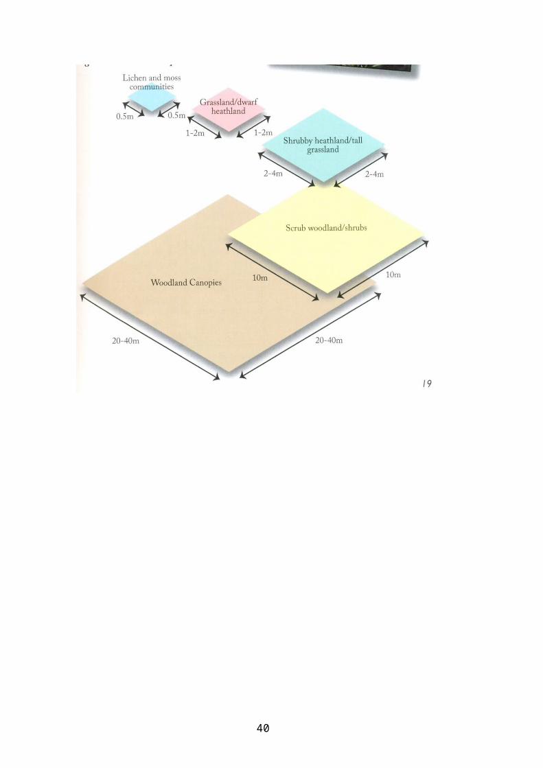
Vegetation Sampling
What is a Quadrat?A quadrat is a defined area of vegetation for ecological study. Quadrats vary in size depending on the type of vegetation unit. Although quadrats are traditionally, and commonly square, they can vary in shape.
Why use a Quadrat?1. Vegetation coverThis is the proportion of the ground occupied by a particular species, usually expressed as a percentage of the total quadrat area.
2. Vegetation frequencyThe chance of finding a species with one throw of a quadrat in a study area. If a species has a frequency of 50% it would occur in 5 of every 10 quadrats analysed.
3. BiodiversityThe number of species which occur within the defined quadrat area. This may be recorded as a numerical value or plant identification can provide more detail on the floral composition of the quadrat area.
Size of QuadratEcologists need to consider the size of the quadrat to ensure that the data is representative. The chosen quadrat size should be based on the size of the plant communities and their distribution pattern.
30

31

Statistical Analysis
With greater amounts of quantitative data being available than ever before, especially in the fields of remote sensing and through the Internet, there is an increased need to be able to summarise effectively and to extrapolate data accurately and quickly. The final stage in the analysis is to attempt to prove or disprove hypotheses; many of the methods which are employed to do this are statistical.
Choosing the right Statistical Test
The type of statistical test conducted during an investigation depends primarily upon the hypothesis being tested and more specifically on whether you are attempting to summarise single data sets or establish whether there is a relationship between sets of data.
Measures of Central Tendency
These seek to provide a single numerical value which is representative of the entire data set.
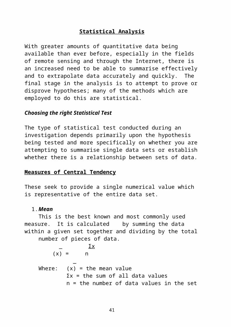
1. MeanThis is the best known and most commonly used measure. It is
calculated by summing the data within a given set together and dividing by the total number of pieces of data.
_ Σx(x) = n
_Where: (x) = the mean value
Σx = the sum of all data valuesn = the number of data values in the set
Advantages It is straightforward to calculate The means of two data sets can be compared to show whether or not they
are actually different It is often considered the most statistically significant of the three
measures as all of the values are considered in the equation
Limitations It is heavily influenced by any extreme/outlying points within the data,
meaning the mean value could be misleading with reference to the rest of the data set
32

It may yield a decimal figure which can be inappropriate depending on the geographical context, e.g. an answer of 14.6 persons
It gives no information as to how the data within the set is spread around the mean, hence two data sets with similar mean values may represent widely differing distributions of data
2. ModeOtherwise known as the modal value, this is the most frequently occurring value within the data set.
Points to consider when using the mode The mode is not always a single value. If a data set has two values that
occur the same number of times then it would be termed bimodal (as opposed to unimodal).
A data set may have no identifiable mode. If the data are recorded within numerically defined categories or classes
than the modal class may be obvious but the exact value of the mode becomes more complicated to calculate.
Advantages It serves a useful purpose in describing the general shape of the
distribution It is fast and easy to work out as there is no calculation involved
Limitations It is of limited mathematical value as it may represent extreme values
within the data set It does not take into account the spread of values within the data set
3. MedianOtherwise known as the mid-point value (m), this is the numerical value falling within the data set at which half of the data are above it and half are below it. It is calculated by:i. First putting the data into arithmetic order.ii. Counting the number of items of data (termed n).iii. Using the equation:
n+1 m = 2
Where: m = the median of the set of datan = the number of pieces of data in the set
Points to consider when using the median
33

If the number of pieces of data in the set is odd then the median value will appear as an integer (whole number) and it is simply the case of finding the piece of data this refers to by counting through the data set from either end.
If the number of pieces of data in the set is even then the median value will lie between two pieces of data within the set. To establish the median number based on this simply add the data values on either side of the data point together and average them. The averaged figure will be the median of the data set.
Advantages It is a more preferable representation of the centre of the distribution if
the data contains extreme values It can be more reliable when there is clustering of values in the data set
Limitations It gives no information as to how the data within the set is spread around
its median value; hence two data sets with similar medians may have a widely different distribution of data
It can be a tedious statistic to calculate manually if the number of observations within the data set is large
It is less mathematically accurate as the actual values do not form part of the calculation
It is less reliable when there are few values in the data set or when there are large gaps between the values
NB. All measures of central tendency have the limitation of being single values used to describe what can be large sets of observations. As they vary considerably within the same set of data, the analysis and comparison of all three measures can provide a deeper understanding of the data.
34

Measures of Dispersion
These analyse a set of data in terms of its spread around the mean or median value.
RangeThis is the simplest and most obvious way to describe the scattering of data within a set. The range defines the region within which all the data values lie. It is calculated by subtracting the lowest value in the data set from the highest to give a single numerical value, again describing the data set.
Advantages It is simple to calculate and illustrates the spread of the data in the set When used with the mean it can provide an insight into the distribution of
values around the mean. It therefore develops the statistical usefulness of the mean
Limitations It is only calculated using two pieces of data from the entire data set It gives no indication of the spread of data in the remaining data set
within the two extremes used in the calculation of the range Whenever an outlier/anomalous result is present and represents the
highest or lowest value the range statistic will utilise this figure and as a result a misleading impression of the true limits/ spread of data set will be given
Example
A group of students, carrying out a fieldwork river study, obtained the following data for bedload size, randomly sampled at one site along a river.
Long axis of rock particle (cm)
15.1 5.7 14.1 32.6 21.4 15 16.7 5.7
Calculate the mean, mode, median and range of the data set.
Spearman’s Rank Correlation Coefficient
35

The statistical techniques mentioned so far have been concerned with single data sets, but in many investigations it is necessary to study the relationship between variables. Spearman’s Rank Correlation Coefficient is used to assess the degree of similarity or correlation between two data sets.
Correlation can also be represented graphically by scattergraphs and the drawing (or not) of best fit lines.
The independent or ‘control’ variable is plotted on the x axis.The dependent variable ( which is expected to be influenced by the control variable) is plotted on the y axis.
Types of Correlation
N.B. When there are no residuals (also called anomalies) and all the points lie along the line of best fit, this will reflect a perfect positive or negative correlation.
In many cases there will be some relationship between the two sets of data, but from the scattergraph it is difficult to gauge exactly how much. This is where
36

Spearman’s Rank Correlation Coefficient is valuable as it provides a reliable measure of the degree of correlation between the two sets of variables. It will provide a numerical value which can be used to assess the strength of the linear relationship as well as the type of relationship, positive or negative, between the two sets of variables. The variables can therefore be compared in a precise and quantitative way.
Uses of Spearman’s RankThis statistical method can be applied where there are two sets of data relating to various points of data collection in the field. There must be a minimum of 10 pairs of values in the data sets – the more, the better. Below 10 sets of values the statistical result is unreliable. The investigator should have reason to believe that there is some sort of relationship between the data sets. This belief could come from observation of the data, i.e. the figures simply look as if there is a relationship between them, or it could be an assumption from geographical knowledge, e.g. that it is likely there will be a relationship between the distance from the source of a stream and its width at any given point.ExamplesPhysical topics
Thickness of soil will increase downslope Temperature range increases with distance from the sea Mean vegetation height decreases with altitude
Human topics Building height decreases with distance from the CBD Birth rate decreases as GNP per capita increases Number of cars per household increases as population density decreases
Steps1. Devise a null hypothesis and an alternative hypothesis, one of which you
will eventually reject.e.g. Null Hypothesis (H0): ‘There is no significant relationship
between unemployment and GDP per capita in Italian Regions’.Alternative hypothesis (H1): ‘There is a correlation between unemployment and GDP per capita in Italian Regions’.
2. The data should be set out in a table (as shown below). Rank the two sets of data independently, giving the highest value a rank of 1, and so on. (The first few rankings have been done for you.) Two or more identical values are given tied ranks.
Italian Region Unemployment Rank GDP per Rank d d2
37

2000 (%) capita (EU=100)
Northwest 9.3 118Lombardy 5.7 131 1.5Northeast 5.0 124 3Emilia-Romagna 5.7 131 1.5Centro 7.9 107Lazio 12.3 113Campania 24.9 2 65Abruzzo-Molise 11.2 87South 22.7 3 65Sicily 25.6 1 67Sardinia 21.3 65
Σd2=
3. Find the difference between the two rankings for each pair of values (d).4. Square the difference to remove all negative values (d2).5. Sum the values of d2 (Σd2).6. Calculate the coefficient (rs) from the formula (which will be given in the
exam):
rs = 1 - 6Σd 2 Where n = the number of pairs of values n3-n
(Make sure you take away from the 1. This is a common cause of error.)
7. The result can be interpreted from a scale of +1 (a perfect positive correlation) to -1 (a perfect negative correlation). Zero indicates no correlation.
8. You now need to determine whether the correlation is significant. You can do this by referring to a significance graph or critical values tables such as the ones below.Work out the degrees of freedom (n-2) and find this value on the horizontal axis of the significance graph.
38

Where the degrees of freedom line intersects with the 5% probability line on the significance graph – read across to the vertical axis to obtain the critical rs value.If the calculated rs value exceeds the critical rs value, then the relationship is significant at the 5% probability level.To check for a higher level of significance a similar method can be employed making use of the 1% and 0.1% probability lines to obtain critical values.
Critical Values Table for Spearman’s Rank Correlation Coefficient
Degrees of Freedom 0.05 (5%) 0.01 (1%)8 0.72 0.849 0.68 0.8010 0.64 0.7711 0.60 0.7412 0.57 0.7113 0.54 0.6915 0.50 0.6520 0.47 0.59
39
9. If the value of rs is greater than the critical value for the appropriate degree of freedom, you can reject your null hypothesis and accept the alternative hypothesis. If the value is above the 1% significance level you can be 99% certain that the correlation is not a result of chance (the relationship may have occurred by chance only 1 time out of 100). If it falls between the 5% and the 1% level, you can only be 95% certain that the result was not due to chance. Below the 5% level, you have to accept the null hypothesis.
You may now need to suggest possible reasons for the correlations you have found. If you have not found a correlation, you can suggest why. Note that a correlation does not necessarily mean that one thing causes another; just that they relate to each other.
Advantages It is a relatively quick and easy method of assessing the degree of
relationship between two data sets It can be used on data which consists of discrete variables (raw figures),
or percentages, which can be ranked
Limitations It does not given any reasons for the link between the data set It requires at least 10 observations for an accurate calculation. Below
this it is an unreliable statistical test It simply places the values in numerical order, paying no regard to the
magnitude of the difference between the values
Possible questions in AS Geography You may be asked to complete a calculation using data provided, and to
interpret the result You may be asked to use your table of results to carry out a calculation.
Therefore you need to decide in advance which variables to use and be able to interpret the result
You may be asked to suggest a possible geographical reason for your findings
You may be asked to evaluate Spearman’s Rank Correlation Coefficient as a statistical test i.e. its advantages and limitations.
Nearest Neighbour Analysis
40
Settlements, buildings, plants, springs, quarries, farms etc. often appear on the map as dots. Dot distributions are commonly used in geography, yet their patterns are difficult to describe. One way in which a pattern can be measured objectively is by nearest neighbour analysis. It can be used to identify a tendency towards clustering or dispersion for shops, industry, settlements, etc. Nearest neighbour analysis gives a numerical score or index that enables one region to be compared to another.
The formula used in nearest neighbour analysis produces a figure expressed as Rn (the nearest neighbour index) which measures the extent to which a pattern is clustered, random or regular. The calculated Rn numerical value will lie between 0 and 2.15.
• Clustered: Rn = 0 All the dots occur close to the same point. A value close to 0 would indicate ‘significant’ clustering – points would be arranged in close proximity to each other.
• Random: Rn = 1.0 There is no pattern (i.e. the distribution of the settlements is random).
• Regular: Rn = 2.15 There is a perfectly uniform pattern where each dot is equidistant from all its neighbours. A value close to 2.15 would indicate ‘significant’ regularity – points would be arranged at a fairly uniform distance from each nearest neighbour.
Worked ExampleA geographer analysing the distribution pattern of post offices in Belfast, theoretically expected a random pattern. The expectation was based on the assumption that this low order service would not require a high threshold population to sustain economic viability and would therefore be located randomly in the community, or neighbourhood, areas.Post Office Distribution in Belfast
41

42

43

Steps
44

1. The points in the study area are accurately mapped and annotated with a number.
2. A table is constructed to record the straight line distance between each point (post offices in this example) and its nearest neighbour.
_3. The average distance (d) is calculated by totalling all the individual
distance values and dividing by the total number of points.
4. The study area is then calculated (a)
5. The Rn numerical value is then calculated by substituting these values into the statistical formula.
6. In order to interpret the Rn value, it is necessary to consult the Nearest Neighbour Significance Graph. Locate the precise number of points on the x axis and the calculated Rn value on the y axis. Their point of intersection on the graph will determine whether the pattern can be classified as significantly random, regular or clustered.
Points to consider when using Nearest Neighbour Analysis Statisticians state that a minimum of 30 points are required to ensure
reliability and validity of conclusions. The delineation of the boundary of the area will require careful
consideration. A larger area will lower the Rn value and exaggerate the extent of clustering. Conversely the inclusion of a smaller area will
45

increase the Rn value and exaggerate the extent of regularity. The total area is therefore critical to the statistical outcome.
Rn = 0.2 Rn = 1.4
Enlarged
The measurement of the straight line distances between points and their nearest neighbours can create some problems. For example, if the points relate to settlements it may be difficult to locate the centre point for measurement, especially if the settlement has a linear morphology.
The inability of the statistic to classify a linear pattern can be regarded as a limitation. For example, settlements are often distributed in a linear fashion as a result of relief, drainage, communications or other topographical landscape features. Therefore the application of nearest neighbour analysis may result in a misleading statistical interpretation.
Nearest Neighbour analysis cannot always distinguish between a single and a multi-clustered distribution (which may have an identical Rn value).
Single Multi-clustered
An Rn value of 1.0 does not always mean a totally random distribution. Two sub-patterns on the map when combined in one index may give a totally false impression of randomness.
Two types of pattern on one map
Sometimes a value of 1.0 is not caused by the chance distribution of the points mapped: it may be related to a second, unmapped factor. For example, villages in an area may give a value of 1.0, but on closer examination it may be seen that they are all based around springs. It is therefore likely that it is the random distribution of the springs that has caused the Rn value, and not chance.
Although the nearest neighbour statistic provides a reliable classification of pattern (to a 5% probability level) it provides no explanation for the
* * * * *
* * * * * * * * * *
* * ** **
* * * * * * * * * * * * * * * *
* * * * *
* *
* * *
46

distribution. Geographers need to explore potential geographical reasons for the patterns classified.
Possible questions in AS Geography You may be asked to complete a calculation using data provided, and to
interpret the result You may be asked to suggest a possible geographical reason for your
findings You may be asked to evaluate Nearest Neighbour Analysis as a statistical
test
47

Questionnaires
A questionnaire is a set of pre-arranged questions designed to obtain information from people about themselves and their views. It is used to collect information about local issues and for assessing people’s attitudes and opinions.
Types of Questionnaire1. Face to face – interview style questionnaires carried out in the street,
neighbourhood or on the doorstep.2. Drop and collect – involves delivering questionnaires with an official
covering letter and either collecting the completed copies or having them returned by mail. The rate of return will probably be less for this type (usually <25%).
Types of Question
Type of Question Advantages DisadvantagesClosedThese offer the respondent a fixed range of answers, usually with mutually exclusive options.
Less time consuming to complete.
Answers lend themselves to quantitative analysis and application of statistics.
Unsuitable if public attitudes or perceptions are required.
They tend to be restrictive and inflexible as answers are predetermined.
OpenQuestions which offer the respondent the opportunity to outline their views or perceptions and formulate their own style of response.
Respondents are able to present their ideas without having to select from predetermined categories. Data is therefore likely to be more accurate.
Difficult to collate and present in graphical or diagrammatic form.
Involves subjective interpretation by the researcher.
Likert ScalesThese are scales which allow the respondent to rank their attitude or view along a predetermined continuum.
Numerical values can be produced, making graphical and statistical analysis possible.
Intensity/strength of feeling can be captured.
Analysis can be complex and tedious if an expansive continuum is employed to cope with positive and negative views.
48

Points to consider when designing and carrying out a questionnaire
1. Question relevanceAll questions included should capture information relevant to the aim of the study.
2. Length/structureThe questions should be short, as respondents will be hesitant if the survey is time consuming. The questionnaire should have well organised categories with clear, concise instructions.
3. Avoid personal questionsIt is not good practice to ask questions of a personal nature e.g. income, age, religion etc.
4. Avoiding biasIt is often necessary to consider factors which may influence the data e.g. obtaining a cross-section of the population to avoid over-representation of a distinct group which would introduce bias.
5. SamplingIt may be necessary to consider:
a. Sample size – a larger sample size will ensure more reliable data.b. Sampling method – it is important to choose the appropriate
sampling method when administering the questionnaire e.g. random, systematic or stratified.
6. Pilot studyA pilot study should be conducted on a small percentage of the sample population. This allows questions to be tested for accuracy and ambiguity. Evaluation of the pilot study may make modification of the questionnaire necessary.
7. Type of questionsThe type of questions needs to be chosen carefully. There are possible alternatives – open, closed and likert scales. The questionnaire can be composed of a combination of all three.
49

Analysing Questionnaire Design
50


