165
Oxford Cambridge and RSA www.ocr.org.uk/geography Version 1 Geographical skills OCR Teacher Guide H081, H481 GEOGRAPHY AS and A Level
Oxford Cambridge and RSA
www.ocr.org.uk/geographyVersion 1
Geographical skills OCR Teacher Guide
H081, H481
GEOGRAPHYAS and A Level

Geographical skills in AS and A Level Geography OCR Teacher Guide Version 1 1 © OCR 2020
OCR may update this document on a regular basis. Please check the OCR website (www.ocr.org.uk) at the start of the academic year to ensure that you are using the latest version.
Contents Chapter 1.1 – Introduction ............................................................................................................ 3
Chapter 1.2 – Skills developed at GCSE ...................................................................................... 4
Chapter 2.1 – Measures of central tendency ............................................................................... 8
Chapter 2.2 – Dispersion: Interquartile range ........................................................................... 20
Chapter 3.0 – Sampling and sampling errors ............................................................................ 28
Chapter 4.1 – Frequency distributions: lines, curves and skew .............................................. 37
Chapter 4.2 – Null hypothesis and significance testing ........................................................... 52
Chapter 4.3 – Lines of best fit and scatterplots ........................................................................ 55
Chapter 4.4 – Statistical tests for association: Spearman’s rank ............................................ 62
Chapter 4.5 – Statistical tests of difference: Chi Square.......................................................... 71
Chapter 4.6 – Statistical tests of Difference: Mann-Whitney U test ......................................... 79
Chapter 4.7 – Statistical tests of difference: t-test .................................................................... 91
Chapter 5.1 – Topic Skills: Mass balance .................................................................................. 97
Chapter 5.2 – Topic Skills – Coasts: sediment budget calculation ....................................... 105
Chapter 5.3 – Topic Skills – Earth’s life support systems: Climate graphs .......................... 117
Chapter 5.4 – Topic Skills – Earth’s life support systems: Unit conversions and rates of change ....................................................................................................................................... 125
Chapter 6.1 – Errors in data ..................................................................................................... 132
Chapter 6.2 – Errors in data presentation ............................................................................... 140
Chapter 7.1 – Selecting appropriate approaches for analysing field data ............................ 146
Appendix ................................................................................................................................... 159
Geographical skills in AS and A Level Geography OCR Teacher Guide Version 1 2 © OCR 2020
About the author
Julia Thomson has 20 years' experience teaching and examining with OCR Geography. She led a large Geography department in an FE Sixth Form College until 2019 and is active in working with a wide range of teachers to improve NEA outcomes and improve synoptic understandings. As a fieldwork enthusiast and keen traveller the examples in this guide are designed to be engaging, relevant and directly linked to popular topic choices for H481.
With special thanks As part of the development for this resource we have used a number of pieces of candidate work, submitted as part of OCR assessments. A special thank you to all the candidates who have provided this work.
Whether you already offer OCR qualifications, are new to OCR, or are considering switching from your current provider/awarding organisation, you can request more information by completing the Expression of Interest form which can be found here: www.ocr.org.uk/expression-of-interest
Looking for a resource? There is now a quick and easy search tool to help find free resources for your qualification: www.ocr.org.uk/i-want-to/find-resources/
OCR Resources: the small print OCR’s resources are provided to support the delivery of OCR qualifications, but in no way constitute an endorsed teaching method that is required by the Board, and the decision to use them lies with the individual teacher. Whilst every effort is made to ensure the accuracy of the content, OCR cannot be held responsible for any errors or omissions within these resources. Our documents are updated over time. Whilst every effort is made to check all documents, there may be contradictions between published support and the specification, therefore please use the information on the latest specification at all times. Where changes are made to specifications these will be indicated within the document, there will be a new version number indicated, and a summary of the changes. If you do notice a discrepancy between the specification and a resource please contact us at: [email protected]. © OCR 2020 - This resource may be freely copied and distributed, as long as the OCR logo and this message remain intact and OCR is acknowledged as the originator of this work. OCR acknowledges the use of the following content: Page.20: Holkham beach/Steven Docwra/gettyimages.co.uk, Cards/Floortje/gettyimages.co.uk, Forest trees/Baac3nes/gettyimages.co.uk, Wall clock/Erik Von Weber/gettyimages.co.uk. Source and permission details are listed alongside each relevant item. Please get in touch if you want to discuss the accessibility of resources we offer to support delivery of our qualifications: [email protected]

Geographical skills in AS and A Level Geography OCR Teacher Guide Version 1 3 © OCR 2020
Chapter 1.1 – Introduction The delivery of Geographical and Fieldwork Skills are key for students in developing their ability to ‘think geographically’ (OCR Specification page 47).
This guide provides a detailed overview of the key geographical skills with worked examples for teachers and students in some familiar and new contexts.
The guide offers opportunities to integrate the exercises included into curriculum delivery by indicating which topic and sub-question the exercises relate to.
A student workbook has been provided for use with this teacher guide. Each chapter is also provided as a classroom PowerPoint.
Students benefit from repeated exposure to quantitative and qualitative skills throughout their A Level topics.
A focus on statistical testing and the use of statistical tests enables teachers and students to have the opportunity to refer to these when working on the independent investigation or centre fieldwork.
The application of geographical skills to fieldwork is linked to these approaches in Chapter 7.
In Chapter 5, this guide offers detail on the topic specific skills listed in the specification, including:
Mass balance calculations
Sediment budget calculations
Climate graphs
Unit conversions
Rates of flow
Fieldwork on carbon storage in coniferous forest
Coastal and Glaciated Landscapes
Earth’s Life Support Systems
Geographical skills in AS and A Level Geography OCR Teacher Guide Version 1 4 © OCR 2020
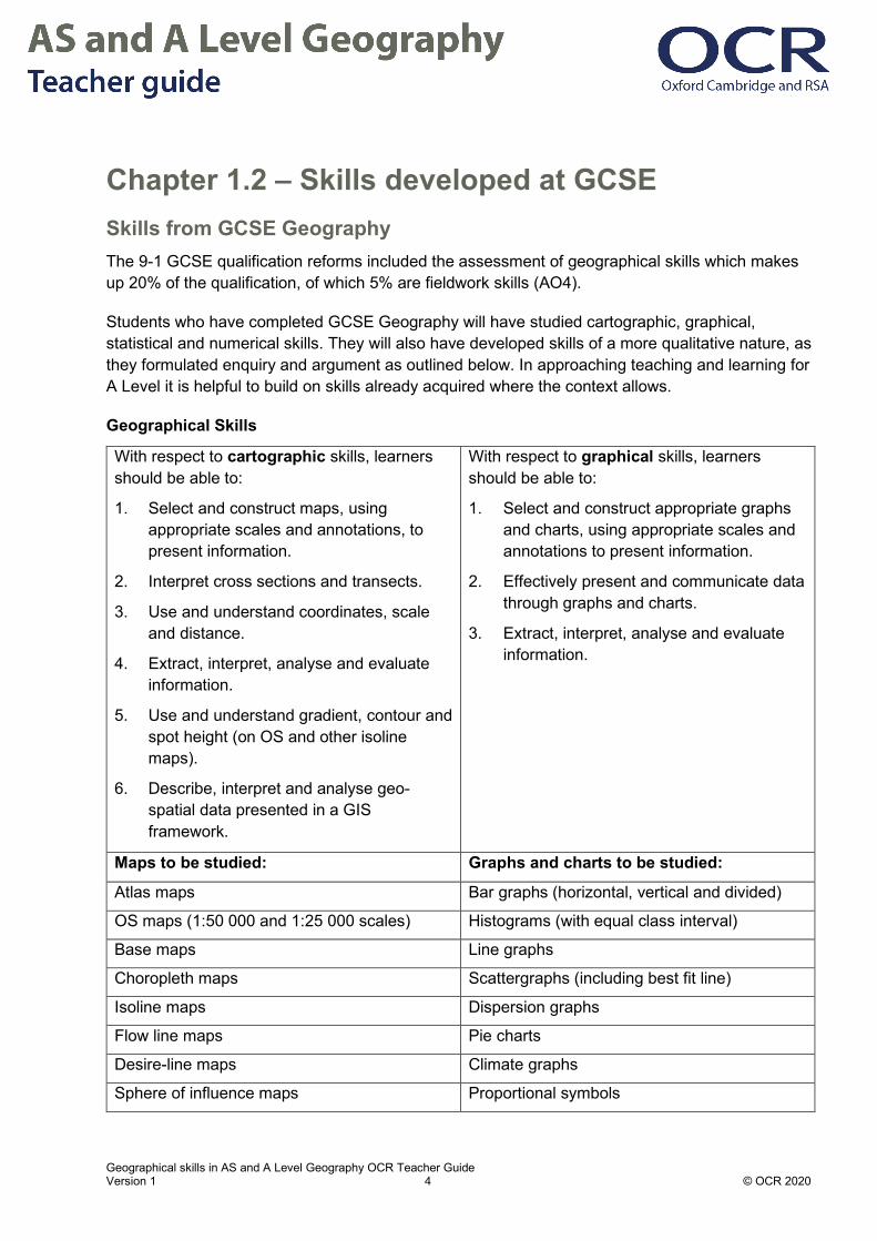
Chapter 1.2 – Skills developed at GCSE Skills from GCSE Geography The 9-1 GCSE qualification reforms included the assessment of geographical skills which makes up 20% of the qualification, of which 5% are fieldwork skills (AO4).
Students who have completed GCSE Geography will have studied cartographic, graphical, statistical and numerical skills. They will also have developed skills of a more qualitative nature, as they formulated enquiry and argument as outlined below. In approaching teaching and learning for A Level it is helpful to build on skills already acquired where the context allows.
Geographical Skills
With respect to cartographic skills, learners should be able to:
1. Select and construct maps, using appropriate scales and annotations, to present information.
2. Interpret cross sections and transects.
3. Use and understand coordinates, scale and distance.
4. Extract, interpret, analyse and evaluate information.
5. Use and understand gradient, contour and spot height (on OS and other isoline maps).
6. Describe, interpret and analyse geo-spatial data presented in a GIS framework.
With respect to graphical skills, learners should be able to:
1. Select and construct appropriate graphs and charts, using appropriate scales and annotations to present information.
2. Effectively present and communicate data through graphs and charts.
3. Extract, interpret, analyse and evaluate information.
Maps to be studied: Graphs and charts to be studied:
Atlas maps Bar graphs (horizontal, vertical and divided)
OS maps (1:50 000 and 1:25 000 scales) Histograms (with equal class interval)
Base maps Line graphs
Choropleth maps Scattergraphs (including best fit line)
Isoline maps Dispersion graphs
Flow line maps Pie charts
Desire-line maps Climate graphs
Sphere of influence maps Proportional symbols

Geographical skills in AS and A Level Geography OCR Teacher Guide Version 1 5 © OCR 2020
Thematic maps Pictograms
Route maps Cross-sections
Sketch maps Population pyramids
Radial graphs
Rose charts
With respect to numerical and statistical skills, learners should be able to:
1. Demonstrate an understanding of number, area and scale.
2. Demonstrate an understanding of the quantitative relationships between units.
3. Understand and correctly use proportion, ratio, magnitude and frequency.
4. Understand and correctly use appropriate measures of central tendency, spread and cumulative
5. Frequency including, median, mean, range, quartiles and inter-quartile range, mode and modal class.
6. Calculate and understand percentages (increase and decrease) and percentiles.
7. Design fieldwork data collection sheets and collect data with an understanding of accuracy, sample
8. size and procedures, control groups and reliability.
9. Interpret tables of data.
10. Describe relationships in bivariate data.
11. Sketch trend lines through scatter plots.
12. Draw estimated lines of best fit.
13. Make predictions; interpolate and extrapolate trends from data.
14. Be able to identify weaknesses in statistical presentations of data.
15. Draw and justify conclusions from numerical and statistical data
With respect to formulating enquiry and argument, learners should be able to: 1. Deconstruct, interpret, analyse and evaluate visual images including photographs,
cartoons, pictures and diagrams.
2. Analyse written articles from a variety of sources for understanding, interpretation and recognition of bias.
3. Suggest improvements to, issues with or reasons for using maps, graphs, statistical techniques and visual sources, such as photographs and diagrams
Source: GCSE Geography A (Geographical Themes) specification, page 13 and 14 https://www.ocr.org.uk/Images/207306-specification-accredited-gcse-geography-a-j383.pdf, GCSE Geography B (Geography for Enquiring Minds) specification, page 17 and 18 https://www.ocr.org.uk/Images/207307-specification-accredited-gcse-geography-b-j384.pdf

Geographical skills in AS and A Level Geography OCR Teacher Guide Version 1 6 © OCR 2020
Fieldwork skills from GCSE Geography Students take part in two fieldwork opportunities which include physical and human contexts as part of GCSE Geography. This gives them knowledge of the Geographical enquiry method on which the Independent Investigation (NEA) builds at A Level. For example, students will have investigated geographical questions and should be able to present and analyse data, as well as reflect on limitations of their investigations.
Fieldwork skills
Source: GCSE Geography A (Geographical Themes) specification, page 15 https://www.ocr.org.uk/Images/207306-specification-accredited-gcse-geography-a-j383.pdf, GCSE Geography B (Geography for Enquiring Minds) specification, page 19 https://www.ocr.org.uk/Images/207307-specification-accredited-gcse-geography-b-j384.pdf
Geographical fieldwork may be defined as the experience of understanding and applying specific geographical knowledge, understanding and skills to a particular and real out-of-classroom context. In undertaking fieldwork, learners practise a range of skills, gain new geographical insights and begin to appreciate different perspectives on the world around them. Fieldwork adds ‘geographical value’ to study, allowing learners to ‘anchor’ their studies within a real world context. Fieldwork must be undertaken:
• outside the classroom and beyond the school grounds
• on at least two occasions
• in contrasting locations
• in both physical and human geographical contexts.
The value of fieldwork goes beyond the aim of collecting primary data. The understanding generated from experiencing geographical concepts, processes and issues in the real world can be illuminating for learners. The investigative process goes beyond data collection, with other key aspects including the presentation and analysis of results, drawing conclusions and critically reflecting on the process.
The following areas of fieldwork will be assessed, through both learners’ own experiences of fieldwork and unfamiliar contexts:
i. understanding of the kinds of question capable of being investigated through fieldwork and an understanding of the geographical enquiry processes appropriate to investigate these
ii. understanding of the range of techniques and methods used in fieldwork, including observation and different kinds of measurement
iii. processing and presenting fieldwork data in various ways including maps, graphs and diagrams
iv. analysing and explaining data collected in the field using knowledge of relevant geographical case studies and theories
v. drawing evidenced conclusions and summaries from fieldwork transcripts and data
vi. reflecting critically on fieldwork data, methods used, conclusions drawn and knowledge gained.
Geographical skills in AS and A Level Geography OCR Teacher Guide Version 1 7 © OCR 2020
Sources to support students without GCSE Geography Students taking Geography A Level (H481) who have not completed a Geography GCSE qualification could be given exercises from the following resources to enable them to catch up and practise these skills.
Resources OCR have a selection of geographical and fieldwork skills resources available via the Planning and Teaching webpage:
Embedding fieldwork skills
Embedding geographical skills
Geographical skills – charts and graphs
Geographical skills – Maps
The Field Studies Council has excellent resources for geographical enquiry
Other sources:
BBC Bitesize
Seneca Learning
Teach It Geography
Geographical skills in AS and A Level Geography OCR Teacher Guide Version 1 8 © OCR 2020
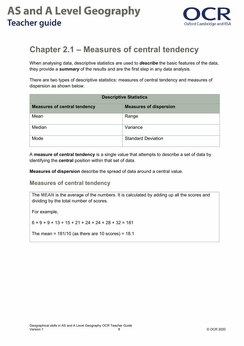
Chapter 2.1 – Measures of central tendency When analysing data, descriptive statistics are used to describe the basic features of the data, they provide a summary of the results and are the first step in any data analysis.
There are two types of descriptive statistics: measures of central tendency and measures of dispersion as shown below.
Descriptive Statistics
Measures of central tendency Measures of dispersion
Mean Range
Median Variance
Mode Standard Deviation
A measure of central tendency is a single value that attempts to describe a set of data by identifying the central position within that set of data.
Measures of dispersion describe the spread of data around a central value.
Measures of central tendency
The MEAN is the average of the numbers. It is calculated by adding up all the scores and dividing by the total number of scores.
For example,
6 + 9 + 9 + 13 + 15 + 21 + 24 + 24 + 28 + 32 = 181
The mean = 181/10 (as there are 10 scores) = 18.1
Geographical skills in AS and A Level Geography OCR Teacher Guide Version 1 9 © OCR 2020
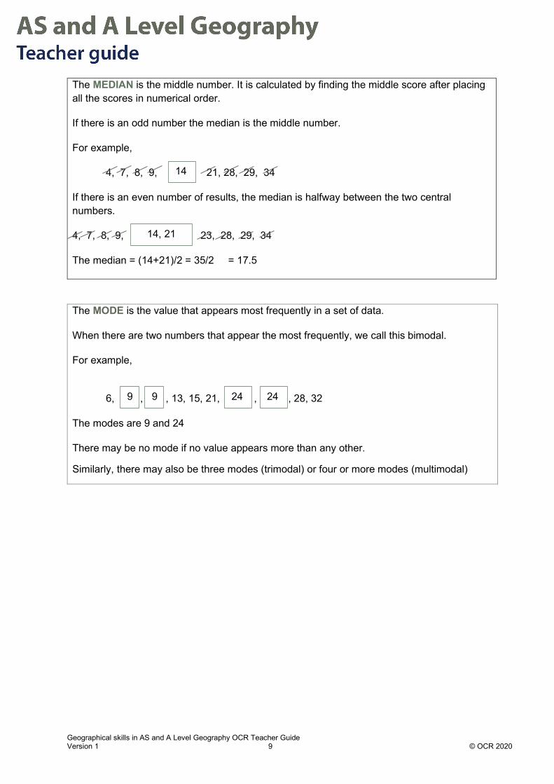
The MEDIAN is the middle number. It is calculated by finding the middle score after placing all the scores in numerical order.
If there is an odd number the median is the middle number.
For example,
4, 7, 8, 9, 21, 28, 29, 34
If there is an even number of results, the median is halfway between the two central numbers.
4, 7, 8, 9, 23, 28, 29, 34
The median = (14+21)/2 = 35/2 = 17.5
The MODE is the value that appears most frequently in a set of data.
When there are two numbers that appear the most frequently, we call this bimodal.
For example,
6, , , 13, 15, 21, , , 28, 32
The modes are 9 and 24
There may be no mode if no value appears more than any other.
Similarly, there may also be three modes (trimodal) or four or more modes (multimodal)
9 24 9 24
14, 21
14

Geographical skills in AS and A Level Geography OCR Teacher Guide Version 1 10 © OCR 2020
Choosing measures of central tendency Measure of central tendency
Definition/how to calculate
When it is appropriate to use
When it is not appropriate to use
Mean All values in the data set are added together and divided by the number of values.
Every value in the data set is included in its calculation so it is representative of the data. It can be calculated with continuous and discrete numeric data.
When there are extreme values or outliers, the mean can be skewed.
The mean cannot be calculated with categorical data, as the values cannot be summed.
Median The middle value of an ordered data set.
When there are extreme values the median is less affected than the mean.
It is the preferred measure of central tendency when the distribution is not symmetrical.
It is less sensitive to variations in the data, so may not present a true picture.
The median cannot be calculated with categorical data, as the values cannot be ordered.
Mode The most frequently occurring value in the data set.
When there is frequency/categorical data, as the others are not appropriate.
There may be no modal value or several.

Geographical skills in AS and A Level Geography OCR Teacher Guide Version 1 11 © OCR 2020
Advantages and Disadvantages of measures of central tendency Measure of Central Tendency
Advantages Disadvantages
Mean Gives an accurate summary where the data has a normal distribution. Useful as an intermediary step for calculating other statistical measures e.g. standard deviation.
Distorted by extreme values. If the data is skewed positively or negatively it will be unrepresentative of the values in the data set.
It is also unreliable if the data set is small.
Median Not affected by extreme values and each value is given equal weight irrespective of its value. It can indicate skew when compared to the mean. If the mean > median = positive skew, if median > mean = negative skew.
Cannot be used for further calculations except the Interquartile range. Does not give any information on the spread of values within the data set. It can be misleading, for example, because data sets with very different ranges can have the same median.
Mode Simple to find. It is not based on the whole data set unlike the median and mean.

Geographical skills in AS and A Level Geography OCR Teacher Guide Version 1 12 © OCR 2020
Standard deviation Method to calculate the standard deviation Calculate the mean of the data set.
Calculate the difference between each value in the data set and the mean.
Square each difference from the previous step, to eliminate negative values.
Total the squared differences.
Divide this by the number of values, minus one.
Calculate the square root.
What does the standard deviation show and why is it useful to measure dispersion? The larger the standard deviation the greater the variation from the mean. If there is a low standard deviation this indicates that the values in the sample are close to the mean value.
In the formula n - 1 is used instead of n in the denominator, as this produces a more accurate estimate of a population’s standard deviation.
Standard deviation (SD) is a useful measure of dispersion because if the observations are from a normal distribution, then 68% of observations lie within ± 1 SD of the mean, 95% of observations lie within ± 2 SD of the mean, and 99.7% of observations lie within ± 3 SD of the mean.
n = number in the data set
x = the value
x bar = mean Standard deviation

Geographical skills in AS and A Level Geography OCR Teacher Guide Version 1 13 © OCR 2020
What are the limitations of the standard deviation? If the data is not normally distributed, but is skewed, it is not appropriate to use SD to measure dispersion.
Source: https://www.geoib.com/normal-distribution.html
When done manually the calculation can be time consuming.
The standard deviation can only be compared between samples of comparable populations, for example you cannot compare a SD for litter layer depth with a SD for soil pH.

Geographical skills in AS and A Level Geography OCR Teacher Guide Version 1 14 © OCR 2020
Student Activity 1 answers – Comparing socio-economic place profiles Specification: 2.1 Changing Spaces, Making Places: 2.1.1.a local place profiles, 2.1.3 Economic change affecting patterns of social inequality in places.
Investigating Economic Change in Cambridge and Middlesbrough A Geographical investigation compared the socio-economic profile of two UK cities of similar sizes, Middlesbrough (population 138,000, 2011 Census) and Cambridge (population 123,000, 2011 Census).
Middlesbrough was dominated by iron and steel production in the 20th Century and is located on the Tees River. It also had a successful shipbuilding industry. Since 1960 the population has declined as demand for steel fell and global competition has made the iron and steel plant uncompetitive. However, since deindustrialisation occurred Teeside University has had an important influence and is famed for its digital animation research. As well as this the town retains some engineering and manufacturing.
Cambridge’s knowledge-based economy has thrived in post-industrial Britain. The city had the fastest growing economy in the UK in 2017. This is partly due to the presence of Cambridge University and Anglia Ruskin University supporting innovation and providing well qualified graduates into digital, R&D and biotechnology sectors. Many multinationals such as Microsoft Research, Apple and Amazon have located to this city since 2010 leading to a strong local multiplier effect.

Geographical skills in AS and A Level Geography OCR Teacher Guide Version 1 15 © OCR 2020
Data from different areas of the cities was collected on the % employed in professional occupations and is displayed below.
Cambridge, Cambridgeshire Middlesbrough, North Yorkshire
% of people employed in professional occupations
% of people employed in professional occupations
42.8 6.5
37.1 36.2
41.6 22.5
34.8 5.4
63.2 22.1
7.7 6.5
9.9 12.6
23.8 18.6
34.8 3.4
29.9 3.3
Source: Oliver O'Brien & James Cheshire (2016) Interactive mapping for large, open demographic data sets using familiar geographical features, Journal of Maps, 12:4, 676-683 DOI: 10.1080/17445647.2015.1060183

Geographical skills in AS and A Level Geography OCR Teacher Guide Version 1 16 © OCR 2020
1. Calculate the measures of central tendency for the above set of raw data.
Mean Median Mode
Cambridge 32.6 34.8 34.8
Middlesbrough 13.7 9.55 6.5
2. What do these results show? What conclusions can be drawn from the measures of central tendency?
Cambridge has higher mean, median and mode for the % of people employed in professional occupations. The mean and median are very similar in Cambridge whereas in Middlesborough the difference between the mean and median is bigger suggesting that there may be more skew in the data.
In Middlesborough the mean value is greater than the median value, so the data is positively skewed. Middlesborough’s mean employment in professional sectors is less than half that of Cambridge.
3. Suggest two reasons why the locations show these differences.
The reasons for these differences could include:
Historical differences in the industrial history of the two locations, notably Middlesborough where employment had been focussed on steel making, shipbuilding and chemical industry. The deindustrialisation of the region since 1960s led to refocussing of the economy on health care, Teesside University and digital animation.
Cambridge did not experience deindustrialisation in the same way, due to very little manufacturing industry in the city. Since 1960 Cambridge has attracted investment in hi tech and biotech sectors, developing the Cambridge Biomedical Campus where professional jobs dominate. It has two universities, Cambridge University and Anglia Ruskin University, as well as many multinational companies like Microsoft Research with many employees who have professional qualifications.

Geographical skills in AS and A Level Geography OCR Teacher Guide Version 1 17 © OCR 2020
Student Activity 2 answers Specification: Earth and Life Support Systems: 1.2.3 Change over time in carbon cycle, 1.2.4b Global management strategies to protect the carbon cycle
Emissions of Carbon dioxide per capita per year 2017
North America CO2 Emissions Asia CO2 Emissions
Country Emissions (tonnes CO2
per capita per year) Country Emissions (tonnes CO2
per capita per year ))
USA 16.24 South Korea 12.08
Canada 15.64 Taiwan 11.49
Bahamas 6.49 Japan 9.45
Barbados 4.63 China 6.98
Mexico 3.8 Thailand 4.79
Cuba 3.18 Vietnam 2.08
Dominican Republic
1.98 India 1.84
Haiti 0.27 Cambodia 0.5
Source: OWID based on the Global Carbon Project; Carbon Dioxide Information Analysis Centre (CDIAC); Gapminder and UN population estimates
1. Calculate the North American and Asian mean emissions per capita.
North America = 6.53 tonnes CO2 per capita per year
Asia = 6.15 tonnes CO2 per capita per year
2. Calculate the median North American and Asian emissions per capita.
North America = 4.22 tonnes CO2 per capita per year
Asia = 5.89 tonnes CO2 per capita per year

Geographical skills in AS and A Level Geography OCR Teacher Guide Version 1 18 © OCR 2020
3. Calculate the range in CO2 emissions per capita.
North America = 15.97 tonnes CO2 per capita per year
Asia = 11.58 tonnes CO2 per capita per year
4. Suggest reasons why the carbon emissions per capita vary within world regions.
Within world regions the level of development is not even. For example, Haiti as an LIDC has a low GDP and is affected by poverty, natural hazards, and has a lack of infrastructure and investment in electrification leading to very low carbon emissions. By contrast the USA and Canada has emissions which are 60 times higher than in Haiti due to emissions from manufacturing industry, food production, transport and domestic use.
5. In countries with high emissions per capita suggest possible management strategies to reduce this.
Mitigation strategies could include:
• Lowering emissions from manufacturing, food production and domestic activity
• Reducing the reliance on fossil fuels to generate electricity
• Increasing investment in renewable energy technology to prevent emissions
• Increasing use of low carbon transport, electric vehicles, bicycles
• Increasing carbon sinks e.g. afforestation, restoration of peatlands
Geographical skills in AS and A Level Geography OCR Teacher Guide Version 1 19 © OCR 2020
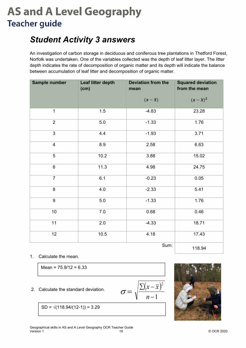
Student Activity 3 answers An investigation of carbon storage in deciduous and coniferous tree plantations in Thetford Forest, Norfolk was undertaken. One of the variables collected was the depth of leaf litter layer. The litter depth indicates the rate of decomposition of organic matter and its depth will indicate the balance between accumulation of leaf litter and decomposition of organic matter.
Sample number Leaf litter depth (cm)
Deviation from the mean
(𝒙𝒙 − 𝒙𝒙�)
Squared deviation from the mean
(𝒙𝒙 − 𝒙𝒙�)𝟐𝟐
1 1.5 -4.83 23.28
2 5.0 -1.33 1.76
3 4.4 -1.93 3.71
4 8.9 2.58 6.63
5 10.2 3.88 15.02
6 11.3 4.98 24.75
7 6.1 -0.23 0.05
8 4.0 -2.33 5.41
9 5.0 -1.33 1.76
10 7.0 0.68 0.46
11 2.0 -4.33 18.71
12 10.5 4.18 17.43
Sum: 118.94
1. Calculate the mean.
2. Calculate the standard deviation.
Mean = 75.9/12 = 6.33
SD = √(118.94/(12-1)) = 3.29

Geographical skills in AS and A Level Geography OCR Teacher Guide Version 1 20 © OCR 2020
Chapter 2.2 – Dispersion: Interquartile range What is dispersion? Dispersion means measuring how variable the data is within a sample.
What are dispersion graphs? Dispersion graphs show visually the spread of values in a data set.
Each value in the data set is plotted as an individual point against a vertical scale.
If a horizontal axis is included, it will have labels for each data set; these can be quantitative (numeric) or qualitative (descriptive).
Source: Birth rate data: https://en.wikipedia.org/wiki/Demographics_of_China
The data on each dispersion graph can be divided into four equal parts called QUARTILES. This is used to show the positions of the median and upper and lower quartiles.

Geographical skills in AS and A Level Geography OCR Teacher Guide Version 1 21 © OCR 2020
Q1 is the LOWER quartile (25% of the values in the sample are below this)
Q2 is the MEDIAN and (50% of the values in the sample are above/below this)
Q3 is the UPPER quartile (75% of the values in the sample are below this)
The INTER-QUARTILE RANGE (IQR) is a measure of dispersion and is calculated by finding the difference in the quartiles:
IQR = Q3 - Q1 or IQR = UQ - LQ.
A high IQR means the data is very dispersed, while a low IQR means the data is less dispersed.
Recap: What is the median? The median value is the middle value of the distribution. Half the values of the sample are lower and half are higher than the median. When the values are ranked from highest to lowest (or vice versa), the rank of the median is given by the formula: (n+1) / 2, where n = number of values.

Geographical skills in AS and A Level Geography OCR Teacher Guide Version 1 22 © OCR 2020
Worked Examples: How to calculate the IQR
Median (Q2) = 𝑛𝑛+12
Lower Quartile (Q1 or LQ) = 𝑛𝑛+14
Upper Quartile (Q3 or UQ) = 3(𝑛𝑛+1)
4
Where n is the number of data values in the data set.
Interquartile Range (IQR) = UQ - LQ
Source: OCR H481/01 QP June 2018 Q1
1 Order the values from highest to lowest: 0.1, 0.4, 0.5, 0.6, 0.9, 1.0, 1.5, 2.0, 4.2
2 n = 9, so the median value is (9 + 1)/2 = 5th value
5th value from the ordered dataset = 0.9
Median = 0.9
3 The interquartile range for the data shown in Table 1 can then be worked out.
Lower quartile = (9 + 1)/4 = 2.5th value
Between 2nd and 3rd values = (0.4 + 0.5)/2 = 0.45
LQ = 0.45
Upper quartile = 3(9 + 1)/4 = 7.5th value
Between 7th and 8th values= (1.5 + 2.0)/2 = 1.75
UQ = 1.75
Interquartile range = Upper quartile – Lower quartile = 1.75 – 0.45 = 1.3

Geographical skills in AS and A Level Geography OCR Teacher Guide Version 1 23 © OCR 2020
IQR and fieldwork data With fieldwork data sets it is useful to use Excel to create Box and Whisker plots showing the range as a vertical line and the IQR as a box.
Example of a box and whisker graph showing the differences in Environmental Quality Score (EQS) between the north and south of the Royal Borough of Kensington and Chelsea.
What are the advantages and disadvantages of dispersion graphs?
Advantages Disadvantages
Visually effective to show the spread of a data set
Needs data set of >20 variables to work best
Can easily compare dispersion of values between two locations
Comparison can only be made if both locations plotted on the same scale
Clustering can be seen easily Data outliers can lead to scaling problems
Quartiles can be added (Q1-Q3) to increase geographical understanding
Does not show a causative relationship, as only one variable plotted
Data range is easily identifiable Does not show comparison through time
Geographical skills in AS and A Level Geography OCR Teacher Guide Version 1 24 © OCR 2020
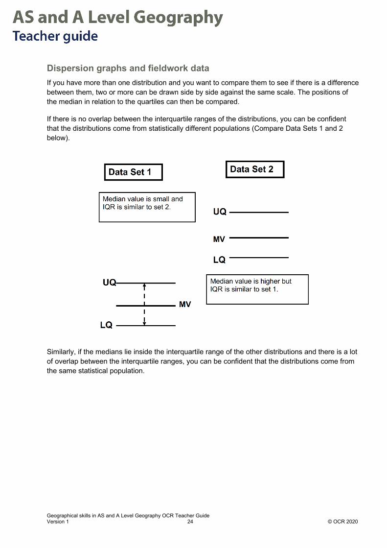
Dispersion graphs and fieldwork data If you have more than one distribution and you want to compare them to see if there is a difference between them, two or more can be drawn side by side against the same scale. The positions of the median in relation to the quartiles can then be compared.
If there is no overlap between the interquartile ranges of the distributions, you can be confident that the distributions come from statistically different populations (Compare Data Sets 1 and 2 below).
Similarly, if the medians lie inside the interquartile range of the other distributions and there is a lot of overlap between the interquartile ranges, you can be confident that the distributions come from the same statistical population.

Geographical skills in AS and A Level Geography OCR Teacher Guide Version 1 25 © OCR 2020
Student Activity answers
1. Plot the dispersion graphs for Years of Life Lost (YLL) due to Lung Cancer in the two regions of China given in the table.
Draw the two graphs side-by-side with the same scale so you can easily compare them.
2. Locate Q1, Q2 and Q3 on the graphs and draw box and whisker plots.
0
200
400
600
800
1000
1200
1400
0 1 2 3
YLL
from
Lun
g C
ance
r
South and East China North and West China
Dispersion Graphs to show YLL from Lung Cancer in South and East China (1) and North and West China (2)
North and West China Q1 = 450, Q2 = 570, Q3 = 860
South and East China Q1= 665, Q2 =715, Q3= 780

Geographical skills in AS and A Level Geography OCR Teacher Guide Version 1 26 © OCR 2020
3. Describe the graphs using median, range and Interquartile range (IQR).
4. Suggest reasons why the YLL due to lung cancer might have the differences shown.
0
200
400
600
800
1000
1200
1400
South and East China North and West China
In North West China the range in YLL (1200 -140) is much greater than in South and East China (940-480).
The median is lower in North West China (570) compared to (715) in South and East China
In North West China there is a greater dispersion of values and so the IQR is greater (410), whereas in South and East China the IQR is much smaller (115) showing less dispersion.
Possible reasons for the pattern shown:
Lower awareness of risks of tobacco abuse in North West China
Higher tobacco use or other airborne pollutants in NW China
Better health surveillance and monitoring in South and East China
Better health awareness and declining smoking rates in South and East China

Geographical skills in AS and A Level Geography OCR Teacher Guide Version 1 27 © OCR 2020
Years of Life Lost due to Lung Cancer
South and East China North and West China
Province YLL from lung cancer (per 100 000 pop) Province YLL from lung cancer
(per 100 000 pop)
Beijing 520 Ningxia 500
Hainan 510 Heilongjiang 1200
Guangdong 680 Jilin 740
Shandong 940 Inner Mongolia 670
Hebei 700 Shanxi 610
Fujian 730 Gansu 400
Zhejiang 720 Shaanxi 500
Henan 710 Qinghai 440
Tianjin 890 Liaoning 990
Anhui 720 Xinjiang 450
Hubei 820 Sichuan 910
Jiangsu 740 Guizhou 570
Guangxi 650 Tibet 140
Shanghai 480 Yunnan 560
Jiangxi 700 Chongqing 860
Hunan 870
Years of Life lost. This is a measure of years of potential life lost due to premature death. The higher the number the more mortality due to this cause in the province in China. YLL is often used to plan direct and indirect health interventions.
Source: Mortality, morbidity, and risk factors in China and its provinces, 1990–2017: a systematic analysis for the Global Burden of Disease Study 2017, Lancet 2019; 394: 1145–58, https://www.thelancet.com/journals/lancet/article/PIIS0140-6736(19)30427-1/fulltext http://creativecommons.org/licenses/by/4.0/

Geographical skills in AS and A Level Geography OCR Teacher Guide Version 1 28 © OCR 2020
Chapter 3.0 – Sampling and sampling errors What is sampling? Sampling is a sub-set of items taken from the whole population (all the data available).
It is used when:
a) the population is too large to study each individual;
b) time is limited; or
c) collecting data is destructive of a physical environment and you are trying to minimise damage.
Sampling tries to ensure that the sample has the following characteristics:
• Unbiased: the mean and standard deviation of the sample is neither larger nor smaller than the values for the whole population.
• Precise: it provides an accurate estimate of the population characteristics. It does not distort patterns/trends and does not exaggerate anomalies.
• Is large enough to produce conclusive results in terms of statistical significance.
• Can be easily collected within the time and by researchers available.
What are the key components of sampling?
A sampling frame that defines the area being investigated, e.g. ward, ecosystem, beach.
Sampling number is the size of the sample needed to ensure reliability and low bias.
Sampling design refers to the sampling technique and the strategy used to apply the technique.
Timing is critical because the time of day and time of the year affect many geographical variables.

Geographical skills in AS and A Level Geography OCR Teacher Guide Version 1 29 © OCR 2020
Sampling techniques commonly used in Geographical investigations include random, systematic, stratified and opportunistic techniques.
Spatial sampling strategies can vary by type, e.g. grid, point or transect, depending on the type of investigation and its purpose.
Sampling strategies for spatial sampling
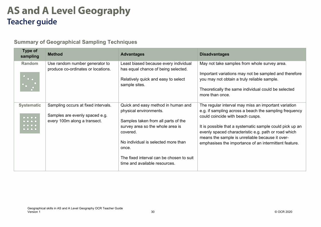
Geographical skills in AS and A Level Geography OCR Teacher Guide Version 1 30 © OCR 2020
Summary of Geographical Sampling Techniques Type of
sampling Method Advantages Disadvantages
Random
Use random number generator to produce co-ordinates or locations.
Least biased because every individual has equal chance of being selected.
Relatively quick and easy to select sample sites.
May not take samples from whole survey area.
Important variations may not be sampled and therefore you may not obtain a truly reliable sample.
Theoretically the same individual could be selected more than once.
Systematic
Sampling occurs at fixed intervals.
Samples are evenly spaced e.g. every 100m along a transect.
Quick and easy method in human and physical environments.
Samples taken from all parts of the survey area so the whole area is covered.
No individual is selected more than once.
The fixed interval can be chosen to suit time and available resources.
The regular interval may miss an important variation e.g. if sampling across a beach the sampling frequency could coincide with beach cusps.
It is possible that a systematic sample could pick up an evenly spaced characteristic e.g. path or road which means the sample is unreliable because it over-emphasises the importance of an intermittent feature.
Geographical skills in AS and A Level Geography OCR Teacher Guide Version 1 31 © OCR 2020
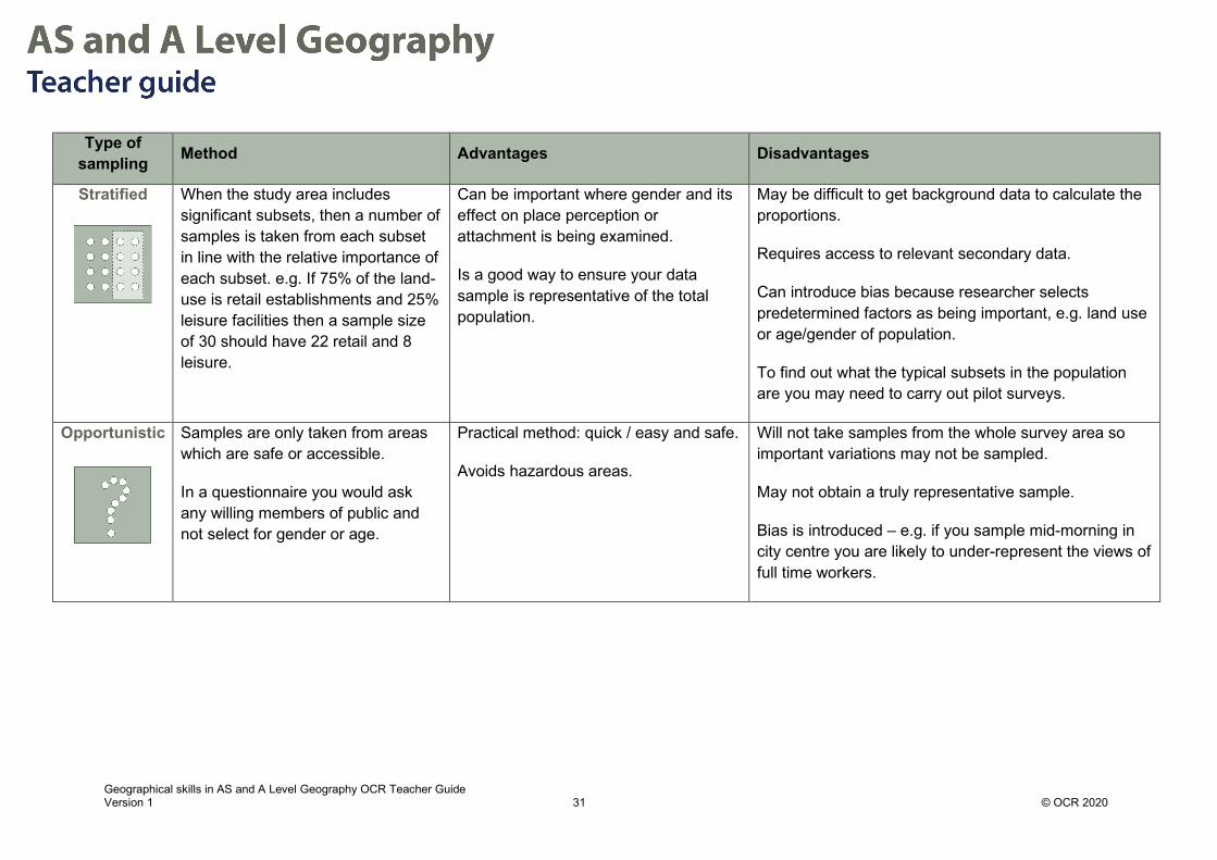
Type of sampling Method Advantages Disadvantages
Stratified
When the study area includes significant subsets, then a number of samples is taken from each subset in line with the relative importance of each subset. e.g. If 75% of the land-use is retail establishments and 25% leisure facilities then a sample size of 30 should have 22 retail and 8 leisure.
Can be important where gender and its effect on place perception or attachment is being examined.
Is a good way to ensure your data sample is representative of the total population.
May be difficult to get background data to calculate the proportions.
Requires access to relevant secondary data.
Can introduce bias because researcher selects predetermined factors as being important, e.g. land use or age/gender of population.
To find out what the typical subsets in the population are you may need to carry out pilot surveys.
Opportunistic
Samples are only taken from areas which are safe or accessible.
In a questionnaire you would ask any willing members of public and not select for gender or age.
Practical method: quick / easy and safe.
Avoids hazardous areas.
Will not take samples from the whole survey area so important variations may not be sampled.
May not obtain a truly representative sample.
Bias is introduced – e.g. if you sample mid-morning in city centre you are likely to under-represent the views of full time workers.

Geographical skills in AS and A Level Geography OCR Teacher Guide Version 1 32 © OCR 2020
Sampling Terminology
Sampling Term Meaning
Sampling frame The study area or group from which the sample is selected, e.g. area on an OS map, a ward within a borough, an electoral register.
Target population
The total number of data points, e.g. individuals, pebbles, streets, from which the sample is taken.
Sampled population
The group of data points from the target population that have been sampled.
Sample size The number of measurements in the sample. For further statistical analysis, this is often taken to be a minimum of 30.
Population parameter
A true summary measurement of the characteristics of the target population, e.g. mean size of all the pebbles on a beach. If the parameter is based on a sample, it is only an estimate.
Bias
This occurs when the sample measurement over- or under-estimates the population parameter.
It may be introduced unconsciously, e.g. including certain places because they are more accessible or interviewing a certain age group/ gender of shoppers because of the time of day/day of the week.
Representative sample
A sample that minimises bias.
Spatial sampling
Point sampling: selection of a series of specific points within an area.
Line sampling: sampling along a line through, for example a city or across a sand dune system. The “line” could be a street, a transect across the sand dunes, etc.
Area sampling: e.g. selection of sample squares.
Geographical skills in AS and A Level Geography OCR Teacher Guide Version 1 33 © OCR 2020
Sampling Errors 1. Random errors: these are caused for example when a researcher misreads a measurement,
e.g. on a light meter in a forest or a clinometer reading on the beach. This will create errors in the sample population. This type of error can be minimized if repeated measurements are made.
2. Systematic errors: these occur for example when equipment being used to sample the variable has not been calibrated correctly, e.g. a weighing balance that has not being zeroed correctly between the samples.
3. Sampling Bias: this is where the population of the sample has been selected/collected in a way which means that the sample is non-random, because not all individuals or instances in the population were equally likely to be selected. For example, surveys are often answered by a self-selecting population. Evidence suggests that the populations responding to online, face to face and telephone surveys are more likely to be opinionated and have strong views which may confirm researcher’s questions. This means that those who have fewer strong views may be under-represented.

Geographical skills in AS and A Level Geography OCR Teacher Guide Version 1 34 © OCR 2020
Student Activity 1 answers
Southwold Beach, Suffolk
1. Suggest a suitable sampling strategy to investigate the variation in beach sediment and angle perpendicular to the shoreline.
To ensure the results are representative set up a sampling frame – the area should include shoreline along a representative stretch of the coastline – for example here, taking into account the possible variation due to groynes, at least a 300m long stretch is indicated.
To ensure a representative sample a systematic sampling strategy is indicated, collecting samples or photos of sediment every 1-2m along a transect line.
The beach angle should also be collected at regular intervals using a systematic strategy, e.g. every 1-2 m with automatic level or clinometer.
Geographical skills in AS and A Level Geography OCR Teacher Guide Version 1 35 © OCR 2020
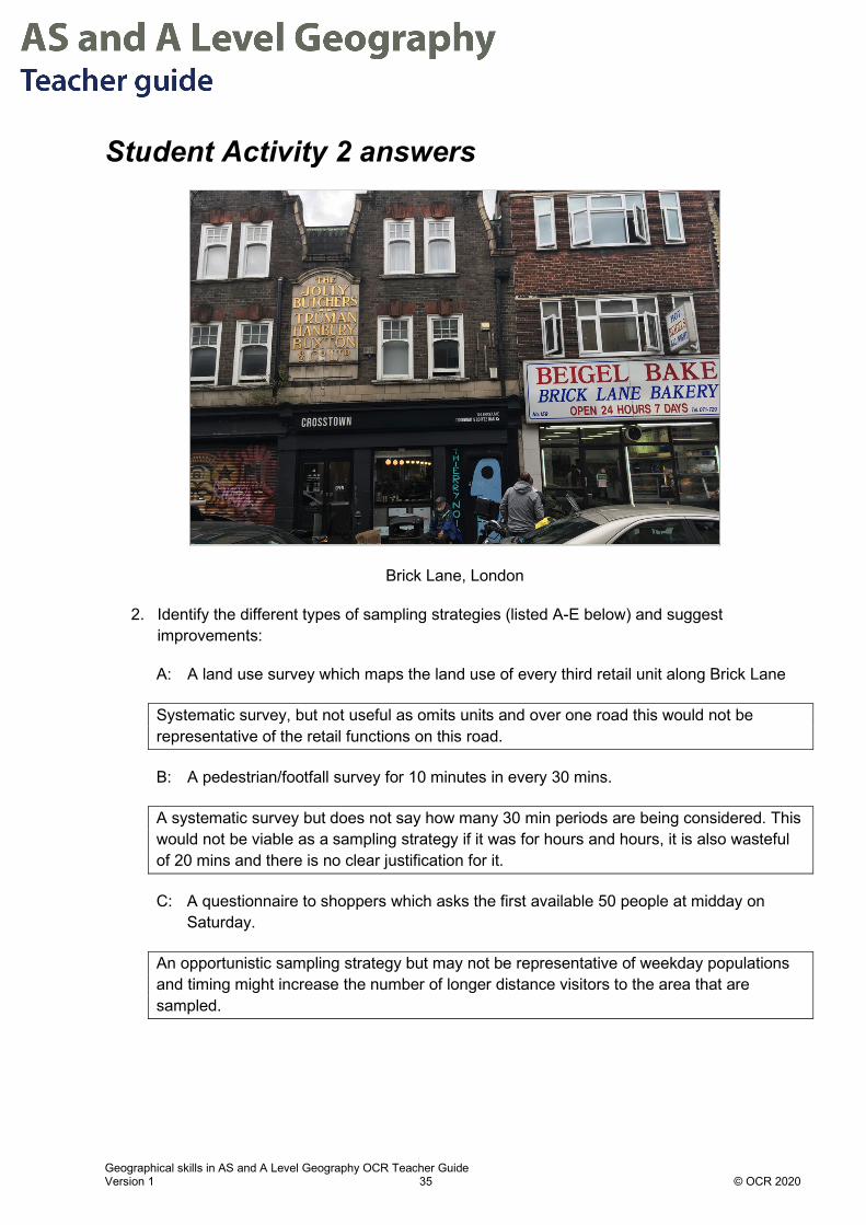
Student Activity 2 answers
Brick Lane, London
2. Identify the different types of sampling strategies (listed A-E below) and suggest improvements:
A: A land use survey which maps the land use of every third retail unit along Brick Lane
Systematic survey, but not useful as omits units and over one road this would not be representative of the retail functions on this road.
B: A pedestrian/footfall survey for 10 minutes in every 30 mins.
A systematic survey but does not say how many 30 min periods are being considered. This would not be viable as a sampling strategy if it was for hours and hours, it is also wasteful of 20 mins and there is no clear justification for it.
C: A questionnaire to shoppers which asks the first available 50 people at midday on Saturday.
An opportunistic sampling strategy but may not be representative of weekday populations and timing might increase the number of longer distance visitors to the area that are sampled.

Geographical skills in AS and A Level Geography OCR Teacher Guide Version 1 36 © OCR 2020
D: A bipolar survey on perceptions of environmental quality. Locations for the participants to take part in the survey are determined using a random number generator to give a distance from the start of the road.
Bipolar surveys measure variables on a scale where the ends of the scale are opposites, for example:
-2 -1 0 1 2
Area has no green space
Area has ample green space
This is an example of bipolar fieldwork scale: bipolar fieldwork scale
An opportunistic sampling strategy at randomly spatial locations, this could avoid researcher bias in collecting all responses around busy parts of the road, but it could also lead to clustering of locations where the responses are made.
E: An environmental quality assessment of the retail and residential area around Brick Lane, Tower Hamlets. The proportion of retail and residential frontage is calculated using Google Street View and then the survey is carried out in locations related to these proportions. The locations are point samples taken looking due East.
A stratified sampling strategy which will take into account different types of land use in proportion to the occurrence in the urban environment. The survey does not say how the point samples are selected in the areas or how retail/residential streets will be selected and so it is vague

Geographical skills in AS and A Level Geography OCR Teacher Guide Version 1 37 © OCR 2020
Chapter 4.1 – Frequency distributions: lines, curves and skew Frequency distributions Frequency is used to refer to the number of times something occurs in a given sample. Frequency distribution is the way in which the frequency varies within a population. Frequency distributions are often shown graphically.
To display larger data sets effectively the data is grouped into classes and displayed in tables. For example, for a population these could be age categories, for beach sediments these might be phi sizes.
How to generate a frequency table It is important to ensure that the dispersion of the values in the sample are represented clearly by the classes chosen. If too few classes chosen, the dispersion of values will be impossible to see clearly.
Working out the classes and class width
Calculate the maximum number of classes = square root of the number of data values (√n)
Calculate the class width = range in data values divided by number of classes.
Example
1. Work out number of classes For example, a researcher collects age data from 35 participants. The data set has a range of 47 (with the youngest aged 18 and oldest aged 65. Therefore, the maximum number of classes = √35 = 5.92 (rounded up to 6)
2. Work out the class width Class width = 47/6 = 7.8 ≈ 8
3. Group data There are 6 classes and the class width is 8 so suitable classes could be chosen as:
18-25, 26-33, 34-41, 42-49, 50-57, 58-65
The age data can then be grouped into these classes to produce a frequency table.
Geographical skills in AS and A Level Geography OCR Teacher Guide Version 1 38 © OCR 2020
Histograms Histograms plot frequency data on the y-axis and display a continuous series of data, in groups, on the x-axis. The value of each bar is represented by its area. Often for ease of reading the classes on the x axis are equal in width. For example, field data shows measurements of the a axis of pebbles found on a rocky shoreline to the nearest cm and displayed in the table below.
Length of the a axis (cm) to nearest cm
Frequency
2≤ - <4 8
4≤ - <6 7
6≤ - <8 9
8≤ - <12 3
12≤ - <16 2
The data above is continuous data. The lengths are recorded to the nearest cm and therefore the groups should reflect this rounding.
Length of the a axis (cm) to nearest cm
Frequency
1.5≤ - <3.5 8
3.5≤ - <5.5 7
5.5≤ - <7.5 9
7.5≤ - <11.5 3
11.5≤ - <15.5 2
This data can be plotted as a histogram. When plotting note that the last two groups are larger than the first three, this must be taken into account when plotting – the area of the bars must be proportional to the frequency.
To account for this, frequency density can be plotted on the y-axis.
𝐹𝐹𝐹𝐹𝐹𝐹𝐹𝐹𝐹𝐹𝐹𝐹𝐹𝐹𝐹𝐹𝐹𝐹 𝑑𝑑𝐹𝐹𝐹𝐹𝑑𝑑𝑑𝑑𝑑𝑑𝐹𝐹 = 𝐹𝐹𝐹𝐹𝐹𝐹𝐹𝐹𝐹𝐹𝐹𝐹𝐹𝐹𝐹𝐹𝐹𝐹𝐶𝐶𝐶𝐶𝐶𝐶𝑑𝑑𝑑𝑑 𝑤𝑤𝑑𝑑𝑑𝑑𝑑𝑑ℎ
As the most common class width is 2cm a good choice for the frequency density is ‘frequency/2cm’.

Geographical skills in AS and A Level Geography OCR Teacher Guide Version 1 39 © OCR 2020
Length of the a axis (cm) to nearest cm Frequency Frequency
density/2cm 1.5≤ - <3.5 8 8 3.5≤ - <5.5 7 7 5.5≤ - <7.5 9 9
7.5≤ - <11.5 3 1.5 11.5≤ - <15.5 2 1
The results can then be plotted:
A histogram to show the length of a axis of clasts in pebble beach sample
Frequency distribution curves Frequency distributions are commonly shown as a line (usually a curve) called a frequency distribution curve, plotted through the mid-point of each bar.
Geographical skills in AS and A Level Geography OCR Teacher Guide Version 1 40 © OCR 2020
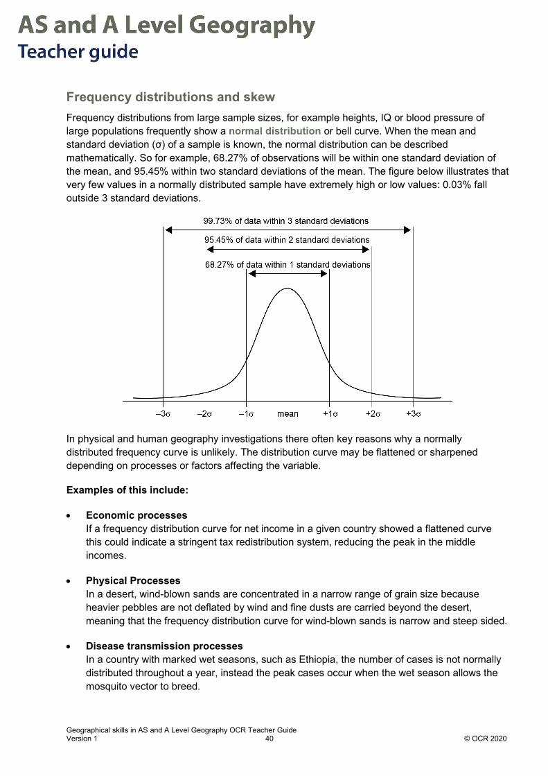
Frequency distributions and skew Frequency distributions from large sample sizes, for example heights, IQ or blood pressure of large populations frequently show a normal distribution or bell curve. When the mean and standard deviation (σ) of a sample is known, the normal distribution can be described mathematically. So for example, 68.27% of observations will be within one standard deviation of the mean, and 95.45% within two standard deviations of the mean. The figure below illustrates that very few values in a normally distributed sample have extremely high or low values: 0.03% fall outside 3 standard deviations.
In physical and human geography investigations there often key reasons why a normally distributed frequency curve is unlikely. The distribution curve may be flattened or sharpened depending on processes or factors affecting the variable.
Examples of this include:
• Economic processes If a frequency distribution curve for net income in a given country showed a flattened curve this could indicate a stringent tax redistribution system, reducing the peak in the middle incomes.
• Physical Processes In a desert, wind-blown sands are concentrated in a narrow range of grain size because heavier pebbles are not deflated by wind and fine dusts are carried beyond the desert, meaning that the frequency distribution curve for wind-blown sands is narrow and steep sided.
• Disease transmission processes In a country with marked wet seasons, such as Ethiopia, the number of cases is not normally distributed throughout a year, instead the peak cases occur when the wet season allows the mosquito vector to breed.

Geographical skills in AS and A Level Geography OCR Teacher Guide Version 1 41 © OCR 2020
Skewed distributions When a distribution is not symmetric it is referred to as a skewed distribution.
For example, in the natural environment sediments deposited in low and high energy coastal environments show differences in sorting and this can be seen as producing skewed distributions. In high energy environments the fine sediments can be winnowed offshore or even blown away leading to a greater proportion of pebbles and shingle and less sand. This gives a negatively skewed distribution, as shown below – more sediments are found in the larger classes.
Negative skew
However, in low energy environments large particles may be absent or there may be a concentration of smaller particles which can typically be moved at lower energy levels. This gives a positively skewed distribution, as shown below – more sediments are found in the smaller classes.
Positive skew
Processes in other environments can also show skewed distributions. For example, glacial environments may deposit sediments with a coarsely skewed distribution.

Geographical skills in AS and A Level Geography OCR Teacher Guide Version 1 42 © OCR 2020
Cumulative frequency diagrams Frequency data can also be plotted as a cumulative frequency curve. The cumulative frequency is a running total of the frequencies in a frequency table.
For example, the table below shows the number of visitors each month to the British Museum, London in 2019. The cumulative number is calculated by adding up the number of visitors for the current and all preceding months, e.g. the cumulative number for March is found by adding up the figures for January, February and March. The cumulative percentage is calculated by dividing the cumulative number by the annual total number of visitors (~6.2 million).
Month No. of visitors (000s) Cumulative No. of
visitors (000s) Cumulative % of
visitors
January 448 448 7.2
February 470 918 14.8
March 494 1412 22.7
April 487 1899 30.6
May 547 2446 39.4
June 578 3024 48.7
July 688 3712 59.8
August 639 4351 70.1
September 447 4798 77.3
October 523 5321 85.7
November 442 5763 92.8
December 445 6208 100.0
Visitors to the British Museum, London in 2019
Source: https://www.gov.uk/government/statistical-data-sets/museums-and-galleries-monthly-visits

Geographical skills in AS and A Level Geography OCR Teacher Guide Version 1 43 © OCR 2020
The points are plotted at the upper-class boundary. Cumulative frequency is plotted on the vertical axis.
How to find the median and quartiles The lower quartile, median and upper quartile can be added to a cumulative frequency graph. Draw horizontal lines at 1/4 of the total frequency, 1/2 of the total frequency and 3/4 of the total frequency, to read an estimate of the lower quartile, median and upper quartile where the line intersects the x axis. The interquartile range can also be estimated from this, see chapter 2.2.
0.0
10.0
20.0
30.0
40.0
50.0
60.0
70.0
80.0
90.0
100.0
Cum
ulat
ive
Perc
enta
ge (%
)
Month
Visitors to the British Museum, London in 2019

Geographical skills in AS and A Level Geography OCR Teacher Guide Version 1 44 © OCR 2020
Student Activity 1 - answers Specification Link: Disease Dilemmas 3.2.4.a Disease outbreak at a global scale
The figure below shows the daily deaths in the UK and Italy from the COVID-19 Pandemic for a two-week period in March 2020.
Source: World Health Organisation, 2020 https://covid19.who.int/
1. Suggest two advantages of presenting the data in this form.
0
100
200
300
400
500
600
700
800
900Daily deaths in the UK and Italy from the COVID-19
UK Italy
Variation across time is easy to recognise and identify.
UK and Italy’s death rate can be compared and the bars are placed next to each other rather than being plotted as a compound bar.
General rising trend in each country can be observed.

Geographical skills in AS and A Level Geography OCR Teacher Guide Version 1 45 © OCR 2020
2. Suggest two limitations with the data presented for comparing mortality from COVID-19 in the UK and Italy.
3. Identify two disadvantages in the presentation of the data.
No information on why the death rate is higher in Italy than UK.
Does not take into account the starting point of outbreak in each country, i.e. a significant factor in Italy’s larger numbers is that by 14 March 2020 the COVID-19 outbreak had been ongoing in Italy for longer than in the UK.
Countries have different ways of recording deaths related to COVID-19 depending on their health systems, leading to over and under counting of the fatalities from the virus. e.g. some countries only counted deaths occurring in hospitals.
The data for the UK is compressed on the x axis due to Italy’s relatively large numbers – this makes seeing variation in the UK data difficult.
The source of the data should be included
Since the 2020 pandemic lasted for an extended period this data may not be representative of the whole outbreak in the countries shown.

Geographical skills in AS and A Level Geography OCR Teacher Guide Version 1 46 © OCR 2020
Student Activity 2 - answers Specification Link: 2.2.2.1 Global Migration: What are the current spatial patterns in the numbers, composition and direction of international migrant flows, including examples of both inter-regional and intra-regional.
Kutupalong camp, Cox’s Bazar, Bangladesh has over 600,000 Rohingya refugees and is the world’s largest refugee camp. A large and sustained forced migration from Myanmar has driven this stateless minority into Bangladesh. The UNHCR are monitoring arrivals and published the demographic profile as a frequency graph.
Study Fig 2 and answer the questions below
Fig 2: Demographic Profile of Refugees in Cox’s Bazar, Bangladesh
Source: United Nations High Commissioner for Refugees https://data2.unhcr.org/en/documents/details/74676 Reproduced under Creative Commons Attribution 3.0 International License.

Geographical skills in AS and A Level Geography OCR Teacher Guide Version 1 47 © OCR 2020
1. Suggest two ways in which the age profile could be improved?
2. Suggest two reasons why the pattern shown could indicate forced and not voluntary
migration?
Source: https://data2.unhcr.org/en/documents/details/74676
Age categories are very uneven, and the working age population is large. For the children there are four age groups whereas there is no information on the breakdown of those over 60.
There are no absolute figures shown and so it would be hard for planners to determine school provision for example from the % of children 5-11.
There are very small differences between male and female and so it would also be valid to display the total population by age groups.
Every age category is present indicating a significant push factor acting on the population
Children have migrated in family groups with their parents which is not typical of voluntary labour migration
The gender ratio M:F is only slightly distorted. Slightly more females could indicate male deaths in conflict. Labour migration would usually preferentially recruit male or female into specific job sectors.
Geographical skills in AS and A Level Geography OCR Teacher Guide Version 1 48 © OCR 2020
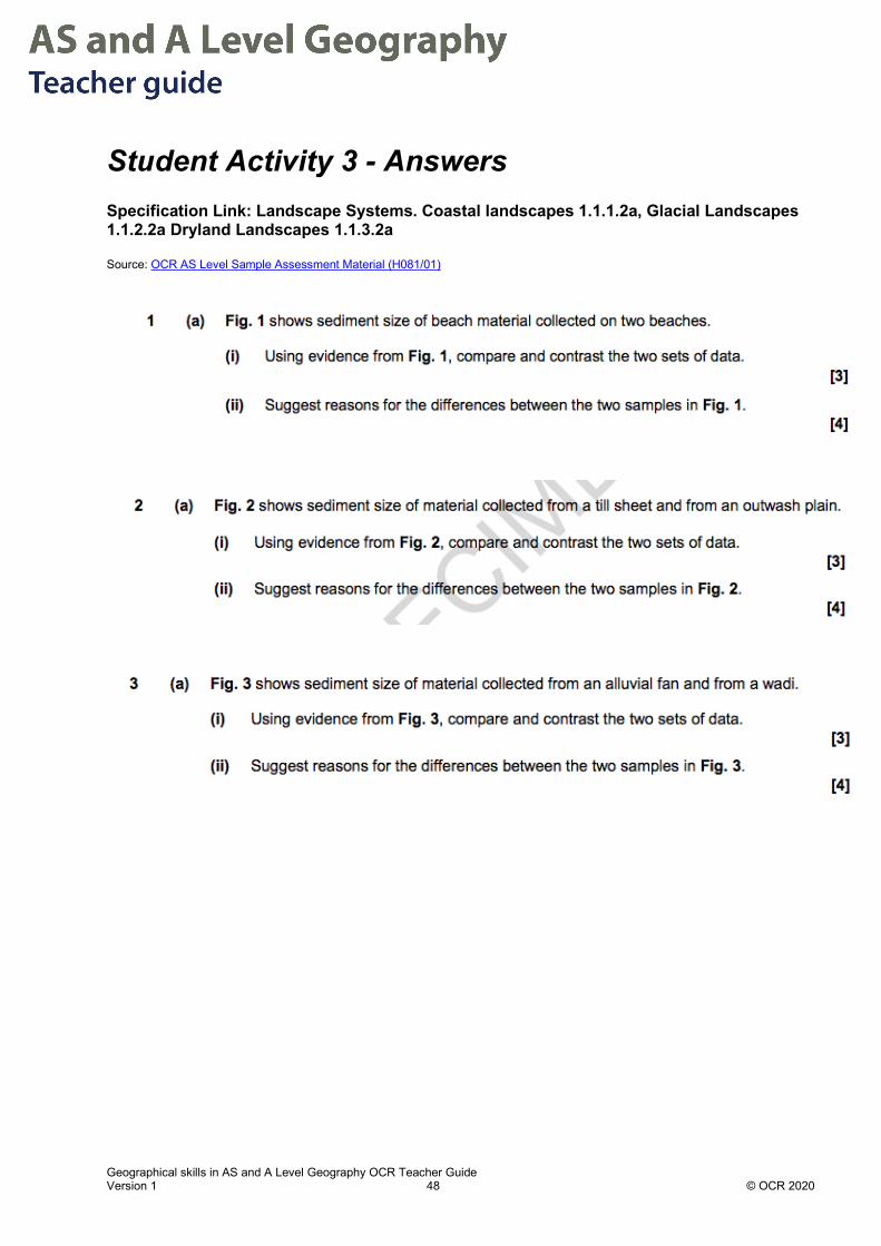
Student Activity 3 - Answers Specification Link: Landscape Systems. Coastal landscapes 1.1.1.2a, Glacial Landscapes 1.1.2.2a Dryland Landscapes 1.1.3.2a Source: OCR AS Level Sample Assessment Material (H081/01)
Geographical skills in AS and A Level Geography OCR Teacher Guide Version 1 49 © OCR 2020
Geographical skills in AS and A Level Geography OCR Teacher Guide Version 1 50 © OCR 2020
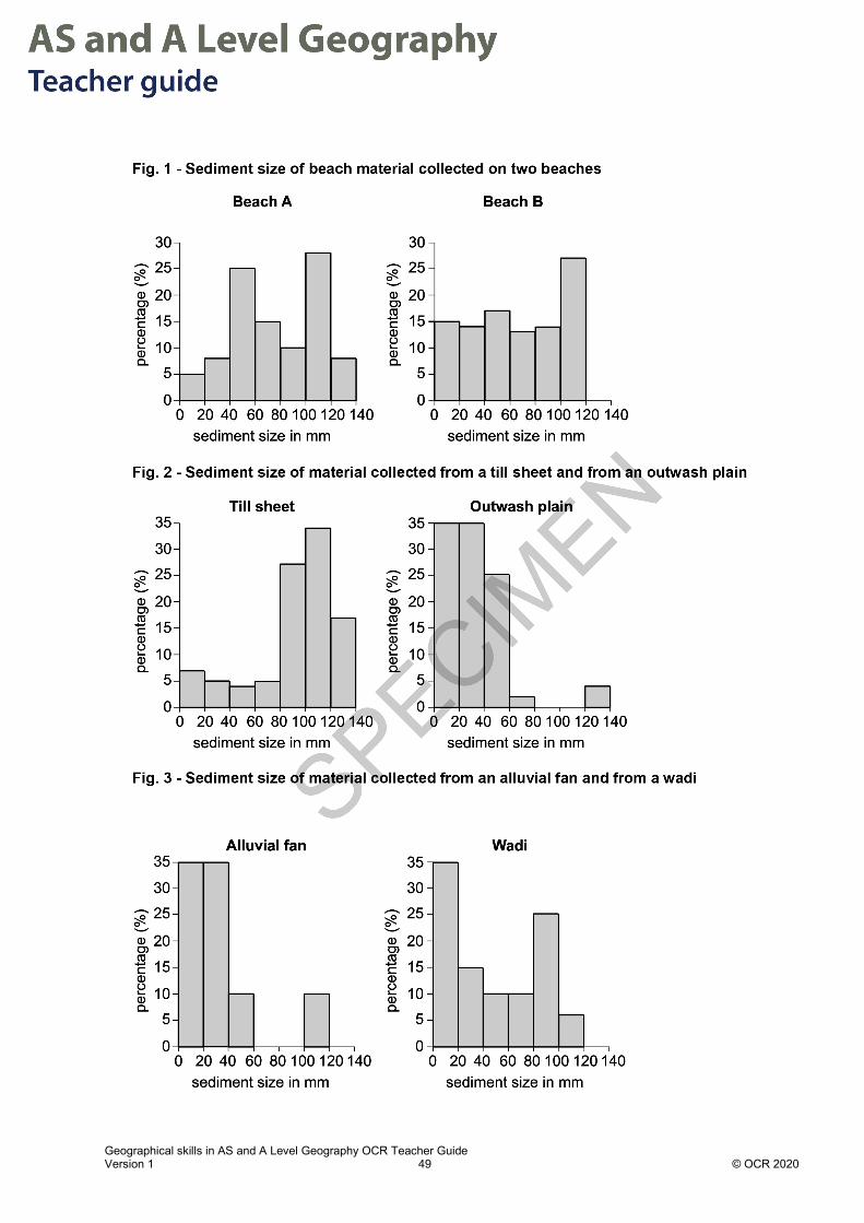
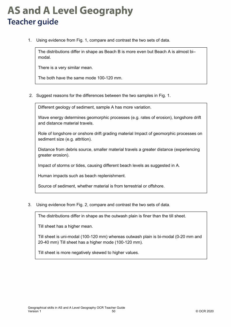
1. Using evidence from Fig. 1, compare and contrast the two sets of data.
2. Suggest reasons for the differences between the two samples in Fig. 1.
3. Using evidence from Fig. 2, compare and contrast the two sets of data.
The distributions differ in shape as Beach B is more even but Beach A is almost bi–modal.
There is a very similar mean.
The both have the same mode 100-120 mm.
Different geology of sediment, sample A has more variation.
Wave energy determines geomorphic processes (e.g. rates of erosion), longshore drift and distance material travels.
Role of longshore or onshore drift grading material Impact of geomorphic processes on sediment size (e.g. attrition).
Distance from debris source, smaller material travels a greater distance (experiencing greater erosion).
Impact of storms or tides, causing different beach levels as suggested in A.
Human impacts such as beach replenishment.
Source of sediment, whether material is from terrestrial or offshore.
The distributions differ in shape as the outwash plain is finer than the till sheet.
Till sheet has a higher mean.
Till sheet is uni-modal (100-120 mm) whereas outwash plain is bi-modal (0-20 mm and 20-40 mm) Till sheet has a higher mode (100-120 mm).
Till sheet is more negatively skewed to higher values.

Geographical skills in AS and A Level Geography OCR Teacher Guide Version 1 51 © OCR 2020
4. Suggest reasons for the differences between the two samples in Fig. 2.
5. Using evidence from Fig. 3, compare and contrast the two sets of data.
6. Suggest reasons for the differences between the two samples in Fig. 3.
Outwash is finer as sorted and eroded by water. Till is coarser as less water sorting.
Different geology of sediment. Till sheet (e.g. clay, sand, gravels and boulders) and Outwash plain (e.g. from boulders to silt).
Outwash may have travelled some distance from source, so it is eroded via attrition.
Outwash is older so weathered down more.
Distance from glacier front, so outwash material is sorted.
Till is closer to the glacier front, only finer materials can be carried far from the glacial snout as energy falls.
The distributions differ in shape as wadi is more even and alluvial fan has smaller material.
The mean of the wadi data is bigger.
The alluvial fan data is bi-modal (0-20 mm and 20-40 mm) whereas the wadi data is uni-modal (0-20mm).
The alluvial fan data is more positively skewed.
The alluvial fan data is more uneven with 3 groups with a frequency of 0.
Different geology of materials, the larger material comprised of tougher more resistant rocks.
The conditions in which the alluvial fan and wadi were formed through the intensity of flow.
The alluvial fan is depositional whilst the wadi is more likely to be an erosional landform.
Distance from source of alluvial fan or wadi. The further from the source, the energy in the waterfalls, only finer materials are carried.
Age of the alluvial fan or wadi, the older landform the finer the material can be.
Role of other dryland processes e.g. wind in re–sorting deposited materials

Geographical skills in A Level Geography OCR Teacher Guide Version 1 52 © OCR 2020
Chapter 4.2 – Null hypothesis and significance testing The Null Hypothesis The null hypothesis is a statement that a researcher will continue to believe unless evidence is found to contradict it. The null hypothesis is often given the symbol Ho.
The null hypothesis (Ho) is constructed as a statement that there is no difference (or relationship or association) between two data sets or variables.
For example, for the variables of ‘beach gradient’ and ‘percentage of sand in the beach sediment’, a null hypothesis might be:
Ho: The beach gradient will show no decrease as the percentage of sand in the beach sediment increases.
A null hypothesis should always be accompanied by an alternative hypothesis. The alternative hypothesis will be true if the null hypothesis is found to be false. The alternative hypothesis is often given the symbol H1.
For our example above, an alternative hypothesis might be:
H1: The beach gradient will become less steep as the percentage of sand in the beach sediment increases.
Significance testing Geographers will often carry out experiments to test whether a null hypothesis is true or false. These experiments produce experimental results. But how does one assess whether the experimental results are actually due to some underlying cause rather than just being down to chance?
To allow for the effects of chance it is normal to assess experimental results to see if they are statistically significant. This can be achieved by setting a significance level. The significance level is often given the symbol of the Greek letter Rho (ρ).
The significance level quantifies the probability of the null hypothesis being false due to chance.
In geographical studies the significance level is normally chosen as either 5% (ρ = 0.05) or 1% (ρ = 0.01). The significance level is also known as the rejection level.
A 5% significance level means that there is only a 5% chance that the null hypothesis is false due to chance. This can also be stated as being 95% confident that a rejection of the null hypothesis has not occurred by chance.

Geographical skills in A Level Geography OCR Teacher Guide Version 1 53 © OCR 2020
For each statistical test published tables or graphs of critical values can be used to look up whether the results are statistically significant at the chosen significance level.
The critical value is used to decide whether the null hypothesis can be rejected.
One-tailed and two-tailed hypotheses A one-tailed hypothesis test is used if we predict that the data will show a change in a particular direction, e.g. an increase or a decrease. A two-tailed hypothesis test is used when we predict that the data will show a difference, but we do not know the direction, e.g. whether it will be larger or smaller.
Example 1 – One tailed hypotheses
An investigation was carried out measuring beach gradients and percentage of sand on the beach.
A one-tailed alternative hypothesis might be:
Null hypothesis, Ho: The beach gradient will show no decrease as the percentage of sand in the beach sediment increases.
Alternative hypothesis, H1: The beach gradient will become less steep as the percentage of sand in the beach sediment increases.
The H1 alternative hypothesis given above is an example of a one-tailed hypothesis because it predicts a direction to the change in the beach gradient.
Note that this hypothesis predicts a correlation between the beach gradient and the percentage of sand in the beach sediment and it is predicting this as a negative correlation (see Chapter 4.3, 4.4).
Example 2 – Two tailed hypotheses An experiment was carried out measuring environmental quality score (EQS) at various distances from a city centre along a defined transect.
Null hypothesis, Ho: There will be no difference between the EQS and distance from the city centre along the transect.
Alternative hypothesis, H1: There will be a significant difference between EQS and the distance from the city centre along the transect. (N.B. this is a two-tailed hypothesis)
A 5% significance level was chosen.
The EQS scores were obtained at 14 points along the transect and a Spearman’s rank statistical test was performed on the results (see Chapter 4.4 for more on Spearman’s rank).
The Spearman’s rank value for the results was calculated to be 0.235.

Geographical skills in A Level Geography OCR Teacher Guide Version 1 54 © OCR 2020
The critical value for Spearman’s rank at a 5% significance level for 14 data sets is 0.538.
See Critical Values Table in Chapter 4.4.
Since the Spearman’s rank of the results is below the critical value this indicates that there is no statistically significant correlation between the distance from the city centre and the environmental quality score. Therefore, in this case the null hypothesis cannot be rejected.

Geographical skills in AS and A Level Geography OCR Teacher Guide Version 1 55 © OCR 2020
Chapter 4.3 – Lines of best fit and scatterplots Testing relationships between data variables Geographical investigations often explore the relationship between variables in space and time. For example, variation in environmental quality vs distance, or temperature vs altitude each compare two variables. In these cases, graphs/scatterplots can be constructed, usually with the independent variable as the x axis.
The independent variable is the variable controlled by the researcher e.g. time between measurements, distance between measurements.
The dependent variable is the variable being studied by the researcher e.g. beach gradient, rate of flow.
If there is a trend in the data, a line of best fit (which may be a curve) should be drawn. A line of best fit must be drawn so that it achieves a balance of points above and below the line and minimises the distance of all data points from the line.
Common errors are:
1. To draw a line which connects all the data points or to force the line through the origin when this is not supported by the data.
2. To plot the independent and dependent variables on the wrong axes.
Dependent and Independent Variables Example of independent variable
Plot on x axis
Example of dependent variable
Plot on y axis
Distance Environmental quality
Time Population size
Time Number of cases of HIV
GDP per capita Value of exports by month
Size of beach sediment Beach gradient
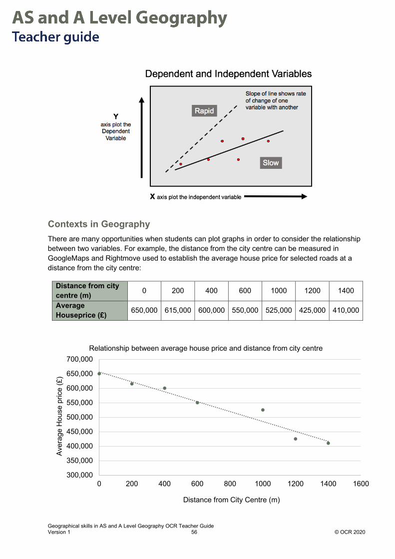
Geographical skills in AS and A Level Geography OCR Teacher Guide Version 1 56 © OCR 2020
Contexts in Geography There are many opportunities when students can plot graphs in order to consider the relationship between two variables. For example, the distance from the city centre can be measured in GoogleMaps and Rightmove used to establish the average house price for selected roads at a distance from the city centre:
Distance from city centre (m) 0 200 400 600 1000 1200 1400
Average Houseprice (£) 650,000 615,000 600,000 550,000 525,000 425,000 410,000
300,000
350,000
400,000
450,000
500,000
550,000
600,000
650,000
700,000
0 200 400 600 800 1000 1200 1400 1600
Aver
age
Hou
se p
rice
(£)
Distance from City Centre (m)
Relationship between average house price and distance from city centre

Geographical skills in AS and A Level Geography OCR Teacher Guide Version 1 57 © OCR 2020
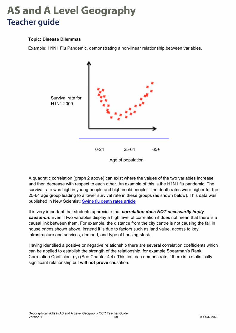
Using a scatterplot to identify a correlation between two variables
Mathematical concepts There are many types of correlation and in the absence of a mathematical procedure to calculate the correlation coefficient a lot of the interpretation comes down to judgement. The following graphs illustrate different types of correlation for two variables plotted against one another:
From GCSE (9-1) Mathematics students may only be familiar with line of best fit when it is a straight line. However, just because the data is not in a straight-line does not mean that there is no correlation or line of best fit.
A weak negative or positive linear correlation occurs when there is a large spread of values around a line of best fit as shown above graphs 4 & 5. Where the correlation is weak there may be significant outliers, points which lie above or below the other points, and affect how well the best fit line explains the data shown. Outliers are common in experimental and field data due to issues of inaccurate measurement or a lack of precision (see Chapter 6.1).
1 2 3 4
5 6 7 8
Geographical skills in AS and A Level Geography OCR Teacher Guide Version 1 58 © OCR 2020
A quadratic correlation (graph 2 above) can exist where the values of the two variables increase and then decrease with respect to each other. An example of this is the H1N1 flu pandemic. The survival rate was high in young people and high in old people – the death rates were higher for the 25-64 age group leading to a lower survival rate in these groups (as shown below). This data was published in New Scientist: Swine flu death rates article
It is very important that students appreciate that correlation does NOT necessarily imply causation. Even if two variables display a high level of correlation it does not mean that there is a causal link between them. For example, the distance from the city centre is not causing the fall in house prices shown above, instead it is due to factors such as land value, access to key infrastructure and services, demand, and type of housing stock.
Having identified a positive or negative relationship there are several correlation coefficients which can be applied to establish the strength of the relationship, for example Spearman’s Rank Correlation Coefficient (rs) (See Chapter 4.4). This test can demonstrate if there is a statistically significant relationship but will not prove causation.
Survival rate for H1N1 2009
0-24 25-64 65+
Age of population
Topic: Disease Dilemmas
Example: H1N1 Flu Pandemic, demonstrating a non-linear relationship between variables.
Geographical skills in AS and A Level Geography OCR Teacher Guide Version 1 59 © OCR 2020
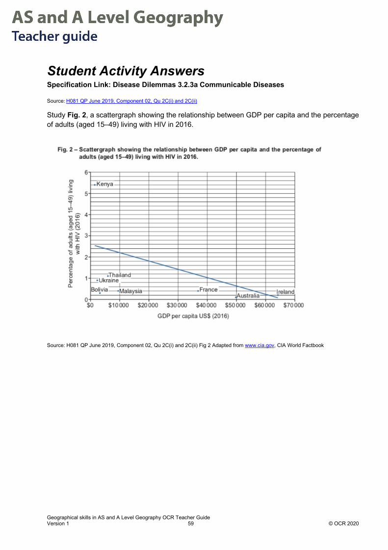
Student Activity Answers Specification Link: Disease Dilemmas 3.2.3a Communicable Diseases
Source: H081 QP June 2019, Component 02, Qu 2C(i) and 2C(ii)
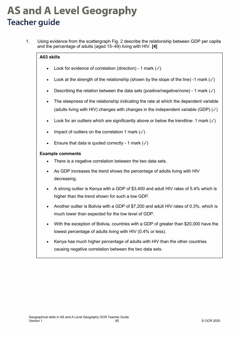
Study Fig. 2, a scattergraph showing the relationship between GDP per capita and the percentage of adults (aged 15–49) living with HIV in 2016.
Source: H081 QP June 2019, Component 02, Qu 2C(i) and 2C(ii) Fig 2 Adapted from www.cia.gov, CIA World Factbook
Geographical skills in AS and A Level Geography OCR Teacher Guide Version 1 60 © OCR 2020
1. Using evidence from the scattergraph Fig. 2 describe the relationship between GDP per capita and the percentage of adults (aged 15–49) living with HIV. [4]
A03 skills
• Look for evidence of correlation (direction) - 1 mark (✓)
• Look at the strength of the relationship (shown by the slope of the line) -1 mark (✓)
• Describing the relation between the data sets (positive/negative/none) - 1 mark (✓)
• The steepness of the relationship indicating the rate at which the dependent variable
(adults living with HIV) changes with changes in the independent variable (GDP) (✓)
• Look for an outliers which are significantly above or below the trendline- 1 mark (✓)
• Impact of outliers on the correlation 1 mark (✓)
• Ensure that data is quoted correctly - 1 mark (✓)
Example comments • There is a negative correlation between the two data sets.
• As GDP increases the trend shows the percentage of adults living with HIV
decreasing.
• A strong outlier is Kenya with a GDP of $3,400 and adult HIV rates of 5.4% which is
higher than the trend shown for such a low GDP.
• Another outlier is Bolivia with a GDP of $7,200 and adult HIV rates of 0.3%, which is
much lower than expected for the low level of GDP.
• With the exception of Bolivia, countries with a GDP of greater than $20,000 have the
lowest percentage of adults living with HIV (0.4% or less).
• Kenya has much higher percentage of adults with HIV than the other countries
causing negative correlation between the two data sets.

Geographical skills in AS and A Level Geography OCR Teacher Guide Version 1 61 © OCR 2020
2. Using evidence from Fig. 2, analyse reasons for differences in HIV rates between countries. [6]
This question includes AO2 (3 marks) and AO3 (3 marks).
For AO2 students need to apply their knowledge and understanding to analyse reasons for the differences in HIV rates between countries
• Proximity to initial place of origin of the disease in Sub-Sharan Africa.
• Risk of infection varies between countries for a variety of reasons including:
- Attitude to barrier contraception
- Infected blood transfusions in LIDCs
- Sharing needles and other injecting materials
• Education/status in society of mothers affects their awareness of ways to reduce risk of
transmission during pregnancy, childbirth and whilst breast feeding.
• Standard of medical care available (including access to barrier contraception) to mothers
and babies depends on a variety of factors including ability of families to access the
services that are available depending on:
- Availability of medical care due to wealth
- Distance from facilities, especially in LIDCs
- Urban or rural– usually urban residents can access services more easily, especially in
LIDCs
For AO3, once students have investigated and interpreted the data, they can use it as evidence in their response
• 5 countries have adult HIV rates under 0.4%, (France, Ireland, Australia, Malaysia and
Bolivia) – ACs / EDCs (except Bolivia) with ability to provide appropriate medical services.
• 2 countries have adult HIV rates around 1% (Ukraine and Thailand). Possible reasons
include
- difficult to afford the healthcare of richer nations
- limited education
- risk of infection is greater.
- The highest adult HIV rate is 5.4%, Kenya, an LIDC with the lowest GDP of those on the
graph, and it is closest to the original location of the disease in humans – the Congo.

Geographical skills in A Level Geography OCR Teacher Guide Version 1 62 © OCR 2020
Chapter 4.4 – Statistical tests for association: Spearman’s rank Spearman’s rank correlation coefficient is a statistical test that examines the degree to which two data sets are correlated, if at all.
What is Spearman’s rank? 1. Spearman’s rank gives a numerical value of the strength of a correlation between two
variables. It shows whether there is a positive correlation, a negative correlation or no correlation.
2. The Spearman’s rank correlation coefficient can be calculated effectively using this formula:
𝐹𝐹𝑠𝑠 = 1 − 6∑𝑑𝑑2
𝐹𝐹3 − 𝐹𝐹
3. Spearman’s rank uses paired values. This means that data set has the same number of data points and the data point in one data set is related to one, data point in the other data set.
4. It is recommended that a minimum of 10 paired values is used for the test. However,
published critical value tables for Spearman’s rank will often cover up to 30 or more pairs of values.
What does the result of the Spearman’s rank test mean? The Spearman’s rank correlation coefficient will always be between -1 and +1. The sign of the coefficient indicates the nature of the correlation – positive or negative. The value indicates how strong the correlation is. A value of 0 means no correlation, whereas a value of 1 means a perfect correlation.
-1
Indicating a perfect negative correlation
0
Indicating no correlation
+1
Indicating a perfect positive correlation

Geographical skills in A Level Geography OCR Teacher Guide Version 1 63 © OCR 2020
Worked example Data of mean sediment size was collected along a beach at seven locations.
In order to use Spearman’s rank correlation coefficient, first the data has to be ranked:
Distance along beach (m) Rank x
Mean sediment size (cm)
Rank y
5 10 5.9 1
20 9 4.5 3
25 8 4.6 2
35 7 4.2 5
50 6 4.3 4
70 5 3.6 6
90 4 2.9 7
100 3 1.3 8.5
115 2 1.3 8.5
130 1 0.9 10
Each variable is ranked from 1 to 10 with 1 being the highest and 10 being the lowest. Notice that for the mean sediment size there are two 1.3 cm items of data occupying the 8th and 9th highest ranks. Therefore, they are given the average rank of (8+9)/2 = 8.5.
Next find the difference between the ranks 𝑑𝑑 and then square 𝑑𝑑2:

Geographical skills in A Level Geography OCR Teacher Guide Version 1 64 © OCR 2020
Distance along
beach (m)
Rank x Mean sediment size (cm)
Rank y d d2
5 10 5.9 1 9 81
20 9 4.5 3 6 36
25 8 4.6 2 6 36
35 7 4.2 5 2 4
50 6 4.3 4 2 4
70 5 3.6 6 -1 1
90 4 2.9 7 -3 9
100 3 1.3 8.5 -5.5 30.25
115 2 1.3 8.5 -6.5 42.25
130 1 0.9 10 -9 81
Total 324.5
The sum of ∑𝑑𝑑2 is 324.5. Finally use the formula:
𝐹𝐹𝑠𝑠 = 1 − 6∑𝑑𝑑2
𝐹𝐹3 − 𝐹𝐹= 1 −
6 × 324.5103 − 10
= 1 − 1947990
= −0.967
To test to see if this is significant the critical value has to be found.
The critical value for the two-tailed test (𝐻𝐻0: There is no correlation between x and y) at the 5% level for 10 pairs of data (8 degrees of freedom) is 0.738.
As the test statistic 𝐹𝐹𝑠𝑠 = 0.967 > 0.738 (we ignore the sign) then we have evidence to reject 𝐻𝐻0 and accept 𝐻𝐻1; therefore we can say, with 95% confidence, there is a negative correlation between mean sediment size and distance along the beach.

Geographical skills in A Level Geography OCR Teacher Guide Version 1 65 © OCR 2020
Detailed Instructions Stages in the calculation What to remember
Stage 1: Devise H1 and H0 and set confidence level of 95%
H0 will always assume that there will be no relationship between the two variables.
Be careful to determine if your H1 hypothesis is one-tailed or two-tailed. (see Chapter 4.2)
Stage 1: Ranking x and y
Each data set is converted into ORDINAL scale by ranking numbers from highest rank to lowest rank
If the ranks are tied add the two positions together and divide by the number of positions which have tied rank, e.g. rank 2 and 3 have same value: 2+3/2 = 2.5. The next rank will be 4 as positions 2 and 3 are used up.
Stage 2: Find the difference between ranks (column d below).
Subtract to find the difference
Stage 3: Square the differences (d2) Square the difference which will remove any negative values
Stage 4: use the formula
n = the number of paired items in the data set 𝐹𝐹𝑠𝑠 = 1 −
6∑𝑑𝑑2
𝐹𝐹3 − 𝐹𝐹
Stage 5: Establish significance of result Calculate the degrees of freedom. This equals the number of paired variables.
Use the Statistical table for Spearman’s rank correlation coefficient.
Make sure you use the correct column in the table – to match your chosen significance level (e.g. 0.05) and one-tailed or two-tailed.
If the calculated value is less than the critical value then accept the null hypothesis.
If the calculated value is greater than the critical value then reject the null hypothesis and accept the alternative hypothesis.
Stage 6 Conclude your calculation with a statement.

Geographical skills in A Level Geography OCR Teacher Guide Version 1 66 © OCR 2020
Student Activity Answers - using Spearman’s Rank Correlation Coefficient Specification Link: 1.1.3.a Coastal Landforms evolve over time as climate changes.
The Westward Ho! Shingle Ridge in North Devon
Introduction
Westward Ho! Shingle ridge has pebbles and cobbles composed of fine-grained sandstone as seen above. The beach material is similar to the geology of cliffs to the south of the ridge in Bideford Bay. Rising sea levels, caused by eustatic sea level rise, in the Flandrian Transgression, 12,000BP moved much of the shingle onshore. Since then historic secondary sources show that the ridge is undergoing modification and its position is changing. Maps from 1800s show that the ridge moving landwards and recent surveys suggest that the supply of sediment is diminishing and the ridge is changing in width and height.
An A level investigation seeks to establish if the ridge gets lower and flatter the further north you travel on the ridge.
Primary data was collected at systematic intervals along the ridge. The height was measured using an automatic level.

Geographical skills in A Level Geography OCR Teacher Guide Version 1 67 © OCR 2020
Westward Ho, North Devon (Googlemaps – Satellite image)
© Google map data 2020
Pebble Ridge
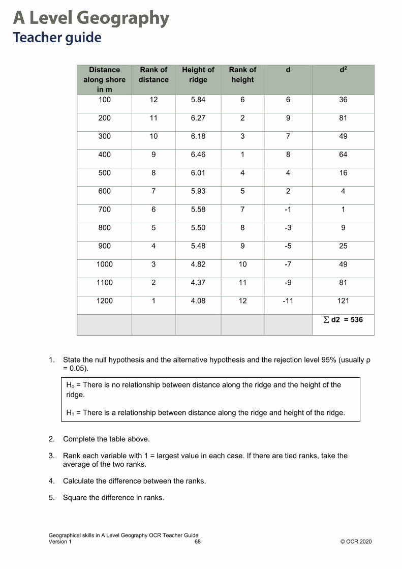
Geographical skills in A Level Geography OCR Teacher Guide Version 1 68 © OCR 2020
Distance along shore
in m
Rank of distance
Height of ridge
Rank of height
d d2
100 12 5.84 6 6 36
200 11 6.27 2 9 81
300 10 6.18 3 7 49
400 9 6.46 1 8 64
500 8 6.01 4 4 16
600 7 5.93 5 2 4
700 6 5.58 7 -1 1
800 5 5.50 8 -3 9
900 4 5.48 9 -5 25
1000 3 4.82 10 -7 49
1100 2 4.37 11 -9 81
1200 1 4.08 12 -11 121
∑ d2 = 536
1. State the null hypothesis and the alternative hypothesis and the rejection level 95% (usually ρ = 0.05).
2. Complete the table above.
3. Rank each variable with 1 = largest value in each case. If there are tied ranks, take the average of the two ranks.
4. Calculate the difference between the ranks.
5. Square the difference in ranks.
Ho = There is no relationship between distance along the ridge and the height of the ridge.
H1 = There is a relationship between distance along the ridge and height of the ridge.

Geographical skills in A Level Geography OCR Teacher Guide Version 1 69 © OCR 2020
6. Sum these squares.
7. Work out the Spearman’s Rank Correlation coefficient (rs) using the formula. The calculated
value will between –1 and +1.
𝐹𝐹𝑠𝑠 = 1 − 6∑𝑑𝑑2
𝐹𝐹3 − 𝐹𝐹
8. a) Test rs for significance by comparing the calculated value and critical value (using the
critical value table). If the calculated value (rs) is greater than the critical value, then you reject the null hypothesis and conclude that there is a significant correlation between “x” and “y”.
b) Explain what the calculated value of rs means and suggest why this trend might continue in
the future.
𝐹𝐹𝑠𝑠 = 1 − 6∑𝑑𝑑2
𝐹𝐹3 − 𝐹𝐹= 1 −
6 × 536123 − 12
= 1 − 32161716
= −0.874
The sum of ∑𝑑𝑑2 is 536.
Test rs for significance by comparing the calculated value and critical value (using the critical value table).
See critical values table.
In this example there are 12 sets of paired values so degrees of freedom = (n – 2) =10.
The critical value for rs at ρ = 0.05 is 0.648
The calculated value (rs) is -0.874 which is greater than the critical value, then you accept the H1 hypothesis and conclude that there is a significant correlation negative correlation between distance along the ridge and height of the ridge.
The result was greater the critical value which means that currently the relationship between distance along the ridge and height is significant. This implies that the ridge becomes significantly lower along the ridge and is consistent with the evidence that the supply of sediment to ridge has reduced (see introduction).
Geographical skills in A Level Geography OCR Teacher Guide Version 1 70 © OCR 2020
9. Based on the result what further data or questions would you need to collect to investigate the ridge.
1. What is the relationship between size of cobbles and distance along the ridge?
2. What is the relationship between size of cobbles and distance across the ridge?
3. Is there evidence of management of the ridge at the southern end which could affect the results?
4. How might movement of cobbles of different sizes vary?
5. How could the incident wave energy be assessed or researched to establish if this has an impact on this ridge and estuary system?

Geographical skills in A Level Geography OCR Teacher Guide Version 1 71 © OCR 2020
Chapter 4.5 – Statistical tests of difference: Chi Square Chi-square The chi-square test is a flexible test which aims to compare the expected frequencies with occurring frequencies. It tests how likely it is that the observed frequencies are due to chance.
A frequency is simply a count of the number of times something has happened. For example, if 200 people visit St Pauls Cathedral, we can say that the frequency of visitors was 200.
Expected frequencies are the counts that we would expect to occur in theory. For the chi-square test it is assumed that the expected frequencies are based on a uniform distribution. In other words, it is assumed that all categories will happen equally often. For example, if one is surveying 120 people about their type of dwelling and there are three categories (Detached, Semi-detached and Apartment) we would expect each type of dwelling to happen equally often, i.e. 40 in each of the 3 categories.
Occurring Frequencies are the actual counts that happen in reality. For example, in the above example the survey’s results might have counts of 32 Detached, 54 Semi-detached and 34 Apartment. These are the occurring frequencies.
Checklist for using the chi-square test: Needs data as frequencies Data needs to be grouped in categories Minimum 20 observed values The expected frequency in each category should be >4. This is good practice for this statistical
test, otherwise the test doesn’t give very reliable results.
The test takes two forms:
The one-sample case. This measures ‘goodness of fit’ of an observed set of frequencies with a theoretical frequency distribution.
The two sample case. This tests whether two attributes of a population tend to be associated, that is to occur together, or whether they occur independently of each other. The population is the total collection of all occurrences of the item being sampled. For example, when measuring pebble size on a beach, the population will be all the pebbles on the beach.
The formula for calculating the chi-square statistic in both cases is:
𝜒𝜒2 = �((𝑂𝑂 − 𝐸𝐸)2 ÷ 𝐸𝐸)
Geographical skills in A Level Geography OCR Teacher Guide Version 1 72 © OCR 2020
Where O = observed frequency of occurrences.
and E = expected (probable) frequency assuming uniform distribution
At the start of the test, the null (H0) and alternative (H1) hypotheses are stated and the significance level at which the test is to be carried out is decided (this is often 5% or below).
The significance level is the probability of rejecting the null hypothesis when it is true. For example, a significance level of 5% or 0.05 indicates a 5% risk of concluding that a difference exists when there is no actual difference.
Once the chi-square test statistic is calculated using the formula above, it is compared to a critical value to decide the outcome of the test. The critical value is determined by the degrees of freedom and the required significance level.
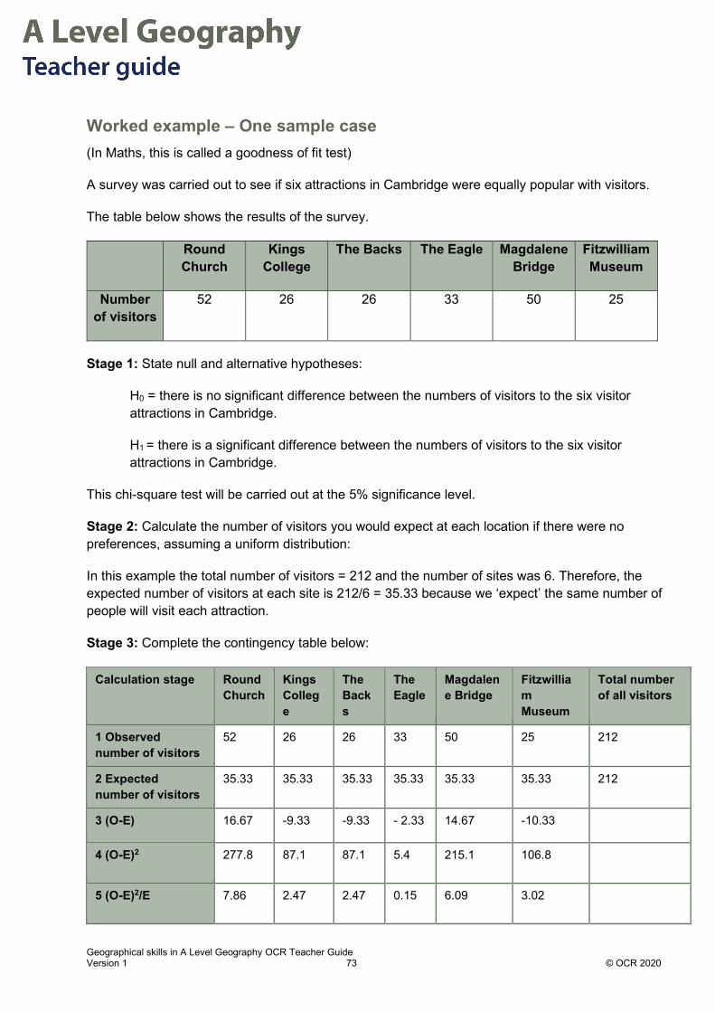
Geographical skills in A Level Geography OCR Teacher Guide Version 1 73 © OCR 2020
Worked example – One sample case (In Maths, this is called a goodness of fit test)
A survey was carried out to see if six attractions in Cambridge were equally popular with visitors.
The table below shows the results of the survey.
Round Church
Kings College
The Backs The Eagle Magdalene Bridge
Fitzwilliam Museum
Number of visitors
52 26 26 33 50 25
Stage 1: State null and alternative hypotheses:
H0 = there is no significant difference between the numbers of visitors to the six visitor attractions in Cambridge.
H1 = there is a significant difference between the numbers of visitors to the six visitor attractions in Cambridge.
This chi-square test will be carried out at the 5% significance level.
Stage 2: Calculate the number of visitors you would expect at each location if there were no preferences, assuming a uniform distribution:
In this example the total number of visitors = 212 and the number of sites was 6. Therefore, the expected number of visitors at each site is 212/6 = 35.33 because we ‘expect’ the same number of people will visit each attraction.
Stage 3: Complete the contingency table below:
Calculation stage Round Church
Kings College
The Backs
The Eagle
Magdalene Bridge
Fitzwilliam Museum
Total number of all visitors
1 Observed number of visitors
52 26 26 33 50 25 212
2 Expected number of visitors
35.33 35.33 35.33 35.33 35.33 35.33 212
3 (O-E) 16.67 -9.33 -9.33 - 2.33 14.67 -10.33
4 (O-E)2 277.8 87.1 87.1 5.4 215.1 106.8
5 (O-E)2/E 7.86 2.47 2.47 0.15 6.09 3.02

Geographical skills in A Level Geography OCR Teacher Guide Version 1 74 © OCR 2020
Stage 4: Calculate the chi-square statistic:
𝜒𝜒2= Σ((O-E)2/E) = 7.86 + 2.47 + 2.47 + 0.15 + 6.09 + 3.02 = 22.06
Stage 5: Calculate the degrees of freedom:
Degrees of freedom (v) = (number of classes -1). In this example, v = 6 – 1 = 5
The degrees of freedom are the number of observations that are free to vary to produce a known result, e.g. the mean.
Stage 6: Check the significance of this result using a table of chi-square values.
To locate the critical value in the table, read off the degrees of freedom (v) in the vertical axis and the significance level (p) in the horizontal axis, i.e. read off the value where v = 5 and p = 5% (see appendix for table of chi-square values)
The critical value at p = 5% when v = 5 is 11.07. The calculated value of 𝜒𝜒2 (22.06) exceeds the critical value (11.07) and so the H0 is rejected and H1 is accepted. In this case, there is sufficient evidence to suggest that there is a significant difference between the numbers of visitors to the six visitor attractions in Cambridge.
Worked example – Two sample case (In Maths, this is called a test for independence in a contingency table. It is testing whether two attributes (in this example, type of housing by gender) of the same population tend to be associated, that is to occur together, or whether they occur independently of each other).
A geography student was interested in the UK’s housing crisis. He investigated preferences of male and female 16-18 year olds for the type of housing unit they perceived as being the most favourable type to live in.
Below is the frequency table for the sample.
Male Female Total
Detached housing 16 15 31
Semi-detached housing 11 6 17
Apartment 7 5 12
Column total 34 26 60
Stage 1: State null and alternative hypotheses:
H0 = there will be no difference in the housing preference between male and female 16-18 year olds.

Geographical skills in A Level Geography OCR Teacher Guide Version 1 75 © OCR 2020
H1= there will be a significant difference in the housing preference between male and female 16-18 year olds.
This chi-square test will be carried out at the 5% significance level.
Stage 2: Calculate the number you would expect for each type of housing if there was no preference, assuming an even distribution:
The expected frequency for each cell is calculated using the formula:
Expected Frequencies = (column total x row total) / overall total
Giving:
Male Female Total
Detached housing
(34 x 31)/60 = 17.57 (26 x 31)/60 = 13.43 31
Semi-detached housing
(34 x 17)/60 = 9.63 (26 x 17)/60 = 7.37 17
Apartment (34 x 12)/60 = 6.80 (26 x 12)/60 = 5.20 12
Column total 34 26 60
Stage 4: Calculate the degrees of freedom:
Degrees of freedom (v) = (Number of Rows – 1) x (Number of Columns -1) = 2 x 1 = 2
Stage 5: Calculate the chi-square statistic:
The formula 𝜒𝜒2= Σ((O-E)2/E) needs to be calculated for each cell first.
Giving:
Male Female
Detached housing
(16 - 17.57)2/17.57 = 0.14
(15 - 13.43)2/13.43 = 0.18
Semi-detached housing
(11 - 9.63)2/9.63 = 0.19
(6 - 7.37)2/7.37 = 0.25
Apartment (7 - 6.80)2/6.80 = 0.01
(5 - 5.2)2/5.2 = 0.01

Geographical skills in A Level Geography OCR Teacher Guide Version 1 76 © OCR 2020
The values for all cells are then added together.
𝜒𝜒2 = 0.14 + 0.18 + 0.19 + 0.25 + 0.01 + 0.01 = 0.78
Stage 6: Check the significance of this result using a table of chi-square values.
The critical value at p = 5% when v = 2 is 5.99. The calculated value of 𝜒𝜒2 (0.78) is less than the critical value (5.99) and so the H0 is accepted and H1 is rejected. In this case there is no significant difference in the housing preference between male and female 16-18 year olds.

Geographical skills in A Level Geography OCR Teacher Guide Version 1 77 © OCR 2020
Student Activity Answers: One sample case Specification Link: Coastal Landscapes.
1.1.2.a. Coastal landforms develop due to a variety of interconnected climatic and geomorphic processes.
At Hunstanton, Norfolk, cliffs are eroding at around 3m every 10 years1. The cliffs are composed of three main rock types: Cretaceous chalk, red gault clay, and greensand sandstone. There are multiple mechanisms for the cliff retreat. They include wave action leading to undercutting and block fall from the top of the cliff and erosion of the cliff face by percolating groundwater running through joints in the rock2.
As the cliffs retreat the intertidal platform is covered with these three source rock types. The three source rocks are found in approximately equal abundance in the cliff face and it is assumed that they contribute equal amounts to the beach.
A sample of 600 pebbles was collected. 240 were chalk, 215 were greensand and 145 were gault clay.
Calculate the χ2 statistic and establish if the observed frequencies of rock types is significantly different from the expected frequencies.
To do this:
1. State Null (H0) and alternative (H1) hypotheses and the significance level.
2. Complete the table below, rows 1-5.
3. Calculate the total 𝜒𝜒2 value in row 6.
H0 = There is no significant difference between the proportions of rock types at the base of Hunstanton cliff.
H1= There is a significant difference between the proportions of rock types at the base of Hunstanton cliff
This chi-square test will be carried out at the 5% significance level.

Geographical skills in A Level Geography OCR Teacher Guide Version 1 78 © OCR 2020
4. Check if this result means there is/is not a significant difference from the expected frequencies.
5. Suggest a reason for the result referring to relevant intertidal processes and the effect of the
geology of these processes.
Sources 1. https://assets.publishing.service.gov.uk/government/uploads/system/uploads/attachment_data/file/340816/Final_Wash_East_consultation_document_final_180714.pdf 2. https://www.west-norfolk.gov.uk/info/20098/water_management_and_flooding/631/hunstanton_coastal_management_plan
Stage Calculation Chalk Greensand Gault clay
1 Observed (O) 240 215 145
2 Expected (E) 200 200 200
3 (O-E) 40 15 -55
4 (O-E)2 1600 225 3025
5 (O-E)2 /E 8 1.125 15.125
6 Σ((O-E)2/E) = 24.25
Degrees of freedom (v) = 3 – 1 =2
At p =5% the critical value for 2 degrees of freedom = 5.99. The calculated value for 𝜒𝜒2 (24.25) exceeds the critical value therefore H0 is rejected and H1 is accepted. There is sufficient evidence to suggest that there is a significant difference between the proportions of rock types at the base of Hunstanton cliff.
As these rocks are found in approximately equal proportions in the cliff but not on the intertidal platform it suggests that the green sand and particularly the gault clay are being more rapidly eroded by attrition in the swash zone. This is likely to be attributed to the greensand and gault clay being less resistant to erosion because they are weakly cemented or are soft unconsolidated sediments. Although chalk is also soft (Mohs hardness = 1) it is more resistant to erosion and tends to fall in large jointed blocks which mean it takes longer to breakdown.

Geographical skills in A Level Geography OCR Teacher Guide Version 1 79 © OCR 2020
Chapter 4.6 – Statistical tests of Difference: Mann-Whitney U test What is this test for? This test is used to investigate whether there is a significant difference between two separate populations or sets of data.
When can it be used? The test is non-parametric which means that it does not require the data to be normally distributed (see Chapter 4.1 for more on the normal distribution).
The test compares ranked data between two sets – for example, this could be between two geographical areas or zones.
The sample size of each data set should be between 5 and 20, and it is a useful test for A level investigations when the sample size is small.
The number of values in each data set do not have to be equal.
The test focuses on the difference between the two medians of the data sets (see Chapter 2.1 for more on means).
Tests can be one-tailed or two-tailed. In geography, we are normally testing for difference without specifying the direction (i.e. greater than or less than), so we predominantly conduct two-tailed tests.
The results are tested for significance using suitable statistical tables (see the appendix).
The significance level is the probability of rejecting the null hypothesis when it is true. For example, a significance level of 5% or 0.05 indicates a 5% risk of concluding that a difference exists when there is no actual difference.
If your significance level is 5% or 0.05, the corresponding confidence level is 1 – 0.05 = 0.95 or 95%.
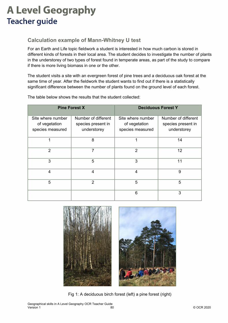
Geographical skills in A Level Geography OCR Teacher Guide Version 1 80 © OCR 2020
Calculation example of Mann-Whitney U test For an Earth and Life topic fieldwork a student is interested in how much carbon is stored in different kinds of forests in their local area. The student decides to investigate the number of plants in the understorey of two types of forest found in temperate areas, as part of the study to compare if there is more living biomass in one or the other.
The student visits a site with an evergreen forest of pine trees and a deciduous oak forest at the same time of year. After the fieldwork the student wants to find out if there is a statistically significant difference between the number of plants found on the ground level of each forest.
The table below shows the results that the student collected:
Pine Forest X Deciduous Forest Y
Site where number of vegetation
species measured
Number of different species present in
understorey
Site where number of vegetation
species measured
Number of different species present in
understorey
1 8 1 14
2 7 2 12
3 5 3 11
4 4 4 9
5 2 5 5
6 3
Fig 1: A deciduous birch forest (left) a pine forest (right)

Geographical skills in A Level Geography OCR Teacher Guide Version 1 81 © OCR 2020
Stage 1: Set up hypotheses and significance level:
H0 – there is no significant difference in the number of plants in the two areas.
H1 – there is a significant difference in the number of plants in the two areas.
This test will be carried out at the 5% significance level.
As we are testing for difference in either direction, this is a two-tailed test.
Stage 2: Rank order the data:
Rank (put in order from lowest to highest number) all scores together; ignore which groups the ranks are associated to:
Site where number of vegetation species
measured
Number of different species present in
understorey
Rank
x5 2 1
y6 3 2
x4 4 3
x3 5 4
y5 5 5
x2 7 6
x1 8 7
y4 9 8
y3 11 9
y2 12 10
y1 14 11
In looking at the rank scores - there is a problem. Two scores are both 5 (highlighted in red). At these sites there were the same number of species in the quadrat in each forest. In such cases, the rank order for each of these double values are added together and divided by two (or divide by how ever many areas had rated similar scores).

Geographical skills in A Level Geography OCR Teacher Guide Version 1 82 © OCR 2020
For example - The species result of “5” has the rank order of 4 and 5.
4 + 5 = 9
Divide this by 2 = 4.5
Therefore, when species result of “5” is given a rank – it will not be of the values of 4 or 5 but 4.5.
Organise the data with their corresponding ranks back into the two data sets as follows:
Pine Forest X Deciduous Forest Y
Site where number of vegetation
species measured
Number of different species
present in understorey
Rank Site where number of vegetation
species measured
Number of different species
present in understorey
Rank
1 8 7 1 14 11
2 7 6 2 12 10
3 5 4.5 3 11 9
4 4 3 4 9 8
5 2 1 5 5 4.5
6 3 2
(This symbol ∑ is called sigma, meaning 'sum of’).
Stage 3: Calculate the sum of ranks (∑):
Add up all the ranks for Pine Forest X, to get value of ∑rx
∑rx = 7 + 6 + 4.5 +3 +1 = 21.5
Add up all the ranks for Deciduous Forest Y, to get value of ∑ry
∑ry = 11 + 10 + 9 +8 + 4.5 +2 = 44.5
Stage 4: Calculate Ux and Uy using the Mann-Whitney formula.
For data set X:
𝑈𝑈𝑥𝑥 = 𝐹𝐹𝑥𝑥 .𝐹𝐹𝑦𝑦 + �𝐹𝐹𝑥𝑥(𝐹𝐹𝑥𝑥 + 1)
2 � −�𝐹𝐹𝑥𝑥

Geographical skills in A Level Geography OCR Teacher Guide Version 1 83 © OCR 2020
where 𝐹𝐹𝑥𝑥 and 𝐹𝐹𝑦𝑦 are the number of data points in data sets X and Y
For data set Y:
𝑈𝑈𝑦𝑦 = 𝐹𝐹𝑥𝑥 .𝐹𝐹𝑦𝑦 + �𝐹𝐹𝑦𝑦�𝐹𝐹𝑦𝑦 + 1�
2 � −�𝐹𝐹𝑦𝑦
Therefore
𝑈𝑈𝑥𝑥 = (5 × 6) + �5(5 + 1)
2 � − 21.5 = 23.5
and
𝑈𝑈𝑦𝑦 = (5 × 6) + �6(6 + 1)
2 � − 44.5 = 6.5
Stage 5: Read off the critical value from the Mann-Whitney test critical values table:
For our example, 𝐹𝐹𝑥𝑥 = 5 and 𝐹𝐹𝑦𝑦 = 6,our significance level is 5% and this is a two-tailed test, (see appendix for table of Mann-Whitney test critical values – please note that the table uses m and n instead of nx and ny)
The critical value is 3.
In order to determine whether this research is significant, the smaller calculated value of U has to be equal or less than the critical value of U.
The value of 𝑈𝑈𝑦𝑦 (6.5) is higher than the critical value (3). Therefore, the two data sets are not significantly different at the 5% significance level. This means that the student can conclude that based on their data there was not a statistically significant difference between the number of plants species found in the pine and deciduous forests, i.e. they should accept the null hypothesis.
Stage 6: Interpretation
The study indicated an insignificant difference between the number of species in the understorey in the two forests. Interpretation and discussion could consider the following:
• There were relatively few sites sampled, the fewer the samples the lower the critical value of U;
• The student might consider if the forests are representative of storage in other temperate forests. For example, Figure 1 shows a very small stand of young birch trees.
• The student might consider other variables which could affect the result including for example the age of the trees and how this might affect understorey carbon stores, or how management may affect it.
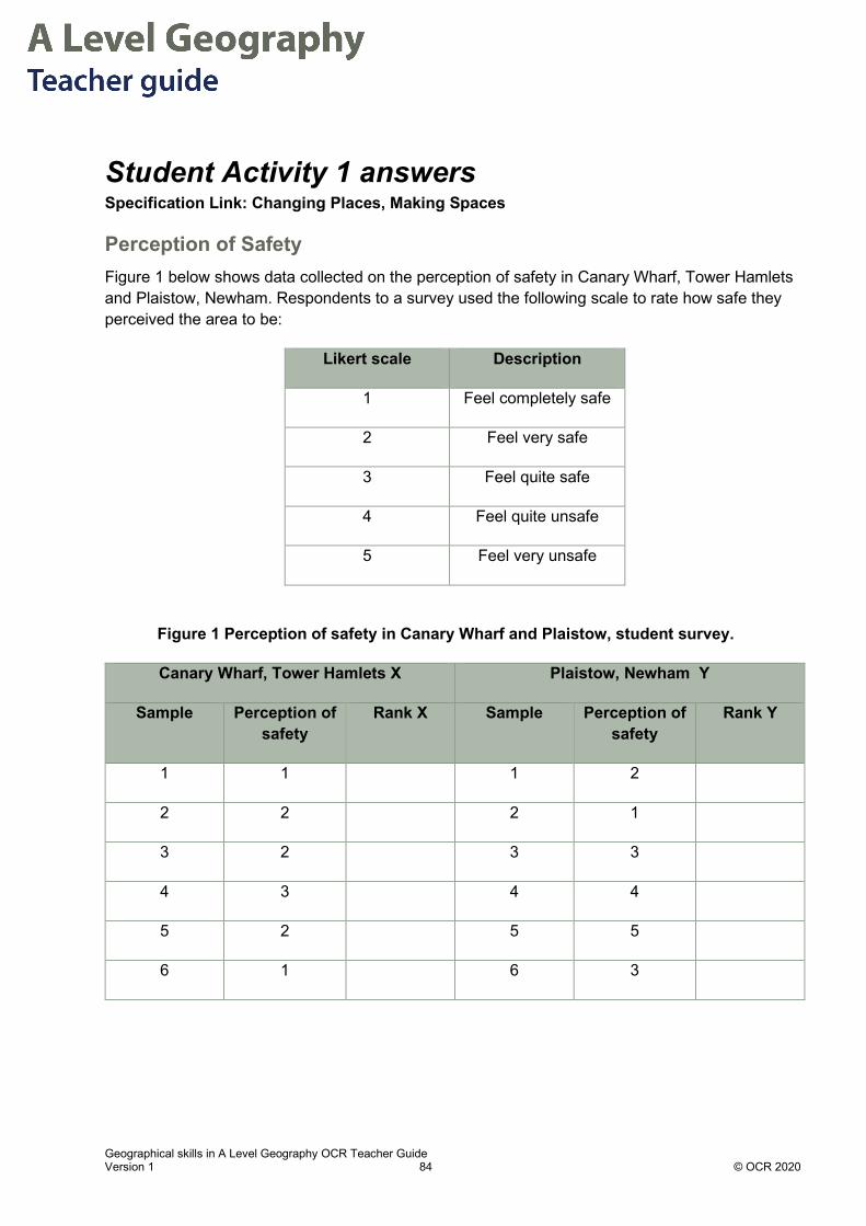
Geographical skills in A Level Geography OCR Teacher Guide Version 1 84 © OCR 2020
Student Activity 1 answers Specification Link: Changing Places, Making Spaces
Perception of Safety Figure 1 below shows data collected on the perception of safety in Canary Wharf, Tower Hamlets and Plaistow, Newham. Respondents to a survey used the following scale to rate how safe they perceived the area to be:
Likert scale Description
1 Feel completely safe
2 Feel very safe
3 Feel quite safe
4 Feel quite unsafe
5 Feel very unsafe
Figure 1 Perception of safety in Canary Wharf and Plaistow, student survey.
Canary Wharf, Tower Hamlets X Plaistow, Newham Y
Sample Perception of safety
Rank X Sample Perception of safety
Rank Y
1 1 1 2
2 2 2 1
3 2 3 3
4 3 4 4
5 2 5 5
6 1 6 3

Geographical skills in A Level Geography OCR Teacher Guide Version 1 85 © OCR 2020
1. State H0 and H1
2. Calculate Ux and Uy
H0 = There is no significant difference in the perception of safety in Canary Wharf and Plaistow.
H1 = There is a significant difference in the perception of safety in Canary Wharf and
Plaistow
Sample Perception of safety Rank
x1 1 1
x6 1 2
y2 1 3
x2 2 4
x3 2 5
x5 2 6
y1 2 7
x4 3 8
y3 3 9
y6 3 10
y4 4 11
y5 5 12
Rank 1 becomes (1 +2 +3) ÷ 3 = 2
Rank 2 becomes (4 + 5 + 6 + 7) ÷ 4 = 5.5
Rank 3 becomes (8 + 9 + 10) ÷ 3 = 9

Geographical skills in A Level Geography OCR Teacher Guide Version 1 86 © OCR 2020
3. Establish the significance of the result at the 5% significance level.
As we are testing for difference in either direction, this is a two-tailed test.
Reading off at m = 6, n = 6, 5% significance level for a two-tailed test gives a critical value of 5.
Since our lower U value (8.5) is more than the critical value of U (5) we accept the null
hypothesis and reject the H1 hypothesis – we cannot be 95% confident that there is a
significant difference in the perception of safety in Canary Wharf and Plaistow.
Canary Wharf, Tower Hamlets X Plaistow, Newham Y
Sample Perception of safety
Rank X Sample Perception of safety
Rank Y
1 1 2 1 2 5.5
2 2 5.5 2 1 2
3 2 5.5 3 3 9
4 3 9 4 4 11
5 2 5.5 5 5 12
6 1 2 6 3 9
ΣUx 29.5 ΣUy 48.5
𝑈𝑈𝑥𝑥 = (6 × 6) + �6(6 + 1)
2 � − 29.5 = 27.5
𝑈𝑈𝑦𝑦 = (6 × 6) + �6(6 + 1)
2 � − 48.5 = 8.5

Geographical skills in A Level Geography OCR Teacher Guide Version 1 87 © OCR 2020
4. Suggest two limitations of the use of this statistical test on this data.
The sample size is small and may not be representative of the populations in these areas.
The research did not state if a specific gender, ethnicity or age group was being compared, without this it is unlikely that the small sample will be valid.
Likert scales are useful, but many respondents pick the middle values and respondents may understand the word ‘safe’ differently.

Geographical skills in A Level Geography OCR Teacher Guide Version 1 88 © OCR 2020
Student Activity 2 answers Specification Link: Earth and Life Support Systems 1.2.2.a. How do the water and carbon cycles operate in contrasting locations? Tropical Rainforest
Effects of Deforestation A study in the Rio Negro drainage basin, Amazonia, Brazil showed the following results in maximum overland flow in 1999 and 2015:
Maximum overland flow discharge from selected rainfall events 1998 (X)
Maximum overland discharge from selected rainfall events 2015 (Y)
Event Discharge (m3s-1 )
Rank X Event Discharge (m3s-1 )
Rank Y
1 10.30 1 21.4
2 9.36 2 26.7
3 11.70 3 50.8
4 27.3 4 43.5
5 1.56 5 20.2
6 7.80
1. State H0 and H1
H0 = There is no significant difference between discharge in the Rio Negra basin in 1998 and 2015.
H1 = There is a significant difference between discharge in the Rio Negra basin in 1998 and 2015.

Geographical skills in A Level Geography OCR Teacher Guide Version 1 89 © OCR 2020
2. Calculate Ux and Uy
3. Establish the significance of the result at the 5% significance level.
Maximum overland flow discharge from selected rainfall events 1998 (X)
Maximum overland discharge from selected rainfall events 2015 (Y)
Event Discharge (m3s-1 )
Rank X Event Discharge (m3s-1 )
Rank Y
1 10.30 4 1 21.4 7
2 9.36 3 2 26.7 8
3 11.70 5 3 50.8 11
4 27.3 9 4 43.5 10
5 1.56 1 5 20.2 6
6 7.80 2
ΣUx 24 ΣUy 42
𝑈𝑈𝑥𝑥 = (6 × 5) + �6(6 + 1)
2 � − 24 = 27
𝑈𝑈𝑦𝑦 = (6 × 5) + �5(5 + 1)
2 � − 42 = 3
As we are testing for difference in either direction, this is a two-tailed test.
Critical value for U is 3 at the 5% significance level for a two-tailed test. Since our lower
U value (3) is the same as the critical value of U (3) we can reject the null hypothesis
and accept the H1 hypothesis – we can be 95% confident that there was a significant
difference between the discharge in the Rio Negra basin in 1998 and 2015.

Geographical skills in A Level Geography OCR Teacher Guide Version 1 90 © OCR 2020
4. Suggest reasons for the result, referring to flows and stores of the hydrological cycle.
Deforestation in the Rio Negra catchment has increased the overland flows. This is
because there is less interception, less interception loss, less infiltration and therefore
less throughflow and ground water flow. The discharge increases because water is
moving faster through quickflow processes and bypassing the slower flows through soil
and bedrock. This leads to increased risk of flooding and flashier hydrographs.

Geographical skills in A Level Geography OCR Teacher Guide Version 1 91 © OCR 2020
Chapter 4.7 – Statistical tests of difference: t-test The Student’s t-test is a statistical test that compares means of two samples to establish if there is a statistically significant difference between them.
It is a parametric test and assumes that the two sets of data are random samples from a normally distributed population or from two identically distributed populations.
It should only be used where the researcher has good reasons to assume that the population is normally distributed. If this is not the case the Mann-Whitney U test is a better alternative.
How to calculate the t test 1. Set up null (H0) and alternative (H1) hypotheses and decide on the level of significance. For
example:
H0 = There is no statistically significant difference between the means.
H1 = There is a statistically significant difference between the means.
This t-test will be carried out at the 5% significance level.
The significance level is the probability of rejecting the null hypothesis when it is true. For example, a significance level of 5% or 0.05 indicates a 5% risk of concluding that a difference exists when there is no actual difference (it is often set at 5% or below).
In this example, we are testing for difference without specifying the direction (i.e. greater than or less than), so this would be a two-tailed test.
2. Calculate mean (�̅�𝑥) and standard deviation (s) for each sample. See Chapter 2.1 for an explanation of how to calculate mean and standard deviation.
Please note that squaring the standard deviation (s2) gives the variance.
3. Calculate the T test statistic by applying the formula for the two-sample t-test:
2
( )
1 1a b
pa b
x xT
sn n
−=
+
where 2 2
2 ( 1) ( 1)2
a a b bp
a b
n s n ssn n
− + −=
+ −
�̅�𝑥𝑎𝑎 and �̅�𝑥𝑏𝑏 are the means of the two data sets, a and b. sa and sb are the standard deviations of the two data sets, a and b. na and nb are the numbers of values in the two data sets, a and b.
2ps is the unbiased pooled estimator (this pools the variances of both samples).
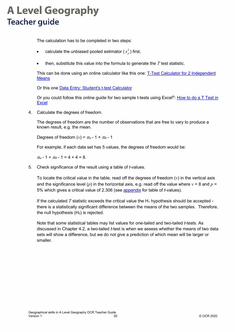
Geographical skills in A Level Geography OCR Teacher Guide Version 1 92 © OCR 2020
The calculation has to be completed in two steps:
• calculate the unbiased pooled estimator ( 2ps ) first,
• then, substitute this value into the formula to generate the T test statistic.
This can be done using an online calculator like this one: T-Test Calculator for 2 Independent Means
Or this one Data Entry: Student's t-test Calculator
Or you could follow this online guide for two sample t-tests using Excel®: How to do a T Test in Excel
4. Calculate the degrees of freedom.
The degrees of freedom are the number of observations that are free to vary to produce a known result, e.g. the mean.
Degrees of freedom (v) = na - 1 + nb - 1
For example, if each data set has 5 values, the degrees of freedom would be:
na - 1 + nb - 1 = 4 + 4 = 8.
5. Check significance of the result using a table of t-values.
To locate the critical value in the table, read off the degrees of freedom (v) in the vertical axis and the significance level (p) in the horizontal axis, e.g. read off the value where v = 8 and p = 5% which gives a critical value of 2.306 (see appendix for table of t-values).
If the calculated T statistic exceeds the critical value the H1 hypothesis should be accepted - there is a statistically significant difference between the means of the two samples. Therefore, the null hypothesis (H0) is rejected.
Note that some statistical tables may list values for one-tailed and two-tailed t-tests. As discussed in Chapter 4.2, a two-tailed t-test is when we assess whether the means of two data sets will show a difference, but we do not give a prediction of which mean will be larger or smaller.

Geographical skills in A Level Geography OCR Teacher Guide Version 1 93 © OCR 2020
Worked example Specification Link: Changing Places; Making Spaces
2.1.2.a How do we understand place?
A student carried out an investigation into the place perception of Manchester city centre for male and female residents of that city. As part of the investigation the student assessed knowledge of city centre landmarks by giving each participant a photo sheet with key landmarks in the city. The student was using this test as a proxy for attachment and civic pride in the city. The participant was asked to name the key landmarks and the student timed the responses. The results by gender are shown in the table below:
Male (𝒙𝒙𝒂𝒂) Time taken (s) Female (𝒙𝒙𝒃𝒃) Time taken (s)
1 108 1 48
2 90 2 32
3 45 3 49
4 50 4 65
5 35 5 70
6 75 6 38
7 57 7 51
The null and alternative hypotheses can be stated as:
H0 = There is no statistically significant difference between the mean time taken for males and females.
H1 = There is a statistically significant difference between the mean time taken for males and females.
This t-test will be carried out at the 5% significance level.
As we are testing for difference in either direction, this is a two-tailed test.
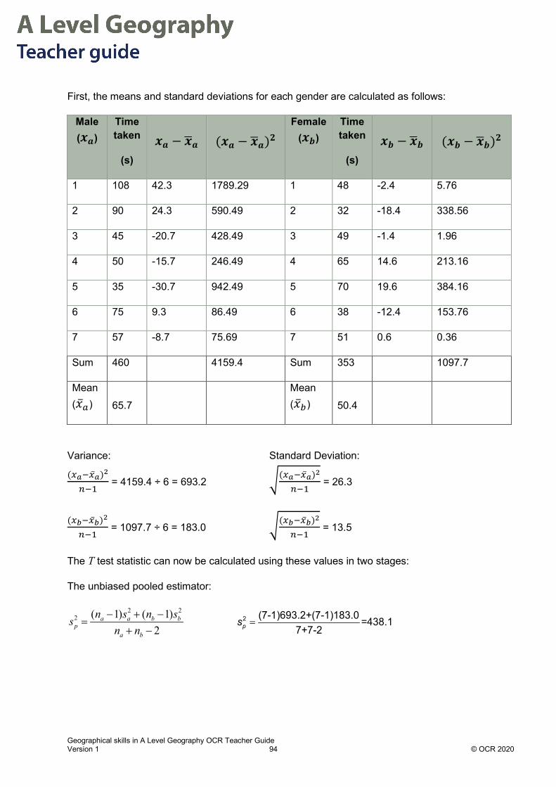
Geographical skills in A Level Geography OCR Teacher Guide Version 1 94 © OCR 2020
First, the means and standard deviations for each gender are calculated as follows:
Male (𝒙𝒙𝒂𝒂)
Time taken
(s)
𝒙𝒙𝒂𝒂 − 𝒙𝒙�𝒂𝒂 (𝒙𝒙𝒂𝒂 − 𝒙𝒙�𝒂𝒂)𝟐𝟐 Female
(𝒙𝒙𝒃𝒃) Time taken
(s)
𝒙𝒙𝒃𝒃 − 𝒙𝒙�𝒃𝒃 (𝒙𝒙𝒃𝒃 − 𝒙𝒙�𝒃𝒃)𝟐𝟐
1 108 42.3 1789.29 1 48 -2.4 5.76
2 90 24.3 590.49 2 32 -18.4 338.56
3 45 -20.7 428.49 3 49 -1.4 1.96
4 50 -15.7 246.49 4 65 14.6 213.16
5 35 -30.7 942.49 5 70 19.6 384.16
6 75 9.3 86.49 6 38 -12.4 153.76
7 57 -8.7 75.69 7 51 0.6 0.36
Sum 460
4159.4 Sum 353
1097.7
Mean (�̅�𝑥𝑎𝑎) 65.7
Mean (�̅�𝑥𝑏𝑏) 50.4
Variance: Standard Deviation: (𝑥𝑥𝑎𝑎−�̅�𝑥𝑎𝑎)2
𝑛𝑛−1 = 4159.4 ÷ 6 = 693.2 �(𝑥𝑥𝑎𝑎−�̅�𝑥𝑎𝑎)2
𝑛𝑛−1 = 26.3
(𝑥𝑥𝑏𝑏−�̅�𝑥𝑏𝑏)2
𝑛𝑛−1 = 1097.7 ÷ 6 = 183.0 �(𝑥𝑥𝑏𝑏−�̅�𝑥𝑏𝑏)2
𝑛𝑛−1 = 13.5
The T test statistic can now be calculated using these values in two stages:
The unbiased pooled estimator:
2 22 ( 1) ( 1)
2a a b b
pa b
n s n ssn n
− + −=
+ − =2 (7-1)693.2+(7-1)183.0 =438.1
7+7-2ps

Geographical skills in A Level Geography OCR Teacher Guide Version 1 95 © OCR 2020
The calculated value of T:
2
( )
1 1a b
pa b
x xT
sn n
−=
+
−= =
+
(65.7 50.4) 1.371 1438.17 7
T
Finally, we check the significance of the result by locating the critical value in the table of t-values using the degrees of freedom and the significance level.
Degrees of freedom = (7-1) + (7-1) = 12 Significance level = 5%
From the table of t-values, the critical value at p = 5% when v = 12 is 2.179.
The calculated value of T (1.37) is less than the critical value (2.179) and so H0 is not rejected. In this case, there is sufficient evidence to suggest that there is no significant difference between the mean time taken for males and females.

Geographical skills in A Level Geography OCR Teacher Guide Version 1 96 © OCR 2020
Student Activity answers Specification Link: 3.2.5.a Disease Dilemmas: Can diseases ever be fully eradicated?
Plants from nature: medicinal value of plants Aspirin is synthesized in laboratories today but the drug's active ingredient, salicylic acid, was first found in Spiraea, a genus of shrubs. Cardiovascular diseases are a growing cause of mortality, especially in Advanced Countries. Research has been taking place in these countries to establish if this drug from nature can reduce the risk of stroke and increase life expectancy. A study was carried out to see if there is a difference in life expectancy (measured in years) as a result of taking low doses of Aspirin compared with those taking a placebo, in healthy over 70s.
Null Hypothesis (H0) = There is no significant difference in life expectancy as a result of taking aspirin
Alternative Hypothesis (H1) = There will be a significant difference in life expectancy as a result of taking aspirin
Standard deviation
Sample taking aspirin
Standard deviation
Sample taking placebo
Difference in means
Calculated value of t
Critical value of t at the 95%
confidence level
8.9 6.1 6.2 3.6 2.021
1. Should researchers accept the alternative or the null hypothesis?
2. State one reason for your choice in 1).
Source/ Further information on medicinal value of plants from nature: https://edition.cnn.com/2010/HEALTH/12/22/aspirin.history/index.html https://www.nejm.org/doi/full/10.1056/NEJMoa1803955?query=featured_home
The alternative hypothesis
Because the calculated value of t is greater than the critical value. Therefore, reject the null hypothesis (H0) and accept the alternative hypothesis (H1).

Geographical skills in AS and A Level Geography OCR Teacher Guide Version 1 97 © OCR 2020
Chapter 5.1 – Topic Skills: Mass balance What is a mass balance?
In geomorphology the concept of mass balance can be applied to many physical systems. These include sediment cells, beaches, ice masses, glaciers, carbon and water cycles.
Physical systems can be thought of as having inputs, stores and outputs. Processes transfer mass into the system as inputs and out of the system as outputs. These systems are mostly open systems, where both mass and energy are transferred across the boundary to the system.
Consider the level of water in a bucket which has a hole. If input of water exceeds outputs through the leak in the bottom, the water level will rise. If the outputs exceed the input of water the mass of water in the bucket will fall.
Research into the mass balance of physical systems is key to understanding the stability of the biosphere, atmosphere and hydrosphere. Many research findings have established that physical systems appear to be dynamic equilibrium whereby the mass balance fluctuates over short-term scales but is in a steady state over long time scales. This is the situation where the there is no net gain or loss of mass from the system over time.
Inputs: mass enters the system
Stores or sinks: mass is stored in the
system
Outputs: mass exits the system
Input of water to bucket exceeds loss and so water level will rise leading to a net gain in mass over time
Input of water to bucket is less than losses and so water level will fall leading to a net loss in mass over time

Geographical skills in AS and A Level Geography OCR Teacher Guide Version 1 98 © OCR 2020
This dynamic equilibrium state is maintained by negative feedback mechanisms which ‘dampen’ down change in the system and restore it to its previous mass balance. However, instability also exists in mass balance due to positive feedback mechanisms leading to either marked and sustained loss of mass or gain in mass in the system (see Chapter 5.2 for further information).
For A Level Geography it is necessary to: 1. Identify inputs and outputs from topic knowledge
2. Calculate mass balance equations
3. Suggest how mass balance will be affected by changes in inputs and outputs
4. Convert units to carry out mass balance equations
Coastal Mass balance calculations
See detailed worked examples in Chapter 5.2
Glacial Mass balance calculations
Mass balance is a concept applied to the ice mass of ice caps sheets and glaciers. The negative mass balance of these areas of the earth are a subject of sustained and detailed research, for example the decline of the Thwaites Glacier in Antarctica. Research findings show that this glacier is being melted from below due to the increased ocean temperatures in the Southern Ocean. For more information on this example of a negative mass balance read:
Antarctica melting: Climate change and the journey to the 'doomsday glacier'
What are the inputs and outputs of mass for a glacier?
Retreat of the snout of the Jungfrau Aletsch Glacier, Switzerland due to negative mass balance, 2019
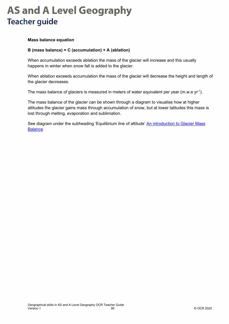
Geographical skills in AS and A Level Geography OCR Teacher Guide Version 1 99 © OCR 2020
Mass balance equation
B (mass balance) = C (accumulation) + A (ablation)
When accumulation exceeds ablation the mass of the glacier will increase and this usually happens in winter when snow fall is added to the glacier.
When ablation exceeds accumulation the mass of the glacier will decrease the height and length of the glacier decreases.
The mass balance of glaciers is measured in meters of water equivalent per year (m.w.e yr-1).
The mass balance of the glacier can be shown through a diagram to visualise how at higher altitudes the glacier gains mass through accumulation of snow, but at lower latitudes this mass is lost through melting, evaporation and sublimation.
See diagram under the subheading ‘Equilibrium line of altitude’ An introduction to Glacier Mass Balance

Geographical skills in AS and A Level Geography OCR Teacher Guide Version 1 100 © OCR 2020
Student Activity 1 answers Glacier mass balance
Research was undertaken on the Aletsch Glacier in Switzerland. This glacier is the longest (22.6 km) and largest glacier in the European Alps.
Researchers used remote sensing data from the ICEsat data from satellites.
They surveyed changes in height (∆H on y axis) in metres at three locations on the glacier, A1, A2 and A3. A1 is in the accumulation zone of the glacier at the highest elevation, A2 is in the middle of the glacier and A3 is close to the snout.
Retreat of the snout of the Jungfrau Aletsch Glacier, Switzerland due to negative mass balance, 2019
Zone A3: ablation losses dominate here and the glacier lost height between 2004 and 2009.
Abraded and striated rock surface recently exposed due to recession of the glacier’s snout.
Small patch of seasonal snow below the snout.
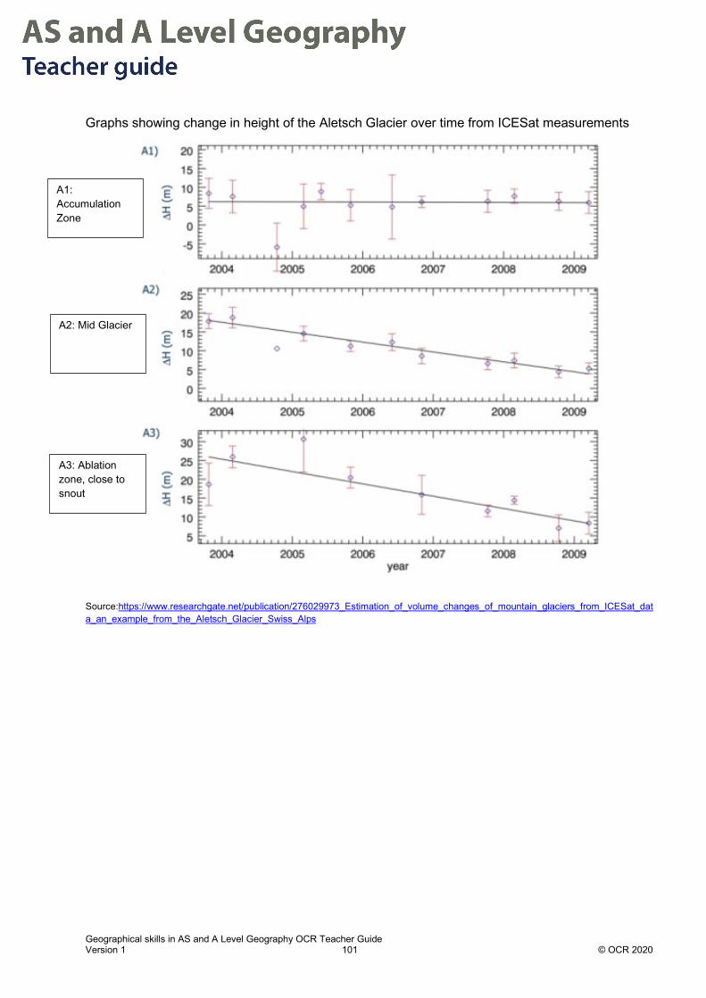
Geographical skills in AS and A Level Geography OCR Teacher Guide Version 1 101 © OCR 2020
Graphs showing change in height of the Aletsch Glacier over time from ICESat measurements
Source:https://www.researchgate.net/publication/276029973_Estimation_of_volume_changes_of_mountain_glaciers_from_ICESat_data_an_example_from_the_Aletsch_Glacier_Swiss_Alps
A1: Accumulation Zone
A2: Mid Glacier
A3: Ablation zone, close to snout

Geographical skills in AS and A Level Geography OCR Teacher Guide Version 1 102 © OCR 2020
1. Describe the pattern in change in height of the glacier over time.
2. Suggest why the glacier has lost height in the pattern described above.
3. Explain how this data would support the view that the glacier has negative mass
A1 there is no change in height for the period 2004-2009, however in A2 and A3 there is a net decrease in height of the glacier of (18-4 m) 14 m at A2 and (26-8m) 18m at A3.
A1 is at the highest elevation and so colder temperatures will lead to less melting, at lower elevation ablation losses are greater and affect lower parts of glacier more where the ice was thinner anyway. At lower elevations A2 and A3 the loss in mass is accelerated by annual snowfall melting more rapidly or less snow fall at lower elevations as a result of climate change.
The glacier has lost height over the time period. The mass balance is measured in meters of water equivalent. If the glacier has lost height it must have melted (assuming no crust movement) and so lost water. The glacier appears to be showing a marked decrease in volume at lower altitudes suggesting that ablation greatly exceeds accumulation.
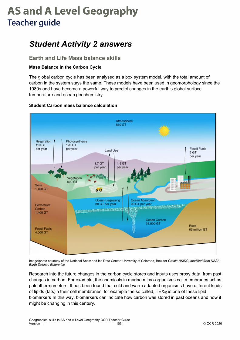
Geographical skills in AS and A Level Geography OCR Teacher Guide Version 1 103 © OCR 2020
Student Activity 2 answers Earth and Life Mass balance skills Mass Balance in the Carbon Cycle
The global carbon cycle has been analysed as a box system model, with the total amount of carbon in the system stays the same. These models have been used in geomorphology since the 1980s and have become a powerful way to predict changes in the earth’s global surface temperature and ocean geochemistry.
Student Carbon mass balance calculation
Image/photo courtesy of the National Snow and Ice Data Center, University of Colorado, Boulder Credit: NSIDC, modified from NASA Earth Science Enterprise
Research into the future changes in the carbon cycle stores and inputs uses proxy data, from past changes in carbon. For example, the chemicals in marine micro-organisms cell membranes act as paleothermometers. It has been found that cold and warm adapted organisms have different kinds of lipids (fats)in their cell membranes, for example the so called, TEX86 is one of these lipid biomarkers. In this way, biomarkers can indicate how carbon was stored in past oceans and how it might be changing in this century.

Geographical skills in AS and A Level Geography OCR Teacher Guide Version 1 104 © OCR 2020
1. Study the image above showing a simplified carbon cycle.
2. Complete the table below, using the image above, where GtC are gigatons of carbon.
Carbon sources Volume (GtC) Carbon sinks Volume (GtC)
Respiration 119 Photosynthesis 120
Land use 1.7 Land use 1.9
Ocean degassing 88 Ocean absorption 90
Fossil fuels 6
Key: GtC = gigatons of carbon;
1 gigaton equals 1 billion or 1,000,000,000 metric tons (a metric ton is 1000 kilograms)
3. Calculate the mass balance of carbon in the atmosphere
4. Convert the answer given into metric tonnes
5. Suggest three reasons why the mass of carbon in the atmosphere is increasing.
Total sources – total sinks = mass balance
(119 +1.7 +88 + 6 = 214) – (120 +1.9 + 90 = 211) = + 3Gt
1 Gt = 1,000,000,000 metric tonnes
3Gt = 3,000,000,000 metric tonnes
• Melting of permafrost in high latitudes releases methane (CH4) from long term stores in permafrost
• Deforestation in low latitudes, notably tropical forests leads to release of C02 from vegetation store
• Destruction of peat bogs at mid latitudes and burning of peat forests in tropical areas releases C02 from vegetation and soil stores
• Increasing industrialisation in LIDCs and continued dependence on fossil fuels in some world areas

Geographical skills in AS and A Level Geography OCR Teacher Guide Version 1 105 © OCR 2020
Chapter 5.2 – Topic Skills – Coasts: sediment budget calculation What is a sediment budget? A sediment budget is an equation which gives the balance between inputs and outputs for part of a coastline, such as a bay or estuary. They are hard to calculate due to all the different inputs and outputs.
Why is it called a ‘budget’? Like a bank account with income and outgoings, a coastal sediment cell has inputs and outputs. These are shown in the diagram below which is simplified representation of a coastal system. In a coastal system when the inputs and outputs are in balance it is said to be in equilibrium. When the inputs and outputs are not in balance there is a state of disequilibrium. Coastal processes, such as abrasion, longshore drift and deposition are the mechanisms which move sediment in and out of the sediment store.
Why is it useful? A sediment budget helps to determine if the coastal system is in surplus or deficit. When a coastal area is in surplus it will have increased deposition and experience a build-up of sediment referred to as accretion. Both surplus and deficit will alter the morphology of the beach, nearshore and offshore areas. For example, if the area is in deficit there will be net erosion and sediment will be removed, often lowering beaches and scouring shingle ridges, making them lower and flatter. If by contrast there is addition of gravel and sand to the beach for beach nourishment, the profile is built up and there is net accretion.
Sediment budgets are useful to establish if the system is in an equilibrium or not and how parts of the coastline are responding to management changes.
Inputs/Sources Outputs/Sinks
Sediment Store
e.g. beach, spit, bar, shingle ridge

Geographical skills in AS and A Level Geography OCR Teacher Guide Version 1 106 © OCR 2020
Who is it useful for? Sediment budgets are used by coastal geomorphologists to explain and justify the Shoreline Management Plans (SMP) which are in place in many parts of sediment cells in the UK.
They can be used to:
• Decide where material dredged (clearing a harbour or shipping channel of sediment to allow shipping) from the seabed or harbours is best deposited.
• Communicate to communities the benefits for no active intervention policy as sediment stores move. • Instigate new management methods. For example, beach nourishment with a large artificial sand dune at Bacton, Norfolk. • Predict how coastlines, especially estuaries will respond to rising sea level.
Sea Palling, Spring 2019. Coastline shows rapid cliff retreat beyond rock reefs indicating rip rap alters the sediment budget
Read more on this example of disequilibrium: As a British village crumbles into the sea, a family holds onto a home that can't be saved
Beyond the rip rap waves break at the base of the soft glacial clays and sands and erode the cliff. The rate of cliff retreat is faster when not protected by rip rap. This location is an example of the promontory effect, whereby protected areas protrude out to sea while unprotected areas are rapidly eroded around them.
Near the village of Happisburgh, large resistant rock blocks (rip rap) protect the base of the cliff

Geographical skills in AS and A Level Geography OCR Teacher Guide Version 1 107 © OCR 2020
What are sediment cells and how to do these relate to the sediment budget? The UK’s coastline is divided into 11 sediment cells within which there is little input or output of sediment. The sediment cells are divided up by large scale coastal features such as estuaries or peninsulas and several cells have been subdivided into sub-cells based on the sediment movement and direction within them.
Sediment cells within which sediment movement is quantified using the sediment cell equation Source:https://assets.publishing.service.gov.uk/government/uploads/system/uploads/attachment_data/file/690251/Sediment_budget_an
alysis_practitioner_guide_-_report.pdf
All sediment budgets are calculated within these cells and are based on the concept of
conservation of matter – sediment is moved around the cell, but its volume is conserved.

Geographical skills in AS and A Level Geography OCR Teacher Guide Version 1 108 © OCR 2020
How is the budget calculated? Inputs to the system are balanced against outputs. The nature of the inputs and outputs depends on the scale area of coastline being studied. Coastal Geomorphologists use LIDAR (radar measurements) and satellite imagery to determine the movement of sediment in the coastal cell.
Typically the following are identified in detailed measurements:
Inputs Outputs
Cliff erosion – rates affected by factors such as: cliff geology and lithology, wave energy, fetch and wind direction.
Marine erosion/Offshore transport – the offshore bathymetry (shape of the seabed) means that in some areas sediment moves offshore filling basins, such as in the North Sea.
Cliff landslides – these are affected by key factors such as the geology, lithology, rainfall and drainage of the cliffs.
Aeolian erosion – wind erodes fine sand and redeposits it at sea or inland.
Longshore drift into cell. Longshore drift out of cell.
Fluvial sediment – rivers carry fine sands, clays and silts to their estuaries where they are deposited.
Dredging – removing sediment from harbours, rivers and shipping channels.
Beach nourishment/recharge – although often short term this method is still used to restore sediment budgets.
Mining of beach sediment – for example for road materials.
The following equation is used to calculate the balance
Source: https://assets.publishing.service.gov.uk/government/uploads/system/uploads/attachment_data/file/690251/Sediment_budget_analysis_practitioner_guide_-_report.pdf

Geographical skills in AS and A Level Geography OCR Teacher Guide Version 1 109 © OCR 2020
How can sediment budgets relate to positive and negative feedback loops?
Negative feedback loops exist on coastlines when a beach is eroded in a storm, dragging sediment offshore, forming a bar. This then reduces the wave energy breaking on the beach, leading to more calm conditions behind the bar and moving the bar back onto the beach. In this way the beach is re-graded through the process of erosion and redeposition. Many shorelines show this sort of change in sediment budget between summer and winter. In the winter the beach has net outputs but in winter it has net inputs, therefore over the whole year the sediment budget of the beach is in equilibrium. The equilibrium state indicates there are no long-term inputs or outputs from the sediment budget.
Source: https://www.dover.gov.uk/Environment/Coast--Rivers/Coast-Protection/KingsdownExhibition/BeachRecycling.aspx
Positive feedback loops will push the coastal system from its equilibrium position into a permanently changed state, which is usually visible in a change to the beach morphology. For example, Salthouse shingle ridge in Norfolk was regularly bulldozed in autumn in the 1990s to protect the ridge and prevent the grazing land behind the ridge from flooding. When this policy was abandoned process in the sediment cell changed the shape of the ridge. Some sediment was pushed onshore in winter storms while 1000s of tonnes was moved by longshore drift lowering and flattening the ridge.
March 2019, Salthouse Shingle Ridge shows signs of positive feedback over the last 20 years: the profile is lower and flatter indicating net loss of sediment from this part of the sediment cell

Geographical skills in AS and A Level Geography OCR Teacher Guide Version 1 110 © OCR 2020
What are the limitations with Sediment budget analysis? 1. In practice it is difficult to estimate and predict how coastal management changes will affect
these sediment sources and sinks. This is because sediments like sand and shingle which are non-cohesive behave differently to cohesive sediments like mud and clay.
2. Usually sediment budgets are calculated over a year time period, because seasonal differences between winter and summer can be substantial. However, if that year has an unusually stormy winter this needs to be considered when creating a management scheme as the sediment budget may not reflect the decadal average or usual conditions.
3. The coastal system is increasingly complex due to rising sea levels, changing coastal policy including an increasing stretch of coastline marked as ‘no active intervention’.
4. If coastal management has taken place, for example the nine rock reefs installed at Sea Palling, Norfolk there is a long period of adjustment before the coastal system reaches equilibrium again.

Geographical skills in AS and A Level Geography OCR Teacher Guide Version 1 111 © OCR 2020
Student Activity 1 answers Specification Link: Coastal Landscapes 1.1.1.a. Coastal landscapes can be viewed as systems. A Level (H481), 2019, Component 01, Q1(b) (i)-(iii)
Table 1 shows the inputs and outputs of sediment for a beach in Cornwall, UK, during 2017.
Table 1: Sediment budget for beach in Cornwall
Inputs and Outputs Component Summer Winter
Input (m3) Cliff Erosion 43 100
Fluvial deposition 50 20
Beach nourishment 50 0
Output (m3) Marine Erosion 20 69
Longshore drift 93 130
(i) Find the mode(s) of the data set shown in Table 1.
(ii) Calculate the sediment budget for each season shown in Table 1.
(iii) State whether each season was in a surplus, deficit or equilibrium state.

Geographical skills in AS and A Level Geography OCR Teacher Guide Version 1 112 © OCR 2020
Mark scheme Question Answer Mark Guidance
1 (b) (i) Find the mode(s) of the data set shown in
Table 1.
Order the numbers from highest to lowest:
130, 100, 93, 69, 50, 42, 20, 20, 0
Modal values = most frequently occurring =
20 (), 50 () 1 mark for both correct values
2 AO3 x2
AO3 – 2 marks 2 x 1 mark ()
1 mark for each correct answer
20, 50 correct modal values
2 x 1 mark for each correct answer
Benefit of the Doubt (BOD) 2 marks Interpreted as two data sets:
• Summer 50 [they might not
always write Winter as there is
mode for Winter but will still
get 2 marks]
• Summer, 50, Winter no mode
• Input 50 [they might not
always write Output as there is
no mode for Output]
• Input 50, Output no mode
Interpreted as four data sets: Input 50, Output no mode, Summer 50,
Winter no mode
1 (b) (ii) Calculate the sediment budget for each season shown in Table 1. Season Input - Output =
Summer 143 - 113 = 30 m3
Winter 120 - 199 = -79 m3
2 AO3 x2
AO3 – 2 marks
2 x 1 mark ()
Units (m3) are not required in order to
get the mark.
Accept comments such as 79 m3
outputted to imply negative.
1 (b) (iii) State whether each season was in a surplus, deficit or equilibrium state. Summer = surplus
Winter = deficit
2 AO3 x2
AO3 – 2 marks
2 x 1 mark ()
1 mark for each correct answer.
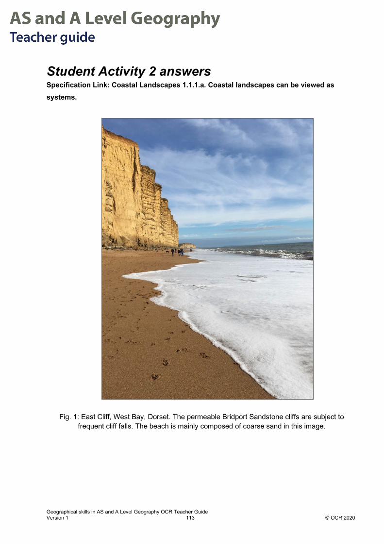
Geographical skills in AS and A Level Geography OCR Teacher Guide Version 1 113 © OCR 2020
Student Activity 2 answers Specification Link: Coastal Landscapes 1.1.1.a. Coastal landscapes can be viewed as systems.
Fig. 1: East Cliff, West Bay, Dorset. The permeable Bridport Sandstone cliffs are subject to frequent cliff falls. The beach is mainly composed of coarse sand in this image.
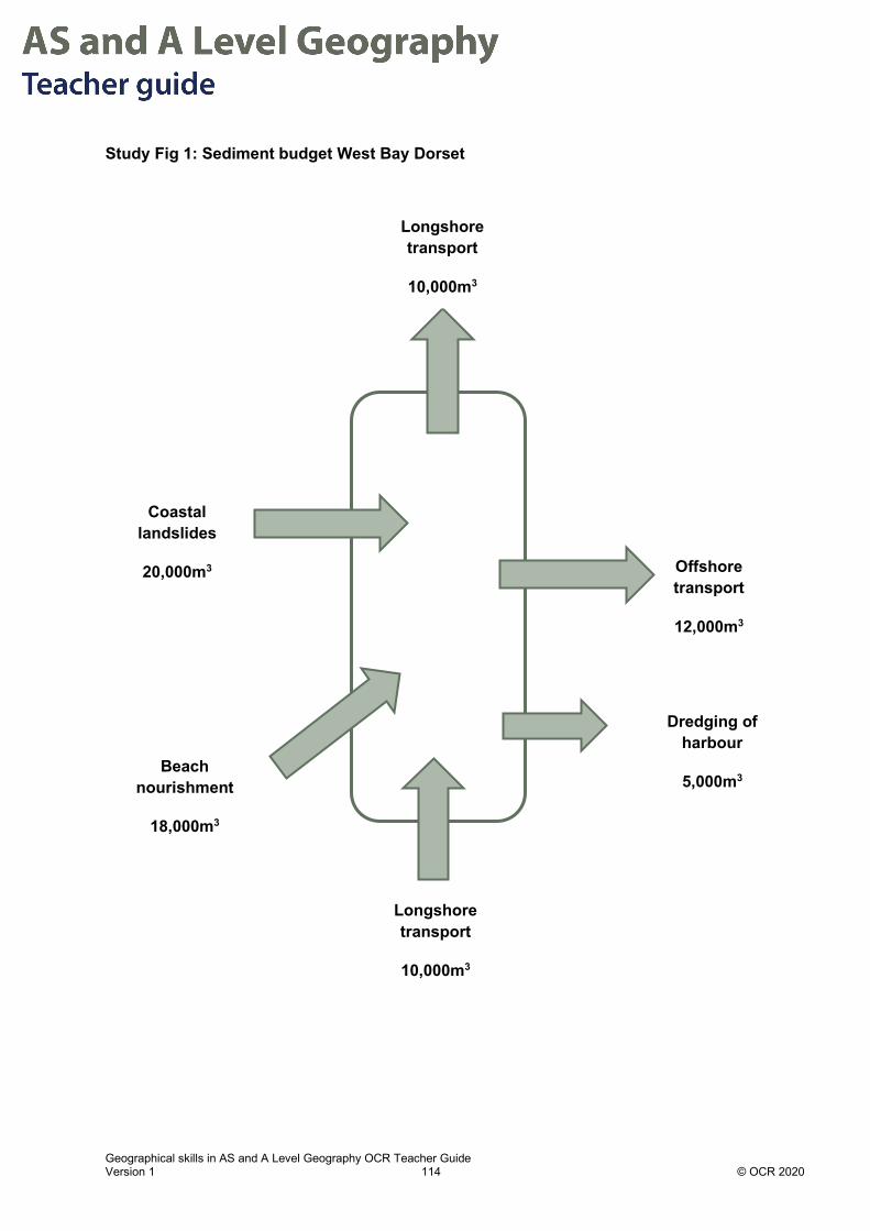
Geographical skills in AS and A Level Geography OCR Teacher Guide Version 1 114 © OCR 2020
Study Fig 1: Sediment budget West Bay Dorset
Coastal landslides
20,000m3
Beach nourishment
18,000m3
Offshore transport
12,000m3
Longshore transport
10,000m3
Dredging of harbour
5,000m3
Longshore transport
10,000m3

Geographical skills in AS and A Level Geography OCR Teacher Guide Version 1 115 © OCR 2020
1. Complete this table using the diagram above
Input Volume Output Volume
Longshore transport 10,000m3 Dredging of harbour
5,000m3
Beach nourishment
18,000m3
Offshore transport 12,000m3
Coastal landslides
20,000m3
Longshore transport
10,000m3
Total inputs 48,000m3 Total outputs 27,000m3
2. Calculate the net sediment budget.
3. At the time of the Second World War the beach was mined for gravel to build a key naval base
at Portland. The estimated amount of gravel and coarse sand extracted in a year was 50,000 tons in total. 1 ton = 1,000 kg. Assuming that 1m3 of the gravel has a mass of 1,600kg, recalculate the net sediment budget for the year the gravel of mined using the figures above.
4. Explain how the sediment budget calculated in 2 and 3 might affect the morphology of East
Beach, West Bay.
Net sediment budget = + 21,000m3
Net sediment budget = + 21,000m3 - 31,250m3 = -10,250m3
Sediment budget calculation (2)
The base of the cliff would show accumulations of landslides from the cliffs. This material would gradually be moved longshore and offshore. The beach replenishment would build up the beach and raise its level temporarily, before sediment is moved offshore and longshore.
Sediment budget calculation (3)
The mining of the beach would lead to a lowered offshore gradient. This might lead to increased erosion at the base of the cliff, and increased risk of collapse, leading to a reduced rate of erosion as the cliff fall would protect the base of the cliff.

Geographical skills in AS and A Level Geography OCR Teacher Guide Version 1 116 © OCR 2020
5. Suggest 2 ways in which the sediment budget might change in future.
6. Evaluate Figure 1 as a way of displaying data.
1. Beach replenishment is often seen as ineffective as it is short term as a strategy, if this was stopped the budget would be closer to equilibrium.
2. If there is increasing sea level and increased storminess there would be increased landslides leading to increased cliff input to the beach system. This would make the sediment more positive in the short term.
1. No scale of the size of the coastal unit is shown.
2. Arrows do not reflect the size of flows.
3. No temporal scale is given for the data shown.

Geographical skills in A Level Geography OCR Teacher Guide Version 1 117 © OCR 2020
Chapter 5.3 – Topic Skills – Earth’s life support systems: Climate graphs A climate graph is a type of compound graph. It shows the average monthly temperature as a line graph and rainfall total for that month as a bar graph. Months are plotted along the x axis.
They are usually plotted as the average values at a location using rainfall and temperature data over a few years.
They are a rich source of information and help to both describe and explain the climate at a given location and are useful for comparing between locations.
Data Source: Weather data provided by WorldWeatherOnline.com https://www.worldweatheronline.com/porto-velho-weather-averages/rondonia/br.aspx
25
26
27
28
29
30
31
32
33
34
0
100
200
300
400
500
600
Jan
Feb
Mar
ch
April
May
June July
Aug
Sept
Oct
Nov
Dec
Tem
pera
ture
Rai
nfal
l
Port Velho, Maderia River Basin, Brazil Climate Graphlocation 63°54′14″W, 8°45′43″S , elevation 90 m
Rainfall (mm)
Temperature

Geographical skills in A Level Geography OCR Teacher Guide Version 1 118 © OCR 2020
Data Source: https://en.climate-data.org/europe/norway/troms/troms%C3%B8-71/
How can climate graphs be used to describe climate? Total rainfall: the total rainfall is calculated by adding the monthly rainfall totals.
Range: the range in temperature and rainfall show the variability in the climate.
Extremes: the months with highest and lowest temperature and rainfall.
Seasonality: the rate of change in temperature and rainfall indicates the seasonality of the climate.
How can climate graphs be used to explain climate? Latitude: This has a strong effect on climate and at low latitudes solar insolation inputs affect temperature, seasonality and rates of evaporation.
Elevation: At higher elevations temperatures are lower due to lower air pressure, and expansion of the air at higher elevations leads to cooling of the air.
Distance from the sea: Inland locations 1000’s of kilometres from the sea receive less water moisture and are therefore drier.
-6
-4
-2
0
2
4
6
8
10
12
14
0
20
40
60
80
100
120
140
Jan
Feb
Mar
ch
April
May
June July
Aug
Sept
Oct
Nov
Dec
Tem
pera
ture
(deg
ree
C)
Rai
nfal
l (m
m)
Month
Tromso, Norway ClimateLocation 69°40′58″N 18°56′34″E
Elevation 9m
Rainfall (mm)
Temperature

Geographical skills in A Level Geography OCR Teacher Guide Version 1 119 © OCR 2020
How do climate graphs reflect water cycle processes? Surface and subsurface water processes
Precipitation controls runoff, rates of infiltration and antecedent soil moisture. Climates with a defined dry season may experience declining river flows, drought and falling groundwater levels, whereas in wet months the reverse can occur.
Evaporation rates Controlled by temperature, humidity, winds, air pressure and available moisture. When temperatures are sub-zero the evaporation rate is low because there is insufficient kinetic energy for a change of state from ice to water vapour.
Weathering rates Chemical weathering controlled by temperature, available water moisture and nature of the bedrock. In tropical climates, weathering of limestone karst can be very rapid, due to both high temperatures and available soil moisture.
How do climate graphs reflect carbon cycle processes?
Rates of photosynthesis
Strongly controlled by light and temperature, for example temperature affects growth in the arctic biome even though plants have adaptations to low light and short growing season. Between 10-20oC the enzymes in photosynthetic pathways are slowed and below.
Rates of respiration
Drought conditions and very high temperatures reduce the rate of plant respiration because water is needed for these and respiration enzymes are denatured by high temperatures. Conversely at low temperatures below 10oC rates of respiration are reduced.
Rates of decomposition
Controlled by temperature and moisture. In climates where temperatures are above 25oC and there is available soil moisture soil fauna and microbes break down dead organic matter quickly. By contrast in arctic climates dead organic matter does not decay, but is buried in frozen soils, accumulating almost 1,600 gigatonnes of carbon1.
1 https://www.nature.com/articles/d41586-019-01313-4

Geographical skills in A Level Geography OCR Teacher Guide Version 1 120 © OCR 2020
Limitations of climate graphs 1. Climate graphs from individual years can be misleading as they could represent anomalously
high or low rainfall and temperature extremes, for example from El Niño years.
2. Climate graphs using data from several years can hide change over time and therefore conceal changes in rainfall and temperature.
3. Climate graphs conventionally show monthly rainfall and temperatures as the only variables. This hides the average high or low temperatures within the monthly average. It also does not give information on humidity, percentage cloud cover or wind speed.

Geographical skills in A Level Geography OCR Teacher Guide Version 1 121 © OCR 2020
Student Activity answers Changing Arctic Climates and the melting of Permafrost: Climate on Herschel Island in Canada Herschel Island is at sea level on the edge of the Arctic Ocean and 69 degrees latitude. The island’s climate has long cold winters when the island is surrounded by ice. In summer the temperature is usually cool (7-8oC) but since 2010 it has experienced temperatures up to 30oC. It has been designated a World Heritage Site, but it is affected by high rates of coastal erosion and permafrost melting.
Image 1: Location of Hershel Island, Northern Canada
Source: NASA, via NASA World Wind, Public Domain, https://commons.wikimedia.org/w/index.php?curid=780629
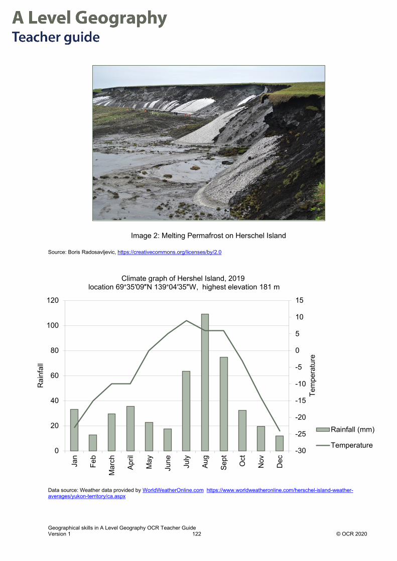
Geographical skills in A Level Geography OCR Teacher Guide Version 1 122 © OCR 2020
Image 2: Melting Permafrost on Herschel Island
Source: Boris Radosavljevic, https://creativecommons.org/licenses/by/2.0
Data source: Source: Weather data provided by WorldWeatherOnline.com https://www.worldweatheronline.com/herschel-island-weather-averages/yukon-territory/ca.aspx
Data source: Weather data provided by WorldWeatherOnline.com https://www.worldweatheronline.com/herschel-island-weather-averages/yukon-territory/ca.aspx
-30
-25
-20
-15
-10
-5
0
5
10
15
0
20
40
60
80
100
120
Jan
Feb
Mar
ch
April
May
June July
Aug
Sept
Oct
Nov
Dec
Tem
pera
ture
Rai
nfal
l
Climate graph of Hershel Island, 2019location 69°35′09″N 139°04′35″W, highest elevation 181 m
Rainfall (mm)
Temperature

Geographical skills in A Level Geography OCR Teacher Guide Version 1 123 © OCR 2020
Understanding the climate graph 1. Find the following data for Herschel Island:
Data Answer
Highest average temperature (oC) 9 oC in July
Lowest average temperature (oC) -24 oC in December
Range in average temperature (oC) 33 oC
Month with maximum precipitation August - 109.1 mm
Lowest monthly rainfall December 11.9 mm
Total annual precipitation 406.9mm
Months when average temperature below 0oC
7 months
Length of growing season (average temperature above 50C)
5 months
There are 5 months when the temperature on Herschel Island exceeds 0oC, when melting can take place. The rate of melting may be increasing because temperatures are hotter in summer months than in previous decades the duration that temperatures are greater than zero is longer. Rain falling in these months will not freeze instead it forms surface pools which can contribute to the melting of the permafrost.
2. The permafrost is melting rapidly on Herschel Island. Explain, using the precipitation pattern and the monthly average temperature why this is the case:
The temperature for 5 months of the year is >00C, between May and September.
During this time precipitation is high and will fall as rain, running of and draining into the Arctic ocean, not staying frozen on the ground surface.
Because the air temperature is above zero the ground will start to warm and surface snow and ice melts.
As the snow melts the albedo of the Island’s surface is reduced, and the ground absorbs more incoming short wave radiation from the sun. This warms the surface further, and warming extends down into the ground, melting the permafrost at depth.
Because the period of above zero temperatures is now 5 months not all the melted permafrost refreezes and so this is an example of positive feedback, so each year more permafrost is defrosted.

Geographical skills in A Level Geography OCR Teacher Guide Version 1 124 © OCR 2020
Application of geographical skills to ELSS topic 1.2.1.b (inputs and outputs of the water cycle) and 1.2.1.c (processes of water and carbon cycle)
Question Response
Comment on how the average temperatures will affect water cycle processes on Herschel Island.
Less snow will form permanent ice due to above zero temperatures, permafrost will melt leading to increased surface water and increased overland flow.
Saturated overland flow may occur as in image 2.
Higher temperatures will lead to increased evaporation rates and more water vapour stored in the atmosphere.
Less water is stored as snow cover so there will be lower albedo and more absorption of incoming solar radiation and therefore less reflection and so warming of the ground surface leading to further melting and increased surface flows and lakes.
Suggest reasons why the flows and stores of the carbon cycle may be affected by the current climate on Herschel Island.
As less snow cover more areas of soil exposed which are colonised by mosses and small flowering plants when temperature greater than 0oC leading to increased photosynthesis and storage of carbon in biomass store.
More ground cover means increased respiration and plants giving out CO2, especially in dim light and months of low sunlight in autumn, winter and early spring.
Increased plants to die back in autumn will increase decomposition rates and release carbon into the soil and atmosphere.
Arctic permafrost stores melting release methane (CH4), into the atmosphere and increasing the rate of warming faster than if only CO2 released.
Climate data sources NASA Earth Observatory
Air and GHG emissions
Further Reading Arctic permafrost is thawing fast. That affects us all.

Geographical skills in AS and A Level Geography OCR Teacher Guide Version 1 125 © OCR 2020
Chapter 5.4 – Topic Skills – Earth’s life support systems: Unit conversions and rates of change Units indicate what a given quantity is measured in.
From GCSE, students will be familiar with the idea that different measurements use different units, e.g. metres for length, seconds for time and kilograms for mass.
They will also be aware of first, second and third order units, e.g. for the metre unit these would be m (length), m2 (area) and m3 (volume).
Unit prefixes Unit prefixes indicate particular multiples and fractions of units.
A full list of SI unit (International System of Units) prefixes is given in Appendix 1, with the prefixes that are most likely to be used within the A Level Geography course highlighted.
Students will need to be aware of some units that are not SI units but are commonly used and accepted alongside SI units.
For example, the units of litres (L) and millilitres (ml) are often used for volume but are not SI units. The SI unit of volume is the m3. One litre is the same as 1 dm3 and 1 ml is the same as 1 cm3.
1m3 = 1,000 dm3 = 1,000,000 cm3.
1m3 = 1,000 L = 1,000,000 ml.
Some other examples of common units that are not SI units include: minutes (m), hours (hr), days (d), degrees (°) and tonnes (t).
Contexts in Geography Geography students use a range of measurements throughout their A Level course.

Geographical skills in AS and A Level Geography OCR Teacher Guide Version 1 126 © OCR 2020
Examples of common measurements and units used.
Measurement Units Examples
Distance km, m, cm, mm, µm
Distance travelled migration/seasonal work (km), length of sea defence (m), length of an axis of pebble, height of vegetation (cm) leaf thickness (mm) virus diameter (µm)
Area km2, m2, cm2, mm2
Country land area, land area covered by ice, water (km2), area of quadrat (m2)
Volume km3, m3, cm3, mm3
Sediment cell dynamics, volume of methane stored in permafrost, volume of floodwaters km3, m3, volume of soil water, volume of evaporation from plant, cm3
Density Mg/m3, g/cm3 Density of rock types, density of glacial ice, snow. Density of soil
Mass t, kg, g Mass of dead organic matter, mass of living biomass, mass of soil
Time Ga, Ma, a, d, h, min, s
Change over geological time scales, e.g. global atmospheric carbon, over historic time, diurnal/monthly, seasonal/annual temperature ranges, tidal cycles (hours), timing longshore drift movement (minutes), wave movement (seconds)
Temperature °C, K Air temperature, soil temperature
Angle degrees° Beach angles, slope angles, angle of dip on geological beds
Unit conversions Students will be expected to be able to convert between different units, for example 0.5 m = 500
mm, without conversion ‘facts’ being given (i.e. 1 m = 1000 mm).
Converting between different multiples is a matter of either multiplying or dividing by the appropriate factor, depending upon the direction of the conversion. For example, converting 7 µm to mm requires a division by 106, not a multiplication. It is a common misconception for students to believe that because millimetres are ‘larger’ than micrometres (in the sense that 1 mm is larger than 1 µm) that a multiplication is necessary to go to the larger unit. However, a simple check should reveal that 7 000 mm is not equal to 7 µm, and so a division is required.

Geographical skills in AS and A Level Geography OCR Teacher Guide Version 1 127 © OCR 2020
Worked example A sample of basalt from the Pacific Ocean is 2 million years old and is 100 km from the Mid Ocean Ridge. Calculate the spreading rate in cm per year.
First the distance must be converted:
1 km = 1,000 m = 100,000 cm
Therefore, 100 km = 100 x 100,000 cm = 10,000,000 cm
Secondly, the spreading rate is calculated by dividing the distance by time:
spreading rate = 10,000,000 cm / 2,000,000 years = 5 cm a−1.
When numbers are very large or very small it can be helpful to express them in standard form. For example:
1 km = 1 x 10³ m = 1 x 105 cm
The above length conversion can be written as:
1 x 10² km = 1 x 102 x 1 x 105 cm = 1 x 107 cm
remembering the ‘power rule’ that 10a multiplied by 10b equals 10 (a+b).
The spreading rate is calculated by dividing the distance by time:
spreading rate = 1 x 107 cm / 2 x 10⁶ years = 5 cm a−1.
Rates of change A rate of change is a measure of how quickly one variable is changing with respect to another. The most common examples are rates of change with time or with distance.
A common rate of change that is familiar from everyday life is speed, measured for example in ms−1 or kph or mph.
Common examples of rates of change encountered in Geography include:
• Rates of tidal flow (m s−1)
• Rates of rainfall intensity (mm hr−1)
• Rates of river discharge (m3 s−1)
• Seafloor spreading rate (cm a−1)
• Thermal heat gradient of earth’s crust (°C km−1)

Geographical skills in AS and A Level Geography OCR Teacher Guide Version 1 128 © OCR 2020
Student Activity 1 answers: Unit Conversions Specification Link: Earth and Life 1.2.4 How human activities cause changes in the availability of water
Complete the table below:
Effects of Human Activity on the water cycle
Use of water Volume in km3 Volume in m3
Irrigation 2800 2.8 x 10¹²
Industry 230 2.3 x 10¹¹
Domestic and Commercial 1.7 x 10² 1.7 x 10¹¹
Answer: Conversion of km to m = scale factor of 103.
Conversion of km3 to m3 = (103)3 = scale factor of 109.
Student Activity 2 answers: Unit conversions Specification Link: Earth and Life: 1.2.1.c Catchment Hydrology Processes
In January-March 2020 a series of named depression systems affected the British Isles leading to high river discharge as the surface and subsurface stores in the hydrological cycle filled. The Severn at Bewdley remained above 220 m3 sec -1 for over a month which was the highest and longest period of flows above 220 m3 sec -1 in over 100 years.
Convert the peak discharges in the table below.
River Severn at Bewdley
m3 sec -1 Equivalent to:
Feb 8th 230 m3s-1 230,000 l s-1 (litres per second)
Feb 18th 470 m3s-1 14,822 Gl yr-1 (Gigalitres per year)
Feb 27th 501 m3s-1 43,286,400 m3d-1 (cubic metres per day)
Source acknowledgement: Data from the UK National River Flow Archive
https://nrfa.ceh.ac.uk/sites/default/files/Briefing_Note_V6.pdf

Geographical skills in AS and A Level Geography OCR Teacher Guide Version 1 129 © OCR 2020
Student Activity 3 answers: Unit conversions Specification Link: Earth and Life 1.2.1 The distribution and size of the major stores in the carbon and water systems
Gigatonne: A gigatonne (Gt) equals one billion tonnes (or one trillion kilogrammes). The United Nations and IPCC uses Gt to measure the amount of carbon in different stores.
Damaged peatlands contribute about 10% of greenhouse gas emissions from the land use sector. CO2 emissions from drained peatlands are estimated at 1.3 gigatonnes of CO2 annually. This is equivalent to 5.6% of global anthropogenic CO2 emissions. Fires in Indonesian peat swamp forests in 2015, for example, emitted nearly 16 million tonnes of CO2 a day. This is more than the daily emissions from the entire US economy. At the same time, peatlands are the largest natural terrestrial carbon store. Worldwide, the remaining area of near natural peatland (>3 million km2) contains more than 550 gigatonnes of carbon, representing 42% of all soil carbon and exceeds the carbon stored in all other vegetation types, including the world’s forests. This area sequesters 0.37 gigatonnes of CO2 a year.
Source: https://www.iucn.org/sites/dev/files/peatlands_and_climate_change_issues_brief_final.pdf
Noting that the remaining area of near natural peatland “sequesters 0.37 gigatonnes of CO2 a year”, calculate the amount of CO2 sequestered per day in tonnes.
Further Reading: Wetland mud is 'secret weapon' against climate change
0.37 Gt = 3.7 x 10⁸ t.
1 year = 365 days.
Therefore 0.37 Gt/yr = (3.7 x 10⁸)/365 = 1,013,699 td-1 = 1.014 x 10⁶ td-1.
Approximately 1 million tonnes a day.

Geographical skills in AS and A Level Geography OCR Teacher Guide Version 1 130 © OCR 2020
Student Activity 4 answers: Rates of change The figure below shows the change in global temperature due to human-induced warming relative to 1850-1900.
Source: FAQ 1.2 Figure 1, Chapter 1 from Allen, M.R., O.P. Dube, W. Solecki, F. Aragón-Durand, W. Cramer, S. Humphreys, M. Kainuma, J. Kala, N. Mahowald, Y. Mulugetta, R. Perez, M. Wairiu, and K. Zickfeld, 2018: Framing and Context. In: Global Warming of 1.5°C. An IPCC Special Report on the impacts of global warming of 1.5°C above pre-industrial levels and related global greenhouse gas emission pathways, in the context of strengthening the global response to the threat of climate change, sustainable development, and efforts to eradicate poverty [Masson-Delmotte, V., P. Zhai, H.-O. Pörtner, D. Roberts, J. Skea, P.R. Shukla, A. Pirani, W. Moufouma-Okia, C. Péan, R. Pidcock, S. Connors, J.B.R. Matthews, Y. Chen, X. Zhou, M.I. Gomis, E. Lonnoy, T. Maycock, M. Tignor, and T. Waterfield (eds.)] https://www.ipcc.ch/sr15/graphics/#cid_6333
1. What was the approximate change in global temperature due to human-induced warming between 2017 and the period 1850-1900?
2. What was the approximate change in global temperature due to human-induced warming
between 1960 and 2017?
1.00oC
(1.00 °C - 0.25 °C) = 0.75 °C

Geographical skills in AS and A Level Geography OCR Teacher Guide Version 1 131 © OCR 2020
3. The figure includes a trend line for the current warming rate. What is the current warming rate in °C yr-1?
Appendix 1
Factor Name Symbol Factor Name Symbol
1024 yotta Y 10−1 deci d
1021 zeta Z 10−2 centi c
1018 exa E 10−3 milli m
1015 peta P 10−6 micro µ
1012 tera T 10−9 nano n
109 giga G 10−12 pico p
106 mega M 10−15 femto f
103 kilo k 10−18 atto a
102 hecto h 10−21 zepto z
101 deca da 10−24 yocto y
Appendix 1: SI unit prefixes
~ = 0.02°C yr-1

Geographical skills in AS and A Level Geography OCR Teacher Guide Version 1 132 © OCR 2020
Chapter 6.1 – Errors in data Types of error in Geographical data Geographical data can be affected by sources of error.
Reliability, Validity and Accuracy Geographical data is analysed to reduce error.
Characteristic What is this error? How might this be a problem?
Accuracy This is a measure of the closeness of the measurement of a variable to the true value. If a test has high accuracy it is in close agreement with the true value. Accuracy can be affected by systematic errors.
If a measurement is inaccurate it can affect the subsequent data processing.
The accuracy of field data can be improved by the researcher improving their technique i.e. using equipment.

Geographical skills in AS and A Level Geography OCR Teacher Guide Version 1 133 © OCR 2020
Characteristic What is this error? How might this be a problem?
Precision The precision of a measurement is a measure of the precision of the instrument you are using to measure. The significant figures displayed on an instrument’s scale are an indication of the precision of the instrument. For example, electronic callipers may be precise to 0.1mm but a ruler would be precise to 1mm. This term applies best to quantitative measurements.
If the equipment available has a low degree of precision, then the data set will be affected by this.
This type of error is referred to as a random error.
Reliability This is a measure of consistency - for example if a measurement was reliable the results would be the same if retested or remeasured.
Measurements are said to have reliability if there is a high degree of confidence that a second retesting would result in the same measurement. A measuring device is said to be reliable if it produces consistent results.
It is hard to separate accuracy and reliability in studies.
Validity This can refer to an individual data collection method or an overall method of fieldwork investigation. A method is valid if it is relevant and useful in answering the question at issue.
e.g. when studying the size of pebbles the use of callipers would be valid but not a weighing scale.
e.g. when studying living conditions of a city it would be valid to survey residents of the city but not valid to survey people who have never visited the location.
To assess validity means to ask whether the method is relevant for answering the question asked.
If the methods do not have validity for examining the study question, then this will undermine the validity of any subsequent analysis or conclusion.
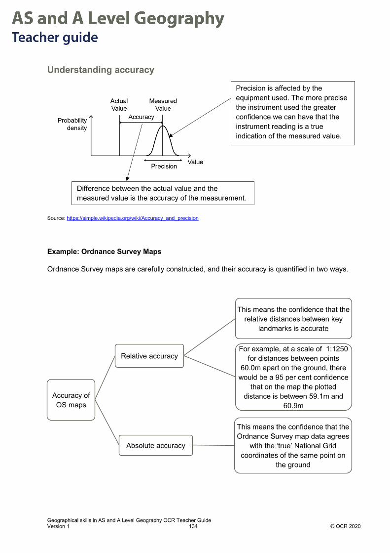
Geographical skills in AS and A Level Geography OCR Teacher Guide Version 1 134 © OCR 2020
Understanding accuracy
Source: https://simple.wikipedia.org/wiki/Accuracy_and_precision
Example: Ordnance Survey Maps
Ordnance Survey maps are carefully constructed, and their accuracy is quantified in two ways.
Accuracy of OS maps
Relative accuracy
This means the confidence that the relative distances between key
landmarks is accurate
For example, at a scale of 1:1250 for distances between points
60.0m apart on the ground, there would be a 95 per cent confidence
that on the map the plotted distance is between 59.1m and
60.9m
Absolute accuracy
This means the confidence that the Ordnance Survey map data agrees
with the ‘true’ National Grid coordinates of the same point on
the ground
Difference between the actual value and the measured value is the accuracy of the measurement.
Precision is affected by the equipment used. The more precise the instrument used the greater confidence we can have that the instrument reading is a true indication of the measured value.

Geographical skills in AS and A Level Geography OCR Teacher Guide Version 1 135 © OCR 2020
Mapped information can rapidly become outdated. In the 20th century due to industrialisation, deindustrialisation and regeneration many AC cities have required updating at regular intervals to ensure accuracy.
Transcription Errors Inaccurate data can be used in reports even where the original data was accurate due to errors in subsequent processing. For example, data collected in the field may be recorded accurately on an original record sheet but then incorrectly copied into a spreadsheet due to transcription errors.
These types of errors can be reduced by keeping original records and checking final data against these.
Example:
In 2007 the IPCC published a report stating that the Himalayan Glaciers would all be melted by 2035. The possible effects of this were severe water shortage for 750 million people in Asia and the report caused widespread alarm. Subsequent journalistic investigations revealed that there may have been a typographic error in the publication of this international report. A leading hydrologist had in fact predicted that the year 2350 was the year by which the melting of glaciers was likely.
Source: http://news.bbc.co.uk/1/hi/world/south_asia/8387737.stm
Understanding sampling errors Sampling errors can include random errors, systematic errors and sampling bias.
Random errors
These are caused for example when a researcher misreads a measurement, e.g. on a light meter in a forest or a clinometer reading on the beach. This will create errors in the sample population. This type of error can be minimized if repeated measurements are made.
Systematic errors
These occur for example when equipment being used to sample the variable has not been calibrated correctly, e.g. a weighing balance that has not being zeroed correctly between the samples.
Sampling Bias
This is where the population of the sample has been selected/collected in a way which means that the sample is non-random, because not all individuals or instances in the population were equally likely to be selected. For example, surveys can be prone to sampling bias. Two factors particularly relevant to surveys are non-response bias and acquiescence bias:
• Non-response bias – in a survey there are always individuals who do not want to respond and the proportion of these will affect the accuracy of your results.

Geographical skills in AS and A Level Geography OCR Teacher Guide Version 1 136 © OCR 2020
• Acquiescence bias – this is the extent to which people taking a survey want to give the ‘correct answer’. This can occur if a researcher asks leading questions or questions that might suggest the researcher’s view or reason for asking.
The method of surveying can also introduce bias. Evidence suggests that the populations responding to online, face to face and telephone surveys are more likely to be opinionated and have strong views which may confirm researcher’s questions. This means that those who have fewer strong views may be under-represented.
Interrogating data When using a data source there are several questions a researcher should consider:
• What is the source of the data?
• How old is the data?
• Is there any evidence that the data was checked or verified?
• What confidence is there in the data source?
• Is the data provider a private company, government department, NGO, multinational drug company - does the provider have an agenda?
• How large is the data set?
• What geographical area does the data set cover?
• If the data is for a time period, what confidence is there in the historic data?
• Has the original data source been manipulated in presentation?
Questions specifically about map sources? • What is the map’s scale, how does this affect accuracy?
• What was the density of observations which were used to make the map?
• What is the stated accuracy of the features displayed on the map?
Evaluating Geography Fieldwork There are several considerations to make when evaluating your field study data.
Accuracy of study data
1. How did the researcher affect the accuracy of the data collected?
2. Was accuracy improved as the study progressed?
3. How were accuracy issues identified?

Geographical skills in AS and A Level Geography OCR Teacher Guide Version 1 137 © OCR 2020
Precision of study data
1. Instruments used: how precise are the measurements made? For example, if two decibel sound meters were used did they give the same results?
2. Were the available instruments for the study imprecise? For example, pH meters commonly used for gardens lack the precision of pH meters used in laboratory contexts.
3. Is there any clear evidence of a lack of precision generating random errors?
Reliability of study
1. Is the researcher confident that the value of a measurement, e.g. length of an axis of a pebble or diameter of tree, is consistent if the same equipment is used?
2. Were multiple measurements taken to ensure this?
3. Is the sample size large enough to ensure reliability?
Validity of the study
1. Did the study achieve what was intended?
2. Was the geographical question a sound one?
3. Did the methods used to study the chosen question fit the objective?

Geographical skills in AS and A Level Geography OCR Teacher Guide Version 1 138 © OCR 2020
Student Activity answers Read the statements below about Coastal Environments evaluating the sources of error in the data.
Using the table above, check if the students have used the correct terminology to describe the sources of error.
A. “The sampling strategy proved easy to conduct in the field over two days. Thus, the strategy was suitable within time limitations. The data collection provided a suitable volume of data to enable statistical analysis from which to draw conclusions on each of the hypotheses, with the 12 beach ridge profiles providing a representative sample of the entire pebble ridge. However, in order to improve the accuracy of the results, it would be worth collecting the same data to see if the results are repeatable in other similar environments at the end of winter.”
B. “Although there was some level of subjectivity involved using Cailleux Index in deciding the sharpest corner, it was a more objective measure than the Power's Index that relies on the interpretation of a picture of well-rounded, rounded, sub-rounded pebbles. Furthermore, it provides a numerical figure that can be used in a greater variety of analytical methods and therefore produce more accurate results.”
Using an automatic level, Westward Ho! North Devon
The student is describing reliability not accuracy. Accuracy refers to the closeness of the value measured to the actual value, but reliability refers to repeatability. This student may also not understand that if results are collected at a different time (“end of winter”) they might not be directly comparable to those collected in summer.
This student understands subjective measurements e.g. choosing the Power’s roundness index and more objective measurements. The student correctly uses the term accuracy referring to the closeness of the measurement to its true value.
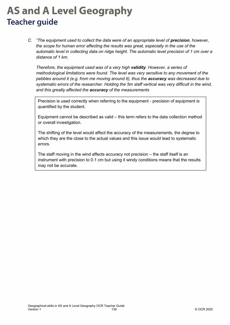
Geographical skills in AS and A Level Geography OCR Teacher Guide Version 1 139 © OCR 2020
C. “The equipment used to collect the data were of an appropriate level of precision, however, the scope for human error affecting the results was great, especially in the use of the automatic level in collecting data on ridge height. The automatic level precision of 1 cm over a distance of 1 km.
Therefore, the equipment used was of a very high validity. However, a series of methodological limitations were found. The level was very sensitive to any movement of the pebbles around it (e.g. from me moving around it), thus the accuracy was decreased due to systematic errors of the researcher. Holding the 5m staff vertical was very difficult in the wind, and this greatly affected the accuracy of the measurements
Precision is used correctly when referring to the equipment - precision of equipment is quantified by the student.
Equipment cannot be described as valid – this term refers to the data collection method or overall investigation.
The shifting of the level would affect the accuracy of the measurements, the degree to which they are the close to the actual values and this issue would lead to systematic errors.
The staff moving in the wind affects accuracy not precision – the staff itself is an instrument with precision to 0.1 cm but using it windy conditions means that the results may not be accurate.

Geographical skills in AS and A Level Geography OCR Teacher Guide Version 1 140 © OCR 2020
Chapter 6.2 – Errors in data presentation Introduction
Displaying data clearly and accurately can be challenging, it requires careful thought on the type of data and the best presentation method(s) to use.
This chapter covers the most common errors when presenting geographical data:
1. Selecting the wrong chart type
2. Displaying invalid correlations
3. Omitting title and axes
4. Omitting scales
5. Presenting data but not referencing it in the supporting text.
Selecting the wrong type of chart for the data available.
Fig 1. Case Fatality Rate (CFR) in China for COVID-19 Pandemic in April 2020. The CFR is calculated by dividing the total number of confirmed deaths due to COVID-19 by the number of confirmed cases.
Source: Data from www.worldometer.com
A pie chart is used to compare categories within a data set. A pie chart displays segments of data according to the share of the total values of the data. This data is not suited for a pie chart because the segments in the pie do not make up a total of all values in the data set. This data would be better displayed as a bar chart.
China Case Fatality Rate
0-9 10-19 20-29 30-39 40-49 50-59 60-69 70-79 80+

Geographical skills in AS and A Level Geography OCR Teacher Guide Version 1 141 © OCR 2020
Invalid correlations When plotting two variables care needs to be taken not to assume that if the variables appear to increase or decrease in synchrony that this is due to a causal link between the variables.
Source: http://tylervigen.com/spurious-correlations (https://creativecommons.org/licenses/by/4.0/)
In this example the number of drivers killed by colliding with a railway train appears to be following the level of US crude oil imports from Norway. Clearly, we know that in terms of geographical processes this cannot be due to a causal link. Correlation does not equal causation.
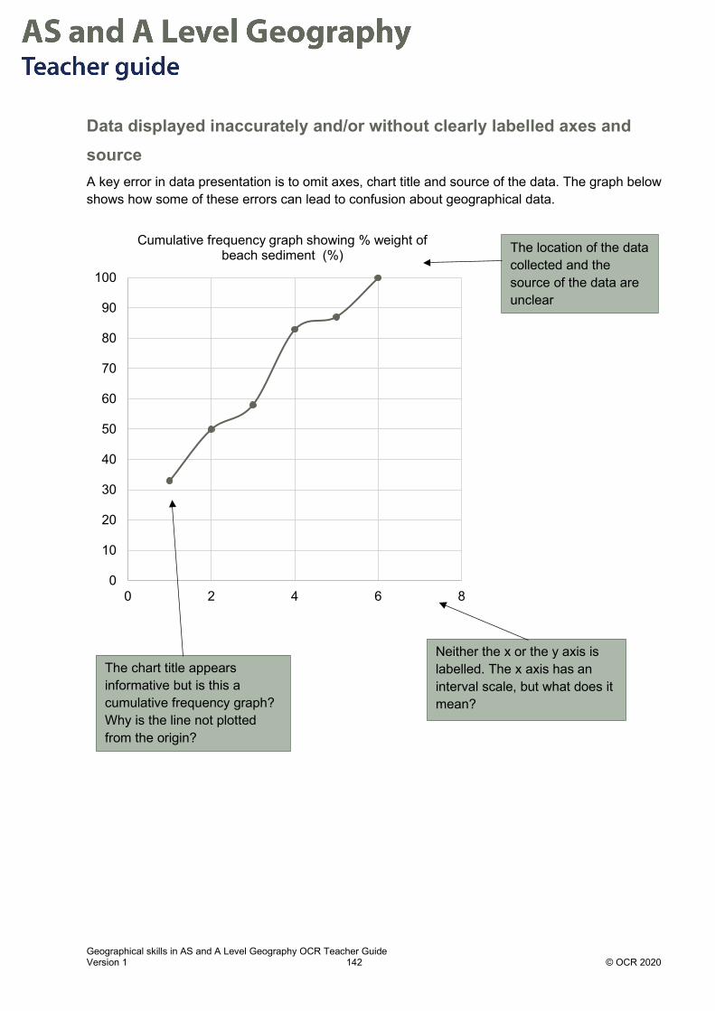
Geographical skills in AS and A Level Geography OCR Teacher Guide Version 1 142 © OCR 2020
Data displayed inaccurately and/or without clearly labelled axes and source A key error in data presentation is to omit axes, chart title and source of the data. The graph below shows how some of these errors can lead to confusion about geographical data.
0
10
20
30
40
50
60
70
80
90
100
0 2 4 6 8
Cumulative frequency graph showing % weight of beach sediment (%)
Neither the x or the y axis is labelled. The x axis has an interval scale, but what does it mean?
The chart title appears informative but is this a cumulative frequency graph? Why is the line not plotted from the origin?
The location of the data collected and the source of the data are unclear

Geographical skills in AS and A Level Geography OCR Teacher Guide Version 1 143 © OCR 2020
Maps scale; made clear Maps should contain a clearly visible scale appropriate to the data being represented.
The map below, from a student’s investigation, shows a good example of a clear scale for the proportional circles used to present carbon storage in tonnes in four located tree types. Both the scale and North arrow are included.
Source: Independent Investigation feedback 2018 and effective marking OCR webinar presentation

Geographical skills in AS and A Level Geography OCR Teacher Guide Version 1 144 © OCR 2020
Data is presented but is not clearly referenced in the text A common error is to display data but then not to clearly reference it in the text of the accompanying report or document. This is particularly an issue for the independent investigation. The Principal examiner commented on this,
“First and foremost, a considerable number of candidates did not fully integrate their various presentation techniques within Section 4 so that the commentary did not go alongside the
diagrams to which they referred. This made it far more difficult to follow the general thrust of the investigation.” (Independent Investigation Feedback 2018)
The process can be visualised as follows:
Example of integration of text and synthesising results from student investigation:
Figure 3.12 How satisfied residents are with healthcare services such as GPs and Pharmacies
For each data presentation techniqueInterpret what it shows
in words
Synthesize: how does this result link to the
other data presented?
Link: make clear link to study
question/theme/theory as appropriate
6
16
53
44
0
9
4447
0
10
20
30
40
50
60
Not at all satisfied Not satsfied Quite satisfied Very satisfied
Perc
enta
ge o
f peo
ple'
s an
swer
s
Level of Satisfaction
Gps Pharmacies

Geographical skills in AS and A Level Geography OCR Teacher Guide Version 1 145 © OCR 2020
Figure 3.13 What residents thought was the least important priority for council spending
19%
12%
31%
38% Increase in number of GPs
Health Education in schools
More green spaces
Restrictions on fast food outlets
Fig 3.12 shows that there is somewhat higher satisfaction with pharmacies in the ward (91% at least quite satisfied) compared to GPs, where over 20% are not satisfied or not at all satisfied.
In relation to Question 2 although waiting time is relatively low (4.2 days – see Fig. 3.10) over a third (34%) of the sample of 32 people still wanted more GPs. Nearly 4 in 10 people (38%) saw restrictions on fast food outlets (Fig 3.13) being the least important issue despite the link to obesity (Booth, Pinkston) and low life expectancy in the ward (see Fig. 3.9).
Reference to figure is direct and data is concisely summarised
Reference to overall study question for investigation is clear
Reference to figure is clear and link is made to secondary sources

Geographical skills in A Level Geography OCR Teacher Guide Version 1 146 © OCR 2020
Chapter 7.1 – Selecting appropriate approaches for analysing field data Analysis and interpretation of field data needs consideration of:
1. Which analytical tools would best support the investigation?
2. Are qualitative or quantitative or mixed methods appropriate?
3. Is hypothesis testing appropriate?
4. Do the chosen analytical techniques make clear links to the title/question/hypothesis?
Key aspects of analysis: Analysis tools are applied to the data set, these may be qualitative or quantitative or both.
Analysis is focussed on the study questions and does not over-claim the findings.
Analysis will make reference to links with key concepts, ideas or geographical theory from the literature review.
Analysis tools will be applied to the most influential data – the data which is most important for answering the study question.
Tools for Quantitative and Qualitative analysis
Analytical tools
Quantitative tools
Inferential statistics
Field sketching and Image analysis
WInf
Qualitative tools
ordles and ographics Codingstatistics
Descriptive

Geographical skills in A Level Geography OCR Teacher Guide Version 1 147 © OCR 2020
Quantitative Analytical Tools A number of quantitative analytical tools have been covered in previous chapters. These are summarised in the table below:
Analytical tool Why is the tool used? Possible presentation techniques used with these analytical tools
Descriptive analytical techniques
Measures of central tendency: (see Chapter 2.1) • Mean • Median • Mode
To show the mean, median and mode and indicate if the measures of central tendency vary within and between samples.
Tables Bar chart Radial chart Dispersion graph
Measures of proportion: • Cumulative frequency • Ratios
To find out proportions Pie chart Triangular graph Composite bar chart Proportional shape map, e.g. using Arc GIS
Measures of Dispersion: (see Chapter 2.2) • Standard deviation • Coefficient of
Variation • Interquartile range
To show the spread of values around the mean. To show spread of values around median
Dispersion graph Box and whisker graph Frequency/cumulative line graph
Inferential statistical techniques Hypothesis testing (see Chapter 4.2)
Tests of difference: • Spearman’s Rank
Correlation (see Chapter 4.4)
To show the strength and nature of a relationship between two sets of data
Scattergraph with line of best fit
Tests of correlation: • Mann Whitney U test
for skewed data sets (see Chapter 4.6)
• Student t test for normally distributed data sets (see Chapter 4.7)
To show whether two data samples are significantly different from each other
Dispersion graphs
Tests of association within or between samples: • Chi-Squared test (see
Chapter 4.5)
To show how closely observed data matches data that is expected if the distribution of data was random
Bar chart
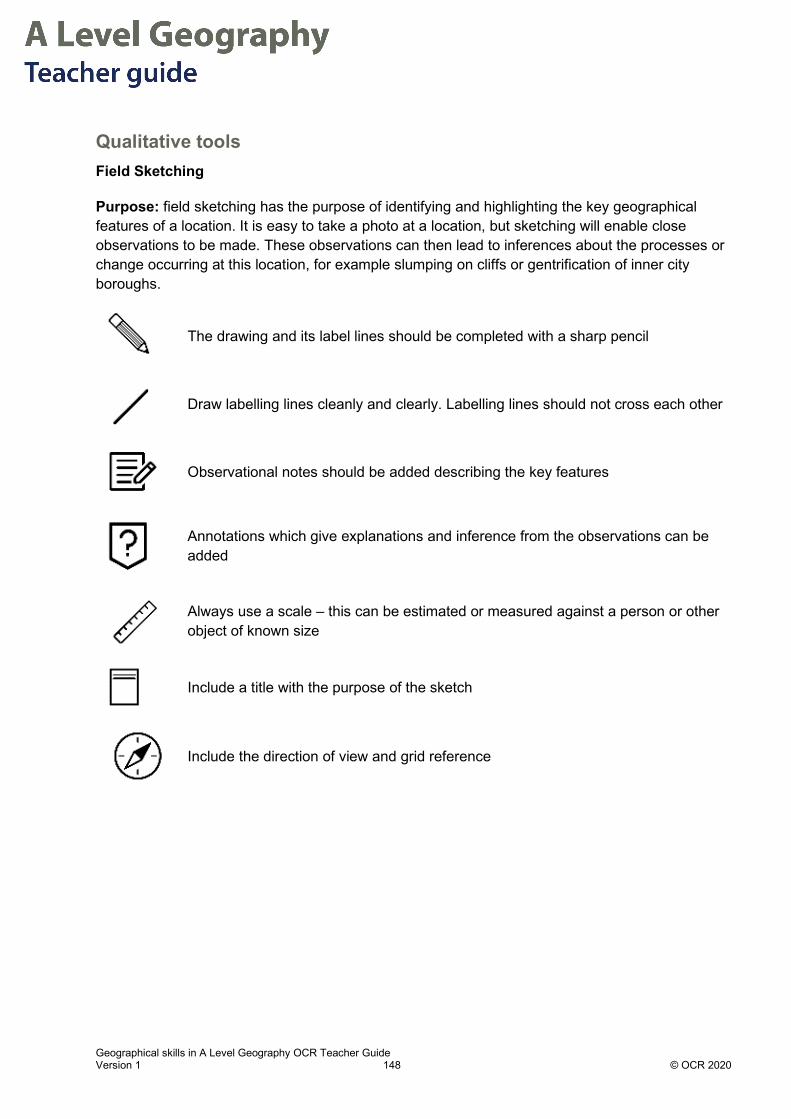
Geographical skills in A Level Geography OCR Teacher Guide Version 1 148 © OCR 2020
Qualitative tools Field Sketching
Purpose: field sketching has the purpose of identifying and highlighting the key geographical features of a location. It is easy to take a photo at a location, but sketching will enable close observations to be made. These observations can then lead to inferences about the processes or change occurring at this location, for example slumping on cliffs or gentrification of inner city boroughs.
The drawing and its label lines should be completed with a sharp pencil
Draw labelling lines cleanly and clearly. Labelling lines should not cross each other
Observational notes should be added describing the key features
Annotations which give explanations and inference from the observations can be added
Always use a scale – this can be estimated or measured against a person or other object of known size
Include a title with the purpose of the sketch
Include the direction of view and grid reference

Geographical skills in A Level Geography OCR Teacher Guide Version 1 149 © OCR 2020
Field sketch example

Geographical skills in A Level Geography OCR Teacher Guide Version 1 150 © OCR 2020
Simplified maps
Purpose: Simplifying a map from other sources such as aerial photos, OS maps and geological maps can summarise and clarify the features of a location. These maps can be useful to make the choice of location clear and demonstrate how the location will be used in the fieldwork investigation.
Guidelines: Think clearly about the purpose of a map in the context of the investigation. Emphasise this purpose by omitting information which is not relevant to this purpose. If a location is being studied for coastal visitor hotspots, a map would omit other features such as sea defences or coastal sediment movement so that the visitor facilities in the area are more prominent.
For example, Map 1 below of Overstrand, Norfolk shows the locations for a fieldwork investigation into the role of marine and subaerial processes affecting cliffs. Symbols were used to represent the location and shape of sea defences and cliff stabilisation measures. This simplified map enables the reader to understand the location of sites and the relative position of the most relevant features to the fieldwork investigation.
Map 1 - Overstrand, Norfolk
Revetments
1994slump
Cliff edge
Old road
Bungalows
Sea wallMudflows
Small scars
Landslides
Fault slip plane
Oldservice road
Rip-rap
12
3
4
56
Gabions
Trees(rotated by creep)
7
Overstrand Landslide(with route indicated)
OldHotel site
50m
N
Revetments
1994slump
Cliff edge
Old road
Bungalows
Sea wallMudflows
Small scars
Landslides
Fault slip plane
Oldservice road
Rip-rap
12
3
4
56
Gabions
Trees(rotated by creep)
7
Overstrand Landslide(with route indicated)
OldHotel site
50m
N

Geographical skills in A Level Geography OCR Teacher Guide Version 1 151 © OCR 2020
Image analysis
Purpose: Image analysis is a powerful qualitative skill. The purpose will depend on the type of images used. There are many examples of possible images depending on the purpose of the investigation. Image types for analysis could include:
• Paintings or artworks of locations
• Cartoons, can express viewpoints on political, economic, environmental, cultural or social issues Climate reality project
• Photographs: contemporary and historical e.g. Google Street View using ‘turn back time’ option Travel back in time with Google street view
• Aerial images e.g. Historic England
• Current or historical map layers showing features being investigated e.g. Living Atlas and ESRI maps
• Image analysis example
The photo below is of 216 Upper Brook Street, Manchester, M13 9LY with analysis added of the socio-economic and environmental characteristics of the site.
Residential flats above retail units currently to let indicating low desirability which may be linked to low environmental quality score.
Single terraced 19thC building next to modern redeveloped hospital site, possibly land held by speculators.
Shop units are locally owned businesses
Multinational fast food companies advertise in this area, which is next to main hospital
Low environmental quality: high traffic volumes leading to air pollution and noise. Side of building covered in graffiti
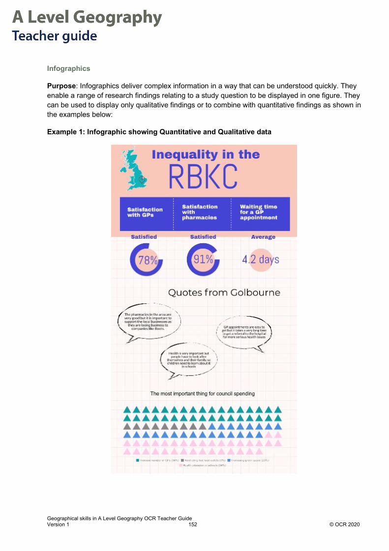
Geographical skills in A Level Geography OCR Teacher Guide Version 1 152 © OCR 2020
Infographics
Purpose: Infographics deliver complex information in a way that can be understood quickly. They enable a range of research findings relating to a study question to be displayed in one figure. They can be used to display only qualitative findings or to combine with quantitative findings as shown in the examples below:
Example 1: Infographic showing Quantitative and Qualitative data

Geographical skills in A Level Geography OCR Teacher Guide Version 1 153 © OCR 2020
Example 2: Infographic only displaying qualitative data
Resources:
How to present your research using infographics: Using infographics to communicate your research
Types of infographic template: What Are the 9 Types of Infographics?
Free software:
• Visme
• Piktochart

Geographical skills in A Level Geography OCR Teacher Guide Version 1 154 © OCR 2020
Wordles
Purpose: Wordles are a ‘cloud’ of words where the size of each word is in proportion to its frequency in a text, interview or survey. These are potentially useful to demonstrate:
• Different perceptions of two different areas or schemes
• Different descriptions of the same area by different user groups/ethnic groups/ages/gender
• Analysis of interviews with two or more respondents
Caution needs to be exercised in applying this technique. Consider carefully your sample size, - where the number of words in the wordle is small the results can be less satisfactory. Do not include connectives and direct articles in the wordle (such as because, a, the) since this distorts the cloud.
This method is easy to criticise for bias if the researcher is the person who states their perception in each place (Example 1 below) and it is more reliable where a number of residents or researchers are inputting their perceptions of place (Example 2 below).
An example of mixed method analysis is shown in the two examples below. Both investigations categorised the words as positive, negative or neutral and calculated these as a proportion of the total sample size.
Example Wordle 1:
Researcher describes their perception of two locations using adjectives:

Geographical skills in A Level Geography OCR Teacher Guide Version 1 155 © OCR 2020
Example Wordle 2
Multiple user groups describe perception of site before and after a rebranding using adjectives:
Resources:
• Word cloud generator
• Word frequency counter

Geographical skills in A Level Geography OCR Teacher Guide Version 1 156 © OCR 2020
Coding and text analysis
Purpose: Coding can be used to analyse texts from both primary and secondary sources and interview transcripts. Coding seeks to compare and analyse texts by looking for patterns and repeated words or phrases. Quality data can be collected using interviews and in-depth focus groups. This data can reveal much more about the places studied than a few questionnaires.
There are five key ways to analyse a text and ‘code’ the text or interview transcripts.
Source: http://www.ocr.org.uk/Images/390518-independent-investigation-student-guide.pdf
Coding Example 1: Theming and Categorising
Multiple secondary sources are often used to find study questions and ensure that these are rooted in existing research.
A simple way to analyse secondary sources, such as interview transcript is to analyse for facts and interpretation which can expose the social, economic and political ideas around a geographical issue. This can help to formulate further study questions and areas of interest.
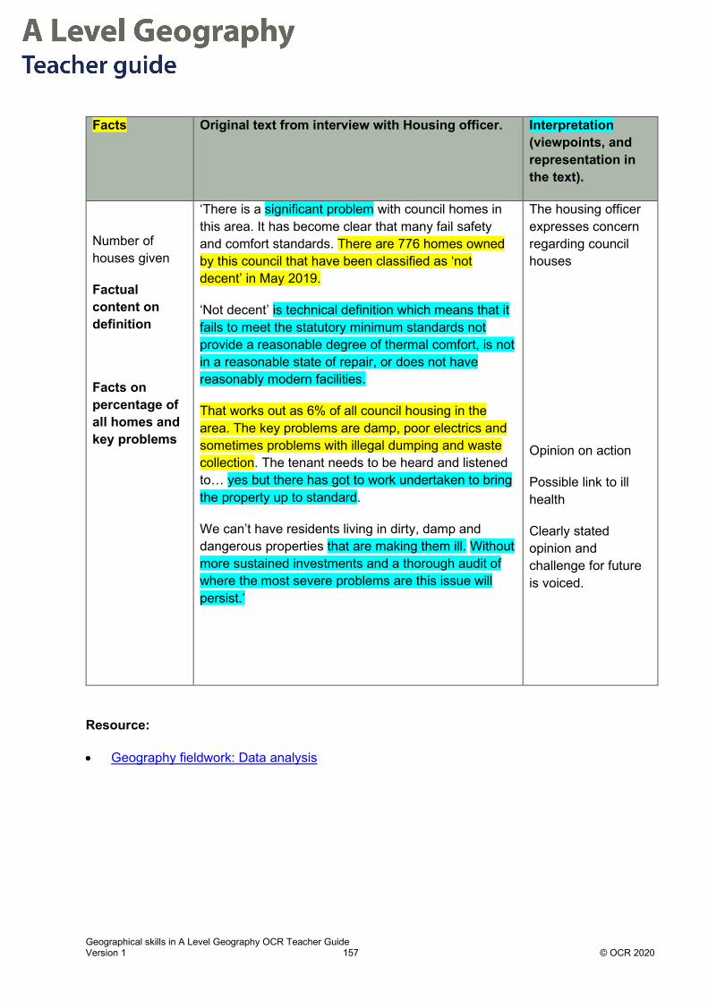
Geographical skills in A Level Geography OCR Teacher Guide Version 1 157 © OCR 2020
Facts Original text from interview with Housing officer. Interpretation (viewpoints, and representation in the text).
Number of houses given
Factual content on definition
Facts on percentage of all homes and key problems
‘There is a significant problem with council homes in this area. It has become clear that many fail safety and comfort standards. There are 776 homes owned by this council that have been classified as ‘not decent’ in May 2019.
‘Not decent’ is technical definition which means that it fails to meet the statutory minimum standards not provide a reasonable degree of thermal comfort, is not in a reasonable state of repair, or does not have reasonably modern facilities.
That works out as 6% of all council housing in the area. The key problems are damp, poor electrics and sometimes problems with illegal dumping and waste collection. The tenant needs to be heard and listened to… yes but there has got to work undertaken to bring the property up to standard.
We can’t have residents living in dirty, damp and dangerous properties that are making them ill. Without more sustained investments and a thorough audit of where the most severe problems are this issue will persist.’
The housing officer expresses concern regarding council houses
Opinion on action
Possible link to ill health
Clearly stated opinion and challenge for future is voiced.
Resource:
• Geography fieldwork: Data analysis

Geographical skills in A Level Geography OCR Teacher Guide Version 1 158 © OCR 2020
Coding Example 2: Categorising
The student looked for patterns in the interview responses and found seven criteria which were frequently mentioned.
The student then coded their responses to show which were most important from an open question.
This created a clear visual pattern of responses. For example, only two companies mention transport and infrastructure.
This is a way of summarising interview data effectively.
Resources:
RGS Guide to Qualitative research

Geographical skills in A Level Geography OCR Teacher Guide Version 1 159 © OCR 2020
Appendix

Geographical skills in A Level Geography OCR Teacher Guide Version 1 160 © OCR 2020

Geographical skills in A Level Geography OCR Teacher Guide Version 1 161 © OCR 2020

Geographical skills in A Level Geography OCR Teacher Guide Version 1 162 © OCR 2020

Geographical skills in A Level Geography OCR Teacher Guide Version 1 163 © OCR 2020

OCR Resources: the small print
OCR’s resources are provided to support the delivery of OCR qualifications, but in no way constitute an endorsed teaching method that is required by OCR. Whilst every effort is made to ensure the accuracy of the content, OCR cannot be held responsible for any errors or omissions within these resources. We update our resources on a regular basis, so please check the OCR website to ensure you have the most up to date version.
This resource may be freely copied and distributed, as long as the OCR logo and this small print remain intact and OCR is acknowledged as the originator of this work.
Our documents are updated over time. Whilst every effort is made to check all documents, there may be contradictions between published support and the specification, therefore please use the information on the latest specification at all times. Where changes are made to specifications these will be indicated within the document, there will be a new version number indicated, and a summary of the changes. If you do notice a discrepancy between the specification and a resource please contact us at: [email protected].
OCR acknowledges the use of the following content: N/A
Whether you already offer OCR qualifications, are new to OCR, or are considering switching from your current provider/awarding organisation, you can request more information by completing the Expression of Interest form which can be found here: www.ocr.org.uk/expression-of-interest
Please get in touch if you want to discuss the accessibility of resources we offer to support delivery of our qualifications: [email protected]
Looking for a resource?There is now a quick and easy search tool to help find free resources for your qualification:
www.ocr.org.uk/i-want-to/find-resources/
OCR is part of Cambridge Assessment, a department of the University of Cambridge. For staff training purposes and as part of our quality assurance programme your call may be recorded or monitored.
© OCR 2020 Oxford Cambridge and RSA Examinations is a Company Limited by Guarantee. Registered in England. Registered office The Triangle Building, Shaftesbury Road, Cambridge, CB2 8EA. Registered company number 3484466. OCR is an exempt charity.
Need to get in touch?If you ever have any questions about OCR qualifications or services (including administration, logistics and teaching) please feel free to get in touch with our Customer Support Centre.
General qualificationsTelephone 01223 553998Facsimile 01223 552627Email [email protected]
www.ocr.org.uk
Did
you
kno
w?


