Music Magazine – Contents Page and DPS Textual Analysis Name: Feargus Bracken Candidate Number: 4009 Center Name: St. Andrew’s Catholic School Center Number: 64135 OCR Media Studies – AS Level Unit G321: Advanced Portfolio
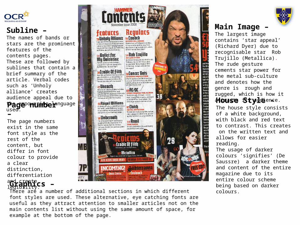
Subline –The names of bands or stars are the prominent features of the contents pages.These are followed by sublines that contain a brief summary of the article. Verbal codes such as ‘Unholy alliance’ creates audience appeal due to the empowering language used.
House Style –The house style consists of a white background, with black and red text to contrast. This creates on the written text and allows for easier reading.The usage of darker colours ‘signifies’ (De Saussre) a darker theme and content of the entire magazine due to its entire colour scheme being based on darker colours.
Page number –The page numbers exist in the same font style as the rest of the content, but differ in font colour to provide a clear distinction, differentiation and create legibility.
Main Image –The largest image contains ‘star appeal’ (Richard Dyer) due to recognisable star Rob Trujillo (Metallica). The rude gesture cements star power for the metal sub-culture and denotes how the genre is rough and rugged, which is how it attracts its audience.
Graphics –There are a number of additional sections in which different font styles are used. These alternative, eye catching fonts are useful as they attract attention to smaller articles not on the main contents list without using the same amount of space, for example at the bottom of the page.
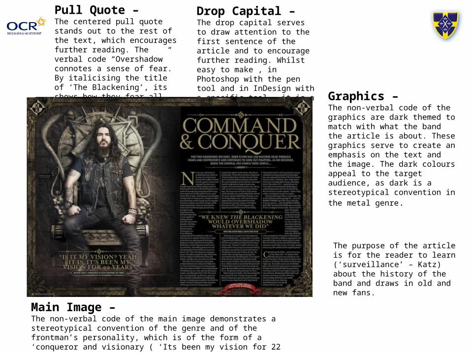
Pull Quote – The centered pull quote stands out to the rest of the text, which encourages further reading. The verbal code “Overshadow” connotes a sense of fear. By italicising the title of ‘The Blackening’, its shows how they fear all their work being compared to their most successful album.
Drop Capital – The drop capital serves to draw attention to the first sentence of the article and to encourage further reading. Whilst easy to make , in Photoshop with the pen tool and in InDesign with a specific tool , it is a eye-catching feature.
Main Image –The non-verbal code of the main image demonstrates a stereotypical convention of the genre and of the frontman’s personality, which is of the form of a ‘conqueror and visionary ( ‘Its been my vision for 22 years’) The inclusion of the throne connotes his power and hold over his fans.
Graphics –The non-verbal code of the graphics are dark themed to match with what the band the article is about. These graphics serve to create an emphasis on the text and the image. The dark colours appeal to the target audience, as dark is a stereotypical convention in the metal genre.
The purpose of the article is for the reader to learn (‘surveillance’ – Katz) about the history of the band and draws in old and new fans.
Main Image –The main image , matched with the content of the article, creates a character for the frontman of relaxed and laid back.
Typography –The use of differing font styles for the text of the main image and the text of the article itself allows it to match the article. The main body of the text is written in a legible, smart font.
Layout –The layout is simple, with the main image taking up one page and the main body consuming the rest.
House Style –The house style of the article is reliant on a binary of black and white, with the inclusion of dark pink and red for additional highlighting purposes.
Questions –The question and answer nature of the article allows a reader greater familiarity with the celebrity being interviewed. The formatting of the questions is so that the questions are highlight with a white background, giving greater emphasis against the black text and grey background. The font size for questions is also of an increased size.
The page number and name of the magazine are present at the bottom of the page, with a miniaturised version of the masthead next to the number.
Conclusion
• A feature I wish to ‘repeat’ (Steve Neale) is the numbering of images to match with the content on the contents page, as it creates a more eye catching view of the article and creates a sense of continuity for readers to follow.
• I intend to ‘repeat’ the convention of having my main feature reflect the content of my text in the means of house colours/image related to the content. This will revolve around a play on words in relation to the image and band name, which will create attention.
• A centred pull quote of a differing colour to the text, of a interesting subject matter, creates interest. I aim to ‘repeat’ this feature to a similar extent in my own DPS with a phrase that would similarly attract attention, and cause the reader to read the article for context.