18
Hand Drawn Draft Final Product
| Date post: | 08-Aug-2015 |
| Category: |
Education |
| Upload: | lancechirume |
| View: | 17 times |
| Download: | 0 times |

Hand Drawn Draft Final Product

Final ProductHand Drawn Draft

Hand Drawn Draft
Final Product

In what ways does your media product use, develop or challenge forms and conventions of real media products?
‘Power’ magazine ‘repeats’ (Steve Neale) codes and conventions from magazines such as ‘XXL’ and ‘The Source Magazine’ and I used these well established magazines to assist me in the production of my magazine pages. I noticed that the magazines had on going colour schemes, so I ‘repeated’ this and had a colour scheme throughout my magazine pages as well. The main colours were red, white, black and gold; this showed continuity. I also made sure that my front cover included features such as:• Bar Code• Issue number • USP (unique selling point)• Masthead• Strapline• Main image and headline • Date price
Out of all the magazine pages that I made, I would say that the double page spread took the longest time to produce because I changed my mind so many times with the overall layout and design of the page. I put a lot of planning into the page; for example, I originally thought to make all the pages the same background colour but after some thought I made the double page spread’s background black, because it was a more exclusive page than the other. This is because it had an interview by Jay Z and I wanted the audience to pay close attention to the page. Just like the front cover and contents page there are specific codes and conventions I included in this page, including:• Drop capital • Magazine logo• Main image • Interview • Page number

For the contents page I ‘repeated’ styles from the previous magazines of inspiration used for the creation for the front cover, which were ‘XXL’ and ‘The Source Magazine’. When I looked at the XXL magazine contents page, they included section within their pages and when I ‘repeated’ the convention it made my contents page clearer to read and understand.
• Puff promotion• Magazine logo• Thumbnail images • Web address• Editorial• Page numbers • Social networking site (Convergence)
In what ways does your media product use, develop or challenge forms and conventions of real media products?
I tried to make interview as interesting as possible, in return ‘educating’ (Katz) the audience about things they didn't’t know about the artist. Before the interview I wrote up a brief introduction about the interviewee, just for the readers who don’t know much about the artist. I planned carefully were I was going put the interview and I used the pen tool place the text around the main image and make it look professional. There are some examples of ‘difference’ in ‘Power’ magazine, a usual double page interview wouldn't’t have a red and gold colour scheme to differentiate the questions in the interview however my interview did this to be unique; the colours are connotations of the person being interviewed. Red represents and the anger and stress Jay Z comes across in his career and gold connotes all his success and happiness throughout his journey of a becoming a rap artist.

How does your media product represent particular social groups?
The magazine, across the 4-pages, helps to represent black male artists as talented and successful people. My front cover is plain and simple but big black and white stands out from the background and helps the reader see his emotions. Clearly he enjoys what he does and this is re-enforced by the headline, he is a successful business man. The overall feel of the front cover is very lively and exciting. This is a contrast to how black males are seen in society, they’re usually portrayed as violent and mischievous people, but the front colour demolishes that ideology. This could offer readers a ‘window into the world’ (Wendy Helsby) to how ‘stars’ (Richard Dyer) handle fame, alternatively giving young black males the ambition to follow in their favourite artists footsteps. Throughout my magazine pages I have used male gender to connote dominance, style and achievement; females reader may find this attractive and view the magazine for their own pleasure, this would conform to the ‘male gaze’ (Laura Mulvey). So you could very much say that black males are represented as good-looking for the female genders liking. As a whole I would say that my media product would appeal to socio-economic groups such as C,D and E because the their jobs require a lot of manual labour and are very repetitive, so my magazine could cause a ‘diversion’ (Katz) from their jobs and update them on what’s going on the world of Hip/Hop music. A large amount of the group D category would most likely be teenage students, meaning that they want to know all the latest music and news before any of their friends do, making them ‘social climbers’ (Maslow)

What kind of media institution (Publisher) might distribute your media product and why?
From the research that was completed pre-production, I would envisage that Townsquare publish ‘Power’ magazines because they publish XXL. I used some of XXL’s codes and conventions to inspire me to produce my media product, so my magazines pages are similar to XXL’s. Townsquare are good at spreading their word, they have over 100 radio stations all over New York, so its easy for them to create ‘personal relationships’ (Katz) and ‘Power’ does a good job if doing this too. For instance, my magazine has cross media convergence which means that the readers can access content on many different social networking platforms, giving a broader variety to what suites them and this is made very clear throughout all my 4 pages and ‘Power magazine also has it’s own website. The similarities of my magazine to ‘XXL’ also ‘signifies’ (De Saussure) that Townsquare because ‘Power’ magazine has similar code and conventions to XXL which might be an incentive to the publishing group.
Townsquare Media Group is a diversified media, entertainment and digital marketing services company that owns and operates radio, digital and live event properties. The Company specializes in creating and distributing original entertainment, music and lifestyle content. Its assets include 311 radio stations and over 325 local companion websites in 66 small to mid-sized markets, a national portfolio of music and entertainment digital properties reaching over 50 million US unique visitors monthly.
http://www.townsquaremedia.com/executive-team

How did you attract/address your audience?
In order to attract the intended target audience I decided to directly address the readers, by using words like ‘you’ and ‘we’ they audience feels apart of the magazine because I am speaking to them directly. My target audience are quite young, between the ages of 15 and 29, in order to grab their attention I had to use language that is common with in their generation, perhaps language that is ‘cool’. A typical Hip/Hop magazine would have words like ‘hottest’ and swearing in the interviews , I also tried to ‘repeat’ (John Berger) this in my magazine pages. The inclusion of codes & conventions such as Twitter and Facebook helped to appeal to the target audience because that’s how my target audience communicates. They use those well known social networks to get informed on the latest news, by creating a platform for my readers to be able to interact with the magazine easily, ‘Power’ will attract a bigger audience. I also asked my target audience what they like most about reading magazines, and they said that they love when they buy a magazine and get a free prize inside. So to attract my target audience I included the code and convention of puff promotion within the front cover. When I reader buys an issue of ‘Power’ they automatically enter themselves to a chance of winning a signed picture of the ‘star’ (Richard Dyer) on the front cover. This is what I considered to ne the USP of the magazine because it offered unique surprises that no other Hip/Hop magazine was giving.

Who would be the audience for your media product and why?
According to Hartley’s seven subjectivities, the target audience for my magazine would be black males (Hartley) between the ages 14 and 29 because they’re the majority of people who are fond of the rap music because it is relatable to their everyday lives. Saying that, even females may be targets for the magazine because the physical attraction from all the successful, handsome artists on the pages act as pleasure for the ‘female gaze’ (Laura Mulvey), therefore attracting a female base audience just for them to see who’s on the cover of the magazine but not actually read the content inside. According to Katz’ Uses & Gratifications theory, men will find it much easier to form ‘personal relationships’ with the artist featured in the magazine because aspire to be them. The younger males look up to their the favourite rappers imitate the some things they do with hope to be successful one day and the older males look for inspiration from their favourite artists to carry on the development of the rap culture. According to Maslow’s hierarchy of needs, ‘social climbers’ will want to know the latest music and fashion trends, therefore being ‘informed and educated’ (Katz) on all the news that goes around in this music industry. Males between the ages of 14 and 29 would be targeted because they’re most likely willing to spend their money on Hip Hop magazine to create a ‘diversion’ from their everyday lives.

What have you learnt about technologies from the process of constructing this product?
The denotation of the software used to construct the media product entitled ‘Power’ was Adobe Photoshop CS4. I chose to use this software for various reasons, such as: the capability to change backgrounds. I could’ve chose to use a gradient background or mix two colours together and put them at different angles; when editing pictures I was able to alter the image completely, in terms of colour, transparency and many more. As you can see Photoshop allowed me to do a number of things. I was familiar with Photoshop before, I did Media Studies in GCSE however I now know more than I did before, because I got more familiar with the software I was able to use more complex tools. I found out that you could bring light into a dark background by making a new layer an using the brush tool with a lighter colour, to paint where you wanted light. This was a really good way of making the background original. I enjoyed using Photoshop because I found new things about the software that I didn’t know before. I wasn’t aware of the fact that you could move a picture on a background and fill in the position the picture was in with the background.In order for this product to look fit for purpose and appeal to the target audience, I decided to create better editing of images using the quick selection tool.

What have you learnt about technologies from the process of constructing this product?
When ever an object is selected and has the moving ants around it, you are able to refine the edges of the picture in a number of ways. Such as making the edge of the picture soft, feather like or add noise (making the edges rough). This was a very useful tool I used when editing the images for my front cover, contents page and double spread. I also used the pen tool to make an outline for the text around the main image for the double page spread, the pen tool allowed me to place text around my image and make it look neat and appealing. Even though You have to manually outline the area you want your text to be in, the tool is really effective way of putting text on a magazine page, it makes it look more professional.

Looking back at your Preliminary task, what do you feel you have learnt in the progression
from it to the full product?I feel that, having completed the preliminary task and learning about the demands of this production process, I have learnt how important is to stick to deadlines. I really struggled at the beginning of the year to constantly meet my deadlines because I was still getting used to Photoshop, and it took me a long while to get the hang of it. There is evidence of progression that I feel particularly demonstrates how I met the demands of the production process, for example the editing in my images. I feel I have mastered how to edit pictures, which I was never able to do before but as the course went on I got familiar with the variety of tools that Photoshop has to offer. My front cover originally meant to be black and white but after playing a around with the effects on pictures, I realised that this worked well with a plain background and also the well established magazines use the same effect.My researching skills were developed throughout the progression of the product, because Most if not all of the information that I gathered was factual. It was based upon statistics. Which makes the content interesting because its not just my opinion. I also learnt that trial and was the way forward to producing a top media standard product, because if you initially start with a great idea and your friend or student gives you feedback on how to improve, your initial idea becomes even greater with feedback. This is something that I learnt after the preliminary task, producing the school magazines pages helped me to understand about what works and what doesn’t; I made sure I didn’t make the same mistakes in the music magazine pages.

Photography Planning – Front Cover
After editing I finally chose toUse this picture because the most established magazines, use close up images on their front covers which what I found out whilst doing research for the Hip Hop genre. I used the eraser To make the edges of the picture Clean and professional and I Thought it would be a good idea to Make the picture black and white For originality.
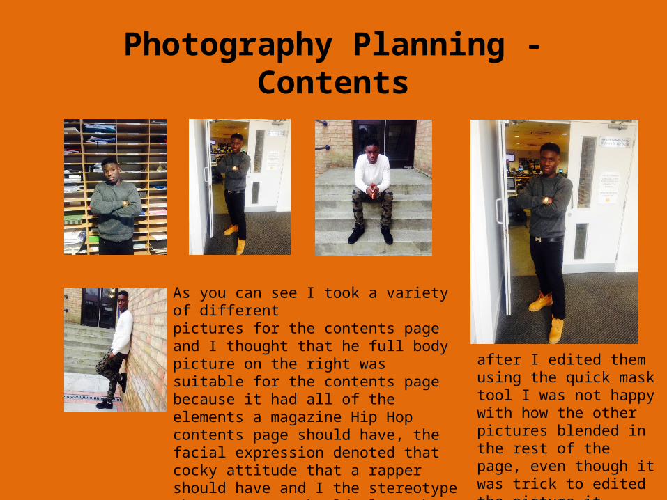
Photography Planning - Contents
As you can see I took a variety of different pictures for the contents page and I thought that he full body picture on the right was suitable for the contents page because it had all of the elements a magazine Hip Hop contents page should have, the facial expression denoted that cocky attitude that a rapper should have and I the stereotype that a rapper should always be wearing gold to measure their success, as you can see the person in the picture is wearing a gold watch. I did try to put the other pictures on to the contents page but
after I edited them using the quick mask tool I was not happy with how the other pictures blended in the rest of the page, even though it was trick to edited the picture it looked like a professional contents page in the end.

Photography Planning – Double Page Spread
For the double Spread I decided to use this picture after taking many others because it had the best lighting and pose was effective. Just
Like the contents page image, this image was also difficult to edited because the back ground was a different colour the image its self. Nevertheless I wanted to use this image because it related so well with the theme of the interview. Jay Z who own plenty of successful businesses, struggles at some point and the image above connoted the stress, whereas all the other images were plain.

Analysing - Contents
Cover lines
Masthead Date
Strapline
Main image
Headline
Convergence/website
Puff promotion
Price
Barcode

Analysing - Contents
Magazine logo
Editorial
Thumbnail Images
Sections
Page number
Main Image
Page number
Convergence/website

Analysing - Contents
Differentiationof questions
Drop CapitalMagazine logo
Main Image
Genre language
Name of interviewee
Magazine website
Convergence
Magazine responsibilities
Page number


