25
As Media Music Magazine Evaluation Momtaz Begum Mily
| Date post: | 13-Jul-2015 |
| Category: |
Education |
| Upload: | mbegum2930 |
| View: | 101 times |
| Download: | 0 times |

As Media Music Magazine Evaluation
Momtaz Begum Mily
Q1. In what ways does your music magazine use, develop or challenge forms and conventions of existing
magazine?

Analysis of Q Magazine’s Front Cover• Q magazine represents indie/pop music.
During my analysis of Q magazine, I discovered ways of addressing target audiences with the variety uses of images, colour, language, anchorage texts, fonts styles, sizes, layouts etc.
• The strategies Q magazine uses in this particular front cover is to attract the audience’s attention is by using no gender biased colours for attraction, large fonts to highlight the main issues that the magazine will include and uses the successful international music stars to help win the audience’s attention to read the magazine further.
• From analysing this magazine front cover it has inspired in me in ways to construct my version of a music magazine based around Hip Hop and R&B and how I could reach my target audiences in similar ways to the way Q magazine did but also challenge it by making my constructive styles different from this magazine.

BEATS Front Cover• As you can see my front cover is very much different from Q magazine’s front cover a
it uses only one central image which many music magazines tend to use.
• From looking at and example of one of VIBE magazines front cover, you can tell that it’s a Hip Hop magazine as Drake is used as the central Image but it appears very bold masculine colours have been used and that the main target audience of the magazine are males who enjoy Hip Hop. If you look at VIBE, the only female name used is ‘SERENA’ and that is printed in small, this suggests that the magazine is targeting more of the males and that there aren’t many Hip Hop artists in the industry to talk about and represent.
• The genre that my magazine represents is Hip Hop and R&B. Although it may look more of a Hip Hop magazine, some of the artists names mentioned like ‘’Rihanna’’ and ‘’Chris Brown’’ indicates it also features R&B in my magazine. I have a colour scheme of mainly Red, Yellow, White and Black and it is continuous throughout the rest of my magazine as part of my house style. I have only one anchorage text compared to Q magazine but I use more puffs and buzz words in a range of different colours highlighting and addressing it to the audience in different ways. The front of my magazine may look quite masculine, perhaps, because of the central image is of a male and is surrounded by bold colours which appears to emphasise masculinity, however my magazine helps balance out the aimed gender by the puff’s used for example the female artists names that my magazine will include and issues on things like ‘’gossip’’, that suggests it’s also aimed at females as they maybe interested in reading about gossip to make them feel a bit more involved.
• This is how my magazine sort of challenges a well known music magazine which represent the genre both Hip Hop and R&B and the type of gender audience it’s being addressed to.

Analysis of Q Magazine’s Contents Page• The contents page from same Q magazine that the
front cover was analysed from, mainly, the three images of the artists used as the front cover image are used again in the contents page but in different ways. For example Jay Z has a close up shot of his face in shades and the other two artists are used in the contents but as a small print screen shots of their mention in the magazine’s articles. The main issues that will be inside the magazine are all on the left hand side of the magazine and is quite small. The three main artists used indicates they are the main focus in the magazine and the page number is printed quite large next to their image indicating that the main focus is on them. The contents still uses the same colours and fonts that were used in the front cover which shows a consistency in house style. They also include the magazine name ‘Q’ on the contents to indicate it’s from this magazine company.
• From analysing this magazine contents page, it has also inspired me into the way I could design my contents page and also challenge its layout by making it a little different.

BEATS Contents Page• As you can see my contents page is very much different from Q
magazine’s contents page as my issues are spread across the page and it only uses two more images, one of Nino who the BEATS front cover central image and of Tanjia who will also be featured in the magazine. A similarity between my magazine and Q magazine is that I have a page number next to the picture of Tanjia trying to imply she is also a main focus in the magazine as well. Another similarity is that BEATS and Q magazine both include the name of their magazine in the contents page.
• My magazine so far shows consistent house style of fonts and colours used in both my front cover and contents page which highlights professionalism.
• From looking at and example of one of VIBE magazines contents page, the layout looks quite simple as it only uses one image on the contents page and some issues on the right hand side of the page. Ciara’s legs are next to thin white lines and it is the outline of a ‘V’ to indicate it’s VIBE’s magazine contents page.
• My Contents page isn’t as simple as VIBE’s magazine as it is a Hip Hop and R&B magazine as well like BEATS. My Contents page includes many more issues and also a little small print text under the cover story informing the reader by hinting a little more on what the article may include and both VIBE and Q magazine do not do that in their contents page and this is how I challenged a typical contents page of well known music magazines.

Analysis of Q Magazine’s Article• From analysing this article, many images were used
and throughout the four pages of this article. The first page was just a blown up picture which took up the space of the whole page and it also had a pull quote on that very page, the next page was just mainly texts of the article and the last two pages involved both images and article texts.
• Again colour and fonts are used with the same consistent house style which is showing professionalism. Because this magazine is called ‘Q’ , it could suggest that its an abbreviation for question which there could indicate this magazine is mainly based on interviews which is why there are so many pages full texts and pull quotes and lots of pictures which shows its relation to the article story and help keep the audience focused.
• From analysing this magazine front cover it has inspired in me in ways to construct my version of a music magazine article. The way I would want to make my article much more different from Q magazine article’s is by to keep it a bit simple by using less images and perhaps texts. I would choose not to use a plain background like Q magazine did but something that would help foreshadow the story of the article

BEATS Article Pages• As you can see my article pages are very much different from Q magazine’s article
pages. This is because I chose to use less images and less texts. I only used three images, the first page used the space of a whole page with pull quotes similar to Q magazines first page. However I used my images in ways where it could foreshadow to the readers what the article would be about. So for example, the first image, Nino’s background is displaying ‘rough’ and it is in black and white but Nino is the only one in colour. The meaning of this image used suggests that he has left his old lifestyle and now has moved on to a lifestyle which is acceptable in society and the title of the article and pull quote helps to emphasise this inference. I chose to use a picture as the background for the main article because it also shows he looks more mature and looks as though he is reflecting on his past as the background represents an anti social environment which also helps to foreshadow the story of the article.
• My magazine has shown consistency of house styles throughout the magazine in many ways such as colours and fonts used. Also, on my front cover I used semi transparent boxes to highlight specific words and the boxes are again used against the background so the text is visible and this overall shows professionalism.
• From looking at an example of VIBE magazine’s article of drake, it has similarities to Q magazine as it uses a plain background, however the article also uses few images and texts.
• My Article pages seem to challenge the way other well known music magazine’s produce there articles, because i used images in the background to allow audiences to make inferences to it to work out the relation between the images, title and pull quotes used before and after reading the article which would make things more interesting and keep the reader a bit more focused because of all the foreshadowing used.

Q2. How does your magazine represent particular social groups?

Representation:
• My magazine represents the music genre’s Hip Hop and R&B and it is emphasised through the images of people dressed in a certain way, speaking in a certain way, in a particular background, uses of colour etc.
• For example the genre hip Hop tends to target the social group that have a interest in the subculture that includesrapping, DJ-ing, hip hop dance, and graffiti art as well as talking or using slang when they speak.
For example, Nino’s story is based on his rehabilitated lifestyle where he now works as a DJ with international names in the music industry. The backgrounds he use to stood behind were covered in graffiti and could indicate a rough lifestyle. The clothes he wear is very street and in the article, from the pull quote it is clear he uses a lot of slang when he speaks in his interview.
Also , on the front cover, the terms used such as ‘’Gangster’’ suggests that Hip Hop is very street.
These Hip Hop sub-cultural features are quite masculine and there are more males in this industry and only a very few females such as Nicki Minaj.

Q3. What kind of media institution might distribute your media product
and why?

Media Institution For Distribution?I would use IPC Media to distribute my magazine because they publish magazines from music, fashion, TV, even wallpaper. This company produces many magazines and targets genders in a range of ways for example magazines only aimed for women e.g. ‘Look’ magazine or ‘shooting gazette’ which is aimed at men. Also they have other magazine products such as television magazine aimed for both males and females. They also have magazine linked website access and this would benefit my music magazine product as I have included a website address at the bottom of my contents page and this could boost popularity and perhaps sales of my product for the future. This company do only publish one music magazine which is NME; a very popular magazine to which I hope my magazine will be to as well, if not better, especially with the aid of magazine website link access. NME represents the music genre of Rock and Indie and BEATS represents R&B and Hip Hop. Bringing a new genre to this company could increase audiences as during my research I found that R&B and Hip Hop were the two most popular listened to music in the developing music industry business of the 21st century.

Q4. Who would be the audience for your music magazine and why?
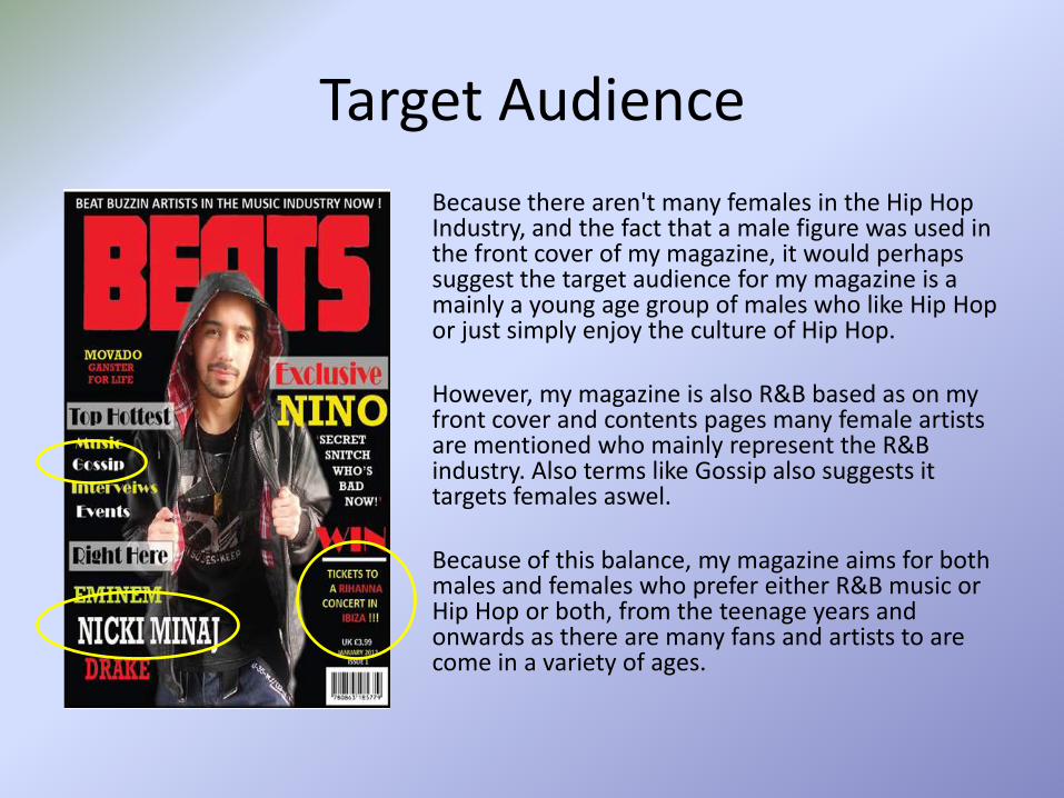
Target Audience
Because there aren't many females in the Hip Hop Industry, and the fact that a male figure was used in the front cover of my magazine, it would perhaps suggest the target audience for my magazine is a mainly a young age group of males who like Hip Hop or just simply enjoy the culture of Hip Hop.
However, my magazine is also R&B based as on my front cover and contents pages many female artists are mentioned who mainly represent the R&B industry. Also terms like Gossip also suggests it targets females aswel.
Because of this balance, my magazine aims for both males and females who prefer either R&B music or Hip Hop or both, from the teenage years and onwards as there are many fans and artists to are come in a variety of ages.

Target Audience Continued• I chose to base my construction of a music magazine around
the genre of Hip Hop and R&B because, as part of my planning, I created a survey on survey monkey and found that the three most popular listened to music are Hip Hop, R&B and Rock which was the third most popular in the 21st
century. • The Hip Hop Subculture is as I said more of street and would
aim to a younger audience from teenagers and above and the race/ ethnicity it would aim for would vary from black to white from different societies where the Hip Hop lifestyle maybe applied to their way of life.
• R&B artists are mainly African Americans who may include rocking, and jazzed based music with a heavy, firm beats in the music they produce as this was quite popular when it started to originate back from the 1940’s.
• But Hip Hop and R&B music tend to do much better in the music industry market and would aim mainly to audiences from young as teenage years to both girls and boys and increasing to young adult men and women.
• Because these two genre’s of music have a diverse range of rhythm and beats, hence the reason why I chose to call my Magazine BEATS as this name represents these two music genres well and the name is current and has the young vibe to it to make it more appealing to its target audiences.
Q5. How did you attract / address your audience?

Target Audience Attraction
• I addressed my audience in a many ways. For example the represent Hip Hop, I used a male figure dressed in jeans, black leather jacket, black t-shit, converse like trainers and in another image he wore a red hoodie and these all emphasise the street / Hip Hop stars dress code.
• To also attract females, I also based my magazine on R&B as many females are a part of this industry and are looked up to by fans who may aspire to be like them.
• The ways I tried to imply that females are also a target audience is by including things that would interest them such as ‘Gossip’ on my front cover or ‘Fashion’ that appears in my contents page.

Target Audience Attraction Continued
• Also during my construction of my music magazine, from the survey monkey results, many people wanted the music magazine to be mainly based around music, or artists and there music background and stories, some gossip and updates on events. On my front cover there are puffs such as ‘Interviews’, ‘events’ and ‘music’ to show to the target audience what my music magazine include which could make the magazine more likely to be purchased.
• Also, people who completed my survey wanted freebies or offers where they could feel more involved so I included a chance to enter and win a holiday to see music stars via a competition. Also from the survey, it helped me to come up with a reasonable price that the customers would be happy to pay and as well as considering my magazine is a monthly magazine. From my final finished magazine product survey feedback, people were happy with the price of my magazine as it wasn’t to cheap or expensive bearing in mind BEATS is a monthly magazine.
Q6. What have you learnt about technologies from the process of
constructing the product?

New knowledge• Setting up a blog then starting to use it was at first
quite difficult for me as I don’t usually upload my work on websites. After experimenting with how to use BlogSpot such as uploading textual information, pictures, editing posts etc all these things I got use to and was able to manage it well without problems.
• Taking images with a digital camera wasn’t difficult as I already had knowledge on how operate cameras and basic knowledge of taking images. Also, from before preparing and the constructing process of a my music magazine, I do like taking pictures of many things and iexperiment by taking pictures in different shots and angles and then viewing the pictures to see which has the best look and / or by cropping or deleting a particular section of the image to see if it can be more effective. From these experiences I was able to apply them to taking pictures of Nino in different backgrounds with him in different positions and the camera in different angles to which after I uploaded the pictures, I was able to select the best ones to work on and improve them by adding different effects.
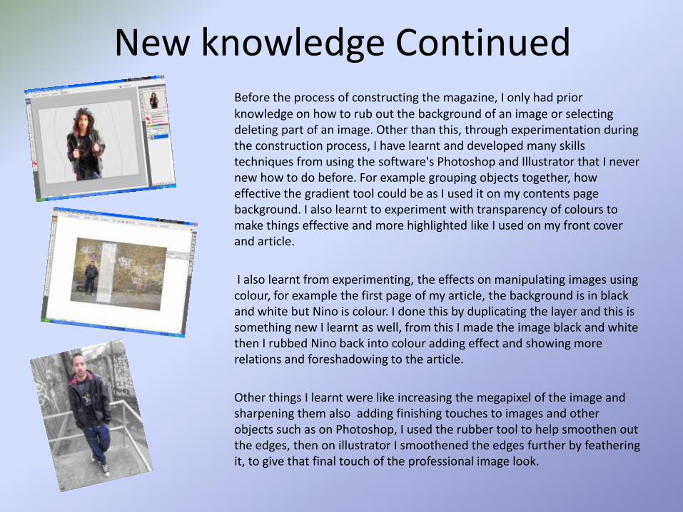
New knowledge ContinuedBefore the process of constructing the magazine, I only had prior knowledge on how to rub out the background of an image or selecting deleting part of an image. Other than this, through experimentation during the construction process, I have learnt and developed many skills techniques from using the software's Photoshop and Illustrator that I never new how to do before. For example grouping objects together, how effective the gradient tool could be as I used it on my contents page background. I also learnt to experiment with transparency of colours to make things effective and more highlighted like I used on my front cover and article.
I also learnt from experimenting, the effects on manipulating images using colour, for example the first page of my article, the background is in black and white but Nino is colour. I done this by duplicating the layer and this is something new I learnt as well, from this I made the image black and white then I rubbed Nino back into colour adding effect and showing more relations and foreshadowing to the article.
Other things I learnt were like increasing the megapixel of the image and sharpening them also adding finishing touches to images and other objects such as on Photoshop, I used the rubber tool to help smoothen out the edges, then on illustrator I smoothened the edges further by feathering it, to give that final touch of the professional image look.

Q7. What do you feel you have learnt in the progression from the
preliminary task to the full product?

Front Covers: College Magazine VS Music Magazine
As you can see there is huge difference between the preliminary task front cover and my final music magazine front cover product. This is because in my final product I have used a better camera and using the adobe Photoshop and Illustrator software's, I have managed to manipulate images e.g. by increasing megapixel, sharpening and smoothening, lighting. I have also used better font and colour styles and used in consistently. I have also added more puffs and used a other features of magazine’s like banners and used particular colours and backgrounds in order for puffs to stand out, be clear and readable by target audiences. In the preliminary task, I didn’t use much puffs but instead used longer sentences and they are likely to put off the readers attention and to approach the magazine.
overall, my final product of my music magazine front cover has more colour and buzz words behind a background where everything can be recognised, especially making it clear who the cover story is about with a anchorage text underneath unlike the preliminary task front cover.
Contents Pages: College Magazine VS Music Magazine
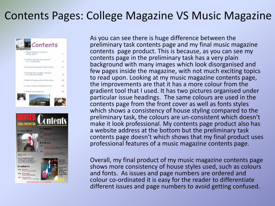
As you can see there is huge difference between the preliminary task contents page and my final music magazine contents page product. This is because, as you can see my contents page in the preliminary task has a very plain background with many images which look disorganised and few pages inside the magazine, with not much exciting topics to read upon. Looking at my music magazine contents page, the improvements are that it has a more colour from the gradient tool that I used. It has two pictures organised under particular issue headings. The same colours are used in the contents page from the front cover as well as fonts styles which shows a consistency of house styling compared to the preliminary task, the colours are un-consistent which doesn't make it look professional. My contents page product also has a website address at the bottom but the preliminary task contents page doesn't which shows that my final product uses professional features of a music magazine contents page.
Overall, my final product of my music magazine contents page shows more consistency of house styles used, such as colours and fonts. As issues and page numbers are ordered and colour co-ordinated it is easy for the reader to differentiate different issues and page numbers to avoid getting confused.

Audience Feedback• My magazine aim was to represent Hip Hop and R&B and was to
appeal to an audience of both males and females, from young as teenage years, who like listening to music of those genres and / or like the culture behind the genre’s.
• From the Survey Monkey Results, I have gathered that the majority found the name of my magazine appealing and said it looked like more of a Hip Hop and R&B magazine that aimed to both males and females. People were asked to rate my magazine front cover and contents page and the higher scores ranged from mainly 7-10. Also the majority liked my article and one person left a response saying ‘’I like how the magazine images and article title relate to the article.. it all works well’’. This leads to the rating of my images used as a whole in my music magazine and people rated them and the higher scores ranged from 8-10. After considering that my magazine would be released monthly and how much people would actually buy a magazine for from the survey that was done before constructing my magazine, judging from the results it shows that people think my magazine price is reasonable and that they would buy it.
• Overall, judging from the audience feedback from survey monkey poll results and the few comments left behind, the construction of my magazine went well. The only thing I would work on for future issues is that I would use less bold colours if I was to use a male model again, because from the results collected from the polls, a few people thought it was aimed at males so next time I would use neutral colours to indicate the magazine is aimed at both males and females.


