ATINER CONFERENCE PRESENTATION SERIES No: MED2017-0024
1
ATINER’s Conference Paper Proceedings Series
MED2017-0024
Athens, 16 October 2017
Changing Logo and the Relationship between Corporate Identity
and Corporate Image: Renault Case-study
Banu Karsak
Athens Institute for Education and Research
8 Valaoritou Street, Kolonaki, 10683 Athens, Greece
ATINER’s conference paper proceedings series are circulated to
promote dialogue among academic scholars. All papers of this
series have been blind reviewed and accepted for presentation at
one of ATINER’s annual conferences according to its acceptance
policies (http://www.atiner.gr/acceptance).
© All rights reserved by authors.
ATINER CONFERENCE PRESENTATION SERIES No: MED2017-0024
2
ATINER’s Conference Paper Proceedings Series
MED2017-0024
Athens, 16 October 2017
ISSN: 2529-167X
Banu Karsak, Associate Professor, Galatasaray University, Faculty of
Communication, Istanbul, Turkey
Changing Logo and the Relationship between Corporate
Identity and Corporate Image: Renault Case-study
ABSTRACT
Managing corporate identity is about identifying the right image for an
organization and communicating it effectively. The terms “corporate identity”
and “corporate image” are sometimes confused with each other. Corporate
identity is what the organization communicates via various cues, whereas its
image is how its target groups actually see it. An image is a perception and it
exists only in the mind of the receiver. In short, corporate identity is a visual
statement of who and what a company is. By changing corporate identity, a
company may help change its image. Corporate identity includes aspects of design
such as logo, colour, type face, and trade characters but also embrace less
tangible elements such as culture, behaviour, and communication style. The
corporate logo or mark is the easily recognizable face of a corporation. The
logo identifies the company or brand. It tells the public who produces the
goods or services they are buying and it is therefore the foundation on which
corporate identity is built. A logo is a graphic representation or symbol of a
company name, trademarks, abbreviation and often, is uniquely designed for
instant recognition. The logo must be catching, memorable and easily recognized.
In this study we propose to examine, by means of visual semiotic analyses,
how logos, as important factors in the construction of corporate identity,
influence the corporate image. The logo of RENAULT, who changed its logo
in 2015, has been chosen as a case study, in order to find out the relationship
between corporate identity and corporate image.
Keywords: logo, corporate identity, corporate image, visual semiotics
Acknowledgement: This paper has been financially supported by Galatasaray
University Research Fund under Grant no 17.300.003
ATINER CONFERENCE PRESENTATION SERIES No: MED2017-0024
3
Introduction
The growth in trade, production and competition in our day, has revealed
the necessity of distinctiveness and need of recognisability for corporations and
brands, and the concept of identity has gained importance. Besides rendering it
possible to make either a positive or a negative impact on the addressee, corporate
identity is a means that helps persons or corporations express and publicise
themselves.
Changing social conditions have caused changes in the content of the
corporate identity concept, and broadened the scope of the concept. With
regard to providing the first impression about the corporate identity, the visual
identity, which can be defined as the exposed face of corporate identity, is of
capital importance. The most remarkable and conventional elements of visual
identity, are the brand logos. Logos are images that depict who the corporations
are, and what they do. Considered from this aspect, any change in a logo, will
directly affect the corporate identity, and therefore, will change customers’
perception about the corporation.
Exemplified in this study with the corporate identity of Renault Company
that is renewed in consequence of the change in their logo, the correlation
between the corporate identity and this change is going to be examined.
Renault, who updated and supported their visual with the motto “Passion for
life” in 2015, are a company operating in the automotive industry. Based on the
possibility that the changes to be made in the logo might affect the perception
of the public about the corporation, an answer to the research question, what
kind of a correlation is there between corporate identity and corporate image, is
going to be sought.
The objective of this study is to analyze the correlation of visual identity,
that is one of the components shaping the corporate identity, and of logo in
particular, with the corporate identity, and therefore with the corporate image.
The logo of the brand we have chosen in this regard, is going to be examined in
the light of visual semiotic theories. The methodological details pertaining to
the study are given in the methodology section.
Conceptual Framework
In order to define the concept of corporate identity, which indicates who
an organization is, what it does and how it does, it will be appropriate to define
the concepts of "organization" and "identity". Dictionary literally means; "A
society is a religion, language, justice, family, law, property, state and so on.
And spiritual beings that are created by people like, and whose certain order,
law, or principle . " Again, the dictionary literally means identity; Is defined as
"all of the characteristics of personality as a social being, conditions, qualities
and characteristics specific to man, circumstances that enable one person to be
a specific person"(Püsküllüoğlu, 1997: 677). Identity enables people and
ATINER CONFERENCE PRESENTATION SERIES No: MED2017-0024
4
institutions to influence them positively or negatively, so it is a tool for people
or institutions to express themselves and promote them.
Looking at the historical development process of the institutional identity,
it appears that the shields of the kings, who led the army in the past centuries,
used icons such as the St.George cross and the Lorraine cross. But as all the
kingdoms use the same emblem, it causes the enemy's head to get mixed up,
and in time the kingdoms have started to use their own characters (Jefkins,
1994: 324). In the Middle Ages, the only force that survived the fall of the
Roman Empire, the Church struggled to regain Christian origins and benefited
from various symbols, primarily crosses. We know that during the colonial
period some nations created identities in order to create unity with the countries
under their patronage; One of the most important examples of this is India,
which is under British colonial rule. In the 1860s, there was a very complex
hierarchy of positions in India, some of whom were large, some were small,
and many were principals and principals. The Queen of England was also
called the Empress of India. All these principals and principalities participated
in a great celebration in Delhi in 1877 and all the uniforms, graphics and
symbols of this demonstration were created by Lockwood Kipling. In this
period, there is also a unit called "Army Officer" in England (Olins, 1990: 16).
All these efforts throughout history have resulted in the promotion of self-
identification, differentiation, unity and sense of belonging. We know that
cities are in the process of creating identity in order to introduce themselves or
to distinguish themselves. For example, in the 15th century, Florentine formed
a picture to separate from Malta. It is also possible to see the snake and cross
figurine, the symbol of the Visconti family (1277-1477), who ruled the city of
Milan for centuries, even today, even in the logo of the Alfa Romeo car brand.
The concept of corporate identity After World War II, Lippincott and
Margulies, operating in New York, were introduced in 1945 by Walter
Margulies, founder of the well-known consulting company. It is possible to say
that Wolff Olins, founded in 1965, is the first agency to operate in this country
in the UK, although the study of corporate identity in the direction of this new
concept in the UK began later on from the first half of the 1960s (Meech,
2002:128). Until the end of World War I, corporate identity reflected the
personal identity of the organization owner. Later on, only the visual identity of
the foundation seems to reflect the corporate identity of the foundation, which
seems to be the logo, color, writing character. In the era of strategic period
from the 1970s to the present day, the approach of corporate identity has been
adopted from the perspective of institutional design, corporate communication,
corporate behavior and corporate philosophy that incorporates visual elements
as part of the organization's communication strategy, not just the image. The
use of these items in an operation, organization-specific manner constitutes the
identity of that institution. Corporate identity is part of the organization's
communication strategy and explains the organization of an organization.
When we look at the historical development process of the identity of the
institution in Turkey, the flags, flags and Sultan of the Ottoman Empire period
can be considered as the first examples. The most advanced examples of brigands
ATINER CONFERENCE PRESENTATION SERIES No: MED2017-0024
5
in the Turkish Islamic states that can be defined as the signature of the Sultan's
name are found in the Ottomans. The Ottomans took the brick from the Anatolian
Selçuk and Anatolian principals and developed it. The first monogram of the
Ottoman sultans was used by Orhan Gazi. The bricks used by Orhan Gazi are
dated 1324 and others are dated 1348 and contain the expression Orhan bin
Osman. Although there are 36 Ottoman sultans, there are 35 sultan brides,
because the first sultan Osman Gazi's tugraya was not found anywhere until
today. In the last era, berat, ferman, and tuition drawn on the ritual are also
seen in the notebooks and in the notebooks. In later dates, it was included in
fountains, mosques, imaret books which were made in the bills, fountains,
flags, population records, buildings, as an emblem. 15.10.2006) On June 15,
1927, a law was issued by the Turkish Grand National Assembly about the
abolition of brigades a year before the writing revolution. With this law, the
use of the bricks on all the official documents in the Republic of Turkey has
come to an end (28 Mayıs 2007 no 1057 National journal publication date 15
Haziran 1927, no 608).
The real important development in Turkey undoubtedly happens during
the Republican period. Multiparty transition, efforts to create corporate identity
as a result of new commercial breakthroughs have gained importance. The
most important breakthrough in this area is the fact that the foreign capital
comes to Turkey in the 60's and the Turkish institutions want to establish their
identity as foreign examples. The establishment of İş Bankası and the creation
of an institutional identity are the first of these applications. It can be said that
the corporate identity of İş Bankası started from the day when the bank was
established. In other words, İş Bankası has never been an organization that
attracts "identity crisis".
With the words of Mustafa Kemal Atatürk, "intelligence, attention and
chastity" was the first condition of success. After 60 years of establishment, it
was necessary to provide a more contemporary and new image to the bank in
the current competitive environment. Until the middle of the 80's the images
that the bank reflected out were "big", "strong" and "trustworthy", but now this
image was not enough. İş Bankası had characteristics such as "to act cautiously",
"to have a complex bureaucracy" and "to follow the rules of the ruling letter"
which did not comply with today's banking rules. In 1987, an agreement was
signed with Lippincott and Margulies. The company has made various proposals
ranging from the creation of new images and concepts to express the bank's
new personality and personality, to the visualization of all aspects of the bank,
the printed materials, the emblem, the illuminated advertisements, and the
exterior and interior appearance of its branches. In the end, it was decided that
İş Bankası's image should be as innovative, modern and dynamic as it is big,
strong and reliable. On the other hand, İş Bankası refusal to change its name to
İşbank was rejected. The logo created in 1948 is still in use with a few minor
changes. İş Bankası is not only interested in appearance to strengthen its corporate
identity, but also strengthens its identity with social responsibility applications
such as scholarships for students in earthquake victims, hospital construction,
student dormitories.
ATINER CONFERENCE PRESENTATION SERIES No: MED2017-0024
6
The corporations, the numbers of which are growing every day, are
mentioned with their unique corporate identities created with the purpose of
being distinguished from the others. Although the studies on corporate identity
have only recently begun to be carried out, symbols, which are significant parts
of identities, were being engraved on cave walls, and that is to say, have existed
since the early eras of human history. In the 19th
century, it was possible to see
craftsmen in Europe use symbols reflecting their professions (Napoles, 1988:13-
14).
The concept of corporate identity was considered as a visual design for
years; however, later on, as a result of changing social conditions, its content
has changed, and broadened. During the period that started in 1970’s and is
extant, known as the strategic period, the approach asserting that the concept of
corporate identity consists of corporate design, corporate communication,
corporate behaviour and corporate ideology, that involve visual elements, was
adopted. Utilization of the above elements in a way peculiar to an enterprise or
an organization shapes the identity of that corporation (Okay, 2000: 20-40).
The concept of corporate identity (Peltekoğlu, 2004: 374), focusing on the
way a corporation is physically recognized, interacts with the concept of
corporate image, that focuses on how the corporation is notionally perceived.
In other words, corporate identity is defined as the whole of messages given by
the corporation; whereas corporate image is defined as the whole of perception
these messages create on the target group of the corporation (Wood, 2004:137).
All studies carried out for the purpose of creating a corporal identity, shape the
corporate image. Therefore, a change in the elements that form the corporate
identity might naturally have impacts on the corporate image. With his
judgment “Identity management can preserve a good image”, Clive Chajet
underscores the significance of this connection (Chajet, 1989: 18).
In other words, corporate identity is all the messages the organization
gives, the corporate image is all the perceptions that these messages have on
the target mass of the foundation (Wood, 2004: 137). Interpretation of the
messages related to the identity of the organization ensures that the image of
that organization is formed. In short, the image is the image of the jungle
perceived by the target groups, while the identity is the way that an institution
introduces itself to groups (Van Riel, 1995:28). While Logo creates the corporate
identity of an organization, it also plays an important role in reflecting the
brand's image. The current status of branding in cultural dissemination is far
more than traditional corporate sponsorship, which is the classic arrangement
of logos in a poster or program in exchange for donations for an organization.
All the façade branding approaches applied to music, arts, films, social activities
are now used. These projects make the logosphere the focus of everything it
touches (Klein 2002: 51).
All the work done to create corporate identity shapes the corporate image.
Therefore, it is natural that the change made in one of the elements forming the
corporate identity will affect the corporate image. Logo should be regarded as
the most striking element of corporate identity in this context. Logos has some
features that it should possess in order to be able to be defined as a good logo:
ATINER CONFERENCE PRESENTATION SERIES No: MED2017-0024
7
it can be classified as perception, differentiation, understanding, reminding and
sending (Westphalen, 2004:306).
In this context, logos must be considered as the most remarkable elements
of corporate identity. Playing an important role in the reflection of corporate
identity, a logo is a hybrid sign; or to clarify, a commercial sign that touches
upon both the language and the pattern (Adam and Bonhomme, 1997: 62).
Logos is a design based on visual perception that people know when they see
it, but can not express it with words (Mucuk, 1997:10). The logo, which can be
described as a diagrammatic flash, visually instantly launches all the values and
imagination of a mark when it is pressed on the button (Semprini 1996: 66-67).
Most of the corporations express themselves through the symbols they
choose, such that, whenever that symbol is seen, the relevant corporation runs
through the mind. Some, on the other hand, are recognized with their names,
rather than with their logos. There are also a number of corporations that present
themselves through both their names, and emblematic characters. Renault
automotive company, for instance, is known with both their rhombic symbol,
and with the emblem involving their characteristic type font. The crocodile of
the world-renowned Lacoste brand remembers the brand everywhere they are,
when they see powerful symbols such as Apple's apple, Peugeot's lion, and they
do not need typography. The primary function of a logo is to make a reference
to the company and the product, or to the product identity. It is not obligatory
to use a grapheme in every logo (Çamdereli, 2000: 111). The type fonts of
graphemes assist conveying the meanings of words, and the messages, correctly.
Among the studies on logos, carried out in the field of visual semiotics,
Jean-Marie Floch’s “Identités Visuelles” can be named as a remarkable one.
Taken part in the analyses of works of different types, such as photographs,
pictures, comic books, Floch has later on focused his efforts on advertisements.
He has analyzed the symbols of IBM and APPLE, and has specified the
meanings and contrarieties they involved, in his abovementioned work, and has
made a great contribution to the studies in the field (Floch, 1995: 44-50).
Organizations may want to change their visual identity over time or change it
entirely. Taking this decision is important and difficult and can be achieved
with full support from the general government. A person perceives 2000
images per day and 150 brands per day (Westphalen, 2004:312). This explains
the importance of your visual. Logos, in the age of economic warfare and
competition between companies is a visual weapon. The logos can become
obsolete over time and have to adapt to time. Organizations need logo change,
a rather difficult and expensive change to change their images and perceptions.
Being more contemporary and having a logo that reflects its strategies and values
should be applied with care as it has importance in terms of corporate image.
Many brands and institutions in Turkey and around the world have changed
logos over time. Arçelik logo is the most remarkable change in Turkey. Arçelik
changed the old hard line logos with a smoother rectangular logo and has a more
contemporary perception in the minds of consumers as well as changing their
identity. In short, the change of the logo's logo has also influenced the change
of identity and image. Piyale as a family business, after participating Sabancı
ATINER CONFERENCE PRESENTATION SERIES No: MED2017-0024
8
Holding, he emphasized this change with the new visuals that combine with the
icons representing the product variety and SA.
Methodology
The logo of Renault, we have chosen with the purpose of analyzing, is going
to be examined as a visual means of communication, with an eclectic approach,
in the light of semiotic theories. The purpose in this study is to define the content
of the logo, and to evaluate it in terms of conformity with the corporate identity.
The studies on semiotic analyses were commenced with Swiss linguist
Ferdinand de Saussure, and American Charles Saunders Peirce. Asserting in
his work “Course in General Linguistics” for the first time that semiotic
analyzing is possible, Saussure touches on the subject of concepts that can be
implemented in signs. However, it is an indisputable fact that Peirce was
involved in semiotics, before Saussure was. Peirce points out the importance he
attaches to semiotics, stating that “the whole universe, although not being
composed of signs only, pulsates with signs”. Moreover, in a way justifying his
words, he confirms that he can discuss all subjects from mathematics to chemistry,
from psychology to astronomy, from gravity to phonetics, from economy to the
history of science, as a semiotic study only, and that he does not discuss any
subject with an approach other than a semiotic one. (Yücel, 1999: 90-91).
It will be appropriate at this point to describe the concept of signs proposed by
Saussure, which is the building block of semiotics. Saussure divides signs into
two, as the signifier (hearing images), and the signified (concept), and asserts
that the correlation between these two is groundless (Saussure, 1985: 99). Signifier
and signified are two inseparable elements and the only difference between
them, is that a signifier requires a means. According to him, the signifier is a
form, and is a projection of the concepts in our minds. All signifiers, through
the medium of a shape, refer to content.
It was emphasized that the signified, in linguistics, is not an object, but is a
mental design of the object, and Saussure indicates the mental subjectivity of
the signified, with the term of “concept” (Barthes, 1993: 38). Every image, or
every signifier, evokes different concepts in the mind of the viewer.
Peirce, who made a great contribution in semiotic image reading, has turned
Saussure’s approach to signifier/signified, into a ternary system. Dealing with
signs mainly by focusing on the signifier, this conversion, introduces three
types of sign, that are visual sign (icone), index (indice) and symbol (symbole)
(Rifat, 2000: 133).
One of the essential works in visual semiotics is Roland Barthes’s study
named “Rhétorique de l’Image”. In the mentioned study, Barthes reflects that
the subject of semiotics is the meaning, and states that each of the sign systems,
for instance pictures, written works, theatres and etc., form a content system.
After describing the objects and the colours in the commercial photographs of
the pasta brand, Panzani, Barthes has examined the concepts they include, in
terms of their connotations (Barthes 1964: 40-51). Besides linguistic messages,
ATINER CONFERENCE PRESENTATION SERIES No: MED2017-0024
9
in this study, he focuses on the denotative and symbolic, or in other words,
connotational analysis of image. The elements we notice in the examined subject,
at first glance, are denotative messages, and can be described in short, as their
pure and uninterpreted meanings. Denotation mediates the symbolic message,
and connotations are built on it. Connotation is based on symbolic
communication, and in order to interpret this message, the contribution of
reader is needed. Denotation mediates the message, and the connotations are
built on it. Connotation is based on symbolic communication, and in order to
interpret this message, the contribution of reader and a subjective interpretation
is needed.
Research Findings
The first steps of the establishment of Renault were taken after Louis
Renault wandered in Lepic in Paris on December 24, 1898 with a small car,
and a year later the Renault brothers and sisters formed the foundation of the
community. Born in February 1877 as the son of a cloth merchant in Paris,
Louis Renault was interested in mechanics, engines and electricity from an
early age. Louis Renault, who set up a workshop in the garden of his family in
Paris, near his family's home in Billancourt, ended his education and started
working on new technologies.
In 1898, Louis Renault, who entered the auto world by creating his first
four-wheeled vehicle, founded the Renault Brothers Group with his two other
brothers, Marcel and Ferdinand, with little capital. Marcel and Ferdinand were
not sure that this industry would succeed at first, but in a very short time Louis
was able to prove it. In the following years, cars won championships in many
races and they advertised their products and made direct marketing. The cars
were being sold for 3000 francs, equivalent to a ten-year salary at that time. As
the brand developed, the workshops along the Seine grew. That same year,
Louis Renault introduced the first 4-cylinder engine.
With the loss of Marcel's life in the Paris-Madrid car race in 1903, Louis
was shocked to lose both his brother and his partner. From these years Ferdinand
has begun to expand Renault's commercial network. In 1905, the group was
ordered to produce serials with 250 cab orders. The cars have been recognized
everywhere from New York to Buenos Aires. In 1909, with the death of
Ferdinand, Louis came to be the only boss. In addition to producing a minibus,
the truck also handles aviation and starts producing aircraft engines.
Spread over 136 thousand square meters, the factory produces the first
military tank during World War I. Louis Renault is honored for its contribution
to the war. Since 1919 Ford, Citroen, and Peugeot brands have entered the market,
and the sector has grown, and despite the decline of Renault's sovereignty II.
During World War II, in 1942, it maintained its supremacy over the bombing
of the Billancout factory. Today Renault is a global brand and still maintains its
position in the automobile sector.
ATINER CONFERENCE PRESENTATION SERIES No: MED2017-0024
10
A Renault logo was created for the first time in 1900, and it was composed
of the initials of Louis Renault. In the logo created in 1919, Renault’s contribution
to the military forces during World War I, was being symbolized. The logo was
involving a tank surrounded by a circle. In the logo created in 1923, the circle
was still there, but the name Renault, was placed in the centre of it. For the first
time in 1925, the rhombic figure was used. The logo was remaining nearly the
same in 1950’s, despite minor changes. However, in 1972, the name of the
company was removed, in the logo1 created by Vasarely, who was a great painter.
The logo created in 1992, was a plain and simple one, compared to the previous
logos, and had a three dimensional appearance. Today, this logo is still being used,
and is integrated with the text underneath.
Renault Logos in the Past2
Logo in 1900’s Logo in 1919
Logo in 1923 Logo in 1930
1 www.caradisiac.com/php/actu 01.10.2003
2 http://college-anne-frank.org/textes/logorenault.htm 01.10.2003
ATINER CONFERENCE PRESENTATION SERIES No: MED2017-0024
11
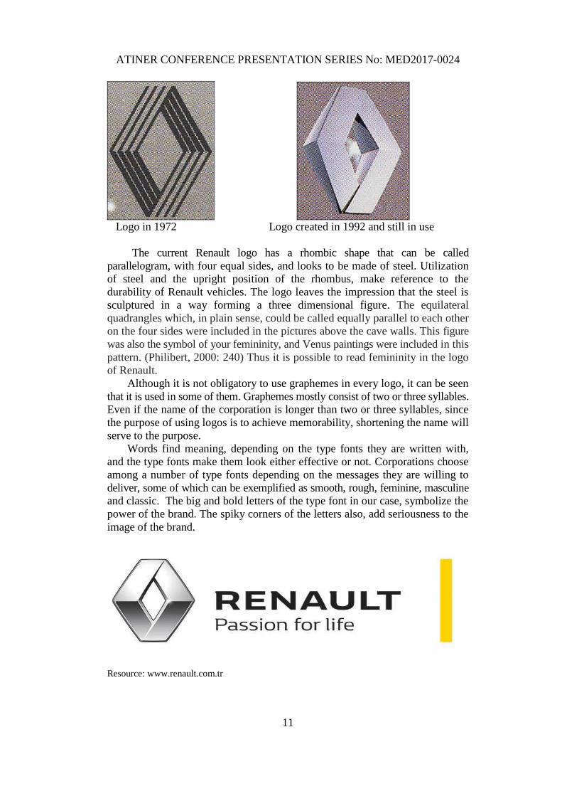
Logo in 1972 Logo created in 1992 and still in use
The current Renault logo has a rhombic shape that can be called
parallelogram, with four equal sides, and looks to be made of steel. Utilization
of steel and the upright position of the rhombus, make reference to the
durability of Renault vehicles. The logo leaves the impression that the steel is
sculptured in a way forming a three dimensional figure. The equilateral
quadrangles which, in plain sense, could be called equally parallel to each other
on the four sides were included in the pictures above the cave walls. This figure
was also the symbol of your femininity, and Venus paintings were included in this
pattern. (Philibert, 2000: 240) Thus it is possible to read femininity in the logo
of Renault.
Although it is not obligatory to use graphemes in every logo, it can be seen
that it is used in some of them. Graphemes mostly consist of two or three syllables.
Even if the name of the corporation is longer than two or three syllables, since
the purpose of using logos is to achieve memorability, shortening the name will
serve to the purpose.
Words find meaning, depending on the type fonts they are written with,
and the type fonts make them look either effective or not. Corporations choose
among a number of type fonts depending on the messages they are willing to
deliver, some of which can be exemplified as smooth, rough, feminine, masculine
and classic. The big and bold letters of the type font in our case, symbolize the
power of the brand. The spiky corners of the letters also, add seriousness to the
image of the brand.
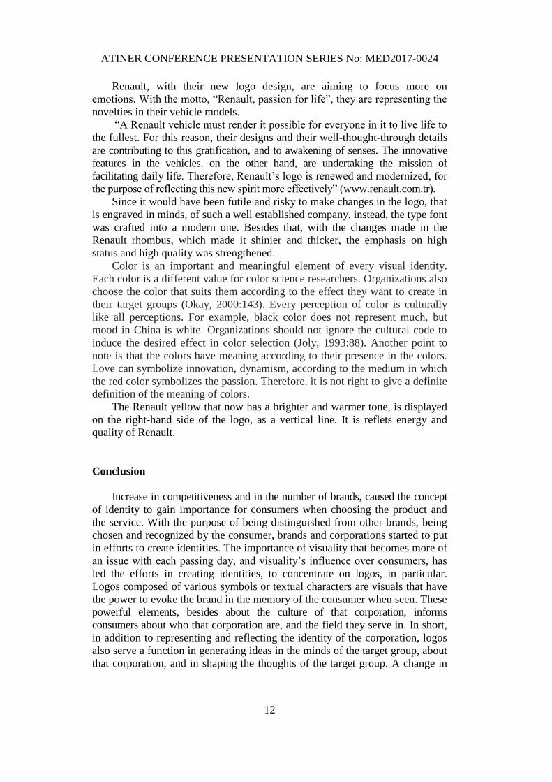
Resource: www.renault.com.tr
ATINER CONFERENCE PRESENTATION SERIES No: MED2017-0024
12
Renault, with their new logo design, are aiming to focus more on
emotions. With the motto, “Renault, passion for life”, they are representing the
novelties in their vehicle models.
“A Renault vehicle must render it possible for everyone in it to live life to
the fullest. For this reason, their designs and their well-thought-through details
are contributing to this gratification, and to awakening of senses. The innovative
features in the vehicles, on the other hand, are undertaking the mission of
facilitating daily life. Therefore, Renault’s logo is renewed and modernized, for
the purpose of reflecting this new spirit more effectively” (www.renault.com.tr).
Since it would have been futile and risky to make changes in the logo, that
is engraved in minds, of such a well established company, instead, the type font
was crafted into a modern one. Besides that, with the changes made in the
Renault rhombus, which made it shinier and thicker, the emphasis on high
status and high quality was strengthened.
Color is an important and meaningful element of every visual identity.
Each color is a different value for color science researchers. Organizations also
choose the color that suits them according to the effect they want to create in
their target groups (Okay, 2000:143). Every perception of color is culturally
like all perceptions. For example, black color does not represent much, but
mood in China is white. Organizations should not ignore the cultural code to
induce the desired effect in color selection (Joly, 1993:88). Another point to
note is that the colors have meaning according to their presence in the colors.
Love can symbolize innovation, dynamism, according to the medium in which
the red color symbolizes the passion. Therefore, it is not right to give a definite
definition of the meaning of colors.
The Renault yellow that now has a brighter and warmer tone, is displayed
on the right-hand side of the logo, as a vertical line. It is reflets energy and
quality of Renault.
Conclusion
Increase in competitiveness and in the number of brands, caused the concept
of identity to gain importance for consumers when choosing the product and
the service. With the purpose of being distinguished from other brands, being
chosen and recognized by the consumer, brands and corporations started to put
in efforts to create identities. The importance of visuality that becomes more of
an issue with each passing day, and visuality’s influence over consumers, has
led the efforts in creating identities, to concentrate on logos, in particular.
Logos composed of various symbols or textual characters are visuals that have
the power to evoke the brand in the memory of the consumer when seen. These
powerful elements, besides about the culture of that corporation, informs
consumers about who that corporation are, and the field they serve in. In short,
in addition to representing and reflecting the identity of the corporation, logos
also serve a function in generating ideas in the minds of the target group, about
that corporation, and in shaping the thoughts of the target group. A change in
ATINER CONFERENCE PRESENTATION SERIES No: MED2017-0024
13
the logo, will have an impact on the corporate identity, and therefore, on the
corporate image. Based upon the above mentioned, it will be correct to say that
there is a correlation among logo, corporate identity, and corporate image.
The Renault logo, we have chosen to examine in this study, was changed
with small touch-ups by the company in 2015. In time, companies might decide
that their logo is not as modern as it used to be, and that it does not reflect new
strategies anymore. A company who though this way, Renault, took a decision
to change their logo, as part of their new strategy. The reason of this change
was the inadequacy of the old logo in reflecting new strategies to the consumer.
The conclusion we draw based upon the example we have examined, indicates
that logos have the power to affect corporal identity and image, either
positively, or negatively. Logos do not only have a function in publicizing and
exhibiting the difference of the brand, but they also have the power to influence
the thoughts of the consumer about that brand. On that account, companies
must consider making use of the irreplaceable power of their logos as an important
part of their communication strategies, in order to be well-recognized and
perceived, or put simply, to strengthen their image in the competitive environment.
References
Adam and Bonhomme (1997). L’Argumentation Publicitaire, Nathan, Paris.
Aytuna Nazlı ve Karsak Banu (2008). “Kurum imajı ve İkna Stratejileri: Etkili İletişim
Sorgulamaları”, Yönetim-iletişim-kültür, Jale Minibaş, Turhan Erkmen (ed) Arıkan
Yayınları.
Barthes, Roland (1964). “Rhétorique de l’Image.”, Communication, 4, Seuil, Paris, 40-51.
Barthes, Roland (1993) Göstergebilimsel Serüven. Tra. Mehmet Rifat, Yapı Kredi
Yayınları, İstanbul.
Chajet Clive (1989).”The Making of a New Corporate Image”, Journal of Business
Strategy, May-June 18-20.
Çamdereli, Mete (2000). “Çok İleri Giderek Bir Mavi Afişi Okumak”, Gazi İletişim, 5:
93-120.
Encylopédie des Symboles (1996). Le Livre de Poche, Paris.
Etkili İletişim Terimleri Sözlüğü (2002). Derleyen Nüket Güz, İnkılap Kitabevi, İstanbul.
Floch, Jean Marie (1995). İdentités Visuelles, Presse Universitaires de France, Paris.
Gregory, J and Wiechmann J. (1999). Marketing Corporate Image, NTC Publishing
Group, Chicago.
Jefkins, Frank, Public Relations Techniques, Butterworth-Heinemann,Oxford, 1994
Klein, Naomi (2002), No Logo, Ankara, Bilgi Yayınevi
Meech Peter, Halkla İlişkilerde Eleştirel Yaklaşımlar, Vadi Yayınları, İstanbul, 2002
Mucuk İsmet (1997). Pazarlama İlkeleri, Türkmen Kitabevi , İstanbul.
Napoles, Veronica (1988), Corporate Identity Design, John Wiley&Sons, New York.
Okay, Ayla (2000). Kurum Kimliği, Media Cat Kitapları, Ankara.
Olins Wally, The Wolf Olins Guide to Corporate Identity, Black Bear Press, London, 1990
Peltekoğlu, Filiz Balta (2007). Halkla İlişkiler Nedir?, Beta Yayınları, İstanbul.
Philibert, Myriam(2000), Dictionnaire des Symboles Fondamentaux, Paris, Editions du
Rocher
Püsküllüoğlu Ali, Türkçe Sözlük, Arkadaş Yayınları, Ankara, 1997
ATINER CONFERENCE PRESENTATION SERIES No: MED2017-0024
14
Rifat, Mehmet (2000). XX. Yüzyılda Dilbilim ve Göstergebilim Kuramları, Om Yayınevi,
İstanubul.
Riel Van (1995). Principles of Corporate Communication, Prentivce Hall, London.
Saussure, Ferdinand de (1985). Genel Dilbilim Dersleri, (Tra).Berke Vardar, Birey ve
Toplum Yayınları, Ankara.
Semprini , Andrea(1996), Analyser la Communication, Paris, L’Harmattan
Wesstphalen Marie-Helene (2004). Communicator (4eme edition), Dunod, Paris.
Wood, Emma (2004). Corporate Identity, Alison Theaker (Ed.), Handbook of Public
Relations, Taylor and Francis Group.
Yücel, Tahsin (1999). Yapısalcılık,Yapı Kredi Yayınları, İstanbul. www.renault.com.tr