18
Audience Focus Group Questionnaire results
| Date post: | 15-Aug-2015 |
| Category: |
Education |
| Upload: | louisacampbell |
| View: | 25 times |
| Download: | 0 times |

Audience Focus Group Questionnaire results

This presentation displays the results of the questionnaire that I presented to the target audience of both male and females between the ages of 15-25. The aim of this was to get feed back on the first drafts of my music magazine in order to show where improvements are needed.

The answers to this question where similar and most people thought the overall look and theme of the magazine was good and fitted with the genre with good photos. People also commented on the simple layout and colour scheme I chose saying they thought it worked well and also made it obvious it was an indie music magazine. This means it will appeal to the target audience and means they are likely to buy the magazine.

All the answers to this were positive meaning each person thought the colour scheme worked well for the genre. Many reasons for this were because it is gender neutral which means there is no gender stereotype so both males and females interested in the indie genre would be drawn to the magazine due to the colour scheme.
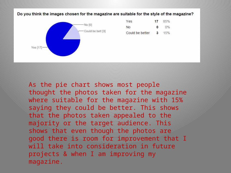
As the pie chart shows most people thought the photos taken for the magazine where suitable for the magazine with 15% saying they could be better. This shows that the photos taken appealed to the majority or the target audience. This shows that even though the photos are good there is room for improvement that I will take into consideration in future projects & when I am improving my magazine.

Results of this question show that the magazine mostly fits in to the Belongings needs on Maslow’s hierarchy of needs showing that the magazine gives the feel that the reader is of equal status as the model on the magazine. This would appeal to the audience as people of the indie genre do not look for role models but for something they can relate to.

This shows that the magazine does not give an opinion and is more factual meaning the reader has to form there own opinion. This would appeal to the target audience as they are controversial and prefer to have their own opinion than be told what there opinion should be. In comparison to other genres for example pop. A pop magazines audience are usually younger and looking for role models who the can copy and therefore value there opinion and change there opinion to fit what the magazine says. There is on anomaly in the results as one person has said that the magazine has changed there opinion but as it is only one person it will be overlook as more people have said otherwise.

Most people have said that the article, which is an interview with an artist, does fit with the genre. As before there is one person who has disagreed with this therefore this will also not have an effect on my magazine as the majority believe the article does fit with the magazine
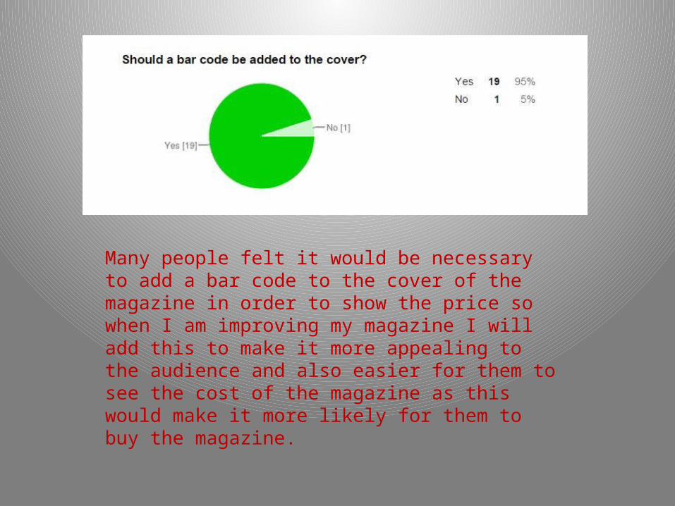
Many people felt it would be necessary to add a bar code to the cover of the magazine in order to show the price so when I am improving my magazine I will add this to make it more appealing to the audience and also easier for them to see the cost of the magazine as this would make it more likely for them to buy the magazine.

The answers shown her provide evidence that the magazine does not give an opinion and is mostly factual which would appeal to audience as it means they can form their own opinion from the information given. This is a positive factor and means no change needs to be made to this when I am improving my magazine.

The feedback I got about the mast head on the cover was that the font could be bigger so it stands out more. This will be something I look at improving when I next work on my magazine.

To make the front cover more interesting many said that more fonts could be used to make it more eye catching the next most popular answer was that there could be more sizes of font. I will use these ideas and see how the look when I improve my magazine as this may help it look more interesting and attract the target audience.

Many felt the contents page was messy and therefore meant it did not look as good as it could therefore I will look at the order and size of the text and make sure it is in proportion with rest of the magazine and try to make it look neater so it gives the contents page a better look.
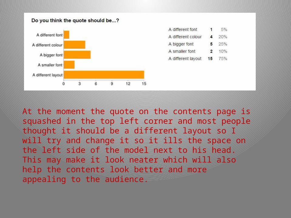
At the moment the quote on the contents page is squashed in the top left corner and most people thought it should be a different layout so I will try and change it so it ills the space on the left side of the model next to his head. This may make it look neater which will also help the contents look better and more appealing to the audience.

The name “Josh Newell” will be made bigger so it stands out over the rest of the headline as the majority of people have said that it would look better. Also this will make it more clear who the article is about and catch the readers eye making them more interested.
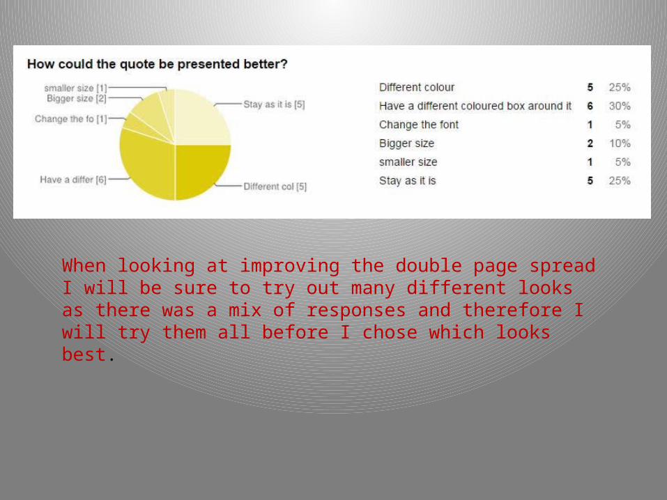
When looking at improving the double page spread I will be sure to try out many different looks as there was a mix of responses and therefore I will try them all before I chose which looks best.

Most people said they would probably buy the magazine if they saw it in a shop and most would recommend it to a friend. This means it appeals to the audience but improvements are needed to make it of a professional standard.

Overall the results I got were positive which suggests my magazine is of good quality. Most of the improvements that will be made are small and will add a added bit of detail that will improve the overall look of the magazine and will make it more appealing to the target audience. I will take into consideration use the result from the audience profile when improving my magazine to make sure what the target audience want is in my magazine and so it will attract the target audience and is of a professional standard.


