22
Aw- fully Beau- tiful
| Date post: | 28-Jan-2015 |
| Category: |
Design |
| Upload: | nate-schulman |
| View: | 109 times |
| Download: | 3 times |
Aw-fullyBeau-tiful
$Some designers just gotta.
to
Awfully Beautiful
$Some designers just gotta.
Reading
Designs
3 4

$ 11 - 1450
$ 12 - 1300
to
1-4
The 80’s
Ed Fella
Letters on Letters of Other Letters
The 80’s
M&Co
Reaganomics, meet your match
5 6
Romantic Marxism
and Bonehead Design
No one ever says Engelism, do they?
$ 7 - 1049
$ 15 - 1775
Postmodernism
Continental Philosophy, ooh la la
Intro
There’s No
Such Thing
Michael Bierut knows
$ 18 - 1899
$ 19 - 2099
The 80’s
Art Chantry
Pulp Non-Fiction
$ 21 - 2675
Notes from
the Manager
Come Back and See Us
$ 29 - 4449
Pro and Con
(fessions)
Name Your Price
$ 27 - 2849

INTROThere’s No Such Thing
8
While ‘Design’ must surely be defined against its opposite, what this dilemma
demands is a look at what’s called the vernacular. ‘Vernacular’ is a multifaceted term
requiring a certain clarification. The word is used both a typological classification and a
characterization. ‘Vernacular’ language, for instance, means a native language, but also
represents a separation from something larger. In standing for something nontraditional,
it often represents a kind of informal folklore. Defined another way, “generally, the term
vernacular is used to refer to the everyday, the quotidian, or the common in contrast to
the important, the significant, or the special.”3 Vernacular design, then, runs counter to
what those more sophisticated and in power will allow as formal and appropriate.
Proper Etiquette
What makes something proper and in good
taste? Where does professionalism end and naivete
begin, and who gets to say? Just as defining art in-
furiated as it inspired throughout the core of 20th
Century Art history, so too have similarly perplex-
ing questions arisen over ‘design’ and ‘undesign’ in
today’s history of the field. Some designers have
come to wonder- what exactly does Graphic Design
have on all the rest? “Who is to say,” asks Design
Diety Steven Heller, “that a naively hand-painted
sign is less effective than a beautifully executed
typeface?”2
Just as famed Architectural
Historian Nikolaus Pevner refered
to vernacular architecture as ‘mere
buildings,’ and famed Art Historian
Arthur Danto to readymades pre-
conversion as ‘mere real things,’
vernacular design is ‘mere design’
and simply that.4 It is the endless
parade of anonymous work that so
endlessly sieges our attention we tune
it out without the slightest effort. In
full, “Design is logically described as
vernacular when it does not involve
self-conscious development, advance
study and planning.”5
ABOVE
Cover of ‘How We Are Hungry’ by Dave Eggers.
Eggers’ writing and design is known for its colloquial wit.
“There’s no such thing
as an undesigned graphic
object anymore, and there
used to be.”
~ Michael Bierut1
10 9
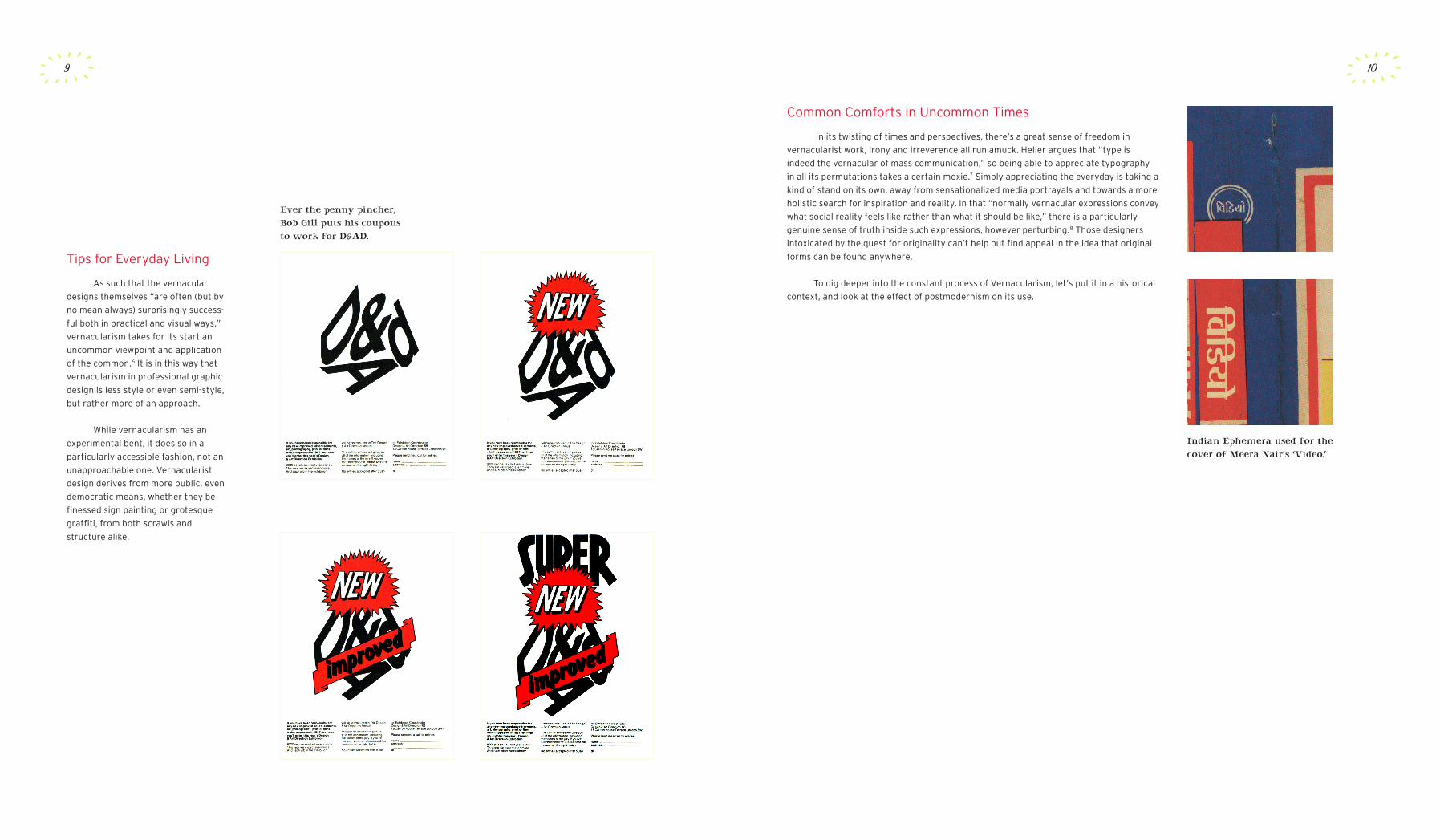
Indian Ephemera used for thecover of Meera Nair’s ‘Video.’
Ever the penny pincher, Bob Gill puts his coupons to work for D&AD.
Tips for Everyday Living
As such that the vernacular
designs themselves “are often (but by
no mean always) surprisingly success-
ful both in practical and visual ways,”
vernacularism takes for its start an
uncommon viewpoint and application
of the common.6 It is in this way that
vernacularism in professional graphic
design is less style or even semi-style,
but rather more of an approach.
While vernacularism has an
experimental bent, it does so in a
particularly accessible fashion, not an
unapproachable one. Vernacularist
design derives from more public, even
democratic means, whether they be
finessed sign painting or grotesque
graffiti, from both scrawls and
structure alike.
Common Comforts in Uncommon Times
In its twisting of times and perspectives, there’s a great sense of freedom in
vernacularist work, irony and irreverence all run amuck. Heller argues that “type is
indeed the vernacular of mass communication,” so being able to appreciate typography
in all its permutations takes a certain moxie.7 Simply appreciating the everyday is taking a
kind of stand on its own, away from sensationalized media portrayals and towards a more
holistic search for inspiration and reality. In that “normally vernacular expressions convey
what social reality feels like rather than what it should be like,” there is a particularly
genuine sense of truth inside such expressions, however perturbing.8 Those designers
intoxicated by the quest for originality can’t help but find appeal in the idea that original
forms can be found anywhere.
To dig deeper into the constant process of Vernacularism, let’s put it in a historical
context, and look at the effect of postmodernism on its use.
Continental Philosophy,
Ooh La La
POSTMODERNISM
12
“Work with the grid system
means submitting to laws of
universal validity.”
~ Josef Müller-Brockmann9
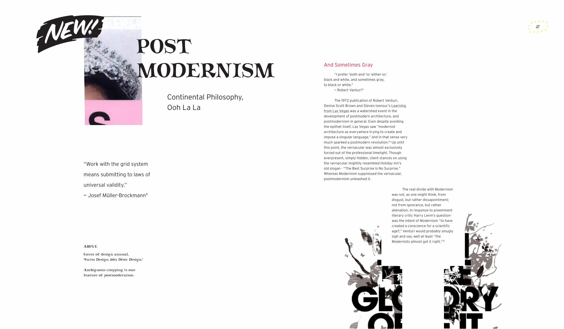
ABOVE
Cover of design annual, ‘Swiss Design 2003: Dèsir Design.’
Ambiguous cropping is one feature of postmodernism.
And Sometimes Gray
“I prefer ‘both-and’ to ‘either-or,’
black and white, and sometimes gray,
to black or white.”
~ Robert Venturi10
The 1972 publication of Robert Venturi,
Denise Scott Brown and Steven Izenour’s Learning
from Las Vegas was a watershed event in the
development of postmodern architecture, and
postmodernism in general. Even despite avoiding
the epithet itself, Las Vegas saw “modernist
architecture as everywhere trying to create and
impose a singular language,” and in that sense very
much sparked a postmodern revolution.10 Up until
this point, the vernacular was almost exclusively
forced out of the professional limelight. Though
everpresent, simply hidden, client stances on using
the vernacular mightily resembled Holiday Inn’s
old slogan - “The Best Surprise Is No Surprise.”
Whereas Modernism suppressed the vernacular,
postmodernism unleashed it.
The real divide with Modernism
was not, as one might think, from
disgust, but rather dissapointment;
not from ignorance, but rather
alienation. In response to preeminent
literary critic Harry Levin’s question-
was the intent of Modernism “to have
created a conscience for a scientific
age?,” Venturi would probably smugly
sigh and say, well at least “the
Modernists almost got it right.”12
13 14
Chantry’s ads for Urban Outffiters playfully use the past to turn over a new leaf.
Walker Art Center publications share the postmodern interest in the vernacular.
Modernism Moves On
To help us deliberate on Modernism’s decline, Design Historian Jack H. Williamson
has charted the three main, positive accomplishments of postmodernism as - “a throwing
off of a severe rationalism which denied more intuitive faculties, an exploration of
symbolic and decorative values, and a recognition and utilization of the past.”13 It’s
illuminating to look within Graphic Design History for these features.
For one, it’s interesting to discover Katherine McCoy, co-chairperson of Cranbrook’s
design department for a quarter of a decade, once worked for Unimark International.
There, she too learned to perfect the Swiss International Typographic style. Headed by
Massimo Vignelli, designers at the New York Unimark office were known for wearing lab
coats to work. While it’s true she soon moved towards a more differentiated approach,
if it was not for her early experiences, McCoy’s breaking point might have been much
different. One of her initial inspirations, afterall, was Wolfgang Weingart, who, while a
renegade, was no complete rebel from standard Swiss foundations. Weingart understood
and put into action the maxim- “Rules are meant to be broken only exceptionally.”
Regarding the throwing off of ‘severe rationalism’ that predicated McCoy’s turn,
London based designer and educator Phil Baines was one of the earliest to come out
fully armed. Lashing out in an early Emigre issue, in a snippet from his thesis, he fumed,
“The Bauhaus mistook legibility for communication.”14 This idea was popularized further
by David Carson in his version, “Never mistake legibility for communication.”15 It’s easy
to blame all this aggression on young newbies attacking their elders. But all that stormed
the legibility gates was not merely hot air, no matter its veracity. Former Icograda
president Jorge Frascara put things more sensibly when he chimed in that, “Today, the
rightness of the Bauhaus’s principles has given way to doubt. One must be critical of
attitudes that, instead of being truly international, impose foreign concepts on local
culture, design education and practice. These artificially injected values interfere with and
destroy the colloquial and vernacular expressions of an exisiting culture.”16 It is indeed
perplexing that even though “Early modernists spoke of the need to design for the
masses,” once, “bits and pieces of that movement finally trickled down into everyday life,
it was seldom in a form modernists would endorse.”17 Now rather Carson was reading up
on Cultural Imperialism, I’m not so sure. Indeed, he was probably surfing. But the fact
remains- postmodern designers, however surprisingly, managed to predict an increasingly
conglomerated world. So perhaps they over-reached, and perhaps they were in a bubble
(and a dimly lit one at that?). They still managed to foresee certain Globalizing tendencies.
Considering today’s politically unstable landscape, they were wise to do so.
The Stage Is Set
As vernacular cultures are
small-scale cultures within larger
arrays, the quest of vernacular design
becomes speaking in a particular
code - that is, to speak only to
those spoken to, and to do so well.
Baines again, said “We design not
for historians to judge or condemn,
but for an audience with immediate
needs and expectations.”18 In such a
viewpoint, Bauhausian ideals of cross
the board universal communication
were rejected. Afterall, argues
Lorraine Wild, what we really need is
“design that talks to diverse groups
in specifically made visual languages
each group will understand.19
An immediate consequence of
this rejection was the freedom to use
what was formerly excised. If such
freedom was abused, at least it was
in the form of an understandable
spite. When April Greiman returned
to America after studying in Basel
with Weingart, the stage was set. The
confluence of new technology and her
Swiss professor’s expanding appeal
egged on Greiman and in-turn, other
U.S. New-Wavers.
The commercialization of
student work from Switzerland which
took place in the States increased
the potential to put the vernacular
through its own translated commodi-
fication process. And while things are
lost in such a translation, it also keeps
things in motion. In a world whose am-
biguity was for too long shoved out,
translated ambiguity would work as a
kind of perpetual ambiguity.
To summarize, in the post-
modern stratosphere, “ironic
employment of vernacular or non-
designed elements, such as hand
drawn typography, constituted a
departure from the rationality of
earlier approaches.”20 Postmodern
ideals had an enormous impact on
design ideals. Especially in places like
Cranbrook and CalArts, the work of
professors and students in Graduate
Graphic Design programs across
America changed irrevocably, setting
into motion a larger effect on the
profession on whole. One such effect,
out of many, was Vernacularism.

Reaganomics,
Meet Your Match
THE 80’S
16
“Make more
from less.”
~ Ed Fella21 Partner in Pentagram’s New
York office, Michael Bierut places Fella
in that rare and esteemed category
of graphic author. He says, “These
designers have a visual approach
that is easily identifiable and this way
of working has, in effect, become a
business card for them. It is also self-
initiated by definition.”23
How Fella begins his works
connects directly to the vernacular’s
appeal, and its spread. A big part of
his brainstorming process is travel.
ABOVE
An Ed Fella design for AIGA’s 1999 America: Cult & Culture conference.
Rallying Cry
Simply as a descriptor, it wasn’t until the
1980’s that use of ‘vernacular’ took off. Though
the term “was used rather imprecisely by graphic
designers,” it nonetheless became a kind of
rallying cry, if not the most coherent one.22 Bold,
somewhat silly, definitely unpretentious, the
vernacular became a satirical vehicle, as well as,
although less overtly, a political one. Who were the
main movers and shakers in this time period?
A Jolly Good Fella
One of the key figures in this translation was
an unlikely one. Commercial artist for 30 years,
graduate from the infamous Cranbrook at 48, and
now professor at CalArts, Ed Fella is a true original.
Interestingly enough, it is Fella’s non-commercial
projects that have won him the most acclaim, a
unique position indeed.

17 18
M&Co
Founded by Tibor Kalman, M&Co was a highly influential firm in the New York
Design scene and beyond. Playful and sometimes perplexing, the firm’s work was never
lacking in wit. M&Co had an “interest in the visual detritus of mass culture,” whereby,
“historical artifacts both high and low were recast as contemporary design attributes.”27
Note the use of ‘detritus’ here - its a telling term to use – a bit derogatory yet still an
attempt to brim with authenticity. It’s another way of saying - though now dead, these
forms once did thrive. Less altruistically, it also speaks of a trash can ripe for the plucking.
Adds Tibor himself, “we were in pursuit of the ugly, the vernacular, and using it in a new
way.”28 With a hint of hindsight humor former Tibor underling Scott Stowell concurs,
admitting that “at M&Co we would spend weeks painstakingly perfecting typography so
that it looked like it had been made by someone who had no idea what s/he was doing.”29
Hrmmm. Professional amateurism? Could that possibly work? What was the point, we
might ask?
Well, here’s what. Kalman knew his stuff. He loved to use the vernacular to create
unexpected reactions in the viewer. He also wanted to prod the profession by making
designers more aware of their own tastes, and, subsequently, their elitism. In an era of
both Thatcherism in the UK, and Reaganomics in the US, Tibor believed elitism was to
blame for all the design world’s unnecessarily decadent work. Living in Manhattan at that
time, Kalman might have met one too many Gordon Gekkos for his freeform tastes. In
taking this stand, as Steven Heller comments, “The lack of pretense in vernacular styles
served to critique the overly polished professionalism that prevailed in the mid-1980s.”30
For Tibor, all this vernacular use boiled down to more indeed than just the crude
versus the refined. At AIGA’s 1989 “Dangerous Ideas” conference in San Antonio,
Texas, Kalman took things a step further, prodding Duffy Design’s Joe Duffy into a
loud, confrontational debate. In an ad he paid for in The Wall Street Times, Duffy, a
package design specialist, had promoted graphic design to big businesses as a tool
particularly adept at seperating essentially the same packaged goods. In doing so,
Kalman provocatively suggested Duffy was promoting a kind of ‘indentured servitude.’
However well intentioned, Tibor’s taste for politics was more insatiable than his rhetoric
was successful. Afterall, Benetton was once rated the 3rd most recognizable brand in the
world, after only McDonald’s and Coca-Cola. Nonetheless, the debate was a particularly
public showcase of typically more private concerns and it was even harder from then on
to deny the power of M&Co’s instigations. While its aesthetics could be silly, the firm’s
influential clout was never in question.
Letters on America
On his wide-ranging cross-
country roadtrips, Fella documents
the vernacular signage of small
town Americana through Polaroids.
These unrestrained blips and pieces
become fodder for experimental
illustration work. Many of these
photographs can be found filling
up ‘Letters on America,’ a book
which made many designers instant
vernacular enthusiasts. Instead of
Mies van Der Roe’s “Less is More,”
or Venturi’s chiding “Less is a Bore,”
Ed Fella simply states “Make more
from less.”24 He exemplifies this in
notebook after notebook, attempting
to add a new piece a day.
“I have about 80 sketchbooks with 100
drawings in each one,” Fella rather shockingly
admits.25 Instead of client commissions, Fella blithley
tread on, following his own muse, and in his own
way. He is Graphic Design’s Fine Artist, or Fine Art’s
Graphic Designer.
Fella’s works “are scout’s maps,
showing the edge of visual language,
where it builds up and breaks down,
where it can go.”26 Sounds liberating,
doesn’t it? No wonder designers of
the world of practicality might wish
for a muse of their own. And if the
vernacular worked for Fella, why not
them? Were there any other takers on
this? Most certainly. M&Co was one of
them, and one of the best.
A utilitarian signboard becomes a post for humor in this M&Co ad for New York’s Restaurant Florent.

19 20
Art Chantry
“Raw, no-frills, collaged, fractured, distressed and recycled,” the work of Art
Chantry incoporates what he called the real American folk art - graphics produced by
untrained craftspersons.31 He espoused the belief that “graphic design is a folk art whose
best practitioners are often anonymous and whose best examples may be deceptively
rough or naive.”32 Above and beyond his fellow designers, it was Chantry who most
successfuly conversed with, converted, and championed the vernacular on his own.
Not working for a firm or huge clients provided Art’s creativity with unprecedented
leverage. Known for his temper, perhaps he needs the space anyway. Nonetheless,
Chantry was the unpretentious and delicious roadside stand to a design world’s caviar.
And even while Art Chantry’s belief that “All graphic design is ‘vernacular’,” is hopelessly
egalitarian, the very fact his work’s accepted as ‘good design’ is one of the design world’s
most open acts of acceptance.33 For a designer who doesn’t even use a computer, that in
itself is a promising thing indeed.
The most practical and likely conundrum in this kind of professionalized acceptance
boils down to that same problem it always is - the one of communication. Is the vernacular
more for the designers who use it or its audience? Just take one of Chantry’s business
card for example. Collaged from a grocery store meat department advert, does it ad-
vertise Chantry’s love of meat? No, silly author! It’s just a gag. Don’t you get it? But the
irony might be lost on some. And what about the ones who get left out? Is it the fault
of the humorless who don’t get the joke or the fault of the comedian for not delivering?
Likely a mix of both, it’s an interesting thing to consider when designing work that uses
the vernacular.
Chantry’s personal business card.
Chantry gleans much of his
visual inspiration from his collection of
vintage Pulp magazines. Sparkling in
wit, his prolific work spans everything
from clothing catalogs to punk flyers.
Pulp Non-Fiction
50’s Nostalgia sells 90’s Urban Outfitters.
and Bonehead Design
ROMANTICMARXISM
“Bad is good.”
~ David Bryne34
22
ABOVE
Promotion for French Paper by Charles Spencer Anderson
A Quiet Retrieve
I’d like now to venture a point of politics -
that those graphic designers who use the everyday
enjoy the vernacular for its how as much as for its
what. For professional designers, especially those
surrounded by similar ilk (New Yorkers, say), the
vernacular is seen as a way out. Its small stories
inscribe an escape from slavish stylistic devotion,
its small towns a quiet retrieve from the piercing
perch of the city.
The Master’s House
Outside of the vernacular’s exotic
properties, there lies within certain allied
designers a shared political interest in new forms
of decentralized representation. Now, if the
vernacular doesn’t seem inherently political, that’s
understandable, but consider this. In Latin, the
term ‘verna’ refers to a slave born in the house of
his master, and many have argued this is as much
the root of ‘vernacular’ as the Latin ‘vernaculus,’
itself meaning ‘indigeneous.’ In that first way, the
premise of the local holds but only in a separated
class delineated and opposed to another, its
superior. This association recalls a sense of
what noted literary critic Houston Baker called
“romantic Marxism” – an appeal overwhelming in
sentimental populism.35
Graphic designers are an
intrinsic part of a wider, cultural
production network, one which
has been one-sidingly deemed the
‘culture industry’ by elitist neo-
Marxist theoretician Theodor Adorno,
and even more disparingly the
‘distraction’ or ‘illusion industry’ by
neo-Marxist philosopher Wolfgang
Fritz Haug. Use of the vernacular
may stem from a certain designer
guilt over differentiating essentially
similar products in the glut of the
contemporary marketplace.
As Professor and social critic
Stuart Ewen recalls, “in a hand-to-
mouth world, material goods were
scarce; they were simple vernacular
products, made from readily available
resources, and crafted at home.”36 But
Capital grew and the sands shifted. As
Haug has even gone so far as to say,
today, “with shades and shadows the
illusion industry populates the spaces
left empty by capitalism.”37 The power
elite of Capitalism surely speaks in a
proper language, of its own choosing,
and its dissidents another. Designers
might be seeking to re-evaluate the
commodification and consumption
paradigm through approaching the
everyday, analyzing those very spaces
they supposedly so populate. Instead
of promising happiness onto users,
they look to see what those users are
doing themselves, on their own terms.
Shades and Shadows
23
Alas, the promises of earnest
aesthetic expression in unlikely
places could enlighten otherwise
bleak situations or areas. The fear of
cultural imperialism, of a McWorld, has
grown louder in recent yerars. In his
essay, “Nostalgia For The Real – Or,
Bad Is Good,” David Byrne mirrors his
former buddy Tibor when he writes
“The faster and great the spread
of globalization, neo-liberalism,
and multinational corporations, the
greater the nostalgia for that which
they replace.”38
Standardization might be
reducing the complexity of the world,
washing out what it wishes. But this is
not to say it isn’t benefitting the world
in other ways, standards of living
and spreading human rights among
them. And anyhow, while this Marxist
angle may illuminate former SDS
member Mr. Tibor, its not terribly all
encompassing for graphic designers
on whole, nor hard to attack. While
we’re surely spoiled, does a hand-
to-mouth world really sound like
something worth idealizing? The
viewpoint puts a stranglehold
on aesthetics by condemning it
as bourgeois manipulation, and
manipulation alone.
24
Of course, purposing varies, as do results. By all
means, not all politicize. By most means, many strive
not to. More aesthetically speaking, vernacular use
has much to do with the fact that, as Heller tells it,
“in a sea of Starbucks, McDonald’s, Walmart, Gap and
all the other large and small, international corporate
brands, anything that looks the least bit human-made
stands above the fray.”40
And for other designers, the
vernacular simply involves a great
deal of play – much more than could
be expected given this interpretative
subtext of oppression and revolt.
Afterall, for goodness sake, Charles
Spencer Anderson jokingly calls his
creative process “Bonehead Design.”41
In viewing all marketing across the
board as an encroachment on purer
values, it empties style of pleasure,
and ignores, in its determinist rush,
any sense of control from within its
appreciators. Former editor of the
Libertarian Reason magazine, Virginia
Postrel takes offense to this, writing,
“Aesthetic skills are real skills. While
not analytical, they nonetheless help
us to perceive and understand the
world.”39 Aesthetic value is here to
stay, Postrel writes, and not only that,
it enriches the very consumers who
have a say in their enjoyment. On top
of that, she would argue, such self-
determination is much stronger than
what Marxists will allot for.
Here To Stay?
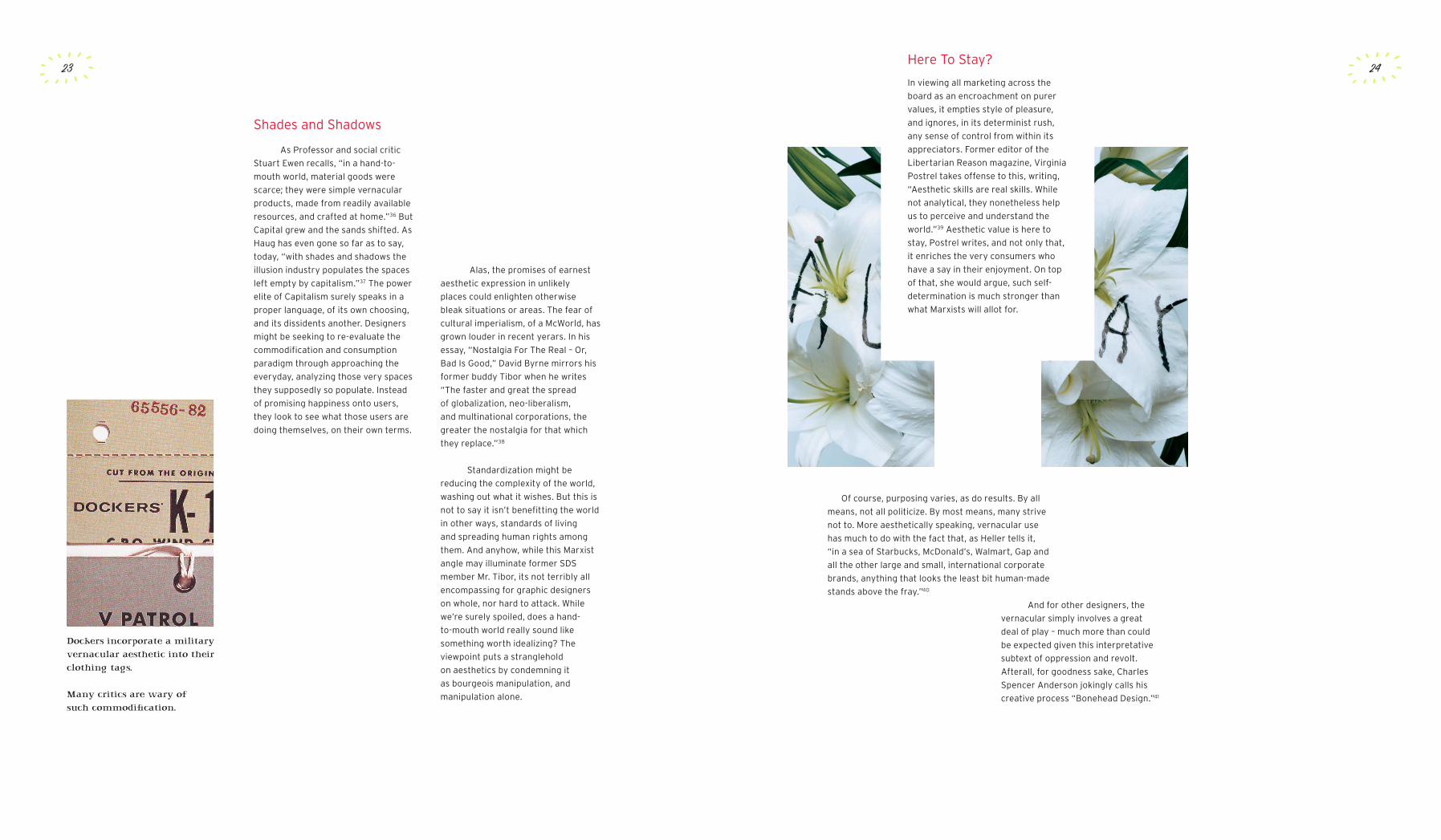
Dockers incorporate a military vernacular aesthetic into their clothing tags.
Many critics are wary of such commodification.
25
Nonetheless, taking the vernacular politically makes good sense. The Post-9/11
curtailment of dissent is worrying and re-asserting the rule of free speech in democracy
is always a good one. Focusing on the local is a positive manifestation of that well
known slogan - Think Global. Buy Local. Let’s be prudent though. We mustn’t forget
the dependence of perspective on definition. Modernist architecture Philip Johnson
also quested for what he called ‘pure’ images of design. The vernacularist search for
community is, in its own way, a search for the universality of brotherhood not so different
from that vision spouted, however dogmatically, by Vignelli and the like. While they both
rely on a broad attempt to unite, in comparison to modernism, vernacularism includes
through meaning, instead of excluding through form.
What other concerns might we take notice of here? Unfortunately, the testy beast
of Appropriation rears its ugly head once more. Gunnar Swanson rightfully wonders-
why is it that, “when designers appropriate forms from non-designers/non-artists, it is
called “recognition of the vernacular””?42 Isn’t there some co-option involved, perhaps
even in a snobbish fashion? How about, as Swanson answers himself, it is because since
“graphic designers do not know the authors we pretend they do not exist.”43 Almost
always anoymous, vernacular authors are by their very nature required to be reticent. If
the work’s ‘bad’ afterall, why would one want to take credit? But that anonymity is also
an ability to ignorantly delineate from higher standards. Keeping these standards is of
utmost importance. Acknowledging difference is as well. This doesn’t mean vernacularist
appropriation should be as unfettered as vernacular works themselves. While some
vernacular authors probably want to keep their way of speaking to themselves, probably
all are inaccessible for interviews or requests. And so, since tracking down is an
impossible task, designers just need to be careful of what they take and how. Questions of
authorship notwithstanding, in the wrong hands, applying a historical surface treatment
in lieu of historical context could be mightily detrimental. Robin Kinross even worries that
“the fad for vernacular bad taste may be an attempt by designers to survive by blending
into the landscape, chameleon-like.”44 The opposite extreme is that designers will want a
renaissance in anonymous forms only as long as they are signed, sealed and delivered on
their own terms, and, of couse, they still get famous for it. Fortunately for more than the
both of us, neither Kinross’ extremity nor my own is highly likely, not in any acceptable
sense at least.
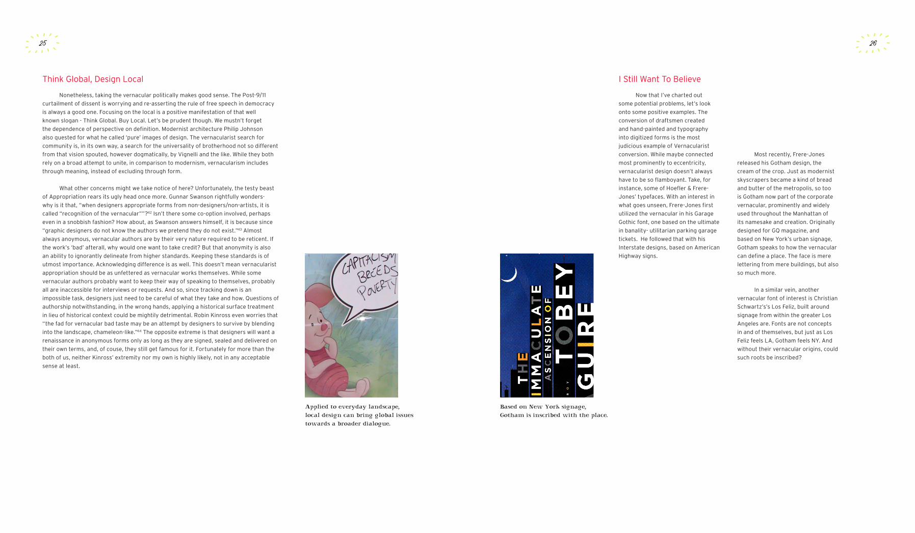
Think Global, Design Local
Applied to everyday landscape, local design can bring global issues towards a broader dialogue.
Now that I’ve charted out
some potential problems, let’s look
onto some positive examples. The
conversion of draftsmen created
and hand-painted and typography
into digitized forms is the most
judicious example of Vernacularist
conversion. While maybe connected
most prominently to eccentricity,
vernacularist design doesn’t always
have to be so flamboyant. Take, for
instance, some of Hoefler & Frere-
Jones’ typefaces. With an interest in
what goes unseen, Frere-Jones first
utilized the vernacular in his Garage
Gothic font, one based on the ultimate
in banality- utilitarian parking garage
tickets. He followed that with his
Interstate designs, based on American
Highway signs.
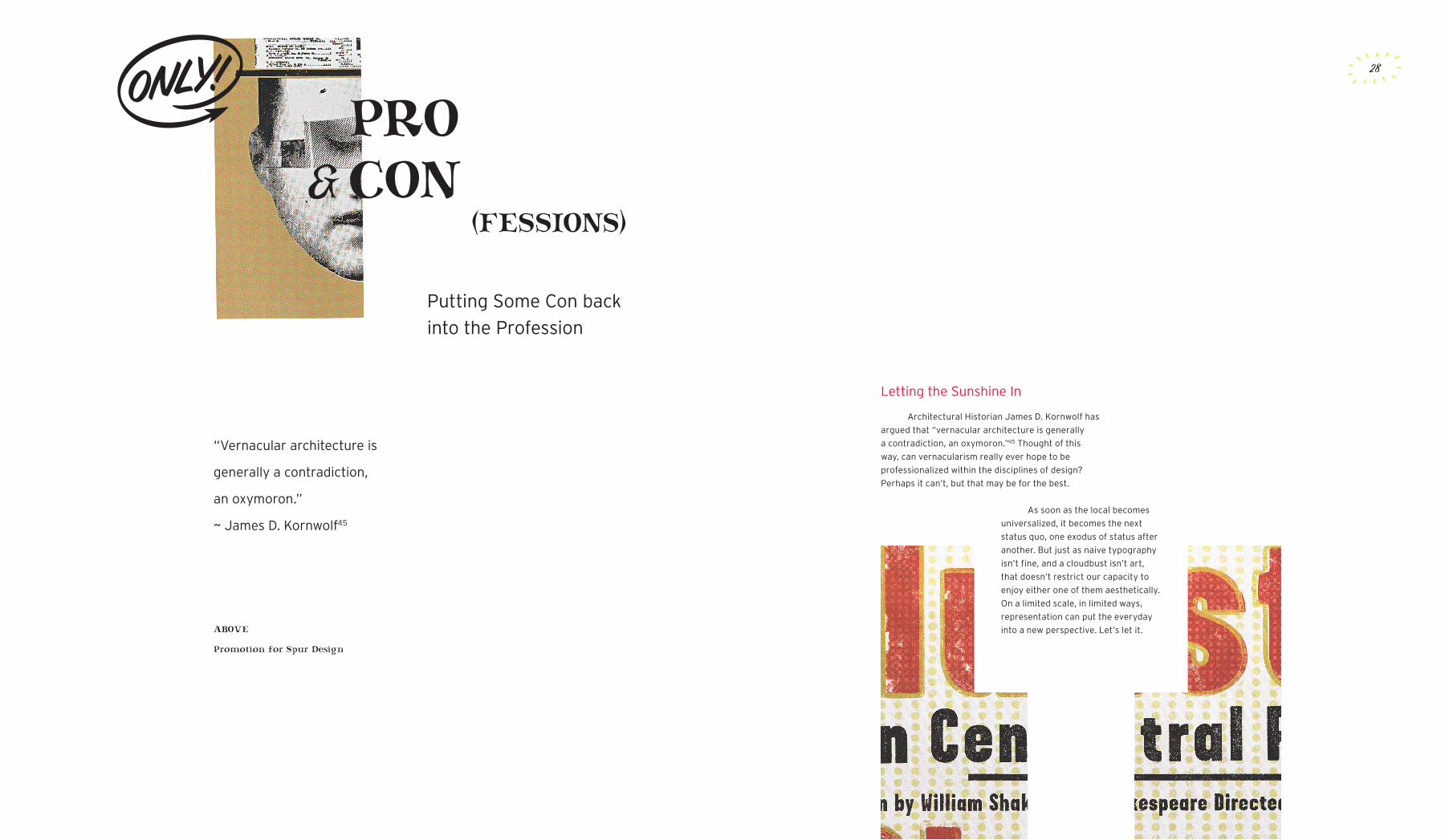
I Still Want To Believe
26
Based on New York signage, Gotham is inscribed with the place.
Most recently, Frere-Jones
released his Gotham design, the
cream of the crop. Just as modernist
skyscrapers became a kind of bread
and butter of the metropolis, so too
is Gotham now part of the corporate
vernacular, prominently and widely
used throughout the Manhattan of
its namesake and creation. Originally
designed for GQ magazine, and
based on New York’s urban signage,
Gotham speaks to how the vernacular
can define a place. The face is mere
lettering from mere buildings, but also
so much more.
In a similar vein, another
vernacular font of interest is Christian
Schwartz’s’s Los Feliz, built around
signage from within the greater Los
Angeles are. Fonts are not concepts
in and of themselves, but just as Los
Feliz feels LA, Gotham feels NY. And
without their vernacular origins, could
such roots be inscribed?
Putting Some Con back
into the Profession
PRO CON
“Vernacular architecture is
generally a contradiction,
an oxymoron.”
~ James D. Kornwolf45
&(FESSIONS)
ABOVE
Promotion for Spur Design
28
Architectural Historian James D. Kornwolf has
argued that “vernacular architecture is generally
a contradiction, an oxymoron.”45 Thought of this
way, can vernacularism really ever hope to be
professionalized within the disciplines of design?
Perhaps it can’t, but that may be for the best.
Letting the Sunshine In
As soon as the local becomes
universalized, it becomes the next
status quo, one exodus of status after
another. But just as naive typography
isn’t fine, and a cloudbust isn’t art,
that doesn’t restrict our capacity to
enjoy either one of them aesthetically.
On a limited scale, in limited ways,
representation can put the everyday
into a new perspective. Let’s let it.
NOTESFROMTHEMANAGER
“Come Back and See Us.”
ABOVE
Cover for the Nation by Scott Stowell’s Open studio
Quality Assurred
30
Glossary
Bonehead Design
Charles Spencer Anderson’s tongue-in-cheek term for his design process.
Bourgeois
“By bourgeoisie is meant the class of modern capitalists, owners of the means of social
production and the employers of wage labor.”
(source: The Communist Manifesto)
Colloquial
an informal expression, one not used in formal speech or writing.
Commodification
the transformation of relationships, formerly untainted by commerce,
into commercial relationships, relationships of buying and selling.
Continental Philosophy
Continental philosophy is a general term for several related philosophical traditions that
originated in continental Europe from the nineteenth century onward, in contrast with
Anglo-American analytic philosophy.
Decentralized
withdrawn from a center or place of concentration; especially having power or function
dispersed from a central to local authorities.
Determinism
the philosophical conception which claims that every physical event, including human
cognition and action, is causally determined by an unbroken chain of prior occurrences.
No mysterious miracles or totally random events occur.
Detritus
dead or decaying organic matter.
Dissident
a person who actively opposes an established opinion, policy, or structure.
Elitism
the attitude that society should be governed by an elite group of individuals.
Globalization
a set of processes leading to the integration of economic, cultural, political, and social
systems across geographical boundaries.

32
Notes
1
2
3
4
5
6
7
8
9
10
11
Virginia Postrel, The Substance of Style: how the rise of aesthetic value is remaking
commerce, culture, and consciousness (New York: Pantheon, 2003), p. 17.
Juan Carlos Mena and Oscar Reyes, Sensacional! Mexican Street Graphics (New York: Princeton Architectural Press, 2002), p. 22.
James Jasinski, Sourcebook on Rhetoric
(Thousand Oaks, CA: Sage Publications, 2001), p. 599.
“Indeed, these readymades, as he termed them, had been mere real things
before they became works of art by Duchamp, who after all did not make the combs or
snow shovels- what would be the point of that?- though he made the works of art.”
Arthur Coleman Danto, Connections to the World
(Berkeley: University of California Press, 1997), p. 8.
“What distinguishes works of architecture from mere buildings is that they are designed
with a view to aesthetic appeal.”
Nikolaus Pevsner, An Outline of European Architecture
(Harmondsworth: Penguin, 1958), p. 23.
John F. Pile, Design: Purpose, Form, and Meaning
(Amherst: University of Massachusetts Press, 1979), p. 40.
Ibid., p. 40.
Steven Heller and Philip B. Meggs, editors, Texts on Type: Critical Writings on Typography
(New York: Allworth Press, 2001), p. vi.
John Bodnar, Remaking America: Public Memory, Commemoration, and Patriotism
in the Twentieth Century (Princeton: Princeton University Press, 1993), p. 14.
Josef Müller-Brockmann, “Grid and Design Philosophy,” Texts on Type:
Critical Writings on Typography (New York: Allworth Press, 2001), p. 198.
Robert Venturi, Complexity and Contradiction in Architecture
(New York: The Museum of Modern Art, 1966), p. 16.
John Docker, Postmodernism and Popular Culture: A Cultural History
(Cambridge: Cambridge University Press, 1995), p. 83.
31
Glossary
Indentured Servitude
an unfree labourer under contract to work for another person,
often without any pay, but in exchange for other essentials.
Legibility
the ease with which type characters can be read.
Moxie
fortitude and determination.
Neo-liberalism
refers to a political-economic philosophy that de-emphasizes
or rejects government intervention in the domestic economy.
Pretense
pretending with intention to deceive.
Pulp
inexpensive fiction magazines widely published from the 1920s through the 1950s.
Utilitarian
having a useful function.

33
Notes
12
13
14
15
16
17
18
19
20
21
22
23
Harry Levin quote:
Frank C. Lu, Modernism: Critical Concepts in Literary and Cultural Studies
(London: Routledge, 2002), p. 303.
Robert Venturi quote:
Jon Lang, Urban Design: The American Experience
(New York: John Wiley and Sons, 1994), p. xi.
Jack H Williamson, “The Grid: History, Use, and Meaning,” in Design Discourse:
History, Theory, Criticism (Chicago: University of Chicago Press, 1989), p. 186.
Gerard Unger, “Legible?,” Emigre 65 (2003), p. 100.
Elizabeth Dye, “Will Graphic Design Save Fashion?...(Or Kill It?),”
Williamette Week (Williamette Week Online: 29 May 2002),
<http://198.107.45.79/story.php?story=2803>.
Jorge Frascara, User-Centered Graphic Design
(London: Taylor & Francis, 1997), p. 130.
Brent C. Brolin, Architectural Ornament: Banishment and Return
(New York: W.W. Norton & Company, 2000), p. 263.
Laurel Harper, Radical Graphics/Graphic Radicals
(San Francisco: Chronicle Books, 1999), p. 14.
Rick Poynor, “Building Bridges Between Theory and Practice,” in Looking Closer 2:
Critical Writings on Graphic Design (New York: Allworth Press, 1997), p. 67.
Russell Bestley and Ian Noble, Visual Research: An Introduction to Research
Methodologies in Graphic Design (London: AVA Books, 2005), p. 188.
Sean Adams and Noreen Morioka, Logo Design Workbook: A Hands-On Guide
to Creating Logos (Gloucester, Massachusetts: Rockport Publishers, 2004), p. 28.
Steven Heller, Design Humor: The Art of Graphic Wit
(New York: Watson-Guptill, 2002), p. 78.
Jane Austin, Graphic Originals: Designers Who Work Beyond the Brief
(East Sussex: RotoVision, 2003), p. 141.
34
Notes
24
25
26
27
28
29
30
31
32
33
34
35
36
Sean Adams and Noreen Morioka, Logo Design Workbook: A Hands-On Guide
to Creating Logos (Gloucester, Massachusetts: Rockport Publishers, 2004), p. 28.
Sarah Dougher and Plazm Media, 100 Habits of Successful Graphic Designers:
Insider Secrets from Top Designers on Working Smart and Staying Creative
(Gloucester, Massachusetts: Rockport Publishers, 2003), p. 98.
Lewis Blackwell, “Character Witness,” Creative Review 20.8 (February 2005), p. 56.
Steven Heller and Louise Fili. Typology: Type Design from the Victorian Era
to the Digital Age (San Francisco: Chronicle Books, 1999), p. 174.
Michael Bierut and Peter Hall, eds, Tibor Kalman: Perverse Optimist,
(New York: Princeton Architectural Press, 1998), p. 34.
Michael Bierut, “Authenticity: A User’s Guide,” Design Observer:
writings about design & culture (Design Observer: 8 February 2005),
<http://www.designobserver.com/archives/000281.html>.
Steven Heller and Christine Thompson, Letterforms: The Evolution of Hand-Drawn,
Humorous, Vernacular, and Experimental Type (New York: Watson-Guptill, 2000), p. 30.
AIGA Orlando, “Art Chantry,” AIGA Orlando (AIGA Orlando: 20 October 2004),
<http://orlando.aiga.org/events/oct20-2004.htm>.
Julie Lasky, “The Cult of Subcultures,” AIGA New York (AIGA New York: 2002),
<http://aigany.org/ideas/features/chantry.html>.
Jessica Helfand, “Our Bodies, Our Fonts,” Design Observer:
writings about design & culture (Design Observer: 15 January 2006),
<http://www.designobserver.com/archives/000281.html>.
Juan Carlos Mena and Oscar Reyes, Sensacional! Mexican Street Graphics (New York: Princeton Architectural Press, 2002), p. 12.
Houston A. Baker, Blues, Ideology and Afro-American Literature: A Vernacular Theory
(Chicago: University of Chicago Press, 1987), p. 67.
Stuart Ewen, All Consuming Images: The Politics of Style in Contemporary Culture
(New York: Basic Books, 1988), p. 30.

35
Notes
37
38
39
40
41
42
43
44
45
Wolfgang Fritz Haug, A Critique of Commodity Aesthetics: Appearance, Sexuality and
Advertising in Capitalist Society (Minneapolis, MN: University of Minnesota Press, 1986),
p. 121.
Juan Carlos Mena and Oscar Reyes, Sensacional! Mexican Street Graphics (New York: Princeton Architectural Press, 2002), p. 12.
Virginia Postrel, The Substance of Style: how the rise of aesthetic value is remaking
commerce, culture, and consciousness (New York: Pantheon, 2003), p. 170.
Juan Carlos Mena and Oscar Reyes, Sensacional! Mexican Street Graphics (New York: Princeton Architectural Press, 2002), p. 22.
Steven Heller, “Through the Past Knowingly?,” AIGA (AIGA: 10 May 2005),
<http://journal.aiga.org/content.cfm?ContentAlias=_getfullarticle&aid=1100943>.
Gunnar Swanson, “What’s Wrong with Plagiarism?,” in Citizen Designer: Perspectives on
Design Responsibility (New York: Allworth Press, 2003), p. 150.
Ibid., p. 150.
Kenneth Fitzgerald, “I Come To Bury Graphic Design, Not To Praise It,”
Emigre 66 (2003), p. 35.
James D. Kornwolf, Architecture and Town Planning in Colonial North America Volume 1
(Baltimore, MD: Johns Hopkins University Press, 2002), p. 10.
36
Image Notes
Promotionals for Fervor Creative
(www.fervorcreative.com)
Non-Format’s book cover for
Sean Wilsey’s “Oh the Glory of It All”
(www.non-format.com)
Poster by Ed Fella
Handwritten Flowers by
Stefan Sagmeister
Poster by Paula Scher
1-2
3
4
5-6
7
1
2
3
6
4
5
7

37 38
Works Cited
Dye, Elizabeth. “Will Graphic Design Save Fashion?...(Or Kill It?).”
Williamette Week Online. 29 May 2002. Williamette Week. 20 January 2006.
<http://198.107.45.79/story.php?story=2803>.
Ewen, Stuart. All Consuming Images: The Politics of Style in Contemporary Culture.
New York: Basic Books, 1988.
Fitzgerald, Kenneth. “I Come To Bury Graphic Design, Not To Praise It.”
Emigre 66 (2003): 29 - 42.
Frascara, Jorge. User-Centered Graphic Design.
London: Taylor & Francis, 1997.
Harper, Laurel. Radical Graphics/Graphic Radicals.
San Francisco: Chronicle Books, 1999.
Haug, Wolfgang Fritz. A Critique of Commodity Aesthetics: Appearance, Sexuality
and Advertising in Capitalist Society. Trans. R. Bock. Minneapolis, MN: University of
Minnesota Press, 1986.
Helfand, Jessica. “Our Bodies, Our Fonts.” Design Observer: writings about design
& culture. 21 February 2005. Design Observer. 15 January 2006. <http://www.
designobserver.com/archives/000281.html>.
Heller, Steven. Design Humor: The Art of Graphic Wit.
New York: Watson-Guptill, 2002.
---. “Through the Past Knowingly?” AIGA - Through the Past Knowingly? 10 May 2005. AIGA. 19 January 2006. <http://journal.aiga.org/content.cfm?
ContentAlias=_getfullarticle&aid=1100943>
Heller, Steven and Louise Fili. Typology: Type Design from the Victorian Era
to the Digital Age. San Francisco: Chronicle Books, 1999.
Heller, Steven and Philip B. Meggs, editors. Texts on Type:
Critical Writings on Typography. New York: Allworth Press, 2001.
Works Cited
Adams, Sean and Noreen Morioka. Logo Design Workbook: A Hands-On Guide to
Creating Logos. Gloucester, Massachusetts: Rockport Publishers, 2004.
AIGA Orlando. “Art Chantry.” AIGA Orlando. 20 October 2004. AIGA Orlando.
17 January 2006. <http://orlando.aiga.org/events/oct20-2004.htm>.
Austin, Jane. Graphic Originals: Designers Who Work Beyond the Brief.
East Sussex: RotoVision, 2003.
Baker, Houston A. Blues, Ideology and Afro-American Literature: A Vernacular Theory.
Chicago: University of Chicago Press, 1987.
Bestley, Russell and Ian Noble. Visual Research: An Introduction to Research
Methodologies in Graphic Design. London: AVA Books, 2005.
Bierut, Michael. “Authenticity: A User’s Guide.” Design Observer: writings about
design & culture. 8 February 2005. Design Observer. 20 January 2006.
<http://www.designobserver.com/archives/000281.html>.
Bierut, Michael and Peter Hall, eds. Tibor Kalman: Perverse Optimist.
New York: Princeton Architectural Press, 1998.
Blackwell, Lewis. “Character Witness.” Creative Review 20.8 (February 2005): 53-56.
Bodnar, John. Remaking America: Public Memory, Commemoration, and Patriotism
in the Twentieth Century. Princeton: Princeton University Press, 1993.
Brolin, Brent C. Architectural Ornament: Banishment and Return.
New York: W.W. Norton & Company, 2000.
Docker, John. Postmodernism and Popular Culture: A Cultural History.
Cambridge: Cambridge University Press, 1995.
Dougher, Sarah and Plazm Media. 100 Habits of Successful Graphic Designers:
Insider Secrets from Top Designers on Working Smart and Staying Creative.
Gloucester, Massachusetts: Rockport Publishers, 2003.

39 40
Works Cited
Swanson, Gunnar. “What’s Wrong with Plagiarism?” Citizen Designer: Perspectives on
Design Responsibility. Heller, Steven and Veronique Vienne, eds. New York: Allworth
Press, 2003. 147 - 158.
Unger, Gerard. “Legible?” Emigre 65 (2003): 100 - 111.
Venturi, Robert. Complexity and Contradiction in Architecture.
New York: The Museum of Modern Art, 1966.
Williamson, Jack H. “The Grid: History, Use, and Meaning.” Design Discourse: History,
Theory, Criticism. Margolin, Victor, ed. Chicago: University of Chicago Press, 1989.
171 - 186.
Works Cited
Heller, Steven and Christine Thompson. Letterforms: The Evolution of Hand-Drawn,
Humorous, Vernacular, and Experimental Type. New York: Watson-Guptill, 2000.
Jasinski, James. Sourcebook on Rhetoric. Thousand Oaks, CA: Sage Publications, 2001.
Kornwolf, James D. Architecture and Town Planning in Colonial North America. Volume 1.
Baltimore, MD: Johns Hopkins University Press, 2002.
Lang, Jon. Urban Design: The American Experience.
New York: John Wiley and Sons, 1994.
Lasky, Julie. “The Cult of Subcultures.” AIGA Online. 2002. AIGA New York.
20 January 2006. <http://aigany.org/ideas/features/chantry.html>.
Lu, Frank C. Modernism: Critical Concepts in Literary and Cultural Studies.
London: Routledge, 2002.
Mena, Juan Carlos and Oscar Reyes. Sensacional! Mexican Street Graphics.
New York: Princeton Architectural Press, 2002.
Müller-Brockmann, Josef. “Grid and Design Philosophy.” Texts on Type: Critical Writings
on Typography. Heller, Steven and Philip B. Meggs, eds. New York: Allworth Press, 2001.
198-200.
Pile, John F. Design: Purpose, Form, and Meaning.
Amherst: University of Massachusetts Press, 1979.
Poynor, Rick. “Building Bridges Between Theory and Practice.” Bierut, Michael, William
Drenttel, Steven Heller, and D.K. Holland, editors. Looking Closer 2: Critical Writings on
Graphic Design. New York: Allworth Press, 1997. 65-67.
Postrel, Virginia. The Substance of Style: how the rise of aesthetic value is remaking
commerce, culture, and consciousness. New York: Pantheon, 2003.
41 42
TIMELINE
Dumbar
visits Cranbrook
1985
Ed Fella graduates
Cranbrook at 48
1987
GRAPHIC DESIGN
Micro processor
development rising
1980
New Wave continues
(Greiman, Hiebert, Scher)
1981
Emigré founded
1982
Meggs’ A History of
Graphic Design debuts
1983
Brody experiments in
The Face
1984
Zuzana Licko designs
the Matrix Typeface
1986
MoMa’s Deconstructivist
Architecture exhibition
1988
Mildred Friedman
retires at Walker
1989
Ronald Reagan
easily elected
1980
Iran frees 52 American
hostages after 444 days
1981
Princess Grace Kelly
is killed
1982
Marines HQ in Beirut
struck in bombing
1983
Reagan re-elected
over Mondale
1984
Gorbachev becomes
Soviet leader
1985
Space Shuttle
Challenger explodes
1986
Black Monday
stock market crash
1987
George Bush elected
President over Dukakis
1988
Uprising in
Tiananmen Square
1989
WORLD HISTORY


