27
Basic Graphics 0 200 400 600 800 1000 1200 1400 -1000 -800 -600 -400 -200 0 X Y Lecture 5 Nicholas Christian BIOST 2094 Spring 2011
| Date post: | 08-Mar-2018 |
| Category: |
Documents |
| Upload: | nguyenkhanh |
| View: | 216 times |
| Download: | 1 times |

Basic Graphics
0 200 400 600 800 1000 1200 1400
−10
00−
800
−60
0−
400
−20
00
X
Y
Lecture 5
Nicholas Christian
BIOST 2094 Spring 2011

R Graphics High-Level Low-Level Saving Graphs
Outline
1. Overview of R Graphics
2. High-Level Plot Functions
3. Low-Level Plot Functions
4. Saving Graphs
2 of 27

R Graphics High-Level Low-Level Saving Graphs
R Graphics
� R is capable of creating high quality graphics
� Graphs are typically created using a series of high-level and low-levelplotting commands. High-level functions create new plots and low-levelfunctions add information to an existing plot.
� Customize graphs (line style, symbols, color, etc) by specifying graphicalparameters
� Specify graphic options using the par() function.� Can also include graphic options as additional arguments to plotting
functions
3 of 27

R Graphics High-Level Low-Level Saving Graphs
Graphic Parameters, par()
� The function par() is used to set or get graphical parameters.
� This function contains 70 possible settings and allows you to adjust almostany feature of a graph.
� Graphic parameters are reset to the defaults with each new graphic device.
� To extract a graphic parameter, par("tag ") or par()$tag .
� To set a graphic parameter, par(tag=value ).
� Most elements of par() can be set as additional arguments to a plotcommand, however there are some that can only be set by a call to par(),mar, oma, mfrow, mfcol see the documentation for others.
4 of 27

R Graphics High-Level Low-Level Saving Graphs
High-Level Plot Functions
plot() Scatterplothist() Histogramboxplot() Boxplotqqplot(), qqnorm(), qqline() Quantile plotsinteraction.plot() Interaction plotsunflowerplot() Sunflower scatterplotpairs() Scatter plot matrixsymbols() Draw symbols on a plotdotchart(), barplot(), pie() Dot chart, bar chart, pie chartcurve() Draw a curve from a given functionimage() Create a grid of colored rectangles with
colors based on the values of a third variablecontour(), filled.contour() Contour plotpersp() Plot 3-D surface
5 of 27

R Graphics High-Level Low-Level Saving Graphs
Low-Level Plot Functions
points() Add points to a figurelines() Add lines to a figuretext() Insert text in the plot regionmtext() Insert text in the figure and outer marginstitle() Add figure title or outer titlelegend() Insert legendaxis(), axis.Date() Customize axesabline() Add horizontal and vertical lines or a single linebox() Draw a box around the current plotrug() Add a 1-D plot of the data to the figurepolygon() Draw a polygonrect() Draw a rectanglearrows() Draw arrowssegments() Draw line segmentstrans3d() Add 2-D components to a 3-D plot
6 of 27
R Graphics High-Level Low-Level Saving Graphs
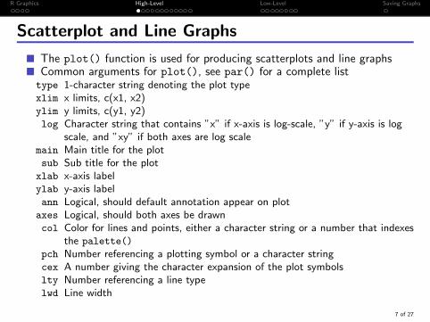
Scatterplot and Line Graphs
� The plot() function is used for producing scatterplots and line graphs� Common arguments for plot(), see par() for a complete listtype 1-character string denoting the plot typexlim x limits, c(x1, x2)ylim y limits, c(y1, y2)log Character string that contains ”x” if x-axis is log-scale, ”y” if y-axis is log
scale, and ”xy” if both axes are log scalemain Main title for the plotsub Sub title for the plot
xlab x-axis labelylab y-axis labelann Logical, should default annotation appear on plot
axes Logical, should both axes be drawncol Color for lines and points, either a character string or a number that indexes
the palette()
pch Number referencing a plotting symbol or a character stringcex A number giving the character expansion of the plot symbolslty Number referencing a line typelwd Line width
7 of 27
R Graphics High-Level Low-Level Saving Graphs
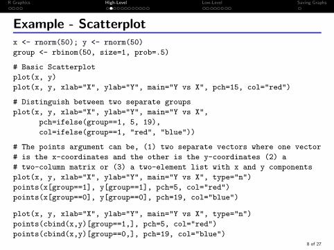
Example - Scatterplotx <- rnorm(50); y <- rnorm(50)
group <- rbinom(50, size=1, prob=.5)
# Basic Scatterplot
plot(x, y)
plot(x, y, xlab="X", ylab="Y", main="Y vs X", pch=15, col="red")
# Distinguish between two separate groups
plot(x, y, xlab="X", ylab="Y", main="Y vs X",
pch=ifelse(group==1, 5, 19),
col=ifelse(group==1, "red", "blue"))
# The points argument can be, (1) two separate vectors where one vector
# is the x-coordinates and the other is the y-coordinates (2) a
# two-column matrix or (3) a two-element list with x and y components
plot(x, y, xlab="X", ylab="Y", main="Y vs X", type="n")
points(x[group==1], y[group==1], pch=5, col="red")
points(x[group==0], y[group==0], pch=19, col="blue")
plot(x, y, xlab="X", ylab="Y", main="Y vs X", type="n")
points(cbind(x,y)[group==1,], pch=5, col="red")
points(cbind(x,y)[group==0,], pch=19, col="blue")8 of 27

R Graphics High-Level Low-Level Saving Graphs
Example - Line Graphs
# Basic Line Graphs
plot(sort(x), sort(y), type="l", lty=2, lwd=2, col="blue")
# Like points, the lines argument can be, (1) two separate vectors
# where one vector is the x-coordinates and the other is the
# y-coordinates (2) a two-column matrix or (3) a two-element list
# with x and y components.
plot(x, y, type="n")
lines(sort(x), sort(y), type="b")
lines(cbind(sort(x),sort(y)), type="l", lty=1, col="blue")
# If there is only one component then the argument is plotted against
# its index (same with plot and points)
plot(sort(x), type="n")
lines(sort(x), type="b", pch=8, col="red")
lines(sort(y), type="l", lty=6, col="blue")
9 of 27

R Graphics High-Level Low-Level Saving Graphs
Histograms and Boxplots
� Use hist() to create histograms and boxplot() for boxplots.
x <- rnorm(50); y <- rnorm(50)
group <- rbinom(50, size=1, prob=.5)
# Basic Histogram
hist(x, main="Histogram of X", col="deeppink4")
# Plot histogram along with a normal density
# Set freq=FALSE, so that the density histogram is plotted (area sums to 1)
hist(x, freq=FALSE, col="red", main="Histogram with Normal Curve")
# Uses the observed mean and standard deviation for plotting the normal curve
xpts <- seq(min(x), max(x), length=50)
ypts <- dnorm(xpts, mean=mean(x), sd=sd(x))
lines(xpts, ypts, lwd=3)
# Basic boxplot
boxplot(x, main="Boxplot of X", border="red", lwd=2)
# Side-by-Side Boxplots
boxplot(x~group, main="Boxplot of X by Group",
names=c("Group 0", "Group 1"), border=c("red", "blue"), lwd=2)10 of 27

R Graphics High-Level Low-Level Saving Graphs
curve()
� The function curve() draws a curve corresponding to a given function.� If the function is written within curve() it needs to be a function of x� If you want to use a multiple argument function, use x for the argument
you wish to plot over.
# Plot a 5th order polynomial
curve(3*x^5-5*x^3+2*x, from=-1.25, to=1.25, lwd=2, col="blue")
# Plot the gamma density
curve(dgamma(x, shape=2, scale=1), from=0, to=7, lwd=2, col="red")
# Plot multiple curves, notice that the first curve determines the x-axis
curve(dnorm, from=-3, to=5, lwd=2, col="red")
curve(dnorm(x, mean=2), lwd=2, col="blue", add=TRUE)
# Add vertical lines at the means
lines(c(0, 0), c(0, dnorm(0)), lty=2, col="red")
lines(c(2, 2), c(0, dnorm(2, mean=2)), lty=2, col="blue")
11 of 27

R Graphics High-Level Low-Level Saving Graphs
outer()
� The outer() function is very useful for contour plots and 3-D surface plots.� outer() performs a general outer product of two vectors, x1
x2x3
(y1 y2 y3)=
f (x1, y1) f (x1, y2) f (x1, y3)f (x2, y1) f (x2, y2) f (x2, y3)f (x3, y1) f (x3, y2) f (x3, y3)
Normally, f (xi , yj) = xiyj , with outer() f can be any function.
� The function passed to outer() must be a vectorized function
> x <- 1:5
> y <- 1:5
> outer(x, y, FUN=function(row, col) row^col)
[,1] [,2] [,3] [,4] [,5]
[1,] 1 1 1 1 1
[2,] 2 4 8 16 32
[3,] 3 9 27 81 243
[4,] 4 16 64 256 1024
[5,] 5 25 125 625 3125
12 of 27

R Graphics High-Level Low-Level Saving Graphs
Contour and 3-D Plots
� Contour plots are created using either contour() or filled.contour()
� filled.contour() accepts a color palette function that is used to assigncolors in the plot
� Built-in color palettes: heat.colors(), terrain.colors(),topo.colors(), rainbow() and cm.colors()
� Create your own color palette using colorRampPalette()
� 3-D surface plots are created using persp(). Use trans3d() to add 2-Dcomponents to a 3-D surface plot.
� All these functions require a matrix of the z values that correspond toz = f (x , y) evaluated on a grid given by x and y , the function outer() isvery useful for creating this matrix.
13 of 27

R Graphics High-Level Low-Level Saving Graphs
Example - Contour and 3-D Plots
library(TeachingDemos) # Contains rotate.persp()
# Evaluate z on a grid given by x and y
x <- y <- seq(-1, 1, len=25)
z <- outer(x, y, FUN=function(x,y) -x*y*exp(-x^2-y^2))
# Contour plots
contour(x,y,z, main="Contour Plot")
filled.contour(x,y,z, main="Filled Contour Plot")
filled.contour(x,y,z, color.palette = heat.colors)
filled.contour(x,y,z, color.palette = colorRampPalette(c("red", "white", "blue")))
persp(x,y,z, shade=.75, col="green3") # 3-D Surface Plot
rotate.persp(x,y,z) # Rotate 3-D Surface Plot
# Add 2-D components to a 3-D Surface plot
# view is the "viewing transformation matrix" needed by trans3d
view <- persp(x,y,z, shade=.75, col="green3")
# Point at (x=1, y=1, z=.01)
points(trans3d(1,1,.1, view), cex=2, col="red", pch=19)
text(trans3d(1,1,.1, view), "(1,1,0.1)", pos=1, font=2)
# Line of z vs x, when y=-.5
lines(trans3d(x, y=-.5, z[7,], view), lwd=2, col="red")
14 of 27
R Graphics High-Level Low-Level Saving Graphs
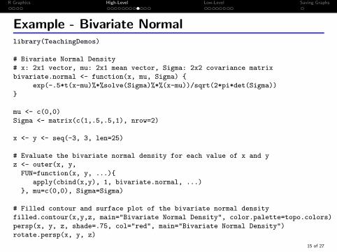
Example - Bivariate Normallibrary(TeachingDemos)
# Bivariate Normal Density
# x: 2x1 vector, mu: 2x1 mean vector, Sigma: 2x2 covariance matrix
bivariate.normal <- function(x, mu, Sigma) {
exp(-.5*t(x-mu)%*%solve(Sigma)%*%(x-mu))/sqrt(2*pi*det(Sigma))
}
mu <- c(0,0)
Sigma <- matrix(c(1,.5,.5,1), nrow=2)
x <- y <- seq(-3, 3, len=25)
# Evaluate the bivariate normal density for each value of x and y
z <- outer(x, y,
FUN=function(x, y, ...){
apply(cbind(x,y), 1, bivariate.normal, ...)
}, mu=c(0,0), Sigma=Sigma)
# Filled contour and surface plot of the bivariate normal density
filled.contour(x,y,z, main="Bivariate Normal Density", color.palette=topo.colors)
persp(x, y, z, shade=.75, col="red", main="Bivariate Normal Density")
rotate.persp(x, y, z)
15 of 27

R Graphics High-Level Low-Level Saving Graphs
Multiple Graphs
� To create a n ×m grid of figures use par() with either the mfcol ormfrow settings.� mfcol=c(nr, nc) adds figures by column� mfrow=c(nr, nc) adds figures by row
� To create a more complex arrangement of multiple plots used layout()
� The arguments widths and heights are vectors that specify the relativewidths and heights of the columns and rows, respectively
� split.screen() is used to create multiple plots and allows you to switchcontrol between plots. After a figure is created you can go back to thatfigure and add more information, layout() and par() do not have thiscapability.� However, the documentation warns that returning to an existing screen to
add information results in unpredictable behavior and may lead to problemsthat are not readily visible.
� To open a new graphics device,� windows() on a Windows machine� quartz() on a Mac machine
16 of 27
R Graphics High-Level Low-Level Saving Graphs
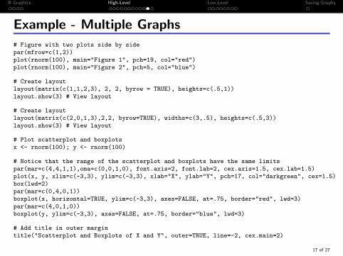
Example - Multiple Graphs
# Figure with two plots side by sidepar(mfrow=c(1,2))plot(rnorm(100), main="Figure 1", pch=19, col="red")plot(rnorm(100), main="Figure 2", pch=5, col="blue")
# Create layoutlayout(matrix(c(1,1,2,3), 2, 2, byrow = TRUE), heights=c(.5,1))layout.show(3) # View layout
# Create layoutlayout(matrix(c(2,0,1,3),2,2, byrow=TRUE), widths=c(3,.5), heights=c(.5,3))layout.show(3) # View layout
# Plot scatterplot and boxplotsx <- rnorm(100); y <- rnorm(100)
# Notice that the range of the scatterplot and boxplots have the same limitspar(mar=c(4,4,1,1),oma=c(0,0,1,0), font.axis=2, font.lab=2, cex.axis=1.5, cex.lab=1.5)plot(x, y, xlim=c(-3,3), ylim=c(-3,3), xlab="X", ylab="Y", pch=17, col="darkgreen", cex=1.5)box(lwd=2)par(mar=c(0,4,0,1))boxplot(x, horizontal=TRUE, ylim=c(-3,3), axes=FALSE, at=.75, border="red", lwd=3)par(mar=c(4,0,1,0))boxplot(y, ylim=c(-3,3), axes=FALSE, at=.75, border="blue", lwd=3)
# Add title in outer margintitle("Scatterplot and Boxplots of X and Y", outer=TRUE, line=-2, cex.main=2)
17 of 27
R Graphics High-Level Low-Level Saving Graphs
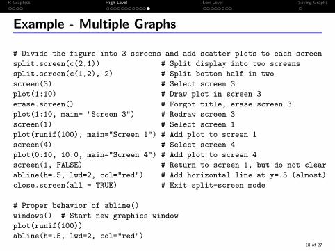
Example - Multiple Graphs
# Divide the figure into 3 screens and add scatter plots to each screen
split.screen(c(2,1)) # Split display into two screens
split.screen(c(1,2), 2) # Split bottom half in two
screen(3) # Select screen 3
plot(1:10) # Draw plot in screen 3
erase.screen() # Forgot title, erase screen 3
plot(1:10, main= "Screen 3") # Redraw screen 3
screen(1) # Select screen 1
plot(runif(100), main="Screen 1") # Add plot to screen 1
screen(4) # Select screen 4
plot(0:10, 10:0, main="Screen 4") # Add plot to screen 4
screen(1, FALSE) # Return to screen 1, but do not clear
abline(h=.5, lwd=2, col="red") # Add horizontal line at y=.5 (almost)
close.screen(all = TRUE) # Exit split-screen mode
# Proper behavior of abline()
windows() # Start new graphics window
plot(runif(100))
abline(h=.5, lwd=2, col="red")18 of 27

R Graphics High-Level Low-Level Saving Graphs
Margins
0 2 4 6 8 10
02
46
810
X
Y
Plot Region 1title('Figure Title')
Figure Marginpar(mar=c(8, 4, 4, 2))
Plot Legend (default)
Figure Legend (xpd=TRUE)
Outer Legend (xpd=NA)
0 2 4 6 8 100
24
68
10X
Y
title('Figure Title')
Plot Region 2Margin Vectors = c(bottom, left, top, right)
units are "lines" (can be non−integer)
Default Marginspar()$oma = c(0, 0, 0, 0)
par()$mar = c(5.1, 4.1, 4.1, 2.1)
Figure Marginpar(mar=c(5, 4, 4, 2))
Line 0Line 1Line 2Line 3
Line
0Li
ne 1
text("Plot Region Text")
mtext("Figure Margin Text")
mtext("Outer Margin Text", outer=TRUE)
Outer Margin
title('Outer Title', outer=TRUE)
par(oma=c(3, 2, 4, 3))
Line 0Line 1Line 2Line 3
Line
0Li
ne 1
Line
20
24
68
10ax
is(4
, out
er=
TR
UE
)
� R Graphics consist of a plot region, a figure margin and an outer margin.� The figure space can be divided into multiple plot regions
19 of 27

R Graphics High-Level Low-Level Saving Graphs
Text
� To add text to the plot region use text() and use mtext() to add text tothe figure and outer margins.
par(mfrow=c(1,2), oma=c(2,2,2,2)) # Add an outer margin to the figure
set.seed(123); x <- rnorm(10); y <- rnorm(10)
# Plot 1plot(x, pch=19, col="red", main="Figure 1")
# Label each point with its indextext(1:10, x, label=1:10, pos=rep(c(4,2), c(2,8)), font=2, cex=1.5)
# Add fancy text to the plot regiontext(1, 1, "This is Fancy Plot Text", family="HersheyScript", adj=0, cex=1.5)
# Add text to the marginmtext("This is Margin Text for Figure 1", side=2, line=4)
# Plot 2plot(x, pch=15, col="blue", main="Figure 2")
# Add plain text to the plot regiontext(1, 1, "This is More Plot Text", family="mono", adj=0, cex=1)
# Add text to the marginmtext("This is Margin Text for Figure 2", side=3, line=.5)
# Outer Margin, the \n can be include in character strings to add new linestitle("OUTER\nTITLE", outer=TRUE, line=-1)mtext("This is Outer Margin Text", side=1, outer=TRUE, font=3)
20 of 27
R Graphics High-Level Low-Level Saving Graphs
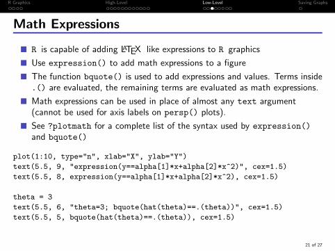
Math Expressions
� R is capable of adding LATEX like expressions to R graphics
� Use expression() to add math expressions to a figure
� The function bquote() is used to add expressions and values. Terms inside.() are evaluated, the remaining terms are evaluated as math expressions.
� Math expressions can be used in place of almost any text argument(cannot be used for axis labels on persp() plots).
� See ?plotmath for a complete list of the syntax used by expression()
and bquote()
plot(1:10, type="n", xlab="X", ylab="Y")
text(5.5, 9, "expression(y==alpha[1]*x+alpha[2]*x^2)", cex=1.5)
text(5.5, 8, expression(y==alpha[1]*x+alpha[2]*x^2), cex=1.5)
theta = 3
text(5.5, 6, "theta=3; bquote(hat(theta)==.(theta))", cex=1.5)
text(5.5, 5, bquote(hat(theta)==.(theta)), cex=1.5)
21 of 27
R Graphics High-Level Low-Level Saving Graphs
Legend
� Legends are added to a figure using legend(), legends can be added tothe plot region, figure margin, or the outer margin
� You are responsible for matching plotting symbols and colors with thesymbols and colors in the legend
� Legend placement is delicate, the location of the legend often changes whenthe figure is resized. Fixing the window size before adding legends helps.
� If you are creating one graph the locator() function can be useful fordetermining the placement
22 of 27

R Graphics High-Level Low-Level Saving Graphs
Example - Legendwindows(width=9, height=6) # Fix window sizepar(mfrow=c(1,2), oma=c(3,0,2,0)) # Add an outer margin to the figure
set.seed(789)x1 <- rnorm(10); x2 <- rnorm(10, mean=2)y1 <- rnorm(10); y2 <- rnorm(10, mean=2)
# PLOT 1, Use range to determine a plot region that is large enough for all the pointsplot(range(x1,x2), range(y1,y2), main="Figure 1", type="n", xlab="X", ylab="Y")points(x1, y1, col="red", pch=19) # Group 1points(x2, y2, col="blue", pch=0) # Group 2legend("topleft", c("Group 1","Group 2"), pch=c(19,0), col=c("red", "blue"),
horiz=TRUE, bty="n")legend(locator(1), c("Group 1","Group 2"), pch=c(19,0), col=c("red", "blue"), title="Legend")
# PLOT 2plot(range(x1,x2), range(y1,y2), main="Figure 2", type="n", xlab="X", ylab="Y")lines(sort(x1), sort(y1), col="red", type="o", pch=19) # Group 1lines(sort(x2), sort(y2), col="blue", type="o", pch=0) # Group 2legend(-2, 2.5, c("Group 1", "Group 2"), pch=c(19,0), col=c("red", "blue"),
horiz=TRUE, bty="n", lty=1)
# Legend in figure marginlegend(1.5, -2.25, c("Group 1", "Group 2"), pch=c(19,0), col=c("red", "blue"), lty=1,
bty="n", xpd=TRUE)# Legend in outer marginlegend(-5.25, -3, c("Group 1", "Group 2"), pch=c(19,0), col=c("red", "blue"), lty=1,
horiz=TRUE, xpd=NA)
23 of 27

R Graphics High-Level Low-Level Saving Graphs
Axis
� In a high-level plot function, if the argument axes=FALSE then the plotaxes will be omitted.
� The functions axis() and axis.Date() are used create custom axes.
# Plot with no axes
par(mar=c(5,5,5,5))
plot(1:10, axes=FALSE, ann=FALSE)
# Add an axis on side 2 (left)
axis(2)
# Add an axis on side 3 (top), specify tick mark location, and add labels
axis(3, at=seq(1,10,by=.5), labels=format(seq(1,10,by=.5), nsmall=3))
# Add an axis on side 4 (right), specify tick mark location and rotate labels
axis(4, at=1:10, las=2)
# Add axis on side 1 (bottom), with labels rotated 45 degrees
tck <- axis(1, labels=FALSE)
text(tck, par("usr")[3]-.5, labels=paste("Label", tck), srt=45, adj=1, xpd=TRUE)
box() # Add box aroung plot region
mtext(paste("Side", 1:4), side=1:4, line=3.5, font=2) # Add axis labels24 of 27

R Graphics High-Level Low-Level Saving Graphs
Example - axis.Date()
dates <- seq.Date(Sys.Date(),by="3 day", length.out=25)
y <- sort(rexp(length(dates)))
plot(dates, y, xlab="Date", ylab="Y", main="Y vs Date",
axes=FALSE, type="o", pch=18, col="darkorange4", cex=1.5)
# Y-axis
axis(2, at=seq(0, max(y), by=.5))
# X-axis
axis.Date(1, at=seq.Date(min(dates), max(dates), "week"),
format="%b %d\n%Y", padj=.5)
axis.Date(1, at=seq.Date(min(dates), max(dates), "day"),
labels=FALSE, tcl=-.25)
box()
25 of 27

R Graphics High-Level Low-Level Saving Graphs
Colors
� The function colors() returns a vector of built-in color names.� grep() can be used to help find colors� Earl Glynn, has create a very nice PDF color chart of all the built-in colors,
there is a link on the class homepage.� To create your own color use, rgb(), hsv() or hcl(), depending on what
method of color specification you prefer� Create a personal color palette using, palette(). When the argument
col=number, R uses the color in the palette that is indexed by number.# Create and use a custom color
burnt.orange <- rgb(red=204, green=85, blue=0, max=255)
plot(1:10, pch=15, col=burnt.orange, cex=3)
palette() # Current palette()
plot(1:10, pch=15, col=5, cex=3)
# Custom palette()
palette(c("red", "darkorange", "gold", "green3", "blue", "magenta3"))
plot(c(1,10), c(-3,3), type="n")
for(i in 1:length(palette())) points(rnorm(10), col=i, pch=18, cex=1.5)
palette("default") # Return to default, here "default" is a keyword26 of 27

R Graphics High-Level Low-Level Saving Graphs
Saving Graphs
� Graphs can be saved using several different formats, such as PDFs, JPEGs,and BMPs, by using pdf(), jpeg() and bmp(), respectively.
� Graphs are saved to the current working directory.� In my opinion, pdf() produces the highest quality graphics and are easy to
include in LATEXdocuments if you use a PDF compiler.
# Create a single pdf of figures, with one graph on each page
pdf("SavingExample.pdf", width=7, height=5) # Start graphics device
x <- rnorm(100)
hist(x, main="Histogram of X")
plot(x, main="Scatterplot of X")
dev.off() # Stop graphics device
# Create multiple pdfs of figures, with one pdf per figure
pdf(width=7, height=5, onefile=FALSE)
x <- rnorm(100)
hist(x, main="Histogram of X")
plot(x, main="Scatterplot of X")
dev.off() # Stop graphics device27 of 27


