78
Best Practices in Dashboard Design Michael Taft, CEO [email protected] (888) 221-6372 x801 Jeff Seybert, PhD [email protected] (913) 469-3442
Best Practices in Dashboard
Design
Michael Taft, [email protected](888) 221-6372 x801
Jeff Seybert, [email protected](913) 469-3442
Outline
• Who is ZogoTech?
• What KPIs to measure?
• How to store them?
• How to display them?
http://www.zogotech.com/recent-webinars/

Outline
• Best examples from outside higher ed
• Previous Work
• Visualization: Tufte, Few, Wong, John Rome
• KPIs: Seybert, AACC
• Data Model: ZT
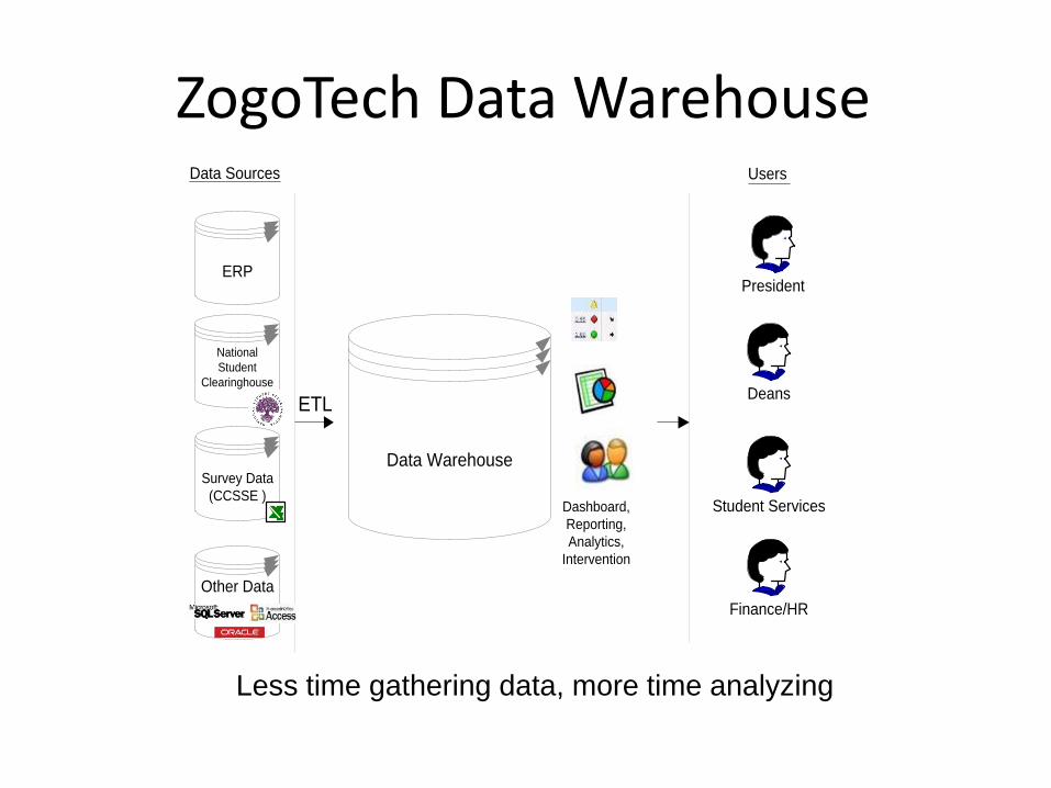
Less time gathering data, more time analyzing
ZogoTech Data Warehouse
Survey Data
(CCSSE )
Other Data
Student Services
Deans
ERPPresident
Data Warehouse
Data Sources
Finance/HR
Users
National
Student
Clearinghouse
Dashboard,
Reporting,
Analytics,
Intervention
ETL
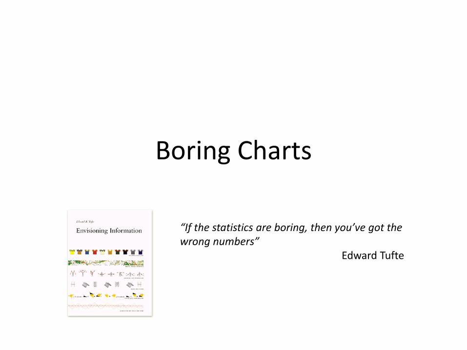
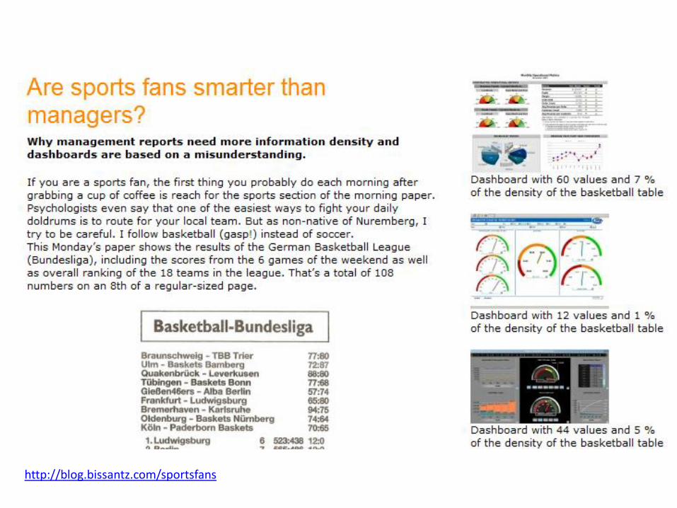
Boring Charts
“If the statistics are boring, then you’ve got the wrong numbers”
Edward Tufte
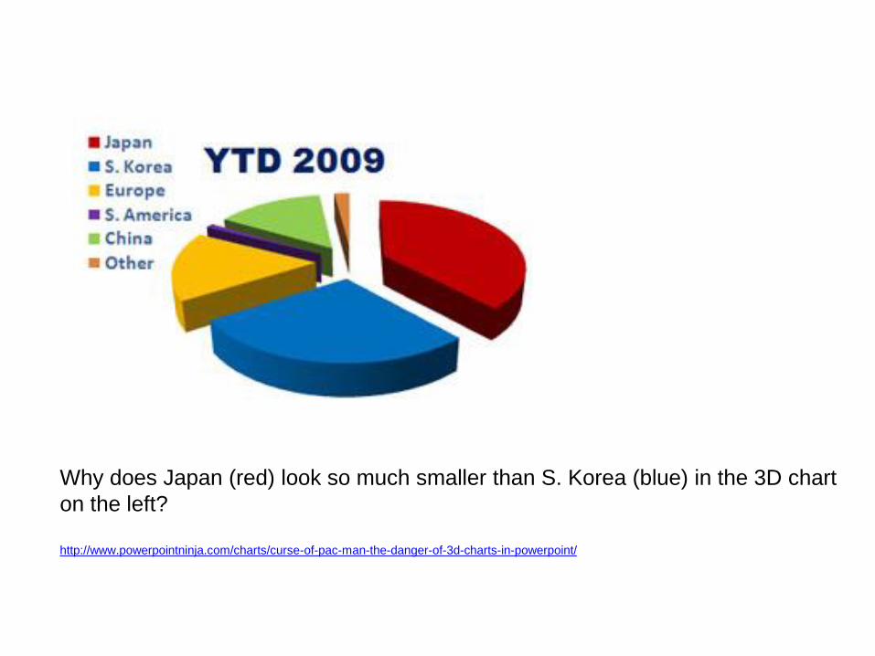
Why does Japan (red) look so much smaller than S. Korea (blue) in the 3D chart
on the left?
http://www.powerpointninja.com/charts/curse-of-pac-man-the-danger-of-3d-charts-in-powerpoint/
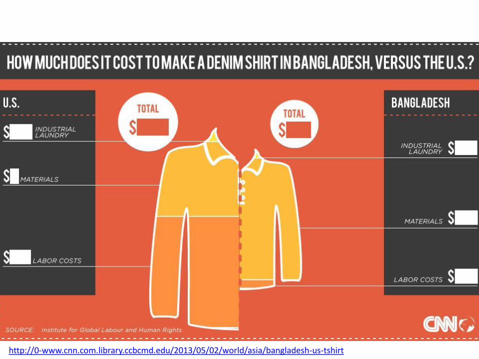
http://0-www.cnn.com.library.ccbcmd.edu/2013/05/02/world/asia/bangladesh-us-tshirt
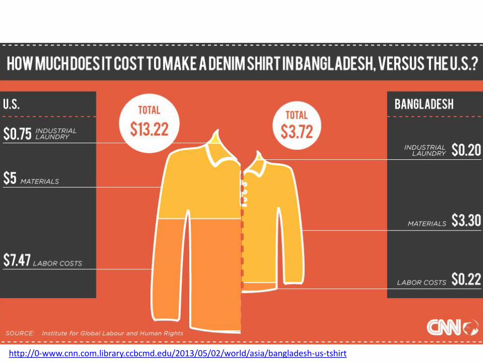
http://0-www.cnn.com.library.ccbcmd.edu/2013/05/02/world/asia/bangladesh-us-tshirt
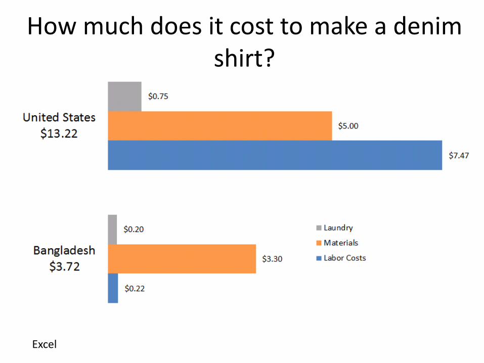
How much does it cost to make a denim shirt?
Excel
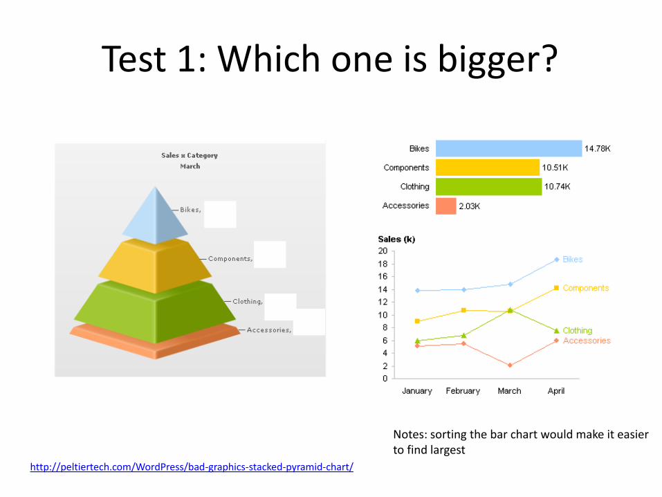
Test 1: Which one is bigger?
http://peltiertech.com/WordPress/bad-graphics-stacked-pyramid-chart/
Notes: sorting the bar chart would make it easier to find largest
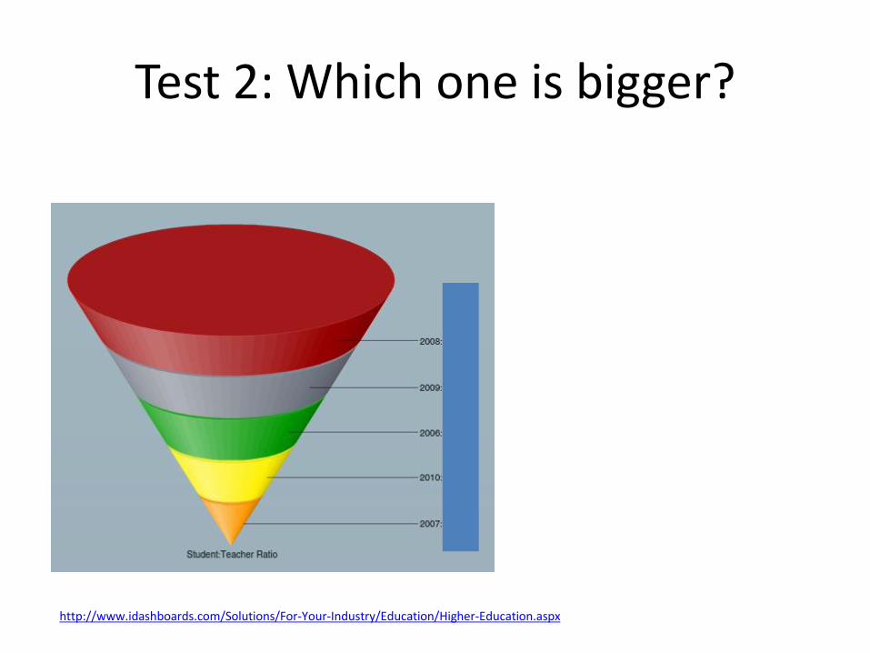
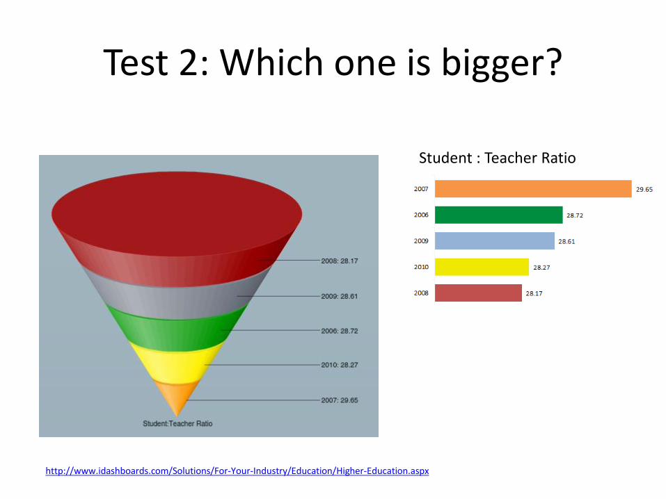
Test 2: Which one is bigger?
http://www.idashboards.com/Solutions/For-Your-Industry/Education/Higher-Education.aspx
Test 2: Which one is bigger?
http://www.idashboards.com/Solutions/For-Your-Industry/Education/Higher-Education.aspx
Student : Teacher Ratio

Test 2: Which one is bigger?
http://www.idashboards.com/Solutions/For-Your-Industry/Education/Higher-Education.aspx
Student : Teacher Ratio
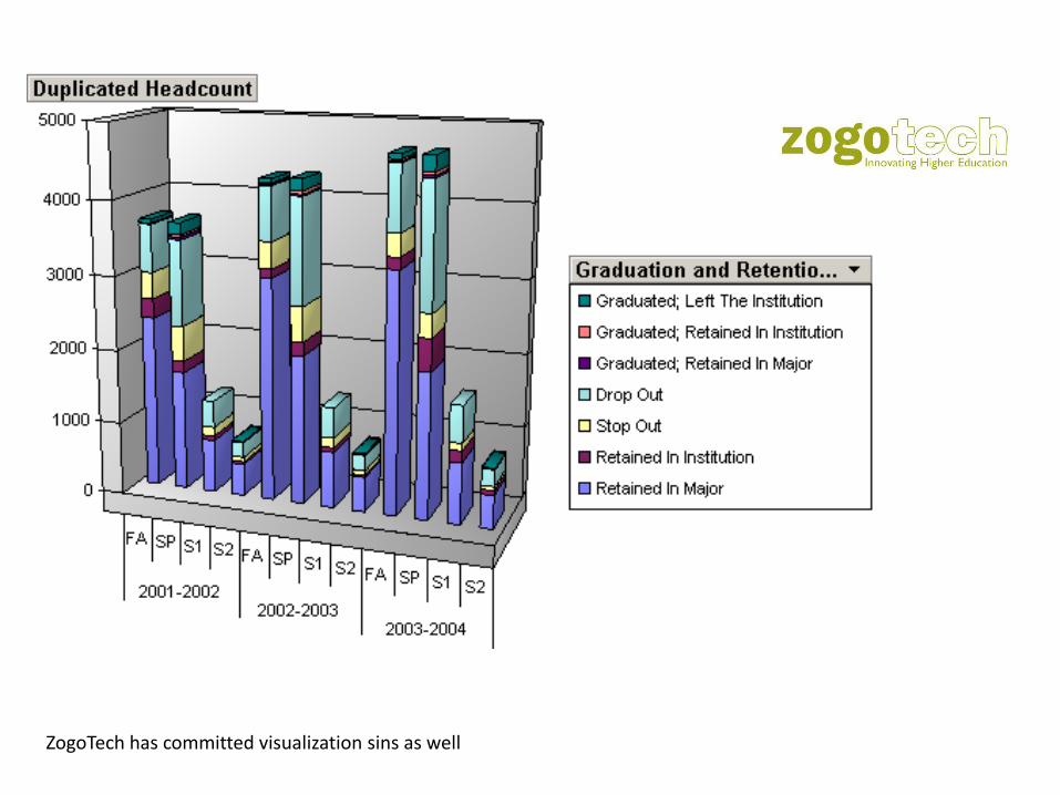
ZogoTech has committed visualization sins as well
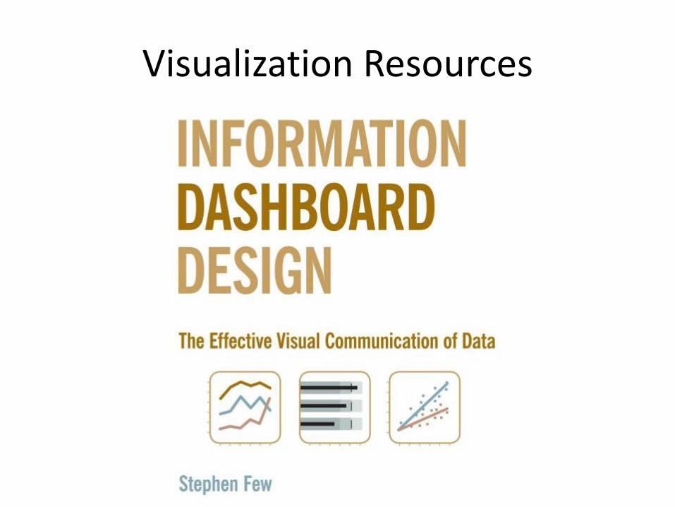
Visualization Resources
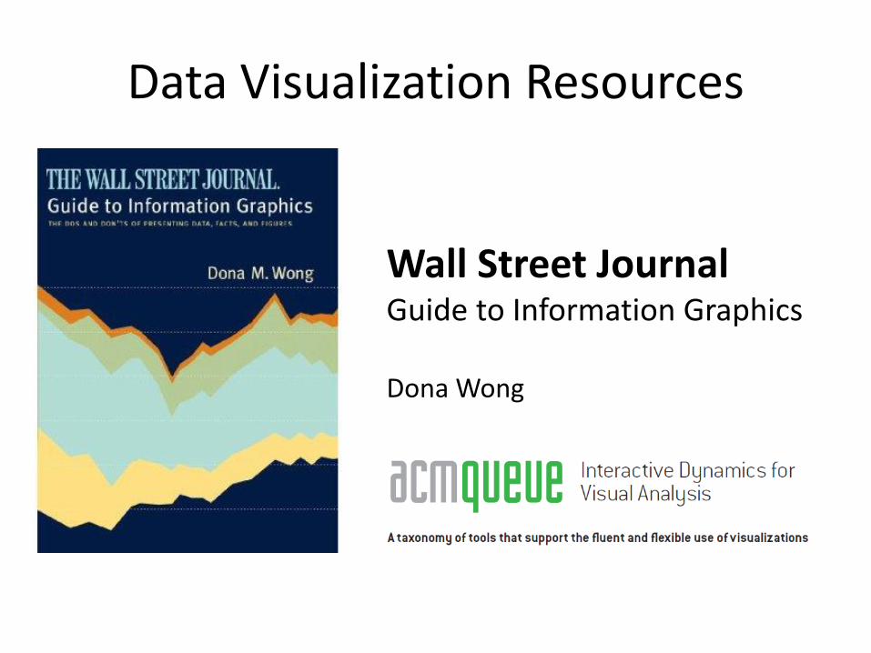
Data Visualization Resources
Wall Street JournalGuide to Information Graphics
Dona Wong
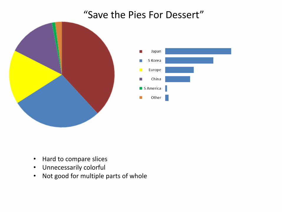
“Save the Pies For Dessert”
• Hard to compare slices• Unnecessarily colorful• Not good for multiple parts of whole
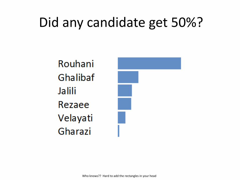
Did any candidate get 50%?
Who knows?? Hard to add the rectangles in your head
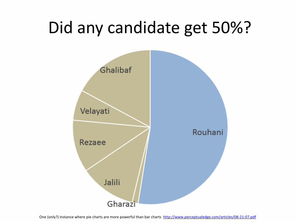
Did any candidate get 50%?
One (only?) instance where pie charts are more powerful than bar charts http://www.perceptualedge.com/articles/08-21-07.pdf
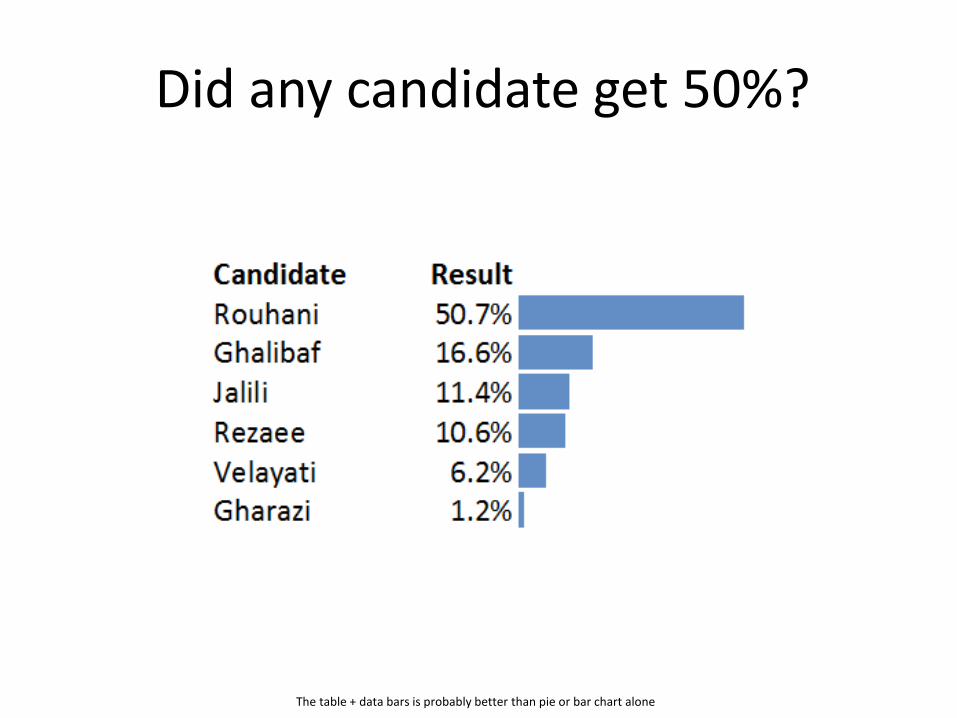
Did any candidate get 50%?
The table + data bars is probably better than pie or bar chart alone

REAL Dashboardscivics, fords, etc.
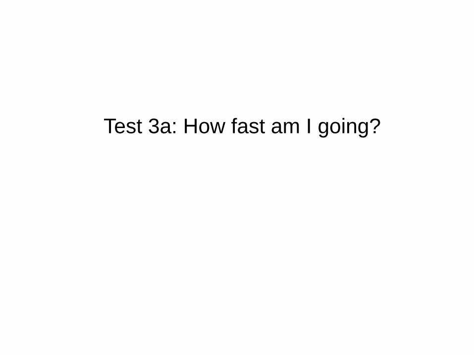
Test 3a: How fast am I going?
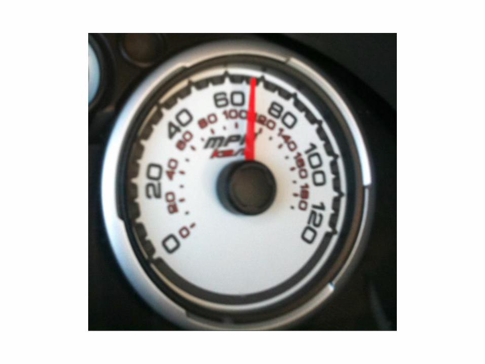

Test 3b: How fast am I going?
The Civic


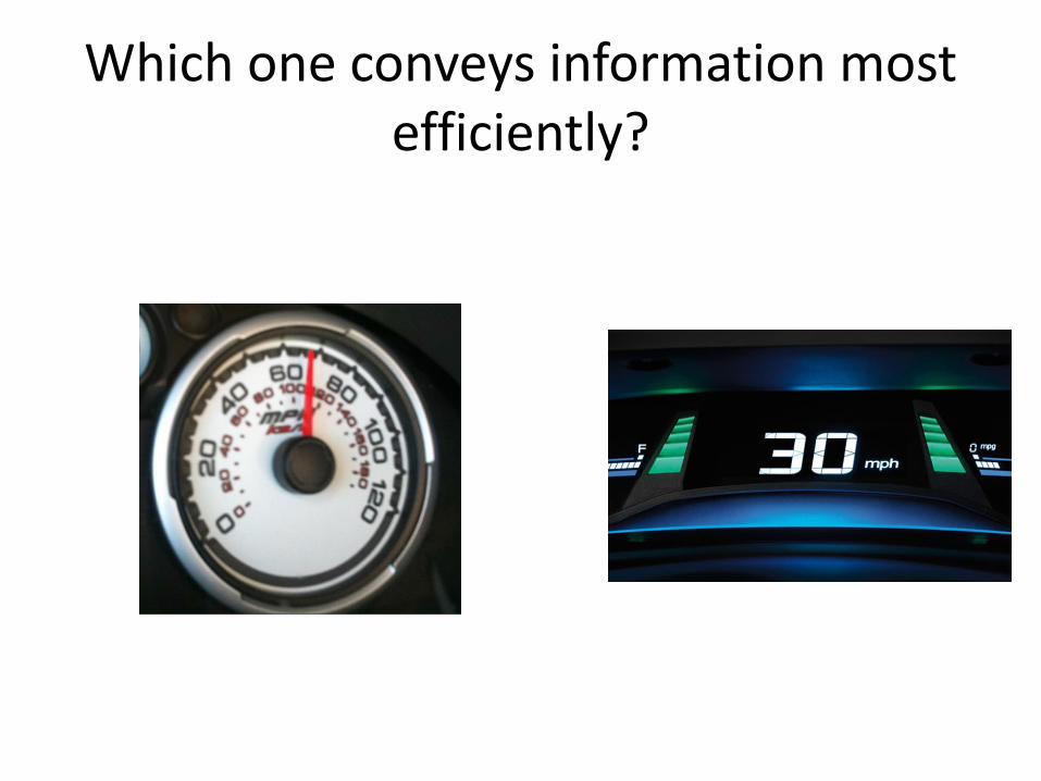
Which one conveys information most efficiently?

Yet we still see them everywhere
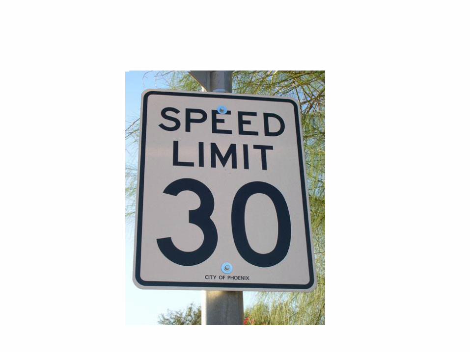
Test 4
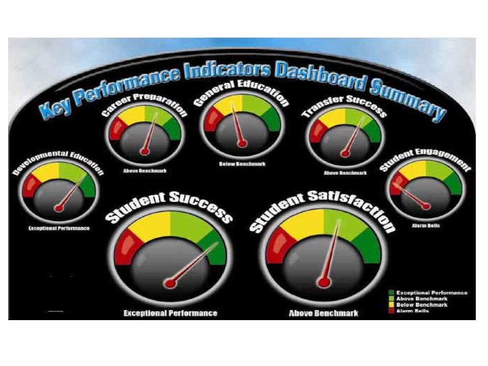
Looks pretty, but not
much information

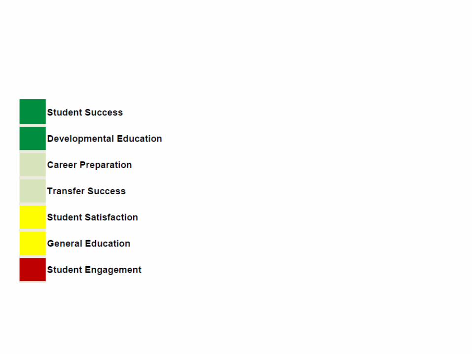
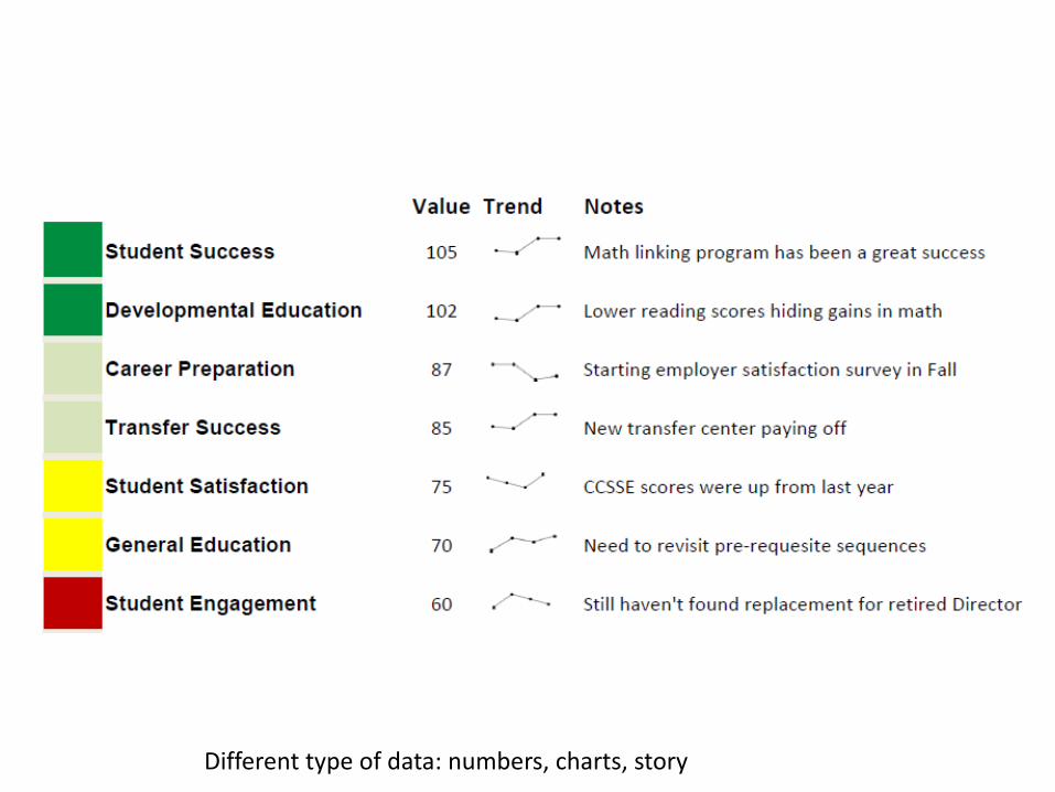
Different type of data: numbers, charts, story

“But people can’t handle that much information”

Don’t dumb down your data
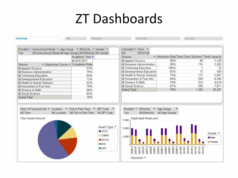
ZT Dashboards

“Not Professional”
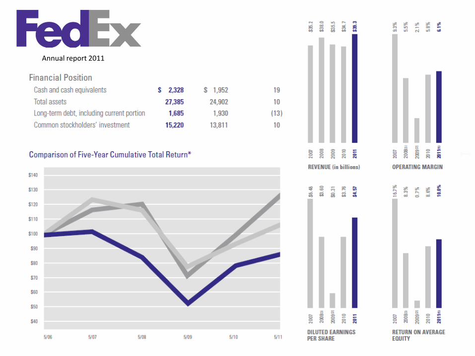
Annual report 2011
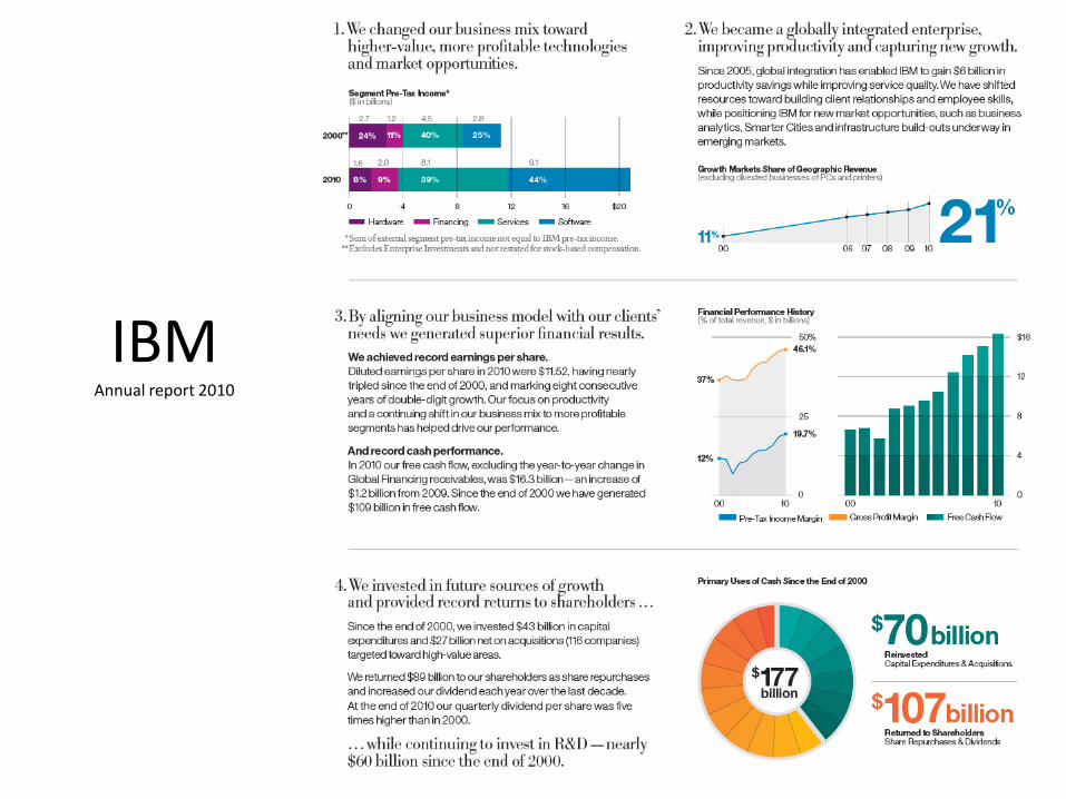
IBMAnnual report 2010
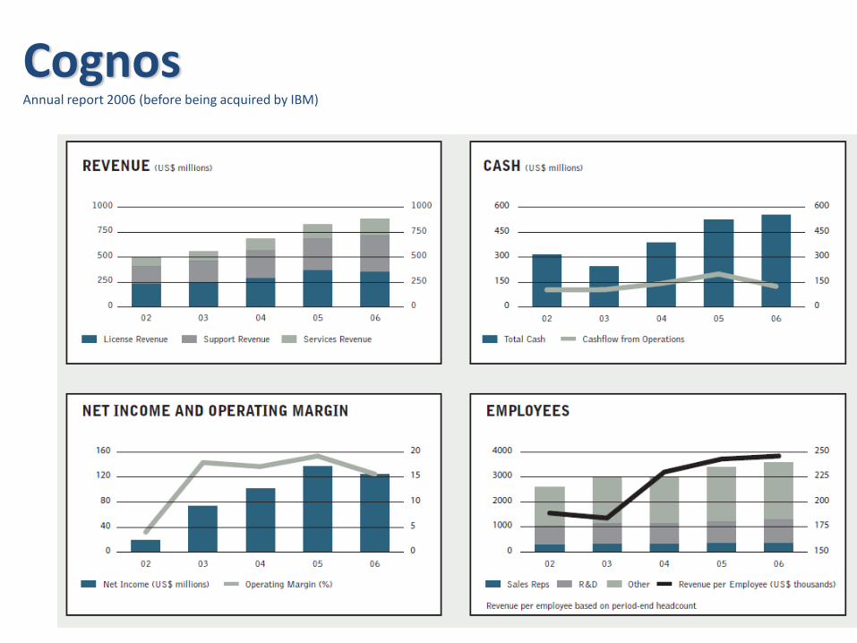
CognosAnnual report 2006 (before being acquired by IBM)
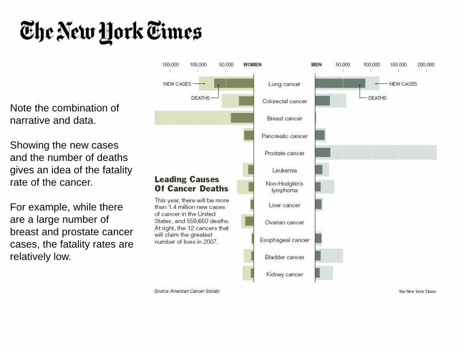
Note the combination of
narrative and data.
Showing the new cases
and the number of deaths
gives an idea of the fatality
rate of the cancer.
For example, while there
are a large number of
breast and prostate cancer
cases, the fatality rates are
relatively low.
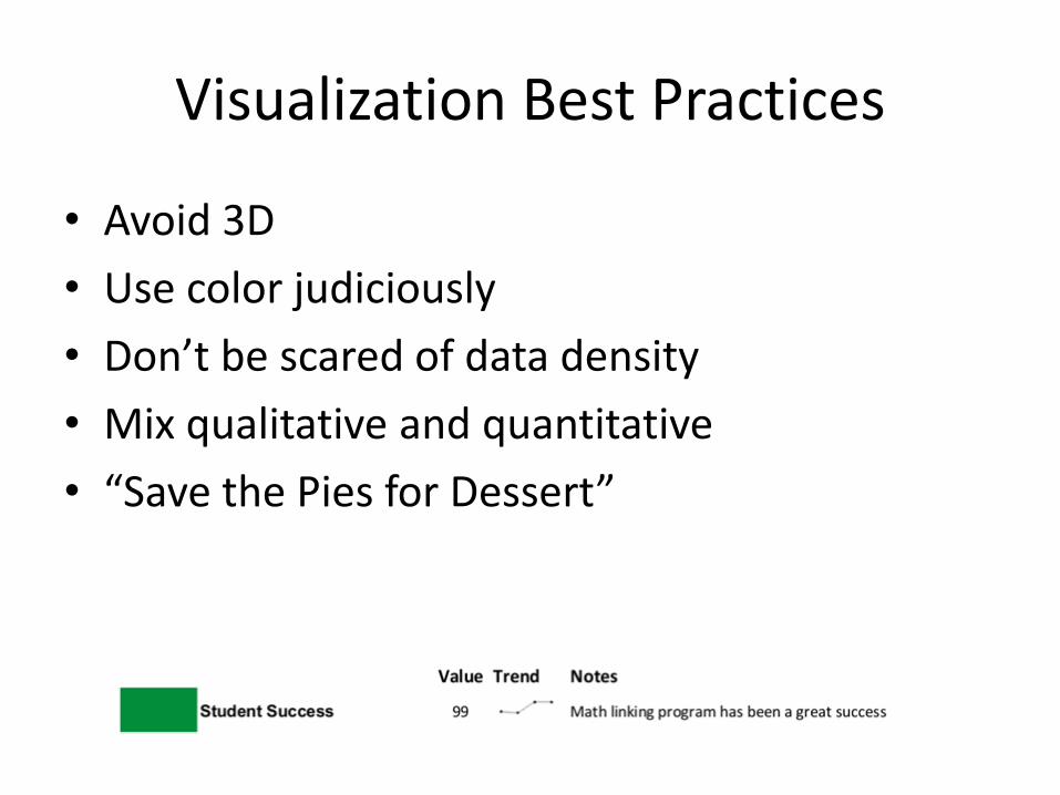
Visualization Best Practices
• Avoid 3D
• Use color judiciously
• Don’t be scared of data density
• Mix qualitative and quantitative
• “Save the Pies for Dessert”
Higher Ed Examples
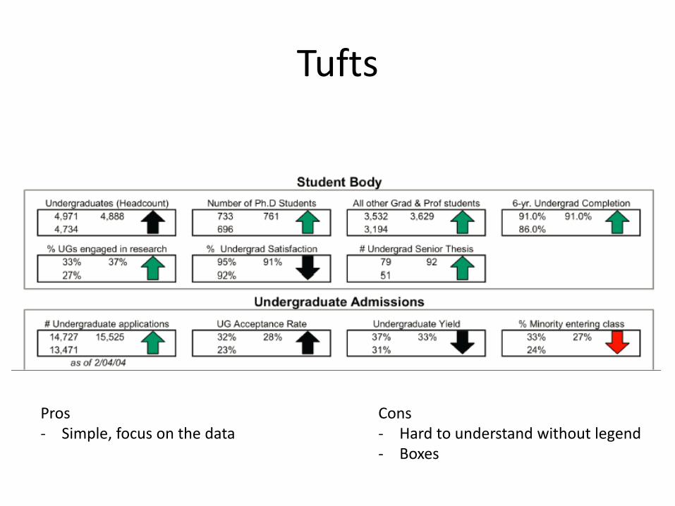
Tufts
Pros- Simple, focus on the data
Cons- Hard to understand without legend- Boxes
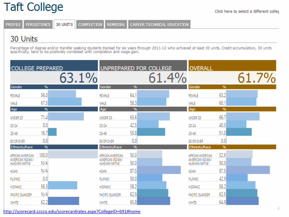
http://scorecard.cccco.edu/scorecardrates.aspx?CollegeID=691#home
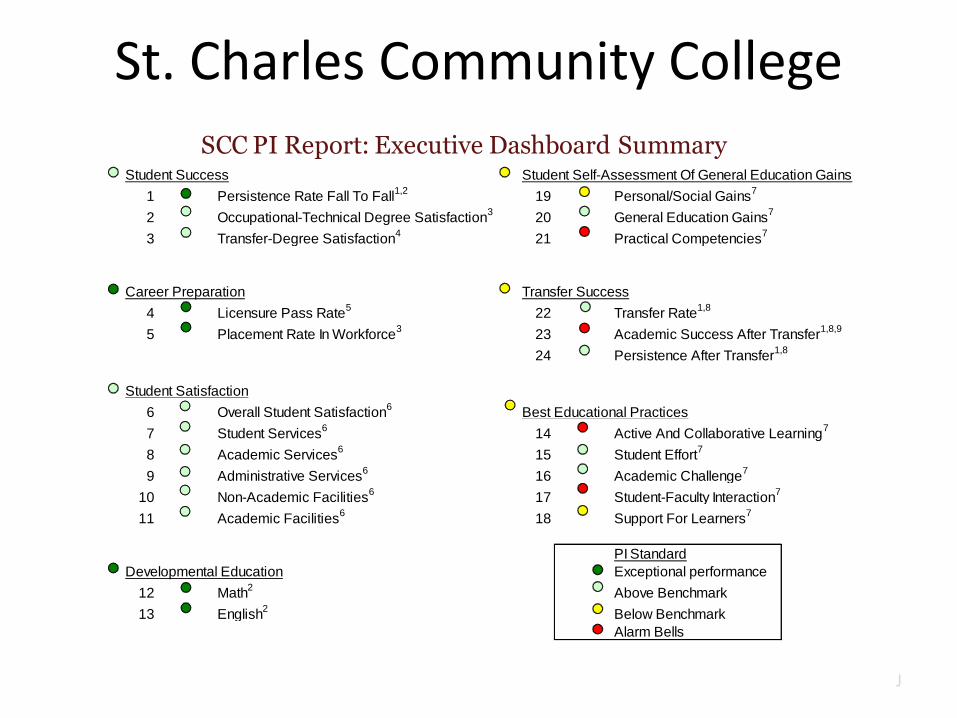
St. Charles Community College
SCC PI Report: Executive Dashboard SummaryStudent Success Student Self-Assessment Of General Education Gains
1 Persistence Rate Fall To Fall1,2
19 Personal/Social Gains7
2 Occupational-Technical Degree Satisfaction3
20 General Education Gains7
3 Transfer-Degree Satisfaction4
21 Practical Competencies7
Career Preparation Transfer Success
4 Licensure Pass Rate5
22 Transfer Rate1,8
5 Placement Rate In Workforce3
23 Academic Success After Transfer1,8,9
24 Persistence After Transfer1,8
Student Satisfaction
6 Overall Student Satisfaction6
Best Educational Practices
7 Student Services6
14 Active And Collaborative Learning7
8 Academic Services6
15 Student Effort7
9 Administrative Services6
16 Academic Challenge7
10 Non-Academic Facilities6
17 Student-Faculty Interaction7
11 Academic Facilities6
18 Support For Learners7
PI Standard
Developmental Education Exceptional performance
12 Math2
Above Benchmark
13 English2
Below Benchmark
Alarm Bells
iii J
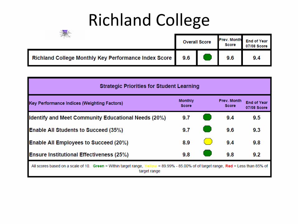
Richland College
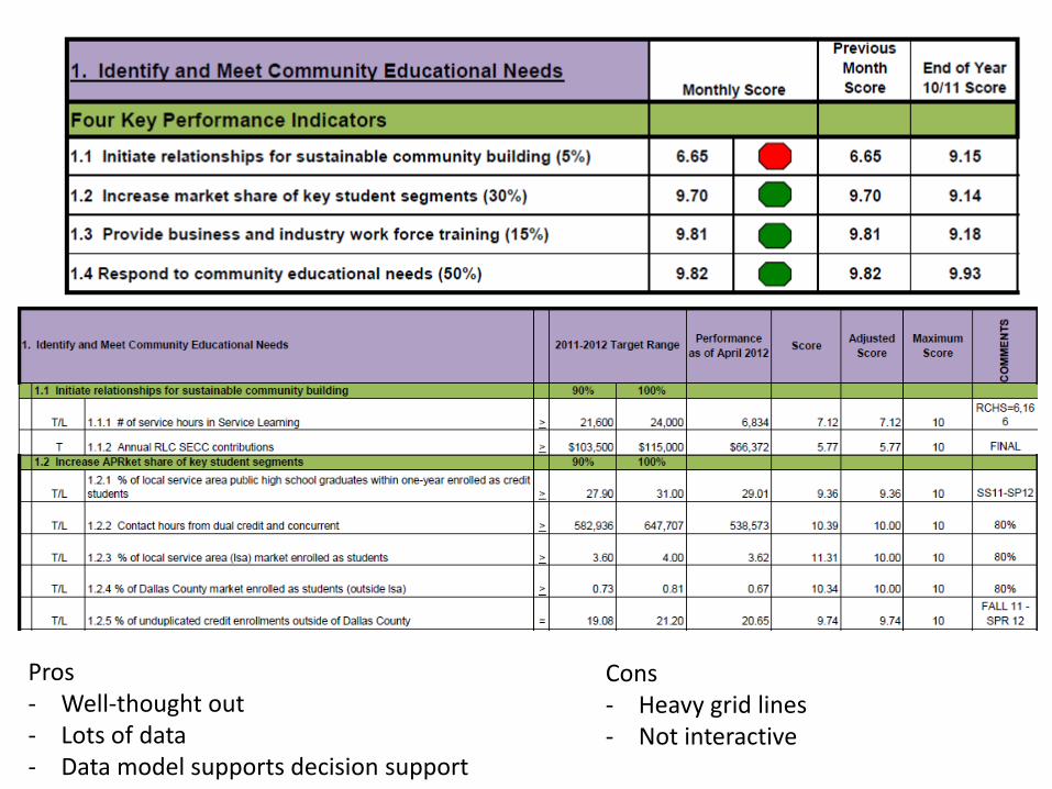
Pros- Well-thought out- Lots of data- Data model supports decision support
Cons- Heavy grid lines- Not interactive
Developing KPIs

Indicators
Use what already works
Menu of indicators from other
sources (NCCBP, AtD schools,
AACC, etc)
See Webinars
http://www.zogotech.com/
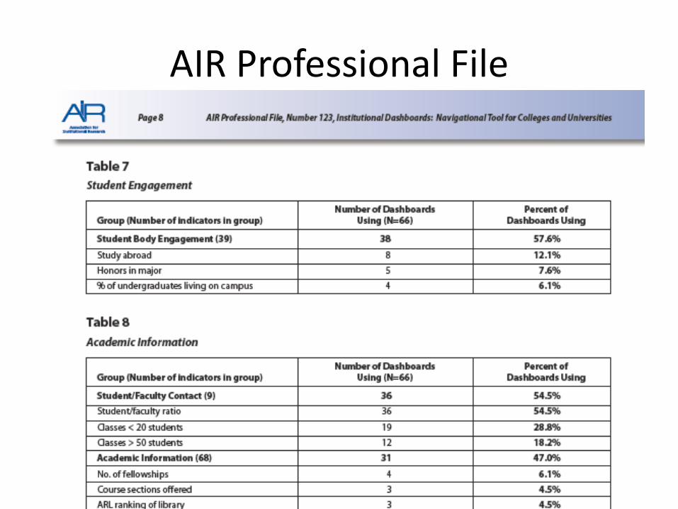
AIR Professional File
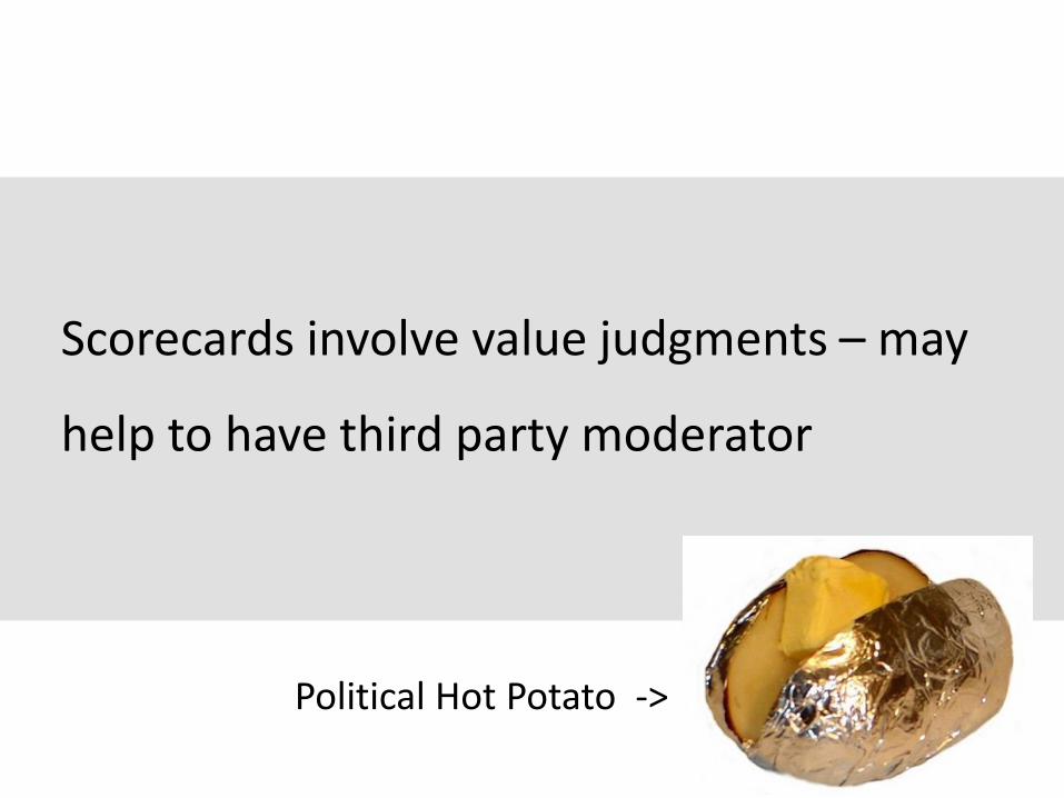
Scorecards involve value judgments – may
help to have third party moderator
Political Hot Potato ->
Dr. Jeff Seybert
• Extensive consulting experience
• Co-Author of Core Indicators of Effectiveness
• Resume
• Personality
How KPIs are Identified
• Outgrowth of strategic planning– Important and meaningful to stakeholders
– Viewed as important to the organization
– Linked to strategic plan and organizational priorities
– Help determine the extent to which the organization is progressing toward its stated goals
• Team can begin with a large number of potential KPIs and then whittle down to the vital few—no more than 15-20
Who’s Involved
• Scorecard Development Team• Senior leadership
• IR
• Key constituencies (Faculty, Student Affairs, others)
• Team solicits input from affected work groups and administrators
• Senior leadership (president’s cabinet?)makes final determination
The KPI Day-long Kickoff Workshop
• Team solicits input
• Pre-workshop “homework”
– Mission/vision/values statements
– Strategic plan
– AACC “Core Indicators of Effectiveness for community colleges”
Workshop Agenda(morning)
• The “work”
– Introductory presentation by facilitator (45-60 minutes)
– Divide into small groups
– Round 1– Goal is to identify the college’s “core business”/most important
institutional functions/key mission components (60-75 minutes)
– Reconvene: groups report progress (30-45 minutes)
– Entire group comes to consensus on core functions (60 minutes)
– Lunch
L

Group Report Out
Workshop Agenda (afternoon)
• The “work” (cont’d.)
– Round 2
• Same groups or “shuffle”?
• Each group assigned one core function
• Begin to derive KPIs that measure each core function (60-75 minutes)
• Reconvene: groups report progress (30-45 minutes)
• Entire group comes to consensus on first-level KPIs (45-60 minutes)
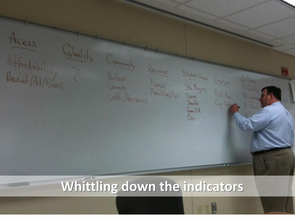
Whittling down the indicators
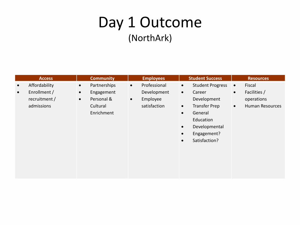
Day 1 Outcome(NorthArk)
Access Community Employees Student Success Resources
Affordability
Enrollment /
recruitment /
admissions
Partnerships
Engagement
Personal &
Cultural
Enrichment
Professional
Development
Employee
satisfaction
Student Progress
Career
Development
Transfer Prep
General
Education
Developmental
Engagement?
Satisfaction?
Fiscal
Facilities /
operations
Human Resources
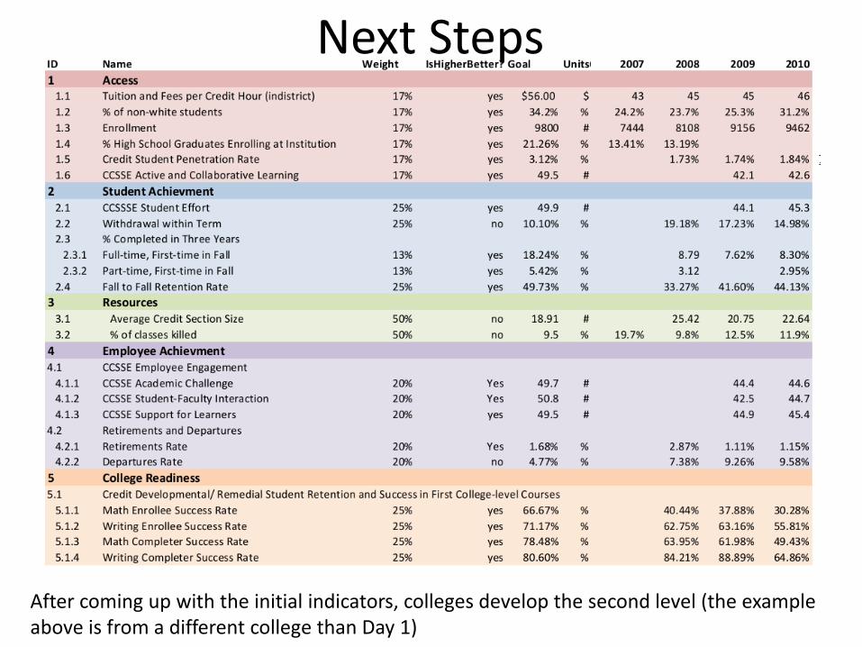
Next Steps
After coming up with the initial indicators, colleges develop the second level (the example above is from a different college than Day 1)
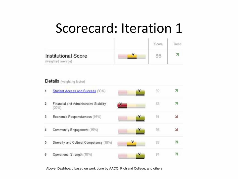
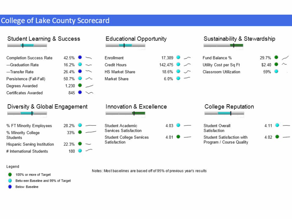
Scorecard: Iteration 1
Above: Dashboard based on work done by AACC, Richland College, and others
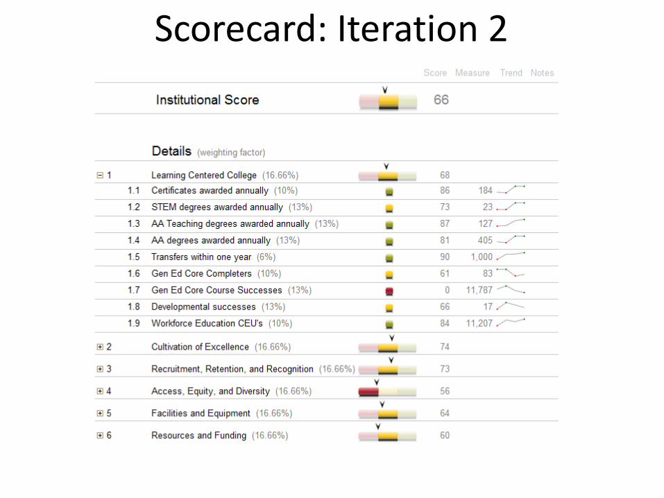
Scorecard: Iteration 2
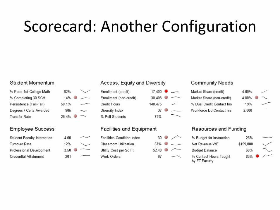
Scorecard: Another Configuration
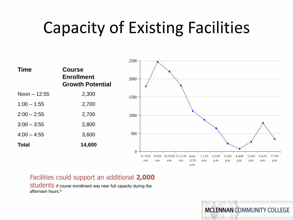
Time Course
Enrollment
Growth Potential
Noon – 12:55 2,300
1:00 – 1:55 2,700
2:00 – 2:55 2,700
3:00 – 3:55 2,800
4:00 – 4:55 3,600
Total 14,600
Facilities could support an additional 2,000students if course enrollment was near full capacity during the
afternoon hours.*
0
500
1000
1500
2000
2500
8 - 8:55
a.m.
9-9:50
a.m.
10-10:50
a.m.
11-11:50
a.m.
noon-
12:55
p.m.
1-1:55
p.m.
2-2:45
p.m.
3-3:45
p.m.
4-4:40
p.m.
5-5:45
p.m.
6-6:55
p.m.
7-7:45
p.m.
Capacity of Existing Facilities

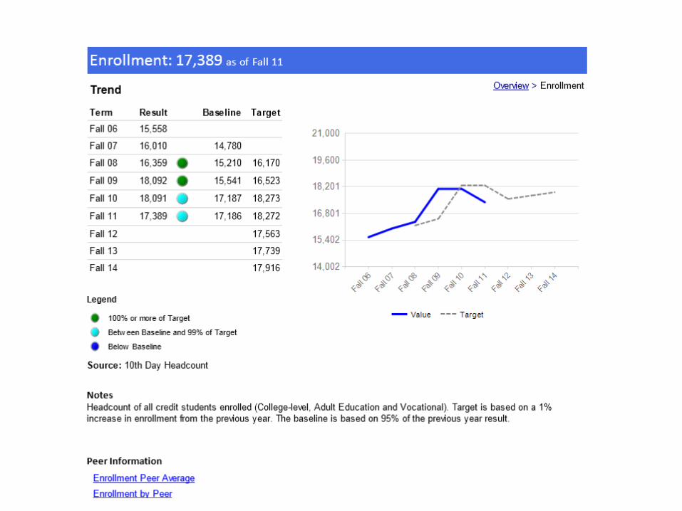
Enrollment by Offset from Census
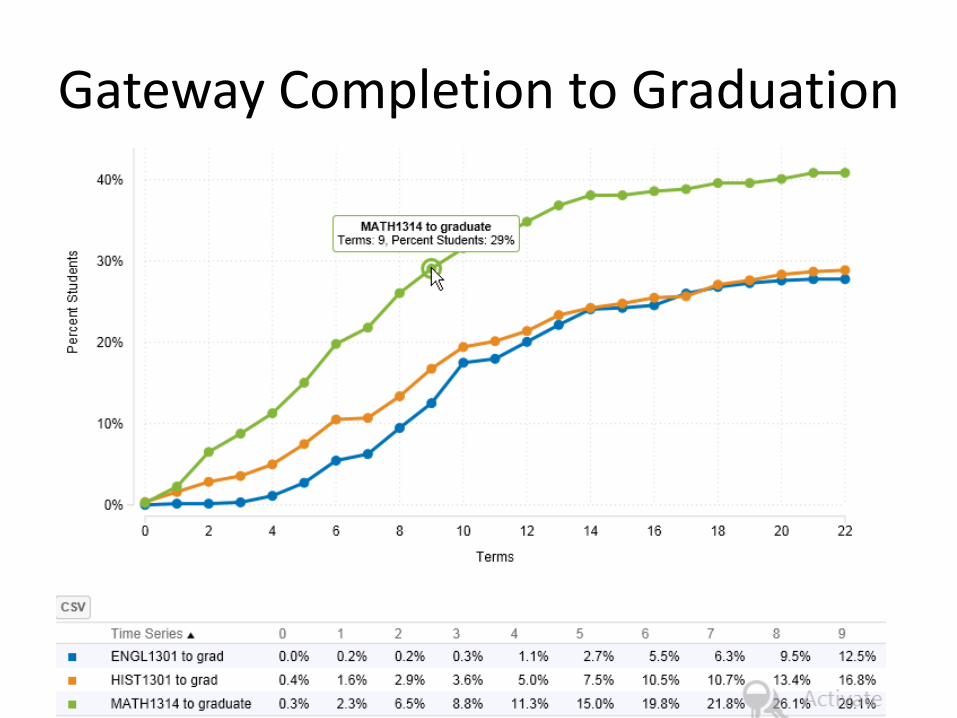
Gateway Completion to Graduation
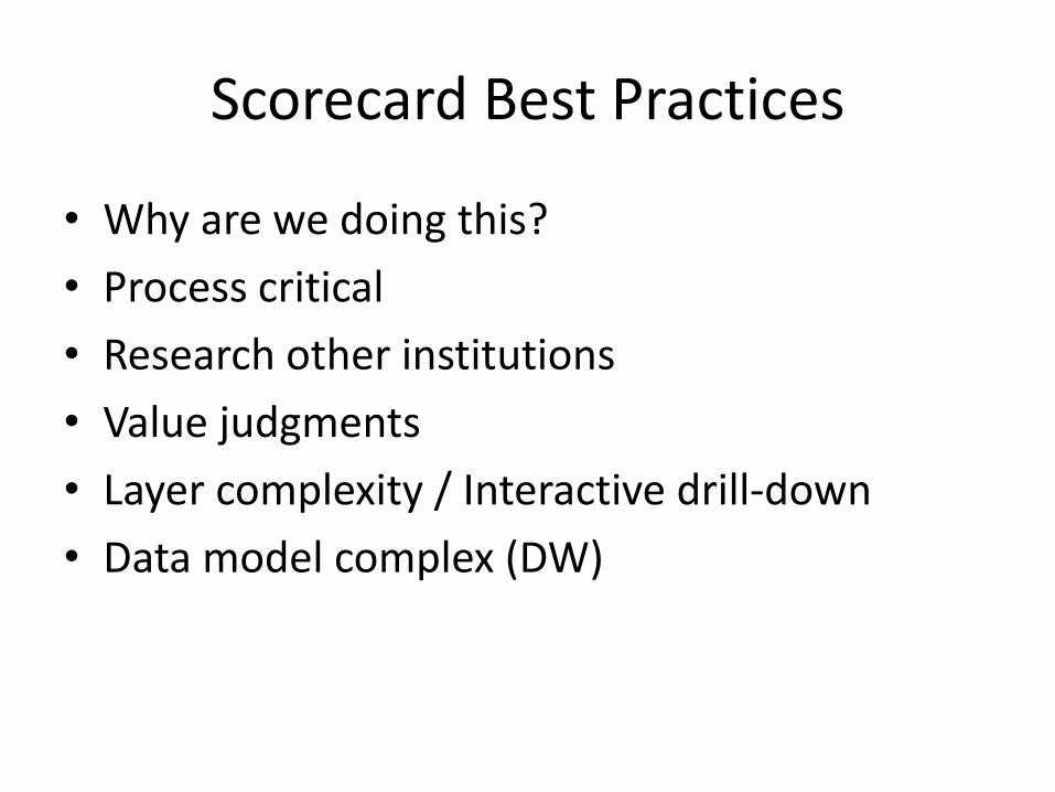
Scorecard Best Practices
• Why are we doing this?
• Process critical
• Research other institutions
• Value judgments
• Layer complexity / Interactive drill-down
• Data model complex (DW)