26
VEGANUARY BOOKLET EVALUATION By Sophie Baker
| Date post: | 12-Jan-2017 |
| Category: |
Education |
| Upload: | sophiebaker98 |
| View: | 18 times |
| Download: | 0 times |
VEGANUARY BOOKLET EVALUATIONBy Sophie Baker

My Intentions and How They’ve Been Carried Out The first graphic that I designed was for my fact file on ‘Vegan Myths’. Because of the title of the fact file saying ‘myths’ I decided to have a play on the word with how I designed the pages with a theme of Greek Gods. This resulted in having animals dressed like Greek Gods in robs and gold leaves with the text on clouds. When planning the design I had a few ideas for the page layout for how I was going to position the text.
I knew I was going to have a scroll at the top of the page with the title ‘Vegan Myths’ and to have animals created in a mythical style but the text was something I needed to make sure was clear and readable. One of the ideas was to have the words floating above the clouds or even to bullet point the myths to the facts. I knew I was going to rotoscope the entire page rather than use images offline for some of the elements on this page. So I scanned in my sketches from my notebook to use as a template for the graphic. Whereas for the scroll I found an image online and rotoscoped that frame.
I had tried rotoscoping an image of a cloud but in the end it looked messy and uneven so I used the ‘Custom Shape Tool’ and selected the speech cloud shape. Once placed into the shaping I wanted I rotoscoped around the bottom of the cloud and cut to make it curved into a cloud and copied the layers to make multiple clouds for the text to sit on. One of main issues I had with this page was the texts font. Once the page was finished I noticed that the font didn’t stand out on the page and was hard to read. This was because I was using two serif fonts (from the header and the main texts) which made all text blend together. I changed the main text to a sans-serif font in bold which made those parts of the text stand out much more.

My Intentions and How They’ve Been Carried Out Sketched ideas for how the page layout could look. I knew it would take some experimenting on Photoshop before I got a better look at how the text would look on the page so I had made a few different ideas for potential looks such as making a list, bullet points, how to position text on cloud (whether above them of in the clouds so they stand out against the background).
Serif font: Sans-Serif font:
My Intentions and How They’ve Been Carried Out When planning what to do for the pages I tired to come up with a few ideas for what was going to be in the booklet. I had already sketched ideas for ‘Vegan Myths’ fact file but when looking for extra content I found on ‘Veganuary’s website places where you could eat and order vegan foods. I began working on ideas about another fact file. I tried to make it as though the reader was seeing an overhead view of a table where the food was being served. I needed there to be a noticeable theme with the restaurant to the graphic. I had sketched out four ideas that could work in the booklet, depending on how the page count works out with the multi-page article. I focused on making at least two which ended up being ‘Yo! Sushi’ and ‘Eat.’. For instance I made a page for ‘Yo! Sushi’ on a conveyer belt of food going around the page. This allowed me to display much more food and label them. I wanted to rotoscope the graphic because then it would have a similar style to the first fact file. This required me to find a suitable image online of a conveyer belt as a template, as well as images of the food that would be presented and labeled. All of the information about where and what to eat was found on ‘Veganuary’s website, I just needed to dissect the facts found to fit on the page. Once the conveyer belt was created I could begin to estimate what food would be displayed. Instead of making plates that go the entirety of the way round I kept a minimum number so it was clear to see what was being shown and so the page didn’t end up looking messy and over crowded. This gave me less items to show the reader but they would be more focused upon and easier to view. When making the graphic I mainly used the ‘Rotoscope Tool’ on Photoshop and using images found online to help give the page more detail. Making the second page for the ‘Eating Out?’ fact file I used the same method of rotoscoping all of the main elements of the page to create more detail for the page. However, the one thing that I hadn’t chosen to rotoscope with these two pages was the logos for the restaurants name. I used the ‘Quick Select Tool’ on images online of the title to make into separate layers to make sure the title was as recognizable as possible. ‘Eat.’ has a different aesthetic to ‘Yo! Sushi’ this meant it helped show a bit of differentiation with my pages. Unlike the first page I only used a few items to represent many. This meant looking at what they had to offer for vegan options and categorizing them. Such as, ‘Breakfast’, ‘Soups and Broth Pots’, and ‘Desserts’. This allowed me to label more options to be ordered from this restaurant. When finishing the two pages and looking over them I noticed that the two pages weren’t as easy to understand as I’d hoped. In the end I found that putting a caption at the bottom of the page, ‘Vegan Friendly Options To Order’, helped fill out the bottom of the page and show the reader more specifically what they’re looking at.

My Intentions and How They’ve Been Carried Out
For preparation I had made four potential ideas through the research and facts I had found on ‘Veganuary’s website. One of ‘Wagamama’, ‘Calucio’s’, ‘Yo! Sushi’ and ‘Eat.’. In the end due to the page count for the booklet I only used two of them. I had planned to make them look a though you were looking at an over head view of a table and the viewer was looking down at the food being displayed. This added with labels to explain what food you could get with a header of where to order these foods. They all had similar looks except for the one for ‘Yo! Sushi’ because instead of a table there was a conveyer belt being used.
Images offline to how I adapted them to my own personal graphic:

My Intentions and How They’ve Been Carried Out
I had took a lot of inspiration from the ‘Eat.’ website for the layout for that specific page in terms of what to put on the page and colour scheme. I had already planned an over head view so I used a lot of their images as templates to create the foods graphics.
My Intentions and How They’ve Been Carried Out For my main infographic I made one based on the environmental impact of not being a vegan meant. All of the information I found was from the ‘Veganuary’ website and because there was so much information given, and in categories, I found that it’d be best to separate the page into section of to show those facts and figures. At first I wanted to make an image that showed a scene in a forest of sorts, with clouds at the top to explain greenhouse gases, then tree to show deforestation, an animal to show how they can loose their homes to these effects, and finally water in a lake to show the lose of what to make meat-based products. However, after experimenting with the design I found that it didn’t express the information in an eye-catching or informative way. I kept the idea in mind of separating the information but with much simpler symbolism. I firstly shrunk down the facts that I had collected from online to one point for each section. This helped me focus on one piece at a time. Originally I had planned to put at the top of the screen a bar chart of ‘Dietary Greenhouse Gas Emissions’ but it took up too much room. Upon further evaluation I saw that it had a look of a factory which tied in well with it’s theme so I created a completely different page for that fact alone so that it could be as big/ clear as possible to show it’s facts. This left me with a bit more room for the three other facts to construct. I took advantage of the words being used like I had done with the ‘Vegan Myths’ fact file and tried designing around them. For instance, the two globes explaining how much of the earth is taken up by farming animals and grow food for them. As a result I made the globes look like pie charts to show the percentage and using the ‘Pen Tool’ I selected around the globes to fit the text around them. This was done for the other fact, simplifying them to fit the facts in a much quicker and effective way. Such as, ‘Cleaning their living spaces’ was used only with a mop with the text in front of it and making a sum of how much water was being used to make one beef steak. The colour scheme of the two pages does work together as a whole but even thought the two pages are infographics on the same topic I wanted them to be seen as separate. I wanted to make them fit their own subject topics. The one with the factory needed be darker to represent pollution. Whereas with the main infographic I made the colour scheme much more bright and eye-catching to catch the readers eye be more informative about what facts are show on that page.

My Intentions and How They’ve Been Carried Out
When first designing my infographic I had over-complicated the design and rather than there being more focus on the facts there was too much focus on the design being very elaborate. Even after trying new possible designs for the page(s).

My Intentions and How They’ve Been Carried Out
Then after some more evaluation and research on how infographic layout are structured I narrowed down my collected facts in smaller categories. I chose one fact from four sections of ‘Veganuary’s’ website on environmental impacts. When laying out what the infographic could look like I found that in practice the bar chart, which I had turned into a factory, was too big to go on the main infographic, so in the end I turned that one fact into it’s own poster which made room for the other three points on the main page.

My Intentions and How They’ve Been Carried Out Making the front cover was an idea I had had early on. When putting it into practice into Photoshop showed that it didn’t meet the standard I had in mind due to the having all of the text be green and using the same throughout the front cover. There was nothing in the front cover that made it stand out to grab the attention of the reader. Re-evaluating the front cover in terms of how I could make the layout I kept the simplistic design element but changed the fonts so that there was a serif and sans-serif font to add differentiation to the cover making certain words, such as ‘you’ and ‘Vegan, would stand out the reader and it would address them more given that they are who I am aiming to bring in with this booklet on the topic of veganism. Experimenting with front, with it’s size, style, colour, etc. made me work with moving the question mark to be as large as the page to take up the text in a different colour to it to add another layer to the page and make the white background less blank.
Whereas with the back cover I had planned to make it an advertisement for ‘Veganuary’ because they are the aimed client for this booklets content. In order to do so I wanted to make it to the point of how to find them. However, the first time I had made back cover I didn’t add a evidence that they had a website or represent what they stand more. I had using the ‘Paint Brush Tool’ on a large size and different brush to make this messy effect for the background around the logos. This however only made the back covers layout bland and messy. I changed my direction for the layout to be much more simple, like the front cover, to be more informative. Using one of their own images for the while of the background and adopting the ‘Quick Selection Tool’ on jpg’s of the logos, and a web-link to their website, to have them stand against the background as separate layer with no white in the background. This new back cover was much more clear and explanatory to what ‘Veganuary’ is and where you can find them and more information which was what I aiming for with the back cover.

My Intentions and How They’ve Been Carried Out
When sketching out the ideas for the front and back cover they turn out well in practice until re-thinking of new ideas and working out what was wrong the first ideas and improving upon them through experimenting with layouts for the two pages on Photoshop.

The Audience My intended audience when making this booklet was for it to be aimed an audience aged around 15 – 30 years old. Keeping in mind that the founders and marketers of ‘Veganuary’ were wanting to bring more male participants into their program I decided to make the graphics unisex, not really pairing the images or information specific to either gender given that the company is for all. Due to the fact that I was aiming my audience to be for both sexes and from quite a young audience to an older audience I needed to make sure that the graphics appealed to all and that the information would resonate with all.
Of course this booklet was mainly pushed towards people who aren’t vegan so they could know more about it so the information I was going to use from the ‘Veganuary’ website would be new information to all readers. The main aspect throughout the pages was there to be a lot of colour to pull readers in. Some of the graphics used are more child-like than others. Such as the ‘Vegan Myths’ fact file. I wanted there to be a play on words with this fact file. Given that ‘Myths’ was in the title I wanted to put animals in there as Greek Gods. This would appeal more to the younger audience because of the cartoon element to the pages.
Whereas with other pages, such as the ‘Eating Out?’ fact files would be more appealing to adults in search of somewhere to eat on a day to day basis. I tried to find places to eat that ere good for everyday purposes rather than a restaurant that you’d only eat at every once-in-a-while. So places like ‘Eat.’ and ‘Yo! Sushi’ worked well for breakfast and lunch for people who work outside of home and in a city, especially because those two places to eat are chain restaurants so there are many of them in cities around England. Because I wasn’t aiming the booklet at a specific audience I made the topic of the main multi-page article an open question to give as much information as possible; ‘Is Being Vegan All About Losing Weight?’ This allowed me branch off of a lot of different topic points to further explain the meaning behind veganism such as the morals behind the diet.

The ContentI was going to make a booklet all about the environmental impact of not being a vegan. So started by sketching ideas about how I could layout my pages but when writing my article, which was the first thing I created for the booklet, I started mocking up the idea of writing with the open question of, ‘Is Being Vegan All About Losing Weight?’ This left me with a large amount of topics that I could cover. Topics such as the morals of being a vegan, what the diet entails, do insects, such as bees who make honey, count?, etc. This made me change the dynamics of my booklet, instead of sticking to a consistent theme I made graphics and put in information about a number of different subjects. I went to ‘Veganuary’s website to find out all of my facts for the infographics and fact files and when looking at what information they had I began to plan. The first graphic I planned was my ‘Vegan Myths’ fact file. Due to the name I did a play on words on how the graphics could tie into the title and facts. Doing this ended up with a Greek Gods theme for the fact file, with gold lettering for the words which were displayed on clouds and Greek God versions of animals that are traditionally eaten by meat eaters. This was how I started to go through a style for my graphic that didn’t have a even theme throughout the duration of my booklets layout. Still looking at the information on ‘Veganuary’s website I found another topic for a second fact file which was on the subject of where to eat out if you’re vegan. I had planned four different pages, each one had a different place to eat and what to order there for vegans, that I could do with this because of the amount of content the website gave me about what you can eat and where. The main premises of these particular graphics was to have an over-head view of what the food looks like to fit the theme of their restaurant, or just to give an idea of the style that restaurant has. For instance, ‘Yo! Sushi’ wasn’t an over head view but rather a conveyer-belt of sushi which is what you see in every ‘Yo! Sushi’ bar. This also gave me a good canvas to how much food I could display. Whereas with the page for ‘Eat.’ was presented as one piece of food eat to represent many through a list. For instance, the bowl of popcorn was the represent desserts for vegans at ‘Eat.’ and a list forms off of the bowl to bullet point what else you can get there for dessert, amongst breakfast, soup and broth pots. This allowed me to try a different style to the ‘Yo! Sushi’ page from both the imagery and wording within the layout. Keeping in mind my original idea for making the booklet about the environmental impact of not being a vegan I decided to make the main infographic about that matter. Because I had used a similar font chose in each of the pages throughout I tried using a completely different one to make that page stand out more.

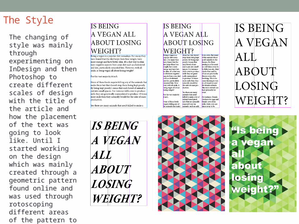
The StyleThe final aspect of my booklet that I created was the multi-page articles layout. Actually writing out the article was the first part of the booklet that I had created but designing the articles pages I found to be very difficult. When first planning how the pages were going to look in InDesign I tried out a few different ideas with how the titles was going to look. I knew I wanted that part of the layout to stand out the most so in the end I had the title on a page on it’s own in bold to one side with the rest of the text in columns over a few pages. However, it was still bland because there was no colour, pictures or pull-quotes. For the rest of my pages they all had been rotoscoped and had all ended up having a cartoon look to them. I knew I didn’t want to do that with the multi-page article as well. These were the pages were I wanted there to be a bit more of an abstract look to the layout. This meant not having any pictures on any of the articles pages. This was so that I could show a running theme within the booklet of using my own images that had been created in someway and to make the article look different in some way. I began by looking up patterns to be used a potential template. Taking one of the patterned images into Photoshop and using the ‘Rotoscope Tool’ to cut out a frame to fit around the title page for the article.
Once created and made into a new layer I played around with the opacity and colorization of that layer and layer next to it. This created a theme for the rest of the pages. I then went on to work on making boarders to go on the pages were the text was split up into columns. This created the abstract design style that I was hoping for with this part of the booklet. When it came to the pull-quotes I treated them in the same style as I had the boarders. I changed the colour throughout the pages so that there was a consistent colour scheme with these pages, like I had done with the infographics fact files and covers. The main issue with the pull-quotes was that I needed to e-arrange them through the page. They were too cramped in the columns there were in so I changed the sizing of their boxes and fonts so that they would spread over the pages more to pull the readers eye in. This and having them in a bold coloured font helped make the articles style resonate more clearly and even though the style of the layout didn’t fit with a theme through the booklet it still pulled the reader in.
The Style
The changing of style was mainly through experimenting on InDesign and then Photoshop to create different scales of design with the title of the article and how the placement of the text was going to look like. Until I started working on the design which was mainly created through a geometric pattern found online and was used through rotoscoping different areas of the pattern to fit around the text and layout of the articles pages.

The Style: My original intentions for the articles layout was to make it very clean and uncomplicated so that it would match the front cover in a way. Sadly, the lack of efforts made in the article meant that it really wasn’t striking enough to readers. Especially since there was so much text using the layout to catch the attention of the readers was paramount. In comparison to other design layouts for articles they have one key advantage that separates mine from theirs which is pictures and how they’ve used graphics to make them more interesting and linked into the text. With the first cover they’ve coupled the header of the article with the image. Linking them together to make a story with the two. As well as with the other layout with how they’ve shaped the text to curve around the model to make the text more dynamic with just one picture and a white background.

The Style
Additionally the more simplistic and plain page layout for the ‘Vogue’ article showed how a layout can be striking while having little graphic design. The use of text being large and having the one image of the model in contrasting bright colours and face covered made the whole layout interesting without having to do much. In contrast what makes these layouts more effective is their use of photographs and how they’ve worked text and graphic with them. In spite of this the abstract design of my article I think works well as a whole through the pages, even with the colour changes over the pages to make them split up. Without images I found that the layout worked, with them I found that they would stand out too much. Maybe if I’d have kept the patterns and shapes in mind and put images in triangles and other shapes but I still find that they’d stand out too much in variation with the rest of the graphics of the article.

The StyleThe style of the infographic changed mainly through the research of how other infographics had been structured. I struggled when it came to how the infographic, facts, were going to displayed in a way that was creative and informative. At first I wanted there to be a whole image, like I had done with my ‘Vegan Myths’ fact file and the ‘Eating Out?’ fact file. However, with the this particular page it wouldn’t have worked because infographics need to display facts in a quick way through words and graphics. Doing research online inspired me to keep the background of my layout plain and let the smaller graphics be the main focus. The graphics for the facts needed to be watered down so that a key word was the image shown and explained. So when talking about percentages of the world be used for land to graze animals and feed them it seemed fit to use the globes image as a pie chart. This followed through the rest of the graphics, finding ways to make them more simplistic and informative. The style throughout the page showed that as well with the colour scheme being quite neutral and not garish but bright with the background only.
The use of smaller facts with key words from them to show the meaning behind them whether they be used as sums, charts or representation
The Style
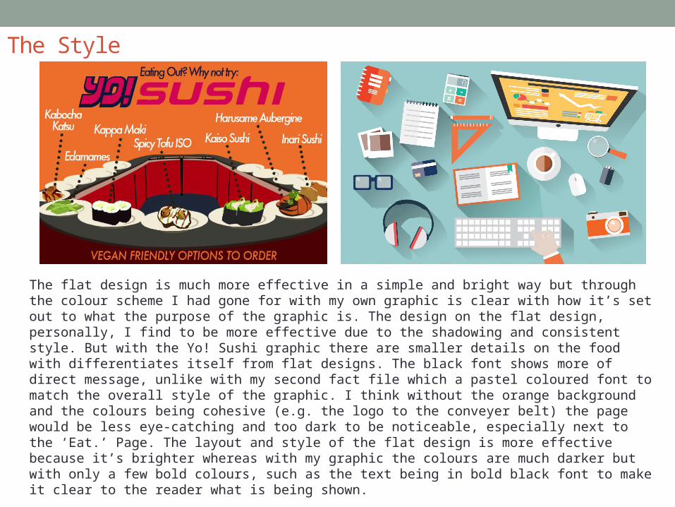
The flat design is much more effective in a simple and bright way but through the colour scheme I had gone for with my own graphic is clear with how it’s set out to what the purpose of the graphic is. The design on the flat design, personally, I find to be more effective due to the shadowing and consistent style. But with the Yo! Sushi graphic there are smaller details on the food with differentiates itself from flat designs. The black font shows more of direct message, unlike with my second fact file which a pastel coloured font to match the overall style of the graphic. I think without the orange background and the colours being cohesive (e.g. the logo to the conveyer belt) the page would be less eye-catching and too dark to be noticeable, especially next to the ‘Eat.’ Page. The layout and style of the flat design is more effective because it’s brighter whereas with my graphic the colours are much darker but with only a few bold colours, such as the text being in bold black font to make it clear to the reader what is being shown.

The Style
The ways in which my graphic compares to this existing one is through the listing of facts. The main element in each is through having one image and explaining in a clear font what the image represents. The existing graphic is very eye-catching due it’s colour scheme. With the bright yellow background with the bold black text displayed on it with the images colourised to be black as well make the overall layout simple but much more explanatory. You won’t need to read as much information due to the reader being able to recognise what the animals and connect the text with them through the simplicity of the design. My graphic is less eye-catching the simple way that the existing graphic possesses. There are bright colours that contrast with one another that make the page stand out to the reader. However the text is less eye-catching in comparison due to me choosing a colour that was matched the overall style of the graphic. Choosing the make the imagery within the graphic also takes away a more effective message. Although my fact file was aimed to be informative rather than affective, like I was aiming to do with my infographic. The fact files were something I wanted to be more detailed to show contrast to the other pages, such as the infographics. I think that if there were to be any changes to pull the reader in, like the existing page does, is to make the main text which labels the fact a slightly darker colour to make it clearer to read. The two graphics are effective in their own ways, mainly through the colour schemes being bright and colourful but the existing graphic is much more informative and to the point.

The Style
The overall style for my booklet wasn’t meant to have a consecutive theme running through out the layout of the pages. I wanted there to be as much information as possible because of the open question I had on the title meaning I wanted there to be a different style for each aspect of the booklet. I think overall the style works well together as a whole when put together. The pages that show the biggest difference in comparison to the other pages is the layout for the multi-page article. But given that in the layout it’s the first thing that people are going to view, within the booklet, I wanted it the be abstract and eye-catching from the beginning which I think it achieves.
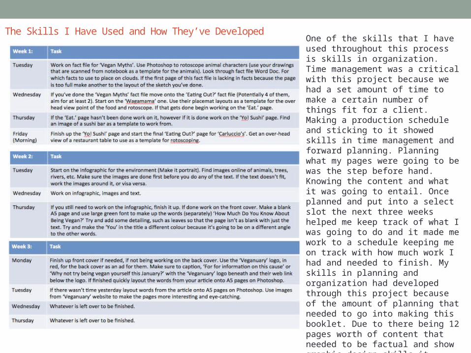
The Skills I Have Used and How They’ve Developed One of the skills that I have used throughout this process is skills in organization. Time management was a critical with this project because we had a set amount of time to make a certain number of things fit for a client. Making a production schedule and sticking to it showed skills in time management and forward planning. Planning what my pages were going to be was the step before hand. Knowing the content and what it was going to entail. Once planned and put into a select slot the next three weeks helped me keep track of what I was going to do and it made me work to a schedule keeping me on track with how much work I had and needed to finish. My skills in planning and organization had developed through this project because of the amount of planning that needed to go into making this booklet. Due to there being 12 pages worth of content that needed to be factual and show graphic design skills it pushed me to think harder about what I was doing. And because I wanted to do so much content after planning it made me work on how I could achieve it through organizing my time management.
The Skills I Have Used and How They’ve Developed
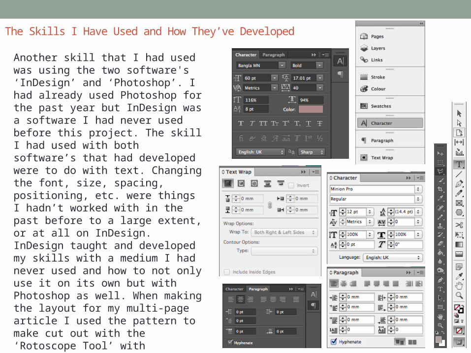
Another skill that I had used was using the two software's ‘InDesign’ and ‘Photoshop’. I had already used Photoshop for the past year but InDesign was a software I had never used before this project. The skill I had used with both software’s that had developed were to do with text. Changing the font, size, spacing, positioning, etc. were things I hadn’t worked with in the past before to a large extent, or at all on InDesign. InDesign taught and developed my skills with a medium I had never used and how to not only use it on its own but with Photoshop as well. When making the layout for my multi-page article I used the pattern to make cut out with the ‘Rotoscope Tool’ with Photoshop but then saving the file as a ‘TIFF’ meant I could open it up in InDesign and make further modification around the text that Photoshop wouldn’t allow.

The Skills I Have Used and How They’ve Developed
I had also used and developed my skills in writing as well for the multi-page article. When making the first draft I focused too much on what I had thought about veganism and not enough on the brief that was given to me. The brief for the article, and the booklet as a whole, was to encourage people who aren’t vegan to try it. This meant using positive content to pull people to why being a vegan is a good idea. The first draft of my article was too balanced. Meaning that I had shown the negative connotation to being on a vegan diet as well as the positive pointers. But the point of the article wasn’t to tell people about what was bad. This meant that I needed to put away those topics on the matter, which also meant me talking about the extremist views of some people who take on being a vegan because it would turn the reader away. Such as saying, ‘After doing some research into the ethics of being a vegan I found that many believe that the keeping of animals is cruel. For instance, if you have a pet, such as a dog, cat, fish, etc., you are being cruel in the eyes of a ‘true vegan’.’ And learn to stick to the brief more clearly to promote the good qualities of the vegan lifestyle.
Learning this meant that I had my article be an open question, ‘Is Being A Vegan All About Losing Weight?’, to readers and covering many topics rather than one. Such as, the ethics of bees and if honey is vegan, animal rights and lifestyle choices a vegan will make outside of what they eat. ‘Arguments such as, ‘Is honey vegan?’ is a common topic brought up. When farming honey from bees they tend not to be harmed within their hives but it’s the principle behind it. Even though many researchers found that taking the honey from the bees is replaced with sugar supplements, which harm the bees due to the lack of nutrients from it.’ This developed my skills of research and structuring the article to fit these topics into a word limit. Gradually over three drafts of the article I had improved my writing skills by keeping with a word limit, appealing to the brief and overall grammar and use of wording for the article.

Areas Of ImprovementKeeping in mind my audience a few of the pages, such as the ‘Vegan Myths’ graphic which looked more aimed for children than adults because of the edits of the animals. Even though it was a play on words with the title the style of the pages overall didn’t meet the standard of the brief in terms of my intended audience. Combined with the other pages they seem to work because of the difference with the pages there isn’t a comprehensive theme. Peer reviews showed that people were happy with the initial idea but the actually making of the animals graphics could be improved upon, to which I agree. They lack the same amount of detail as other graphics and some show better quality in comparison to others.
The front cover was up for debate to viewers. In reflection I should really make a front cover that is eye-catching to all and not to a few. But half seemed to like the cover, they found it to be eye-catching and easy to understand, didn’t need to be overly composed with it’s style. Whereas the other half of people said the opposite about the front cover saying that they found it to be bland and didn’t make them want to pick it up to read. This was from the lack of colour and the font being too simple and the total design element. Lacking in graphic design and vibrancy. To extent I agree with the both sides of the peer reviews for the front cover because I do find it to be lacking in graphics and skill but I was aiming for there to be a simplistic style to it so that the focus could be entirely on that question meeting the topics inside. To link the front and back cover together I could have made the back cover an answer to the question at the beginning of the cover.
One the front cover I asked the reader, ‘How Much Do You Know About Being Vegan?’ This associated with the multi-page article, which touched upon a few different topics of what it means to be a vegan with the open question, ‘Is Being Vegan All About Losing Weight?’ due people referring to the lifestyle as mainly a ‘diet’ and not seeing further than that because of that one word. The back cover was something I thought I could add an advertisement for our clients from ‘Veganuary’ to further the reader’s research if they wanted to and for them to try the diet plan that ‘Veganuary’ do. However, when reviewing my work I though I could have connected the front and back cover together by putting, ‘How Much Did You Learn about Being Vegan?’ on the back cover. All the same it wouldn’t have worked overall because making that link may have confused readers to why the rest of the booklet didn’t look the same as those two pages. Having a lack of theme made a theme with my booklet because it meant that there wasn’t a need for continuity as a whole with the booklets layout.
Areas Of Improvement
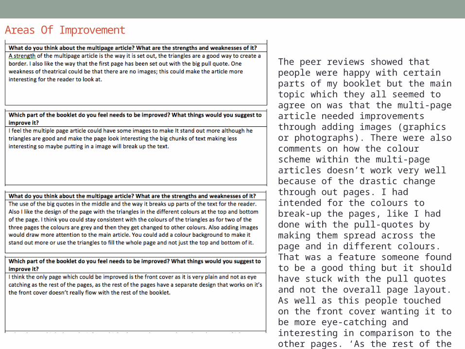
The peer reviews showed that people were happy with certain parts of my booklet but the main topic which they all seemed to agree on was that the multi-page article needed improvements through adding images (graphics or photographs). There were also comments on how the colour scheme within the multi-page articles doesn’t work very well because of the drastic change through out pages. I had intended for the colours to break-up the pages, like I had done with the pull-quotes by making them spread across the page and in different colours. That was a feature someone found to be a good thing but it should have stuck with the pull quotes and not the overall page layout. As well as this people touched on the front cover wanting it to be more eye-catching and interesting in comparison to the other pages. ‘As the rest of the pages have a separate design that works on it, the front cover doesn’t really flow with the rest of the booklet’.


![6. [pro forma] project pro-forma james horbury](https://static.documents.pub/doc/80x56/588684481a28ab962a8b7881/6-pro-forma-project-pro-forma-james-horbury.jpg)


