19
Brand Guidelines 201

Brand Guidelines 1 © and confidential, all rights reserved.
Brand Guidelines
2 0 1

Brand Guidelines 2 © and confidential, all rights reserved.
B R A N D M A N T R A
It’s only been 100 years since the first woman won the Nobel Prize for Science, 60 since the election of the first female Prime Minister, 10 since a woman became Speaker of the House.
As it turns out: things for women, and for everyone, do change. So why does the field of technology still feel like the same old boy’s club?
In the US, women fill a scant 26% of all computing jobs - a number that’s only getting worse - with the rest of the world coming up similarly short. Well, we —a network of the best and brightest entrepreneurs, coaches and mentors from around the globe — we’d like to makea little change of our own.
We’d like to impart our skills on to a new generation to help create a worldwide web of tech-savvy, knowledge-hungry girls willing to learn, socialize, and create something to change the world, their world.
It’s time to make it girls for a change.
Girls fora change.

Brand Guidelines 3 © and confidential, all rights reserved.
The meaning of a brand extends far past the simple concepts of words and logos. A brand encompasses a philosophical approach to the way a company not only expresses itself, but the story it weaves, and the unique voice with which that story is told.
The voice of Technovation is an essential aspect in helping people to both recognize and remember our brand. It is the foundational element for the building of our personality and the supporting aspect for everything else in our system.
Creating, and then expressing ourselves in a consistent tone will allow a better understanding who we are and what we do.
FunEnergeticEmpoweringSmartBoldEncouragingInspiring
Know it allExclusiveBoringEasyOne-dimensionalTimidLimiting
BrandTone
T E C H N O V AT I O N I S T E C H N O V AT I O N I S N O T

4 © and confidential, all rights reserved.Brand Guidelines
Logo & Identity
1

Brand Guidelines 5 © and confidential, all rights reserved.
Wordmark
LO G O & I D E N T I T Y
Logo: Pathway
A confident, bold stylized ‘T’ symbolizes the paths that entwine on the Technovation journey. It is inspired by three individual paths (girl, mentor and sponsor) linking together. The ‘T’ is placed inside a sphere to emphasize the path and give it a sense of solidity and wholeness.
Iridescent is incorporated into the new logo to tie Technovation more tightly to its parent organization. Technovation is a program of Iridescent and so in all channels where a logo is needed, this new incorporated logo treatment should be used.
In anticipation of the full scope of applications for the logo, we’ve provided three alternative configurations. For example, the simple Roundel & T mark could possibly be applied on the edge of a photograph of a marketing collateral piece.
Primary Lockup
Roundel Mark Only Stacked Lockup

Brand Guidelines 6 © and confidential, all rights reserved.
LO G O & I D E N T I T Y
Logo Color Treatment
Consistency in our logo presentation is important. When at all possible, the full color logo treatments featured in this document are preferred. The two-color treatments specified here are also ideal for all types of media, and are suitable for positive or reverse application. The symbol is in our corporate Shamrock green. On white and light gray backgrounds, the logotype is black. On black or dark grey backgrounds, the logotype is white. For 1-color treatments, please keep the background our corporate color — green or white. Do not use other Technovation colors.
2-Color Preferred Treatment
1-Color Preferred Treatment
Brand Guidelines 7 © and confidential, all rights reserved.
.25" width
2" width 1.25" width .7" width
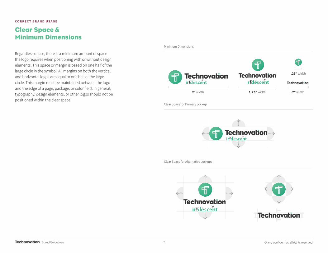
CO R R E C T B R A N D U S A G E
Clear Space & Minimum Dimensions
Minimum Dimensions
Clear Space for Primary Lockup
Clear Space for Alternative Lockups
Regardless of use, there is a minimum amount of space the logo requires when positioning with or without design elements. This space or margin is based on one half of the large circle in the symbol. All margins on both the vertical and horizontal logos are equal to one half of the large circle. This margin must be maintained between the logo and the edge of a page, package, or color field. In general, typography, design elements, or other logos should not be positioned within the clear space.

Brand Guidelines 8 © and confidential, all rights reserved.
Incorrect Implementation
Do not use older versions of the logo or previous logos.
Do not change the placement of the mark.
Technovation
Do not rotate or change the direction of the logo.
Do not change the font of the wordmark or rewrite it.
Do not outline the logo or add special Do not change the color of the wordmark or logo mark.
Do not remove any elements of the logo.
Do not place other design elements within stated “clear space.”
Do not place the logo on a background that isn’t a brand color or a gradient.
Do not separate the logo into an unspecified lockup.
CO R R E C T B R A N D U S A G E
It is important to maintain unity and consistency across the brand communication. To maintain this consistency, please do not implement the logo as demonstrated on this page.
Implementing the Logo

Brand Guidelines 9 © and confidential, all rights reserved.
LO G O & I D E N T I T Y
The World Pitch logo is provided for use during the World Pitch event and for World PItch event marketing and print collateral and materials.
The Team Location/Chapter lockup is shown here to explain and represent how any team should attach their personal team’s location to the logo without creating something that does not inherently follow these brand guidelines. These specific locations should be set in Eagle Book, carefully respecting the space below the logo in the examples here.
World Pitch Logo and Team Location Lockups
World Pitch Logo Lockup
WORLD PITCH
Team Location/Chapter Lockup Examples
RIO DE JANIERO
CHARLOTTESVILLE
BOSNIA I HERZEGOVINA

10 © and confidential, all rights reserved.Brand Guidelines
Color Palette &Typography
2

Brand Guidelines 11 © and confidential, all rights reserved.
A N O V E R V I E W
Primary Green and Supporting Shades
Pantone 2247 CPantone 346 UCMYK 63-00-55-00RGB 90-191-148HEX #5ABF94
Pantone 7640 CPantone 7421 UCMYK 35-85-50-20RGB 144-61-84HEX #903D54
Pantone 7723 CCMYK 73-00-60-10RGB 40-168-128HEX #28A880
Pantone 7642 CCMYK 35-84-43-34RGB 124-50-77HEX #7C324D
Pantone 349 CCMYK 100-00-80-50RGB 00-101-64HEX #006540
Pantone 690 CCMYK 48-100-56-54RGB 83-04-45HEX #53042D
Primary Maroon and Supporting Shades
Brand Colors
Shamrock Mulberry
Jade Boysenberry
Pthalo Rosewood
The primary brand colors are to be used for main brand communication and marketing collateral. Supporting colors can also be utilized this way, however, they should show up less as to not overpower the primary brand colors.

Brand Guidelines 12 © and confidential, all rights reserved.
A N O V E R V I E W
Supporting Neutrals
Pantone 413 CMYK 07-03-05-08RGB 243-242-241HEX #ECECEC
Pantone 379 CMYK 10-02-70-00RGB 234-228-111HEX #EAE46F
Pantone Cool Gray 10CMYK 45-01-00-01RGB 102-102-102HEX #666666
Pantone 414 CCMYK 20-15-15-00RGB 202-202-202HEX #CCCCCC
Pantone 583 CCMYK 20-04-100-10RGB 193-196-33HEX #C1C321
Pantone 446 CCMYK 54-27-36-82RGB 68-68-68HEX #444444
Pantone 415 CCMYK 50-40-40-05RGB 135-135-135HEX #878787
Pantone 419 CCMYK 86-70-69-95RGB 33-33-33HEX #333333
Supporting Colors
Supporting Accents
Light Grey
Laser Lemon
Silver
Mid Grey
Citrine
Granite
Dark Grey Chalkboard
Please use these neutrals as supporting colors in the design or document. Supporting shades aid the designs to subtly convey depth in the color palette, similarly in the logo. The support neutrals work well for body copy.
Supporting accent colors should only be used minimally, in call to action statements or buttons, and in bringing attention to the brand messaging. See the sample design as an example of this.
Pantone 5135 CCMYK 50-70-25-05RGB 137-94-134HEX #895E86
Pantone 325 CCMYK 63-00-25-00RGB 76-195-199HEX #4BC2C6
Pantone 5126 CCMYK 60-80-35-15RGB 111-70-107HEX #6F466B
Pantone 326 CCMYK 73-00-30-10RGB 00-171-174HEX #00ABAD
Pantone 262 CCMYK 89-100-55-35RGB 66-27-65HEX #421B41
Pantone 7721 CCMYK 100-00-40-50RGB 00-103-104HEX #006667
Secondary Blue and Supporting ShadesSecondary Purple and Supporting Shades
Wisteria Marine
Antiqua Sea
Byzantium Oceana
Brand Guidelines 13 © and confidential, all rights reserved.
A N O V E R V I E W
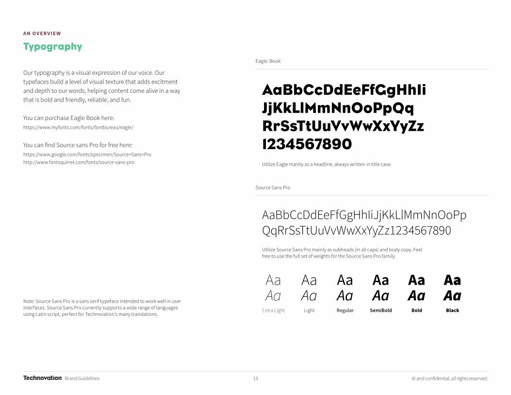
Eagle: Book
Source Sans Pro
Utilize Eagle mainly as a headline, always written in title case.
Utilize Source Sans Pro mainly as subheads (in all caps) and body copy. Feel free to use the full set of weights for the Source Sans Pro family.
Typography
Our typography is a visual expression of our voice. Our typefaces build a level of visual texture that adds excitment and depth to our words, helping content come alive in a way that is bold and friendly, reliable, and fun.
You can purchase Eagle Book here:https://www.myfonts.com/fonts/fontbureau/eagle/
You can find Source sans Pro for free here:https://www.google.com/fonts/specimen/Source+Sans+Prohttp://www.fontsquirrel.com/fonts/source-sans-pro
Note: Source Sans Pro is a sans serif typeface intended to work well in user interfaces. Source Sans Pro currently supports a wide range of languages using Latin script, perfect for Technovation’s many translations.
AaBbCcDdEeFfGgHhIiJjKkLlMmNnOoPpQqRrSsTtUuVvWwXxYyZz1234567890
AaBbCcDdEeFfGgHhIiJjKkLlMmNnOoPpQqRrSsTtUuVvWwXxYyZz1234567890
AaAa
Extra Light
AaAa
Light
AaAaRegular
AaAaSemiBold
AaAa
Bold
AaAaBlack

Brand Guidelines 14 © and confidential, all rights reserved.
A N O V E R V I E W
Primary Colors Pattern
Secondary Colors Pattern
Pattern
Pattern is another way to infuse dimensionality and life to the system. Patterns help convey different feelings depending on palette and direction. They also enhance the design and brand messaging depending on the use case. These can be used in a variety of ways. In print, these patterns reinforce our colorful, fun, bold and energetic look and feel. When used online, they provide the opportunity for motion. Please use these patterns and brand elements sparingly, as to not overwhelm the new brand identity. Only use the patterns over their specific brand color. Do not rotate the patterns, or scale them dramatically.

15 © and confidential, all rights reserved.Brand Guidelines
MarketingCollateral
3
Brand Guidelines 16 © and confidential, all rights reserved.
Girls for a change.
TEC H N O LO G Y E N TR E PR E N EU R S H I P LE D BY G I R L SEvery year, Technovation challenges girls all over the world to build
a mobile app that will address a community problem.
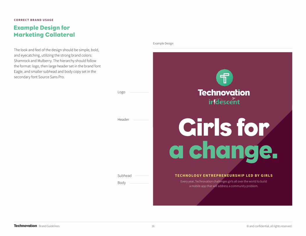
CO R R E C T B R A N D U S A G E
Logo
Header
Subhead
Body
Example Design for Marketing Collateral
The look and feel of the design should be simple, bold, and eyecatching, utilizing the strong brand colors: Shamrock and Mulberry. The hierarchy should follow the format: logo, then large header set in the brand font Eagle, and smaller subhead and body copy set in the secondary font Source Sans Pro.
Example Design

Brand Guidelines 17 © and confidential, all rights reserved.
Vertical Document Horizontal Document
Vertical Document Horizontal Document
CO R R E C T B R A N D U S A G E
This is the ideal state of the Technovation brand design, occupying at least 50% of the chosen document or printed marketing collateral such as postcards, posters, flyers, brochures, banners, or other promotional material.
The grey space on the backside is the intended space for body copy and any other descriptions of programs, brand messaging and any other information or details. This grey space is also available for any desired imagery, preferably placed on the top half space of the piece.
This is the minimum state of the Technovation brand design, occupying at least 25% of the chosen document or printed marketing collateral such as postcards, posters, flyers, brochures, banners or other promotional material.
Marketing Collateral

Brand Guidelines 18 © and confidential, all rights reserved.
CO R R E C T B R A N D U S A G E
This is an indication of logo placement for printed non-marketing documents such as letterhead, contracts, forms, guides, workbooks, handbooks, tutorials, and documentation with multiple pages. Avoid placing any logos in the central space of the document. This area is intended for body copy/text, so please put all document content in this space. Please use the logo in its primary and horizontal lockup across these kinds of documents, pictured here on this page.
Printed and Digital Documents Vertical and Horizontal Documents

Brand Guidelines 19 © and confidential, all rights reserved.
Girls for a change.


