17
BRAND STYLE GUIDE rev 6.29.10

BRAND STYLE GUIDE
rev 6.29.10

To Real America who is craving real American food, real face-to face connections and real value, Applebee’s is your every day, neighborly dining place where you can be yourself; that enables you to connect with those that matter most over the food you love by being real in the neighbor-hood every day; because we serve honest, mouthwatering American food in a casual, relaxing atmosphere, provide every day value and care about our neighbors and the neighborhoods we live in. Our Brand Promise is expressed through our tagline:
The purpose of this style guide is to help you recognize and understand the proper branding of marketing and advertising materials for Applebee’s®. It is not intended to be used by you to create your own materials. All advertising and marketing materials, including creative projects, must be routed through Field Marketing for approval. All internet and other electronic marketing must all be pre-approved. Field Marketing will assess each project to ensure accurate branding and quality control.
There’s no place like the neighborhood.sm

Logo The Applebee’s logo is the heart of our brand. As such it must remain constant and unwavering. Use the white Applebee’s logo over darker photographs and dark core colors. Use the color Applebee’s logo over lighter photographs and light/white colors. Logo should always be prominent on pieces, but not distracting from the food.
Color logos
knoCked-outlogos
b/w logos
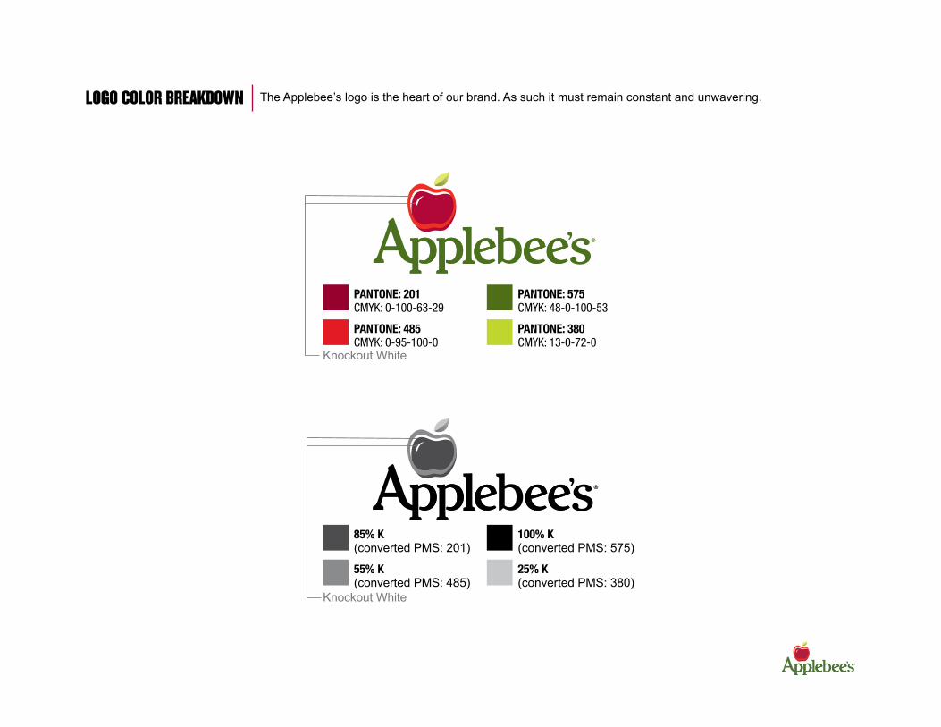
pantone: 201CMYK: 0-100-63-29
pantone: 485CMYK: 0-95-100-0
pantone: 575CMYK: 48-0-100-53
pantone: 380CMYK: 13-0-72-0
Knockout White
85% k(converted PMS: 201)
55% k(converted PMS: 485)
100% k(converted PMS: 575)
25% k(converted PMS: 380)
Knockout White
Logo CoLoR BREAKDoWN The Applebee’s logo is the heart of our brand. As such it must remain constant and unwavering.
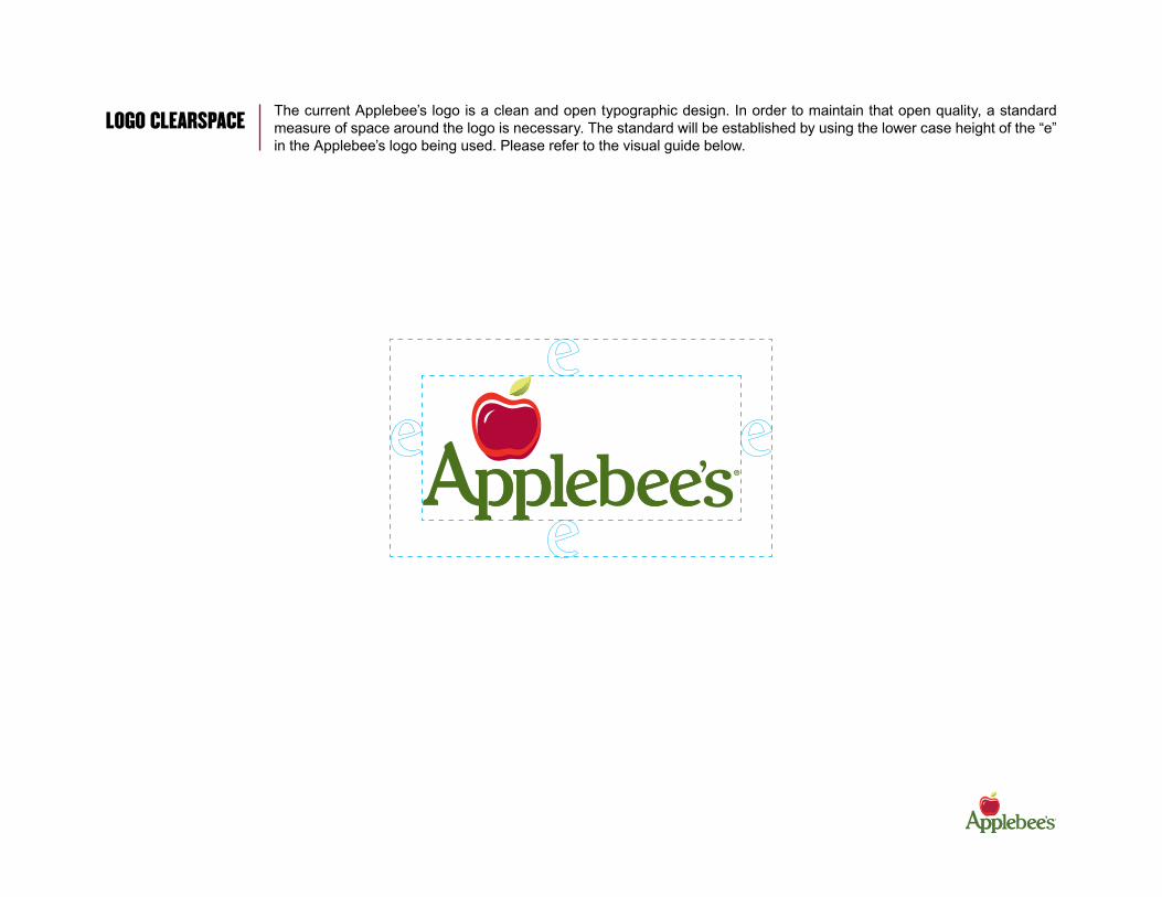
Logo CLEARSPACE The current Applebee’s logo is a clean and open typographic design. In order to maintain that open quality, a standard measure of space around the logo is necessary. The standard will be established by using the lower case height of the “e” in the Applebee’s logo being used. Please refer to the visual guide below.

INCoRRECT USE of Logo DO nOT take creative liberties with the logo as it’s crucial that we build brand equity throughout all restaurants.
Do not remove apple from logo. Do not distort. Do not change the color.
Do not add frames or badges. Do not use over patterns or busy backgrounds.
Do not remove the white shoulder from the apple.
Do not use harsh drop shadows.
Do not outline the logo.
Do not change the size of the apple.
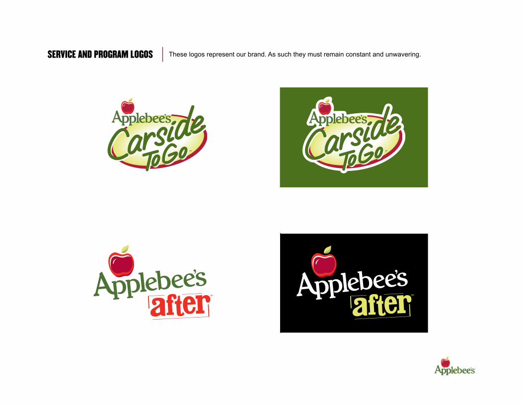
SERVICE AND PRogRAM LogoS These logos represent our brand. As such they must remain constant and unwavering.

BRAND PALETTE Applebee’s uses a core palette to maintain a contemporary, welcoming image. When all colors come together, it produces Applebee’s complete personality palette. It is a timeless use of color that presents us as a friendly neighborhood face. The palette is approachable, casual and fun. These colors should be used through out the restaurant setting, from a wall down to our carpets. Accent colors should be used sparingly. Always design within these colors and guidelines to build brand consistency at every Applebee’s in every part of the world.
pantone 380
CMYK13 - 0 - 72 - 0
pantone 485
CMYK0 - 95 - 100 - 0
aCCent Colors
teXt - bodY CopY
wHIte blaCk
prImarY Colors
pantone 201
CMYK0 - 100 - 63 - 29
pantone 384
CMYK18 - 0 - 100 - 31
seCondarY Colors
pantone 110
CMYK0 - 12 - 100 - 7
pantone 469
CMYK0 - 52 - 100 - 62

seCondarY tYpefaCe aCCent tYpefaCe
Sign Painter - House ScriptFoundry: House Industries
Champion heavyweight ChAmpIoN mIDDLEwEIGhT ChAMPIoN WELTERWEIghT Champion Liteweight
Arial RegularArial Bold
DIN Black DIN Bold DIN MediumDIN Regular
Champion Gothic FamilyFoundry: Hoefler & Frere Jones
DIN FamilyFoundry: Font Shop International
prImarY tYpefaCe
sign Painter House script
Use for headlines and subheads. Use for body copy.
TYPogRAPhY These fonts work well together and may be used in conjunction at any time. Use the fonts as straightforward as possible. Do not alter the font by adding outlines or glow effects. Only use subtle drop shadows when trying to enhance readability.
fonts for dIgItal medIa and Internal CommunICatIonThese are “system fonts” that can be used in all browsers. Use on email blasts and all internal communications (Word documents, training materials, Power Point Presentations, etc.)
Use sparingly to draw attention to a word but never as major design element.

prImarY trademarks
Use the guide below to ensure that all copyrighted and registered items are used properly. The ®, SM and TM is used after words, logos and slogans to indicate that Applebee’s has rights in whatever is preceding the symbol is a registered trademark. The ® confirms that the word, words or logo are federally registered trademarks. The SM and TM indicates the we claim the rights to the word, words or logo.
food and beverage produCts
Applebee’s Realburgers®
Chicken Tanglers®
Fiesta Lime Chicken®
Triple Chocolate Meltdown® Brewtus®
Main Street ’Rita®
Mucho Margarita® Skinny Bee Margarita™ Summer Squeeze®
Pick ‘N Pair®
3 Course Classics®
Unbelievably Great Tasting & Under 550 Calories™
taglInes
There’s No Place Like the Neighborhood.SM
Applebee’s Neighborhood Grill and Bar®
“A” is for Applebee’s®
Applebee’s Neighborhood Values®
It’s not fast food – It’s Applebee’s food fast.®
You Call It In. We Bring It Out.®
Real At First BiteSM
America’s Favorite Neighbor®
servICes and programs
Applebee’s Carside To GoSM
Applebee’s AfterSM
Applebee’s Anywhere®
Applebee’s Core News®
Applebee’s Community ConnectionsSM
TRADEMARKS
CopYrIgHt
websIte
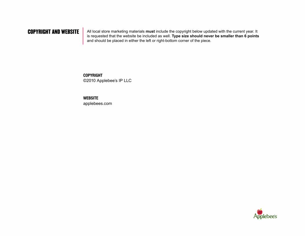
All local store marketing materials must include the copyright below updated with the current year. It is requested that the website be included as well. Type size should never be smaller than 6 points and should be placed in either the left or right-bottom corner of the piece.
©2010 Applebee’s IP LLC
CoPYRIghT AND WEBSITE
applebees.com
messagIng
• Messaging should be compelling, simple and short.
• Less is more.
• Utilize content that engages and promotes a strong call to action that drives traffic.
• Consider your audience. Be sure you are relevant to your consumer. Speak to customers about things that matter to them.
ConsIderatIons for CreatIon of prInt ads and CollateralTen quick checkpoints that will help ensure your print ad is successfully communicating your objective and that it will be approved in a timely manner:
MERChANDISINg gUIDELINES
1. CHeCk tHe CreatIve stYle guIdeo The first step in making sure your ad will be approved is making
sure you are familiar with the Creative Style Guide, and what resources are available in helping you to create your ad.
2. CHeCk tHe amount and tYpe of Info vs. tHe CommunICatIon veHICleo Don’t try to squeeze too much information into a given element
o Outdoor Boards or Banners should contain 7 words or less and communicate your message at a glance.
o Elements existing outside the restaurant should contain “sell copy,” and not detailed menu copy.
o Elements residing on the tabletop should contain more specific order information and maybe even price points where appropriate.
3. CHeCk tHe fontso Were the approved fonts used?
o Were the fonts used appropriately, as indicated in the Creative Style Guide?
o Is the type readable in the way it is being used? 4. CHeCk tHe Colorso Were colors selected from the approved color palette?
o Is at least one of our primary brand colors used in the piece?
5. CHeCk tHe logo plaCemento Did you remember to include a logo? If so, is the branding coming
through?
o Is this the appropriate logo for the communication?
o Did you remove the logo for an element promoting alcohol (where illegal to co-brand)?

6. CHeCk tHe tone o The appropriate tone for our copy is straightforward, friendly,
light-hearted, comfortable and conversational. o We are not edgy, high-end, sarcastic, presumptuous or goofy.
7. overall, does tHe pIeCe “fIt” wItH tHe applebee’s brand? o Clip art of food & beverages is discouraged. Photography is
always preferred where appropriate.
o Floating plates are discouraged. It’s always best to “ground” photos with inset boxes, or use photos as a full bleed.
o Don’t forget to add drop shadows to headlines or photo boxes to add depth.
o Add a gradation to the background of your element to add interest with depth & texture.
8. CHeCk tHe basICs… o Is all of the information correct?
o Is everything spelled correctly?
o Are product descriptions & photos up-to-date? (CORE photos & descriptions will always be correct)
o Are the correct photos with the correct descriptions?
9. Is tHe CommunICatIon Clear? o Would the message make perfect sense to you even if you’d
never heard of the program?
o Will the program/message drive sales or traffic?
o Is there a way to twist the offer or the message to make it more interesting?
10. would tHe pIeCe make It tHrougH a legal revIew? o Has the appropriate disclaimer information been added
in the same size as the menu item description and no smaller than 7 points.
o If it’s a limited time offer or promotion, is it stated clearly on the piece?
o The word “Applebee’s” must have a circle-R (®) after the first mention of each on a piece.
o Be aware of other parties’ trademarked names or phrases that may not be approved for use and avoid use.
Examples: “Super Bowl”, “March Madness”
o Are you making any claims, such as nutrition or quality, that should be reviewed by counsel?
o Did you include the copyright line?
o Please ensure all proper legal checks through your company’s legal department are complete – Applebee’s Services, Inc. is not responsible for thorough legal checks.
MERChANDISINg gUIDELINES Continued
DISCLAIMER gUIDELINES
The use of a disclaimer is not guaranteed protection against suit or liability. A disclaimer’s effectiveness is determined on a case-by-case basis in the particular context in which the disclaimer is being used. Nevertheless, disclaimers are worthwhile from a legal and guest perspective. They are most useful when they are:
The following points are also helpful to keep in mind when developing an appropriate disclaimer:
• Food Safety messages should come first. Consumer protection notices (e.g. disclaimers) should generally come next, with trademark notices to follow. None of these things should be combined into one block of text that doesn’t allow for them to be seen as distinct messages.
• The FTC uses the expression “clear and conspicuous” to describe the minimum standard for an effective disclaimer.
• A “reasonable and ordinary consumer” standard is used to determine the effectiveness of a disclaimer.
promInent. A disclaimer should be prominent; meaning its font size and location on the menu should make it “stand out.” It should not be hidden among other non-disclaimer text (e.g. lost in a paragraph that includes trademark notices), or positioned on the menu so it is not noticeable or requires the guest to rotate the menu or take some other action to actually read it. Putting a disclaimer in its own box to separate it from other text and enhance its prominence is recommended. Ideally, a disclaimer is at least the same size as the menu item description and no smaller than 7 points.
ClearlY vIsIble. A disclaimer should be clearly visible; meaning it’s color should contrast with its background and its font type should be easy to read. If the “average” guest cannot read the disclaimer from a “typical” reading distance, it is probably not prominent or clearly visible.
understandable. A disclaimer should be easy to understand; meaning the message is straightforward, clear and void of “terms of art,” marketing speak, or other expressions not familiar to the general public. It should not contain expressions that might confuse the reader about the intended meaning or what items to which it relates.
The following guidelines are intended to assist in the design and creation of disclaimers for use on Applebee’s merchandising pieces. These guidelines should be considered in the creative/design process as a general matter. However, specific use of disclaimers should continue to be reviewed by your company’s legal department or counsel.
DISCLAIMER gUIDELINES Continued
standard dIsClaImer InformatIon for Coupons
• Valid only at participating restaurants.• Not valid with any other offer or discount.• Not valid toward the purchase of alcoholic beverages or gift cards.• Not redeemable for cash.• Limit one coupon per party per visit.• Offer not applicable to tax or gratuity.• Prices and participation may vary.• No photocopies or scans accepted.
If your message includes alcoholic beverages, you should consult your legal counsel to assure that it complies with all federal, state and local regulations concerning the sale of alcohol for each location. This legal check is your responsibility. Violations of alcohol regulations could result in fines, temporary closure and, in extreme cases, the loss of your alcohol license.
addItIonal dIsClaImer InformatIon There may be occasion to use the following:
• Coupon void if expiration date left blank.• For dine-in only.• While supplies last.
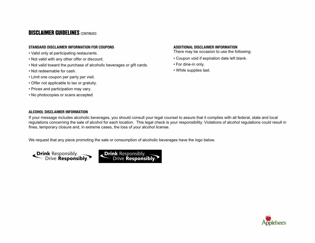
We request that any piece promoting the sale or consumption of alcoholic beverages have the logo below.
alCoHol dIsClaImer InformatIon

SAMPLE AD
TRY ANY NEW APPLEBEE’SReaLBURgeR® FRom ACRoSS AmERICA
There’s No Place Like The NeighborhoodSM
RealBuRgeRs fRom acRoss ameRIca are this country’s favorite food, reinterpreted by its favorite grill & Bar.
Neighborhood recipes with fresh flavor, unique combinations and a cooking technique that sears in flavor like nothing else.
offeR eXPIRes 5/5/2010COUPON REQUIRED. Valid only on your choice of one NEW Applebee’s Realburgers® from Across America burger and fries at participating Applebee’s® locations. Does not include beverage, tax or gratuity. Coupon has no cash value.One coupon per person per visit. Dine-in only. May not be used in conjunction with any other offer or discount. No photocopies or scans accepted. Void where prohibited. Valid at (city) location(s) only.
applebees.com© 2010 applebee’s IP llc
Long on Hometown Flavor Big on Peppers & Onions
Sizzling With a Spicy KickSmoky Southern BBQ Taste
Philly Burger
Southwest Jalapeño BurgerCowboy Burger
ReaLBURgeRS®Introducing Applebees’
only at
5$
New!
New!
New!
One bite and you’ll believe...
fRoM ACRoSS AMERICA
Here is a sample ad to help guide you when creating your own materials. Please note the clarity and focus of the message, prominence of Applebee’s branding, use of fonts, etc. Compare your creative with current Applebee’s merchandising & promotional material and ensure that it has the same look and feel of the Applebee’s family of communications.
Website and copyright line.
Offer disclaimer should appear no smaller than 7 point type on the final printed piece.

• Always confirm artwork specifications with your respective print source before you begin your project. Print documents can be created in anysoftware that allows export as an EPS file. The most popular layout programs are Adobe InDesign and QuarkXPress.
• We recommend images have resolution of 300 dpi (dots per inch) EPS or TIFF files.
• Pay attention to the size of images you are placing in a layout. If they are enlarged and used at less than 300 dpi (dots per inch), the resolution will suffer.
• Use maximum quality JPEG compression for EPS files and LZW compression for TIFF files.
• Create final artwork and proof all copy prior to printing.
• Before collecting files for print, be sure to include all native application files and linked supporting files with your document, including fonts, logos and images.
• We recommend printing on a coated semi-matte or coated semi-gloss stock to maintain vibrancy of images and create a high visual impact to the customer.
• If printing with an offset printer, insist on a press check. Check your piece while it’s on press to ensure color and information accuracy.
• Images and colors often appear different on screen than they do when printed due to monitor settings and calibration. Whenever possible, work with your print provider to ensure images and colors meet your expectations.
PRINTINg CoNSIDERTATIoNS


