16
Brand Iden)ty Design Mega Infra & Trading Company Ltd

Brand Iden)ty Design Mega Infra & Trading Company Ltd

Contents
• The Process
• Our Understanding of the Brief
• Research Keywords
• Research – Compe)tor Logos
• Research – Inspira)onal Elements
• Sketches
• Design Op)ons
• Way Forward

The Process
UNDERSTAND ANALYZE BRAINSTORM DESIGN DEVELOP
Capture the client brief Understand brand vision and values
Research the brand environment Determine inspira)ons
Brand name Sketch concepts Peer review
Design concepts Colour and Typography
Develop brand iden)ty. Design associated collateral.
Brand Iden)ty Ques)onnaire
Mindmap Research Checklist
Sketches Designs Brand Manual Other Designs

Our Understanding of the Brief
• Mega Infra & Trading Co. trades in a plethora of building raw materials and equipment
• Primary customers include infrastructure companies, real estate builders, suppliers and manufacturers
• Unique selling point of the company is the range of its products and services, unmatched by its contemporaries
• Mega Infra wants a brand iden)ty that reflects its innova)ve, unique and modern products and services, while projec)ng experience, professionalism and reliability
• The look and feel of the brand should be geared towards an interna)onal as well as Indian audience, showcasing a new age company backed by experience

Research Keywords

Research – Compe)tor Logos

Inspira)onal Elements
Equipment
Progress
Abstract
Infrastructure Building Blocks
Strength

Sketches
Variations of the Initial “M” Stability and Reliability
Strength
Building Blocks
Abstract Elements

Design Op)ons

Option 1
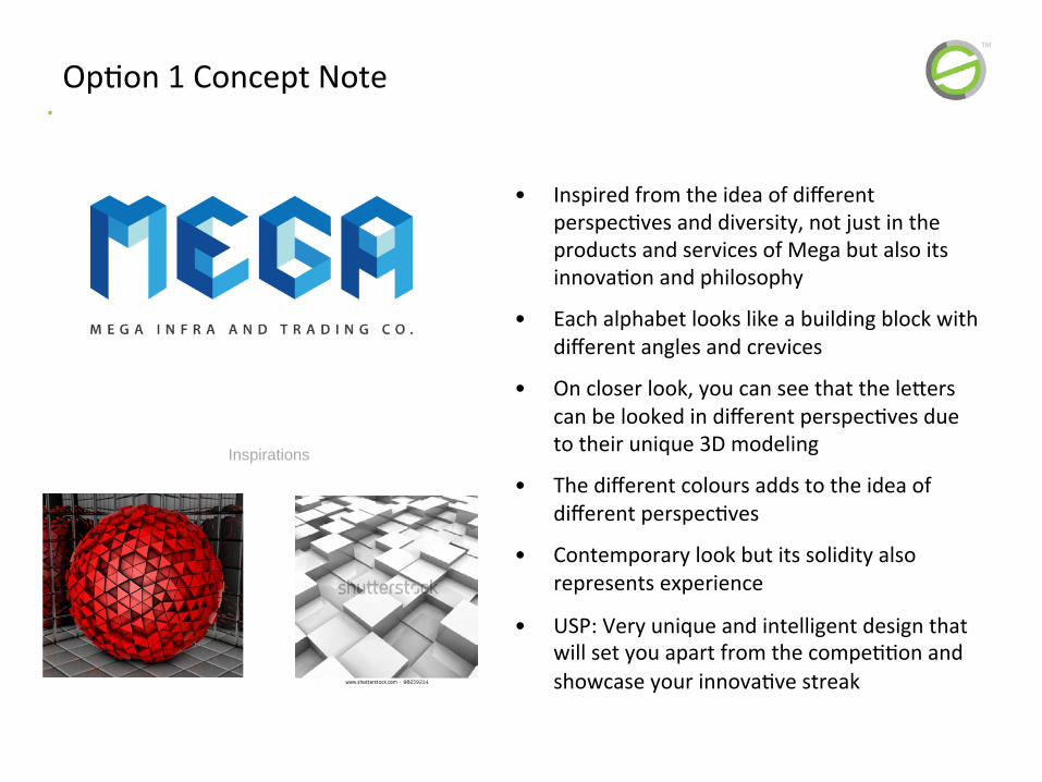
• Inspired from the idea of different perspec)ves and diversity, not just in the products and services of Mega but also its innova)on and philosophy
• Each alphabet looks like a building block with different angles and crevices
• On closer look, you can see that the leZers can be looked in different perspec)ves due to their unique 3D modeling
• The different colours adds to the idea of different perspec)ves
• Contemporary look but its solidity also represents experience
• USP: Very unique and intelligent design that will set you apart from the compe))on and showcase your innova)ve streak
Op)on 1 Concept Note
Inspirations
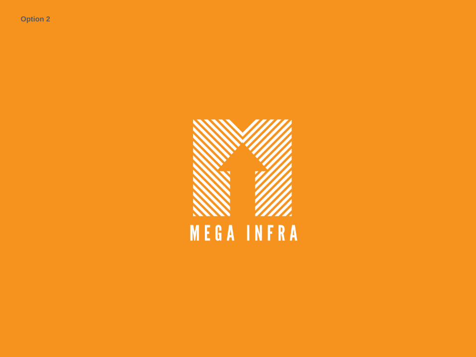
Option 2
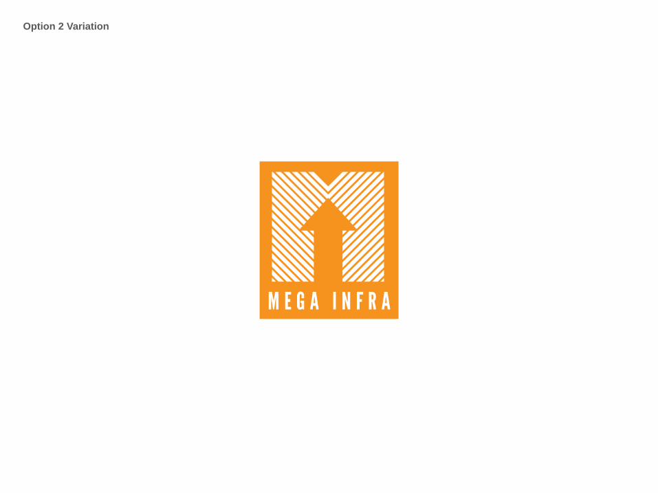
Option 2 Variation

Option 2 Variation 2

• Inspired from progress
• Also inspired from the philosophy of going against the status quo to do something unique and innova)ve (orange arrow going against the white downward arrows)
• The logo forms an “M” for Mega and the arrow forms the “i” for Infra
• Out of the box, represents a philosophy and has interes)ng applica)ons
Op)on 2 Concept Note
Inspirations

Way Forward
• Take feedback from the client on presented op)ons
• Develop further op)ons if required
• Shortlist op)ons and provide colour and font op)ons
• Finalize the logo design and brand iden)ty


