194
Building BIRT Dashboards

Building BIRT Dashboards

This documentation has been created for software version 11.0.5. It is also valid for subsequent software versions as long as no new document version is shipped with the product or is published at https://knowledge.opentext.com.
Open Text Corporation275 Frank Tompa Drive, Waterloo, Ontario, Canada, N2L 0A1Tel: +1-519-888-7111Toll Free Canada/USA: 1-800-499-6544 International: +800-4996-5440Fax: +1-519-888-0677Support: https://support.opentext.comFor more information, visit https://www.opentext.com
Copyright © 2017 Actuate. All Rights Reserved.Trademarks owned by Actuate“OpenText” is a trademark of Open Text.
Disclaimer
No Warranties and Limitation of Liability
Every effort has been made to ensure the accuracy of the features and techniques presented in this publication. However, Open Text Corporation and its affiliates accept no responsibility and offer no warranty whether expressed or implied, for the accuracy of this publication.
Document No. 170215-2-749303 February 15, 2017

i
ContentsAbout Building BIRT Dashboards . . . . . . . . . . . . . . . . . . . . . . . . . . . . . . . . vii
Chapter 1Getting started . . . . . . . . . . . . . . . . . . . . . . . . . . . . . . . . . . . . . . . . . . . . . . . . 1About Actuate BIRT dashboards . . . . . . . . . . . . . . . . . . . . . . . . . . . . . . . . . . . . . . . . . . . . . . . . . . . . . 2Using a BIRT dashboard . . . . . . . . . . . . . . . . . . . . . . . . . . . . . . . . . . . . . . . . . . . . . . . . . . . . . . . . . . . . 3
Opening a dashboard or gadget file . . . . . . . . . . . . . . . . . . . . . . . . . . . . . . . . . . . . . . . . . . . . . . . . 3Subscribing to a shared dashboard . . . . . . . . . . . . . . . . . . . . . . . . . . . . . . . . . . . . . . . . . . . . . . . . . 4Building a dashboard . . . . . . . . . . . . . . . . . . . . . . . . . . . . . . . . . . . . . . . . . . . . . . . . . . . . . . . . . . . . 4Building a custom gadget . . . . . . . . . . . . . . . . . . . . . . . . . . . . . . . . . . . . . . . . . . . . . . . . . . . . . . . . 4
Types of dashboards and gadgets . . . . . . . . . . . . . . . . . . . . . . . . . . . . . . . . . . . . . . . . . . . . . . . . . . . . 5Integrating BIRT files . . . . . . . . . . . . . . . . . . . . . . . . . . . . . . . . . . . . . . . . . . . . . . . . . . . . . . . . . . . . . . . 5
Chapter 2Designing a dashboard . . . . . . . . . . . . . . . . . . . . . . . . . . . . . . . . . . . . . . . . . 7About dashboard organization . . . . . . . . . . . . . . . . . . . . . . . . . . . . . . . . . . . . . . . . . . . . . . . . . . . . . . 8Adding dashboards and gadgets . . . . . . . . . . . . . . . . . . . . . . . . . . . . . . . . . . . . . . . . . . . . . . . . . . . . . 8
Subscribing to a dashboard . . . . . . . . . . . . . . . . . . . . . . . . . . . . . . . . . . . . . . . . . . . . . . . . . . . . . . . 9Creating a dashboard . . . . . . . . . . . . . . . . . . . . . . . . . . . . . . . . . . . . . . . . . . . . . . . . . . . . . . . . . . . 10Adding gadgets to a dashboard . . . . . . . . . . . . . . . . . . . . . . . . . . . . . . . . . . . . . . . . . . . . . . . . . . .11
Formatting a dashboard . . . . . . . . . . . . . . . . . . . . . . . . . . . . . . . . . . . . . . . . . . . . . . . . . . . . . . . . . . . 13Choosing a dashboard layout . . . . . . . . . . . . . . . . . . . . . . . . . . . . . . . . . . . . . . . . . . . . . . . . . . . . 14Managing gadget placement . . . . . . . . . . . . . . . . . . . . . . . . . . . . . . . . . . . . . . . . . . . . . . . . . . . . . 16Personalizing a dashboard . . . . . . . . . . . . . . . . . . . . . . . . . . . . . . . . . . . . . . . . . . . . . . . . . . . . . . . 17
Changing a dashboard . . . . . . . . . . . . . . . . . . . . . . . . . . . . . . . . . . . . . . . . . . . . . . . . . . . . . . . . . . . . 19Editing a dashboard file . . . . . . . . . . . . . . . . . . . . . . . . . . . . . . . . . . . . . . . . . . . . . . . . . . . . . . . . . 19Saving dashboard changes . . . . . . . . . . . . . . . . . . . . . . . . . . . . . . . . . . . . . . . . . . . . . . . . . . . . . . . 20
Planning dashboard design . . . . . . . . . . . . . . . . . . . . . . . . . . . . . . . . . . . . . . . . . . . . . . . . . . . . . . . . 21Planning for permissions and options . . . . . . . . . . . . . . . . . . . . . . . . . . . . . . . . . . . . . . . . . . . . . 21Considering the web browser . . . . . . . . . . . . . . . . . . . . . . . . . . . . . . . . . . . . . . . . . . . . . . . . . . . . 22Planning for first use . . . . . . . . . . . . . . . . . . . . . . . . . . . . . . . . . . . . . . . . . . . . . . . . . . . . . . . . . . . . 22Optimizing dashboard use . . . . . . . . . . . . . . . . . . . . . . . . . . . . . . . . . . . . . . . . . . . . . . . . . . . . . . . 23
Chapter 3Building operational dashboards . . . . . . . . . . . . . . . . . . . . . . . . . . . . . . . . 25About operational dashboards . . . . . . . . . . . . . . . . . . . . . . . . . . . . . . . . . . . . . . . . . . . . . . . . . . . . . . 26About report gadgets . . . . . . . . . . . . . . . . . . . . . . . . . . . . . . . . . . . . . . . . . . . . . . . . . . . . . . . . . . . . . . 27
Setting general gadget options . . . . . . . . . . . . . . . . . . . . . . . . . . . . . . . . . . . . . . . . . . . . . . . . . . . 28Using a parameter gadget . . . . . . . . . . . . . . . . . . . . . . . . . . . . . . . . . . . . . . . . . . . . . . . . . . . . . . . 30
ii
Using a report gadget . . . . . . . . . . . . . . . . . . . . . . . . . . . . . . . . . . . . . . . . . . . . . . . . . . . . . . . . . . . .31Using a Reportlet gadget . . . . . . . . . . . . . . . . . . . . . . . . . . . . . . . . . . . . . . . . . . . . . . . . . . . . . . . . .33
Displaying report parameters . . . . . . . . . . . . . . . . . . . . . . . . . . . . . . . . . . . . . . . . . . . . . . . . . . . . . . .34Displaying parameters inside the gadget . . . . . . . . . . . . . . . . . . . . . . . . . . . . . . . . . . . . . . . . . . .35Displaying parameters in a new selector . . . . . . . . . . . . . . . . . . . . . . . . . . . . . . . . . . . . . . . . . . .36Linking to a parameter gadget . . . . . . . . . . . . . . . . . . . . . . . . . . . . . . . . . . . . . . . . . . . . . . . . . . . .37Linking to a data selection gadget . . . . . . . . . . . . . . . . . . . . . . . . . . . . . . . . . . . . . . . . . . . . . . . . .38Using dynamic filter parameters . . . . . . . . . . . . . . . . . . . . . . . . . . . . . . . . . . . . . . . . . . . . . . . . . .38
About extras gadgets . . . . . . . . . . . . . . . . . . . . . . . . . . . . . . . . . . . . . . . . . . . . . . . . . . . . . . . . . . . . . . .38Setting general gadget options . . . . . . . . . . . . . . . . . . . . . . . . . . . . . . . . . . . . . . . . . . . . . . . . . . . .39Using an HTML gadget . . . . . . . . . . . . . . . . . . . . . . . . . . . . . . . . . . . . . . . . . . . . . . . . . . . . . . . . . .40Using an image gadget . . . . . . . . . . . . . . . . . . . . . . . . . . . . . . . . . . . . . . . . . . . . . . . . . . . . . . . . . . .41Using an import gadget . . . . . . . . . . . . . . . . . . . . . . . . . . . . . . . . . . . . . . . . . . . . . . . . . . . . . . . . . .42Using a text gadget . . . . . . . . . . . . . . . . . . . . . . . . . . . . . . . . . . . . . . . . . . . . . . . . . . . . . . . . . . . . . .43Using a video gadget . . . . . . . . . . . . . . . . . . . . . . . . . . . . . . . . . . . . . . . . . . . . . . . . . . . . . . . . . . . .44
Chapter 4Building analytic dashboards . . . . . . . . . . . . . . . . . . . . . . . . . . . . . . . . . . 47About analytic dashboards . . . . . . . . . . . . . . . . . . . . . . . . . . . . . . . . . . . . . . . . . . . . . . . . . . . . . . . . . .48Using data objects in gadgets . . . . . . . . . . . . . . . . . . . . . . . . . . . . . . . . . . . . . . . . . . . . . . . . . . . . . . . .49
About data object designs . . . . . . . . . . . . . . . . . . . . . . . . . . . . . . . . . . . . . . . . . . . . . . . . . . . . . . . .49About data object stores . . . . . . . . . . . . . . . . . . . . . . . . . . . . . . . . . . . . . . . . . . . . . . . . . . . . . . . . . .50Selecting a data object to display . . . . . . . . . . . . . . . . . . . . . . . . . . . . . . . . . . . . . . . . . . . . . . . . . .51
Using data sets and data cubes . . . . . . . . . . . . . . . . . . . . . . . . . . . . . . . . . . . . . . . . . . . . . . . . .52Previewing data objects . . . . . . . . . . . . . . . . . . . . . . . . . . . . . . . . . . . . . . . . . . . . . . . . . . . . . . . .52Refreshing a data object . . . . . . . . . . . . . . . . . . . . . . . . . . . . . . . . . . . . . . . . . . . . . . . . . . . . . . .53Setting parameters for data objects . . . . . . . . . . . . . . . . . . . . . . . . . . . . . . . . . . . . . . . . . . . . . .54
Filtering a gadget data source . . . . . . . . . . . . . . . . . . . . . . . . . . . . . . . . . . . . . . . . . . . . . . . . . . . . .55About data visualization gadgets . . . . . . . . . . . . . . . . . . . . . . . . . . . . . . . . . . . . . . . . . . . . . . . . . . . .58
Setting general gadget options . . . . . . . . . . . . . . . . . . . . . . . . . . . . . . . . . . . . . . . . . . . . . . . . . . . .59Using the color picker . . . . . . . . . . . . . . . . . . . . . . . . . . . . . . . . . . . . . . . . . . . . . . . . . . . . . . . . . . .60About data groups, drill down and drill up . . . . . . . . . . . . . . . . . . . . . . . . . . . . . . . . . . . . . . . . .62Using a chart gadget . . . . . . . . . . . . . . . . . . . . . . . . . . . . . . . . . . . . . . . . . . . . . . . . . . . . . . . . . . . . .64
Displaying data in charts . . . . . . . . . . . . . . . . . . . . . . . . . . . . . . . . . . . . . . . . . . . . . . . . . . . . . .66Changing fonts in charts . . . . . . . . . . . . . . . . . . . . . . . . . . . . . . . . . . . . . . . . . . . . . . . . . . . . . . .68Using chart themes . . . . . . . . . . . . . . . . . . . . . . . . . . . . . . . . . . . . . . . . . . . . . . . . . . . . . . . . . . .69Formatting an area chart . . . . . . . . . . . . . . . . . . . . . . . . . . . . . . . . . . . . . . . . . . . . . . . . . . . . . . .71Formatting a bar chart . . . . . . . . . . . . . . . . . . . . . . . . . . . . . . . . . . . . . . . . . . . . . . . . . . . . . . . . .74Formatting a column chart . . . . . . . . . . . . . . . . . . . . . . . . . . . . . . . . . . . . . . . . . . . . . . . . . . . . .76Formatting a doughnut chart . . . . . . . . . . . . . . . . . . . . . . . . . . . . . . . . . . . . . . . . . . . . . . . . . . .78Formatting a line chart . . . . . . . . . . . . . . . . . . . . . . . . . . . . . . . . . . . . . . . . . . . . . . . . . . . . . . . .79Formatting a pie chart . . . . . . . . . . . . . . . . . . . . . . . . . . . . . . . . . . . . . . . . . . . . . . . . . . . . . . . . .81Formatting a scatter chart . . . . . . . . . . . . . . . . . . . . . . . . . . . . . . . . . . . . . . . . . . . . . . . . . . . . . .82
iii
Using a cross-tab gadget . . . . . . . . . . . . . . . . . . . . . . . . . . . . . . . . . . . . . . . . . . . . . . . . . . . . . . . . 84Displaying data in a cross-tab gadget . . . . . . . . . . . . . . . . . . . . . . . . . . . . . . . . . . . . . . . . . . . 86Formatting a cross-tab gadget . . . . . . . . . . . . . . . . . . . . . . . . . . . . . . . . . . . . . . . . . . . . . . . . . 87
Using a Flash gadget . . . . . . . . . . . . . . . . . . . . . . . . . . . . . . . . . . . . . . . . . . . . . . . . . . . . . . . . . . . . 88Displaying data in Flash gadgets . . . . . . . . . . . . . . . . . . . . . . . . . . . . . . . . . . . . . . . . . . . . . . . 89Formatting a bullet gadget . . . . . . . . . . . . . . . . . . . . . . . . . . . . . . . . . . . . . . . . . . . . . . . . . . . . 91Formatting a cylinder gadget . . . . . . . . . . . . . . . . . . . . . . . . . . . . . . . . . . . . . . . . . . . . . . . . . . 92Formatting a linear gauge gadget . . . . . . . . . . . . . . . . . . . . . . . . . . . . . . . . . . . . . . . . . . . . . . 94Formatting a meter gadget . . . . . . . . . . . . . . . . . . . . . . . . . . . . . . . . . . . . . . . . . . . . . . . . . . . . 96Formatting a sparkline gadget . . . . . . . . . . . . . . . . . . . . . . . . . . . . . . . . . . . . . . . . . . . . . . . . . 97Formatting a thermometer gadget . . . . . . . . . . . . . . . . . . . . . . . . . . . . . . . . . . . . . . . . . . . . . . 98
Using a Flex table gadget . . . . . . . . . . . . . . . . . . . . . . . . . . . . . . . . . . . . . . . . . . . . . . . . . . . . . . . 100Displaying data in a Flex table gadget . . . . . . . . . . . . . . . . . . . . . . . . . . . . . . . . . . . . . . . . . 101Formatting a Flex table gadget . . . . . . . . . . . . . . . . . . . . . . . . . . . . . . . . . . . . . . . . . . . . . . . . 102
Using a table gadget . . . . . . . . . . . . . . . . . . . . . . . . . . . . . . . . . . . . . . . . . . . . . . . . . . . . . . . . . . . 104Displaying data in a table gadget . . . . . . . . . . . . . . . . . . . . . . . . . . . . . . . . . . . . . . . . . . . . . . 105Formatting a table gadget . . . . . . . . . . . . . . . . . . . . . . . . . . . . . . . . . . . . . . . . . . . . . . . . . . . . 107
Customizing data visualization gadgets . . . . . . . . . . . . . . . . . . . . . . . . . . . . . . . . . . . . . . . . . . . . 108About data selection gadgets . . . . . . . . . . . . . . . . . . . . . . . . . . . . . . . . . . . . . . . . . . . . . . . . . . . . . . 109
Using a data selection gadget . . . . . . . . . . . . . . . . . . . . . . . . . . . . . . . . . . . . . . . . . . . . . . . . . . . .112Displaying data in a data selection gadget . . . . . . . . . . . . . . . . . . . . . . . . . . . . . . . . . . . . . . . . .114Formatting data selection gadgets . . . . . . . . . . . . . . . . . . . . . . . . . . . . . . . . . . . . . . . . . . . . . . . .115
Formatting a calendar gadget . . . . . . . . . . . . . . . . . . . . . . . . . . . . . . . . . . . . . . . . . . . . . . . . . .116Formatting a check box gadget . . . . . . . . . . . . . . . . . . . . . . . . . . . . . . . . . . . . . . . . . . . . . . . . .117Formatting a combo box gadget . . . . . . . . . . . . . . . . . . . . . . . . . . . . . . . . . . . . . . . . . . . . . . . .118Formatting a list gadget . . . . . . . . . . . . . . . . . . . . . . . . . . . . . . . . . . . . . . . . . . . . . . . . . . . . . . .118Formatting a radio button gadget . . . . . . . . . . . . . . . . . . . . . . . . . . . . . . . . . . . . . . . . . . . . . .119Formatting a slider gadget . . . . . . . . . . . . . . . . . . . . . . . . . . . . . . . . . . . . . . . . . . . . . . . . . . . 120
Using a data version gadget . . . . . . . . . . . . . . . . . . . . . . . . . . . . . . . . . . . . . . . . . . . . . . . . . . . . 121Selecting a data object . . . . . . . . . . . . . . . . . . . . . . . . . . . . . . . . . . . . . . . . . . . . . . . . . . . . . . . 121Choosing a selector type . . . . . . . . . . . . . . . . . . . . . . . . . . . . . . . . . . . . . . . . . . . . . . . . . . . . . 121Formatting a data version gadget . . . . . . . . . . . . . . . . . . . . . . . . . . . . . . . . . . . . . . . . . . . . . 123
Using a selector group gadget . . . . . . . . . . . . . . . . . . . . . . . . . . . . . . . . . . . . . . . . . . . . . . . . . . . 124Selecting a data object . . . . . . . . . . . . . . . . . . . . . . . . . . . . . . . . . . . . . . . . . . . . . . . . . . . . . . . 124Choosing a selector type . . . . . . . . . . . . . . . . . . . . . . . . . . . . . . . . . . . . . . . . . . . . . . . . . . . . . 124Formatting a selector group gadget . . . . . . . . . . . . . . . . . . . . . . . . . . . . . . . . . . . . . . . . . . . . 125
Chapter 5Sharing dashboards and gadgets . . . . . . . . . . . . . . . . . . . . . . . . . . . . . . 127About sharing dashboards and gadgets . . . . . . . . . . . . . . . . . . . . . . . . . . . . . . . . . . . . . . . . . . . . . 128Sharing dashboards . . . . . . . . . . . . . . . . . . . . . . . . . . . . . . . . . . . . . . . . . . . . . . . . . . . . . . . . . . . . . . 128Sharing gadgets . . . . . . . . . . . . . . . . . . . . . . . . . . . . . . . . . . . . . . . . . . . . . . . . . . . . . . . . . . . . . . . . . 131Managing permissions . . . . . . . . . . . . . . . . . . . . . . . . . . . . . . . . . . . . . . . . . . . . . . . . . . . . . . . . . . . 133

iv
Chapter 6Linking and scripting gadgets . . . . . . . . . . . . . . . . . . . . . . . . . . . . . . . . . 135About linking gadgets together . . . . . . . . . . . . . . . . . . . . . . . . . . . . . . . . . . . . . . . . . . . . . . . . . . . . .136Building gadget links . . . . . . . . . . . . . . . . . . . . . . . . . . . . . . . . . . . . . . . . . . . . . . . . . . . . . . . . . . . . .137
Understanding automatic linking . . . . . . . . . . . . . . . . . . . . . . . . . . . . . . . . . . . . . . . . . . . . . . . .137Selecting a field to receive link data . . . . . . . . . . . . . . . . . . . . . . . . . . . . . . . . . . . . . . . . . . . . . . .138Using multiple user selections . . . . . . . . . . . . . . . . . . . . . . . . . . . . . . . . . . . . . . . . . . . . . . . . . . .139
Building one-way cascading selections . . . . . . . . . . . . . . . . . . . . . . . . . . . . . . . . . . . . . . . . .139Updating from a single selection . . . . . . . . . . . . . . . . . . . . . . . . . . . . . . . . . . . . . . . . . . . . . . .140
Scripting linked gadgets . . . . . . . . . . . . . . . . . . . . . . . . . . . . . . . . . . . . . . . . . . . . . . . . . . . . . . . . . . .140Using the onChange function . . . . . . . . . . . . . . . . . . . . . . . . . . . . . . . . . . . . . . . . . . . . . . . . . . . .142
Displaying values in a JavaScript console . . . . . . . . . . . . . . . . . . . . . . . . . . . . . . . . . . . . . . .142Displaying values in Internet Explorer . . . . . . . . . . . . . . . . . . . . . . . . . . . . . . . . . . . . . . . . . .143Displaying selected values . . . . . . . . . . . . . . . . . . . . . . . . . . . . . . . . . . . . . . . . . . . . . . . . . . . .144
Using linked values . . . . . . . . . . . . . . . . . . . . . . . . . . . . . . . . . . . . . . . . . . . . . . . . . . . . . . . . . . . .144Reading and writing parameter values . . . . . . . . . . . . . . . . . . . . . . . . . . . . . . . . . . . . . . . . . . . .145
Chapter 7Managing dashboard resources . . . . . . . . . . . . . . . . . . . . . . . . . . . . . . . 147About external resources . . . . . . . . . . . . . . . . . . . . . . . . . . . . . . . . . . . . . . . . . . . . . . . . . . . . . . . . . .148Managing BIRT data objects . . . . . . . . . . . . . . . . . . . . . . . . . . . . . . . . . . . . . . . . . . . . . . . . . . . . . . . .148Managing external resources . . . . . . . . . . . . . . . . . . . . . . . . . . . . . . . . . . . . . . . . . . . . . . . . . . . . . . .149
Displaying a URL . . . . . . . . . . . . . . . . . . . . . . . . . . . . . . . . . . . . . . . . . . . . . . . . . . . . . . . . . . . . . .149Displaying Adobe Flash content . . . . . . . . . . . . . . . . . . . . . . . . . . . . . . . . . . . . . . . . . . . . . . . . . .150Displaying embedded HTML . . . . . . . . . . . . . . . . . . . . . . . . . . . . . . . . . . . . . . . . . . . . . . . . . . . .151Displaying images . . . . . . . . . . . . . . . . . . . . . . . . . . . . . . . . . . . . . . . . . . . . . . . . . . . . . . . . . . . . .151Displaying third-party gadgets . . . . . . . . . . . . . . . . . . . . . . . . . . . . . . . . . . . . . . . . . . . . . . . . . . .151Displaying videos . . . . . . . . . . . . . . . . . . . . . . . . . . . . . . . . . . . . . . . . . . . . . . . . . . . . . . . . . . . . . .152Testing external resources . . . . . . . . . . . . . . . . . . . . . . . . . . . . . . . . . . . . . . . . . . . . . . . . . . . . . . .152
Managing dashboard resources . . . . . . . . . . . . . . . . . . . . . . . . . . . . . . . . . . . . . . . . . . . . . . . . . . . . .153Understanding the personal dashboard . . . . . . . . . . . . . . . . . . . . . . . . . . . . . . . . . . . . . . . . . . .153Understanding shared dashboards . . . . . . . . . . . . . . . . . . . . . . . . . . . . . . . . . . . . . . . . . . . . . . .153Understanding dashboard style sheets . . . . . . . . . . . . . . . . . . . . . . . . . . . . . . . . . . . . . . . . . . . .153
Chapter 8Building custom gadgets . . . . . . . . . . . . . . . . . . . . . . . . . . . . . . . . . . . . . 155About gadget specifications . . . . . . . . . . . . . . . . . . . . . . . . . . . . . . . . . . . . . . . . . . . . . . . . . . . . . . . .156About Actuate gadgets . . . . . . . . . . . . . . . . . . . . . . . . . . . . . . . . . . . . . . . . . . . . . . . . . . . . . . . . . . . .156About Google gadgets . . . . . . . . . . . . . . . . . . . . . . . . . . . . . . . . . . . . . . . . . . . . . . . . . . . . . . . . . . . .156Creating Google gadgets . . . . . . . . . . . . . . . . . . . . . . . . . . . . . . . . . . . . . . . . . . . . . . . . . . . . . . . . . .157
Using gadget features . . . . . . . . . . . . . . . . . . . . . . . . . . . . . . . . . . . . . . . . . . . . . . . . . . . . . . . . . . .158Using the Flash feature . . . . . . . . . . . . . . . . . . . . . . . . . . . . . . . . . . . . . . . . . . . . . . . . . . . . . . .159Using the minimessage feature . . . . . . . . . . . . . . . . . . . . . . . . . . . . . . . . . . . . . . . . . . . . . . . .159

v
Using the pubsub feature . . . . . . . . . . . . . . . . . . . . . . . . . . . . . . . . . . . . . . . . . . . . . . . . . . . . 160Using the tabs feature . . . . . . . . . . . . . . . . . . . . . . . . . . . . . . . . . . . . . . . . . . . . . . . . . . . . . . . 160
Using an external location . . . . . . . . . . . . . . . . . . . . . . . . . . . . . . . . . . . . . . . . . . . . . . . . . . . . . . 161Linking Google gadgets . . . . . . . . . . . . . . . . . . . . . . . . . . . . . . . . . . . . . . . . . . . . . . . . . . . . . . . . . . 162
Linking an import gadget . . . . . . . . . . . . . . . . . . . . . . . . . . . . . . . . . . . . . . . . . . . . . . . . . . . . . . 162Using multiple import gadgets . . . . . . . . . . . . . . . . . . . . . . . . . . . . . . . . . . . . . . . . . . . . . . . . . . 164
Using a unique channel name . . . . . . . . . . . . . . . . . . . . . . . . . . . . . . . . . . . . . . . . . . . . . . . . 164Changing a channel name . . . . . . . . . . . . . . . . . . . . . . . . . . . . . . . . . . . . . . . . . . . . . . . . . . . . 164
Linking two Google gadgets together . . . . . . . . . . . . . . . . . . . . . . . . . . . . . . . . . . . . . . . . . . . . 165Linking public Google gadgets . . . . . . . . . . . . . . . . . . . . . . . . . . . . . . . . . . . . . . . . . . . . . . . . . . 166
Using a gadget-building tool . . . . . . . . . . . . . . . . . . . . . . . . . . . . . . . . . . . . . . . . . . . . . . . . . . . . . . 167
Index . . . . . . . . . . . . . . . . . . . . . . . . . . . . . . . . . . . . . . . . . . . . . . . . . . . . . . 169

vi
A b o u t B u i l d i n g B I R T D a s h b o a r d s vii
A b o u t B u i l d i n g B I R TD a s h b o a r d s
Building BIRT Dashboards includes the following chapters:
■ About Building BIRT Dashboards. This chapter provides an overview of this guide.
■ Chapter 1. Getting started. This chapter explains how to start using BIRT dashboards.
■ Chapter 2. Designing a dashboard. This chapter explains how to personalize the dashboard layout.
■ Chapter 3. Building operational dashboards. This chapter explains how to use report and extras gadgets to build operational dashboards.
■ Chapter 4. Building analytic dashboards. This chapter provides information about using data gadgets to build analytic dashboards.
■ Chapter 5. Sharing dashboards and gadgets. This chapter explains the different options for sharing dashboard and gadget files.
■ Chapter 6. Linking and scripting gadgets. This chapter provides information about linking and scripting gadgets on a dashboard.
■ Chapter 7. Managing dashboard resources. This chapter provides information about using BIRT data objects and using external resources with BIRT gadgets.
■ Chapter 8. Building custom gadgets. This chapter provides information about building gadgets for use on BIRT dashboards.

viii B u i l d i n g B I R T D a s h b o a r d s
C h a p t e r 1 , G e t t i n g s t a r t e d 1
C h a p t e r
1Chapter 1Getting started
This chapter contains the following topics:
■ About Actuate BIRT dashboards
■ Using a BIRT dashboard
■ Types of dashboards and gadgets
■ Integrating BIRT files
2 B u i l d i n g B I R T D a s h b o a r d s
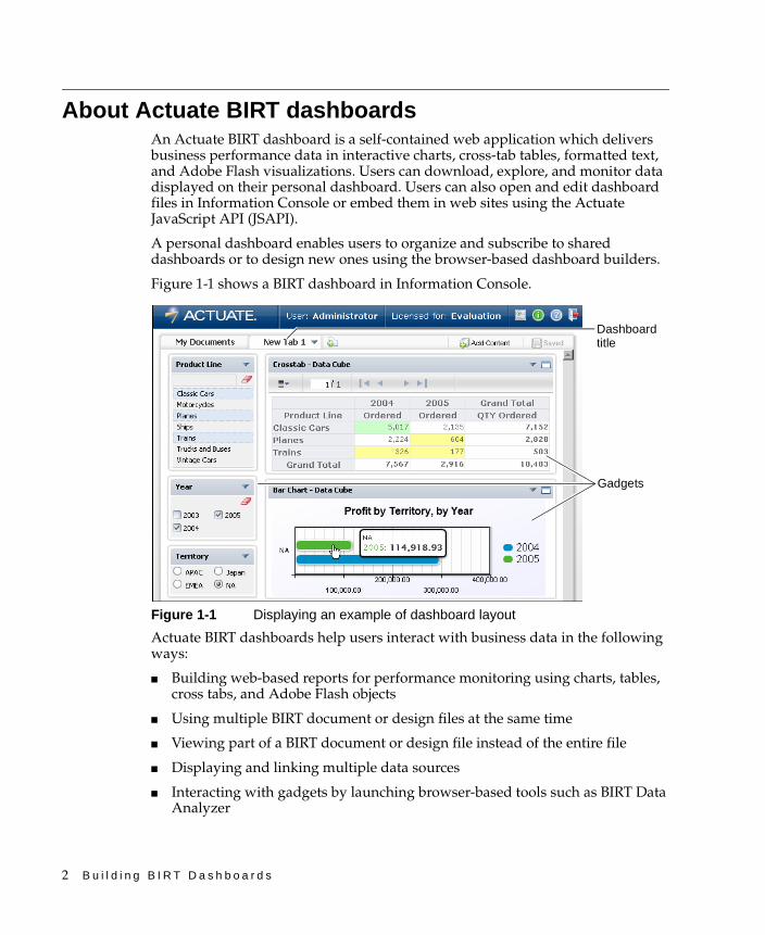
About Actuate BIRT dashboardsAn Actuate BIRT dashboard is a self-contained web application which delivers business performance data in interactive charts, cross-tab tables, formatted text, and Adobe Flash visualizations. Users can download, explore, and monitor data displayed on their personal dashboard. Users can also open and edit dashboard files in Information Console or embed them in web sites using the Actuate JavaScript API (JSAPI).
A personal dashboard enables users to organize and subscribe to shared dashboards or to design new ones using the browser-based dashboard builders.
Figure 1-1 shows a BIRT dashboard in Information Console.
Figure 1-1 Displaying an example of dashboard layout
Actuate BIRT dashboards help users interact with business data in the following ways:
■ Building web-based reports for performance monitoring using charts, tables, cross tabs, and Adobe Flash objects
■ Using multiple BIRT document or design files at the same time
■ Viewing part of a BIRT document or design file instead of the entire file
■ Displaying and linking multiple data sources
■ Interacting with gadgets by launching browser-based tools such as BIRT Data Analyzer
Dashboard title
Gadgets
C h a p t e r 1 , G e t t i n g s t a r t e d 3
■ Keeping information current using dashboard and gadget refresh timers
■ Exploring and exporting data using dynamic filtering and drill-down analysis
■ Mixing external web services with existing business data
Users interact with dashboard data using the gadgets on the dashboard. Each gadget is a self-contained data viewer. For example, there are gadgets that display interactive BIRT reports, tables, cross tabs, and charts. Other gadgets display values for a user to select, such as a list or calendar gadget.
Gadgets such as HTML and image gadgets bring in data from external sources to display on the dashboard. Custom gadgets can use HTML code to display information and use JavaScript events to add custom user interactions.
The BIRT 360 option for BIRT iServer is required to use dashboard and gadget files. If this option is not available, users cannot open dashboards or gadgets.
Some features require appropriate BIRT iServer options. For example, to use browser-based tools, such as BIRT Interactive Viewer, the BIRT iServer requires the appropriate license options.
Using a BIRT dashboardUsers log in to Information Console to start using BIRT dashboards. Users can then interact, export, or print data displayed in their personal dashboard or make new dashboards. The personal dashboard is associated with each user account and contains dashboards that the user subscribes to or has created.
Dashboards contain one or more gadgets that display data or enable user choices. For example, a user searches data by selecting a country name in a list gadget which filters data in a linked chart gadget. The chart gadget shows data for the selected country. Users can then select different perspectives of the chart data to view, such as viewing the chart data for selected years.
Each user’s personal dashboard contains dashboards created by the user or dashboards that the user subscribes to. Changes on a user’s personal dashboard persist across sessions in the user’s Information Console account. Users can reset their personal dashboard to display the system default dashboard, a blank dashboard, or a selected dashboard file.
Opening a dashboard or gadget fileUsers can open dashboard or gadget files using Information Console’s file explorer. Changes to dashboards opened as a file can be saved as the same or a new dashboard file. For example, authors can update a shared dashboard file directly from the shared folder without having to keep the dashboard in their personal dashboard.
4 B u i l d i n g B I R T D a s h b o a r d s
Actuate JavaScript API commands embeds both dashboard and gadget files into web pages. For more information about JSAPI, see Using Actuate JavaScript API.
Subscribing to a shared dashboardUsers and organizations share dashboards so that other users can subscribe to the same dashboard and view the same data. For example, shared dashboards can monitor business data and use refresh rates to keep the data current, they can display approved performance indicators, and enable interactivity for users to explore, analyze, and export the data.
A user adds a dashboard file to their personal dashboard by subscribing to the files from the dashboard gallery. When a user subscribes to a dashboard, that dashboard is displayed to the user each time they log in to Information Console.
Shared dashboards appear with the share icon on the dashboard title. Shared dashboards update to the latest version when a new version of the dashboard file is available.
Users can interact with gadgets on the shared dashboard but cannot change the layout or gadget configuration settings. For example, users can filter displayed data using data selection gadgets like lists. If a data version gadget exists on the dashboard users can select from different versions of a BIRT data object store to display on the dashboard.
Building a dashboardUsers build their own dashboards to display information they want to see. When adding gadgets, users configure gadget options such as data source, filtering, display formatting and linking to other gadgets.
When a user builds a new dashboard they have full control over dashboard layout and the gadgets that they add to the dashboard.
Building a custom gadgetDashboard and gadget developers build custom gadgets in the following ways:
■ Add custom HTML and JavaScript code in an HTML gadget.
■ Add a URL to a web application into an HTML gadget.
■ Create a custom Google gadget and load it into an import gadget.
Building HTML gadgets and import gadgets is described later in this document. Creating Google gadgets is also discussed later in this document.

C h a p t e r 1 , G e t t i n g s t a r t e d 5
Types of dashboards and gadgetsDashboards belong to one of the following types:
■ Operational dashboards display BIRT design and document files, or external files and web pages located on external servers. The following gadget categories are used for operational dashboards:
■ Report gadgets display entire BIRT document and design files. Reportlet gadgets display only the bookmarked portion of BIRT document and design files.
■ Extras gadgets display external web pages, embedded HTML and JavaScript code, Google gadgets, external images and video on the dashboard.
■ Analytic dashboards present one or more data sources using data visualizations and data selection gadgets. The following gadget categories are used for analytic dashboards:
■ Data visualization gadgets use charts, cross tabs, tables, and Flash gadgets to help users analyze and explore data.
■ Data selection gadgets help users to select data using lists, calendars, check boxes. Other gadgets link to these selections to filter the data that is displayed to the user.
■ Mixed dashboards that display operational and analytic gadgets together
Dashboards are either private dashboards that are only available to the user that created them, or shared dashboards for other users to access. Private dashboard files reside in a user’s personal dashboard file or in a folder with sharing disabled. Shared dashboard files reside in the shared folders where users access them using the dashboard gallery.
Integrating BIRT filesFiles created by BIRT Designer Professional or BIRT Studio are displayed on the dashboard using report or Reportlet gadgets. Using BIRT files brings interactivity and rich visual displays of BIRT applications to the dashboard environment.
For example, BIRT Designer Professional offers several Adobe Flash objects for visualizing data, supports charts in multiple image formats, offers drill through hyperlinks, enables full-page output formats such as Adobe PDF, and supports custom business logic solutions. These features are available using report or Reportlet gadgets to display BIRT files in the dashboard.

6 B u i l d i n g B I R T D a s h b o a r d s
C h a p t e r 2 , D e s i g n i n g a d a s h b o a r d 7
C h a p t e r
2Chapter 2Designing a dashboard
This chapter contains the following topics:
■ About dashboard organization
■ Adding dashboards and gadgets
■ Formatting a dashboard
■ Changing a dashboard
■ Planning dashboard design
8 B u i l d i n g B I R T D a s h b o a r d s
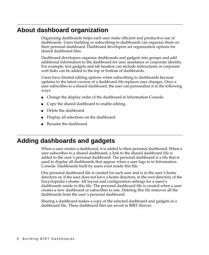
About dashboard organizationOrganizing dashboards helps each user make efficient and productive use of dashboards. Users building or subscribing to dashboards can organize them on their personal dashboard. Dashboard developers set organization options for shared dashboard files.
Dashboard developers organize dashboards and gadgets into groups and add additional information to the dashboard for user assistance or corporate identity. For example, text gadgets and tab headers can include instructions or corporate web links can be added to the top or bottom of dashboards.
Users have limited editing options when subscribing to dashboards because updates to the latest version of a dashboard file replaces user changes. Once a user subscribes to a shared dashboard, the user can personalize it in the following ways:
■ Change the display order of the dashboard in Information Console.
■ Copy the shared dashboard to enable editing.
■ Delete the dashboard.
■ Display all selections on the dashboard.
■ Rename the dashboard.
Adding dashboards and gadgetsWhen a user creates a dashboard, it is added to their personal dashboard. When a user subscribes to a shared dashboard, a link to the shared dashboard file is added to the user’s personal dashboard. The personal dashboard is a file that is used to display all dashboards that appear when a user logs in to Information Console. Dashboards built by users exist inside this file.
One personal dashboard file is created for each user and is in the user’s home directory or, if the user does not have a home directory, in the root directory of the Encyclopedia volume. All layout and configuration settings for a users’s dashboards reside in this file. The personal dashboard file is created when a user creates a new dashboard or subscribes to one. Deleting this file removes all the dashboards from the user’s personal dashboard.
Sharing a dashboard makes a copy of the selected dashboard and gadgets in a dashboard file. These dashboard files are saved in BIRT iServer.
C h a p t e r 2 , D e s i g n i n g a d a s h b o a r d 9
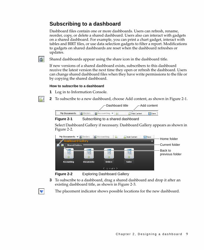
Subscribing to a dashboardDashboard files contain one or more dashboards. Users can refresh, rename, reorder, copy, or delete a shared dashboard. Users also can interact with gadgets on a shared dashboard. For example, you can print a chart gadget, interact with tables and BIRT files, or use data selection gadgets to filter a report. Modifications to gadgets on shared dashboards are reset when the dashboard refreshes or updates.
Shared dashboards appear using the share icon in the dashboard title.
If new versions of a shared dashboard exists, subscribers to this dashboard receive the latest version the next time they open or refresh the dashboard. Users can change shared dashboard files when they have write permissions to the file or by copying the shared dashboard.
How to subscribe to a dashboard
1 Log in to Information Console.
2 To subscribe to a new dashboard, choose Add content, as shown in Figure 2-1.
Figure 2-1 Subscribing to a shared dashboard
Select Dashboard Gallery if necessary. Dashboard Gallery appears as shown in Figure 2-2.
Figure 2-2 Exploring Dashboard Gallery
3 To subscribe to a dashboard, drag a shared dashboard and drop it after an existing dashboard title, as shown in Figure 2-3.
The placement indicator shows possible locations for the new dashboard.
Add contentDashboard title
Current folder
Back to previous folder
Home folder

10 B u i l d i n g B I R T D a s h b o a r d s
Figure 2-3 Placing a new dashboard
The new dashboard appear in the selected location, as shown in Figure 2-4.
Figure 2-4 Adding a shared dashboard
Creating a dashboardUsers organize gadgets using dashboards. Users create a dashboard, then add one or more gadgets to each dashboard. Creating a dashboard adds it to the user’s personal dashboard. Users can also share the dashboard.
Users can also create a new dashboard by copying a shared dashboard. When users copy a shared dashboard, they create a new dashboard and can customize it. Copying a shared dashboard breaks the link to the original, shared dashboard file and future updates do not change the new, copied dashboard. Changes made to the copied dashboard do not affect the original files.
How to create a blank dashboard
1 Log in to Information Console.
2 Select New tab as shown in Figure 2-5.
Figure 2-5 Creating a new, blank dashboard
A new, blank dashboard appears with options to add gadget to the dashboard, as shown in Figure 2-6.
Figure 2-6 Adding content to a new dashboard
Shared dashboard
Placement indicator
New tab
New dashboard
C h a p t e r 2 , D e s i g n i n g a d a s h b o a r d 11
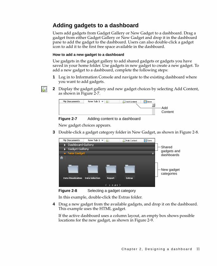
Adding gadgets to a dashboardUsers add gadgets from Gadget Gallery or New Gadget to a dashboard. Drag a gadget from either Gadget Gallery or New Gadget and drop it in the dashboard pane to add the gadget to the dashboard. Users can also double-click a gadget icon to add it to the first free space available in the dashboard.
How to add a new gadget to a dashboard
Use gadgets in the gadget gallery to add shared gadgets or gadgets you have saved in your home folder. Use gadgets in new gadget to create a new gadget. To add a new gadget to a dashboard, complete the following steps:
1 Log in to Information Console and navigate to the existing dashboard where you want to add gadgets.
2 Display the gadget gallery and new gadget choices by selecting Add Content, as shown in Figure 2-7.
Figure 2-7 Adding content to a dashboard
New gadget choices appears.
3 Double-click a gadget category folder in New Gadget, as shown in Figure 2-8.
Figure 2-8 Selecting a gadget category
In this example, double-click the Extras folder.
4 Drag a new gadget from the available gadgets, and drop it on the dashboard. This example uses the HTML gadget.
If the active dashboard uses a column layout, an empty box shows possible locations for the new gadget, as shown in Figure 2-9.
Add Content
New gadget categories
Shared gadgets and dashboards
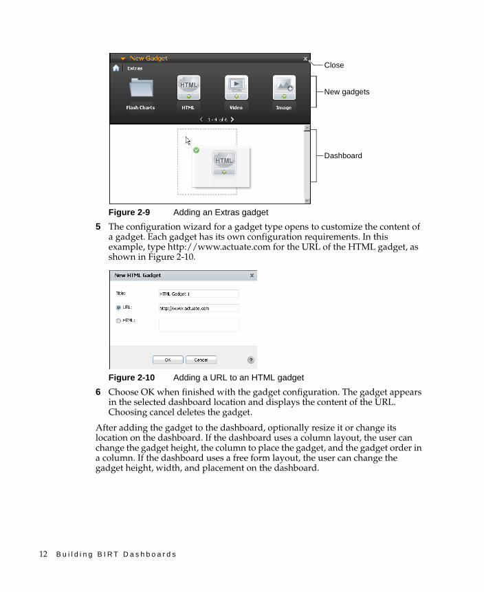
12 B u i l d i n g B I R T D a s h b o a r d s
Figure 2-9 Adding an Extras gadget
5 The configuration wizard for a gadget type opens to customize the content of a gadget. Each gadget has its own configuration requirements. In this example, type http://www.actuate.com for the URL of the HTML gadget, as shown in Figure 2-10.
Figure 2-10 Adding a URL to an HTML gadget
6 Choose OK when finished with the gadget configuration. The gadget appears in the selected dashboard location and displays the content of the URL. Choosing cancel deletes the gadget.
After adding the gadget to the dashboard, optionally resize it or change its location on the dashboard. If the dashboard uses a column layout, the user can change the gadget height, the column to place the gadget, and the gadget order in a column. If the dashboard uses a free form layout, the user can change the gadget height, width, and placement on the dashboard.
New gadgets
Dashboard
Close
C h a p t e r 2 , D e s i g n i n g a d a s h b o a r d 13
Formatting a dashboardEach dashboard supports gadget layout for free form or one, two, or three columns. Free form layout supports resizing gadgets and placing them anywhere on the dashboard. This layout also supports overlapping gadgets.
Using the dashboard column layout supports:
■ Automatic width resizing for gadgets within a column
■ Adjusting column width to a value relative to the size of the web browser
■ Changing the order of gadgets within the same column
■ Moving gadgets from one column to another
■ Adjusting gadget height to a fixed value
■ Changing individual gadgets to floating for placement outside of columns
Dashboard layout defines how the gadgets appear on a dashboard. Each gadget uses either a column or free form layout. Gadgets that use column layouts do not overlap and appear either above or below another gadget in the same column. Gadgets in free form layout can be anywhere on the dashboard. If a free form gadget overlaps another gadget, the user can move the gadget to the front or back of the other gadgets.
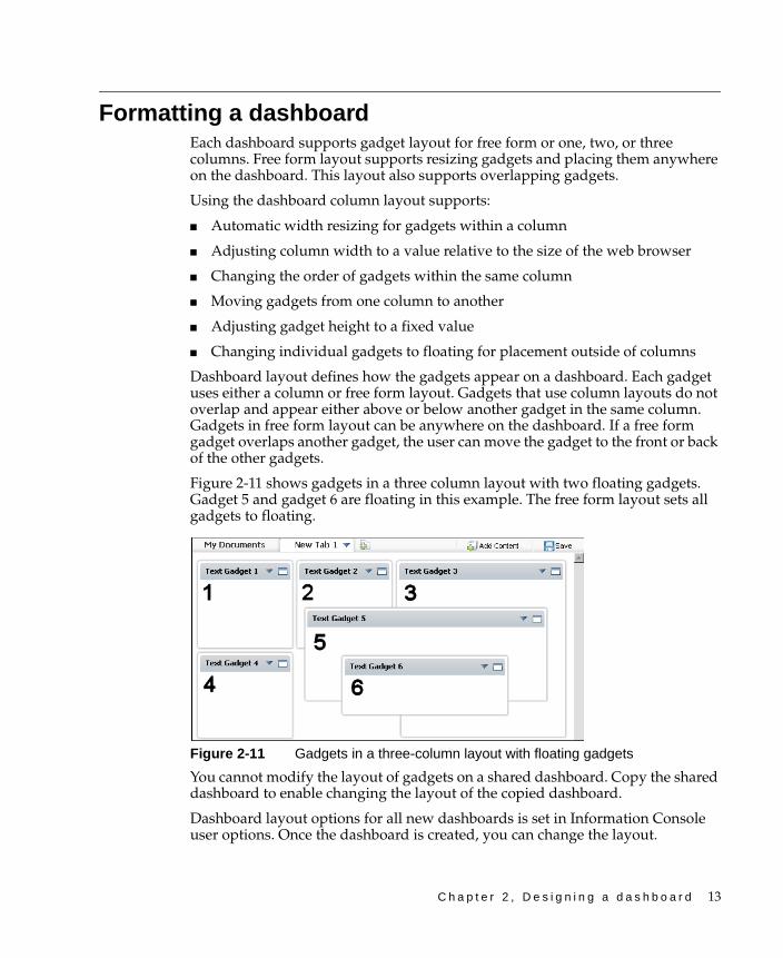
Figure 2-11 shows gadgets in a three column layout with two floating gadgets. Gadget 5 and gadget 6 are floating in this example. The free form layout sets all gadgets to floating.
Figure 2-11 Gadgets in a three-column layout with floating gadgets
You cannot modify the layout of gadgets on a shared dashboard. Copy the shared dashboard to enable changing the layout of the copied dashboard.
Dashboard layout options for all new dashboards is set in Information Console user options. Once the dashboard is created, you can change the layout.
14 B u i l d i n g B I R T D a s h b o a r d s
Choosing a dashboard layoutYou can change the layout on dashboards that you create or copy. Choose a layout with one, two, or three columns, where gadgets appear within each column, and column width can be adjusted. You can move and resize all gadgets anywhere on the dashboard by setting the layout to free form. Free form layout supports overlapping gadgets.
Dashboard layout is set for all new dashboards as an option in a user’s Information Console account. When a dashboard layout changes, existing gadgets are repositioned to fit the new dashboard layout.
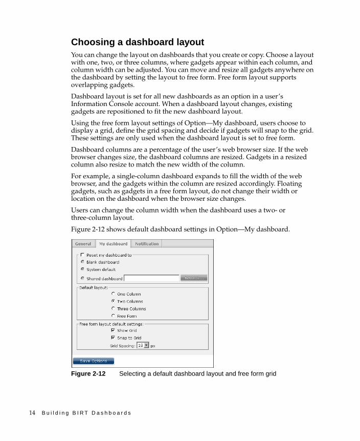
Using the free form layout settings of Option—My dashboard, users choose to display a grid, define the grid spacing and decide if gadgets will snap to the grid. These settings are only used when the dashboard layout is set to free form.
Dashboard columns are a percentage of the user’s web browser size. If the web browser changes size, the dashboard columns are resized. Gadgets in a resized column also resize to match the new width of the column.
For example, a single-column dashboard expands to fill the width of the web browser, and the gadgets within the column are resized accordingly. Floating gadgets, such as gadgets in a free form layout, do not change their width or location on the dashboard when the browser size changes.
Users can change the column width when the dashboard uses a two- or three-column layout.
Figure 2-12 shows default dashboard settings in Option—My dashboard.
Figure 2-12 Selecting a default dashboard layout and free form grid
C h a p t e r 2 , D e s i g n i n g a d a s h b o a r d 15
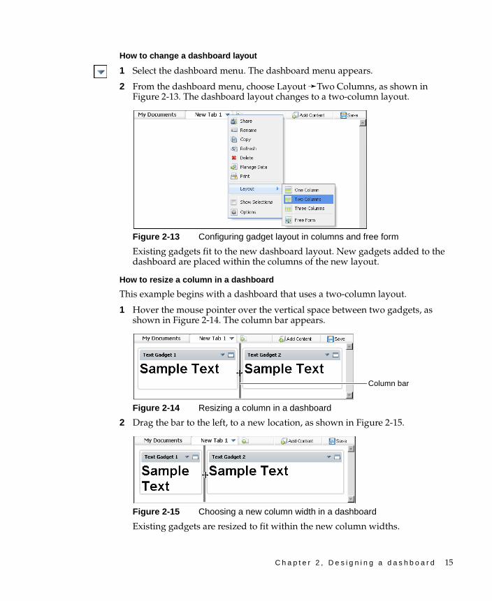
How to change a dashboard layout
1 Select the dashboard menu. The dashboard menu appears.
2 From the dashboard menu, choose Layout ➛Two Columns, as shown in Figure 2-13. The dashboard layout changes to a two-column layout.
Figure 2-13 Configuring gadget layout in columns and free form
Existing gadgets fit to the new dashboard layout. New gadgets added to the dashboard are placed within the columns of the new layout.
How to resize a column in a dashboard
This example begins with a dashboard that uses a two-column layout.
1 Hover the mouse pointer over the vertical space between two gadgets, as shown in Figure 2-14. The column bar appears.
Figure 2-14 Resizing a column in a dashboard
2 Drag the bar to the left, to a new location, as shown in Figure 2-15.
Figure 2-15 Choosing a new column width in a dashboard
Existing gadgets are resized to fit within the new column widths.
Column bar

16 B u i l d i n g B I R T D a s h b o a r d s
Managing gadget placementNew gadgets use the dashboard layout when added. You can move existing gadgets on the dashboard, within the columns or set the gadget to float when the dashboard uses the column layout,. You can place floating gadgets anywhere on the dashboard while other gadgets remain in the column layout. You can return a floating gadget to the column layout of the dashboard by selecting dock from the gadget menu.
If the dashboard uses a column layout, you can move the gadgets above or below other gadgets in the same column. Gadgets in a column layout do not overlap and have an adjustable height. If the dashboard uses a free form layout, all gadgets are floating. Floating gadgets have an adjustable height and width. When the free form grid is displayed, gadgets can be snapped to the grid for exact placement, as shown in Figure 2-16.
Figure 2-16 Placing gadgets in a free form grid
Users can resize these gadgets and place them anywhere on the dashboard. Floating gadgets can overlap each other. You can move overlapping gadgets to the front or back from the gadget menu, as shown in Figure 2-17.
Figure 2-17 Displaying the gadget menu
Gadget menu
Front and back options
Gadget header

C h a p t e r 2 , D e s i g n i n g a d a s h b o a r d 17
Right-click anywhere on the gadget header to display the gadget menu.
How to change the size of a gadget
1 Hover the mouse pointer over the border of a gadget. A solid line appears, highlighting the borders that can be modified, as shown in Figure 2-18.
Figure 2-18 Selecting a gadget border to change
2 Drag the border to a new position to resize the gadget, as shown in Figure 2-19. The gadget resizes to the new border.
Figure 2-19 Changing the size of a gadget
Personalizing a dashboardYou can personalize dashboards you create or copy with the following options:
■ Auto refresh, to refresh the dashboard at a selected interval
■ Footer, to include HTML text at the bottom of the dashboard page
■ Header, to include HTML text at the top of the dashboard page
■ Name, to customize the name of the dashboard
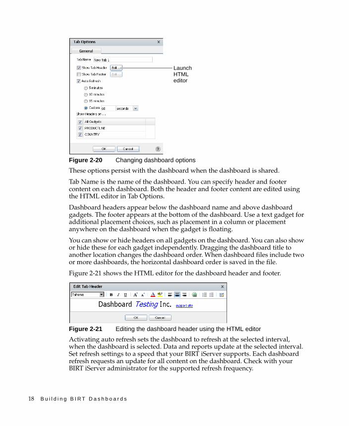
Dashboard options are available in the dashboard menu for each dashboard, as shown in Figure 2-20.
Mouse cursor
18 B u i l d i n g B I R T D a s h b o a r d s
Figure 2-20 Changing dashboard options
These options persist with the dashboard when the dashboard is shared.
Tab Name is the name of the dashboard. You can specify header and footer content on each dashboard. Both the header and footer content are edited using the HTML editor in Tab Options.
Dashboard headers appear below the dashboard name and above dashboard gadgets. The footer appears at the bottom of the dashboard. Use a text gadget for additional placement choices, such as placement in a column or placement anywhere on the dashboard when the gadget is floating.
You can show or hide headers on all gadgets on the dashboard. You can also show or hide these for each gadget independently. Dragging the dashboard title to another location changes the dashboard order. When dashboard files include two or more dashboards, the horizontal dashboard order is saved in the file.
Figure 2-21 shows the HTML editor for the dashboard header and footer.
Figure 2-21 Editing the dashboard header using the HTML editor
Activating auto refresh sets the dashboard to refresh at the selected interval, when the dashboard is selected. Data and reports update at the selected interval. Set refresh settings to a speed that your BIRT iServer supports. Each dashboard refresh requests an update for all content on the dashboard. Check with your BIRT iServer administrator for the supported refresh frequency.
Launch HTML editor
C h a p t e r 2 , D e s i g n i n g a d a s h b o a r d 19
Changing a dashboardUsers can edit dashboards displayed on the users personal dashboard or dashboard files in the Encyclopedia volume. For example, a dashboard developer can create a template dashboard file to use when building new dashboards.
Editing a dashboard fileUsing the Information Console file explorer, you can edit individual dashboard files and save the dashboard file to a new dashboard file.
Dashboards opened for editing from the Information Console file explorer have the following save options if you have permission to edit the dashboard:
■ Save: save the current dashboard settings to the existing dashboard file.
■ Save as: save the current dashboard to a new dashboard file.
Saving a dashboard file replaces the previous dashboard file with the new changes. If other users subscribe to the changed dashboard, they will receive the new dashboard the next time they log in to Information Console or refresh their personal dashboard.
Saving a dashboard as a new file will create a new dashboard file.
How to save a dashboard as a new dashboard file
Follow these instructions to save a new dashboard file from a dashboard opened from the Information Console file explorer.
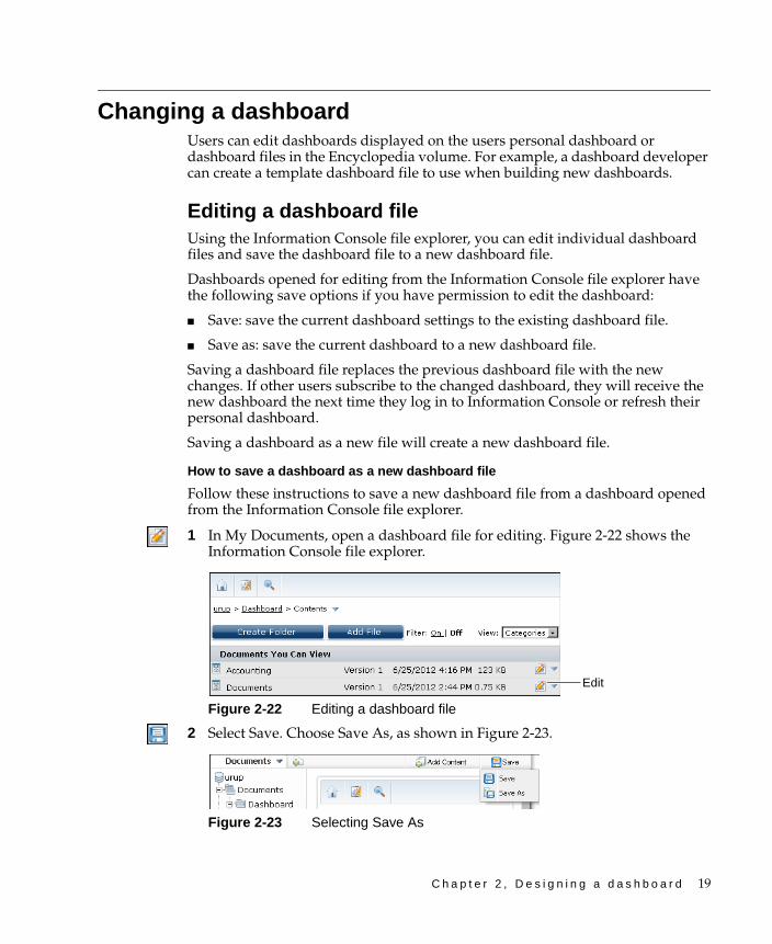
1 In My Documents, open a dashboard file for editing. Figure 2-22 shows the Information Console file explorer.
Figure 2-22 Editing a dashboard file
2 Select Save. Choose Save As, as shown in Figure 2-23.
Figure 2-23 Selecting Save As
Edit
20 B u i l d i n g B I R T D a s h b o a r d s
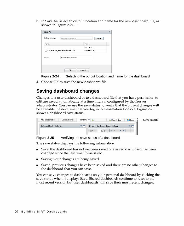
3 In Save As, select an output location and name for the new dashboard file, as shown in Figure 2-24.
Figure 2-24 Selecting the output location and name for the dashboard
4 Choose OK to save the new dashboard file.
Saving dashboard changesChanges to a user dashboard or to a dashboard file that you have permission to edit are saved automatically at a time interval configured by the iServer administrator. You can use the save status to verify that the current changes will be available the next time that you log in to Information Console. Figure 2-25 shows a dashboard save status.
Figure 2-25 Verifying the save status of a dashboard
The save status displays the following information:
■ Save: the dashboard has not yet been saved or a saved dashboard has been changed since the last time it was saved.
■ Saving: your changes are being saved.
■ Saved: previous changes have been saved and there are no other changes to the dashboard that you can save.
You can save changes to dashboards on your personal dashboard by clicking the save status when it displays Save. Shared dashboards continue to reset to the most recent version but user dashboards will save their most recent changes.
Save status
C h a p t e r 2 , D e s i g n i n g a d a s h b o a r d 21
Planning dashboard designPlanning dashboard usage assures that users can receive and use the expected data. After deciding the content to be displayed and necessary gadgets to assist in data selection, it is important to consider user permissions and web browser limitations. Optimization techniques are available to enhance the user experience.
You can open and edit dashboard files without subscribing to them. This enables you to build a dashboard and save it in a private folder until you are ready to share it. Use the Information Console file explorer to open a dashboard file for editing.
Planning for permissions and optionsThe same permissions that apply to files in Information Console apply to dashboard files. Users of shared dashboards require file permissions to access the shared dashboard file and the data object file it displays. Each file has access permissions that the dashboard owner or the Information Console administrator sets.
The following gadgets have additional permission requirements:
■ Report and Reportlet gadgetsUser must have appropriate permission to access the BIRT document or design file used in the gadget. If the user needs to interact with BIRT documents, the BIRT Interactive Viewer for iServer option is required.
■ Extras gadgetsUser must have external network access and permission to display the external content. Actuate software does not manage these permissions. This includes HTML, Video, Image, Text, and Import Gadgets.
■ Data selection and data visualization gadgetsUser requires permission to view the displayed data objects.
Verify with the BIRT iServer administrator that users of the new dashboard are assigned the correct security role and BIRT iServer options. A user’s security role and installed BIRT iServer options define what functionality and browser-based tools are available to users. The BIRT iServer administrator manages security roles and BIRT iServer options.
For example, although a BIRT iServer has the BIRT 360 option for dashboards enabled, users require the correct security role and options activated for their account before they can create dashboards.
For more information about permissions, see “Managing permissions” in Chapter 5, “Sharing dashboards and gadgets.”

22 B u i l d i n g B I R T D a s h b o a r d s
Considering the web browserBIRT dashboards rely on the user’s web browser to present information. Using supported web browsers assures a consistent display of dashboards and gadgets. Although external resources can display in a dashboard, the web browser manages security settings and browser plug-ins such as Adobe Flash Player.
Dashboard developers must verify with their local network administrator that any needed security requirements and add-ons are available on user web browsers. For example, install Adobe Flash Player to access any web content that uses Adobe Flash, such as chart or Flash gadgets.
The following web browsers are supported for use with Information Console:
■ Google Chrome 7.x, 12.x, 14 - 22.x
■ Internet Explorer 7.x, 8.x, and 9.x
■ Mozilla Firefox 4 - 15.x
■ Safari 4, 5
Web browsers support different screen sizes and enable users to change the size of the web browser. When planning gadget layout and design, it is important to consider the screen size of all expected users. Web browsers can override several layout features for a web page such as font size, background color, or a cascading style sheet.
Some browsers support internet protocols differently. While Mozilla Firefox and Safari support many HTML5 features and SVG graphic files, Internet Explorer does not currently support them. This difference is an important consideration when displaying content from external web sites or embedding HTML code in gadgets.
Web links in a gadget window open the linked page within the gadget window but can also open in a new web browser window. Web sites and web browsers can override this configuration. Some external content may not support display from within a gadget. For example, trying to embed the URL http://www.google.com into an HTML gadget opens the Google web page in place of the dashboard.
Information Console has time-out values to close a user’s session after a certain time of inactivity. When a time out occurs in Information Console, the user’s session closes but the web browser with its cached dashboard may continue to display the last information received.
Planning for first useWhen a user first logs in to Information Console that has the BIRT 360 option installed, the user does not have a personal dashboard file. Users see an initial dashboard based on a template stored with the Information Console
C h a p t e r 2 , D e s i g n i n g a d a s h b o a r d 23
configuration files. This template can also be set by a user in the Information Console Options page. The template dashboard is loaded as a shared dashboard.
For example, the default dashboard template is the My Documents dashboard, which a user sees after logging in to Information Console. The user can change the default dashboard page using the Information Console Options page.
For more information about changing the default dashboard template with Information Console, see Information Console Developer Guide.
For more information about using the Information Console Options page, see Using Information Console.
Optimizing dashboard useThe following considerations assist in optimizing a dashboard:
■ Use data object store files instead of data object design files to avoid long queries when on-demand data is not required. Object store files are cached at the BIRT iServer, enabling multiple users to quickly access data.
■ Display BIRT report document files in place of BIRT report design files when possible. This avoids the time necessary for data population and rendering of a report design file.
■ Activate dashboard auto refresh only when monitoring changing data.
■ When using data selection gadgets, consider using data objects with optimized indexes for quick population of the gadget.
■ Use data selection gadgets or summarized data in place of large reports.
■ Consider BIRT design features available in BIRT Designer Professional for advanced chart interactivity and layout control. For example, adding a bookmark to a grid element in a BIRT design file enables the display of multiple BIRT elements. Multiple BIRT visualizations can be put into the grid. A Reportlet gadget can then embed the bookmarked grid element for display on a dashboard.

24 B u i l d i n g B I R T D a s h b o a r d s
C h a p t e r 3 , B u i l d i n g o p e r a t i o n a l d a s h b o a r d s 25
C h a p t e r
3Chapter 3Building operational
dashboardsThis chapter contains the following topics:
■ About operational dashboards
■ About report gadgets
■ Displaying report parameters
■ About extras gadgets
26 B u i l d i n g B I R T D a s h b o a r d s
About operational dashboardsOperational dashboards are a type of dashboards that display entire BIRT files, selected parts of BIRT files, and external content as gadgets on a web page. Each gadget displays its contents in a column or free form layout on the dashboard, as shown in Figure 3-1.
Figure 3-1 Displaying an operational dashboard
Report gadgets display entire BIRT document and design files. Reportlet gadgets display only a single bookmarked component of BIRT document and design files. For example, a BIRT document that contains a table and chart can display the entire document in a report gadget, or only the chart in a Reportlet gadget.
Parameter gadgets display parameter settings contained in BIRT document and design files. Users specify parameter values in parameter gadgets to update a linked gadget with new data. For example, two report gadgets contain a parameter to select a country. Instead of displaying the parameter in both report gadgets, you can list the country names in a parameter gadget and link the report gadgets to the list. Changing the parameter gadget’s value updates the linked report gadgets on the dashboard.
Report and Reportlet gadgets require the Actuate BIRT option. These gadgets also support interactive viewing when the Actuate BIRT Interactive Viewer option is installed on the Actuate BIRT iServer.
C h a p t e r 3 , B u i l d i n g o p e r a t i o n a l d a s h b o a r d s 27
Extras gadgets display external web content, such as images, web pages or web applications, and custom gadgets on the dashboard.
About report gadgetsReport gadgets display content and data from existing BIRT document or design files. Multiple report gadgets can display on a dashboard at the same time. Report gadgets support using BIRT Interactive Viewer by maximizing the gadget.
By displaying BIRT files or bookmarked components of a BIRT file, users can display several existing Flash gadgets and objects from BIRT Designer Professional and BIRT Studio in dashboard gadgets. Users can share these gadgets for others to use. Report and Reportlet gadgets support all components of a BIRT file such as cross tabs, multiple hyperlinks, chart image formats, and switch view.
For example, a BIRT developer uses BIRT Designer Professional to create a document with four bookmarked elements: a radar chart, a Flash map, a table, and a cross tab. Four Reportlet gadgets can each contain a different bookmarked component of the BIRT document. The developer can share these gadgets for other users to view or include in personal dashboards.
Table 3-1 shows the report gadgets available to use in a dashboard.
Users can export the report gadget content as raw data or in formats like Adobe PDF, IBM AFP, Microsoft Word and Excel. An optional toolbar enables users to navigate pages and export report data or content.
Report gadgets support drill-through of charts when the BIRT developer enables this functionality. Figure 3-2 shows a report gadget with parameters.
Table 3-1 Report gadget types
Icon Type Purpose
Parameter Parameter gadgets display parameters of a selected BIRT document and design file. Other gadgets can use these parameters. This gadget supports dynamic parameters that enable users to select a condition operator and a value.
Report Report gadgets display entire BIRT document and design files in a gadget. The document retains the file access permissions of the original BIRT document.
Reportlet Reportlet gadgets display bookmarked elements from BIRT document and design files, such as a cross tab, table, or chart, in a gadget. The document part retains the file access permissions of the original BIRT document.
28 B u i l d i n g B I R T D a s h b o a r d s
Figure 3-2 Exporting content from a minimized report gadget
Users can interactively change the appearance, content and layout of a BIRT document when the user maximizes the report gadget. Figure 3-3 shows a maximized report gadget.
Figure 3-3 Opening the context menu of a maximized report gadget
Setting general gadget optionsAll report gadgets have general options to display the gadget on the dashboard. The following general gadget options are available after a report gadget is created:
■ Auto Refresh
■ Dimensions
■ Enable Scroll bar
■ Show Border
Maximize
Report parameters
Report content
Toolbar
Toolbar menu
Report content
Context menu
Toolbar
C h a p t e r 3 , B u i l d i n g o p e r a t i o n a l d a s h b o a r d s 29
■ Show Header
■ Show Toolbar
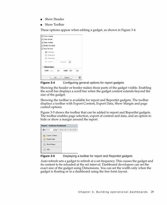
These options appear when editing a gadget, as shown in Figure 3-4.
Figure 3-4 Configuring general options for report gadgets
Showing the header or border makes those parts of the gadget visible. Enabling the scroll bar displays a scroll bar when the gadget content extends beyond the size of the gadget.
Showing the toolbar is available for report and Reportlet gadgets. The toolbar displays a toolbar with Export Content, Export Data, Show Margin and page control options.
Figure 3-5 shows the toolbar that can be added to report and Reportlet gadgets. The toolbar enables page selection, export of content and data, and an option to hide or show a margin around the report.
Figure 3-5 Displaying a toolbar for report and Reportlet gadgets
Auto refresh sets a gadget to refresh at a set frequency. This causes the gadget and its content to be reloaded at the set interval. Dashboard developers can set the exact size of the gadget using Dimensions. You can set the width only when the gadget is floating or in a dashboard using the free form layout.

30 B u i l d i n g B I R T D a s h b o a r d s
Using a parameter gadgetParameter gadgets display parameter choices from a BIRT file on the dashboard. Other report or Reportlet gadgets on the same dashboard can use these parameters when the BIRT file they display require parameters. A BIRT developer can add parameters to a BIRT file.
Parameter gadgets present all or selected parameter choices that the BIRT document or design file includes, as shown in Figure 3-6. When the BIRT file displayed in the report or Reportlet gadget requires static parameters, these parameters can be linked to a data visualization gadget instead of a parameter gadget. Static parameters request a value from a user. Dynamic parameters request a value and a condition.
Figure 3-6 Selecting a BIRT file and choosing parameters to display
When editing this gadget, you can assign default values to selected parameters. Dynamic parameters, if available in the BIRT file, can also be assigned default conditions in addition to the value, as shown in Figure 3-7.
Figure 3-7 Selecting default values in a parameter gadget
Dynamic parameters enable additional flexibility for a user to select and explore data using a variety of condition operators and values. Default condition operators and values appear in the gadget. A user can change both the operator and value on the dashboard.
The BIRT report developer adds one or more conditions to display in a dynamic filter parameter. For more information about parameters, see “Displaying report parameters,” later in this chapter.
Condition
Values

C h a p t e r 3 , B u i l d i n g o p e r a t i o n a l d a s h b o a r d s 31
Dashboard developers can customize the display of parameter gadgets using Edit Parameter Gadget—General options. For more information about general options, see “Setting general gadget options,” earlier in this chapter.
How to create a parameter gadget
This procedure requires a dashboard you can edit. Create a new dashboard if one does not already exist. To create a parameter gadget, complete the following steps:
1 Display available gadgets by selecting Add Content and choosing New Gadget.
2 Display report gadgets by selecting Report.
3 Drag the parameter gadget and drop it on the dashboard.
4 Type a name for the gadget.
5 Select a BIRT report document or report design file to receive parameters from.
6 Select which parameters to display.
7 Select default values for any parameters in New Parameter Gadget—Parameter.
8 Choose OK to create the new gadget.
Specify desired gadget display options by choosing Edit from the gadget menu after the gadget has been placed on the dashboard. You can change the following settings in Edit Parameter Gadget—General:
■ Gadget dimensions
■ Display the header, border, and scroll bar
■ Refresh rate
Using a report gadgetA report gadget displays an entire BIRT report document file or BIRT report design file on a dashboard. The embedded document retains the file access permissions of the original BIRT document. Users can share report gadgets for others to use.
Users can browse the Encyclopedia volume to find a BIRT document or design file or type the path to a known file. The selected file displays in the gadget. If the Interactive Viewer option is installed, the user can interact with the BIRT document by maximizing the gadget.
When you add this gadget to the dashboard or edit it, the report settings similar to Figure 3-8 appear. You can edit the gadget title and select a report to display.

32 B u i l d i n g B I R T D a s h b o a r d s
Figure 3-8 Selecting a report for a report gadget
BIRT files can contain parameters to request user interaction. Parameters can be set within the gadget configuration, displayed in the gadget for the user to select values, or linked to a data selection or parameter gadget on the same dashboard. For more information about using parameters in gadgets, see “Displaying report parameters,” later in this chapter.
Dashboard developers can customize how the gadget displays on the dashboard using Edit Report Gadget—General options. For more information about general options, see “Setting general gadget options,” earlier in this chapter.
How to create a report gadget
This procedure requires a dashboard you can edit. Create a new dashboard if one does not already exist. To create a report gadget, complete the following steps:
1 Display available gadgets by selecting Add Content and choosing New Gadget.
2 Display report gadgets by choosing Report.
3 Drag the report gadget and drop it on the dashboard.
4 Type a name for the gadget.
5 Select a BIRT report document or report design file to display.
6 Select default values for any parameters in New Report Gadget—Parameter.
7 In New Report Gadget—Parameter Display Settings, select one of the following display settings for each parameter in the report:
■ Do not display the parameter and use the defaults set in the gadget
■ Display parameter as part of the gadget
■ Display parameter as a new selector
■ Link to this selector and pick an existing data selection or parameter gadget
8 Choose OK to create the new gadget.
Specify desired gadget display options by choosing Edit from the gadget menu after the gadget has been placed on the dashboard. You can change the following settings in Edit Report Gadget—General:
■ Gadget dimensions
C h a p t e r 3 , B u i l d i n g o p e r a t i o n a l d a s h b o a r d s 33
■ Display the header, border, and scroll bar
■ Display a toolbar
■ Refresh rate
Using a Reportlet gadgetReportlet gadgets are similar to report gadgets, except the dashboard developer selects an existing bookmark from within a BIRT document or design file.
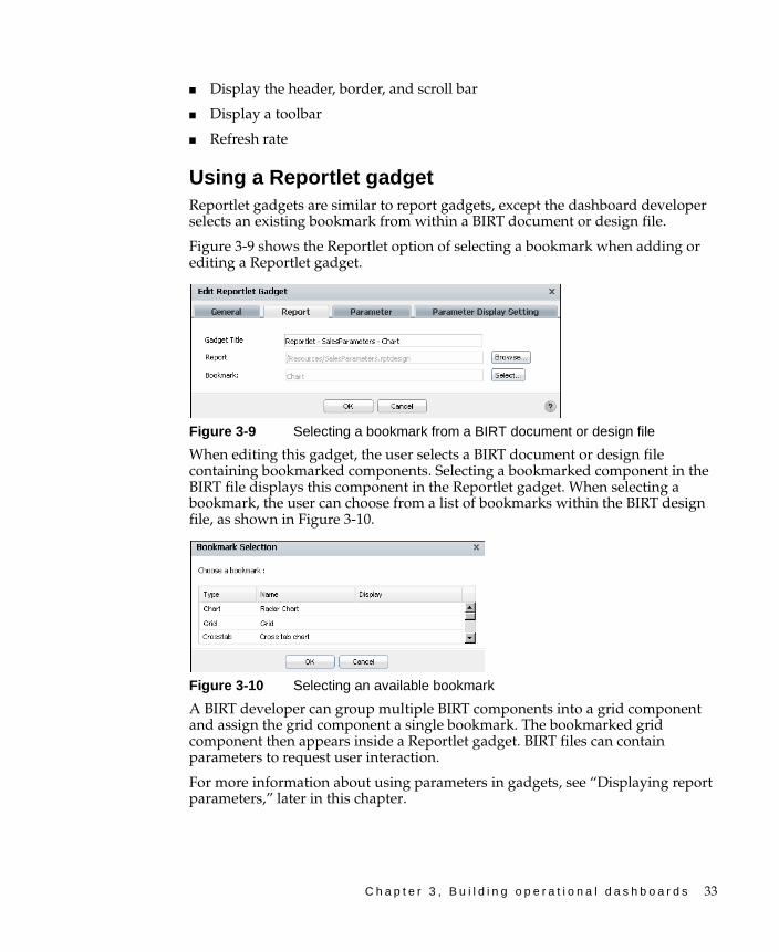
Figure 3-9 shows the Reportlet option of selecting a bookmark when adding or editing a Reportlet gadget.
Figure 3-9 Selecting a bookmark from a BIRT document or design file
When editing this gadget, the user selects a BIRT document or design file containing bookmarked components. Selecting a bookmarked component in the BIRT file displays this component in the Reportlet gadget. When selecting a bookmark, the user can choose from a list of bookmarks within the BIRT design file, as shown in Figure 3-10.
Figure 3-10 Selecting an available bookmark
A BIRT developer can group multiple BIRT components into a grid component and assign the grid component a single bookmark. The bookmarked grid component then appears inside a Reportlet gadget. BIRT files can contain parameters to request user interaction.
For more information about using parameters in gadgets, see “Displaying report parameters,” later in this chapter.

34 B u i l d i n g B I R T D a s h b o a r d s
Dashboard developers can customize how the gadget displays on the dashboard using Edit Report Gadget—General options. For more information about general options, see “Setting general gadget options,” earlier in this chapter.
How to create a Reportlet gadget
This procedure requires a dashboard you can edit. Create a new dashboard if one does not already exist. To create a Reportlet gadget, complete the following steps:
1 Display available gadgets by selecting Add Content and choosing New Gadget.
2 Display report gadgets by choosing Report.
3 Drag the Reportlet gadget and drop it on the dashboard.
4 Type a name for the gadget.
5 Select a BIRT report document or report design file to display.
6 Select a bookmark to display.
7 Select default values for any parameters in New Report Gadget—Parameter.
8 In New Report Gadget—Parameter Display Settings, select one of the following display settings for each parameter in the report:
■ Do not display the parameter
■ Display parameter as part of the gadget
■ Display parameter as a new selector
■ Link to this selector and pick an existing data selection or parameter gadget
9 Choose OK to create the new gadget.
Specify desired gadget display options by choosing Edit from the gadget menu after the gadget has been placed on the dashboard. You can change the following settings in Edit Report Gadget—General:
■ Gadget dimensions
■ Display the header, border, and scroll bar
■ Display a toolbar
■ Refresh rate
Displaying report parametersParameters enable users to input values into the BIRT document or design file for filtering, formatting or processing data. Parameters can be required to run a file job or they can be optional. For example, a BIRT design file that displays order
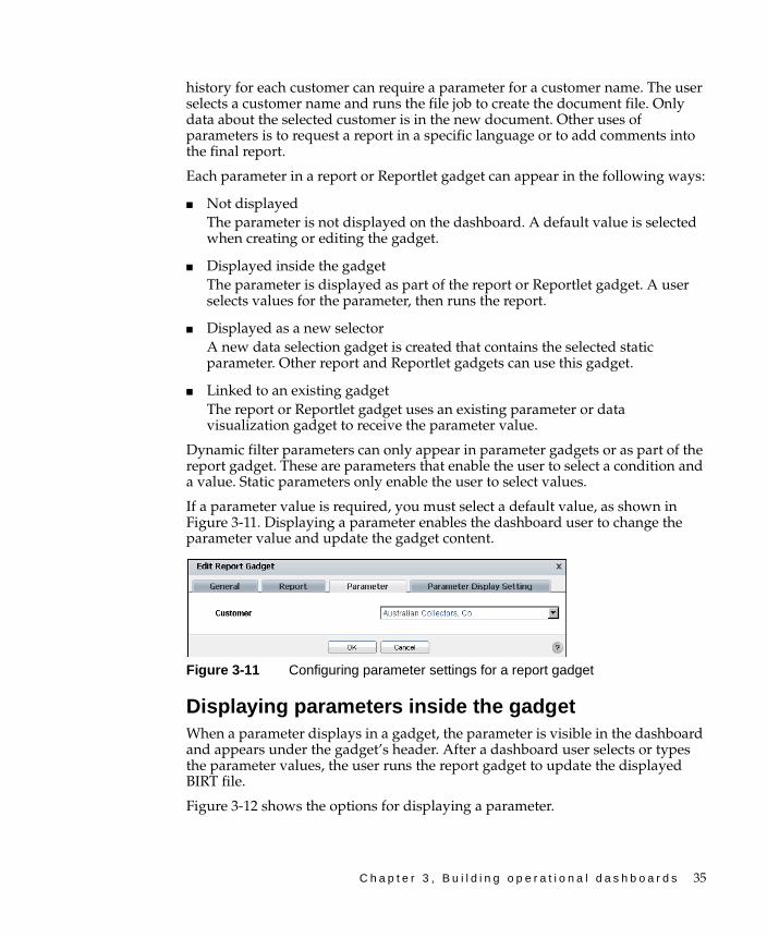
C h a p t e r 3 , B u i l d i n g o p e r a t i o n a l d a s h b o a r d s 35
history for each customer can require a parameter for a customer name. The user selects a customer name and runs the file job to create the document file. Only data about the selected customer is in the new document. Other uses of parameters is to request a report in a specific language or to add comments into the final report.
Each parameter in a report or Reportlet gadget can appear in the following ways:
■ Not displayed The parameter is not displayed on the dashboard. A default value is selected when creating or editing the gadget.
■ Displayed inside the gadgetThe parameter is displayed as part of the report or Reportlet gadget. A user selects values for the parameter, then runs the report.
■ Displayed as a new selectorA new data selection gadget is created that contains the selected static parameter. Other report and Reportlet gadgets can use this gadget.
■ Linked to an existing gadgetThe report or Reportlet gadget uses an existing parameter or data visualization gadget to receive the parameter value.
Dynamic filter parameters can only appear in parameter gadgets or as part of the report gadget. These are parameters that enable the user to select a condition and a value. Static parameters only enable the user to select values.
If a parameter value is required, you must select a default value, as shown in Figure 3-11. Displaying a parameter enables the dashboard user to change the parameter value and update the gadget content.
Figure 3-11 Configuring parameter settings for a report gadget
Displaying parameters inside the gadgetWhen a parameter displays in a gadget, the parameter is visible in the dashboard and appears under the gadget’s header. After a dashboard user selects or types the parameter values, the user runs the report gadget to update the displayed BIRT file.
Figure 3-12 shows the options for displaying a parameter.

36 B u i l d i n g B I R T D a s h b o a r d s
Figure 3-12 Configuring parameter display settings for a report gadget
Displaying parameters in a new selectorChoosing to display a parameter as a new selector for a gadget, launches the Data Selector Gadget Wizard. This wizard builds a data selection gadget using the parameter choices in the BIRT file as a data source.
Other gadgets on the same dashboard can link to the new data selection gadget, to receive user selected values. When users change the selected data in the data selection gadget, linked report gadgets update to display the new information.
For example, a chart and a report gadget can link to the same data selection gadget. Changing the value in the data selection gadget updates the data displayed in the linked chart and the report gadgets.
How to create a new selector for a parameter
1 Add a report gadget to a dashboard, and select a BIRT file that contains parameters.
2 In Edit Report Gadget—Parameter Display Settings, select Display parameter as a new selector, as shown in Figure 3-13. Data Selector Gadget Wizard appears.
Figure 3-13 Configuring parameter display settings for a report gadget
3 In Data Selector Gadget Wizard—Type, select Combo Box, as shown in Figure 3-14.
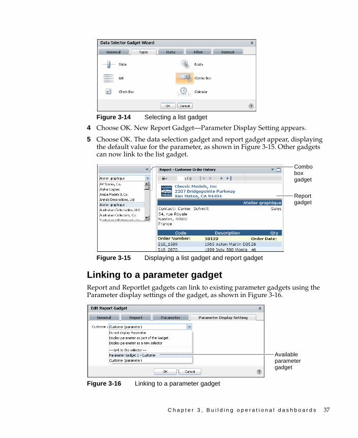
C h a p t e r 3 , B u i l d i n g o p e r a t i o n a l d a s h b o a r d s 37
Figure 3-14 Selecting a list gadget
4 Choose OK. New Report Gadget—Parameter Display Setting appears.
5 Choose OK. The data selection gadget and report gadget appear, displaying the default value for the parameter, as shown in Figure 3-15. Other gadgets can now link to the list gadget.
Figure 3-15 Displaying a list gadget and report gadget
Linking to a parameter gadgetReport and Reportlet gadgets can link to existing parameter gadgets using the Parameter display settings of the gadget, as shown in Figure 3-16.
Figure 3-16 Linking to a parameter gadget
Combo box gadget
Report gadget
Available parameter gadget

38 B u i l d i n g B I R T D a s h b o a r d s
Linking to a data selection gadgetIf existing data selection gadgets are already on the dashboard, the report gadget can link to those gadgets. Changes made to the data selection gadget update data in the linked report gadget. For example, consider a report gadget that has a parameter requiring a customer name. A data selection gadget already exists on the dashboard and lists customer names. You can set up the new report gadget to link to the existing data selection gadget.
For more information about linking gadgets, see “About linking gadgets together” in Chapter 6, “Linking and scripting gadgets.”
Using dynamic filter parametersIf a BIRT document or design file includes dynamic filter parameters, those parameters must be hidden, displayed as part of the gadget, or linked to an existing parameter gadget. Parameter gadgets can display dynamic filters.
About extras gadgetsExtras gadgets display external files or embedded HTML, CSS, and JavaScript code. Table 3-2 shows the extras gadgets available to use in a dashboard.
Table 3-2 Extras gadget types
Icon Type Purpose
HTML HTML gadgets contain external web site URL or embedded HTML, CSS, or JavaScript code. The gadget displays this external content or web site.
Image Image gadgets contain external image URL. The image appears on the dashboard page through an Adobe Flash-based image viewer. The following image types are supported: .jpg, .png, .gif.
Import gadget
Import gadgets display external gadget XML files. This gadget contains the external URL to a gadget file. The import gadget supports Google gadgets following the Google gadget XML specification.
Text Text gadgets contain HTML-formatted text. When editing text in the gadget, an HTML text editor appears for visual or HTML source editing.
Video Video gadgets contain external video URL from an external media server. This gadget supports embedded HTML or JavaScript code. The gadget displays this external content.

C h a p t e r 3 , B u i l d i n g o p e r a t i o n a l d a s h b o a r d s 39
Flash charts are also available in the Extras category. These are Flash versions of the charts in the Data Visualization gadget category.
For more information about displaying external content on a dashboard, see “Managing external resources” in Chapter 7, “Managing dashboard resources.”
Setting general gadget options All extras gadgets have general options to display the gadget on the dashboard. The following general gadget options are available after an extras gadget is created:
■ Auto Refresh
■ Dimensions
■ Enable Scroll bar
■ Show Border
■ Show Header
Auto refresh sets a gadget to refresh at a set frequency. This causes the gadget and its content to be reloaded at the set interval. Dashboard developers can set the exact size of the gadget using Dimensions. You can set the width only when the gadget is floating or in a dashboard using the free form layout.
Showing the header or border makes those parts of the gadget visible. Enabling the scroll bar displays a scroll bar when the gadget content extends beyond the size of the gadget. These options appear when editing a gadget, as shown in Figure 3-17.
Figure 3-17 Configuring general options for extras gadgets
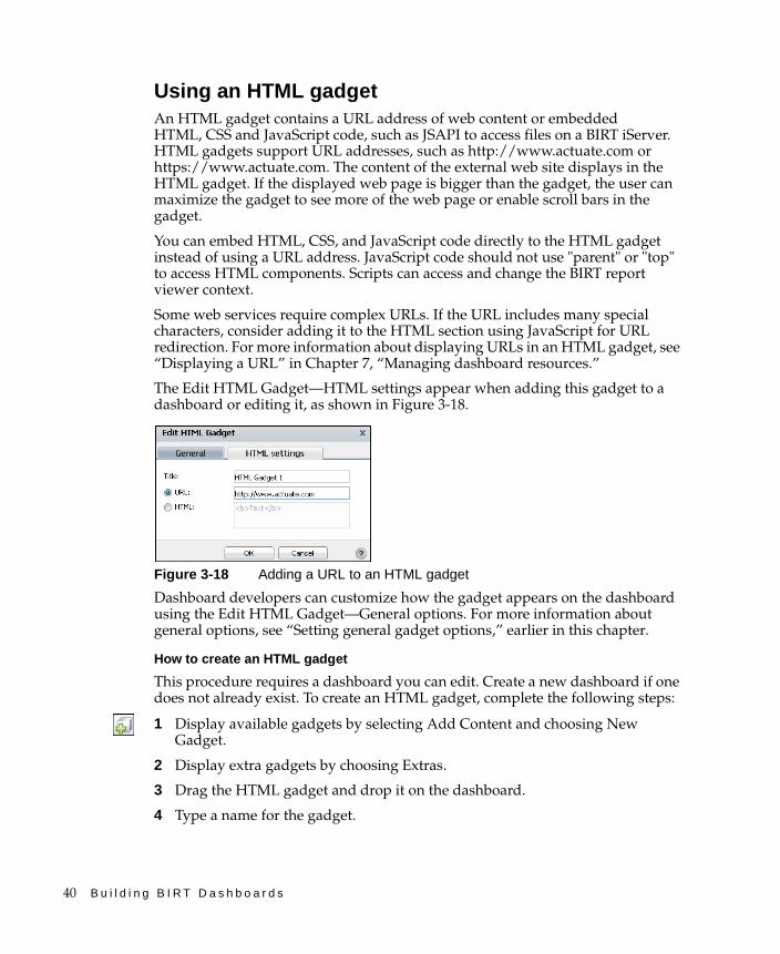
40 B u i l d i n g B I R T D a s h b o a r d s
Using an HTML gadgetAn HTML gadget contains a URL address of web content or embedded HTML, CSS and JavaScript code, such as JSAPI to access files on a BIRT iServer. HTML gadgets support URL addresses, such as http://www.actuate.com or https://www.actuate.com. The content of the external web site displays in the HTML gadget. If the displayed web page is bigger than the gadget, the user can maximize the gadget to see more of the web page or enable scroll bars in the gadget.
You can embed HTML, CSS, and JavaScript code directly to the HTML gadget instead of using a URL address. JavaScript code should not use "parent" or "top" to access HTML components. Scripts can access and change the BIRT report viewer context.
Some web services require complex URLs. If the URL includes many special characters, consider adding it to the HTML section using JavaScript for URL redirection. For more information about displaying URLs in an HTML gadget, see “Displaying a URL” in Chapter 7, “Managing dashboard resources.”
The Edit HTML Gadget—HTML settings appear when adding this gadget to a dashboard or editing it, as shown in Figure 3-18.
Figure 3-18 Adding a URL to an HTML gadget
Dashboard developers can customize how the gadget appears on the dashboard using the Edit HTML Gadget—General options. For more information about general options, see “Setting general gadget options,” earlier in this chapter.
How to create an HTML gadget
This procedure requires a dashboard you can edit. Create a new dashboard if one does not already exist. To create an HTML gadget, complete the following steps:
1 Display available gadgets by selecting Add Content and choosing New Gadget.
2 Display extra gadgets by choosing Extras.
3 Drag the HTML gadget and drop it on the dashboard.
4 Type a name for the gadget.
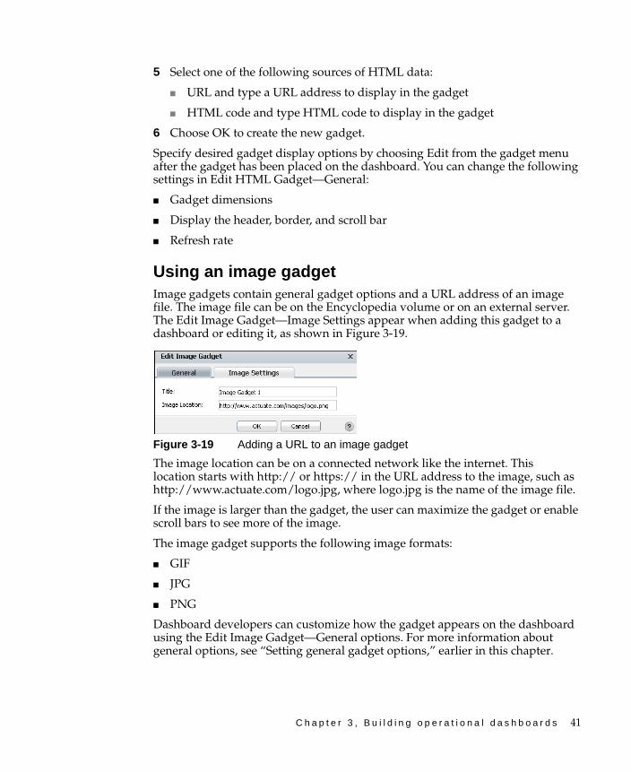
C h a p t e r 3 , B u i l d i n g o p e r a t i o n a l d a s h b o a r d s 41
5 Select one of the following sources of HTML data:
■ URL and type a URL address to display in the gadget
■ HTML code and type HTML code to display in the gadget
6 Choose OK to create the new gadget.
Specify desired gadget display options by choosing Edit from the gadget menu after the gadget has been placed on the dashboard. You can change the following settings in Edit HTML Gadget—General:
■ Gadget dimensions
■ Display the header, border, and scroll bar
■ Refresh rate
Using an image gadgetImage gadgets contain general gadget options and a URL address of an image file. The image file can be on the Encyclopedia volume or on an external server. The Edit Image Gadget—Image Settings appear when adding this gadget to a dashboard or editing it, as shown in Figure 3-19.
Figure 3-19 Adding a URL to an image gadget
The image location can be on a connected network like the internet. This location starts with http:// or https:// in the URL address to the image, such as http://www.actuate.com/logo.jpg, where logo.jpg is the name of the image file.
If the image is larger than the gadget, the user can maximize the gadget or enable scroll bars to see more of the image.
The image gadget supports the following image formats:
■ GIF
■ JPG
■ PNG
Dashboard developers can customize how the gadget appears on the dashboard using the Edit Image Gadget—General options. For more information about general options, see “Setting general gadget options,” earlier in this chapter.
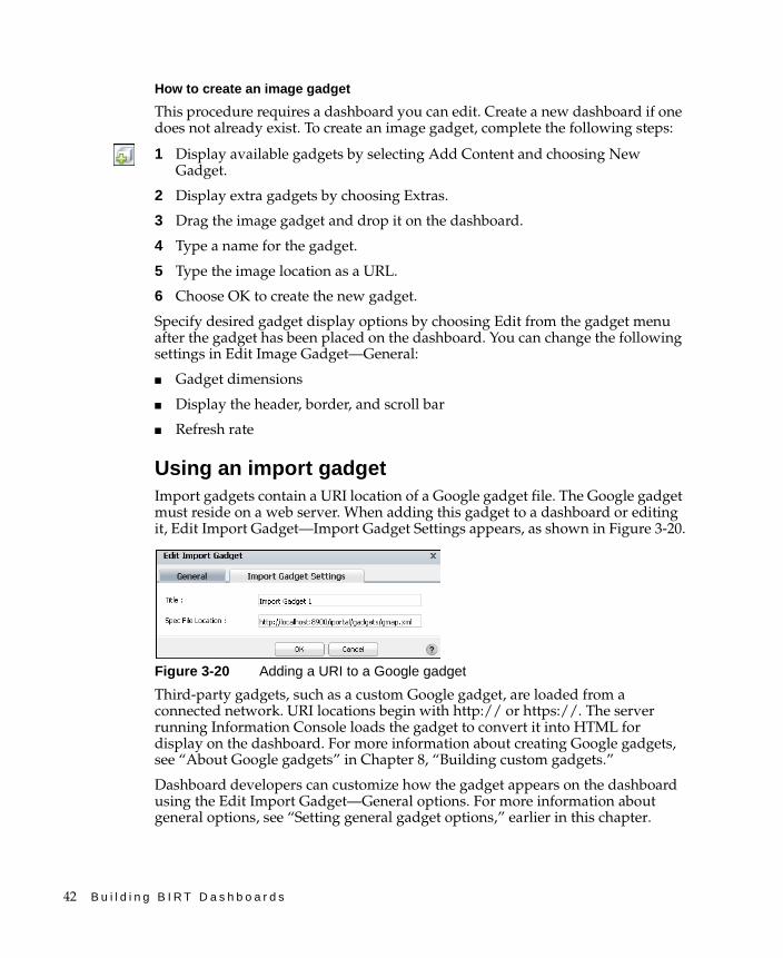
42 B u i l d i n g B I R T D a s h b o a r d s
How to create an image gadget
This procedure requires a dashboard you can edit. Create a new dashboard if one does not already exist. To create an image gadget, complete the following steps:
1 Display available gadgets by selecting Add Content and choosing New Gadget.
2 Display extra gadgets by choosing Extras.
3 Drag the image gadget and drop it on the dashboard.
4 Type a name for the gadget.
5 Type the image location as a URL.
6 Choose OK to create the new gadget.
Specify desired gadget display options by choosing Edit from the gadget menu after the gadget has been placed on the dashboard. You can change the following settings in Edit Image Gadget—General:
■ Gadget dimensions
■ Display the header, border, and scroll bar
■ Refresh rate
Using an import gadgetImport gadgets contain a URI location of a Google gadget file. The Google gadget must reside on a web server. When adding this gadget to a dashboard or editing it, Edit Import Gadget—Import Gadget Settings appears, as shown in Figure 3-20.
Figure 3-20 Adding a URI to a Google gadget
Third-party gadgets, such as a custom Google gadget, are loaded from a connected network. URI locations begin with http:// or https://. The server running Information Console loads the gadget to convert it into HTML for display on the dashboard. For more information about creating Google gadgets, see “About Google gadgets” in Chapter 8, “Building custom gadgets.”
Dashboard developers can customize how the gadget appears on the dashboard using the Edit Import Gadget—General options. For more information about general options, see “Setting general gadget options,” earlier in this chapter.
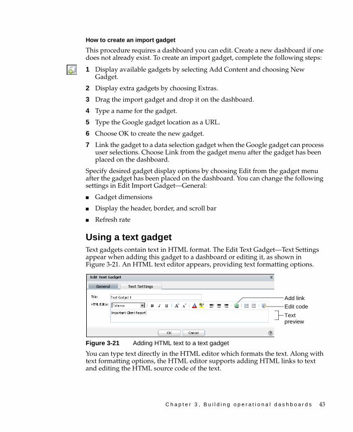
C h a p t e r 3 , B u i l d i n g o p e r a t i o n a l d a s h b o a r d s 43
How to create an import gadget
This procedure requires a dashboard you can edit. Create a new dashboard if one does not already exist. To create an import gadget, complete the following steps:
1 Display available gadgets by selecting Add Content and choosing New Gadget.
2 Display extra gadgets by choosing Extras.
3 Drag the import gadget and drop it on the dashboard.
4 Type a name for the gadget.
5 Type the Google gadget location as a URL.
6 Choose OK to create the new gadget.
7 Link the gadget to a data selection gadget when the Google gadget can process user selections. Choose Link from the gadget menu after the gadget has been placed on the dashboard.
Specify desired gadget display options by choosing Edit from the gadget menu after the gadget has been placed on the dashboard. You can change the following settings in Edit Import Gadget—General:
■ Gadget dimensions
■ Display the header, border, and scroll bar
■ Refresh rate
Using a text gadgetText gadgets contain text in HTML format. The Edit Text Gadget—Text Settings appear when adding this gadget to a dashboard or editing it, as shown in Figure 3-21. An HTML text editor appears, providing text formatting options.
Figure 3-21 Adding HTML text to a text gadget
You can type text directly in the HTML editor which formats the text. Along with text formatting options, the HTML editor supports adding HTML links to text and editing the HTML source code of the text.
Add link
Edit code
Text preview
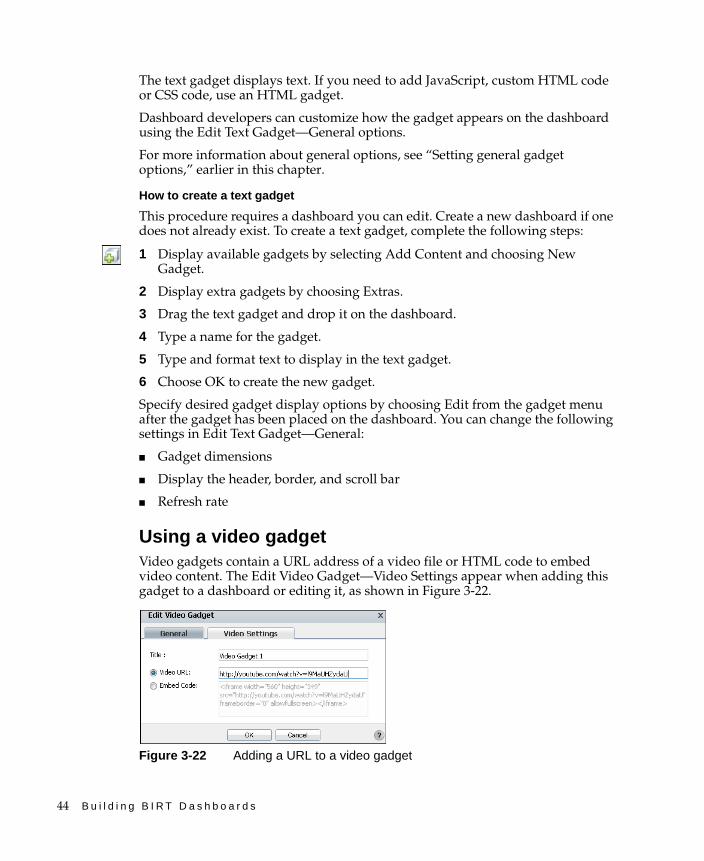
44 B u i l d i n g B I R T D a s h b o a r d s
The text gadget displays text. If you need to add JavaScript, custom HTML code or CSS code, use an HTML gadget.
Dashboard developers can customize how the gadget appears on the dashboard using the Edit Text Gadget—General options.
For more information about general options, see “Setting general gadget options,” earlier in this chapter.
How to create a text gadget
This procedure requires a dashboard you can edit. Create a new dashboard if one does not already exist. To create a text gadget, complete the following steps:
1 Display available gadgets by selecting Add Content and choosing New Gadget.
2 Display extra gadgets by choosing Extras.
3 Drag the text gadget and drop it on the dashboard.
4 Type a name for the gadget.
5 Type and format text to display in the text gadget.
6 Choose OK to create the new gadget.
Specify desired gadget display options by choosing Edit from the gadget menu after the gadget has been placed on the dashboard. You can change the following settings in Edit Text Gadget—General:
■ Gadget dimensions
■ Display the header, border, and scroll bar
■ Refresh rate
Using a video gadgetVideo gadgets contain a URL address of a video file or HTML code to embed video content. The Edit Video Gadget—Video Settings appear when adding this gadget to a dashboard or editing it, as shown in Figure 3-22.
Figure 3-22 Adding a URL to a video gadget
C h a p t e r 3 , B u i l d i n g o p e r a t i o n a l d a s h b o a r d s 45
The video gadget supports URL addresses, such as http://www.youtube.com or https://www.youtube.com. The content of the external web site displays in the video gadget.
You can also add HTML code and JavaScript code directly to the video gadget. Some video web sites support an embedded video player with user customizations by offering HTML code to embed into other web sites. The video gadget can use this HTML code to display the video content.
Dashboard developers can customize how the gadget appears on the dashboard using the Edit Video Gadget—General options. For more information about general options, see “Setting general gadget options,” earlier in this chapter.
How to create a video gadget
This procedure requires a dashboard you can edit. Create a new dashboard if one does not already exist. To create a video gadget, complete the following steps:
1 Display available gadgets by selecting Add Content and choosing New Gadget.
2 Display extra gadgets by choosing Extras.
3 Drag the video gadget and drop it on the dashboard.
4 Type a name for the gadget.
5 Select one of the following sources of video data:
■ Video URL and type a URL address to display in the gadget
■ Embed Code and type HTML code to display in the gadget
6 Choose OK to create the new gadget.
Specify desired gadget display options by choosing Edit from the gadget menu after the gadget has been placed on the dashboard. You can change the following settings in Edit Video Gadget—General:
■ Gadget dimensions
■ Display the header, border, and scroll bar
■ Refresh rate

46 B u i l d i n g B I R T D a s h b o a r d s

C h a p t e r 4 , B u i l d i n g a n a l y t i c d a s h b o a r d s 47
C h a p t e r
4Chapter 4Building analytic
dashboardsThis chapter contains the following topics:
■ About analytic dashboards
■ Using data objects in gadgets
■ About data visualization gadgets
■ Customizing data visualization gadgets
■ About data selection gadgets
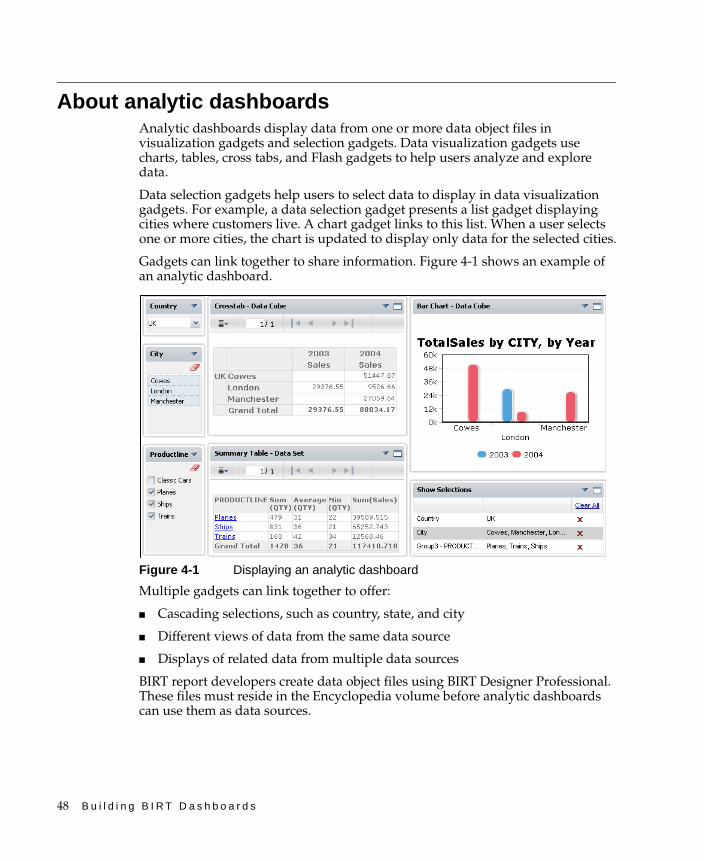
48 B u i l d i n g B I R T D a s h b o a r d s
About analytic dashboardsAnalytic dashboards display data from one or more data object files in visualization gadgets and selection gadgets. Data visualization gadgets use charts, tables, cross tabs, and Flash gadgets to help users analyze and explore data.
Data selection gadgets help users to select data to display in data visualization gadgets. For example, a data selection gadget presents a list gadget displaying cities where customers live. A chart gadget links to this list. When a user selects one or more cities, the chart is updated to display only data for the selected cities.
Gadgets can link together to share information. Figure 4-1 shows an example of an analytic dashboard.
Figure 4-1 Displaying an analytic dashboard
Multiple gadgets can link together to offer:
■ Cascading selections, such as country, state, and city
■ Different views of data from the same data source
■ Displays of related data from multiple data sources
BIRT report developers create data object files using BIRT Designer Professional. These files must reside in the Encyclopedia volume before analytic dashboards can use them as data sources.
C h a p t e r 4 , B u i l d i n g a n a l y t i c d a s h b o a r d s 49
Using data objects in gadgetsData object files contain one or more data sets or data cubes. Data objects are either a design file or a store file. Data object design files contain only the information to query and add structure to external data sources. These files can cache the queried data as a data object store file.
For example, a data object design file that is only be a few kilobytes in size is saved as a data object store file. The size of the new file is a few megabytes in size because the results from data query are stored inside the data object store file. Data objects can filter data using parameters, if the BIRT developer included them. Filtered data objects limit the data that appears in all gadgets that use them.
Dashboard developers can also filter the data displayed in each gadget using the data settings of the gadget. For example, two chart gadgets using the same data object are on a dashboard. One gadget has a filter condition to display data from 2010 and the other gadget has a filter to display data from 2009. Additionally, data visualization gadgets support interactive filtering by the user.
The order of filtering is as follows:
■ Data object parametersThese parameters limit data displayed in all gadgets on the user’s dashboards.
■ Gadget data-source filteringThese filters are applied to each gadget. Users can change these filters if they have permissions to edit the gadget.
■ Data selection gadgetsThese gadgets filter any gadget that links to them.
■ Interactive filteringThese filters use visible data fields in a data visualization gadget. Interactive filtering are applied to data that matches all previous filtering conditions.
If data contain hyperlinks, these hyperlinks can appear in the data visualization gadgets. For example, order numbers in a data object can have hyperlinks to view the invoice for an entire order.
About data object designsA BIRT data object design file contains all the information to connect to an external data source, retrieve data from that data source, and structure the data in a way that supports business analysis. Data objects organize data in tables, called data sets, or in multiple dimensions called data cubes. Parameters can be added by the BIRT report developer to request values for filtering or to use with a script inside the data object design file. Figure 4-2 shows a data object design file opened in BIRT Designer Professional.

50 B u i l d i n g B I R T D a s h b o a r d s
Figure 4-2 Using BIRT Designer Professional to view a data object design file
BIRT data object design files do not store data. When a gadget requests data from a data object design file, one or more queries are sent to the external data source to retrieve data.
Data selection gadgets, such as a list and data visualization gadgets, such as a chart, use BIRT data objects as the source of the data that they display on the dashboard. These files are stored in the Encyclopedia volume’s resource folder. Data object design files use the file-name extension .datadesign.
About data object storesWhen a dashboard uses a data object design, each time the dashboard is refreshed the data object connects to the underlying data source and retrieves data from it. This operation is typically resource-intensive and time consuming. For a more efficient data access alternative, cache the data in a data object store, and use this file as a data source for dashboard gadgets.
Data objects stores, similar to data marts, are repositories of data gathered from corporate data sources to address specific business queries. These files support version storage, for example, a data object store called orders.data can exist as a different version for each quarter of a year or containing data from different countries. This ensures that multiple dashboards use the same data. Dashboard developers can select a specific version or to always use the latest version in a gadget. Data object store files have the file-name extension .data.

C h a p t e r 4 , B u i l d i n g a n a l y t i c d a s h b o a r d s 51
Selecting a data object to displayAnalytic dashboards display data from BIRT data objects. Data visualization and data selection gadgets require a data object file. Each gadget displays data from one data set or data cube in the selected data object. After a data object is used in a dashboards, it appears as an available data object to all other gadgets, as shown in Figure 4-3.
Figure 4-3 Choosing an available data object
To select from additional data objects, choose New Data in Use Data From. Manage Data appears and enables developers to browse, select and refresh available data objects. Figure 4-4 shows an example of selecting available data objects.
Figure 4-4 Viewing available BIRT data store and BIRT data design files
Available data objects
Launch Manage Data
Add to dashboard
Remove from dashboard
Data object version Parameter bindings
Resources folder and sub folders
Refresh data
Data type preview
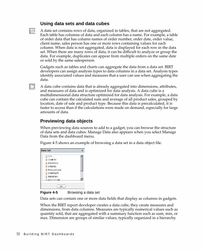
52 B u i l d i n g B I R T D a s h b o a r d s
Using data sets and data cubesA data set contains rows of data, organized in tables, that are not aggregated. Each table has columns of data and each column has a name. For example, a table of order data that has column names of order number, order date, order value, client name, sales person has one or more rows containing values for each column. When data is not aggregated, data is displayed for each row in the data set. When there are many rows of data, it can be difficult to analyze or group the data. For example, duplicates can appear from multiple orders on the same date or sold by the same salesperson.
Gadgets such as tables and charts can aggregate the data from a data set. BIRT developers can assign analysis types to data columns in a data set. Analysis types identify associated values and measures that a user can use when aggregating the data.
A data cube contains data that is already aggregated into dimensions, attributes, and measures of data and is optimized for data analysis. A data cube is a multidimensional data structure optimized for data analysis. For example, a data cube can contain the calculated sum and average of all product sales, grouped by location, date of sale and product type. Because this data is precalculated, it is faster to access than if the calculations were made on demand, especially for large amounts of data.
Previewing data objectsWhen previewing data sources to add to a gadget, you can browse the structure of data sets and data cubes. Manage Data also appears when you select Manage Data from the dashboard menu.
Figure 4-5 shows an example of browsing a data set in a data object file.
Figure 4-5 Browsing a data set
Data sets can contain one or more data fields that display as columns in gadgets.
When the BIRT report developer creates a data cube, they create measures and dimensions, from data columns. Measures are typically numerical values such as quantity sold, that are aggregated with a summary function such as sum, min, or max. Dimension are groups of similar values, typically organized in a hierarchy.
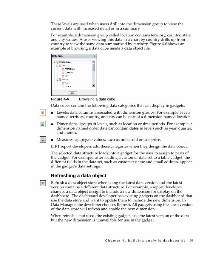
C h a p t e r 4 , B u i l d i n g a n a l y t i c d a s h b o a r d s 53
These levels are used when users drill into the dimension group to view the current data with increased detail or in a summary.
For example, a dimension group called location contains territory, country, state, and city values. A user viewing this data in a chart by country drills up from country to view the same data summarized by territory. Figure 4-6 shows an example of browsing a data cube inside a data object file.
Figure 4-6 Browsing a data cube
Data cubes contain the following data categories that can display in gadgets:
■ Levels: data columns associated with dimension groups. For example, levels named territory, country, and city can be part of a dimension named location.
■ Dimensions: groups of levels, such as location or time periods. For example, a dimension named order date can contain dates in levels such as year, quarter, and month.
■ Measures: aggregate values, such as units sold or sale price.
BIRT report developers add these categories when they design the data object.
The selected data structure loads into a gadget for the user to assign to parts of the gadget. For example, after loading a customer data set to a table gadget, the different fields in the data set, such as customer name and email address, appear in the gadget’s data settings.
Refreshing a data objectRefresh a data object store when using the latest data version and the latest version contains a different data structure. For example, a report developer changes a data object design to include a new dimension for display on the dashboard. The dashboard developer has existing gadgets on the dashboard that use the data store and want to update them to include the new dimension. In Data Manager, the developer chooses Refresh. All gadgets using the latest version of the data store will refresh and enable the new dimension.
When refresh is not used, the existing gadgets use the latest version of the data but the new dimension is unavailable for use in the gadget.
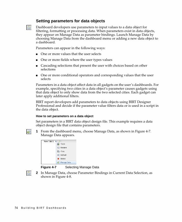
54 B u i l d i n g B I R T D a s h b o a r d s
Setting parameters for data objectsDashboard developers use parameters to input values to a data object for filtering, formatting or processing data. When parameters exist in data objects, they appear on Manage Data as parameter bindings. Launch Manage Data by choosing Manage Data from the dashboard menu or adding a new data object to a dashboard.
Parameters can appear in the following ways:
■ One or more values that the user selects
■ One or more fields where the user types values
■ Cascading selections that present the user with choices based on other selections
■ One or more conditional operators and corresponding values that the user selects
Parameters in a data object affect data in all gadgets on the user’s dashboards. For example, specifying two cities in a data object’s parameter causes gadgets using that data object to only show data from the two selected cities. Each gadget can later apply additional filters.
BIRT report developers add parameters to data objects using BIRT Designer Professional and decide if the parameter value filters data or is used in a script in the data object.
How to set parameters on a data object
Set parameters in a BIRT data object design file. This example requires a data object design file that contains parameters.
1 From the dashboard menu, choose Manage Data, as shown in Figure 4-7. Manage Data appears.
Figure 4-7 Selecting Manage Data
2 In Manage Data, choose Parameter Bindings in Current Data Selection, as shown in Figure 4-8.
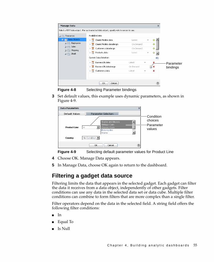
C h a p t e r 4 , B u i l d i n g a n a l y t i c d a s h b o a r d s 55
Figure 4-8 Selecting Parameter bindings
3 Set default values, this example uses dynamic parameters, as shown in Figure 4-9.
Figure 4-9 Selecting default parameter values for Product Line
4 Choose OK. Manage Data appears.
5 In Manage Data, choose OK again to return to the dashboard.
Filtering a gadget data sourceFiltering limits the data that appears in the selected gadget. Each gadget can filter the data it receives from a data object, independently of other gadgets. Filter conditions can use any data in the selected data set or data cube. Multiple filter conditions can combine to form filters that are more complex than a single filter.
Filter operators depend on the data in the selected field. A string field offers the following filter conditions:
■ In
■ Equal To
■ Is Null
Parameter bindings
Condition choicesParameter values

56 B u i l d i n g B I R T D a s h b o a r d s
A number field offers the following additional filter condition operators:
■ Between
■ Greater than
■ Greater than or equal to
■ Less than
■ Less than or equal to
Business users and developers can edit filter conditions in the gadget data settings if they have permission to edit the dashboard in which the gadget is located. Users can interactively add filter conditions to data appearing inside data visualization gadgets, but these additional filters only use data already received by the gadget. Data available for interactive filtering is data that already matches any parameters on the data object, that already matches the data source filtering of the gadget, and that is being displayed in the gadget.
For example, a gadget uses a data object that displays product orders. The data object contains a field naming the country where the product was sold. The gadget does not display the country field. The dashboard developer can filter the gadget’s data source to show orders from selected countries. In the example, users cannot use interactive filtering to select the country because the country does not appear in the gadget. Interactive filtering of the gadget by users can only filter the country field if that field appears in the gadget.
How to filter a data source in a gadget
This example uses a list gadget.
1 From the gadget menu, choose Edit, as shown in Figure 4-10. Data Selector Gadget Wizard appears.
Figure 4-10 Selecting Edit to create a filter
2 In Data Selector Gadget Wizard—Data, choose Filter, as shown in Figure 4-11. Data Selector Gadget Wizard—Filter appears.
Edit
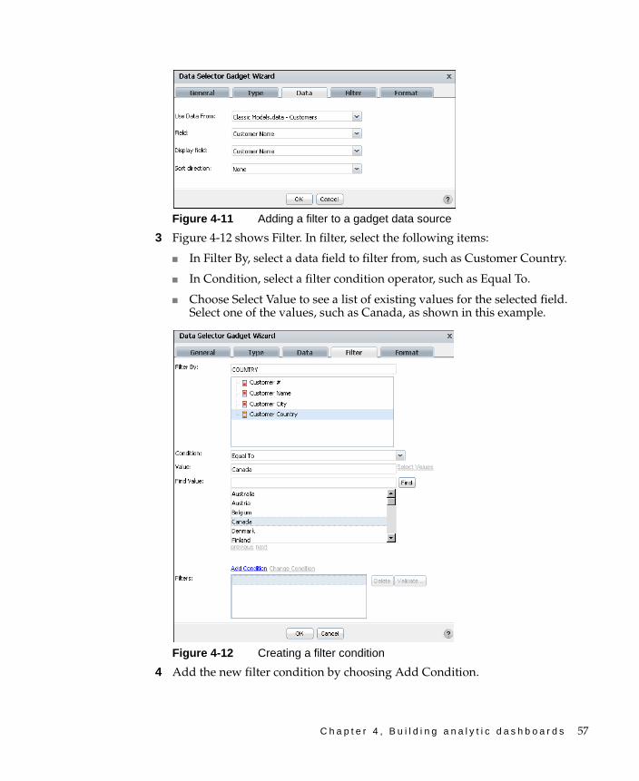
C h a p t e r 4 , B u i l d i n g a n a l y t i c d a s h b o a r d s 57
Figure 4-11 Adding a filter to a gadget data source
3 Figure 4-12 shows Filter. In filter, select the following items:
■ In Filter By, select a data field to filter from, such as Customer Country.
■ In Condition, select a filter condition operator, such as Equal To.
■ Choose Select Value to see a list of existing values for the selected field. Select one of the values, such as Canada, as shown in this example.
Figure 4-12 Creating a filter condition
4 Add the new filter condition by choosing Add Condition.
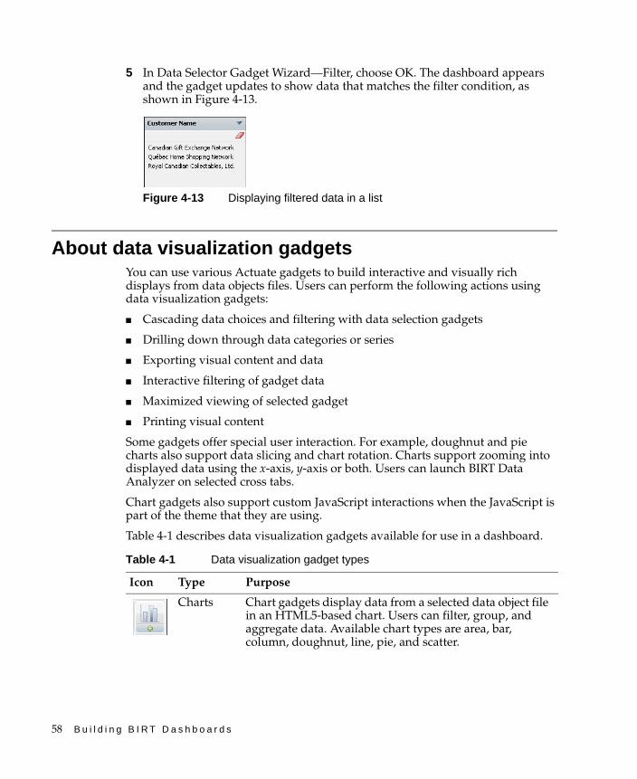
58 B u i l d i n g B I R T D a s h b o a r d s
5 In Data Selector Gadget Wizard—Filter, choose OK. The dashboard appears and the gadget updates to show data that matches the filter condition, as shown in Figure 4-13.
Figure 4-13 Displaying filtered data in a list
About data visualization gadgetsYou can use various Actuate gadgets to build interactive and visually rich displays from data objects files. Users can perform the following actions using data visualization gadgets:
■ Cascading data choices and filtering with data selection gadgets
■ Drilling down through data categories or series
■ Exporting visual content and data
■ Interactive filtering of gadget data
■ Maximized viewing of selected gadget
■ Printing visual content
Some gadgets offer special user interaction. For example, doughnut and pie charts also support data slicing and chart rotation. Charts support zooming into displayed data using the x-axis, y-axis or both. Users can launch BIRT Data Analyzer on selected cross tabs.
Chart gadgets also support custom JavaScript interactions when the JavaScript is part of the theme that they are using.
Table 4-1 describes data visualization gadgets available for use in a dashboard.
Table 4-1 Data visualization gadget types
Icon Type Purpose
Charts Chart gadgets display data from a selected data object file in an HTML5-based chart. Users can filter, group, and aggregate data. Available chart types are area, bar, column, doughnut, line, pie, and scatter.
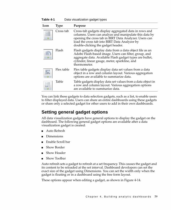
C h a p t e r 4 , B u i l d i n g a n a l y t i c d a s h b o a r d s 59
You can link these gadgets to data selection gadgets, such as a list, to enable users to filter displayed data. Users can share an entire dashboards using these gadgets or share only a selected gadget for other users to add in their own dashboards.
Setting general gadget optionsAll data visualization gadgets have general options to display the gadget on the dashboard. The following general gadget options are available after a data visualization gadget is created:
■ Auto Refresh
■ Dimensions
■ Enable Scroll bar
■ Show Border
■ Show Header
■ Show Toolbar
Auto refresh sets a gadget to refresh at a set frequency. This causes the gadget and its content to be reloaded at the set interval. Dashboard developers can set the exact size of the gadget using Dimensions. You can set the width only when the gadget is floating or in a dashboard using the free form layout.
These options appear when editing a gadget, as shown in Figure 4-14.
Cross tab Cross-tab gadgets display aggregated data in rows and columns. Users can analyze and manipulate this data by opening the cross tab in BIRT Data Analyzer. Users can load the cross tab into BIRT Data Analyzer by double-clicking the gadget header.
Flash Flash gadgets display data from a data object file as an Adobe Flash-based image. Users can filter, group, and aggregate data. Available Flash gadget types are bullet, cylinder, linear gauge, meter, sparkline, and thermometer.
Flex table Flex table gadgets display data set values from a data object in a row and column layout. Various aggregation options are available to summarize data.
Table Table gadgets display data set values from a data object in a row and column layout. Various aggregation options are available to summarize data.
Table 4-1 Data visualization gadget types
Icon Type Purpose
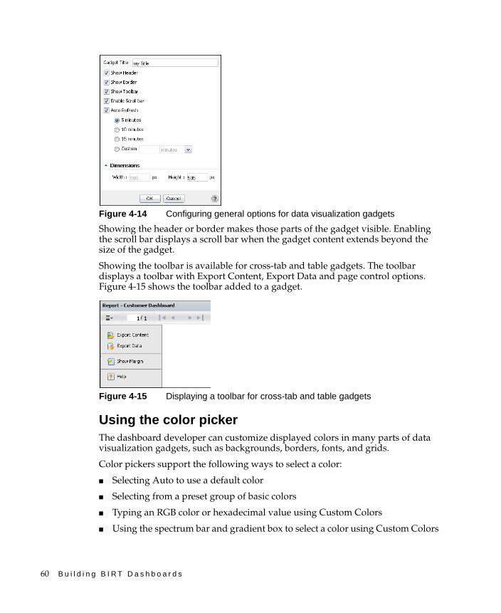
60 B u i l d i n g B I R T D a s h b o a r d s
Figure 4-14 Configuring general options for data visualization gadgets
Showing the header or border makes those parts of the gadget visible. Enabling the scroll bar displays a scroll bar when the gadget content extends beyond the size of the gadget.
Showing the toolbar is available for cross-tab and table gadgets. The toolbar displays a toolbar with Export Content, Export Data and page control options. Figure 4-15 shows the toolbar added to a gadget.
Figure 4-15 Displaying a toolbar for cross-tab and table gadgets
Using the color pickerThe dashboard developer can customize displayed colors in many parts of data visualization gadgets, such as backgrounds, borders, fonts, and grids.
Color pickers support the following ways to select a color:
■ Selecting Auto to use a default color
■ Selecting from a preset group of basic colors
■ Typing an RGB color or hexadecimal value using Custom Colors
■ Using the spectrum bar and gradient box to select a color using Custom Colors
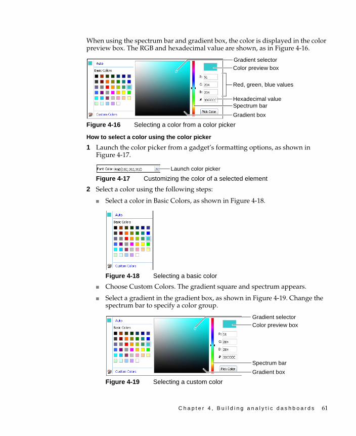
C h a p t e r 4 , B u i l d i n g a n a l y t i c d a s h b o a r d s 61
When using the spectrum bar and gradient box, the color is displayed in the color preview box. The RGB and hexadecimal value are shown, as in Figure 4-16.
Figure 4-16 Selecting a color from a color picker
How to select a color using the color picker
1 Launch the color picker from a gadget’s formatting options, as shown in Figure 4-17.
Figure 4-17 Customizing the color of a selected element
2 Select a color using the following steps:
■ Select a color in Basic Colors, as shown in Figure 4-18.
Figure 4-18 Selecting a basic color
■ Choose Custom Colors. The gradient square and spectrum appears.
■ Select a gradient in the gradient box, as shown in Figure 4-19. Change the spectrum bar to specify a color group.
Figure 4-19 Selecting a custom color
Gradient selector
Red, green, blue values
Gradient box
Hexadecimal valueSpectrum bar
Color preview box
Launch color picker
Gradient selector
Gradient box
Spectrum bar
Color preview box
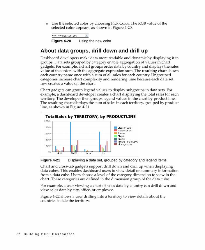
62 B u i l d i n g B I R T D a s h b o a r d s
■ Use the selected color by choosing Pick Color. The RGB value of the selected color appears, as shown in Figure 4-20.
Figure 4-20 Using the new color
About data groups, drill down and drill upDashboard developers make data more readable and dynamic by displaying it in groups. Data sets grouped by category enable aggregation of values in chart gadgets. For example, a chart groups order data by country and displays the sales value of the orders with the aggregate expression sum. The resulting chart shows each country name once with a sum of all sales for each country. Ungrouped categories increase chart complexity and rendering time because each data set row creates a value on the chart.
Chart gadgets can group legend values to display subgroups in data sets. For example, a dashboard developer creates a chart displaying the total sales for each territory. The developer then groups legend values in the chart by product line. The resulting chart displays the sum of sales in each territory, grouped by product line, as shown in Figure 4-21.
Figure 4-21 Displaying a data set, grouped by category and legend items
Chart and cross-tab gadgets support drill down and drill up when displaying data cubes. This enables dashboard users to view detail or summary information from a data cube. Users choose a level of the category dimension to view in the chart. These categories are defined in the dimension group of the data cube.
For example, a user viewing a chart of sales data by country can drill down and view sales data by city, office, or employee.
Figure 4-22 shows a user drilling into a territory to view details about the countries inside the territory.
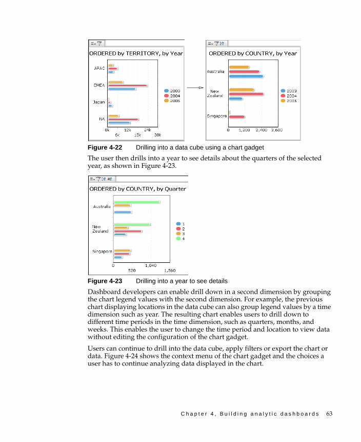
C h a p t e r 4 , B u i l d i n g a n a l y t i c d a s h b o a r d s 63
Figure 4-22 Drilling into a data cube using a chart gadget
The user then drills into a year to see details about the quarters of the selected year, as shown in Figure 4-23.
Figure 4-23 Drilling into a year to see details
Dashboard developers can enable drill down in a second dimension by grouping the chart legend values with the second dimension. For example, the previous chart displaying locations in the data cube can also group legend values by a time dimension such as year. The resulting chart enables users to drill down to different time periods in the time dimension, such as quarters, months, and weeks. This enables the user to change the time period and location to view data without editing the configuration of the chart gadget.
Users can continue to drill into the data cube, apply filters or export the chart or data. Figure 4-24 shows the context menu of the chart gadget and the choices a user has to continue analyzing data displayed in the chart.
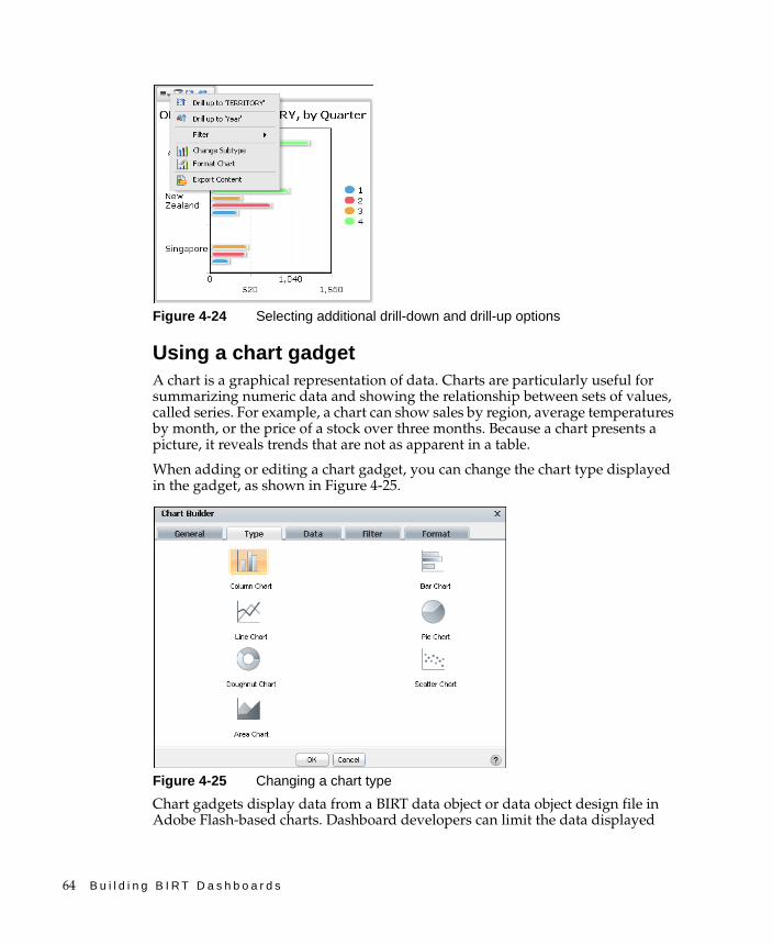
64 B u i l d i n g B I R T D a s h b o a r d s
Figure 4-24 Selecting additional drill-down and drill-up options
Using a chart gadgetA chart is a graphical representation of data. Charts are particularly useful for summarizing numeric data and showing the relationship between sets of values, called series. For example, a chart can show sales by region, average temperatures by month, or the price of a stock over three months. Because a chart presents a picture, it reveals trends that are not as apparent in a table.
When adding or editing a chart gadget, you can change the chart type displayed in the gadget, as shown in Figure 4-25.
Figure 4-25 Changing a chart type
Chart gadgets display data from a BIRT data object or data object design file in Adobe Flash-based charts. Dashboard developers can limit the data displayed
C h a p t e r 4 , B u i l d i n g a n a l y t i c d a s h b o a r d s 65
using filters, aggregate data sets, enable drill through for data cubes, and group data by values or dimensions. Users can filter displayed data and export content and data using the context menu.
Dashboard developers can customize chart gadget options using the Chart Builder—General options. For more information about general options, see “Setting general gadget options,” earlier in this chapter.
How to create a chart gadget
This procedure requires a dashboard you can edit. Create a new dashboard if one does not already exist. To create a chart gadget, complete the following steps:
1 Display available gadgets by selecting Add Content and choosing New Gadget.
2 Choose the Data Visualization folder. If the folder is not visible, choose Home first.
3 Drag a chart gadget type, such as a column chart and drop it on the dashboard.
4 Specify the desired gadget appearance in Chart Builder—General:
■ Display the header, border, and scroll bar
■ Gadget title
■ Refresh rate
5 To select the data to display in the chart, complete the following steps:
1 In Chart Builder—Data—Use Data From, select a data source.
2 Select fields from the data source to display in the chart.
3 Specify data aggregations and groups as desired.
6 Limit displayed data with filter conditions, if desired, in Chart Builder—Filter.
7 Format the chart, if desired, using chart options in Chart Builder—Format:
■ Select a BIRT chart theme.
■ Set the chart size within the gadget.
■ Select a chart subtype, such as side-by-side, stacked, or percent stacked.
■ Enable zoom on the x-axis, y-axis or both for user data selection.
8 Choose OK to create the new gadget.
Enable interactive filtering, if desired, by linking the chart to a data selection gadget. After the chart is placed on the dashboard, it links to data selection gadgets that use the same data source. You can remove these links or add new ones.

66 B u i l d i n g B I R T D a s h b o a r d s
Displaying data in chartsAdding a chart gadget to a dashboard or editing it, displays Chart Builder—Data, where the developer selects data to display in the chart. Chart gadgets can display data from any data set or cube in a single data object file. The dashboard developer assigns the data to the different parts of the chart. Each chart type presents data differently. If hyperlinks exist in the data object file, they can appear in the chart by selecting Chart Builder—Data—Use default hyperlink.
Chart gadgets that display data cubes enable users to drill down into category and series data. For example, a chart showing stock by year and country supports drill-down to look at the time category in greater detail such as quarters or months. After finding the right time view, the user can then drill down to a more detailed location view like city.
Dashboard developers can also limit the data that appears in the gadget by using Chart Builder—Filter to create filter conditions. For more information about filtering, see “Filtering a gadget data source,” earlier in this chapter.
Tooltips can appear in a chart gadget and display the following information:
■ Category data
■ Values from a column in a data set
■ Value data
■ Value series name
Area, bar, column, line and scatter chart gadgets can display and group data categories, like names of countries or product types, as shown in Figure 4-26.
Figure 4-26 Selecting data to display as an area, bar, column, line, or scatter chart

C h a p t e r 4 , B u i l d i n g a n a l y t i c d a s h b o a r d s 67
When grouping category values or legend items that are dates, an additional option for selecting the time interval appears. For example, grouping category values by an order date enables the developer to select a time interval of years, quarters, months, weeks, and days. The chart displays data grouped to the selected time interval.
Pie and doughnut chart gadgets use slices to group and display categories of data, such as names of countries or product types, as shown in Figure 4-27. Values define the size of each slice relative to the other slices.
Figure 4-27 Selecting data to display as a pie or doughnut chart
Dashboard developers can use aggregate expressions to summarize data set values. Values from a data cube are already aggregated. Table 4-2 shows the aggregate expressions available in chart gadgets.
Table 4-2 Aggregate expressions for chart gadgets
Function Description
Average Returns the average of the values
Count Returns the number of values, including duplicate values
Distinct Count Returns the number of values, excluding duplicate values
First Returns the first value among the values
Last Returns the last value among the values
Max Returns the largest value among the values
Min Returns the smallest value among the values
Sum Returns the sum of the values
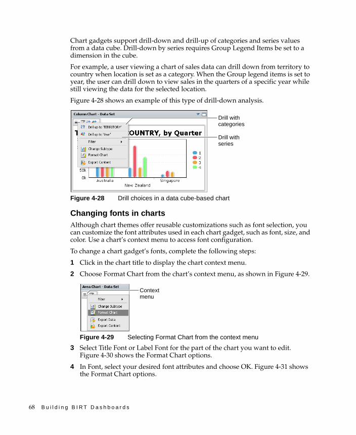
68 B u i l d i n g B I R T D a s h b o a r d s
Chart gadgets support drill-down and drill-up of categories and series values from a data cube. Drill-down by series requires Group Legend Items be set to a dimension in the cube.
For example, a user viewing a chart of sales data can drill down from territory to country when location is set as a category. When the Group legend items is set to year, the user can drill down to view sales in the quarters of a specific year while still viewing the data for the selected location.
Figure 4-28 shows an example of this type of drill-down analysis.
Figure 4-28 Drill choices in a data cube-based chart
Changing fonts in chartsAlthough chart themes offer reusable customizations such as font selection, you can customize the font attributes used in each chart gadget, such as font, size, and color. Use a chart’s context menu to access font configuration.
To change a chart gadget’s fonts, complete the following steps:
1 Click in the chart title to display the chart context menu.
2 Choose Format Chart from the chart’s context menu, as shown in Figure 4-29.
Figure 4-29 Selecting Format Chart from the context menu
3 Select Title Font or Label Font for the part of the chart you want to edit. Figure 4-30 shows the Format Chart options.
4 In Font, select your desired font attributes and choose OK. Figure 4-31 shows the Format Chart options.
Drill with series
Drill with categories
Context menu
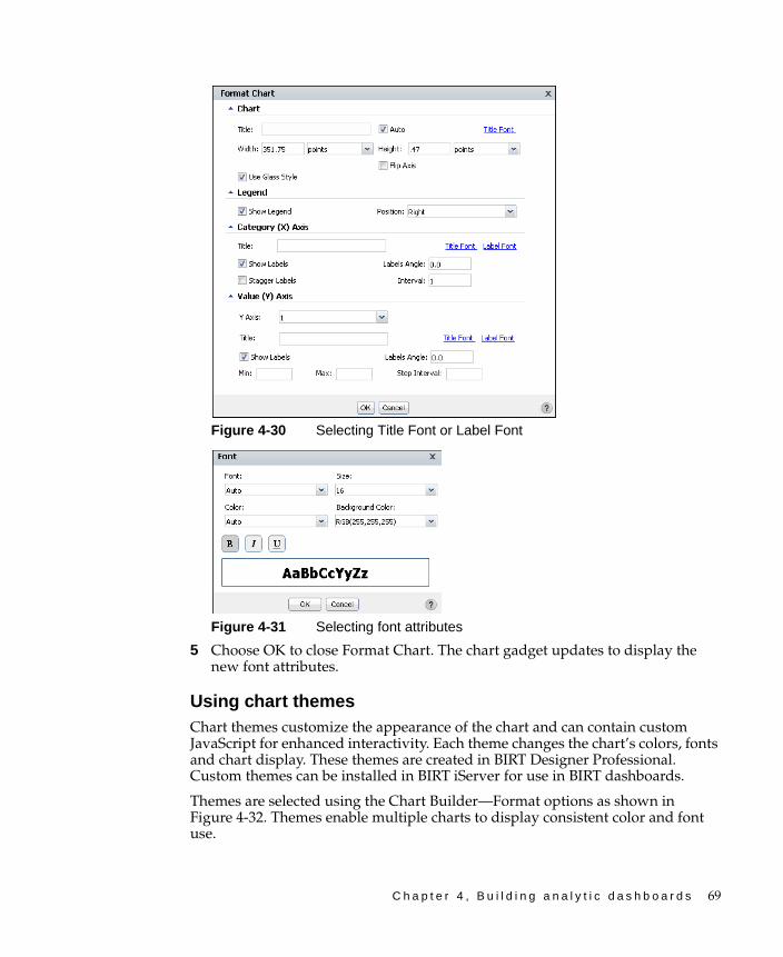
C h a p t e r 4 , B u i l d i n g a n a l y t i c d a s h b o a r d s 69
Figure 4-30 Selecting Title Font or Label Font
Figure 4-31 Selecting font attributes
5 Choose OK to close Format Chart. The chart gadget updates to display the new font attributes.
Using chart themesChart themes customize the appearance of the chart and can contain custom JavaScript for enhanced interactivity. Each theme changes the chart’s colors, fonts and chart display. These themes are created in BIRT Designer Professional. Custom themes can be installed in BIRT iServer for use in BIRT dashboards.
Themes are selected using the Chart Builder—Format options as shown in Figure 4-32. Themes enable multiple charts to display consistent color and font use.
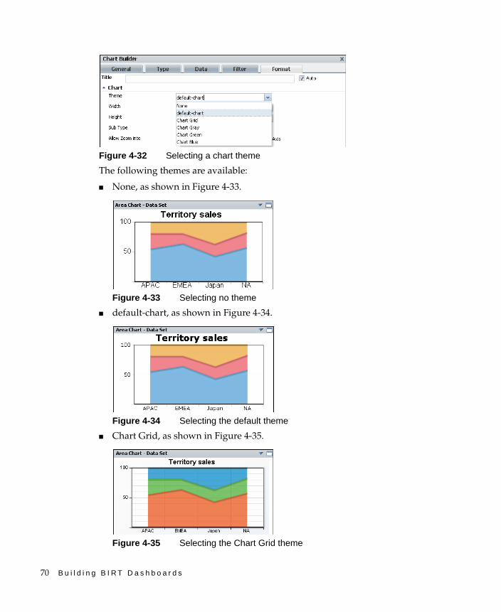
70 B u i l d i n g B I R T D a s h b o a r d s
Figure 4-32 Selecting a chart theme
The following themes are available:
■ None, as shown in Figure 4-33.
Figure 4-33 Selecting no theme
■ default-chart, as shown in Figure 4-34.
Figure 4-34 Selecting the default theme
■ Chart Grid, as shown in Figure 4-35.
Figure 4-35 Selecting the Chart Grid theme
C h a p t e r 4 , B u i l d i n g a n a l y t i c d a s h b o a r d s 71
■ Chart Gray, as shown in Figure 4-36.
Figure 4-36 Selecting the Chart Gray theme
■ Chart Green, as shown in Figure 4-37.
Figure 4-37 Selecting the Chart Green theme
■ Chart Blue, as shown in Figure 4-38.
Figure 4-38 Selecting the Chart Blue theme
Formatting an area chartAn area chart displays data values as a set of points, connected by a line, with the area below the line filled. You typically use an area chart to present data that occurs over a continuous period of time. You can format an area chart gadget to modify its appearance on a dashboard using Chart Builder.

72 B u i l d i n g B I R T D a s h b o a r d s
Figure 4-39 shows the elements that you can modify.
Figure 4-39 Displaying a percent stacked area chart
Choose Edit from the gadget menu or create a new gadget to open Chart Builder. In Chart Builder, select Format to see formatting options. The following formatting options are available for an area chart:
■ Change the title of the chart.If Auto is selected for the chart’s title, the chart title changes as a user drills down to view more detailed data or drills up to view summary data.
For example, a chart title of TotalSales by Country, changes to TotalSales by City when a user drills down to display cities of a selected country. Remove the auto selection to prevent the title from changing.
Figure 4-40 shows these options.
Figure 4-40 Formatting an area chart
■ Use Chart options to change the chart display, such as width and height. Select a chart theme to change the appearance of the chart. For more information about themes, see “Using chart themes,” earlier in this chapter.
If you are displaying multiple values, the chart subtype can be set to display these values as overlay, stacked or percent stacked. Selecting the glass style displays the chart bars with a glass-like fill.
Legend
Steps
Values title
Chart title
Tooltip
Categories labels Categories title
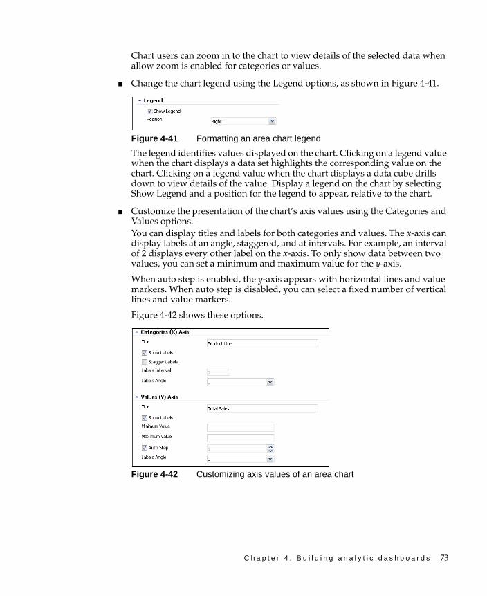
C h a p t e r 4 , B u i l d i n g a n a l y t i c d a s h b o a r d s 73
Chart users can zoom in to the chart to view details of the selected data when allow zoom is enabled for categories or values.
■ Change the chart legend using the Legend options, as shown in Figure 4-41.
Figure 4-41 Formatting an area chart legend
The legend identifies values displayed on the chart. Clicking on a legend value when the chart displays a data set highlights the corresponding value on the chart. Clicking on a legend value when the chart displays a data cube drills down to view details of the value. Display a legend on the chart by selecting Show Legend and a position for the legend to appear, relative to the chart.
■ Customize the presentation of the chart’s axis values using the Categories and Values options.You can display titles and labels for both categories and values. The x-axis can display labels at an angle, staggered, and at intervals. For example, an interval of 2 displays every other label on the x-axis. To only show data between two values, you can set a minimum and maximum value for the y-axis.
When auto step is enabled, the y-axis appears with horizontal lines and value markers. When auto step is disabled, you can select a fixed number of vertical lines and value markers.
Figure 4-42 shows these options.
Figure 4-42 Customizing axis values of an area chart

74 B u i l d i n g B I R T D a s h b o a r d s
Formatting a bar chartA bar chart displays data values as a set of horizontal bars and is useful for displaying data side-by-side for easy comparison. You can format a bar chart gadget to modify its appearance on a dashboard using Chart Builder.
Figure 4-43 shows the elements that you can modify.
Figure 4-43 Displaying a stacked bar chart gadget
Choose Edit from the gadget menu or create a new gadget to open Chart Builder. In Chart Builder, select Format to see formatting options. The following formatting options are available for a bar chart:
■ Change the title of the chart. If Auto is selected for the chart’s title, the chart title changes as a user drills down to view more detailed data or drills up to view summary data.
For example, a chart title of TotalSales by Country, changes to TotalSales by City when a user drills down to display cities of a selected country. Remove the Auto selection to prevent the title from changing.
Figure 4-44 shows these options.
Figure 4-44 Formatting a bar chart
■ Use Chart options to change the chart display, such as width and height. Select a chart theme to change the appearance of the chart. For more information about themes, see “Using chart themes,” earlier in this chapter.
Values title
Category labels
Categories title
Chart title
Steps
Legend
Tooltip
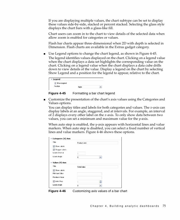
C h a p t e r 4 , B u i l d i n g a n a l y t i c d a s h b o a r d s 75
If you are displaying multiple values, the chart subtype can be set to display these values side-by-side, stacked or percent stacked. Selecting the glass style displays the chart bars with a glass-like fill.
Chart users can zoom in to the chart to view details of the selected data when allow zoom is enabled for categories or values.
Flash bar charts appear three-dimensional when 2D with depth is selected in Dimension. Flash charts are available in the Extras gadget category.
■ Use Legend options to change the chart legend, as shown in Figure 4-45.The legend identifies values displayed on the chart. Clicking on a legend value when the chart displays a data set highlights the corresponding value on the chart. Clicking on a legend value when the chart displays a data cube drills down to view details of the value. Display a legend on the chart by selecting Show Legend and a position for the legend to appear, relative to the chart.
Figure 4-45 Formatting a bar chart legend
■ Customize the presentation of the chart’s axis values using the Categories and Values options. You can display titles and labels for both categories and values. The x-axis can display labels at an angle, staggered, and at intervals. For example, an interval of 2 displays every other label on the x-axis. To only show data between two values, you can set a minimum and maximum value for the y-axis.
When auto step is enabled, the y-axis appears with horizontal lines and value markers. When auto step is disabled, you can select a fixed number of vertical lines and value markers. Figure 4-46 shows these options.
Figure 4-46 Customizing axis values of a bar chart
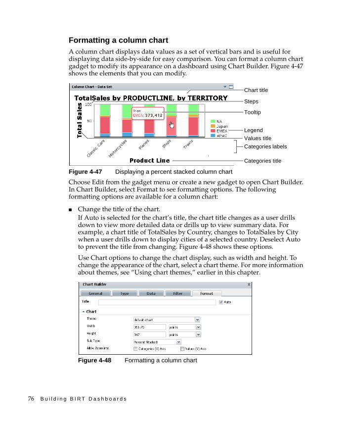
76 B u i l d i n g B I R T D a s h b o a r d s
Formatting a column chartA column chart displays data values as a set of vertical bars and is useful for displaying data side-by-side for easy comparison. You can format a column chart gadget to modify its appearance on a dashboard using Chart Builder. Figure 4-47 shows the elements that you can modify.
Figure 4-47 Displaying a percent stacked column chart
Choose Edit from the gadget menu or create a new gadget to open Chart Builder. In Chart Builder, select Format to see formatting options. The following formatting options are available for a column chart:
■ Change the title of the chart.If Auto is selected for the chart’s title, the chart title changes as a user drills down to view more detailed data or drills up to view summary data. For example, a chart title of TotalSales by Country, changes to TotalSales by City when a user drills down to display cities of a selected country. Deselect Auto to prevent the title from changing. Figure 4-48 shows these options.
Use Chart options to change the chart display, such as width and height. To change the appearance of the chart, select a chart theme. For more information about themes, see “Using chart themes,” earlier in this chapter.
Figure 4-48 Formatting a column chart
Values title
Legend
Chart title
Tooltip
Categories title
Steps
Categories labels

C h a p t e r 4 , B u i l d i n g a n a l y t i c d a s h b o a r d s 77
If you are displaying multiple values, the chart subtype can be set to display these values side-by-side, stacked or percent stacked. Selecting the glass style displays the chart bars with a glass-like fill.
Chart users can zoom in to the chart to view details of the selected data when allow zoom is enabled for categories or values.
Flash column charts appear three-dimensional when 2D with depth is selected in Dimension. Flash charts are available in the Extras gadget category.
■ Change the chart legend using the Legend options, as shown in Figure 4-49.The legend identifies values displayed on the chart. Clicking on a legend value when the chart displays a data set highlights the corresponding value on the chart. Clicking on a legend value when the chart displays a data cube drills down to view details of the value. Display a legend on the chart by selecting Show Legend and a position for the legend to appear, relative to the chart.
Figure 4-49 Formatting a column chart legend
■ Customize the presentation of the chart’s axis values using the Categories and Values options.You can display titles and labels for both categories and values. The x-axis can display labels at an angle, staggered, and at intervals. For example, an interval of 2 displays every other label on the x-axis. To only show data between two values, you can set a minimum and maximum value for the y-axis.
When auto step is enabled, the y-axis appears with horizontal lines and value markers. When auto step is disabled, you can select a fixed number of vertical lines and value markers. Figure 4-50 shows these options.
Figure 4-50 Customizing axis values of a column chart
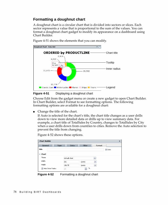
78 B u i l d i n g B I R T D a s h b o a r d s
Formatting a doughnut chartA doughnut chart is a circular chart that is divided into sectors or slices. Each sector represents a value that is proportional to the sum of the values. You can format a doughnut chart gadget to modify its appearance on a dashboard using Chart Builder.
Figure 4-51 shows the elements that you can modify.
Figure 4-51 Displaying a doughnut chart
Choose Edit from the gadget menu or create a new gadget to open Chart Builder. In Chart Builder, select Format to see formatting options. The following formatting options are available for a doughnut chart:
■ Change the title of the chart.If Auto is selected for the chart’s title, the chart title changes as a user drills down to view more detailed data or drills up to view summary data. For example, a chart title of TotalSales by Country, changes to TotalSales by City when a user drills down from countries to cities. Remove the Auto selection to prevent the title from changing.
Figure 4-52 shows these options.
Figure 4-52 Formatting a doughnut chart
Inner radius
Chart title
Tooltip
Legend

C h a p t e r 4 , B u i l d i n g a n a l y t i c d a s h b o a r d s 79
■ Use Chart options to change the chart display, such as width and height. Select a chart theme to change the appearance of the chart. For more information about themes, see “Using chart themes,” earlier in this chapter.
Flash doughnut charts appear three-dimensional when 2D with depth is selected in Dimension. Inner radius, outer radius and rotation of the chart can also be set in the Flash doughnut chart. Flash charts are available in the Extras gadget category.
■ Change the chart legend using the Legend options, as shown in Figure 4-53.The legend identifies values displayed on the chart. Clicking on a legend value when the chart displays a data set highlights the corresponding value on the chart. Clicking on a legend value when the chart displays a data cube drills down to view details of the value. Display a legend on the chart by selecting Show Legend and a position.
Figure 4-53 Formatting a doughnut chart legend
Formatting a line chartA line chart displays data values as a set of points that are connected by a line. You typically use line charts to present large amounts of data that occur over a continuous period of time. You can format a line chart gadget to modify its appearance on a dashboard using Chart Builder.
Figure 4-54 shows the elements that you can modify.
Figure 4-54 Displaying a line chart
Legend
Chart title
Category labels
Tooltip
Value title
Steps
Category title
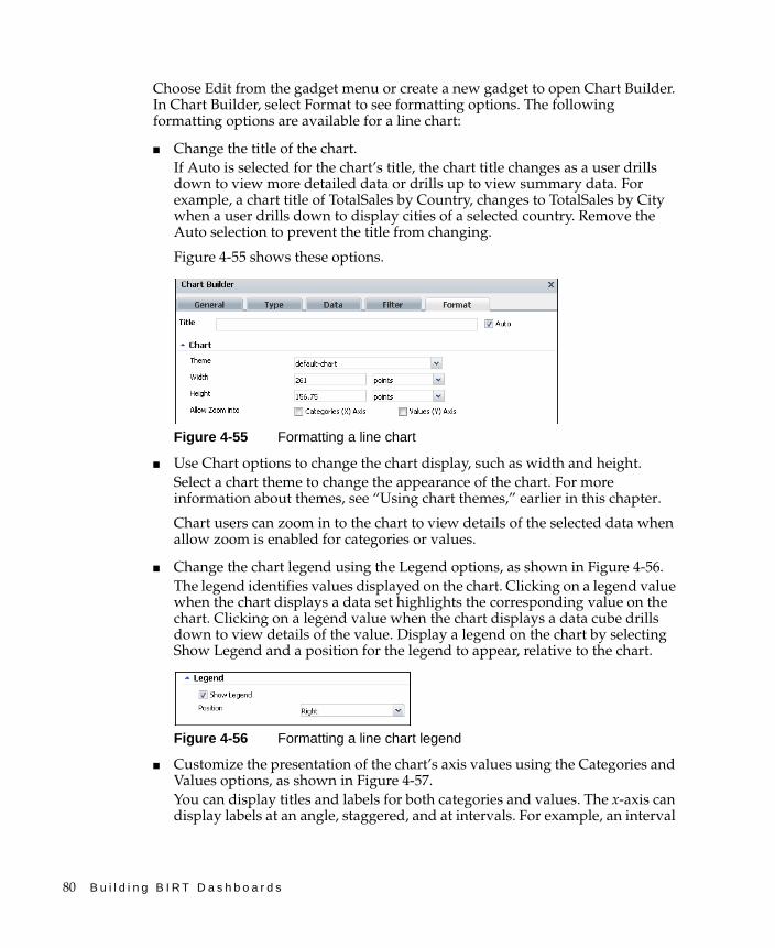
80 B u i l d i n g B I R T D a s h b o a r d s
Choose Edit from the gadget menu or create a new gadget to open Chart Builder. In Chart Builder, select Format to see formatting options. The following formatting options are available for a line chart:
■ Change the title of the chart.If Auto is selected for the chart’s title, the chart title changes as a user drills down to view more detailed data or drills up to view summary data. For example, a chart title of TotalSales by Country, changes to TotalSales by City when a user drills down to display cities of a selected country. Remove the Auto selection to prevent the title from changing.
Figure 4-55 shows these options.
Figure 4-55 Formatting a line chart
■ Use Chart options to change the chart display, such as width and height. Select a chart theme to change the appearance of the chart. For more information about themes, see “Using chart themes,” earlier in this chapter.
Chart users can zoom in to the chart to view details of the selected data when allow zoom is enabled for categories or values.
■ Change the chart legend using the Legend options, as shown in Figure 4-56.The legend identifies values displayed on the chart. Clicking on a legend value when the chart displays a data set highlights the corresponding value on the chart. Clicking on a legend value when the chart displays a data cube drills down to view details of the value. Display a legend on the chart by selecting Show Legend and a position for the legend to appear, relative to the chart.
Figure 4-56 Formatting a line chart legend
■ Customize the presentation of the chart’s axis values using the Categories and Values options, as shown in Figure 4-57.You can display titles and labels for both categories and values. The x-axis can display labels at an angle, staggered, and at intervals. For example, an interval
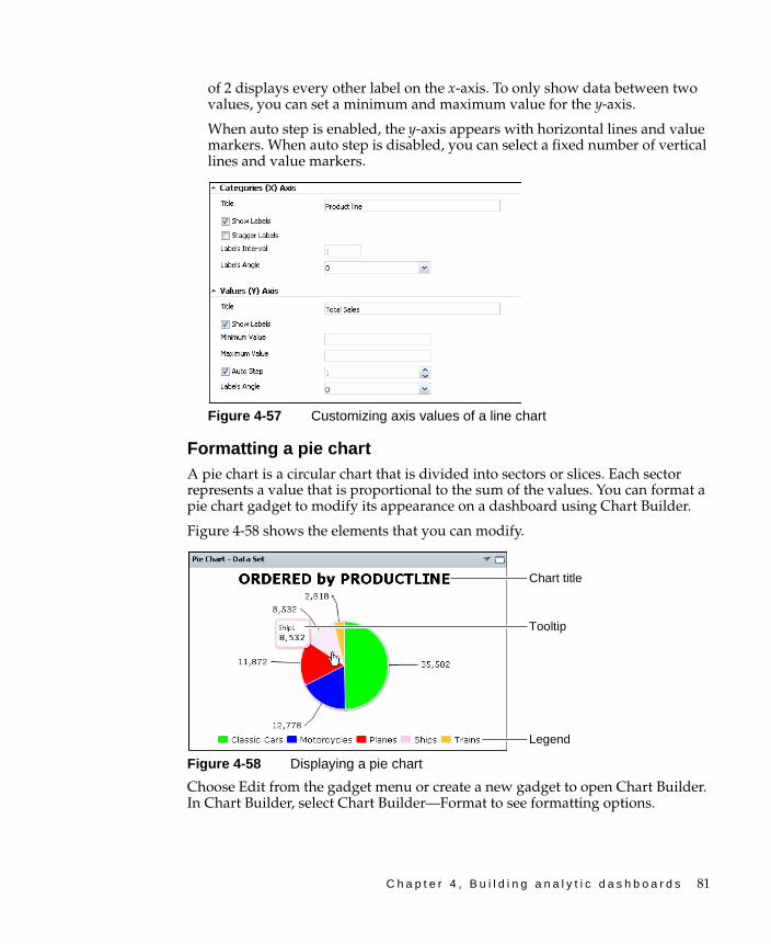
C h a p t e r 4 , B u i l d i n g a n a l y t i c d a s h b o a r d s 81
of 2 displays every other label on the x-axis. To only show data between two values, you can set a minimum and maximum value for the y-axis.
When auto step is enabled, the y-axis appears with horizontal lines and value markers. When auto step is disabled, you can select a fixed number of vertical lines and value markers.
Figure 4-57 Customizing axis values of a line chart
Formatting a pie chartA pie chart is a circular chart that is divided into sectors or slices. Each sector represents a value that is proportional to the sum of the values. You can format a pie chart gadget to modify its appearance on a dashboard using Chart Builder.
Figure 4-58 shows the elements that you can modify.
Figure 4-58 Displaying a pie chart
Choose Edit from the gadget menu or create a new gadget to open Chart Builder. In Chart Builder, select Chart Builder—Format to see formatting options.
Legend
Tooltip
Chart title

82 B u i l d i n g B I R T D a s h b o a r d s
The following formatting options are available for a pie chart:
■ Change the title of the chart. If Auto is selected for the chart’s title, the chart title changes as a user drills down to view more detailed data or drills up to view summary data. For example, a chart title of TotalSales by Country, changes to TotalSales by City when a user drills down to display detail values of a selected country. Remove the Auto selection to prevent the title from changing.
■ Use Chart options to change the chart display, such as width and height. Select a chart theme to change the appearance of the chart. For more information about themes, see “Using chart themes,” earlier in this chapter.
Flash pie charts appear three-dimensional when 2D with depth is selected in Dimension. Radius and rotation of the chart can also be set in the Flash pie chart. Flash charts are available in the Extras gadget category.
Figure 4-59 shows these options.
Figure 4-59 Formatting a pie chart
■ Change the chart legend using the Legend options, as shown in Figure 4-60.
The legend identifies values displayed on the chart. Clicking on a legend value when the chart displays a data set highlights the corresponding value on the chart. Clicking on a legend value when the chart displays a data cube drills down to view details of the value. Display a legend on the chart by selecting Show Legend and a position for the legend to appear, relative to the chart.
Figure 4-60 Formatting a pie chart legend
Formatting a scatter chartA scatter chart presents data as x-y coordinates by combining two sets of numeric values into single data points. A scatter chart typically is used to display scientific and statistical data, because it shows if there is a relationship between two sets of measurements. You can format a scatter chart gadget to modify its appearance on a dashboard using Chart Builder.
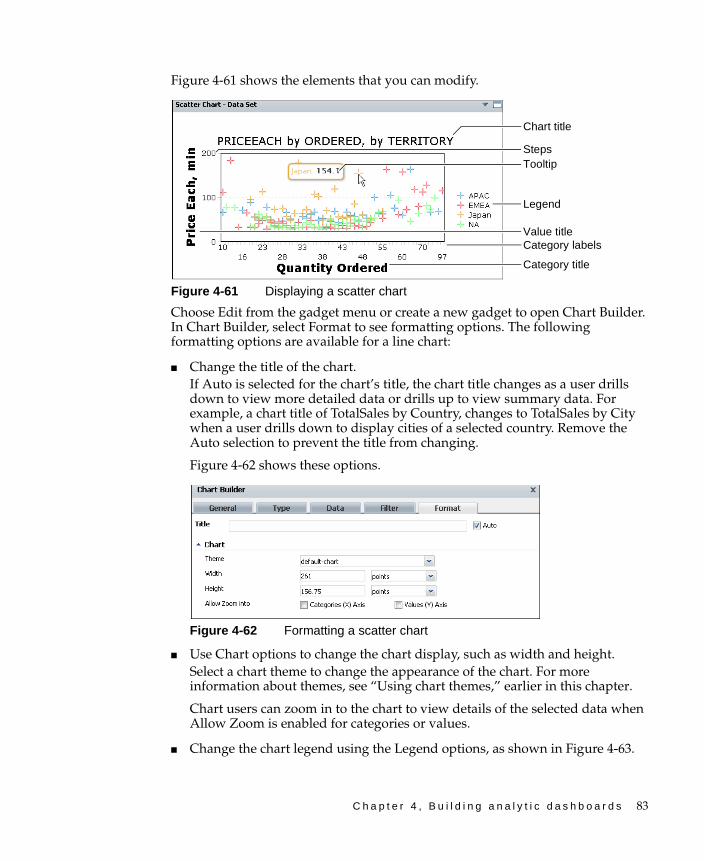
C h a p t e r 4 , B u i l d i n g a n a l y t i c d a s h b o a r d s 83
Figure 4-61 shows the elements that you can modify.
Figure 4-61 Displaying a scatter chart
Choose Edit from the gadget menu or create a new gadget to open Chart Builder. In Chart Builder, select Format to see formatting options. The following formatting options are available for a line chart:
■ Change the title of the chart. If Auto is selected for the chart’s title, the chart title changes as a user drills down to view more detailed data or drills up to view summary data. For example, a chart title of TotalSales by Country, changes to TotalSales by City when a user drills down to display cities of a selected country. Remove the Auto selection to prevent the title from changing.
Figure 4-62 shows these options.
Figure 4-62 Formatting a scatter chart
■ Use Chart options to change the chart display, such as width and height. Select a chart theme to change the appearance of the chart. For more information about themes, see “Using chart themes,” earlier in this chapter.
Chart users can zoom in to the chart to view details of the selected data when Allow Zoom is enabled for categories or values.
■ Change the chart legend using the Legend options, as shown in Figure 4-63.
Category title
Legend
Chart title
Steps
Category labels
Tooltip
Value title

84 B u i l d i n g B I R T D a s h b o a r d s
Figure 4-63 Formatting a scatter chart legend
The legend identifies values displayed on the chart. Clicking on a legend value when the chart displays a data set highlights the corresponding value on the chart. Clicking on a legend value when the chart displays a data cube drills down to view details of the value. Display a legend on the chart by selecting Show Legend and a position for the legend to appear, relative to the chart.
■ Customize the presentation of the chart’s axis values using the Categories and Values options.You can display titles and labels for both categories and values. The x-axis can display labels at an angle, staggered, and at intervals. For example, an interval of 2 displays every other label on the x-axis. To only show data between two values, you can set a minimum and maximum value for the y-axis.
When auto step is enabled, the y-axis appears with horizontal lines and value markers. When auto step is disabled, you can select a fixed number of vertical lines and value markers.
Figure 4-64 shows these options.
Figure 4-64 Customizing axis values of a scatter chart
Using a cross-tab gadgetA cross tab displays data cubes in a row–and–column matrix that has a spreadsheet-like appearance. The cross tab is ideal for summarizing data in a compact and concise format, and displays summary, or aggregate values such as sums, counts, or averages. The cross tab groups these values by one set of data listed down the left side of the matrix and another set of data listed across the top of the matrix.
C h a p t e r 4 , B u i l d i n g a n a l y t i c d a s h b o a r d s 85
Cross-tab gadgets display data cubes and can open in BIRT Data Analyzer for additional user analysis and to add a chart view to the cross tab. Users can format displayed values, export content, and export data using the context menu.
Dashboard developers can customize cross-tab gadget options using the Crosstab Builder—General options. For more information about general options, see “Setting general gadget options,” earlier in this chapter.
How to create a cross-tab gadget
This procedure requires a dashboard you can edit. Create a new dashboard if one does not already exist. To create a cross-tab gadget, complete the following steps:
1 Display available gadgets by selecting Add Content and choosing New Gadget.
2 Choose the Data Visualization folder. If the folder is not visible, choose Home first.
3 Drag the cross-tab gadget and drop it on the dashboard.
4 Specify desired gadget display options in Crosstab Builder—General:
■ Display the header, border, and scroll bar.
■ Display a toolbar.
■ Gadget title.
■ Refresh rate.
5 To select the data to display in the cross-tab gadget, complete the following steps:
1 In Crosstab Builder—Data—Use Cube From, select a data source.
2 Select dimension, attribute, and measure fields to display in the cross tab.
6 Limit displayed data with filter conditions, if desired, in Crosstab Builder—Filter.
7 Format the cross tab, if desired, in Crosstab Builder—Format.
■ Display grand totals.
■ Display subtotals.
■ Enable page breaks.
8 Choose OK to create the new gadget.
Enable interactive filtering by linking the cross tab to a data selection gadget. After the cross tab is placed on the dashboard, it links to data selection gadgets that use the same data source. You can remove these links or add new ones.
86 B u i l d i n g B I R T D a s h b o a r d s
Displaying data in a cross-tab gadgetCross-tab gadgets display data from data cubes in BIRT data objects. Crosstab Builder—Data appears when the user adds this gadget to a dashboard or edits it. Users select a data cube from data objects already used on the dashboard. If the data object is not shown, the user adds a new data object to the dashboard, then selects a data cube.
Select Use default hyperlink to display hyperlinks contained in data objects. BIRT report developers can add hyperlinks to a data object using BIRT Designer Professional.
The dashboard developer assigns data to parts of the cross tab. Dimensions and attribute levels are assigned to rows or columns of the cross tab. Measures are assigned to summary fields. To select multiple values, press Ctrl as you select each value.
Dashboard developers can also limit the data that appears in the gadget by using Crosstab Builder—Filter to create filter conditions. For more information about filtering, see “Filtering a gadget data source,” earlier in this chapter.
Figure 4-65 shows the data options.
Figure 4-65 Selecting data to display as a cross tab
Data aggregation type
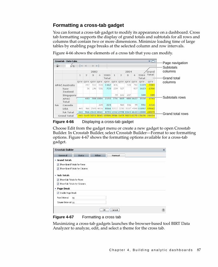
C h a p t e r 4 , B u i l d i n g a n a l y t i c d a s h b o a r d s 87
Formatting a cross-tab gadgetYou can format a cross-tab gadget to modify its appearance on a dashboard. Cross tab formatting supports the display of grand totals and subtotals for all rows and columns that contain two or more dimensions. Minimize loading time of large tables by enabling page breaks at the selected column and row intervals.
Figure 4-66 shows the elements of a cross tab that you can modify.
Figure 4-66 Displaying a cross-tab gadget
Choose Edit from the gadget menu or create a new gadget to open Crosstab Builder. In Crosstab Builder, select Crosstab Builder—Format to see formatting options. Figure 4-67 shows the formatting options available for a cross-tab gadget.
Figure 4-67 Formatting a cross tab
Maximizing a cross-tab gadgets launches the browser-based tool BIRT Data Analyzer to analyze, edit, and select a theme for the cross tab.
Subtotals columns
Page navigation
Subtotals rows
Grand total rows
Grand total columns
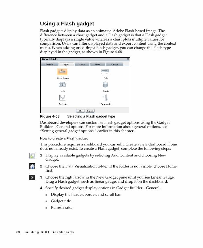
88 B u i l d i n g B I R T D a s h b o a r d s
Using a Flash gadgetFlash gadgets display data as an animated Adobe Flash-based image. The difference between a chart gadget and a Flash gadget is that a Flash gadget typically displays a single value whereas a chart plots multiple values for comparison. Users can filter displayed data and export content using the context menu. When adding or editing a Flash gadget, you can change the Flash type displayed in the gadget, as shown in Figure 4-68.
Figure 4-68 Selecting a Flash gadget type
Dashboard developers can customize Flash gadget options using the Gadget Builder—General options. For more information about general options, see “Setting general gadget options,” earlier in this chapter.
How to create a Flash gadget
This procedure requires a dashboard you can edit. Create a new dashboard if one does not already exist. To create a Flash gadget, complete the following steps:
1 Display available gadgets by selecting Add Content and choosing New Gadget.
2 Choose the Data Visualization folder. If the folder is not visible, choose Home first.
3 Choose the right arrow in the New Gadget pane until you see Linear Gauge. Drag a Flash gadget, such as linear gauge, and drop it on the dashboard.
4 Specify desired gadget display options in Gadget Builder—General:
■ Display the header, border, and scroll bar.
■ Gadget title.
■ Refresh rate.
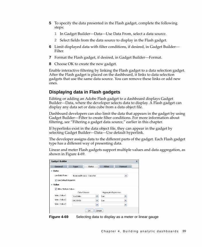
C h a p t e r 4 , B u i l d i n g a n a l y t i c d a s h b o a r d s 89
5 To specify the data presented in the Flash gadget, complete the following steps:
1 In Gadget Builder—Data—Use Data From, select a data source.
2 Select fields from the data source to display in the Flash gadget.
6 Limit displayed data with filter conditions, if desired, in Gadget Builder—Filter.
7 Format the Flash gadget, if desired, in Gadget Builder—Format.
8 Choose OK to create the new gadget.
Enable interactive filtering by linking the Flash gadget to a data selection gadget. After the Flash gadget is placed on the dashboard, it links to data selection gadgets that use the same data source. You can remove these links or add new ones.
Displaying data in Flash gadgetsEditing or adding an Adobe Flash gadget to a dashboard displays Gadget Builder—Data, where the developer selects data to display. A Flash gadget can display any data set or data cube from a data object file.
Dashboard developers can also limit the data that appears in the gadget by using Gadget Builder—Filter to create filter conditions. For more information about filtering, see “Filtering a gadget data source,” earlier in this chapter.
If hyperlinks exist in the data object file, they can appear in the gadget by selecting Gadget Builder—Data—Use default hyperlink.
The developer assigns data to the different parts of the gadget. Each Flash gadget type has a different way of presenting data.
Linear and meter Flash gadgets support multiple values and data aggregation, as shown in Figure 4-69.
Figure 4-69 Selecting data to display as a meter or linear gauge
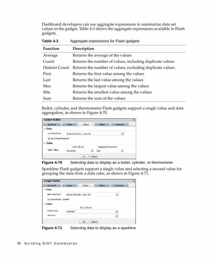
90 B u i l d i n g B I R T D a s h b o a r d s
Dashboard developers can use aggregate expressions to summarize data set values in the gadget. Table 4-3 shows the aggregate expressions available in Flash gadgets.
Bullet, cylinder, and thermometer Flash gadgets support a single value and data aggregation, as shown in Figure 4-70.
Figure 4-70 Selecting data to display as a bullet, cylinder, or thermometer
Sparkline Flash gadgets support a single value and selecting a second value for grouping the data from a data cube, as shown in Figure 4-71.
Figure 4-71 Selecting data to display as a sparkline
Table 4-3 Aggregate expressions for Flash gadgets
Function Description
Average Returns the average of the values
Count Returns the number of values, including duplicate values
Distinct Count Returns the number of values, excluding duplicate values
First Returns the first value among the values
Last Returns the last value among the values
Max Returns the largest value among the values
Min Returns the smallest value among the values
Sum Returns the sum of the values
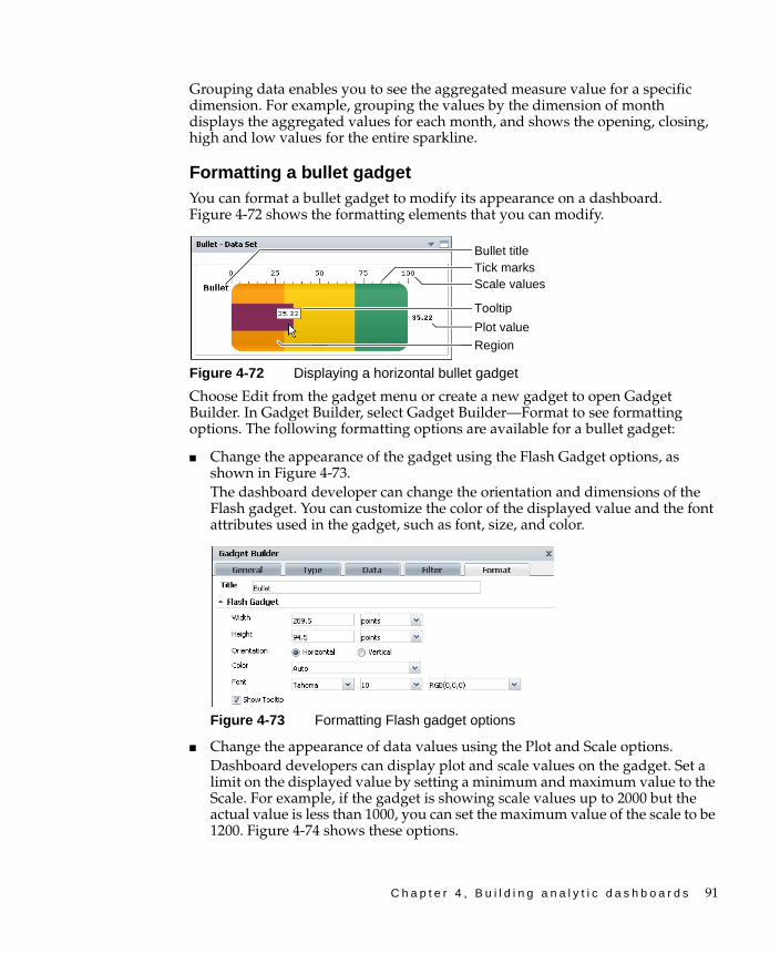
C h a p t e r 4 , B u i l d i n g a n a l y t i c d a s h b o a r d s 91
Grouping data enables you to see the aggregated measure value for a specific dimension. For example, grouping the values by the dimension of month displays the aggregated values for each month, and shows the opening, closing, high and low values for the entire sparkline.
Formatting a bullet gadgetYou can format a bullet gadget to modify its appearance on a dashboard. Figure 4-72 shows the formatting elements that you can modify.
Figure 4-72 Displaying a horizontal bullet gadget
Choose Edit from the gadget menu or create a new gadget to open Gadget Builder. In Gadget Builder, select Gadget Builder—Format to see formatting options. The following formatting options are available for a bullet gadget:
■ Change the appearance of the gadget using the Flash Gadget options, as shown in Figure 4-73.The dashboard developer can change the orientation and dimensions of the Flash gadget. You can customize the color of the displayed value and the font attributes used in the gadget, such as font, size, and color.
Figure 4-73 Formatting Flash gadget options
■ Change the appearance of data values using the Plot and Scale options. Dashboard developers can display plot and scale values on the gadget. Set a limit on the displayed value by setting a minimum and maximum value to the Scale. For example, if the gadget is showing scale values up to 2000 but the actual value is less than 1000, you can set the maximum value of the scale to be 1200. Figure 4-74 shows these options.
Scale valuesTick marks
Plot value
Bullet title
Tooltip
Region
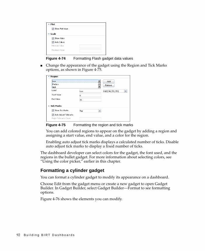
92 B u i l d i n g B I R T D a s h b o a r d s
Figure 4-74 Formatting Flash gadget data values
■ Change the appearance of the gadget using the Region and Tick Marks options, as shown in Figure 4-75.
Figure 4-75 Formatting the region and tick marks
You can add colored regions to appear on the gadget by adding a region and assigning a start value, end value, and a color for the region.
Enabling auto adjust tick marks displays a calculated number of ticks. Disable auto adjust tick marks to display a fixed number of ticks.
The dashboard developer can select colors for the gadget, the font used, and the regions in the bullet gadget. For more information about selecting colors, see “Using the color picker,” earlier in this chapter.
Formatting a cylinder gadgetYou can format a cylinder gadget to modify its appearance on a dashboard.
Choose Edit from the gadget menu or create a new gadget to open Gadget Builder. In Gadget Builder, select Gadget Builder—Format to see formatting options.
Figure 4-76 shows the elements you can modify.

C h a p t e r 4 , B u i l d i n g a n a l y t i c d a s h b o a r d s 93
Figure 4-76 Displaying a cylinder gadget
The following formatting options are available for a cylinder gadget:
■ Change the appearance of the gadget using the Flash Gadget options, as shown in Figure 4-77.
Figure 4-77 Formatting Flash gadget options
The dashboard developer can change the dimensions of the Flash gadget. You can customize the color of the displayed value and the font attributes used in the gadget, such as font, size and color.
■ Change the appearance of data values using the Value and Scale options, as shown in Figure 4-78.
Figure 4-78 Formatting Flash gadget data values
Dashboard developers can display plot and scale values on the gadget. Set a limit on the displayed value by setting a minimum and maximum value to the Scale. For example, if the gadget is showing scale values up to 2000 but the
Tick marks
Value
Scale values
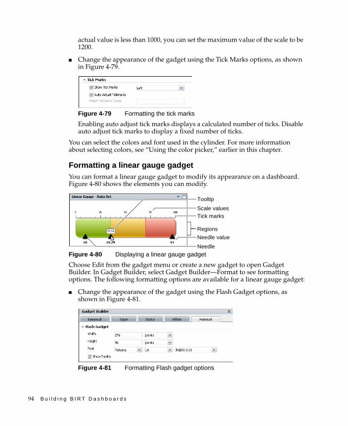
94 B u i l d i n g B I R T D a s h b o a r d s
actual value is less than 1000, you can set the maximum value of the scale to be 1200.
■ Change the appearance of the gadget using the Tick Marks options, as shown in Figure 4-79.
Figure 4-79 Formatting the tick marks
Enabling auto adjust tick marks displays a calculated number of ticks. Disable auto adjust tick marks to display a fixed number of ticks.
You can select the colors and font used in the cylinder. For more information about selecting colors, see “Using the color picker,” earlier in this chapter.
Formatting a linear gauge gadgetYou can format a linear gauge gadget to modify its appearance on a dashboard. Figure 4-80 shows the elements you can modify.
Figure 4-80 Displaying a linear gauge gadget
Choose Edit from the gadget menu or create a new gadget to open Gadget Builder. In Gadget Builder, select Gadget Builder—Format to see formatting options. The following formatting options are available for a linear gauge gadget:
■ Change the appearance of the gadget using the Flash Gadget options, as shown in Figure 4-81.
Figure 4-81 Formatting Flash gadget options
Tick marks
Regions
Scale values
Needle
Needle value
Tooltip
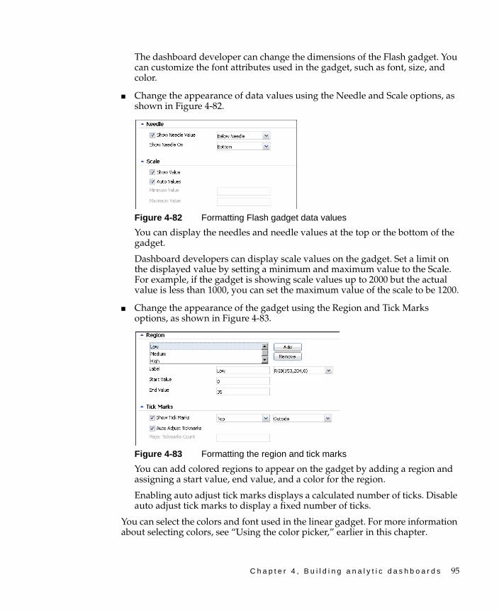
C h a p t e r 4 , B u i l d i n g a n a l y t i c d a s h b o a r d s 95
The dashboard developer can change the dimensions of the Flash gadget. You can customize the font attributes used in the gadget, such as font, size, and color.
■ Change the appearance of data values using the Needle and Scale options, as shown in Figure 4-82.
Figure 4-82 Formatting Flash gadget data values
You can display the needles and needle values at the top or the bottom of the gadget.
Dashboard developers can display scale values on the gadget. Set a limit on the displayed value by setting a minimum and maximum value to the Scale. For example, if the gadget is showing scale values up to 2000 but the actual value is less than 1000, you can set the maximum value of the scale to be 1200.
■ Change the appearance of the gadget using the Region and Tick Marks options, as shown in Figure 4-83.
Figure 4-83 Formatting the region and tick marks
You can add colored regions to appear on the gadget by adding a region and assigning a start value, end value, and a color for the region.
Enabling auto adjust tick marks displays a calculated number of ticks. Disable auto adjust tick marks to display a fixed number of ticks.
You can select the colors and font used in the linear gadget. For more information about selecting colors, see “Using the color picker,” earlier in this chapter.
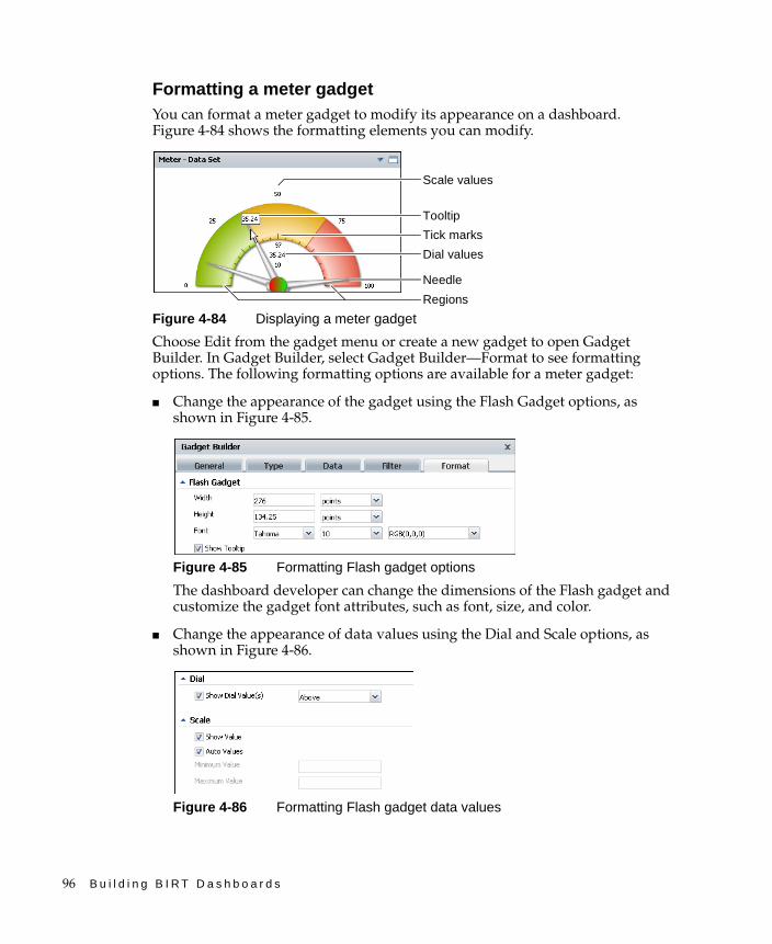
96 B u i l d i n g B I R T D a s h b o a r d s
Formatting a meter gadgetYou can format a meter gadget to modify its appearance on a dashboard. Figure 4-84 shows the formatting elements you can modify.
Figure 4-84 Displaying a meter gadget
Choose Edit from the gadget menu or create a new gadget to open Gadget Builder. In Gadget Builder, select Gadget Builder—Format to see formatting options. The following formatting options are available for a meter gadget:
■ Change the appearance of the gadget using the Flash Gadget options, as shown in Figure 4-85.
Figure 4-85 Formatting Flash gadget options
The dashboard developer can change the dimensions of the Flash gadget and customize the gadget font attributes, such as font, size, and color.
■ Change the appearance of data values using the Dial and Scale options, as shown in Figure 4-86.
Figure 4-86 Formatting Flash gadget data values
Tick marks
Needle
Scale values
Regions
Tooltip
Dial values
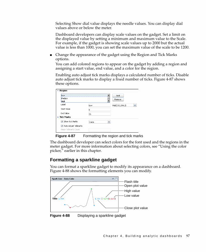
C h a p t e r 4 , B u i l d i n g a n a l y t i c d a s h b o a r d s 97
Selecting Show dial value displays the needle values. You can display dial values above or below the meter.
Dashboard developers can display scale values on the gadget. Set a limit on the displayed value by setting a minimum and maximum value to the Scale. For example, if the gadget is showing scale values up to 2000 but the actual value is less than 1000, you can set the maximum value of the scale to be 1200.
■ Change the appearance of the gadget using the Region and Tick Marks options.You can add colored regions to appear on the gadget by adding a region and assigning a start value, end value, and a color for the region.
Enabling auto adjust tick marks displays a calculated number of ticks. Disable auto adjust tick marks to display a fixed number of ticks. Figure 4-87 shows these options.
Figure 4-87 Formatting the region and tick marks
The dashboard developer can select colors for the font used and the regions in the meter gadget. For more information about selecting colors, see “Using the color picker,” earlier in this chapter.
Formatting a sparkline gadgetYou can format a sparkline gadget to modify its appearance on a dashboard. Figure 4-88 shows the formatting elements you can modify.
Figure 4-88 Displaying a sparkline gadget
Flash title
Close plot value
Low value
High value
Open plot value
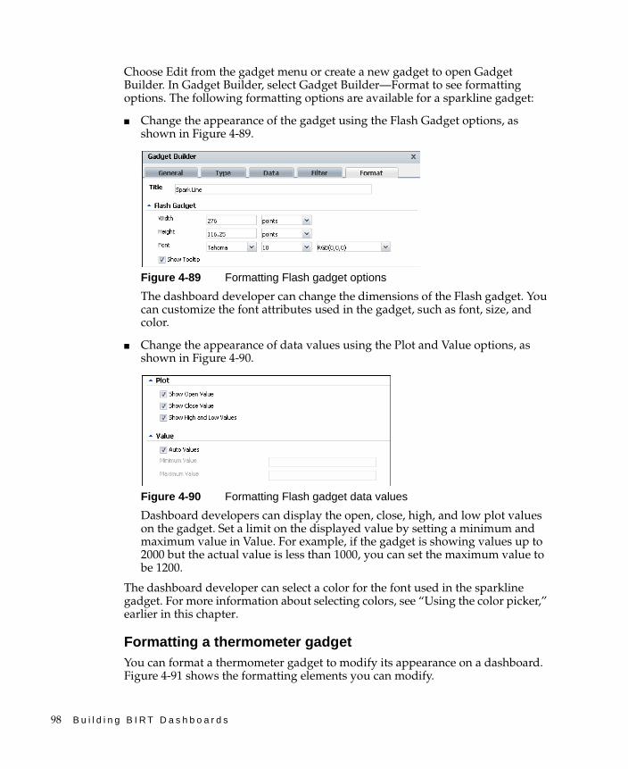
98 B u i l d i n g B I R T D a s h b o a r d s
Choose Edit from the gadget menu or create a new gadget to open Gadget Builder. In Gadget Builder, select Gadget Builder—Format to see formatting options. The following formatting options are available for a sparkline gadget:
■ Change the appearance of the gadget using the Flash Gadget options, as shown in Figure 4-89.
Figure 4-89 Formatting Flash gadget options
The dashboard developer can change the dimensions of the Flash gadget. You can customize the font attributes used in the gadget, such as font, size, and color.
■ Change the appearance of data values using the Plot and Value options, as shown in Figure 4-90.
Figure 4-90 Formatting Flash gadget data values
Dashboard developers can display the open, close, high, and low plot values on the gadget. Set a limit on the displayed value by setting a minimum and maximum value in Value. For example, if the gadget is showing values up to 2000 but the actual value is less than 1000, you can set the maximum value to be 1200.
The dashboard developer can select a color for the font used in the sparkline gadget. For more information about selecting colors, see “Using the color picker,” earlier in this chapter.
Formatting a thermometer gadgetYou can format a thermometer gadget to modify its appearance on a dashboard. Figure 4-91 shows the formatting elements you can modify.
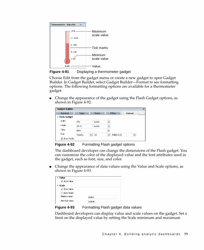
C h a p t e r 4 , B u i l d i n g a n a l y t i c d a s h b o a r d s 99
Figure 4-91 Displaying a thermometer gadget
Choose Edit from the gadget menu or create a new gadget to open Gadget Builder. In Gadget Builder, select Gadget Builder—Format to see formatting options. The following formatting options are available for a thermometer gadget:
■ Change the appearance of the gadget using the Flash Gadget options, as shown in Figure 4-92.
Figure 4-92 Formatting Flash gadget options
The dashboard developer can change the dimensions of the Flash gadget. You can customize the color of the displayed value and the font attributes used in the gadget, such as font, size, and color.
■ Change the appearance of data values using the Value and Scale options, as shown in Figure 4-93.
Figure 4-93 Formatting Flash gadget data values
Dashboard developers can display value and scale values on the gadget. Set a limit on the displayed value by setting the Scale minimum and maximum
Value
Tick marks
Minimum scale value
Maximum scale value

100 B u i l d i n g B I R T D a s h b o a r d s
value. For example, if the gadget is showing scale values up to 2000 but the actual value is less than 1000, you can set the maximum value of the scale to be 1200.
■ Change the appearance of the gadget using the Tick Marks options, as shown in Figure 4-94.
Figure 4-94 Formatting the region and tick marks
Enabling auto adjust tick marks displays a calculated number of ticks. Disable auto adjust tick marks to display a fixed number of ticks.
The dashboard developers can select colors for the gadget and the font used in the thermometer gadget. For more information about selecting colors, see “Using the color picker,” earlier in this chapter.
Using a Flex table gadgetFlex table gadgets display data sets in a row–and–column matrix and switch between a detailed table of all values in the data set or a summary table of aggregated values in the data set. Aggregate values of a Flex table can expand to view the data making up the aggregate value. Users can filter displayed data and export data using the context menu.
Dashboard developers can customize Flex table gadget options using the Flex Builder—General options. For more information about general options, see “Setting general gadget options,” earlier in this chapter.
How to create a Flex table gadget
This procedure requires a dashboard you can edit. Create a new dashboard if one does not already exist. To create a Flex table gadget, complete the following steps:
1 Display available gadgets by selecting Add Content and choosing New Gadget.
2 Choose the Data Visualization folder. If the folder is not visible, choose Home first.
3 Choose the right arrow in the New Gadget pane until you see Adobe Flex Table. Drag the Adobe Flex table gadget and drop it on the dashboard.
4 Specify desired gadget display options in Flex Builder—General:
■ Display the header, border, and scroll bar.
■ Gadget title.
■ Refresh rate.

C h a p t e r 4 , B u i l d i n g a n a l y t i c d a s h b o a r d s 101
5 To select the data to display in the Flex table gadget, complete the following steps:
1 In Flex Builder—Data—Use Data From, select a data source.
2 Select any fields to display when using tabular format.
3 Select dimension, attribute, and measure fields to display when using summary format.
6 Limit displayed data with filter conditions, if desired, in Flex Builder—Filter.
7 Format the Flex table gadget, if desired, in Flex Builder—Format.
8 Choose OK to create the new gadget.
Enable interactive filtering by linking the Flex table to a data selection gadget. After the Flex table is placed on the dashboard, it links to data selection gadgets that use the same data source. You can remove these links or add new ones.
Displaying data in a Flex table gadgetAdding this gadget to a dashboard or editing it, displays Flex Builder—Data, as shown in Figure 4-95.
Figure 4-95 Assigning data to display in a Flex table gadget
A dashboard developer selects a data set from data objects on the dashboard, or adds a new data object from data objects available on the BIRT iServer. Filtering data sets occurs before the data appears in the gadget.
The dashboard developer assigns data to different parts of the Flex table. To select multiple values, press Ctrl as you select each value.
Aggregation function
Add fieldRemove field
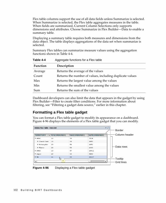
102 B u i l d i n g B I R T D a s h b o a r d s
Flex table columns support the use of all data fields unless Summarize is selected. When Summarize is selected, the Flex table aggregates measures in the table. When fields are summarized, Current Column Selections only supports dimensions and attributes. Choose Summarize in Flex Builder—Data to enable a summary table.
Displaying a summary table requires both measures and dimensions from the data object. The table displays aggregations of the data set when summarize is selected.
Summary Flex tables can summarize measure values using the aggregation functions shown in Table 4-4.
Dashboard developers can also limit the data that appears in the gadget by using Flex Builder—Filter to create filter conditions. For more information about filtering, see “Filtering a gadget data source,” earlier in this chapter.
Formatting a Flex table gadgetYou can format a Flex table gadget to modify its appearance on a dashboard. Figure 4-96 displays the elements of a Flex table gadget that you can modify.
Figure 4-96 Displaying a Flex table gadget
Table 4-4 Aggregate functions for a Flex table
Function Description
Average Returns the average of the values
Count Returns the number of values, including duplicate values
Max Returns the largest value among the values
Min Returns the smallest value among the values
Sum Returns the sum of the values
Data rows
Column header
Border
Grid linesTooltip

C h a p t e r 4 , B u i l d i n g a n a l y t i c d a s h b o a r d s 103
Choose Edit from the gadget menu or create a new gadget to open Flex Builder. In Flex Builder, select Flex Builder—Format to see formatting options. The following formatting options are available for a Flex table gadget:
■ Customize the appearance of the table header using the Column Header options and the font attributes used in the header, such as alignment, color, font, and size. You can selected a color for the font and background, as shown in Figure 4-97.
Figure 4-97 Formatting headers of a Flex table
■ Customize the appearance of the table rows using the Data Row options, as shown in Figure 4-98.
Figure 4-98 Formatting the data row
The dashboard developer can set a color for every other row by selecting an alternating background color in Data Row. You can customize the font attributes used in the rows, such as color, font, and size.
■ Customize the border and grid displayed in the table using the General Properties options, as shown in Figure 4-99.
Figure 4-99 Formatting the table border and grid
If you display a border and grid lines you can select a color to for them. You can select colors for the Column Header, the Data Row, and the General Properties of the Flex table gadget. For more information about selecting colors, see “Using the color picker,” earlier in this chapter.
Color picker, single row
Color picker, alternating row

104 B u i l d i n g B I R T D a s h b o a r d s
Using a table gadgetA table displays data sets in a row-and-column format. Summarizing table data presents aggregate data information in a report, providing users with a concise view of the data. For example, a table can display order dates, order numbers and the total value of every order or group values by month to show the monthly sum of orders.
Table gadgets display data from a BIRT data object or data object design file. Dashboard developers can limit the data displayed using filters. If the displayed data includes hyperlinks on the values those links are visible to gadget users.
For example, a BIRT data object listing order numbers and customer names, has hyperlinks on the order number that takes a user to the actual order. When displayed in a table, all values in the order numbers column have hyperlinks that a user can select. Selecting the order number hyperlink opens the order in the user’s browser.
Table values support formatting, conditional formatting, grouping, sorting, aggregation and computed column creation when the context menu is used in the table.
Dashboard developers can customize table gadget options using the Table Builder—General options. For more information about general options, see “Setting general gadget options,” earlier in this chapter.
How to create a table gadget
This procedure requires a dashboard you can edit. Create a new dashboard if one does not already exist. To create a table gadget, complete the following steps:
1 Display available gadgets by selecting Add Content and choosing New Gadget.
2 Choose the Data Visualization folder. If the folder is not visible, choose Home first.
3 Drag the table gadget and drop it on the dashboard.
4 Specify desired gadget display options in Table Builder—General:
■ Display the header and border.
■ Display a scroll bar.
■ Display a toolbar.
■ Gadget title.
■ Refresh rate.
5 To select the data to display in the table gadget, complete the following steps:
1 In Table Builder—Data—Use Data From, select a data source.
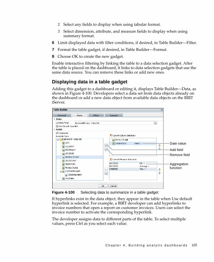
C h a p t e r 4 , B u i l d i n g a n a l y t i c d a s h b o a r d s 105
2 Select any fields to display when using tabular format.
3 Select dimension, attribute, and measure fields to display when using summary format.
6 Limit displayed data with filter conditions, if desired, in Table Builder—Filter.
7 Format the table gadget, if desired, in Table Builder—Format.
8 Choose OK to create the new gadget.
Enable interactive filtering by linking the table to a data selection gadget. After the table is placed on the dashboard, it links to data selection gadgets that use the same data source. You can remove these links or add new ones.
Displaying data in a table gadgetAdding this gadget to a dashboard or editing it, displays Table Builder—Data, as shown in Figure 4-100. Developers select a data set from data objects already on the dashboard or add a new data object from available data objects on the BIRT iServer.
Figure 4-100 Selecting data to summarize in a table gadget
If hyperlinks exist in the data object, they appear in the table when Use default hyperlink is selected. For example, a BIRT developer can add hyperlinks to invoice numbers that open a report on customer invoices. Users can select the invoice number to activate the corresponding hyperlink.
The developer assigns data to different parts of the table. To select multiple values, press Ctrl as you select each value.
Add field
Remove field
Date value
Aggregation function

106 B u i l d i n g B I R T D a s h b o a r d s
Table columns support the use of all data fields unless the table is a summary table. A summary table supports aggregating measures in the table. When fields are summarized, columns only use dimensions and attributes. Choose Table Builder—Data—Fields—Summarize to enable summary tables.
Displaying a summary table requires both measures and dimensions from the data object. The table displays aggregations of the data set when summarize is selected. Summary tables can aggregate dates values using the following intervals, as shown in Figure 4-100:
■ Years
■ Quarters
■ Months
■ Weeks
■ Days
Summary tables can summarize measure values using the aggregation functions shown in Table 4-5.
Table 4-5 Aggregate functions
Function Description
Average Returns the average of the values.
Count Returns the number of values, including duplicate values.
Count Distinct Returns the number of values, excluding duplicate values.
First Returns the first value among the values.
Last Returns the last value among the values.
Max Returns the largest value among the values.
Median Returns the median, or middle value among the values.
Min Returns the smallest value among the values.
Mode Returns the mode, or the value that occurs most frequently among the values.
Standard Deviation
Returns the standard deviation of a set of values. Standard deviation is a statistic that shows how widely values disperse from the mean value. If a set of values contains 50, 75, 80, 90, and 95, standard deviation returns 17.536.
Sum Returns the sum of the values.
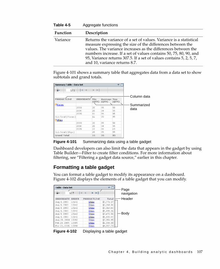
C h a p t e r 4 , B u i l d i n g a n a l y t i c d a s h b o a r d s 107
Figure 4-101 shows a summary table that aggregates data from a data set to show subtotals and grand totals.
Figure 4-101 Summarizing data using a table gadget
Dashboard developers can also limit the data that appears in the gadget by using Table Builder—Filter to create filter conditions. For more information about filtering, see “Filtering a gadget data source,” earlier in this chapter.
Formatting a table gadgetYou can format a table gadget to modify its appearance on a dashboard. Figure 4-102 displays the elements of a table gadget that you can modify.
Figure 4-102 Displaying a table gadget
Variance Returns the variance of a set of values. Variance is a statistical measure expressing the size of the differences between the values. The variance increases as the differences between the numbers increase. If a set of values contains 50, 75, 80, 90, and 95, Variance returns 307.5. If a set of values contains 5, 2, 5, 7, and 10, variance returns 8.7.
Table 4-5 Aggregate functions
Function Description
Summarized data
Column data
Body
Header
Page navigation
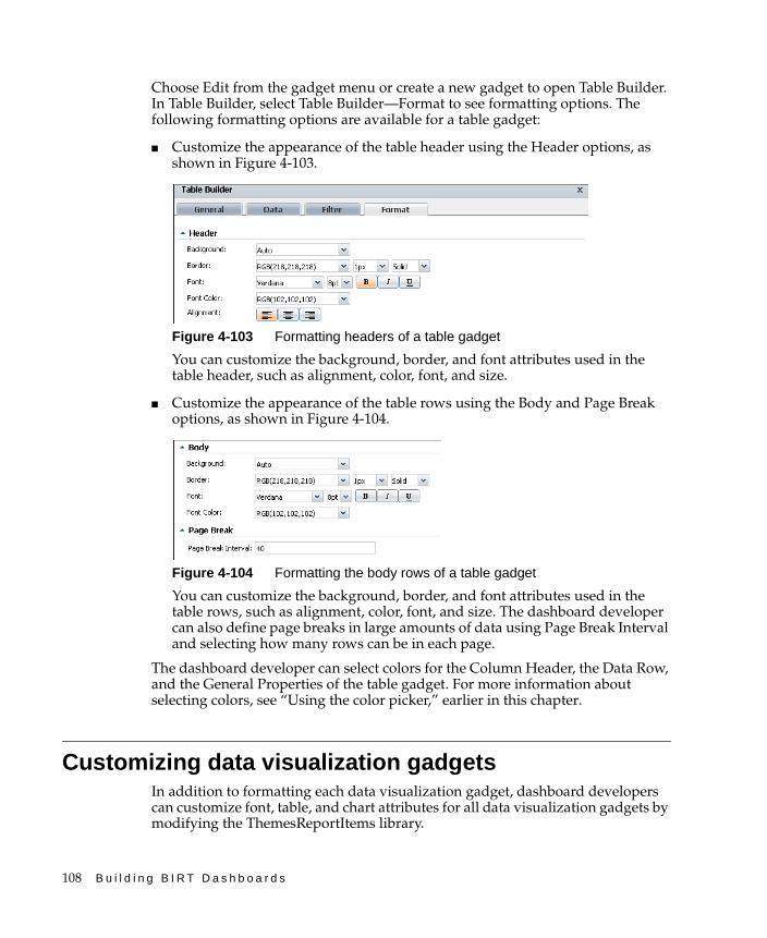
108 B u i l d i n g B I R T D a s h b o a r d s
Choose Edit from the gadget menu or create a new gadget to open Table Builder. In Table Builder, select Table Builder—Format to see formatting options. The following formatting options are available for a table gadget:
■ Customize the appearance of the table header using the Header options, as shown in Figure 4-103.
Figure 4-103 Formatting headers of a table gadget
You can customize the background, border, and font attributes used in the table header, such as alignment, color, font, and size.
■ Customize the appearance of the table rows using the Body and Page Break options, as shown in Figure 4-104.
Figure 4-104 Formatting the body rows of a table gadget
You can customize the background, border, and font attributes used in the table rows, such as alignment, color, font, and size. The dashboard developer can also define page breaks in large amounts of data using Page Break Interval and selecting how many rows can be in each page.
The dashboard developer can select colors for the Column Header, the Data Row, and the General Properties of the table gadget. For more information about selecting colors, see “Using the color picker,” earlier in this chapter.
Customizing data visualization gadgetsIn addition to formatting each data visualization gadget, dashboard developers can customize font, table, and chart attributes for all data visualization gadgets by modifying the ThemesReportItems library.
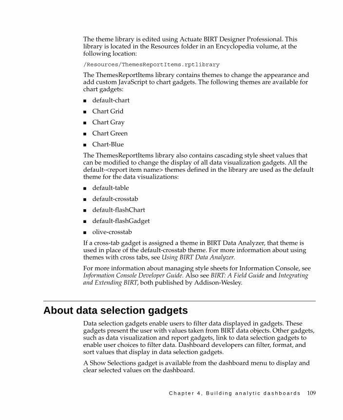
C h a p t e r 4 , B u i l d i n g a n a l y t i c d a s h b o a r d s 109
The theme library is edited using Actuate BIRT Designer Professional. This library is located in the Resources folder in an Encyclopedia volume, at the following location:
/Resources/ThemesReportItems.rptlibrary
The ThemesReportItems library contains themes to change the appearance and add custom JavaScript to chart gadgets. The following themes are available for chart gadgets:
■ default-chart
■ Chart Grid
■ Chart Gray
■ Chart Green
■ Chart-Blue
The ThemesReportItems library also contains cascading style sheet values that can be modified to change the display of all data visualization gadgets. All the default-<report item name> themes defined in the library are used as the default theme for the data visualizations:
■ default-table
■ default-crosstab
■ default-flashChart
■ default-flashGadget
■ olive-crosstab
If a cross-tab gadget is assigned a theme in BIRT Data Analyzer, that theme is used in place of the default-crosstab theme. For more information about using themes with cross tabs, see Using BIRT Data Analyzer.
For more information about managing style sheets for Information Console, see Information Console Developer Guide. Also see BIRT: A Field Guide and Integrating and Extending BIRT, both published by Addison-Wesley.
About data selection gadgetsData selection gadgets enable users to filter data displayed in gadgets. These gadgets present the user with values taken from BIRT data objects. Other gadgets, such as data visualization and report gadgets, link to data selection gadgets to enable user choices to filter data. Dashboard developers can filter, format, and sort values that display in data selection gadgets.
A Show Selections gadget is available from the dashboard menu to display and clear selected values on the dashboard.
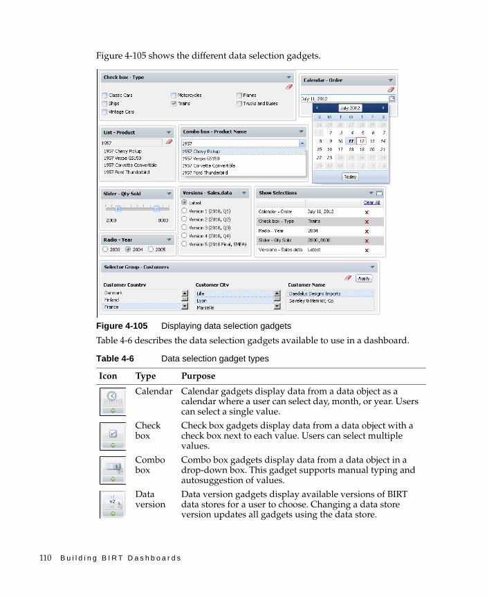
110 B u i l d i n g B I R T D a s h b o a r d s
Figure 4-105 shows the different data selection gadgets.
Figure 4-105 Displaying data selection gadgets
Table 4-6 describes the data selection gadgets available to use in a dashboard.
Table 4-6 Data selection gadget types
Icon Type Purpose
Calendar Calendar gadgets display data from a data object as a calendar where a user can select day, month, or year. Users can select a single value.
Check box
Check box gadgets display data from a data object with a check box next to each value. Users can select multiple values.
Combo box
Combo box gadgets display data from a data object in a drop-down box. This gadget supports manual typing and autosuggestion of values.
Data version
Data version gadgets display available versions of BIRT data stores for a user to choose. Changing a data store version updates all gadgets using the data store.
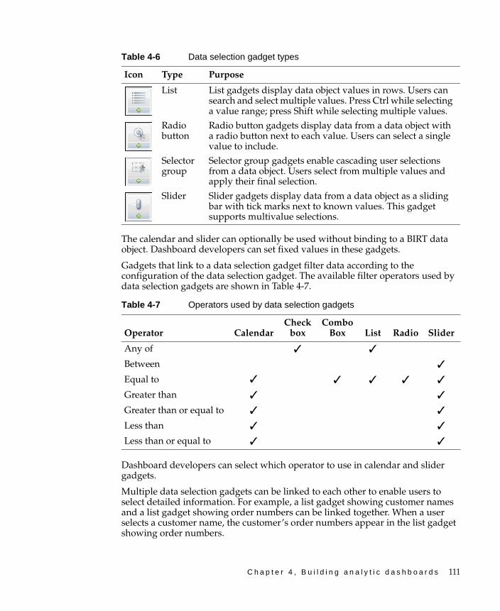
C h a p t e r 4 , B u i l d i n g a n a l y t i c d a s h b o a r d s 111
The calendar and slider can optionally be used without binding to a BIRT data object. Dashboard developers can set fixed values in these gadgets.
Gadgets that link to a data selection gadget filter data according to the configuration of the data selection gadget. The available filter operators used by data selection gadgets are shown in Table 4-7.
Dashboard developers can select which operator to use in calendar and slider gadgets.
Multiple data selection gadgets can be linked to each other to enable users to select detailed information. For example, a list gadget showing customer names and a list gadget showing order numbers can be linked together. When a user selects a customer name, the customer’s order numbers appear in the list gadget showing order numbers.
List List gadgets display data object values in rows. Users can search and select multiple values. Press Ctrl while selecting a value range; press Shift while selecting multiple values.
Radio button
Radio button gadgets display data from a data object with a radio button next to each value. Users can select a single value to include.
Selector group
Selector group gadgets enable cascading user selections from a data object. Users select from multiple values and apply their final selection.
Slider Slider gadgets display data from a data object as a sliding bar with tick marks next to known values. This gadget supports multivalue selections.
Table 4-7 Operators used by data selection gadgets
Operator CalendarCheck
boxCombo
Box List Radio Slider
Any of ✓ ✓
Between ✓
Equal to ✓ ✓ ✓ ✓ ✓
Greater than ✓ ✓
Greater than or equal to ✓ ✓
Less than ✓ ✓
Less than or equal to ✓ ✓
Table 4-6 Data selection gadget types
Icon Type Purpose
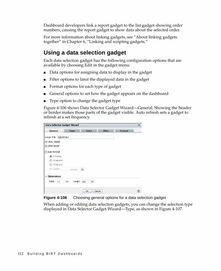
112 B u i l d i n g B I R T D a s h b o a r d s
Dashboard developers link a report gadget to the list gadget showing order numbers, causing the report gadget to show data about the selected order.
For more information about linking gadgets, see “About linking gadgets together” in Chapter 6, “Linking and scripting gadgets.”
Using a data selection gadgetEach data selection gadget has the following configuration options that are available by choosing Edit in the gadget menu:
■ Data options for assigning data to display in the gadget
■ Filter options to limit the displayed data in the gadget
■ Format options for each type of gadget
■ General options to set how the gadget appears on the dashboard
■ Type option to change the gadget type
Figure 4-106 shows Data Selector Gadget Wizard—General. Showing the header or border makes those parts of the gadget visible. Auto refresh sets a gadget to refresh at a set frequency.
Figure 4-106 Choosing general options for a data selection gadget
When adding or editing data selection gadgets, you can change the selection type displayed in Data Selector Gadget Wizard—Type, as shown in Figure 4-107.
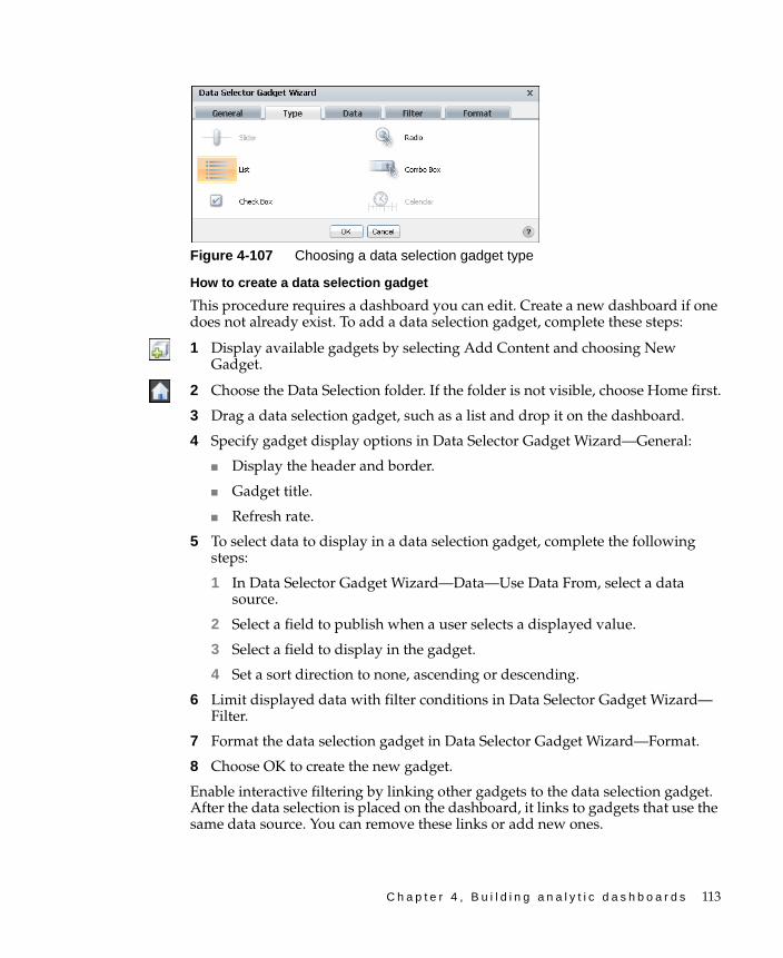
C h a p t e r 4 , B u i l d i n g a n a l y t i c d a s h b o a r d s 113
Figure 4-107 Choosing a data selection gadget type
How to create a data selection gadget
This procedure requires a dashboard you can edit. Create a new dashboard if one does not already exist. To add a data selection gadget, complete these steps:
1 Display available gadgets by selecting Add Content and choosing New Gadget.
2 Choose the Data Selection folder. If the folder is not visible, choose Home first.
3 Drag a data selection gadget, such as a list and drop it on the dashboard.
4 Specify gadget display options in Data Selector Gadget Wizard—General:
■ Display the header and border.
■ Gadget title.
■ Refresh rate.
5 To select data to display in a data selection gadget, complete the following steps:
1 In Data Selector Gadget Wizard—Data—Use Data From, select a data source.
2 Select a field to publish when a user selects a displayed value.
3 Select a field to display in the gadget.
4 Set a sort direction to none, ascending or descending.
6 Limit displayed data with filter conditions in Data Selector Gadget Wizard—Filter.
7 Format the data selection gadget in Data Selector Gadget Wizard—Format.
8 Choose OK to create the new gadget.
Enable interactive filtering by linking other gadgets to the data selection gadget. After the data selection is placed on the dashboard, it links to gadgets that use the same data source. You can remove these links or add new ones.
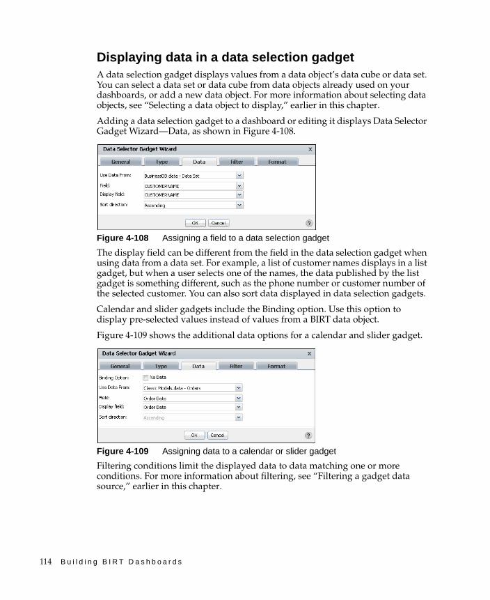
114 B u i l d i n g B I R T D a s h b o a r d s
Displaying data in a data selection gadgetA data selection gadget displays values from a data object’s data cube or data set. You can select a data set or data cube from data objects already used on your dashboards, or add a new data object. For more information about selecting data objects, see “Selecting a data object to display,” earlier in this chapter.
Adding a data selection gadget to a dashboard or editing it displays Data Selector Gadget Wizard—Data, as shown in Figure 4-108.
Figure 4-108 Assigning a field to a data selection gadget
The display field can be different from the field in the data selection gadget when using data from a data set. For example, a list of customer names displays in a list gadget, but when a user selects one of the names, the data published by the list gadget is something different, such as the phone number or customer number of the selected customer. You can also sort data displayed in data selection gadgets.
Calendar and slider gadgets include the Binding option. Use this option to display pre-selected values instead of values from a BIRT data object.
Figure 4-109 shows the additional data options for a calendar and slider gadget.
Figure 4-109 Assigning data to a calendar or slider gadget
Filtering conditions limit the displayed data to data matching one or more conditions. For more information about filtering, see “Filtering a gadget data source,” earlier in this chapter.

C h a p t e r 4 , B u i l d i n g a n a l y t i c d a s h b o a r d s 115
Formatting data selection gadgetsEach gadget type has different formatting options to assist user choices using the gadget. These options are available in Data Selector Gadget Wizard—Format.
Additionally, the following data types can be formatted for custom display by choosing Format As in Data Selector Gadget Wizard—Format:
■ Number column format, shown in Figure 4-110. Supporting general number, currency, fixed, percent, scientific, custom, and unformatted options.
Figure 4-110 Selecting a number format
■ Date column format, shown in Figure 4-111. Supports different date formats, custom formatting, and unformatted value options.
Figure 4-111 Selecting a date format
■ String column format, shown in Figure 4-112. Supports uppercase, lowercase, custom formatting, and unformatted options.
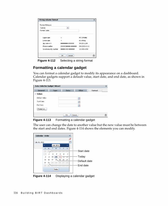
116 B u i l d i n g B I R T D a s h b o a r d s
Figure 4-112 Selecting a string format
Formatting a calendar gadgetYou can format a calendar gadget to modify its appearance on a dashboard. Calendar gadgets support a default value, start date, and end date, as shown in Figure 4-113.
Figure 4-113 Formatting a calendar gadget
The user can change the date to another value but the new value must be between the start and end dates. Figure 4-114 shows the elements you can modify.
Figure 4-114 Displaying a calendar gadget
Start date
End date
Default date
Today
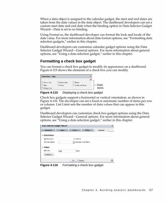
C h a p t e r 4 , B u i l d i n g a n a l y t i c d a s h b o a r d s 117
When a data object is assigned to the calendar gadget, the start and end dates are taken from the date values in the data object. The dashboard developers can set a custom start date and end date when the binding option in Data Selector Gadget Wizard—Data is set to no binding.
Using Format as, the dashboard developer can format the look and locale of the date value. For more information about date format options, see “Formatting data selection gadgets,” earlier in this chapter.
Dashboard developers can customize calendar gadget options using the Data Selector Gadget Wizard—General options. For more information about general options, see “Using a data selection gadget,” earlier in this chapter.
Formatting a check box gadgetYou can format a check box gadget to modify its appearance on a dashboard. Figure 4-115 shows the elements of a check box you can modify.
Figure 4-115 Displaying a check box gadget
Check box gadgets support a horizontal or vertical orientation, as shown in Figure 4-116. The developer can set a fixed or automatic number of items per row or column. List Limit sets the number of data values that can appear in this gadget.
Dashboard developers can customize check box gadget options using the Data Selector Gadget Wizard—General options. For more information about general options, see “Using a data selection gadget,” earlier in this chapter.
Figure 4-116 Formatting a check box gadget
Data items

118 B u i l d i n g B I R T D a s h b o a r d s
Formatting a combo box gadgetYou can format a combo box gadget to modify its appearance on a dashboard. Figure 4-117 displays the elements that you can modify.
Figure 4-117 Displaying a combo box gadget
Combo box gadgets can display a default value and a list limit. Select Allow Typing to support typing into the combo box to quickly find a known value. Enable auto suggest to present users with matching data as the user types a value. Figure 4-118 shows the combo box formatting options.
Figure 4-118 Formatting a combo box gadget
You can customize the gadget display options using the general options. For more information about general options, see “Using a data selection gadget,” earlier in this chapter.
Formatting a list gadgetYou can format a list gadget to modify its appearance on a dashboard. Figure 4-119 displays the elements you can modify.
Figure 4-119 Displaying a list gadget
Data items
Typing field
Data items
Search field
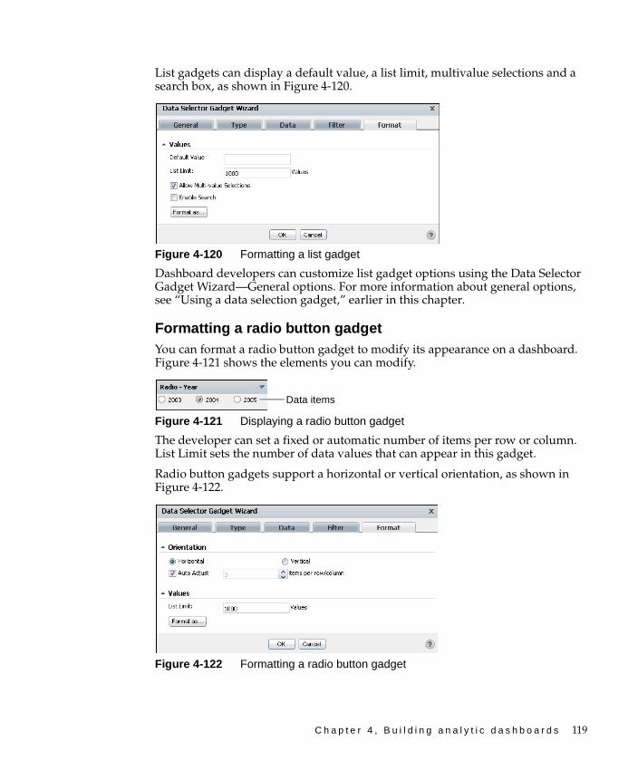
C h a p t e r 4 , B u i l d i n g a n a l y t i c d a s h b o a r d s 119
List gadgets can display a default value, a list limit, multivalue selections and a search box, as shown in Figure 4-120.
Figure 4-120 Formatting a list gadget
Dashboard developers can customize list gadget options using the Data Selector Gadget Wizard—General options. For more information about general options, see “Using a data selection gadget,” earlier in this chapter.
Formatting a radio button gadgetYou can format a radio button gadget to modify its appearance on a dashboard. Figure 4-121 shows the elements you can modify.
Figure 4-121 Displaying a radio button gadget
The developer can set a fixed or automatic number of items per row or column. List Limit sets the number of data values that can appear in this gadget.
Radio button gadgets support a horizontal or vertical orientation, as shown in Figure 4-122.
Figure 4-122 Formatting a radio button gadget
Data items

120 B u i l d i n g B I R T D a s h b o a r d s
Dashboard developers can customize radio button gadget options using the Data Selector Gadget Wizard—General options. For more information about general options, see “Using a data selection gadget,” earlier in this chapter.
Formatting a slider gadgetYou can format a slider gadget to modify its appearance on a dashboard. Figure 4-123 shows the elements you can modify.
Figure 4-123 Displaying a slider gadget
Slider gadgets support a horizontal or vertical orientation, as shown in Figure 4-124.
Figure 4-124 Formatting a slider gadget orientation
The range of values appearing on the slider is automatically adjusted based on the data displayed or you can set a minimum and maximum value.
When auto adjust tick marks is enabled, the tick marks appear on the slider. The developer can set the number of tick marks by disabling auto adjust tick marks interval. Figure 4-125 shows these options.
Figure 4-125 Formatting a slider gadget’s values
Thumb selector

C h a p t e r 4 , B u i l d i n g a n a l y t i c d a s h b o a r d s 121
One or two thumb selectors can display for user interaction. Using two thumb selectors enables the user to select a minimum and maximum value. Using one thumb selector makes additional data operators available. The developer can set default values for the thumb selectors to start from. For example, you can display a data cube’s week dimension in a slider gadget for users to select a period of time between two selected weeks, as shown in Figure 4-126.
Figure 4-126 Using a slider and custom format to select between two weeks
When a data object is assigned to the slider gadget, the minimum and maximum values are taken from the values in the data object. The dashboard developer can set a custom minimum and maximum value when the binding option in Data Selector Gadget Wizard—Data is set to no binding.
Dashboard developers can customize slider gadget options using the Data Selector Gadget Wizard—General options. For more information about general options, see “Using a data selection gadget,” earlier in this chapter.
Using a data version gadgetData version gadgets display available versions of BIRT data object store files for a user to view. The developer adds a data version gadget to a dashboard and selects a data object store file. All available versions of that data store file are displayed in the data version gadget. The developer then displays data from the same data object store file in data visualization gadgets, such as a chart and a table, on the dashboard. When the user selects a version of the data store, those gadgets update to display data from the selected version.
Selecting a data objectThe data version gadget displays the version number and, if available, the version name of the each version of the selected BIRT data store file. For example, if the dashboard developer wants to display the Sales.data file in a data version gadget, all versions of the Sales.data file are displayed in the data version gadget.
Choosing a selector typeYou can display data version gadgets in a combo box, list, or radio types. Use the Data Selector Gadget Wizard—Type options to change how the data version gadget is displayed, as shown in Figure 4-127.
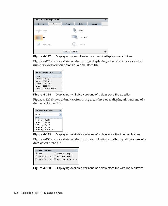
122 B u i l d i n g B I R T D a s h b o a r d s
Figure 4-127 Displaying types of selectors used to display user choices
Figure 4-128 shows a data version gadget displaying a list of available version numbers and version names of a data store file.
Figure 4-128 Displaying available versions of a data store file as a list
Figure 4-129 shows a data version using a combo box to display all versions of a data object store file.
Figure 4-129 Displaying available versions of a data store file in a combo box
Figure 4-130 shows a data version using radio buttons to display all versions of a data object store file.
Figure 4-130 Displaying available versions of a data store file with radio buttons
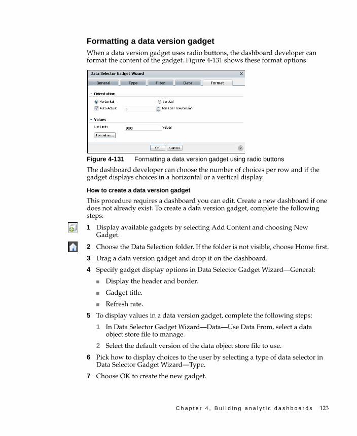
C h a p t e r 4 , B u i l d i n g a n a l y t i c d a s h b o a r d s 123
Formatting a data version gadgetWhen a data version gadget uses radio buttons, the dashboard developer can format the content of the gadget. Figure 4-131 shows these format options.
Figure 4-131 Formatting a data version gadget using radio buttons
The dashboard developer can choose the number of choices per row and if the gadget displays choices in a horizontal or a vertical display.
How to create a data version gadget
This procedure requires a dashboard you can edit. Create a new dashboard if one does not already exist. To create a data version gadget, complete the following steps:
1 Display available gadgets by selecting Add Content and choosing New Gadget.
2 Choose the Data Selection folder. If the folder is not visible, choose Home first.
3 Drag a data version gadget and drop it on the dashboard.
4 Specify gadget display options in Data Selector Gadget Wizard—General:
■ Display the header and border.
■ Gadget title.
■ Refresh rate.
5 To display values in a data version gadget, complete the following steps:
1 In Data Selector Gadget Wizard—Data—Use Data From, select a data object store file to manage.
2 Select the default version of the data object store file to use.
6 Pick how to display choices to the user by selecting a type of data selector in Data Selector Gadget Wizard—Type.
7 Choose OK to create the new gadget.
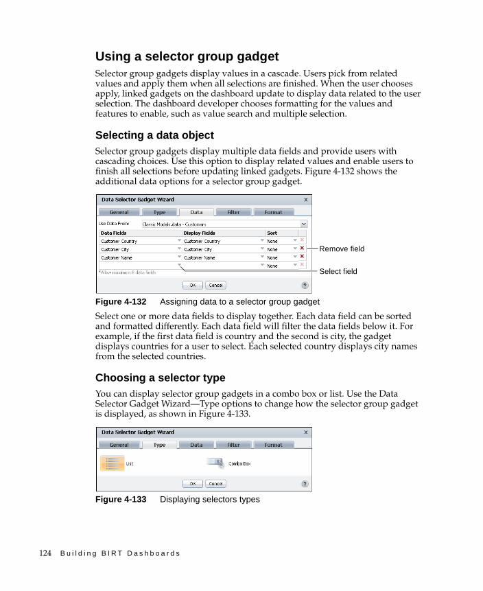
124 B u i l d i n g B I R T D a s h b o a r d s
Using a selector group gadgetSelector group gadgets display values in a cascade. Users pick from related values and apply them when all selections are finished. When the user chooses apply, linked gadgets on the dashboard update to display data related to the user selection. The dashboard developer chooses formatting for the values and features to enable, such as value search and multiple selection.
Selecting a data objectSelector group gadgets display multiple data fields and provide users with cascading choices. Use this option to display related values and enable users to finish all selections before updating linked gadgets. Figure 4-132 shows the additional data options for a selector group gadget.
Figure 4-132 Assigning data to a selector group gadget
Select one or more data fields to display together. Each data field can be sorted and formatted differently. Each data field will filter the data fields below it. For example, if the first data field is country and the second is city, the gadget displays countries for a user to select. Each selected country displays city names from the selected countries.
Choosing a selector typeYou can display selector group gadgets in a combo box or list. Use the Data Selector Gadget Wizard—Type options to change how the selector group gadget is displayed, as shown in Figure 4-133.
Figure 4-133 Displaying selectors types
Remove field
Select field
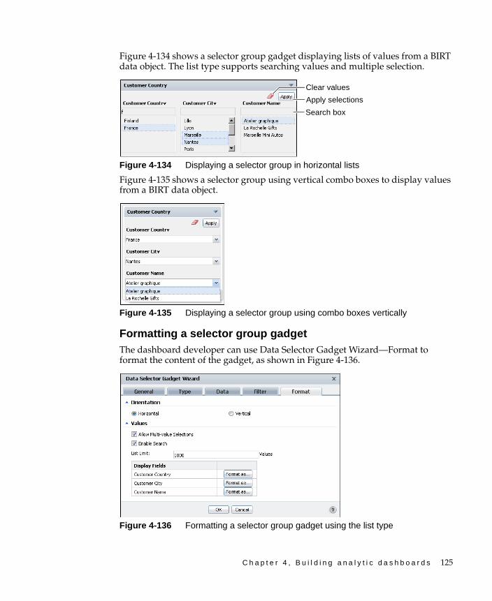
C h a p t e r 4 , B u i l d i n g a n a l y t i c d a s h b o a r d s 125
Figure 4-134 shows a selector group gadget displaying lists of values from a BIRT data object. The list type supports searching values and multiple selection.
Figure 4-134 Displaying a selector group in horizontal lists
Figure 4-135 shows a selector group using vertical combo boxes to display values from a BIRT data object.
Figure 4-135 Displaying a selector group using combo boxes vertically
Formatting a selector group gadgetThe dashboard developer can use Data Selector Gadget Wizard—Format to format the content of the gadget, as shown in Figure 4-136.
Figure 4-136 Formatting a selector group gadget using the list type
Apply selections
Search box
Clear values
126 B u i l d i n g B I R T D a s h b o a r d s
The dashboard developer can enable a horizontal or vertical display, multiple selections, and value search. The developer can also limit the quantity of values to display in the gadget and format each display field. For example, all country names could display in capital letters.
For more information about formatting options, see “Formatting data selection gadgets,” earlier in this chapter.
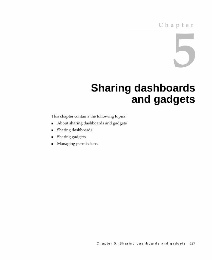
C h a p t e r 5 , S h a r i n g d a s h b o a r d s a n d g a d g e t s 127
C h a p t e r
5Chapter 5Sharing dashboards
and gadgetsThis chapter contains the following topics:
■ About sharing dashboards and gadgets
■ Sharing dashboards
■ Sharing gadgets
■ Managing permissions

128 B u i l d i n g B I R T D a s h b o a r d s
About sharing dashboards and gadgetsUsers can share and assign file access permissions to dashboard and gadget files. When users subscribe to a dashboard file they always receive the latest version of that file. Users that want to edit a shared dashboard must either copy the dashboard or open the original dashboard file using Information Console.
For example, a company’s dashboard developer shares a dashboard named “Shipments” with information about product shipping. If the company changes the primary shipping provider and adds some secondary shipment companies, the developer updates the Shipments dashboard and all users of the shared Shipments dashboard receive the changed dashboard when they log in to Information Console.
Shared gadgets enables users to build their own dashboards with pre-built gadgets. Continuing the previous example, the dashboard developer can build a gadget displaying daily outgoing shipments. When this gadget is shared, other users can add it to their personal dashboard.
Users can save dashboard and gadget files to the shared dashboard folder or to other directories on the Encyclopedia volume. When users save dashboard and gadget files to the shared dashboard folder, those files are available for users from the dashboard gallery and gadget gallery. Saving dashboard and gadget files to other locations requires users to open the file directly from the Information Console file manager.
Sharing dashboardsUsers can save one or more dashboards as a dashboard file for subscription or viewing by other users. Shared dashboards can open as a file for viewing and interaction, or display in external web pages using Actuate JSAPI. Shared dashboard files use Actuate file permissions and users can save them to a private or shared folder. Dashboards in the shared dashboard folder are available in the dashboard gallery when users build new dashboards.
Users subscribing to a dashboard file receive the latest version the next time they refresh their browser or log in to Information Console. Copied dashboards do not receive updates but the data that they display can change if the data object it uses is designed.
You can also save dashboards to a private folder. Saving dashboards to a private folder is useful for saving versions of a dashboard in progress or to temporarily remove a dashboard from your personal dashboard file. When the dashboard is in a private folder, you can view or edit the dashboard with the Information Console file explorer or add the dashboard back to your personal dashboard by
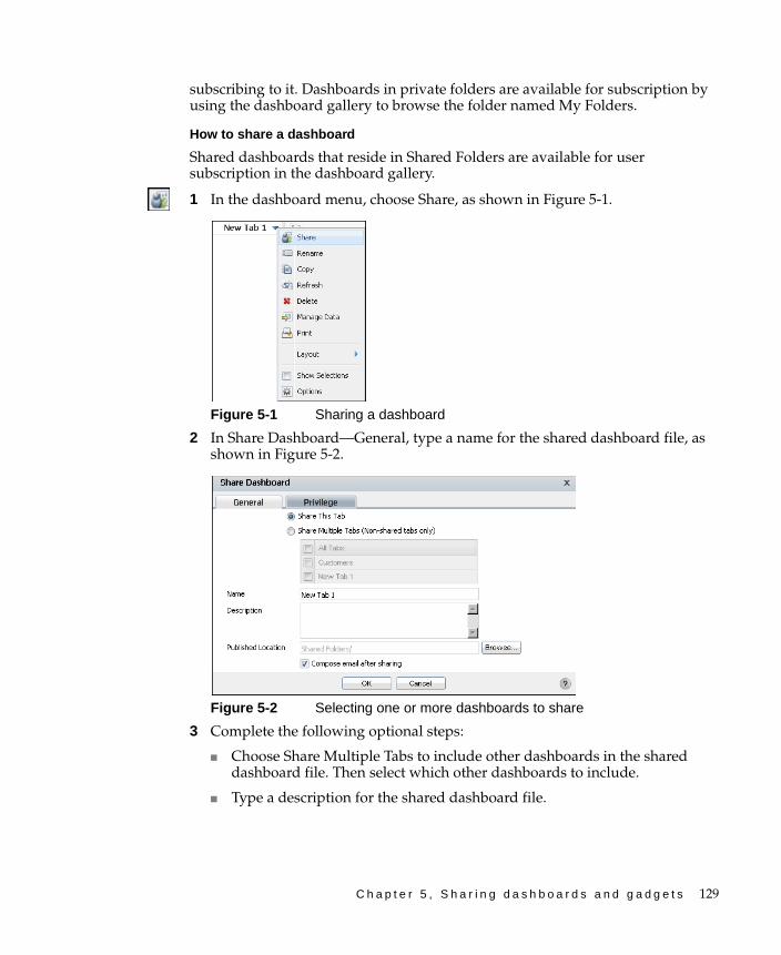
C h a p t e r 5 , S h a r i n g d a s h b o a r d s a n d g a d g e t s 129
subscribing to it. Dashboards in private folders are available for subscription by using the dashboard gallery to browse the folder named My Folders.
How to share a dashboard
Shared dashboards that reside in Shared Folders are available for user subscription in the dashboard gallery.
1 In the dashboard menu, choose Share, as shown in Figure 5-1.
Figure 5-1 Sharing a dashboard
2 In Share Dashboard—General, type a name for the shared dashboard file, as shown in Figure 5-2.
Figure 5-2 Selecting one or more dashboards to share
3 Complete the following optional steps:
■ Choose Share Multiple Tabs to include other dashboards in the shared dashboard file. Then select which other dashboards to include.
■ Type a description for the shared dashboard file.
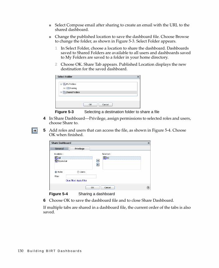
130 B u i l d i n g B I R T D a s h b o a r d s
■ Select Compose email after sharing to create an email with the URL to the shared dashboard.
■ Change the published location to save the dashboard file. Choose Browse to change the folder, as shown in Figure 5-3. Select Folder appears.
1 In Select Folder, choose a location to share the dashboard. Dashboards saved to Shared Folders are available to all users and dashboards saved to My Folders are saved to a folder in your home directory.
2 Choose OK. Share Tab appears. Published Location displays the new destination for the saved dashboard.
Figure 5-3 Selecting a destination folder to share a file
4 In Share Dashboard—Privilege, assign permissions to selected roles and users, choose Share to.
5 Add roles and users that can access the file, as shown in Figure 5-4. Choose OK when finished.
Figure 5-4 Sharing a dashboard
6 Choose OK to save the dashboard file and to close Share Dashboard.
If multiple tabs are shared in a dashboard file, the current order of the tabs is also saved.
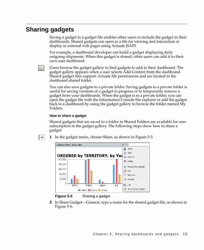
C h a p t e r 5 , S h a r i n g d a s h b o a r d s a n d g a d g e t s 131
Sharing gadgetsSaving a gadget to a gadget file enables other users to include the gadget in their dashboards. Shared gadgets can open as a file for viewing and interaction or display in external web pages using Actuate JSAPI.
For example, a dashboard developer can build a gadget displaying daily outgoing shipments. When this gadget is shared, other users can add it to their own user dashboard.
Users browse the gadget gallery to find gadgets to add to their dashboard. The gadget gallery appears when a user selects Add Content from the dashboard. Shared gadget files support Actuate file permissions and are located in the dashboard shared folder.
You can also save gadgets to a private folder. Saving gadgets to a private folder is useful for saving versions of a gadget in progress or to temporarily remove a gadget from your dashboards. When the gadget is in a private folder, you can open the gadget file with the Information Console file explorer or add the gadget back to a dashboard by using the gadget gallery to browse the folder named My Folders.
How to share a gadget
Shared gadgets that are saved to a folder in Shared Folders are available for user subscription in the gadget gallery. The following steps show how to share a gadget:
1 In the gadget menu, choose Share, as shown in Figure 5-5.
Figure 5-5 Sharing a gadget
2 In Share Gadget—General, type a name for the shared gadget file, as shown in Figure 5-6.
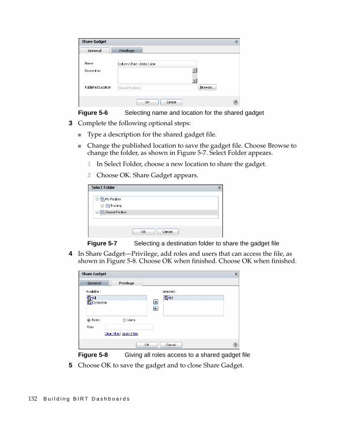
132 B u i l d i n g B I R T D a s h b o a r d s
Figure 5-6 Selecting name and location for the shared gadget
3 Complete the following optional steps:
■ Type a description for the shared gadget file.
■ Change the published location to save the gadget file. Choose Browse to change the folder, as shown in Figure 5-7. Select Folder appears.
1 In Select Folder, choose a new location to share the gadget.
2 Choose OK. Share Gadget appears.
Figure 5-7 Selecting a destination folder to share the gadget file
4 In Share Gadget—Privilege, add roles and users that can access the file, as shown in Figure 5-8. Choose OK when finished. Choose OK when finished.
Figure 5-8 Giving all roles access to a shared gadget file
5 Choose OK to save the gadget and to close Share Gadget.

C h a p t e r 5 , S h a r i n g d a s h b o a r d s a n d g a d g e t s 133
Managing permissionsA user’s file access permissions combined with a user’s security role determines what actions a user can perform on a dashboard or gadget file. Functionality such as viewing BIRT document files requires appropriate BIRT iServer options, such as the Actuate BIRT option. Contact your BIRT iServer administrator for information on currently installed options.
Default dashboard feature IDs and Information Console functionality levels correspond with default security roles in BIRT iServer, as shown in Table 5-1.
New users created on the BIRT iServer receive the Active Portal Advanced security role. The BIRT iServer administrator can change the default functionality levels and security roles. For more information about functionality levels and security roles, see Managing an Encyclopedia Volume.
Additionally, user actions correspond to user security roles on BIRT iServer and offer different user functions actions, as shown in Table 5-2.
For example, giving a user write access to a dashboard file also requires that the user have a security role that allows modifying dashboards. Different security
Table 5-1 Dashboard feature names, functionality levels, and security roles
Dashboard feature ID Functionality level BIRT iServer security role
Consumer Basic All
Business User Intermediate Active Portal Intermediate
Developer Advanced Active Portal Advanced
Developer Administrator Active Portal Administrator
Table 5-2 Default dashboard user actions and functionality level
Actions Bas
ic
Inte
rmed
iate
Ad
van
ced
Ad
min
istr
ator
Viewing dashboard files and embedded gadgets ✓ ✓ ✓ ✓
Building, modifying, and sharing dashboards ✓ ✓ ✓
Creating gadget types: report and extras ✓ ✓ ✓
Creating gadget types: data selection and data visualization ✓ ✓
Sharing gadget files ✓ ✓

134 B u i l d i n g B I R T D a s h b o a r d s
roles exist in customized Information Console installations. The Encyclopedia volume administrator manages security roles.
Dashboard users require appropriate permissions to view and edit any data that is embedded in a dashboard gadget. This embedded data includes BIRT document files or external web content displayed in dashboard gadgets. For example, a user who wants to analyze a cross tab in a BIRT document file. The BIRT file is displayed in a report gadget. The user needs the following file access permissions:
■ Permission to view the dashboard file
■ Permission to view the original BIRT document file
The user also needs to be using BIRT iServer with the following iServer option:
■ The Actuate BIRT for iServer option for viewing the BIRT document
■ The Actuate BIRT 360 for iServer option for using dashboards
Users who subscribe to a dashboard use their own permissions in BIRT iServer to access data or run reports. For example, an administrative user creating a shared dashboard does not give users of that shared dashboard administrative access to data or files on BIRT iServer. Users of the shared dashboard can view gadgets on the dashboard using their own permissions.
Shared dashboards receive visible and read rights for the selected users and roles. Users can assign additional file permissions using Information Console.
C h a p t e r 6 , L i n k i n g a n d s c r i p t i n g g a d g e t s 135
C h a p t e r
6Chapter 6Linking and
scripting gadgetsThis chapter contains the following topics:
■ About linking gadgets together
■ Building gadget links
■ Scripting linked gadgets
136 B u i l d i n g B I R T D a s h b o a r d s
About linking gadgets togetherGadgets link to each other so that information from one gadget can change the information displayed in another gadget. One gadget publishes information, and one or more other gadgets subscribe to the publishing gadget, linking the two gadgets together. Gadgets, like data selection gadgets, publish their data when a user changes a value, such as selecting an item from a list.
This process supports the following data scenarios:
■ Filtering visual displays based on parameter selection by a user
■ Cascading choices, where selections in one data selection gadget populates choices displayed in another data selection gadget
■ Interlinking data sources, where changes in a data selection gadget can affect gadgets using data from different data objects
■ User selection-triggered scripts that execute global JavaScript code
For example, a chart gadget and a report gadget link to a list gadget that contains the names of countries. When a user selects a country in the list gadget, the chart and the report gadget update with data related to the selected country.
Figure 6-1 shows linking gadgets receiving filtered data based on user selection. The filtered data is then displayed to the user.
Figure 6-1 Gadgets linking to list gadget
Each linked gadget can use different BIRT data objects as data sources. Using different data objects requires that the value published by the data selection gadget matches a data field in the linked gadgets.
REPORTLIST
Datasource
Webbrowser
Gadgets on a BIRT dashboard
Userselection
Remote user
Filtereddata
Data object
USAFranceJapan
Linked to list
BIRTdesign file
CHART
Linked to list
Dataobject Filtered
data
Datasource
BIRTiServer
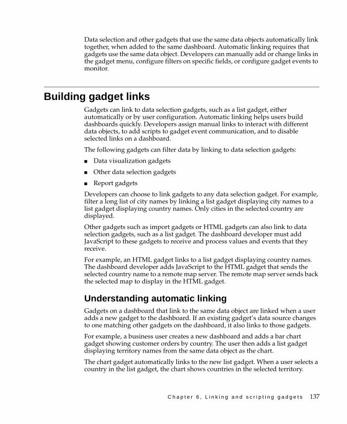
C h a p t e r 6 , L i n k i n g a n d s c r i p t i n g g a d g e t s 137
Data selection and other gadgets that use the same data objects automatically link together, when added to the same dashboard. Automatic linking requires that gadgets use the same data object. Developers can manually add or change links in the gadget menu, configure filters on specific fields, or configure gadget events to monitor.
Building gadget linksGadgets can link to data selection gadgets, such as a list gadget, either automatically or by user configuration. Automatic linking helps users build dashboards quickly. Developers assign manual links to interact with different data objects, to add scripts to gadget event communication, and to disable selected links on a dashboard.
The following gadgets can filter data by linking to data selection gadgets:
■ Data visualization gadgets
■ Other data selection gadgets
■ Report gadgets
Developers can choose to link gadgets to any data selection gadget. For example, filter a long list of city names by linking a list gadget displaying city names to a list gadget displaying country names. Only cities in the selected country are displayed.
Other gadgets such as import gadgets or HTML gadgets can also link to data selection gadgets, such as a list gadget. The dashboard developer must add JavaScript to these gadgets to receive and process values and events that they receive.
For example, an HTML gadget links to a list gadget displaying country names. The dashboard developer adds JavaScript to the HTML gadget that sends the selected country name to a remote map server. The remote map server sends back the selected map to display in the HTML gadget.
Understanding automatic linkingGadgets on a dashboard that link to the same data object are linked when a user adds a new gadget to the dashboard. If an existing gadget’s data source changes to one matching other gadgets on the dashboard, it also links to those gadgets.
For example, a business user creates a new dashboard and adds a bar chart gadget showing customer orders by country. The user then adds a list gadget displaying territory names from the same data object as the chart.
The chart gadget automatically links to the new list gadget. When a user selects a country in the list gadget, the chart shows countries in the selected territory.
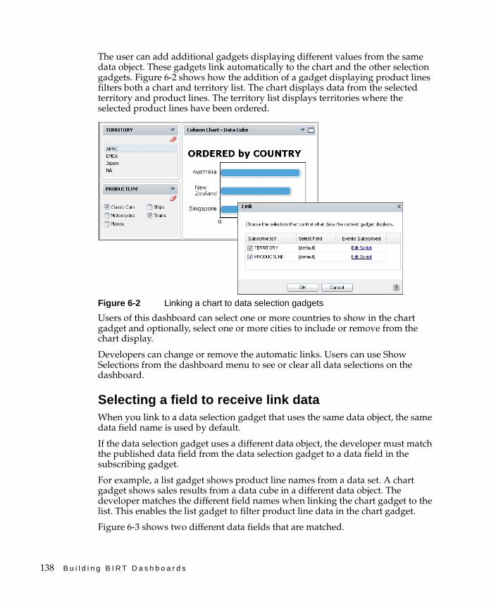
138 B u i l d i n g B I R T D a s h b o a r d s
The user can add additional gadgets displaying different values from the same data object. These gadgets link automatically to the chart and the other selection gadgets. Figure 6-2 shows how the addition of a gadget displaying product lines filters both a chart and territory list. The chart displays data from the selected territory and product lines. The territory list displays territories where the selected product lines have been ordered.
Figure 6-2 Linking a chart to data selection gadgets
Users of this dashboard can select one or more countries to show in the chart gadget and optionally, select one or more cities to include or remove from the chart display.
Developers can change or remove the automatic links. Users can use Show Selections from the dashboard menu to see or clear all data selections on the dashboard.
Selecting a field to receive link dataWhen you link to a data selection gadget that uses the same data object, the same data field name is used by default.
If the data selection gadget uses a different data object, the developer must match the published data field from the data selection gadget to a data field in the subscribing gadget.
For example, a list gadget shows product line names from a data set. A chart gadget shows sales results from a data cube in a different data object. The developer matches the different field names when linking the chart gadget to the list. This enables the list gadget to filter product line data in the chart gadget.
Figure 6-3 shows two different data fields that are matched.

C h a p t e r 6 , L i n k i n g a n d s c r i p t i n g g a d g e t s 139
Figure 6-3 Selecting a field to receive a data selection link
Using multiple user selectionsWhen multiple data selection gadgets link together, each gadget updates to display a subset of all user selections. Each user selection also updates linked visualization or report gadgets.
For example, consider a chart gadget linking to two data selection gadgets; a list gadget displaying country names and a list gadget displaying city names. If the user selects a country, then the city list updates to show cities in the country and the chart gadget displays data about the country. If the user selects a city, then the country list updates to show the country containing the city and the chart gadget updates to displays data about the city.
The Show Selection gadget from the dashboard menu can clear all data selections on the dashboard at the same time.
Building one-way cascading selectionsTwo or more data selection gadgets can link to each other to show subsets of their displayed values. Gadgets link automatically when using the same data object on the same dashboard. Editing the gadget links enables you to limit which user selections can update other gadgets.
For example, a list gadget showing customer names and a list gadget showing order numbers link to each other. When the user selects either a customer name, or customer order number, the other gadget updates its displayed values. Removing the link from the customer name list to the order number list stops the customer name list from updating. The order number list remains linked to the customer name list. Changes to the customer name list continue to change the order number list.
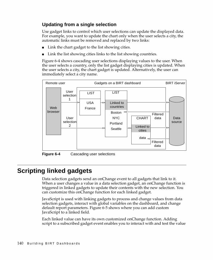
140 B u i l d i n g B I R T D a s h b o a r d s
Updating from a single selectionUse gadget links to control which user selections can update the displayed data. For example, you want to update the chart only when the user selects a city, the automatic links must be removed and replaced by two links:
■ Link the chart gadget to the list showing cities.
■ Link the list showing cities links to the list showing countries.
Figure 6-4 shows cascading user selections displaying values to the user. When the user selects a country, only the list gadget displaying cities is updated. When the user selects a city, the chart gadget is updated. Alternatively, the user can immediately select a city name.
Figure 6-4 Cascading user selections
Scripting linked gadgetsData selection gadgets send an onChange event to all gadgets that link to it. When a user changes a value in a data selection gadget, an onChange function is triggered in linked gadgets to update their contents with the new selection. You can customize this onChange function for each linked gadget.
JavaScript is used with linking gadgets to process and change values from data selection gadgets, interact with global variables on the dashboard, and change default report parameters. Figure 6-5 shows where you can add custom JavaScript to a linked field.
Each linked value can have its own customized onChange function. Adding script to a subscribed gadget event enables you to interact with and test the value
BIRT iServer
LIST LIST
Webbrowser
Gadgets on a BIRT dashboard
User selection
1
Remote user
Filtereddata
USA
France
Linked tocountries
CHART
Linked tocities
dataFiltered
data
User selection
2
Datasource
Boston
NYC
Portland
Seattle
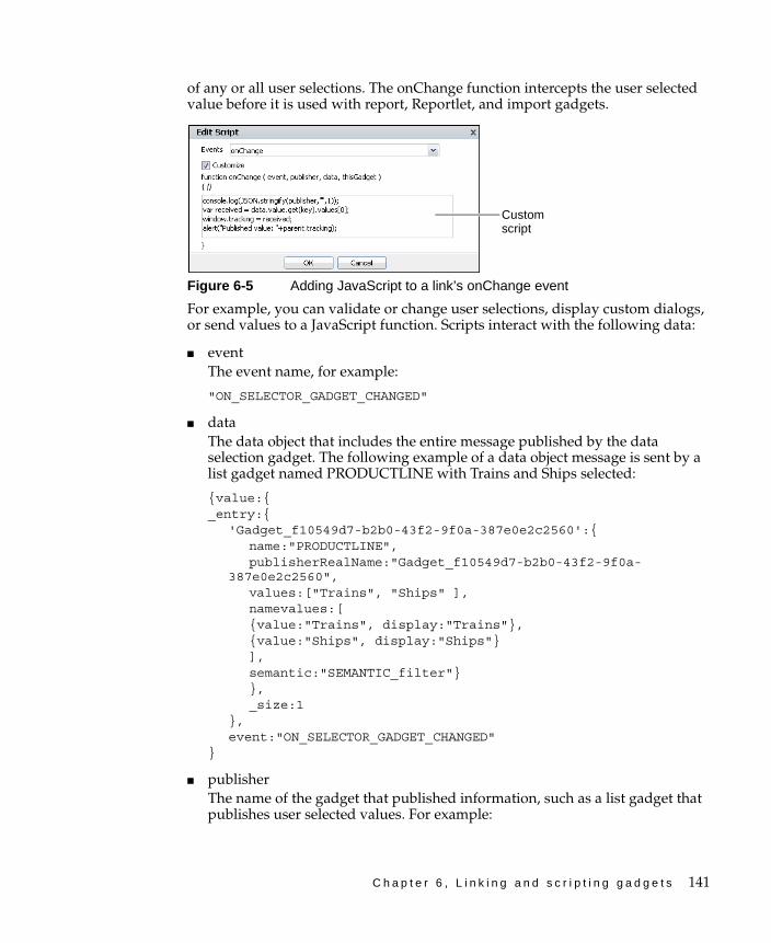
C h a p t e r 6 , L i n k i n g a n d s c r i p t i n g g a d g e t s 141
of any or all user selections. The onChange function intercepts the user selected value before it is used with report, Reportlet, and import gadgets.
Figure 6-5 Adding JavaScript to a link’s onChange event
For example, you can validate or change user selections, display custom dialogs, or send values to a JavaScript function. Scripts interact with the following data:
■ eventThe event name, for example:
"ON_SELECTOR_GADGET_CHANGED"
■ dataThe data object that includes the entire message published by the data selection gadget. The following example of a data object message is sent by a list gadget named PRODUCTLINE with Trains and Ships selected:
{value:{_entry:{
'Gadget_f10549d7-b2b0-43f2-9f0a-387e0e2c2560':{name:"PRODUCTLINE",publisherRealName:"Gadget_f10549d7-b2b0-43f2-9f0a-
387e0e2c2560",values:["Trains", "Ships" ],namevalues:[{value:"Trains", display:"Trains"},{value:"Ships", display:"Ships"}],semantic:"SEMANTIC_filter"}},_size:1
},event:"ON_SELECTOR_GADGET_CHANGED"
}
■ publisherThe name of the gadget that published information, such as a list gadget that publishes user selected values. For example:
Custom script
142 B u i l d i n g B I R T D a s h b o a r d s
{"_gadgetName": "Gadget_f10549d7-b2b0-43f2-9f0a-387e0e2c2560","_gadgetTitle": "PRODUCTLINE","_gadgetType": "selector","_tabName": "823a17bc-c0a7-4d46-84d2-a4726ad624ce","_tabTitle": "New Tab 1"
}
■ thisGadgetThis object refers to the report or Reportlet gadget receiving the published message. You can use this data to verify values in parameters and set conditions for updating a linking gadget.
The following example shows the value of thisGadget for a BIRT report design file with a customer name parameter:
{_gadgetName:"Gadget_95497566-9ce3-4fc6-8bde-3159ca69c173",_gadgetTitle:"Report - Customer Order History",_gadgetType:"viewer",_tabName:"823a17bc-c0a7-4d46-84d2-a4726ad624ce",_tabTitle:"New Tab 1",_currentReportParameters:[
{_:{initialize:(function (){} ),_FACADE_INSTANCE:{},_name:"Customer",_value:"Saveley & Henriot, Co.",_valueIsNull:false,_isRequired:true,_isMultiList:false,_dataType:"String"
}}
]}
Using the onChange functionUse the onChange function to access gadget messages sent by data selection gadgets. This enables you to use JavaScript to access user selections. You can then view these values in a JavaScript debug console or in JavaScript alerts.
Displaying values in a JavaScript consoleYou can view a user selection from a list gadget using a a web browser’s JavaScript console. The following JavaScript code displays the publisher of a linked gadget event in a JavaScript console that supports the JSON method, such as Internet Explorer:
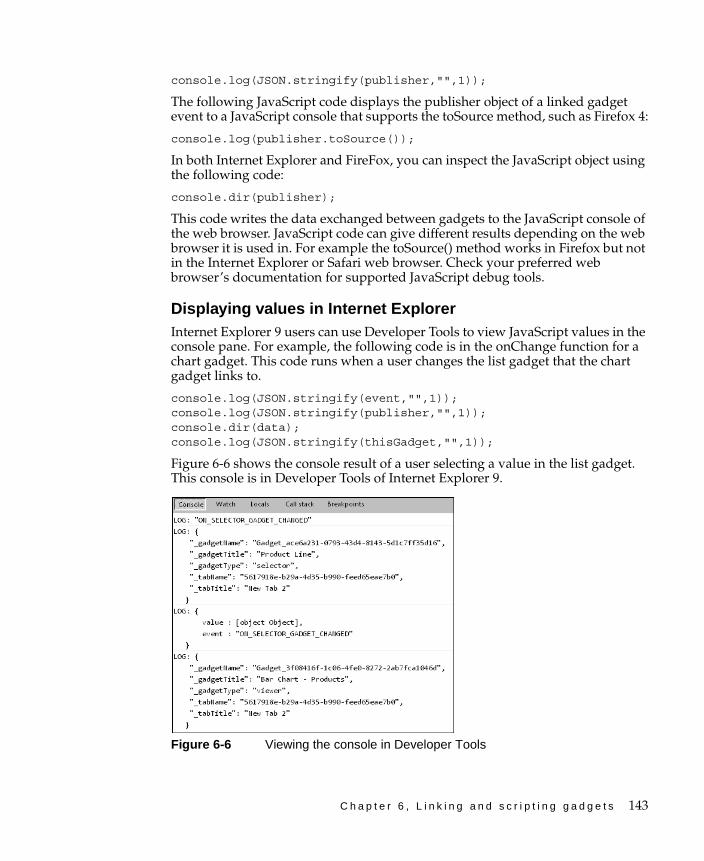
C h a p t e r 6 , L i n k i n g a n d s c r i p t i n g g a d g e t s 143
console.log(JSON.stringify(publisher,"",1));
The following JavaScript code displays the publisher object of a linked gadget event to a JavaScript console that supports the toSource method, such as Firefox 4:
console.log(publisher.toSource());
In both Internet Explorer and FireFox, you can inspect the JavaScript object using the following code:
console.dir(publisher);
This code writes the data exchanged between gadgets to the JavaScript console of the web browser. JavaScript code can give different results depending on the web browser it is used in. For example the toSource() method works in Firefox but not in the Internet Explorer or Safari web browser. Check your preferred web browser’s documentation for supported JavaScript debug tools.
Displaying values in Internet ExplorerInternet Explorer 9 users can use Developer Tools to view JavaScript values in the console pane. For example, the following code is in the onChange function for a chart gadget. This code runs when a user changes the list gadget that the chart gadget links to.
console.log(JSON.stringify(event,"",1));console.log(JSON.stringify(publisher,"",1));console.dir(data);console.log(JSON.stringify(thisGadget,"",1));
Figure 6-6 shows the console result of a user selecting a value in the list gadget. This console is in Developer Tools of Internet Explorer 9.
Figure 6-6 Viewing the console in Developer Tools
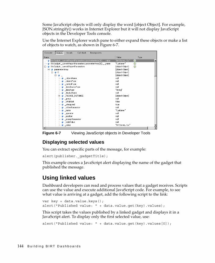
144 B u i l d i n g B I R T D a s h b o a r d s
Some JavaScript objects will only display the word [object Object]. For example, JSON.stringify() works in Internet Explorer but it will not display JavaScript objects in the Developer Tools console.
Use the Internet Explorer watch pane to either expand these objects or make a list of objects to watch, as shown in Figure 6-7.
Figure 6-7 Viewing JavaScript objects in Developer Tools
Displaying selected valuesYou can extract specific parts of the message, for example:
alert(publisher._gadgetTitle);
This example creates a JavaScript alert displaying the name of the gadget that published the message.
Using linked valuesDashboard developers can read and process values that a gadget receives. Scripts can use the value and execute additional JavaScript code. For example, to see what value is arriving at a gadget, add the following script to the link:
var key = data.value.keys();alert("Published value: " + data.value.get(key).values);
This script takes the values published by a linked gadget and displays it in a JavaScript alert. To display only the first selected value, use:
alert("Published value: " + data.value.get(key).values[0]);
C h a p t e r 6 , L i n k i n g a n d s c r i p t i n g g a d g e t s 145
JavaScript can change user selected values, such as changing the selection value of France to FR. This enables you to select parts of a user selection, such as, extracting a tracking number or part of a phone number, and apply additional changes to the selection.
Scripts can read and change report parameter values of report gadgets and values going to import gadgets. Scripts can also write user selection values to a global variable on the dashboard page.
For example, a script on an HTML gadget can write the value of a user selection to a global variable using the following code:
var key = data.value.keys();var received = data.value.get(key).values[0];window.tracking = received;
The HTML gadget can retrieve the global variable with the following HTML code:
<script type="text/javascript">var message = parent.tracking;document.write(message)
</script>
The HTML gadget must be refreshed to load the global variable. You can refresh a gadget by selecting Refresh from the gadget menu.
Reading and writing parameter valuesYou can use scripts to read and write current parameter values for report and Reportlet gadgets. The thisGadget object uses the getCurrentReportParameters() function to view and change report parameters.
Scripts support the following actions:
■ Set conditions for the using a data selection value.
■ Change the value of the linked data selection.
■ Change the parameter value of the report or Reportlet gadget.
For example, a dashboard developer makes a report gadget to display country information in a BIRT design file. The developer expects users to select a country from a linked list gadget. The BIRT design file has parameters for Country, State and City but the developer only wants to show country information. Listing 6-1 shows a script to remove current parameter values for State and City, as shown in the following sample script.

146 B u i l d i n g B I R T D a s h b o a r d s
Listing 6-1 Example script for reading and writing report parameters
var params = thisGadget.getCurrentReportParameters();for ( var i = 0; i < params.length; i++ )
{var param = params[i];if ((param.getName() == 'State') || (param.getName() == 'City'))
{param.setValue('');param.setValueIsNull(true);data.runReport = false;}
}

C h a p t e r 7 , M a n a g i n g d a s h b o a r d r e s o u r c e s 147
C h a p t e r
7Chapter 7Managing dashboard
resourcesThis chapter contains the following topics:
■ About external resources
■ Managing BIRT data objects
■ Managing external resources
■ Managing dashboard resources
148 B u i l d i n g B I R T D a s h b o a r d s
About external resourcesActuate gadgets can display external resources such as images, videos, remote web sites, and external gadget files on the dashboard. BIRT iServer does not manage these external resources. The external resources reload each time a user views a dashboard containing these gadgets.
The user or computer administrator must install any browser plug-ins necessary to view external content, such as Adobe Flash Player.
Network firewalls, bandwidth limitations, domain-name resolution, internet connectivity, and the power of the remote server that stores the external resources affect the delivery and quality of external resources that appear in a gadget.
Some external content requires licensing or other approval to reuse. These sites often have published terms of use. If there is any question about the reuse of an external resource, contact the owner.
Managing BIRT data objectsData visualization and data selection gadgets display data from BIRT data objects. Data objects are stored as files in the Resource folder of the Encyclopedia volume and supports Actuate file permissions. Developers create data object files with BIRT Designer Professional.
Data object designs query data on demand and are saved as files with the file-name extension .datadesign. These files give users the most current information because the queries are made on demand. This also means that users viewing recently updated data can view different data.
Data object stores cache data from a previous query as a file with the file-name extension .data. This file enables users to access the information faster than waiting for a query to data sources. If BIRT iServer has adequate memory to load the object store files, one or more these files can reside in memory, resulting in an improved dashboard result time.
Data object store files, in addition to providing improved response for data queries, ensures that all users of the data object store receive the same data. Dashboard developers can choose a specific version or the latest version of a data object store file to display in a gadget. Users view the latest version of the data object store file when the most recent version is selected. For example, if a data object design file is scheduled to create a data object store file every week, using the latest version setting enables the gadget to display data from the newest weekly version, without further configuration.
Users and gadget builders can filter data in data visualization gadgets in the following ways:
C h a p t e r 7 , M a n a g i n g d a s h b o a r d r e s o u r c e s 149
■ Setting parameters of a data object using Manage data from the dashboard menu
■ Using the gadget menu’s data source filtering
■ Using data selection gadgets
■ Using the context menu’s filter settings
Each of the previous filtering solutions requires specific privileges. For example, a user with all necessary privileges, such as an administrator, can filter data using any of the previous solutions. A user with privileges to only view a dashboard can use data selection gadgets or the context menu to apply filtering on the dashboard’s gadgets.
Setting parameters of a data object filters values for all gadgets using that data object. The BIRT developer who creates the data object must enable parameters.
BIRT files displayed in report or Reportlet gadgets do not use the dashboard to manage their data sources. BIRT Designer Professional and BIRT Studio manage the data sources used by BIRT files.
Managing external resourcesExternal gadget resources require the external web service or file to be available on user demand. Neither Information Console or BIRT iServer cache these resources.
Displaying a URLYou can display a web site or web application on the dashboard using an HTML gadget. For example, using a URL such as http://www.actuate.com loads the Actuate web site into the HTML gadget.
Some web sites and web applications support receiving additional parameters in the URL. If the additional parameters in the URL require special encoding you can encode the URL or consider using JavaScript redirection with the same URL in the HTML gadget.
To use an unencoded URL in an HTML gadget, replace the unencoded characters as shown in Table 7-1.
Table 7-1 Encoding URL characters for an HTML gadget
Character Replacement text
Backslash (\) Slash (/) or the URL encoding of %5C
Space ( ) The URL encoding %20
Ampersand (&) The HTML character entity &

150 B u i l d i n g B I R T D a s h b o a r d s
For example, the following URL does not work in an HTML gadget:
http://localhost:8700/iportal/iv?__report=\Home\US sales.rptdocument&__page=3
The following rewritten URL works in an HTML gadget:
http://localhost:8700/iportal/iv?__report=%5CHome%5CUS%20sales.rptdocument&__page=3
Similarly, to use a URL inside a JavaScript redirection, replace any backslashes with a slash or the URL encoding of %5C. The following code shows JavaScript redirection used to display a URL:
<script type="text/javascript"> <!-- window.location = "URL"//-->
</script>
Place this code in the HTML section of the HTML gadget, replacing URL with the URL that retrieves the Actuate document. For example, the URL to a BIRT report document file is:
http://localhost:8700/iportal/iv?__report=\Home\US Sales.rptdocument&__report=3
The following JavaScript redirection script loads the BIRT report document into an HTML gadget:
<script type="text/javascript"> <!-- window.location = "http://localhost:8700/iportal/iv?__report=/Home/US sales.rptdocument&__page=3"//-->
</script>
Some web sites do not permit embedding their content in another web site or attempt to control the browser display to present their content. For example, JavaScript code using "parent" or "top" to access HTML components can overwrite parts of the Information Console interface.
When displaying an external site in an HTML gadget, hyperlinks in embedded web sites can redirect the user to other locations or web sites. How this link resolves depends on the HTML code of the remote site. If the link attempts to load a new page in the place of the existing page, it is possible for the user of an HTML gadget to browse different web sites on the internet.
Displaying Adobe Flash contentAdobe Flash content often appears above other content such as a gadget menu, when displayed in a web browser. If a dashboard developer has access to the source code of the HTML or Google gadget that displays the Adobe Flash

C h a p t e r 7 , M a n a g i n g d a s h b o a r d r e s o u r c e s 151
content, the developer can add the wmode parameter to enable other content to appear above the Adobe Flash content. The wmode parameter must be in the object tag that displays the Adobe Flash content and have a value of opaque or transparent. Opaque is less processor intensive on the user’s web browser than transparent.
The following code shows an example of setting the wmode parameter to opaque for embedded Adobe Flash content:
<object type="application/x-shockwave-flash" width="100%" height="100%" id="flash" data="/iportal/testing/test.swf"><param name="movie" value="/iportal/testing/test.swf" /><param name="quality" value="best" /><param name="wmode" value="opaque" /><param name="bgcolor" value="ffffff" />
</object>
If the you do not have access to the source code where the Adobe Flash content appears, contact the web site administrator where the content appears and ask them to set the wmode parameter to transparent in the object tag displaying the Adobe Flash content.
Displaying embedded HTMLEmbedded HTML can include HTML, CSS, and JavaScript code that is not supported by the user’s browser and computer. For example, not all web browsers support HTML5 or CSS3. A Linux computer cannot load ActiveX components, and a Windows computer requires a Java runtime to use Java Web Start.
Web applications that require special network ports or protocols, such as a video chat application, require those ports be available on the local computer that accesses Information Console.
Displaying imagesImages stored on a web server can appear in an image gadget or HTML gadget. The image gadget uses Adobe Flash to display images on the dashboard. If users do not have Adobe Flash Player installed, consider embedding the image content in an HTML gadget.
Displaying third-party gadgetsThird-party gadgets are XML files that are displayed in import gadgets and are retrieved from:
■ A web server on the internet
■ An internal network web server

152 B u i l d i n g B I R T D a s h b o a r d s
These gadgets must be valid XML files and follow the Google gadget specification for gadget design. Information Console must be able to retrieve the gadget file to render it as HTML. If Information Console does not have access to the internet, the gadget file can be moved to a web server on an internal network.
For more information about writing Google gadgets for BIRT iServer, see Chapter 8, “Building custom gadgets.”
Displaying videosVideos on a web server can appear in a video gadget on a dashboard. The BIRT iServer does not manage the bandwidth and memory required for this video.
Testing external resourcesIt is important to test external resources and custom JavaScript code that you use on dashboards before deployment. During testing, if a new gadget causes any rendering issues, the developer can try some of the following solutions:
■ Disable any required web browser plug-ins.
■ Press ESC to stop gadget rendering on the dashboard.
■ Refresh the web browser.
■ Reset the user’s personal dashboard.
■ Use the computer’s network firewall to block access temporarily to the external site where the content is stored.
■ Remove the user’s personal dashboard file, which contains the user’s dashboard information. This deletes all the user’s dashboards currently displayed on their personal dashboard.
If the content uses a lot of memory, such as embedded video players, lots of development can increase the memory used by the web browser. Consider restarting the web browser or monitoring the memory used by the web browser.
If there are any rendering issues for a shared dashboard or gadget, the developer that created the file can try one of the following solutions:
■ Change the user permissions on the file.
■ Delete, move, or rename the shared file.
■ Save a new version of the file with changed or disabled content.
For example, a developer is reviewing a dashboard gadget that retrieves information from an external web site. If the external web site is not available, the developer can replace the dashboard or gadget with a text gadget that explains why the functionality is currently unavailable.

C h a p t e r 7 , M a n a g i n g d a s h b o a r d r e s o u r c e s 153
A user’s personal dashboard file contains all the user’s dashboard information. This file is located in the user’s home directory. If the user does not have a home directory, the personal dashboard file is stored in the root of the Encyclopedia volume. Deleting this file removes all shared and personal dashboards in the user’s account.
Managing dashboard resourcesMany Information Console resources are available in the Encyclopedia Volume’s Resource directory. Dashboards use resources from other locations, such as the following:
■ Personal dashboard file
■ Shared dashboards
■ Dashboard style sheets
Understanding the personal dashboardDashboards and links to shared dashboards reside in a user’s personal dashboard file. This file is in the user’s home directory or in the root of the Encyclopedia volume if the user does not have a home directory. The personal dashboard file name is __xxxxx_dashboard.dashboard, where xxxxx is the name of the user. Deleting this file erases the dashboard configuration for that user.
This file is created when a user creates a new dashboard or subscribes to an existing one.
Understanding shared dashboardsUsers cannot edit shared dashboards. These dashboards are loaded each time the user refreshes the web browser, refreshes the shared dashboard, or logs in to Information Console. If the shared dashboard file changed since the last time it was loaded, the newest version loads.
Understanding dashboard style sheetsMany parts of the Actuate dashboard environment and browser-based tools use style sheets located in the Encyclopedia volume or in the installation of Information Console.
The Information Console uses different skins to customize the appearance of the web interface. Gadgets such as data visualization gadgets use CSS style sheets in the ThemesReportItems.rptlibrary, located in the Resource folder of the Encyclopedia volume.
154 B u i l d i n g B I R T D a s h b o a r d s
HTML, video, and third-party gadgets can load their own CSS style sheets in their embedded content.
Report and Reportlet gadgets use style sheets and themes that are defined in the embedded BIRT document or design file.
Cross-tab gadgets use the themes embedded in the cross tab by the browser-based BIRT Data Analyzer tool.
For more information about managing style sheets for Information Console, see Information Console Developer Guide. Also see BIRT: A Field Guide and Integrating and Extending BIRT, both published by Addison-Wesley.
C h a p t e r 8 , B u i l d i n g c u s t o m g a d g e t s 155
C h a p t e r
8Chapter 8Building custom gadgets
This chapter contains the following topics:
■ About gadget specifications
■ About Actuate gadgets
■ About Google gadgets
■ Creating Google gadgets
■ Linking Google gadgets
■ Using a gadget-building tool
156 B u i l d i n g B I R T D a s h b o a r d s
About gadget specificationsDashboards support Actuate and Google gadget specifications. These specifications define the XML structure of the gadget files. Gadget developers can make custom gadgets using the Google gadget specification to display the customized content on the dashboard.
Actuate gadgets are included with Information Console and stored in the Encyclopedia volume. The data visualization, data selection, report and extras gadget categories are Actuate gadgets.
Google gadgets are XML files that contain CSS, HTML, and JavaScript code. Gadget developers can create custom Google gadgets or use public ones to access the services of those gadgets from the dashboard. Google gadgets give the dashboard developer complete control of how data appears within a gadget, can request external content for display on the dashboard, and can link to Actuate gadgets.
For example, a Google gadget can receive shipment tracking number code, send the code to the shipping company’s web service, receive the data on the current status of the shipment, and format that data for display on the dashboard. When a user selects an order number the current status on the order shipment appears on the dashboard, in the import gadget.
About Actuate gadgetsUsers build Actuate gadgets with browser-based gadget wizards available in Information Console. These wizards are launched when a user adds a gadget to a dashboard or edits an existing gadget. Actuate gadgets can link to each other and to data object files. These gadgets are in the Encyclopedia volume and support the file access permissions of Information Console.
Saving Actuate gadgets to the shared folder makes these gadgets available to other users to access from the dashboard gallery and the gadget gallery.
Actuate gadgets are rendered using Actuate JSAPI and are displayed on a dashboard or opened separately as a file.
About Google gadgetsGoogle gadgets are text files with the .xml file-name extension. The Google gadget appears on the dashboard when it is loaded into an import gadget, from the extras category of Actuate gadgets. The Google gadget files reside on a web server accessible to Information Console. If Information Console does not have

C h a p t e r 8 , B u i l d i n g c u s t o m g a d g e t s 157
access to the internet, the external gadgets can reside on a web server on a secured network.
Google gadget files are stored on an external server. Actuate uses Apache Shindig to convert Google gadget files to HTML code. Google gadgets render inside iframe tags on the dashboard.
The following URI locations are examples of Google gadgets that can load into an import gadget to appear on a dashboard:
■ http://www.google.com/ig/modules/ajaxsearch.xml
■ http://www.google.com/ig/modules/calculator.xml
■ http://www.google.com/ig/modules/calendar-for-your-site.xml
■ http://www.google.com/ig/modules/driving_directions.xml
For more information about using the import gadget to display Google gadgets, see “Using an import gadget” in Chapter 3, “Building operational dashboards.”
User-written Google gadgets must adhere to the Google gadget specifications. These gadgets render on the dashboard inside iframe tags, and can link to Actuate gadgets to receive data.
Creating Google gadgetsUsers can create Google gadgets that display on a dashboard. These gadgets are XML text files and must follow the Google gadget specification. After the file is placed on a web server, a dashboard developer can use the file’s URI in an import gadget to make it appear on the dashboard.
A Google gadget file typically includes the following components:
■ Module tagThis tag includes all gadget contents except the XML file declaration that begins the file.
■ ModulePrefs tagThis tag contains gadget characteristics and required features.
■ Content tagThis tag contains CSS, HTML, and JavaScript code used in the gadget.
■ CDATA section This section avoids XML parsing and the escape of special characters in HTML and JavaScript code.
Listing 8-1 shows an example Google gadget that displays HTML content.
158 B u i l d i n g B I R T D a s h b o a r d s
Listing 8-1 Example Google gadget displaying HTML code
<?xml version="1.0" encoding="UTF-8" ?> <Module>
<ModulePrefs title="gadget example" height="300"></ModulePrefs><Content type="html"><![CDATA[
<script type="text/javascript"><!-- JavaScript code -->
</script> <!-- HTML code --><div id="my_div" style="background-color:green;height:100%"><b>My sample gadget</b></div>
]]></Content>
</Module>
CSS, HTML, and JavaScript content that normally goes inside BODY tags of an HTML file can be included in a Google gadget. Google gadgets generate their own HTML, HEAD, and BODY tags so it is not necessary for a gadget developer to use these tags in the gadget. Users can load external files such as JavaScript libraries and images in the gadget by using the URI of the external file.
Using gadget featuresGoogle gadgets use features to describe special API that enables the gadget to function. The code for these APIs are stored on the server displaying the Google gadget, in this case on Information Console. The gadget developer uses less code because the requested feature is loaded by Information Console. For example, instead of adding JavaScript code to parse data, the parse function can be loaded as a feature.
The Google gadget must contain a <require> element with the feature name, as shown in the following code:
<Require feature="pubsub" />
This code requests the pubsub gadget feature, which enables communication from an Actuate gadget to a Google gadget.
When the feature is available, the gadget loads the API associated with the feature from Information Console. If the requested feature is not available, an error message appears. Externally hosted Google gadgets can require special features not available in Information Console.
If a missing feature uses JavaScript, the feature can be included in a customized Google gadget by a software developer integrating the missing JavaScript code into the gadget code.
C h a p t e r 8 , B u i l d i n g c u s t o m g a d g e t s 159
The following Google gadget features are supported along with the Google gadget Core JavaScript API:
■ Flash
■ Minimessage
■ Pubsub
■ Tabs
For more information about building Google gadgets with these features, see the Google Gadget API reference at the following URL:
http://code.google.com/apis/gadgets/docs/reference/
Using the Flash featureGadget developers embed Flash movies in Google gadgets using the Flash feature. The following code shows the Flash feature being used in a Google gadget:
<?xml version="1.0" encoding="UTF-8" ?> <Module>
<ModulePrefs title="Flash demo" height="300"><Require feature="flash" />
</ModulePrefs><Content type="html"><![CDATA[
<div id="flashcontainer"></div> <script type="text/javascript">
var url = "http://www.mywebsite.com/swfs/main.swf";gadgets.flash.embedFlash(url, "flashcontainer", {
swf_version: 6,id: "flashid"})
</script> ]]>
</Content></Module>
Optionally, gadget developers can use the object tag to embed the Adobe Flash content in HTML code. For more information about using Adobe Flash, see “Displaying Adobe Flash content” in Chapter 7, “Managing dashboard resources.”
Using the minimessage featureGadget developers can display a temporary message to users using the minimessage feature. Figure 8-1 shows the minimessage feature in a gadget.
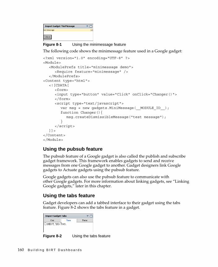
160 B u i l d i n g B I R T D a s h b o a r d s
Figure 8-1 Using the minimessage feature
The following code shows the minimessage feature used in a Google gadget:
<?xml version="1.0" encoding="UTF-8" ?> <Module>
<ModulePrefs title="minimessage demo"><Require feature="minimessage" />
</ModulePrefs><Content type="html">
<![CDATA[ <form> <input type="button" value="Click" onClick="Changer()"></form><script type="text/javascript">
var msg = new gadgets.MiniMessage(__MODULE_ID__);function Changer(){
msg.createDismissibleMessage("test message");}
</script> ]]>
</Content> </Module>
Using the pubsub featureThe pubsub feature of a Google gadget is also called the publish and subscribe gadget framework. This framework enables gadgets to send and receive messages from one Google gadget to another. Gadget designers link Google gadgets to Actuate gadgets using the pubsub feature.
Google gadgets can also use the pubsub feature to communicate with other Google gadgets. For more information about linking gadgets, see “Linking Google gadgets,” later in this chapter.
Using the tabs featureGadget developers can add a tabbed interface to their gadget using the tabs feature. Figure 8-2 shows the tabs feature in a gadget.
Figure 8-2 Using the tabs feature
C h a p t e r 8 , B u i l d i n g c u s t o m g a d g e t s 161
The following code shows the tabs feature being used in a Google gadget:
<?xml version="1.0" encoding="UTF-8" ?> <Module>
<ModulePrefs title="tabs demo"><Require feature="tabs" />
</ModulePrefs><Content type="html"><![CDATA[ <script type="text/javascript"> var tabs = new gadgets.TabSet(__MODULE_ID__, "Two");function init() {
tabs.addTab("One", {contentContainer: document.getElementById("id_1")});
tabs.addTab("Two", {contentContainer: document.getElementById("id_2")});
tabs.addTab("Three", {contentContainer: document.getElementById("id_3")});
}gadgets.util.registerOnLoadHandler(init);</script><div id="id_1" style="display:none">Content, tab One.</div><div id="id_2" style="display:none">Content, tab Two.</div><div id="id_3" style="display:none">Content, tab Three.</div>]]></Content>
</Module>
Using an external locationGoogle gadgets are stored in the following locations:
■ Google server
■ Web server
The location of the XML file must be given as a URI path, for example:
http://www.google.com/ig/modules/ajaxsearch.xml
Because the gadget file renders using the Information Console, the location must be accessible from the server running Information Console. For example, an import gadget using the URI http://localhost/mygadget.xml loads the gadget from a web server on Information Console.
Google also offers a gadget hosting service for developers. If you have direct access to the server that Information Console is using, you can store Google gadgets on the server. For example, add a directory named myGadgets to the default Windows location of Information Console:
C:\Program Files\Actuate11\iServer\servletcontainer\iportal\
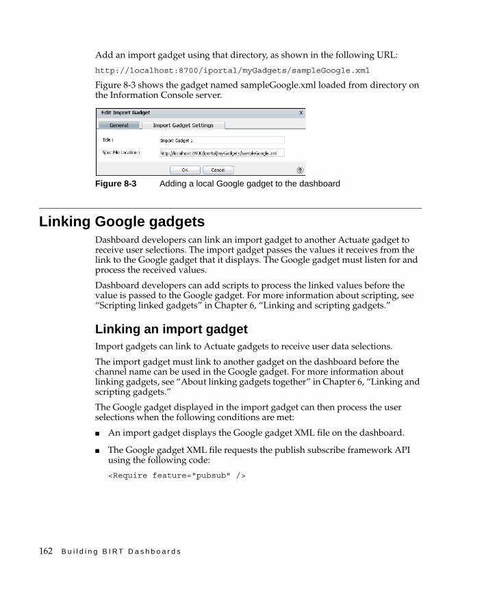
162 B u i l d i n g B I R T D a s h b o a r d s
Add an import gadget using that directory, as shown in the following URL:
http://localhost:8700/iportal/myGadgets/sampleGoogle.xml
Figure 8-3 shows the gadget named sampleGoogle.xml loaded from directory on the Information Console server.
Figure 8-3 Adding a local Google gadget to the dashboard
Linking Google gadgetsDashboard developers can link an import gadget to another Actuate gadget to receive user selections. The import gadget passes the values it receives from the link to the Google gadget that it displays. The Google gadget must listen for and process the received values.
Dashboard developers can add scripts to process the linked values before the value is passed to the Google gadget. For more information about scripting, see “Scripting linked gadgets” in Chapter 6, “Linking and scripting gadgets.”
Linking an import gadgetImport gadgets can link to Actuate gadgets to receive user data selections.
The import gadget must link to another gadget on the dashboard before the channel name can be used in the Google gadget. For more information about linking gadgets, see “About linking gadgets together” in Chapter 6, “Linking and scripting gadgets.”
The Google gadget displayed in the import gadget can then process the user selections when the following conditions are met:
■ An import gadget displays the Google gadget XML file on the dashboard.
■ The Google gadget XML file requests the publish subscribe framework API using the following code:
<Require feature="pubsub" />
C h a p t e r 8 , B u i l d i n g c u s t o m g a d g e t s 163
■ The gadgets.pubsub.subscribe(channelName, callback) method is used in the Google gadget to receive the linked message and send it to a callback function, as shown in the following code:
gadgets.pubsub.subscribe("ON_SELECTOR_GADGET_CHANGED", callbackFunction);
■ A callback function exists in the Google gadget XML file that processes the received message. For example, a callback function can parse the incoming message and create a value, such as a customer’s address. The callback function then sends the value to an external web service such as Google maps, and updates the gadget with the response from the external web service.
Listing 8-2 shows an example Google gadget that displays changes from linked data selection gadgets. After saving the Google gadget code as an XML file and placing it on a web server, load the file into an import gadget. Use the link options from the import gadget menu to link the new import gadget to a data selection gadget on the dashboard. Each time the linked data selection gadget is changed, the selected value displays in the Google gadget.
Listing 8-2 Example Google gadget with linking enabled
<?xml version="1.0" encoding="UTF-8" ?><Module>
<ModulePrefs title="linking example" height="500"><Require feature="pubsub" />
</ModulePrefs><Content type="html"><![CDATA[
<script type="text/javascript"> function onEventChange(sender, message) {
document.getElementById('changeme').innerHTML=message;}gadgets.pubsub.subscribe("ON_SELECTOR_GADGET_CHANGED", onEventChange);
</script> <div id="changeme">DEFAULT TEXT</div> <br /><div>The above text changes according to the current selection of the gadgets it is linked to.</div>
]]></Content>
</Module>
For more information about Google gadgets, see the Google gadget specification at the following URL:
http://code.google.com/apis/gadgets/
164 B u i l d i n g B I R T D a s h b o a r d s
Using multiple import gadgetsDashboard developers can use multiple Google gadgets on the same dashboard. Each Google gadget must be listening on unique channel names unless the gadget developer wants them to receive the same user selections. When an import gadget links to a data selection gadget, the message sent by the data selection gadget is a global message. This global message is sent across the dashboard on the ON_SELECTOR_GADGET_CHANGED channel. This means that when a user selects a value from a a data selection gadget, all linking import gadgets that listen on the ON_SELECTOR_GADGET_CHANGED channel receives the same message.
For example, a dashboard developer adds an import gadget to show a map of customer addresses and another import gadget to show shipping status on orders. When a user selects the order number from a linked list gadget, both import gadgets receives the value and try to process it. The import gadget that shows shipping can process the value. The import gadget showing a map expects an address and is unable to retrieve a valid map from an order number.
The issue is resolved when both import gadgets listen on different channels for user selections. Once each gadget is assigned a unique channel event name, messages can go to the correct import gadget. If the previous example used unique channel names, changes to the customer list gadget only affects the import gadget showing a map. Changes to the list gadget showing order numbers, only affects the import gadget showing shipping status.
Using a unique channel nameThe gadget developer can create a unique channel name in the Google gadget and configure the import gadget to use the new channel name when linking to the data selection gadget.
To use a unique channel name in a Google gadget, change the channel name when calling the gadgets.pubsub.subscribe() method. The following code shows the channel name changed to Unique_channel_name:
gadgets.pubsub.subscribe("Unique_channel_name", onEventChange);
Only data arriving on the unique channel name triggers the onEventChange function.
Changing a channel nameOnce the Google gadget is listening for a unique channel name, the channel name must be changed in the dashboard. Add a script to the link settings of the import gadget to match the channel name used in the embedded Google gadget. The following code shows an example of this script that changes the channel event name to Unique_channel_name.
data.event = 'Unique_channel_name';
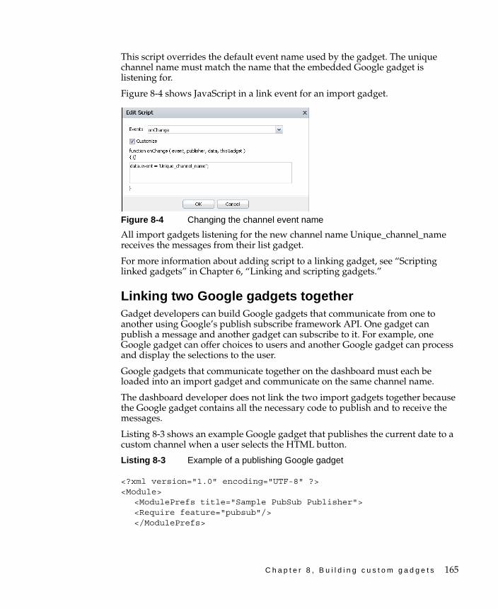
C h a p t e r 8 , B u i l d i n g c u s t o m g a d g e t s 165
This script overrides the default event name used by the gadget. The unique channel name must match the name that the embedded Google gadget is listening for.
Figure 8-4 shows JavaScript in a link event for an import gadget.
Figure 8-4 Changing the channel event name
All import gadgets listening for the new channel name Unique_channel_name receives the messages from their list gadget.
For more information about adding script to a linking gadget, see “Scripting linked gadgets” in Chapter 6, “Linking and scripting gadgets.”
Linking two Google gadgets togetherGadget developers can build Google gadgets that communicate from one to another using Google’s publish subscribe framework API. One gadget can publish a message and another gadget can subscribe to it. For example, one Google gadget can offer choices to users and another Google gadget can process and display the selections to the user.
Google gadgets that communicate together on the dashboard must each be loaded into an import gadget and communicate on the same channel name.
The dashboard developer does not link the two import gadgets together because the Google gadget contains all the necessary code to publish and to receive the messages.
Listing 8-3 shows an example Google gadget that publishes the current date to a custom channel when a user selects the HTML button.
Listing 8-3 Example of a publishing Google gadget
<?xml version="1.0" encoding="UTF-8" ?><Module>
<ModulePrefs title="Sample PubSub Publisher"><Require feature="pubsub"/></ModulePrefs>
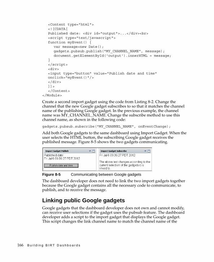
166 B u i l d i n g B I R T D a s h b o a r d s
<Content type="html"><![CDATA[Published date: <div id="output">...</div><br><script type="text/javascript"> function myEvent() {
var message=new Date();gadgets.pubsub.publish("MY_CHANNEL_NAME", message);document.getElementById('output').innerHTML = message;
}</script><div><input type="button" value="Publish date and time" onclick="myEvent()"/></div>]]></Content>
</Module>
Create a second import gadget using the code from Listing 8-2. Change the channel that the new Google gadget subscribes to so that it matches the channel name of the publishing Google gadget. In the previous example, the channel name was MY_CHANNEL_NAME. Change the subscribe method to use this channel name, as shown in the following code:
gadgets.pubsub.subscribe("MY_CHANNEL_NAME", onEventChange);
Add both Google gadgets to the same dashboard using Import Gadget. When the user selects the HTML button, the subscribing Google gadget receives the published message. Figure 8-5 shows the two gadgets communicating.
Figure 8-5 Communicating between Google gadgets
The dashboard developer does not need to link the two import gadgets together because the Google gadget contains all the necessary code to communicate, to publish, and to receive the message.
Linking public Google gadgetsGoogle gadgets that the dashboard developer does not own and cannot modify, can receive user selections if the gadget uses the pubsub feature. The dashboard developer adds a script to the import gadget that displays the Google gadget. This script changes the link channel name to match the channel name of the
C h a p t e r 8 , B u i l d i n g c u s t o m g a d g e t s 167
Google gadget. For example, the dashboard developer looks at the XML code of the Google gadget and sees the following code:
gadgets.pubsub.subscribe("MY_PERSONAL_GOOGLE_GADGET", onEventChange);
The channel name used by this Google gadget is MY_PERSONAL_GOOGLE_GADGET.
The dashboard developer then links to a data selection gadget, such as a list gadget, and adds a script to the link settings to match the channel name used in the Google gadget. The following code shows an example of this script, changing the name of the event to MY_PERSONAL_GOOGLE_GADGET.
data.event = "MY_PERSONAL_GOOGLE_GADGET";
When the user makes a selection from the list gadget, the import gadget changes the channel name and passes the message to the Google gadget. For more information about adding script to a linking gadget, see “Scripting linked gadgets” in Chapter 6, “Linking and scripting gadgets.”
Using a gadget-building toolThe BIRT 360 iServer option includes Actuate gadgets. When you add these gadgets to the dashboard or edit them, a gadget-building wizard launches. Use Gadget Builder to configure Actuate gadgets.
Google gadgets can be built with any of the following third-party tools:
■ Text editor For example, Microsoft Notepad for Windows.
■ XML text editorFor example, XML Copy Editor, available at the following URL:
http://xml-copy-editor.sourceforge.net/
■ Google Gadgets EditorThis editor requires a Google account and is available at the following URL:
http://code.google.com/apis/gadgets/docs/tools.html#GGE
Google Gadgets Editor supports hosting Google gadgets and previewing gadgets when loaded in iGoogle. If you already have an iGoogle home page, you can add this editor to your iGoogle page with the following URL:
http://www.google.com/ig/directory?url=gge.xml
Hosting enables gadget developers to immediately receive a URL to reach the gadget they are building.

168 B u i l d i n g B I R T D a s h b o a r d s
I n d e x 169
IndexSymbols\ (backslash) character 149& (ampersand) character 149
Aaccess permissions. See privilegesaccessing
dashboard files 21dashboards 128data 134data objects 21, 48, 50external content 21external data sources 49external resources 148, 149gadgets 128Google gadgets 42, 156, 161HTML components 40image files 41reports 21shared files 128source code 151theme libraries 109video content 45
actions (user) 133, 145Active Portal Advanced security role 133ActiveX components 151Actuate gadgets 156Actuate JavaScript API 4, 156Actuate web site 149adding
bookmarks 27combo boxes 36computed columns 104dashboards 4, 8, 10, 23data cubes 52data objects 51data selectors 36filter conditions 57filters 55, 65gadgets 11, 13, 156, 167HTML code 22hyperlinks 86
JavaScript code 140legends 75links 8, 43, 136, 137plug-ins 148report parameters 30summary tables 102, 106summary values 67text 43video content 44, 45
add-ons (browser) 22administrators 21, 22, 133, 134Adobe Flash Player 22, 151
See also Flash contentAdobe Flex table gadgets. See Flex table
gadgetsaggregate expressions 67aggregate functions 67, 106aggregation
adding Flash gadgets and 90, 91adding table gadgets and 100, 102, 104,
106displaying date values and 106displaying summary tables and 102, 106grouping data and 62setting analysis types for 52
alerts 144, 152alternating background colors 103ampersand (&) character 149analysis types 52analytic dashboards 5, 48analyzing data 5, 52animated images 88Apache Shindig application 157application programming interfaces (APIs) 4,
158, 165applications 5, 149, 151area chart formatting options 72area chart gadgets 71Auto refresh options 18, 23Auto suggest options 118automatic linking 137Average function 67, 106axis values (charts) 75

170 B u i l d i n g B I R T D a s h b o a r d s
Bbackground colors 103, 108backslash (\) character 149bandwidth 152bar chart formatting options 74bar chart gadgets 67, 74BIRT 360 licenses 3BIRT Data Analyzer 58BIRT Designer Professional 5, 27BIRT documents. See report documentsBIRT Interactive Viewer 3, 27BIRT Interactive Viewer option 26BIRT iServer. See iServerBIRT option (licensing) 26BIRT reports 21
See also reportsBIRT Studio 5bookmarks 23, 27, 33borders 103, 108browsing internet sites 150
See also web browsersbullet gadgets 90, 91
See also Flash gadgetsbutton gadgets 111, 119
Ccache 22, 50, 149calendar gadgets 110, 114, 116cascading selections 54cascading style sheets 109, 153
See also CSS codecategory values (charts) 66, 75CDATA sections 157changes, monitoring 23changing
See also editingchannel names 164chart legends 75chart titles 74chart types 64dashboard layouts 13, 14, 15dashboard templates 23dashboards 3, 10, 128data 134, 136, 140data selection types 112, 121, 124filter conditions 56
functionality levels 133gadget layouts 13gadgets 4, 9, 59, 136headers and footers 18HTML code 43links 137, 138report parameters 35, 145reports 28security roles 133shared dashboard files 153text 38user selections 141, 145
channel names 164, 166channels 164character encoding 149character formats 115characters 157Chart Builder 65, 66, 69chart gadget types 58chart gadgets
See also specific typeadding legends to 75aggregating data and 52analyzing data and 63changing chart type for 64creating 58, 65displaying context menus for 63displaying data in 62displaying hyperlinks in 66drilling through 27, 62, 68editing 66filtering data for 49, 65, 66formatting 71, 74, 76, 78, 79, 81, 82grouping data for 62, 63selecting data for 48, 64, 66setting display options for 65user interactions and 58
chart subtypes 75chart titles 74chart types 64charts 3, 23, 64check box gadgets 110, 117clearing data selections 139close plot values 98code 5, 150, 151, 158
See also HTML code; JavaScript codecolor picker 60, 61
I n d e x 171
color settings 60, 92, 103, 108column bars 15column chart formatting options 76column chart gadgets 67, 76column headers 18, 103, 108column layout options 14column layouts 11, 13, 16column names 52, 138columns
adding cross-tab gadgets and 86adding table gadgets and 102, 106adding to floating gadgets 18creating computed 104creating data cubes and 52displaying data sets and 52linking to 138resizing 14, 15
combo box gadgets 110, 118combo boxes 36comments 35computed columns 104conditions
filtering data and 30, 49, 55, 57selecting parameters and 30
configuration settings 8, 12configuration wizard 12configurations 22, 153, 167
changing gadget 4connections 42, 49, 50, 148console window (JavaScript) 143Content tag 157context menus 63converting Google gadgets 157copying
dashboards 128shared dashboards 10subscribed dashboards 10
Core JavaScript API (Google) 159Count distinct function 106Count function 67, 106creating
analytic dashboards 48bookmarks 27chart gadgets 65combo boxes 36computed columns 104cross-tab gadgets 85
dashboards 4, 8, 10, 23data cubes 52data selection gadgets 36data version gadgets 123filters 55, 65Flash gadgets 88Flex table gadgets 100Google gadgets 157, 165, 167HTML gadgets 40image gadgets 42import gadgets 43parameter gadgets 31report gadgets 32report parameters 30Reportlet gadgets 34shared dashboards 129summary tables 102, 106summary values 67table gadgets 104text gadgets 44video gadgets 45
cross tabs 58, 84Crosstab Builder 86, 87cross-tab gadget toolbars 60cross-tab gadgets
adding 59assigning themes to 109, 154creating 85displaying data and 84, 86displaying hyperlinks in 86drilling through 62filtering data for 85, 86formatting 87setting display options for 85
CSS code 38, 40, 109, 151, 158CSS files 153cubes. See data cubescustomizing
color settings 60dashboards 3, 17–18data formats 115, 117gadgets 4, 108, 156Google gadgets 156, 157onChange events 140table headers 103, 108
cylinder gadgets 90, 92See also Flash gadgets
172 B u i l d i n g B I R T D a s h b o a r d s
Ddashboard files 8, 21, 128, 153
See also dashboardsdashboard footers 18Dashboard Gallery 9dashboard gallery 129dashboard headers 18dashboard layouts
changing 15selecting 14setting 13
dashboard menu 15dashboard templates 22dashboard types 5dashboards
See also specific typesaccessing 128adding gadgets to. See gadgetschanging 3, 10, 128copying 128creating 4, 8, 10, 23deleting 8, 152deploying 152designing 21, 23displaying customized content on 156displaying data and 2, 3, 22, 48displaying external content and 21, 22, 148displaying report files and 5, 26, 27managing resources for 153monitoring changes for 23naming 129opening 3, 128personalizing 3, 17–18replacing with text gadgets 152resetting personal 3retrieving data for 23, 49, 50saving 128, 130, 132selecting 18setting layout options for 13, 14setting licensing options for 21setting privileges for 21, 133setting refresh interval for 18, 23sharing 128, 129subscribing to 4, 9temporarily removing 128testing external resources for 152
updating 4viewing 4, 8, 22
dataaccessing 134adding to HTML gadgets 41adding to table gadgets 101, 104aggregating. See aggregationanalyzing 5, 52changing 134, 136, 140deleting 139displaying 22, 48, 156entering 118exporting 27filtering 49, 55–58, 148grouping 52, 62interacting with 2plotting 48, 66publishing 136, 141retrieving 23, 50running large reports and 23selecting 48, 109sorting 109, 113summarizing. See summarizing dataupdating 18, 26, 36viewing trends in 64
Data Analyzer (BIRT) 58data attribute 141data cache 50data cubes
adding selection gadgets and 114, 121adding table gadgets and 91, 102, 106aggregating data and 52building chart gadgets and 66building cross tabs and 86building cross-tabs and 86creating 52displaying summary tables and 102, 106filtering data in 55retrieving data in 49, 53selecting 86viewing data in 62viewing structure of 52
data fields 52, 106, 138See also columns
.data files. See data storesdata filters 49, 55, 148data hierarchies (cubes) 52
I n d e x 173
data object data sources 48, 50, 52, 136data object designs 49data object files 23, 48, 49, 51, 148data object stores 4data object stores. See data storesdata objects
accessing 21, 48, 50adding 51creating gadgets and 66, 86, 89creating tables and 101, 104, 105displaying hyperlinks in 86filtering data in 49, 55–58, 149linking to gadgets and 136, 137, 138managing 148retrieving data from 23, 49, 50, 109selecting 51, 52, 121, 124setting parameters for 54–55
Data page (Chart Builder) 66Data page (Crosstab Builder) 86Data page (Data Selector) 114Data page (Gadget Builder) 89Data page (Table Builder) 105data ranges 111data row formatting options 103, 108data rows 52, 86data selection gadget types 110, 112, 121, 124data selection gadgets
See also specific typeadding 113changing values in 36, 140creating 36displaying 123editing 112, 113filtering data and 4, 111filtering data for 49, 65formatting 115handling events for 140, 142, 144, 145linking to 36, 38, 65, 137, 139retrieving data for 23, 50running large reports and 23selecting data and 5, 48, 109, 114selecting data objects for 51, 148selecting parameters for 35, 145selecting type of 121, 124setting privileges for 21testing user selections for 140, 144
data selection gadgets formatting optionscalendar gadgets 116check box gadgets 117combo box gadgets 118data version gadgets 123, 125list gadgets 118radio button gadgets 119slider gadgets 120
Data Selector Gadget Wizardaccessing 36, 114changing selection types and 121, 124displaying data and 114displaying parameters and 36editing selection gadgets and 112filtering data and 56, 113setting formatting options and 115, 125
data selectors 35, 36See also data selection gadgets
data set categories 62data set filters 55data set groups 62data set structures 52data sets 49, 52, 104, 114data sources
accessing data object 48accessing external 49adding HTML data and 41filtering data in 49, 55–58linking to gadgets and 136, 137managing 149previewing 52retrieving data from 23, 50
data stores 50, 148See also data objects
data types 115data version gadgets 4, 110, 121, 123, 124, 125data visualization gadget types 58data visualization gadgets
See also specific typeadding 48, 58analyzing data and 5applying styles to 109changing color settings for 60, 61customizing 108displaying parameters and 35editing 59
174 B u i l d i n g B I R T D a s h b o a r d s
data visualization gadgets (continued)filtering data for 56, 148resizing 59retrieving data for 50selecting data objects for 51, 148selecting hyperlinks in 49selecting parameters and 30setting display options for 59setting privileges for 21
.datadesign files. See data object filesdate dimensions 121date formats 115dates 67, 106, 116
See also calendar gadgetsdefault dashboard template 23default functionality levels 133default security roles 133default themes 109default values
data object parameters and 55data selection gadgets and 116, 118, 119,
121report parameters and 30, 31, 35
default version 123deleting
dashboards 8, 152data 139links 138report parameters 145
deploying dashboards 152design files 5, 21, 23, 49designing
dashboards 21, 23gadgets 22
developers 161dial settings (Flash gadgets) 96dialog boxes 141dimensions (data cubes) 52, 53, 86directories 128, 153directory paths 31display options (gadgets) 28, 39display options (report parameters) 32, 35Display parameter as new selector setting 36display settings (browsers) 22displaying
customized content 156dashboards 4, 8, 22
data 22, 48, 156data version gadgets 121, 124external content 5, 21, 22, 148external files 38, 149filter parameters 38Flash content 150gadget headers 18gadgets 22, 31Google gadgets 156HTML code 151hyperlinks 66, 86images 151linked gadgets 138movies 159publisher names 142report elements 23, 27report parameters 32, 34, 35, 36, 145reports 5, 27source code 5, 38summary tables 102, 106summary values 59, 64, 84text 43third-party gadgets 151version information 121, 124videos 45, 152web content 40
Distinct Count function 67document files 150documentation viidocuments 5, 21, 23
See also reportsdomain names 148doughnut chart formatting options 78doughnut chart gadgets 58, 67, 78drill-through functionality 27, 53, 62, 68duplicate values 52, 106dynamic parameters 30, 35, 38
EEdit HTML Gadget dialog 40, 41Edit Image Gadget dialog 41, 42Edit Import Gadget dialog 42, 43Edit Parameter Gadget dialog 31Edit Report Gadget dialog 32, 34Edit Text Gadget dialog 43, 44Edit Video Gadget dialog 44, 45
I n d e x 175
editingSee also changingchart gadgets 66cross-tab gadgets 85, 86, 87data selection gadgets 112, 113Flash gadgets 88, 91Flex table gadgets 100, 101, 102HTML gadgets 40, 41image gadgets 41, 42import gadgets 42, 43parameter gadgets 31report gadgets 31, 32Reportlet gadgets 33, 34shared dashboards 128, 153source code 43table gadgets 104, 105, 108text gadgets 44video gadgets 45
editors 18, 43, 167embedded code 5, 22, 151embedded documents 31embedded images 151embedding web content 150encoding 149Encyclopedia volume administrators 134Encyclopedia volumes 31, 50, 128event attribute 141event names 141event-handling scripts 141, 142, 144, 145events 137, 140exporting data 27expressions
adding dynamic parameters and 30aggregating data and 67filtering data and 57
external content 5, 21, 22, 148external data sources 49external files 158external gadget files 42external resources 22, 38, 148, 149, 152
See also external contentexternal web pages 5, 40external web services 149externally hosted Google gadgets 158extras gadget display options 39extras gadget types 38
extras gadgets 5, 21, 38, 40See also specific type
Ffeature IDs 133features 3, 158, 159field names 138
See also column namesfields 52, 106, 138
See also columnsfile access permissions
See also privilegesembedding report files and 31setting 21, 130, 132shared files and 128, 134viewing data and 134
file browser 128, 131file cache 23file explorer 3file manager 128file-name extensions 50file paths 31file types 41, 49files
See also specific typeaccessing dashboard 21accessing data objects and 49, 50accessing Google gadget 156, 161accessing report 21accessing shared 128adding to personal dashboards 4adding URLs for 150changing shared dashboard 153choosing 31displaying external 38displaying third-party gadgets and 151embedding in web pages 4, 5integrating with dashboards 5, 26, 27loading external 158loading Google gadget 157removing dashboard 153rendering as HTML 152saving 128selecting bookmarks in 33selecting data object 51specifying specific versions of 50

176 B u i l d i n g B I R T D a s h b o a r d s
files (continued)viewing report 149
file-sharing features 128filter conditions 30, 49, 55, 57filter expressions 57Filter page (Chart Builder) 66Filter page (Crosstab Builder) 86Filter page (Data Selector) 56, 113Filter page (Flex Builder) 101Filter page (Gadget Builder) 89Filter page (Table Builder) 105, 107filter parameters 30, 35, 38filtering data 49, 55–58, 148firewalls 148, 152First function 67, 106Flash content 89, 150, 159Flash feature (Google gadgets) 159Flash gadget types 59Flash gadgets
See also specific typecreating 59, 88displaying data and 88, 89, 91filtering data for 89grouping data for 91loading BIRT-specific 27resizing 91setting display options for 88, 89
Flash gadgets format optionsbullet gadgets 91cylinder gadgets 92linear gauge gauges 94meter gadgets 96sparkline gadgets 97thermometer gadgets 98
Flash object types 88Flash objects 27Flash Player 22, 151
See also Flash contentFlex Builder 100, 101, 103Flex table formatting options 102Flex table gadgets 59, 100, 101
See also table gadgetsfloating gadgets 13, 16folders 50, 109, 128font attributes
chart gadgets 74Flash gadgets 91
table gadgets 103, 108visualization gadgets 108
footers 18Format page (Chart Builder) 65, 74Format page (Crosstab Builder) 87Format page (Data Selector) 113, 115, 125Format page (Flex Builder) 101, 103Format page (Gadget Builder) 89, 91Format page (Table Builder) 105, 108formats
chart gadgets 71, 74, 76, 78, 79, 81cross-tab gadgets 87customizing 115, 117data selection gadgets 115displaying text and 43exporting data and 27Flash gadgets 89Flex table gadgets 102image files 41scatter gadgets 82table gadgets 107
formatted content 27, 38formatting options (Flash gadgets)
bullet gadgets 91cylinder gadgets 92linear gauge gadgets 94meter gadgets 96sparkline gadgets 97thermometer gadgets 98
formatting options (selection gadgets)button gadgets 119calendar gadgets 116check box gadgets 117combo box gadgets 118data version gadgets 123, 125list gadgets 118slider gadgets 120
free form grid 16free form layout options 14free form layouts 13, 16functionality levels (Information
Console) 133functions 67, 106, 141
GGadget Builder 88, 89, 91, 167
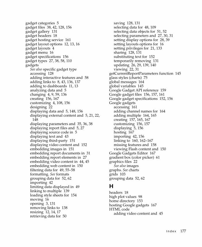
I n d e x 177
gadget categories 5gadget files 38, 42, 128, 156gadget gallery 131gadget headers 18gadget hosting service 161gadget layout options 12, 13, 16gadget layouts 4gadget menu 16gadget specifications 156gadget types 27, 38, 58, 110gadgets
See also specific gadget typeaccessing 128adding interactive features and 58adding links to 8, 43, 136, 137adding to dashboards 11, 13analyzing data and 5changing 4, 9, 59, 136creating 156, 167customizing 4, 108, 156designing 22displaying data and 5, 148, 156displaying external content and 5, 21, 22,
148displaying parameters and 35, 36, 38displaying report files and 5, 27displaying source code in 5displaying text and 43displaying third-party 151displaying video content and 152embedding images in 151embedding report documents in 31embedding report elements in 27embedding video content in 44, 45embedding web content in 150filtering data for 49, 55–58formatting. See formatsgrouping data for 52, 62importing 42limiting data displayed in 49linking to multiple 139loading style sheets for 154moving 16opening 3, 131removing links to 138resizing 12, 14, 17retrieving data for 50
saving 128, 131selecting data for 48, 109selecting data objects for 51, 52selecting parameters and 27, 30, 31setting display options for 28, 39setting layouts options for 16setting privileges for 21, 133sharing 128, 131substituting text for 152temporarily removing 131updating 26, 29, 139, 140viewing 22, 31
getCurrentReportParameters function 145glass styles (charts) 75global messages 164global variables 145Google Gadget API reference 159Google gadget files 156, 157, 161Google gadget specifications 152, 156Google gadgets
accessing 161adding channel names for 164adding multiple 164, 165creating 157, 165, 167customizing 156, 157displaying 5, 156hosting 167importing 42, 156linking to 160, 162–167missing features and 158viewing Flash content and 150
Google Gadgets Editor 167gradient box (color picker) 61graphics files 22
See also imagesgraphs. See chartsgrids 103grouping data 52, 62
Hheaders 18high plot values 98home directory 153hosting Google gadgets 167HTML code
adding video content and 45
178 B u i l d i n g B I R T D a s h b o a r d s
HTML code (continued)converting Google gadgets to 157converting third-party gadgets and 42creating Google gadgets and 158displaying 5, 38, 151editing 43embedding Flash content in 159embedding in gadgets 22, 40, 41redirecting web browsers and 150returning global variables from 145
HTML data 41HTML editor 18, 43HTML files 152HTML formats 43HTML gadgets
adding URLs to 149–150creating 38, 40–41displaying external web resources
and 149, 150displaying Flash content and 150loading global variables to 145loading report files into 150loading style sheets for 154viewing images in 151
HTML links 43HTML settings page 40HTML tags 158hyperlinks 49, 66, 86
See also URLs
Iiframe tag 157iGoogle accounts 167image file types 41image files 22, 41image gadgets 38, 41–42, 151Image Settings page 41image size 41images 5, 88, 151Import Gadget Settings page 42import gadgets 38, 42–43, 162, 164, 165importing
Google gadgets 42, 156third-party gadgets 42
indexed searches 23Information Console 22, 133, 152
Information Console interface 150, 153input 30, 54, 118, 140input fields 54, 118interactive features 23, 56, 58Interactive Viewer 3, 27Interactive Viewer option 26internet 148, 150internet protocols 22, 151iServer 18, 133, 134, 148iServer administrators 21iServer licensing options 3, 21, 26
JJava Web Start application 151JavaScript APIs 4, 156, 159JavaScript code
adding custom 140displaying 5, 38embedding 40Google gadget features and 158Google gadgets and 158handling events and 144, 145HTML components and 40linking gadgets and 137, 140redirection and 150testing custom 152video content and 45web browsers and 143, 150
JavaScript console 143JavaScript functions 141JavaScript libraries 158JSAPI applications 156JSON method 142
Llarge reports 23Last function 67, 106layout options
changing 15selecting 13, 14, 16setting 13
legends (charts) 62, 63, 68levels (data cubes) 53, 86libraries 109, 153, 158licensing options 3, 21, 26line chart formatting options 80
I n d e x 179
line chart gadgets 67, 79linear gauge gadgets 89, 94
See also Flash gadgetslinking to
data selection gadgets 36, 38, 65, 137, 139Google gadgets 160, 162–167import gadgets 162, 164list gadgets 139multiple gadgets 139parameter gadgets 37
linksSee also URLsaccessing web pages and 22adding 8, 136automatic 137entering HTML 43
Linux systems 151list gadgets 111, 118, 139loading external resources 148localization 35, 117losing dashboard configurations 153low plot values 98
MManage Data command 52Manage Data dialog 51, 54manual links 137Max function 67, 106measures (data cubes) 52, 53, 86media servers 38Median function 106memory 148, 152menus 15, 16, 63messages 142, 152, 159, 160, 164meter gadgets 89, 96
See also Flash gadgetsMin function 67, 106minimessage feature (Google gadgets) 159missing features (Google gadgets) 158mixed dashboards 5Mode function 106Module tag 157ModulePrefs tag 157monitoring dashboard changes 23monitoring performance 2movies 159
moving gadgets 16multidimensional data structures 52, 53multiple filter conditions 55My dashboard page 14My Documents dashboard 23My Folders folder 129
Nnaming
dashboards 129HTML gadgets 40image gadgets 42import gadgets 43parameter gadgets 31report gadgets 32Reportlet gadgets 34text gadgets 44video gadgets 45
needle settings (Flash gadgets) 95network administrators 22network ports 151network protocols 151networked environments 21, 22, 42, 148, 152New Parameter Gadget dialog 31New Report Gadget dialog 32, 34New tab icon 10number formats 115numeric data 64
Oobject tag 151onChange events 140onChange function 142online documentation viiopaque value 151open plot values 98opening
Chart Builder 74Crosstab Builder 87Dashboard Gallery 9dashboards 3, 128Data Selector Gadget Wizard 36, 114Flex Builder 101, 103Gadget Builder 91Gadget Gallery 131gadgets 3, 131

180 B u i l d i n g B I R T D a s h b o a r d s
opening (continued)large tables 87Table Builder 105, 108web browsers 22web pages 22
operational dashboards 5, 26See also dashboards
operators 30, 55, 111optimizing dashboards 23, 148options (licensing) 3, 21, 26orientation (selection gadgets) 117, 119, 120,
123output formats 27overlapping gadgets 13, 16
Ppage breaks 87, 108parameter bindings 54Parameter Bindings button 54Parameter Display Settings page 32, 34, 36parameter gadgets 26, 30, 31, 37parameters
accessing data objects and 54–55adding to gadgets 27, 32adding to URLs 149changing 35, 145creating 30deleting 145displaying 32, 34, 35, 36filtering data and 30, 38, 49, 149getting report 145selecting 30, 36setting default values for 55setting display options for 32, 35updating data and 26viewing Flash content and 151
paths 31percent stacked chart subtype 75performance 2, 148, 152permissions. See privilegespersonal dashboard files 153personal dashboards 2, 3, 8, 22pictures. See image gadgets; imagespie chart formatting options 82pie chart gadgets 58, 67, 81plot settings (Flash gadgets) 91, 93, 98
plug-ins 22, 148, 152ports 151precalculated data 52predefined gadgets 156previewing data sources 52printing 58private dashboards 5private folders 128privileges
accessing gadgets and 21accessing shared files and 128, 130, 132assigning security roles and 133assigning to users 133–134changing dashboards and 9changing data and 134designing dashboards and 21embedding report documents and 31filtering data and 56, 149networked environments and 21sharing dashboards and 134
programmers 161public gadgets 156, 166publish and subscribe framework 160publish subscribe framework API 165published gadget messages 142publisher attribute 141publisher names 142publishing data 136, 141pubsub feature (Google gadgets) 160, 166
Qqueries 23, 49, 50, 148
Rradio button gadgets 111, 119range of values 111redirection (web pages) 40, 149, 150refreshes (dashboards) 18, 23refreshes (gadgets) 29, 59, 112region settings (Flash gadgets) 92, 95, 97remote servers 148removing
dashboards 8, 152data 139links 138report parameters 145
I n d e x 181
report design files 5, 21, 23report document files 150report documents 5, 21, 23
See also reportsreport elements 23, 27report files 5, 21, 26, 27, 149report gadget toolbars 29report gadget types 27report gadgets
See also specific typeadding 27, 31, 32editing 31, 32loading style sheets for 154scrolling 29selecting parameters for 30setting display options for 28setting licensing options for 26setting privileges for 21setting size of 29viewing data in 5, 26viewing parameters in 35, 145
report parametersaccessing data objects and 54–55adding to gadgets 27, 32changing 35, 145creating 30deleting 145displaying 32, 34, 35, 36filtering data and 30, 38, 49, 149getting 145selecting 30, 36setting default values for 55setting display options for 32, 35updating data and 26
report viewers 40Reportlet gadget toolbars 29Reportlet gadgets
adding 33, 34creating bookmarks for 27editing 33, 34loading style sheets for 154selecting parameters for 30setting display options for 34setting licensing options for 26setting privileges for 21viewing data and 23, 26viewing parameters in 35, 145
viewing report files and 5reports
accessing 21adding bookmarks to 27adding comments to 35changing 28displaying 5, 27generating language specific 35hiding parameters in 38interacting with 5monitoring performance and 2running 23, 134selecting bookmarks for 33selecting parameters in 30, 34, 36updating 18viewing parameters in 26, 32viewing specific parts of 26, 27
require element 158required parameters 35resetting
personal dashboards 3resizing
columns 14, 15Flash gadgets 91gadgets 12, 14, 17images 41
resources 22, 38, 148, 149, 153Resources folder 50, 109result sets 49
See also queriesroles 21, 133row formatting options 103, 108rows 52, 86running large reports 23
Ssaving
dashboards 128, 130, 132gadgets 128, 131
scale settings (Flash gadgets)bullet gadgets 91cylinder gadgets 93linear gauge gadgets 95meter gadgets 96thermometer gadgets 99
scatter chart formatting options 83
182 B u i l d i n g B I R T D a s h b o a r d s
scatter chart gadgets 82scripts 40, 49, 140, 145, 162scroll bars 29searches (indexed) 23security 22security roles 21, 133security settings 22Select Data dialog 52, 54Select Folder dialog 130selection gadgets. See data selection gadgetsseries values (charts) 66, 75servers 148, 156, 161sessions, timing out 22Share command 129, 131Share Gadget dialog 131share icon 4, 9Share Tab dialog 129shared dashboard privileges 21, 134shared dashboards 5, 10, 128, 129, 153shared files 128shared folders 128shared gadgets 128, 131Show Selection gadget 139side-by-side chart subtype 75skins 153slider gadgets 111, 114, 120sorting 109, 113source code 5, 150, 151, 158
See also HTML code; JavaScript codespace character 149sparkline gadgets 90, 97
See also Flash gadgetsspecial characters 157spectrum bar (color picker) 61stacked chart subtype 75Standard Deviation function 106static parameters 30, 35stopping gadget rendering 152string formats 115strings 145style sheets 109, 153
See also CSS codesubscribed dashboard icon 4subscribed dashboards 4, 9subscribing to dashboards 4, 9substrings 145Sum function 67, 106
Summarize page (Table Builder) 106summarizing data
aggregate expressions and 67chart gadgets and 64cross-tab gadgets and 84, 87running large reports and 23table gadgets and 102, 104, 106
summary fields 86summary formats 101summary tables 100, 102, 106summary values 53, 59, 106supported web browsers 22SVG graphics files 22system administrators 21, 133
TTab Options page 17tab order (dashboards) 18, 130tabbed interfaces 160table attributes 108Table Builder 104, 105, 108table gadget toolbars 60table gadgets
See also Flex table gadgetsadding 59, 104aggregating data and 52displaying data and 104, 105formatting 107limiting data in 107linking to data selection gadgets 105setting display options for 105viewing hyperlinks in 104, 105
table headers 103, 108tables 52, 87, 104tabs feature (Google gadgets) 160tabular formats 101, 104templates 22temporary messages 159testing
external resources 152JavaScript code 152user selection values 140, 144
text 38, 43text editors 18, 43, 167text files 156text formats 43, 115
I n d e x 183
text gadgets 18, 38, 43–44, 152Text Settings page 43themes (default) 109Themes Report Items library 109, 153thermometer gadgets 90, 98
See also Flash gadgetsthird-party gadgets 42, 151, 154thisGadget object 142, 145thumb selectors (slider gadgets) 121tick mark settings (Flash gadgets)
bullet gadgets 92cylinder gadgets 94linear gauge gadgets 95meter gadgets 97thermometer gadgets 100
tick mark settings (selection gadgets) 120time dimensions 63time intervals 67time-out settings 22toolbars 29, 60tooltips 66toSource method 143transparent value 151trends 64troubleshooting 152two-way links 139Type page (Data Selector) 121, 123, 124
Uunavailable functionality 152updating
dashboards 4data 18, 26, 36gadgets 26, 29, 139, 140reports 18
URIs 42, 157, 158, 161URLs
adding parameters to 149embedding source code and 40entering 41external content and 22gadget files and 38HTML gadgets and 41image files and 38, 41media servers and 38video gadgets and 45
web addresses and 40user actions 133, 145user input 30, 54, 118, 140user interactions 58, 121
See also user input; user selectionsuser interactivity. See interactive featuresuser privileges. See privilegesuser roles 21, 133user selections 36, 139, 140, 145, 162, 166
See also data selection gadgetsuser sessions, timing out 22
Vvalidating user selections 141value series (charts) 66, 75value settings (Flash gadgets) 93, 98, 99values
adding calendar gadgets and 116changing 36, 140displaying default 116, 118, 119displaying summary 59, 64, 84grouping legend 62, 63, 68linking to gadgets and 137, 138requesting from users 30, 54requesting with conditions 30selecting default 35selecting multiple 105, 111selecting parameters and 30, 31selecting range of 111setting default 55, 121setting slice size and 67showing differences between 107showing most frequently occurring 106showing relationship between 64testing user selection 140, 144updating linked gadgets and 26viewing large data sets and 52viewing subgroups and 62
variables 145Variance function 107version gadgets 4versioning functionality 50, 121, 124, 128video chat applications 151video files 5, 44video gadgets 38, 44–45, 152, 154video players 45, 152

184 B u i l d i n g B I R T D a s h b o a r d s
Video Settings page 44videos 152viewers 40viewing
customized content 156dashboards 4, 8, 22data 22, 48, 156data version gadgets 121, 124external content 5, 21, 22, 148external files 38, 149filter parameters 38Flash content 150gadget headers 18gadgets 22, 31Google gadgets 156HTML code 151hyperlinks 66, 86images 151linked gadgets 138movies 159publisher names 142report elements 23, 27report parameters 32, 34, 35, 36, 145reports 5, 27source code 5, 38summary tables 102, 106summary values 59, 64, 84text 43third-party gadgets 151version information 121, 124videos 45, 152web content 40
visualizations. See data visualization gadgetsvolume administrators 134
Wweb addresses 40
See also URLsweb applications 151web browser cache 22web browser-based tools 3web browsers 22, 143, 151web links 22
See also URLsweb pages 4, 5, 22, 40web servers 156, 161web services 40, 149web sites 40, 149web-based reports 2Windows systems 151wizards 156wmode parameter 151
Xx-axis values (charts) 75XML files 38, 151, 156, 161XML parsing 157XML structures 156XML text editors 167
Yy-axis values (charts) 75


