94
CENG 394 Introduction to Human-Computer Interaction CENG 394 HCI interaction design basics
| Date post: | 01-Jan-2016 |
| Category: |
Documents |
| Upload: | maud-golden |
| View: | 243 times |
| Download: | 2 times |
CENG 394Introduction to Human-Computer Interaction
CENG 394HCIinteraction design basics

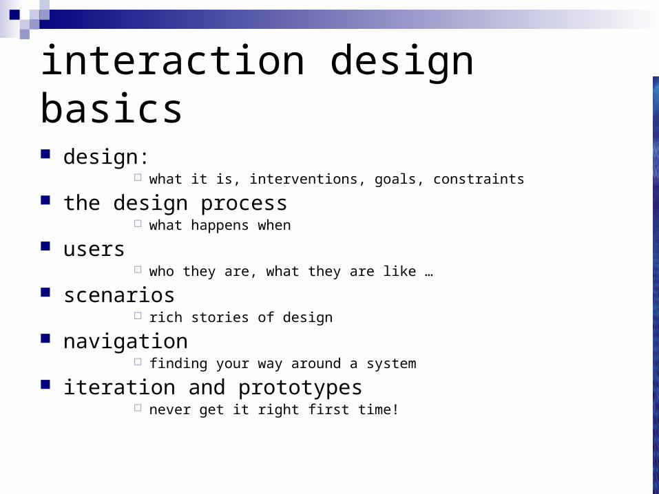
interaction design basics
design: what it is, interventions, goals, constraints
the design process what happens when
users who they are, what they are like …
scenarios rich stories of design
navigation finding your way around a system
iteration and prototypes never get it right first time!
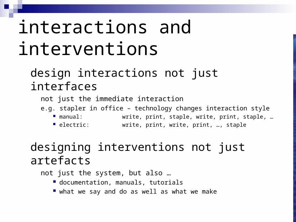
interactions and interventions
design interactions not just interfaces not just the immediate interaction e.g. stapler in office – technology changes interaction style
manual: write, print, staple, write, print, staple, … electric: write, print, write, print, …, staple
designing interventions not just artefacts not just the system, but also …
documentation, manuals, tutorials what we say and do as well as what we make
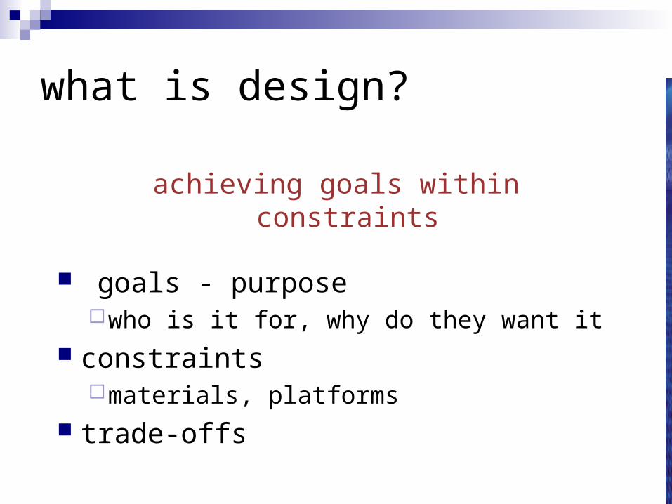
what is design?
achieving goals within constraints
goals - purposewho is it for, why do they want it
constraintsmaterials, platforms
trade-offs
golden rule of design
understand your materials
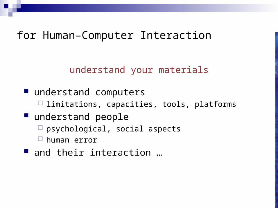
for Human–Computer Interaction
understand your materials
understand computers limitations, capacities, tools, platforms
understand people psychological, social aspects human error
and their interaction …
To err is human
accident reports .. aircrash, industrial accident, hospital mistake enquiry … blames … ‘human error’
but … concrete lintel breaks because too much weight blame ‘lintel error’ ?
… no – design errorwe know how concrete behaves under stress
human ‘error’ is normal we know how users behave under stress so design for it!
treat the user at least as well as physical materials!
Central message …
the user
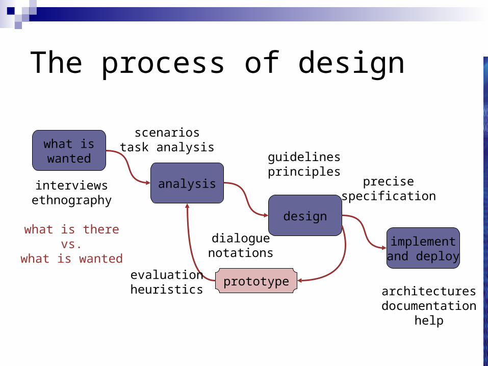
The process of design
what iswanted
analysis
design
implementand deploy
prototype
interviewsethnography
what is therevs.
what is wanted
guidelinesprinciples
dialoguenotations
precisespecification
architecturesdocumentation
help
evaluationheuristics
scenariostask analysis
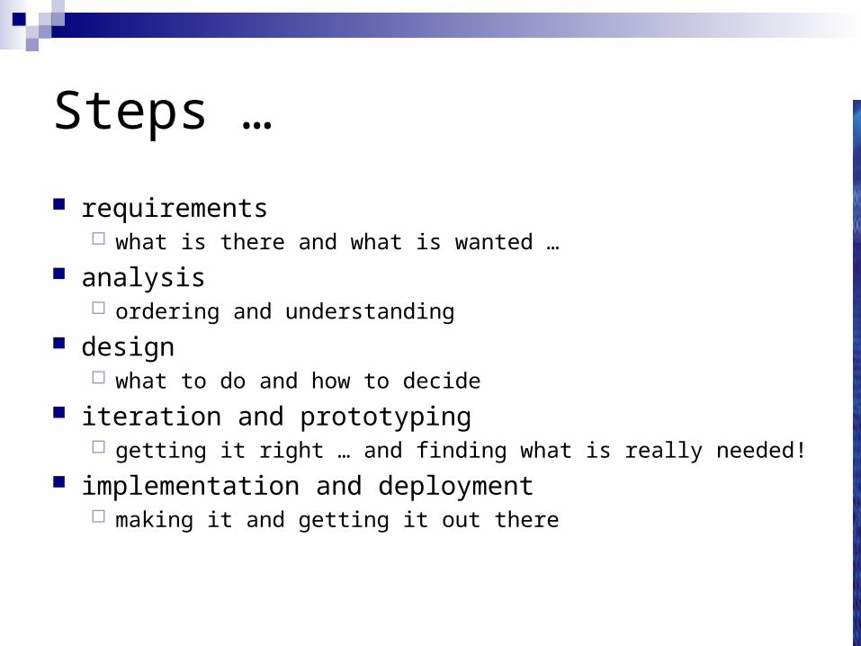
Steps …
requirements what is there and what is wanted …
analysis ordering and understanding
design what to do and how to decide
iteration and prototyping getting it right … and finding what is really needed!
implementation and deployment making it and getting it out there
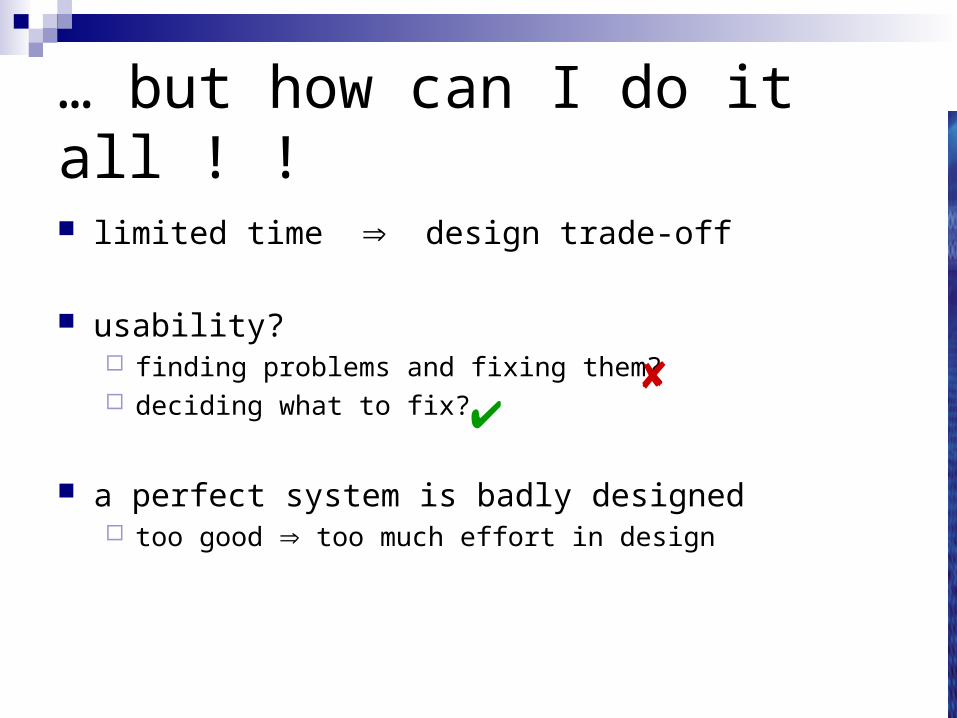
… but how can I do it all ! !
limited time design trade-off
usability? finding problems and fixing them? deciding what to fix?
a perfect system is badly designed too good too much effort in design

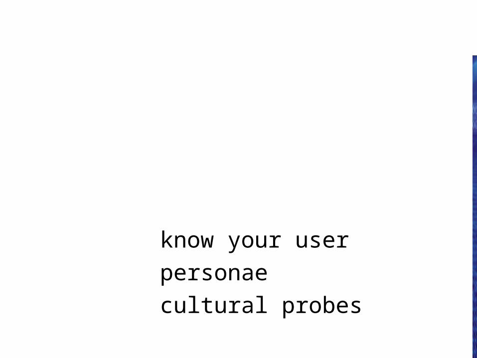
user focus
know your user
personae
cultural probes
know your user
who are they? probably not like you! talk to them watch them use your imagination
persona
description of an ‘example’ usernot necessarily a real person
use as surrogate userwhat would Oya think
details mattermakes her ‘real’
example persona
Betty is 37 years old, She has been Warehouse Manager for five years and worked for Simpkins Brothers Engineering for twelve years. She didn’t go to university, but has studied in her evenings for a business diploma. She has two children aged 15 and 7 and does not like to work late. She did part of an introductory in-house computer course some years ago, but it was interrupted when she was promoted and could no longer afford to take the time. Her vision is perfect, but her right-hand movement is slightly restricted following an industrial accident 3 years ago. She is enthusiastic about her work and is happy to delegate responsibility and take suggestions from her staff. However, she does feel threatened by the introduction of yet another new computer system (the third in her time at SBE).
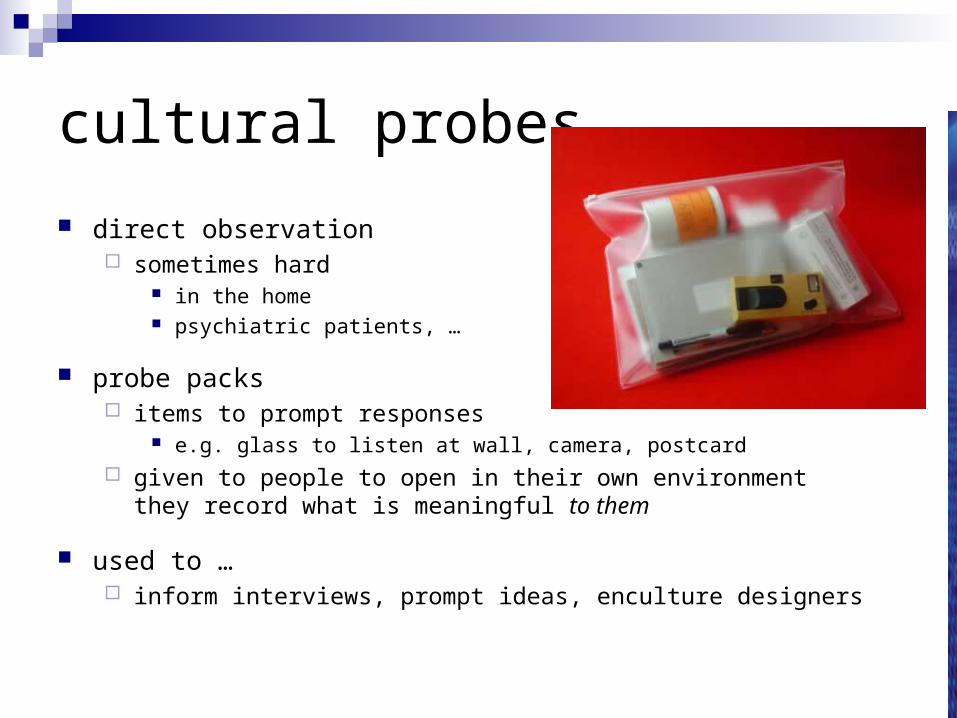
cultural probes
direct observation sometimes hard
in the home psychiatric patients, …
probe packs items to prompt responses
e.g. glass to listen at wall, camera, postcard given to people to open in their own environment
they record what is meaningful to them
used to … inform interviews, prompt ideas, enculture designers
scenarios
stories for design
use and reuse
scenarios
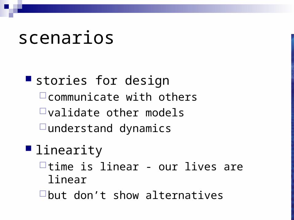
stories for designcommunicate with othersvalidate other modelsunderstand dynamics
linearity time is linear - our lives are linearbut don’t show alternatives
scenarios …
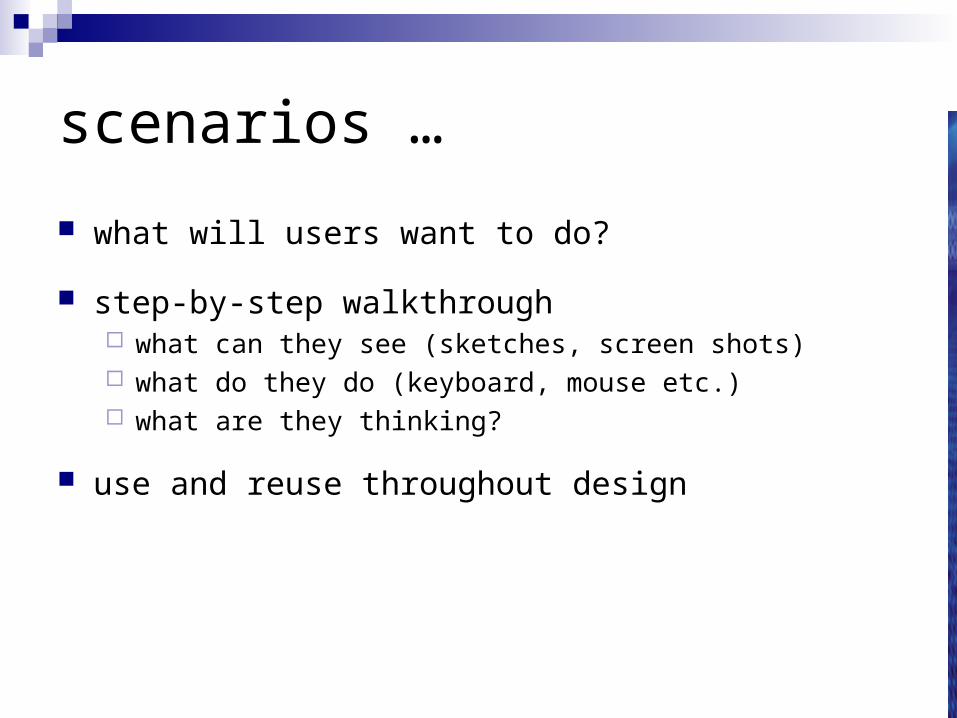
what will users want to do?
step-by-step walkthrough what can they see (sketches, screen shots) what do they do (keyboard, mouse etc.) what are they thinking?
use and reuse throughout design
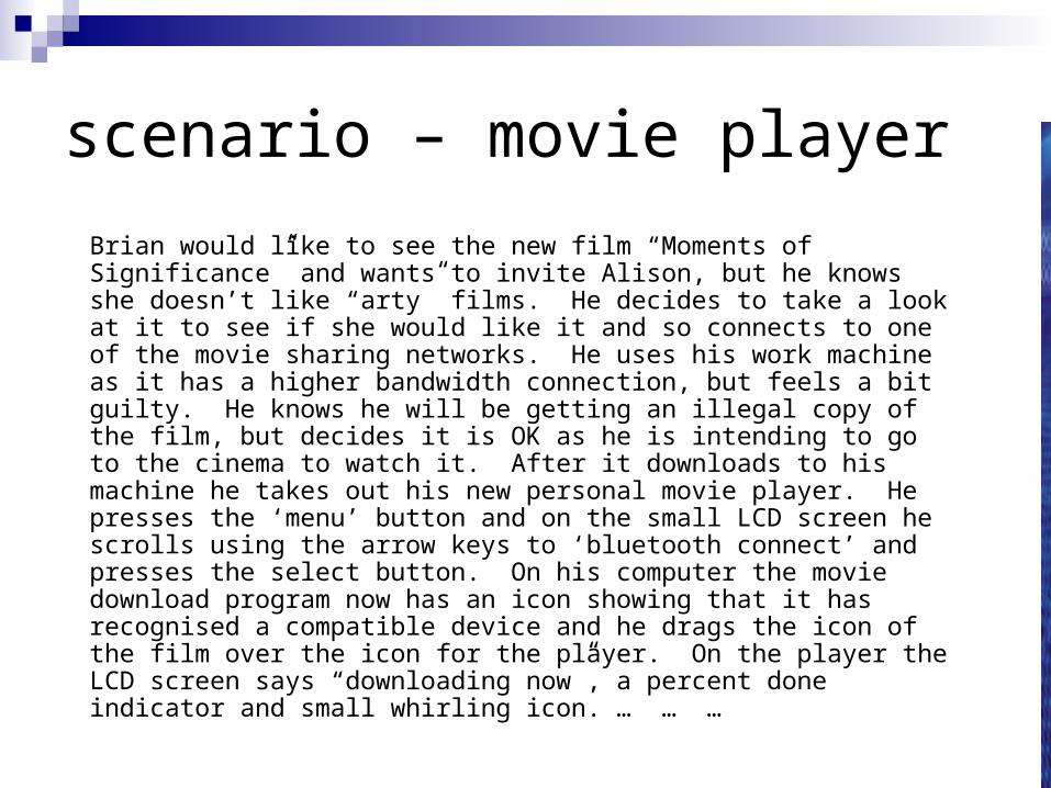
scenario – movie player
Brian would like to see the new film “Moments of Significance” and wants to invite Alison, but he knows she doesn’t like “arty” films. He decides to take a look at it to see if she would like it and so connects to one of the movie sharing networks. He uses his work machine as it has a higher bandwidth connection, but feels a bit guilty. He knows he will be getting an illegal copy of the film, but decides it is OK as he is intending to go to the cinema to watch it. After it downloads to his machine he takes out his new personal movie player. He presses the ‘menu’ button and on the small LCD screen he scrolls using the arrow keys to ‘bluetooth connect’ and presses the select button. On his computer the movie download program now has an icon showing that it has recognised a compatible device and he drags the icon of the film over the icon for the player. On the player the LCD screen says “downloading now”, a percent done indicator and small whirling icon. … … …
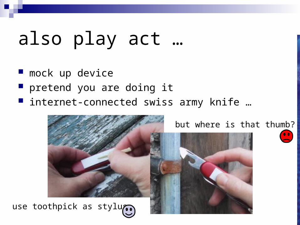
also play act …
mock up device pretend you are doing it internet-connected swiss army knife …
use toothpick as stylus
but where is that thumb?
… explore the depths
explore interactionwhat happens when
explore cognitionwhat are the users thinking
explore architecturewhat is happening inside
use scenarios to ..
communicate with othersdesigners, clients, users
validate other models ‘play’ it against other models
express dynamicsscreenshots – appearancescenario – behaviour
linearity
Scenarios – one linear path through system
Pros: life and time are linear easy to understand (stories and narrative are natural) concrete (errors less likely)
Cons: no choice, no branches, no special conditions miss the unintended
So: use several scenarios use several methods

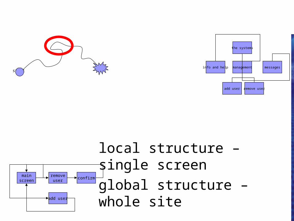
navigation design
local structure – single screen
global structure – whole site
start
the systems
info and help management messages
add user remove user
mainscreen
removeuser
confirm
add user
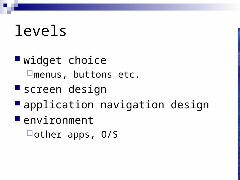
levels
widget choicemenus, buttons etc.
screen design application navigation design environment
other apps, O/S
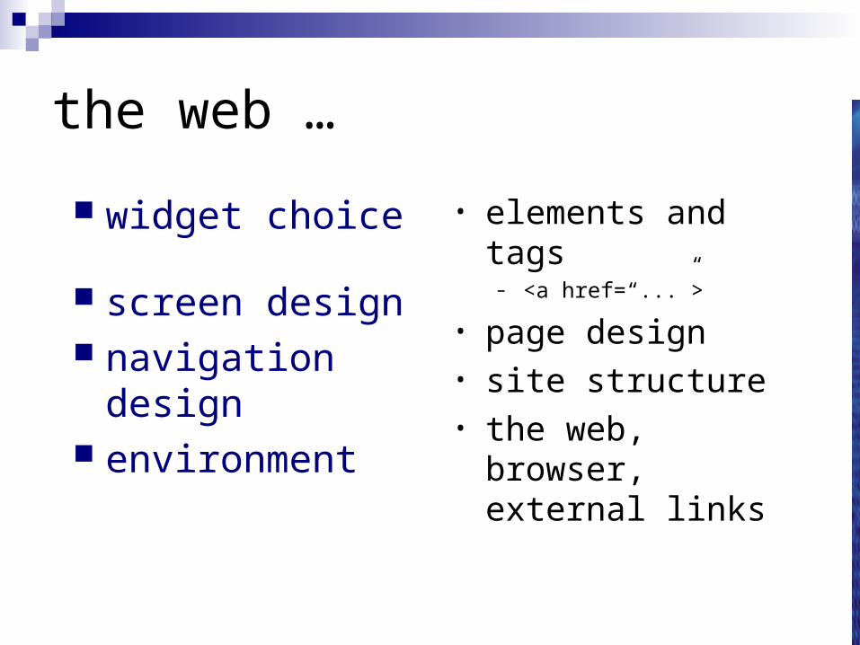
the web …
widget choice
screen design navigation design environment
• elements and tags– <a href=“...”>
• page design• site structure• the web, browser,
external links

physical devices
widget choice
screen design navigation design environment
• controls– buttons, knobs, dials
• physical layout• modes of device• the real world
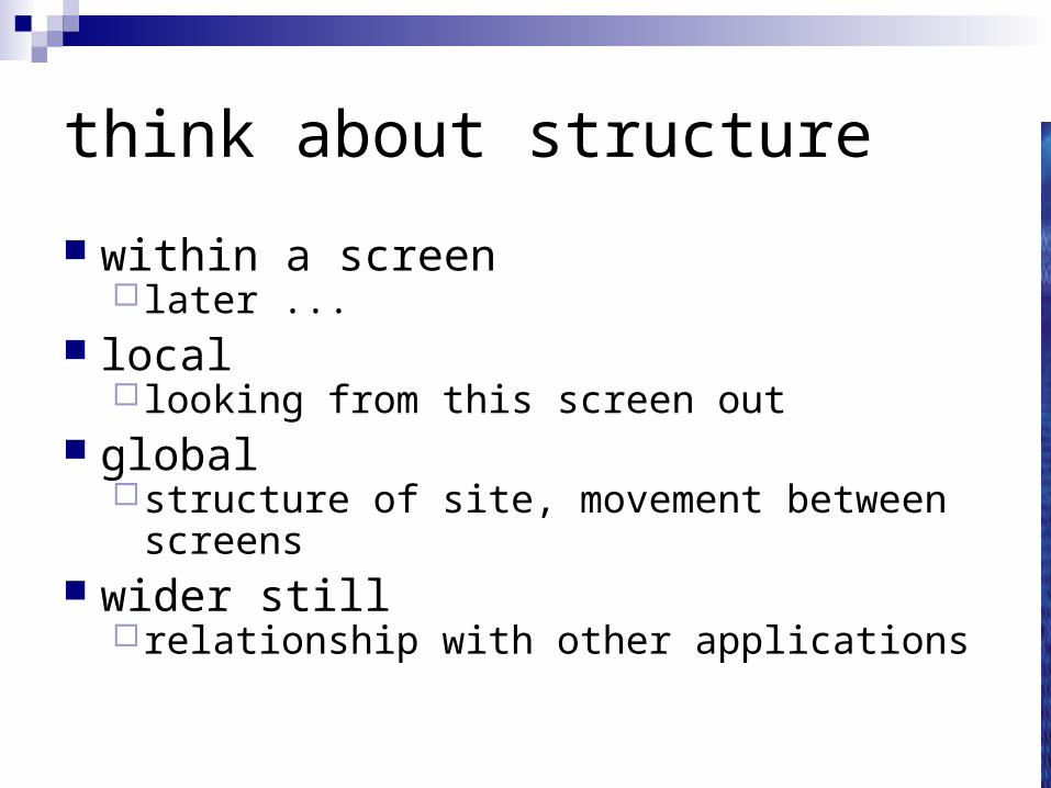
think about structure
within a screen later ...
local looking from this screen out
globalstructure of site, movement between screens
wider stillrelationship with other applications
local
from one screen looking out
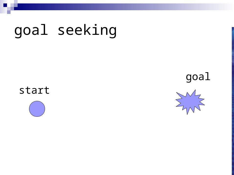
goal seeking
goalstart

goal seeking
startgoal
progress with local knowledge only ...

goal seeking
goalstart
… but can get to the goal
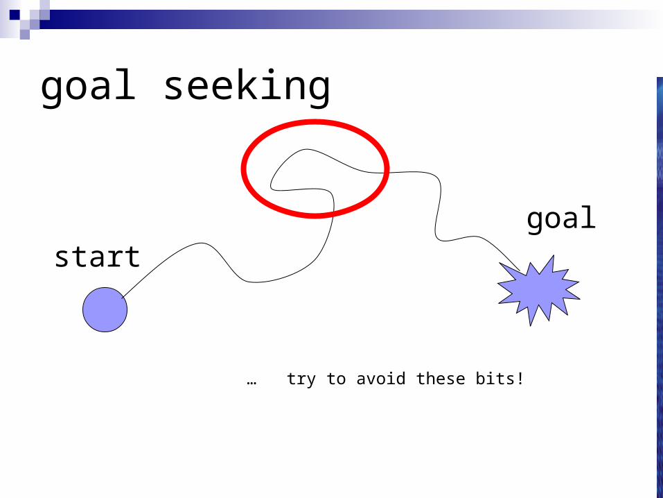
goal seeking
… try to avoid these bits!
goalstart
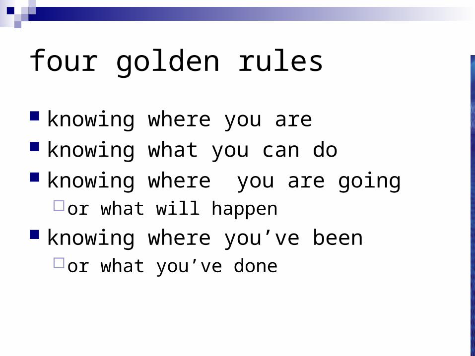
four golden rules
knowing where you are knowing what you can do knowing where you are going
or what will happen knowing where you’ve been
or what you’ve done
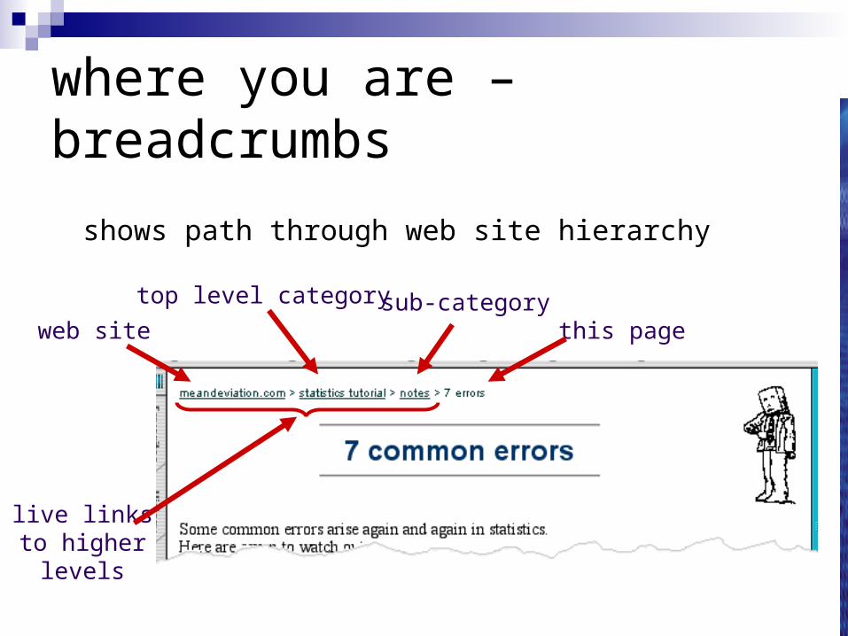
where you are – breadcrumbs
shows path through web site hierarchy
web site
top level category sub-categorythis page
live linksto higher
levels
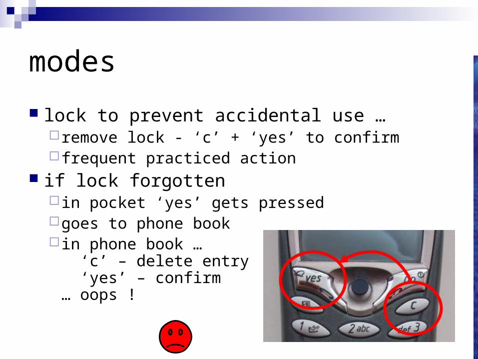
modes
lock to prevent accidental use …remove lock - ‘c’ + ‘yes’ to confirm frequent practiced action
if lock forgotten in pocket ‘yes’ gets pressedgoes to phone book in phone book …
‘c’ – delete entry ‘yes’ – confirm… oops !
global
between screens
within the application
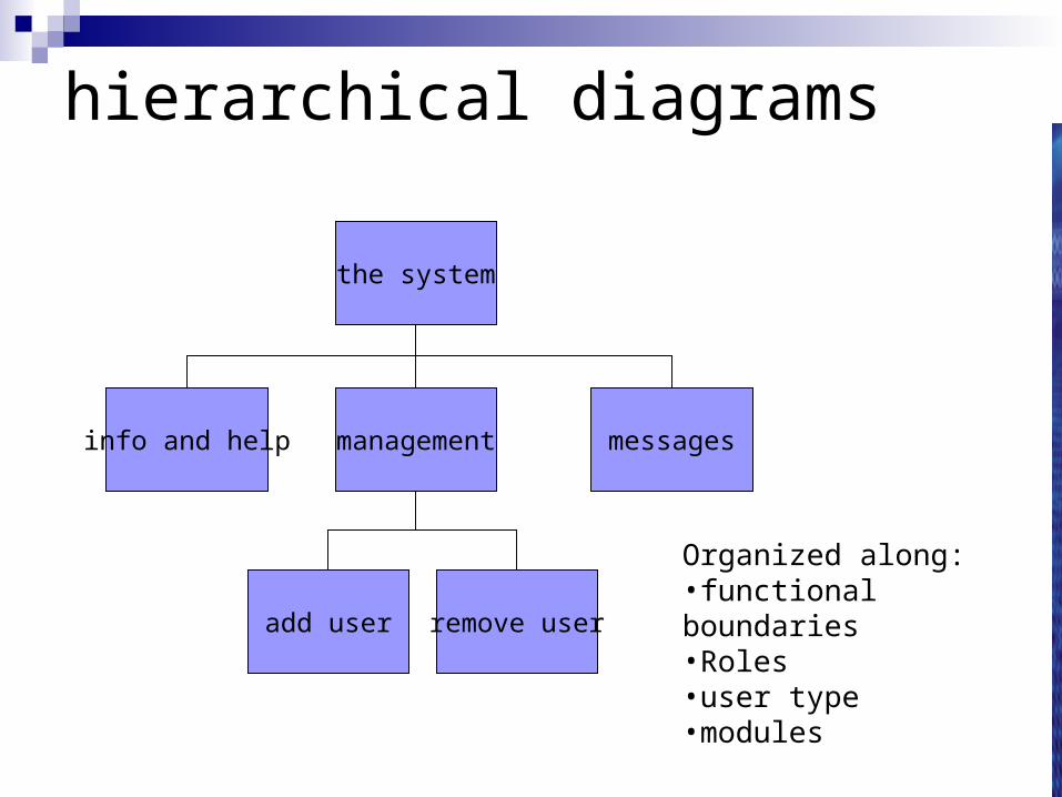
hierarchical diagrams
the system
info and help management messages
add user remove user
Organized along:•functional boundaries•Roles•user type•modules
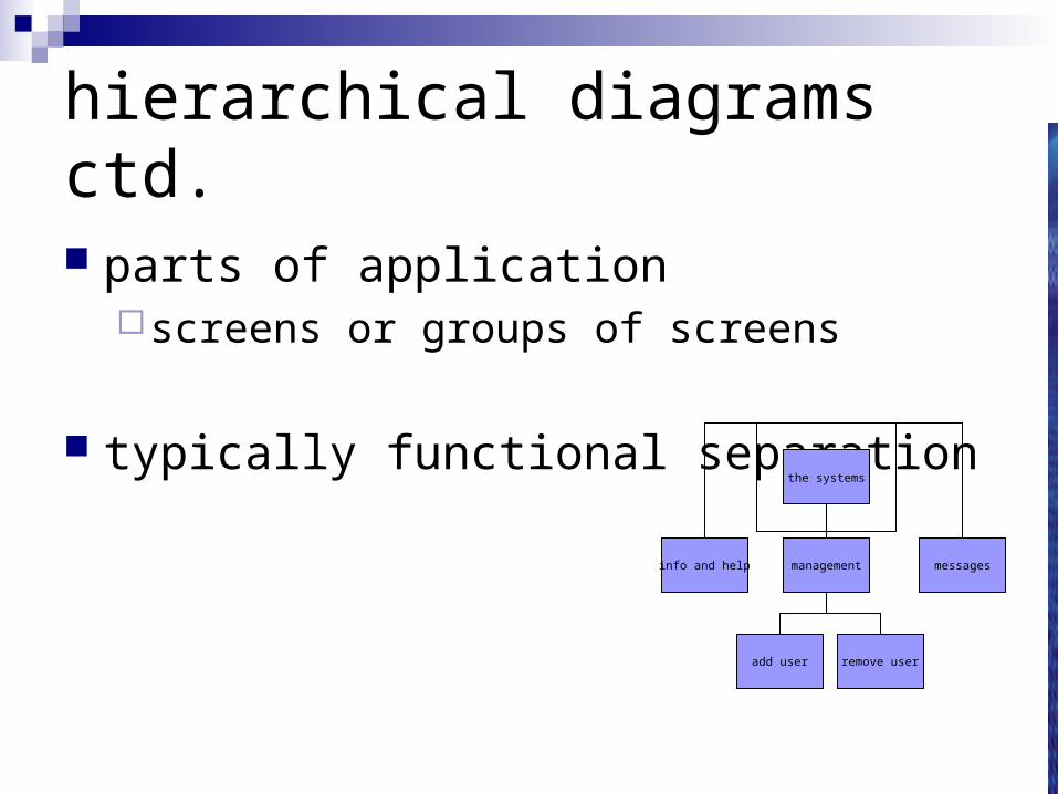
hierarchical diagrams ctd.
parts of applicationscreens or groups of screens
typically functional separationthe systems
info and help management messages
add user remove user
navigating hierarchies
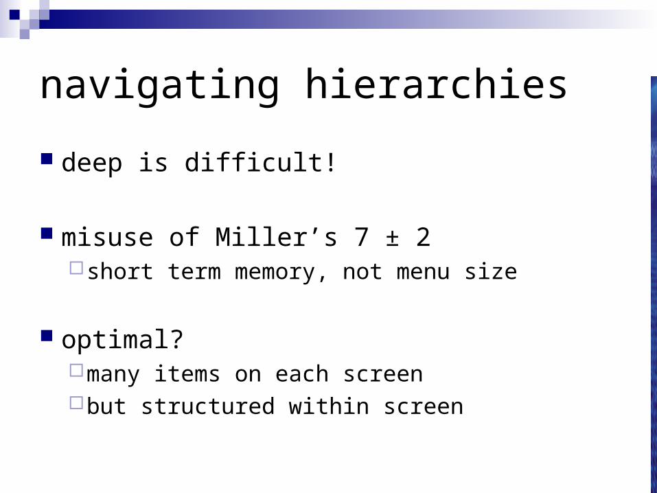
deep is difficult!
misuse of Miller’s 7 ± 2short term memory, not menu size
optimal?many items on each screenbut structured within screen
think about dialogue
what does it mean in UI design?
• computer dialogue pattern of interaction between users and system
(cross-links in hierarchies, editing-deleting a record etc.)
but details differ each time
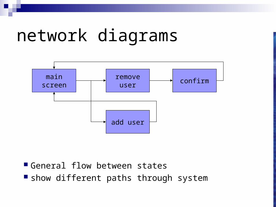
network diagrams
General flow between states show different paths through system
mainscreen
removeuser
confirm
add user
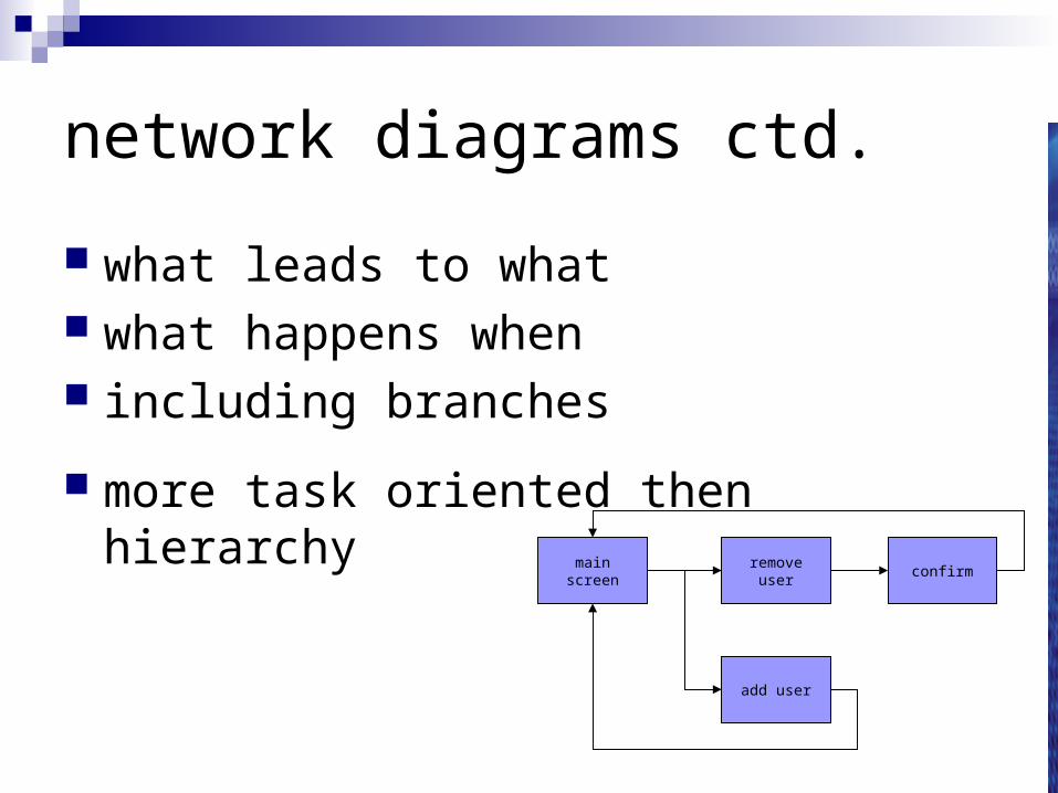
network diagrams ctd.
what leads to what what happens when including branches
more task oriented then hierarchymain
screenremove
userconfirm
add user
wider still
between applications
and beyond ...
wider still …
style issues:platform standards, consistency
functional issuescut and paste
navigation issuesembedded applications links to other apps … the web

screen design and layout
basic principles
grouping, structure, order
alignment
use of white spaceABCDEFGHIJKLM
NOPQRSTUVWXYZ
Dix , AlanFinlay, JanetAbowd, GregoryBeale, Russell
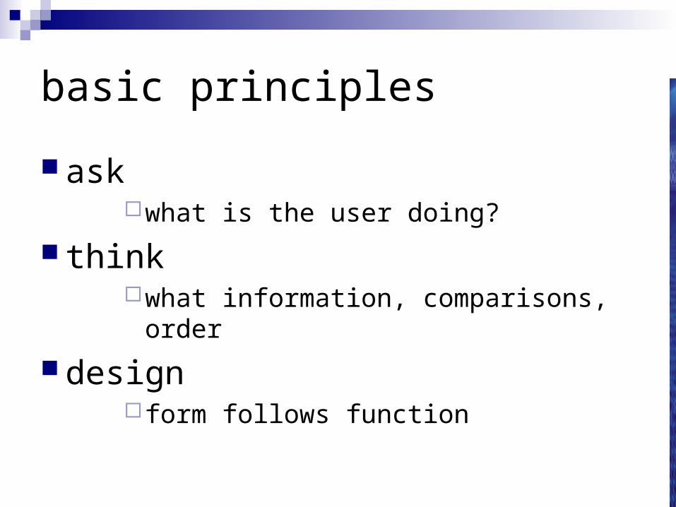
basic principles
askwhat is the user doing?
thinkwhat information, comparisons, order
design form follows function
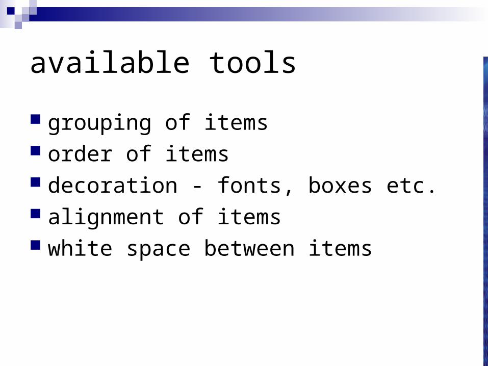
available tools
grouping of items order of items decoration - fonts, boxes etc. alignment of items white space between items
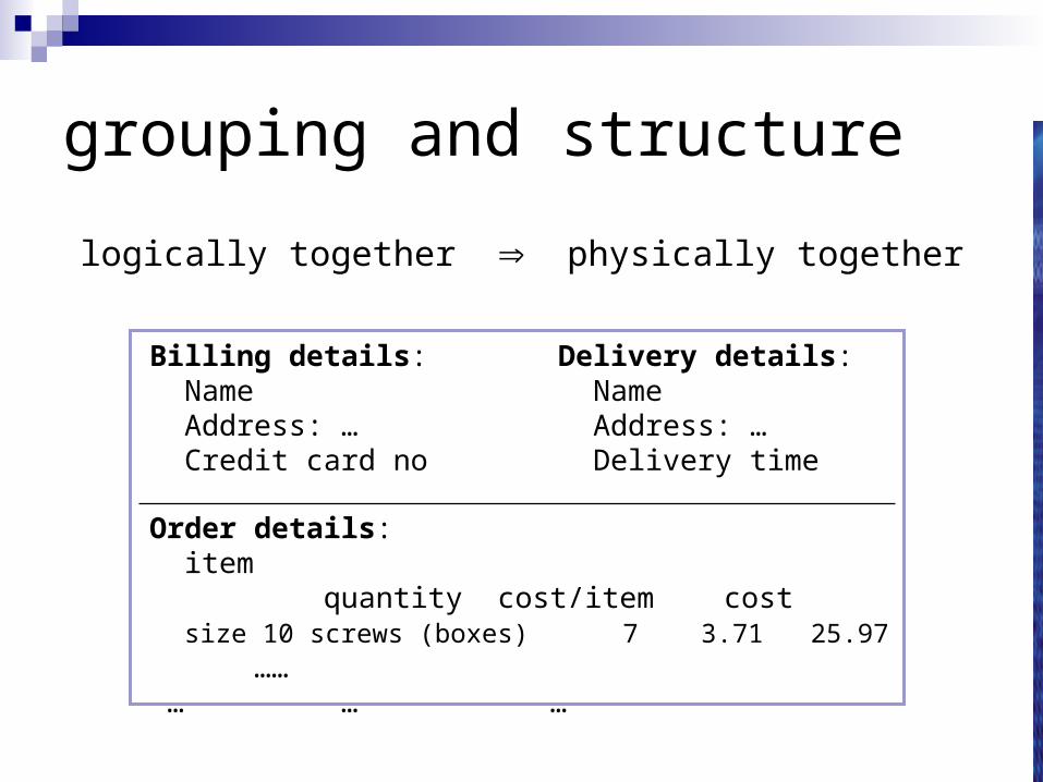
grouping and structure
logically together physically together
Billing details: Name Address: … Credit card no
Delivery details: Name Address: … Delivery time
Order details: item quantity cost/item cost size 10 screws (boxes) 7 3.71 25.97 …… … … …
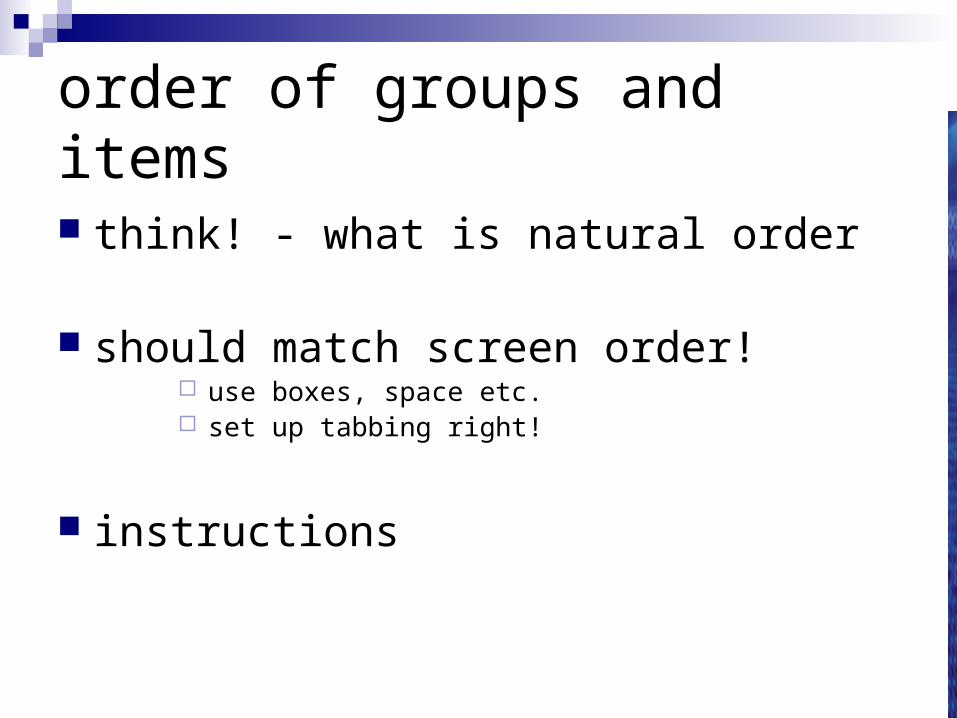
order of groups and items
think! - what is natural order
should match screen order! use boxes, space etc. set up tabbing right!
instructions
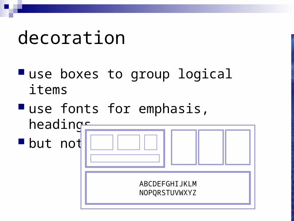
decoration
use boxes to group logical items use fonts for emphasis, headings but not too many!!
ABCDEFGHIJKLMNOPQRSTUVWXYZ
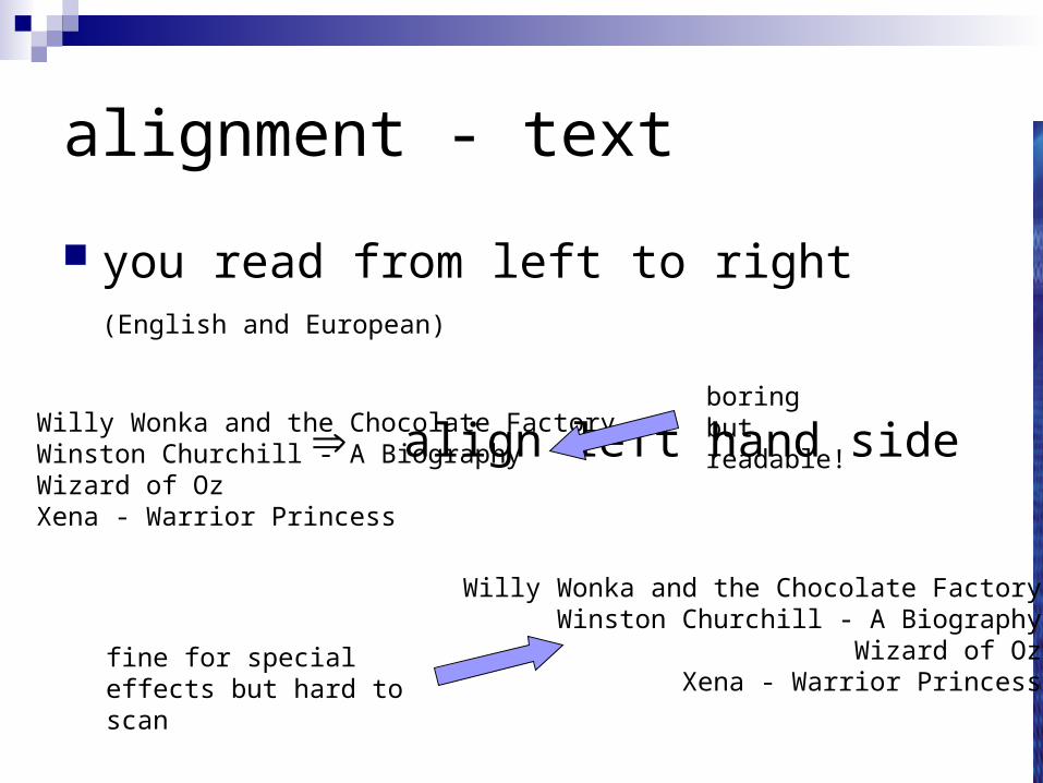
alignment - text
you read from left to right (English and European)
align left hand sideWilly Wonka and the Chocolate FactoryWinston Churchill - A BiographyWizard of OzXena - Warrior Princess
Willy Wonka and the Chocolate FactoryWinston Churchill - A Biography
Wizard of OzXena - Warrior Princess
fine for special effects but hard to scan
boring butreadable!
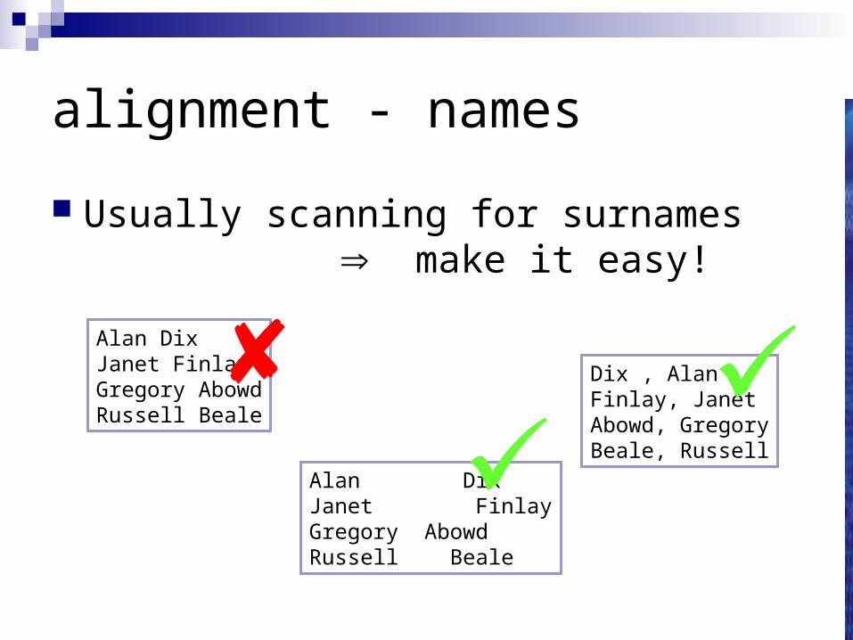
alignment - names
Usually scanning for surnames make it easy!
Alan DixJanet FinlayGregory AbowdRussell Beale
Alan DixJanet FinlayGregory AbowdRussell Beale
Dix , AlanFinlay, JanetAbowd, GregoryBeale, Russell
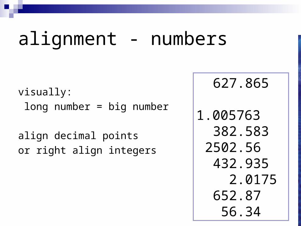
alignment - numbers
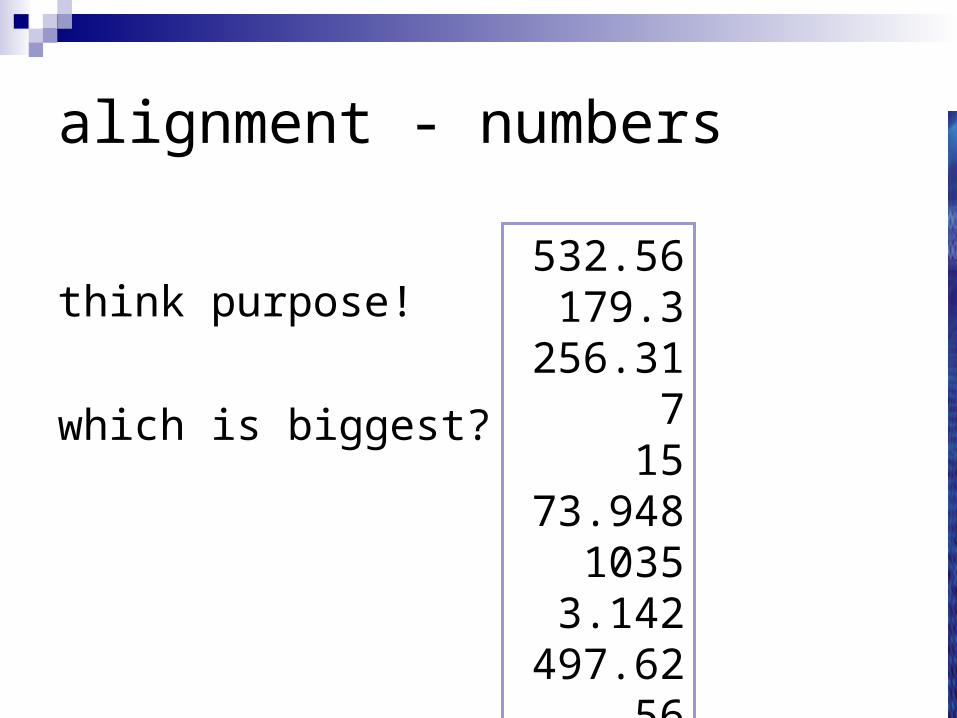
think purpose!
which is biggest?
532.56179.3
256.31715
73.9481035
3.142497.6256
alignment - numbers
visually:
long number = big number
align decimal points
or right align integers
627.8651.005763
382.5832502.56
432.9352.0175
652.8756.34
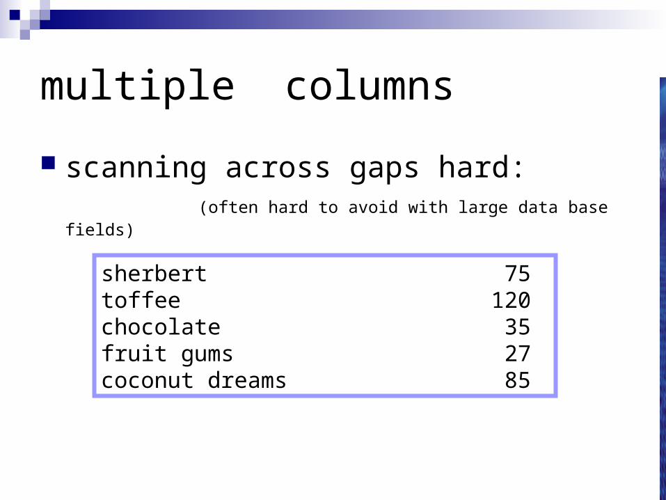
multiple columns
scanning across gaps hard:(often hard to avoid with large data base fields)
sherbert 75toffee 120chocolate 35fruit gums 27coconut dreams 85
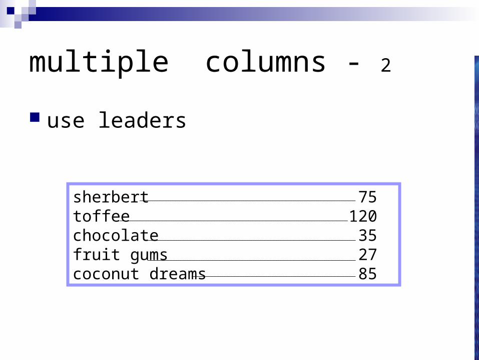
multiple columns - 2
use leaders
sherbert 75toffee 120chocolate 35fruit gums 27coconut dreams 85
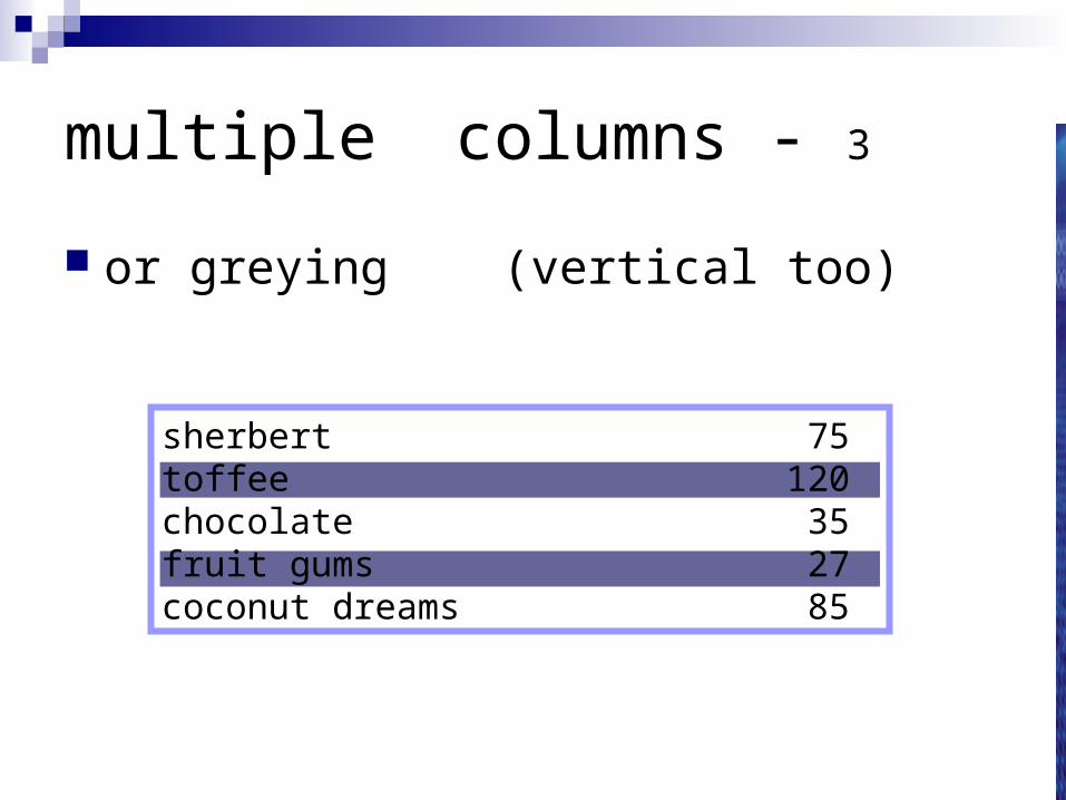
multiple columns - 3
or greying (vertical too)
sherbert 75toffee 120chocolate 35fruit gums 27coconut dreams 85
sherbert 75toffee 120
chocolate 35fruit gums 27
coconut dreams 85
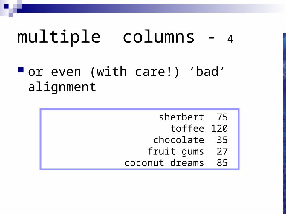
multiple columns - 4
or even (with care!) ‘bad’ alignment
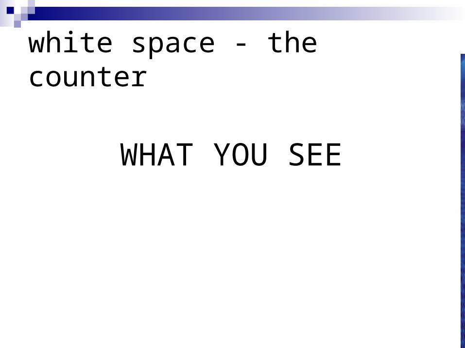
white space - the counter
WHAT YOU SEE
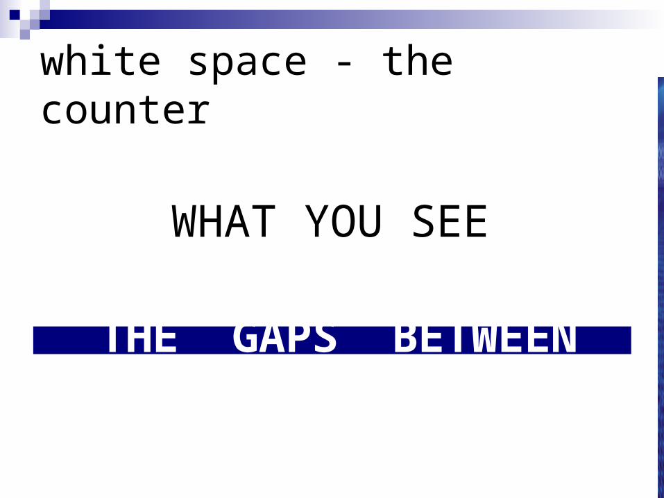
white space - the counter
WHAT YOU SEE
THE GAPS BETWEEN
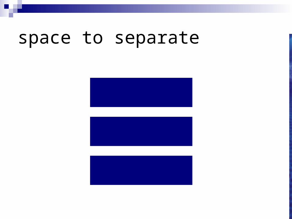
space to separate
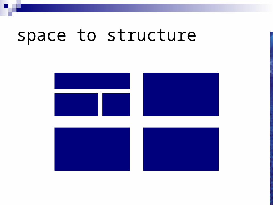
space to structure
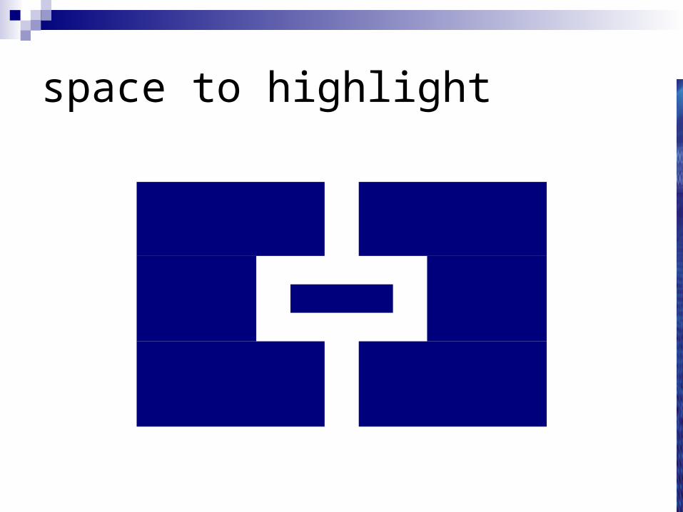
space to highlight
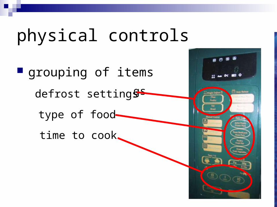
physical controls
grouping of itemsdefrost settings
type of food
time to cooktype of food
time to cook
defrost settings
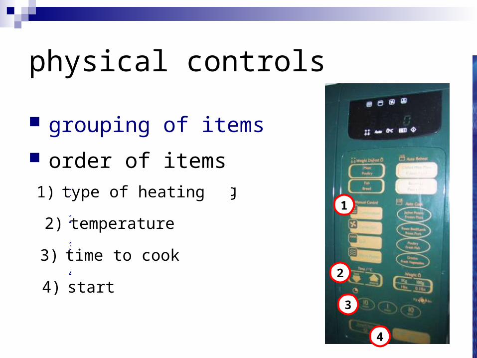
physical controls
grouping of items
order of items1) type of heating
2) temperature
3) time to cook
4) start
4
4) start2
2) temperature
3
3) time to cook
11) type of heating
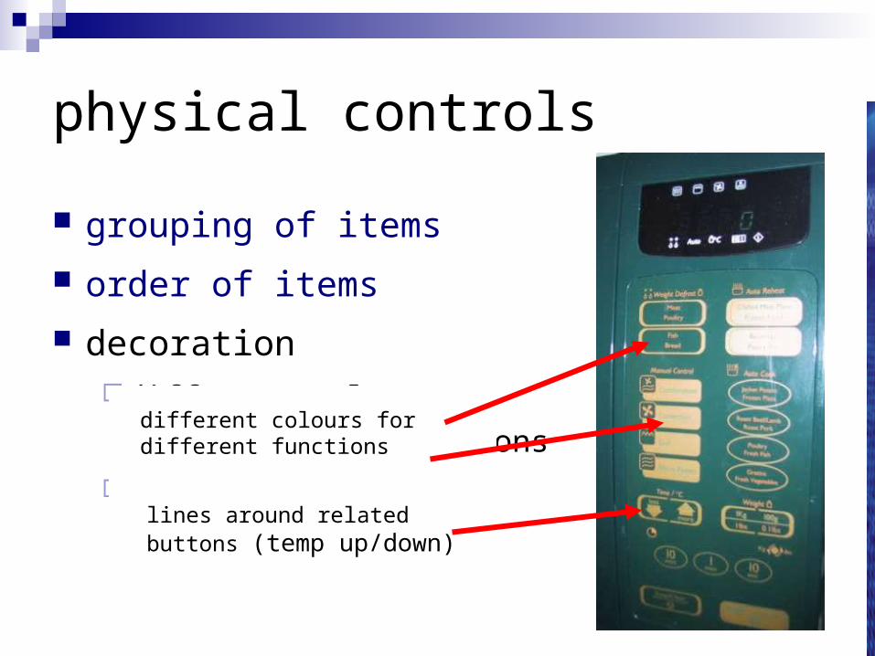
physical controls
grouping of items
order of items
decorationdifferent colours
for different functions
lines around related
buttons
different colours for different functions
lines around related buttons (temp up/down)
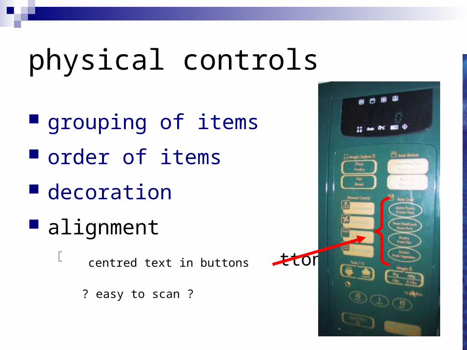
physical controls
grouping of items
order of items
decoration
alignmentcentered text in buttons
? easy to scan ?? easy to scan ?
centred text in buttons
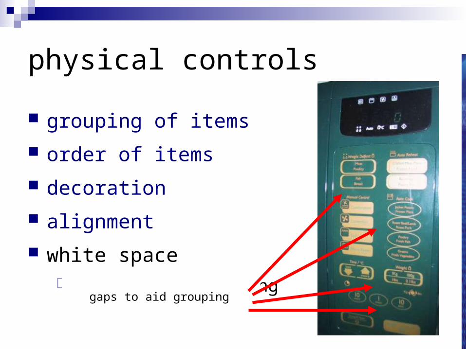
physical controls
grouping of items
order of items
decoration
alignment
white spacegaps to aid groupinggaps to aid grouping

user action and control
entering information
knowing what to do
affordances
entering information
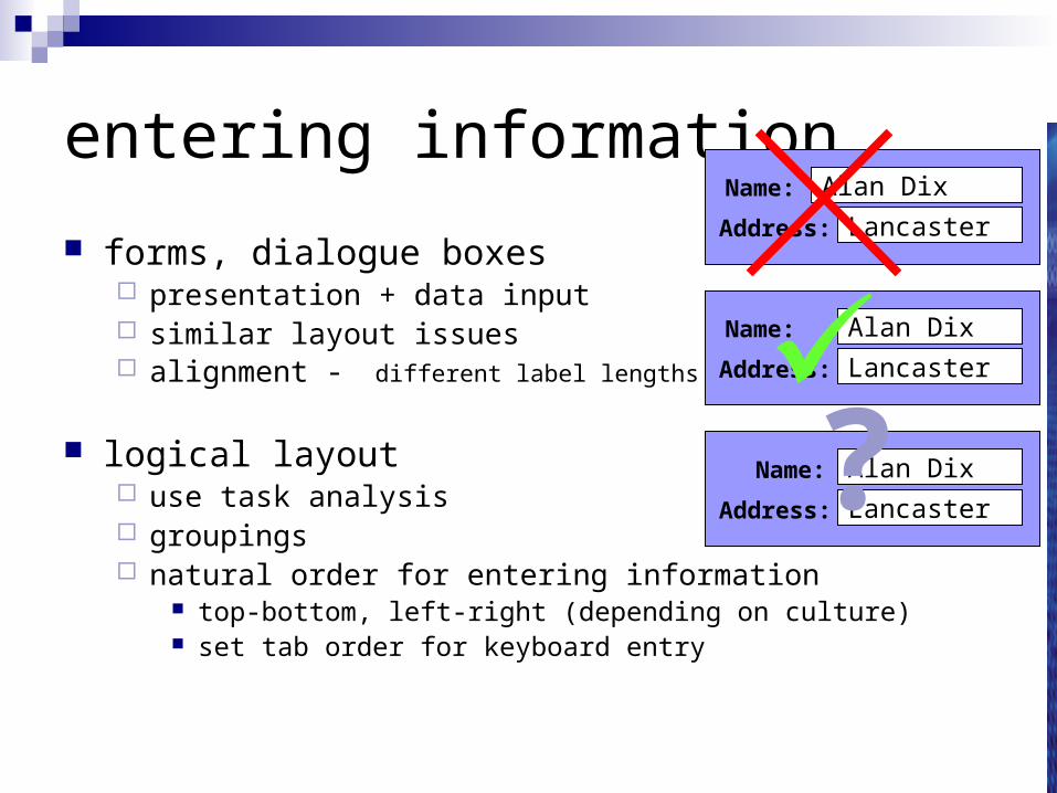
forms, dialogue boxes presentation + data input similar layout issues alignment - different label lengths
logical layout use task analysis groupings natural order for entering information
top-bottom, left-right (depending on culture) set tab order for keyboard entry
Name:
Address:
Alan Dix
Lancaster
Name:
Address:
Alan Dix
Lancaster
Name:
Address:
Alan Dix
Lancaster
?
knowing what to do
what is active what is passivewhere do you clickwhere do you type
consistent style helps-company and platform guidelines
e.g. web underlined links labels and icons
standards for common actions language – bold = current state or action
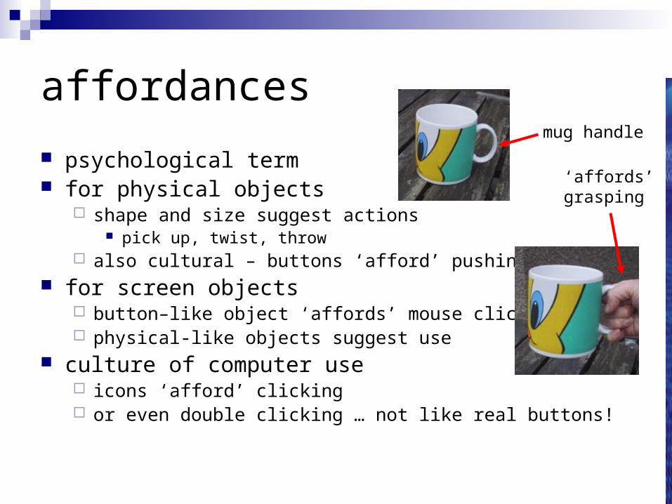
affordances
psychological term for physical objects
shape and size suggest actions pick up, twist, throw
also cultural – buttons ‘afford’ pushing for screen objects
button–like object ‘affords’ mouse click physical-like objects suggest use
culture of computer use icons ‘afford’ clicking or even double clicking … not like real buttons!
mug handle
‘affords’grasping
appropriate appearance
presenting information
aesthetics and utility
colour and 3D
localisation & internationalisation
presenting information
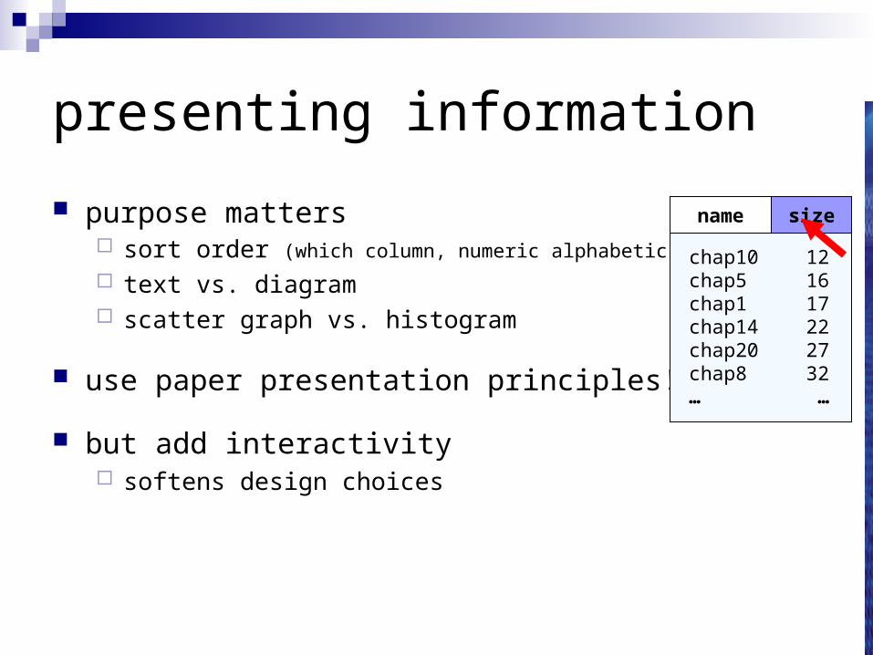
purpose matters sort order (which column, numeric alphabetic)
text vs. diagram scatter graph vs. histogram
use paper presentation principles!
but add interactivity softens design choices
chap1chap10chap11chap12chap13chap14 …
171251
2628322
…
sizename size
chap10chap5chap1chap14chap20chap8…
121617222732…
name size
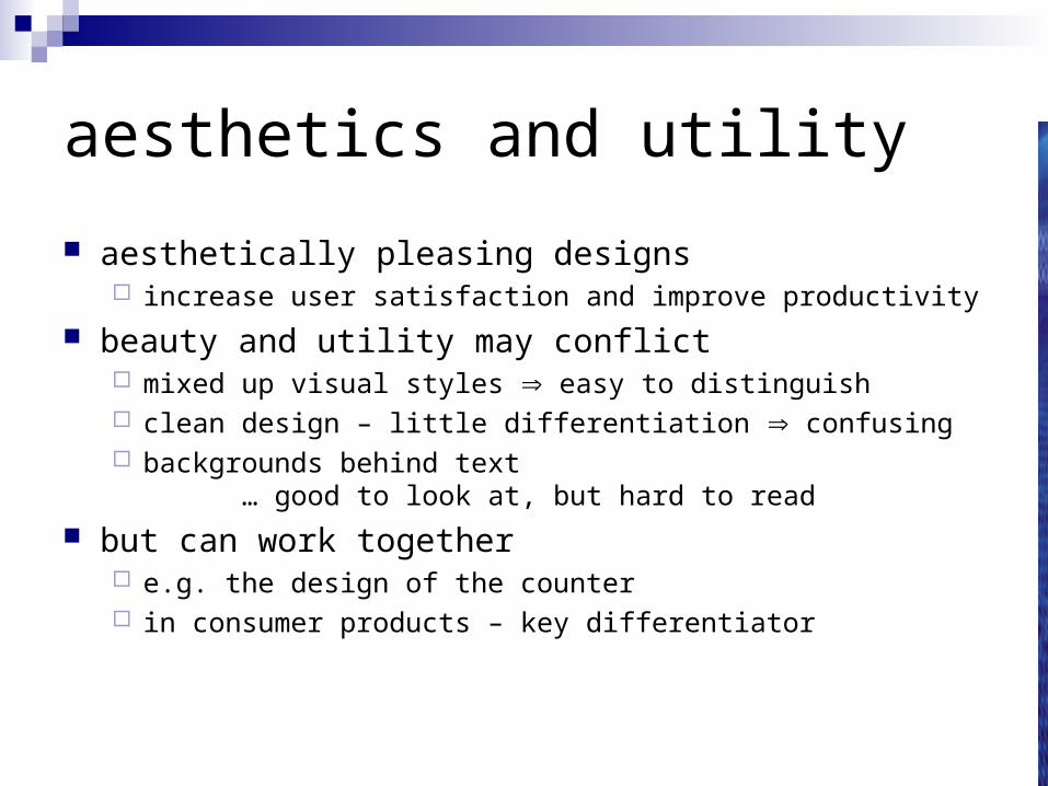
aesthetics and utility
aesthetically pleasing designs increase user satisfaction and improve productivity
beauty and utility may conflict mixed up visual styles easy to distinguish clean design – little differentiation confusing backgrounds behind text
… good to look at, but hard to read
but can work together e.g. the design of the counter in consumer products – key differentiator
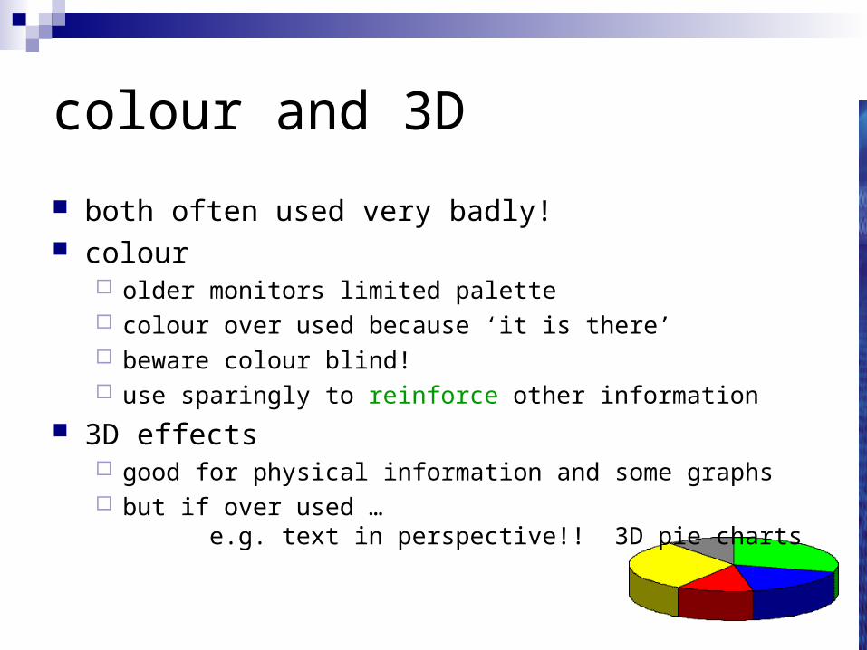
colour and 3D
both often used very badly! colour
older monitors limited palette colour over used because ‘it is there’ beware colour blind! use sparingly to reinforce other information
3D effects good for physical information and some graphs but if over used …
e.g. text in perspective!! 3D pie charts
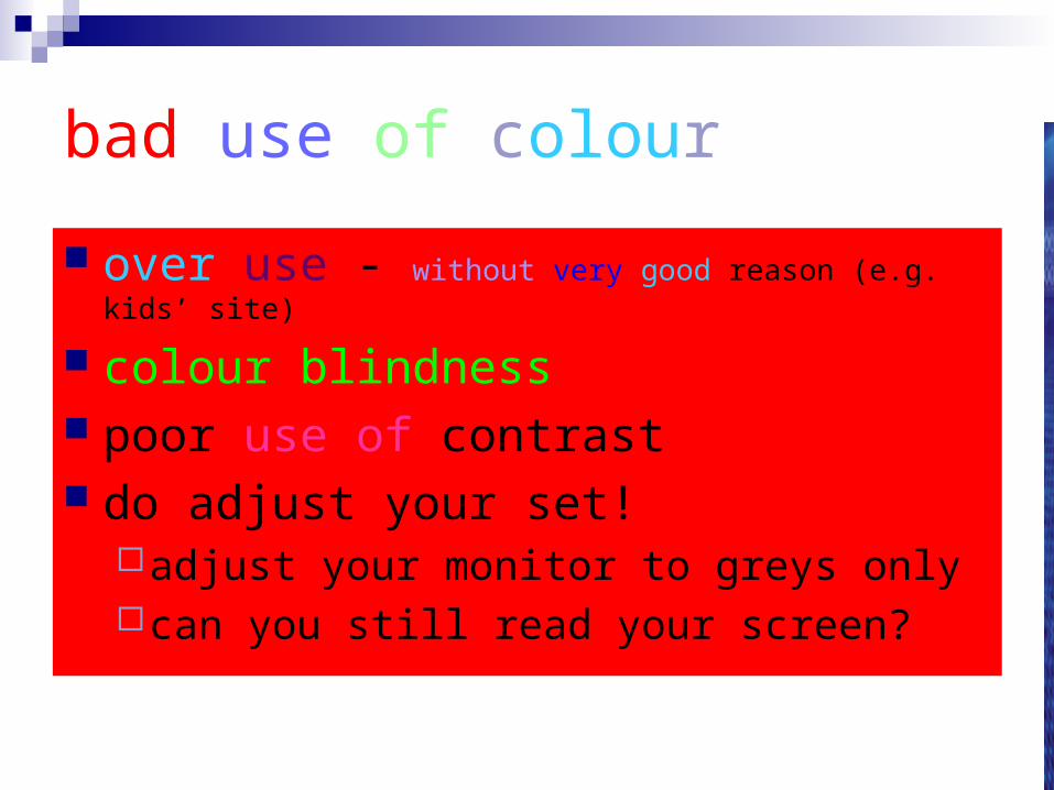
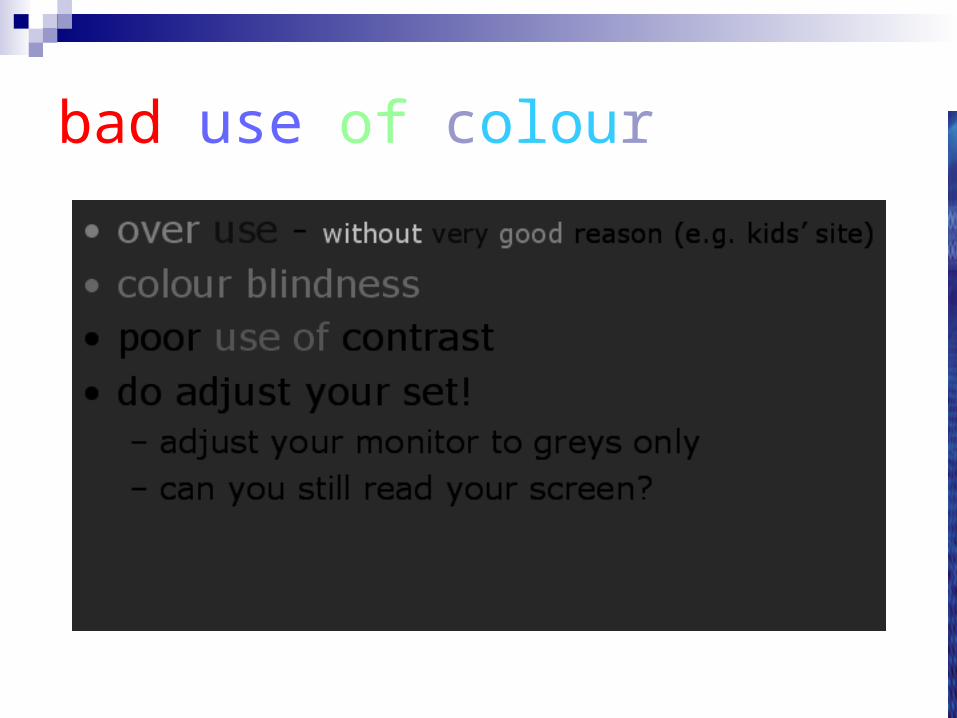
bad use of colour
over use - without very good reason (e.g. kids’ site)
colour blindness poor use of contrast do adjust your set!
adjust your monitor to greys onlycan you still read your screen?
bad use of colour
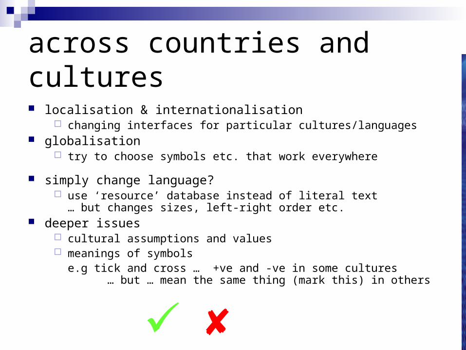
across countries and cultures
localisation & internationalisation changing interfaces for particular cultures/languages
globalisation try to choose symbols etc. that work everywhere
simply change language? use ‘resource’ database instead of literal text
… but changes sizes, left-right order etc. deeper issues
cultural assumptions and values meanings of symbols e.g tick and cross … +ve and -ve in some cultures
… but … mean the same thing (mark this) in others

prototyping
iteration and prototyping
getting better …
… and starting well
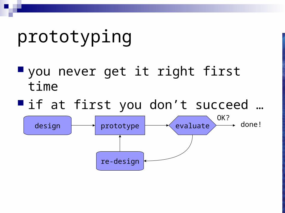
prototyping
you never get it right first time if at first you don’t succeed …
prototype evaluatedesign
re-design
done!OK?
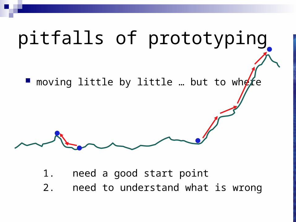
pitfalls of prototyping
moving little by little … but to where
1. need a good start point
2. need to understand what is wrong
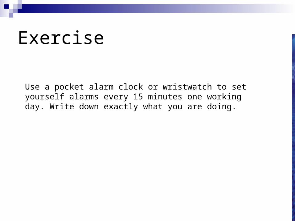
Exercise
Use a pocket alarm clock or wristwatch to set yourself alarms every 15 minutes one working day. Write down exactly what you are doing.
Manual Override
Target6000
Pressure SET
+
–
Alarm Control
Reactor Targets
Pressure7934
Temp325
Flow Rate10256
IMMEDIATESHUTDOWNCOMMENCE
Emergency Shutdown
CONFIRM
Emergency Confirm
CANCEL
LOTS OF OTHERCONTROLSreactor targets
informationpanel
alarmcontrolpanel
emergencyshutdown
panel
emergencyconfirmpanel
NUCLEAR REACTOR MAIN CONTROL PANEL
0 1
4
7 8 9
3
65
2
manualoverride
panelkeypad
for manualoverride
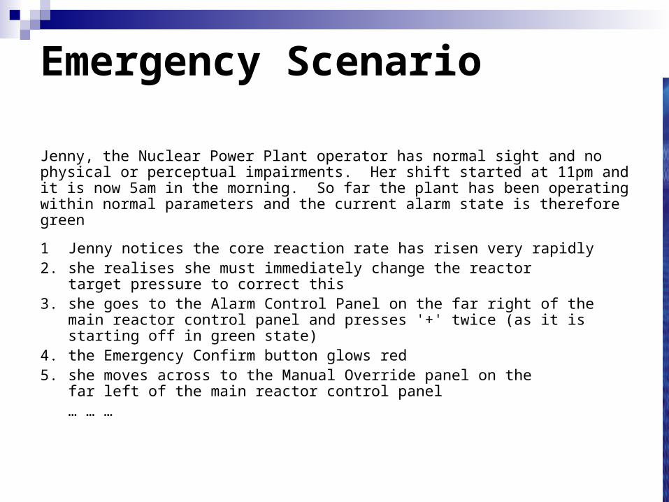
Emergency Scenario
Jenny, the Nuclear Power Plant operator has normal sight and no physical or perceptual impairments. Her shift started at 11pm and it is now 5am in the morning. So far the plant has been operating within normal parameters and the current alarm state is therefore green
1 Jenny notices the core reaction rate has risen very rapidly2. she realises she must immediately change the reactor
target pressure to correct this3. she goes to the Alarm Control Panel on the far right of the
main reactor control panel and presses '+' twice (as it isstarting off in green state)
4. the Emergency Confirm button glows red5. she moves across to the Manual Override panel on the
far left of the main reactor control panel… … …


